#whyprojectposter
Explore tagged Tumblr posts
Visit Tumblr Blog
Explore Tumblr blogs with no restrictions, modern design and the best experience.
Last Seen Tumblr Blogs


Fun Fact
Tumblr has 4 main sources of revenue.
Photo
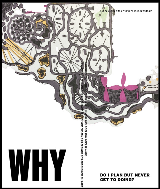


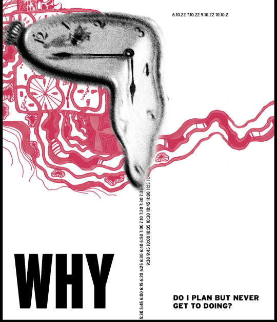
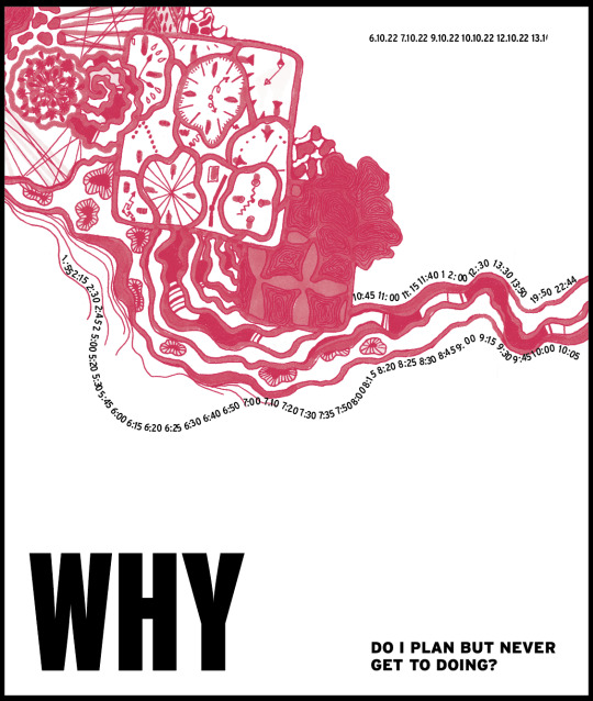

Why poster development
I found that the colour illustration was not quite consistent in colour to include in my poster. So I changed it to monochrome to get rid of all the inconsistencies and glare that came from the poor lighting in my room. I also think that one colour makes the viewer focus on the details, which are more meaningful in this work. I got rid of the Dali clock to draw more attention to the illustration and to fully celebrate my work. The dripping alarm clocks looked harmonious with the black and white clock, but not next to the elements of my illustration, so I tried to attach them to my illustration by placing text on the wavy lines that are part of my design. I'm not sure about the layout, but I think it will be easy to fix once I figure out where to place my question.
0 notes