#whyproject
Explore tagged Tumblr posts
Text
Why?

2 notes
·
View notes
Text
Lecture 1
05/10/2022
Introduction to Level 5:
4 Units: 40, 20, 20, 40 credits - all towards degree
Process Book: Strategy/narrative of project-Refined version of blog
Blog: Context and initial ideas
Sketchbook: Sketches of illustrative ideas/layout/mind maps to be uploaded to blog
Level 5 loosely defined career direction, so keep that in mind
When showcasing work, consider it like a pitch to employers
Context can be historical but also important to consider contemporary
When analysing artworks, explain what it does and why it has been selected
Landscape and square formats are not recommended for process book
Make sure to use a specific URL with Tumblr
Why Project:
The question of 'why' needs to be presented. When uploading (say the outcome is a poster), make sure it is PDF
Examples from past:
Curious why coriander is horrible (tastes like soap), so took a bar of soap and packaged it in illustrated coriander wrapping
Why was the brief set, outcome was a rap and an animation
1 note
·
View note
Text
Conclusion to WHY?
To conclude I am happy with the outcome and the amount of work and effort I was able to put into this project, even when we were given a limited time for the project. getting to the point I got too is something that I am very proud of.
0 notes
Photo
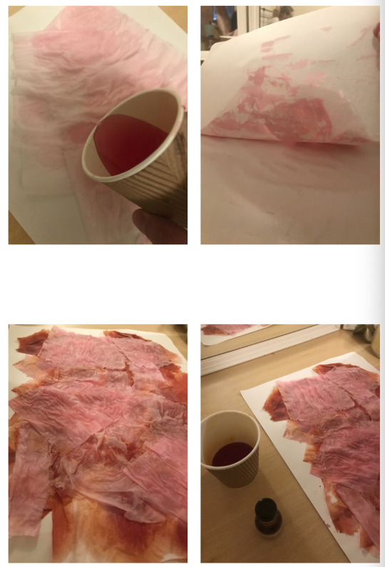
To develop my idea of the progression of colour, I used pink and red food dye to change the colour of the toilet paper. I first took a piece of A3 paper and laid out different thickness of toilet paper over the top. When the dye is used by itself, it dries too dark for my intention of it. To overcome this I watered down the dye so the colours wouldn’t be as harsh.
0 notes
Text
first versions of why project new version. (remaster)
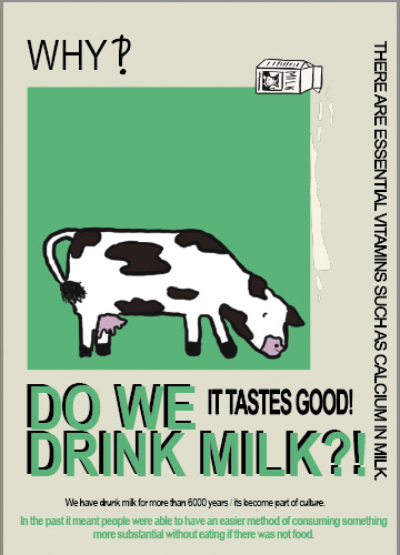
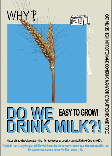

improvements to make : illustration continuity, hierarchy needs to be better. change the title, make simpler.
0 notes
Photo
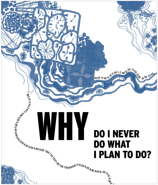
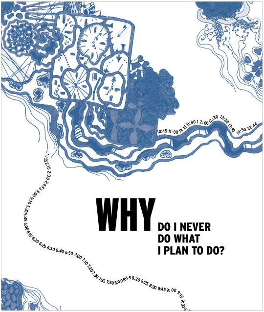
Why project final layouts
0 notes
Text
Why Tutorial
Following the animation that I have produced so far here is the feedback given by Mark and Richard.
Look at the movement of the primary research I have done and integrate it in my animation
Linger on the sausage longer, make him walk for longer or do a run for a ball
Maybe play with the jazz music, adjust the animation to the music.
I am gonna look on this feedback to adjust the animation. I defiantly agree that it's a bit short and that the sausage dog should last longer and I think the way to do it is by making him walk longer tho I don't have reference for how a sausage dog looks like when it jumps. I also have noticed looking back at the primary research video that the sausage dog only wiggled his butt when excited or sees me. Therefor, making him wiggle his butt while walking won't be accurate. I will look for other things that he can do to make him linger for longer wether it's by extending the walk or make him do a run.
0 notes
Quote
VCM0661: Evaluation
The whole unit was quite productive in the creative field. I had the opportunity to test how much I could do in a short time, and I felt that I have improved in the quality of the final works. The ‘‘WHY Project brief’’ was presented as questions asked by children, however we could present it in any way. I chose to present it with an answer for children but it easily works for all types of ages, since it can be a topic of public interest. Also the ‘‘ handmade style ’’ is very fashionable, creates a more organic and more personalized feeling. The ‘‘ RSA in group ’brief was also a project focused on searching and generating ideas, my group was mainly interested in the socialization and integration of people in coffee shops, bars or common areas. In general, both projects were successful, I feel that the main objectives were met.
Regarding the individual RSA project, it was a very challenging project because recently I was struck by animation and my main objective since choosing the briel was to make an animation with After Effects. For that I did many tests and practices with different ideas that I had together with tutorials that were very helpful in this process. The idea of this project was advancing mainly after my tutorials, I was focused on creating an idea that would really impact an audience, I was not very in agreement with the idea that it was only a `` warning ‘’ or a `` statement ‘’ ‘because that already exists, however I was told to take care of the sensitivity of the audience. I was focused on human actions, lack of awareness, influence among ourselves and how it is used, and how I could use those same tools to persuade the audience and insist that we be more aware of the environment. I have the thought that the best way to change something is with what already exists. In this case, just as animals are ingesting garbage and human waste, we humans do not know that this is a cycle that returns to us and not precisely to our dump but to our intestine. It is a reality that we are not aware of and of course, unfortunately when we see that littering affects us then it is when we create awareness. With that same idea I created an animation, in this case for a older audience, adults in general. I am very satisfied with the results, I feel that I learned a lot and my skills are better. If I had to do it differently it would be the opportunity to make others the style of the drawings, maybe to experiment more and it would serve to broaden the audience, and my skills.
0 notes
Text
Why?
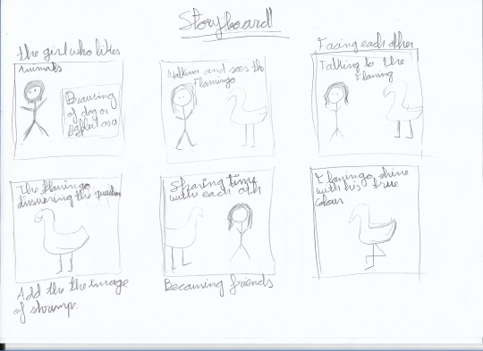
Planning

1 note
·
View note
Photo
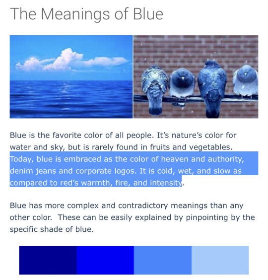
Why Poster Colour
My next step was to consider the colour and find one that symbolised slowness. This would help me convey my first message through colour, as it would tell the viewer the mood of my project. I chose blue as it is known to represent slowness.
0 notes
Photo
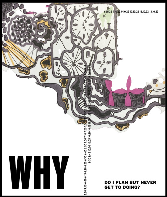


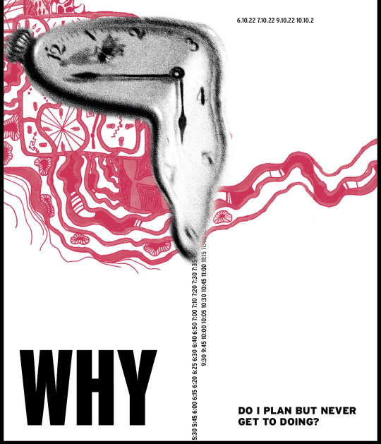

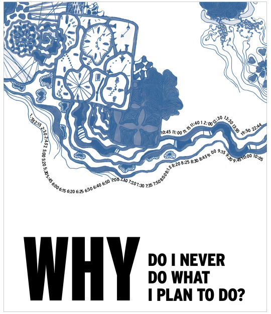
Why poster development
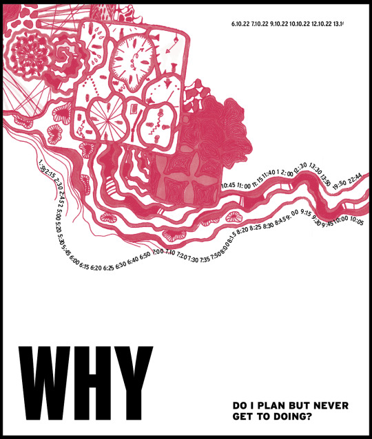
I found that the colour illustration was not quite consistent in colour to include in my poster. So I changed it to monochrome to get rid of all the inconsistencies and glare that came from the poor lighting in my room. I also think that one colour makes the viewer focus on the details, which are more meaningful in this work. I got rid of the Dali clock to draw more attention to the illustration and to fully celebrate my work. The dripping alarm clocks looked harmonious with the black and white clock, but not next to the elements of my illustration, so I tried to attach them to my illustration by placing text on the wavy lines that are part of my design. I'm not sure about the layout, but I think it will be easy to fix once I figure out where to place my question.
0 notes
Photo

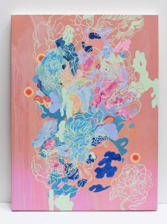
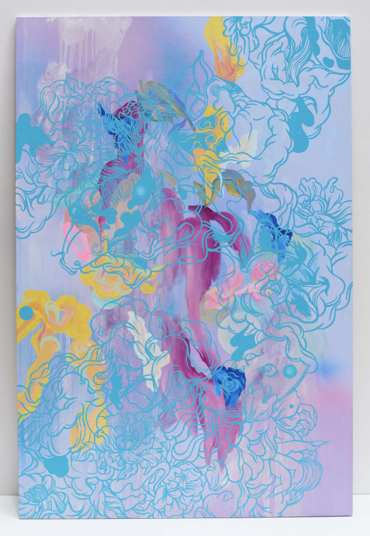

Jennifer Lamontagne Our Blue Planet 2018-2020
Luise Zhang: The Pure Land, Sinners into fragments 2018
Five Bearded Irises by Michelle Morin
My illustration is heavily inspired by these artists and their beautifully detailed work. I wanted to include fine detail in my work to illustrate the number off all the things irrelevant to my design that I did during this project.
0 notes
Text

Trying digital illustration
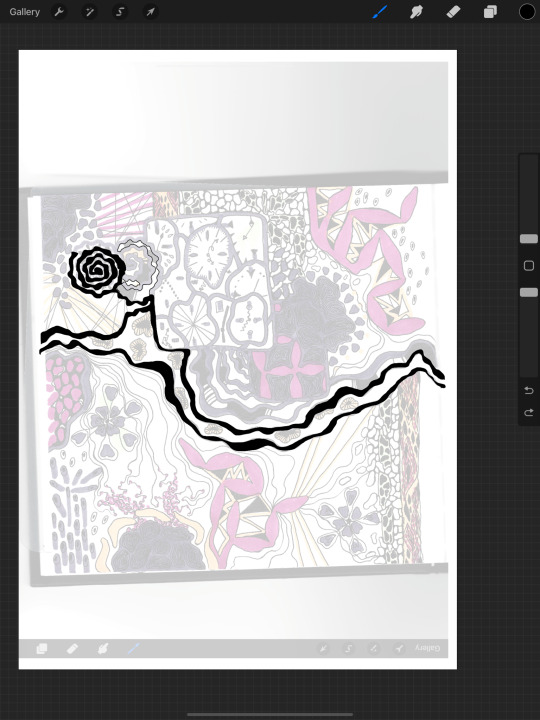
When I scanned my artwork, I wasn't happy with its quality and texture. My solution was to try redrawing it in Procreate to see if it would look cleaner. But when I drew the first few lines, I realised that the work had lost its value - wasting time on something unimportant. I had spent at least 4-5 hours on my drawing and recreating it in Procreate would have taken much less time and lost the sense of duration. So I just photographed my drawing and edited it in photoshop to fix its vibrancy and texture.
0 notes
Text


Why project illustration, markers and gel pens
Here are a few steps in creating my illustration. I have included many small details that are associated with time to convey my idea that time is wasted and planned things never get done in time. The unilinear swirls illustrate the circles on the slices of tree trunks, which speak to their age. The dotted pattern in the lower left corner shows the number of landmarks and my confusing path to them. All the elements are linked to show that one leads to the other, and this process of constant distraction never stops. The overlapping clocks mean that time is irrelevant even despite the number of clocks around me. The wavy lines try to bring flow to my work process, but even there you can see the bumps and parts that are blocked.
I think I've managed to visualise the way my brain works and answer the question of why I never do what I plan to do.
0 notes


