#yeah i reused some of these pics from my old posts
Text


🥵You can call me the Senior Citizen Sodomizer🥵
#kiss#kiss band#kissblr#gene simmons#kiss army#pookie bear#celebrity crush#rock and roll#god i want him so bad#ridiculous#the demon#crying shitting throwing up#i wanna fuck that old man nasty style#older men are hot#nasty#yeah i reused some of these pics from my old posts#whatcha gonna do about it#genes number one nastiest fangirl
9 notes
·
View notes
Text
totk rewrite- botw2 edition
been thinking about the other totk rewrite again (the one only based on botw in which the sonau stay a mystery while being expanded upon)
i talked about it before but heres a lil breakdown (im reusing alot of mechanics from the villain rauru rewrite bc they work too well to be discarded for this one)-
(edit, about five hours later .. its not a little breakdown, its a pretty complete summarized breakdown of the entire new rewrite that i didnt intend to spend the last hours of my sunday on but here we are .. long post, but with pics bc theres lots of concepts im reusing or reviving)
okay START:
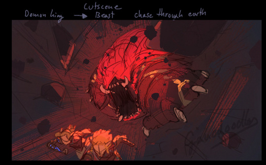
zelda and link explore the caverns below hyrule castle bc the shiekah tech has been losing power and their research as to why lead them here
they discover ganondorf and through zeldas curiosity break the, already weak, seal on him (no enigma stone here, the seal was done by an ancient queen of hyrule)- he wakes up attacks them, breaks the mastersword and miasmas/malices links arm off (also idea is that you have to fight him but meant to lose horribly lol) and then have to play an escape sequence (or watch a cutscene of it) in which zelda drags link after herself running from gan
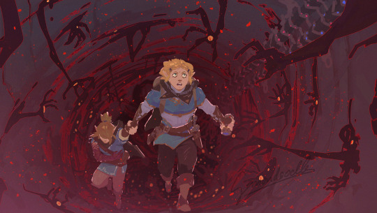
(remember this old first idea drawing i made when i started to think about a rewrite? yeah im reviving that, except theres no totk sonau in this anywhere)
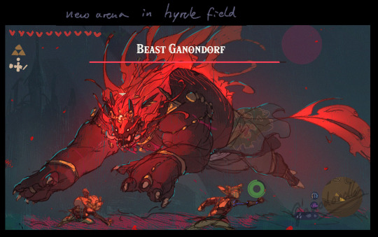
they get out and immediately afterwards a heavy earthquake runs through the land, completely, and actually, changing the map (also using the idea of devastating the regions climates- gerudo desert is flooded, death mountain collapsed inwards, the zoras realm is dried up, rito village has completely frozen over - ACTUALLY frozen over, everything encased in thick ice, the temperature has a special new low point, the winds too strong to glide anywhere-, mountains and rivers shifted, caves are revealed- oh and most of the main villages have tried to flee somewhere saver so theres no literal 1 to 1 repeat of points of interest from botw; also no uh .. miasmas holes that are literally jsut like drilled out bc what?? i want the access to the underground be few and hidden to make it more special to discover)
links arm gets amputated and replaced with a shiekah tech one (maybe using the botw shiekah stone/slate since they still dont know how to make them and its the best self sufficient piece of tech left that doesnt rely on the breaking fuel structure)
(reusing this concept from the villain rauru one, with the difference beign that theres no corruption of link -or maybe it does have an effect to have shiekah tech literally hooked up to yourself *thinking emoji*- the abilities remainign the same)

when link wakes up some time has passed (so its more logical that the other regions have tried to cope with everything happening) you get a tutorial by purah and other shiekah (bc with zelda in charge theres more shiekah doing tech stuff again! cool!) and now have a magic meter (functions like in the previous pic, recharges over time depending on environment! bc i find that idea so cool for interstign puzzles and storytelling- like i said in an older post, a place where lots of people died might be richer in spirit energy recharging your magic faster- others have been hollowed out of luminous stone which slows down the recharge) and you are left to decide where to go
both zelda and you have a shiekah stone/slate replica but its incomplete since as mentioned the knowledge on how to make it is still lost so it only has the basic functions, such as the map, journal, camera and teleport
zelda is your companion from the start, in the years since botw she trained in basic self defense and can use her sealing powers as a shield to protect herself (though reluctantly since she doesnt want to rely on them) so you dont need to babysit her- you can tell her to be aggressive in encounters, supporting you (occasionally shields you or heals you a little?) or stay out of it/only self defend if an enemy targets her (in case you dont want any help) - she also copies your movement in a way, when you glide around she will too etc- in cases where you go very fast to one thing, like the hookshot, she will grab onto you
zelda also acts as your mobile crafting station, to put it bluntly, as she can craft and repair weapons, which is at first limited but can be expanded upon by doing quests (like the options of spear crafting being hugely expanded by a zora quest- fitting their fight style), when she does it you need the material needed for it though it costs no money- theres new little smith shops around the world that can repair and craft as well in which you can spend money instead for material you are lacking (and a little fee for the work you know)
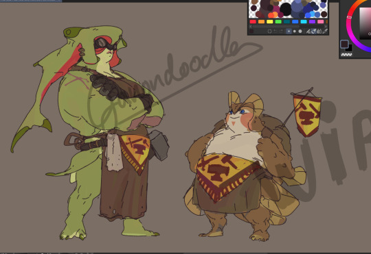
(one of the first rough concepts for a pair of smiths, one is at the shop (green lady, the scars on her arms are her missing fins bc she burned them or lost them in battle), the other walks around it like terry (beedle) does and from whom you can buy already crafted simple things, like arrow types-
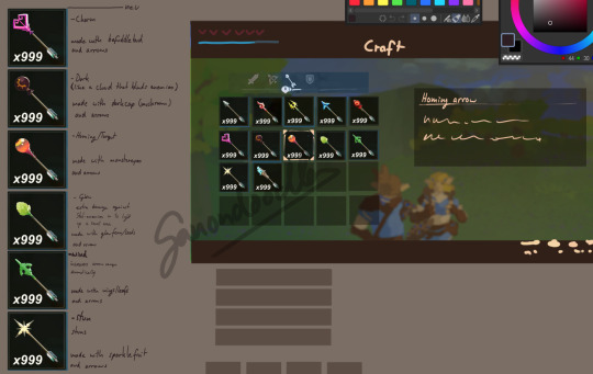
oh yeah, arrow types return and get more options bc theres no way in hell id make anyone scroll through that awful menu just to fuse one arrow at a time (the old types return, but theres new ones and all are craftable in bulk, here and old rough sketch)
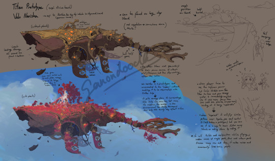
(also theres no new 'in the same location jsut a few steps to the left' towers that shoot you into the air bc it just destroys the entire world design- even if there is no sonau tech in this one so no gliders- i want the sky to feel as dangerous and mystical as the underground)
the sky has to be reached via the hookshot, its got big islands mostly with old shiekah ruins, including that broken titan prototype i drew before, and the bird mechanic (you can tame birds and register them at a location there, idk if im keeping the idea of a lone shiekah there, but the birds will stay)-which is if you tamed a bird you can call it when gliding to gain a little boost in height, enabling you to reach islands further away (since no building, yeah that mechanic is better used in a game actually built around it, which totk just isnt- do not argue with me about that- to really let it shine instead of just being a tiktok viral funney build simulator that adds nothing meaningful to the game and actively makes it worse due to its implementation just not fitting there) or save you from falling if you barely missed the edge of one
- theres few points of teleportation up there so the world map isnt made skippable, theres no shrines there (and in general, there are no shrines, just minidungeons- ACTUAL minidungeons- integrated into the world, like really big caves that are each unique and filled with challenges- and much fewer of them)
(the islands being mostly made nigh invisible from the surface bc clouds gather on their underside)
perhaps different glider types?! and you can switch their design via zelda too
the old botw shrines are non fucntional due to loss of power, either overgrown or broken into pieces due to the ground breaking open, some might be infested with malice/miasma and comes alive like a weird mix between guardian and miasma crab (which also goes for guardian wrecks that hadnt been taken apart for research yet), some are fallen into caves that got revealed or got swallowed by the ground with only the tip remaining-
the titans (divine beasts) are all repurposed (like in the other rewrite ideas i had)- the rito tried to flee the blizzard using medoh but sicne no one has piloted it and unstable connection to them causes them to crash in the hebra mountains, unable to leave it due to the storm and thus on limited time; vah rudania was perhaps made into a temple, or training ground but fell into the underground when death mountain collapsed (imagine ... malice/miasma infested rudania being an actual boss itself, chasing after you in the underground); vah ruta was absolutely made into a place of worship and after their domain dried out a few remained there praying to it convinced their faith would save them- its not able to move but manages to produce a little water still; vah naboris might have been used as a stronghold/lookout but due to the desert flooding (which is in fact, bad) its one of the 'islands' people now reside in
new weather types, including storm and darkness caused by mushroom spores that are invasife to the surface
theres at least six dungeons, one for each region (but not in the exact place as in botw bc that is literally just plain stupid though i might use the zora sewer/water system idea for an actual dungeon instead of .. a single button- bc how cool would that have been?? no no lets put the fish people in the sky and put a single button in the coolest part of it that only activates a waterfalll .... coming out of a tiny island in the sky- all just by of the visual neatness of swimming up??- anyway) plus a yiga one that is in and below the akalla citadel- also might put hyrule castle into the underground and inaccessible for a good portion of the game- and one in the forest of the krogs that was corrupted (which i thought was the reaso nfor the backpack krogs, but no, they literally have no goal and serve no purpose than to make funney videos with em, and then even the forest is nothing more but a reused lame fight agaisnt phantom gan- im starting to rant, sorry)
the abilties of the champions will be similar but there are changes, as in tulins (who i might just change to teba bc lets be real he was the one you interacted with in botw really..) isnt a gust of wind, since its both contrary to revalis whole deal of how difficult it was for him to create the updraft and then tulin can just do an almost exactly the same thing as like, a 12 year old- also its little usefullness after me adding in the birds for the sky and different glider types- maybe ill make it a strong windcut forward like in the other rewrite, like the yiga officer windattack but on steriods
id also consider most of them not having the innate ability for it anyway, except for yuno maybe since he literally inherited daruks shield and as my idea was could make a variation of it adding the roll an fire to it but still having the shield, bc it kinda makes them like a boring copy of the botw champions and also lessens both their impact in a way (perhaps bringing dungeon items back?? idk,so still working on that)
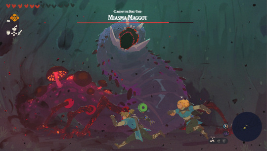
each dungeon has a unique boss, at least on of which being a corrupted friend (PROPERLY DONE not like poor yuno in totk >:I ) bc each being just some monster tm is kinda boring (like twilight princess was so cool for how it mixed its bosses tbh)- also want satori to have a dark (also nice) counterpart that you might have to fight first bc you are trespassing into its domain (an old sketch gonna revisit it at some point)
new armor sets of course, and you still own YOUR house in hateno, zelda either has her own one in the spot where landa (the funky building lad that you bought your house from in botw) had the 'example' houses or yours got an additional building added onto it for zelda (and you can customize like, trees around it and have a lil farm spot too!!) and in your house theres a chest you can store armor sets in so you dont have to sell them to avoid inventory clutter
POUCHES return!! you can find some but most are locked behind quests (since logically people likely would have pouches) making them a really good reward and dont force you to engange with krogs if you are tired of them, it also avoids making you go back to them over and over just to expand inventory (you can choose for which part you want to use the pouch for, weapon or shield slot etc)- krog seeds are now its own currency for a lil shop you unlock in the forest, one of the highest rewards being the eponator zero (the motorcycle from botw)
also BOTTLES return! the main way to store healing, which also has to be consumed in real time (like in skyward sword, select in on a wheel so link takes it in his hands and 'a' to use it) avoiding the pause and spam apples into your mouth problem-
now cooking is NOT removed, it has even better effects than potions BUT it cant be stored and has to be consumed where you cook it (hear me out-);
the cookbook in totk i find pretty annoyingly useless so, the cookbook is now a proper book you can fill out and when you want to cook a recipe you select it there and cook it with what you have (it shows if you dont have it all and also if you wanna swap an ingredient that would end with a similar effect) AND since you cant store it, theres special NPCs that reappear throughout hyrule (like a group of chefs that have one in each region at least) that let you just cook whatever you want without it wasting your materials, and if you hit a recipe it unlocks and is saved in your cookbook (you have to have the materials you want to cook with but it wont consume them, so you cant jsut spam it and fill the entire book out in one go- maybe the chef can give you subtle hints with expressions if something might be good or not before you try it out so you dont waste ages just cooking the same shit over and over xD)
(also possible idea for an item or big quest reward, a portable pot you can set up to cook with -with wood and fire- on the go without having to rely on finding them in the wild, and zelda can act as you chef giving you hints ... honestly i love this idea, remember all the cute botw art of them travelling and cooking together?? make that real you idiots!)
to upgrade your health or stamina you have to get spirit orbs still, but this time you get big ones that each can be traded, since thers fewer minidungeons but they are 4 times bigger than shrines they also give you 4 times the reward- but still one where you can choose which one you want bc i find that an important bit of freedom (idea still is that you free trapped souls and they give you the orb as a reward, majority of which are in caves in the underground or in the surface caves) which encourages you to vary your gameplay and not focus just on one area bc you probably want all those things, go for quests for puches and bottles, for minidungeons for health/stamina etc
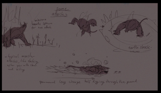
oh yeah, the underground houses several dungeons, the weird gravity effect is in either the entire underground or in parts of it- it does not span the entirety of the map, isntead its smaller and often enclosed areas that each are more detailed and 'finished', theres different bioms and enemies you dont find anywhere else, and some enemies on the surface (like the miasma hands but like .. less easy and no phantom ganon bc that got boring rly fast) that sport those hands can grab you and drag you underground- which can either mean doom for you or .. discovering a new area down there hmmmm a risk to take isnt it :3
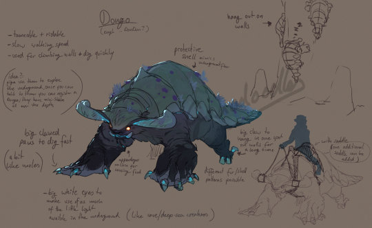
(also wanted there to be a mount there but idk if i will use this old concept of the dongos or if i want it to be a crab like thing bc of the underwater theme i want to go for)
LORE/STORY
so as you explore you may discover caves and areas in the underground containing sonau architecture (the type from botw, not totk) most of which heavily damaged, but theres few that are in 'better' shape bc they have been in selaed off caverns that werent yet discovered-
you find out the sonau, which you only vaguely knew from ruins in the overworld, were in fact real (but no you dont suddendly know they fucked with hylians and even their names of untold thosuands of years ago that you just so happen to have read in a book all of the sudden like it was an always known fact and not at all a myste- .. rant alarm .. ), and given the ruins underground they must have originated from there, but there are no scriptures that survived and all sculptures are in very bad shape, alot of which seems intentionally destroyed- slowly you and zelda piece together through vague clues (VAGUE game VAGUE, let people THINK) that they had knowledge of the past and the nature of the ever repeating return of disaster to hyrule; the biggest reveal beign that they knew the cycle wasnt natural at all and that it keeps being repeated only through the structure of how this land operates, the beliefs of the people that rule it, altered history etc.
the ancient shiekah under the rule of hyrules royalty found out what the sonau had discovered/knew and persecuted them (parelells to what the king would do to them later on, anyone??) since the divinity of the kingdom must be upheld by all means necessary- which is why the sonau had disappeared so entirely, with little of their culture left and none of them, and by doing so the ancient shiekah also discovered the previously lost knowledge of the gerudo king having turned into the biggest threat to the kingdom in the past (which the sonau had kept secret, knowing what consequences it could have if not handled carefully), which starts up a whole other betrayal plot of the kingdom planning to imprison gan before he can become a true threat (im gonna guess the relations between the gerudo and hyrule havent been that great even before since hyrule was still the main empire)
gan finds out before the plan goes through and assasinates the king of hyrule, the ancient queen declares war (yes, the queen for once) and in the end sacrifices herself to seal him away, more for revenge than any prophecy, but it nevertheless leads to the cycle doing its thing yet again
calamity ganon is a product of ganondorf trying to break free of his seal- and perhaps in an attempt to weaken his unbreakable will the shiekah discover they can use his spirit as a powerful source to their newly invented tech- which previously ran with processed luminous stones (yes battery theory will never let me go idc) and essentially use his own power against him by beating the calamity with their tech
(this knowledge is also how you get the yiga to work with you, using your knowledge of the past as leverage and zeldas ability to negotiate - and bc i thinks it would be cool to see her develop that way, and no i dont mean it as they all gonan fix it uwu either, its hard to go into more nuance here, its already way longer than i wanted- and yes this also ties into the koga is one of the ancient monks that made himself basically immortal through malice experiments HC of mine)
he attacks the regions bc they too sided with hyrule, he drags you to the underground bc its where he has spent thousands of years in agony, hes only out for revenge, an understable one and one you can sympathize with, but one you cannot negotiate with, its been too long, too much, no amount of apology could sate the desire for payback (which keeps the whole link and zelda defeat ganon formular alive BUT gives it nuance, right?? more tragic really, i hope that comes across)
he attacks link and zelda, breaks the masterword bc he has seen it all before, the original calamity, through the eyes of malice, he knows what you will do, inevitably so, you too will come for him, again
at the midpoint of the game you will reach hyrule castle (underground? perhaps it depends on how much health you have, getting grabbed and dragged into its depths losing hearts and if you have enough you survive until you are inside the castle and let go, you cant teleport outside - oh and zelda is either absent for the fight bc you got separated or she held onto you and protected herself with her power- honeslty kinda like the seperation idea bc after having her around all the time its gotta be super creepy to be suddendly alone) and will have a fight with him, that you kinda lose but are saved by the rest of the crew that zelda had banded together and brought here after being seperated from you- maybe without koga yet bc he would be locked to late game i think
there will be a quest to reforge the mastersword, which if you havent already gone to the forest will now lead you there (oh also some of the krogs you find outside the forest now will tell you that they had to flee, but maybe warn you not to go there yet if you are still in early game, others might not know bc they left to plant new forests, windwaker style, maybe a quest there too! to give them purpose beyond being your plaything and then just disappearing- ahem .. )
(old concept for the krog forest/dekutree boss)
the dekutree will tell you to restore it it will need the blessings of the three dragons (who might not have appeared yet, or slowly disappeared one by one, they might need to be rescued bc gan probably knows you are gonna try and repair the sword)
(oh look more old concepts still relevant!)

in the end it will .. end with you defeating ganon, just like always (unsure of the place where it will will be but OH LOOK old concepts- here it was still with hyrule castle in mind but that might be jsut for the midpoint fight now- maybe id put the end fight on the forgotten plateau, to round it up nicely, ending where botw began ... ;3
i really like this one .. even more than the villain rauru one, though that one is fun bc a twist like that is pretty neat and fighting with ganondorf is also rly cool- but sicne i just dont like the totk sonau and much prefer them remaining mostly a mystery im very fond of this (also .. im so sick of ancient people with high tech bs now..)
the aim with this is to .. make a botw2 that actually feels like a botw 2 (for me), shiekah tech is still there but little functions still, logically bc its main powersource is breaking off of it, the sonau are a mystery and kinda negatively talked about bc the shiekah persecuted them just like they would later be - also explains why there are shiekah things in every sonau building, of course they would overtake their places and try to erase a much as possible of them (the thunder plateau might have been a place of worship to farodra or for research- now look its a puzzle for a shrine to strengthen our hero to defeat the thing we caused :)) ), the sonau are expanded upon WITHOUT destroying their mystery (none of them are shown, there are NO memories in this game, everything happens in real time and what you can learn about the past is mostly vague clues pieced together by nerd zelda!)
it gives more depth to the shiekah as well as add an important ounce of nuance to the yiga and shiekah, to ganondorf as well while adressing and fixing the things that needed work in botw in ways i would find enjoyable (instead of making it WORSE)
i also dont want to go too hard on 'zelda is totally agaisnt the monarchy bc monarchy BAD', its not meant to come across like that, i just wanted to do sth interesting that does question everything and bc i like to think she could be lead to a different way of thinking, especially if so through her own research and discovery of previously buried history, being confronted with her own biased views by her passion for her interests
anyway, if you read through all of this, i probably forgot stuff, buts its very late and i spent alot of time writing this (bc i cant stop once i started i guess) and theres lots of things repeated that i already talked about BUT if yo actually read through it all, i cannot even begon to express just how much that means to me, and id i dare request, do tell if you like it!!! and thank you so much!!! it might not seem like much but this is also very important to me, i still dream of gamedev after all and i see this as a sort of practice, are my mechanics and stuff actually better os does it just seem like it to me etc -
(though keep in mind, this is in part self indulfent bc hey, its not real and is never gonna be so i might just do what i want- and yes i do believe it is doable, even if this all sounds alot, the magic lies in making it less but make that 'less' more dense and detailed, hence the underground being like at least cut in half in size and the building mechanic being removed (to give to a game where its better used than totk) alone should free alot of time and space for the things i described here)
-thanks again for reading, posts like these rarely get much attention so uh ... its pretty much never worth the time i spent typing designing and writing it (even if theres still lots missing here, like the dungeons and details to the champions ..) so every bit of commentary weighs alot more <3
#ganondoodles talks#ganondoodles#zelda#ganondoodles rewrites totk#botw2#loz#legend of zelda#tagging it as totk even if it might endanger it#totk#the legend of zelda#long post#but worht it! .. i hope#i think im best at the whole mechanical aspect thant the story#bc im a lil whimp and have trouble writing serious flaws etc#at least i feel like thats me#anyway- i cant look at the screen anymore i need a break#and if you read through it all and like it!#i wish i could thank you like you deserve ;_;#bc who reads through this mess really#gotta have nerves of steel- my respect
363 notes
·
View notes
Text
Kyidyl Does Archaeology - Part 6
(yep, the rest of the parts of this are all under the KyidylCL tag, in case you happen across just this one.)
Rocks and...other stuff
Ok so here we are...we’ve arrived at my least favorite thing. Lithics. I’ll be honest with you guys, my disinterest in lithics means that I don’t have a lot to add here. But...I’ll do what I can.
So, first off, we’ve found *thousands* of lithics on this site. It is by far the most common thing we have. We’ve found broken tools, used up tools, intact points, fire cracked rock, like...the whole nine. One of the things you can learn from lithics is how far people were going to get their rock. For example, we have a lot of jasper in our lithics, so we know they were going up onto the nearby mountain because that’s where the nearest jasper deposits are. I *absolutely* am not the right person to go into a detailed account here, but I do know that they were going pretty far away to get their supplies - even over to the other side of the mountains. Or at least they were trading with people in closer proximity to those places.
I think what’s amazing to me is the degree to which they work quartz and quartzite. Here’s one of the points we found:
I’m pretty sure, if I’m remembering the things the Rock Guy told me correctly, that point is made of quartzite. Quartz and quartzite are very hard (7/7.5 on the Mohs scale aka the rock hardness scale.), so working them is difficult. I don’t know how to do it, but I know it must have taken either an impressive amount of brute force or an impressive amount of energy. Either way, it’s neat. Hell I found a piece of quartz the last time I was in the field (which I don’t have, or I’d show you.) that literally looked like it was cut like a gemstone. It’s more likely it came out of a geode but still, they did cool shit with quartz. Some of what we’ve found has been almost as clear as glass.
I’m aware that the style a point is made in (and everything that is, well, pointy...is a point. It includes spear tips, arrow heads, etc.) is indicative of the age of a site, but I don’t know enough here to go into it and we’ve already covered age in the pottery and digging post (it’s late woodland - early contact, c. 1300s - 1700s), so I’m just gonna show you some cool pictures.
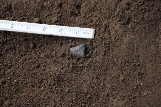
First point that we found...

Same hole, another point. Probably both are arrowheads given the size. The one I’m holding up in the picture up there was probably a spear, not an arrowhead. Arrowheads are actually really small.
Here’s another weird rock:
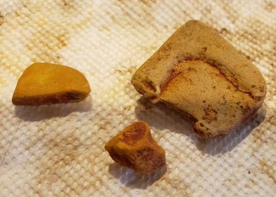
It’s weird because that one in the upper right has that groove in it and is kinda squished. to me it looks like a tile, which would be really anachronistic to this particular site, and our Rock Guy assures me this is a natural thing, but these rocks have something on them I’ve been finding on a lot of the lithics: a red residue. You can see it pretty clearly on the top surface on the center rock, but it’s in the grooves on the right one too. These rocks didn’t come out of the pit with the red dirt, so it’s not like...red dirt from burning. To me it looks like ocre, but this is one of those areas where my knowledge base just comes up short and I need to wait for someone who knows more to look at them. But lets just say that I have this experience often where I’ll say something like “this looks like ocre” and people will be like “nooo, that doesn’t make sense” and then they’ll spend some time with the artefact and be like “hey look at this it looks like ocre” and I’m over here like....yes....I know....I told you that weeks ago...perhaps if I’d found a way to say it in a male voice we wouldn’t be having this conversation. x.x Aaaaannnnnyway.
Another kind of rock we have are fire-cracked rocks. Back in the day they used to heat rocks in the fire and then put them in pots to boil the water. They often reuse them, and after a few uses the constant “hot rock plunged into cold water” thing causes them to crack. It’s *extremely* common to find this all over the world. I saw it at the site I worked in England, too, when we were digging the Roman stuff. And it’s always kind of confused me because even though water boils basically instantly when you add the very hot rock, it would likely take longer for the rock to heat up than it would to just, y’know, boil the water, so why use the rocks? Then it occurred to me: because the rocks were just casually tossed into fires that weren’t being used for cooking. So you toss a few into the fire you’re using for warmth or for smoking or whatever in the morning and by the time dinner rolls around you just grab some rocks that’ve been in the fire all day and you toss them into a pot of water. Multitasking ftw! I would find some pics for you but I’m NGL guys, they just look like stones that’ve been cracked in half. People weren’t all that picky about the type or anything like that.
So yeah, that’s rocks, now who wants to see some weird shit? You, obviously, YOU want to see some weird shit.
Weird Shit
First up, because I STILL haven’t figured out why this is like this, we have this bone:
Ok honestly I’m only like 93% sure it’s a small piece of bone, but like...it’s definitely natural. It’s been burned for awhile but the weird part here is that IT’S GREEN. Now that’s not in and of itself weird - this is what happens to bone when there’s some metal nearby. It often leaves behind green staining on bones. But there was no metal in the ground here, and this thing was pretty deep. Below the civil war trench stuff. So I have no idea why it’s green like this.
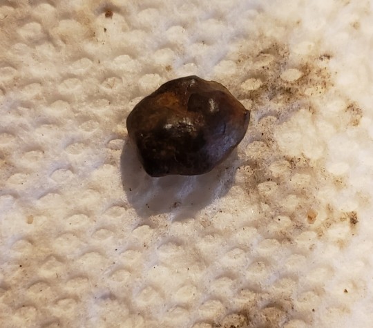
This...thing. No idea what it is. Roughly a quarter inch long, metallic...looks like slag but, again, came out of a hole that was really too deep for us to be finding iron in (in this case, iron is a modern contaminant or something you’d only find in the top - IE, later - layers.). Meteorite, maybe? We’ve found some other weird stuff like this too but it was from much higher layers.
The back and front of a piece of bone that is too small for me to make a determination as to whether or not it’s human without like...a microscope. I don’t have one. I mean it probably *isn’t* human, but the color is right, soooo...IDK I just thought it was weird.
This is another small, weird, brown thing. BUT! it’s a different kind of small, weird brown thing than the other one. The other one passes the magnet test and fails to leave a streak when wet. This one fails the magnet test but left a brown streak on my skin when wet (no...I didn’t lick this one). So I’m pretty sure it’s a coprolite, but I’ve never handled them before so I’m not entirely certain. It looks like one to me, though (coprolite is very old poop. Poop is important bc it informs on diet and stuff. There have been literal fights and thefts in the archaeological community over coprolites.). This came out of one of the test pits and we haven’t dug over there yet so IDK.
This next bit is less weird and more cool.

This is a very small, very burned piece of bone but it’s cool for two reasons. One, see that long light-color diagonal mark in the lower right area of the top surface? That’s either a butchery mark or more tooth marks. I learn towards butchery becaaaaause....see how flat this is? That only happens when it’s been cut by people. Bones don’t break clean and flat like that, the crack or they splinter. When they crack they do it vertically because that is with the grain of the bone. This is horizontal, or across the grain. They have to be cut to look so flat. Here’s another example from the test pits:

See? Perfectly flat across the grain. This one has also been cut and burned. The white color of the two bones means they’ve been burned for a long time at a high temperature. All of the collagen - the soft stuff - gets burned off when you do it for long enough and at a high enough temperature and the minerals are left behind. Both of these images are macro images on bones that are smaller than an inch.
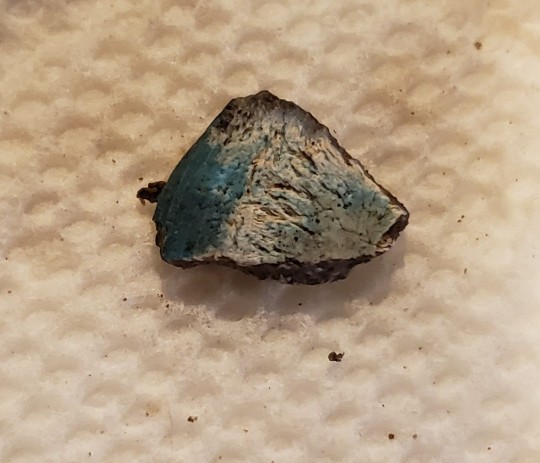
Ok, one more weird thing:


This is actually the back and front of a rock. It’s flat on both sides like pottery, but it tasted like a rock and it has no temper so...rock. But in that top image it has some kind of dark residue on it that almost looks like rust or paint, and the opposite side has small marks that look like cut marks or tool marks. I’m not sure what kind of rock it was, but it also had a dry, sandy texture to it. IDK it was just weird. The marks could just be damage over time to the rock (what we call taphonomic damage.), but the residue is pretty strange.
Anyway, that about wraps it up. I think that what I’m gonna do is start going through the uncleaned material I have downstairs (I got sidetracked by covid and the holidays. :P) and start posting what I found or anything out of the ordinary, if you guys want anyway. Thanks for sticking around through this long series of posts about the site I work at, and I hope you enjoyed it. As always, if you have any questions my askbox is open. :)
26 notes
·
View notes
Text
In defense of Final Fantasy XIII-2 (long post - mild spoilers ahead!)

Disclaimer: Sorry for the pics bad quality. I don't own a ps3, my friend lent me one, and I don't really know how to take screenshots, so I did my best to make my photos look visible. Just don't mind them much.
SO, I'll start by saying that this game IS BAD and it's part of a badly executed and hated trilogy. To be honest, I don't appreciate Final Fantasy XIII much: the first time I played it I was blinded by (light – sorry pun) the visuals and the crystals and everything was shining and whatever. But then I replayed it, and started seeing all the things people were complaining about. As I skipped some scenes to make my second playthrough smoother and faster, I noticed one thing: I was bored. I wasn't enjoying the gameplay, I didn't understand the story in its entirety even if it was my second time playing it. It was one of the first videogames I played in English (hello from Argentina) so I thought that maybe my limitations with the language were dampening my experience, but I asked a friend about the plot and she told me she didn't understand it either.
At any rate, I only played FFXIII because I wanted to play FFXIII-2. I didn't know why, or what, but something in the sequel (cof cof Noel cof) gave me the urge to try and see it for myself. Like I mentioned before, I don't own a ps3, so I had to wait until in 2015 they released the PC ports. I was so happy with this, that I decided to complete the game 100% and see everything it had to offer.
And it has so much to offer! Yes, I won't deny it, the plot is all over the place, and this is where the trilogy goes to hell with its story. But, let's just say we are all aboard the suspension of disbelief train – if we do it, we'll find there's a great story behind all the time gates.
What I enjoyed the most about this sequel was the characters. In XIII I spent HOURS complaining about how annoying everyone was (except for Fang, she's perfect). I couldn't relate to or stand anyone: Lightning became obnoxious with her monotone, Hope was a crybaby with a pretentious revenge plot that didn't work out well, Sahz is just kinda there not contributing anything to the plot, Vanille just has that oh-please-kill-me squeaky voice and Snow is… I hate Snow. I just hate him. The little fondness I have for him stems from my love for Troy Baker's performances, but oh my Etro, Snow is just like a shonen hero in the body of a 21-year-old man. It's just not right, it defies the laws of anime and videogames. Please eradicate him. I hate Square Enix for creating a character like him and forcing me to play as him and use him as a Sentinel because he's just that good in that role, damn him!
But in FFXIII-2? Suddenly, I found myself rooting for Noel and Serah. We get to learn about Noel's backstory, his sad present, his depressing lifestyle. The inexorability of his tale, the imminence of his decaying world. And he becomes such an endearing partner! He's always there to catch Serah if she falls, he's always asking her if she's feeling well. He's proficient, he's efficient, and he's not complaining about stupid stuff. He even doesn't want to talk about his past because he doesn't want to bother Serah – PLEASE Hope just learn something from this man!
And what about Serah? She's not the best character, I give it to you, but she goes from damsel in distress to a badass time traveler in a blink of an eye, and I can certainly get behind that! She's selfless, she faces everything head on, even though she's scared. Her journey began with the search of her sister, but slowly she found herself surrounded by things she couldn't quite comprehend, only to learn that she was more entangled with the fate of the world than she'd anticipated.
And if you do some optional stuff, you can learn things about Mog as well – not only his features are useful (and funny), but he's also the comic relief, adding extra spice to some of the conversations. His exaggerated expressions and his cute voice make up for a good companion.
And I cannot NOT mention Caius (Liam O'Brien I stan). Say whatever about him, but I love his characterization. He's well made. Yes, he wants the same as countless others villains from the FF franchise, but this time I can understand his motives. I feel pity for him. I want to help him. He's cursed beyond redemption. And he's got the best theme song ever.
I can understand these characters. The game spends enough time on everyone so we can learn to care for them, they show us how their relationship nurtures, their dynamics. And I care! This is something XIII-2 made right and XIII did not: I don't care about Lightning, or Hope, or Snow, but I do care that Noel and Serah succeed in their task. I don't care about Barthandelus or the Pulse Fal'Cie, but I do care about Caius getting what he wants. XIII had so many characters but spent too little time in developing (properly, at least) their strengths and weaknesses, but most of all, their relationships. The only real relationship that feels genuine is the one between Fang and Vanille, but that's because they know each other from before the events of the game; whereas the rest of the team feels like… badly placed pieces of puzzle trying to fit.
I know you're gonna say, hey, other FF put together characters that had nothing to do and it worked (yeah, I can mention FFXII and to a certain extent, because Penelo and Vaan were just there for the lulz I guess). In XIII it just didn't work for me: I couldn't root for any of them, and when the game was finished, I was kinda relieved.
That doesn't happen in XIII-2. Maybe they got it, maybe it was out of luck, I don't know, but characters here are better fleshed out, and we can learn to care and root for them, so we want to see it through to the end by their side.
That's just one thing that XIII-2 did better.

Gameplay was enhanced: now it's faster, more strategic, it doesn't bullshit you like when the leader died in XIII. I'm not going to delve deeper into the Pokémon thing, but yes, you can catch them all, and it adds a lot to the stakes because there's one more thing to gain besides the battle: the monster you're fighting. The game added so many features, it blows me away: the time travelling, opening new paths, closing some; the fragments, which give you experience points and insights in some of the lore; the fragment skills, additional things you can earn or do if certain requirements are met; the f*cking casino that has chocobo races, something that was lacking in the previous game; you can add ADORNMENTS to the monsters you tame to get the ultimate fashion experience. I don't know, there's so much to do, too many timelines to visit. There are too many sidequests, but all of them are linked to the main plot, so you feel like you're still learning things from the main story. Yes, I know, they reuse the same map over and over (Yaschas Massif and Oerba, I'm looking at you), but they compensate with some brand new maps, like Academia 4XX AF which must be my favorite location, so full of life and futuristic style, and the Archylte Steppe, with its weather changing feature.
Sometimes the lack of gameplay slaps you in the face but in the good sense, for instance in Academia 400 AF, where you have a forced battle every two seconds. The sense of urgency and danger is well conveyed through the use of random encounters with enemies. Or when you visit the Void Beyond with Serah, that you're alone, and you have a ghastly Mog following you around, with some of his features blocked. They used everything they had at their disposal, and they used it well. Gone are the days with the endless hallway that we complained so much about in XIII (as if FFX wasn't linear as hell too, but we don't complain about that one – don't dare because it's my favorite FF I warn you): now you can choose how to play, when to play, face that monster or go for an alternative ending. They listened to our whining and gave us this sequel, yes, that nobody asked for, but yet, they did.
There's a huge world-building surrounding all the time travelling thing: in the future, time travel becomes something of an everyday topic, so when you walk around in Academia 4XX you can hear kids playing "let's go and destroy those evil paradox monsters". They built a world around the idea that you can time travel, and that's how Hope gets to live and see every era, monitoring his work that will take centuries to be fulfilled. This is how we should take the time travel in this game, not as doomsday-serious as in Terminator or Back to the Future, but with a more light-hearted approach. I think that's what they tried to do, and it works well that way.

However light-hearted this game tries to be, it has some sad and depressing bits, mostly around Noel and his way of life. Whenever his theme song kicks-in, you can understand all his character without a word. And that takes me to another thing this game excels at: soundtrack. Now, I won't say it's better than XIII, because the first game has some awesome music as well, but I'll be damned if I don't give enough credit to this game's songs. Yeul's Theme, Noel's Theme, Wishes – you learn everything of these characters by just listening to these beautiful vocals. And I also love that the music took risks, like the Crazy Chocobo theme – I swear that thing is both the best and worst thing out of this game.
Confession time: I can't stop shipping Serah and Noel. I'm just so angry that Snow exists because it forbids this ship in the canon. I have one major complain about it, though: I can't help but notice that both Caius and Noel are infatuated by a fifteen-year-old. I can't discern how much of it is "loyalty beyond boundaries" or "I love her, I truly love her, like I'm in love with her" kind of love, but still, it bugs me a bit. Caius and Yeul's relationship feels more natural, given that he's her guardian, and he acts upon this role the whole game, until the end, where Noel clearly states that Yeul always came back because she wanted to stay by Caius's side. So it leaves me wondering. And Lightning Returns pretty much confirmed to us that Noel was in love with Yeul, which of COURSE I don't LIKE at ALL but I'll roll with it. I'm just glad that we got XIII-2 ending where Jason Marsden's voice breaks when he yells Serah's name. They gave me enough content for a thousand fics. Let's pretend that Noel's attitude in LR doesn't happen, ok?
You can hate this game. I can't blame you for it. Nobody wanted it, it doesn't connect well to its predecessor unless you read two novellas, and it forcefully leads us to Lightning Returns where, I can safely say, the plot goes to hell, almost literally. But this game exists, and it doesn't deserve half the hate it receives. If you play it it's because you enjoyed XIII (I highly doubt that you'll make yourself go through this suffering if you didn't like the first one – if you do, I just don't know why you hate yourself so much), and if you did, there's no way you're not going to see all the good things they added in this one. Enjoy it for what it is, and not for what it's not, or for what it could've been.
I sometimes wonder what could've happened if this game didn't have "Final Fantasy" on its cover. Because the time travel is intelligent and fun to play, the world-building around the Farseers and this bleak future is interesting and well made – the problem with this game is that it's a Final Fantasy and that it's a sequel to an already quite finished story. It feels like they forced a sequel, and maybe they did. But I, for once, am glad they did.
#final fantasy xiii-2#final fantasy 13-2#final fantasy 13#final fantasy xiii#ff13#ffxiii#ff13-2#ffxiii-2#final fantasy#square enix#serah farron#noel kreiss#noerah#snow villiers#lightning farron#lightning ffxiii#videogame review#videogame#review#caius#liam o'brien#laura bailey#troy baker#paddra nsu yeul#yeul
65 notes
·
View notes
Text
2018 Megaman Valentine’s Day Contest Rules and Info! *CLOSED*
How do I follow up a 10th Anniversary contest blowout that had tons of prizes? I really can’t, can I? Especially in terms of the sheer amount of winners. So, things will be a little less flashy with this year’s contest, but that doesn’t mean I don’t have a few surprises in store, either!
Here is the rundown for this year’s contest:
PRIZES:
It’s the usual get-what-you want option for the top 3 artists in each category. If you prefer a cash prize through Paypal, that’s always the easiest and quickest option to get your reward.
As always though, I will be flexible and work with the winners to purchase Megaman-related prizes, if there’s something you’ve really had your eye on and would like ordered. Be it a 4-inch Nel, Nendoroid, Megamix manga, or some other trinket, if I can find it within your prize price range and order it to be shipped straight to you, I will do all I can to make it happen!
The winners for both the Talent and Humor categories will receive the following:
1st Place: $100 USD or an item(s) up to that value.
2nd Place: $50 USD or an item(s) up to that value.
3rd Place: $25 USD or an item(s) up to that value.
RULES:
Two categories, in which you are allowed to submit one entry for each category, if you would like. If you place in one category, you will be automatically disqualified from the other, for reasons of fairness, and to give other people a chance to win a prize.
CATEGORY 1: If You Like It, You Should Put a Ring Boomerang On It (Talent)
Content Requirements:
* A romantically simple, or extravagantly over-the-top proposal scene between the Megaman characters of your choice
When thinking of a more romantic, but creative Valentine’s concept I haven’t really done yet, about the only thing off the top of my head was that of a proposal. While there aren’t a ton of actual married couples or even canon romantic relationships in the Megaman Universe, I think it still is a concept that will produce a lot of variety and unique ideas!
As always, you have creative freedom as to how you want to approach this theme. Perhaps you want to draw a nervous character picking out some bling at Ms. Millions’ jewelry shop. Maybe the proposal involves a fusion of Jewel Man and Ring Man surprising the fiancée-to-be. Want to draw a proposal fail? Make it on the jumbotron of Strike Man’s stage, and she’ll probably be too embarrassed to say, ‘Yes!’ Wedding proposal not your thing? You’re fine to make it something like a prom proposal even, if you’d like.
As the talent category, judging for this theme will focus on the technical skills of your piece. Just as guys throughout history have had to brainstorm the most creative and surefire way to get her to say, ‘Yes!,’ your goal for this category is to create a unique and outstandingly well-drawn proposal scene to get me to say, “You win!”
CATEGORY 2: Beauty and the Beastman.EXE (Humor)
Content Requirements:
* Awwwwww…Beast Out! At least one Megaman character turned into a monsterous, beastly form. But looks are deceiving, and there’s a curse that needs to be broken.
* A beautiful character who hopefully has learned to love this other character shunned by society…or maybe not.
* Other various Megaman characters cursed into the form of household items or a handsome, vain, muscular suitor who can’t read books are purely optional.
Tale as old as Time~Man, claws like Greiga Rock~man, Beauty and the Beast…man.
Yeah, song with great rhyme, that is not. XD
In the EXE series, we had a gimmick in EXE 6 known as ‘Beast Out,’ where Rockman took on a more animalistic form, either that of the Cybeast Greiga or Falzer. In the anime, this concept was utilized on other characters, giving us beastly “Zoanoroid” versions of classic Navis. So there has been some precedent of turning Megaman characters into beastly monsters.
So, let’s combine that idea with a popular fairy tale/Disney classic! Your goal for this category is to create a hilarious scene with a mismatched couple of a beautiful Megaman character and the less-attractive, beast form of another character of your choice. You are welcome to draw something alluding to your favorite part of the original tale or any of the numerous versions based off of it. You certainly can just use Beastman.EXE as the title alludes to, but you don’t have to. You can get creative and make a beastly form of whatever character you’d like.
For this category, show me how beauty is only skin-deep, in the funniest way possible!
PARTICIPATION PRIZE RAFFLE:
Back once again, with much less sadly, I am going to give away 3 rare participation prizes. There is not a separate wildcard category this year. In order to be eligible for the participation prizes, all you need to do is enter a pic for either the Talent or Humor category!
Like last year, if there is a prize here you are NOT interested in, please note that when you send in your submission(s) to me. Otherwise, you will be automatically entered in the raffle for a chance at each of these 3 items.
If you draw a pic for both the humor and the talent categories, you can double your chances to win! (Odds of course, depending on how many others enter and also draw two pics.) You will be able to add your name into the drawing a second time for just 1 of these prizes.
So, what are these raffle prizes? I’m sticking with the art theme, so you could come away with any of these special, historic pieces of Megaman art!
Raffle Prize #1 – Rockman 8 Anime Mid-Game Cutscene Cel (with Genga)
Yes, you are seeing that right. Just for drawing, you could come away with this cel from the mid-game cutscene, where, Rock runs out of Dr. Light’s lab after being told that if he ‘fwinds dat meatey-oar, we’wll fwind Doctah Whywee.” Yes, you can have a piece of that scene!! As you can see in these samples, the cel is not stuck, so you can proudly display each piece separately if you prefer!

It’s this scene, only not covered by the lab wall. Probably the first time we’ve seen this art fully unobstructed!
Raffle Prize #2 – Archie Comics Worlds Unite Inked page (Sonic Universe #77, Page 8)
Inked and signed by Gary Martin, this page showcases that rare brotherly interaction between X and Rock, with the sneering, evil trio of Wily, Robotnik and Xander Payne all behind bars immediately after they portal-escaped from Sigma’s grasp. Although their sentence only lasted like a page, before X let them out…
Raffle Prize #3 – Captain N Robot Master Height Chart
Ugly and poorly constructed? Yes! But that’s what’s so great about Captain N production art. From season 2, here are 3 of the 7 MM2 Robot Masters used in Episode 5, The Big Game: Wood Man, Heat Man and Quick Man. Why are they taped on like that? Apparently, when making these height chart references, the animators just reused other height charts as a base. So underneath these 3, you’ll find the original height chart for the people of Kongoland, a Smurfy-blue-bodied-Thundercat hybrid tribe of Donkey Kong worshippers. Yep, that’s a real sentence I just typed.
SUBMISSION GUIDELINES:
When you submit, I would prefer you to include the following information in this format, along with your entry:
(Your name/preferred alias) – As much as I usually know who you are, there’s always someone new or somebody who has a different preference from what their email name says.
(Category this entry is for) – You can either say 1 or 2, or Talent/Humor·
(Participation Prize Eligibility) – Just write “All” if you are interested in the chance to win anything. Write: “Exclude from #__” if you do not have interest in winning a particular participation prize.
In the event you are submitting your second entry, please specify which prize # you would like your bonus chance in the raffle to be put towards.
Only submit your own work, as usual. Any character, major or minor, from any series is allowed. Pairing characters from different series is totally allowed. Same-gender pairings are completely fine.
As always, participants are allowed to submit from all over the world. It’s easier for me to get prizes to US entrants, because international shipping is complicated and pricey, but I’ll do what I can for you guys who aren’t in the States.
Paypal is still the preferred method for cash prize payouts. Please have a valid account to receive your winnings.
Youngin's, get your parents permission before entering.
Entries do not need to be colored, but it is preferred. The more effort put into things as always, the better chance you have!
Entries can either be e-mailed to me at rock2125[at]hotmail[dot]com, or you can just PM/note me a link to your pic.
DO NOT post your pics in this journal, your dA galleries, tumblr blogs, other sites, etc. until the contest is over. This is the fairest way for competitive reasons. I prefer to keep them all secret until the deadline has passed.
I'll edit a confirmed entry list in this thread when I receive them. So you won't be in the dark about whether or not I've received your entry.
DEADLINE:
The deadline for this contest will be Monday, February 12th, 2018 by 11:59PM CST. This gives you a little more than 5 weeks to finish your entry!
MISCELLANEOUS INFO:
As usual, If you don't plan to enter, but would like to help me judge, please let me know through DM or mention so here. Never hurts to have extra opinions on all the entries.
Bug me with questions if you have any. Please join in, and good luck to everyone who enters!
Heed the Heel Navi’s message...
Confirmed Entries:
Category 1 (Talent): @borockman, @pandapanic0, @drewblossom, @wintesm, @hyperbole1729, @jb-artist, @digitallyfanged, @tianura, @lightlabs, @peach35, @iris-sempi, superbasket5, @shikai-the-storyteller, @yugiohlesbian
Category 2 (Humor): @frankenchio, @erekisaiko, @drewblossom, @prar-draws, @amiable-apparition, dark-dullahan,
85 notes
·
View notes
Text
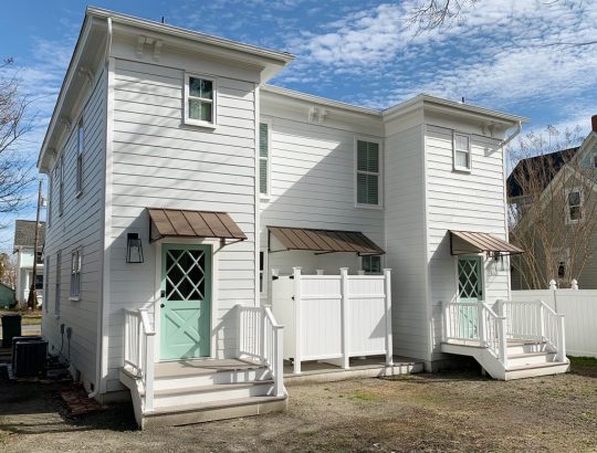
Four More Finished Spaces At The Duplex!
If you tuned in last week, you saw us very excitedly reveal the before & after photos of the first four rooms that we completed at the duplex. SO MANY EXCLAMATION POINTS! There isn’t much rhyme or reason to the order of the things we’re sharing – we’re just rolling things out as we complete & photograph them… so today we have FOUR MORE SPACES THAT ARE DONE DONE DONE!
Can you tell how thrilling that is for us to proclaim after over a year and a half of working to get this house put back together and ready for renters this summer?! (The listing will go live on Airbnb once we’re done with all the rooms & have ’em photographed. We’ll make a big announcement when we get to that point, so don’t worry, you didn’t miss it!).
Let’s start with the back bedroom on the left side of the duplex – aka the side with the pink doors.

bed | side table | lamps| shades | fan | duvet | pillows | lumbar | wall: SW Spare White | trim: SW Extra White | doors: SW White Truffle
This room’s twin on the other side was in last week’s post and we mentioned that the back bed wall was a little bit narrower on the other side, so we used wall sconces instead of table lamps (every space is slightly different on each side just because 100 year old houses are quirky like that). But over here the bed wall was wider, which allowed for some larger quartz topped side tables (so shiiiiiny – and hooray for a material that won’t stain like marble).
We also got to top them with these sweet gray lamps, and once again we planned the outlet placement so they’re located behind each nightstand, so we can plug in those lights and still have an available outlet for charging phones (we’ve rented more than a few places that led to us crawling around under the bed or pulling out dressers in search of those ever elusive phone charging outlets).

bed | side table | lamp| shade | sound machine | duvet | vanity | faucet | pulls | tile | mirror | bath light | door: SW White Truffle?
Here’s a before shot of the room as it looked when we bought the duplex, which had drop ceilings to hide some ongoing roof leaks and painted plastic paneling to cover up the mold in the walls. Where that window is below is pretty much where we placed the door to access the full bathroom that we added on, which made this space into a true master bedroom. We also added the double closets to flank the window on the left wall, so if you scroll back up and you look at the window behind the bed, that’s one that we added to the bedroom since this one basically turned into the door to the bathroom.

The before picture below was taken with our backs basically to the corner above. I’m including it because guess what was hiding behind that odd black slanted wall in the corner?

Yup, it was the gorgeous brick chimney that we exposed on both sides! It adds so much charm and history to the space. And yes, that’s a roach fogging can sitting on the floor above. Right before the house was for sale someone set off a fogger in every room and then didn’t come back and remove them before our showing… so there were foggers on the floor and a whole bunch of dead roaches belly up everywhere. It wouldn’t be on my house staging checklist, but it didn’t scare us, so… maybe it worked?
But back to the after pics. Once again we did an airy and open metal bed in front of the window, to let the light stream in (and feel less like a wall of furniture that’s blocking the pane of glass). Our round quartz tables fit nicely into that angled corner – and they soften the corner in a nice way. Who doesn’t love the mix of polished quartz & weathered old brick? They go together like rama-lama-lama-ka-dinga-da-dinga-dong (that was harder to type than you’d think, btw).

bed | side table | lamps| shades | duvet | pillow | lumbar | curtains | curtain rod | rug | wall: SW Spare White | trim: SW Extra White
This before shot was taken with our backs to the brick chimney, so that window on the right below is where we built out the double closets to flank that lovely view that looks out on some huge all-summer-long flowering trees (giant pink crape myrtles).
Oh and do you see that trap-door looking thing in the corner of the ceiling in the photo above? That’s where a leak got so bad that it eroded the original ceiling and then went through the drop ceiling and collapsed it in that spot. After we removed the drop ceiling it was clear that a LOT of the roof was failing – so we changed the pitch of the roof to be a bit steeper so water would run off of it more efficiently and not cause this issue again down the road. But yeah, rebuilding the whole roof was a doozie (you can see the entire house completely roof-less and wall-less here).
Here’s the after from the exact same corner. You can see that we have those cute pink-doored double closets now that make that window shine (they’re painted White Truffle by Sherwin Williams). And we shifted the doorway over to make sense of the upstairs layout a bit more. You can see our before & after floor plans a little later in this post to picture all of these layout changes more easily.

dresser | mirror | bench |bed | faux fig |wall: SW Spare White | trim: SW Extra White | doors: SW White Truffle
We also added a dresser for addition clothing storage (it’s the same dresser we have in our bedroom, but in the crisp white color instead of the gray one). Then we hung our favorite stenciled mirror over it for that inlay look (we LOVE how big it is, this is a room-making mirror you guys). We love that it basically creates an additional window in the room by reflecting the light of the other one (see the picture above).
This is one of the two closets in the room (remember they flank the window) so they each provide space for hanging clothes, storing suitcases, etc. And our eyes love the symmetry so much of having two in the room – I’m so glad we did it, because it feels like they were meant to be here.

dresser | mirror | rug | luggage rack |wall: SW Spare White | trim: SW Extra White | doors: SW White Truffle
And yes, we are going to add more wooden hangers. There were people who worried the ones that they saw in our previous post weren’t enough, so more are coming. DO NOT WORRY. Buying those = the easiest thing on our list right now. Ha!
This is what you’d see if you stood with your back to the master bathroom, and you can see that we reused the rug that we had in the beach house living room a while back. And it was clearly mean to be in this master bedroom with the pink doors and the dark oil-rubbed bronze accents (in the drawer pulls, curtain rods, bed, and the door hardware). It fits the room perfectly, which makes me so happy – and on a sunny day it takes on a pinker watermelon tone, which is pretty cool (you can see that here). It was a secondhand find, so I can’t link to something identical, but this rug is pretty close (and the price is good!).
dresser | mirror | bed | rug | fan | wall: SW Spare White | trim: SW Extra White | doors: SW White Truffle
If you stand with your back to the dresser above, you see the doorway that leads to the new master bathroom that we added onto this room. So much more functional, and we had fun with that bold floor tile and all white tile and wall paint everywhere else (except for the fun pink door).

bed | side table | lamp| shade | sound machine | duvet | vanity | faucet | pulls | tile | mirror | bath light | door: SW White Truffle
The bathroom feels surprisingly serene for having such a colorful patterned floor tile, mostly thanks to using other colors sparingly, adding some calming touches like a faux succulent, some muted art (this print and another print by this artist) and some natural touches in the woven cup and the leather vanity pulls (this is the vanity we bought – and we just swapped out the hardware).

vanity | faucet | pulls | tile | mirror | hook | toilet | photo art | wall: SW Spare White | trim: SW Extra White
You can also see above that we mounted a mirror above the sink that’s functional and hinged to fit within the window frame, but still allows a lot of light to stream in. We frosted the glass so nobody feels like there isn’t privacy in here – but it thankfully doesn’t effect how might light floods this space.
Oh and a few people asked in the last post why we didn’t just put the window over the toilet – but from the back of the house it would have looked super odd to have a window right on the edge of the addition instead of in a more centralized placement. The historic review board has to approve things like additions and new window locations, so I doubt they would have gone for such an off centered window since the original back windows were in a central-ish spot too. (You can see more shots of the back of the duplex here – we LOVE how it came out!)
I also have to admit that I love a mirror in a window! We did that in our second house and the make-up-friendly natural light was never better! Ha!
vanity | faucet | pulls | tile | mirror | hook | toilet | photo art | wall: SW Spare White | trim: SW Extra White?
If you stand with your back to the wall to the right of the toilet, here’s what you see: a simple all-white shower (the key to a bold tile on the floor = non-demanding neutral tile everywhere else), a soft extra long shower curtain, and some handy towel hooks on the back of the door. For anyone wondering how we feel about mixed metals – we’re into it! Just have each one occur a few times in each space and you’re golden. For example in here we have chrome on the shower fixtures, the shower curtain rod, and the sink vanity’s faucet while the door’s hinges, knob, and hooks are all oil rubbed bronze. Looks just fine! All metals are sort of like a neutral if you layer them into the room a few times each.

wall tile | shower floor | grout: warm gray | shower fixtures | curtain | rod | door hook | door: SW White Truffle
This is one of my favorite before shots of the bunch. Check out that mauve trim and the leafy wallpaper border. The crazy thing is that we restructured the landing upstairs so much that the after isn’t very parallel at all. We actually moved the access to the bedroom over to the right (where you see that corner of a sconce peeking into the photo below) and that open doorway that you see became a nice big hall linen closet. We also pushed the doorways back, so the landing at the top of the stairs is about twice as big – so you don’t feel nearly as closed in or crowded.
Here’s basically the same angle now. See how the doorway shifted over and the landing is a lot bigger and more breathable? Oh how I wish we had taken a photo of the linen closet open because it’s a work of art. We added chunky white shelves that are so functional for towels and extra bedding, and we even have a tiny ironing board and an iron. It’s gorgeous. Yes, a closet can be gorgeous. We need to share that in a video tour soon I think!

tile | rug |wall: SW Spare White | trim: SW Extra White | doors: SW White Truffle
I mentioned we’d include a before & after floor plan for you guys to better understand the layout changes. Remember that each side of the duplex only had one full bath when we bought it, and a very odd diagonal hallway that was not original to the house (it had been restructured probably in the 70s or 80s). So we enjoyed bringing it back to the more classic and traditional layout without any triangular hallways – it just feels more fitting and less cobbled together. Plus two and a half bathrooms per side feels a lot better than one!

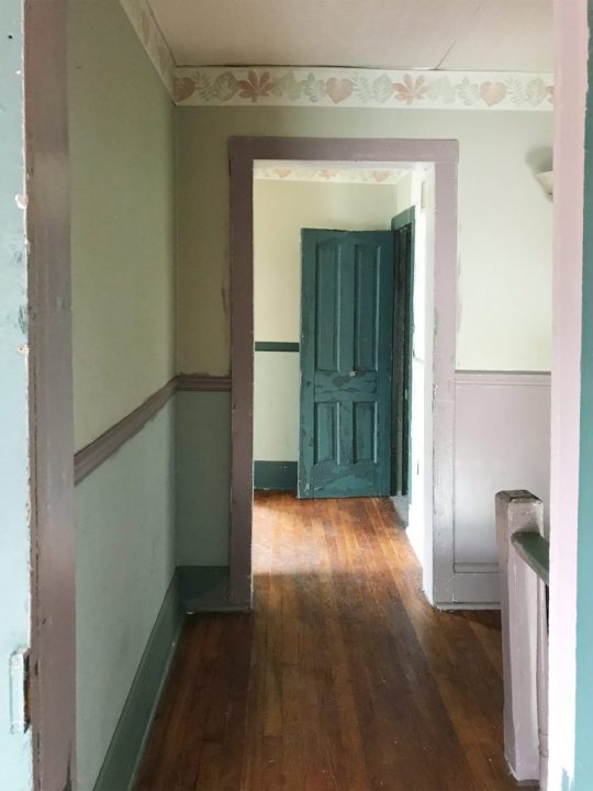
One of the hugest changes we made isn’t something you can see on a floor plan though. The original steps on each side of the duplex were like a dark closed-in tunnel. They were completely drywalled on each side from the very bottom step, all the way up to almost the top step. Yeah… like no light passed through that space at all, as you can see below:

So when we restructured things, we opened a bunch of the bottom stairs up with a railing (more on that in a second) and we moved the bedroom doorway at the top of the stairs back a bit too, which meant instead of just having a short little railing up top, we flood the top 6 stairs or so with light.

rug | faux fig | basket | framed canvas | door: SW Oyster Bay | wall: SW Spare White | trim: SW Extra White
If you don’t remember the story of the railings, they’re the original railings from our front porch at our home in Richmond, and they fit PERFECTLY into the duplex at the top and bottom of the stairs. COMPLETELY MEANT TO BE! We’re so glad they got to live on here (more on The Sisterhood Of The Traveling Railing here & here).
A few seconds ago I said that we opened up the bottom of the stairs, so here are some before & afters of that update. This is what it looked like when we bought the house – all closed in completely by a diagonal hallway of drywall with just a tiny doorway to enter the living room from the front vestibule, which felt VERY CRAMPED.

Now it looks like this, thanks to creating a much wider doorway into the living room, and an open railing that lets in tons of light & adds some great architectural interest. That light is a space-maker too guys, and the price is so good (it’s huge). The ceilings on the first floor of the duplex are 9′, so it allowed for some fun large-and-in-charge fixtures in a few spots (so if your ceilings are 8′ and you want that light, measure to see if it’s too low, and if so you could place it over a table or a bed – ooh it would be so good in a bedroom.
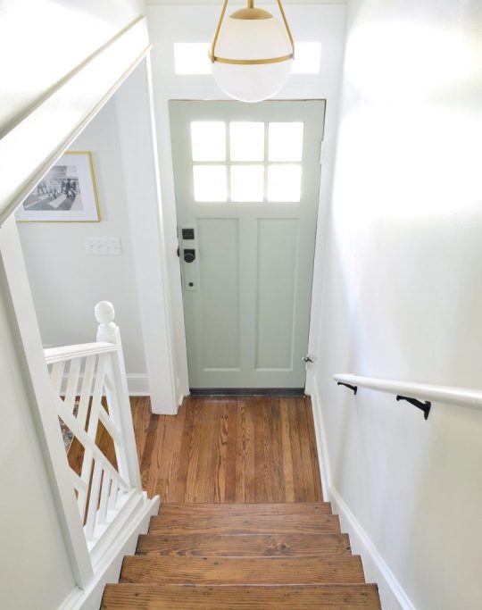
light | door: SW Oyster Bay | wall: SW Spare White | trim: SW Extra White
But back to the view upstairs. This is the view of the front bedroom on the right side from the hallway.
rug | faux fig | basket | framed canvas | door: SW Oyster Bay | wall: SW Spare White | trim: SW Extra White
We revealed the front bedroom on the left side of the house in last week’s post, and a few things are similar in this space (we chose the same wooden bed and the same art for that back wall as well as the same rug ).

rug | faux fig | basket | framed canvas | mirror | curtains | curtain rod | door: SW Oyster Bay | wall: SW Spare White | trim: SW Extra White
But a few things we did differently over here are that we oped for slightly wider nightstands (they fit in here and wouldn’t in the other front bedroom! The slight measurement differences from side to side are so funny). We also did table lamps in here instead of wall mounted sconces, which add some nice texture.

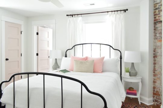
bed | duvet | pillows | nightstands | lamps | shades | curtains | curtain rod | wall: SW Spare White | trim: SW Extra White
We also hung a breezy little mobile above the bed on the right (it’s hard to see in the photo above for some reason, but you can see it a lot better in person and in the picture below. The gold hardware on it with the white wood seagulls are so perfect for the beach. It’s actually a mobile we’ve had in our bonus room at home for years, but we knew it would be perfect at the beach (it’s no longer sold, but here’s another mobile I’m loving).

bed | duvet | pillows | nightstand | lamp | shade | sound machine | curtains | rug | wall: SW Spare White
The bedside tables are SO NICE. They were a bit of a splurge for me (compared to the cheaper mint ones I got for the other side’s front bedroom) but I just loved that there were two drawers and that pretty display space in the middle for books or magazines. They look really well made in person – and the added width (they’re 24″ wide) feels great too. So if you’re looking for some classic white nightstands, these are good. Oh and we put a sound machine in each bedroom because we did that for the beach house and it’s SO NICE. Our kids love a sound machine and we’ve found that when people come to stay with us they appreciate having one too.
Below is a shot of the wall that’s across from the head of the bed, where we mounted a great wood-framed mirror (the price is so good you guys! we have one of these in the beach house too). It’s nice to have a bedroom mirror for people to check themselves out before leaving the room when they don’t have a master bath to use for that. And that doorway you see with the diamond grilled window beyond it (my VERY FAVORITE HOUSE FEATURE!) is the cute little closet for this room.

mirror | faux fig | basket | blackout curtain | curtain rod | lamp | shade |door: SW Oyster Bay | wall: SW Spare White | trim: SW Extra White
The curtain panel that you see next to the diamond window is blackout lined, so it blocks light that would stream into the bedroom when you pull them closed. All the other windows in the duplex have white faux wood blinds to block light and for privacy, but I couldn’t bear to put them on the diamond windows.
And across from that window is a diamond fronted dresser that we designed (can you tell we love diamonds?!) as well as a hanging bar for additional clothing storage. I love the little white honeycomb pendant light that we have in there too. We also used that light in the laundry room downstairs as well as over the kitchen sink. So classic looking. Five stars, would recommend.

diamond dresser | pendant light | faux fig | basket | mirror | wall: SW Spare White | trim: SW Extra White
I gotta say I love that the wood in the mirror and the bed and even the hangers is all that warm medium tone, so it feels really earthy and calming in here. Especially when you compare it to this before shot, which once again has a drop ceiling and plastic paneled walls that were covering various water and mold related issues:

Also this floor. OH THIS FLOOR. I hated it with every fiber of my being, because someone had put peel & stick tile all over half of it and then ripped it up before selling. But all the glue from the sticky tiles STAYED ON THE FLOOR. I am not exaggerating when I say that when I walked in with my flip-flopped feet for the first time, my flip flops came off of my feet and stuck to the floor as I tried to take another step. I literally had to pry them off with my hands in order to move. It was like a human-sized sticky trap.
Thankfully after refinishing the floors, they’re glorious and guaranteed not to steal your flip flops. Still gotta steam the curtains in here (remember we use these Ikea curtains and hack them to look like this) so I guess it’s not 100% done, but it’s very very close, which feels very very good. Also I love this rug. We bought it twice (it’s also on the other side) and it’s casual and beachy.

bed | rug |duvet | pillows | lamp | shade | curtains | curtain rod | framed canvas | faux fig | basket |wall: SW Spare White | trim: SW Extra White
So there you have it. Four more spaces in the duplex that we’re thrilled to have fixed up and filled with as much charm and function as we could muster.
Oh and while we’re on the subject of function, we went with SIX CEILING FANS in here because we know lots of people who love sleeping with a fan on, and although we have central air, that breeze feels beachy and calming. So yeah…. design-wise we love a light fixture, but it just felt right to do crisp white fans for the beach.

We’ve been really happy with them so far (you know we turn them on when we’re working away in each room – ha!). We did these larger ones for the four larger bedrooms (as seen in the back bedroom above). And these smaller versions for the two smaller twin bed rooms (which we have yet to finish & reveal – but soon!).

Speaking of those twin bed rooms, after they’re done we’re switching our focus to finishing up the two living rooms, two dining spaces, two kitchens, and two laundry rooms! AND THE TWO BACK PATIOS! Still plenty to do, but we’re getting closer every day!
P.S. You can see the entire process of bringing the duplex back to life here From a complete “before” video tour, to planning the floor plan & the style vibe, to tiling it all and revealing the before & afters of the front and the back of the house, it’s chock full of info & pics.
*This post contains affiliate links*
The post Four More Finished Spaces At The Duplex! appeared first on Young House Love.
0 notes
Text
Four More Finished Spaces At The Duplex!
If you tuned in last week, you saw us very excitedly reveal the before & after photos of the first four rooms that we completed at the duplex. SO MANY EXCLAMATION POINTS! There isn’t much rhyme or reason to the order of the things we’re sharing – we’re just rolling things out as we complete & photograph them��� so today we have FOUR MORE SPACES THAT ARE DONE DONE DONE!
Can you tell how thrilling that is for us to proclaim after over a year and a half of working to get this house put back together and ready for renters this summer?! (The listing will go live on Airbnb once we’re done with all the rooms & have ’em photographed. We’ll make a big announcement when we get to that point, so don’t worry, you didn’t miss it!).
Let’s start with the back bedroom on the left side of the duplex – aka the side with the pink doors.
bed | side table | lamps| shades | fan | duvet | pillows | lumbar | wall: SW Spare White | trim: SW Extra White | doors: SW White Truffle
This room’s twin on the other side was in last week’s post and we mentioned that the back bed wall was a little bit narrower on the other side, so we used wall sconces instead of table lamps (every space is slightly different on each side just because 100 year old houses are quirky like that). But over here the bed wall was wider, which allowed for some larger quartz topped side tables (so shiiiiiny – and hooray for a material that won’t stain like marble).
We also got to top them with these sweet gray lamps, and once again we planned the outlet placement so they’re located behind each nightstand, so we can plug in those lights and still have an available outlet for charging phones (we’ve rented more than a few places that led to us crawling around under the bed or pulling out dressers in search of those ever elusive phone charging outlets).

bed | side table | lamp| shade | sound machine | duvet | vanity | faucet | pulls | tile | mirror | bath light | door: SW White Truffle?
Here’s a before shot of the room as it looked when we bought the duplex, which had drop ceilings to hide some ongoing roof leaks and painted plastic paneling to cover up the mold in the walls. Where that window is below is pretty much where we placed the door to access the full bathroom that we added on, which made this space into a true master bedroom. We also added the double closets to flank the window on the left wall, so if you scroll back up and you look at the window behind the bed, that’s one that we added to the bedroom since this one basically turned into the door to the bathroom.

The before picture below was taken with our backs basically to the corner above. I’m including it because guess what was hiding behind that odd black slanted wall in the corner?

Yup, it was the gorgeous brick chimney that we exposed on both sides! It adds so much charm and history to the space. And yes, that’s a roach fogging can sitting on the floor above. Right before the house was for sale someone set off a fogger in every room and then didn’t come back and remove them before our showing… so there were foggers on the floor and a whole bunch of dead roaches belly up everywhere. It wouldn’t be on my house staging checklist, but it didn’t scare us, so… maybe it worked?
But back to the after pics. Once again we did an airy and open metal bed in front of the window, to let the light stream in (and feel less like a wall of furniture that’s blocking the pane of glass). Our round quartz tables fit nicely into that angled corner – and they soften the corner in a nice way. Who doesn’t love the mix of polished quartz & weathered old brick? They go together like rama-lama-lama-ka-dinga-da-dinga-dong (that was harder to type than you’d think, btw).

bed | side table | lamps| shades | duvet | pillow | lumbar | curtains | curtain rod | rug | wall: SW Spare White | trim: SW Extra White
This before shot was taken with our backs to the brick chimney, so that window on the right below is where we built out the double closets to flank that lovely view that looks out on some huge all-summer-long flowering trees (giant pink crape myrtles).

Oh and do you see that trap-door looking thing in the corner of the ceiling in the photo above? That’s where a leak got so bad that it eroded the original ceiling and then went through the drop ceiling and collapsed it in that spot. After we removed the drop ceiling it was clear that a LOT of the roof was failing – so we changed the pitch of the roof to be a bit steeper so water would run off of it more efficiently and not cause this issue again down the road. But yeah, rebuilding the whole roof was a doozie (you can see the entire house completely roof-less and wall-less here).
Here’s the after from the exact same corner. You can see that we have those cute pink-doored double closets now that make that window shine (they’re painted White Truffle by Sherwin Williams). And we shifted the doorway over to make sense of the upstairs layout a bit more. You can see our before & after floor plans a little later in this post to picture all of these layout changes more easily.

dresser | mirror | bench |bed | faux fig |wall: SW Spare White | trim: SW Extra White | doors: SW White Truffle
We also added a dresser for addition clothing storage (it’s the same dresser we have in our bedroom, but in the crisp white color instead of the gray one). Then we hung our favorite stenciled mirror over it for that inlay look (we LOVE how big it is, this is a room-making mirror you guys). We love that it basically creates an additional window in the room by reflecting the light of the other one (see the picture above).
This is one of the two closets in the room (remember they flank the window) so they each provide space for hanging clothes, storing suitcases, etc. And our eyes love the symmetry so much of having two in the room – I’m so glad we did it, because it feels like they were meant to be here.

dresser | mirror | rug | luggage rack |wall: SW Spare White | trim: SW Extra White | doors: SW White Truffle
And yes, we are going to add more wooden hangers. There were people who worried the ones that they saw in our previous post weren’t enough, so more are coming. DO NOT WORRY. Buying those = the easiest thing on our list right now. Ha!
This is what you’d see if you stood with your back to the master bathroom, and you can see that we reused the rug that we had in the beach house living room a while back. And it was clearly mean to be in this master bedroom with the pink doors and the dark oil-rubbed bronze accents (in the drawer pulls, curtain rods, bed, and the door hardware). It fits the room perfectly, which makes me so happy – and on a sunny day it takes on a pinker watermelon tone, which is pretty cool (you can see that here). It was a secondhand find, so I can’t link to something identical, but this rug is pretty close (and the price is good!).

dresser | mirror | bed | rug | fan | wall: SW Spare White | trim: SW Extra White | doors: SW White Truffle
If you stand with your back to the dresser above, you see the doorway that leads to the new master bathroom that we added onto this room. So much more functional, and we had fun with that bold floor tile and all white tile and wall paint everywhere else (except for the fun pink door).

bed | side table | lamp| shade | sound machine | duvet | vanity | faucet | pulls | tile | mirror | bath light | door: SW White Truffle
The bathroom feels surprisingly serene for having such a colorful patterned floor tile, mostly thanks to using other colors sparingly, adding some calming touches like a faux succulent, some muted art (this print and another print by this artist) and some natural touches in the woven cup and the leather vanity pulls (this is the vanity we bought – and we just swapped out the hardware).

vanity | faucet | pulls | tile | mirror | hook | toilet | photo art | wall: SW Spare White | trim: SW Extra White
You can also see above that we mounted a mirror above the sink that’s functional and hinged to fit within the window frame, but still allows a lot of light to stream in. We frosted the glass so nobody feels like there isn’t privacy in here – but it thankfully doesn’t effect how might light floods this space.
Oh and a few people asked in the last post why we didn’t just put the window over the toilet – but from the back of the house it would have looked super odd to have a window right on the edge of the addition instead of in a more centralized placement. The historic review board has to approve things like additions and new window locations, so I doubt they would have gone for such an off centered window since the original back windows were in a central-ish spot too. (You can see more shots of the back of the duplex here – we LOVE how it came out!)

I also have to admit that I love a mirror in a window! We did that in our second house and the make-up-friendly natural light was never better! Ha!
vanity | faucet | pulls | tile | mirror | hook | toilet | photo art | wall: SW Spare White | trim: SW Extra White?
If you stand with your back to the wall to the right of the toilet, here’s what you see: a simple all-white shower (the key to a bold tile on the floor = non-demanding neutral tile everywhere else), a soft extra long shower curtain, and some handy towel hooks on the back of the door. For anyone wondering how we feel about mixed metals – we’re into it! Just have each one occur a few times in each space and you’re golden. For example in here we have chrome on the shower fixtures, the shower curtain rod, and the sink vanity’s faucet while the door’s hinges, knob, and hooks are all oil rubbed bronze. Looks just fine! All metals are sort of like a neutral if you layer them into the room a few times each.

wall tile | shower floor | grout: warm gray | shower fixtures | curtain | rod | door hook | door: SW White Truffle
This is one of my favorite before shots of the bunch. Check out that mauve trim and the leafy wallpaper border. The crazy thing is that we restructured the landing upstairs so much that the after isn’t very parallel at all. We actually moved the access to the bedroom over to the right (where you see that corner of a sconce peeking into the photo below) and that open doorway that you see became a nice big hall linen closet. We also pushed the doorways back, so the landing at the top of the stairs is about twice as big – so you don’t feel nearly as closed in or crowded.

Here’s basically the same angle now. See how the doorway shifted over and the landing is a lot bigger and more breathable? Oh how I wish we had taken a photo of the linen closet open because it’s a work of art. We added chunky white shelves that are so functional for towels and extra bedding, and we even have a tiny ironing board and an iron. It’s gorgeous. Yes, a closet can be gorgeous. We need to share that in a video tour soon I think!
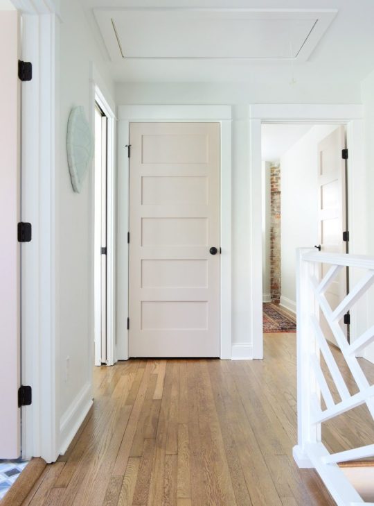
tile | rug |wall: SW Spare White | trim: SW Extra White | doors: SW White Truffle
I mentioned we’d include a before & after floor plan for you guys to better understand the layout changes. Remember that each side of the duplex only had one full bath when we bought it, and a very odd diagonal hallway that was not original to the house (it had been restructured probably in the 70s or 80s). So we enjoyed bringing it back to the more classic and traditional layout without any triangular hallways – it just feels more fitting and less cobbled together. Plus two and a half bathrooms per side feels a lot better than one!
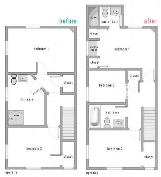
One of the hugest changes we made isn’t something you can see on a floor plan though. The original steps on each side of the duplex were like a dark closed-in tunnel. They were completely drywalled on each side from the very bottom step, all the way up to almost the top step. Yeah… like no light passed through that space at all, as you can see below:
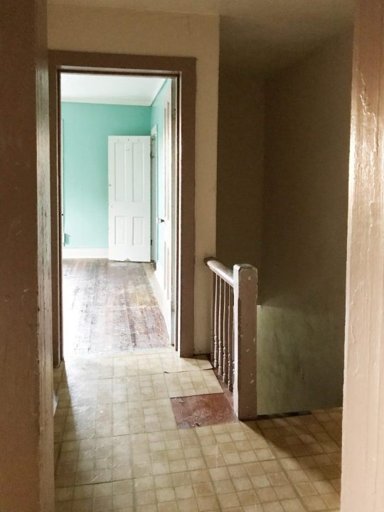
So when we restructured things, we opened a bunch of the bottom stairs up with a railing (more on that in a second) and we moved the bedroom doorway at the top of the stairs back a bit too, which meant instead of just having a short little railing up top, we flood the top 6 stairs or so with light.

rug | faux fig | basket | framed canvas | door: SW Oyster Bay | wall: SW Spare White | trim: SW Extra White
If you don’t remember the story of the railings, they’re the original railings from our front porch at our home in Richmond, and they fit PERFECTLY into the duplex at the top and bottom of the stairs. COMPLETELY MEANT TO BE! We’re so glad they got to live on here (more on The Sisterhood Of The Traveling Railing here & here).
A few seconds ago I said that we opened up the bottom of the stairs, so here are some before & afters of that update. This is what it looked like when we bought the house – all closed in completely by a diagonal hallway of drywall with just a tiny doorway to enter the living room from the front vestibule, which felt VERY CRAMPED.
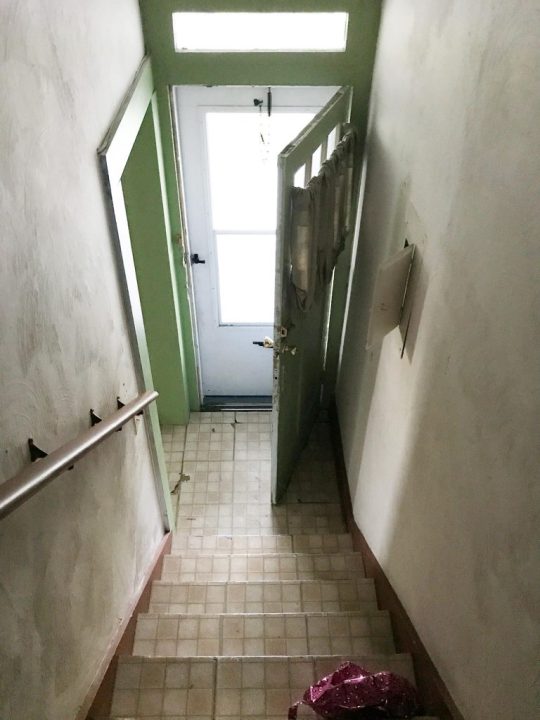
Now it looks like this, thanks to creating a much wider doorway into the living room, and an open railing that lets in tons of light & adds some great architectural interest. That light is a space-maker too guys, and the price is so good (it’s huge). The ceilings on the first floor of the duplex are 9′, so it allowed for some fun large-and-in-charge fixtures in a few spots (so if your ceilings are 8′ and you want that light, measure to see if it’s too low, and if so you could place it over a table or a bed – ooh it would be so good in a bedroom.

light | door: SW Oyster Bay | wall: SW Spare White | trim: SW Extra White
But back to the view upstairs. This is the view of the front bedroom on the right side from the hallway.
rug | faux fig | basket | framed canvas | door: SW Oyster Bay | wall: SW Spare White | trim: SW Extra White
We revealed the front bedroom on the left side of the house in last week’s post, and a few things are similar in this space (we chose the same wooden bed and the same art for that back wall as well as the same rug ).

rug | faux fig | basket | framed canvas | mirror | curtains | curtain rod | door: SW Oyster Bay | wall: SW Spare White | trim: SW Extra White
But a few things we did differently over here are that we oped for slightly wider nightstands (they fit in here and wouldn’t in the other front bedroom! The slight measurement differences from side to side are so funny). We also did table lamps in here instead of wall mounted sconces, which add some nice texture.

bed | duvet | pillows | nightstands | lamps | shades | curtains | curtain rod | wall: SW Spare White | trim: SW Extra White
We also hung a breezy little mobile above the bed on the right (it’s hard to see in the photo above for some reason, but you can see it a lot better in person and in the picture below. The gold hardware on it with the white wood seagulls are so perfect for the beach. It’s actually a mobile we’ve had in our bonus room at home for years, but we knew it would be perfect at the beach (it’s no longer sold, but here’s another mobile I’m loving).
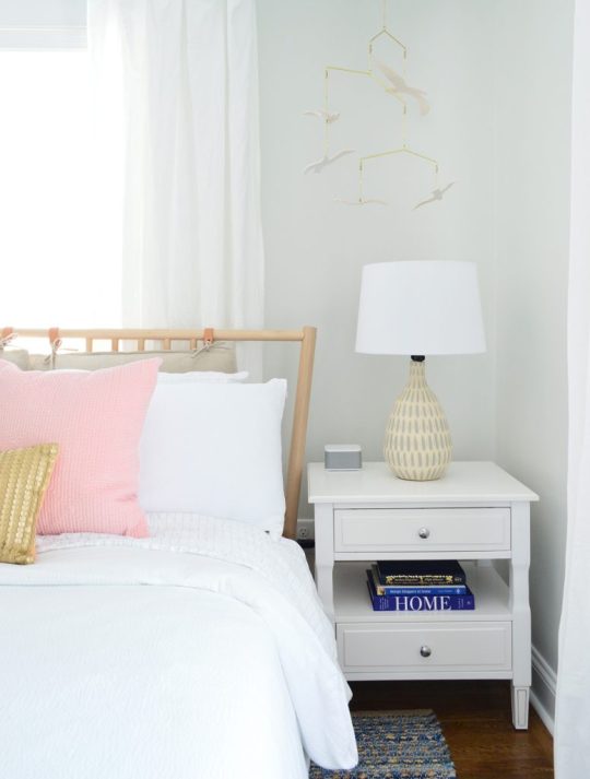
bed | duvet | pillows | nightstand | lamp | shade | sound machine | curtains | rug | wall: SW Spare White
The bedside tables are SO NICE. They were a bit of a splurge for me (compared to the cheaper mint ones I got for the other side’s front bedroom) but I just loved that there were two drawers and that pretty display space in the middle for books or magazines. They look really well made in person – and the added width (they’re 24″ wide) feels great too. So if you’re looking for some classic white nightstands, these are good. Oh and we put a sound machine in each bedroom because we did that for the beach house and it’s SO NICE. Our kids love a sound machine and we’ve found that when people come to stay with us they appreciate having one too.
Below is a shot of the wall that’s across from the head of the bed, where we mounted a great wood-framed mirror (the price is so good you guys! we have one of these in the beach house too). It’s nice to have a bedroom mirror for people to check themselves out before leaving the room when they don’t have a master bath to use for that. And that doorway you see with the diamond grilled window beyond it (my VERY FAVORITE HOUSE FEATURE!) is the cute little closet for this room.
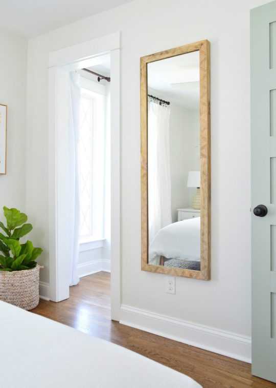
mirror | faux fig | basket | blackout curtain | curtain rod | lamp | shade |door: SW Oyster Bay | wall: SW Spare White | trim: SW Extra White
The curtain panel that you see next to the diamond window is blackout lined, so it blocks light that would stream into the bedroom when you pull them closed. All the other windows in the duplex have white faux wood blinds to block light and for privacy, but I couldn’t bear to put them on the diamond windows.
And across from that window is a diamond fronted dresser that we designed (can you tell we love diamonds?!) as well as a hanging bar for additional clothing storage. I love the little white honeycomb pendant light that we have in there too. We also used that light in the laundry room downstairs as well as over the kitchen sink. So classic looking. Five stars, would recommend.

diamond dresser | pendant light | faux fig | basket | mirror | wall: SW Spare White | trim: SW Extra White
I gotta say I love that the wood in the mirror and the bed and even the hangers is all that warm medium tone, so it feels really earthy and calming in here. Especially when you compare it to this before shot, which once again has a drop ceiling and plastic paneled walls that were covering various water and mold related issues:

Also this floor. OH THIS FLOOR. I hated it with every fiber of my being, because someone had put peel & stick tile all over half of it and then ripped it up before selling. But all the glue from the sticky tiles STAYED ON THE FLOOR. I am not exaggerating when I say that when I walked in with my flip-flopped feet for the first time, my flip flops came off of my feet and stuck to the floor as I tried to take another step. I literally had to pry them off with my hands in order to move. It was like a human-sized sticky trap.
Thankfully after refinishing the floors, they’re glorious and guaranteed not to steal your flip flops. Still gotta steam the curtains in here (remember we use these Ikea curtains and hack them to look like this) so I guess it’s not 100% done, but it’s very very close, which feels very very good. Also I love this rug. We bought it twice (it’s also on the other side) and it’s casual and beachy.

bed | rug |duvet | pillows | lamp | shade | curtains | curtain rod | framed canvas | faux fig | basket |wall: SW Spare White | trim: SW Extra White
So there you have it. Four more spaces in the duplex that we’re thrilled to have fixed up and filled with as much charm and function as we could muster.
Oh and while we’re on the subject of function, we went with SIX CEILING FANS in here because we know lots of people who love sleeping with a fan on, and although we have central air, that breeze feels beachy and calming. So yeah…. design-wise we love a light fixture, but it just felt right to do crisp white fans for the beach.

We’ve been really happy with them so far (you know we turn them on when we’re working away in each room – ha!). We did these larger ones for the four larger bedrooms (as seen in the back bedroom above). And these smaller versions for the two smaller twin bed rooms (which we have yet to finish & reveal – but soon!).
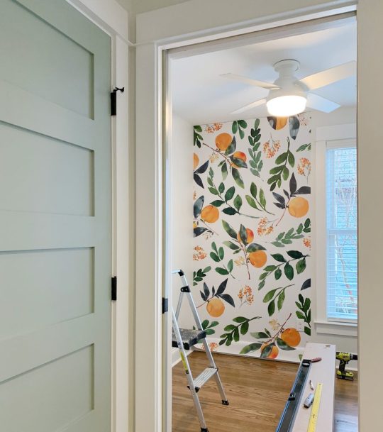
Speaking of those twin bed rooms, after they’re done we’re switching our focus to finishing up the two living rooms, two dining spaces, two kitchens, and two laundry rooms! AND THE TWO BACK PATIOS! Still plenty to do, but we’re getting closer every day!
P.S. You can see the entire process of bringing the duplex back to life here From a complete “before” video tour, to planning the floor plan & the style vibe, to tiling it all and revealing the before & afters of the front and the back of the house, it’s chock full of info & pics.
*This post contains affiliate links*
The post Four More Finished Spaces At The Duplex! appeared first on Young House Love.


Four More Finished Spaces At The Duplex! published first on https://landscapingmates.blogspot.com
0 notes
Text
Four More Finished Spaces At The Duplex!
If you tuned in last week, you saw us very excitedly reveal the before & after photos of the first four rooms that we completed at the duplex. SO MANY EXCLAMATION POINTS! There isn’t much rhyme or reason to the order of the things we’re sharing – we’re just rolling things out as we complete & photograph them… so today we have FOUR MORE SPACES THAT ARE DONE DONE DONE!
Can you tell how thrilling that is for us to proclaim after over a year and a half of working to get this house put back together and ready for renters this summer?! (The listing will go live on Airbnb once we’re done with all the rooms & have ’em photographed. We’ll make a big announcement when we get to that point, so don’t worry, you didn’t miss it!).
Let’s start with the back bedroom on the left side of the duplex – aka the side with the pink doors.

bed | side table | lamps| shades | fan | duvet | pillows | lumbar | wall: SW Spare White | trim: SW Extra White | doors: SW White Truffle
This room’s twin on the other side was in last week’s post and we mentioned that the back bed wall was a little bit narrower on the other side, so we used wall sconces instead of table lamps (every space is slightly different on each side just because 100 year old houses are quirky like that). But over here the bed wall was wider, which allowed for some larger quartz topped side tables (so shiiiiiny – and hooray for a material that won’t stain like marble).
We also got to top them with these sweet gray lamps, and once again we planned the outlet placement so they’re located behind each nightstand, so we can plug in those lights and still have an available outlet for charging phones (we’ve rented more than a few places that led to us crawling around under the bed or pulling out dressers in search of those ever elusive phone charging outlets).

bed | side table | lamp| shade | sound machine | duvet | vanity | faucet | pulls | tile | mirror | bath light | door: SW White Truffle?
Here’s a before shot of the room as it looked when we bought the duplex, which had drop ceilings to hide some ongoing roof leaks and painted plastic paneling to cover up the mold in the walls. Where that window is below is pretty much where we placed the door to access the full bathroom that we added on, which made this space into a true master bedroom. We also added the double closets to flank the window on the left wall, so if you scroll back up and you look at the window behind the bed, that’s one that we added to the bedroom since this one basically turned into the door to the bathroom.
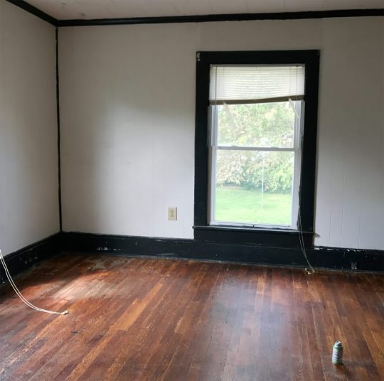
The before picture below was taken with our backs basically to the corner above. I’m including it because guess what was hiding behind that odd black slanted wall in the corner?

Yup, it was the gorgeous brick chimney that we exposed on both sides! It adds so much charm and history to the space. And yes, that’s a roach fogging can sitting on the floor above. Right before the house was for sale someone set off a fogger in every room and then didn’t come back and remove them before our showing… so there were foggers on the floor and a whole bunch of dead roaches belly up everywhere. It wouldn’t be on my house staging checklist, but it didn’t scare us, so… maybe it worked?
But back to the after pics. Once again we did an airy and open metal bed in front of the window, to let the light stream in (and feel less like a wall of furniture that’s blocking the pane of glass). Our round quartz tables fit nicely into that angled corner – and they soften the corner in a nice way. Who doesn’t love the mix of polished quartz & weathered old brick? They go together like rama-lama-lama-ka-dinga-da-dinga-dong (that was harder to type than you’d think, btw).
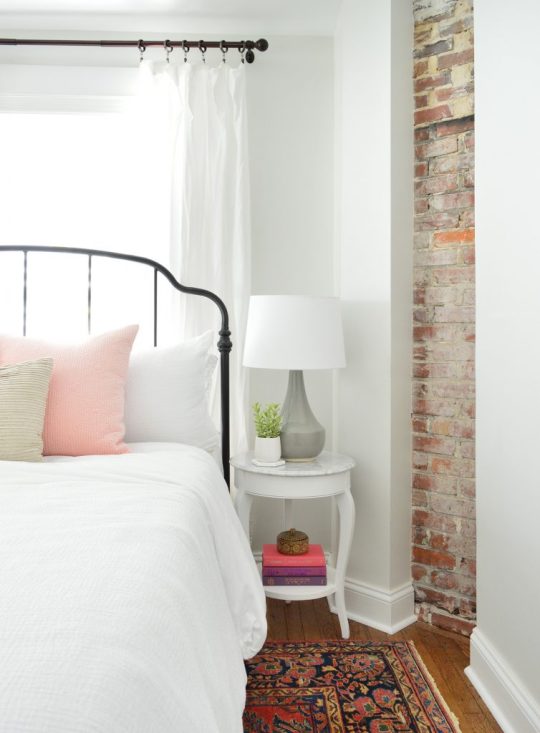
bed | side table | lamps| shades | duvet | pillow | lumbar | curtains | curtain rod | rug | wall: SW Spare White | trim: SW Extra White
This before shot was taken with our backs to the brick chimney, so that window on the right below is where we built out the double closets to flank that lovely view that looks out on some huge all-summer-long flowering trees (giant pink crape myrtles).

Oh and do you see that trap-door looking thing in the corner of the ceiling in the photo above? That’s where a leak got so bad that it eroded the original ceiling and then went through the drop ceiling and collapsed it in that spot. After we removed the drop ceiling it was clear that a LOT of the roof was failing – so we changed the pitch of the roof to be a bit steeper so water would run off of it more efficiently and not cause this issue again down the road. But yeah, rebuilding the whole roof was a doozie (you can see the entire house completely roof-less and wall-less here).
Here’s the after from the exact same corner. You can see that we have those cute pink-doored double closets now that make that window shine (they’re painted White Truffle by Sherwin Williams). And we shifted the doorway over to make sense of the upstairs layout a bit more. You can see our before & after floor plans a little later in this post to picture all of these layout changes more easily.

dresser | mirror | bench|bed | faux fig |wall: SW Spare White | trim: SW Extra White | doors: SW White Truffle
We also added a dresser for addition clothing storage (it’s the same dresser we have in our bedroom, but in the crisp white color instead of the gray one). Then we hung our favorite stenciled mirror over it for that inlay look (we LOVE how big it is, this is a room-making mirror you guys). We love that it basically creates an additional window in the room by reflecting the light of the other one (see the picture above).
This is one of the two closets in the room (remember they flank the window) so they each provide space for hanging clothes, storing suitcases, etc. And our eyes love the symmetry so much of having two in the room – I’m so glad we did it, because it feels like they were meant to be here.
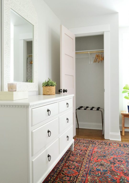
dresser | mirror | rug | luggage rack |wall: SW Spare White | trim: SW Extra White | doors: SW White Truffle
And yes, we are going to add more wooden hangers. There were people who worried the ones that they saw in our previous post weren’t enough, so more are coming. DO NOT WORRY. Buying those = the easiest thing on our list right now. Ha!
This is what you’d see if you stood with your back to the master bathroom, and you can see that we reused the rug that we had in the beach house living room a while back. And it was clearly mean to be in this master bedroom with the pink doors and the dark oil-rubbed bronze accents (in the drawer pulls, curtain rods, bed, and the door hardware). It fits the room perfectly, which makes me so happy – and on a sunny day it takes on a pinker watermelon tone, which is pretty cool (you can see that here). It was a secondhand find, so I can’t link to something identical, but this rug is pretty close (and the price is good!).

dresser | mirror | bed | rug | fan | wall: SW Spare White | trim: SW Extra White | doors: SW White Truffle
If you stand with your back to the dresser above, you see the doorway that leads to the new master bathroom that we added onto this room. So much more functional, and we had fun with that bold floor tile and all white tile and wall paint everywhere else (except for the fun pink door).
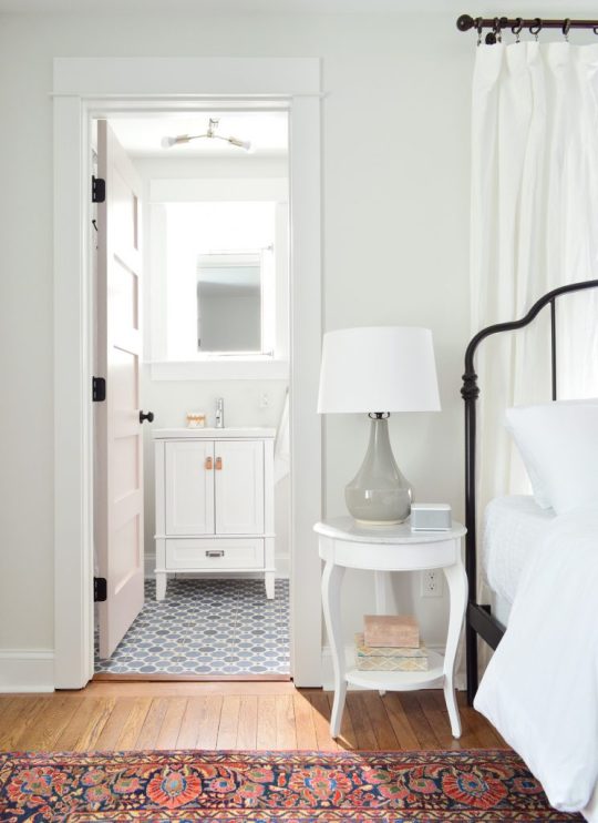
bed | side table | lamp| shade | sound machine | duvet | vanity | faucet | pulls | tile | mirror | bath light | door: SW White Truffle
The bathroom feels surprisingly serene for having such a colorful patterned floor tile, mostly thanks to using other colors sparingly, adding some calming touches like a faux succulent, some muted art (this print and another print by this artist) and some natural touches in the woven cup and the leather vanity pulls (this is the vanity we bought – and we just swapped out the hardware).

vanity | faucet | pulls | tile | mirror | hook | toilet | photo art | wall: SW Spare White | trim: SW Extra White
You can also see above that we mounted a mirror above the sink that’s functional and hinged to fit within the window frame, but still allows a lot of light to stream in. We frosted the glass so nobody feels like there isn’t privacy in here – but it thankfully doesn’t effect how might light floods this space.
Oh and a few people asked in the last post why we didn’t just put the window over the toilet – but from the back of the house it would have looked super odd to have a window right on the edge of the addition instead of in a more centralized placement. The historic review board has to approve things like additions and new window locations, so I doubt they would have gone for such an off centered window since the original back windows were in a central-ish spot too. (You can see more shots of the back of the duplex here – we LOVE how it came out!)

I also have to admit that I love a mirror in a window! We did that in our second house and the make-up-friendly natural light was never better! Ha!
vanity | faucet | pulls | tile | mirror | hook | toilet | photo art | wall: SW Spare White | trim: SW Extra White?
If you stand with your back to the wall to the right of the toilet, here’s what you see: a simple all-white shower (the key to a bold tile on the floor = non-demanding neutral tile everywhere else), a soft extra long shower curtain, and some handy towel hooks on the back of the door. For anyone wondering how we feel about mixed metals – we’re into it! Just have each one occur a few times in each space and you’re golden. For example in here we have chrome on the shower fixtures, the shower curtain rod, and the sink vanity’s faucet while the door’s hinges, knob, and hooks are all oil rubbed bronze. Looks just fine! All metals are sort of like a neutral if you layer them into the room a few times each.
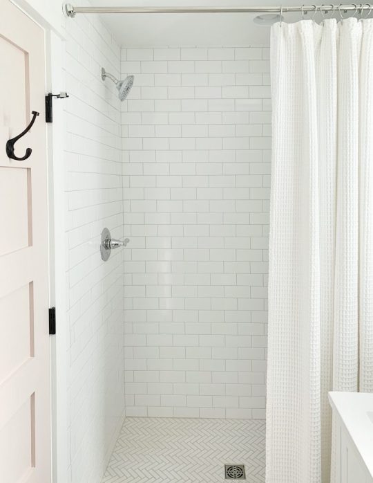
wall tile | shower floor | grout:warm gray | shower fixtures | curtain | rod | door hook | door: SW White Truffle
This is one of my favorite before shots of the bunch. Check out that mauve trim and the leafy wallpaper border. The crazy thing is that we restructured the landing upstairs so much that the after isn’t very parallel at all. We actually moved the access to the bedroom over to the right (where you see that corner of a sconce peeking into the photo below) and that open doorway that you see became a nice big hall linen closet. We also pushed the doorways back, so the landing at the top of the stairs is about twice as big – so you don’t feel nearly as closed in or crowded.

Here’s basically the same angle now. See how the doorway shifted over and the landing is a lot bigger and more breathable? Oh how I wish we had taken a photo of the linen closet open because it’s a work of art. We added chunky white shelves that are so functional for towels and extra bedding, and we even have a tiny ironing board and an iron. It’s gorgeous. Yes, a closet can be gorgeous. We need to share that in a video tour soon I think!

tile | rug |wall: SW Spare White | trim: SW Extra White | doors: SW White Truffle
I mentioned we’d include a before & after floor plan for you guys to better understand the layout changes. Remember that each side of the duplex only had one full bath when we bought it, and a very odd diagonal hallway that was not original to the house (it had been restructured probably in the 70s or 80s). So we enjoyed bringing it back to the more classic and traditional layout without any triangular hallways – it just feels more fitting and less cobbled together. Plus two and a half bathrooms per side feels a lot better than one!

One of the hugest changes we made isn’t something you can see on a floor plan though. The original steps on each side of the duplex were like a dark closed-in tunnel. They were completely drywalled on each side from the very bottom step, all the way up to almost the top step. Yeah… like no light passed through that space at all, as you can see below:

So when we restructured things, we opened a bunch of the bottom stairs up with a railing (more on that in a second) and we moved the bedroom doorway at the top of the stairs back a bit too, which meant instead of just having a short little railing up top, we flood the top 6 stairs or so with light.
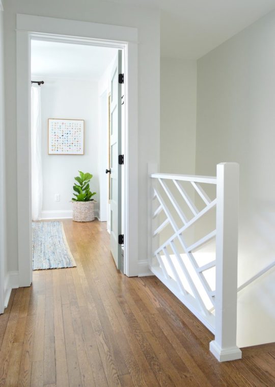
rug | faux fig | basket | framed canvas | door: SW Oyster Bay | wall: SW Spare White | trim: SW Extra White
If you don’t remember the story of the railings, they’re the original railings from our front porch at our home in Richmond, and they fit PERFECTLY into the duplex at the top and bottom of the stairs. COMPLETELY MEANT TO BE! We’re so glad they got to live on here (more on The Sisterhood Of The Traveling Railing here & here).
A few seconds ago I said that we opened up the bottom of the stairs, so here are some before & afters of that update. This is what it looked like when we bought the house – all closed in completely by a diagonal hallway of drywall with just a tiny doorway to enter the living room from the front vestibule, which felt VERY CRAMPED.

Now it looks like this, thanks to creating a much wider doorway into the living room, and an open railing that lets in tons of light & adds some great architectural interest. That light is a space-maker too guys, and the price is so good (it’s huge). The ceilings on the first floor of the duplex are 9′, so it allowed for some fun large-and-in-charge fixtures in a few spots (so if your ceilings are 8′ and you want that light, measure to see if it’s too low, and if so you could place it over a table or a bed – ooh it would be so good in a bedroom.

light | door: SW Oyster Bay | wall: SW Spare White | trim: SW Extra White
But back to the view upstairs. This is the view of the front bedroom on the right side from the hallway.
rug | faux fig | basket | framed canvas | door: SW Oyster Bay | wall: SW Spare White | trim: SW Extra White
We revealed the front bedroom on the left side of the house in last week’s post, and a few things are similar in this space (we chose the same wooden bed and the same art for that back wall as well as the same rug ).
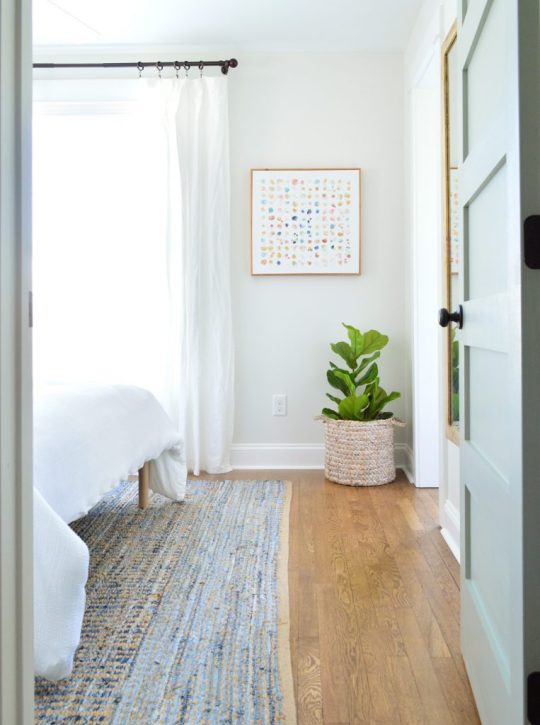
rug | faux fig | basket | framed canvas | mirror | curtains | curtain rod | door: SW Oyster Bay | wall: SW Spare White | trim: SW Extra White
But a few things we did differently over here are that we oped for slightly wider nightstands (they fit in here and wouldn’t in the other front bedroom! The slight measurement differences from side to side are so funny). We also did table lamps in here instead of wall mounted sconces, which add some nice texture.
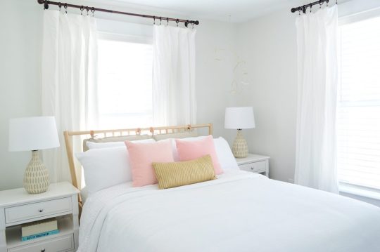
bed | duvet | pillows | nightstands | lamps | shades | curtains | curtain rod | wall: SW Spare White | trim: SW Extra White
We also hung a breezy little mobile above the bed on the right (it’s hard to see in the photo above for some reason, but you can see it a lot better in person and in the picture below. The gold hardware on it with the white wood seagulls are so perfect for the beach. It’s actually a mobile we’ve had in our bonus room at home for years, but we knew it would be perfect at the beach (it’s no longer sold, but here’s another mobile I’m loving).

bed | duvet | pillows | nightstand | lamp | shade | sound machine | curtains | rug | wall: SW Spare White
The bedside tables are SO NICE. They were a bit of a splurge for me (compared to the cheaper mint ones I got for the other side’s front bedroom) but I just loved that there were two drawers and that pretty display space in the middle for books or magazines. They look really well made in person – and the added width (they’re 24″ wide) feels great too. So if you’re looking for some classic white nightstands, these are good. Oh and we put a sound machine in each bedroom because we did that for the beach house and it’s SO NICE. Our kids love a sound machine and we’ve found that when people come to stay with us they appreciate having one too.
Below is a shot of the wall that’s across from the head of the bed, where we mounted a great wood-framed mirror (the price is so good you guys! we have one of these in the beach house too). It’s nice to have a bedroom mirror for people to check themselves out before leaving the room when they don’t have a master bath to use for that. And that doorway you see with the diamond grilled window beyond it (my VERY FAVORITE HOUSE FEATURE!) is the cute little closet for this room.

mirror | faux fig | basket | blackout curtain | curtain rod | lamp | shade |door: SW Oyster Bay | wall: SW Spare White | trim: SW Extra White
The curtain panel that you see next to the diamond window is blackout lined, so it blocks light that would stream into the bedroom when you pull them closed. All the other windows in the duplex have white faux wood blinds to block light and for privacy, but I couldn’t bear to put them on the diamond windows.
And across from that window is a diamond fronted dresser that we designed (can you tell we love diamonds?!) as well as a hanging bar for additional clothing storage. I love the little white honeycomb pendant light that we have in there too. We also used that light in the laundry room downstairs as well as over the kitchen sink. So classic looking. Five stars, would recommend.

diamond dresser | pendant light | faux fig | basket | mirror | wall: SW Spare White | trim: SW Extra White
I gotta say I love that the wood in the mirror and the bed and even the hangers is all that warm medium tone, so it feels really earthy and calming in here. Especially when you compare it to this before shot, which once again has a drop ceiling and plastic paneled walls that were covering various water and mold related issues:

Also this floor. OH THIS FLOOR. I hated it with every fiber of my being, because someone had put peel & stick tile all over half of it and then ripped it up before selling. But all the glue from the sticky tiles STAYED ON THE FLOOR. I am not exaggerating when I say that when I walked in with my flip-flopped feet for the first time, my flip flops came off of my feet and stuck to the floor as I tried to take another step. I literally had to pry them off with my hands in order to move. It was like a human-sized sticky trap.
Thankfully after refinishing the floors, they’re glorious and guaranteed not to steal your flip flops. Still gotta steam the curtains in here (remember we use these Ikea curtains and hack them to look like this) so I guess it’s not 100% done, but it’s very very close, which feels very very good. Also I love this rug. We bought it twice (it’s also on the other side) and it’s casual and beachy.
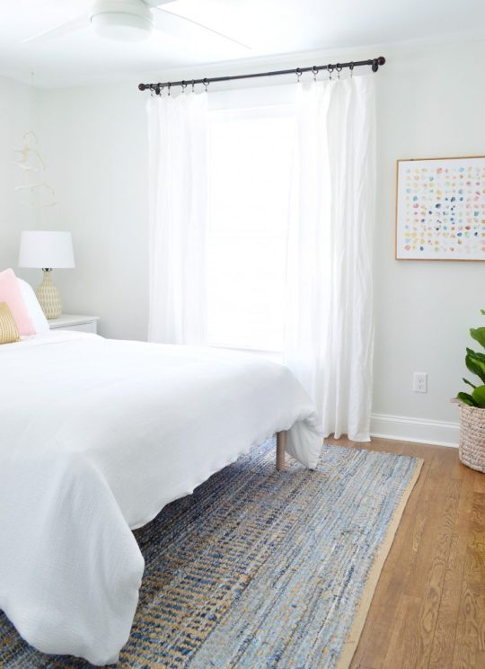
bed | rug |duvet | pillows | lamp | shade | curtains | curtain rod | framed canvas | faux fig | basket |wall: SW Spare White | trim: SW Extra White
So there you have it. Four more spaces in the duplex that we’re thrilled to have fixed up and filled with as much charm and function as we could muster.
Oh and while we’re on the subject of function, we went with SIX CEILING FANS in here because we know lots of people who love sleeping with a fan on, and although we have central air, that breeze feels beachy and calming. So yeah…. design-wise we love a light fixture, but it just felt right to do crisp white fans for the beach.

We’ve been really happy with them so far (you know we turn them on when we’re working away in each room – ha!). We did these larger ones for the four larger bedrooms (as seen in the back bedroom above). And these smaller versions for the two smaller twin bed rooms (which we have yet to finish & reveal – but soon!).

Speaking of those twin bed rooms, after they’re done we’re switching our focus to finishing up the two living rooms, two dining spaces, two kitchens, and two laundry rooms! AND THE TWO BACK PATIOS! Still plenty to do, but we’re getting closer every day!
P.S. You can see the entire process of bringing the duplex back to life here From a complete “before” video tour, to planning the floor plan & the style vibe, to tiling it all and revealing the before & afters of the front and the back of the house, it’s chock full of info & pics.
*This post contains affiliate links*
The post Four More Finished Spaces At The Duplex! appeared first on Young House Love.


0 notes
Text
Week 48-52: 1 Year Later and Lots of New Changes
Weight at the start: 190.9 lbs
Weight at the end: 188.9 lbs
Calorie consumption: 2,298
Average daily caloric consumption: 1,986.71
Total Workout Time This Week: 0 minutes
Dietary guidelines: No fast food, no straws, slower eating, no soda, 1 low/no sugar option meal, 1 vegetarian meal, 1 low/no sodium meal
——–
Okay....yeah, still really bad about posting. I’m probably going to hate myself for this when I try and read through these later and think “but what was I thinking about during this period of time?!” so I’ll do my best to surmise how it’s been going and how I’ve been feeling.
When I first got down to 190.9, I was really excited and figured I’d hit my goal weight before the year was up! But I began noticing that there was some sagging on my body, which was SUPER noticeable in my breasts (at least to me). I’ve taken more steps to keep my skin elasticity up and keep sagging to a minimum, and one of those was deciding to maintain my weight for a week or two before starting back up on losing weight. I have started noticing with the start of my period that my breasts seem a little fuller and less saggy, and I hope it’s because the skin has tightened up in that area.
My next goal will be 185 lbs, and for that I plan on going through ALL the clothes I have and letting myself get rid of things that don’t fit me well anymore (or reusing them as rags if they’re really old and not worth donating or selling). I’m finding there are a lot of clothes that are way too big and I don’t have the room for them anymore.
Another conclusion I came to is that...I don’t know if I want to lose all the weight that I planned to. Something I began noticing recently was that as I’ve had to find older, smaller clothes to wear and buy new things that fit is that I’m fitting into sizes I thought I wouldn’t fit into until I was 180-175 lbs! That’s been a really cool feeling, and also something I’ve come to terms with. I think a lot of it also has to do with me confronting how I feel about my body and feeling more positively about it (I think being open with my partner and having experiences with other people have also made me feel a little more desirable, even though I don’t have the perfect body).
What has probably made a maaajor difference has been the cardio and strength training - as I’ve increased the weight, reps, sets, miles, exercises, etc over the past two years, I’ve also increased my muscle mass and definition, which means I’m holding on to weight in more compartmentalized ways. This was something that I noticed was often true for my body (I seemed to look a little smaller than people who weighed the same as I did), and I think as I became less skinny fat and more toned, that was definitely true. This concept first occurred to me when I was using /r/loseit on Reddit, and one woman talked about how vastly different her body looked when she wasn’t working out vs when she was a trainer at the same weight (she looked 30 lbs lighter after, despite being 135 lbs in both pics). With a lot of that in mind, I’m less concerned about meeting the goal weight than I am about actually getting to the size I wanted.
So, of course, what’s my end goal here now?
I know that I absolutely still wouldn’t go under 145 lbs, but I think that would also look a lot differently on me than I think it would. The way I plan on structuring my diet now would be to lose weight in increments of 5 lbs - measure myself in terms of size and compare it to the size I was (roughly) when I was 145 lbs - and go from there. Shirts and pants are beginning to fit me like they did when I was around the 163-170 mark, and I don’t think I’ll have too much weight left to lose after that.
I’ve also been structuring my diet in different ways - I started taking many smaller snacks in with me to work as opposed to lunch meat sandwiches, and I typically feel a little fuller than if I had just the sandwich. I’ve also discovered that I just don’t have the facility at home to do gargantuan meal prep; and honestly, I don’t want to spend all my time doing that. It sucks.
On a side note - I used to smoke more, but I’ve found that I get the munchies far too hard when I do and save that for cheat days when I’m not concerned about calorie counting
————
I’ve been hitting the gym at a pretty regular rate, with the exception being this last week as I’ve had a really gross chest cold and felt dreadful waking up (though not necessarily throughout the day). I’m progressing through my weight training, and I’ll actually be starting my first full mile running soon!
——–
Here’s to the rest of the week (and actually making posts on time). I will try and do a year in review to see how much progress I’ve made since then (complete with actual pictures this time, I swear).
0 notes
Text
Four More Finished Spaces At The Duplex!
If you tuned in last week, you saw us very excitedly reveal the before & after photos of the first four rooms that we completed at the duplex. SO MANY EXCLAMATION POINTS! There isn’t much rhyme or reason to the order of the things we’re sharing – we’re just rolling things out as we complete & photograph them… so today we have FOUR MORE SPACES THAT ARE DONE DONE DONE!
Can you tell how thrilling that is for us to proclaim after over a year and a half of working to get this house put back together and ready for renters this summer?! (The listing will go live on Airbnb once we’re done with all the rooms & have ’em photographed. We’ll make a big announcement when we get to that point, so don’t worry, you didn’t miss it!).
Let’s start with the back bedroom on the left side of the duplex – aka the side with the pink doors.

bed | side table | lamps| shades | fan | duvet | pillows | lumbar | wall: SW Spare White | trim: SW Extra White | doors: SW White Truffle
This room’s twin on the other side was in last week’s post and we mentioned that the back bed wall was a little bit narrower on the other side, so we used wall sconces instead of table lamps (every space is slightly different on each side just because 100 year old houses are quirky like that). But over here the bed wall was wider, which allowed for some larger quartz topped side tables (so shiiiiiny – and hooray for a material that won’t stain like marble).
We also got to top them with these sweet gray lamps, and once again we planned the outlet placement so they’re located behind each nightstand, so we can plug in those lights and still have an available outlet for charging phones (we’ve rented more than a few places that led to us crawling around under the bed or pulling out dressers in search of those ever elusive phone charging outlets).
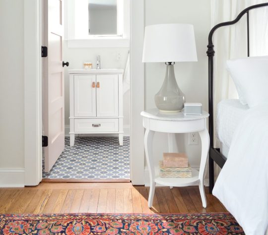
bed | side table | lamp| shade | sound machine | duvet | vanity | faucet | pulls | tile | mirror | bath light | door: SW White Truffle?
Here’s a before shot of the room as it looked when we bought the duplex, which had drop ceilings to hide some ongoing roof leaks and painted plastic paneling to cover up the mold in the walls. Where that window is below is pretty much where we placed the door to access the full bathroom that we added on, which made this space into a true master bedroom. We also added the double closets to flank the window on the left wall, so if you scroll back up and you look at the window behind the bed, that’s one that we added to the bedroom since this one basically turned into the door to the bathroom.

The before picture below was taken with our backs basically to the corner above. I’m including it because guess what was hiding behind that odd black slanted wall in the corner?
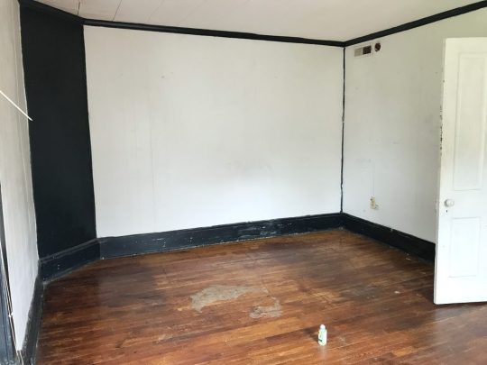
Yup, it was the gorgeous brick chimney that we exposed on both sides! It adds so much charm and history to the space. And yes, that’s a roach fogging can sitting on the floor above. Right before the house was for sale someone set off a fogger in every room and then didn’t come back and remove them before our showing… so there were foggers on the floor and a whole bunch of dead roaches belly up everywhere. It wouldn’t be on my house staging checklist, but it didn’t scare us, so… maybe it worked?
But back to the after pics. Once again we did an airy and open metal bed in front of the window, to let the light stream in (and feel less like a wall of furniture that’s blocking the pane of glass). Our round quartz tables fit nicely into that angled corner – and they soften the corner in a nice way. Who doesn’t love the mix of polished quartz & weathered old brick? They go together like rama-lama-lama-ka-dinga-da-dinga-dong (that was harder to type than you’d think, btw).

bed | side table | lamps| shades | duvet | pillow | lumbar | curtains | curtain rod | rug | wall: SW Spare White | trim: SW Extra White
This before shot was taken with our backs to the brick chimney, so that window on the right below is where we built out the double closets to flank that lovely view that looks out on some huge all-summer-long flowering trees (giant pink crape myrtles).

Oh and do you see that trap-door looking thing in the corner of the ceiling in the photo above? That’s where a leak got so bad that it eroded the original ceiling and then went through the drop ceiling and collapsed it in that spot. After we removed the drop ceiling it was clear that a LOT of the roof was failing – so we changed the pitch of the roof to be a bit steeper so water would run off of it more efficiently and not cause this issue again down the road. But yeah, rebuilding the whole roof was a doozie (you can see the entire house completely roof-less and wall-less here).
Here’s the after from the exact same corner. You can see that we have those cute pink-doored double closets now that make that window shine (they’re painted White Truffle by Sherwin Williams). And we shifted the doorway over to make sense of the upstairs layout a bit more. You can see our before & after floor plans a little later in this post to picture all of these layout changes more easily.

dresser | mirror | bench |bed | faux fig |wall: SW Spare White | trim: SW Extra White | doors: SW White Truffle
We also added a dresser for addition clothing storage (it’s the same dresser we have in our bedroom, but in the crisp white color instead of the gray one). Then we hung our favorite stenciled mirror over it for that inlay look (we LOVE how big it is, this is a room-making mirror you guys). We love that it basically creates an additional window in the room by reflecting the light of the other one (see the picture above).
This is one of the two closets in the room (remember they flank the window) so they each provide space for hanging clothes, storing suitcases, etc. And our eyes love the symmetry so much of having two in the room – I’m so glad we did it, because it feels like they were meant to be here.

dresser | mirror | rug | luggage rack |wall: SW Spare White | trim: SW Extra White | doors: SW White Truffle
And yes, we are going to add more wooden hangers. There were people who worried the ones that they saw in our previous post weren’t enough, so more are coming. DO NOT WORRY. Buying those = the easiest thing on our list right now. Ha!
This is what you’d see if you stood with your back to the master bathroom, and you can see that we reused the rug that we had in the beach house living room a while back. And it was clearly mean to be in this master bedroom with the pink doors and the dark oil-rubbed bronze accents (in the drawer pulls, curtain rods, bed, and the door hardware). It fits the room perfectly, which makes me so happy – and on a sunny day it takes on a pinker watermelon tone, which is pretty cool (you can see that here). It was a secondhand find, so I can’t link to something identical, but this rug is pretty close (and the price is good!).

dresser | mirror | bed | rug | fan | wall: SW Spare White | trim: SW Extra White | doors: SW White Truffle
If you stand with your back to the dresser above, you see the doorway that leads to the new master bathroom that we added onto this room. So much more functional, and we had fun with that bold floor tile and all white tile and wall paint everywhere else (except for the fun pink door).

bed | side table | lamp| shade | sound machine | duvet | vanity | faucet | pulls | tile | mirror | bath light | door: SW White Truffle
The bathroom feels surprisingly serene for having such a colorful patterned floor tile, mostly thanks to using other colors sparingly, adding some calming touches like a faux succulent, some muted art (this print and another print by this artist) and some natural touches in the woven cup and the leather vanity pulls (this is the vanity we bought – and we just swapped out the hardware).
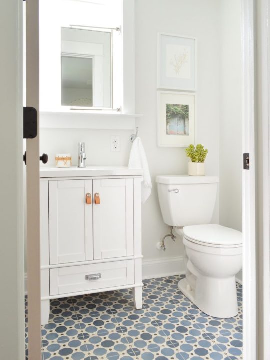
vanity | faucet | pulls | tile | mirror | hook | toilet | photo art | wall: SW Spare White | trim: SW Extra White
You can also see above that we mounted a mirror above the sink that’s functional and hinged to fit within the window frame, but still allows a lot of light to stream in. We frosted the glass so nobody feels like there isn’t privacy in here – but it thankfully doesn’t effect how might light floods this space.
Oh and a few people asked in the last post why we didn’t just put the window over the toilet – but from the back of the house it would have looked super odd to have a window right on the edge of the addition instead of in a more centralized placement. The historic review board has to approve things like additions and new window locations, so I doubt they would have gone for such an off centered window since the original back windows were in a central-ish spot too. (You can see more shots of the back of the duplex here – we LOVE how it came out!)

I also have to admit that I love a mirror in a window! We did that in our second house and the make-up-friendly natural light was never better! Ha!
vanity | faucet | pulls | tile | mirror | hook | toilet | photo art | wall: SW Spare White | trim: SW Extra White?
If you stand with your back to the wall to the right of the toilet, here’s what you see: a simple all-white shower (the key to a bold tile on the floor = non-demanding neutral tile everywhere else), a soft extra long shower curtain, and some handy towel hooks on the back of the door. For anyone wondering how we feel about mixed metals – we’re into it! Just have each one occur a few times in each space and you’re golden. For example in here we have chrome on the shower fixtures, the shower curtain rod, and the sink vanity’s faucet while the door’s hinges, knob, and hooks are all oil rubbed bronze. Looks just fine! All metals are sort of like a neutral if you layer them into the room a few times each.

wall tile | shower floor | grout: warm gray | shower fixtures | curtain | rod | door hook | door: SW White Truffle
This is one of my favorite before shots of the bunch. Check out that mauve trim and the leafy wallpaper border. The crazy thing is that we restructured the landing upstairs so much that the after isn’t very parallel at all. We actually moved the access to the bedroom over to the right (where you see that corner of a sconce peeking into the photo below) and that open doorway that you see became a nice big hall linen closet. We also pushed the doorways back, so the landing at the top of the stairs is about twice as big – so you don’t feel nearly as closed in or crowded.

Here’s basically the same angle now. See how the doorway shifted over and the landing is a lot bigger and more breathable? Oh how I wish we had taken a photo of the linen closet open because it’s a work of art. We added chunky white shelves that are so functional for towels and extra bedding, and we even have a tiny ironing board and an iron. It’s gorgeous. Yes, a closet can be gorgeous. We need to share that in a video tour soon I think!

tile | rug |wall: SW Spare White | trim: SW Extra White | doors: SW White Truffle
I mentioned we’d include a before & after floor plan for you guys to better understand the layout changes. Remember that each side of the duplex only had one full bath when we bought it, and a very odd diagonal hallway that was not original to the house (it had been restructured probably in the 70s or 80s). So we enjoyed bringing it back to the more classic and traditional layout without any triangular hallways – it just feels more fitting and less cobbled together. Plus two and a half bathrooms per side feels a lot better than one!

One of the hugest changes we made isn’t something you can see on a floor plan though. The original steps on each side of the duplex were like a dark closed-in tunnel. They were completely drywalled on each side from the very bottom step, all the way up to almost the top step. Yeah… like no light passed through that space at all, as you can see below:

So when we restructured things, we opened a bunch of the bottom stairs up with a railing (more on that in a second) and we moved the bedroom doorway at the top of the stairs back a bit too, which meant instead of just having a short little railing up top, we flood the top 6 stairs or so with light.

rug | faux fig | basket | framed canvas | door: SW Oyster Bay | wall: SW Spare White | trim: SW Extra White
If you don’t remember the story of the railings, they’re the original railings from our front porch at our home in Richmond, and they fit PERFECTLY into the duplex at the top and bottom of the stairs. COMPLETELY MEANT TO BE! We’re so glad they got to live on here (more on The Sisterhood Of The Traveling Railing here & here).
A few seconds ago I said that we opened up the bottom of the stairs, so here are some before & afters of that update. This is what it looked like when we bought the house – all closed in completely by a diagonal hallway of drywall with just a tiny doorway to enter the living room from the front vestibule, which felt VERY CRAMPED.

Now it looks like this, thanks to creating a much wider doorway into the living room, and an open railing that lets in tons of light & adds some great architectural interest. That light is a space-maker too guys, and the price is so good (it’s huge). The ceilings on the first floor of the duplex are 9′, so it allowed for some fun large-and-in-charge fixtures in a few spots (so if your ceilings are 8′ and you want that light, measure to see if it’s too low, and if so you could place it over a table or a bed – ooh it would be so good in a bedroom.

light | door: SW Oyster Bay | wall: SW Spare White | trim: SW Extra White
But back to the view upstairs. This is the view of the front bedroom on the right side from the hallway.
rug | faux fig | basket | framed canvas | door: SW Oyster Bay | wall: SW Spare White | trim: SW Extra White
We revealed the front bedroom on the left side of the house in last week’s post, and a few things are similar in this space (we chose the same wooden bed and the same art for that back wall as well as the same rug ).

rug | faux fig | basket | framed canvas | mirror | curtains | curtain rod | door: SW Oyster Bay | wall: SW Spare White | trim: SW Extra White
But a few things we did differently over here are that we oped for slightly wider nightstands (they fit in here and wouldn’t in the other front bedroom! The slight measurement differences from side to side are so funny). We also did table lamps in here instead of wall mounted sconces, which add some nice texture.

bed | duvet | pillows | nightstands | lamps | shades | curtains | curtain rod | wall: SW Spare White | trim: SW Extra White
We also hung a breezy little mobile above the bed on the right (it’s hard to see in the photo above for some reason, but you can see it a lot better in person and in the picture below. The gold hardware on it with the white wood seagulls are so perfect for the beach. It’s actually a mobile we’ve had in our bonus room at home for years, but we knew it would be perfect at the beach (it’s no longer sold, but here’s another mobile I’m loving).

bed | duvet | pillows | nightstand | lamp | shade | sound machine | curtains | rug | wall: SW Spare White
The bedside tables are SO NICE. They were a bit of a splurge for me (compared to the cheaper mint ones I got for the other side’s front bedroom) but I just loved that there were two drawers and that pretty display space in the middle for books or magazines. They look really well made in person – and the added width (they’re 24″ wide) feels great too. So if you’re looking for some classic white nightstands, these are good. Oh and we put a sound machine in each bedroom because we did that for the beach house and it’s SO NICE. Our kids love a sound machine and we’ve found that when people come to stay with us they appreciate having one too.
Below is a shot of the wall that’s across from the head of the bed, where we mounted a great wood-framed mirror (the price is so good you guys! we have one of these in the beach house too). It’s nice to have a bedroom mirror for people to check themselves out before leaving the room when they don’t have a master bath to use for that. And that doorway you see with the diamond grilled window beyond it (my VERY FAVORITE HOUSE FEATURE!) is the cute little closet for this room.

mirror | faux fig | basket | blackout curtain | curtain rod | lamp | shade |door: SW Oyster Bay | wall: SW Spare White | trim: SW Extra White
The curtain panel that you see next to the diamond window is blackout lined, so it blocks light that would stream into the bedroom when you pull them closed. All the other windows in the duplex have white faux wood blinds to block light and for privacy, but I couldn’t bear to put them on the diamond windows.
And across from that window is a diamond fronted dresser that we designed (can you tell we love diamonds?!) as well as a hanging bar for additional clothing storage. I love the little white honeycomb pendant light that we have in there too. We also used that light in the laundry room downstairs as well as over the kitchen sink. So classic looking. Five stars, would recommend.
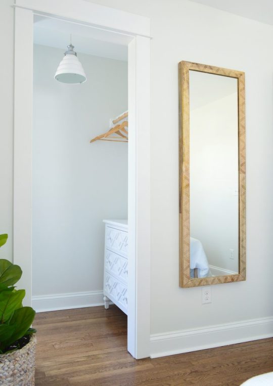
diamond dresser | pendant light | faux fig | basket | mirror | wall: SW Spare White | trim: SW Extra White
I gotta say I love that the wood in the mirror and the bed and even the hangers is all that warm medium tone, so it feels really earthy and calming in here. Especially when you compare it to this before shot, which once again has a drop ceiling and plastic paneled walls that were covering various water and mold related issues:

Also this floor. OH THIS FLOOR. I hated it with every fiber of my being, because someone had put peel & stick tile all over half of it and then ripped it up before selling. But all the glue from the sticky tiles STAYED ON THE FLOOR. I am not exaggerating when I say that when I walked in with my flip-flopped feet for the first time, my flip flops came off of my feet and stuck to the floor as I tried to take another step. I literally had to pry them off with my hands in order to move. It was like a human-sized sticky trap.
Thankfully after refinishing the floors, they’re glorious and guaranteed not to steal your flip flops. Still gotta steam the curtains in here (remember we use these Ikea curtains and hack them to look like this) so I guess it’s not 100% done, but it’s very very close, which feels very very good. Also I love this rug. We bought it twice (it’s also on the other side) and it’s casual and beachy.

bed | rug |duvet | pillows | lamp | shade | curtains | curtain rod | framed canvas | faux fig | basket |wall: SW Spare White | trim: SW Extra White
So there you have it. Four more spaces in the duplex that we’re thrilled to have fixed up and filled with as much charm and function as we could muster.
Oh and while we’re on the subject of function, we went with SIX CEILING FANS in here because we know lots of people who love sleeping with a fan on, and although we have central air, that breeze feels beachy and calming. So yeah…. design-wise we love a light fixture, but it just felt right to do crisp white fans for the beach.
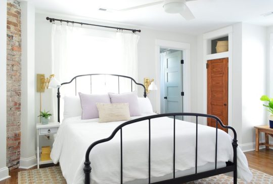
We’ve been really happy with them so far (you know we turn them on when we’re working away in each room – ha!). We did these larger ones for the four larger bedrooms (as seen in the back bedroom above). And these smaller versions for the two smaller twin bed rooms (which we have yet to finish & reveal – but soon!).

Speaking of those twin bed rooms, after they’re done we’re switching our focus to finishing up the two living rooms, two dining spaces, two kitchens, and two laundry rooms! AND THE TWO BACK PATIOS! Still plenty to do, but we’re getting closer every day!
P.S. You can see the entire process of bringing the duplex back to life here From a complete “before” video tour, to planning the floor plan & the style vibe, to tiling it all and revealing the before & afters of the front and the back of the house, it’s chock full of info & pics.
*This post contains affiliate links*
The post Four More Finished Spaces At The Duplex! appeared first on Young House Love.


0 notes
Last Seen Blogs

carltonmorrow
Carlton Morrow

midageswitch
Middle Aged Switch

snckiuytre
无标题

severus-survives-au
Severus Snape Lives/Time Travel AU

enneagramwonder
enneagram wonder