
soshi's silly little side blog.(fresh animation recommendations every day at 7 pm cst)
Last active 2 hours ago
Don't wanna be here? Send us removal request.
Statistics
We looked inside some of the posts by the-second-soshening and here's what we found interesting.
Average Info
Notes Per Post
0
Likes Per Post
0
Reblog Per Post
0
Reply Per Post
0
Time Between Posts
1 day
Number of Posts By Type
Text
17
Last Seen Tumblr Blogs


Fun Fact
Tumblr.com rank in the US is 25.
Text
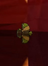
stuff soshi thinks you should watch no. 23: "narrows" (thad carlile, 2025)
i fr thought this was off the air for a second
youtube
with the big bad heat wave rolling across the us, this short is an appropriate fit. stay hydrated...but not too hydrated!
so "narrows" has a really interesting story about a frog dad trying to find water for his tadpoles to grow in. apparently, "narrows" was unintentionally based on the creator's own experience with raising kids in los angeles. funny how that happens, huh?
the cool thing about this animation is that the characters are hand-drawn, but the backgrounds are done in blender (BLENDER REPRESENT!!). i think that might be the first thing i've shown here that actually does that? i think day job might've done something similar. nonetheless, it's a really unique look.
not only do the backgrounds look pretty, they also do a great job at creating a sort of claustrophobic feeling—this is called "narrows," after all! here are the shots that do that best:


i think the most fundamental reason for this feeling is because if you break down the backgrounds to their most basic colors—orange and blue—there's so much orange compared to the slivers of blue at the top. it's almost like the sky is being boxed in by the desert!
and in other shots, the whole background is just orange and brown, which only adds to this feeling of being trapped.

another aspect i'd like to touch on is the water. i can't figure out how carlile managed to animate the water with 2d characters!
admittedly, i really only know the basics of 3d programs, and i'm learning a bit about blender right now. i know that blender can simulate physics, but other than that, i don't really know a lot about animating water in 3d, let alone when 2d characters are interacting with it. that alone is really impressive!
there's also a lot of attention to detail in the reflections of the water. not only does the frog dad have a reflection, it also looks different at different angles, like so:


of course, there is also the possibility that having a detailed reflection all the time would have been too distracting. even then, though, you can still tell there's a lot of thought put into the shots!

on a similar topic, when the frog dad is running through the water, i like how it isn't too over-the-top. there is definitely such a thing as over-animating, and adding splashes and water going everywhere would've definitely detracted from the scene. carlile instead uses other ways to up the tension in the scene, which are much simpler and yet really effective.


finally, a little something about the sound design. ryan austin, the sound designer, did such a great job with creating an immersive atmosphere with sound! this is a short with no dialogue, so sound and music really help elevate the experience!
when the frog dad is walking through the narrows, for instance, it sounds like an empty hallway. not to mention that i love the sounds of water at the little pond oasis thing. i assume if you're down here, you watched this short...so i encourage you to watch it again with headphones!
anyways, that's going to be it for me. if you liked "narrows," you should share it! carlile is between industry gigs right now, so i think it would really help him out a lot. and besides, i'd really like to see a whole series of this. i love frog dad.
#stuff soshi thinks you should watch#animation#recommendation#2d animation#3d animation#blender#indie animation#frog#ribbit#stay hydrated#seriously.#animation study#youtube
0 notes
Text
stuff i think you should watch no. 22: "garage sale" (tim eterno, 2024)
this short is rockin' cool...but that term is so uncool it makes my face hurt, so let's just say you should watch this.
youtube
this one comes from america, which is not australia.
so this is a little short from tim eterno, who does art, animation, and voice acting for other stuff like deadlycomics's "cool times." "garage sale" immediately caught my attention with its papercraft-esque style.
also, there's a goat. i like goats!
anyways, the style. the way the team behind "garage sale" pulled off its style was by drawing the characters first in toon boom harmony and tvpaint, and then using a texture layer to make them look like they were drawn on paper. then, the lighting and the shading was done in after effects. (eterno talks about it more here.)
this is something i've done myself, albeit using only krita (my beloved), and i have to say, this is a really simple but effective way to emulate this sort of arts-and-craftsy-type deal!
i did notice that the style was a little inconsistent, especially near the beginning. maybe that was intentional, considering the aesthetic? this was also a capstone, so i could probably understand. still, it kind of threw me off...
what ultimately won me over, though, was the climax of the film. ooh! i got goosebumps!
this film does such a great job playing around with the dynamics between the characters, and it really shines best in the climax. a lot of it is the song itself, but the animation and the backgrounds contribute a lot, too!
so the basic gist of the climax, if you haven't watched it (which you should! what are you doing down here!) is that it's a musical battle between shen (the dog) and qat (the...cat). shen is a lot more energetic, so a lot of his movements are broad. he walks around a lot. and he even carries himself into the air with his music, like so:

qat is the complete opposite. she's a keyboardist, so obviously she doesn't move around as much, but it also really fits her more introverted personality.
there's also this charming shot where she looks like she's casting a magic spell on her keyboard.

the backgrounds also help to accentuate their personalities. shen's background is warmer, and its use of lines create a lot of motion. meanwhile, qat's background is cooler and travels in a spiral.
this is pretty standard design stuff, but it's super effective. both backgrounds sum up their personalities perfectly—and the result is a scene that oozes with character!
(maybe there's a better word, but...)
anyways, on the topic of backgrounds, the film's environment looks really beautiful. in the video's description, eterno says the film is inspired by "the dog days of childhood summer," and i can really feel it looking at the backgrounds.


these come from eterno's portfolio. the one at the top was done by alex siple, and the rest were from markandflops.
there's something oddly nostalgic about looking at these backgrounds. i'm either reminded of my hometown or some shows i watched as a kid.
summer and nostalgia...they go together like soshis and goats.
but anyways, that's going to be it from me! i love indie pop, so this was a fun short to start off the week with. rock on 🤘✌️🪨🎸🦊🐐❓❓❓
#stuff soshi thinks you should watch#animation#recommendation#indie animation#indie pop#2d animation#goat#baa#i bet i could do a bang-up impression of cowbell#Youtube
0 notes
Text
today i learned about the dew point scale..."oppressive and miserable" describes a lot of things

0 notes
Text
stuff soshi thinks you should watch no. 21: "lucky" (oh yeah wow & air india radio, 2010)
(eyestrain warning! god, what is it with you australians and bright lights?)
a week ago, this series crash-landed into australia. now, as i pack my bags and hightail it out the outback, i leave you with this:
youtube
ironically, for a music video titled "lucky," i unluckily lost my draft twice while writing this. so i'll try to sum up what i remember writing...
there's something about this music video that really screams "nostalgia!" and i think it comes down to two things:
the visuals
and the music
though this is a music video, so that doesn't really explain a lot. let me elaborate:
i really like neon lights! i don't know why, though. i do associate neon lights with long car trips home and visiting california and its small towns. here are some shots that evoke that sort of feeling:


and adding to the "car trip" feeling is the music, of course. i usually don't talk about music much, mostly since i don't know a lot of music theory, but this is a music video, so...here are my thoughts.
the twangy guitar really evokes the nostalgia for me. it reminds me of something i'd hear on the radio while on a long car trip in the countryside or to a forest of some sort. (disasterpeace's "daisy wheel" and danimal cannon's "agrobacter" evoke similar feelings, again using a twangy guitar.)
and the violins and piano just add this elegance to the whole thing. it's hard to believe i'm describing a video about doodly little fellas as "elegant," but it's true. it all feels so poignant. i mean, this was even released in 2010, when i was growing up, so there's that too, of course.
doodles as "elegant" ...
that's part of the beauty of animation. you don't necessarily have to know how to draw well to animate something impactful. it helps, sure, but you could also animate a bunch of lines and still find ways to breathe so much life and emotion into them! i think as long as something was made with a lot of heart and evokes any kind of emotion in me, it's worth a watch. or at least a peek.
and with that...my strange "trip" to australia draws to a close. but this certainly isn't the end-all-be-all guide to australian animation. this is really only scratching the surface! you can check out other australian animations at the national film and sound archive's official website.
anyways, i think things will go back to "normal" next week (as if anything here is normal, haha). i mean, i'll resume showcasing random animations from random places. maybe i'll do more themed weeks like this, especially since this one took me down some unexpected (but also really fun) paths. i do have a long list of animations that are waiting to be showcased though, so i'll get back to that tomorrow.
until then, i leave you with a souvenir from australia:

snail!
#stuff soshi thinks you should watch#animation#recommendation#music video#live action#neon#neon lights#australian animation#animation study#did you notice that this post has exactly 7 images in it?#talk about lucky!#snail#🐌#what sound does the snail make?#is it like slurp?#or slorp?#i may have lost this post twice...but i have the indomitable human spirit#also...for some reason this gives me lbp vibes?#just how doodly it is.#i'll stop now#youtube#eyestrain warning#Youtube
0 notes
Text
ok so i guess i forgot to change the time zone on this blog...so all of my posts have been appearing at 8 instead of 7? goes to show how smart i am lmao
but donut worry, i fixed it. anyways...tonight's little thing to watch should be here soon 🤞 it's a good one !!
0 notes
Text
stuff i think you should watch no. 20: "hot to trot" (palm beach pictures and voyager films, 1977)
goodvibes only (click me to watch it!)
(brief flash warning at 2:40 and 3:46!)
today's violently australian animation is about...a pig. and some beautiful backgrounds!
i don't know if you could tell, but recently i've been getting a lot of animations from the national film and sound archive's website. there are a lot of good animations there, so much so that if i tried to cover them all it would probably take at least a month.
but this one in particular caught my eye, mostly because of captain goodvibes. his design is pretty unique. i mean, look at this dude!

apparently this guy was a really popular surfing icon back then. captain goodvibes, or the "pig of steel," was originally a comic by a cartoonist named tony edwards for a surfing magazine called tracks. he later had his own radio show, his own record, and, as you can see, his own short film!
"hot to trot" has really nice-looking backgrounds. i'm always a sucker for psychedelic visuals, and this has a lot of them.
at the beginning, for instance, there's this sun:

there's also goodvibes's barge...

and this wave!

i don't know why i like psychedelic art so much, especially since i'm as clean as it gets. i like weird experimental stuff anyways, so that might be part of it.
i also think it's because psychedelic art isn't really concerned about being realistic anyways. i really like how "geometric" these look? for lack of a better word.
like the wave, for example, has a really satisfying pattern. i feel like i'm looking at a graph.
the sun, too, has really intricate patterns that just feel...satisfying? i guess? this film has put me at a loss for words. though i guess that's kind of the point, haha!
well, i guess i better wrap this up before i start losing more words. i'll leave you with some food for thought about goodvibes's sidekick astro.

you don't suppose...?
#stuff soshi thinks you should watch#animation#recommendation#australian animation#2d animation#surfing#psychedelic art#animation study#flash warning#pig#oink
0 notes
Text
stuff i think you should watch no. 19: dust echoes (australian broadcasting corporation and djilpin arts aboriginal corporation, 2004-2007)
hello! you can click on me to watch this beautiful little series!
(do note that this series may contain the voices of deceased aboriginal australians and torres strait islanders.)
(also note that episode 9, "the spear," has flashing lights.)
it wouldn't be right to discuss australian animation without touching on aboriginal australians. there are a lot of aboriginal australians in not just animation, but film in general! this program for nunga screen (a film program for first nations filmmakers) is a good example.
perhaps the most prominent aboriginal australian animation i could find was a series called dust echoes. this was a series of 12 animations made in collaboration with the djilpin arts aboriginal corporation, which is based in the jawoyn nation.
dust echoes was directed towards older children, with each episode focusing on a different dreamtime story from central arnhem land.
besides the subject matter—mythology has recently been a fairly big interest of mine—dust echoes has very beautiful visuals. for instance, episode 3, "brolga song," has a really striking painterly style! here are some shots i liked:


some of the other episodes also have really nice art styles, too. (episode titles are in the alt text.)


the styles for episode 4 and 11 (top left and bottom middle respectively) really stand out to me because of the emphasis on imperfections. there, the characters and backgrounds are rendered roughly, and it adds a really human quality to them that i like.
i also really like the choice of music! dust echoes's music combines traditional instruments, most notably the didgeridoo and clapsticks, and combines it with more modern instruments. you can hear this best in "the spear," which combines the didgeridoo with dnb.
all in all, i think dust echoes is worth checking out. like i said, i really like learning about mythology, but i'm a slow reader, and i get distracted very easily...so presenting them in animated form is much more my speed!
to close out this post, i'd like to mention two aboriginal australian animators i came across while researching aboriginal animation:
jonathan saunders - a woppaburra illustrator and animator. saunders' comic, zero-point, features an aboriginal australian superhero and has been adapted into a 4-episode webseries.
jake duczynski - a gomeroi and mandandanji director who founded studio gilay. studio gilay has a couple of short films, like "wanmari" and "gurungatch & mirrigan" along with a series called "cooked."
go give them a watch!
#stuff soshi thinks you should watch#animation#recommendation#australian animation#aboriginal australian#first nations#animation study#flash warning
0 notes
Text
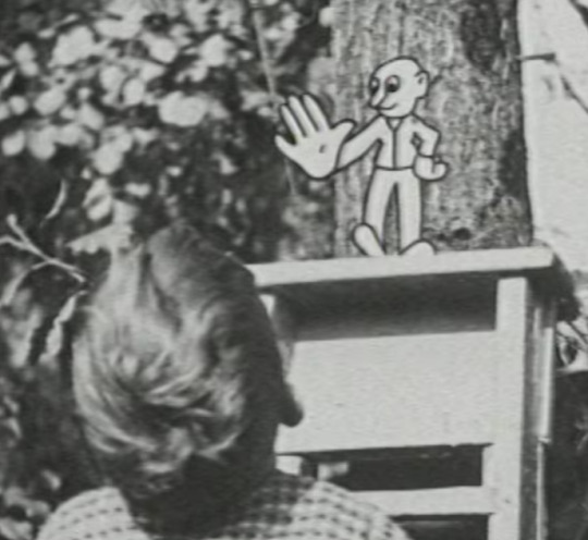
stuff i think you should watch no. 18: "snippy is an artful dodger" (david barker, 1925)
this thing is almost a hundred years old?! that's older than me!
click here to watch it.
the 1920s! a great decade for animation! (though not for much else...)
in germany, lotte reiniger released the adventures of prince achmed, the oldest surviving animated film. in america, studios like the fleischer brothers and disney revolutionized animation technologies. (in retrospect, though, disney was probably not a good idea.)
and in australia, animation was catching on, too. for example, artists like virgil reilly and alec laing created and projected "lightning sketches," which were quick drawings that used animation to speed themselves up.
then, in 1915, cartoonist harry julius created cartoons of the moment as part of the australasian gazette newsreel. his studio, cartoon filmads, also animated advertisements not just for australia, but for other countries like england and india. in fact, cartoon filmads may be one of the earliest examples of the use of storyboards...
but i digress. let's talk about snippy!
for its time, "snippy" is actually pretty impressive! this combination of live-action and animation had certainly been done before, like with the fleischer brothers' "the tantalizing fly" (1919). but i can't think of any other early animations that placed animated subjects in live-action settings.
the way barker made this was to take freeze frames of live-action footage and then animate snippy over them with cels. there's one scene, though, that uses the live-action footage itself: here on the roundabout.
this scene is really impressive to me because you can really believe that snippy is actually there! i mean, look at this...

there's just something really nice about this, and i don't know why. i think the main reason is because of how clean it looks? it's like, snippy's outlines don't go over the seat or the boy's head or anything.
there's also another scene where snippy pushes a grate off to the side, which i also think is impressive. i guess the key here is interactivity. like roger rabbit!
this one was a shorter film, so i don't really have much else to blab about. so tata for now...see you tomorrow!
#stuff soshi thinks you should watch#animation#1920s animation#australian animation#cel animation#live action#animation study#recommendation
0 notes
Text
stuff i think you should watch no. 17: day job (paul georghiou, 2024)
there are three of them...
youtube
youtube
youtube
another australian animation? what is going on? i'm not complaining, it's just kind of strange.
anyways, day job is a series i watched a while back. it was made as part of fresh blood, a program by screen australia that finds talents from across the country and allows them to make shorts and other stuff. wish we could get that here in the states...
its creator, paul georghiou, also worked on smiling friends. i mention this because day job has a really similar, "casual conversation" type of tone for a lot of its dialogue.
the basic premise of day job is that it's a mockumentary set in a bowling alley, and the show does a really great job pulling that off. there are the little details, like the camera shaking, but the key part to this is the dialogue.
speaking from personal experience and also watching other stuff, dialogue, especially casual dialogue, is really tricky to write. a lot of it feels like a balancing act between moving the story forwards; revealing personalities and backstories; and still making it feel natural.
but day job does a really good job at making the writing feel casual! so i was and wasn't surprised to hear that a majority of day job was actually improvised. according to this video, the voice artists would record whatever happened during their session, even if it was someone walking in and saying hello.
what really adds to the improv is that in the interview, georghiou says the characters were "mostly based on their actor." so you don't really have to try too hard to really get into your role, which i think really makes the dialogue feel much more natural.
i know the dialogue's been the main focus of this post, but i thought i'd just touch on the visuals for a bit. i really like day job's stylized designs, especially with the faces and the use of five fingers. (five fingers? in a cartoon?) also, even though most of the animation in day job focuses on the mouth movements, there's still a lot of thought put into how they move.
for instance, georghiou talks about wanting to avoid what he calls "teeth flashing," which is where the teeth disappear and reappear where a character is talking. also, this is a small detail, but i really like how the characters' chins move when they're talking. these are small things, but they go a long way in making the animation feel more alive.
i'll end this post with a little signal boost: you can support day job over here! wow! show indie animation some love today! and some money! but mostly love!
#stuff soshi thinks you should watch#animation#recommendation#animation study#australian animation#2d animation#indie animation#slurp! yum! fresh blood!#Youtube
0 notes
Text
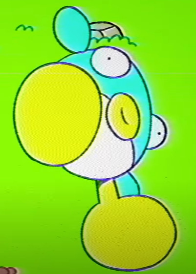
stuff i think you should watch no. 16: "plumpin" (ivan dixon and studio showoff, 2025)
i love you plumpin
youtube
this is another animation from australia, this time from a group called studio showoff. this is the second australian animation this week, and it's just as cartoony as olive place. i wonder if this is leading up to something...?
"plumpin" oozes with personality, both in design and in animation. for example, plumpin's walk is more of a waddle. it looks so dopey, but it fits its personality perfectly.
what really adds to the personality, too, is the sound design. felix colgrave, who you might recognize from his "donks" and "double king" animations, did the score for "plumpin." so going back to plumpin's walk...
every time plumpin takes a step, a little "bwah" plays in the background. it's a little detail, but it adds a lot to how goofy plumpin is. the kids yelling "plumpin" at the beginning also adds to the kind of "old kids' tv show" that i think this animation is trying to evoke. it's like something i'd see on some kind of alternate universe sesame street.
on the topic of old kids' shows, i really like the vhs filter here! i think it really fits the loose, simple art style that "plumpin" has. it also changes a bit to fit the tone of the story, which is a really neat detail.
i think that's going to be all for me, so i'll end with a couple of designs i really like from "plumpin."
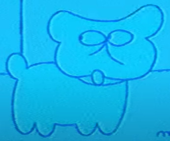
i love this dog!
#stuff soshi thinks you should watch#animation#australian animation#2d animation#indie animation#recommendation#animation study#let's love plumpin together#Youtube
0 notes
Text
soshi says hoillo
welcome to my sideblog! go here for my main blog.
you might be here for stuff soshi thinks you should watch, especially since that's really the only thing here right now. it's a daily series i do to analyze animations and what i like about them. it's also a really fun way for me to showcase artistic voices around the world. if that sounds like something up your alleyway, then follow #stuff soshi thinks you should watch.
just a heads up, some animations will contain flashing lights! i'll tag these with #flash warning if you need to block them.
0 notes
Text
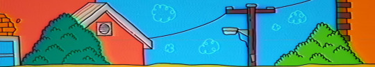
stuff i think you should watch no. 15: olive place, luxury inn (jarrod prince, 2025)
a lovely pilot from down under!
youtube
do you remember skillbard from yesterday's post? they also worked on this, so i thought it would be a neat segue.
olive place comes from jarrod prince, who also worked on some stuff for fionna and cake and ok ko!. you can really feel the cartoon network influence here: i mean, prince even says that the whole show is meant to give off "chowder vibes."
and you know what? it does! besides the concept and the writing, i think what really sells the whole feel of the show is its use of mixed media.
olive place primarily uses 2d animation in adobe animate (according to one of the comments on this short), but it also features segments with puppetry, 3d animation, pixel animation, and even live-action!
i always like animations that mix different styles (gumball and smiling friends are the ones i think of first), but the thing is, i don't really know why. maybe it's just cool to see different art styles interacting with each other?
working with mixed styles can be a challenge, but it adds a lot of visual uniqueness to a project. (i can attest to this because i've been working on a mixed-media project myself!)
one thing to keep in mind, at least in my opinion, is that you should still stay true to the overall aesthetic of the project.
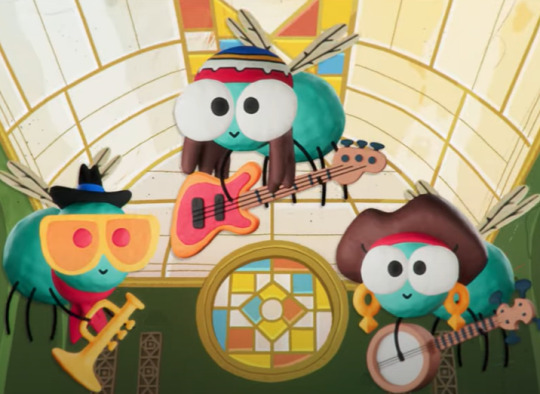
the jazz flies in olive place, for example, take on a sort of clay stopmotion-y look, but their simple character designs still fit in with the show's cartoony aesthetic.

this is another good example, showing the different styles side-by-side. even though the character on the left has a different art style, their design is still simple, round, and vibrant, so they don't feel like they're completely out of place.
on the topic of character designs, i love how all the characters look in olive place! the characters' designs lean towards exaggeration while still keeping everything simple, which really fits the show's goofy, lighthearted atmosphere.
and one last thing...

this part is really funny.
0 notes
Text
stuff i think you should watch no. 14: "anon mation" (caleb wood, 2016)
(flash warning!)
i like to close out the week with stuff that left a big impact on me...or at least really wowed me. this is one of them.
youtube
experimental animation is one of my favorite types of animation. "anon mation" was part of a larger animated anthology by late night work club titled strangers, and it really does take the "strangers" theme literally.
"anon mation" was done entirely on a (defunct) website called doodletoo, where a bunch of anonymous artists collaborated to make...this. there's not much for me to study animation-wise, but this is still one hell of a...film?
just the idea that complete strangers can get together and actually make a vaguely coherent animation, let alone in real time, is so mind-blowing. not only that, but the participants actually couldn't communicate with each other at all. i can't wrap my head around that.
and beyond that, "anon mation" really speaks to the humanness of art. with the rise of ai, a lot of people have kind of forgotten that the whole point of art isn't necessarily to impress others. it's to connect! to express yourself! and sometimes it's just to have fun, too, like in here!
beyond the process, i think the end product is really mesmerizing to look at. do you know what hypnagogic hallucinations are? they're the images you see as you slowly fall asleep. "anon mation" feels very hypnagogic...sometimes you'll get somewhat cohesive scenes, like this:

and then other times, you just get this:

and then sometimes you get tragedies...

the internet works in strange ways, doesn't it?
finally, i'd like to touch on the music for this. the background music was done by skillbard! skillbard is an audio team from the uk, and they do a lot of music and sound design for different projects. if you remember "love" from off the air, they did some of the sounds for the opening short. check them out here!
anyways, that's going to be all from me for today. i think i'm going to go marvel at this unlikely masterpiece some more. take care!
0 notes
Text
stuff i think you should watch no. 13: "one regular sandwich" (brawlers world, 2025)
this aesthetic is very crunchy and delicious.
youtube
this was a video made for low poly day over on newgrounds. it's a really charming animation, and it's part of a larger project called brawlers world. sifting around the brawlers world website (which has an amazing aesthetic, btw), the basic gist of the project is that it takes place in a futuristic, post-apocalyptic world.
besides having pretty solid worldbuilding, brawlers world has such a pretty aesthetic. it really reminds of something i'd see on the dreamcast? maybe i'm thinking of jet set radio.
it's not just the low-polyness, it's also the character designs and the colors. "one regular sandwich" (and the brawlers world project at large) really nails that early 2000s video game aesthetic.
here are some shots that i really like:


i'm actually not sure what it is about these shots that make me like them, but i think it's because of the colors? it really adds to the atmosphere. plus, the use of atmospheric perspective, where things in the background look less saturated, just makes it a lot more appealing to me. (the top pictures are the best examples of this.)
another thing i like is the expressions. i mean, just look at these!

i really like 3d models that use 2d textures for the face. i think all of the other 3d stuff i've shown so far also did stuff like this? i know "ted and toby" did this, but i don't know about "oh no." maybe this says a lot about my personal preferences...
but yeah! you should definitely check brawlers world out. i'm excited to see where this little project goes.
0 notes
Text
stuff i think you should watch no. 12: "aliy's strange restaurant" (heo-heot and noh eun a, 2024)
i'm back from finals! and look what i brought!
youtube
this is another animation that's been sitting in my watch later list! this one comes from hoseo university in south korea. i've been meaning to feature a south korean animation for a while now.
in case you don't know, a lot of american animated shows, especially those that are hand-drawn, outsource their animation to studios overseas, like rough draft in south korea. historically, the downside to this, besides working in typically poor conditions and going uncredited, is that it stifles the animators' creativity and their voices in the process. (you can read more about outsourcing here and here.)
so that's part of the reason why i wanted to showcase this short: to feature a domestic film from a country known for doing outsourced animation. but the main reason, of course, was that "aily's strange restaurant" was a fun watch for me!
besides the cute character designs, "aily's strange restaurant" has an animation style i really like. for lack of a better word, it feels...snappy? like snapping your fingers. a lot of the motions here are quick, and i think a lot of it comes down to the spacing.
in animation, there are three parts to an action: the anticipation (the buildup to an action), the action itself, and the follow-through (which basically shows the audience that the action is complete). some of the motions in "aily's strange restaurant," however, ditch the action altogether! but it still works because the anticipation and the follow-through helps your brain register the movement.
this part is a good example of what i mean: when aliy turns her head at 1:57, there's a bit of anticipation and a bit of follow-through, but there's no in-between. not even a smear! it's such a small detail, but it really adds to the "snappiness" that i love about this animation. (stuff like friday night funkin' and rhythm heaven also have this type of "snappy" animation.)
the whole story and atmosphere is really charming too! like the lineless backgrounds are nice to look at. i also love stuff set in space, and the idea of someone running a whole restaurant out of schadenfreude is pretty funny to me. but maybe that just says a lot about who i am...
#stuff soshi thinks you should watch#animation#recommendation#south korean animation#animation study#look!#aliens!#Youtube
0 notes
Text
announcement time!
"stuff i think you should watch" is going to be on a bit of a break as i wrap up finals, but i plan to be back on friday! when i return, i'll be scheduling the posts for 7 pm cst instead of 5 so i can have more room to write giant walls of text.
thanks for understanding!
0 notes
Text
stuff i think you should watch no. 11: coal town (dir. ford kropinak, 2024)
(flash warning!)
youtube
(bit of spoilers down here.)
i've always been a huge fan of stuff that combines mundane, contemporary worlds with crazy supernatural crap (gravity falls, the mother trilogy, scps, etc.) so coal town was really a treat for me to watch!
coal town is a show directed by ford kropinak and produced by the nyanimators, who are based in venezuela. i've really been traveling the world with these animations lately, huh?
i love how much personality the animation has, and i think a lot of it comes down to how loose it feels. the line boil, of course, is a big part of it, but it also comes down to its use of smear frames.
with the exception of "oh no," "naynay's paradise," and "where is smiley," i think pretty much every animation in this series so far has been animated on twos. that basically means you have a new drawing on every other frame.
however, the majority of coal town's animation is on threes and fours. i believe coal town is animated at 30 fps, so you only have around 8 to 10 drawings per second. it can save time, and it can also be a really neat stylistic choice, but that also means you have less drawings to convey readable movement.
smear frames can help alleviate that. coal town uses a lot of smears, and not only do they help communicate movement, they also loosen up the show's already loose art style. what you get is a really unique style of animation!
another thing i like: the camerawork. coal town features a lot of shots with a sort of fish-eye lens effect to them, like around the 3:51, 5:00, and 6:51 marks. this is a really cool effect that i don't really see much in animation, and especially at 6:51, it really conveys this sense that there's something off—which is exactly what this show is going for.
finally, the effects in coal town are amazing. again, the climax is the best example of this, but the scene before that with clover's laptop does a great job too. the shot at 6:01 has such attention to detail: the dust particles, the reflection, the pixels on the screen, even that weird thing that happens when you press on the screen too hard and it looks like it's rippling (what the hell is that even called). it's little things like these that really add to the atmosphere!
anyways, this goes without saying, but there's a lot of love put into this. check it out sometime soon!
0 notes