
A sense of elegance, according to a New Yorker named Gabrielle
Don't wanna be here? Send us removal request.
Statistics
We looked inside some of the posts by thecoutureperception and here's what we found interesting.
Average Info
Notes Per Post
14
Likes Per Post
12
Reblog Per Post
2
Reply Per Post
0
Time Between Posts
18 days
Number of Posts By Type
Text
17
Last Seen Tumblr Blogs


Fun Fact
Tumblr has been providing a Korean-language service since 2013.
Text
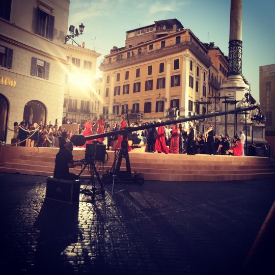
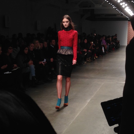
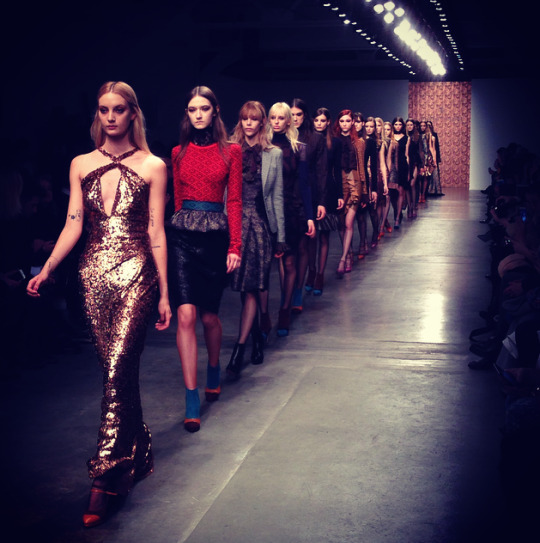
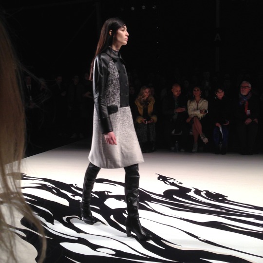
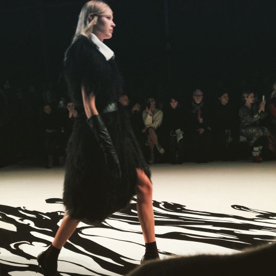
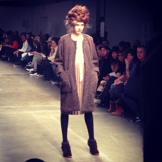
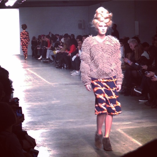
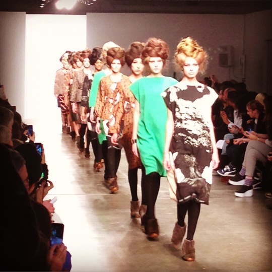
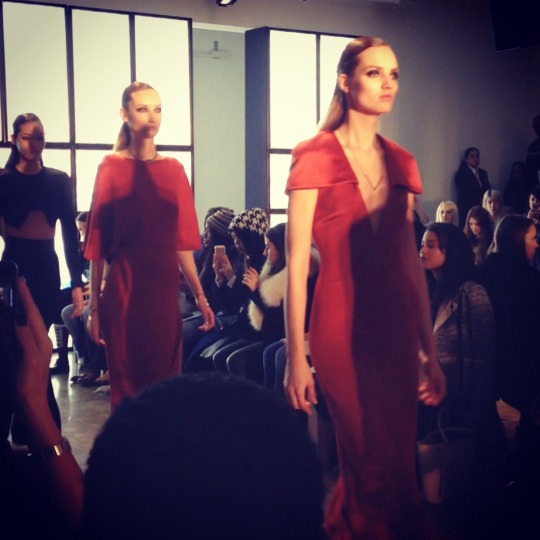
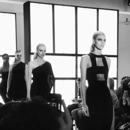
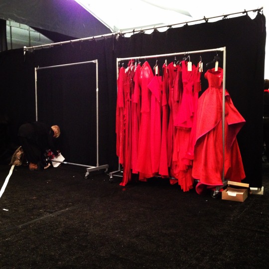
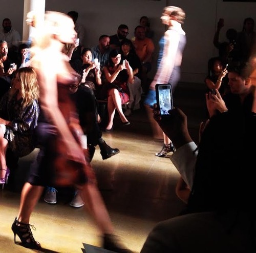
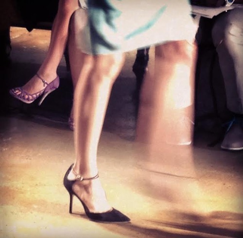
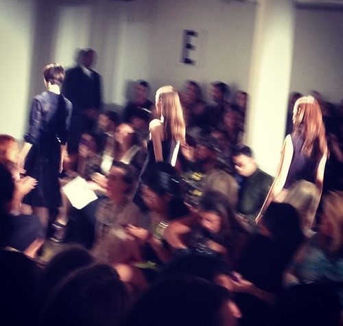
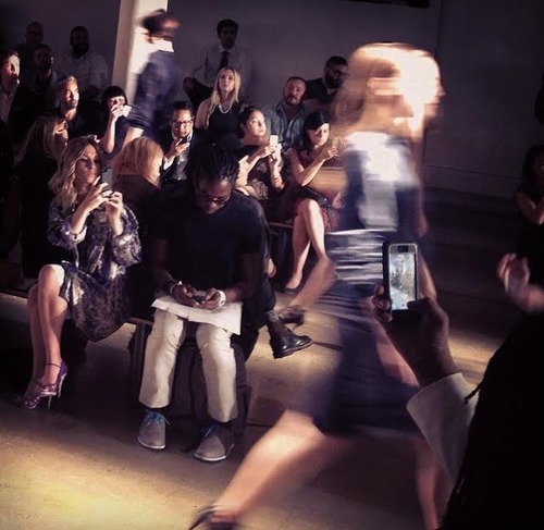
2015 Valentino Fall Haute Couture Rome Runway Show “Mirabilia Romae”
Valentino's haute couture show in Rome was a marvel to witness. Each gown was simply divine. The references of roman influence in fashion were clear. A hint of history was present here, and it was executed beautifully.
My entry to this show was a complete surprise, absolutely no plans were made in advance. I arrived in Rome a few days before the show, assuming that all of the haute couture shows were being in held in Paris at the time. I was distracted by the fact that I was breathing the same air as Sophia Loren until I came across Valentino’s official store and studio. The next thing I knew, I found myself standing in Piazza Mignanelli amongst a body of bloggers and fashion enthusiasts, witnessing the works of an iconic fashion brand. This was my first international fashion show. It was a dream.
Congratulations and Thank you, Valentino.
Maria Grazia Chiuri and Pierpaolo Piccioli are geniuses.
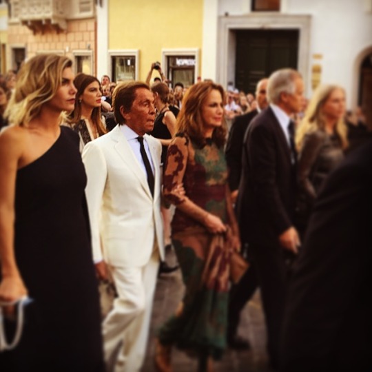
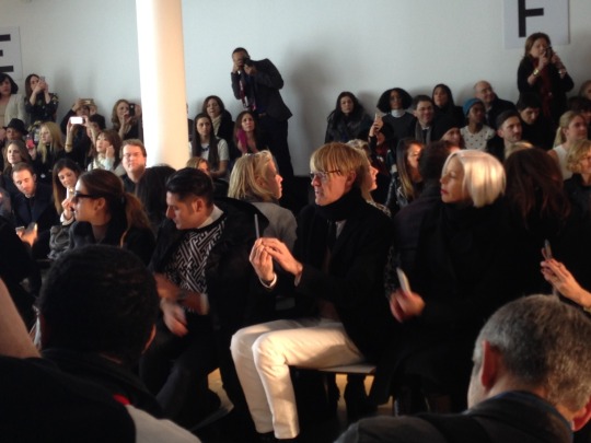
Valentino Garavani strutting through Piazza Mignanelli with his crew, minutes before a breathtaking runway show
From a distance.
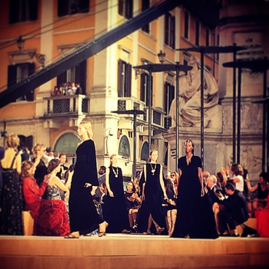
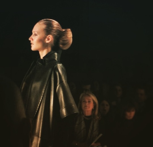
So chic, dressed all in black. Valentino appreciates the simplicity of dressing just as much he stresses detail and embellishment
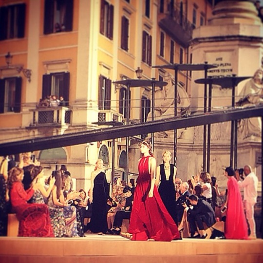
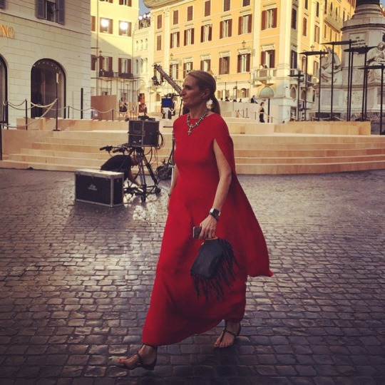
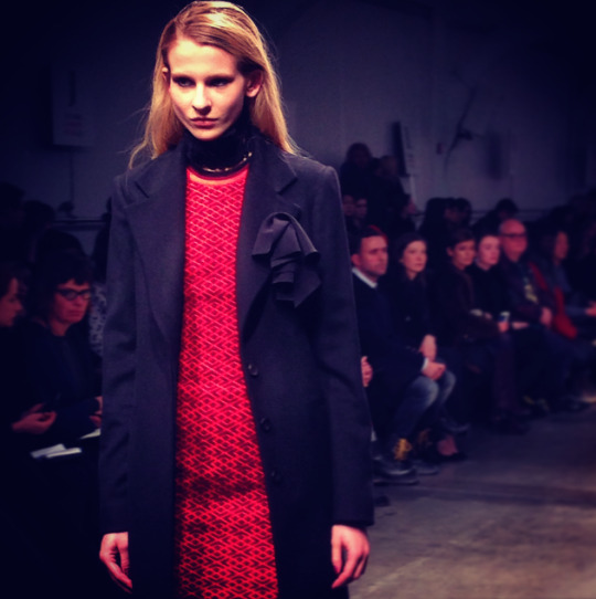
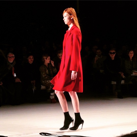
One of Valentino's many elegant guests dressed in a beautiful shade of red
#valentino#garavani#fashion#rome#italy#italianfashion#beautiful#runwayshow#fashion photography#Fashion Week#fashion show#hautecouture#red#fabulous#dresses#gowns
3 notes
·
View notes
Text
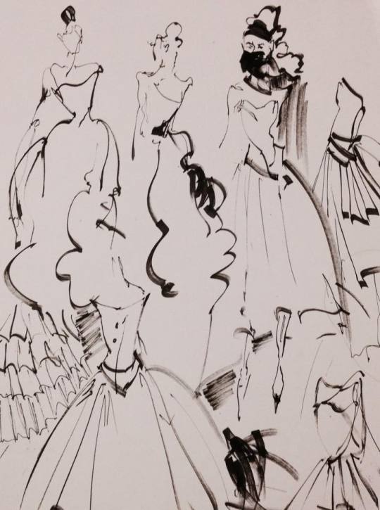
An Alternative Prom
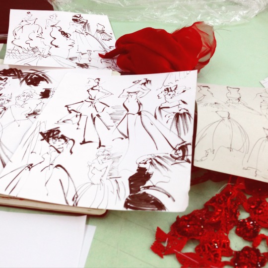
Never in my life have I been obsessed with the concept of Prom, however the event presented me with an opportunity to wear something more extravagant than usual and pretend I was attending some sort of gala. Spending time with dear friends while appearing fabulous is also a plus, of course. I planned to construct my own gown so I did a series of sketches to present to my bosses. I felt utterly grateful that they acknowledged my prom dramas and gave me constructive commentary, including swatches for my fabric shopping journey.
After being sent on a small fashion mission to the Oscar De La Renta headquarters to deliver some materials, I noticed Michael Kors exiting the elevator, and in that moment I was struck with the audacity to ask him to Prom. The interaction may have been too quick and frenzied for Kors to act upon my out of the blue promposal, which later left me questioning whether or not he had even understood what I blurted out at him. He declined in a fashionable manner, speed-walking out of the lobby in sunglasses most likely designed by himself. What a delight it would be if an iconic designer escorted me to Prom. With this is mind, I emailed Issac Mizrahi asking him to Prom. It was meant to be a poem, but the poetic aspect faded towards the end. Embarrassingly I began my “poem” with, “Dear Issac Mizrahi, Unzipped is my heroin.
“The monochrome, grainy feel never fails to give me that nostalgia of classic New York in the 90’s, (Even though I wasn’t even born yet in 94’).” Mizrahi has always been an inspiration of mine, especially because I felt as if I were following his footsteps. We are both alumni of Fiorello LaGuardia High School of Music & Art and Performing Arts. Soon, I will be attending Parsons: The New School for Design, where Mizrahi also attended. I never received a reply in time, but all of this is still quite hilarious. I even asked my wonderful boss to Prom, since he has known me personally for the majority of my life. He is a fashion icon himself.
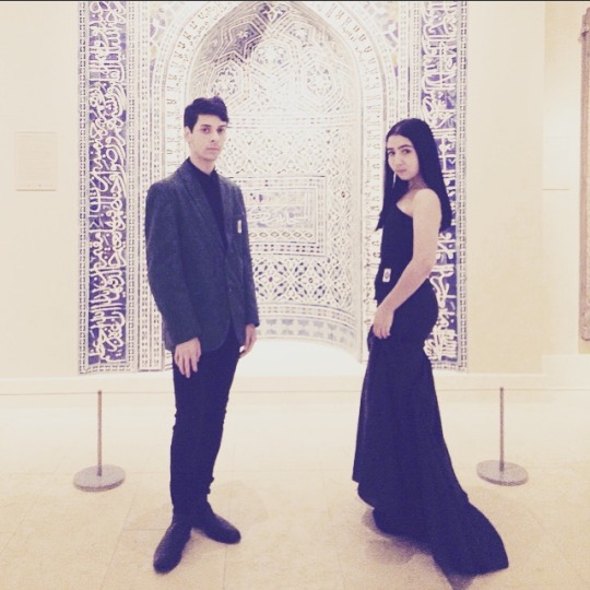
And yet after all of my own anxiety associated with prom details, I did not actually attend formal prom. Instead, I decided to go to the Metropolitan Museum of Art wearing my gown. I included a couple of my close friends in this plan, they dressed up as well. We headed to the Met, roamed around the “China: Looking through the Glass” exhibition, and left at closing time. Fashion, Friends and Fun at the Met. It was a delight.
#prom#prom2015#metropolitan#museum#art#dress#promdress#custom#designer#alternativeprom#blackdress#metropolitanmuseum#metropolitanmuseumofart
1 note
·
View note
Text
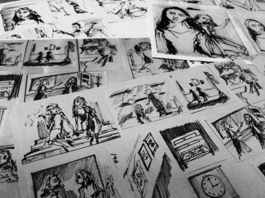
Costumes for Short Films: Take 1
It is June, and instead of channeling my inner high school student with senioritis, I am storyboarding and taking notes. My high efforts now have reminded me of the effort put into a super short silent film I worked on earlier this year. When I say “super short”, I mean it. It was literally a minute and 32 seconds.
This is the reflection I handed in for a grade. The frantic, last-minute attempts of solving grand issues, improvising, seeking alternatives to things, and tackling the freak obstacles of life is so utterly me. I still laugh about this as if I had written it years ago, yet all of this occurred only months ago:
“Weeks before this project had officially been announced, I had already begun brainstorming ideas. I knew I wanted to create a film inspired by artists I have either encountered or read about. Originally, the primary concept of the film was meant to satirize the art and fashion world. I had four main characters in mind which included a painter, a snobby fashion editor, a ditzy assistant, and a fan girl. The personality of the editor in the film was meant to resemble to behavior of iconic fashion editors such as Diana Vreeland, and Anna Wintour. Through this role, the actor portraying the editor would have to imitate Wintour’s passiveness and Vreeland’s dramatic personality. The artist would maintain a phlegmatic countenance, almost like Karl Lagerfeld. The character, “fangirl”, was meant to mock fandoms or obsession. The fan girl would be shown especially during the arrival of any significant character (the artist and fashion editor). The character of the ditzy assistant mocks the concept of having an intern, and how often interns can be mistreated while working. There have been numerous cases of interns being terrified of coming to work because they have become aware that they are in the midst of the brutality of the fashion industry where they are given the most ridiculous tasks.
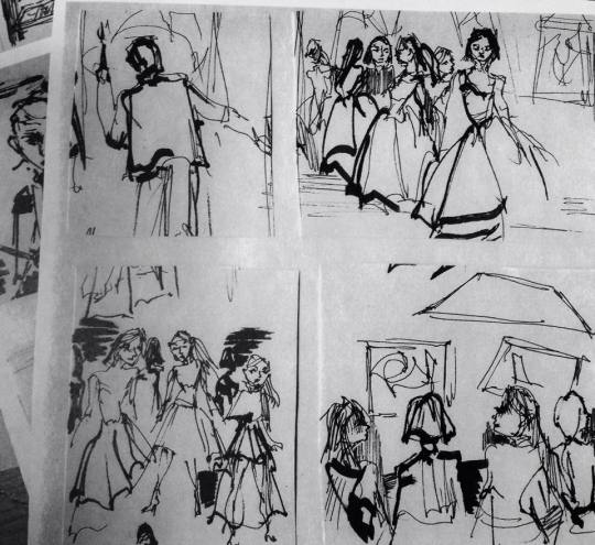
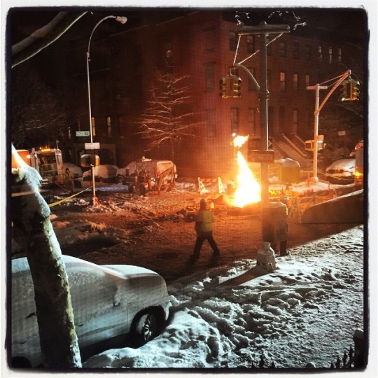
My group and I were able to translate a number of my visions, but not all. My initial ideas were becoming too ambitious to execute, which led us to have to simplify the story in order to clarify the character development and overall storyline. During group discussions, we noticed things in our story boards and scripts that we feared would not be read well. As a group, we felt that the ambiguity of some of the imagery needed to be toned down. For the story to have more character development, I thought about changing the character roles...Aji remained as the artist and I eliminated the role of the fashion editor. India, instead, portrayed the artist’s assistant. I decided that this character would have a desire to become an artist, but is secretive about it because she isn’t too fond of how cruel the art/fashion world can be, and she’s afraid of what everyone would think. Julia remained as the fangirl, but she also played the role of assistant #2. I chose not to appear in the film so that I could focus on directing and filming. Through out the process of filming, my group and I stumbled upon some obstacles. Lack of time, of course, was a major source of our problems in production and filming. Our film relied entirely on a green screen, so we needed a set space to build the set and organize props. Within the 4-5 class periods we were given to film, running up and down the stairs carrying easels, chairs, palettes and paintings stripped us of time and energy. Once all of the materials were gathered and set up, we had to set up the green screen and allow for a couple of the actors to change into costumes. Preparation was time consuming. I was responsible for creating the costumes worn in the film, and I did complete all of them. Of course garment construction requires a decent amount of time, so I gave myself an early start. There was, however, a startling event in which caused a delay. On the night before filming began, all of the power blew out in my neighborhood due to an explosion underground. The salt used to melt snow seeped into the manholes on my street and eroded the wires that connected to the power-lines. Con Edison and the Fire Department were in my house. So with no power to turn on my sewing machine, I had to resort to hand sewing some small details while holding up my iPhone flashlight. This actually did not cause too much of an issue since we were shooting the scenes out of order anyway, although I would have preferred to arrive on set with properly hemmed dresses.
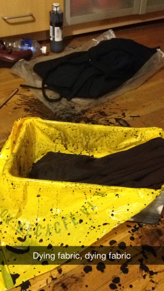
Alterations had to be made to the dress collection as well. I did not feel the need to buy black jersey to construct a couple of dresses since I already owned the same material in turquoise. Although, I soon realized that the turquoise could have conflicted with the green/blue screen effect since it was nearly “sea green”, which resembles a hue of blue. After this realization, I attempted to dye the dresses black with fabric dye in a bath tub. I waited hours for the dresses to dry, only to learn that the dye was too weak, and that I had completely stained the tub with black ink. I reached a great deal of trouble and that day concluded with me being forced to basically bleach the entire bathroom.

Due to timing constraints, we weren't able to capture the ideal footage of the art gallery scene. This issue also correlates with the fact that the green screen paper was not set up properly during some shots. In order to have captured full length shots of the party guests, we would have needed to spread out the green screen, along with applying it to the ground to fit every figure in. Apart from green screen related issues, it became difficult to gather all of the extras in one room at a specific time. We were only able to gather four out of the eight extras we needed for filming. Despite not having all of the extras present, we continued to film. I thought about taking advantage of the green screen by layering shots of the extras in iMovie to create an effect that seemed as if there were many more characters in one shot than there actually were. We attempted to transfer the entire iMovie project to Final Cut pro in order to continue layering the green screen shots, however the editing became too complex so we ended up narrowing it down to whatever we had shot originally. After shooting everything on the script, my group and I realized that our film was quite short. We were very specific with our shot list, and only filmed what we believed was needed. In the end, we did not have any extra footage to experiment with while editing. The process of editing was surprising alright, we actually were able to collaborate despite having to huddle together to face a tiny laptop screen.
Applying the backgrounds to each individual shot was time consuming, but not difficult. The most difficult aspect of finalizing the project was creating smooth transitions with both the shots and the music tracks. In the end though, my group and I never faced any personal issues. We were able to work together smoothly, everyone was prepared and cooperative. Despite having to make some changes due to timing, we utilized our resources and were able to finish what we had begun.”
#englishclass#highschool#nyc#film#filmclass#shortfilm#silentfilm#german expressionism#backgrounds#costumes#costumedesign#groupproject#storyboarding#storyboards#filming
0 notes
Text
Fashion Sustainability inspired Stop-motions
For my A.P Environmental final I sacrificed a couple of days of sleep in order to accomplish my typical, overly complex goals for a project. I delved further into the fashion industry to gather research and footage on sustainability in fast and slow fashion. I essentially made a mini documentary. Student by morning, Documentary Film maker by afternoon, Film editor by evening. As if the balance I maintained between school and fashion wasn't already hectic, I decided to briefly feign a life of documentary-making. In addition to this, I felt the need to beautify the film with stop motions and illustrations.
Out of all of this stop-motions, this one is my favorite in terms of aesthetic and presentation. This was created in reference of how immediacy is so prominent in fast fashion to the point where these brands can copy a design, do a sketch, and have the looks go to production within days to later be sold to the public for alarmingly low prices.
The point of the overall project was to raise awareness of how wasteful the Fashion industry is. Utilizing intelligent design to reduce the social and environmental impact of apparel products will improve the fashion industry drastically, since the regulation of textile waste is becoming more apparent in eco-fashion. From a designer’s point of view, choice of color, print, texture and material should be taken into consideration when developing a collection. Devising new methods of pattern making will prevent the wasting of fabric and materials, and slowing down production will allow products constructed by workers to become longer-lasting and better-functioning, which will eventually lead to a decrease of purchases made in fast fashion stores where quantity is preferred over quality. This will promote smaller fashion brands, especially ones that are responsible in manufacturing and sustainable overall. Teenagers can become more sustainable in fashion though recycling their clothes so that they do not end up in landfills, Buying higher quality clothing that will last longer, attempting to make alterations/ mend ripped clothing instead of getting rid of them, and taking the time to learn where products derive from and whether or not they were ethically produced.
1 note
·
View note
Text
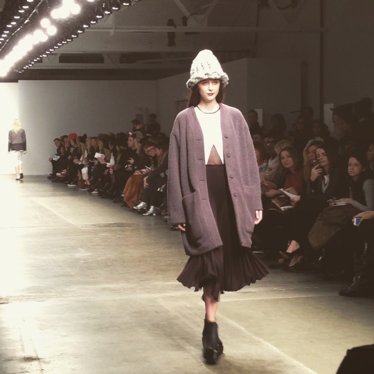
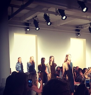
Zang Toi Fall 2015 Runway Show
We are all in agreement that you simply cannot leave Venice without having felt a spark of inspiration, and here Zang Toi delivered his romantic perception of Venice to us. Opening with a Vittorio Grigolo song, a model with a hazelnut suede jacket emerges wearing a long and reflective necklace that appears as a set of large buttons. With a view of the majestic blue-green waters of the Venetian Grand Canal, Zang Toi decided to divert attention to the neutrals of the city. Everything was sleek, smooth and immensely romantic, with long capes, elegant leather jackets, and fur pieces. The touch of minimal jewelry and dark purple lipstick was great, since these additions did not act as distractions. Each look was well balanced and showcased the entirety of the ensemble, as well as representing Toi’s vision of Venice.
Towards the end of the show, bronze, metallic-like looks came down the runway with impressions of the Venetian landscape printed on both faces of the dresses. This led to more of the gazar blended material with shimmery embroidery, as well as the fabulous cashmere tights.
The Finale was to die for. A luxurious taupe gazar cape with the Venetian landscape painted on glided back and forth as the rest of the collection followed in two separate paths. A man with a feathered mask escorted the final look to the front as if he had just asked for a dance. Everything was done with such grace.This show was one of the few where I cried. If I were to fly back to Venice in the Winter, I would be quick to snag one of Toi’s capes. In a sense, I feel as if my invitation to this show was a gift meant for me to gaze upon the beauty of Venice in advance to my arrival in July of this summer. I will be mentally replaying this collection throughout my visit.

#zang toi#fashion#fashion photography#new york fashion week#Fashion Week#fashion show#new york#nyc#nyfw#fall/winter 2015#nyfw fw15#venice#italy
0 notes
Text
Sophie Theallet Fall/Winter 2015
Infused with taste and romance, Sophie Theallet’s Fall 2015 Ready-to-Wear runway show epitomized elegance and beauty. There were clear references to the look of the gypsies, yet Theallet managed to tackle the theme in a sleek manner with ruffles and peplums rendered in leather, beautiful black lace, an assortment of colorful prints, and a touch of brocade. Although Theallet is a French designer who extracts inspiration from her own culture and past, the collection delivered an essence of Spanish flamenco as well. The movement the ruffles created, along with the loose material, lace, and illustrative prints were so utterly Spanish. Either way, I was immensely attracted to the variety of pieces presented throughout. Despite the long trial of feminine silhouettes, there are some notable looks in which highlighted a richness in the tailoring required to execute trousers. The level of sophistication was spot on.
Feel the intensity.

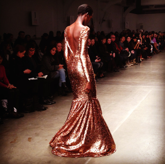
A golden goddess.
#sophie theallet#fashion#fashion photography#new york fashion week#Fashion Week#fashion show#pier59studios#french#frenchdesigners#dresses#ready to wear#color
1 note
·
View note
Text
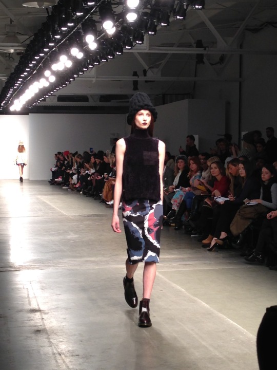
Lie Sangbong Fall/Winter 2015 Runway Show
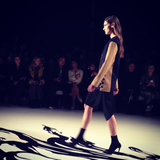
I was drawn to the graphic murals of NYC based artist, Sun K. Kwak, whose illustrations were walked upon in the venue for Lie Sangbong’s Fall/Winter 2015 runway show. The movement of Kwak’s work resonated well with Sangbong’s collection due to the balance of minimalism and audacity in color and shape. Lie Sangbong aimed for solids blocks of color, yet he did not refrain from playing with illustration. The prints were completely appropriate as it did not become an overwhelming factor, nor was it incorporated too often for a collection that was meant to highlight the simplistic aesthetic. The collection was dominated by hues of navy, grey, camel, burgundy and red. As a statement, leather was utilized to transform the ensembles into something more edgy. Overall, this collection managed to combine a variety of design principles without tainting the primary concept.
#liesangbong#fashion#fashion photography#Fashion Week#fashion show#new york fashion week#fashiondesign#illustration#kwak#models#runway#nyc#nyfw fw15#fall/winter 2015
0 notes
Text
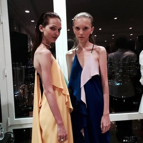
A Détacher Fall 2015 Ready-to-Wear Show
Mona Kowalska’s work here is as intellectually thoughtful as her previous works. The story Kowalska wished to convey was one where the complexities of friendship between women would be highlighted, inspired by the stories of Elena Ferrante, an iconic pseudonymous Italian novelist. Vouge published an article called “Elena Ferrante on the Origins of her Neapolitan Novels” in regards to Ferrante’s work in 2014, revealing her direct words from a supposedly rare interview. “Relationships between women don’t have solid rules like those between men,” says the Italian author Elena Ferrante. “I was interested in recounting how a long friendship between two women could endure and survive in spite of good and bad feelings, dependence and rebellion, mutual support and betrayal.”
There is a fierce quality present throughout the collection, yet it is subtle. Clearly, not all designers require the use of ominous shades in order to give off drama and intensity. While the thick, braided headpieces gave a sense of old, Italian romance, exaggeration was employed. Kowalska evoked modernity while radiating the deep portrait of women’s friendships developed within the stories of Ferrante.
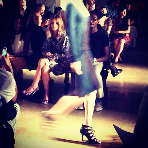
This last photo was taken during the rehearsal show. I must admit that I had forgotten that there would be an actual rehearsal, so the whole time I kept thinking, “Oh dear, did everyone forget the show was today?”
Apart from that, I was disappointed with the clothes. As I sat there appalled by the lack of innovation, I soon noticed guests being directed to their seats and that the real show had not even begun yet. This is what always happens when I arrive too early. I never seem to remember this classic rule of fashion week: Shows never begin on time.
#fashion#fashion photography#new york fashion week#Fashion Week#fashion show#runway#adetacher#thelook#pier59studios#nyc#nyfw#ready to wear
2 notes
·
View notes
Text
Cushnie Et Ochs Fall/Winter 2015 Runway Show
As Usual, Cushnie Et Ochs delivers a chic and refined collection. Straying from the typical cut-out dress from previous seasons, this collection delved further into silhouettes that were crisper, and softly sculpted. There was a sense of weightlessness that was apparent, in which suggests a free-floating environment. This resonated well with the draping and construction done with light materials such as mesh and viscose blends. The strong variety of separates will allow their clientele to play with color and shape combinations.
With such a polished aesthetic that does not refrain from giving off some edge, Cushnie Et Ochs will most definitely expand their clientele and evolve into an even greater brand of this century considering their dominant inspiration of modernity.
Here is Linda Fargo sitting front row!
#fashion#fashion photography#new york fashion week#fashion show#Fashion Week#cushnieetochs#nyc#nyfw#nyfw fw15#chic#milkstudios#runwayshow
1 note
·
View note
Text
Go Red Runway show at Mercedes-Benz Fashion Week 2015
The American Heart Association’s Go Red For Women Red Dress Collection presented by Macy’s during Mercedes-Benz Fashion Week this week, was a well executed event and stands as a reminder to women that they must protect their heart health. The event brought together a variety of high end designers, along with influential celebrities.
I accompanied the Donna Karan design team through out the backstage chaos. Prior to this, I was granted the opportunity of adding on the finishing touches to a dress designed specifically for Orange is the New Black star, Laverne Cox, by fixing the hems of each chiffon layer. With much excitement, I observed the fitting process and was prepared to hand the designers their materials when needed. Being amongst such a talented body of people was gratifying. And just as I thought things could not reach a higher level of awesome, Cox glides away into the lobby. Everyone watched in admiration as the chiffon flowed with her movements. Laverne Cox is fabulous.
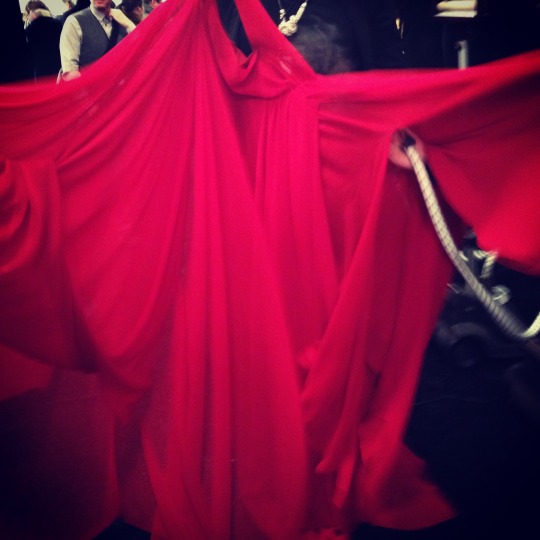
Here is Laverne Cox’s dress being steamed before showtime!
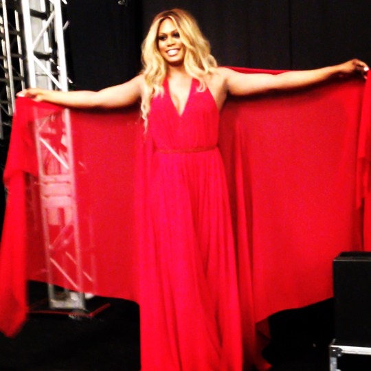
Laverne Cox looking gorgeous backstage, wearing Donna Karan.
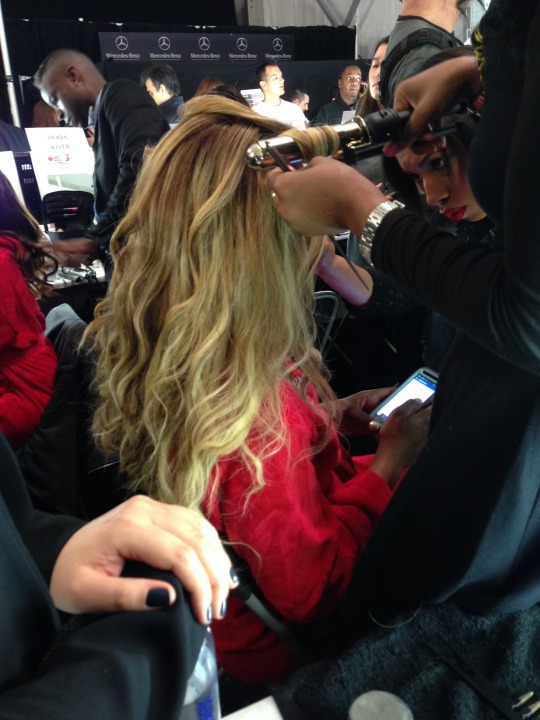
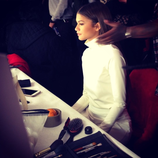
I captured this image of Zendaya Coleman getting her hair done backstage at the Go Red show. The fabulousness never ends.
#fashion#Fashion Week#fashion show#new york fashion week#gored#american heart association#women#dresses#Donna Karan#Donna Karan Atelier#laverne cox#fabulous#zendaya
2 notes
·
View notes
Text
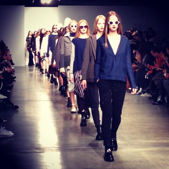
Timo Weiland Fall 2015 Ready-to-Wear Show
After being granted an all access pass to Pier 59 Studios during fashion week by a dear friend, I headed straight to the Timo Weiland Fall 2015 Ready-to-Wear show. This was the first show I attended at Pier 59 Studios, and the first show I attended to kick off my fashion week experience.
The collection was filled with ease, meaning that the simplicity of it all fell into a look that actually represents the desire of effortlessly chic apparel in which many strive for. With the chunky hats and oversized sweaters, the collection was given a touch of “tomboy”, without being too forced. The contradiction between the loose, off-the-shoulder, causal pieces and the more feminine and refined pieces felt natural. There was a sense of layering that was enticing and the color palette was very sophisticated.
The use of prints complimented the overall looks. Not at all distracting, or too “busy” for ready-to-wear.
0 notes
Text
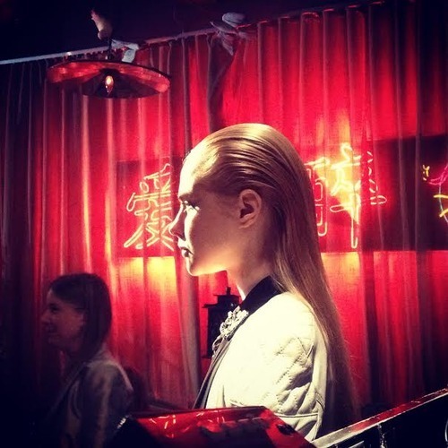
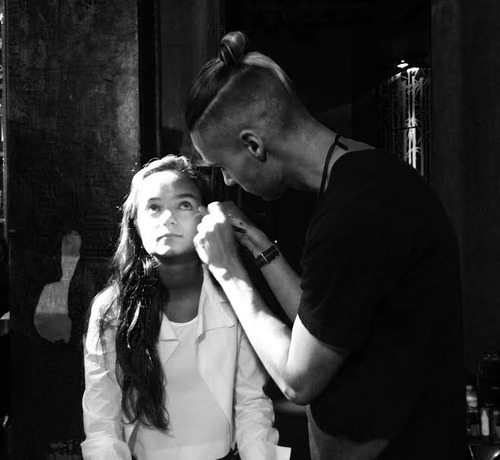
Backstage at Valentina Kova Fashion Presentation Spring/Summer 2015 Collection
Upon entering the dressing room at the Mondrian Soho hotel where Valentina Kova's presentation was held, I was dazzled by racks of neoprene and bits of white lace. The audacious spectrum of color alone suggested great character. Little by little, the dressing room became crowded of stylists, models, photographers, makeup artists, and interns such as myself.

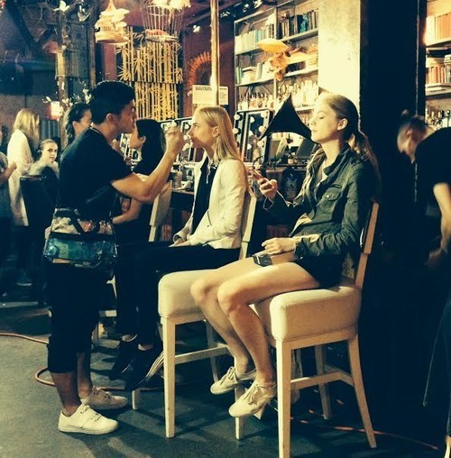
I assisted with small tasks as usual, until I received a set assignment of my own for the rest of the night. I took charge of the social media of the fourteen year old DJ and model, Callie Reiff. I documented the process, along with the preparations for her work. Here are some shots of Callie getting her makeup done by makeup artist, Brian Dean. The palette was quite soft and natural. Callie's lashes were accentuated with a lash brush, and was given a light pink shade for her lips.

Callie DJ'd during the show, following into the after party as well. The event took place on the rooftop of the Mondrian Soho Hotel, providing guests with a view of both gorgeous clothing, and the New York City landscape as night fell. Callie wore a Valentina Kova neoprene, monochrome one-piece as she DJ'd. It was edgy, perfect for the vibe of the overall presentation.

Kova's spring/summer collection consisted of jackets, trenches, and swimwear done is fresh colors. Within the femininity of some of the silhouettes, there is an easy-going strength which easily comes forth. The looks were edgy, and easy to wear. Kova's first ever fashion presentation attracted a vast group of fashionistas from around the country, the vibe of the presentation was very chic.

Bonus for any "Orange is the New Black" fans...Laverne Cox made an appearance, she illuminated the venue with her presence. Here is a glimpse of Cox getting hair and makeup done, she is fabulous.

2 notes
·
View notes
Text
Costello Tagliapietra Spring/Summer 2015 Collection
Complementary colors, Modern shapes, and delineating seams were the highlight of the Ready-To-Wear Costello Tagliapietra show at Milk Studios. The clothes were effortlessly chic due to their cuts and folds, the detailing was beautifully done. There was definitely a romance to the collection, especially with the fluidity of some of the fabrics. The inclusion of the linear and nearly serpentine patterns corresponded to the attention paid to the seam work. During the show, I focused on the movement of the fast paced figures. The lens of the iphone camera to insensitive to the intense lighting of the runways, however the motion of the show was captured. The blend of hues within the color palette was fabulous, I especially loved the use of Lapis Lazuli blue with a deep ruby purple. This collection frames shape well with it's meticulousness in line work, enhancing the overall silhouette of a figure.
#new york#new york fashion week#nyfw#nyfw ss15#Fashion Week#fashion#fashion show#runway#costello tagliapietra
1 note
·
View note
Text
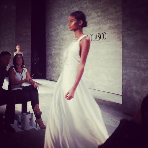
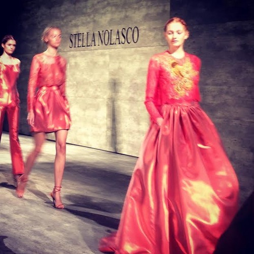
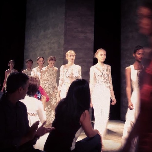
Stella Nolasco Spring/Summer 2015 Collection
Stella Nolasco's spring/summer 2015 collection held at the Pavillion at Mercedes-Benz Fashion week clearly illustrated the romanticism of her Puerto Rican culture. The Spanish, Azure mist, Celestial, and silver lake blues referenced the natural coloring of Caribbean waters, along with Yellows and Oranges to highlight flamboyancy. The collection consisted of lace, metallic materials, sequins, A-line silhouettes, and backless pieces. In terms of editing and styling, the hair and makeup choices corresponded to the overall collection. The flow of the show was simply gorgeous, moving with such fluidity.
0 notes
Text
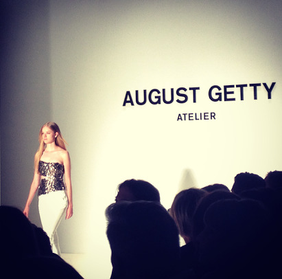
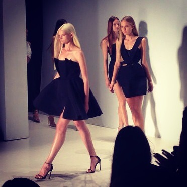
August Getty Atelier Show at Mercedes-Benz Fashion Week 2014
For August Getty’s first Mercedes-Benz runway show, all elements of a show came to fruition. The salon at the tents was the perfect space for the atelier show, and the front row was occupied by VIP’s such as Shaun Ross, Callie Reiff, and Whoopi Goldberg. The collection was filled with fabulously modern shapes, with a sophisticated color palette. The show ended with Getty taking a quick selfie on the runway, giving the venue a little spark of humor and spirit.
0 notes
Text
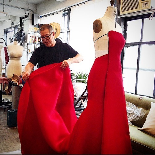
Preparations for the VMA's
Rarely is there a period within a year where designers and stylists are not frantically organizing dress fittings and whatnot. We would convince our minds to believe that we were clear of anything too significant to worry about, until the Emmys and VMA's began approaching rapidly. Oh, and how could I forget New York fashion week which begins in September.
Despite the over-lapping of new systems, fashion concepts, and plans, the cyclic flow of the industry cannot be disturbed. The complex interweaving of design processes can be displayed through the relationships between designers, stylists, clients and pattern makers. Generally, the original design of a garment translates to a set fabric and color scheme. However, works in progress are extremely prone to change, whether or not they are drastic.
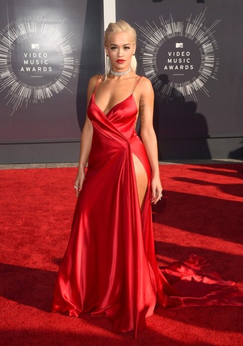
I was able to witness the early stages of Rita Ora's dress for the VMA's. Originally, it was going to be a strapless gown with a gorgeous train in the back, all done in organza. However, the design transformed after Ora's dress fittings. According to style magazines, Donna Karan's atelier dress for Ora was one of the best of the night. The audacity of the red suited her well.
0 notes
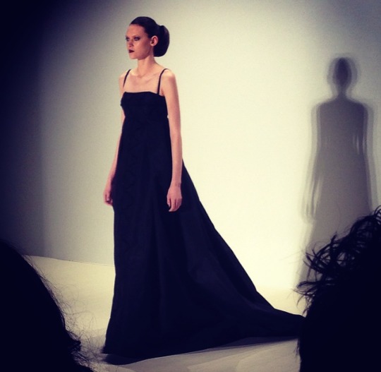
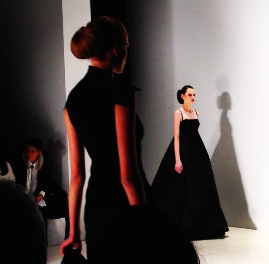
Text
The little black dress: A woman's uniform
Black was once deemed to be the color of mourning, and was not considered a color of fashion. Color, as in historical societies, associated color with status. However, the color of black swept through history. Coco Chanel carefully removed class values from color and clothing, focusing on elegance and the simplicity of a woman. In 1926, Chanel published a little black dress in American Vogue. Black became a uniform. Black, sleek and simple, the little black dress and it’s concept will never perish.
Think of the 1960’s when the lovely Audrey Hepburn dazzled us in “Breakfast at Tiffany’s” (A must film). During the earlier scenes, What did she our Holly Golightly do? She put on her little black dress, and headed to Tiffany’s. Simplicity, and a healthy dose of elegance. The concept of “The little black dress”, is intellectual and abstract. What, did you think the little black dress was a simple clothing item? The little black dress is a statement, any one may wear it any way.

0 notes