Archive of past classes here. While on the archive page you can hover over individual images to see the tags. These tags will identify the individual class meeting each post relates to.
Don't wanna be here? Send us removal request.
Statistics
We looked inside some of the posts by theoriesanddocuments and here's what we found interesting.
Average Info
Notes Per Post
21
Likes Per Post
8
Reblog Per Post
13
Reply Per Post
0
Time Between Posts
21 seconds
Number of Posts By Type
Photo
12
Text
5
Last Seen Tumblr Blogs


Fun Fact
The average Tumblr user visits about 67 pages every month.
Photo

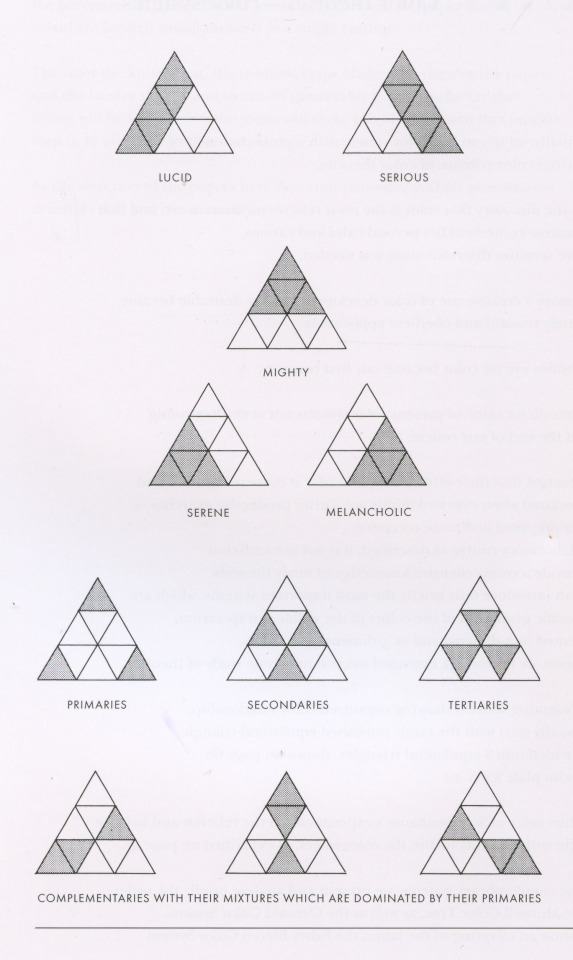
Interaction of Color, Folder XXIV:1 “Color theories—color systems.” The Equilateral Triangle. By Barry Schactman and/or Rackstraw Downes (the credit is unclear in my copy of the complete Interaction of Color).
In Chapter XXIV, Albers reminds us once again of his preference for practice over theory, and states that, in general, color systems are of limited use to the artist. This is why he places only a brief description of a few of them at the very end of the book. He takes a moment to explain the equilateral triangle illustration, above, which is referred to as the “Goethe Triangle” in some editions of Interaction of Color and elsewhere. This illustration reorganizes the information contained in the more traditional color wheel, placing the primaries at the corners, secondaries in the middle of each side, and tertiaries nested in between. He also presents a diagram assigning moods or psychological states to groups of colors within the triangle, which seems to relate to Goethe’s matching of individual colors to specific temperaments.
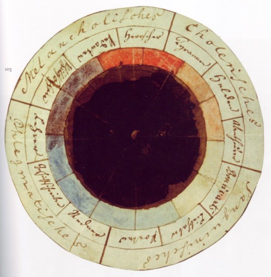
Bottom: “The Temperament Rose” by Johann Wolfgang von Goethe (German 1749-1832) and Friedrich Schiller (German 1759-1805). One can find lots of images of color wheels credited to Goethe; I have no reason to believe he didn’t design the triangle shown in Interaction of Color, but I haven’t been able to find the source.
3 notes
·
View notes
Photo
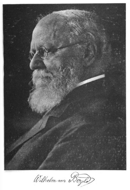
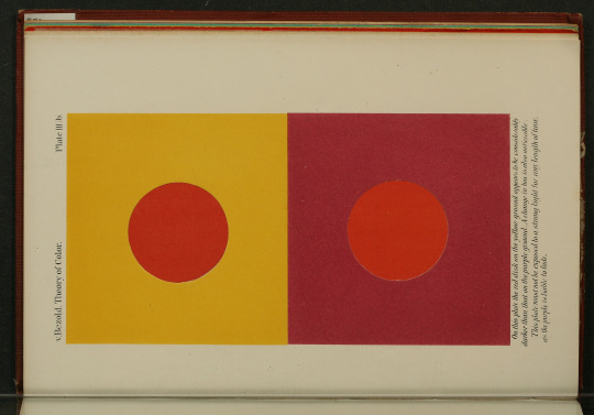

Johann Friedrich Wilhelm von Bezold (German 1837-1907). Photograph by Rudolf Dührkoop. Along with those of M.E. Chevreul, Bezold’s studies of the industrial and aesthetic applications of color had an impact on the community of artists. Many of the illustrations in his Theory of Color will look familiar to anyone who has made color studies based on problems given in Interaction of Color. The next few posts will trace the short path from Bezold to Albers.
The Theory of Color in its Relation to Art and Art-Industry 1876. Color plate III b, center, and plate VI, bottom. You can view and download PDF copies of this book at archive.org.
4 notes
·
View notes
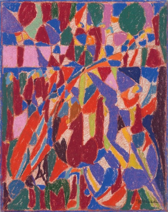
Photo
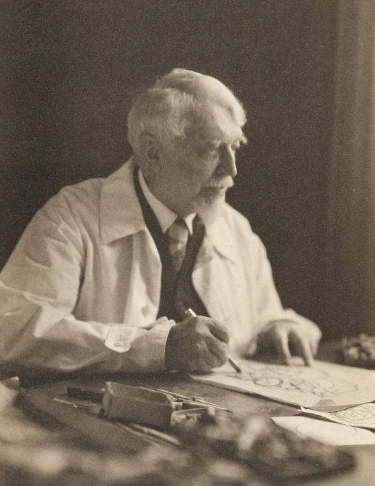
Adolf Hölzel (German 1853-1934). Source. Hölzel was a painter and teacher. His reading Johann Friedrich Wilhelm von Bezold’s Theory of Color inspired both his art practice and teaching. He taught Johannes Itten, who was Albers’ teacher at the Bauhaus.
Zirkusszene (Circus scene). Pastel on firm vellum, 12 ½ x 9 ¾ inches. Source. Hölzel’s early work was very typical of German 19th century painting, but he switched to a more abstract type of imagery after the birth of Modernist art in the early 20th century.
2 notes
·
View notes
Photo

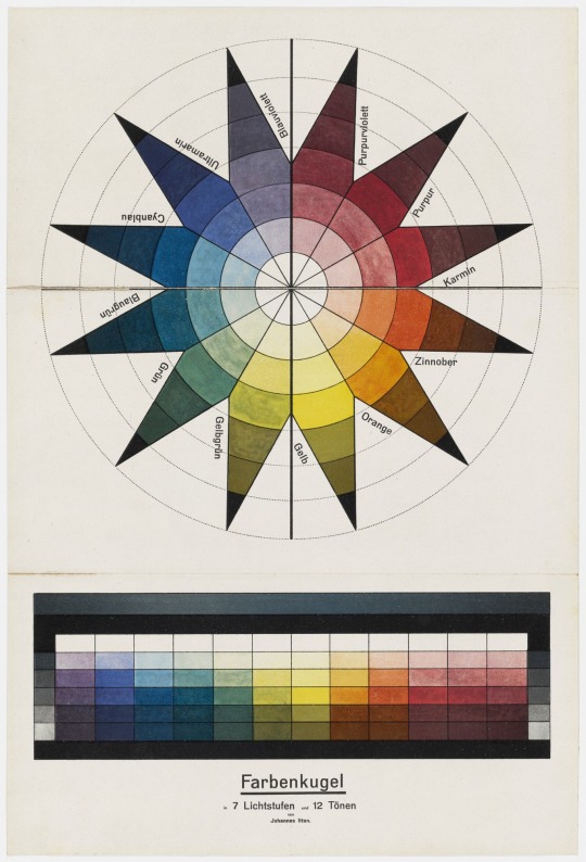
Johannes Itten (Swiss 1888-1967) in 1921. Photo by Paula Stockmar. Itten was a student of Adolf Hölzel who became one of the founders of the Bauhaus. He was also Albers’ teacher. His own color course resulted in the books The Art of Color and The Elements of Color (PDF here); Albers borrowed certain ideas from Itten, including the use of colored paper collage instead of paint, but he challenges Itten’s ideas elsewhere in Interaction of Color.
Color Sphere in 7 Light Values and 12 Tones 1921. Lithograph on paper, 18 5/8 x 12 9/16. Museum of Modern Art, New York. This sphere–imagine cutting out he star shape and wrapping the points around a ball until they meet again at the bottom–is one of several systems intended to visualize the spectrum of colors, in tints and shades from light to dark, inhabiting three-dimensional space. It is related to a similar sphere designed by German painter Philipp Otto Runge.
Space Composition, I 1944. Oil on canvas, 25 5/8 x 19 ¾ inches. Museum of Modern Art, New York.
3 notes
·
View notes
Photo
The next few posts explore the the remarkably varied work produced by artists who studied under Albers. There are a few famous names, and I tried to include work by people whose studies appeared in the Interaction of Color portfolio. I paid particular attention to artists involved with issues pertaining to perception, and those who explore materials in a creative, innovative manner–both of which are hallmarks of Albers’ own work and teaching.
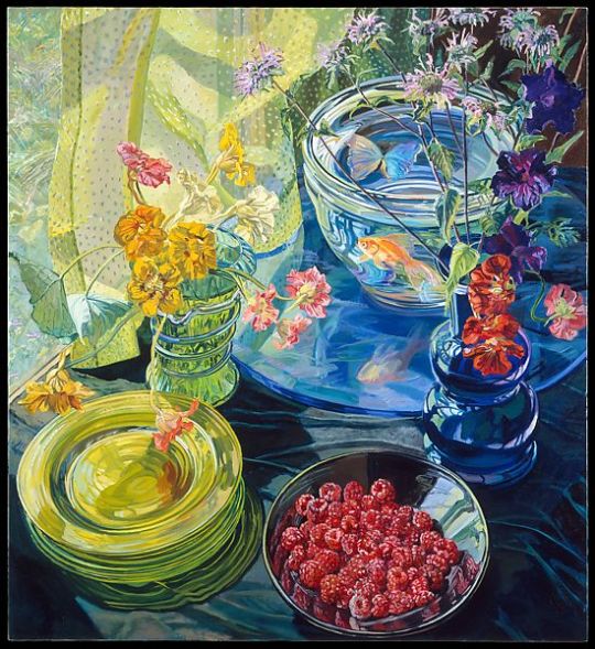
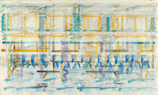
Janet Fish (American b. 1938). Raspberries and Goldfish 1981. Oil on linen with acrylic gesso ground, 72 x 64 inches. Metropolitan Museum of Art, New York.
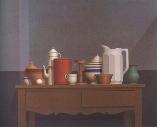
William Bailey (American b. 1930). Still Life Noto 1986. Oil on canvas, 40 x 50 inches. Private collection. Source: Strand, Mark. William Bailey. New York: Harry N. Abrams, Inc., 1987. Page 47.
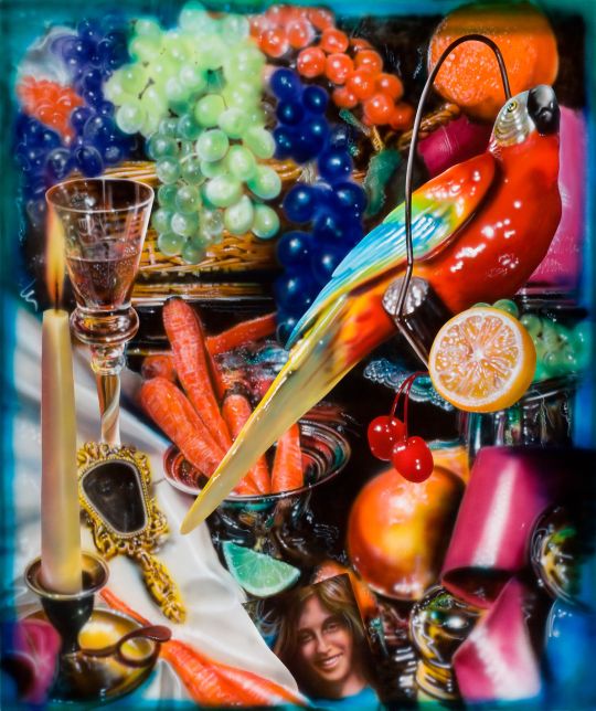
Audrey Flack (American b. 1931). Bounty 1978. Oil and acrylic paint on canvas, 80 ¼ x 67 ¼ inches. Reynolda House Museum of American Art, Winston-Salem, N.C.
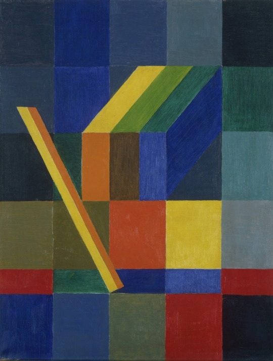
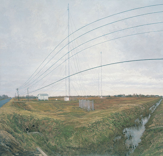
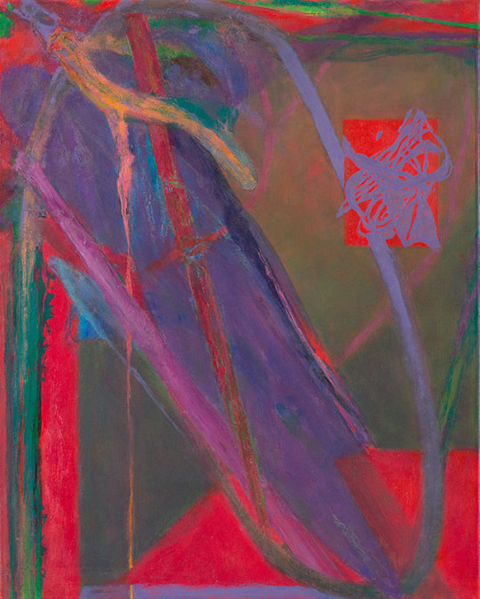
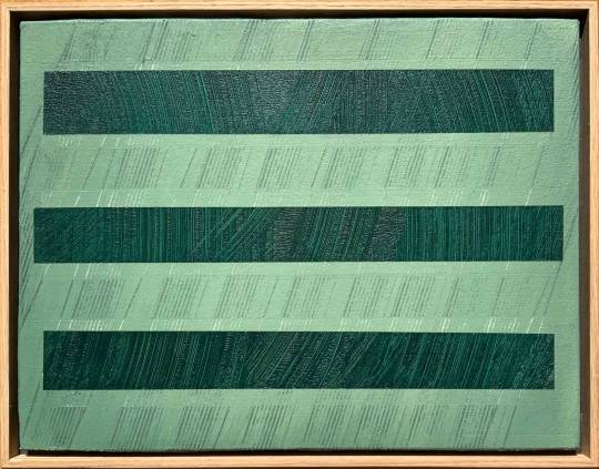
Rackstraw Downes (American, born England 1939). At the Confluence of Two Ditches Bordering a Field with Four Radio Towers 1995. Oil on canvas, 46 x 48 inches. Private Collection. Source.
Albers, the uncompromising modernist, taught several artists who became known for their contributions to various realist painting movements of the second half of the 20th century. We looked at one of Fish’s color studies in class; her still life oil paintings, watercolors, and pastels are chromatically intense. Flack started out as an Abstract Expressionist but became known for works that added a feminist perspective to the 1970s Photorealist tendency. Bailey is a classicist and Downes deals in perception, incorporating visual distortions to mimic the process of seeing. Incidentally, Downes states that he didn’t study directly under Albers, as Albers had retired shortly before his arrival at Yale; however, he learned from various teachers who’d studied with Albers, and his studies appear in Interaction of Color.
2 notes
·
View notes
Text
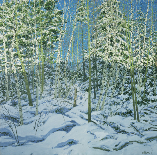
Neil Welliver (American 1929-2005). Shadow 1977. Oil on canvas, 96 x 96 inches. Museum of Modern Art, New York.
Welliver was taught by Albers, and later became Rackstraw Downes teacher. This remarkable painting happens to contain elements of Interaction of Color problems we worked on, most especially "XIV: Color intervals and transformation" and "XVII: Film color and volume color."
0 notes
Photo
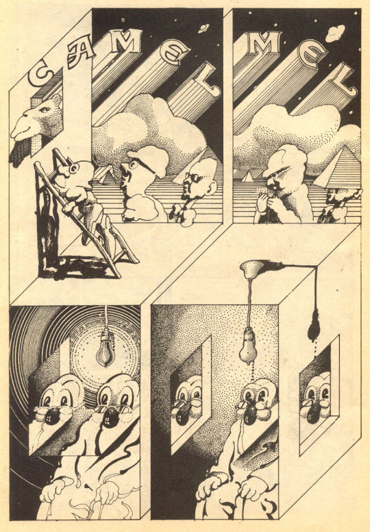
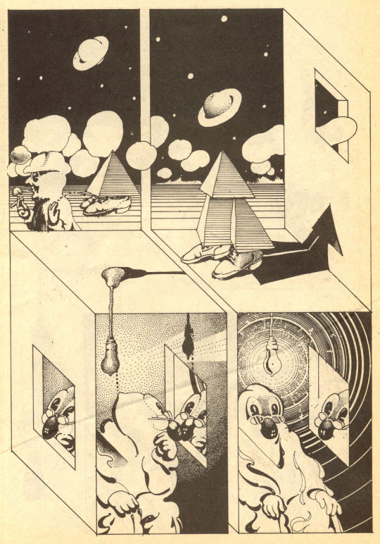
Victor Moscoso (American, born Spain, 1936). Two pages from Zap Comix #3, Fall 1968. Source.
Last week we looked at one of Moscoso’s vibrant (and vibrating) Bay Area rock concert posters from the late 1960s; here are pages from one of the underground comic books he contributed to. This is another example of how Albers’ influence extended well beyond his own particular area of endeavor. I am also reminded of the internal contradictions in some of Albers’ geometric line drawings. Fair warning to those who might be interested in seeing more of this work: Zap Comix has been the subject of multiple obscenity trials; much of the content is, shall we say, not for the faint of heart.
Moscoso talks a little about his experiences with Albers in this 2015 interview in Paris Review.
1 note
·
View note
Photo
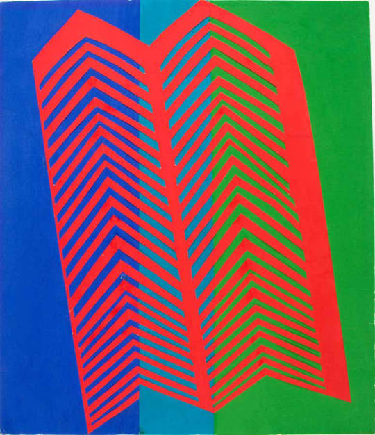
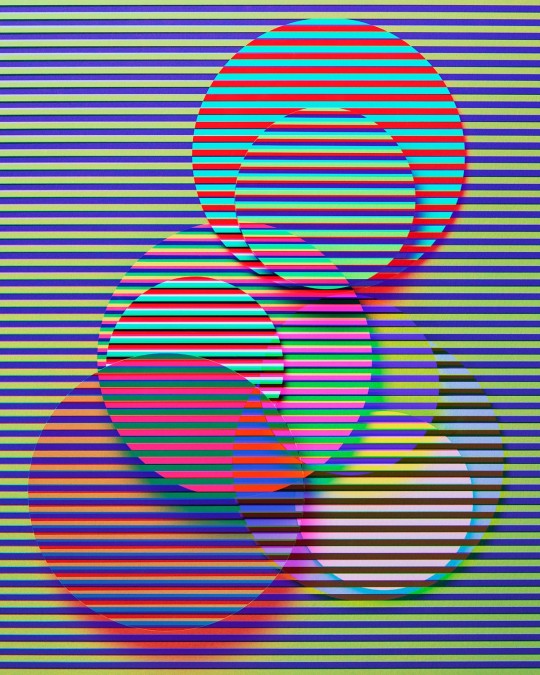
Albers did not consider himself to be an Op artist, but his interest in perception made him a formative influence on the movement, and a handful of Op practitioners studied with him. Both Stanczak and Anuszkiewicz produced works that could be seen as especially ambitious responses to some of the problems given in Interaction of Color.
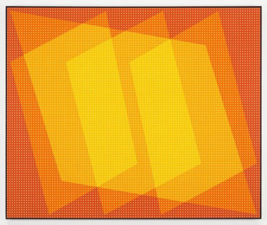
Julian Stanczak (American, born Poland 1928-2017). Formation 1973. Acrylic on canvas, 50 x 60 inches. Source.
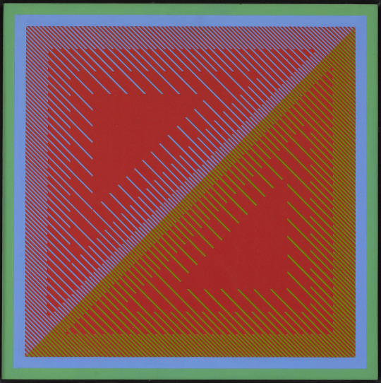
Richard Anuszkiewicz (American b. 1930). Untitled II 1968. Acrylic on panel, 16 5/8 x 16 5/8 inches. Source.
1 note
·
View note
Text
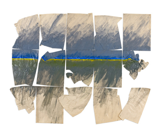
Susan Weil (American b. 1930). Wind’s Havoc 1974. Acrylic on paper, 72 x 89 3/4 inches. Source.
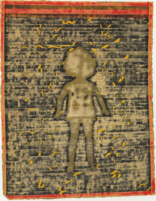
Ray Johnson (American 1927-1995). Shirley Temple 1958. Mixed media collage on board. Private collection. Source.
Both Weil and Johnson studied with Albers at Black Mountain College. They're equally difficult to categorize as artists, taking a free approach to materials and concepts. Weil collaborated with her friend Robert Rauschenberg while at Black Mountain College, creating a series of figurative photograms; her later work is sometimes abstract, sometimes figurative, conceptual, and frequently incorporates photographic processes. Johnson was a collagist who was particularly known for his use of the postal service to distribute works of art, forming collaborations with the recipients. Both artists were associated with a veritable who's who of mid- to late-twentieth century New York artists.
0 notes
Photo
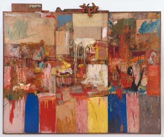
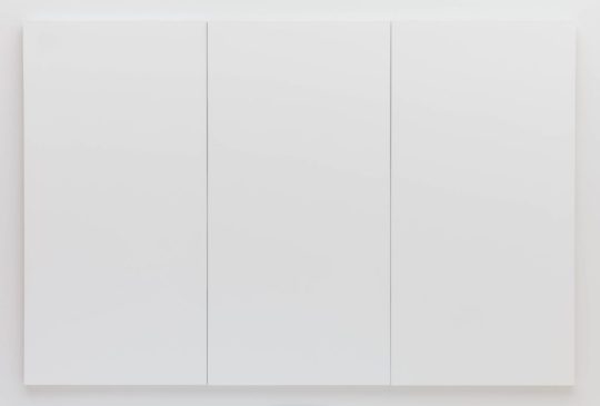
Robert Rauschenberg (American 1925-2008). Rauschenberg became one of Albers’ most famous former students; to hear Rauschenberg tell it, he may also have been one the worst students Albers ever had. However, his independent nature and lifelong interest in unusual, often discarded materials could have been inspired by his studies with Albers, who encouraged his students to experiment with whatever happened to be close at hand in what he called matière studies.
The early white paintings were a different response to Albers teaching. Unwilling to impose his will on color the way Albers would have had him do, he made a series of entirely white paintings that were intended to reflect the changing light and colors in the environment around them. Composer John Cage memorably referred to them as “airports for lights, shadows, and particles,” and his silent piece 4′33″ was indebted to their example.
Collection 1954-55. Oil, paper, fabric, wood, and metal on canvas; 80 x 96 inches. San Francisco Museum of Modern Art, San Francisco, California.
White Painting [three panel] 1951. Latex paint on canvas, 72 x 108 inches. San Francisco Museum of Modern Art, San Francisco, California.
1 note
·
View note
Text
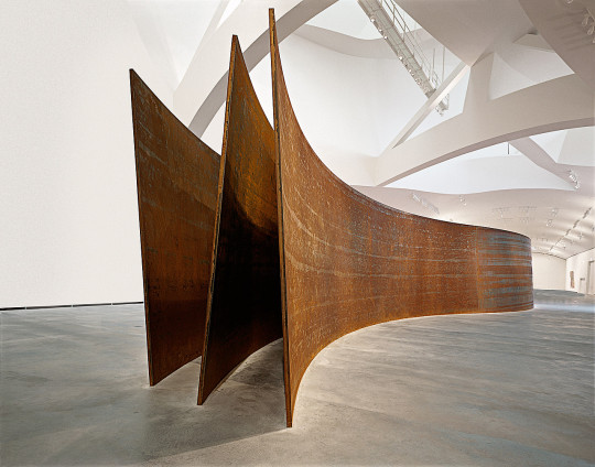
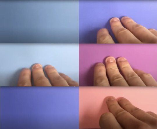
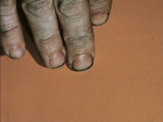
Richard Serra (American 1938-2024). Serra's massive steel sculptural works are well known, so it might come as a surprise to learn that he studied painting, and not sculpture, at Yale. He took the color class from Albers, and later made a short film consisting a single, tight shot of the top surface of a stack of Color-aid paper, with his own hand entering the frame at regular intervals, pulling the top sheet away to reveal the color of the sheet below. Having spent weeks working with pristine sheets of unblemished Color-aid, you might have the same uncomfortable response I do upon seeing the grubbiness of Serra's fingertips in the bottom image.
Snake 1994-1997. Weathering steel, three parts; 13 feet 2 inches x 104 feet x 22 feet 4 1/2 inches. Guggenheim Bilbao, Spain.
Color Aid 1970-71. 16mm color film with sound, 36 minutes. Whitney Museum of American Art, New York.
0 notes
Photo
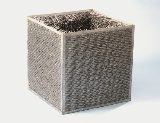
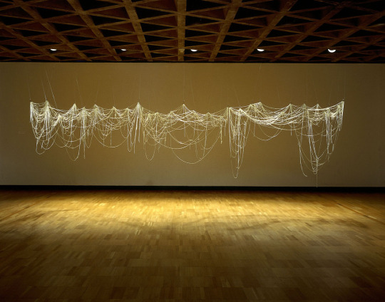
Eva Hesse (American, born Germany 1936-1970). Hesse’s reputation as an innovative sculptor has grown in the decades following her early death. One of her leaf studies appeared on the back cover of an earlier edition of Interaction of Color for decades, and we examined one of her untitled target gradients a few weeks ago; here are two sculptural works made using industrial materials.
Accession II 1969. Galvanized steel and vinyl, 30 ¾ x 30 ¾ inches. Detroit Institute of Arts, Detroit, Michigan.
Right After 1969. Fiberglass, approximately 5 x 18 x 4 feet. Milwaukee Art Museum, Milwaukee, Wisconsin. Source.
1 note
·
View note
Photo
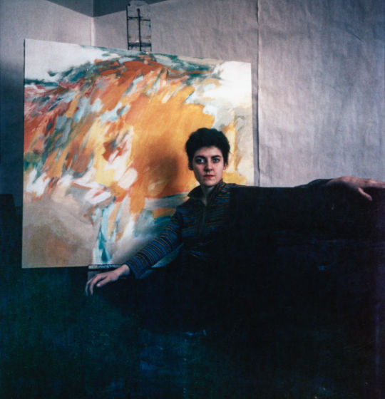
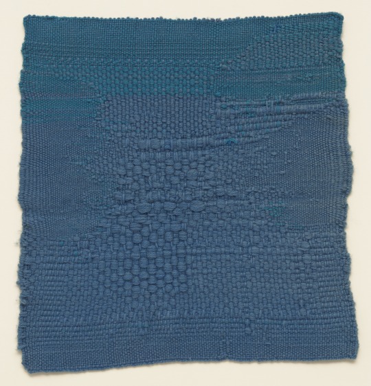
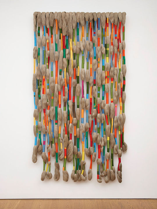
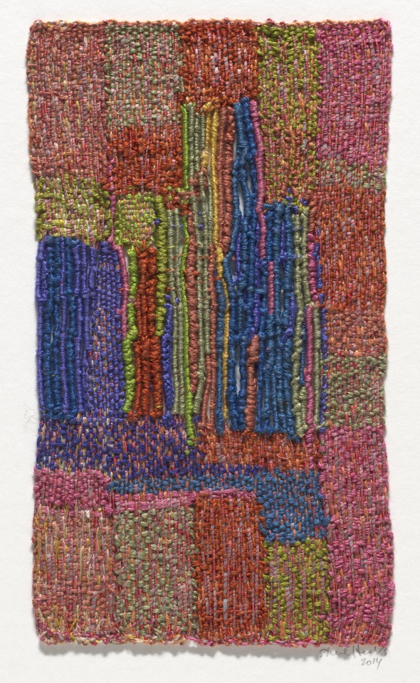
Sheila Hicks (American, lives in Paris, b. 1934). Hicks was a painter at Yale. Noting that some of her paintings seemed to evoke aspects of the weaving process, Albers suggested she meet his wife Anni. This meeting inspired Hicks to fully immerse herself in textiles as a sculptural and coloristic medium. She studied indigenous textiles in Mexico and South America, possibly following the Albers’ mutual interest Latin American arts and crafts.
Sheila Hicks, with a painting, at Yale Art School, 1958. Photo by Ernest Boyer. Source.
Blue Letter 1959. Hand-woven wool, 17 ¾ x 17 inches. Museum of Modern Art, New York.
Full Regalia 2007. Natural linen, triple-dyed embroidery cotton; 96 x 54 x 5 inches. Source.
Minime 2014. Linen and silk, 9 ½ x 5 ½ inches. Museum of Modern Art, New York.
1 note
·
View note
Photo
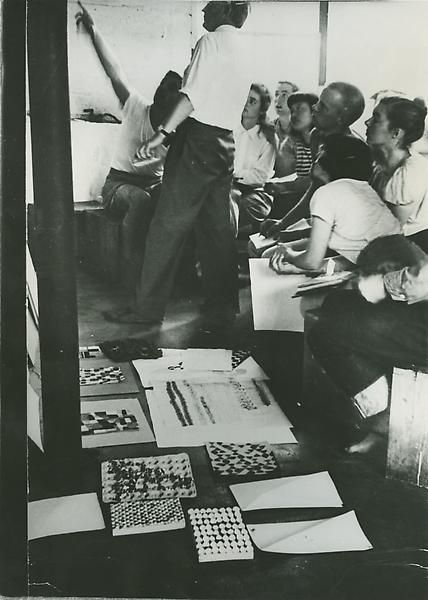


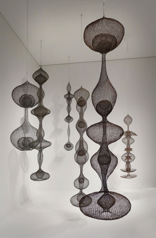
Ruth Asawa (American 1926-2013). Many elements of Asawa’s unique output might be traced back to her early experience with Albers at Black Mountain College, particularly her exploratory use of unusual materials. Here we see an example of her student work (possibly a response to the “Vibration” problem), an early black-and-white work anticipating Op Art, and two images of her signature sculptural works in wire.
The first image shows Asawa as a student, sitting next to Ray Johnson, an artist who became known for his use of the postal service in the creation and distribution of his work.
Ray Johnson, Ruth Asawa and other students in Josef Albers’ class at Black Mountain College, ca. 1945-46. Photo by Josef Breitenbach. Source.
Untitled (BMC.126, Study in Primary Colors) c. 1946-49. Paper collage, 13 ½ x 11 ½ inches. Harvard Art Museums/Busch-Reisinger Museum, Cambridge, Massachusetts. Given to Harvard by Josef Albers in 1949.
Untitled (SF.003, Undulating Parallelograms) circa 1951-52. Ink and gouache on board, 27 x 27 inches. Source.
Untitled (S.407) 1952. Crocheted copper wire, 54 x 15 ½ x 15 ½ inches. Source.
Installation of Asawa’s work in the 2016 Berkeley Art Museum and Pacific Film Archive exhibition Architecture of Life. Photo: Laurence Cuneo. Source.
1 note
·
View note
Text
Charles Emerson (American b. 1935). Emerson arrived at Yale around the time Albers retired, but he studied under his associates and attended critiques led by Albers. Some of you have probably met him or heard him lecture; he speaks eloquently on the subject of color in art, and continues to make chromatically rich, adventurous abstract paintings.
Leaving the Valley 2004. Oil on canvas, 24 x 36 inches. Source.
Angels at Twilight 2022. Oil on canvas, 10 x 10 inches. Source.
Growing Wings on the Way Down 2017. 24 x 30 inches. Source.
0 notes
Text
Vincent Castagnacci (American, born Italy, 1939). Professor Castagnacci studied at Yale in the 1960s, shortly after Albers' retirement. I took his color and drawing classes, which were largely based on Albers' teaching, as well as that of Albers' colleague Bernard Chaet. Both classes were formative experiences for me as a young artist.
Reflections at Howie’s Quarry 1979. Oil on cotton, 9 x 15 inches.
20.VII-3.VIII.12 2012. Charcoal pencil, chalk, and graphite pencil on paper; 22 1/2 x 30 inches.
Autumn Piece #13 4.1.13. 2013. Oil on cotton, 17 1/2 x 22 3/4 inches.
6.I-11.I.18 #2 2018. Acrylic on cotton, 14 1/2 x 18 inches.
0 notes
Photo
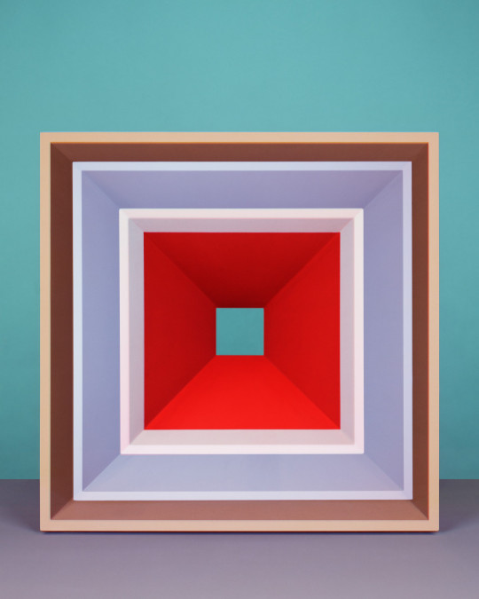
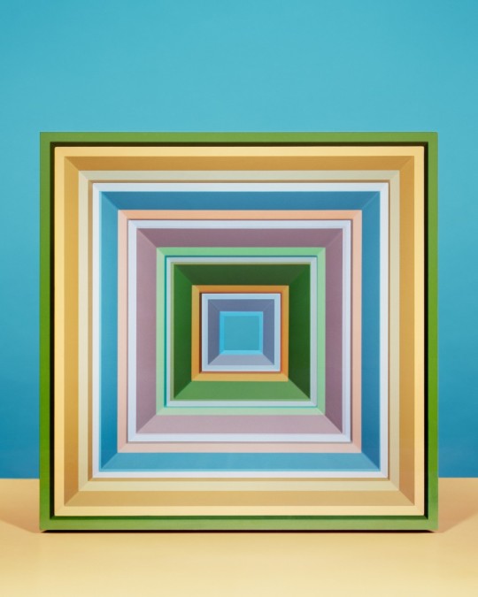

Jessica Eaton (Canadian b. 1977). The vivid colors of Eaton’s work, recently applied to a familiar nested-square composition, have a direct connection to Albers’ paintings and ideas. There is one significant difference, however: Eaton is not a painter but a photographer. The pictures seen here are the result of a complex process of photographing colorless three-dimensional objects in multiple exposures, using a single piece of large-format, positive film. Eaton masks off parts of the image between exposures, and different colored filters are placed in front of the camera’s lens each time. The cumulative effect is gorgeous color with a heightened, slightly unreal quality. The sheet of film is then scanned and printed digitally. You can find a video documenting aspects of her process in the next post.
cfaal 2204 2018. Pigment print, 30 x 24 inches. Edition of 5 plus 2 artist’s proofs. Source.
cfaal 1031 2018. Pigment print, 60 x 48 inches. Source.
Transition H50 2016. Pigment print, 50 x 40 inches. Source.
Natura Morta (Luce Danzante) 06 2021. Pigment print, 32 x 40 inches. Source.
1 note
·
View note