
Don't wanna be here? Send us removal request.
Statistics
We looked inside some of the posts by treasuregsstuff and here's what we found interesting.
Average Info
Notes Per Post
1
Likes Per Post
1
Reblog Per Post
0
Reply Per Post
0
Time Between Posts
18 days
Number of Posts By Type
Text
5
Last Seen Tumblr Blogs


Fun Fact
The average Tumblr user visits about 67 pages every month.
Text
Module 6
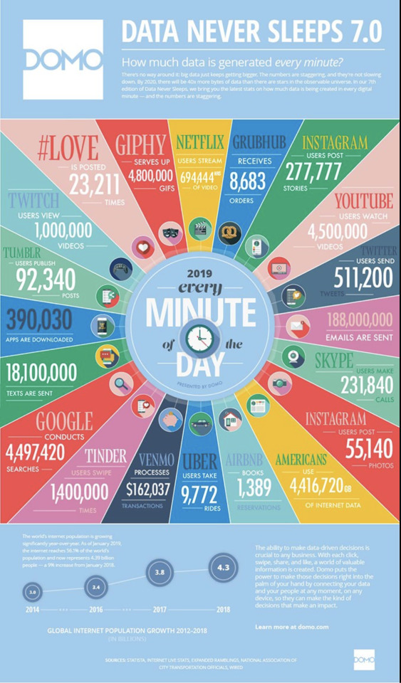

This is an infographic I've pulled from online. The underlying agenda of this infographic is to try and get readers to become scared of their data becoming stolen by other companies and tells the user that if they use their company their data would be "placed in their (the user's)hands.
Marvel uses the same font and colors to keep consistency within their brand. Keeping the same colorway and font helps the brand become more recognizable amongst others as people all over the world are familiar with it.
0 notes
Text
Module 5


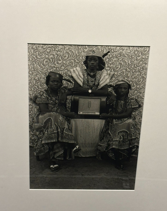
A photo of a woman. The denotative meaning is a woman with patterns on her clothing.
This same photo can hold a connotative meaning of a woman from an African tribe being upset because she is forced to marry.
This street sign of a person crossing serves as an iconic function. The icon of a person walking is used to signal drivers to slow down in the area since people might be walking there.
This map has an indexical function as displays both a letter and a map connecting both to a story about the past. When you read the letter, the viewer is able to discover the meaning of the map.
The sign "Black Lives Matter" has a symbolic meaning as the phrase depicted is connected to a larger movement.
The Coach Company logo is a design that is used throughout the company and references the past by using a coach with a carriage and horses. It connections a historical fact to its own name.
0 notes
Text
Module 2


A piece of a woman with a basket of flowers. The first piece uses a combination of different mediums and textures to help the viewers decipher all of the individual pieces within one work. Ex. The woman and the building in the background.
A piece that is split into two pieces. Although all of the women are painted the same. The artist places them in various poses to give them individuality.
An abstract piece of art. This piece features people shaped in very similar but very distinctive ways. It also features a textured background that help separate the background from the people.
A piece featuring a newspaper stand. This exhibit adds spacing between the three characters on the outside and the guy within the newspaper stand to add depth to the piece.
This painting features creatures in similar shapes, yet they are positioned opposite one another so the viewer can tell the difference.
0 notes
Text
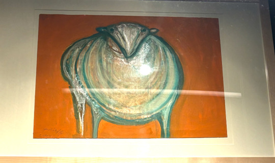


A painting of a sheep or lamp. The sheep has hints of blue/green while the background is orange to emphasize the folds of the animal's fur and make it the main focus of this artwork. While white is the main color of this lamb/sheep, the blue/green undertones within its fur help add depth perception to show not only the thickness of the fur but also help complement the slight orange tones within the sheep and the background.
A painting of 3 birds. This photo uses analogous colors to display both a connection and a distinction between the three birds. The bird in the middle is primarily light green and the other two are majority a darker shade of green to make the viewer focus more on the one in the middle. The outer two birds are displayed in a darker green to not only tone them down but make them a background.
A physical book of A Cat's Cradle. This book uses predominantly cool colors of different shades of blue. I believe that the book uses cool colors to display calmness, as blue is usually associated with that feeling especially lighter shades. These colors are used to trick the reader at first glance, as the actual content of the book is very confusing.
An exhibit from the Broad Art Museum. This piece uses primarily warm colors to make it very chaotic. The exhibit seems all over the place at first, until you read about it. I believe that the designer was hoping to catch the viewer's attention and make them question it, so they can find out more.
A painting of some wrestlers. This piece uses an orange background to contrast the primary color of white as well as the skin color of the wrestlers. The orange color helps empahzise the the actions of the wrestlers rather than the wrestlers themselves.
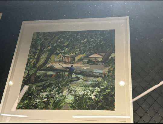
A painting of a man on a raft in a river. This painting displays the gestalt principle of proximity as the man in the painting is painted smaller to make him appear further in the distance.
A photo of three women. This painting displays an active figure-ground. The entire picture is in black and white. The shapes within the wall, help parts of the girl's dresses to blend in causing an illusionary effect.
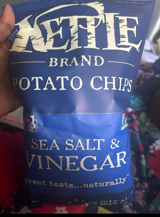
A chip bag. This bag uses a specific font to make it appear to be older than it actually is. The bag uses a font to make viewers believe that the company is older than it actually is, as the font can be compared to other brands that started in the 1800s, but the Kettle Brand only started in 1982.
0 notes
Text


Picture 1: A Gogo Squeez box; the box uses a combination of photography and graphic design to illustrate what is included in the box. I believe that the pictures of the apples on unicycles help appeal to children, which is the majority of this product's targeted audience.
Picture 2: A Court of Thornes and Roses(book), this book cover uses red as its background while the title is printed in yellow to contrast/ stand out from the background. This book also includes a picture of a creature printed in a unique and old art style.
Picture 3: UX textbook, the textbook has a geometric-focused design, that includes a variety of colors. The design helps complement the title very well, as the depth placed in the shapes makes it harder to see how big the "room" is when compared to the person sitting down on the edge of one of the shapes.
Picture 4: My laptop cover; my cover includes various types of stickers that each have their own art style. Some of them are very minimalistic, while others are very illustrative which helps describe the stories behind them.
Picture 5: A concert poster; the poster has a retro/ vintage design. It follows a very "out of the box" theme, that helps to make it stand out. It is also typography-based, as it only includes two colors throughout the poster.
1 note
·
View note