
Don't wanna be here? Send us removal request.
Statistics
We looked inside some of the posts by wlcunited and here's what we found interesting.
Average Info
Notes Per Post
1
Likes Per Post
1
Reblog Per Post
0
Reply Per Post
0
Time Between Posts
10 minutes
Number of Posts By Type
Photo
4
Last Seen Tumblr Blogs


Fun Fact
28.6 is the average number of monthly visits per US mobile user.
Photo

Responsive Bootstrap 4 Admin Menu
The Responsive Bootstrap 4 Admin Menu is a beautiful advanced menu with sidebar for admin dashboards based on Bootstrap 4. That menu comes in 2 versions: Dark and Light Mode, this menu is the thing for you.
We made it our priority to not add things that you don’t need, so the menu comes with just enough features for you to easily use.
It combines multiple bootstrap components and features numerous example of how it can be used.
Live Preview: Responsive Bootstrap 4 Admin Menu
0 notes
Photo

Responsive Bootstrap 4 Mega Dropdown Menu (RTL Supported)
The standard Bootstrap 4 navigation bar has been expanded with many functions in this responsive Bootstrap 4 mega dropdown menu with RTL support and can be used or replaced for your existing Bootstrap 4 project. You can quickly activate or deactivate functions in the settings.scss file.
Whether a dropdown menu, a dropdown submenu, a full-page menu or a sidebar navigation, this mega menu leaves nothing to be desired.
You can easily integrate pictures, galleries, videos, maps and much more. The mega menu can not only be used extensively on a desktop pc, also you can use it completely on tablets and mobile devices - fully automatically.
Live Preview: Responsive Bootstrap 4 Mega Dropdown Menu (RTL Supported)
0 notes
Photo

Responsive Mega Dropdown Menu (RTL Supported)
The Responsive Mega Dropdown Menu has been equipped with many functions and can be used or replaced for your existing project. You can quickly activate or deactivate functions in the settings.scss file.
Whether a dropdown menu, a dropdown submenu, a full-page menu or a sidebar navigation, this mega menu leaves nothing to be desired.
You can easily integrate pictures, galleries, videos, maps and much more. The mega menu can not only be used extensively on a desktop pc, also you can use it completely on tablets and mobile devices - fully automatically.
Live Preview: Responsive Mega Dropdown Menu (RTL Supported)
0 notes
Photo
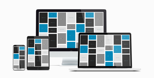
Responsive CSS Flexbox Grid Framework (Masonry Supported)
The CSS3 Flexible Box, or flexbox, is a layout mode intended to accommodate different screen sizes and different display devices. For many applications, the flexible box model is easier than the block model since it does not use floats, nor do the flex container’s margins collapse with the margins of its contents.
Many designers find the flexboxes easier to use than boxes. Without a lot of work, div’s frequently rose to the top of a page when designers did not want them to – so for example, sticking a footer to the bottom of a page was difficult. The widths and heights of flexboxes vary to adapt to the display space, holding the lower down elements in place. Flexbox logic also asks whether you want div’s to accrue to the right or on the bottom. The display order of flexbox elements is independent of their order in the source code.
Popular layouts can thus be achieved more simply and with cleaner code. This independence intentionally affects only the visual rendering, leaving speech order and navigation based on a linear reading of the HTML source.
Live Preview: Responsive CSS Flexbox Grid Framework (Masonry Supported)
1 note
·
View note