sideblog planned to dump my after god hyperfixation on..prob heavy spoilers warning!! thanks
Don't wanna be here? Send us removal request.
Text

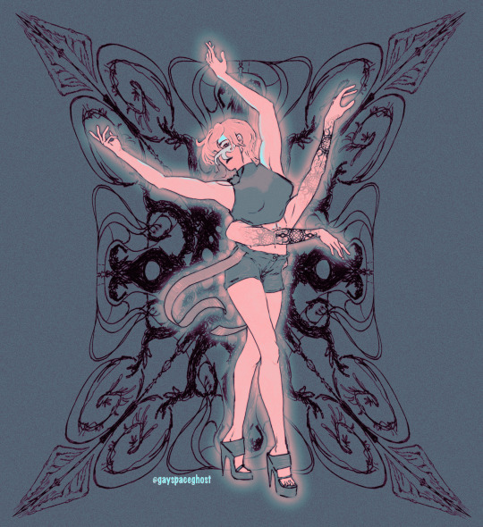


this girl, this girl right here
64 notes
·
View notes
Text
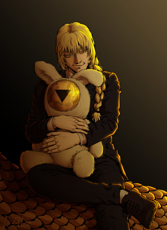
my bbygirls <3
Also I settled for just colouring Orokapi's scales in ochre bc idk, that seemed to fit him the most.
47 notes
·
View notes
Text
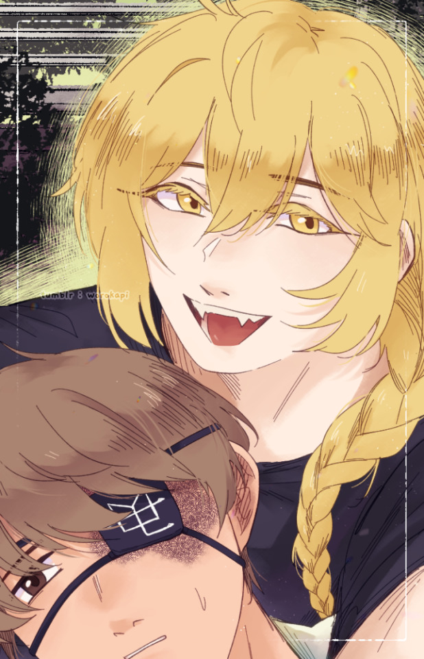
selfie!
#after god#obikawa kiyoshi#tokinaga sachiyuki#art#theres not enough colored after god art in the world#i realize i can draw#doing this instead of the 50 other things i said id work on
72 notes
·
View notes
Text
"okay waka this is how you serve cunt." "like this obikawa?" "omg yes girl slay"


#after god#after god spoilers#obikawa kiyoshi#kamikura waka#sharing this with the crowd#my friend is so right#i need her#please
48 notes
·
View notes
Text
reblogging: chapter 77 is now up at mangaone!

"僕は別に、お前が蛇の姿になっても好きだよ。" "I don't really care, I'll still like you even when you turn into a snake"
96 notes
·
View notes
Text
worokapi seems to be a canonical spelling so i changed this blogs name lol

3 notes
·
View notes
Text
volume 8 chapter 62 seems to have one panel redrawn

[txt in one bubble has been blurred bc it is a spoiler technically i guess]
in the digitally published version Obikawa's eyes look more energetic and there's an innocence in the way he blurted out suggestion. like he said it before he even registered the implications and his own personal feelings regarding the topic. it's impulsive, like the first thought that immediately came to his mind, and he doesn't hesitate to shout it out. like an "oh, I got an idea of what I can do!"
but the print one though? however? he's blushing just a little bit? the little change in the way his eyes are less wide makes it feel much warmer, like he said this coming more from a place of genuine care. it was still impulsive, but oh.. it makes me think more about how he really loves Tokinaga. like an "oh, I'd be more than happy to help!"
either way i think both still conveys that Obikawa's idea of being able to help Tokinaga makes him happy... the change is subtle but I get very different energies of where his genuineness is coming from.
personally i like the digitally published one since i feel like the enthusiastic blurting of the suggestion makes it feel more innocent, because the pages afterwards haven't changed and it sort of solidifies more how more of an impulse it was
but I will never know if the redraw was just because Eno was unsatisfied with how she drew the face or wanted to convey a different meaning lol. i might be looking too into it
#after god#obikawa kiyoshi#tokinaga sachiyuki#after god spoilers#i want what they have#platonic love my beloved#rambles
41 notes
·
View notes
Text

my son he has every disease
#these doodles are lovely!#i can remember the panels you've referenced for each one :3#i think we should give him more diseases (affectionate)#after god#obikawa kiyoshi#reblog
53 notes
·
View notes
Text


that guy that i want to put in a microwave
#onbiwakwa..mmyfvarotie....#these doodles are so cute!!#agree also putting him in a tupperware. kinda have to. gooped guy#obikawa kiyoshi#after god#reblog
71 notes
·
View notes
Text

"僕は別に、お前が蛇の姿になっても好きだよ。" "I don't really care, I'll still like you even when you turn into a snake"
#after god#after god spoilers#but they're vague spoilers#orokapi#tokinaga sachiyuki#art#chapter 77 is FUCKING ME THE FUCK UP IN THE FEELS#i wanted to draw the emotion i felt..#the gut punch#if only they could...#IF ONLY#the TL is google translated with my best localization estimation sorry it might not be accurate
96 notes
·
View notes
Text
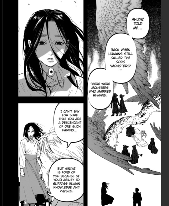
after god mondayyyyy oh fuck godfucking might be real in after god universe
4 notes
·
View notes
Text
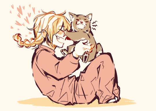
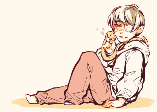
can't believe puppy tokinaga canon
#I LOVE THIS THANK YOU OP#puppy tokinaga is so everything we need to talk about it more#sooo sweet#after god#reblog
145 notes
·
View notes
Text
oh i can actually pin an intro post oops
hi welcome to my sideblog dedicated to my after god hyperfixation
call me strabi or okapi (on this blog only)
pronouns they/them preferred, I'm an adult
my main acc is @strabi which will prob be the one interacting back with after god mutuals! its not a secret I just want to keep ag stuff here only
fun fact: I draw 👍 yay
fav char: I adore orokapi/obikawa's character a ton and I miss him
SPOILERS WARNING across this whole blog!! I typically peruse through the entire series up to date in my posts and out of context spoilers may be posted.
the ask box thingy is open on the blog, feel free to send messages or after god art requests in there! 👋
2 notes
·
View notes
Text
after god art style study --part 2
damn only 30 images per post
part one here!!
---
line art -------
the line texture of eno's art in after god looks like an analog g-pen. it's is clean but retains a pretty textured feel and in some points, line art hatching or sketchy lines are used form the lines. particularly, larger drawings that would have thicker lines have the appearance of being hatched which gives it a very cool depth too.
if you try looking carefully, especially for the thicker dot tips left at the ends of g-pens, you can see lines aren't always drawn in one clean stroke.
I think the feathering/chicken scratch art technique can be utilized to create these fluffy-looking thick lines. though you would need a good idea how to control your lineweight while doing it to be able to maintain a smooth looking output.
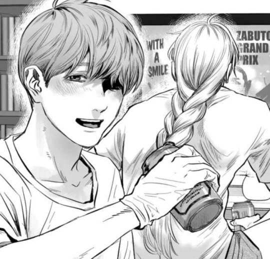
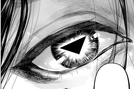
custom csp tools
I do think a couple reoccurring art assets seen are custom csp brushes/tools not on the csp asset store. browsing the csp asset store brings up nothing or I haven't searched far enough. the immediate most obvious one to me is the eldritch stringy things, it looks like a looping ribbon brush. there's no way she's redrawing that shit 23892093 times, neither would I want to do that LOL. there is enough warping in each stroke for me to believe it's not a flat image being copypasted.
sometimes I like to download assets to be able to breakdown how an artist created them to make my own so aw I can't really break down how it works. but I think it's impressive the tool is super seamless, I can't really tell where the eldritchy horrors begins or ends as it's so fluid.

I'm sort of guessing tokinaga's facial/finger/leg scar is also a custom asset.

haven't found anything for orokapi's scales either so there's chance it's a custom brush too.

hair -------
hair is very detailed. you can see where the hair grows from on the head. I don't really have much to comment there.
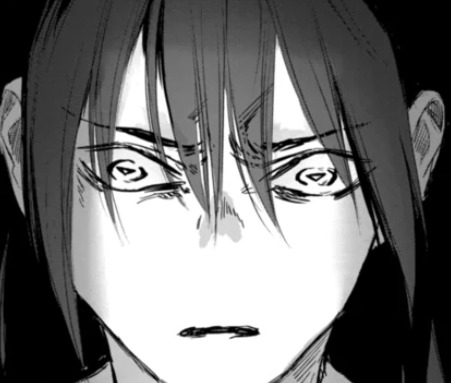
waka's hair is usually the most detailed, given the amount of freedom pure black ink gives- you can detail as much as you want without worrying about how it interacts with the line art.
the extra thin strands is pretty consistent across all black-haired characters, like minami and yoriko. I don't think the extra thin strands are exclusive to waka just because she has long hair, since ushio and obikawa also have long hair but both have a lighter color.
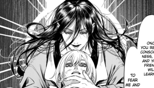
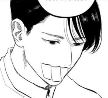
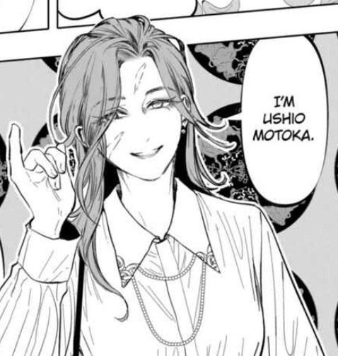
hair typically overlaid over the eyes does fully obscure the eyes underneath. so if not careful, large patches of hair or certain hairstyles can entirely hide the eyes and may not be great if you need to show the eyebrows and to emphasize a character's expression.
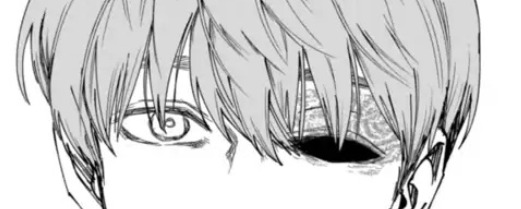
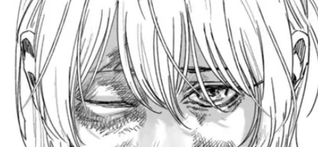
a workaround to keep the lines for the eyes visible is to erase small bits here and there to give the illusion of strands of hair that you're able to see past at what's behind it.

for darker-haired characters- usually waka- some lighter gray is also added to her hair to show her eyes/face.
side profiles -------
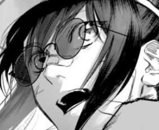
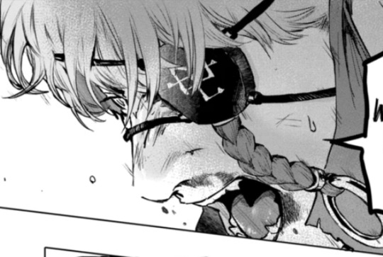
the shape of the face is simple, but is much more defined than the typical cutesy moe animes with the tip of the nose to the chin usually being a flat single line. I appreciate the way the bottom lip is drawn and defined at certain angles.
I do really like the way the edge of the nose connects into the face. these side profiles give a super three-dimensional feel to the face, accentuated by the eyes

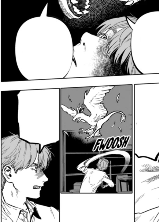
eyes -------
eno draws very pretty eyes hiiiiiiii
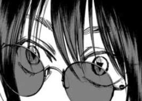
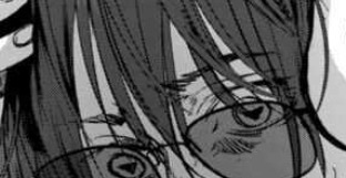
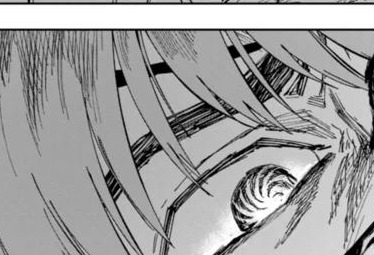
honestly I don't have a lot to say about the eyes. they stick on the end of semi-realism with the upper and lower eyelid being consistently drawn with circle irises. (that sounds obvious but some anime don't stick with circle irises or draw the lower eyelid)
a lot of feathering can typically be found around the eyes or makes up how the eyes are drawn. sometimes the eyelids are detailed in closer shots to really emphasize the 3d feel of the eyeball.
sometimes, the tearducts in the eyes are drawn.
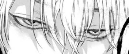
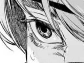

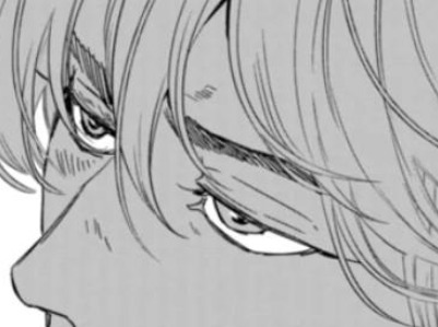
these eyes typically follow a consistent 5-line shape.
simpler eyes usually use 2-lines to make the shape.


most characters are not monolid and have an eyelid crease to help show the 3 dimensionality of the eye. very rarely the outer corner of the eye is not drawn with a connected line.
[fig below shows my study of the line strokes making up the shape of the eyes]

eyebrows -------
eyebrow detailing depends on the shot- if it's upclose to the face it will usually be more detailed with some hatched lines. otherwises they're typically a couple of lines. sometimes one or two "guidelines" can be seen for the top and bottom of the brow and the inside is hatched in.
teeth -------
eno draws teeth
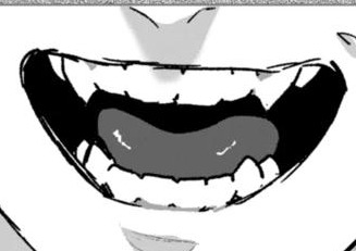
to be able to draw each individual tooth without it looking weird is skill. and depends on the art style, sometimes detailed teeth do not work for certain art styles (but that's not to say it's not impossible. if your goal is to make people feel uncanny with detailed ass teeth on a cute anime character, sure lol)
orokapi/obikawa's teeth do have prominent canines (snake) (lol) but other characters also have their molars slightly lined in. often, the teeth are not fully lined, where the main line art only shows defining the gums and the ends of each tooth.


coloring -------
after a while I did notice after god consistently uses gray to color tones. it isn't exclusively black and white with toning.
an 80 value or #CECECE is a good color to take from the study to use for manga shading.
I'm sort of guessing this may make the books cost more to print because gray ink is adds another expense.
application -------
and finally applying some of these details to my own art ✨
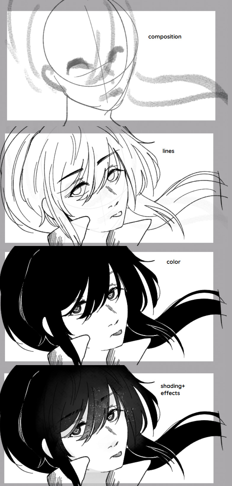
thanks for reading! hope this gave some cool insights into the art of after god :]
25 notes
·
View notes
Text
after god art style study --part 1
first off disclaimer I don't really know if there's a supposed professional/appropriate method of studying artist's art styles so please don't expect this to be polished or like a tutorial in any way this is just me spending a lot of time admiring eno sumi's art
thoughts overall
eno's art has a pretty semi-realism leaning anime art style. it's not conventionally cute, the level of detail is what you'd see in a seinen manga. thumbs up it works out just right
because this is manga with what looks like a monthly to biweekly release schedule yeah I too would want to be paid $$$$ as my full time job if I were drawing with that crunch deadline so shortcuts and corner cutting are taken to make the job easier. I particularly want to study some of the shortcuts in addition to the way she stylizes certain things in her art style.
I used to have a very cutesy/baby-faced anime art style and had really wanted to move more away from that to something more mature-looking. studying how an artist stylizes something is a cool way to figure out how you want to depict something in your style too. obviously still do take life studies and all... there is nuance between understanding how an artist builds on top of fundamentals versus copying plainly what is depicted. I know how to draw noses but I couldn't figure out or visualize how it'd best look in my artwork.
I dooooo still have to learn how to draw old people like old-old people aaaaaaaaaaaaaaaaaaaaaaaaaaaaaaaaaaaaaaa
clip studio paint and tools -------
I previously identified in an older post eno most likely works with clip studio paint.. eno has posted here about CELSYS which is the company that owns CSP.
more csp stuff:
background black swirls is 黒うず from ベタ部分に使うブラシ
you guys like the default crack brush? me too the triangle shape is very noticable
some of the other cracks in the scene looks like its from 瓦礫を描くブラシセットおまけ付き
lightning brush from lightning brushes
this is a very good water brush set


3d models -------
I personally cannot really discern perfectly if 3d models were ever used for posing the characters- if there was use of 3d character models then thank god they weren't directly traced over bc 3d does not translate to 2d well when it's directly traced over and that type of jarring uncanny proportions is what I'm used to seeing when that happens.
however, sometimes it is kinda noticable when the anatomy looks a little bit wonky or rushed. I don't blame it that much for comic making standards
[tokinaga are you okay you look kinda rough]
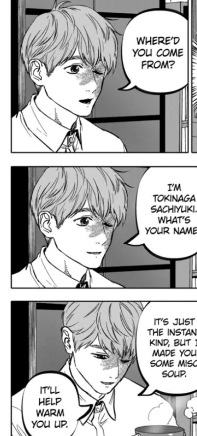
[ch.32 has a bunch of can models]

3d models are most often used for the backgrounds in After God or for smaller, repetitive objects. they're integrated pretty seamlessly in my opinion, but also in my opinion I have to consider my bar is below the ground because I read webtoons time to time and the number of poorly or lazily implemented 3d background assets makes me sad

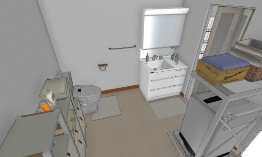

[tokinagas apartment] [2]
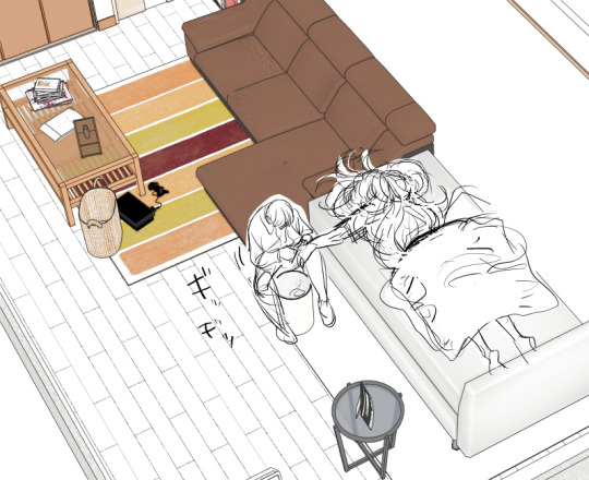
I remember in my blog read through I had google translate catch she mentioned she used home design 3d or something something to make the house models. unfortunately I don't know where the exact mention was (i dont speak or read japanese bummer) so take it with a grain of salt
noses -------
nosesss!!
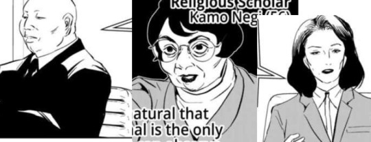
they are more detailed than the typical "single dot/line" anime nose, I really appreciate that. the variety within the main characters isn't very wide, but I digress. if it's easy to draw then it's easy to draw and it's nice to feel no pressure drawing what you want to draw
the most common nose drawn is a line for the bridge and two lines indicating the nostrils. the two nostril lines may vary in direction depending on if you're viewing the face, differing angles from above or face from below
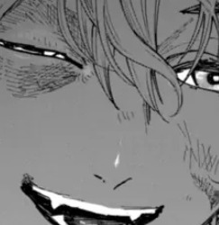
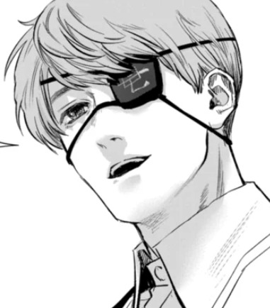
frequently, in addition to that, the tip of the nose is also defined.

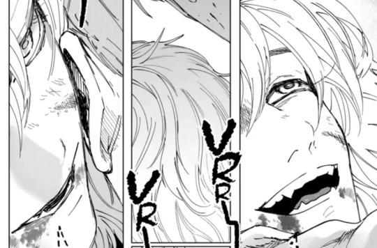

sometimes the bridge is given some additional depth with some hatching instead of a singular line.

sometimes, only the nostrils are drawn. shading may be used to define the nose shape instead of using lineart.
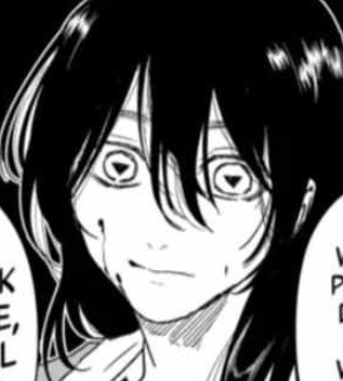

sometimes instead of a line for the nose bridge, a "triangle" shine shape is drawn. usually it shows up on smaller images.
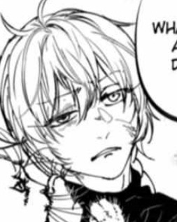
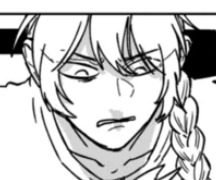
very rarely does it ever end up being drawn as a single line (either for the nose bridge OR the bottom of the nose).
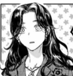
the diversity of noses typically shows up the most on the older aged characters. or the non-japanese characters.

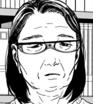
chin-up profiles -------
honestly i don't see really actual bottoms of the chins drawn that often and when I do it's rather rare or simplified


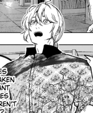
---
cont in part two
10 notes
·
View notes
Text

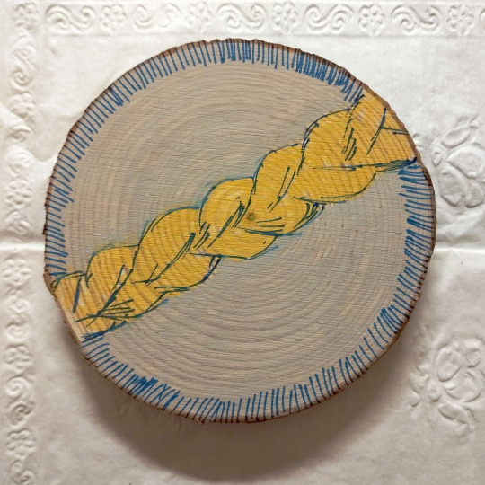

got taken out to an event and got to paint some coasters and I thought why not there's like no real After God merch there right now lol
homage to eno's chapter 4 cover! it's entirely eyeballed so it's a bit wonky >u>
the wood grain makes a really interesting pattern.. hypnotic even...
17 notes
·
View notes
