
Last Seen Blogs

florencepews
touché

ragnathedragon-blog
Ragna's Random Blog

ayelenasnard-blog
♥ be infinite !

norskkitten
baby-faced

floating-aroound
l' espoir
Text


تلخيص لكتاب "فكَّر خطأ: كيف تتغلب على الحالة الراهنة وتؤدي العمل المهم".
كتب الكتاب بقلم جون بيلينبيرج، ومايك بيرن، وجريج جالي، مع إليزابيث إيفيتس ديكنسون.
ونشر في سنة 2021.
وتصنيف الكتاب إدارة الاعمال والقيادة والتصميم.
يبدأ الكتاب بتأسيس الفكرة الرئيسية لـ "الوضع الراهن" أو "الحالة الراهنة", ويشرح المؤلفون كيف يمنع الوضع الراهن للأفراد من القضاء على روتين توليد الأفكار من خلال خلق ممارسات لتفكير الخاطئ، واتباع الافراد منهج التفكير المغاير لتغلب على عقبات التي تظهر عند محاولة رؤية فريدة الى حقيقة واقعة، وقال المؤلفون الطبيعة البشرية تحب الروتين والاحساس بعدم الارتياح بأن يكون التفكير بعيد عن المألوف او خارج الصندوق.
ويطرح المؤلفون ستة مواضيع رئيسية: "كن جريئًا، استكشف، أطلق العنان لنفسك، اصنع الأشياء، جازف مجازفة صغير، وتحرك بسرعة" والتي تجسد جميعها ممارسات طورها المؤلفون التفكير الخاطئ والحصول على أفكار أكثر تنوعًا وإبداعًا. "كن جريئًا" وهي فكرة وجود حلول أكبر بدلاً من خطوات صغيرة، و "استكشف" من البحث الى السعي لإيجاد الإلهام لأفكارك والحصول على معلومات جديدة، "أطلق العنان لنفسك" وهو وضع نفسك في موقف غير مألوف أو غير مريح حيث يمكنك تحمل المزيد من المخاطر والتعرض لوجهات نظر وفرص مختلفة، "اصنع الأشياء" وهو تسليط الضوء على تطور العديد من الأفكار المتناثرة وتحولها إلى أفكار ملموسة. "جازف مجازفة صغيره" تجسيد فكرة المجازفة على الأفكار الصغيرة التي تسمح بتوضيح الأفكار الأكثر تفصيلا. "تحرك بسرعة" لبناء الزخم لتغلب على الشكوك والأخطاء وتجاوز الارتباك والمشاركة والانفتاح للآخرين لمساعدتك في تطوير حلولك.
واقترح كتاب "فكَّر خطأ" فكرة التفكير الجديد للقضاء على المثالية الثابتة التي جلبها الوضع الراهن، من خلال الممارسة، سيتمكن الأفراد من حل المشكلات بطريقة إبداعية ومبتكرة.
بعد قراءة الكتاب تمكنت من التعرف على طريقة جديدة في التفكير، والتركيز أكثر على التفاصيل والعملية والابتكار، وهناك موضوع آخر مثير للاهتمام يوجه المؤلف انتباهنا إليه وهو عدد الأفكار التي يجب إنشاؤها عند التوصل إلى ابتكار جديد، على سبيل المثال، إذا توصلنا إلى مئات الأفكار المختلفة، فيمكننا الحصول على عدد قليل من الأفكار الجيدة، ولكن ماذا لو توصلنا إلى عشرين فقط وقدم الكتاب أيضا أدوات وموارد ستسمح لي ولغيري من الأفراد بتوسيع ممارساتنا حول كيفية توليد الأفكار.
@uob-funoon
3 notes
·
View notes
Text
Silkscreen FA327 Final Project
Mrs. Patricia Barakat
@patriciabarakat @uob-funoon
#uob funoon#silkscreen#silkscreenprinting#serigraphy#printing#pop art#@uob funoon#@patriciaBarakat#andy warhol#fa327#colorseparationandprintingtechniques#printmaking#graphicdesign#art#universityofbahrain#yayoi kusama
6 notes
·
View notes

Text


•رأس البطيخة•
يبلغ فريد من العمر سبع سنوات، طفل جميل إلا إنه ولد برأس كبير. التحق بالمدرسة الابتدائية ليبدأ الأطفال بالتنمر على شكل رأسه، إلا إن أمه ومعلمته استطاعتا مساعدة فريد بفضل موهبته في الرياضيات.
@uob-funoon
4 notes
·
View notes
Text


Project 1, FA222, Detailed coverage of the lecture.
DR. Ehab Juma
practitioners and so they believed in this kind of classical modernist
view of graphic design you know some of these works you might have seen before but I think it was a place where it was like form follows function design should be neutral design as problem-solving and that was my first exposure to you know coming from just like all these you know a rule-breaking or a very kind of working-class diverse kind of affinity to letters I was suddenly learning that there was a canon that you know in established history a history that was you know mostly white uh male-centric and male-dominated by the history nonetheless that they told me that was you know the only history and I had to just really digest that and you know a lot of my career is just as much of realizing where you know where my influences are because this is something that influences me a lot but it's also unlearning that this is the only acceptable
um kind of history but you know I just been I just almost kind of hit the jackpot where I studied with two you know teachers in typography Leah Hoffman Simon Johnson who trained directly under Wolfgang Weingarten who was another Swiss designer that I really looked up to um in Switzerland and so they really kind of just engrossed me into the whole history of it and I just kind of just did my best and you know the first year as many of you might have also experienced was like you know no computers at all and doing things I think the proper way and what I was lucky was that you know before my frontal lobe was developed I gained a framework on how to deconstruct and look at the world around me you know a lot of design principles that you might learn like repetition or contrast um you know you start to really see that kind of play out in the world where the stakes are maybe higher and the implications are a little bit larger and so you know this was just really kind of this early exposure to people that created the rules and people that broke the rules at the same time and but I think as I went on through my education I started realizing that these rules as helpful as they might be there's a lot of performative um there's a lot of performativity or a lot of theater to it you know I think we you know in school I learned so much about like the grid um having a
a structure having things line up and having things be rational you know I think everybody's probably seen the
the thing on the bottom right where people try to make up these like kind of lines and ex like all these like invisible kind of guides and scaffolds about this is why there's a bite out of the apple you know a lot of it's um a lot of it is to just was made specifically to sell
design as something to take seriously but it's also what was also interesting was that
this was always in school seen as like you know you had a classical design which was like the graphic design dark ages and suddenly in the 1950s Helvetica came around and everything kind of changed but that's not true I mean grids are for example seen as like a recent invention but ever since the printing press was invented we've been trying to um rationalize things and have like an internal kind of structure um Aldous minus one of the earliest printers in Venice um in the 16th century you know the more we uncovered his books and we printed we realized that it wasn't just you know random letters formed together on a letterpress set you know there was a grid there was a structure there wasn't an internal um order to things and there also was you know a set amount of proportions um
and a pattern you know to even just how the letterforms existed, and they were all interconnected and related and they kind of use you know what if you go design at dropbox or Facebook or Google, for example, you might get told like the Fibonacci sequence is like a magical number but for them you know they had their own set of like magical numbers and magical proportions and rules to think too and
that was what was important to them, but you know I think when we look back at history, I think we oftentimes really kind of overcomplicate things and so you know
the letterforms that we use today are the Latin alphabet you know a b c d to z um you know we could thank the Romans for that and so the letters have been around for thousands of years and so we lost a lot of information about roman culture
and roman society um as Europe entered into the Middle Ages or what was
previously known as the dark ages so, by the time they happened you know the renaissance happened they were just really fetishizing a lot of like what the Romans did so it was like just rediscovering roman philosophy and Greek philosophy and rediscovering you know the classics as they called in, they're like there must, be a reason for everything and so when we look at these letterforms um you know by the time.
@uob-funoon
11 notes
·
View notes
Text


Project 1, FA222, Detailed coverage of the lecture.
DR. Ehab Juma
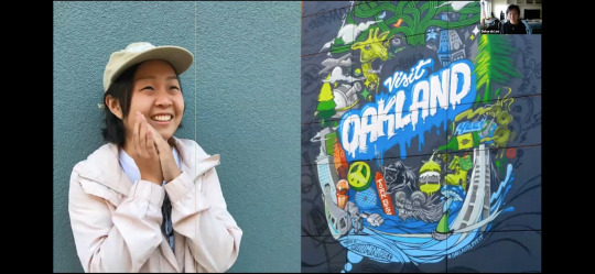
I want to welcome you, first of all to the cmu school of designs lecture series we are super excited to have deb lee
here with us today um deb is terrific and I'm a huge huge fan of her work um.
I just want to give everyone a quick reminder that our final lecture series of the semester is next Monday the time is going to be 4 30 pm um instead of noon it's with James Todd of jd type foundry more information is on the website and um I just really quickly want to thank um Darlene Scalise joe Lyons Whitney Friedman and Bruce Hannigan for all that they do to make the lecture series happen I also want to thank um fellow committee members molly Steenson Diana chum Megan urban and Jacqueline psych for all the great work that they do Jacqueline also designs our posters and all the social media that we have for the lecture series and today she's going to introduce deb as well so Jacqueline take it away thanks fred um dubli is a Korean American freelance illustrator and graphic novelist deb graduated from the school of design in 2018 where they then shifted their focus into editorial and publishing illustration they have worked with clients such as the new yorker npr pbs Washington post HarperCollins books procreate app and more and they're set to publish their debut graphic novel in limbo in spring 2022. we were particularly excited about deb's focus on the nuances of trauma mental illness and the diaspora dev I've been personally a longtime admirer and we are so honored to have you here thank you so much Jacqueline okay um should I start sharing my screen now okay let's see all right is everyone we're good okay cool let's.
get started okay hi um I just want to say like really quickly thank you so much for having me um as somebody who was in the school of design, I was also a part like I was in the audience of these lecture series like 99 of the time so to be able to speak to the audience now is kind of wild and it's like it's such an honor to be here so thank
you again for having me so to reintroduce myself um I am an illustrator based in Oakland I’m moving to Brooklyn literally next week so wish me luck it's going to be a wild ride um I work mostly in editorial and publishing so what that means is editorial would be like articles that you would see online or on print and these are usually like one-time stories about like current events or like science it can literally be anything but it's starting to range from like medium now is becoming really popular scientific American npr and others being like the new York times the new yorker publishing would be work that is um like I would I like to compare it to like programming how there's like the front end and the back end of it like the back end is like what you don't see so like that's like character design or world building um front end would be like whatever you split like whatever like is shown to the consumers so book covers um like the interior pages of like a picture book etc. but that is me in 2021 so let's go back to 2020 2014. so in 2014, I was in high school and I was working I was like so obsessed with drawing like I would draw when like my teachers weren't looking um they probably saw me, uh and I wanted to go to be like an animator or an illustrator but when you have Asian parents like they don't let you do that most of the time so they were like we need you to you know make money we need you to participate in capitalism and like do something that is like that like actually like gives you an income so we like talked it out and we're like okay we should go to a school I should go to a school that is more like academic and has a like a very strong design program within like an academic space so we decide so I enrolled in carney melon and it was a really good choice for me because there was like a separate design and art school and I was able to take classes that are outside of the design program if I would.
@uob-funoon
10 notes
·
View notes
Text


Project 1, FA222, Detailed coverage of the lecture.
DR. Ehab Juma
I want to welcome you, first of all to the cmu school of designs lecture series we are super excited to have deb lee
here with us today um deb is terrific and I'm a huge huge fan of her work um.
I just want to give everyone a quick reminder that our final lecture series of the semester is next Monday the time is going to be 4 30 pm um instead of noon it's with James Todd of jd type foundry more information is on the website and um I just really quickly want to thank um Darlene Scalise joe Lyons Whitney Friedman and Bruce Hannigan for all that they do to make the lecture series happen I also want to thank um fellow committee members molly Steenson Diana chum Megan urban and Jacqueline psych for all the great work that they do Jacqueline also designs our posters and all the social media that we have for the lecture series and today she's going to introduce deb as well so Jacqueline take it away thanks fred um dubli is a Korean American freelance illustrator and graphic novelist deb graduated from the school of design in 2018 where they then shifted their focus into editorial and publishing illustration they have worked with clients such as the new yorker npr pbs Washington post HarperCollins books procreate app and more and they're set to publish their debut graphic novel in limbo in spring 2022. we were particularly excited about deb's focus on the nuances of trauma mental illness and the diaspora dev I've been personally a longtime admirer and we are so honored to have you here thank you so much Jacqueline okay um should I start sharing my screen now okay let's see all right is everyone we're good okay cool let's.
get started okay hi um I just want to say like really quickly thank you so much for having me um as somebody who was in the school of design, I was also a part like I was in the audience of these lecture series like 99 of the time so to be able to speak to the audience now is kind of wild and it's like it's such an honor to be here so thank
you again for having me so to reintroduce myself um I am an illustrator based in Oakland I’m moving to Brooklyn literally next week so wish me luck it's going to be a wild ride um I work mostly in editorial and publishing so what that means is editorial would be like articles that you would see online or on print and these are usually like one-time stories about like current events or like science it can literally be anything but it's starting to range from like medium now is becoming really popular scientific American npr and others being like the new York times the new yorker publishing would be work that is um like I would I like to compare it to like programming how there's like the front end and the back end of it like the back end is like what you don't see so like that's like character design or world building um front end would be like whatever you split like whatever like is shown to the consumers so book covers um like the interior pages of like a picture book etc. but that is me in 2021 so let's go back to 2020 2014. so in 2014, I was in high school and I was working I was like so obsessed with drawing like I would draw when like my teachers weren't looking um they probably saw me, uh and I wanted to go to be like an animator or an illustrator but when you have Asian parents like they don't let you do that most of the time so they were like we need you to you know make money we need you to participate in capitalism and like do something that is like that like actually like gives you an income so we like talked it out and we're like okay we should go to a school I should go to a school that is more like academic and has a like a very strong design program within like an academic space so we decide so I enrolled in carney melon and it was a really good choice for me because there was like a separate design and art school and I was able to take classes that are outside of the design program if I would.
@uob-funoon
8 notes
·
View notes
Text

Project 1, FA222, Detailed critical coverage of exhibitions.
DR. Ehab Juma
@uob-funoon
Bahrain holds region’s first NFT MENA exhibition
Manama, Mar. 17 (BNA): Witness a unique and innovative experience in the region with NFT MENA Exhibit 2022.
Bahrain has opted to capitalize on a cutting-edge exhibition that provides us with a dynamic and futuristic picture of the art world both regionally and worldwide.
The popularity of the blockchain world, and especially the use of NFTs by artists throughout the world, is bolstering this NFT art show.
On March 16, the exhibition welcomed guests to engage in networking and attract those interested in learning more about NFTs through interesting booths and art pieces that provided a look into the future.

"We would like to thank HM the King and Shaikh Rashid bin Khalifa Al Khalifa, Chairman of the National Council for Arts, for their support in embracing new concepts in art and technology in Bahrain," Dar Al Fann Gallery Chairman Abdulrahman Al Mokla stated.
"They have been really generous in future-proofing the art world that has showcased the best in what the Kingdom has to offer."
The show will continue with a series of seminars and discussion panels led by industry experts on how to use technology as a creative outlet in the art world, as well as new investment and worldwide market potential.
The event exemplifies the Kingdom's forward-thinking attitude by presenting a digital art revolution that will forever transform how we see it by fusing culture and technology.
From 4pm to 10pm, the show will be on display at the Ritz-Carlton until March 18.

10 notes
·
View notes
Text
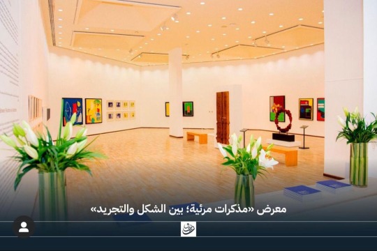
Project 1, FA222, Detailed critical coverage of exhibitions.
DR. Ehab Juma
On Tuesday, March 1, 2022, the Arts Center witnessed the opening of the exhibition "Visual Notes: Between Form and Abstraction" by Bahraini artist Rashid Ahmed Al-Arifi, in the presence of Sheikha Hala bint Mohammed Al Khalifa, Director General of Culture and Arts at the Bahrain Authority for Culture and Antiquities, and a number of artists, cultural figures and those interested in cultural affairs in the Kingdom of Bahrain.
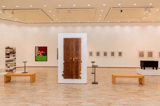

The exhibition This exhibition is part of the activities of the 16th Spring Culture Festival, and it will continue at the Arts Center until the end of this March from 9:00 am to 8:00 pm.
The Culture Authority is holding this exhibition in appreciation of the artist Al-Arifi winning the second prize at the Bahrain Annual Fine Arts Exhibition for the year 2020 AD for the artwork “Culture of a Classified Company”.
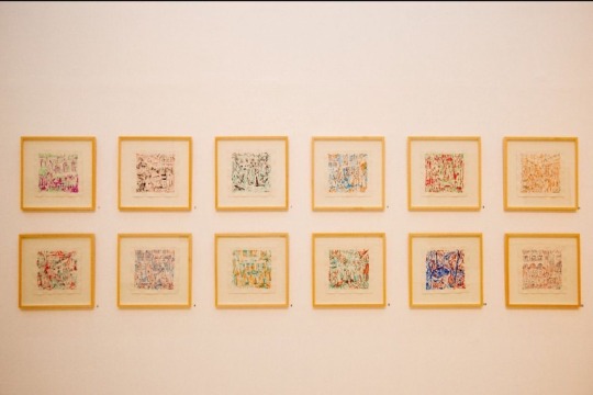
The artist Rashid Ahmed Al-Arifi thanked the Bahrain Authority for Culture and Antiquities for the poets in order to promote the artistic movement in Bahrain, a picture of a name belonging to the Kingdom of Bahrain. He said, "It is considered that her knowledge is from the outside
It indicates that the artistic elements that do not depend on the linear narrative, refer to figures, and events, and draw inspiration from scattered excerpts from Bahraini culture and heritage. The artist Al-Arifi hoped that the exhibition would be admired by the art connoisseur in Bahrain and that the viewer would coexist with the narrative scenes around which the works revolve.
It is noteworthy that the artist Rashid Ahmed Al-Arifi is an architect, designer, and plastic artist who uses visual narration in his artworks of all kinds. It also belongs to the artistic community, as his uncle, the late artist Rashid Al-Arifi. Rashid Ahmed Al Arifi style by many Bahraini and international artists such as Jork Kondo, Salvador Dali, Mark Rotko, Joan Miro, and Takashi Murakami. Participated in art fairs for local and international fairs to exchange information and science fairs.
It is worth mentioning that the Spring of Culture Festival is being held this year by the Bahrain Authority for Culture and Antiquities, the Sheikh Ibrahim Center for Culture and Research, and Al Dana Theatre, in cooperation with Al Riwaq Space for Arts and Al Bareh for Fine Arts. Where a year reads to the public a general program in 1992. A year and a year of entertainment games, exhibitions, lectures, exhibitions, and international shows that suit different tastes and ages and bridges of cultural and human communication between the Kingdom and the world.
@uob-funoon
9 notes
·
View notes
Text
Project 1, FA222, Detailed coverage of interviews
DR. Ehab Juma
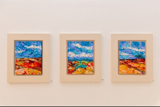
Landscapes of Time and Space by Kenjiro Okazaki’s
The artist discusses his current collection of miniature abstract tableaux, as well as the history of landscape painting and why uncertainty may provide a sense of purpose.

Travis Diehl, Each little abstract artwork in your series 'Topica Pictus' [2020–ongoing] is accompanied by a brief essay. I'm keen to hear your thoughts on the situation.
Kenjiro Okazaki’s, I remember a lot of things as soon as I start painting. I don't start painting with a theme in mind. Rather, the painting process is a search for a certain subject or concept. Each piece must have its own distinct personality. Each character's style cannot be limited to that of the artist. For instance, in [Corn and Summer Wheat,2002] When I first used this hue, the tone reminded me of Thomas Hart Benton's work Corn and Winter Wheat (1948). Then it reminded me of the Japanese argument about whether or not landscapes can have regional features. This is how I begin to think and write at the same time as I paint.
TD: I'm not sure how much of this is my imagination, but several of your abstract paintings have compositions that seem like works by other artists: For example, [Albrecht Dürer's Dream / A massive rain drop ravages the quarry, 2020] has overtones of Pieter Bruegel the Elder's Tower of Babel [c.1563].
KO: They do, in fact, have the same diagonal. I recognized not just that painting, but other works by Paul Cézanne, such as Mont Saint-Victoire [1904–06]; quarries were a favourite topic for Dürer. Looking at Bruegel's Tower of Babel, I notice that it isn't a tower at all: it is a stone quarry erected on top of an existing mountain.

Kenjiro Okazaki, (Corn and Summer Wheat), 2020, acrylic on canvas, 16 × 20 cm. Courtesy: the artist and Blum & Poe, Los Angeles
TD: So, all these mountains are reflected in your composition.
KO: Yes, since they combine art and nature.
TD: The margins of the colors and strokes appear to be mirrored in the notches or recessions of your frames as well.
KO: The frame is the device that directs movement from the artwork to the outside world and from the outside world to the painting's universe. It has to do with architecture. The most crucial purpose is to let a breeze pass through while providing shelter from the rain. Of course, the purpose of my frame is inspired by the history of the curved canvas, which prioritized the painting as an object over the autonomy of the painting space. The frame is added after the painting is completed; however, I find that I anticipate the shape of the frame while I work on my paintings. Writing, painting, and frame (architecture) are all vital to me, even if I don't understand how everything fits together. It's similar to the three-body dilemma outlined by Henri Poincaré in the 19th century: when three or more stars have enough mass to have a gravitational impact on each other, their velocity becomes practically incalculable and unpredictable. I get nervous whenever I try to write or draw something because I'm not sure if I'll be able to do it correctly.
@uob-funoon
10 notes
·
View notes
Text


Project 1, FA222, Detailed coverage of interviews
DR. Ehab Juma
Hurvin Anderson and Peter Doig on the Caribbean's Meaning Two artists reflect on the relevance of place in their work as their exhibition 'Life Between Islands' opens at Tate Britain.
Amy Sherlock, what does the term "Caribbean" conjure up for you? Hurvin Anderson In an odd sense, the Caribbean is a location I'm unfamiliar with yet have learnt about via dialogue. I've never lived there, but I'm familiar with it because to family stories. That may be why I'm attracted in the Caribbean scenery — I've heard so much about it since I was a kid. My first visit to Jamaica was when I was 14 years old, in 1979. I was the only one of eight children born in the United Kingdom.

Peter Doig, Cricket Painting (Paragrand), 2006–12, oil on canvas, 3 × 2 m. Courtesy: ©️ the artist and Michael Werner Gallery, New York/London
Peter Doig, how 'Caribbean' do you believe your work was before you returned to Trinidad as an adult in 2002 to conduct a residency?
HA: Pre-2002 works, I believe, were me looking at British life through the perspective of the Caribbean. I was utilizing Handsworth Park in Birmingham, near where I grew up, to interact with the British countryside. It was a location I was familiar with and understood.
AS: The setting of your early picture Ball Watching [1997] is highly vague. It's difficult to tell what we're looking at and how far the landscape stretches beyond the frame.
PD: When I first saw that picture when you were a student at the Royal College of Art, I thought the figures' body language was very non-British. One man, in particular, stood in the center with his knee bent. That piece, to me, is more about the people, this gathering, and this time of watching and waiting than it is about the scenery.

Peter Doig, Paragon, 2005, aquatint and etching on paper, 39 × 30 cm. Courtesy: ©️ the artist, Michael Werner Gallery, New York/London, and Tate
AS: Figures appear and disappear in both of your works. Do you consider yourselves to be painters of landscapes?
PD: When people ask what I do, I tell them I paint figures, sometimes in landscapes. The figure, I believe, is significant; even if it isn't immediately visible, there is the sense of presence, of something human.
HA: It's interesting how you responded. Figuration is a big concept for me. I suppose I'm trying to be vague. I'm still fascinated by abstraction.
PD: I have a different relationship with the Caribbean than Harvin since I grew up in Trinidad.
I moved there when I was two years old, and I stayed until I was seven and a half years old. My father was passionate about oil painting. He'd attend a lot of the local shows and, despite his meager income, managed to acquire a few pieces. My childhood home in Canada was subsequently decorated with paintings by Trinidadian painters. Those identities were still around when I went to Trinidad 33 years later. Carlisle Chang, Willi Chen, Leo Glasgow, and the Holder brothers, Geoffrey and Boscoe, are just a few of the artists that are well-known in Trinidad. Or Sybil Atteck, who studied in St Louis under Max Beckmann. She returned to Trinidad and made a significant impact on the local scene.
@uob-funoon
6 notes
·
View notes
Text

Project 1 FA222, logo analysis
DR. Ehab Juma
This is a logo for a coffee shop, for the company "Caribou" that sells all kinds of coffee drinks, both cold and hot.
The logo on the left is the old Caribou logo, and the one on the right is the new one.
The new logo of Caribou Coffee is made simpler and more playful than the previous one. It projects the major features of the brand, a coffee bean located where the animal heart resides, it evidently is a depiction of a coffee-brown color. repre-senting the brand's playful character, the blue shield signifies the sign from Alaska's Denali Park, the logo is generated by graphic elements which includes a coffee bean located where the animal heart resides, along with the C shaped horns, The legs of the animal are in a shape of spoons, Stylish font, The blue shield-like shape in the back-ground signifies the sign from Alaska's Denali Park. This was also shown in the previous logo, Caribou Coffee's new brand consists of a new logo. color palette, and design elements that provide new power and wider context to the current tagline "Life is short. Stay awake for it." The fonts used in the Caribou Coffee logo are stylish.
@uob-funoon
9 notes
·
View notes
Text

Project 1 FA222, logo analysis
DR. Ehab Juma
The logo is the famous Adidas brand logo.
The name Adidas is derived from that of its founder, Adolf Dassler. The company's logo has changed over time, but it's always included three stripes. The current configuration is three stripes at an angle which together form a triangle. This symbolizes a mountain also evoke back to the heritage of the company which was founded in Austria (the alps/mountains), which in turn represents the challenges that all athletes have to overcome, and the mountain emblem contains balance and harmony in the emblem.
@uob-funoon
9 notes
·
View notes
Text

Project 1, FA222, Advertisement analysis
DR. Ehab Juma
In many ways, this advertisement is a throwback. This commercial design incorporates vintage motifs to honor a traditional commodity (milk) while promoting a very "now" product (oat milk). The commercial design incorporates pictures from thirty or forty years ago to appeal to an audience that may not be willing to make the changeover. The message is clear. If you can't drink milk, this is the next best alternative. The commercial is ingenious in that it pays respect to a classic while presenting what is typically the wave of the future, expresses how delicious milk tastes and the yellow color suggests happiness when drinking milk. The color also reflects the color of oats that is added with milk.
The ad is very comfortable for the eye and the appropriate and harmonious colors.
@uob-funoon
9 notes
·
View notes
Text

Project 1, FA222, Advertisement analysis
DR. Ehab Juma
This product from "Tropicana" specializes in orange juice. Orange slices inside the juice box indicate that the juice is fresh without any sugary additives or flavors, and the scattering of orange tree leaves around the juice suggests that the oranges come out of nature straight into the juice box.
The elements of composition and design in the advertisement, the main element (drink can) in the middle of the advertisement so that it allows the viewer to see the product directly without being distracted by something else, then he sees some details in the advertisement, and the other element (orange slices) attached to each other in the form of juice and creates for us The element of unity, and the orange color also gives its ability to open the appetite, at the top if we notice the leaves and some oranges have been hidden by 50% so as not to narrow the product itself and the product is the center of attention in the advertisement, and the tree leaf gave the design movement instead of sukoon Advertising.
@uob-funoon
8 notes
·
View notes
Text

FA222 Assignment6, Principles of graphic design
Dr. Ehab Juma
In this assignment, we were asked to make a group of two people present two custom design principles. For example, the group might research and present the principle of 'balance' and 'focus'. In terms of research, students use library resources, books, journals, and online references. Each group writes the topic and presents it to the class. Each group had to provide 3 examples illustrating each of the specific principles. Each design principle should present a single artwork that demonstrates the principle.
I used one of the design principles used is alignment and leaving margins on the page content helps focus the eye on the content better.
I took this photo of the product in the heritage villagein (alkaria altorathia) which is in “Askar”.
The product is a soft drink which is called “crush” that the old generation miss.
The idea is to bring back the memory of the old soft drink.
Then I added a text to make it look balanced.
@uob-funoon
23 notes
·
View notes
Text

FA222 Assignment5, Principles of graphic design
Dr. Ehab Juma
In this task, we were asked to search for an existing logo that we would like to redesign, analyze, and critique in visual, aesthetic, social, economic, or political dimensions and we can also suggest ways to improve the logo. The logo is redesigned using Adobe Illustrator and an A4 size artboard.
I have reworked the famous Kanafani logo in making delicious kunafa
Initially, my goal in developing the logo was to simplify it from the elements that are abundant.
At first, I simplified the character in the logo as a hat and a mustache.
And I changed the line to a more sophisticated line in line with the hat line.
I worked from a regular circle to a circle that resembles the shape of vermicelli that is used for kunafa.
@uob-funoon
27 notes
·
View notes