#(MADE THE TEXTURE MYSELF W A TUTORIAL)
Explore tagged Tumblr posts
Visit Tumblr Blog
Explore Tumblr blogs with no restrictions, modern design and the best experience.
Last Seen Tumblr Blogs


Fun Fact
US Tumblr user growth rate is estimated to slow down to 4.1%.
Text
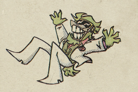
struggling w art? wanting to test art things anyway? fear not, joyous little chibied high roller to the rescue
#i am so close to passing out but woe. high roller. i managed to Draw a thing#guys do not torture yourself dont do halftone yourself just get brushes for it or smthn#(MADE THE TEXTURE MYSELF W A TUTORIAL)#(eACH SIZE AND COLOR HAD TO BE A DIFFERENT LAYER)#(IT HURTS!)#ok i did this proper! time to go back to bullshitting it bc art can be whatever i wants it 2 be#also i can and will draw other clash characters eventually im just a little burnt out whoopsie. yk how art and fixations are#ttcc#toontown corporate clash#high roller#vintage style#guz art
84 notes
·
View notes
Note
Hiii!! How do U model in blockbench, are there any tips you've got for beginners because I really like the stuff you've made in it!!! <33
Thank you so much, anon!! 🥹🥹🥹
I'll probably go around to making a beginner-friendly blockbench tutorial in the future haha (im still a beginner myself)- but I do have two video recommendations (both around 15 minutes)!
If you're just starting off, I highly recommend this one, which models a pokeball while going over basics + model texturing (they use the "draw directly on 3d model" texturing method, which I use for all my blockbench models)
And for model rigging, I recommend this video made by the same person! It's a super quick modeling process video that goes over tips w/ how to create models specifically for rigging/animation!
As for beginner tips from me, I'd definitely say that if you're just starting off using blockbench, start with something simple- like a few simple-shaped meshes & texture whatever you like on it! Just to get a feel with how everything works before modeling characters, items, backgrounds, etc
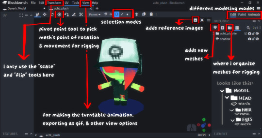
And what helped me a lot was that block's interface/layout was a lot easier for me to focus on the essentials that i frequent - in other words, the interface feels i lot more in-your-face/easier-to-read for me than complicated ones like blender or maya that makes me feel overwhelmed & going "omg what is what and which is which??? WHERE DO I START??? 😭😭😭" by the layout asdfghj-
The parts circled (squared?) in red are the only things I use (in Edit mode):
82 notes
·
View notes
Note
Hello, I’m inlove with your art style and how you draw sceneries!! I really wanna try learning how to draw backgrounds more often, do you have any tips about drawing background? Thank you!
Complete guide to Background painting:
So um thank u for asking me Caleb- chan (˃ ⌑ ˂ഃ )! Im glad u trust me on this! But I'm not actually that confident about myself on this, and as a chaotic anarchist, I'll just dump everything I know about this topic to u...
There's so much to talk about background painting, so this is going to be very long, pls bear w me here n forgive me for the broken english_(:зゝ∠)_
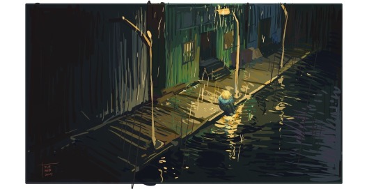
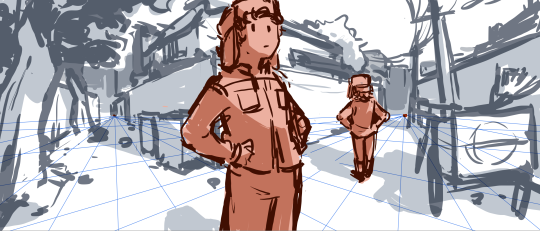
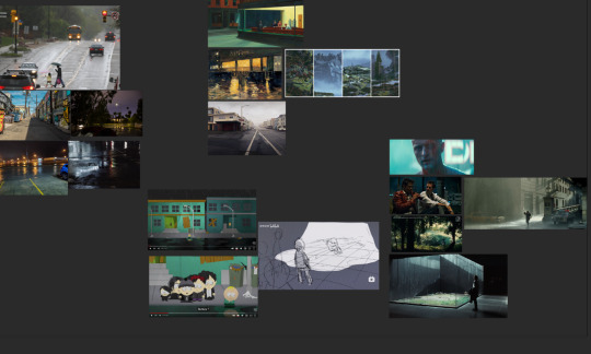
It's better to demonstrate with an illustration, so I'll be using this colorkey for that upcoming animated project as an example(two versions for different methods).. along with some other old pics of mine and this sketch I loosly built.
(Also just like I've mentioned in the color tutorial, this would be the only time I explain the theories n tricks, bc it takes too much time to make these.(;′⌒`) I hope ppl r okay w this?)
Purpose and rules
Well for me personally, I'd like my paintings to be rich in storytelling and emotion, rather than a pure decorative picture. So I'm providing two basic methods here, one about realistic background, another about surreal background.
We'll talk about these two in later chapters, but first, preparation.
Preparation
Like I mentioned in last tutorial, gather information before u start any project.
Some irl images —— for real life physics, I'm studying mostly reflections here.
Refs from the original material —— Ofc
Illustrations —— once you studied the irl physics, check out how other ppl deal with the same situation for inspiration, but pls don't just copy them.
Movies —— I think they're just neat (for a nice overall tone, and that helps making your work more)
You could start by painting characters on existing photos, it's a nice exercise.
Realistic
Realistic background requires the understanding of a lot of things, for me personally, proportion is the most important, bc it's the easiest mistake your viewer could spot.
If u check any tutorials on this they'll say u need to use vanishing points to create invisible grids and , I loosly made these to show u how they work
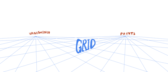
most of the time u use vanishing points to set up the whole scene, two would be enough most of the time.
( Well, or three points, if u want to do something more dramatic, fancy. Or 5 points if u want to do something even more dramatic. )
( For a more lens based logic, 3 or 5 points work best for a mock up 15-35 focal length shot.)
Do a grid using these points. and build environment following the grid.
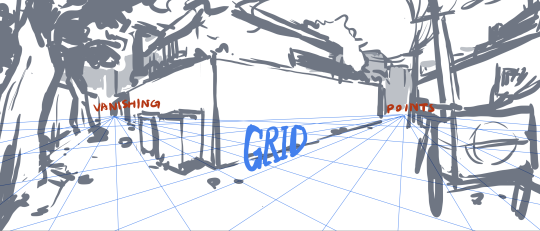
Put your character in this environment, and their vanishing point will match the one with this environment.
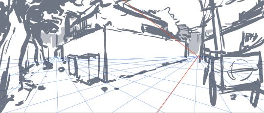
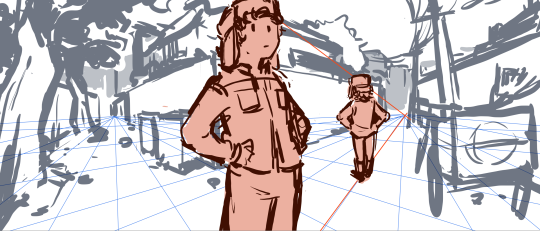
Determine the lighting for your environment, one lightsource first.
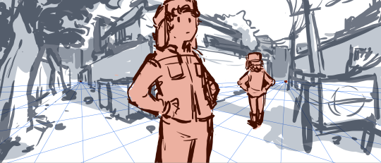
Then do the shadow for your character.
(If you don't want a very detailed background this would be enough? Normally I don't do sharp and clear perspective for a more chaotic and hand crafted aesthetic.)
But again, sometimes u just need it to be extremely accurate.
So I made a model for my animation scene, it's widely used by concept artists, so if u're interested, try it out:
u don't have to make a complete set, just boxes would also help.
Surreal
No need to think about actual background this time, just do whatever u want that makes it look good in 2d composition.
u could check out my tutorial on composition on this.
For topics and ideas to put in these experimental surreal paintings, u could try thinking in a "meta" way?
Like this one, I compositioned it from the understating of texture and material : glass.
all the strokes r square-ish, making everything looks breakable.
and the composition is also square-ish, u see sharp edges for the silhouette
Um... it's something I can't explain to the fullest, but u'll get it one day...
Demonstration
And now, the demonstration: I've painted this twice, this one using Blender as the assisting tool:
My logic here is using a mild color scheme over an existing environment, using strokes following the structure.
I made mock up lightings in my model, so the lighting is easier.
the rest is just putting Butters in this set.
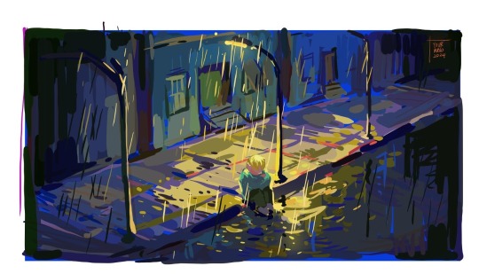
And this one just traditional method + eyeballing: (what I've been using recently)
Since I'm not painting over model, eyeballing the set or use the vanishing point+ grid method from earlier... then set the main tone for it (this time it's blue)
I went for a very saturated blue compairing to the other one.
Then paint the light out, for a main light source. I used yellow for a contrasting effect.
The rest is basically the same, but since it doesn't have a model under it I don't need the strokes to tenderize the solidness of an existing model...
Anyways...
I'd suggest u use whatever method that is more comfortable to you, bc I might not be that good at doing it most effectively_(:зゝ∠)_ and I'm sure you're going to find your own unique way!)
Recording of these two paintings is here, hope they're helpful to u:
Exercise and Summarize
So um, after each painting u might want to summarize. One thing I would do is to remove saturation and check if the grayscale looks good-
check what colors u used the most-
check what angle (or shots or framing) u like better-
check what lighting suits your atmosphere-
these are good for u to develop a style-
There are some tutorials on the internet on more of this topic, I'm sure ur able to find them, they'll do a better job for me I think~
And I'm sorry this came out so late! a lot of things have happened...
Hope u have a good time creating art, and have a nice day Caleb-!
-Maid
53 notes
·
View notes
Text
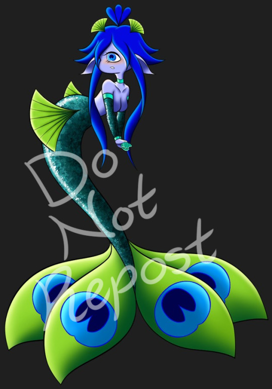
I'M SO HAPPY WITH HOW THEY TURNED OUT AAAAAAAAA 🖤💜💙💚💛🧡❤💖🌈
I really wanted to challenge myself with a more complicated theme, so I went for a peacock this time. However, I made the mistake of not naming it beforehand, so it took forever to figure that out once the rendering had been completed ralviejsbfg
Anywho, I went insane doing the flats because the colors would either clash too hard or would blend into something boring orz Then, after fucking around one time, it finally came together *Wheezes*
Honestly, I'm super happy with how the hands and arms turned out. I used myself as reference to redo them from the base I was using and AAAAAAA The hair was also really fun to make, which surprised me because it's usually the feature that's given the most trouble out of all the designs I've made thus far. I wanted to have magical girl under the sea vibes and I think I nailed it.
Endless thank you to Alle for her awesome help and for her mermaid tail tutorial that she sent me when I struggled with figuring out the texture ;w; 💜🌈
Creator of Occulae: Liinaii
Base: Liinaii
Current Owner of This Design: TID
2 notes
·
View notes
Note
9, 24 and 27 for the creator asks!
9: Would you say your style has changed a lot since you first started creating? oh for SURE. regardless of what i consider my start bc i used to gif from like 2015-2017 and then i didn't start up again until april of 2023. this time around, i have learned SO much, and i'm sure part of that is just bc of how much gif styles have changed in the last 6-8 years, but also bc i joined a couple gifmaking networks and have gotten so much help through them, found so many resources, and learned tons! to compare, here's one of the sets i was proudest of from Back In The Day. now, it's definitely not horrible, but the coloring and the slow framerate make me borderline homicidal. this one is marginally better, and i remember thinking i was really Doing Something with that typography 😂 here are some of the sets i made early on in my Return to Gifmaking this past April/May. this was one of the first times i'd ever combined multiple gifs into one and girl. what the fuck happened. why are the framerates Like That? what is this typography? i had no business making early l&o gifs 540px wide bc the quality is bad enough at 268px 💀and i think this one is a good example of i got the spirit! the execution just wasn't quite there. i like the main gif with the overlay of the sky, but i'd do the typography very differently and idk if i'd do it in b&w? i could try and remake it tbh, it's been 9 months since i made and posted it.
24: What’s your step by step? How do you organise your editing process? buckle up 😂
make clips of the scene(s) i want to use if i don't already have them
import video frames to layers
action 1: grouping and timing (groups all layers and sets frame rate to 0.05)
delete any extra frames
crop to whatever dimensions i'm using
action 2: sharpening (two smart sharpen layers) + vivid sharpening (i used this tutorial and i usually keep that folder at 30% but sometimes drop it down to 10-15%)
coloring! it depends on what i'm giffing, but i color everything from scratch at least the first time. i save a LOT of my psds, like there's one psd that i use for almost all my tfothou gifs, a couple for hill house depending on the tint of the scene i'm giffing, one for law & order that sometimes needs to be adjusted just a little, one for the good wife, one or two for satc, etc. but they're all psds that i created myself.
typography (if applicable) which almost always involves scrolling through the entire list of fonts just to use one of my go-tos
action 3: this save action from anyataylorjoy
export > save for web!
upload to hellsite (derogatory) and gifsets always immediately go to my drafts, even if i want to post them right away, just so i can make sure i'm happy with everything and try to catch any last-minute mistakes
as for general organization, i'm organized on my computer to a near-ridiculous standard, but it works for me lmao. my psds, templates, and project psds (where i save an entire finished gif if it's for a larger, complex set and then never get rid of them lmao), and all overlays, textures, icons, graphics, transitions, etc. are meticulously organized. my finished gifs are also organized into their own folders.
27: What’s your favourite font to use? in general, monsterrat. i use it for everything in google docs, and it's my fave sans serif to go with serif or script fonts. when i'm using it for giffing, i usually use semibold.
1 note
·
View note
Text
What have I got for the past month? DS CREW in an 80s cafe: 28~ hours of work - [✓] Blender + Photosop tutorials (I looked at them, but it was useless) - [✓] A more detailed sketch (I already had an idea from last year) - [✓] Sketch color, etc. with color and light (made in Blender) - [✓] Model in Blender - [✓] Over-sketch / Underline - [65%] B/W (volume) - [ ] Color - [ ] Finalization (textures, correction, signature) - [ ] GIF, posting, saving Why am I writing this? So that the group doesn't stay empty for too long. Yes, yes, I'll make it in a month, I told myself in the summer.
------------------------------------------------------------------------------
Что у меня есть за прошедший месяц? DS CREW в кафе 80-х: 28~ часов работы
[✓] Туториалы Blender + Photosop (посмотрела, но бесполезно)
[✓] Скетч детальнее (уже была идея с прошлого года)
[✓] Скетч цвет и т.д. с цветом и светом (сделала в Blender)
[✓] Моделька в Blender
[✓] Перескетч / Недолайн
[65%] Ч/б (объем)
[ ] Цвет
[ ] Доработка (текстуры, коррекция, подпись)
[ ] Гифка, выкладка, сохранение
Зачем я это пишу? Чтобы группа не пустовала долго. Да-да, успею за месяц, сказала я себе летом.
0 notes
Text
VI c. UV_1
(Previous: Changing the texture displayed in Blender)
As mentioned before, the uv_1 map plays a very different role than uv_0: it tells the game where certain parts of your mesh are located, so that the whole thing could move with sliders. It seems many people struggle with it a lot – and to be honest, I have no idea why, as in my experience uv_1 has always been totally unproblematic. Hopefully you'll share my feelings on this!
Let's click once again the little triangle on the right ('Data') and choose 'uv_1' this time.
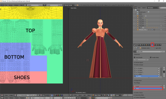
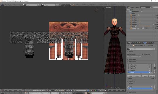
As you can see, the texture on the model turned very weird – and it'll stay this way, as that map is not meant for texturing. You can as well change to solid shading, if you find that craziness spooky or annoying.
If you switch to edit mode, you'll see that the map looks just as crazy:
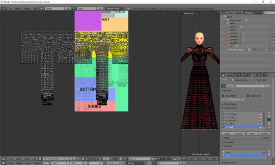
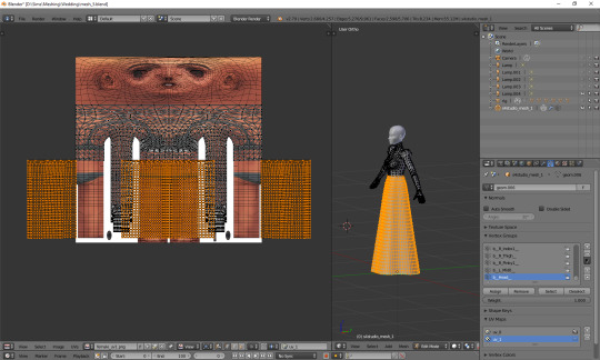
UV_1 uses a completely different type of template. It differs very slightly depending on age and gender of your sim; the adult female one looks like this:
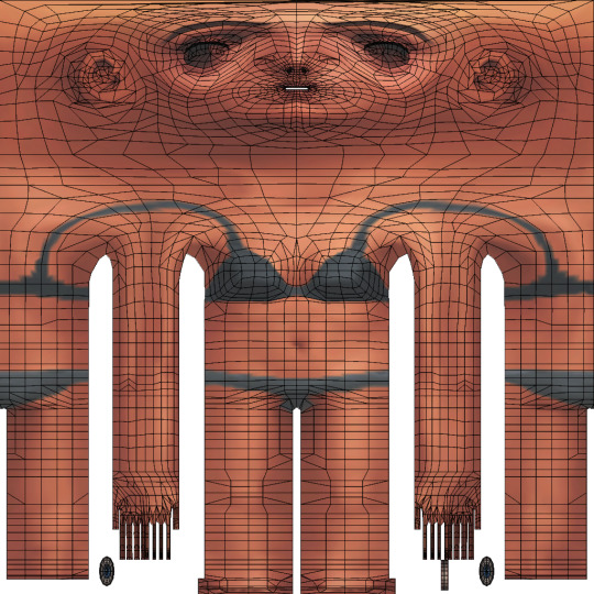
You can download all the versions from S4S forum, in HERE (I highly suggest you make some kind of 'Basics' folder for all those things which you'll keep reusing!)
Once you have downloaded it, click 'Image' and then 'Open image'. It works exactly the same as in case of uv_0. Now it should look like this:
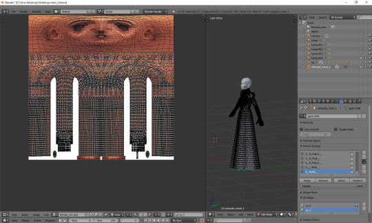
You can see that your vertices are twice wider than the template. I'm not sure why the template has been made in this way instead of getting adjusted to the TS4 requirements, but that's what we have to work with. Select all the vertices (a), press s, then x, then type 0.5 and press enter. Do not move your mouse! Your uv map should be twice narrower now:
We still have to move it, so that it'd align with the template. Select all again, this time press g, x and type 512. That's exactly the number of pixels you need to move your mesh to the right. Now it should finally look correct.
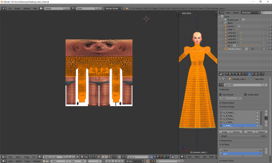
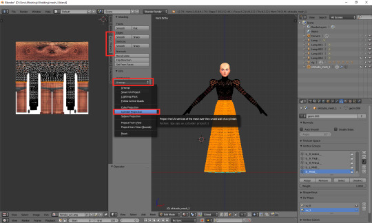
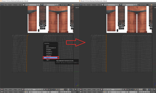
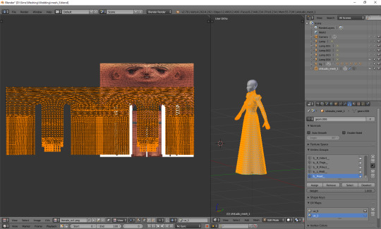
Just like in case of uv_0, the top part is completely done, so the only thing we have to do is unwrap the skirt. This time the only valid methods for doing it are no. 1 and 2 (see: VI a), namely moving the lines manually or using cylinder projection. As at this point making manual adjustments would be too cumbersome, we're going to use option no. 2.
Select the lowest line of vertices to select your whole skirt, go to front view this time (num 1) and choose cylinder projection.
Move the newly unwrapped faces up or down (g, y), to the black area, so that you could properly see them.
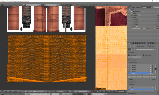
You can see that my dress got unwrapped a bit unevenly – there are small 'steps' on the sides. I highlighted all the faces which should form the left edge. Now I'll move the highlighted parts on the right to the left, and the non-highlighted parts on the left to the right, and then it should all look and work fine.
Tip: you can also move them precisely into the right place by typing g, x, 1024 (to move to the right) or g, x, -1024 (to move to the left)!
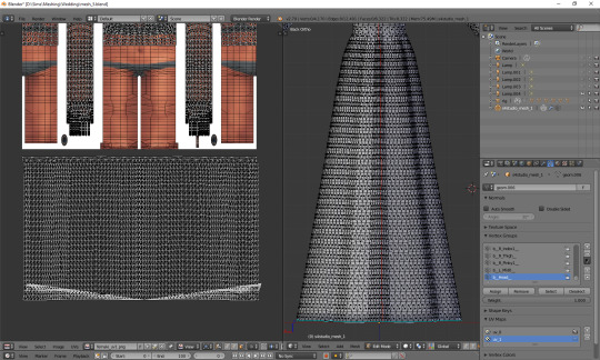
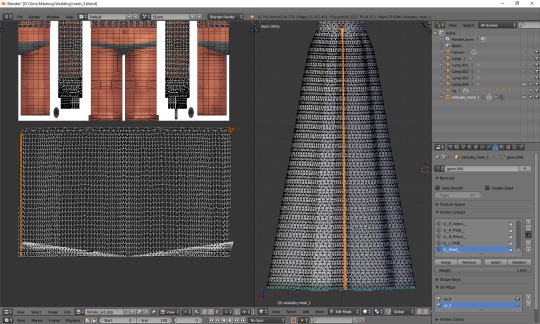
The weird part at the bottom is the closing circle; you can select the central vertex (which is here doubled on the sides), weld it and move it down, to more or less align it with the lowest row. Or simply wait with closing your dress until you're done with uv_1 ;). The bigger problem is that step my dress still has at the top. I'll select all the vertices below it and just very gently move them along the x axis to the left. Now, that looks better:
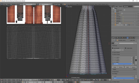
And now, just as we did before, we have to connect the skirt with the top. It's a bit trickier than in case of uv_0, because you can't do it in one piece: your mesh has to be split along the back and both sides. Take a look at the top mesh. Let's start from the left: click the rightmost face and then, in 3D view, the faces right underneath it. This will tell you where your skirt should be split.
I'll deselect the face of the top, select the whole part of the skirt left from the selection and then move it to the left (g, x), separating it from the central part.
That weird line at the bottom is the closing circle again – I'll delete it and redo it afterwards, it'll really be easier.
Repeat the same steps for the part on the right.
The edges of those three parts should be, if possible, straight. Mine aren't. To be able to adjust them, I'll select the edges and temporarily split them (ctrl + e, in 3D view). Select a vertex or two above as well, or the uppermost one won't get split!
(If you're having problems with selecting edges, it might be smart to select the whole skirt (not the top!) and change it back from tris to quads (alt + j). Then you can easily select edges by clicking them while holding alt).
Split also the top row of vertices, to separate the skirt from the top. Just for a second.
Now select a whole edge, press w and choose 'Align X'
Repeat for the remaining edges. If you want to and feel that it's needed, you can also straighten other lines in your mesh.
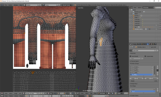
Now it's finally the time to put it in the right place. Select the skirt and move it up (g, y).
One can immediately see that it's way too tall. Scale it along the y axis until it looks more reasonable. It should start at the lowest line of the top and end a bit above the feet. Nothing big will happen if it covers them, but it has to fit inside the picture!
And now just scale and move each of the 3 parts individually, along the x axis, to match them with the top.
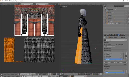
The only thing left to do is to weld the vertices. It's unlucky that we separated the skirt from the top; now we have to select all, remove doubles and then once again split the side edges to be able to weld everything properly. Just like with uv_0: select a vertex, press w and choose 'weld' from the drop-down menu. Repeat for aaaaaall the vertices connecting the skirt with the top.
Sometimes the vertices can be quite far away from each other. Is it still safe to weld them? I'd say risk it. If you see some weird stuff happening in game when changing your sim's body type, you'll know you have to fine tune it: straighten some lines, make them more regular etc. However, chances are quite high that it won't matter at all.
Select all and remove doubles. Yes, again (I keep doing it all the time, that's probably why I love the edge split modifier so much).
And now a very important, final step that I usually forget about: you have to revert the moving and scaling changes you made at the very beginning. Select all and press g, x, -512 to move it back into position, and then s, x, 2, to make it twice wider again. Otherwise TS4 will get quite perplexed with your mesh (and so will you, seeing everything being weirdly deformed and moving with all the wrong sliders)!
As you see, it's not very difficult and once you get a grip of it, you can do it in no time. To be honest, 90% of the time I don't even do the whole scaling and moving thing; I just open the picture, to know where the feet are, and adjust the rest to the top. UV_1 is really not that bad, at least as long as you don't have to deal with the upper body half.
Here are just a couple of general, closing remarks which I'd like to share:
If you move any vertices of the top, immediately move them on the uv_1 map as well. I try to avoid it at all costs, but sometimes I can't resist making just one teeny tiny adjustment... Arms are usually not a problem, neck can get problematic, and breast area is an absolute nightmare. I already mentioned it once, but honestly, better dissolve vertices and cut new edges with the knife tool than move anything in there.
If you're frankenmeshing, remember to weld any vertices you merged in 3D view! If your mesh is getting split in game when you move any sliders, that probably means you didn't connect those parts on the uv_1 map (or that it's vertex paint... but that's another story).
Of course, if you added any other parts to your mesh than just a skirt – or if you frankenmeshed a thing, but changed its location, e.g. took a hair ribbon and put it on the skirt – you have to put it in the right place as well! In case of frankenmeshing you just have to change its location on the map; if you made it yourself, you'll have to experiment with different types of unwrapping first (pssst, projecting from view usually isn't a bad idea).
There are also certain cases - rarely, but still - when it might be a better idea not to properly unwrap a part of the mesh, but weld it all together to a little dot and put it in the right place on the uv_1. The first example which comes to my mind are 3D buttons. I always weld each button to a single dot, so that it’d be changing its size evenly, without deformations. However, this comes at a prize of an increased risk of clipping.
And finally: if you're having big problems with uv_1 and my method doesn't work for you – or if you made your mesh completely from scratch, so you don't have an unwrapped top – you can always make a data transfer, copying uv_1 data from another mesh. I won't elaborate on this one, because Teanmoon already explained it all in her amazing tutorial, which you can find HERE. Scroll down a bit until you see 'UV-1 Transfers'. I think I used it myself once or twice in the past and I was quite pleased with the results :).
***
Once again, I'm sorry both for how long you had to wait for this tutorial and for its final length. I swear I intended it to be a simple, concise explanation ^^. I hope that at least it's all clear and will help you avoid any problems with uvs. Please tell me if you have any questions or if something doesn't work for you – really, I mean it! Half of my inspiration for this tutorial comes from me watching other simmers struggle with making their first pieces of CC, as it helps me notice what hasn't been explained yet.
From now on we'll be moving into the dangerous territory of clones, cuts, regions, bones and weights, and I need some time to figure out how to divide this whole topic into sensible parts. It's not even that hard, but very interconnected, and that makes it difficult to tackle – as covering it all in one part is absolutely out of the question. Please have some patience with me and stay tuned!
53 notes
·
View notes
Text
Rules: Answer 30 questions and tag 20 blogs you are contractually obligated to get to know better.
Thank uuu sweet @beinggaydoincrime !!!
Name: Kristýna (Kiki)
Gender: female
Star sign: aquarius (sun, virgo moon, libra rising :D)
Height: 5′6 (169cm) so like in the middle range where I get just close enough to get stuff from the higher shelves but also not tall enough to be sure it won’t fall down in a messy way so I have to get a chair anyway dfgjdfkgjn
Time: 15:48 and also past like 3hrs since I wanted to study for math exam that I have in a week but time blindness exists so I will have to deal with it later today
Birthday: January 24th
Favorite bands: BTS, Ateez..and then like I have variety of fav songs from different bands but really I can’t come up with the names rn
Favourite solo artists: Dua Lipa, Tame Impala, Calvin Harris, Bruno Mars, Miley Cyrus, Halsey, Billie Eilish, Rihana, Ariana Grande, Galantis, Bryce Vine,......and maaany others
Last movie: Kung-Fu Panda <3
Last show: I think it was The Mandalorian? (I think that was the last show I watched bc then I stopped bc I knew I would get distracted during my exam season if I did otherwise :D)
When did I create this blog: I think it was February 15th 2015 (to be closer to the cool and funny mcu text posts I kept on finding on insta)
What I post: like...a mix of everything, this blog is layers of my current interests, cracking up but also very serious and interesting text posts from the depth of the internet (bc compared to every other platform, the kinds of ideas exchanged here feel the most stimulating and don’t make me tired from ppl)
Last thing I googled: ramyeon - saw it on a gifset and wanted to see what kind of a korean food it was
Other blogs: I could’t keep track of them if I had a different blog for every fandom so I’m stuffing happily everything here :D
Do I get asks: from mutuals <33
Why I chose my url: I wanted something catchy/funny from mcu connected with Steve Rogers and catws was a very fav of mine (and still is), so there came up Sam Wilson’s line <3
Following: 1135.....ok I did not expect that, I haven’t checked that number in a while lol
Followers: 396 - my lovely audience, thank you for supporting the chaotic clown I am so far <3
Average hours of sleep: 7 - 9
Instruments: violin, I can remember bit of playing the flute, AND I am learning my fav songs from youtube tutorials on keyboard we have in the basement.
What I am wearing: literally the kinds of clothes I’ve been wearing the past 4months bc of online uni - sweatpants, t-shirt (one I dyed myself and the pattern turned out so well so I love it a lot - fun story, it was white and very cool w/jeans when I first bought it, but bc I was not educated about fast fashion enough back then, I bought it from Zara so its cool texture very quickly deteriorated. I tried sewing a little “it’s lit” on it and bc it was not symmetrical, it looked even worse xD two years later being stashed in the back of my drawer, I decided to dye it and now it’s alive and functioning at its best again, with a little “it’s lit” at the front! <3), and a HOODIE bc it’s cold here rn
Dream job(s): film production manager - or an actor, or an artist (but these two i have no idea how to do so that’s why it’s a dream job)
Dream Trip: Australia, New Zealand, West Coast, South Korea, Caribbean islands, really anywhere plspls I miss it so much TT
Favorite food: this is very specific but there is something sooo soothing abt sushi rice w/soy sauce. Also banana coconut chocolate chip cookies I’ve made like 6 times in these past 5 weeks.
Nationality: czech (this is a very small country and I feel amazed everytime someone even a tiny bit references it bc...I know we have the symbols such as beer, picturesque Prague center, but other than that..like I still feel we are very ordinary over here..also bc I’m becoming to feel more strongly abt how borders are again a social construct that aids nationalism and prevents healthy interactions and empathy towards other people, so that is why :D)
Favourite song: can’t choose one ever so the cURRENT one is Do I Do - Stevie Wonder
Last book I read: I think it was MDZS and I nEED to get back to it asap bc I stopped in the middle bc uni semester happened :’c
Top 3 fictional universes I'd like to live in: mcu, and can’t think of really fav two other ones so the ones that come to my mind rn: The Untamed & hp
i tag: @underaswift-sunrise @thosefinelines @victoriannarwhal @tootiredtoosadtooangry @betweencrossedblades @till-dawn-do-us-part @freshwoods @yeetlinglaozus @flythesail @space-ace13 @benniiie no pressure!!
#tag game#christine talks#this was fun aaaa#i loved rambling abt these things#esp the t-shirt lol i love sharing it#beinggaydoincrime#thank uu :33
8 notes
·
View notes
Text
--MODS (ver. 1.16.4 ~ 5 only)--
EASY; OBVIOUS
better third person (TEST THIS 🚨)
wool to string wool tweaks is better ✅
tameable rabbits ✅
more flower bushes ✅ + custom mod for more small flowers 🔲
string lights ✅ (In-game book with recipes/tutorial?⚠️)
botany pots ✅ (learn recipes ⚠️)
invisible armor (actually 1 utility armor slot and 1 visible armor slot but same thing) ✅
NEW
added camels ✅
added chimneys ✅
bell noise when fish on fishing line ✅
can sleep slightly earlier (before stars show up) ✅
better caves, better mineshafts, and stronghold saver ✅
DID NOT add better portals because no they aren't ❌
supplementaries ✅ (hanging signs, notice boards, item shelves, fireflies, etc.; life is good)
added endermail (endermen will deliver packages for you) (do test this one 🚨 it's hard to do in creative)
added flower doubler ✅
added "kelp acts like bonemeal" ✅ (note: only one of either kelp or bonemeal will grow a vine and I forget which 🚨)
added "eggs hatch when they despawn (but only on hay bales and also only when there are fewer than X chickens around already)" ✅
added sleeping bags (skip night without setting spawn point) and hammocks (skip day) ✅
added ability to use banner pattern on bed ✅ (test this 🚨)
added tea ✅ (are the teapots and stuff placeable though..?? 🚨)
BIG DEAL; CONSIDERING
create ✅ (disabled ugly ores and custom stone types in worldgen; they aren't needed to make water wheels which are ALLLLL I care about 📝)
quark (some. mob variants, maybe vertical slabs, oddities for item pipes, etc) ✅
mcmmo 🔲 (pros: taming. cons: I don't actually even like mmos)
inventory tweaks quark has everything we need actually ✅
tree felling ✅ (serilum ver.) (it's so good) (NO AUTO-REPLANTING)
lava lamps ❌❓
ON THE LOOKOUT
one person sleeping makes night be over (check which version this became a thing in) QUARK HAS ✅ BUT TEST IT THOUGH 🚨
always show coordinates and ONLY coordinates (no F3 PLEASE) (Resource pack I got for this seems not to be working. Alt: serilum's gui compass. 🚨) 🔲
immortal neutral mobs (incl. bees) Does not appear possible with any currently existing mod. However, friendly fire prevents damage to pets and I have added passive endermen to prevent aggroing our very tall friends, which should mitigate this as much as possible. ✅ WATCH OUT for cats and rabbits though, that is very much still a massacre waiting to happen. CROSS-TEST WITH RABBIT TAMING 🚨
mooblooms & moolips ✅ CHARM HAS REALLY GOOD ONES
dog variants ✅ betterdogs. Con: to get specific dog type, name of type of dog must be in nametag name, which is mildly weird. Pro: fuck it !
legible signs. (editable signs also?) ✅ vanilla tweaks and quark, respectively.
feathers + leather without killing mobs ✅ charm "chickens drop feathers passively" rule, plus combination of "rotten flesh to leather" & all-paper books.
renewable saddles + name tags ✅ saddle recipe + nametagtweaks. (note: I think I actually have more than one thing installed that adds a nametag recipe but whatever. do test both of these though 🚨 also horse armor?)
more stars/more interesting night sky 🔲 (I hate texture packs. maybe I have to fucking make one)
candy colored texture packs and shaders 🔲 (I DUNNO, YOU GUYS)
BETTER STAINED GLASS? ?? also glass slabs, stairs, etc. might have to do this myself 🔲 (absent by design may add the shapes, as would glasscutter if it were ever updated to 1.16. try absent again now that optimization mods are working? the stained glass though, I do actually have to fucking do myself; nobody understands my aesthetic tastes apparently. CROSS-TEST ABSENT W/ QUARK'S FRAMED GLASS BLOCKS? 🚨)
GOING CONCERNS
proximity chat (found a voice chat mod that might work. to test. 🚨)
teach everyone how to screenshot
NEW PROBLEMS
"In Control!" does make mobs noticeably less lively if you're not within a couple dozen blocks of them. BUT the performance increase is VITAL... play with settings.
Charm (I think?) villager adjustments COMPLETELY fuck up the village near spawn. (Solution: maybe just turn them off... they're not that good. Also, may be able to get away with JUST turning off lumberjack and leaving beekeeper on. Test savanna and extreme hills villages with these rules.)
Better Caves fucks up the cool tunnel I wanted to make next to the ice spikes but I might just worldedit it into submission lol
Quark mob variants are OKAY. I do actually need to test 🚨 whether quark and charm can both have them enabled at the same time and have that like. work. Because charm's are slightly cuter in general but I like quark's purple cow hsjdjfjf
Chimney mod is cool but oh my god I have to 🔲 turn the amount of smoke particles it generates down
QUARK CANDLES ARE MADE FROM TALLOW AND NOT BEESWAX FOR SOME REASON... but charm's only come in one color. also neither of them cluster like the ones from 1.17!!! I HAVE COMPLAINTS 🔲 (solution: different mod OR custom mod OR crafttweaker)
also quark's blossom trees are a cute idea but they're ugly. fix? 🔲 AND fix the decorated paper wall and lantern.
related: macaw's doors has sliding paper doors. pros: MANY MORE DOORS, TRAPDOORS, WINDOWS. cons: choice paralysis? cluttered recipe book?
🔲 STILL DO HAVE TO PUT MORE FLOWERS.. IN IT..THE GAME.
wooden axe is the wand tool for worldedit and so does not work as an axe. I'm pretty sure there's a way around this but I think it's funnier to just ban the use of wooden axes specifically. unhinged server laws. also yes I want everyone to have access to worldedit. yes I will murder and kill them if they use it to be rude. we live in a society
the nether is still ugly. there's not really anything I can do about that though
🔲 Limiting factor on arrows is now flint, which is annoying to get, so maybe do something about that too.
🔲 also I totally have not found a good lead recipe so that too
🚨🔲🚨 and finally: this post is now way too long so I have to work on making a coherent file that lists included features, and another that lists stuff I'm still looking to add remove or change. NOT EVEN I WANT TO READ ALL THIS !!!
2 notes
·
View notes
Note
I am dumb. I thought they had 1 effect only. But i suppose both?
That’s okay, dear! I didn’t find the tutorial anywhere!! But it’s so easy, I can make a little tutorial!!! (Btw sorry If i don’t explain myself well, english isn’t my first language):
So 1st I’m gonna show you how to do this:
Before

After

1. Using the Eyedropper Tool, choose the eye’s color. Just like this:

For me, it’s too dark so I went to the color picker and changed it to a lighter color which is #29475e. Since it’s a gif I made a new layer over one of my frames, named it “Blue” and clicked alt ctrl + G and that’s a Clipping Mask. Then I made 2 more layers and the second one I named it “White” and third one “Black”. It should look like this:

2. So on the blue one using the brush tool (t) (use a soft brush w settings: size: 4 hardness: 0%) paint over the eyes with the color #29475e. After you’ve painted over the eyes you will have to go to Filter > Blur > Gaussian Blur. Set the Radius to 2.0 (you can use 1.5 or 1.0, whichever looks great on your edit). Then set the blending mode of your layer to Soft Light.


3. On the White layer pick the color white #ffffff and paint over on the bottom of the eyes, like this:

Then pick the color black #000000 and paint on the top of the eyes. (on your black layer). Like this:

Then go to Filter > Blur > Gaussian Blur. Same settings: Radius 2.0 (or 1.0 > 1.5 whichever is great for you) and set the layer to Soft Light. Go to your white layer, click Ctrl + J and it will create a copy. Same with your black layer. On your white layer copy set the opacity to 88%, on your black layer copy set the opacity to 60% and you’re done!

You’ve to do this to every Frame/Layer and then Sharpen, add coloring and textures if you want to, so it can look like this:

And then for the text effect:
1. So create your gif, cut it, sharpen, etc. Then click T (text layer) on your 2nd frame and write whatever you want, click Ctrl + J and then rasterize your layer. (So you’ve the original and the copy. You will use the copy ONLY. The original it’s for reference) Then go to Filter > Blur > Motion Blur and the angle is 0 and distance 10 pixels.

Then do the same on each layer. So, frame 3 > copy the original text > rasterize layer > go to filter > blur > motion blur: Angle 0 - Distance 9 pixels.
frame 4 > copy the original text > rasterize layer > go to filter > blur > motion blur: Angle 0 - Distance 8 pixels.
frame 5 > copy the original text > rasterize layer > go to filter > blur > motion blur: Angle 0 - Distance 7 pixels.
frame 6 > copy the original text > rasterize layer > go to filter > blur > motion blur: Angle 0 - Distance 6 pixels.
until you get to distance 0 pixels and that’ll be all! It should look like this:

It should end up looking like this:

If you’ve any question feel free to send me a message or ask!! :)
5 notes
·
View notes
Note
Hello! Since I've seen how absolutely spectacular your art is, do you have any tips/tricks/tutorials on drawing smoke and fire? Thanks in advance!!
(I always have tips/tricks but I have to walk myself through it haha.)
First things first, I’ll always suggest looking at references of fire and smoke. There’s lots of different kinds of types of fire and there’s lots of ways smoke will look because of that. Draw from life when you can (I’ve drawn So Many campfires), but, when you can’t, look at pictures and kinda just explore the shapes and feeling from how it moves and the shapes it tends to take.
But, in general here’s the key types of fires:

Slow flames are pretty easy to sketch, they’ve got a fairly consistent outline, and tends toward the same paths. actually…… it acts a bit like (long, mostly straight) hair flowing in the wind, if that helps you think about it. I tend to start from the center and work out, but, there’s LOTs of ways to do it. Overall, you should keep your lines loose and curved making a vague coned shape.

These are faster and/or hotter fires, and tend toward thinner and more ragged edges. With larger fires, you’ll see a few more ‘straight’ lines a lot closer to an actual cone-shape.
And, for fun:

W/ fires like this^ the shape kinda shifts from a cone to a leaf-shape? it will bloom outward from the ignition point, and then very softly tapper itself off. The texture kinda shifts throughout the whole thing. Some parts will be softer, while others will have a more ragged shape, and, even more will kinda have a texture like this: (which I tend to use for clouds and trees too)

The top of the flame tends to be smoother, while the areas closer to the ignition point/bottom, tend to have this ^ explosive texture, and the rest is generally comprised of the quick-flame.
As for color, there’s a million was to do it (and I’ve tried many). In general the pattern is: base, shadow, highlights.
I personally use the ‘airbrush’ tool for the majority of coloring, particularly w/ shadows and highlights. if I have a bit of a faster or more explosive flame, I will use the pencil tool to add some sharp solid highlight lines, and give it a bit more of a sharpness.
When I’m trying for a bit more solid look, I tend to fill in the entire shape of the flame w/ the base, and then follow the outer edges of the flame with the shadow, and then add highlights, which will mostly appear in the center of the flame, However, you shouldn’t Just keep it there, add a few highlights near the edges, and along the shading. You’ll add contrast and make it feel brighter. The illusion of brightness is entirely built on highlights sharply contrasting darks.

For softer feels, I work Purely with the airbrush tool. Again, starting with a mid-tone, and then, with a slightly more concentrated size/opacity, I’ll go back over w/ the shadow and highlights.


I really follow my intuition at this point, but, it’s mostly following those shapes you made w/ the sketch.
I find fires tend to act like water in that, it wants to merge with itself. So, you’ll want to keep that merging feeling for your flame. It’s in a constant cycle of birth, merging and extinguishing in a way. Fire has a very fluid feeling to it.
Smoke is Very Similar to fire (to the point that I draw the sketches of smoke pretty much like I do a soft-flame) with one key difference it doesn’t care if it stays together, it will if it can, but, honestly, smoke kinda feels like it’s trying to escape first and foremost, even if it does so in a more meandering, lazy way.

Overall I kinda approach smoke softly first, just using the airbrush to know where it’s going, and then, I go back over w/ the airbrush on a smaller/higher opacity and outline it, and texture more concentrated areas. it’ll look a lot like the softer approach to fire, really. (you can also go back over again w/ the lower opacity to softly darken areas w/out making visible lines, if you find an area might look better darker)

This, is using a similar approach, but w/ the more cloudy look.

Meanwhile, this, I airbrushed, and then erased the edges and certain areas so that it’ll have a hard edge, and then went back over with the airbrush, and eraser w/ a lighter pass. this kinda makes it a bit more solid, but, I find it doesn’t work very effectively if you want it as the resulting smoke from a fire.

When you put smoke over a fire itself, I suggest leaving some space between the fire and the smoke. It will give your fire some breathing room, and, also indicates the area where the area of heated gas that will look clear, but have a slightly warped appearance, like the horizon on a particularly hot day.
…..
I think that’s most of what I can think of right now….. if you’d like, I can probably expand on one thing or another. Anywho, hope that helps!
Just explore how things look and feel and you’ll find something that works for you!
47 notes
·
View notes
Text
unaesthetic asks (anon edition)
i usually use a psd for asks to make them look nice and transparent and number them but tbh it’s just keeping me from answering asks quickly, having to shift layers around and stuff. so this is me literally cutting and pasting the text of some asks into a text post instead, sry.
if i did not answer yr thing here i lost/never got the ask, need a separate post to answer it (community lot anon), or worked myself into an anxious lather when i did not have an immediate response at the ready and fled into the woods to hide inside an old damp log and mutate slowly into a creature composed entirely of moss.

1) hey friend i think i can actually help with this one! slig did my poor lover for momma lisa, and has a few of my other skins linked to different body meshes in this tag here. @asimplevampire also did rehash for androgyny. those are the two i know off the top of my head but if anyone else knows any others pls reply to this post!
i don’t personally make showerproof skintones for body meshes because i a) am lazy and b) don’t usually take pics of my sims in the shower or naked in general so the occasional floating head just gives me a lil chortle when it does happen.

2) yis, it is the second to last one in this post by @magpieplayssims with a bunch of face masks piled on.

3) i use a personal edit of gunmod’s 3.1 A camera which alters the, like, central pivot axis so i can swing the camera underground into any basements i might be using. as a result, whenever i load the lot, it starts me off zoomed inside the floor, you just gotta zoom out with the scroll wheel to get above ground and it works normally from there. i haven’t figured out how to mitigate this while still being able to access underground rooms. which is why my edit never got its own post, but i did share it here.

4) nah, not really. i mean i have an outdated one at the back of my catalogue but my face is boring to me cuz i see it every day n stuff & i’m less and less interested in making human features now that custom sliders have let me go absolutely mad with power.

5) ye sorry i put that on my to-do list and promptly forgot about it cuz my brain seems to think that putting something on a list means it’s done forever now!!!! but now it’s actually done and i’m fixing the other links too.
6) yr phone is a craven liar and i will not stand for this libel. earlier today i was genuinely bewildered by a discussion about channing tatum cuz i thought his name was tatum channing. i sat there for minutes, convinced that there were two guys in hollywood one named channing tatum and the other named tatum channing and wondering if that ever got confusing for them.
7) u would be surprised, friend! my memory is a lawless wasteland but i do not end up chatting back and forth w/ many ppl b/c i am a seething pit of social anxiety. if we talked, like, more than twice, i probs remember u!
8) omg i was about to be like “nah i never made nosemasks for those” but that is a fucking lie of the highest caliber, i totally did make one (1) set and then forgot entirely about it. i will post them with the next batch of bodyshop content which should be Shortly (and if i don’t just yell @ me and i’ll just lazily put them on sfs and link them in a reply).
also thank u anon i am glad u like my content! :D

9) omg thank u so much anon that is so sweet of u to say!! truly i don’t feel like i have accomplished a whole lot beyond managing to snag @resurrection-failed but that is definitely the Best thing i could accomplish so i am 100% fine w/ that

10) oh ts4. i want to play it real bad but i have discovered that playing games that are still being updated and could break at any moment due to a new patch or ep gives me hives. esp when it’s sims games b/c those are held together exclusively w/ wishes and prayers as it is. they’re like the bottom panel of an expanding brain meme on spaghetti coding. at least when the game is Done there nothing else for EA to break (... right?). plus i only have base+pets and no money to throw at the other expansions so i could maybe download 1/10th of the cc available out there ¯\_(ツ)_/¯
but i am excited to be late af to the party. lemme tell u. thank u for saying such nice things, anon!! i hope u have a good day also. like, lots of ‘em.

11) hey anon! it’s built into tumblr’s text editor. u type the text first, highlight it, and click on the fourth button that looks like a slouchy figure 8 to insert yr link. i’m not sure if it’s the same on mobile, tho, cuz the tumblr mobile app is self-elected torture.
12) i do not right now but i can make one. idk if it would interest you but i am also doing a big ol’ blend of the hq eyes and wifezaya’s favorite ephemera mist eyes and will make a default version of those too when they are done.

13) nah i am still using my v3 texture for straight hairs and for waves or natural hair i just use nouk’s originals. i’m old-fashioned and boring. if u need help w/ making yr own, tho, i would suggest checking out @furbyq’s tutorial here!
14) hey friend! i did have plans to do that, in that vague way where i have plans to do many things but most of the time end up taking a five-hour nap under a cat instead or watchin game grumps. luckily, @digitalangels is a doll and did it for me so consider this my official endorsement. i am pooklet and i approve this action.
15) hey anon. when did i call it that?? i think usually i just call it marriage or equal marriage if i need to specify (or gay marriage if i’m feelin Spicy cuz nonbinary-for-nonbinary is pretty gay). if i did say same-sex it was probs w/ implied air-quotes since that was the term du jour when we got married, which was 3+ years before the supreme court mandate, when it was only legal in some places and everyone was still ‘‘‘‘debating’’’’ the ‘‘‘‘issue’’’’ of queers gettin all married.

16) i been gatherin’ links for u anon but lemme look around a lil more. i will either give this its own post or add it as its own section in the resource post that is like .... five years overdue. meanwhile if anyone reading this has anything they either know is made for dark skin or works well universally or knows of a list like this that already exists, i would appreciate links!

17) I KNOW THAT’S YOU, AZAYA
#anonymous#pooklet replies#wcif#pazooka#pooklet irl#sims 2#ts2#also if u got cakebread wcifs plssss ask me on dreamwidth#in the post in question#with a link to the picture
16 notes
·
View notes
Photo

HEADER TUTORIAL (requested by anonymous)
First of all, I’m insanely happy that you, dear anon, found my header worthy of having its own tutorial made. I’m genuinely surprised, but it’s a good kind of surprise. Second of all, in no way am I fluent in Photoshop–in fact, all I do is follow a couple tutorials made by some very talented people here, while making my own adjustments and adding textures until the result is not Terrible. It’s just a heads-up. And, finally, third of all, I’m not a native English speaker, so forgive all the following mistakes. I try very hard with both punctuation and grammar, I really do. :’) So, let’s begin!
1. Get the picture you want to make a header with (duuuh) in the best quality you can get. I usually go from 1080 and bigger.
2. Cut it out! I have this tutorial memorised by now, so just follow it for this step.

3. Now, let’s get to colouring. You can use this tutorial to do so, or you can search for some other ones, if the colours in your pic are different. I don’t have a specific pattern; as I said, I just click buttons until I’m satisfied with the result (I know, not really helpful, but bear with me).

Also, in this header I coloured in Joanna’s dress to make it brighter (you can also change its colour entirely!). To do that, you want to select the Layer Mask with Ctrl pressed and fill it with desired colour (in this case, it’s pink). Also, if you want to change the colour, you can just double-click on its miniature and choose another one.

Then, you get the Eraser tool and erase the pink from everything but the dress. Don’t forget to click on the Layer Mask (w/o Ctrl this time).

(It’s a bit sloppy, because I haven’t saved the original cut-out I made all the adjustments on & made a new quick one).
Next, staying on the Layer Mask, choose the Overlay blend mode for a more vivid colour, or Soft Light for a not-so-loud one. I usually go with the latter. Don’t forget to adjust the Opacity.

(My PS is in Russian, so I underlined everything needed).
4. Once you do that, go ahead and create a new file sized 700x400 (it usually works for me, but you can use other size, if that’s too small for you). Then, merge the visible layers and put the cut-out onto this new file and adjust the size (Ctrl + T & better to have Shift pressed while adjusting, so that the pic doesn’t get too stretched in all the wrong places).

4. Time to get creative. :’) Search for 2-3 textures which would look good together, and don’t forget about the colour scheme you want to achieve. Here, I used these two bad boys:


Put them behind the main pic and make all the needed adjustments, mostly with the blend mode. You can also enhance or tone down the colours, it’s up to you, really.

I also added some Gradient on the main layer for more pink. Once again, this is not identical because I had to remake it! Hope it’s not a deal breaker, I’m just showing you the process.
5. After all that jazz, I usually like to soften the edges. Select the layer with the cut-out and then choose Eraser. Make sure it’s super soft and bigger than you’d think you need:

Also, make the Opacity & the pressure of the Eraser about 55-60%.

Then you just go ahead and trace the outline of the cut-out. It’s all up to you, just make sure it looks natural and soft, and if needed, adjust the settings.

That’s it! Sharpen it & put it on your blog!

P.S. I also have a version of it in blue, just so you see you really can make it any colour you want.

I hope all this mess was helpful! I also hope you–both the anon and whoever is reading this now–won’t use these headers, because I made them specifically for myself & my friend, and I really count on your understanding. No doubt, the ones you’ll make will be even more beautiful!
#yes i make tutorials now#me an absolute fool#:')#thanks for asking tho!!#hope it helped#header tutorial#the newsombergs
27 notes
·
View notes
Note
Whoa I really love your lineless art! How do you do it?
:”ooo thank you so much, it really does mean a lot to hear that— usually bc I don’t go lineless often, it takes me forever lmao
And here’s a lil tutorial- this is just how I do lineless art. It is by no means the correct way, so feel free to mix and match w other artists! Personally, when I do lineless art, I do my best to keep it sweet and simple— i think that’s when it looks best, but if you want to go for a more detailed piece, that is okay too!
1. As always, start off with your sketch. It doesn’t have to be super detailed; as long as you got the basics of your drawing down you’re good. (Eg, I’ll add in the seams of the clothing and hair partitions later on).
2. Set your sketch layer to Multiply. Create a new layer under the sketch layer. This’ll be your first lineless layer. I usually start with the face and work from there. And another thing I do (that I find helps) is just use random colors for each layer to get the shapes of the layers down, and then go back and properly color them later. This helps me see the shapes I’m working with and refine them if I need to (I usually go with various shades of red and pink).
Some tips about layering:
-It’s easier if you divide your hair into 2 layers— a front (where the bangs usually are) and a back layer. The back hair layer is usually under all the other layers.
-Separating the face layer from the other skin layers helps make shading easier as well.
-It might seem like a pain to separate your clothes into different layers (eg for the collars and sleeves and main body), but it’s a huge help when it comes to the final shading (I’ll admit I’m a little guilty of not separating them myself when I’m in a rush :”) ).
This is what your first layer will look like when you hide the sketch layer:
It’s a little messy, but that’s okay— you can refine it if you want, but don’t get too caught up in refining before you actually get your shapes down.
3. Fill in the rest of your lineless layers. The colors look kinda weird, but that’s just to show that each color is a different layer. Note how the hair, clothes and skin are split into different sections. There’s also breast pockets on her uniform, but those’ll be added in later on. Refine your shapes if you need to at this point.
4. Now, go in and recolor everything to the colors you want them to be.
Now, it’s time for the fun part— shading!
So usually lineless art has a combination of gradients and hard shadows, yes? Do the hard shadows first. (At least, it’s what I do.)
There’s some parts that aren’t shaded yet, they’ll be colored w mostly gradients. Also, you don’t need to create a new clipping layer to add the shadows— you can just do it on the same layer after locking the transparency.

9. Make a new clipping layer over each different layer, and add gradients as you see fit. It’s really up to each different person how they go about adding the gradients. For the eyes, I usually make it graduate from dark to light, and then add a light shine afterwards. I didn’t do the hair yet, bc I have a different technique for it.

10. For the hair, create a new clipping layer over the hair layers. Then, using a default pen at different opacities, draw hair strokes— just enough to not seem overly detailed.
Using the lasso selection tool, create a selection where you want the hair shinies to go. Then, using the Gradient tool, make a gradient with the darkest part on top. After you do so, it should look like this:

Now, repeat the process for the back hair.
Almost done!

11. Now, create a new clipping over the shading layer. This’ll be your highlights layers. Set the blending mode to add, and add a couple spots of shine along the gradient you made.
And you’re done! ❤️
OPTIONAL STEP: Merge all the layers down, and create a new clipping layer over your merged drawing. Find a paper-like texture and overlay it over the drawing. The blending mode should be set to Overlay for best results.
I really hope this helped you a little bit, anon! Lemme know if you have any questions!
209 notes
·
View notes
Text
another icon tutorial
so the poll was pretty 50/50, so most likely i’ll make a gif tutorial at some point soon.
please leave any questions or requests you have in my inbox!!
i’m not the best at explaining so bear with me lol
general method
so i’m going to show you how i make these kinds of icons:

tutorials under the cut.
i try to be trendy and give cute tip sections:
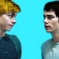
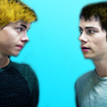
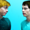
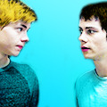
a huge tip would be to make sure your screencap is hd quality. i get my screencaps from (x), (x), or just googling ‘___ screencaps’. remember kids, always pick good quality screencaps.
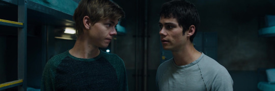
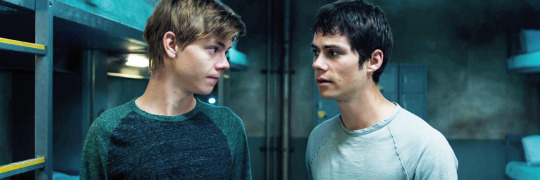
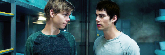
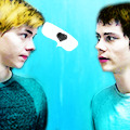
here is our screencap! two fresh ass beautiful boys, we love a couple
i use a psd for headers, but for icons i tend to just color them myself. i use curves, color balance, vibrance & sometimes a white color fill set to soft light. maybe even some selective color to brighten the neutrals and darken the blacks.
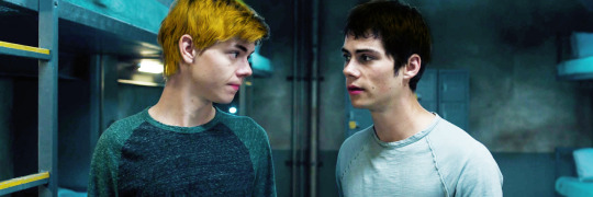
now it’s time for my personal favorite part, coloring the subjects. i take a small brush with 0% hardness in a new layer set to multiply and paint over thomas’ lips. i draw over his eyebrows with a black brush set to soft light. then a brown brush set to multiply or hard light over his hair. :)
i do the same for newt now, albeit different color choices.
next i crop the image, my icon dimensions are 120x120! you could use 150, 100, 200, but my go to is 120.

now i create a solid fill layer with the color of my choice, i add a layer mask and brush black over the subjects so they’re visible. i then take a white brush with 50% hardness and brush around the subjects until it looks like this.
i add a black and white gradient fill, set it to soft light, and angle it at 68.2.
i create a new layer and set it to color, then i paint over thomas and newt’s shirts with the same color i used for the background. then i duplicate the layer and set it to soft light.
and you could easily leave it there with a nice, perfectly good icon, but i like to add my own details and textures and stuff to make them more personal :)
(here is where we go full on crazy, windows vista is quaking in a corner, this is too bright for me to handle bitch what are you doing)
i add more curves, up the vibrance, brighten the image with selective color. (remember to keep darkening the blacks so the icon doesn’t look washed out), keep in mind that all your coloring should be underneath the solid color fill layer. i also duplicate some of the coloring layers i made, such as the hair layers and lips.
this is a lil trick that i use often for darker icons and picspams, it gives a nice glowy look that i like a lot. i zoom in and take a small white brush set to soft light, and paint over the highlights on their faces/hair.
sometimes i create a new layer, set it to screen, and take a big light blue brush and just click lightly where i want there to be more light. but i don’t need to do that for this icon.
i try to be trendy and give cute tip sections:
PSA; always color your icons to fit the lighting!1!! normally in tv shows we get shitty, dark, blue/yellow lighting that looks grainier than a 1950′s tv set. you need to be stealthy and work around the lighting. color balance is your best friend when it comes to yellow/blue lighting. here are some good coloring tutorials to use as techniques. (x) (x) (x)
i take this texture, add a b&w filter to it, set it to soft light and create a layer mask to remove the texture from their faces.

now, u could add lil doodles to it like this;
or you could just leave it as it is. i now convert (only the screencap) for smart filters, and i use a sharpening action (i wish i could remember who made it!! i don’t remember).
and boom, that is how i make most of my icons.
here is my result:
fancy/longer method!
this method is for when i take twenty years to make one icon, usually for when i make my mobile themes or a request.
examples:
and this will be our result:
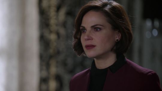
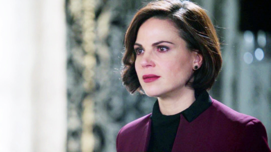
so we have our screencap, i’m using one of regina mills, one of the great loves of my life.
now we do the coloring process i used for my last icon. curves, color balance, white color fills, gradient maps, vibrance, etc.
i follow all the previous steps that i mentioned, the hair and face coloring, changing the outfit colors, cropping, solid color background.
i try to be cute and give trendy tip sections:
tip, follow the curves of the subject’s hair when coloring the outline/erasing the bg!! it just makes the icon look nicer and it flows better. sometimes you can even create your own waves.
next, add the gradients. i use an angled b&w one and then i use one matching the bg layer and angle it where the light would hit regina. i set it to screen, and use a layer mask to remove it in areas i don’t want it.
(just play around with gradients. they can rlly make or break your icon)
here is when i start messing about with lil details. i start highlighting her face with a small white brush on a layer set to soft light to make the icon stand out more, and i even take a tan colored brush (set to multiply, low opacity) and brush around where the shadows hit more; her jawline and where her hair looks darker. look at the difference
here is when i go full whack and add more curves, brightness, saturation, color balance, bring out more of the blacks with selective color and duplicate some of the coloring layers.
now i add various textures, specifically watercolor textures from this pack. (i set them to soft light and using a layer mask, remove the texture from her face.)
now, i usually google ‘tumblr cloud overlay’ or something and add them to my icon. i’m using these three specifically:
(i use them as gifs for headers, but that’s a different process. for icons i just place them over my image like another texture.)


now just duplicate any layers as finishing touches, sharpen, save, and you’re done!
(you could also change the green-blue to different colors.)
main tips;
always keep your screencap coloring as natural as possible until after you’ve added the color background, that’s when you can go crazy and go as far as you can with vibrance and brightness.
different scenes work with different techniques. you can’t follow one coloring tutorial and use it for everything, you have to keep the steps in mind and just merge all the knowledge together.
highlighting with soft light is such a nice detail!! it rlly adds to the soft glowing look
textures are the love of my life! i have a huge folder saved with hundreds of different ones, but i can link you to some that i use a lot. (x) (x) (x)
practice!! icons are fun to make and should be an enjoyable hobby, the way your icons look will progress over time. tutorials are just helpful along the way :)
#icon tutorial#ps tutorial#icons tutorial#ps help#mine#my tutorial#idk if i did a good job at explaining??#hopefully i did
57 notes
·
View notes
Note
Whaaa you're art is amazing! Like what!? Okay, okay, I got a couple questions afyer looking through your blog: ▪When did you start using Krita? ▪what brushes do you use for sketch, line, and shading? ▪what advice can you give to me as a noob and somewhat newer artist, in usimg Krita? Love you're art whether it's finished or unfinished! 🐢💕
1.) Sometime around 2014! Krita was on version 2.8 iirc. Used to crash often so my hand was kind of permanently in a claw-like position over ctrl-s lol. These days autosave has made me a bit lazier saving files.
2.) I have a bunch of brushes I made myself! But I usually stick to just one over the course of a drawing. Most of them are simple and just have tweaked pressure curves and a different brush tip.
3.) Prepare to spend a good amount of time getting familiar with the program! It’s designed to let you do your work and just provides you the tools with which to do it. More often than not people give up on Krita because it seems heavy and daunting! That and lag, but we’ll address that later.
Suggestions:
- Learn to love pressure curves. Here is a link to a tutorial by David Revoy, which shows some common pressure curves. (Also try an S-shaped curve!)
You can also set pressure curves for individual brushes if you want different feels for different brushes. It can affect size, opacity, color, etc. So many possibilities. These curves can take away a lot of stress from your hand! If you find yourself hurting because you need to put too much pressure on your lines to make them thicker, change the pressure curve! If you wanna make thin lines easier, pressure curves!
- On that note, play with the brush settings! There are so so many options it seems daunting, but the pixel brush alone can give you many great effects! Play with brush tips and spacing and rotation and the aforementioned curves! They don’t have to be super weird to be useful! My favorite brush is probably just the default brush with different pressure curves for size and opacity. Moat of my brushes are variations of that, to be fair.
- Shortcuts are your friend. Open Krita and have a look at the keyboard shortcuts settings. You can probably bind nearly everything to a keyboard shortcut! I have my most used ones mapped where my left hand can reach them, my fingers barely even have to move. Learn what tools and shortcuts you use the most!
- Navigate like a boss. Learn these by heart:
PAN (space + drag)
ZOOM (ctrl + space + drag) (reset with ctrl+0)
ROTATE (shift + space + drag) (reset with 5)
MIRROR (M) (mine is set to shift-v though because I use it a lot)
- Blending modes are awesome. There’s two. Layer blending modes and brush blending modes. Each can be used to make fun effects! For example, creating glowing stars is easy with a scatter brush and addition brush blending mode. I also love to do bright lighting with a new layer set to hard overlay. Behind is also great if you are lazy like me and just want to paint on the same layer but gosh dang the lineart is in the way.
Read more about blending modes here, if you wanna get all geeky and excited about it like me. Here’s a video on blending modes by GDquest, so you can see their effects visually.
- Read the wiki! It’s there to answer all your questions and more. If not, you can always post a question on the IRC or forums, or you can also throw a question my way or to krita’s tumblr.
Other fun features:
- wraparound mode (W) - good for tiles images such as wallpapers
- multibrush - make perfectly symmetrical images or things like snowflakes
- animation - enough said!!
- different layer types such as clone layers and file layers! which can be combined with transformation masks as seen in this tutorial here by Wolthera.
- document information - found in the file menu, it tells you who is the author (you can set up in settings) as well as how much time you spend on a file! Very helpful, especially with commissions!
Krita and lag
If you have a not so powerful computer (like me) lag can be a deterrent. Some tips:
- Try not to work on super large canvases. (lately though, with instant preview, it seems to be a little better)
- Turn instant preview on or off. Sometimes it works better without it, sometimes it doesn’t.
- Brushes tend to be a source of lag, such as large textures, small spacing. Try to use smaller textures and increase the spacing of the brush.
- If your brush doesn’t need to be super accurate (like a heavily textured rough brush), set precision to 0.
Aaaand that’s pretty much it! I’ll add more when I come up with more, feel free to send an ask if you have any more questions! Krita is like, one of my favorite topics and it gets me too excited. I’ve typed this out like 3 times and had to retype it twice now lol but yeah. Have fun!
90 notes
·
View notes