#Design feedback
Explore tagged Tumblr posts
Visit Tumblr Blog
Explore Tumblr blogs with no restrictions, modern design and the best experience.
Last Seen Tumblr Blogs


Fun Fact
In 2020, Tumblr had 29.4 million users in the US.
Text
Thoughts?


4 notes
·
View notes
Text

Feedback
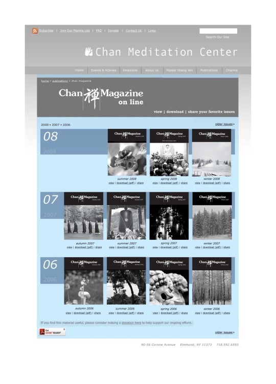
[Design feedback on Tony Kushner's web page design given via email on September 27, 2008 at 2:38pm]
Chan Magazine Online
▪️I see why you did the "08", "07", "06" with just the last two digits but you may want to add the 2008 for those that are just stupid. I know it says the year under the issues, but people are just dumb. I have enclosed an idea of a potential treatment
▪️I would also suggest the addition of a breadcrumb, its an indicator where you are on the site. I have included that in my suggested layout revision also.
▪️I would shift the donation to the bottom of the page its awkward being at the top. esp on the first page. I just got to this section and you have your hand out already it seems in appropriate.
▪️note the "share your favorite" opens the pandora box for another form element page
▪️I added the years at the top of the page too if they don't have too many years that might be a good alternative to "older" issues. You can just bold the issues that are on the page your on and underline the rest showing that there are links to other years.
▪️What happens when you click "view" or "download" in the grey header at the top of the page? Does is show the current issue, that is a little confusing. If it is instructional you may want to treat the copy differently.
Event Calendar
▪️I would consider the use of breadcrumbs on this page too
▪️I know you have a very grey palette but the hierarchy of the header versus the body copy isn't totally clear. I would try to knock out "ongoing activities" so its clear that everything in that bar is ongoing, there are several ways you can do that. Darken the grey, left justify the copy, or make it bigger to fill the box so it take more ownership of the space
▪️The right side of the page is not clear that they are "May Events" you may want to either move your sub nav "may", june", "july" over so the may falls in the blue box, secondarily you may want to add a header that says "May Events" at the bottom of the section you may want to put a link on the bottom right to "more May events" so the page isn't too scrolly.
▪️Do you have a thing against line breaks I have added some horizontal lines to break up the information a little bit more. a problem I am having scanning it, is isn't hierarchied well, which makes it hard to visually scan
▪️the grey on white in the on going events its a little hard to read I would really consider going with black
General Note
▪️You need to have a stronger top of the page lock up for this content that is off the homepage, right now you have information jumping all over the place you really need to have a consistent lock up so the user isn't confused moving from page to page.
▪️My previous suggestion of adding breadcrumbs would help with consistency but also your placement of headers and even your color treatments should not jump around so much. ie if dark grey is the header color for the publication section every section of publications should have the grey header. If all of the calendar is that teal color all calendar pages should have that teal header.
▪️But please do a consistent header for each section no matter if they have their own special type treatment. There is nothing wrong with redundancy but you need to have consistency when navigating the page are the user will be confused. A good exercise is to drag all of the jpegs of your flats to preview and scroll thru them seem which content is jumping around from page to page. In a good design you don't want a lot of that. The only major changes should be coming in the body of the page but not in the footer and headers of the page.

[Afterwords: I was oscillating on whether I should share this email or not, but then I thought about the fact that I am a multi-faceted individual and my interactions aren't always just limited to romantic or plutonic relationships, sometimes I take on more of a teacherly role. By this time I had designed dozens of websites, and had been the business manager for an interactive department at a boutique ad agency, I had a good grasp on web page design and could easily advise a bourgeoning designer.
What I love best is my feedback is even, and not attacking the designer but giving my opinions on how to make the designs stronger. I will have to admit, it was actually exciting for me, because I was taking on a more creative director role. In an ad agency there is a hierarchy to a design team, the creative director usually oversees an art director and a copywriter.
The AD and CW will drive the content and design and the CD will just make sure it all makes sense and is on brand for the client, taking in all the information they may have from direct client meetings, et al. It's a more advisory role. Thats what I felt like I was doing here with Tony, taking on an advisory role to his design. Unlike an agency, my feedback was voluntary, he could take what I said or not, I would never usually see revised flats unless he got stuck again.
Also the comments all make sense even without having the actual flats to look at. I am really trying to relay my thought process, and what I feel a user will experience as they navigate the page, something called usability. It just reminds me of how good I was at this kind of work, and albeit website design would move to a more template based application driven platform, I loved this period of time when an actual individual would design all the elements on a page.
I think I am understating how much I loved website design. I would sometimes just design pages for shits and giggles, nothing that would ever get programmed, but because I loved the challenge of taking someone else's page and figuring out another way to execute it creatively. I remember sometimes being in front of my computer for twelve hours straight coding a page, trying to get everything right. Hand coding was just so relaxing for me, I probably would have made a good engineer if I kept at it, but then like so many things I begin to loose interest.
I love that Tony felt that I was enough of an expert in this to approach about feedback, I am pretty sure I put more than ten thousand hours into this at this point. I would get so frustrated with clients who didn't really understand the depths of my skills, and how much backend work I put into their pages, some of which stood up beautifully decades later.
Now I need to find a visual to go with this essay, what exactly can show something that you don't necessarily photograph while you're doing it? Now that will be the challenge, won't it?]
[Photos courtesy of the Brown Estate]
#website design#feedback#creative director#hand coding#HTML#web 1.0#flat design#design feedback#usability#breadcrumbs#global navigation#trevor brown design#email#page layout
0 notes
Text
Job Application Confirmation Emailer Redesign
I recently applied for the designer's position at smallcase.
But something seemed off this time.
I have applied previously for the role of content writer.
But something went unnoticed.
The email that I received as a confirmation in response to my job application had issues with typography and visual design in general.
smallcase as a product is very dynamic.
I wanted to match the visual tone of the emailer with that of the website.
For this purpose: ➡️ I looked up the typeface used in the website, which is Graphik Web. ➡️ Got similar typefaces currently used in modern designs such as Montserrat and Raleway. ➡️ Added visual elements like shapes and coins to add depth. ➡️ Added slogan and "We" to the line "Hope you are doing well!" to provide a personalized touch.
I hope to have done justice to the template's design.
I am posting the designs individually and the final desktop versions.
Any feedback is welcome as I am open to growth.


#ui ux design#graphic design#design inspiration#job application#creative process#typography matters#visual design#design feedback#dechnsign#theharssharora
0 notes
Text
#BugHerd#Website feedback tool#Project management tool#Web development process#Streamline web development#Bug tracking tool#Collaboration tool#Agile development#Web design feedback#User experience (UX)#User interface (UI)#Developer tools#Design feedback#Team collaboration#Productivity tools#Efficient workflow#Quality assurance (QA)
0 notes
Text
“I don’t like that Sera is sharply dressed because it feels like a lesbian trope”
Maybe she just likes being sharply dressed?
#txt#I enjoy reading the feedback but I found this one a bit odd#I was going to avoid explaining the designs but tl;dr Sera is high ranking so I wanted to give her an outfit that suited her character#idk maybe it’s just me since I’m a lesbian myself but I don’t really enjoy being told a design is bad because it feels stereotypical#some lesbians do in fact like suits!
2K notes
·
View notes
Text


#Candace bird#at least I made a birs au now and I escaped the fish au#animal au#phineas and ferb#pnf#ferb fletcher#phineas flynn#candace flynn#art#traditional art#fanart#any feedback on these bird designs?#also do you like the more polished drawings or are the sketchy ones like the second image good too?#I won't stop making either I just want to know what people think cause I'm nosy
688 notes
·
View notes
Text

painter!🎨
#roblox pressure#pressure roblox#pressure fanart#pressure#pAInter#digital art#my art#i honestly don’t really like how design turned out#my last hope for changing my mind is any feedback#KSKSKDK
1K notes
·
View notes
Text

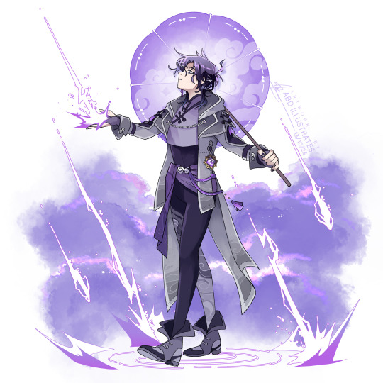
☔ Lixin ☔
More art from this week's video! In which I made a more Genshin Impact OC’s! Second to last – (but certainly not least) – is this sword-wielding meteorologist from Liyue with an electro vision and a 100% chance of running into thunderstorms! ☔
[DO NOT EDIT OR REPOST TO OTHER SITES / ACCOUNTS] ♻️reblogs are lovely tho!♻️
#artists on tumblr#abd illustrates#genshin impact#fanart#character design#original character#all the comments about him so far have been so hilarious y'all thank u for your very thirsty feedback god bless 🙏
3K notes
·
View notes
Note
Wow, I absolutely love your discworld art. The shapes you make with each character are so delightful and energetic and distinct. Thanks for posting them.
omg thank you so much….. people have been telling me a lot how much they love the shapes and i couldnt be happier… i love character design yippee ^^
have an old vetinari sketch where he kinda has my posture…

#send me asks to unlock more sketches ig#i have so much more#AND THEYRE COMING TRUST#i just gotta prganise them so its not total chaos#but really the feedback i have been getting on my discworld art specifically on tumblr is so heartwarming#like#guys#i love it sm more on here than instagram i get to see everyones thoughts its so cool#especially when they point out stuff i put there on purpose#like yes#my art#art#artists on tumblr#character design#discworld#lord vetinari#ask
275 notes
·
View notes
Text
Here's the man of the hour...
Diomedes of Argos ✨⚔️

Here's a better look at the full body if you want it <3
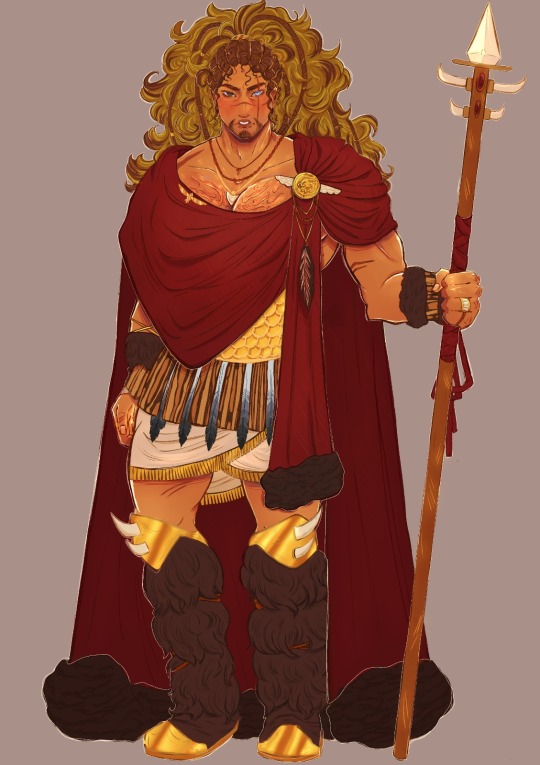
anyway, you know the drill, here's the detail dump after the cut!! vv
HIS HAIR + GROOMING - his mane of dirty blonde hair, not unlike a lion's mane 🦁! Diomedes is likened to a lion in battle many times in the Iliad, and upon my first uninfluenced impression of him, I could NOT get the lion imagery out of my head. I'm very aware that boars and albatrosses are more commonly associated with him, but I just got too attached to liomedes!! yea he has a weird mix of locs and free hair, don't ask me how it works it just does okay NONE OF MY DESIGNS ARE EVER REALISTIC yall should know this by now lolll... you might also notice though that his facial hair is in a similar shape to that of boar tusks 🐗✨, of course I had to pay homage yall!!
THE HELL ARE THOSE GOLDEN MARKS? - they're ichor, you silly goose!!! in book 5, Diomedes has a moment of aristeia, where he wounds both Aphrodite and Ares in battle ⚔️🩸✨! there's a common perception that ichor marks are permanent and similar to burn scars, and I think that's so damn cool, so he's got some marks on his upper chest from Aphrodite's ichor splashing down his cuirass, and his palms are stained with ichor from Ares + vigorously trying to scrub the marks off himself and his spear lol (I imagine it kinda stains the wrinkles and lines in his palms, but yall know I cant be bothered to draw detailed hands like that). ON THE TOPIC OF SCARS, peep Pandarus' arrow scar in his shoulder + oath scar on his palm that's barely visible lol ‼️ In the same vein, he's got mismatched eyes 👁️🫦🧿 from Athena's blessing of sight to him (in book 5, Athena blesses him to be able to tell the difference between gods and mortals!)
BOAR EMBLEM + BOAR TUSKS & SKIN & FUR + OWL FEATHER + ALBATROSS FEATHERS & PIN - kinda speaks for itself? boar cause.. tydeus 🐗, owl feather cause athena loves that guy 🦉, and just a couple of albatross nods here and there for now 🪽. I like to imagine Dio's life in stages of animals-- as a kid (epigoni) he's a boar, still trying to emulate his father, in the war he's a lion, finding his own footing and also being freaking insane, and after that (Italy) he's an albatross (as he's usually described as then). In the time period of the Iliad, he'd be a nice in between of all of this, thus the mix of kinda all of those symbols!
YOU READ THROUGH ALL THAT???? - okay congrats thanks for sticking around this long!! here's an extra hc just for you-- the soles on the bottoms of his shoes have paw pads on them 🐾! they help to cover his tracks, cause he's a smart boy like that! Odysseus isn't the only champion of Athena who has tricks up his sleeve! that's definitely the only reason and it isn't mostly a decision I made cause vibes + cute..... I'll try to include this feature in future drawings, though it's hard to show LOLLL, for now just know that the little paw prints all over the Achaean camp aren't from some cute lil puppy padding around but actually from a full grown ass man
this guy is long overdue! I've adored Diomedes ever since I first read the Iliad (my friends can attest to this I am so annoying to them about him)... I was really disappointed joining the Greek myth fandom to see that so FEW people liked, or even knew about this guy! buttttt diving deeper into the fandom + over time, I found more and more like-minded people who are just as (if not sometimes even more) insane about him as I am! and i've met so many lovely friends through that too 🩷🩷🫂‼️
thank you again for your love and time <3 you can look forward to more designs! I love adding little details into my designs, and there's a couple I might have missed out even with all this rambling, so if you can spot them they're a little treat for you hehe. again if yall notice anything I might not have noticed before, do lmk so I can pretend like that was my intention with the design all along lol hehe I love you all! thank uuuu!!! 🩷🩷🩷
#greek mythology#tagamemnon#greek myth art#the iliad#homeric epics#diomedes#diomedes of argos#character design#i love him so much 😞#pls lmk what you think of him! adore any and all feedback <3#okay kisses bye xoxo
306 notes
·
View notes
Text

Tweaked Ion's design again; hopefully settled on something a little more concrete?
#pokemon#pkmn#art#doodle#pokemon mystery dungeon#pmd#zeraora#(oc) ion#(oc) team vip#azurity have a stable and unchanging design challenge: impossible#OKAY but I'm actually so much happier with this than the last rendition#the idea with the zappy stripes/pattern was that they could visually indicate electricity travelling through the limb?#or something along those lines haha#the only issue is actually getting to the point in canon where I can show off the second form more ^^;;;;;#i say having not written any canon#also shoutout to senty for feedback on the design process 🙏
206 notes
·
View notes
Text
Ben 10 Upgrade redesign [Art Twitter @Emorio357]

#ben 10 omniverse#ben 10 alien force#ben 10#ben 10 fanart#ben 10 ultimate alien#ben tennyson#character art#character design#character concept#gwen tennyson#ben 10 upgrade#rook blonko#ben 10 fandom#ben 10 fan alien#ben 10 four arms#ben 10 feedback#ben 10 reboot#ben 10 uaf#kevin levin#ben 10 au#ben 10 classic#alien fanfiction#alien fanart#alien oc#oc art#original charater art#original character#ocs#oc artist#transformers
276 notes
·
View notes
Note
OMG SCOOPED MICHAEL AHHHHH I LOVE HIM SM IM SO HAPPY YOUR FINALLY DRAWING THE LIL GUY
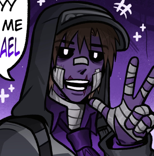
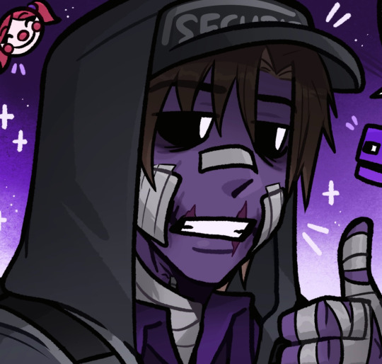
THE GUY EVER is finally here!!
#ask reply#literally I’m so happy y’all loved his design#I really didn’t want to disappoint but the reaction/feedback has been great#I’m gonna have sooo much fun drawing him#there’s too many ideas to do but I’ll try and do em all 💜
2K notes
·
View notes
Text


page o woims
1 2
#dragon age#dragon age spirits#dragon age veilguard#veilguard#dragon age spirit designs#concept design#digital art#artists on tumblr#concept art#feedback encouraged
367 notes
·
View notes
Text
Hi hello!✨
I've mentioned a couple days ago I'll be releasing a merch interest survey, so here it is! All the details should be in the form itself so have a gander if you're interested!
#cheea chatter#bts#ill be reblogging this a couple times over the course of the month while i sort through some patreon stuff#then ill be able to get to designing once ive gotten enough feedback!#thank you <3!#edited so you dont have to sign in to respond#i feel like thatd make things easier for folks!
193 notes
·
View notes