#GISmapping
Explore tagged Tumblr posts
Visit Tumblr Blog
Explore Tumblr blogs with no restrictions, modern design and the best experience.
Last Seen Tumblr Blogs


Fun Fact
After the announcement of the deal with Yahoo!, there were 170K signatures of unhappy Tumblr users petitioning to prevent the sale in 2013.
Text

This is WAY different from my usual art, but I'm posting it anyway! I start GIS masters soon and before then I'm practicing making maps in Esri tutorial projects. I'm trying to do one a day, or at least like every other day. This Arctic Sea Ice Decline map took me around 4-5 hours to make, and I changed it from the instructions because I wanted clearly defined decade chunks rather than a gradient map of ice presence over time lol (also just wanted to see if I remembered how to do it). The tutorial provides data sets to use and it's my job to assemble and analyze the raw data and visualize it using ArcPro into something recognizable.
but yea expect to see more little maps n such I suppose
#art#is this art? Im saying it is#arcgispro#arcpro#map#mapping#maps#arctic#arctic ice#ice#environment#environmental science#aesthetic#wyyrmwood#gis#gismapping#digital#ice cover#data#datascience#data analytics#computer science
9 notes
·
View notes
Text


👉 Beneath the Himalayas: Unveiling the Underwater Secrets of Jammu & Kashmir with Bathymetric Surveys ✅ Bathymetric Survey in Jammu & Kashmir plays a vital role in understanding the intricate underwater terrain of this ecologically rich and strategically significant region. Jammu & Kashmir’s water bodies—from the lofty alpine lakes like Dal and Wular to the glacier-fed rivers such as the Chenab and Jhelum—serve purposes far beyond their breathtaking beauty. Call : +91 8074692090 Visit : https://slokainfrasolutions.com/blogs/bathymetric-survey-in-jammu-kashmir/
#BathymetricSurvey#UnderwaterMapping#HydrographicSurvey#LakeMapping#GeospatialData#InfrastructureDevelopment#SmartSurveying#EnvironmentalMonitoring#RemoteSensing#GISMapping#SlokaInfraSolutions#DepthMeasurement#SonarTechnology#WaterbodyMapping#SeabedSurvey#SurveyTechnology#JammuAndKashmir#Himalayas#JKTourism#KashmirLakes#IndianGeography#HimalayanWaters
2 notes
·
View notes
Text
Mapping Stories That Matter: Exploring Culture with Interactive Story Maps
Stories aren’t just found in books—they unfold around us every day. In the rhythms of daily life, in the spaces we move through, meaning is constantly created. Interactive story maps help capture that depth—not just showing where things happen, but why they matter.

Beyond Pins and Text: Why Story Maps Make a Difference
Interactive story maps created on platforms like MAPOG blend spatial data with visual storytelling. Whether it’s showcasing monuments, documenting community spaces, or mapping cultural festivals, story maps provide dynamic, multimedia-rich experiences. Each point on the map becomes a micro-story, complete with descriptions, images, and meaningful context.
Instead of a static document or a plain PDF, a story map lets users explore data intuitively—zooming into areas, reading histories, and drawing connections between places and their cultural significance.
The Challenge with Traditional Methods
Spreadsheets, reports, and slide decks may convey facts, but they rarely spark curiosity. They miss the visual relationships between locations, and they’re hard to interact with. By contrast, story maps let you see clusters, patterns, and trends. For example: Where are India’s Buddhist sites concentrated? What colonial buildings align with old trade routes? You can't spot that in a list—but you can on a map.
Who Benefits from Story Mapping?
Creating a story map using MAPOG isn’t just a tech activity—it’s a cultural tool that serves:
Educators & Students: Bringing history and geography to life in classrooms through visual journeys.
Tourism Boards: Highlighting cultural circuits and local heritage trails to inspire travelers.
NGOs & Researchers: Mapping social initiatives or heritage restoration projects spatially and clearly.
Content Creators: Building engaging blogs, portfolios, or exhibits with embedded interactive narratives.

A New Way to Connect with Culture
By turning data into narrative and maps into experiences, story maps do more than display—they communicate. They help us see patterns we hadn’t noticed before. And more importantly, they make heritage, culture, and community stories more approachable, discoverable, and memorable.
In an era where visual storytelling is more impactful than ever, story maps empower us to map what truly matters—from ancient ruins to modern social movements. With tools like MAPOG, it’s never been easier to create and share stories that are grounded in place and rich in meaning.
Your story deserves a map—and the world deserves to see it.
4 notes
·
View notes
Text
How to Add CSV Data to an Online Map?
Introduction
If you're working with location-based data in a spreadsheet, turning it into a map is one of the most effective ways to make it visually engaging and insightful. Whether you're planning logistics, showcasing population distribution, or telling a location-driven story, uploading CSV (Comma-Separated Values) files to an online mapping platform helps simplify and visualize complex datasets with ease.

🧩 From Spreadsheets to Stories
If you've ever worked with spreadsheets full of location-based data, you know how quickly they can become overwhelming and hard to interpret. But what if you could bring that data to life—turning rows and columns into interactive, insightful maps?
📌 Why Map CSV Data?
Mapping CSV (Comma-Separated Values) data is one of the most effective ways to simplify complex datasets and make them visually engaging. Whether you're analyzing population trends, planning delivery routes, or building a geographic story, online mapping platforms make it easier than ever to visualize the bigger picture.
⚙️ How Modern Tools Simplify the Process
Modern tools now allow you to import CSV or Excel files and instantly generate maps that highlight patterns, relationships, and clusters. These platforms aren’t just for GIS professionals—anyone with location data can explore dynamic, customizable maps with just a few clicks. Features like filtering, color-coding, custom markers, and layered visualizations add depth and context to otherwise flat data.
📊 Turn Data Into Actionable Insights
What’s especially powerful is the ability to analyze your data directly within the map interface. From grouping by categories to overlaying district boundaries or land-use zones, the right tool can turn your basic spreadsheet into an interactive dashboard. And with additional capabilities like format conversion, distance measurement, and map styling, your data isn't just mapped—it's activated.
🚀 Getting Started with Spatial Storytelling
If you're exploring options for this kind of spatial storytelling, it's worth trying platforms that prioritize ease of use and flexibility. Some tools even offer preloaded datasets and drag-and-drop features to help you get started faster.
🧭 The Takeaway
The bottom line? With the right platform, your CSV file can become more than just data—it can become a story, a strategy, or a solution.
Practical Example
Let’s say you have a CSV file listing schools across a country, including their names, coordinates, student populations, and whether they’re public or private. Using an interactive mapping platform like the one I often work with at MAPOG, you can assign different markers for school types, enable tooltips to display enrollment figures, and overlay district boundaries. This kind of layered visualization makes it easier to analyze the spatial distribution of educational institutions and uncover patterns in access and infrastructure.
Conclusion
Using CSV files to create interactive maps is a powerful way to transform static data into dynamic visual content. Tools like MAPOG make the process easy, whether you're a beginner or a GIS pro. If you’re ready to turn your spreadsheet into a story, start mapping today!
Have you ever mapped your CSV data? Share your experience in the comments below!
4 notes
·
View notes
Text
#gsourcetechnologies#engineeringservices#architectureservices#GISmapping#geographic information system#cadastralmapping#utility mapping#map digitization
2 notes
·
View notes
Text
Add Excel Data to Geographic Boundaries Using Excel Attributes
In many industries today, data lives in spreadsheets. From population statistics to energy consumption and public health figures, Excel is a go-to tool. But here’s the catch: on its own, Excel doesn’t provide spatial insight. That’s where GIS comes in.

Why Spatializing Excel Data Matters
Imagine having a table of population data for every state but no visual representation of where those populations are growing or declining. You might see trends in numbers, but geography adds depth. Geographic Information Systems (GIS) allow us to take that spreadsheet data and layer it over physical spaces — turning raw numbers into actionable insights.
Whether it’s urban planners tracking population shifts, health departments mapping disease outbreaks, or educators visualizing literacy rates, mapping Excel data unlocks new meaning. But until recently, doing this required heavy software and technical skills.
The Simple Approach to Data-Driven Mapping
Now, platforms have evolved to simplify this process. For instance, tools that support Excel attribute join workflows allow users to upload geographic boundary data (like state outlines), then attach Excel files with matching attributes. Once the common attribute is identified (like “State Name”), the tool automatically binds the two, generating a new layer with visualized data.
The best part? It doesn’t require a GIS degree. Some platforms even allow users to style their data — think color-coded population maps or density overlays — and share them interactively. You can explore this simplified workflow MAPOG.

Industries Embracing This Change
This approach is gaining traction across industries:
Public Policy & Governance: To plan resource allocation or infrastructure development.
Retail & Market Research: To analyze sales by region and optimize store placement.
Environmental Studies: To map deforestation or water scarcity based on field data.
Education: For teachers to demonstrate geographic trends and engage students visually.
In short, the ability to connect Excel and geography is helping decision-makers respond faster and smarter.
Final Thoughts
Mapping shouldn’t be a barrier—it should be a bridge. And if you’re sitting on a spreadsheet full of valuable insights, it might be time to explore platforms that let you bring it to life. You could start with one like MAPOG. It’s intuitive and built for users who need clarity, not complexity.
0 notes
Text
youtube
Dari Nol ke Pro di GIS & IT Tools! Diskon Besar + Komisi 50%!
📘 QGIS, ArcGIS, KeepassXC, Survey GPS Android 💼 Pelatihan + Bisnis dalam satu paket
MAYAR:
LynkID:
UDEMY:
#KursusGIS#TrainingITIndonesia#KomisiReseller#DiskonGIS#BelajarDigital#MasterJondITGIS#GISMapping#Youtube
0 notes
Text
Mapping Cyclone Shelter Locations and Access in Coastal Regions Using GIS Tools
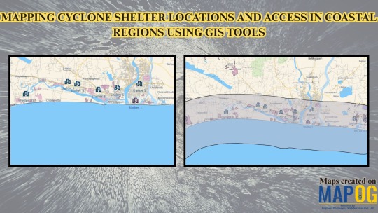
In seismically active regions, the safety of school infrastructure and evacuation zones is crucial. With GIS tools, students and researchers can develop interactive maps to assess school location safety, evacuation access, and hazard exposure. By layering schools, roads, fault lines, and land use, raw spatial data becomes a powerful visual tool for planning and preparedness.
Why Use GIS to Map School Safety in Earthquake Zones?
In earthquake scenarios, rapid evacuation and structural integrity determine outcomes. GIS helps us explore vital questions:
Are schools located near active fault lines?
Do they have accessible evacuation routes?
How many students fall within high-risk zones?
By overlaying spatial layers such as roads, topography, and school locations, users can assess exposure and propose mitigation strategies. Intuitive tools make it accessible for educational and planning use with no coding required.
Key Benefits of GIS Mapping in Education and Risk Assessment
Through hands-on spatial planning, this activity teaches essential GIS techniques like buffering and shelter mapping, applies real data to emergency scenarios, and brings together students, organizations, and agencies to build geospatial insight and improve disaster response efforts.
How to Use GIS tools for a Cyclone Shelter Mapping Project
Start your project by opening a new story, giving it a relevant name and description that highlights cyclone shelter mapping. Load critical layers including administrative borders, road networks, and land use to reflect populated zones. Draw the coastline using Add Story, and apply a 5 km buffer to mark the cyclone-prone region. Manually place cyclone shelters, adding key attributes such as capacity and emergency contacts. Use custom symbols and clear labels for better understanding. Share the finished map through the publish feature for emergency planning and public awareness.

Sample Data Fields for School Safety Mapping
Location, Student Capacity, Elevation (m), Evacuation Area, Nearby Roads, First Aid Kits, Seismic Retrofitting, Managed By, Safety Radius, Building Type, Year of Construction, Past Earthquake Impact, Safety Officer Name & Number
Educational Impact and Use Case
This GIS-based project turns seismic risk analysis into a student-friendly learning experience. It builds technical and spatial thinking skills while encouraging proactive planning. Ideal for subjects like geography, earth science, disaster risk reduction, and urban planning, this project prepares students for real-world problem solving and public safety applications.
Whether you're mapping logistics hubs or earthquake safety zones, GIS tools help reveal risks and prepare smarter responses. In vulnerable regions, it becomes a critical planning resource.
Conclusion
Mapping school safety in earthquake-prone areas using GIS platforms like MAPOG is a simple, effective way to connect learning with life-saving action. With basic layers and thoughtful analysis, students and researchers can evaluate risks and improve evacuation readiness.
🌐 Ready to create your school safety zone map? Start mapping smarter today.
Map school safety in earthquake-prone regions using free GIS platforms like MAPOG. Learn how students and researchers can assess hazards, add key infrastructure points, and improve community preparedness through interactive mapping.
#GISMapping#EarthquakePreparedness#SchoolSafety#MAPOG#SpatialPlanning#EmergencyResponse#GeographyEducation#FreeGIS#UrbanPlanning#RealWorldGIS
1 note
·
View note
Text
#GIS#GISMapping#GeographicInformationSystem#SpatialAnalysis#GeospatialData#DroneSurvey#UAVSurvey#AerialSurvey#DroneMapping
0 notes
Text
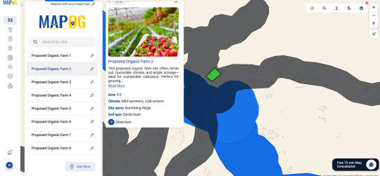
🌱 Using GIS Tools to Identify Best Sites for Organic Farming and Increase Yield
📍 Introduction
Let’s face it—finding the perfect spot for organic farming isn’t just about green fields and good vibes. It’s about data. As organic farming becomes more essential in our sustainable future, selecting the right piece of land can make or break your farm’s success. That’s where GIS tools come in.

🧠 Key Concepts
So, what’s GIS? Geographic Information Systems (GIS) are tools that capture, analyze, and visualize spatial data. Think layers of information—soil quality, rainfall, terrain, land use—all stacked together to help you make smart decisions.
And when you’re growing organic? Every factor counts.
🌾 How GIS Supports Organic Farming
Using GIS, you can:
➡️ Map out soil types and moisture levels ➡️ Analyze slope and sunlight exposure ➡️ Perform buffer analysis to stay clear of pollutants (like roads or residential zones) ➡️ Merge layers to see the full picture—where all the right conditions align
Tools like MAPOG make this super accessible. You don’t need to be a cartographer—just upload your data, run your buffers, and start mapping your future farm.
🧑🌾 Who’s Using This?
Local agriculture departments are using GIS to zone out regions for organic certifications
NGOs and environmental groups rely on it to advocate for sustainable land use
Organic certification bodies trace farm origins and verify compliance
Even policy makers use it to shape subsidies and district-level irrigation schemes
��� Conclusion
In a world where sustainable choices matter more than ever, GIS isn’t just a tech buzzword—it’s a real game-changer for agriculture. Whether you're just exploring or already knee-deep in compost, GIS tools can help you farm smarter, not harder.
✨ Ready to see your land differently? Tools like MAPOG can help you start mapping your organic vision today.
0 notes
Text
Accurate ZIP Code Boundary Maps and Shapefiles
Download detailed ZIP code boundary maps with GIS-compatible files for use in planning, analysis, or territory management. Accurate data with national coverage. https://www.zip-codes.com/zip-code-map-boundary-data.asp

0 notes
Text
#BathymetricSurvey#GujaratDevelopment#WaterMapping#EchoSounding#HydrographicSurvey#SmartInfrastructure#CoastalSurvey#PondSurvey#PortsToPonds#SlokaInfraSolutions#SonarTechnology#DepthSurvey#BlueEconomy#GISMapping#SurveyIndia#WaterTech#EnvironmentalPlanning
0 notes
Text
Mapping Fire Safety: Making Infrastructure Exciting and Interactive
Fire safety isn’t just about stations and equipment—it's about protecting lives and communities. Traditional reporting methods give you data but often miss the bigger story. That’s where interactive mapping comes in, making your fire safety content visually engaging and easier to understand.

Why Map Your Fire Safety Infrastructure?
Interactive maps bring your fire safety information to life. Whether you're a blogger, urban planner, or community advocate, intuitive platforms like MAPOG let you clearly show where fire stations are located, their response areas, and critical risk zones.
What’s Missing from Traditional Infrastructure Posts?
Regular reports and tables usually don’t capture important spatial details—like underserved industrial areas or overlapping response coverage. Interactive maps fill this gap, clearly showing fire safety coverage, risk zones, and how these factors affect community safety.
Benefits of Visual Mapping for Your Content
Visual maps can significantly boost your storytelling:
Easy to Understand: Quickly show response coverage, identify gaps, and highlight high-risk areas.
Engaging Content: Visually connect fire safety directly to community health and well-being.
Clear Comparisons: Effortlessly compare emergency response effectiveness across various urban areas.

Bring Your Fire Safety Story to Life with MAPOG
MAPOG makes visual storytelling easy:
Quick Mapping: Easily add fire stations, industrial zones, and risk areas.
Detailed Insights: Show coverage status, effectiveness, and necessary actions clearly.
Custom Visuals: Highlight important details with distinctive icons, colors, and interactive elements.
Interactive maps are more than practical—they’re storytelling magic. Clearly highlight fire safety issues, coverage gaps, and critical risks to help communities and decision-makers respond effectively.
Use MAPOG to turn your fire safety content into captivating visual stories, making infrastructure easier to understand and engage with than ever before!
1 note
·
View note
Text
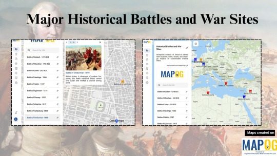
How GIS Is Reimagining Historical Battles and War Sites
History doesn’t just happen, it happens somewhere. Every great battle, from ancient times to modern wars, unfolded across real terrain. And yet, we often learn about war without ever understanding the land that shaped it. That’s where Geographic Information Systems (GIS) step in, offering a way to map the past and see history in a whole new dimension.
Whether it’s the Battle of Thermopylae, Hastings, or Stalingrad, GIS helps us explore not just what happened, but where and why it mattered.
Seeing Strategy Through Space
Using GIS tools, we can now visualize battlefield locations, terrain advantages, movement routes, and areas of control. In one of my recent projects using MAPOG, I plotted a timeline of key battles across ancient, medieval, and modern periods. Each point told a story of strategy, geography, and impact.

I added elevation data to understand why armies chose certain high ground. I layered historical sites with modern maps to trace how landscapes have changed over centuries. The result? A living, visual archive of human conflict across time.
Why It Matters: Turning History into Experience
GIS doesn’t just make maps — it makes arguments visible. It shows:
Why a river crossing changed a war
How a forest slowed an army’s advance
Where supply lines ran thin
Which battlegrounds are now forgotten beneath cities
These aren’t just cool visuals, they help students, educators, and researchers tell more complete and compelling stories about war and human history.
Who Uses GIS to Map War?
Today, GIS is being used by archaeologists, military historians, museum curators, and even students working on school projects. The beauty? You don’t need to be a mapping expert.
Platforms like MAPOG let you drop pins, color-code eras, upload visuals, and organize battles into eras all in a few clicks. You can focus on the storytelling, not the software.
Making It Easy with Tools Of GIS
I used MAPOG List View Map to organize battles chronologically. With symbols for each conflict and color codes for different eras (Red for Ancient, Blue for Medieval, Orange for Modern), the map turned into a timeline across geography.
MAPOG made it easy to:
Add point , add title write description
Add photos, summaries, and custom labels
Explore terrain using satellite overlays
Share the final map with friends, students, or an audience

If you’re into history, this is the kind of project that makes the past feel alive again.
Conclusion: Seeing the Past, Shaping the Future
History isn’t just what happened. It’s where it happened and understanding that can change how we learn, teach, and remember.

With GIS, we’re not just reading about wars, we’re exploring them, walking their paths, and seeing their impact. So if you’ve ever wanted to time-travel through maps, start with a project like this. Use GIS, use MAPOG, and turn names and dates into living stories on the land.
1 note
·
View note
Text
Transform Property Management with Accurate Survey and GIS Mapping Solutions
At CyberSWIFT, we offer comprehensive Property Survey and GIS Mapping services that support accurate land administration, infrastructure planning, and real estate development. Our solutions are designed to meet the needs of government bodies, urban development authorities, infrastructure agencies, and private organizations seeking precision and clarity in land-related data.

Get a free consultation: https://www.cyberswift.com/in/industries/urban-gis-solutions
Our Key Offerings Include:
📍High-precision cadastral and topographical surveys
📍GIS-based property boundary mapping and parcel-level data visualization
📍Digitization of land records for easy retrieval and management
📍Integration of spatial data with decision-support systems
📍Identification of encroachments and resolution of property disputes
📍Scalable solutions for urban, semi-urban, and rural areas
By combining advanced survey techniques with geospatial intelligence, CyberSWIFT ensures that land and property information is not only accurate but also actionable. Our team ensures adherence to local regulations and industry standards to support legal compliance and efficient land governance.
#PropertySurvey#GISMapping#LandRecordsManagement#GeospatialServices#DigitalLandRecords#UrbanPlanning#InfrastructureMapping#CyberSWIFT
0 notes
Text
How to Map a Franchise Business with Filters for Location & Services
In today's franchise-driven economy, managing multiple outlets across varied geographies comes with its fair share of complexity. From ensuring brand consistency to optimizing logistics and tailoring services to local demand, there’s a lot at stake. A major challenge arises when franchise owners need to make data-backed decisions quickly — and that's where mapping comes into play. More specifically, Geographic Information Systems (GIS) offer a powerful solution.

Why GIS Mapping Is Crucial for Franchises
GIS-based mapping isn't just about placing markers on a map. It’s about analyzing locations, understanding consumer behavior patterns, and managing operations across diverse geographic clusters. Food chains, for example, use spatial data to identify underserved areas, compare performance across urban and suburban outlets, and evaluate factors like accessibility, parking availability, or foot traffic. Retail, real estate, tourism, and logistics also rely heavily on this kind of geospatial intelligence.
Franchise mapping tools allow businesses to draw custom location boundaries, categorize outlets by service types (like drive-thru, dine-in, or delivery-only), and assign real-world attributes — everything from seating capacity to ratings and reviews. With smart layering options, franchise owners can visualize patterns and correlations that would otherwise go unnoticed.

How to Make It Work for Your Business
Let’s say you're managing a multi-city food brand. You could start by dividing your outlets into categories like Urban Core Locations, Suburban Branches, Drive-Thru Services, or Tourist Hotspots. Then, using a GIS-powered map tool, draw specific regions using polygons and tag each area with relevant business data — such as business hours, popular dishes, or accessibility options. These visual filters help you understand which locations need investment, staffing changes, or a menu refresh.
Some platforms even let you customize these visual zones with different colors, labels, and elevation (height), making your analysis more vivid and actionable. If you're looking to experiment with these capabilities, there's an intuitive platform available here such as MAPOG. It offers an interactive space to test these features without diving into technical setups.
Final Thought
For any franchise business aiming to scale with clarity and consistency, GIS mapping is more than just a visual tool — it’s a decision engine. Try exploring platforms that offer category tagging, polygon drawing, and data-rich customization. It may just be the missing piece in your strategy.
#FranchiseMapping#GISBusinessTools#SmartRetail#retailtech#mapog#spatial analysis#gismapping#interactivemaps#LocationIntelligence#datadrivendecisions#MappingForGrowth
0 notes