#Going to have to individually render and color
Explore tagged Tumblr posts
Visit Tumblr Blog
Explore Tumblr blogs with no restrictions, modern design and the best experience.
Last Seen Tumblr Blogs


Fun Fact
The total number of visits Tumblr.com received during January 2021 is 327 million.
Text
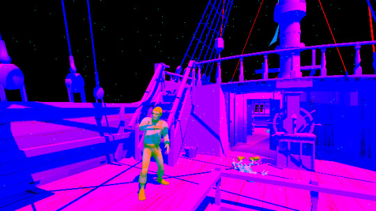
some doodles! (PHIGHTING!)


A collection of recent subspace and Medkit doodles! The final thing is actually a remake of a really silly meme I made like. God how long back in August of 2023? Geez I’ve been in the fandom for awhile,,, it’s crazy how my art has evolved since then for real!
also… these, no, no I am not giving ANY sort of explanation for them

#artists on tumblr#phighting!#phighting#phighting fanart#digital art#roblox phighting#phighting roblox#art#phighting art#roblox#I can’t think of any tailor swift songs to quote sorry#This is the second most cursed thing I’ve drawn of subspace and Medkit#Second too mederica and Britianspace….#I am a horrible person /silly#ANYWAYS OFF OF THAT TOPIC#THE RATS!!#I hate both of them so much /aff#Jeraboaspace my beloved… ouuuugh#And predisastor I love predisaster a lot#“Please stick your hands into the bars of my enclosure!! I swear that I won’t bite!!” - cutiespace. Probably#Anyways I’m going back into the gutters#Artfight is soon so don’t expect any other unique content from me lol#I have like 90+ characters bookmarked so yeah that’s ALLLLL yall are going it be seeing for artfight season#I’m gonna resume working on TMA designs AFTER artfight#I wasn’t expecting them to take this long but I mean there’s a lot of characters I still have to design and then a lot of characters I’m#Going to have to individually render and color#So YEAH#That au is definitely going to take a long time- but worry not since I’m still SUPERRRRR hyper fixated on TMA#So I have not forgotten about it!#Now for actual tags…
92 notes
·
View notes
Text
AHHH THEM THEM THEM <3 <3 <3 <3

@intotheelliwoods 🫵🫵
I couldn’t decide which one I liked better so you get both
#I MISSED THIS HOW DID I MISS THIS#I THINK IT GOT LOST IN THE COMP STUFF GOING ON???#2 arms left fanart#THANK YOU SO MUCH#ugh the first one looks like they are about to portal somewhere thats SICK#and oh my gosh you can see sprouts individual shell scutes#THATS SICK#hehe their smiles#and AHHH the colors for them are perfect!!!#hell yes poptart deserves to have orange stripes#also the fully rendered jorts#not the fully rendered jorts-#thank you so much I love this <3#I AM ONCE AGAIN SORRY I MISSED THIS SOMEHOW-#also omg hi its been a while princess!!!!!
191 notes
·
View notes
Note
When creating art, how do you deal with the fact that seemingly everyone's opinions and tastes are completely individual? Like, how do you make good art, when around 40-50% of what even is "good art" changes from person to person? Sure, we have points we can all agree, but I'm baffled by how three people can agree and disagree on the same pieces of media. I can like movies A and B, and feel like they're very alike, but a friend might love B and hate A and another friend thinks the opposite.
The confusion is because "good" is being used to mean several different things:
To My Personal Taste. If you like a piece of art, you could very easily describe it as good just because you had a good time with it.
Well Put Together. If a story is well-crafted, lacking in plotholes or contrivances, broadly carefully woven, makes sense the more you think about it, etc - you could deem it to be good because it's been put together well. If a work of art looks good, the light sources and shadows make sense with one another, the colors work well together, the composition has clarity, the anatomy is correct - then the work was put together competently and skillfully, and could be called good for this reason.
Objective Quality. When people describe a movie as good, this is usually what they are trying to judge. Whether an objective judgment can be rendered on something as subjective as art is something people have been yelling about for centuries. In my estimation, the quality of a work has to be judged based on what the artist was going for and how close their execution was to that goal. An attempt at photorealism might be seen as "objectively bad" if it doesn't look photorealistic.
And by the same token, "bad" can mean a BUNCH of different things:
Bad Because I Had A Bad Time
Bad Because It Didn't Deliver What I Expected From It
Bad Because It Hit Me With A Personal Dealbreaker
Bad Because I Couldn't Take It Seriously
Bad Because It Didn't Make Sense To Me
Bad Because It Said Something I Really Disagreed With
And many more. This is why I think it's helpful to unpack a story further than just "is it good or bad" because those judgments are almost always concealing a more interesting personal analysis. There are stories I find highly ineffective that are still professionally well-crafted and accomplishing the creator's goals. There are stories I enjoy the hell out of that are weighed down by ropey characterization and dubious values. It's usually more effective, in my experience, to narrow in and identify what parts of a work are working for you, and what parts aren't clicking.
509 notes
·
View notes
Note
I have been staring and admiring your piece of the holiday/dreemurr kids at the piano, and it’s so beautiful. The rendering is honestly the nicest/ most appealing rendering that i’ve seen in my opinion, i was wondering if you would share your process or a tutorial of sorts? No pressure, your art is so lovely and i strive to achieve a similar look someday :)
oh my goodness thank you!! 😭😭😭😭 thats such high praise.. and of course i can share!
so basically how i went about this is, this drawing came second to the first one, it literally ocurred to me in the middle of rendering the dark world kris and a lot of the composition choices came from the contrast between them. the timelapse starts with an already-laid-out piano sketch cuz i had to correct the perspective on the first one so many times that i took this shortcut for more accuracy, afterwards i did a quick sketch of the poses i imagined and very loosely arranged the background... i shouldve honestly used perspective lines but im too stubborn about them. anyways speaking of perspective, in the first one not only did i want to give it depth but also incline it somewhat, you will see its not exactly on a horizontal axis but tilted slightly, this is because i wanted to evoke a sense of instability/of being pulled in. so with the second canvas you can see me tilting it as i go to be a proper mirror to the first one.
enough talk on perspective (esp considering u asked for rendering particularly)... lets talk colors! so particularly for this canvas ill say.... the holiday kitchen was a bit nightmareish in terms of color palette bro its SO WHITE. you will see i went back and forth a few times about what tone to make the piano, the background, etc, so as to not be too bright next to the characters. speaking of which, i colored them first under the sketch and immediately started shifting hues, values, trying to find the vibe i wanted, because of the way i render, which is by merging the lineart with the color layer, this is because i like rendering to feel like im "sculpting" out my drawing, its easier to control shapes and textures this way (for me), i do understand it's not the most efficient one tho! sometimes i do make separate layers for complicated details that i dont want compromising the whole layer. i primarily use lasso fill after merging the layers because it gives off a cleaner look, and its much faster to manipulate the shapes and silhouettes with it (this is a core thing in my recent art cuz,, i used to spend waaaaay too much time doing everything by brush and at some point it started not only limiting me but putting me off from rendering altogether). then i used some textured brushes here and there to blend some colors and to deliberately place lineart where i want.
this piece in particular had a looot of back and forth of switching the character's palettes and outfits so that they could bounce off of each other better and make the viewer's eye navigate through more than one focal point. i wasnt planning on anything more than a subtle shadow here and there but i felt like the characters lacked a bit of depth, so i added shadows and highlights appropriately (always playing off from the base color of the thing im rendering, be it skin, clothes, i work the colors individually so that it feels less predictable). afterwards you just have to adjust the lighting on the background, figure out which details you want to make stand out (as u can see im not too overly detailed on background elements, just enough to properly suggest the room), and .. you're done!!
105 notes
·
View notes
Note
DUUUDDEEE your art is insane!! I ADORE the scales you draw and render, and how you make so much of your illustrations look like real work staff from WoF would make! Do you have any tips for scales? Rendering? Drawing them :0?
thank you so much!! for scales, i'd recommend avoiding circle shapes and instead go for a more angular hexagonal shape! it reduces weird gaps in between the scales and makes the texture look a lot more tight-knit and interconnected


as for rendering, i think my best tip would be to start with shadows first. make a shadow layer, fill it in entirely with the base color for the shadows, and carve out the light source by erasing parts of the shadow layer. I've been trying out a new method of rendering which takes a lot less time but gives the same if not better results (using a color layer on multiply above a greyscale render layer with a color overlay to add color to the shadows! i'll go more in depth with this once i have a finished example piece to break down)
and i usually render scales by filling in each individual scale above the lineart to create an alpha mask and i use a clipping group using the mask

scale mask (normal layer mode, 100% opacity)

set to "color dodge" at 40% opacity, additional "shadow" layer (black color layer set to "erase" above the layers in the clipping group) used to create depth!
152 notes
·
View notes
Note
Or! Very different! Return of the Obra Dinn
ok now THIS i have absolutely no idea. i have been thinking about her ever since it came out and i am at a complete loss. so i will do some digging
ok SO. it does something super similar to what i was speculating for sable by rendering the scene to a texture for edge detection. each individual part is given a random color so it can know what to draw lines between

it also passes lighting + some extra colors to pick which textures & dither pattern to use. red here is the lighting!
they found a way to have all that information in just one texture but i showed both of them just for claritys sake. in the actual game it only needs one!! super fast
and then we have the part that i have had nooo idea how they did, the final result with all the dithering. this is done in a full screen post process effect!
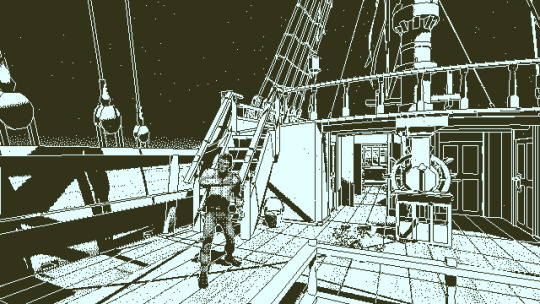
i know theres way to convert images into 1-bit dithered images using something called a dither pattern, but i dont 100% understand the technology behind it
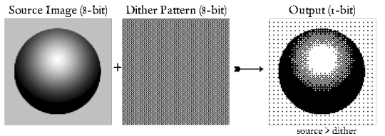
i also know its incredibly hard to make look good when moving the camera around. and so did the guy making obra dinn! so he spent 100 hours experimenting to get it to look natural and finally cracking it by mapping the dither pattern to a sphere that follows you, and sampling the sphere from the angle you look at things from

hereee's my sources if you wanna go more in-depth !
https://forums.tigsource.com/index.php?topic=40832.msg1363742#msg1363742
https://forums.tigsource.com/index.php?topic=40832.msg1124342#msg1124342
https://forums.tigsource.com/index.php?topic=40832.msg1124342#msg1124342
2K notes
·
View notes
Note
What advice would you give to someone who's been drawing for a really long time, but is always frustrated and burned out?


This became quite long, so I'm going to go ahead and put it in a read more!
If you’re frustrated and burnt out, it can help to pinpoint why it is that you feel that way— for me it’s often that I’m unsatisfied with the level I’m drawing at and feel I can do better, or I know I’m getting stuck doing what I know and am comfortable doing but it doesn’t feel like enough. Other times it’s externally motivated, such as finding my pieces aren’t doing so well anymore on social media.
If you fall into the habit of drawing and don't want to stop, I find studies to be the most helpful. This can be anything, but I like to usually draw on photos and reality. I would specifically recommend realistic studies to people who do a lot of rendering and coloring, because it's a gateway into starting to observe reality around yourself and picking out how to draw what you perceive on a daily basis from just looking at the world.
Studies are, in essence, going back to how many of us learn how to draw: copying. I think this is a really good way to feel proud of your work again while also feeling a concrete sense that you're improving! Because when you copy something, it gives you the muscle memory to replicate it again when you need it, like a clothing fold or a specific perspective or pose, or the way light reflects off of something.
This is versatile too: you can focus on drawing any object, maybe isolated clothing folds or accessories, or drawing hands, or maybe doing quick figure drawings. You set the parameters for this yourself, and come up with something that helps you grow as an artist or feel good about your art as needed.
Another way to combat dissatisfaction with your art is to discover something new to love, such that the desire to see this thing drawn overcomes your dissatisfaction. Watch new things! Play new games, maybe draw a character you've never drawn before. The funniest and probably best advice I've seen before on consistently drawing is to become obsessed with one guy and draw them all the time for years. I do subscribe by this! My interests are in flux usually but you can often find individual characters that I take a liking to and keep on drawing until it becomes second nature. When it doesn't feel fun anymore, I find another one.
And that's where the third one comes in: sometimes you have to give yourself time to find a compelling reason to draw again, to fall in love with your own art again or fall in love with someone else's art and want to honor them with your own. It's difficult to draw when you're forcing yourself to draw and staring down a blank canvas, but it's a lot easier when you're in the middle of doing some work or something and the thought of a character or something makes you just want to put down everything if even just to scribble them on a post-it-note, right? Passion ebbs and flows and sometimes you just have to trust that it'll flow back to you in time, even if you can't predict it.
I hope this helps, and I hope you're able to find reasons to love drawing again. :)
94 notes
·
View notes
Note
hello i love ur art <3 may i ask how you shade/render? or if you can share any helpful tutorials you learned from ^^


Unhinged Art Tutorial
Well, anon and @merlucide! I'm not sure if I'm the best person to learn from (I'll attach some video links at the end to people who I personally look to for art advice) but I happen to have a series of screenshots for how i render with a strawpage drawing I did recently(at the time I drafted most of this a month+ ago), so I'll go over what I do, at least in this case.
Warning: A bit rambly. Not sure if intelligible.
Tutorial..? Explanation? under the cut.
I have a few different shading styles based on ease of program usage and effort level, but in this case i had to individually streak the shadows. I'll be focusing on hair and skin for the most part here.
My sketches are pretty poor, because I'm hasty:


Honestly I find the better the initial sketch, the easier the final profuct will come. So take your time, use layers when sketching to be clean. The airbrush layering shows vaguely how I tend to shade hair.

Backlighting *Applicable mostly when there is a bright background, light behind the subject, or in neutral lighting.
The 'underside'/inside I tend to use a peachier, brighter tone closer to the skin color (for tanned skinned characters I'd use a shade closer to a rosy orange, since that's just a more saturated peach. For darker skinned characters, I'd recommend a slightly redder & brighter version of their skin tone. This works pretty well with dark hair+dark skin, but in the case that your character's hair color is a lot lighter compared to their skin tone [also in the case of a fair skinned character with WHITE hair] it's totally fine to ignore the natural undertone of the character and shade it with a pinkish white.) This works for any hair texture but can be more time consuming for coily hair textures. (2c-4c)

Lineart when I take my time / Old rendering video


It looks more stable if you start off with a solid lineart base because you won't struggle with big-picture placement issues.
"Lineart" when I just try to pump out a drawing

I first did a rough sketch, kept it as an overlay layer and drew over it.

(Chickenscratching is valid though, honestly. I think it has a look to it!) I usually block out base colors, and vaguely where I want the shading to go, unless I need a special type of lighting, which then I'd do the base colors and either choose to wait until I'm finished rendering or do light processing* (*will discuss this later in this post) with different blending modes and layers.
For example if I'm doing the colors mostly FIRST (Choosing a grayed out palette) and then rendering, it'd look a little something like this: Left (Trackpad, on FireAlpaca) / Right (iPad, on Clip Studio & Procreate)


Sometimes, I'll shade with a dark, grayed out tone and then fill it in with something slightly more vibrant. This kind of gives it a bounce-light feel? Also with a lot of pieces I do recently I try to block out entire parts as white because lighting especially on white background pieces looks better if you pretend that it's white behind the character due to an intense sunlight.

Also, I use gradient layers to tweak with the colors. It's pretty useful and looks nice!!!! Gradient maps are available in every software I use: Procreate, FireAlpaca and Clip Studio Paint.

I find that the more intense the light (but not scattered, as in the source is either very bright or it's very close) the darker the shadows usually look? And if there's a brightness coming from behind the figure and the hair is splayed out in some way, it will appear semi translucent because it's just a bunch of strands made of keratin and collagen, something like that....


Anyway this is all very messy but I hope it helped

Here's a process photo for how I shade if that helps too.


More examples..

I broke down my thought process in my lighting so here's a close up of that.
i totally forgot about the video links so here's my idol the one and only:
And I think this guy makes quick but concise tip videos:
Finally I really like the in depth professional explanations from a long time illustrator:
I've personally taken advice from all three's videos and used them to improve my own art, so take a peek!!!!
81 notes
·
View notes
Text
Have you heard of the term "patterns mills"? These are shopfronts that quickly produce a pattern without any sort of testing or vetting, and then put it on the market with an AI-generated or stolen image for a very tempting price. Patterns produced this way are rampant in the cross-stitching world. However, I've recently noticed an uptick in these types of storefronts in the quilting and foundation paper piecing world. Since I'm well versed in FPP patterns, I would like to describe what an AI-generated quilt pattern looks like as well as provide other suspicious giveaways. AI will only get better, so while these mistakes are dead giveaways now, they might be fixed in the future. FPP patterns seem to be easier to replicate in AI than traditionally pieced patterns, which is why I will focus on FPP in this blogpost. However, you can apply the same clues to any sort of craft pattern (or really anything) you can buy online. Important: AI-generated images are not prohibited on Etsy. However, within their policies they state that you must disclose if you used AI within your listing, and these shops do not have that disclosure.

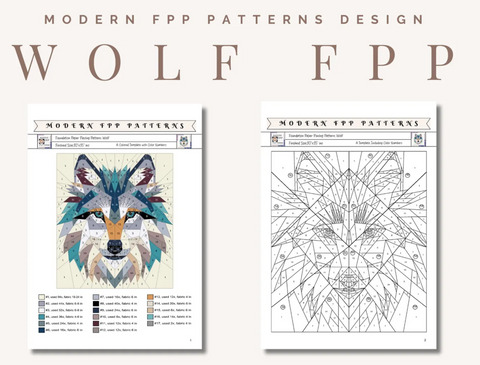
Below is a listing for a wolf face FPP pattern. When you first look at it, does anything seem suspicious?

First, I would like to draw your attention to the scissors in the bottom left of the photo. These scissors are physically impossible to use and are literally melting into the yellow cutting mat. The lines of this cutting mat are unresolved, as are the lines on the green cutting mat in the bottom right corner. These are your first giveaways. However, not all images have background sewing items that look a little funny. Let's take a look at the actual "completed quilt."

The first thing I notice is that the only background seam line (from this apparently foundation paper pieced quilt) is the one in the top left corner. The seam is merely hinted at and does not go all the way to the edge. Additionally, I notice that the eye is too round. One could argue that the cover photo is merely an enhanced version of the completed quilt, but there are no completed quilt photos in the listing. Another clue for identifying AI generated quilt images is that there are a ton of colors/prints used. The prints in this image seem nebulous and the prints around the eye whiskers (?) lose a lot of fidelity. The individual fabrics themselves do not have consistency.

In the image above, the things I notice are that there are curved seams within the gray and white colors. A typical FPP pattern would not have curved piecing interspersed between regular straight seam piecing. Also, piecing lines that are useless, especially visible in the bluish-gray piece on the left. The amount of piecing within that patch does not make sense. Below you will see another listing from a different Etsy seller.
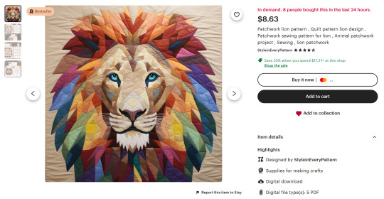
From afar, it looks really good. Plus, the seller has great reviews! And it's a Bestseller! But let us take a closer look…
The first thing that sticks out to me is how the whiskers of the lion are resolved. You can see where they fade into the muzzle of the lion without a realistic piecing line. Some of the patches are straight up "smeary" and wrinkly, a telltale sign of AI. The program does not know how to accurately render the design so it creates an approximation. These are things that are hard to see unless you zoom in. Below is a listing for a legitimate lion FPP pattern from designer Pride and Joy Quilting so you can see the difference. It is clear that the first image is an actual completed quilt top.
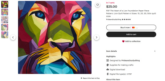
Beyond the AI-generated cover quilts, I'd also like to cover other signs of a pattern generated from a pattern mill.
For the lion pattern, the cost is only $8.63. This is very cheap for what is supposed to be a full sized quilt pattern with a multitude of templates.
Both of these sellers have very generic names. While not an immediate cause for concern, I recommend being skeptical.
There are no actual completed quilt images within the listing.
Both of them are considered "Bestsellers" on Etsy, but the shop with the wolf pattern only has 10 reviews. It makes me wonder about the disparity between "buyers" and reviewers.
The 5 star reviews for the lion pattern are extremely generic and talk only about "how much their friend Lisa will enjoy the pattern" or "how easy it was to download." These are not helpful for understanding the quality of the actual product. The 1 star reviews are way more descriptive about the issues the pattern has. This makes me wonder about fake reviews.

Both of these patterns include a full layout of the FPP diagram within the listing. I personally would never do this and I don't know many designers who would.
The lion pattern says this within its description: "Before making a purchase, we'd like to inform you about some important aspects. The product stands out for its template, design, and print quality, serving as a valuable tool for sewing projects. The instructions include two techniques: direct fabric marking (with visible stitches) and invisible stitches. Both are general guidelines and not step-by-step instructions. You can choose these techniques or any other that you consider suitable based on your experience and preference. There are no refunds for the digital file. We appreciate your understanding and are available for any questions." This demonstrates to me that the pictures are not accurate because they are clearly attempting to depict FPP and are hoping that you won't read the description until it is too late.
Why is every lowercase i in the wolf pattern missing its dot? Like, why? I find that strange and off putting.
So, how do you avoid accidentally purchasing a pattern like this?
The first step is gaining experience in recognizing listings that seem a bit fishy. Use the bullet points listed above to see what kind of feeling you get when looking over a listing. I also recommend finding out more about the designer from their website or from their social media. Not all legitimate designers have these necessarily, but it's a great place to start. Try messaging the shop owner on Etsy. Does it sound like they know what they are even talking about? You'll then build a good list of designers and shops you trust. A big and worrisome thing to remember is that AI will only get better and produce better looking images. This will make it harder to identify pattern mills by the image alone. However, the clues that I've listed will help if you put them all together and come to a conclusion. I suggest using them for all your online shopping. I hope this helps!
139 notes
·
View notes
Text
SBBB 2025 rules:
No generative AI allowed in any form.
Minors are welcome, but will only be allowed to work on SFW projects.
Participants are required to have a Discord account, as the check-ins and creative teams collaboration will happen in the server dedicated to the event. They will also be asked to provide a second form of communication of their choice (e.g. tumblr, social media, email, etc.)
Progress check-ins as outlined in the event timeline are mandatory. This helps us all to ensure team communications are going smoothly, and that participants are on track to complete their works by the final deadlines.
If you are having trouble with a deadline, please let a mod know as soon as possible. The mod team can arrange something to accommodate reasonable requests for extensions.
Do not discuss, share or post your work on any social media until your assigned posting date.
If any participant wishes to contribute a form of art and/or content that does not fit the art criteria laid out in these rules (such as a podfic, fanvideo, gifset, photoset, etc.), please contact the mods to discuss what this will look like. These are more than welcome, and will be shared in the Big Bang pages along with the fics and their main companion art pieces.
For Writers:
Writers commit to publishing a new, original, SuperBat focused fic on their assigned posting date. (The work can be an existing WIP or idea, as long as it hasn’t been published anywhere before).
Works must meet the minimum word count of 20k.
Works can include any and all ratings and warnings as long as they are tagged accordingly.
Any continuity and/or alternative universe is welcome.
Side couples are allowed as long as SuperBat remains the focus of the work. Moresomes with SuperBat (such as Clark/Bruce/Lois/Selina, or Clark/Bruce/Hal) are also allowed, but only if treated as secondary/background plots.
You are allowed to bring in your own beta, request one or more betas to be assigned to your team, or opt out of having a beta completely.
Multi-chapter works are allowed, but all the chapters must be published simultaneously on the assigned day.
Writers will publish their fics on Ao3 to allow the SBBB team to add their fics to the event’s collection.
For Artists:
Traditional and digital mediums are welcome. Traditional art must be scanned or photographed in clear lighting, ideally with minor color correction so that the final image accurately represents or enhances what was drawn. The final art must be at a resolution of at least 300dpi.
The artwork must be polished and represent multiple days worth of work. If you create a single illustration, it must contain the following attributes:
multiple figures
colors
shading
backgrounds
full render or detailed line art
If you want to contribute multiple illustrations, each individual illustration does not need to meet all the criteria above, but the total amount of work should roughly be equivalent.
We may discuss with artists the possibility of working on multiple projects if the artist group is smaller than the writers group. In this case, the total amount of work an artist contributes (outlined above) would be spread equally across projects.
Artists can publish their works on platforms such as Tumblr, Bluesky, Pillowfort, etc. We ask that artists also upload their final work onto a hosting website (such as imgur) that will allow for embedding into the corresponding fics. This can be discussed with the Mod team at any time, and assistance given for anyone who doesn't have experience with setting this up.
For Beta Readers:
You and your writer will establish what kind of help or feedback they are looking for (grammar, pacing, etc.)
You will be expected to be available to give timely feedback to your writer(s) as requested.
The event will have a dedicated space where betas will be able to provide quick feedback to any writers (not just who they’re paired with) who request assistance on their fics, but participation outside of your agreed teams is not mandatory.
For Pinch Hitters:
You can elect to sign up as a pinch hitter for art and/or beta reading purposes.
In the unlikely scenario where a member of a team drops their role, pinch hitters will be asked to take over and work with the team.
The deadlines will remain the official ones, unless too critical. Mods will discuss each case with the pinch hitter to ensure that the workload and remaining time are balanced.
Want to know the timeline of the event? You can read it here!
#superbat big bang#superbat#sbbb2025#big bang#batman#superman#bruce wayne#clark kent#fandom event#dc comics
120 notes
·
View notes
Text
LeafWing tribe sheet!
its over, i finally did them all. sorry this one took a while, ive been losing motivation, but at least its done!! honestly i love leafwings, so im glad i could get them out.
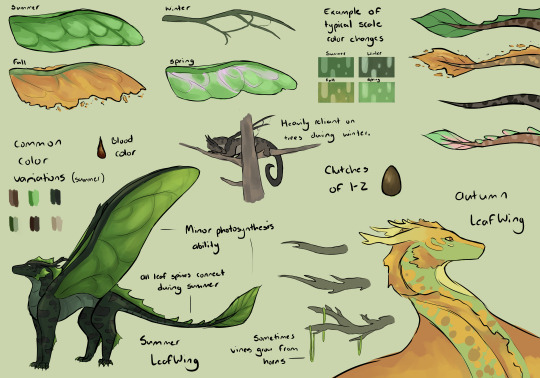
Physical Appearence + Traits:
-LeafWings are arboreal dragons, living in and relying on trees to hunt, shelter and sleep. Their talons are perfectly shaped to comfortably climb and hold onto branches, and their narrow wings allow them to swoop and weave through the trees without crashing.
-LeafWings’ colors, physical traits, and even demeanor shift and change with the seasons. During the summer, their frills and wings are rich green, and scales bright and glossy. They have higher energy and sleep less. During the fall, their colors shift to a warmer spectrum, their leafy frills start to flake off, and they start to prepare for winter. Once winter arrives, they lose their frills, tail-leaf and wing membranes, as well as turning duller and darker. They spend the majority of winter asleep, relying on the trees’ bare branches for camouflage, now rendered flightless. Finally, during spring, they wake up, their colors brighten, and their wing membranes return. The buds that grow along their backs open up and form their spine frills before summer begins.
-LeafWings are lithe and agile, and are very quiet fliers, especially when compared to HiveWings and SilkWings.
-During the summer, with their wings at their fullest, they can actually photosynthesize. They still need to eat food, but anytime they sleep during the day with their wings open to the sun, they wake up energized and not needing to eat for a while after.
-The coloration and shape of LeafWings’ wings varies both by region and individual. Some LeafWings mimic specific types of trees.
-Some LeafWings also have Leafspeak, an ability which allows them to communicate with plants and even control them if powerful enough.
Life Cycle:
-LeafWings hatch in clutches of one or two. They take around 5 months to hatch, and they are deeply reliant on their parents and their wider community. LeafWings are strongly protective of their dragonets. They also grow up somewhat quickly, reaching physical maturity quickly, but they continue to grow in size their entire lives.
-They partner for life, but often only raise one clutch of eggs (sometimes only a single egg) in their lifetime. The tribe is somewhat small as a result.
-LeafWings don’t have an official education system, instead relying on parents, peers and older, more experienced dragons to teach them what they need to know. LeafWings can then go on to pursue whatever tribe role stands out to them, using a sort of mentoring system.
Society and Culture:
-Before LeafWings were split into two groups, the tribe was quite peaceful and unified. The queen, by tradition, always had a council, and they lived nearby and alongside SilkWings. The tribe was known for being friendly and knowledgeable, and deeply dedicated to caring for the forest.
-LeafWings are also very resourceful. From various leaves, grasses, bits of wood, flowers, and insects, they could create baskets and rugs, thin slats of wood to write on, dyes, storage objects, and various weapons and food preparing tools. Learning to make and control fire meant they could progress faster. They were also talented woodcarvers, weavers and artists, sometimes trading not only supplies, but also various art pieces to and from the SilkWings.
-They were expert foragers, and had records of every type of tree, plant and animal in their forest. Many had small gardens of their own - medicinal herbs, spices, and plants they simply found pretty.
-Those with leafspeak were beloved and respected in the tribe, not dissimilar to animus dragons. Sometimes they would mould the shape of trees’ growth to create proper homes and nests for dragons to spend the nights, especially in winter.
-They have tribe-wide celebrations to mark spring, when they all wake from torpor, and the summer solstice, when they are at their highest energy and fullest lives.
-The SapWings, after the tribe was forcibly split, remained very similar culturally, though they lost their ability to trade and had to concentrate on survival in the poison jungle. The PoisonWings, meanwhile, changed dramatically. They became distinctly aggressive and warlike, taking their understanding of plants and animals and weaponizing them. They used the many venoms, poisons and sharp, dangerous objects throughout the jungle to their full advantage. A number of dragons died in the process, but those who survived became stronger.
-LeafWings believe that plants hold some level of consciousness, and some believe that they are animated by fully conscious spirits, each with its own unique consciousness and opinions. Trees are unanimously believed to be extremely wise and benevolent, and as deserving utmost care and respect. They are treated as if they were tribe elders themselves. It was once agreed upon by all leafspeakers that if a tree resisted a request, they were not allowed to make any attempt to force it to do what they wanted. Leafspeakers would also be used to make requests before cutting off any part of the tree to use - if it refused, it would be left alone. (It isn’t hard to imagine the way they felt when the entire forest was cut and burned down by the HiveWings.)
Diet: Omnivorous. LeafWings eat meat (birds, rodents, sometimes large mammals and reptiles), sometimes raw, sometimes cooked, and also a wide variety of plants, fruits and nuts. Because of the versatility of their diet, they have a great number of meals they like to prepare, usually garnished with herbs, spices and sweeteners like honey and certain types of tree sap.
248 notes
·
View notes
Text
Batgirl and Robin Car Doodles


I was locked in a car for 8 hours yesterday and had to do something to keep from going insane. I'm not super happy with these renders, but I figure someone out there will enjoy these.
Flat color drawings and design notes under the cut:


I love Batgirl and Robin duos! They're such cutie patooties! Here we have Dick Grayson Robin and Bette Kane Batgirl, Jason Todd Robin and Barbara Gordon Batgirl, Tim Drake Robin and Cassandra Cain Batgirl, and Damian Wayne Robin and Stephanie Brown Batgirl!
All these pairings are accurate to the comics---these characters existed as Robin and Batgirl at the same time and teamed up frequently. The only one I'm missing are the famous Dick and Barbara duo and Cass and Steph during Steph's Robin run (and technically Damian and Babs, but. . . .eh).
I have a /thing/ about giving heroes kneepads. I've seen what they do to their knees! If you have no invulnerability, you will either wear kneepads or I will make you suffer the consequences! Hence Dick, Bette, and Jason's trashed legs here.
I am greatly entertained by the fact that while the Robins' suits stay very similar from person to person with only some style differences, the Batgirls have cycled through damn near everything. Robins range from "how much skin are you covering and how much black are you wearing?" But Batgirls have been everything from "Robin but Girl" to "Knockoff Batman" to "Batman if he was small and possessed by a spooky eldritch entity" to "EAT MY HOMEMADE PURPLE!"
Batgirl Steph originally looked exactly like Barbara but with more purple and less yellow, but I wanted to highlight the contrast between Batgirls, so I went for her Batgirls! design here: that one has the lower face mask that nobody else wears. Buuuut I was also giving everyone white-out eyes for stylistic consistency and because it's easier to draw, so I went for a Raven-esque shadow effect from her hood that I think worked decently. I also gave her a bat-eared hood to match with the other Batgirls all having ears somehow.
(Bye-the-bye, while Robins and Batmans are usually drawn with whited out eyes in their masks, Batgirls in Barbara's suit style are not, and neither are people with Bette style masks. This is fascinating to me because the whiteout lenses aren't actually canonical---it's a stylistic choice that all live action adaptations remove, and many individual comic panels that are close-ups of faces demonstrate that you CAN in fact see their eyes behind their masks. This is with the lone exception of Cass, who I believe has a spiderman thing going in her full-face cowl).
For similar contrast reasons, I gave Babs her navy blue style instead of her OG purple, even though she usually looks better in purple. Sorry Barbara, you generally look best as Oracle anyway.
I hate Damian's edgy gray robin suit with a burning passion. WHERE IS THE GREEN!? YOU KNOW: THE COLOR MOST OF US ASSOCIATE WITH DAMIAN! WHERE IS IT YOU BASTARDS?!?!
Anyway, while I liked the posing, the renders definitely suffered from lack of sleep and car jostling, so I think these may be good candidates for a redraw sometime next year.
#giraffe's ramblings#Giraffe's Scribblings#abby's batshit#batfam fanart#batfam#dc comics#dc fanart#dc robin fanart#dc robin#batgirl#batgirl fanart#dick grayson#bette kane#jason todd#barbara gordon#tim drake#cassandra cain#damian wayne#stephanie brown#batman comics#sorry to my bette stans who were looking for flamebird/titans content#I PROMISE I'm working on Cotton-Eye Joes for you! I'm reading Secret Origins! Life is just INCREDIBLY BUSY right now!#I'd tag all the fanarts but I'm too tired and I don't think tumblr's sorting system listens to that anymore anyways
52 notes
·
View notes
Note
how did you learn to render realistic light/volumes so well? your work looks real to my eyes in a way i cannot wrap my head around
I mention having studied as a sculptor for 4 yrs a lot when I get asked about my process but I really do think it was extremely helpful to my 2D art progression (more than anything else, really - I kinda sucked at sculpting).
It hardwired my brain to think of everything I make in 3D terms. Even when we were doing figure studies on paper, it was emphasised that we imagine the figure in three dimensional volumes, and pay attention to how the light and shadows wrapped 'round each individual form. Now, when I paint, I think of "sculpting" the painting out with my brush - when I add shadow to a cheekbone, I imagine I am smoothing the form away with my thumb in order to make the plane of the cheek curve more towards the darkness, and I imagine the different values within that shadow area as well. When I carve out a piece of the nose to form its shape, I think of how this new shape affects the shadows it is casting on the cheeks or mouth. Knowing exactly where your light source is from the start is very important for this.
And I know "think of everything in 3D and imagine the light/shadows wrapping around an object" is super common advice, but I don't think a lot of people mention that it's not just a mindset you can slip into immediately, it's something you have to train up just like any of your other art skills. You kinda have to brute force yourself to ignore that you're working on a flat canvas, and let go of all shorthands (instead of only visualising the nose as a flat image, as it exists in profile in the image you're referencing, imagine how it might look if suddenly the model turned their head towards you. Think of how the planes of the nose are curving away from you to create that rounded shape of the tip, think of what you can't see but you know exists on the other side, etc.)
But of course, it's hard to do this if you've never studied what a nose looks like at different angles. You need to build your mental library so you can enter that space easier. So 3D reference in general is still very important to me; I work better when I can spin something around and see how the light changes or curves because it helps me understand it, rather than just copying what I see in flat 2D ref. I rarely guess at anything I'm not sure of - whenever I need them, I either take references of myself or someone I know, and sometimes I use a simple head sculpt I made in blender ages ago when I'm lazy/need to figure out a more complicated lighting situation. I treat every drawing as a learning experience and try to solidify more of my existing knowledge through it. I even had a small head I'd sculpted in real clay for a while. When I'm in the mood for doing studies I'll sometimes set up a bunch of different lighting scenarios with the 3D head or a 3D-printed skull I have and do quick micropaintings, to refresh my memory. One of the other things I do, for example, is take a flat reference imagine whose lighting I like, re-create that lighting in 3D, then turn the 3D head around to see how it would look under that light source at different angles.
I'm also constantly observing things in the real world. Whenever I'm watching movies my eyes and brain are immediately drawn to the lighting and colors, how the shadows change whenever someone retreats from dark into light etc. I make notes of these or screenshot to do studies later. Whenever I'm hanging out with people and I notice an interesting lighting situation happening I ask them to let me take a picture so I can study it later, or add it to the reference vault. I love to people watch, I look at nature, I'm probably the spaciest person to hang out with but it's helped with the art lmao. Again, this is also something that you can consciously train yourself to do, it didn't come innately to me.
And uhh, honestly sometimes I think it helps that I use a lot of dramatic lighting in most of my portraits. It's easier to sort of "cheese" three dimensionality when you have such a defined separation between dark and light. The first thing I do is paint in the darkest shadow on any painting, then work outward from that. You can use things like the shadow's penumbra, the terminator shadow and ambient occlusion to push the three dimensionality further.
Anyway in relation to this I think of painting more in terms of value rather than color. I don't paint in b&w but over time I've come to learn the values of colors instinctively, though I sometimes apply a black and white filter on top and toggle it on whenever I wanna check if I'm on the right track. Then on top of that, apply colour theory such as different coloured bounce light and sub surface scattering, the colors in different zones of the face, etc.
To summarise, it mostly comes down to studying a lot, training yourself to visualise everything in a 3D space, being observant, making every drawing a learning experience, and training yourself to discard what you 'think' an eye or mouth looks like so you don't fall back on those shorthands whenever you're drawing something more realistic. Grab some clay and make a ball, do some studies of it.
Hopefully this helped shed light on my thinking process in some way; explaining things is usually when I remember english is my second language, I never know if I'm making any sense haha.
#text#as much as training myself to think like this has been helpful I also feel like it's been a bit detrimental#because I have a harder time making cartoonier more stylised art even when i want to.#also of course I am hugely inspired by artists who do a lot of realistic portraiture and I stare at their paintings a lot & save them#pinterest hates 2 see me coming
37 notes
·
View notes
Text
magic system dr | core mechanics
------------------------------------------------------------------------------
date: june 10 2025. got home from work early. currently working on the teachers section and lowkey wanna edit the language but other than that i just have to add more ppl and i'm done.
idk what aesthetic i'm going for okay. i haven't even made a pinterest board on this dr.
------------------------------------------------------------------------------


✧˖*°࿐mana system
*ೃ༄mana pool
each individual's mana pool is a measurable resource—the internal energy reserve from which all magical abilities draw.
დ࿐ ˗ˋ the size of the pool is determined by: ꪆৎ 𓂃 › aura size (bigger auras = more mana), ꪆৎ 𓂃 › aura tone (e.g., Iridescent tones expand mana pool beyond normal size; Adularescent tones may provide near-limitless microcasting or instant regeneration) ꪆৎ 𓂃 › training level (users can expand their capacity through rigorous control training and exposure).
დ࿐ ˗ˋ tone modifiers: ꪆৎ 𓂃 › Metallic: +15–25% efficiency. neutral on capacity, but increase efficiency of spells (less mana used per cast) ꪆৎ 𓂃 › Iridescent: +20–50% bonus pool (varies by user control) ꪆৎ 𓂃 › Adularescent: variable—may regenerate over time, overflow, or break normal caps. Grants passive regen and immune to burnout once per day ꪆৎ 𓂃 › Lighter: +10% potential power, but -10% control precision ꪆৎ 𓂃 › Darker: +10% control precision, -5% total output
დ࿐ ˗ˋ mana usage feels different per element. for example: ꪆৎ 𓂃 › lightning = sharp, rapid drain. ꪆৎ 𓂃 › earth = slow, heavy drain. ꪆৎ 𓂃 › psychic = steady trickle with sudden bursts.
*ೃ༄regeneration
𓂃 ࣪˖ ִֶָꪆৎ baseline: a full 8-hour rest cycle restores 100% mana. this process is tied to biological circadian rhythms.
𓂃 ࣪˖ ִֶָꪆৎ meditation: allows 20–40% partial regeneration over 1–2 hours, depending on tone. Silver auras, for instance, meditate more efficiently.
𓂃 ࣪˖ ִֶָꪆৎ environmental ties: some users regenerate faster in elemental environments. a Water user near a river may regenerate faster.
დ࿐ ˗ˋ accelerated methods: ꪆৎ 𓂃 › magical potions or healing spells (rare and expensive) ꪆৎ 𓂃 › aura-linked mana siphoning from others (only some colors like black, gold, or amber can do this ethically) ꪆৎ 𓂃 › some users can tap into "Reserve Mana": 10% hidden pool accessible only under stress or emotional surges ꪆৎ 𓂃 › overuse can damage mana pathways and lead to chronic burnout
*ೃ༄physical drain
დ࿐ ˗ˋ using more than 70% of one’s mana pool begins to manifest bodily side effects: ꪆৎ 𓂃 › fatigue, dizziness, nosebleeds, shaking hands, slowed thought processes. ꪆৎ 𓂃 › continued usage leads to muscle fatigue, heart stress, or fainting ꪆৎ 𓂃 › some tone variants like Darker can handle these effects more gracefully.
*ೃ༄overcast penalty
using magic at >100% mana (overcast) forcibly pulls energy from muscle and nerve systems.
დ࿐ ˗ˋ results include: ꪆৎ 𓂃 › blackouts, seizures, coma, and in rare cases, permanent aura fractures (rendering magic inaccessible or unstable). ꪆৎ 𓂃 › unconsciousness or temporary paralysis ꪆৎ 𓂃 › potential "mana scars"—long-term damage to aura flow ꪆৎ 𓂃 › locked magic (cooldown ranges from hours to days) ꪆৎ 𓂃 › only elite or highly trained casters (often tri-aura users or white/silver elites) can intentionally dip into overcast range without immediate collapse.
overcast use leaves a visible "scorch" in the user's aura, detectable by trained mages for up to 24 hours.
*ೃ༄mana density
დ࿐ ˗ˋ heavier spells cost exponentially more ꪆৎ 𓂃 › tier I: small utility (lights, detection) – low cost ꪆৎ 𓂃 › tier II: combat-ready (barriers, fireballs) – moderate ꪆৎ 𓂃 › tier III: large-scale manipulation (teleport, weather, mind break) – high to extreme ꪆৎ 𓂃 › tier IV+: forbidden/legendary scale spells – unique to rare auras or artifacts


✧˖*°࿐aura visibility
*ೃ༄visible spectrum
non-magic users see a faint shimmer or colored haze in strong emotional moments or high-casting situations.
magic users with basic training can perceive the aura’s main color.
დ࿐ ˗ˋ advanced users can detect: ꪆৎ 𓂃 › tone (metallic, iridescent, etc.) ꪆৎ 𓂃 › subshade ꪆৎ 𓂃 › general mana fullness
*ೃ༄trained sight
დ࿐ ˗ˋ individuals with insight-based abilities (indigo, silver, purple) or advanced schooling can read: ꪆৎ 𓂃 › mana stability ꪆৎ 𓂃 › elemental alignment ꪆৎ 𓂃 › recent overcast use ꪆৎ 𓂃 › aura fusion or damage
specialized devices in schools or combat teams can scan and report aura stats instantly (mana % / tone / color index).
*ೃ༄aura suppression
advanced users can learn to suppress their aura, rendering them invisible to magical detection.
full suppression is extremely taxing and requires constant micro-mana output.
დ࿐ ˗ˋ long-term suppression can cause: ꪆৎ 𓂃 › internal mana turbulence (like a magic pressure cooker) ꪆৎ 𓂃 › higher overcast risk when reactivating
black and indigo users tend to learn suppression faster than others due to affinity with stealth and aura control.


✧˖*°࿐multi-aura mechanics
*ೃ༄dual auras (approx. 5%)
possess two independent aura types, typically of complementary elements (e.g., Fire + Wind or Water + Ice).
cannot use both simultaneously without suffering mana dissonance—violent internal energy rejection.
დ࿐ ˗ˋ must switch manually between aura states. ꪆৎ 𓂃 › switch time: 10–30 seconds under focus.
𓂃 ࣪˖ ִֶָꪆৎ cooldown: must stay in an aura state for at least 5 minutes before re-switching.
*ೃ༄tri auras (approx. 0.5%)
possess three complete aura profiles—each with a tone, affinity, and mana behavior.
დ࿐ ˗ˋ switching is mentally taxing and slower: ꪆৎ 𓂃 › switch time: 1–3 minutes, depending on mental focus and mana stability. ꪆৎ 𓂃 › cooldown: must maintain auras for 10+ minutes.
დ࿐ ˗ˋ tri aura users are typically: ꪆৎ 𓂃 › elite-level individuals ꪆৎ 𓂃 › descendants of rare-lineage bloodlines ꪆৎ 𓂃 › chosen in metaphysical or unknown ways (e.g., born during an aura storm, soul rebirth, etc.)
improper switching causes "split casting", leading to uncontrolled results (e.g., lightning made of poison).
*ೃ༄fusion techniques (advanced)
დ࿐ ˗ˋ some highly trained dual/tri aura users develop hybrid casting styles: ꪆৎ 𓂃 › e.g., fire + gravity = flame bombs that anchor enemies to the floor. ꪆৎ 𓂃 › these are rare, dangerous, and require a high resonance threshold to perform without shattering aura balance.
fusion can only be used once the caster passes a synchronization trial—a metaphysical rite conducted in specialized environments (often school graduation capstones).
#reyaint#reality shifting#shiftblr#reality shifter#shifting#shifting community#shifting motivation#anti shifters dni#dr scrapbook#dr world#boarding school dr#magic system dr
43 notes
·
View notes
Text
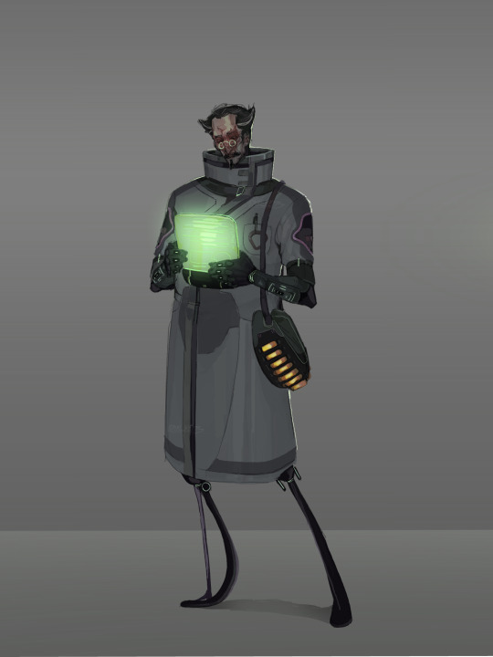
My Human AL-AN redesign!! The video is still a WIP because I got sick haha, but yk.
At first I was scared I wouldn’t see a lot of visual Improvement, since the video is only 7 months old, but I compared the two and wow, there is a huge difference and I’m very happy with it.
Also this isn’t really much of an AU(?) it’s kinda hard to explain but it’s basically just the alien designs replaced with humanoids for my personal convenience (can’t draw em very well), with some minor story altercation that doesn’t really affect the plot. I think with AL this is easier to explain as they canonically have the ability to cause visual hallucinations, so this design would probably just be an extension of that, not really how he looks. I always liked the idea of the architects being a little eldritch that way, they have a true form but it’s unphysical, the human mind can’t make it up so the individual simply chooses what to present itself as: at least that’s my personal interpretation/headcanon.
As I’ve said before in the first post about the concept design where I further explain my decisions -
, I gave him a burn scar over his face from the disease research facility incident wich I imagine stuck with him in a way it, in one way or another, burns itself through every body he possesses aslong as the transfer doesn’t go wrong and he remains with the memory (also obviously to resemble his face screen).
His attire is based off of those the alterrans scientists wear, the pattern is a mix of precursor architecture textures and shapes mimicking those on his body, the logo on the lab coat is inspired by the architect statues from BZ, wich i reaaaally loved.
Hair/face shaped to vaguely resemble his face plate thingy and horns.
Also gave them a bag in wich I imagine carries all the different tools that are built into their arms in the game, because I’d rather die than draw those again beyond blocking in rough shapes haha, bag coincidentally ended up having a sea dragon color palette wich I initially wanted to change but ended up really loving because it kinda symbolises his guilt haunting him a little. it’s also stacked to the brim with enzyme 42 for obvious reasons.
I also still stand by the idea that the architects would look a little uncanny when trying to resemble humans, they can mimic them to near perfection, but something is just off, the body ratio looks strange, neck a few centimetres too long, shoulders a tad bit too low, lower legs too long, face moving too monotonely, small things like that yk.
Had to rerender this because I started drawing at like 6am at wich point my brain was rotting so hard I completely forgot what brushes I use, but that doesn’t really matter since I love to render so yk lol.
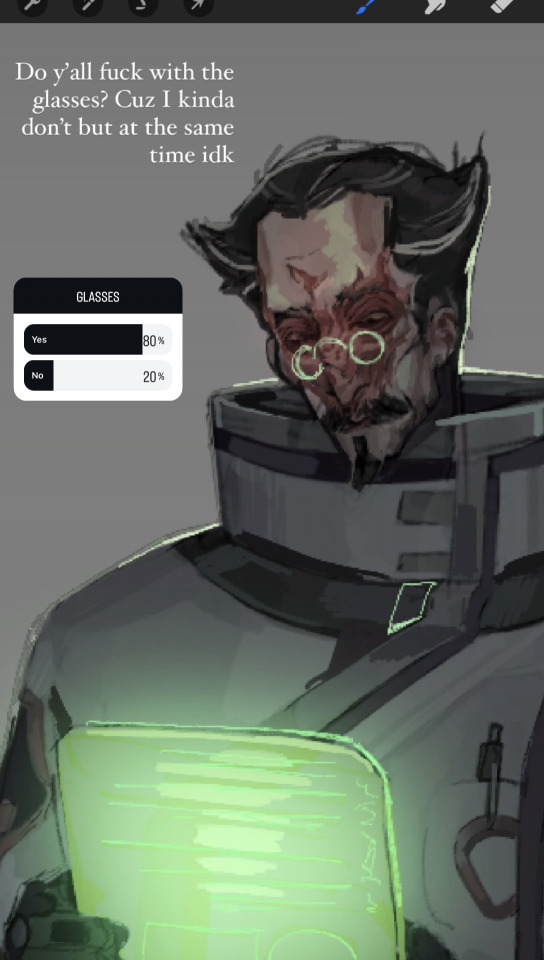
I made a poll on Instagram asking wether or not people liked the glasses, because on one hand I felt it made the colors more even whilst directing attention at and lighting the face nicely, but on the other I don’t really wanna make every „smart“ character have glasses, so I decided that these are reading glasses, wich means he does have them but he can also go without.
here is the alternative without:

#subnautica#subnautica below zero#al-an#video game fandom#al an subnautica#subnautica art#al an#subnautica fanart#video game fanart#fanart#gajinka#humanization#human al an#small artist#artists on tumblr#concept art#subnautica au#idk what else to tag#btw architects do not have set gender roles#because they’re literally digital alien ghosts lmao#like why would they#subnautica architects
96 notes
·
View notes
Text
Clothes Make the Man: AKA, me geeking about the fashion of the Halloween guest characters
CW: THERE MAY BE LOST IN THE BOOK WITH THE NIGHTMARE BEFORE CHRISTMAS SPOILERS UP AHEAD!
Also this is going to get extremely rambly on my end. 😅
I kinda got this idea while I was rendering Skully's doll and it made me realize something.
SKULLY'S PREDECESSORS ARE HARD TO DRESS!
OTL ...
But then again you do also have to think of the time period some of these movies take place in while alongside their inspirations. It is so hilarious to me that I find Rollo alongside Fellow and Gidel (who are both well and alive) are so tricky for me to find a proper wardrobe for them compared to a freaking NRC Alumni who's been dead for many years.
Why? Well, let me break it down.
1. Rollo Flamme

Ah, Judge Flamme Rollo longs to purge the world of vice and sin and HOO LAWD does his design give him that air of power. Of course, due to him being a far less creepy version of the man he's twisted from (and it's kinda the case of every character in this game) where obvious points to obvious that he has to dress similar to Claude Frollo especially with Nobel Bell College LITERALLY being a Cathedral (and it's why I lovingly call it Twisted Wonderland's version of Catholic school)
I guess you could try to fit him in something modern but considering that sorta 15th century Paris look that Fleur City or just Nobel Bell College has in general, it's a little difficult to place him in something that could match his very quiet, serious, and intimidating aura. As if his freaking sanpaku eyes and his fuckass monk hairstyle wasn't enough, the student council robes really showcase that among the student body, he is someone that's held with so much respect and high regard (when they really shouldn't and he knows it) but despite his rather quiet demeanor, you can't help but feel a bit off as if something terrible is about to happen.
I'm sure the people of Paris in Hunchback were not expecting the freaking self-righteous judge to succumb to his lust for Esmeralda much like how Rollo would succumb to his wrath against mages.
Both men are sinful and self-righteous individuals but they carry so much power with how they dress. They're public officials but they hate the world and everyone in it.
Also, I love how Rollo's plan is foreshadowed in his shoes considering that Firelotuses are the freaking buckles! XD
2. Fellow Honest and Gidel/Ernesto Foulworth and Gino

My Italian kings, MY SHAYLAS! HOW I LOVE YOU SCHEMING BASTARDS SO MUCH!
Truth be told, out of all of the villains in Disney's canon, I wanted Honest John and Gideon to get the Twisted Wonderland treatment so bad especially since they're absolute icons in their own right. However, mainly because of how often I addressed Fellow using his JP name (though controversial opinion, I actually grew to like his EN name despite me wishing that Aniplex didn't change it for the sake of convenience. Oh well, makes for a fun headcanon lol) I'm going to address him and Gidel using those names purely out of convenience.
Okay, so what can we tell about these two?
While yes, they do have this sorta flashy showman look to them, you can immediately tell that the two of them aren't exactly well off. However, just looking at them, they do look like a pair of carnival barkers don't they, or at least a circus ringmaster and his assistant?
Yes, yes, this is another obvious points to obvious moment where Fellow and Gidel are supposed to dress as Honest John and Gideon respectively, but compared to the characters they're twisted from, their clothes DEFINITELY got an upgrade compared to the stuff that Honest John and Gideon are wearing with their colors being a little more saturated and embellished with embroidery compared to the tattered clothes they wore. I know Fellow has quite the talent for sewing but if he sewed and embroidered his and Gidel's ensembles BY HIMSELF?! Damn dude, why didn't you go into costume work or tailoring?! Though knowing them they DEFINITELY would pull an Emperor's New Clothes type of situation lmao
Okay, fangirling aside, I think another challenge I have when it comes to picturing them in different attire (aside from their financial situation) is also tied to the fact that Honest John and Gideon were written to be like a vaudeville duo with the two representing a couple of character tropes you would see in comedy acts during that era of entertainment (especially with Gideon taking inspiration from Harpo Marx much like what happened with Dopey. A little bit of trivia is that Gideon was ACTUALLY supposed to talk and his VA was supposed to be Mel Blanc, yes THAT Mel Blanc, but the writers at Disney thought it would be funnier if Gideon didn't speak and acted as a sort of Harpo Marx type character. Although, Mel Blanc did go back and record a couple hiccups for Gideon for the tavern scene).
You can see the sorta old vaudeville-esque inspirations for both Fellow and Gidel kinda but I will admit, to me their style reads more as
"Vaudeville rejects who ended up becoming a pair of carnival barkers."
Especially with how flashy their outfits are.
Their style is so specific to them that it makes it so hard for me to pinpoint what era or aesthetic would work with them because they look like themselves in whatever outfit Fellow manages to concoct, and of course, with Gidel admiring his big brother so much (and him acting as that old fox's conscience in a sense) he's going to look amazing (and cute as all Hell) in whatever outfit Fellow tailors for him.
TLDR: They really don't look like themselves unless it's something Fellow made along with it being cute and unique to them.
Still Fellow, YOU WOULD KILL IT AT FASHION SCHOOL! BRO, OH MY LORD!
OTL
3. Skully J. Graves

And here we are, the man of the hour and the one responsible for making this very ranty blog post. Skully J. Graves, the darling Pumpkin King of Twisted Wonderland.
One thing to point out compared to his predecessors is that this guy is literally MONOCHROME EVEN DOWN TO HIS SKIN TONE! (Seriously, homeboy is as pale as a CORPSE COUGH COUGH! What?)
There is very little color in his outfits with the exception of the bits of gold on his lapel pin and his bright orange eyes. It's elegant as it is spooky which is very much on par with his hero, Jack Skellington.
However, one thing with fashion is that you can tailor a monochrome outfit specifically to your taste by adding texture and HOO LAWDY IS SKULLY THE KING OF OUTFIT TEXTURE!
There's so much detail and texture in his outfit from the rips on his jabot, sleeve cuffs, and the tails on his coat, the haphazard stitches, the skeleton hands on his gloves, his black and white shoes, and even the different type of fabric used on his coat ranging from swirls, stripes (both regular and pinstripes), and even solid fabric to not make the outfit look too busy. His outfit is a bit busy but it has enough balance to where it doesn't take away from Skully's appearance as well as give it that dark whimsy that people often associate with Tim Burton's characters.
"So Dorkus, why do you find it easier to dress Skully compared to Rollo or the Playful Duo?" I hear you ask.
If there's one thing I know about Tim Burton, one of his more iconic looks in terms of art direction is his dark and Gothic romanticization of the Victorian era (a time period in which a lot of people HC was Skully's prime years at NRC) or similar eras to that (CORPSE BRIDE, ALICE IN WONDERLAND, AND SWEENY TODD I AM LOOKING AT YOU!)
With that in mind and also with Skully's more monochrome color palette, he in my opinion would look so stunning in Elegant Gothic Aristocrat style or Ouji especially given the fact that both Yana Toboso and Tim Burton have this spooky atmosphere surrounding the mid-to-late 1800s.
Sure, Skully came from a time period with a strict dress code for gentlemen, but it's kinda one that people do romanticize as well as take inspiration from, but hilarious enough, many Halloween traditions we know now did emerge from that era.
So, because of these little factors, I have a certain aesthetic in mind for him and that sort of Victorian Gothic look would fit him the best.
Whew that was long and ranty but that's all I wanted to say.
#twisted wonderland#disney twisted wonderland#disney twst#twst#twst thoughts#glorious masquerade#stage in playful land#lost in the book with tim burton's the nightmare before christmas#rollo flamme#fellow honest#gidel#skully j graves
33 notes
·
View notes