#How to Create Custom Typography
Explore tagged Tumblr posts
Visit Tumblr Blog
Explore Tumblr blogs with no restrictions, modern design and the best experience.
Last Seen Tumblr Blogs


Fun Fact
In Q3 of 2020, 31% of US users access the Tumblr app daily.
Text
youtube
How to Create Custom Typography
How to create custom vintage typography text design in Adobe Illustrator CC..
In today's Adobe Illustrator tutorial I'm going to show you how to create a custom typography design. I am going to show you tools such as the type tool, how to download and install fonts from Adobe Cloud, use the Pathfinder, Pen Tool and how to add shadows to your text.
#graphic design#illustrator tutorials#education#youtube#adobe illustrator tutorials#adobe illustrator tutorial#typography tips#typography tutorial#typography design#typography#cool fonts#graphic designers#graphic art#How to Create Custom Typography#typography tutorials#text design#Youtube
0 notes
Text
Color, Typography, and Beyond: The Building Blocks of Brand Identity
In today’s competitive marketplace, a well-defined brand identity is critical for businesses seeking to make a memorable impression. Among the essential elements of branding, color and typography play pivotal roles, shaping how consumers perceive and connect with a brand. This article explores "Color, Typography, and Beyond: The Building Blocks of Brand Identity," providing insights into how…
#best practices for brand management#Blocks#Brand#Branding strategies for small businesses#Building#building brand loyalty#business growth strategies#Color#corporate social responsibility#creating a strong brand identity#customer relationship management#digital marketing for startups#e-commerce tips for businesses#how to scale your business.#how to start a successful business#Identity#importance of social media for businesses#influencer marketing for brands#small business funding options#top business trends 2024#Typography
0 notes
Note
hii! i absolutely love your work. i've been getting into trying to make borders myself, and i was wondering if you had any tips on where to find good pngs or do you create everything yourself? i feel like my luck so far hasn't been great but maybe i just don't know how to search for it correctly!
Hello, nonnie! I'm so glad you enjoy my work; thank you for your kind words. ( ˶ˆᗜˆ˵ ) And oh my gosh, it's so nice to see a new GFX creator in the making! One of us, one of us, one us. ~ Welcome to the wonderful world of editing, hehe!
I've compiled a list of websites that I use for my graphics, but please do let me know if you need anything else and I'll be happy to assist!
For general assets, as well as inspiration, I generally use these websites: behance (which is pretty much the industry standard when it comes to graphic design in general, they have cool studios or experienced designers that post their works and/or assets), booth (an independent japanese resources hub with many free and paid assets), huanban (an independent chinese resources hub, same proposal as booth), abdz (mostly focused on typography and branding), dribble (more focused on web applications and design) and envato (templates).
Since I'm colourblind, I'm not always confident about how to compose colours together. So whenever I'm in doubt, I use coolors (to get palettes from images and browse through palette ideas) and colorhunt (which gives ideas for palette themes and motifs).
I love typography a whole bunch, but sometimes it's hard to find that one right font for your project. Whenever I need to look for something else, I always run to these websites: google fonts (when I'm on a budget and want to use 100% free fonts, including for commercial use), 1001fonts (to quickly find fonts based on themes, it has a great tag system), dafont (a big classic huge dabatase of custom fonts), befonts (for more industry standard-leaning fonts) and kerismaker (for those magazine looks). When I want to identify a font used on an image and where I can download/purchase it, I use myfonts and font squirrel. They even give you similar options for free, too!
Suppose I'm specifically searching for illustrations/PNGs I can use on my upcoming project. In that case, I'll either go to flat icons (for websites, applications or presentations), vertex (for 3d icons and/or general vectors), graphic burger (for logo making), cleanpng (for I want a tree PNG and do not want to clean it myself, for example), pngtree (same idea as the previous one, you just search for a word and will see all PNGs related to it) and pngall (self explanatory).
Regarding backgrounds, textures, and photography in general, I rely on websites like pixabay, vecteezy, 3d ocean, morguefile, freepik and isorepublic. They have high-quality photos and videos that you can use on your projects. However, if I specifically need mockups or patterns, I turn to unblast, pacage and ava.
Besides those, you can always search for things on Deviantart and Twitter! Though I do not use those much, I think Instagram and Threads also have pages dedicated to sharing resources. Discord can be a nice place to search for graphic design servers, too.
However, if I cannot find specific resources for a commission/project for whatever reason, then I will make them myself. Be it through photography, drawing or anything else I can get my little hands on.
For the more technical/applications side, the programs I use for my graphics and edits are Adobe PhotoShop 2020, Adobe After Effects 2020, Adobe Illustrator 2020, Clip Studio Paint (for when I need to draw or polish something for specific projects/commissions), and HandBrake (for when I need to make screencaps). My drawing tablet is an oldie, Wacom One.
Hopefully, this can be a nice starting point for you! Please feel free to reblog and/or like this post if you'd like to save it for whatever purpose. ~ I hope you enjoy this journey ahead, and if you need anything else, let me know! You got this! ദ്ദി ˉ͈̀꒳ˉ͈́ )✧
#♡: answered! *#graphic resources#gfx resources#roleplay resources#rph#rp resources#editing resources#carrd resources#editing
124 notes
·
View notes
Note
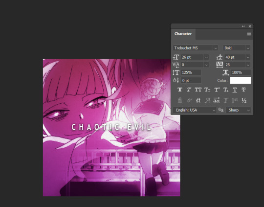
Hi, I love your gifs for Himiko!!!
https://www.tumblr.com/biblical-love/781849514019536896/lgbtqcreators-event-27-doomed-by-the?source=share
Please tell me how you made the shape and its color in the third gif

thank you for your kind words anon, and of course, i'd be happy to show you how i did this effect!
(note: i did my best to make this tutorial as beginner friendly as possible, but absolutely do let me know if there's anything i need to elaborate on!)
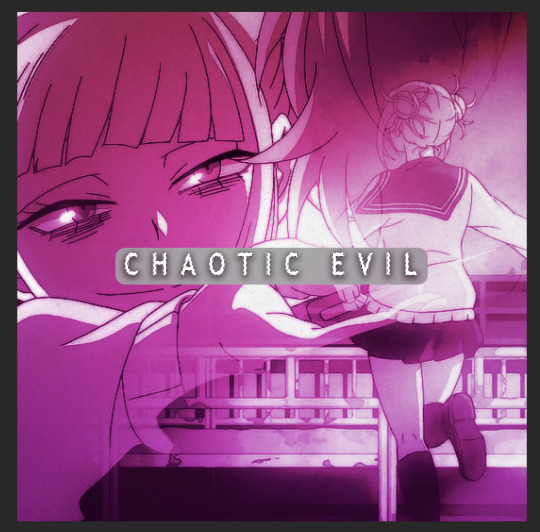
STEP ONE: TYPE OUT YOUR TEXT
These are the text settings I used (in case you were curious).
STEP TWO: ADD A ROUNDED RECTANGLE

it doesn't actually matter if your rectangle is in front of or behind your text. the hex code for the shade of gray i used i #a9a2a7, but you can also go lighter or darker if you want to, so long as it's a shade of white / black / gray.
STEP THREE: SELECT YOUR TEXT
To do this, hold down your "ctrl" key, and click on the icon for the text layer under your "layers window". it's somewhat difficult to see in this screenshot, but you should see a dashed line outlining your text after you've done this
STEP FOUR: INVERT THE SELECTION

Use your Marquee tool (which you can access by clicking the "m" key), and right click on the selected typography
STEP FIVE: ADD A LAYER MASK TO THE RECTANGLE
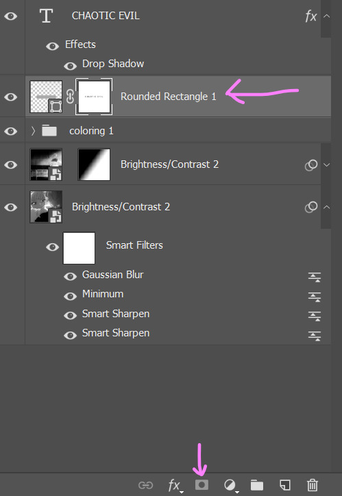
MAKE SURE YOUR INVERTED SELECTION IS STILL OUTLINED. click on the layer for your rounded rectangle in the layers window. then, find the icon at the bottom of the window that looks like a rectangle with a circle missing from the middle.
STEP SIX: DELETE YOUR TEXT

this will leave you with just the rectangle, which has had the text cut out by the layer mask.
STEP SEVEN: CHANGE THE RECTANGLE'S BLEND MODE TO "DIFFERENCE" OR EXCLUSION

honestly, there isn't really much of a difference between the settings and what they do, so just pick whichever one you like more. if you don't like the colors, don't sweat it. we're going to be changing them in the next step.
STEP EIGHT: ADD A GRADIENT OR COLOR OVERLAY

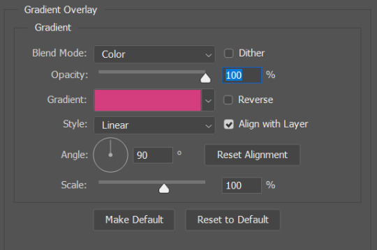
to add the overlay, click on your rounded rectangle layer, and then find the button that looks like the letters "fx" (it should be right next to the layer mask button from earlier).
and that's it! you now have a custom block font!

if you use this tutorial to create any gifs, make sure to tag me (by using the #tuserecho tag) - i'd love to see them!
#behind the gifs#userbaz#userrobin#userishh#usersadie2#rosedavid#tuserheidi#carolook#tuserhol#userahri#phillycheesesteph#uservivaldi#usercats#tsusermels#usernolan#userbunneis#userrsun#usergif#dailyresources
56 notes
·
View notes
Text


RESOURCE DIRECTORY 2.0 + HOW TO NAVIGATE USERGIF
Hello! We hit 10k followers! I want to take this moment to thank all our wonderful followers and the talented members of usergif! We created this blog less than 2 years ago and are constantly blown away by your support and beautiful creations. As a thank-you, we're proud to announce our new and improved resource directory!!! Shout out to arithemes' custom page which allowed us to create a more streamlined and organized directory for everyone to use. Under the cut, you'll find a guide to help you find exactly the resource you're looking for on our blog. Happy gifmaking! :)

THE UPDATED DIRECTORY
All resources are in alphabetical order first by the creator's URL (at the time of entry), then by the resource's title. Each title is a clickable link that'll redirect you to the original post. Beneath that, you'll find the creator's URL and the resource's relevant filter tags:
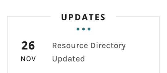
As always, whenever I add new entries to the directory, you'll see the last date listed on the right side of the blog here:
If you don't see one of your recent tutorials listed there, please be patient. I update the directory on a monthly basis, but only add resources that have already exited our queue.
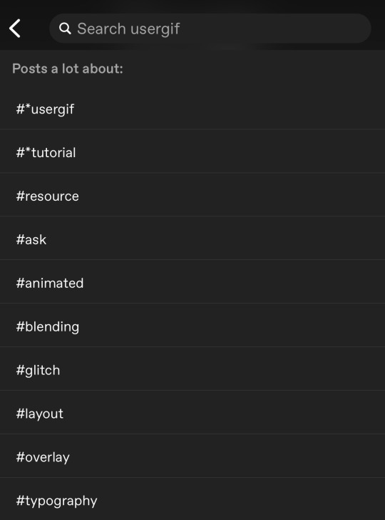
THE FILTERS

Please note: the Source section has exclusive filters, meaning you can only select one at a time. In the Type and Effects sections, you can select as many filters as you want. However, if you select 2 filters in one section, like "animated" and "blending," it'll show results for any resource with either of those tags, not necessarily resources that include both of those tags.
Here's a breakdown of how we categorize our resources:
Source: ↳ all: posted by any creator ↳ usergif: posted by usergif
Type: ↳ all: click this to reset filter selections ↳ action: pre-recorded photoshop functions that can be replayed ↳ basics: non-effects-related resources to help new gifmakers get their feet off the ground (please remember usergif is not a resource for beginner-level gifs and focuses on intermediate to advanced gif effects. however, we thought it would be helpful to keep some basic resources available) ↳ brush: various brush shapes like ripped paper edges or intricate textures ↳ fonts: names and links to fonts or font packs ↳ template: pre-made, downloadable layouts and designs ↳ texture: overlays that add a different finish to a gif such as Ben Day dots (retro comic dots) or glitter ↳ tutorial: any post that provides an explanation for a gif effects process ↳ other
Effect: ↳ all: click this to reset filter selections ↳ animated: an effect that applies movement to an element such as rotating text or wiggling shapes ↳ blending: aka double exposure, this effect combines two or more gifs layered on top of each other ↳ color: specifically for color manipulation, an effect in which the original colors are completely different (e.g. a blue sky colored to look pink) ↳ glitch: an effect where color channels are toggled and layered over the original gif to give a flickering effect ↳ layout: multiple gifs on one canvas like a collage (e.g. hexagon layout) or poster-style templates ↳ overlay: an added element layered above a gif (excluding text) such as a shape, another gif confined to a shape, a texture, etc. ↳ transition: an effect that stylizes the passage from one scene/clip into another, such as a fade, glitch, linear wipe, or motion blur transition ↳ typography: any kind of stylized text added over a gif (does not include basic captions)
You can find examples of all these gif effects via their respective tags on our Nav!
THE SEARCH BAR

This search bar functions the same way as the search bar in the upper right corner of our main blog and the search function on Tumblr's mobile app.
Tumblr search allows you to generate results using keywords found in the body of the post or the tags. So, if you're looking for a post but can only remember it having the word "rotoscoping," you can type that in either in the directory's search or blog's search and find any post on our blog that mentions the exact keyword "rotoscoping."
THE NAV & TAGS
Tags function differently from search keywords as these relate to exact words and phrases found only in the tags, not the body of the post. Our members use tags to categorize original posts and reblogs. Some of our most frequently used tags are listed on our Navigation Page and saved in the mobile search function pictured below:
But if you ever want to quickly navigate a tag, simply add /tagged/word to the end of our url to find that tag! For example, if you want to see all the posts we've tagged as a #tutorial, just go to usergif.tumblr.com/tagged/tutorial.
BROKEN LINKS
Whether it's due to a creator frequently changing their url, the absence of an automatic blog redirect, or my own mistakes when coding the directory — you may stumble upon a broken link. Here's what to do:
If a creator has changed their username but their blog doesn't automatically redirect you to the new blog, check if they listed their new user name in the title of their old blog like I did:
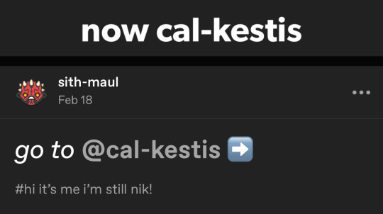
In this case, simply replace the url you landed on with this new url. For example, https://sith-maul.tumblr.com/post/692130400398704640/how-to-make-an-animated-google-search-overlay-a → would become → https://cal-kestis.tumblr.com/post/692130400398704640/how-to-make-an-animated-google-search-overlay-a
However, if you can't figure out the creator's new url or in the case that I messed up the link due to human error, feel free to send us a message so I can help find the source or correct the mistake!
WHERE TO FIND THIS INFO AGAIN
If you ever need to access this guide while using the directory, simply click the "i" button here:

And that's it! We hope this revamped directory is a lot more efficient and helpful. Thank you again for all your support and for helping us reach this follower milestone!
#*usergif#*usergifdirectory#completeresources#usershreyu#userace#uservivaldi#userbecca#usertreena#userzaynab#alielook#usernanda#userhella#userelio#useraish#userabs#tuserabbie#tusermona#usersmia#tuserlucie#usercats
365 notes
·
View notes
Text

🧡 Tuesday Tips #3 🧡
Your website is more than just a collection of pages—it’s your digital home. It should reflect you, your interests, and your personality. But with so many sites out there, how do you make yours stand out?
Here are 25 ways to make your website feel more personal, unique, and personalized to you!
........................................................................................................
🎨 Design & Aesthetics
1. Custom Color Palette – Pick colors that resonate with your personality and aesthetic.
2. Unique Typography Choices – Use a mix of fonts that match your vibe.
3. Handwritten or Doodle Elements – Add personal sketches or notes.
4. Custom Cursor – Let visitors use a fun, themed cursor on your site.
5. Personalized Favicon – A tiny but powerful detail that makes your site feel complete.
6. Themed Layouts for Different Pages – Make each page visually distinct but cohesive.
7. Custom Backgrounds – Textures, gradients, or even a personal photograph.
8. Retro or Experimental CSS Styles – Go wild with unique styles that make your site stand out.
9. Create a Custom Hand-Drawn Logo – Instead of a standard logo, try sketching one yourself for a unique touch.
10. Add Subtle Animations – Small hover effects, background animations, or cursor trails can bring your site to life.
11. Play With Layering Elements – Overlap images, text, and shapes for a more dynamic look.
12. Design a Personalized Loading Screen – A custom loading animation or message adds a fun detail visitors will remember.
13. Add Your Own Handwriting as a Font – Convert your handwriting into a web font for a truly personal touch.
14. Design a Seasonal Theme Switcher – Let visitors toggle between different seasonal or mood-based color palettes.
........................................................................................................
📜 Content & Personality
15. Create a Behind-the-Scenes Page – Show how your website was built, share your thought process, or include fun bloopers.
16. Add a "The Making Of" Section – Share drafts, sketches, or early concepts behind your creative works.
17. Include a Personal Dictionary of Words You Love – A list of favorite words, phrases, or slang you frequently use.
18. Design a "Things That Make Me Happy" Page – A simple, uplifting page filled with personal joys.
19. Show Your Progress on a Learning Goal – Track and share your journey in learning a new skill, language, or hobby.
........................................................................................................
💾 Interactivity & Engagement
20. Add a Clickable Mood Indicator – Let visitors see your current mood with an emoji or phrase that changes over time.
21. Create a Dynamic Banner That Updates Automatically – Display different messages depending on the time of day or special occasions.
22. Add a "What I'm Listening To" Widget – A live-updating display of your current favorite song or playlist.
23. Embed a Poll or Voting Feature – Let visitors vote on fun topics or help you make creative decisions.
24. Introduce a Mini Personality Quiz – Something quirky like “Which of my favorite books/movies are you?”
25. Make an "Ask Me Anything" Page – An interactive page where visitors can submit questions for you to answer.
Closing: Make It Yours!
Your website should be you in digital form—fun, unique, and engaging. Whether you add just one or all 25 ideas, the most important thing is to have fun and make it your own.
If you try any of these ideas, let me know—I’d love to see what you create!
-----------------------------------------------------------------
Want to help the Small Web movement grow?
Join us on other platforms. ♥
FB Page & Group:
facebook.com/thesmallweb
facebook.com/groups/thesmallweb
Twitter/X:
x.com/smallweblove
Tumblr Community:
tumblr.com/communities/thesmallweb
Mastodon:
indieweb.social/@thesmallweb
#small web#indie web#web revival#old web#blog#neocities#2000s web#decentralized social media#decentralizedfuture#old internet#decentralization
17 notes
·
View notes
Text
HWA writer is doing a vote on Artificial Intelligence and a round up on what graphic designers actually do and why you shouldn't shoot your foot.
So writer news the HWA is voting about AI use, both in writing and covers. Most of my social media bubble is saying NO. 'cause obviously, it's stealing other people's work, but there is also this guy...

I get it, a lot of people don't understand the process that graphic designers have to go through. But it's harder than people think and some of the cost is BUYING LICENSED PICS TO USE IN YOUR COVER.
Unlike AI, graphic designers pay the photographers, etc OR have really expensive equipment to make high res images for book covers themselves. My cheap camera was 600 bucks in 2019. That does not include background, lights, etc. If you're complaining about the cost of custom covers from graphic artists, think about the cost to hire models, costume, and the camera equipment.
But it's more than Oh, snap pretty pictures or pay for it, there are other principles that go into art which include composition (which I covered many times), color and color theory knowledge (which AI can't always do well because there is also psychology per culture that one has to put in.)
There is also typography and knowledge of the market and psychology. You're paying for a lot more than Oh, just slapped pictures together. You're paying for a human who can create something unique that shows off the elements of your book in maybe ways you didn't think about.
Graphic artists are artists because we do things like arrange your websites for you to maximize psychological interaction. Graphic artists are not on the same par as AI.
So, no, this is a horrible take. I use traditional and computer media. But you can't unite if you think, OMG, you drew that in a computer v. you drew that on paper versus and think the first one is invalid. OMG, you wrote that in a computer. You wrote that on paper. The principles the human is applying are pretty similar.
Many graphic artists also draw. Many people use both media.
When Will up there can explain the positives and negatives of what a tangency is and how to color adjust a photo digitally on levels+curves, and how those things can affect the psychology of people interacting with their final product, then he can talk about OMG, how digital art is ruining covers.
Graphic Designers also know how to typeset your covers, who usually do it digitally, so don't eff with them by slamming the people that work with you. Because lemme tell you, the thing that makes your covers and the back of your books look excellent is that tight yet quite difficult art of typography. If that graphic designer really cared, they put that little extra work into eliminating the rivers on the blurb for you to make sure it was that extra bit more readable. They cared about the color of the type and the type face. And those people too are graphic designers. Psychologically, great graphic design is chef's kiss and when typography is done just so, the potential reader *feels* it through the design and the emotion your book is promising to give them.
So don't disparage graphic designers. Even for the fraction who cannot draw, when they are good they HELP with your marketing that much more.
General advice: Don't disparage platforms. Don't disparage your fellow true artists/creatives. Because it's likely you'll have the opportunity to work with them someday, and do you want to cut off the roads to making your book/product the best it can be? Uplift. Graphic designers are not the same as AI. Graphic designers pay other artists for licenses to their work.
Add to that the HWA is holding a vote about AI writing, etc. And yeah, we kinda need to spread this info around.
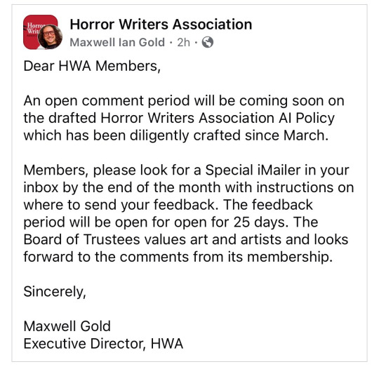
Dear HWA Members, An open comment period will be coming soon on the drafted Horror Writers Association Al Policy which has been diligently crafted since March. Members, please look for a Special iMailer in your inbox by the end of the month with instructions on where to send your feedback. The feedback period will be open for open for 25 days. The Board of Trustees values art and artists and looks forward to the comments from its membership. Sincerely, Maxwell Gold Executive Director, HWA
38 notes
·
View notes
Text
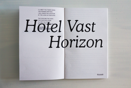
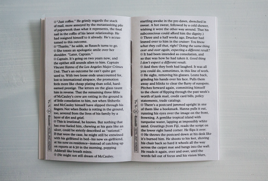
Hotel Vast Horizon by @rocket-eighty-eight
Heat (1995) | Vincent Hanna/Neil McCauley | 16,202 words | 100 pages
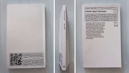

You can see and download the whole typeset HERE.
You can also print it if you want a copy for yourself! I provide printable files below. Check out the guide first ↓ The book is 11x18cm AKA 4,3x7,1" & can be printed with a coptic stitch or staples. Mine's printed on 80gsm grey recycled paper & 210gsm grey paper for the cover.
DOWNLOAD THE FILES / PRINTING & BINDING GUIDE
HEY!!!! HI! finally. If you've checked the Heat (1995) (Al Pacino and Robert De Niro Go on a Date: The Movie) tag on AO3 in the past year you've probably checked out Hotel Vast Horizon (Michael Mann Could Never: The Fic). Welp here it is on paper.
The common thread in the typeset was always the ocean (and shit, I said the o-word. did you know there are like 20 references to water, seas and storms in HVH, and yet never once "ocean" is said?). The other thread was the Bitstream Cooper typeface, which is round and curvy and so pleasing on the eye. Isn't it? Also Arial (underrated), because I needed it for the sequencing to show that Michael Mann is a loser. I'm kidding. Or am I? But this brings me to another major thing: the sequencing. (The common denominator between movies and books: the sequence.) That can only be apprehended on the full PDF/book, and it's really something that did not really exist (in so much depths) in the previous typesets.
As to what the sequencing is saying, or what the hell this intro is about (no I did not have a stroke when I did it), I will not say much if only that it is about the vocabulary, the image, the movie, the things that go beyond fate, a little bit Neil vs Vincent and a lot the reason vs the heart. More things shall remain unexplained because I feel they would be better experienced than laid out here.
If you'd still like to know what's actually going on in this thing don't hesitate to send in an ask lol.
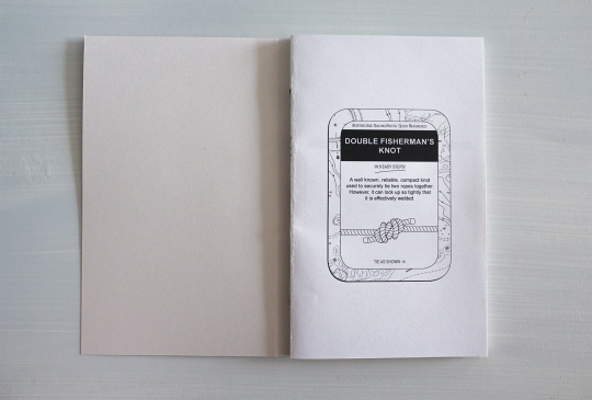
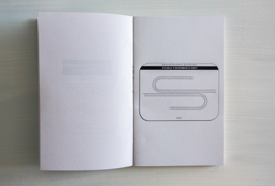
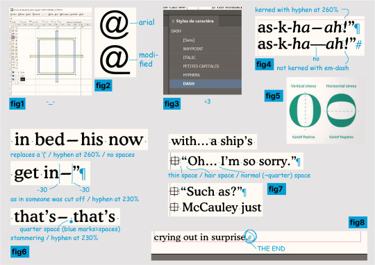
More details on the technical matters + a visualization at the bottom, because there is work involved and my micro typography is so clean it could give Neil McCauley a boner.
help where do i even begin? I learnt how to use FontForge to create a new typeface specifically for that symbol at the beginning of the paragraphs in order to implement it in InDesign (see fig.1 below), I changed the Arial's @ in FontForge too (fig.2) to have it fit with the underline in @ rocket88, what the hell.
2. I also drew 11 (I think) illustrations for the intro (yes, those knots......), but that wasn't as complicated as I thought it would be. I do deeply curse InDesign's "Print Booklet" function for how much it hates images though.
3. I would like you to meet my InDesign characters styles (fig.3) as they simply are impeccable and the best you will ever see, I could not have been more professional if you had paid me 5 grand for this. The hyphens! The dashes! The custom small caps!
4. To get even further in the micro typography. It is, in most, most cases, much too time-consuming to properly kern (=modulate the space between your characters and/or words) your text for how little the average eye will get out of it, and/or your average graphic designer is certainly not getting paid enough to actually do it properly. I, on the other hand, am insane and unemployed, therefore yes, I kerned this shit. Micro typo is actually the sculpture of the white spaces of your page. When done thoroughly it does mean checking every characters with your own eyeballs.
So in english, since this typeset is in english, the rules are no spaces for punctuation. Right? and not right ? It makes for a pretty tight block. I do argue too tight - although of course you'll also have times where you want tight. (And this is all within the 5% of the time where kerning matters.) That might not sound too bad until you get to em-dashes, this '—' thing. Which is a literally useless punctuation mark that is so hysterically long it'll leave an unnatural horizontal void in your text and draw all attention to it—you know, instead of the text itself. Useless, because it can always be replaced by commas, colon, semicolon, or parentheses. Unnatural, because em/en-dashes do not follow a typeface's characteristics (when hyphens do! fig4), so they hardly fit with serifs, AND characters are generally vertically stressed in latin (fig5: which one looks normal?) except... well. So you'll have the tightest group of punctuation marks humping each other?!"— then a dash literally the size of a whole ass m that looks nothing like the rest. ridiculous. absurd.
Anyway the point is I said bye-bye to this aberration and used hyphens stretched at 260% (lmao. it works so well?). And sometimes 230%. Sometimes with a space after, sometimes not - if not the same meaning then why the same treatment (fig6)? I wondered at this point if I wasn't going too far (lol) but this is the point of micro typo, so, whatever. See fig7 for more kerning stuff.
5. I have far less things to say about this part than the last even though I must have spent twice as much time on it, but I just wanted to say that I manually set the text rag on all 69 pages, it looks nice, I love tetris, AND!!!! the greatest thing about the whole fucking book (fig8): the text starts on the top line of the first column, and ends, on p.91, on the LAST line of the column, at the very bottom of the page, and IT IS NOT. BY. CHANCE!!!!!! HAHAHAHAHA!!!!!!
thanks for reading. perfection has not been achieved and there might still be typos. see you later.
89 notes
·
View notes
Text

Describe the Visual Identity: Making Your Brand Visually Memorable
The visual identity of your brand is the thing most people will notice first. Now, let’s go into detail about each element and explore what should be included in brand guidelines:
Brand Guidelines Logo
Your logo is the face of your brand. Outline when and how to deploy it. Include variations in format, such as horizontal or stacked. Mention minimum size and spacing requirements.
Example: Apple’s logo is iconic because it’s simple yet versatile.
It works equally well on product packaging, digital ads, and storefronts. A good mark helps people recognize your brand right away.
Color Palette
Choose primary and secondary colors that reflect your brand personality. Use tools like Pantone or HEX codes to ensure accuracy.
Example: Coca-Cola’s red evokes excitement and energy, while Tiffany & Co.’s Robin’s egg blue conveys elegance and exclusivity.
Colors evoke emotions and associations. Choosing the right palette strengthens your brand’s emotional impact.
Typography
Specify the selection of font types that match your brand’s personality. Include rules on headings, subheadings, body text, and other typographic elements.
Example: Google utilizes clean, sans-serif fonts to convey simplicity and approachability.
Typography informs both readability and perception. The wrong font undermines credibility.
Photography
Establish rules for imagery styles. Include candid shots and staged shots. Also specify filters or image treatment to utilize.
Example: Airbnb photography is about homes and actual experiences, therefore reinforcing their community-driven ethos.
Imagers tell stories, and continuing photography styles reinforce the brand narrative.
Iconography
If applicable, provide examples of approved icons and explain their role within your brand ecosystem.
Example: Microsoft’s Fluent Design System includes standardized icons that enhance the device user experience.
Icons simplify communication and improve usability, especially in digital interfaces.
By detailing these elements, you create a framework ensuring every piece of content aligns seamlessly with your overall aesthetic.
GraphyPix LLC offers multiple brand guidelines for your design. Investing in strong brand guideline templates is not just about looks. It’s about giving your audience a smooth experience. When done well, these documents are valuable tools. They empower teams, please customers, and boost growth.
11 notes
·
View notes
Text
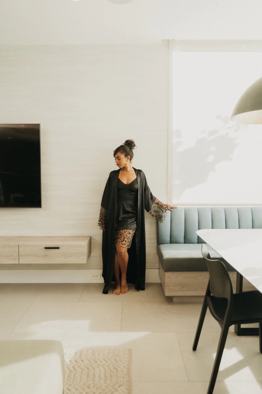
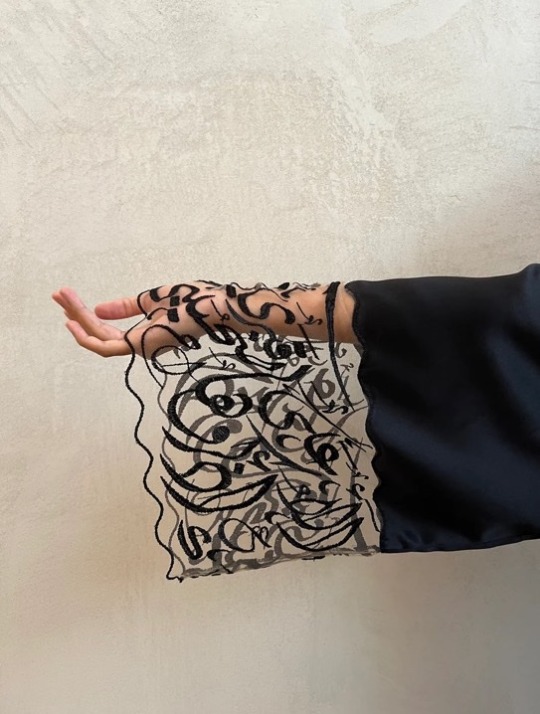
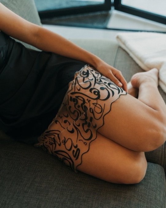
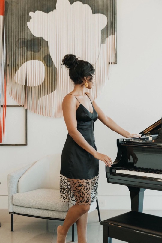
Hadal embroidered an Arabic love poem by Mahmoud Darwish, a Palestinian poet, on invisible tulle. The embroidery is custom typography created by a calligraphy artist. The poem reads:
قالوا: تموت بها حبـاًً، فقلـت لهـم
ألا اذكروها علـى قبـري فتحيينـي
English translation:
They asked “Do you love her to death?” I said “Speak of her over my grave and watch how she brings me back to life.”
#palestine#palestinians#fashion#couture#Arabic#calligraphy#hadal#designer#artists#haute couture#high fashion#poetry#poems#poem#Mahmoud Darwish#dress#robe#sleepwear#glam#free Palestine#Gaza#mine#contemporary art#contemporary design#contemporary fashion#clothes#Art#Art history#free Gaza#mena
66 notes
·
View notes
Text
youtube
How to Create Custom Script Type
Usually custom typography pieces would be drawn by hand, but today I'll share the secret of how you can still create trendy lettering by customising ready-made fonts in Adobe Illustrator.
#Illustrator Typography#How to Create Custom Script Type#graphic designer#graphic design#illustrator tutorials#education#youtube#illustration#typography design#typography tutorial#typography tutorials#typography#Youtube
0 notes
Text
Expert Picks: The Best Shopify Website Designers for 2025’s Trending Store Features

The world of eCommerce is transforming faster than ever, and Shopify remains at the forefront of that evolution. As brands aim to deliver exceptional user experiences and capitalize on design-led growth, the need for a skilled Shopify designer has never been greater.
Cross Atlantic Software specialize in bringing together cutting-edge creativity and eCommerce functionality. In this article, we’re diving into the top Shopify website designers to watch in 2025 and sharing expert insights on the trending Shopify store design features that are shaping the future of online retail.
Why Shopify Design Matters in 2025
Before we get into the list of designers and specialists, it’s important to understand why Shopify design is more critical than ever. Online shoppers expect more than a functional website—they want intuitive navigation, fast load times, visually engaging layouts, and mobile responsiveness. That’s where the expertise of a Shopify specialist comes into play.
What Makes a Great Shopify Website Designer?
A truly standout Shopify website designer goes beyond aesthetics. They focus on:
Conversion-driven layouts
Brand-centric user experience
Responsive mobile design
SEO-optimized pages
Seamless app integrations
Let’s take a look at what trends are dominating Shopify in 2025 and who is best equipped to execute them flawlessly.
2025’s Top Shopify Store Design Trends
1. Personalized Shopping Experiences
Thanks to AI and data analytics, personalization is no longer a luxury—it's an expectation. Smart Shopify store design integrates AI-driven recommendations, dynamic product displays, and personalized landing pages. This keeps customers engaged and encourages more frequent purchases.
2. Video-First Product Displays
Static images are taking a backseat in 2025. Leading Shopify website designers are building immersive product pages with background videos, 360-degree product views, and storytelling clips. These elements give customers a real feel for what they’re buying, right from the screen.
3. Mobile-First Design
With more than 75% of eCommerce traffic coming from mobile, top Shopify specialists are prioritizing mobile performance. Think smooth scrolling, effortless one-tap checkouts, and pages that load in the blink of an eye—because today’s shoppers won’t wait around.
4. Eco-Conscious Branding
Consumers are more conscious of sustainability. Modern Shopify store designs are incorporating eco-friendly color schemes, carbon tracking widgets, and transparency tabs to showcase ethical sourcing.
5. Modular Design Systems
In 2025, agility is key. Many Shopify designers are adopting modular design systems—reusable UI components that let store owners update their sites quickly without starting from scratch.
Meet the Experts: Top Shopify Website Designers for 2025
Cross Atlantic Software works with some of the most forward-thinking professionals in the Shopify ecosystem. Here are the types of Shopify website design services that are in high demand—and who’s delivering them.
1. The Strategist Shopify Designer
A strategist isn’t just focused on look and feel—they focus on conversion. They use analytics, customer behavior, and A/B testing to inform every design decision. Our own Cross Atlantic Software design team is known for combining user psychology with clean aesthetics to boost ROI.
Best for: DTC brands looking to scale quickly.
2. The Visual Storyteller
These Shopify website designers are all about emotion. They create visual narratives through imagery, layout, typography, and animation. For lifestyle, fashion, and beauty brands, this approach is especially effective.
Best for: High-end or boutique brands seeking emotional engagement.
3. The Technical Shopify Specialist
Some projects require deep technical know-how. Whether it’s integrating custom features, building subscription logic, or streamlining complex product catalogs, these Shopify specialists bridge the gap between design and engineering.
Best for: B2B, SaaS, or stores with unique backend needs.
4. The Speed-First Optimizer
If performance is your priority, look for a Shopify designer focused on speed. These experts optimize image sizes, reduce unused code, and streamline user flows—all to reduce bounce rates and increase sales.
Best for: Mobile-heavy industries or global brands.
5. The Brand Builder
A great store starts with great branding. These Shopify website design services offer end-to-end support—from logo creation and color palette development to building a custom Shopify theme that aligns with your vision.
Best for: New brands or rebrands that need full creative direction.
Why Choose Cross Atlantic Software?
With hundreds of projects completed and clients across North America, Europe, and Asia, Cross Atlantic Software is more than just a design agency—we’re your eCommerce growth partner.
Our Services Include:
Custom Shopify store design
Theme development and optimization
UI/UX design tailored to your industry
Shopify Plus migration and setup
Full-stack Shopify website design services
Cross Atlantic Software believes every brand has its own story to tell. Our Shopify specialists work closely with you to make sure your store doesn’t just look great—it feels like you.
Client Success:
One of our recent clients, a sustainable fashion label based in Los Angeles, came to us for a full redesign. Their outdated store had a high bounce rate and poor mobile usability.
Our team implemented a modern Shopify store design with immersive video elements, quick-load product pages, and mobile-first navigation. Within three months:
Bounce rate decreased by 27%
Mobile conversions increased by 40%
Average order value rose by 15%
This is the power of working with expert Shopify website designers who understand trends and business objectives.
Conclusion:
If you're planning to launch or revamp your Shopify store in 2025, don’t settle for generic templates or cookie-cutter solutions. Partnering with an experienced Shopify designer or Shopify specialist can make the difference between a store that looks good—and one that converts.
Cross Atlantic Software is passionate about building digital experiences that drive growth. Whether you’re a startup looking for full Shopify website design services or an established brand wanting to refresh your Shopify store design, we’re here to help.
Ready to future-proof your eCommerce store? Contact Cross Atlantic Software today for a free consultation and let’s create something extraordinary together.
#shopify website design services#shopify store design#shopify website designers#shopify specialist#shopify designer
3 notes
·
View notes
Text
Argentina 50 Años Jersey Font – Celebrate a Legacy in Style

Celebrate the golden legacy of Argentine football with the exclusive Argentina 50 Años Jersey Font – a tribute to the nation’s rich history and its collaboration with Adidas. Perfect for custom jerseys, Cricut projects, or football-themed gifts, this font echoes the design of Argentina's 50th Anniversary Kit and honors their 1978 World Cup win.
👉 Get the Argentina 50 Años Jersey Font on Etsy
🏆 Adidas x Argentina 50th Anniversary Kit – On-Pitch Tribute
Kit Release & Debut: Adidas released the Argentina 50th Anniversary Kit on November 14th, 2024, and the national team debuted it during a match against Peru on November 19th.
Design & Features: The kit blends classic white and light blue stripes with gold details, including the Adidas Trefoil logo and AFA lettering. It features a special collar graphic, black and gold shorts, and matching socks. The look is both modern and nostalgic.
Historical Significance: This is Argentina’s first-ever anniversary kit, celebrating 50 years of partnership with Adidas, which began in 1974. Though Argentina worked with other brands like Le Coq Sportif in the past, the Adidas connection was renewed in 2001 and remains iconic today.
Color Palette:
Main color: Ambient Sky
Gold accents for the Trefoil, AFA, and laurel wreath
3 stars symbolizing Argentina’s World Cup wins
🎨 What You’ll Get – Argentina 50 Años Font
This font is inspired by the unique number and name styling seen in the anniversary kit. You’ll receive:

✅ OTF & TTF files for easy installation
✅ Complete A–Z and 0–9 set
✅ Retro feel blended with modern block design
✅ High-resolution quality for vinyl and fabric use
👉 Get the Argentina 50 Años Jersey Font on Etsy
🖨️ How to Customize Your Jersey
Whether you're a collector or a fan who loves to wear your pride, you can apply this font to your own kit using:
Install the font on your computer
Open your software (like Canva, Illustrator, Cricut)
Create your name + number using this font
Export it for print
Use HTV or DTF printing with a heat press for best results

🛠️ 5 Best Tools for Using Football Jersey Fonts
To create your custom designs professionally, try:
Canva – Quick and easy mockups
Cricut Design Space – For vinyl cutting and layout
Adobe Illustrator – Vector editing and pro design
CorelDRAW – Great for large-format printing
Inkscape – A free alternative for SVG editing

youtube
🛍️ Why Buy from Etsy?
Our fonts are listed on Etsy, a safe and trusted marketplace for creatives. With instant download and secure checkout, Etsy gives you:
🔐 Trusted payments
📥 Immediate access to your files
✉️ Easy communication and support
🌍 Global accessibility
👉 Get the Argentina 50 Años Jersey Font on Etsy
❓ Frequently Asked Questions (FAQ)
Can I use this font with Cricut or Silhouette? Yes – the SVG and vector files are fully compatible.
Is this an official AFA font? No. This is a fan-made recreation inspired by the 50 Años kit for personal use.
Can I sell jerseys made with this font? The font is for personal use only. Contact us if you need a commercial license.
What formats are included? You’ll get OTF, TTF, SVG, AI, EPS files in a zip download.
How do I install the font? Just double-click the OTF or TTF file and click "Install" on your Mac or PC.
—
Unlocking the Style: The Significance of the 🇦🇷 Argentina 50 Años Jersey Font
The Historical Context of the 🇦🇷 Argentina 50 Años Jersey
Argentina football history, 50 years celebration, soccer jersey design, iconic sportswear
The Design Elements that Make the 🇦🇷 Argentina 50 Años Jersey Font Unique
jersey typography, font design in sportswear, visual identity, branding in jerseys
Why the Right Font Matters in Sports Jerseys: A Look at Impact and Recognition
sports branding, jersey recognition, fan engagement through design, typography importance in sports
The Influence of Typography on Team Spirit and Fan Culture
fan loyalty symbols, cultural significance of fonts, community identity through jerseys
A Closer Look at How to Acquire Your Own 🇦🇷 Argentina 50 Años Jersey Font Design
where to buy jerseys online, custom jersey options, limited edition sportswear availability
Conclusion: Celebrate Argentine Football Legacy with the Iconic 50 Años Jersey Font Today!
👉 Get the Argentina 50 Años Jersey Font on Etsy
Unlock the Nostalgia: Discover the Argentina 50 Años Jersey Font
Introduction: The Significance of the Argentina 50 Años Jersey
Argentina football history, commemorative jersey, sports design, football culture, jersey typography
The Unique Style of the Argentina 50 Años Jersey Font
jersey font design, typography in sports, unique athletic fonts, visual identity, custom jersey fonts
How to Incorporate the Argentina 50 Años Jersey Font into Your Designs
graphic design tips, sports branding, using jersey fonts in projects, personalizing jerseys, font applications
The Legacy of Argentina's Football Achievements Celebrated Through Design
football achievements history, Argentine football legends, cultural impact of sports jerseys, iconic designs in football history
Where to Find and Download the Argentina 50 Años Jersey Font for Your Projects
font download sources, free font resources for designers, where to buy jersey fonts online, creative marketplace options for fonts
Conclusion: Celebrate Argentine Football History by Using the Iconic 50 Años Jersey Font Today!
👉 Get the Argentina 50 Años Jersey Font on Etsy
#argentina#Argentina 50 Años#messi font#messi custom#leo messi#Messi jersey#world cup#world cup 2026#font#font design#fonts#fonts & typography#football#football jerseys#football numbers#jersey#soccer font#soccer#Soccer ttf#Soccer otf#Custom jersey#Youtube
4 notes
·
View notes
Text
Which tools every UIUX designer must master?
Gaining proficiency with the appropriate tools can greatly improve your workflow and design quality as a UI/UX designer. The following are some tools that any UI/UX designer has to know how to use:
1. Design Tools:
Figma: One of the most popular and versatile design tools today. It’s web-based, allowing real-time collaboration, and great for designing interfaces, creating prototypes, and sharing feedback.
Sketch: A vector-based design tool that's been the go-to for many UI designers. It's particularly useful for macOS users and has extensive plugins to extend its capabilities.
Adobe XD: Part of Adobe's Creative Cloud, this tool offers robust prototyping features along with design functionalities. It’s ideal for those already using other Adobe products like Photoshop or Illustrator.
2. Prototyping & Wireframing:
InVision: Great for creating interactive prototypes from static designs. It’s widely used for testing design ideas with stakeholders and users before development.
Balsamiq: A simple wireframing tool that helps you quickly sketch out low-fidelity designs. It’s great for initial brainstorming and wireframing ideas.
3. User Research & Testing:
UserTesting: A platform that allows you to get user feedback on your designs quickly by testing with real users.
Lookback: This tool enables live user testing and allows you to watch users interact with your designs, capturing their thoughts and reactions in real time.
Hotjar: Useful for heatmaps and recording user sessions to analyze how people interact with your live website or app.
4. Collaboration & Handoff Tools:
Zeplin: A tool that helps bridge the gap between design and development by providing detailed specs and assets to developers in an easy-to-follow format.
Abstract: A version control system for design files, Abstract is essential for teams working on large projects, helping manage and merge multiple design versions.
5. Illustration & Icon Design:
Adobe Illustrator: The industry standard for creating scalable vector illustrations and icons. If your design requires custom illustrations or complex vector work, mastering Illustrator is a must.
Affinity Designer: An alternative to Illustrator with many of the same capabilities, but with a one-time payment model instead of a subscription.
6. Typography & Color Tools:
FontBase: A robust font management tool that helps designers preview, organize, and activate fonts for their projects.
Coolors: A color scheme generator that helps designers create harmonious color palettes, which can be exported directly into your design software.
7. Project Management & Communication:
Trello: A simple project management tool that helps you organize your tasks, collaborate with team members, and track progress.
Slack: Essential for team communication, Slack integrates with many design tools and streamlines feedback, updates, and discussion.
9 notes
·
View notes
Text

🌟 Title: A New Hope – Fanmade Poster | Photoshop Compositing
✨ A tribute to the beginning of a legend...
This is a fanmade Star Wars: A New Hope poster I created as part of my Photoshop compositing practice. As someone who's still learning, I was hesitant to share it — but I’m really happy with how it turned out! This project helped me explore layout design, lighting, and visual storytelling, all inspired by the classic Star Wars aesthetic.
The poster features iconic elements from Episode IV: A New Hope, including Luke Skywalker, Princess Leia, Darth Vader, and the Death Star, blended together with dramatic lighting and textures to create a cinematic vibe. I tried to honor the original spirit of the saga while giving it my own visual touch.
🛠️ Tools & Process:
Adobe Photoshop (compositing, lighting, poster design)
Stock photos and textures
Custom lighting and glow effects
Typography inspired by vintage sci-fi posters
🎨 I’m still growing as an artist, but this piece was a lot of fun to make and a big step forward in my learning journey. Feedback is welcome and appreciated!
#StarWarsPoster#ANewHope#StarWarsArt#FanArtPoster#PhotoshopCompositing#DigitalPosterDesign#SciFiPoster#StarWarsFanArt#EpisodeIV#PhotoshopPractice#DigitalArt#MoviePosterArt#LearningPhotoshop#VaderArt#LukeSkywalkerArt
2 notes
·
View notes
Text
Looking for Unique Gifts? Little Majlis Has You Covered!

In today's fast-paced, convenience-driven world, finding a gift that truly stands out is becoming increasingly rare. Many of us turn to generic online stores or last-minute mall stops for gift shopping, only to end up with items that lack personality and connection. But if you're in the UAE and looking for something thoughtful, handmade, and meaningful—Little Majlis is your go-to destination.
A One-of-a-Kind Marketplace
Little Majlis isn’t just another online shop. It’s a beautifully curated UAE-based marketplace that brings together local makers, artists, and creative entrepreneurs. With a deep appreciation for craftsmanship and culture, the platform is a celebration of the UAE’s vibrant creative scene. It offers everything from handcrafted home décor and artisan jewelry to personalized baby gifts and quirky stationery—all made with care by talented individuals.
The name “Majlis” is rooted in tradition—it refers to a place of gathering, conversation, and community. And that’s exactly what Little Majlis aims to create: a welcoming space where shoppers can connect with creators and find products that carry a story.
Why Shop for Unique Gifts?
The best gifts are the ones that make people feel seen and appreciated. While it’s easy to grab something off the shelf, a unique gift shows thoughtfulness. It says, “I took the time to find something just for you.”
Here are a few reasons why unique gifts from Little Majlis are a step above the rest:
Authenticity: Each product on Little Majlis is made with heart. Whether it’s a hand-painted ceramic or a woven tote inspired by Emirati heritage, it has a soul that factory-made items lack.
Local Flair: Many products reflect the culture, art, and design of the UAE. That makes them perfect for anyone who loves the region or wants to share a piece of it with others.
Sustainable Shopping: Many sellers use eco-conscious materials, produce in small batches, and avoid wasteful packaging—perfect for the mindful shopper.
Supporting Small Businesses: Every purchase supports a real person or a small team working hard to keep their craft alive.
What You’ll Find at Little Majlis
Whether you're shopping for a birthday, wedding, baby shower, or holiday, Little Majlis has you covered. Here's a look at some of their standout categories:
1. Home & Living
Add a creative touch to any space with wall prints, hand-poured candles, quirky mugs, and embroidered cushions. These items are ideal for housewarmings or personal home makeovers.
2. Baby & Kids
The perfect destination for new parents and little ones! From custom name plaques and swaddles to soft toys and nursery décor, everything feels lovingly made.
3. Stationery
Perfect for creatives and organized minds—shop for artistic notebooks, greeting cards, calendars, and prints with regional themes or modern flair.
4. Fashion & Accessories
Jewelry that tells a story, hand-sewn bags, scarves with Arabic calligraphy, and other unique finds. These are gifts that combine style with substance.
5. Food & Kitchen
Gourmet dates, handmade jams, artisan chocolates, and spice blends that taste like home. A great pick for foodies who appreciate the finer things.
Personalized Gifts That Mean More
One of the best things about shopping at Little Majlis is the ability to personalize. Many makers offer customizations—names, initials, messages, or dates—so your gift can truly feel one-of-a-kind. Personalized items work wonderfully for milestones like weddings, anniversaries, or baby arrivals.
Imagine gifting a hand-drawn family portrait with Arabic calligraphy or a handcrafted tray engraved with a special message. These are not just gifts—they're memories wrapped in creativity.
A Tribute to UAE Culture
What makes Little Majlis especially unique is how deeply it reflects the spirit of the UAE. From products that use Arabic typography and desert-inspired patterns to items that celebrate Islamic heritage, it’s a platform rooted in place and purpose.
Expats often shop here for cultural gifts to take home, while locals love finding pieces that blend traditional design with modern aesthetics. It’s a space where heritage and innovation coexist beautifully.
Easy, Enjoyable Shopping Experience
Little Majlis has put a lot of thought into making the online experience as enjoyable as shopping in a boutique. The website is clean, easy to navigate, and allows you to browse by category, occasion, or even by seller. You can explore stories behind each creator, read product reviews, and even reach out to makers for special requests.
With fast and reliable delivery across the UAE, your thoughtful gift will be wrapped and on its way without hassle. No long queues, no mass-produced junk—just authentic gifting made easy.
What Shoppers Say
Many UAE residents and visitors rave about their experience with Little Majlis. Here’s what they love most:
"I found the perfect gift for my friend’s baby shower—something I couldn’t have found in a mall."
"It feels good knowing my purchase supported a local artist."
"I love the UAE-themed art prints. They remind me of home."
"The customization made my gift extra special. The seller even sent a handwritten note!"
Final Thoughts
In a region known for its rich culture and hospitality, gifting is an important tradition. Whether you're celebrating a loved one or looking for something that simply brings joy, Little Majlis is a treasure trove of possibilities. With each item crafted with care and purpose, you're not just giving a gift—you’re giving meaning, memory, and connection.
So next time you're on the hunt for something special, skip the big-box stores and dive into the world of Little Majlis. It’s more than a shop—it’s a celebration of creativity, culture, and community, right here in the UAE.
Happy gifting!
2 notes
·
View notes