#Minimalist UI
Explore tagged Tumblr posts
Visit Tumblr Blog
Explore Tumblr blogs with no restrictions, modern design and the best experience.
Last Seen Tumblr Blogs


Fun Fact
Users from the US are the majority of Tumblr visitors.
Text
The Evolution of UI/UX
From Skeuomorphism to Neumorphism & Beyond

User Interface (UI) and User Experience (UX) design have undergone a remarkable transformation over the years. From the early days of skeuomorphism to the sleek, modern neumorphism, the way we interact with digital interfaces continues to evolve. In this blog, we explore the history, key transitions, and the future of UI/UX design.
For more design insights, visit our UI/UX blog collection.
The Era of Skeuomorphism: Making Digital Feel Familiar
What is Skeuomorphism? Skeuomorphism is a design approach that mimics real-world objects and textures to make digital interfaces more intuitive. This style was widely used in the early days of computing and mobile apps.
Key Characteristics:
Realistic textures and shadows (e.g., leather-bound calendar apps, glossy buttons)
3D effects and depth
Gradients and detailed illustrations
Why It Was Popular: Skeuomorphic design helped users transition from physical to digital interfaces by offering a familiar look and feel. Early Apple iOS interfaces exemplified this approach.
Downfall: As mobile-first design became the norm, these visuals began to feel outdated and cluttered.
The Rise of Flat Design: A Minimalist Revolution
What is Flat Design? Flat design focused on simplicity and usability by eliminating 3D effects and textures.
Key Characteristics:
Clean, minimalist layouts
Bold colors and sharp edges
Simple, legible typography
No shadows or depth
Why It Became the Standard: With better performance and mobile responsiveness, companies like Google and Microsoft embraced flat design, helping it become mainstream.
Material Design: Adding Depth Back
What is Material Design? Material Design by Google blends flat design with depth and motion to create more intuitive interactions.
Key Characteristics:
Soft shadows and layering
Card-based structure
Fluid animations
Emphasis on usability and feedback
This hybrid approach improved UX without sacrificing performance.
The Neumorphism Trend: A Fusion of Old and New
What is Neumorphism? Neumorphism, or “New Skeuomorphism,” combines depth and simplicity, giving UI components a soft, tactile appearance.
Key Characteristics:
Embossed look with soft shadows
Muted color palettes
Minimalist yet interactive elements
Rounded corners and subtle gradients
Why It’s Trending: Neumorphism aligns well with dark mode, reducing eye strain and enhancing modern UI elements. However, it faces criticism over accessibility and contrast limitations.
Beyond Neumorphism: The Future of UI/UX
The future of UI/UX is shaped by emerging technologies and evolving user expectations:
Glassmorphism: Popularized by macOS and Windows 11, it adds frosted glass effects and layered transparency.
AI-Powered Design: Adaptive interfaces using AI in UX to anticipate user needs.
AR & VR: Transforming navigation, e-commerce, and gaming with immersive experiences.
Sustainable & Ethical Design: Prioritizing accessibility, energy efficiency, and inclusive digital experiences.
Final Thoughts
UI/UX design has evolved from skeuomorphic realism to flat simplicity, material fluidity, and now to neumorphic softness. As technology and user behaviors continue to change, designers must focus on creating digital products that are not only beautiful but also intuitive and inclusive.
Stay ahead of the curve—explore more on Pixelizes for design trends, resources, and tips that shape the future of UI/UX.
#UI Design#UX Design#History of UI/UX#UI/UX Trends#Design Evolution#Skeuomorphism#Flat Design#Material Design#Neumorphism#Glassmorphism#AI in UX#AR/VR in Design#Future of UX#Ethical Design#Sustainable UX#Accessibility in Design#User-Centered Design#Visual Design Trends#Minimalist UI#Interaction Design#Web Design#Mobile UX#Creative Inspiration#Digital Interfaces#Design Thinking
1 note
·
View note
Text

i really get the point of this game
#decided to stick with this hud. or at least alternate it now and then#there's no other fun huds i can find!! everything is so utilitarian and minimalist WHICH MAKES SENSE#but i want cute maximalist uis!!! i like that!!!
14 notes
·
View notes
Text
who needs fighting games when you have a dashboard
54 notes
·
View notes
Text


Download Here: https://www.behance.net/gallery/225354775/Universa-Futuristic-Font
Universa is a display font with a unique futuristic impression, offering a distinctive and eye-catching design. It is the perfect choice for projects that require a modern look, especially in fields such as technology, astronomy, automotive, and more. Its sleek, contemporary style ensures that it stands out in any design, providing a clean and cutting-edge appearance that aligns with the latest trends and innovations.
#futuristic font#free font#modern font#technology font#display font#sans serif font#branding design#visual identity#tech font#type design#typography#custom font#logo font#digital font#neon font#cyberpunk font#minimalist font#clean font#font inspiration#typeface#font design#graphic font#modern branding#branding font#font maker#creative type#ui font#ux font#sci fi font#artstation design
3 notes
·
View notes
Text
Navigating Regulatory Compliance with Minimalist UI in Healthcare Software

Healthcare apps have to follow strict regulations like HIPAA and GDPR. A minimalist UI makes compliance easier by honing in on essential data privacy measures and lowering the chances of user errors. Intuitive designs also enhance data entry accuracy, which helps reduce security risks.
To learn more about this, check out this blog!
2 notes
·
View notes
Note
hii!!! sorry, i was just thinking about how annoying procreate’s colourpicking is and remembered i saw you tweet something about how it’s irritating to use? my current workaround is colourpicking the hex codes elsewhere and then just inputting the hex codes into procreate in a new palette (so i can reuse the colours)
oh yeah i did that before figuring out that i needed to reselect this and restart the app multiple times ?? honestly i think this section is stupid as hell and should not exist in the first place its just an unnecessary overcomplication, its kind of buggy too 💀
ty tho ! if anyone else has the same problem as i did but this doesnt work still u can follow this tip ☝️
#actually i have a lot of nitpicks with this app like how their color history is ass#the texts dont go in one layer so if ure a comic artist ud have 30 layers for every seperate sentence#colordrop is also unnecessarily over complicated i hate it#just be a normal bucket tool my god 🤦#the ui is too minimalist its killing me#the things procreate has better than ibispaint is that they have better brushes and its less greedy as shit tho#so i applaude them for that#SIGH procreate needs to start stealing ibis' ui id pay for that#(im lying im broke)#watch andy spiral into madness#wow look at mr ramble here
4 notes
·
View notes
Text
Week 12: Connections Between Design, Social Engagement, and Tradition.
The artistic vision statement I had for myself was a reflection of what I viewed myself and how others viewed me. I personally felt that it was well thought out as I constantly was looking through my previous works to compare with what I wrote down and they all do align. I also asked around my classmates and they do say the same or gave me a few prompts that best describe me as a person. I am satisfied with my artistic vision statement as I know myself better than anyone and I feel that staying true to your statement and the work that best fits your style matters as execution is key.

One work of design that I feel best resonates with me and connects with my artistic vision statement has to be "The French House of Polène" UI/UX Web design. They are a brand that creates leather goods that combine minimalism and creative expression. I took screenshots of the elements I liked about this UI and thought that I would love this type of design style for myself as described in my artist vision statement.
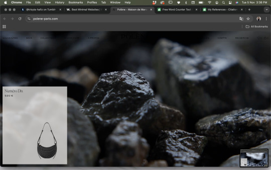


The reason why I chose this design work is because it really reflects me and my design style, as well as my artistic vision statement which is simple, minimalistic, and straightforward. This could reconnect back to our topic that we covered this week regarding social engagement. I could see this website to be a part of a sustainability design project where they could sell their bags which were made from recyclable materials. I like how simple yet interactive the UI/UX is for this website and how easy it was to navigate myself.
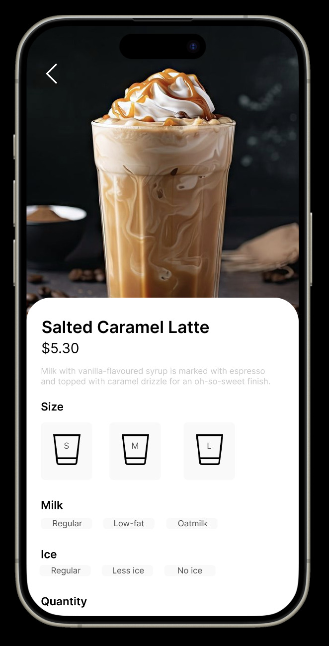
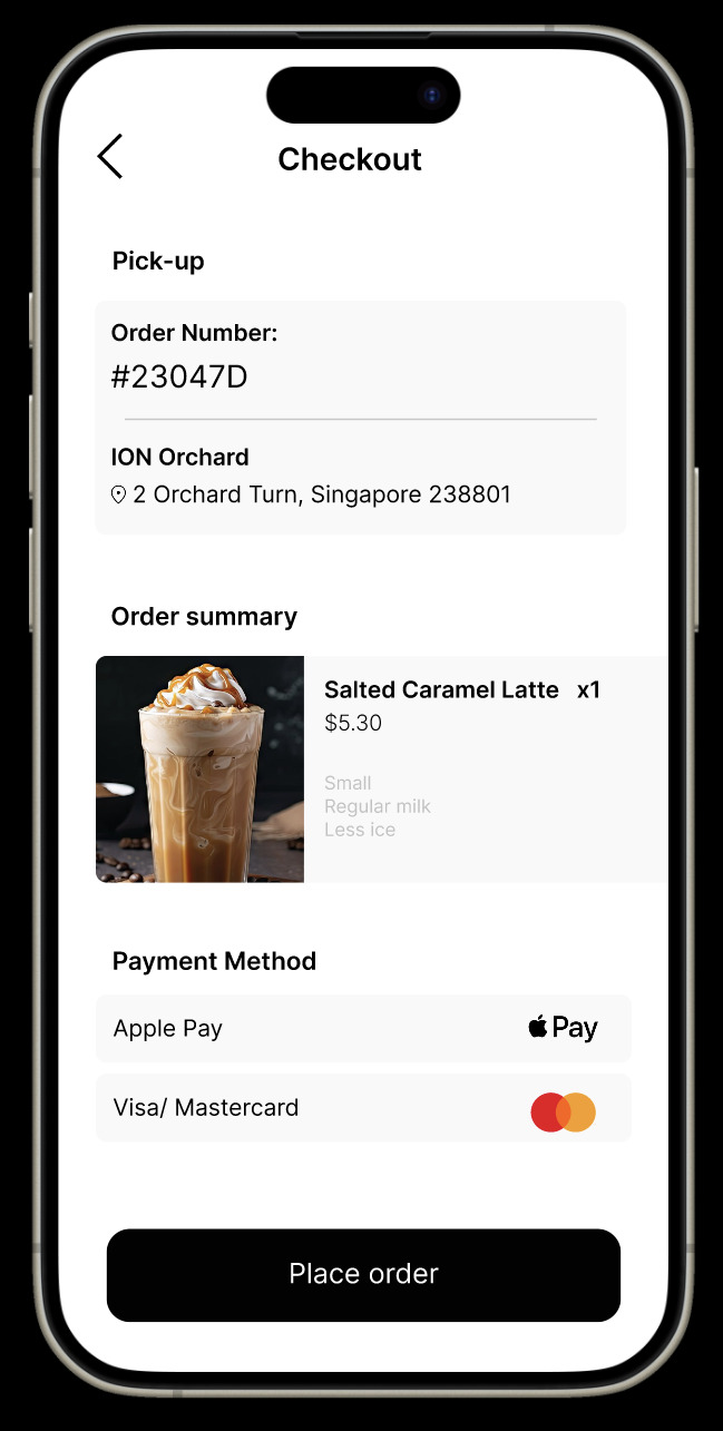
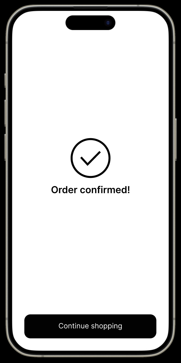
One of my personal projects is this cafe mobile app which gives users a chance to order in advance anywhere they are and collect it at the nearest most convenient place for them to do so to beat the queue. I added minimal graphics so users find it easy to access and won't be confused using the app itself. My lecturer gave good feedbacks for this work therefore I was satisfied and happy that what I was aiming to do could be seen by my lecturer.
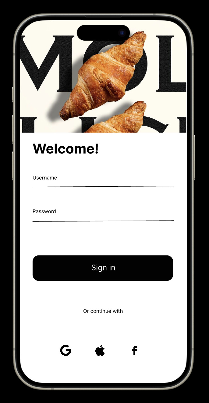
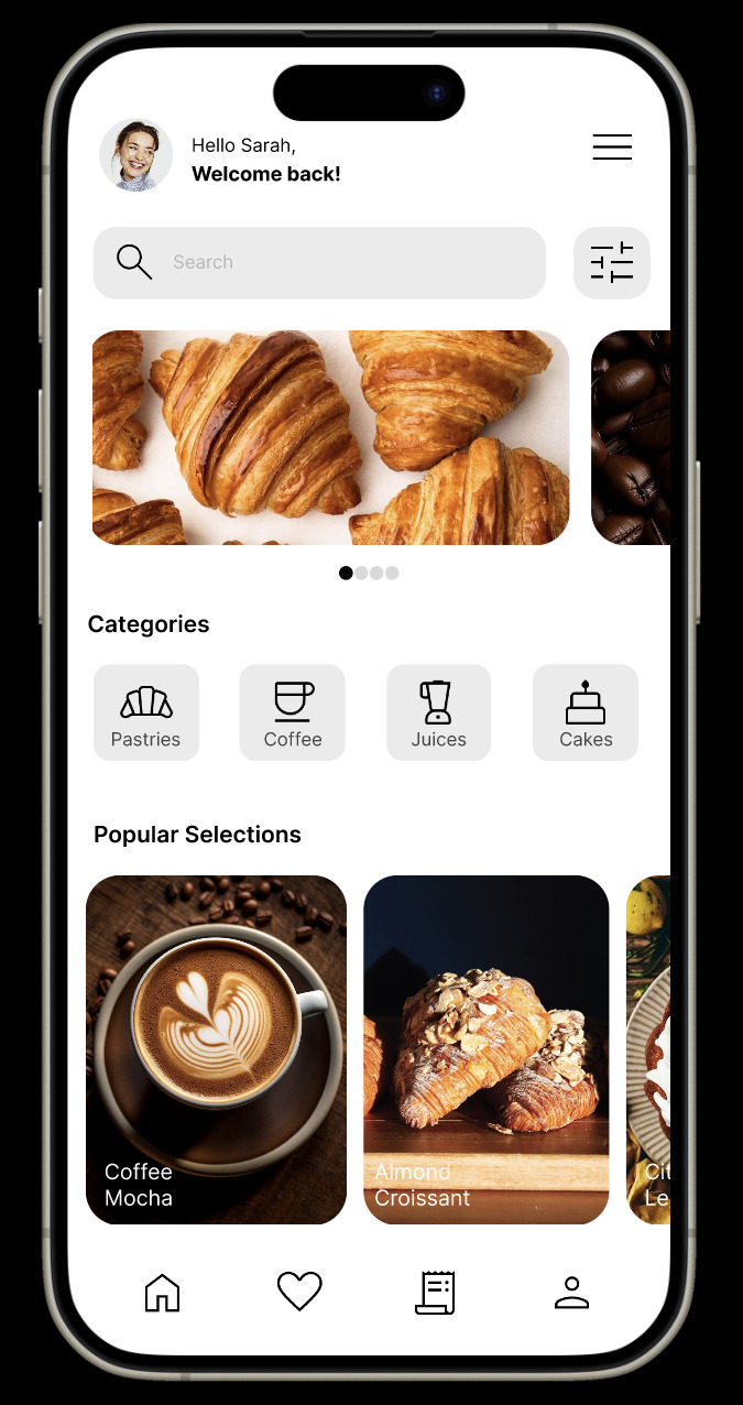

This also resonates with the topic we covered this week. I think my design best fits with the idea of community as it's very convenient for a busy world in Singapore where everything is fast-paced and when the people here likes to be fast with what they do. Therefore this app is a convenient way and also a common one where food brands are doing the same for their own stores.
To sum it all up, I personally find it satisfying when every design work I do best resonates with my artistic vision statement. It makes me happy that I know my own strengths and weaknesses so I can execute works better.
(475 Words)
References:
7 Advantages of Using a Mobile Ordering App for Your Restaurant | Restolabs. (n.d.). https://www.restolabs.com/blog/mobile-ordering-app
Complexity of Simplicity: What Really Is Behind Simple UI/UX Design. (2024, August 7). https://www.eleken.co/blog-posts/the-complexity-of-simplicity-in-ui-ux-design
Polène - Maison de Maroquinerie Parisienne | E-shop. (n.d.). Polène. https://www.polene-paris.com/
3 notes
·
View notes
Text
honestly the fact that procreate is apparently working on a destop application is pretty sweet, its def understandable how it became like a workhorse for a lot of people, its super lightweight and can still do a lot of stuff, even if it's ui is extremely minimal and takes some learning. I hope it'll be good n work on windows tbh
#i dont use procreate as much anymore bc im kinda picky abt what i refer to as the 'brush engine' but im unsure if thstd what it rlly is#i dont like how the brushes handle. its a good app ive made a lot of art in it most of my jjba stuff was made in procreate#i almost exclusively used it up until my last semesrer of college#n had it on my ipad mini. but uh. i do not. i dont rlly like how brushes feel in it#it could even he an issue with the apple pencil and its pressure sensitivity compared to a tablet and ptsai#so i cant wait to see if maybe ive just been doing things wrong#but as long as procreate is a one time purchase. i say get it if you can#my irl homie makes crazy shit in it. animations and pixel art n everything#i just. it doesnt feel right. im glad clip studio implemented a minimalist ui because thats been the best of both workds for me tbh#just yappin here about tech stuff mostly dont worry about me#not art
4 notes
·
View notes
Text

Tane Bank is a leading financial institution dedicated to providing comprehensive banking solutions and exceptional customer service to individuals, businesses, and communities. Established with a commitment to integrity, innovation, and excellence, Tane Bank strives to be the preferred banking partner for those seeking personalized financial guidance and long-term success. With a focus on trust, transparency, and reliability, Tane Bank aims to empower its customers to achieve their financial goals and realize their dreams
#branding#designer#marketing#graphic design#business logo#brand identity#creative logo#logo design#financial#global#budget#west bank#ui#ui ux design#ux#minimalism#minimal fashion#minimalistic#minimalart
3 notes
·
View notes
Text
why has game ui only gotten so much worse as time has went on. literally infinite potential to make it look good and artistic yet 99% of games settle for "bland minimalistic black and white + only character renders instead of actual artwork
#nintendo is the worst about this. like they are THE company that shouldn't#have complete dogshit ugly minimalist ui with only renders for character portraits#fuck outta here
2 notes
·
View notes
Text
p3 rebirth new ui is an eyesore holyshit
#it's so intrusive#cheesy signal#the blue fcking burns my eyes#ce minimalist ui over this visual noise
1 note
·
View note
Text
thinking about replaying wind waker aaaa i miss that game sm
#robo ramble#straight up my favorite zelda game.#im just so burnt out of modern zelda i cant with open world this open world that and terrible minimalist ui that takes 500 years to use
1 note
·
View note
Text
#Mobile App UI/UX Design#Mobile UI Design Tips#Mobile UX Design Best Practices#UI/UX for Mobile Apps#Essential Mobile App Design Tips#User interface design for mobile apps#Mobile user experience tips#Mobile app interface best practices#App design principles#UI/UX strategy for apps#Mobile design guidelines#Touchscreen UX design#Mobile navigation design#Responsive mobile UI#Minimalist mobile UI design
0 notes
Text
Free WordPress Theme for Web Designers, Developers, and Digital Creatives
Introduction
Your skills as a designer or developer deserve to be showcased on a professional, polished website. But if you're starting out or freelancing on a budget, hiring a web developer to build your own site might not be realistic.
That’s where the Web Programmer Lite – Free WordPress Theme for Designers steps in. It’s a clean, flexible, and beginner-friendly theme that lets creatives showcase their work, promote services, and land more clients — all without spending a rupee.
Why Web Programmer Lite is Great for Designers
1. Built for Creatives This theme is designed with developers, designers, and freelancers in mind. The layout highlights your skills, projects, and professional background effectively.
2. Visual Showcase Focus It includes a portfolio section where you can add screenshots, client projects, or design samples — a must-have for any creative professional.
3. Easy to Customize You don’t need to know how to code. Web Programmer Lite works with Elementor and other drag-and-drop builders for seamless customization.
4. Mobile & SEO Friendly The layout adjusts beautifully on phones and tablets, and the structure is optimized to help your site rank better on search engines.
5. Fast Loading Times With clean code and minimal bloat, this theme ensures that your site loads quickly and keeps visitors engaged.
Top Features of Web Programmer Lite – Free WordPress Theme
Sleek and minimal design tailored for portfolios
Responsive and mobile-friendly layout
Customizable homepage sections for services, skills, projects, and testimonials
Built-in portfolio and contact forms
WooCommerce-ready if you want to sell digital products or services
Supports page builders like Elementor and Gutenberg
SEO-ready structure and schema-friendly code
One-click demo content import for faster setup
Want to start building your personal brand? Try the Free WordPress Theme for Designers to get started right away.
Final Thought
Whether you’re a freelance web developer, UI/UX designer, or digital consultant, Web Programmer Lite gives you the tools to stand out online. It’s fast, free, and flexible enough for both beginners and pros.
FAQs
1. Can I use this theme to build client websites? Yes, it’s suitable for both personal and professional use.
2. Is it optimized for search engines? Yes, it follows best practices for SEO.
3. Can I add my portfolio easily? Absolutely. The theme includes built-in portfolio functionality.
#free designer WordPress theme#creative portfolio theme#graphic designer website template#web designer WordPress theme#free design portfolio#designer showcase theme#design studio template#freelance designer theme#artistic portfolio theme#visual portfolio template#UX designer theme#UI/UX portfolio template#free creative layout#digital designer WordPress#personal portfolio theme#illustrator website theme#modern design theme#creative agency free theme#minimalist designer template#responsive design theme
0 notes
Text
Elite-Folio Profile Template – Elevate Your Digital Presence
LIVE DEMO | BUY NOW
Stand Out with a Stunning, Modern Profile Template
Your online profile is your digital business card—make it unforgettable! This fully responsive, animated, and customizable profile template is designed to showcase your skills, experience, and personality in the most professional way.
Why Choose This Template?
✅ Dark & Light Mode Toggle – Auto-saves user preference for optimal viewing day or night. ✅ Smooth Animations & Micro-Interactions – Engage visitors with elegant hover effects and transitions. ✅ Mobile-First Responsive Design – Flawless display on all devices (desktop, tablet, and mobile). ✅ Built-in Contact Form + WhatsApp Integration – Let potential clients or employers reach you instantly. ✅ Dynamic Gradient Backgrounds – Eye-catching colors that adapt to your brand. ✅ Floating Social Media Bar – Keep your networks accessible with stylish animated icons.

Perfect For:
✔ Freelancers (Designers, Developers, Writers, Marketers) ✔ Job Seekers – Make recruiters remember you! ✔ Entrepreneurs & Consultants – Present your services professionally. ✔ Creative Professionals – Artists, photographers, and content creators.

Key Benefits:
📌 No Coding Skills Needed – Just replace text, images, and links. 📌 Fast Loading & SEO-Friendly – Optimized for better search visibility. 📌 Modern UI/UX – Clean, elegant, and designed to impress. 📌 Highly Customizable – Change colors, fonts, and layouts easily.

How to Use It?
1️⃣ Download the template. 2️⃣ Edit with any code editor (VS Code, Sublime Text, etc.). 3️⃣ Add your info, portfolio, and links. 4️⃣ Deploy to Netlify, Vercel, or any hosting service.
Pro Tip:
"Your profile is your first impression—make it bold, professional, and memorable!"
Ready to Boost Your Online Presence?
✨ Get this template now and start attracting opportunities!
💬 Need help customizing? Contact us for support! -
Mail: [email protected]
#Professional Profile Template#Portfolio HTML Template#Personal Website Template#CV Template#Resume Template#Modern UI Profile#Minimalist Portfolio#Dark/Light Mode Template#Animated Portfolio#Gradient Background Template#Freelancer Portfolio#Job Seeker Template#Creative Professional Profile#Designer Portfolio Template#Developer Personal Website#Responsive HTML Template#No-Code Customizable Template#WhatsApp Integration Template#Contact Form HTML Template#Social Media Profile Template#Artist Portfolio Template#Photographer Profile Template#Writer Portfolio Template#UX Designer Portfolio#Business Consultant Template#Best Selling Profile Template#Premium HTML Template#Downloadable Portfolio Template#One-Page Personal Website#2024 New Design Template
1 note
·
View note
Text
Google’s New Logo and the Shift Toward Minimalist Design
Google has updated its iconic G logo for the first time in ten years. While the change may seem subtle to some, the update is a strong indicator of a larger trend unfolding in the technology world. The move reflects a growing shift toward minimalist design across digital platforms, products, and brand identities.
Minimalism in design is about refining how users interact with visual systems. From cleaner interfaces to simpler logos, technology companies are aligning design choices with clarity and functionality. Google’s new logo is part of this ongoing evolution. It signals more than just a visual refresh. It shows a shift in how tech companies are thinking about user experience, accessibility, and digital branding.

A Brief Look Back at Google's Logo Evolution
Google has always used its logo to express its identity. When it first launched in 1998, the logo had a basic serif font and bright, primary colors. Over the years, the design changed, with updates that included 3D effects, shadows, and subtle refinements. In 2015, Google made a major switch to a flat sans-serif font. The new look made the logo more readable on small screens and adaptable across devices.
That 2015 update also introduced the now-familiar standalone G icon. It features the four signature colors of the brand - blue, red, yellow, and green. Now in 2025, the G icon gets its first major revision. The changes may not be dramatic, but they are intentional. Line curves have been smoothed, color hues adjusted, and the shape refined. These tweaks make the logo sharper and better suited to modern screen formats.
What Changed in the New Google Logo
The updated icon focuses on geometric consistency. The color tones are slightly richer, and the contrast has been optimized for visibility on both light and dark backgrounds. The stroke edges are cleaner. This ensures the logo looks balanced on high-resolution and small displays.
Google did not create this update for visual flair alone. It was about functionality. The logo now scales better on wearable devices, AR headsets, foldable phones, and compact interfaces. It also loads faster, thanks to lower image file weights and improved vector quality.
Why Tech Brands Are Choosing Minimalism

Minimalist design removes anything that does not serve a purpose. It values structure, whitespace, and clarity. The idea is to highlight only what the user needs at a given moment. As screens get smaller and user expectations rise, minimalist design helps reduce friction.
Tech companies like Apple, Meta, and Airbnb use minimalist principles to create smoother user experiences. Their platforms rely on clean layouts, strong typography, and consistent iconography. Minimalist design supports faster interaction. It helps people focus on actions without distractions.
Google’s decision to simplify its logo fits this pattern. It makes the brand more adaptive. It also strengthens how the brand appears across platforms like Chrome, Gmail, and Google Workspace.
Minimalism and User Experience
Minimalist design is not just about looking good. It affects how people use digital products. Simple interfaces load faster and reduce cognitive load. When there is less on the screen, users know where to look and what to do.
This is important in search engines, mobile apps, and productivity tools. People want fast answers. They want clean dashboards. They expect icons and buttons to work without confusion. A minimalist visual identity improves trust. It tells users the company values ease and accessibility.
Google’s new logo reflects this UX mindset. It blends into a wider strategy where simplicity drives performance.
What Startups Can Learn from Google’s Update
Startups often wonder how much effort they should invest in brand design. A logo may seem like a small part of the business. But it carries meaning. It signals how the company thinks about products and users. A well-designed brand shows users that the company pays attention to detail.
Google’s logo update is not just cosmetic. It is part of a larger commitment to clarity and user comfort. Startups should pay attention to this. A clean, flexible brand identity helps products stand out in crowded markets. It builds trust with users from the first touchpoint.
Minimalist design also makes it easier to scale. Whether launching an app, running ads, or creating presentations, a simple brand system saves time and keeps visuals consistent.
Qwegle’s View on Minimalist Design in Tech

At Qwegle, we approach design with purpose. We believe every element on the screen should serve a function. Our team uses minimalist principles in UI, branding, and product development. Simplicity allows us to build tools that are faster, clearer, and more accessible.
Our clients come from industries like finance, healthcare, education, and e-commerce. In each case, we focus on reducing friction in design. That means fewer colors, fewer buttons, and smarter typography. We test how layouts perform on mobile, desktop, and wearable devices.
We also help brands rethink their visual identity. A minimalist logo is not just a trend. It supports fast recognition, flexible marketing, and better user engagement. As we’ve seen with Google, a refined logo can say a lot without saying too much.
How This Affects Tech in General
Google is not the only tech giant leaning into minimalist design. This approach is becoming the standard across the industry. Microsoft simplified its Office icons. Samsung uses simple layouts in its One UI. Even startups are designing logos with fewer strokes and flat tones.
This trend shows that digital users value ease. They want software to work the moment it loads. They expect visual systems to guide them, not confuse them. Minimalist design supports that. It removes visual noise and builds intuitive journeys.
From smartwatches to smart TVs, screens are everywhere. Brands need logos and interfaces that work across sizes and shapes. Clean design is the only way to keep things consistent and efficient.
Final Thoughts
Google’s new logo is more than a brand refresh. It reflects a global shift in how technology is designed and delivered. Simplicity is becoming the core of good digital experiences. Companies are removing clutter and focusing on what matters.
Minimalism is no longer a design choice. It is a strategy. It improves usability, supports speed, and builds trust. As Google leads the way, other tech firms are sure to follow.
For startups, marketers, and designers, now is the time to revisit your visual systems. A simpler approach may be the most powerful move you can make.
0 notes