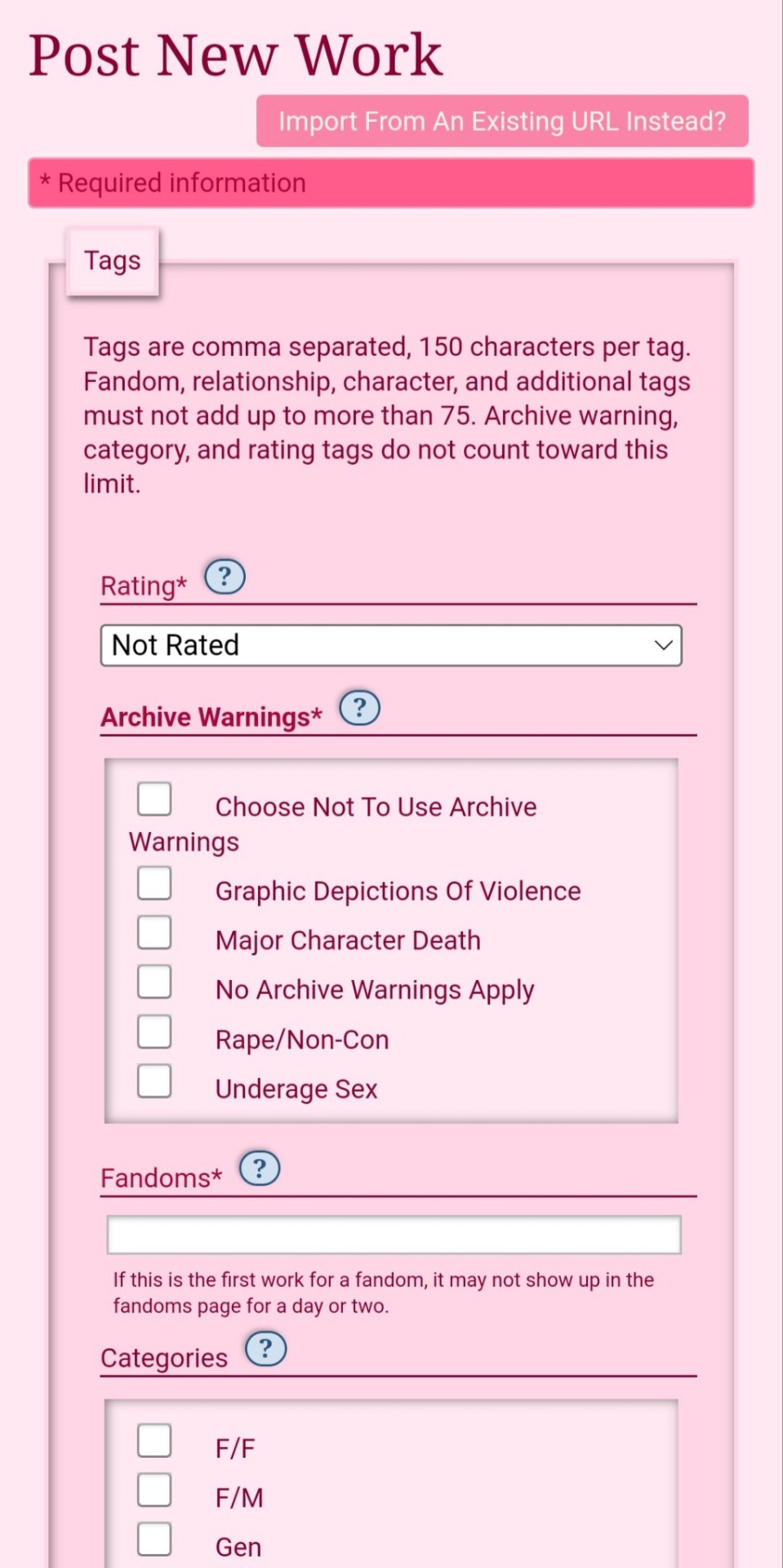
#css input color
Explore tagged Tumblr posts
Visit Tumblr Blog
Explore Tumblr blogs with no restrictions, modern design and the best experience.
Last Seen Tumblr Blogs


Fun Fact
BuzzFeed published a report claiming that Tumblr was utilized as a distribution channel for Russian agents to influence American voting habits during the 2016 presidential election in Feb 2018.
Text
Placeholder Color Change using CSS
#codingflicks#html css#frontend#placeholder color change#css input color#css#html#webdesign#frontenddevelopment#css3#input#css form#form html css#css tricks#css effects
5 notes
·
View notes
Text
i'm glad to finally have a desktop theme for this blog... ^-^

if there is one change i want to make, it would be to try and add a little stylized like button back into the theme. just to make things easier..
#my posts#it has been so long since i did any html and css and making this theme did NOT require html or css knowledge to use.#i just had to find where to input the thing to change the poll colors from bright blue. and once i did that there was nothing.#but a like button needs a little more work i think. one day..
12 notes
·
View notes
Text
peachy keen ao3 site skin
If you'd like to add this site skin to your AO3 account, the code is under the cut.
Colours Used: pale peach: #ffeae4 darker peach: #f3c6ba yellow: #ffd7a8 orange: #ff9b75 reddish orange: #f44336 darkest orange: #8E0505
CSS:
#outer { background: linear-gradient(90deg, rgba(255,155,117,.9) 0%, rgba(255,215,168,1) 100%); }
#header .primary { background: #ff9b75; background-repeat: repeat; box-shadow: none; }
#search .button, #header .logo { display: none; }
#header .heading a, #greeting img.icon { visibility: hidden; }
#header #search .text { background: #ffeae4; border: none; box-shadow: none; width: 7em; }
#header h1.heading a::before { content: " 🍑🍑🍑"; visibility: visible; }
.splash .module h3 { border-bottom: none; color: #f44336; }
#header .menu, #small_login { background: #ffeae4; box-shadow: none; width: 20em; }
#greeting .user > li a { color: #8E0505; }
#header .menu li, .splash .news li { border-bottom: none; }
#header .actions a:hover, #header .dropdown:hover a.dropdown-toggle, #header .menu li a { background: none; color: #f44336 !important; }
#footer { background: #ff9b75; }
#main { color: #8E0505; }
#main a { color: #f44336; }
.splash .favorite li:nth-of-type(2n+1) a { background: #ffeae4; border: 1px solid #ffeae4; border-radius: 5px; }
.splash .favorite li:nth-of-type(2n+1) a:hover, .splash .favorite li:nth-of-type(2n+2) a:hover { background: #f44336; border: 1px solid #f44336; border-radius: 5px; color: #fff !important; }
.resp-sharing-button--twitter, a.resp-sharing-button__link { color: #fff !important; }
.listbox, fieldset, fieldset dl dl, fieldset fieldset fieldset, fieldset fieldset dl dl, dd.hideme, form blockquote.userstuff, .dynamic form { background: url("https://image.freepik.com/free-vector/vector-seamless-pattern-with-peaches_1015-1760.jpg"); background-repeat: repeat; border: 4px solid #fff; box-shadow: none; }
form dl { background: #ffeae4; border: 2px solid #fff; box-shadow: none; }
input, textarea { border: 1px solid #f44336; box-shadow: none; }
input:focus, select:focus, textarea:focus { background: #ffeae4; }
form dt { border-bottom: 1px solid #fff; }
form dd.required { color: #8E0505; }
.LV_invalid { background: #ffd7a8; border: 1px solid #fff; color: #f44336; box-shadow: none; }
.LV_invalid_field, input.LV_invalid_field:hover, input.LV_invalid_field:active, textarea.LV_invalid_field:hover, textarea.LV_invalid_field:active { border: 1px solid #8E0505; }
.autocomplete div.dropdown ul { background: #fff; border: 1px solid #f44336; color: #f44336; box-shadow: none; }
.autocomplete .dropdown ul li:hover, .autocomplete .dropdown li.selected { background: #f44336; color: #fff; }
.required .autocomplete, .autocomplete .notice { color: #f44336; }
.ui-sortable li { background: #ffd7a8; border: 2px solid #fff; box-shadow: none; }
.ui-sortable li:hover { background: #ff9b75; border: 2px solid #fff; box-shadow: none; }
.ui-draggable form { box-shadow: none; }
.notice, .comment_notice, .kudos_notice, ul.notes, .caution, .error, .comment_error, .kudos_error, .alert.flash, muted.notice, form.verbose legend, .verbose form legend, span.question, span.symbol, select { background: #ffeae4; color: #f44336; border: 2px solid #f44336; box-shadow: none !important; }
#modal { background: #ffeae4; border: 4px solid #ff9b75; box-shadow: none; }
#modal .content { border-bottom: none; }
.actions a:visited, .action:visited, .action a:link, .action a:visited { color: #f3c6ba; }
.actions a:hover, .actions input:hover, .actions a:focus, .actions input:focus, label.action:hover, .action:hover, .action:focus { color: #f44336; border-top: none; border-left: none; box-shadow: none; background: #f3c6ba; }
.actions a:active, .current, a.current, a:link.current, .current a:visited { color: #fff; background: #ff9b75; border-color: #fff; box-shadow: none; }
.actions label.disabled { background: #ff9b75; }
.actions .disabled select { color: #fff; border-color: #fff; }
.delete a, span.delete { color: #f44336; box-shadow: none; }
.secondary { background: #fff; border: 2px solid #f44336; box-shadow: none; }
.own, .draft, .draft .wrapper, .unread, .child, .unwrangled, .unreviewed { background: #ffeae4 !important; }
.draft { border: 2px dashed #ff9b75; }
span.unread, .replied, span.claimed, .actions span.defaulted { background: #f3c6ba; color: #f44336; border: 1px solid #fff; border-bottom: none; }
.actions span.defaulted { color: #8E0505; }
.draggable, .droppable, span.requested, .nominations .rejected { color: #8E0505; }
.nominations .approved { background: #ffeae4; }
.nominations .rejected { background: #f3c6ba; }
span.offered.requested { color: #ffeae4; }
.wrapper { box-shadow: none; }
dl.index dd { background: #f3c6ba; }
p.kudos { background: url("https://64.media.tumblr.com/14dd2ee05dbcc111dab41d6206985fe8/b1eb33fb168e0088-4b/s1280x1920/8fabca965895c42bae4d746506ffc96324eb2fd5.png"); background-repeat: no-repeat; }
.statistics .index li:nth-of-type(even) { background: #f3c6ba; }
fieldset fieldset.listbox { background: #ffeae4; border: 2px solid #ff9b75; box-shadow: none; }
.listbox>.heading, .listbox .heading a:visited { color: #f44336; }
.listbox .index { background: #ffeae4; box-shadow: none; }
dl.meta { border: 2px solid #f44336; background: #ffeae4; }
.actions a, .actions a, .action, input[type="submit"], button, .actions label, .actions a, .actions a:link, .action, .action:link, .actions input, input[type=submit], button, .actions label { background: #ffeae4; border: 1px solid #f44336; text-shadow: none; color: #f44336; }
.current, #dashboard .current { background: #f44336; border: 1px solid #fff; text-shadow: none; color: #fff; }
#dashboard.own { border-top: none; border-bottom: none; }
#dashboard a { color: #f44336 !important; }
#dashboard a:hover { background: #ff9b75; }
label { color: #f44336; }
li.blurb, fieldset ul { background: #ffeae4 !important; border: 2px solid #fff; }
#header h2.collections, .reading h4.viewed, dl.index { background: #ffeae4; color: #f44336; }
.comment h4.byline { background: #f3c6ba; border-bottom: 2px solid #fff; }
.comment div.icon { border-bottom: 5px solid #ff9b75; }
li.comment { border: 2px solid #fff; background: #f3c6ba; }
li.comment ul.actions { background: transparent !important; border: none !important; }
#stat_chart g[clip-path^=url] > g:nth-of-type(2) rect, #stat_chart svg g:nth-of-type(2) > g rect:last-of-type, #stat_chart g[clip-path^=url] > g:nth-of-type(2) rect:first-of-type { opacity: 50% !important; }
h5.fandoms.heading a, .fandom .tag, .work .fandom a.tag { font-variant: small-caps; }
.warnings .tag, .work .warning a.tag { background: #8E0505; border: 1px solid #8E0505; border-radius: 5px; color: #fff !important; padding-left: .5em; padding-right: .5em; }
.relationships .tag, .work .relationships a.tag { background: #f44336; border: 1px solid #f44336; border-radius: 5px; color: #fff !important; font-weight: bold; padding-left: .5em; padding-right: .5em; }
.characters .tag, .work .characters a.tag { background: #ff9b75; border: 1px solid #ff9b75; border-radius: 5px; color: #fff !important; font-weight: bold; padding-left: .5em; padding-right: .5em; }
.freeforms .tag, .work .freeforms a.tag { color: #f44336 !important; }
.commas li:after { content: none; }
ul.tags { line-height: 190%; }
1K notes
·
View notes
Text

ao3 skin that i made!! (copy code under "keep reading")
it's a messy combination of pieces of code from other people's skins and my own changes
the header image is NOT MINE! it is "Pattern Galaxy Space Planets Vibrant Linear Universe" by Arncil on Redbubble, which i just used as an example for an image you could use!
here are some of the skins that i can remember using as part of this, but i've been building it for years so forgive me if i forget some:
Shortening long tag fields by Xparrot (on ao3)
Slim Shaded by AO3 (on ao3)
Lily Garden by tealtiam (on Tumblr)
AO3 Tag category coloring! by ao3css (on Tumblr)
come back here to my tips or leave a comment if you need some help customizing the code!
Background color: #26303C
Text color: #CBC6C3
Header color: #46626D
Accent color: #993F33
steps to create a new skin using this code:
log into ao3 account
go to dashboard >> skins
click "create site skin"
make sure TYPE is "site skin"
add a unique title
copy all code below
paste into field 'CSS'
click on "use wizard" at the top
copy and paste the four colors written above into their corresponding boxes
click SUBMIT
click USE
how to customize this skin:
FONT SIZE: at the very top of the code, change the "90%" to be bigger or smaller to change the font size within a fic
MAIN COLORS: to change the main colors, select "use wizard" when editing the skin and replace any of the four hex codes under "Background color:", "Text color:", "Header color:", and "Accent color:"
SECONDARY COLORS: find all hex codes within the code and change those numbers as you like! i changed all colors to match with the color palette of the header photo that i chose to make it feel cohesive
TAG COLORS: towards the end, the "relationship", "character", and "freeform" tags alternate three colors to make them easy to separate. in this skin they are all very similar, so you can change those to be whatever colors you like!
HEADER PHOTO: find the link towards the end of the code right before the warning tags and replace it with a link to any photo you like! it loops, so you don't have to worry about sizing or anything
FONT: i'm unsure how exactly to do this, but the in-fic font is currently set to Georgia Serif, so i suppose just go find that and replace it with your preferred font!
BORDER STYLES: wherever you see the code "border-style:", replace the word that comes after it with one of these options: none, solid, dashed, dotted, double, groove, ridge, inset, outset, or hidden
WARNING TAGS: at the very end of the code is a list of words or phrases that, when they appear in the tags of a fic, are highlighted in a contrasting color so that they are easy to avoid if necessary. you can add or remove those tags however you like, or change the warning color!
COPY AND PASTE ALL CODE BELOW
#workskin { font-size: 90%; } li.blurb .tags { max-height: 7.5em; overflow-y: auto; } #header { min-height: 0; } #header a, #header fieldset, #header ul.primary, #header ul.primary .current { border: 0; background: 0; } h1 a img { height: 50px; border: 0; } #header .landmark { clear: none; } #header ul.primary { background: rgba(0,0,0,0.65); border-bottom: 1px solid rgba(0,0,0,0.75); } #header ul.primary, #header ul.primary .current, ul.primary.actions a, #header ul.primary .current { color: #CBC6C3; } #header ul.primary .current, #header #search input, #header #search input:focus { background: rgba(0,0,0,0.25); color: #CBC6C3; box-shadow: inset 0 0 3px #131A2A; border-color: #131A2A; } .actions, .actions input { text-transform: lowercase; } blockquote.userstuff { font-family: "Mido", "AUdimat", "Ostrich Sans Rounded","Lucida Grande", sans-serif !important; position: relative; background: rgba(0,0,0,0.1); padding: 2%; border: 1px solid rgba(0,0,0,0.15); box-shadow: 0 0 2px rgba(0,0,0,0.4); } blockquote.userstuff:after { content: "\201D"; right: 0; top: auto; left: auto; } body, .userstuff { font-family: Mido, Georgia, serif; } .heading, .userstuff h3, .userstuff h4 { font-family: "CabinSketch", Georgia,serif; } #main .heading { color: #CBC6C3; } #inner .group, #inner .heading, fieldset, .verbose legend, table, table th, col.name, span.unread, span.replied { outline: none; background: transparent; border-color: #131A2A; border-style: double; box-shadow: none; border-radius: 2em; border-bottom-right-radius: 0; border-top-left-radius: 0; } #inner .group .group .group, col.name { border-style: double; border-color: #CBC6C3; box-shadow: 0 0 2px #000; } #inner .bookmark .user.module, #inner .wrapper { border: 0; border-radius: 0; border-top: 3px double #bbb; box-shadow: none; } .filters { font-size: 90%; } .toggled form, .dynamic form, .secondary, .dropdown { background: #fff url("/images/skins/textures/tiles/white-handmade-paper.jpg"); } a.tag, a.tag:visited, a.tag:link { display: inline-block; padding: 1px 3px; margin: 2px 0px; border: 2px solid #46626D; border-radius: 5px; } .commas li:after { content: ""; } h5.fandoms.heading { color: transparent; } .favorite a.tag { border: none; } .tags li.relationships:nth-of-type(3n+1) a.tag { background-color: #1d3954; } .tags li.relationships:nth-of-type(3n+2) a.tag { background-color: #264663; } .tags li.relationships:nth-of-type(3n+3) a.tag { background-color: #305475; } .tags li.characters:nth-of-type(3n+1) a.tag { background-color: #214154; } .tags li.characters:nth-of-type(3n+2) a.tag { background-color: #294c61; } .tags li.characters:nth-of-type(3n+3) a.tag { background-color: #31576e; } .tags li.freeforms:nth-of-type(3n+1) a.tag { background-color: #234e54; } .tags li.freeforms:nth-of-type(3n+2) a.tag { background-color: #2a585e; } .tags li.freeforms:nth-of-type(3n+3) a.tag { background-color: #316269; } .tags li.freeforms a.tag:hover, .tags li.characters a.tag:hover, .tags li.relationships a.tag:hover { background-color: #26303C; color: white; } #header .logo { display: none; } #header ul.primary { box-shadow: none; padding-top: 30px; padding-bottom: 30px; background: #FCC191 url(https://i.pinimg.com/564x/8c/bc/ae/8cbcae1760dc88ae8730566337a5d2eb.jpg); background-attachment: fixed; } li.blurb a.tag[href*="suicid"], [href*="suicide"], [href*="Suicide"], [href*="rape"], [href*="Rape"], [href*="consentual"], [href*="Consentual"], [href*="non-con"], [href*="consent issues"], [href*="Kidnapping"], [href*="kidnapping"], [href*="Canibalism"], [href*="cannibalism"], [href*="Cannibalism"], [href*="Dove"], [href*="dead dove do not eat"], [href*="murder"], [href*="Murder"], [href*="harm"], [href*="self harm"], [href*="Harm"], [href*="Torture"], [href*="abduction"], [href*="asphyxiation"], [href*="blood"], [href*="Blood"], [href*="death"], [href*="Death"], [href*="gore"], [href*="Gore"], [href*="incest"], [href*="Incest"], [href*="trauma"], [href*="Trauma"], [href*="torture"] { color: #000000; font-weight: bold; background-color: #993F33; }
1K notes
·
View notes
Text
dark flat ao3 skin v2.0


1. log in and go HERE
2. click button "Create Site Skin"
3. name it whatever
4. copy/paste code from below in "CSS" field
5. "Submit"
6. make sure you clicked button "Use" HERE in the list of skins
7. change it as you like
CSS:
outer .region,
footer .group,
.post fieldset fieldset, fieldset fieldset { background: none; }
body, .group, .group .group, .region, .flash, fieldset, fieldset fieldset ul, form dl, textarea,
main .verbose legend,
.verbose fieldset, .notice, ul.notes, input, textarea, table, th, td:hover, tr:hover, .symbol .question:hover,
modal,
.ui-sortable li, .required .autocomplete, .autocomplete .notice, .system .intro, .comment_error, .kudos_error, div.dynamic, .dynamic form,
ui-datepicker-div,
.ui-datepicker table { color: #eee; border-color: #151619; outline: #111; box-shadow: none; }
form .notice, form ul.notes { box-shadow: none; }
workskin {
font-size: 1.2em; margin: auto; padding: 0 0.25em; max-width: 60em; overflow-x: auto; overflow-y: hidden; position: relative; }
.actions a, .actions a:link, .action, .action:link, .actions input, input[type="submit"], button, .current, .actions label { border-radius: 0; }
header ul.primary,
outer #footer,
.toggled form { background: #1a1b1f; }
header .primary {
background: none; padding: 10px 0; width: 100%; box-shadow: none; }
fieldset, form dl, fieldset dl dl, fieldset fieldset fieldset, fieldset fieldset dl dl, dd.hideme, form blockquote.userstuff { background: #1a1b1f !important; }
.user.navigation.actions>li { margin-top: 0.3em !important; }
header .menu,
small_login {
border: 1px solid #1f2126; box-shadow: none; padding: 0; }
.tags.group, .more.group { margin-top: 0.6em; }
header .actions a:hover,
header .actions a:focus,
header .dropdown:hover a,
header .open a,
header .menu,
small_login,
.group.listbox, fieldset fieldset.listbox, form blockquote.userstuff, input:focus, textarea:focus, li.relationships a, .group.listbox .index, .dashboard fieldset fieldset.listbox .index,
dashboard a:hover,
th,
dashboard .secondary,
.secondary, .thread .even, .system .tweet_list li, .ui-datepicker tr:hover { background: #151619; }
.userstuff p { text-align: justify; margin: 1.286em auto; padding: 0; line-height: 1.5; }
.tags.commas { margin: 1.5em auto; }
header .dropdown .menu a:hover,
header .dropdown .menu a:focus,
.splash .favorite li:nth-of-type(odd) a, .ui-datepicker td:hover,
tos_prompt .heading,
tos_prompt [disabled] {
background: #22262a; }
outer,
.javascript, .statistics .index li:nth-of-type(even),
tos_prompt,
.announcement input[type="submit"] { background: #151619; }
.filters .submit input { border: 1px solid #202227; background-color: #202227; height: 110%; margin: 1em 0; min-height: 2.286em; padding-left: 0; padding-right: 0; text-align: center; white-space: normal; }
header ul.primary,
footer,
dashboard ul,
dl.meta, .group.listbox, fieldset fieldset.listbox,
main li.blurb,
form blockquote.userstuff, div.comment, li.comment, .toggled form, form dl dt, form.single fieldset,
inner .module .heading,
.bookmark .status span, .splash .news li, .filters .group dt.bookmarker { border-color: #1a1b1f; }
.work.navigation.actions { width: 100%; }
dl.meta { border: none; }
.splash .news li { padding: 1em; }
fieldset, form dl, fieldset dl dl, fieldset fieldset fieldset, fieldset fieldset dl dl, dd.hideme, form blockquote.userstuff { padding: 1em; }
.logged-in .splash>.module { width: 100% !important; }
dl.meta { max-width: 75em; margin: auto; clear: right; padding: 2em 1.75em; position: relative; overflow: hidden; }
.group.listbox, fieldset fieldset.listbox,
main li.blurb,
.wrapper,
dashboard .secondary,
.secondary, form blockquote.userstuff, .thread .comment, .toggled form { box-shadow: none; }
dashboard .current,
.actions a:active,
outer .current,
a.current, .current a:visited, span.unread, .replied, span.claimed, dl.index dd, .own, .draft, .draft .unread, .child, .unwrangled, .unreviewed, .ui-sortable li:hover { background: #1a1b1f; border-color: #1f2126; }
greeting .menu {
right: 0; border: 1px solid #1f2126; box-shadow: none; }
select { background-color: #202227; color: #fff; border: 1px solid #202227; min-height: 3em; border-radius: 0; padding: 0 0.6em; }
input:focus, select:focus, textarea:focus { background: #202227; }
body, .toggled form, .dynamic form, .secondary, .dropdown { background: #202227; color: #fff; margin: 0; padding: 0; }
footer a:hover,
footer a:focus,
.autocomplete .dropdown ul li:hover, .autocomplete .dropdown li.selected, a.tag:hover, .listbox .heading a.tag:visited:hover, .symbol .question, .qtip-content { background: #a7a7a7; color: #111; }
.splash .favorite li:nth-of-type(odd) a:hover, .splash .favorite li:nth-of-type(odd) a:focus { background: #a7a7a7; color: #111; }
header #greeting img,
header .heading a,
header .heading a:visited,
header .user a:hover,
header .user a:focus,
header fieldset,
header form,
header p,
dashboard a:hover,
.actions a:hover, .actions input:hover, .delete a, span.delete, span.unread, .replied, span.claimed, .draggable, .droppable, span.requested, a.work, .blurb h4 a:link, .blurb h4 img, .splash .module h3, .splash .browse li a:before, .required, .error, .comment_error, .kudos_error, a.cloud7, a.cloud8,
tos_prompt .heading {
color: #a7a7a7; }
header .menu li {
border-bottom: 1px solid #2c2c2c; margin: 0; text-align: left; }
greeting .icon,
dashboard,
dashboard.own,
.error, .comment_error, .kudos_error, .LV_invalid, .LV_invalid_field, input.LV_invalid_field:hover, input.LV_invalid_field:active, textarea.LV_invalid_field:hover, textarea.LV_invalid_field:active, .qtip-content { border-color: #151619; }
dashboard.own {
border: none; }
form.filters dl { margin-left: 0; margin-right: 0; }
.filters .expander:focus { outline: none; }
.filters .expander { padding: 0.45em 0 0.45em 14px; }
.filters .group dt.search, .filters .range dt { padding: 1.25em 0 0.4em 0; }
a.tag { border-bottom: 1px dotted !important; }
a, a:link, a.tag,
header a,
header a:visited,
header .primary .open a,
header .primary .dropdown:hover a,
header .primary .dropdown a:focus,
header #search input:focus,
header #search input:hover,
dashboard a,
dashboard span,
dashboard .current,
.heading, .group .heading, .filters dt a:hover { color: #fff; }
header .dropdown .menu a {
padding: .75em .5em .75em; }
header #search .text {
background: #151619 !important; border-radius: 0; margin: 0.2857em 0.429em; }
a:visited, .actions a:visited, .action a:link, .action a:visited, .listbox .heading a:visited, span.series .divider { color: #999; }
a:active, a:focus, button:focus { outline: none; }
.actions a, .actions a:link, .action, .action:link, .actions input, input[type="submit"], button, .current, .actions label,
header .actions a {
background: #23252a; border-color: #23252a; color: #eee; box-shadow: none; text-shadow: none; }
.actions a:hover, .actions input:hover,
dashboard a:hover,
.actions a:focus, .actions input:focus,
dashboard a:focus {
color: #fff; border-color: #101214; box-shadow: none; background-color: #101214; }
.actions a:active, .current, a.current, .current a:visited { color: #fff; background: #101214; border-color: #101214; box-shadow: none; }
.delete a, span.delete { box-shadow: none; }
ul.required-tags, .bookmark .status span, .blurb .icon { opacity: 0.9; border: 0; }
outer .group .heading,
header .actions a,
fieldset.listbox .heading, .userstuff .heading, .heading, .userstuff h2 { text-shadow: none; color: #fff; background: none; }
header .actions a,
fieldset fieldset, .mce-container button, .filters .expander { box-shadow: none; }
fieldset fieldset.listbox { outline: none; }
form dd.required { color: #eee; }
.mce-container input:focus { background: #F3EFEC; }
.announcement .userstuff a, .announcement .userstuff a:link, .announcement .userstuff a:visited:hover { color: #fff; }
a, a:link, a:visited:hover { color: #fff; text-decoration: none; }
.announcement .userstuff a:visited { color: #666; }
.announcement .userstuff a:hover, .announcement .userstuff a:focus { color: #999; }
.event.announcement .userstuff a, .filters .expander { color: #eee; }
form.verbose legend, .verbose form legend { background: #151619; }
.listbox li.blurb { box-shadow: none; background: #1a1b1f; }
li.blurb, fieldset, form dl { border: none; }
li.blurb, .blurb .blurb { display: block; position: relative; clear: left; padding: 1em 1.4em; overflow: visible; background: #1a1b1f; }
dashboard ul {
float: none; display: block; padding: 0.26em 0; text-align: right; position: relative; background: none; }
user-fandoms {
padding: 1.4em 0; background: #1a1b1f; }
.listbox .index { padding: 0.6em 0; }
.bookmark div.user { background-color: #151619; }
.bookmark dl.stats { margin-bottom: 1.5em; margin-top: 1.5em; }
.dashboard .own, .comment span.unreviewed { background: #1a1b1f; opacity: 1.0; }
.own, .draft, .draft .wrapper, .unread, .child, .unwrangled, .unreviewed { background: #1a1b1f; opacity: 0.95; }
.actions a, .actions a:link, .action, .action:link, .actions input, input[type="submit"], button, .current, .actions label { padding: 0.5em 1em; border-radius: 0; }
header {
margin: 0 0 3em; }
.tags.group, .more.group { padding: 0.6em; }
dashboard a,
dashboard span {
line-height: 2.2; padding: 0 0.5em; }
.listbox>.heading, .listbox .heading a:visited { margin-left: .6em; }
.listbox, fieldset fieldset.listbox { border: 1px solid #1a1b1f; margin: 0.5em auto; box-shadow: none; }
.reading .user { margin-top: 1.5em; padding-top: 0.5em; border-top: 1px solid #23252a !important; }
.comment .userstuff { background-color: #1a1b1f !important; }
input, textarea { box-shadow: none; background: #151619; padding: 0.4em; }
.filters .indicator:before { background: #404248; color: #aaa; display: inline-block; border: 1px solid #404248; margin-right: 0.25em; background-image: none; }
.filters [type="checkbox"]+.indicator:before { padding: 0 0.25em; border-radius: 2px; }
.filters [type="checkbox"]:checked+.indicator:before { background: #970000; color: #ffffff; background-image: none; }
.filters input:checked+.indicator:before { border-color: #1a1b1f; }
.filters input:checked+.indicator+span { font-weight: 500; }
.filters .exclude [type="checkbox"]:checked+.indicator:before { background: #970000; color: #ffffff; background-image: none; }
.filters [type="radio"]:checked+.indicator:before { background: #970000; background-image: none; }
ui-datepicker-div,
.ui-datepicker table { background: #1a1b1f; }
.ui-datepicker td { border: 1px solid #23252a; }
.notice, .comment_notice, .kudos_notice, ul.notes, .caution, .error, .comment_error, .kudos_error, .alert.flash { background: #2e3138; border: 1px solid #2e3138; margin: 0.6em auto; padding: 1em; box-shadow: none; border-radius: 0; }
.listbox .index { padding: 0.6em; box-shadow: none; }
dl.meta { max-width: 75em; background: #1a1b1f; margin-top: 1em; }
dl.index dd { background: #151619 !important; }
form.search input[type="text"] { border-top-color: #151619; background-color: #202227; padding: 0.45em 0.45em; border-radius: 0; }
modal {
background: #1a1b1f; border: 10px solid #1a1b1f; margin: 3% 0; max-width: 800px; min-width: 200px; padding-bottom: 44px; position: relative; text-align: left; width: 80%; z-index: 501; }
.post .meta dd ul li { display: block; padding-bottom: 0.6em; }
workskin {
font-size: 1.2em; max-width: 52em; }
div.comment, li.comment { padding: 0.6em; background: #1a1b1f !important; }
201 notes
·
View notes
Text
So I created an ao3 skin and I would like to share it for anyone who wants to use it 💞
Here’s the code >>>
•Wizard Settings
Can be overridden by custom CSS :
Background color:
#FCEBFC
Text color:
#AF7E98
Header color:
#B34A81
Accent color:
#EABEE4
•CSS:
:root {
--background-color: #f9e3f2;
--text-color: #4d494a;
--form-background: #fdeff5;
}
body {
font-family: sans-serif;
}
.wrapper {
background-color: white;
border: 2px solid #f3c2e3;
}
#header {
padding: 10px;
margin-bottom: 15px;
}
#header a {
text-decoration: none;
}
#header a:hover {
text-decoration: underline;
}
#header ul.navigation.actions.user.signed-in {
display: flex;
justify-content: flex-end;
padding: 10px;
}
#main {
padding: 20px;
}
.heading {
padding: 8px;
margin-bottom: 10px;
font-weight: bold;
}
input[type="text"],
input[type="date"],
textarea,
select {
border: 1px solid #f3c2e3;
padding: 8px;
margin: 5px 0;
}
input[type="radio"],
input[type="checkbox"] {
margin-right: 5px;
}
.button,
input[type="submit"],
button {
border: none;
padding: 10px 20px;
cursor: pointer;
border-radius: 4px;
margin-bottom: 5px;
}
.button:hover,
input[type="submit"]:hover,
button:hover {
background-color: #e687b0;
}
#new_work_form .actions .button {
border: none;
padding: 10px 20px;
margin: 5px 5px 5px 0;
cursor: pointer;
border-radius: 4px;
}
.actions .button.current {
border: none;
padding: 10px 20px;
margin: 5px 5px 5px 0;
cursor: pointer;
border-radius: 4px;
}
#work_search_form .submit .button {
border: none;
padding: 10px 20px;
margin: 5px 0;
cursor: pointer;
border-radius: 4px;
}
#work_search_form .submit .button:hover {
background-color: #e687b0;
}
I decided to write it down for easier access🌸
I’ll leave a Reddit link below ⬇️ that explains how to use the code if it’s your first time easily. Credit to @tired-library-ghost on Reddit for this amazing explanation ❤️

71 notes
·
View notes
Text
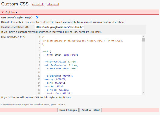
[dw] theme code
for @fractalkiss's anon who asked about ren's dreamwidth theme - i'm the creator and here's how to install it :) feel free to message me if you run into problems setting it up or if there's something you need help with etc. this theme is free for everyone to use btw
1. APPLY BASE THEME
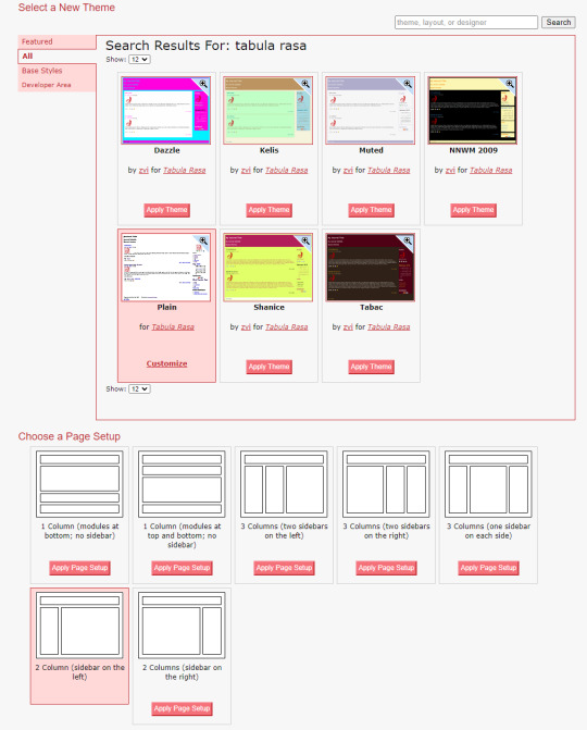
Go to your theme customization page, and search for the "Tabula Rasa" theme. Apply the Plain version, and "2 Column (sidebar on the left)" for the Page Setup.
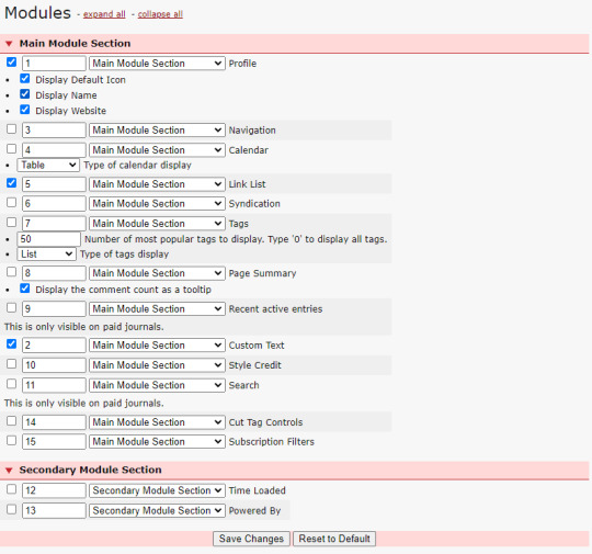
2. SET UP MODULES
Go to the modules page, and uncheck all the modules except for the following:
[1] Profile
[2] Custom Text
Make sure the numbers match as well so everything displays in the correct order.
[5] Link List
3 COPY & PASTE CUSTOM CSS
The most important part: adding the actual custom layout to modify Tabula Rasa.
Go to the Custom CSS section, and paste the code below into the Custom Stylesheet URL box.
https://fonts.googleapis.com/css?family=Material+Symbols+Outlined|Material+Symbols+Rounded|Inter:400;500;600;700
Make sure Use layout stylesheet(s) is checked.
In the Use embedded CSS box, copy and paste the entire code HERE.
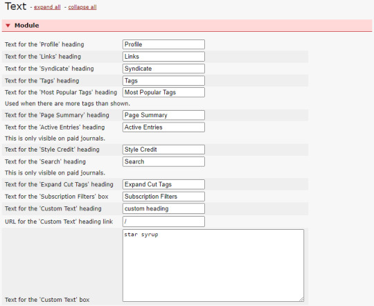
4. EDIT TEXT SETTINGS
If you check your theme, you'll notice some glaring errors. Go to the text section, and input anything you want in the Text for the 'Custom Text' box for it to be displayed on your blog sidebar.
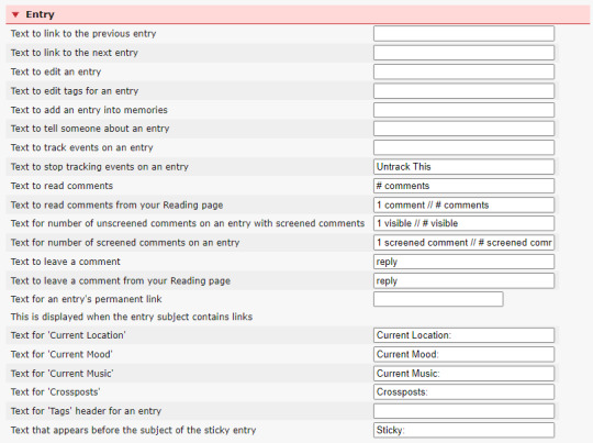
To fix the icons, make sure the settings under the Entry section match the image below.
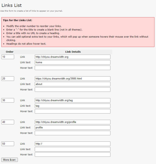
5. ADD YOUR LINK LIST
In order to add the navigation links to your sidebar, go to Link List and fill out the link details like so: (recommended to have max 4)
# HOW DO I CHANGE THE COLOR SCHEME?
In the theme code, under :root, you can change the hex code for the folllowing variables:
--background
-- entry
--dark
--darker
--darkest
--font-color
--accent
--darker-accent
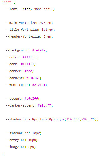
that's pretty much it! again, if there's something you need help with when setting this up, do send me a message. note that this theme is for dreamwidth and dreamwidth only, and will not work on livejournal. enjoy anons and friends!
36 notes
·
View notes
Text
Strawberry Delight
This is a light version of the Rasberry Delight skin.
The pink icons are from @zerafinacss, specifically found here on their ao3.
Another thing that would look good with this skin is this, which is also from @zerafinacss. If added, this is what the icons will look like:

First, copy these codes into the wizard.

After you save that, you just copy and save this code into the css.
#header .logo {
background-image: url("https://images.squidge.org/images/2024/03/30/AO3_imageset_pink.png");
background-size: 250px 1044px;
padding: 42px 0 0 60px;
width: 0 !important;
height: 0 !important;
background-position: -140px -749.6px;
}
#header ul.primary,
#header h2 {
box-shadow: none;
}
button,
.actions a,
.actions a:link,
.action,
legend .action:link,
input[type="submit"],
.actions a:visited,
.actions li label,
a.action.modal-closer {
color: #FCF5ED;
background: #FA84A7;
border: 1px solid #FA84A7;
box-shadow: none;
}
button:hover,
.actions a:hover,
.action:hover,
input[type="submit"]:hover {
color: #00224D;
background: #ffc0d3 !important;
border: 1px solid #ffc0d3;
box-shadow: none;
}
.actions li .current,
.current,
#dashboard .current {
color: #FCF5ED;
background: #ffc0d3;
border: 1px solid #ffc0d3;
box-shadow: none;
}
dl.meta {
border: 1px solid #ff5c8c;
}
.wrapper {
box-shadow: 1px 1px 5px #ff5c8c;
}
.actions input:focus {
border-top: 1px solid #ef4073;
border-left: 1px solid #ef4073;
box-shadow: none;
}
#dashboard .secondary {
background: #ff93b3;
box-shadow: inset 2px 2px 5px #ef4073;
}
.alert .userstuff {
background: #ff91ba;
border-color: #ffd6e6;
color: #8a0035;
}
.qtip-content,
.notice:not(.required),
.comment_notice,
.kudos_notice,
ul.notes,
.caution,
.notice a {
color: #ffdde8;
}
.notice,
.comment_notice,
.kudos_notice,
ul.notes,
.caution,
.error,
.comment_error,
.kudos_error,
.alert.flash {
background: #ff5c8c;
border: 1px solid #ff96bc;
}
.required,
.error,
.alert.flash {
color: #a9073b;
}
p.muted.notice {
display: none;
}
#dashboard a:hover,
#header .user a:hover,
button:hover,
.actions a:hover,
.action:hover,
input[type="submit"]:hover {
color: #ce2c67;
}
.comment img[src$="/images/skins/iconsets/default/icon_user.png"] {
padding: 55px 0 0 55px !important;
background-position: 0px -525px !important;
}
.required-tags .rating-notrated,
.required-tags .rating-general-audience,
.required-tags .rating-explicit,
.required-tags .rating-mature,
.required-tags .rating-teen,
.required-tags .category-femslash,
.required-tags .category-gen,
.required-tags .category-slash,
.required-tags .category-none,
.required-tags .category-het,
.required-tags .category-multi,
.required-tags .category-other,
.required-tags .complete-no,
.required-tags .complete-yes,
.required-tags .warning-yes,
.required-tags .warning-no,
.required-tags .warning-choosenotto,
.required-tags .external-work,
.status .private .text,
.status .public,
.status .hidden,
.status .rec,
.status .count,
.index .skins .icon,
.index .mystery .icon,
.index .tag .icon,
.index .tagset .icon,
.comment .icon .anonymous,
.comment .icon .visitor,
.abbreviated .icon .visitor,
.abbreviated .icon .anonymous,
.skins .primary .icon,
.admin .primary .icon,
.tagset .primary .icon,
.tag .primary .icon,
a.rss span,
p.kudos,
#symbols-key dl img,
#bookmark-symbols-key img,
img[src$="/images/skins/iconsets/default/icon_user.png"],
img[src$="/images/skins/iconsets/default/icon_collection.png"],
img[src$="/images/lockblue.png"] {
background-image: url("https://images.squidge.org/images/2024/03/30/AO3_imageset_pink.png");
background-size: 200px 835px;
}
#symbols-key dl img,
#bookmark-symbols-key img {
width: 0 !important;
height: 0 !important;
padding: 25px 0 0 25px;
}
img[src$="/images/skins/iconsets/default/rating-notrated.png"],
img[src$="/images/skins/iconsets/default/category-none.png"],
img[src$="/images/skins/iconsets/default/warning-no.png"] {
background-position: -150px 0px;
}
img[src$="/images/skins/iconsets/default/rating-general-audience.png"] {
background-position: -50px -25px;
}
img[src$="/images/skins/iconsets/default/rating-teen.png"] {
background-position: 0px -25px;
}
img[src$="/images/skins/iconsets/default/rating-mature.png"] {
background-position: -75px -25px;
}
img[src$="/images/skins/iconsets/default/rating-explicit.png"] {
background-position: -25px -25px;
}
img[src$="/images/skins/iconsets/default/category-femslash.png"] {
background-position: -25px 0px;
}
img[src$="/images/skins/iconsets/default/category-het.png"] {
background-position: -75px 0px;
}
img[src$="/images/skins/iconsets/default/category-gen.png"] {
background-position: -50px 0px;
}
img[src$="/images/skins/iconsets/default/category-multi.png"] {
background-position: -100px 0px;
}
img[src$="/images/skins/iconsets/default/category-other.png"] {
background-position: -125px 0px;
}
img[src$="/images/skins/iconsets/default/warning-choosenotto.png"] {
background-position: -125px -25px;
}
img[src$="/images/skins/iconsets/default/warning-yes.png"] {
background-position: -150px -25px;
}
img[src$="/images/skins/iconsets/default/warning-external-work.png"] {
background-position: -75px -50px;
}
img[src$="/images/skins/iconsets/default/complete-no.png"] {
background-position: -100px -25px;
}
img[src$="/images/skins/iconsets/default/complete-yes.png"] {
background-position: -175px -25px;
}
img[src$="/images/skins/iconsets/default/bookmark-rec.png"] {
background-position: -100px -50px;
}
img[src$="/images/skins/iconsets/default/bookmark-public.png"] {
background-position: -125px -50px;
}
img[src$="/images/skins/iconsets/default/bookmark-private.png"] {
background-position: -175px -50px;
}
img[src$="/images/skins/iconsets/default/bookmark-hidden.png"] {
background-position: -150px -50px;
}
img[src$="/images/skins/iconsets/default/icon_user.png"],
img[src$="/images/skins/iconsets/default/icon_collection.png"],
img[src$="/images/lockblue.png"] {
width: 0 !important;
height: 0 !important;
}
img[src$="/images/skins/iconsets/default/icon_user.png"] {
padding: 100px 0 0 100px;
background-position: 0px -75px;
}
.index:not(.comment) .abbreviated img[src$="/images/skins/iconsets/default/icon_user.png"] {
padding: 75px 0 0 75px;
background-position: 0px -375px;
}
.index:not(.comment) img[src$="/images/skins/iconsets/default/icon_user.png"] {
padding: 55px 0 0 55px;
background-position: 0px -525px;
}
#greeting img[src$="/images/skins/iconsets/default/icon_user.png"] {
padding: 1.786em 0 0 1.786em;
background-position: 0 -19px;
background-size: 201% !important;
}
img[src$="/images/skins/iconsets/default/icon_collection.png"] {
padding: 100px 0 0 100px;
background-position: -100px -175px;
}
.index img[src$="/images/skins/iconsets/default/icon_collection.png"] {
padding: 55px 0 0 55px;
background-position: -55px -525px;
}
img[src$="/images/lockblue.png"] {
padding: 15px 0 0 15px;
background-position: -155px -305px;
}
9 notes
·
View notes
Text

CÓDIGO #130 | Change of Pace.
LIVE PREVIEW & DOWNLOAD.
♦ Quinto prompt del Codember 2023 (Seasons) de @elalmacen-rp. Una tablilla que sirve tanto para búsquedas como para listas de grupos, con acento personalizado para cada pestaña. Tiene 4 pestañas por defecto, pero se pueden añadir más (instrucciones bajo el cut). ♦ No quites los créditos ni uses como base. ♦ Todos los colores y fuentes son modificables. Si no sabéis cambiar algo, preguntadme por ask y os echaré una mano.
Si quieres retirar pestañas: Quita los inputs, labels y [role=“box”] que no te hagan falta.
Si quieres agregar pestañas: Añade un input con un id nuevo (recomiendo usar numerados), label nuevo con for igual al id del input y un [role=“box”] con number igual al id del input.
A continuación agrega este CSS en tu <style>:
.cd23-seasons input#cd23s-XX:checked ~ * { –tab:YY; }
El XX sería el número que has puesto en tu input, y en tab vas a poner ese número menos 1. Por ejemplo, si es tu pestaña 5, sería #cd23-c5, y –tab sería igual a 4. A continuación, añadirás esto:
.cd23-seasons input#cd23s-XX:checked ~ [role="tabs"] label[for="cd23s-XX"] { background: var(--_tabs-color); border-color: var(--_tabs-color); }
Siendo XX, de nuevo, el número que has puesto en tu input.
#ncodes#codember2023#dohtml#dohtml template#html#rpg#html template#rpg template#ncwanted#ncadmin#ncmulti
138 notes
·
View notes
Text
simple ao3 skin

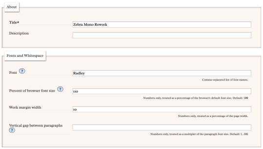


made this while procrastinating my final project
parent skin: zebra mono (ao3 public skin)
font, font size, and margin width edited with wizard (can be easily changed!)
css code: below the break!
header ul.primary,
footer,
.autocomplete .dropdown ul li:hover, li.selected, a.tag:hover { background: #000 url('https://i.pinimg.com/736x/a5/9d/f7/a59df777843458ba08859f8cb2b0b027.jpg'); background-size: 500px; }
footer ul,
header .primary a {
background: #AA336A; }
header .primary a:hover {
background: #FFF5EE; }
header .heading a,
header .actions a:hover,
header .actions a:focus,
header .dropdown:hover a,
header .open a,
header fieldset,
header form,
header p,
dashboard a:hover,
.actions a:hover, .actions input:hover, .delete a, span.delete, span.unread, .replied, span.claimed, .draggable, .droppable, span.requested, a.work, .blurb h4 a:link, .blurb h4 img, .system .latest h3, .system div.news h3, .system .tweets h3, .required, .error, a.cloud7, a.cloud8 { color: #000; }
outer #header #greeting .icon,
dashboard.own,
.error, .comment_error,
header ul.primary,
.LV_invalid, .LV_invalid_field, input.LV_invalid_field:hover, input.LV_invalid_field:active, textarea.LV_invalid_field:hover, textarea.LV_invalid_field:active,
header .primary a,
header .primary .current,
header .primary input,
header .search input {
border-color: #000 !important; }
.icon { background: none; }
#lesbian colors!! bless up!!#(it was an accident but nobody has to know that)#ao3#ao3 skins#archive of our own#pink#orange#white#Zebra Mono#simple#meso-z
13 notes
·
View notes
Text
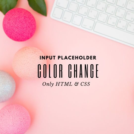
Change Input Placeholder Color
#Change Input Placeholder Color#html css#frontend#html#css#css3#frontenddevelopment#css animation#css input color#css placeholder#neduzone
0 notes
Text

#00. Estaciones | Cronología
El quinto código para el codember2023 de @elalmacen-rp es una cronología hecha para un foro privado. Como verán, muy ad hoc a la temática, la cronología se divide en estaciones.
Quizá en un futuro hagamos un revamp o tomemos la estructura para algo completamente nuevo que podamos ofrecerles. ✨
🎄 🎁 ✨ FELIZ NAVIDAD ✨ 🎁 🎄
Sin más, les dejamos algunas instrucciones pero recuerden que si tienen alguna duda o problema, pueden enviarnos un ask para ayudarles.
Busca la parte que dice XXXtab-1 en la parte de input y label. Cambia las XXX por las iniciales de tu pj o lo que tú quieras. Esto se tiene que hacer en todas y cada una de las pestañas.
Fíjate que también tiene un número al final XXXtab-1. Este número debe cambiar en cada pestaña. Si agregas más pestañas, asegúrate de ir cambiando los números también.
Cada label tiene una clase tab seguida de un número: uno, dos, tres y cuatro. Asegúrate de cambiar la clase de acuerdo al número que deseas que se muestre a un lado del botón de cada pestaña. Si deseas cambiar la numeración o aumentarla, envíanos un ask para ayudarte.
Agregamos una variable para cambiar el ancho de la tablilla, la encontrarás como --ancho: 100%. Recomendamos que el mínimo sea de 400px pues menos de eso, los elementos se verán apretujados.
En el CSS al final del código encontrarás que puedes modificar los elementos .a:before y .c:before. Estos son los iconos para se��alar que un tema está abierto (clase a) o cerrado (clase c). Nosotros usamos Cappuccicons, pero puedes usar los que desees. Cambia la font-family y después el unicode de tu icono. No dudes en preguntar si necesitas ayuda.
Como siempre, les recordamos las reglas:
i. No retires los créditos, por favor. ii. Los colores, fuentes, imágenes (backgrounds) son modificables. iii. No cambies la estructura o uses como base. iv. Si tienes dudas o necesitas soporte con los códigos, no dudes en enviarnos un mensaje. v. Like/reblog si la utilizas, nos ayudaría mucho ♥︎ vi. ¡Disfrútalos! (ノ◕ヮ◕)ノ~:・゚✧:・゚✧
Y ahora sí, puedes encontrar el código en pastebin, sólo da click en el enlace. ✨
147 notes
·
View notes
Note
pi!!! please reupload the full css for your dark and glowy ao3 site skin i beg! i saw it and immediately was like that's the prettiest thing ever :0
code under the cut
#header { background-image: url("https://cdn.pixabay.com/photo/2022/10/19/16/56/fireflies-7533056_1280.jpg"); background-repeat: no-repeat; background-size: cover; background-position: center center; background-color: #152623; }
#header .heading { height: 15em; }
#header .primary { background: #0d1d1f; box-shadow: 0px 0px 15px #f9f6ce; }
#header .logo, #header .heading sup { visibility: hidden; }
#header .heading a { color: #152623; text-shadow: 0px 0px 15px #f9f6ce; }
.event .userstuff { background: #425e50; border: 1px solid #f9f6ce; }
#outer.wrapper { background: #0d1d1f; color: #f9f6ce; }
#main a { color: #8c9b76; }
#greeting a.dropdown-toggle, #header .actions a { color: #f9f6ce !important; text-shadow: 0px 0px 3px #152623; }
#greeting .menu, #header .dropdown .menu, #header .dropdown:hover a { background: #0d1d1f; box-shadow: 0px 0px 15px #f9f6ce; }
span.submit.actions input.button { display: none; }
#greeting img.icon { display: none; }
#header #search .text, .search [role="tooltip"] { background: #0d1d1f; box-shadow: 0px 0px 15px #f9f6ce; color: #f9f6ce !important; border: 1px solid #0d1d1f; }
form.search input[type=text], form.search input[type=submit], .autocomplete div.dropdown ul { background: #0d1d1f !important; border: none; box-shadow: 0px 0px 15px #f9f6ce; color: #f9f6ce; display: block; }
#header #search .text { width: 7em; }
.notice, .comment_notice, .kudos_notice, ul.notes, .caution, .error, .comment_error, .kudos_error, .alert.flash { background: #f9f6ce; box-shadow: 0px 0px 15px #f9f6ce !important; color: #0d1d1f; border: none; }
.notice a, .comment_notice a, .kudos_notice a, ul.notes a, .caution a, .error a, .comment_error a, .kudos_error a, .alert.flash a { color: #506957; font-weight: bold; }
.splash .module h3 { color: #f9f6ce; border-bottom: 2px solid #f9f6ce; }
.splash .favorite li:nth-of-type(2n+1) a { background: #f9f6ce; box-shadow: 0px 0px 15px #f9f6ce; color: #0d1d1f; font-weight: bold; font-variant: small-caps; }
.splash .favorite li:nth-of-type(2n+2) a { color: #f9f6ce; font-weight: bold; font-variant: small-caps; font-size: 110%; }
.splash .favorite li:nth-of-type(2n+1) a:hover, .splash .favorite li:nth-of-type(2n+2) a:hover { color: #f9f6ce; font-weight: bold; font-variant: small-caps; background: #425e50; }
#footer { background: #425e50; color: #f9f6ce; border-top: 3px solid #f9f6ce; box-shadow: 0px 0px 15px #f9f6ce; }
#footer a, #footer .heading { color: #f9f6ce; }
.actions a, .actions a:focus, .actions input:focus, .action:focus, .actions li input, .actions li input[type="submit"], input[type="submit"], .actions li label, ul.navigation.actions li a, .action:link, .actions a:link { background: #425e50; border: 1px solid #f9f6ce; color: #f9f6ce; box-shadow: 0px 0px 15px #f9f6ce; border-radius: 5px; }
.current, #dashboard .current { background: #f9f6ce !important; color: #0d1d1f !important; box-shadow: 0px 0px 15px #f9f6ce !important; border-radius: 5px; }
#dashboard.own { border-top: 5px solid #f9f6ce; border-bottom: 5px solid #f9f6ce; box-shadow: 0px 0px 15px #f9f6ce; }
#dashboard a:hover { background: #0d1d1f; box-shadow: 0px 0px 15px #f9f6ce; }
#dashboard a { color: #f9f6ce; }
dl.meta { border: 1px solid #f9f6ce; box-shadow: 0px 0px 15px #f9f6ce; }
.listbox .index { background: #0d1d1f; }
.listbox, fieldset fieldset.listbox { background: #f9f6ce; box-shadow: 0px 0px 15px #f9f6ce; }
form dl, fieldset, fieldset fieldset, fieldset fieldset fieldset, fieldset fieldset dl dl, dd.hideme, form blockquote.userstuff, input, select, select:focus, textarea, span.symbol.question, .own { background: #0d1d1f !important; color: #f9f6ce !important; border: 1px solid #f9f6ce; box-shadow: 0px 0px 15px #f9f6ce; }
.autocomplete li.added, .post .meta dd ul li.added, label, label.required { color: #f9f6ce; }
span.delete { background: #f9f6ce; box-shadow: 0px 0px 15px #f9f6ce; }
span.delete a { color: #0d1d1f !important; font-weight: bold; }
.ui-sortable li, .dynamic form, div.dynamic { background: #0d1d1f; border: 1px solid #f9f6ce; }
.dropdown { background: #0d1d1f; }
form.verbose legend, .verbose form legend { background: #f9f6ce; color: #0d1d1f; box-shadow: 0px 0px 15px #f9f6ce; }
li.blurb { border: 1px solid #f9f6ce; box-shadow: 0px 0px 15px #f9f6ce; }
.draft { background: #0d1d1f; color: #f9f6ce; border: 2px dashed #f9f6ce; box-shadow: 0px 0px 15px #f9f6ce; }
.draft .wrapper { background: #0d1d1f; border: 1px solid #f9f6ce; }
#header h2 { background: #f9f6ce !important; color: #0d1d1f; box-shadow: 0px 0px 15px #f9f6ce; }
#stat_chart svg rect:first-of-type { opacity: 60%; }
#stat_chart g[clip-path^=url] > g:nth-of-type(2) rect, #stat_chart svg g:nth-of-type(2) > g rect:last-of-type, #stat_chart g[clip-path^=url] > g:nth-of-type(2) rect:first-of-type { filter: hue-rotate(140deg); opacity: 80% !important; }
.statistics .index li:nth-of-type(2n) { background: #0d1d1f; border: 1px solid #f9f6ce; }
.reading h4.viewed, dl.index dd, table, th, dt.child { background: #0d1d1f; }
#modal, span.replied { background: #0d1d1f; color: #f9f6ce; border: 2px solid #f9f6ce; box-shadow: 0px 0px 15px #f9f6ce; }
h4.heading.byline { background: #f9f6ce; color: #0d1d1f; }
li.comment { border: 1px solid #f9f6ce; }
.comment div.icon { border-bottom: 5px solid #f9f6ce; box-shadow: 0px 0px 15px #f9f6ce; }
.thread .even { background: #425e50; }
.unread { background: #0d1d1f; border: 5px dashed #f9f6ce !important; }
span.unread { background: #f9f6ce; color: #0d1d1f; }
span.indicator::before { box-shadow: 0px 0px 15px #f9f6ce; }
.warnings .tag, .work .warning a.tag, dd.warning.tags a { border: 1px solid #f9f6ce; border-radius: 5px; background: #f9f6ce; padding-left: 2px; padding-right: 2px; box-shadow: 0px 0px 10px #f9f6ce; }
.relationships .tag, .work .relationships a.tag, dd.relationship.tags a { background: none; color: #f9f6ce !important; font-weight: bold; text-shadow: 0px 0px 15px #f9f6ce; }
.filters .expander { background: url("https://64.media.tumblr.com/3c89981f933f9f57157d6dcec6fd85a7/94c6737c6db9ad60-e5/s1280x1920/f7557e617a5439c506721bd326580a0cb4c1f8d8.png") left center no-repeat; color: #f9f6ce !important; font-weight: bold; }
.filters .expanded .expander { background: url("https://64.media.tumblr.com/dab095a2fd9387bc1e0c57747ba6b13f/94c6737c6db9ad60-ad/s1280x1920/c1a4e14e0565cdcac5d3e20bebac3ab440f2d607.png") left center no-repeat; }
8 notes
·
View notes
Text
Genesis Updates For Todayyyy
Good morning everyone. Not really though I've been up since 11. Crazy, right? ANYWAYS. I'm barreling through 19 and the haunting realization that I need filler so Tweek doesn't suck is slowly dawning upon me.
Updates will pull up later after I go to iHOP because that's all Americans do. We lie and be menaces online and go to iHOP. Anyways. Enjoy the art I made on the bus while going to my doctors appointment to combat all the iHop I eat.

(yes I figured out how to properly use the eraser tool and I am going at it)
But also can I get some input here I kinda wanna change the art style of all the stuff I have so far to fit this kinda vibe but IDK how to implement it because color is SO important to the fic and I want the beginning stuff to look cute. Like I need a visible difference between the characters at the beginning versus them at the end. If anyone has any ideas please enlighten me bc I would LOVE to make these changes while I only have like five things done and not when I have like 30. Much love.
I lied I'm not going to iHOP it just started storming like crazy. SO ENJOY UR UPDATES <3
6:24: We are now 62.8k deep and chapter nineteen is done. On my way to twenty!!! (Things are getting interesting.)

Another one bites the dust ig
9:57 Me writing creek like I'm not about to kill them in six chapters is fucking insane LMFAO
12:35 I keep getting distracted but guys I feel so fucking bad for Craig rn LMAO
1:12: Craig has gone crazy and I have too because I'm playing with CSS instead of writing.
3:53 STOP I'm rereading because my chapters grow slightly shorter and I will not let that slide and there are things that need to be implemented but reading this without warning actually just made me wheeze LIKE WHO DO I THINK I AM LMFAOOOO

okay happy 7am I am closing this doc with 66.1k and chapter 20 is pretty much done GOODNIGHT.
12 notes
·
View notes
Note
Hello, wanted to say I read and loved the demo. Very well done. I just had a few questions, would love to know what Twine Template you use, especially at the beginning. Where you have the character creator, I love that the box around your selection changes to say/match what you chose. Such as depending on what skin color I choose it changes to signify that. Would love to know if you would share how you did that. I look forward to future updates! Best of luck.
Thank you! 🤍
I'm using the default template for SugarCube, if I remember correctly. Glad that you liked the box effect, it was my solution to reducing the number of passages whilst still allowing the validation of user input in character creation.
I did it through a combination of HTML tags and SugarCube native macros. Technical stuff under the cut:
Here is an example for eye color:
<fieldset class="charbox"><legend id="chareyes" class="chartxt">$p.appearance.eyes</legend> <div class="charoptions">Your eyes are: <<link "hazel">><<set $p.appearance.eyes to "hazel">><<replace "#chareyes">>$p.appearance.eyes<</replace>><</link>> <<link "brown">><<set $p.appearance.eyes to "brown">><<replace "#chareyes">>$p.appearance.eyes<</replace>><</link>> [rest of the options removed for brevity]</div> </fieldset>
The fieldset and the legend HTML tags together form a single box, a so-called legend, which I declare per attribute such as name, skin color, etc. You need a fieldset to make legend work iirc, but legend is where that text is displayed and it is positioned on the box frame by default. Important here is to give a unique ID to the legend tag ("chareyes" in this case), as we are interested in manipulating the text shown in it depending on our box.
In the sample above, the options I present for the eye color are listed within the Twine <<link>> tags. For these links there is no target passage to go to. Instead, you can see it is coded to do two things upon clicking the respective option. One, setting a game variable to the selected color.
<<set $p.appearance.eyes to "brown">>
Two, triggering a replace command to change the value shown in the legend to the description of the selected eye color according to the variable we have set in the same line. This is the bit you are asking about:
<<replace "#chareyes">>$p.appearance.eyes<</replace>>
Replace triggers without changing passages, so this way you can adjust multiple variables on a single "page". You'd obviously need to adjust the corresponding CSS classes to make it look the desired way, but the mechanics are serviced with just this idea above.
Hope this helps!
12 notes
·
View notes
Text
How to Create Multi-Step Forms With Vanilla JavaScript and CSS
New Post has been published on https://thedigitalinsider.com/how-to-create-multi-step-forms-with-vanilla-javascript-and-css/
How to Create Multi-Step Forms With Vanilla JavaScript and CSS
Multi-step forms are a good choice when your form is large and has many controls. No one wants to scroll through a super-long form on a mobile device. By grouping controls on a screen-by-screen basis, we can improve the experience of filling out long, complex forms.
But when was the last time you developed a multi-step form? Does that even sound fun to you? There’s so much to think about and so many moving pieces that need to be managed that I wouldn’t blame you for resorting to a form library or even some type of form widget that handles it all for you.
But doing it by hand can be a good exercise and a great way to polish the basics. I’ll show you how I built my first multi-step form, and I hope you’ll not only see how approachable it can be but maybe even spot areas to make my work even better.
We’ll walk through the structure together. We’ll build a job application, which I think many of us can relate to these recent days. I’ll scaffold the baseline HTML, CSS, and JavaScript first, and then we’ll look at considerations for accessibility and validation.
I’ve created a GitHub repo for the final code if you want to refer to it along the way.
The structure of a multi-step form
Our job application form has four sections, the last of which is a summary view, where we show the user all their answers before they submit them. To achieve this, we divide the HTML into four sections, each identified with an ID, and add navigation at the bottom of the page. I’ll give you that baseline HTML in the next section.
Navigating the user to move through sections means we’ll also include a visual indicator for what step they are at and how many steps are left. This indicator can be a simple dynamic text that updates according to the active step or a fancier progress bar type of indicator. We’ll do the former to keep things simple and focused on the multi-step nature of the form.,
The structure and basic styles
We’ll focus more on the logic, but I will provide the code snippets and a link to the complete code at the end.
Let’s start by creating a folder to hold our pages. Then, create an index.html file and paste the following into it:
Open HTML
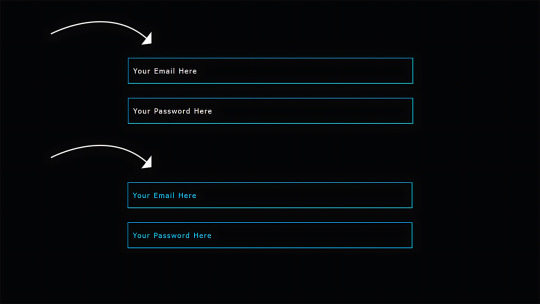
<form id="myForm"> <section class="group-one" id="one"> <div class="form-group"> <div class="form-control"> <label for="name">Name <span style="color: red;">*</span></label> <input type="text" id="name" name="name" placeholder="Enter your name"> </div> <div class="form-control"> <label for="idNum">ID number <span style="color: red;">*</span></label> <input type="number" id="idNum" name="idNum" placeholder="Enter your ID number"> </div> </div> <div class="form-group"> <div class="form-control"> <label for="email">Email <span style="color: red;">*</span></label> <input type="email" id="email" name="email" placeholder="Enter your email"> </div> <div class="form-control"> <label for="birthdate">Date of Birth <span style="color: red;">*</span></label> <input type="date" id="birthdate" name="birthdate" max="2006-10-01" min="1924-01-01"> </div> </div> </section> <section class="group-two" id="two"> <div class="form-control"> <label for="document">Upload CV <span style="color: red;">*</span></label> <input type="file" name="document" id="document"> </div> <div class="form-control"> <label for="department">Department <span style="color: red;">*</span></label> <select id="department" name="department"> <option value="">Select a department</option> <option value="hr">Human Resources</option> <option value="it">Information Technology</option> <option value="finance">Finance</option> </select> </div> </section> <section class="group-three" id="three"> <div class="form-control"> <label for="skills">Skills (Optional)</label> <textarea id="skills" name="skills" rows="4" placeholder="Enter your skills"></textarea> </div> <div class="form-control"> <input type="checkbox" name="terms" id="terms"> <label for="terms">I agree to the terms and conditions <span style="color: red;">*</span></label> </div> <button id="btn" type="submit">Confirm and Submit</button> </section> <div class="arrows"> <button type="button" id="navLeft">Previous</button> <span id="stepInfo"></span> <button type="button" id="navRight">Next</button> </div> </form> <script src="script.js"></script>
Looking at the code, you can see three sections and the navigation group. The sections contain form inputs and no native form validation. This is to give us better control of displaying the error messages because native form validation is only triggered when you click the submit button.
Next, create a styles.css file and paste this into it:
Open base styles
:root --primary-color: #8c852a; --secondary-color: #858034; body font-family: sans-serif; line-height: 1.4; margin: 0 auto; padding: 20px; background-color: #f4f4f4; max-width: 600px; h1 text-align: center; form background: #fff; padding: 40px; border-radius: 5px; box-shadow: 0 0 10px rgba(0, 0, 0, 0.1); display: flex; flex-direction: column; .form-group display: flex; gap: 7%; .form-group > div width: 100%; input:not([type="checkbox"]), select, textarea width: 100%; padding: 8px; border: 1px solid #ddd; border-radius: 4px; .form-control margin-bottom: 15px; button display: block; width: 100%; padding: 10px; color: white; background-color: var(--primary-color); border: none; border-radius: 4px; cursor: pointer; font-size: 16px; button:hover background-color: var(--secondary-color); .group-two, .group-three display: none; .arrows display: flex; justify-content: space-between align-items: center; margin-top: 10px; #navLeft, #navRight width: fit-content; @media screen and (max-width: 600px) .form-group flex-direction: column;
Open up the HTML file in the browser, and you should get something like the two-column layout in the following screenshot, complete with the current page indicator and navigation.
Adding functionality with vanilla JavaScript
Now, create a script.js file in the same directory as the HTML and CSS files and paste the following JavaScript into it:
Open base scripts
const stepInfo = document.getElementById("stepInfo"); const navLeft = document.getElementById("navLeft"); const navRight = document.getElementById("navRight"); const form = document.getElementById("myForm"); const formSteps = ["one", "two", "three"]; let currentStep = 0; function updateStepVisibility() formSteps.forEach((step) => document.getElementById(step).style.display = "none"; ); document.getElementById(formSteps[currentStep]).style.display = "block"; stepInfo.textContent = `Step $currentStep + 1 of $formSteps.length`; navLeft.style.display = currentStep === 0 ? "none" : "block"; navRight.style.display = currentStep === formSteps.length - 1 ? "none" : "block"; document.addEventListener("DOMContentLoaded", () => navLeft.style.display = "none"; updateStepVisibility(); navRight.addEventListener("click", () => if (currentStep < formSteps.length - 1) currentStep++; updateStepVisibility(); ); navLeft.addEventListener("click", () => if (currentStep > 0) currentStep--; updateStepVisibility(); ); );
This script defines a method that shows and hides the section depending on the formStep values that correspond to the IDs of the form sections. It updates stepInfo with the current active section of the form. This dynamic text acts as a progress indicator to the user.
It then adds logic that waits for the page to load and click events to the navigation buttons to enable cycling through the different form sections. If you refresh your page, you will see that the multi-step form works as expected.
Multi-step form navigation
Let’s dive deeper into what the Javascript code above is doing. In the updateStepVisibility() function, we first hide all the sections to have a clean slate:
formSteps.forEach((step) => document.getElementById(step).style.display = "none"; );
Then, we show the currently active section:
document.getElementById(formSteps[currentStep]).style.display = "block";`
Next, we update the text that indicators progress through the form:
stepInfo.textContent = `Step $currentStep + 1 of $formSteps.length`;
Finally, we hide the Previous button if we are at the first step and hide the Next button if we are at the last section:
navLeft.style.display = currentStep === 0 ? "none" : "block"; navRight.style.display = currentStep === formSteps.length - 1 ? "none" : "block";
Let’s look at what happens when the page loads. We first hide the Previous button as the form loads on the first section:
document.addEventListener("DOMContentLoaded", () => navLeft.style.display = "none"; updateStepVisibility();
Then we grab the Next button and add a click event that conditionally increments the current step count and then calls the updateStepVisibility() function, which then updates the new section to be displayed:
navRight.addEventListener("click", () => if (currentStep < formSteps.length - 1) currentStep++; updateStepVisibility(); );
Finally, we grab the Previous button and do the same thing but in reverse. Here, we are conditionally decrementing the step count and calling the updateStepVisibility():
navLeft.addEventListener("click", () => if (currentStep > 0) currentStep--; updateStepVisibility(); );
Handling errors
Have you ever spent a good 10+ minutes filling out a form only to submit it and get vague errors telling you to correct this and that? I prefer it when a form tells me right away that something’s amiss so that I can correct it before I ever get to the Submit button. That’s what we’ll do in our form.
Our principle is to clearly indicate which controls have errors and give meaningful error messages. Clear errors as the user takes necessary actions. Let’s add some validation to our form. First, let’s grab the necessary input elements and add this to the existing ones:
const nameInput = document.getElementById("name"); const idNumInput = document.getElementById("idNum"); const emailInput = document.getElementById("email"); const birthdateInput = document.getElementById("birthdate") const documentInput = document.getElementById("document"); const departmentInput = document.getElementById("department"); const termsCheckbox = document.getElementById("terms"); const skillsInput = document.getElementById("skills");
Then, add a function to validate the steps:
Open validation script
function validateStep(step)
Here, we check if each required input has some value and if the email input has a valid input. Then, we set the isValid boolean accordingly. We also call a showError() function, which we haven’t defined yet.
Paste this code above the validateStep() function:
function showError(input, message) const formControl = input.parentElement; const errorSpan = formControl.querySelector(".error-message"); input.classList.add("error"); errorSpan.textContent = message;
Now, add the following styles to the stylesheet:
Open validation styles
input:focus, select:focus, textarea:focus outline: .5px solid var(--primary-color); input.error, select.error, textarea.error outline: .5px solid red; .error-message font-size: x-small; color: red; display: block; margin-top: 2px; .arrows color: var(--primary-color); font-size: 18px; font-weight: 900; #navLeft, #navRight display: flex; align-items: center; gap: 10px; #stepInfo color: var(--primary-color);
If you refresh the form, you will see that the buttons do not take you to the next section till the inputs are considered valid:
Finally, we want to add real-time error handling so that the errors go away when the user starts inputting the correct information. Add this function below the validateStep() function:
Open real-time validation script
function setupRealtimeValidation() nameInput.addEventListener("input", () => if (nameInput.value.trim() !== "") clearError(nameInput); ); idNumInput.addEventListener("input", () => if (idNumInput.value.trim() !== "") clearError(idNumInput); ); emailInput.addEventListener("input", () => if (emailInput.validity.valid) clearError(emailInput); ); birthdateInput.addEventListener("change", () => if (birthdateInput.value !== "") clearError(birthdateInput); ); documentInput.addEventListener("change", () => if (documentInput.files[0]) clearError(documentInput); ); departmentInput.addEventListener("change", () => if (departmentInput.value !== "") clearError(departmentInput); ); termsCheckbox.addEventListener("change", () => if (termsCheckbox.checked) clearError(termsCheckbox); );
This function clears the errors if the input is no longer invalid by listening to input and change events then calling a function to clear the errors. Paste the clearError() function below the showError() one:
function clearError(input) const formControl = input.parentElement; const errorSpan = formControl.querySelector(".error-message"); input.classList.remove("error"); errorSpan.textContent = "";
And now the errors clear when the user types in the correct value:
The multi-step form now handles errors gracefully. If you do decide to keep the errors till the end of the form, then at the very least, jump the user back to the erroring form control and show some indication of how many errors they need to fix.
Handling form submission
In a multi-step form, it is valuable to show the user a summary of all their answers at the end before they submit and to offer them an option to edit their answers if necessary. The person can’t see the previous steps without navigating backward, so showing a summary at the last step gives assurance and a chance to correct any mistakes.
Let’s add a fourth section to the markup to hold this summary view and move the submit button within it. Paste this just below the third section in index.html:
Open HTML
<section class="group-four" id="four"> <div class="summary-section"> <p>Name: </p> <p id="name-val"></p> <button type="button" class="edit-btn" id="name-edit"> <span>✎</span> <span>Edit</span> </button> </div> <div class="summary-section"> <p>ID Number: </p> <p id="id-val"></p> <button type="button" class="edit-btn" id="id-edit"> <span>✎</span> <span>Edit</span> </button> </div> <div class="summary-section"> <p>Email: </p> <p id="email-val"></p> <button type="button" class="edit-btn" id="email-edit"> <span>✎</span> <span>Edit</span> </button> </div> <div class="summary-section"> <p>Date of Birth: </p> <p id="bd-val"></p> <button type="button" class="edit-btn" id="bd-edit"> <span>✎</span> <span>Edit</span> </button> </div> <div class="summary-section"> <p>CV/Resume: </p> <p id="cv-val"></p> <button type="button" class="edit-btn" id="cv-edit"> <span>✎</span> <span>Edit</span> </button> </div> <div class="summary-section"> <p>Department: </p> <p id="dept-val"></p> <button type="button" class="edit-btn" id="dept-edit"> <span>✎</span> <span>Edit</span> </button> </div> <div class="summary-section"> <p>Skills: </p> <p id="skills-val"></p> <button type="button" class="edit-btn" id="skills-edit"> <span>✎</span> <span>Edit</span> </button> </div> <button id="btn" type="submit">Confirm and Submit</button> </section>
Then update the formStep in your Javascript to read:
const formSteps = ["one", "two", "three", "four"];
Finally, add the following classes to styles.css:
.summary-section display: flex; align-items: center; gap: 10px; .summary-section p:first-child width: 30%; flex-shrink: 0; border-right: 1px solid var(--secondary-color); .summary-section p:nth-child(2) width: 45%; flex-shrink: 0; padding-left: 10px; .edit-btn width: 25%; margin-left: auto; background-color: transparent; color: var(--primary-color); border: .7px solid var(--primary-color); border-radius: 5px; padding: 5px; .edit-btn:hover border: 2px solid var(--primary-color); font-weight: bolder; background-color: transparent;
Now, add the following to the top of the script.js file where the other consts are:
const nameVal = document.getElementById("name-val"); const idVal = document.getElementById("id-val"); const emailVal = document.getElementById("email-val"); const bdVal = document.getElementById("bd-val") const cvVal = document.getElementById("cv-val"); const deptVal = document.getElementById("dept-val"); const skillsVal = document.getElementById("skills-val"); const editButtons = "name-edit": 0, "id-edit": 0, "email-edit": 0, "bd-edit": 0, "cv-edit": 1, "dept-edit": 1, "skills-edit": 2 ;
Then add this function in scripts.js:
function updateSummaryValues() nameVal.textContent = nameInput.value; idVal.textContent = idNumInput.value; emailVal.textContent = emailInput.value; bdVal.textContent = birthdateInput.value; const fileName = documentInput.files[0]?.name; if (fileName) const extension = fileName.split(".").pop(); const baseName = fileName.split(".")[0]; const truncatedName = baseName.length > 10 ? baseName.substring(0, 10) + "..." : baseName; cvVal.textContent = `$truncatedName.$extension`; else cvVal.textContent = "No file selected"; deptVal.textContent = departmentInput.value; skillsVal.textContent = skillsInput.value || "No skills submitted"; }
This dynamically inserts the input values into the summary section of the form, truncates the file names, and offers a fallback text for the input that was not required.
Then update the updateStepVisibility() function to call the new function:
function updateStepVisibility() formSteps.forEach((step) => document.getElementById(step).style.display = "none"; ); document.getElementById(formSteps[currentStep]).style.display = "block"; stepInfo.textContent = `Step $currentStep + 1 of $formSteps.length`; if (currentStep === 3) updateSummaryValues(); navLeft.style.display = currentStep === 0 ? "none" : "block"; navRight.style.display = currentStep === formSteps.length - 1 ? "none" : "block";
Finally, add this to the DOMContentLoaded event listener:
Object.keys(editButtons).forEach((buttonId) => const button = document.getElementById(buttonId); button.addEventListener("click", (e) => currentStep = editButtons[buttonId]; updateStepVisibility(); ); );
Running the form, you should see that the summary section shows all the inputted values and allows the user to edit any before submitting the information:
And now, we can submit our form:
form.addEventListener("submit", (e) => e.preventDefault(); if (validateStep(2)) alert("Form submitted successfully!"); form.reset(); currentFormStep = 0; updateStepVisibility(); );
Our multi-step form now allows the user to edit and see all the information they provide before submitting it.
Accessibility tips
Making multi-step forms accessible starts with the basics: using semantic HTML. This is half the battle. It is closely followed by using appropriate form labels.
Other ways to make forms more accessible include giving enough room to elements that must be clicked on small screens and giving meaningful descriptions to the form navigation and progress indicators.
Offering feedback to the user is an important part of it; it’s not great to auto-dismiss user feedback after a certain amount of time but to allow the user to dismiss it themselves. Paying attention to contrast and font choice is important, too, as they both affect how readable your form is.
Let’s make the following adjustments to the markup for more technical accessibility:
Add aria-required="true" to all inputs except the skills one. This lets screen readers know the fields are required without relying on native validation.
Add role="alert" to the error spans. This helps screen readers know to give it importance when the input is in an error state.
Add role="status" aria-live="polite" to the .stepInfo. This will help screen readers understand that the step info keeps tabs on a state, and the aria-live being set to polite indicates that should the value change, it does not need to immediately announce it.
In the script file, replace the showError() and clearError() functions with the following:
function showError(input, message) const formControl = input.parentElement; const errorSpan = formControl.querySelector(".error-message"); input.classList.add("error"); input.setAttribute("aria-invalid", "true"); input.setAttribute("aria-describedby", errorSpan.id); errorSpan.textContent = message; function clearError(input) const formControl = input.parentElement; const errorSpan = formControl.querySelector(".error-message"); input.classList.remove("error"); input.removeAttribute("aria-invalid"); input.removeAttribute("aria-describedby"); errorSpan.textContent = "";
Here, we programmatically add and remove attributes that explicitly tie the input with its error span and show that it is in an invalid state.
Finally, let’s add focus on the first input of every section; add the following code to the end of the updateStepVisibility() function:
const currentStepElement = document.getElementById(formSteps[currentStep]); const firstInput = currentStepElement.querySelector( "input, select, textarea" ); if (firstInput) firstInput.focus();
And with that, the multi-step form is much more accessible.
Conclusion
There we go, a four-part multi-step form for a job application! As I said at the top of this article, there’s a lot to juggle — so much so that I wouldn’t fault you for looking for an out-of-the-box solution.
But if you have to hand-roll a multi-step form, hopefully now you see it’s not a death sentence. There’s a happy path that gets you there, complete with navigation and validation, without turning away from good, accessible practices.
And this is just how I approached it! Again, I took this on as a personal challenge to see how far I could get, and I’m pretty happy with it. But I’d love to know if you see additional opportunities to make this even more mindful of the user experience and considerate of accessibility.
References
Here are some relevant links I referred to when writing this article:
How to Structure a Web Form (MDN)
Multi-page Forms (W3C.org)
Create accessible forms (A11y Project)
#:not#Accessibility#ADD#aria#Article#Articles#attention#attributes#background#border-radius#box#box-shadow#browser#buttons#challenge#change#classes#code#Color#content#CSS#CV#dept#direction#display#email#error handling#event#Events#Exercise
3 notes
·
View notes