#digital paint tutorial
Explore tagged Tumblr posts
Visit Tumblr Blog
Explore Tumblr blogs with no restrictions, modern design and the best experience.
Last Seen Tumblr Blogs


Fun Fact
Tumblr has a low social media market share in South America.
Text
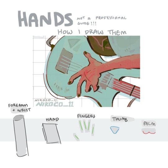


my recipe for drawing hands!
(small note that this is a shortcut that is more abt style and ease than anatomical accuracy. it helps to take time to really properly study hands, makes it easier to bend the rules a bit like this and have it still look good!!)
(learn rules b4 u break them or whatevah)
#qna#tutorial#guide#drawing tutorial#digital art#illustration#drawing#artists on tumblr#my art#clip studio paint
60K notes
·
View notes
Text
Kokabiel painting process
www.patreon.com/angelarium
1K notes
·
View notes
Text
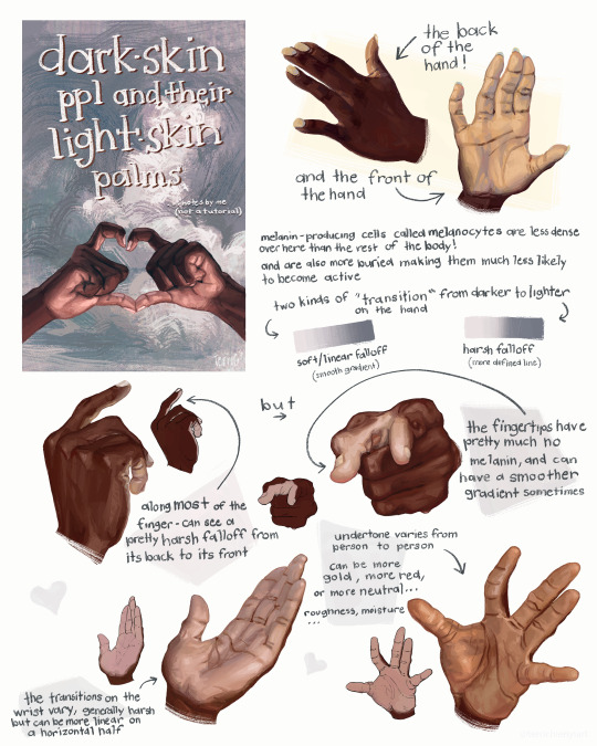
this is not a tutorial this is just me rambling
#art#art study#reference#painting#hands#digital art#illustration#bipoc#poc#black#black art#dark skin#information#art tutorial#art non tutorial#artists on tumblr#art tips#sketched this in january so its gotta leave my head someday
27K notes
·
View notes
Text
One of my long time patrons requested a space painting tutorial with a focus on how to make the stars shine and the colors vibrant. So I recorded a speed paint I made under 10 minutes of how to paint the Milky Way. I hope it helps!
You can find free downloads of the brushes I used right here YuumeiArt.com/space-tutorial It contains a brush set for Photoshop and another set for Clip Studio (converted by Arcane Halo)
Music is Tree Soul by Kentdow
3K notes
·
View notes
Text
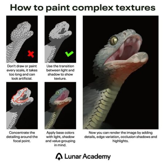
Excellent painting tutorial. In case you don't know the terms in the last description, "edge variation" means having "hard" or "soft" edges, where hard edges are crisp and good for high-detail, and soft edges are more blurry/smudged and are good for giving objects the appearance of receding in distance. In the painting above, the snake's eye uses hard edges, and its teeth and underside of the jaw use softer edges. "Occlusion shadows" are the absolute darkest parts because they are the areas where no light reaches, not even reflected or ambient light. They tend to be small and are used sparingly. Above, there's an occlusion shadow around the snake's eye. However, the shading of the eye was probably exaggerated to make it stand out more, since it's the focal point.
2K notes
·
View notes
Text
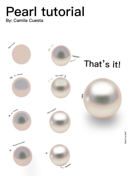
“Pearl painting process by Camilla Cuesta applies to hand-painted gameart texture painting too!”
Source: Twitter at artofjeffp
3K notes
·
View notes
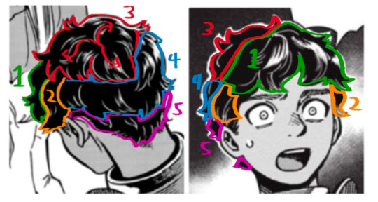
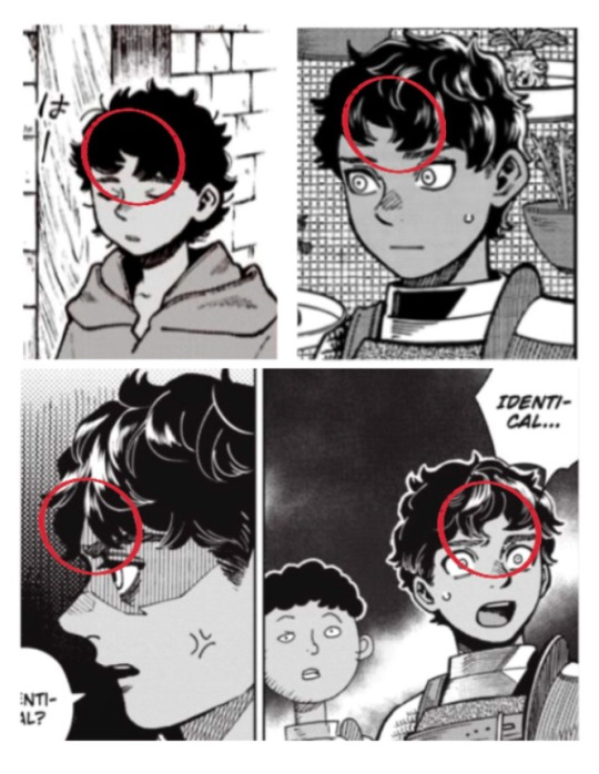
Text
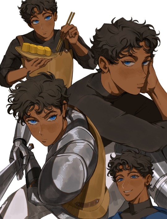
Getting better at drawing Kabru. This guy is def not easy to draw (especially if you want to draw him in your own style).
I’ve compiled some observations:
🍅 Hair: By far the most challenging part. He actually has a middle part as observed from numerous manga panels but it can be hard to notice because his hair is so short.
I also broke his hair down into approximately 5 different areas (because his hair is layered) so I can see the flow of the hair better:
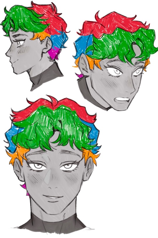
🍅 Face: His face is like a cat’s face 🐱. Thinking about a cat’s face helped me a lot.
His face generally wide and round but also has a sharp, narrow chin. I’m more used to drawing older characters so this was a struggle to me.
🍅 Brows: I never noticed this until I bought the Daydream book but his brows are actually thicker at the ends and angled downwards.
Also sharing my lineart (lowkey like this a lot):
#digital illustration#procreate#delicious in dungeon#dungeon meshi#kabru#迷宮飯#kabru of utaya#喀布爾#digital painting#my art#gomigo_dog#tutorial
900 notes
·
View notes
Text


a short/mini digital painting tutorial by yours truly 🫡
a lot of people really like how i painted kaveh in that short hkvh comic so i thought i'd share a quick painting tutorial! I hope this can be helpful to yall ^_^
#also if you'd like a more in-depth understanding of light & shadow i highly suggest Angel Ganev on youtube#dude explains so well and i like how he respect people's art styles as he improves their art#art tutorial#drawing tutorial#digital painting tutorial#digital art tutorial#artists on tumblr#my art
555 notes
·
View notes
Text

90% of the reason I loved Neopets so much as a child was the faeries, and in retrospect my utter fascination with whatever was going on between Illusen and Jhudora was probably just another sign of how terminally gay I am <3
#neopets art#illusen#jhudora#neopets faerie#my friends do a paint night every wednesday and my contribution is always some form of digital art- this was yesterday's adventure#sylph draws#i used to stare at the neopets faerie drawing tutorials for hours- they were so beautiful#im also thinking of getting some stickers printed just for fun and to slap around campus#illusen x jhudora
302 notes
·
View notes
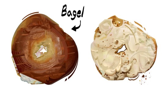
Text
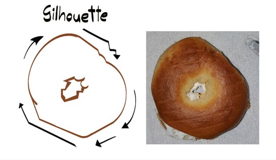
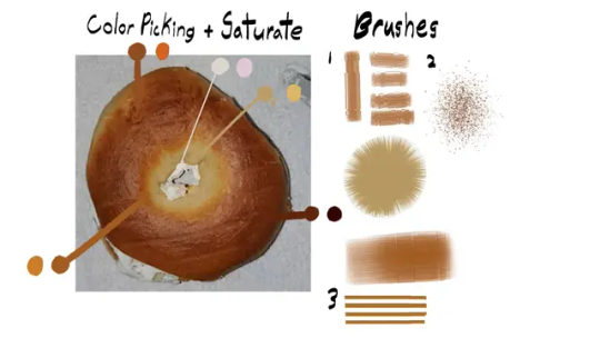
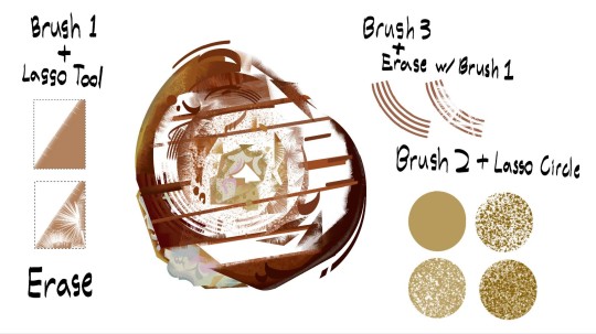
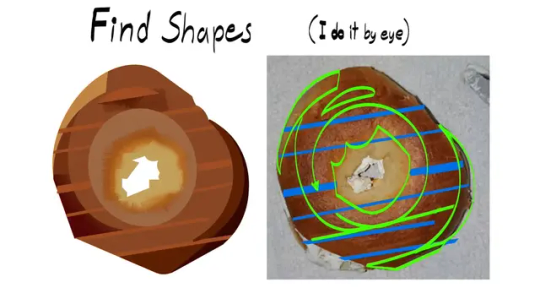
Painted a Bagel
#digital art#digital painting#digital illustration#illustration#visdev#bagel#food art#art study#tutorial
3K notes
·
View notes
Note
hi!!! I have literally no idea if you do tutorials or advice, but I was wondering what your process for rendering skin is?? you have such a lovely and realistic (but unique) way of coloring skin :)
I’m not very good at explaining my process so I hope this makes sense :)
For skin I start by picking a base colour (a mid-tone) then I can add darker and lighter shading depending on where my light source is.
I work in patches of colour (I hate blending haha) following the shape of the face/body part. I picture each part like a 3d object.

I adjust brightness and saturation as I go and add complimentary colours where I think the skins undertones would be (this part is just trial and error there’s no real skill to it it’s purely what I think looks nice)
This is just how I do it and I’m sure there’s artists who can explain colour theory and lighting for skin a lot better :) but I hope this helps! <3
#ask response#art tutorial#tutorial#my art#answered asks#ask box#artists on tumblr#art#digital art#artwork#draw#drawing#ask#asks open#artist#surrealist art#animal art#procreate#illustration#digital painting#rendering
174 notes
·
View notes
Note
Hey there! Your actually one of my inspiration for art! I really like how realistically shaded the backgrounds are and everything! Do you have any tips for shading in digital art?
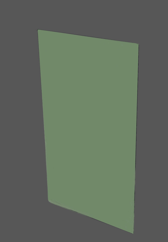
Hey, I appreciate it, thank you! There are lots of things that go in to making a good background but this is the main idea that made backgrounds click for me:
Hopefully you'll agree that of these two shapes, the one on the right feels more 'real', despite the fact neither of these shapes are meant to represent anything. The shape on the right just has a noise filter and a faint light-to-dark gradient from top to bottom. Those two things create movement on a small scale (the noise) and on a large scale (the gradient). The presence of that sort of movement is what gets your brain to register something as real.
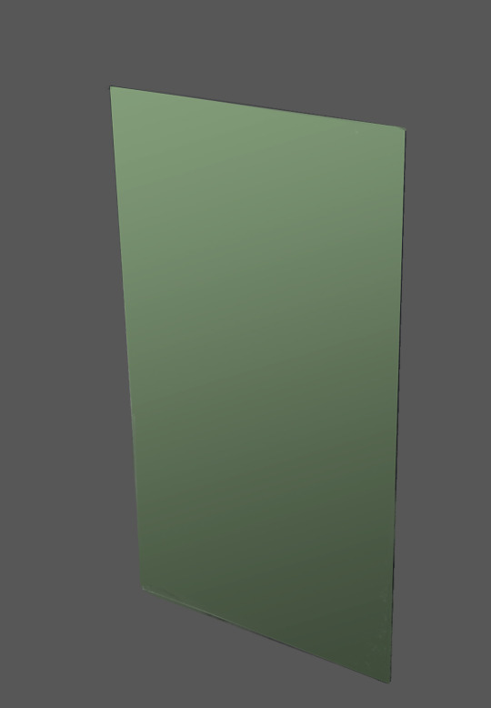
Here I've taken the shape and given it a new environment, a colour and then a gradient. The shape with the movement feels a little more natural in its environment, I think.
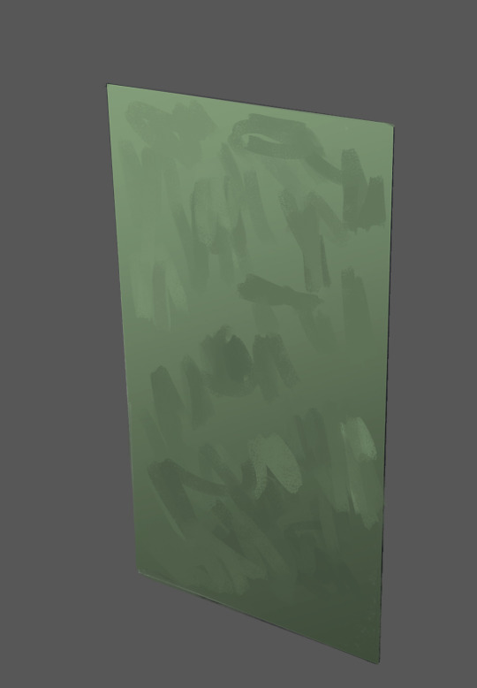
Then directly on top of that, I can start creating small scale movement, like the noise, through brush strokes. At first (on the left) the brushstrokes look quite out of place and unnatural. But as you work in to the surface more, creating more and more overlapping brushstrokes of various sizes and directions - all while trying to maintain the sense of that gradient - the strokes will start to more naturally integrate in to each other, creating a bed on to which other elements will lay naturally.
Here I give this abstract shape some context by painting some cracks and decay on it. These new elements create movement by giving our eyes more shapes to latch on to and jump between. I then added a pattern to it. This pattern adds more movement and reinforces the light effect by adhering to the gradient (getting darker at the same rate the wall does).
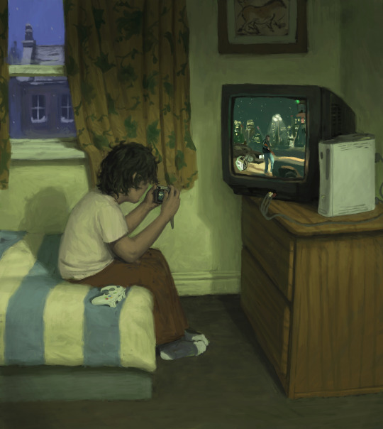
You can see I use this idea all through this picture. I make sure in any section there is always some kind of movement of light, whether its left-to-right, or top-to-bottom, corner-to-corner etc. Patterns like the woodgrain on the drawer or the textile of the curtain create additional movement and reinforce the dimensions of their respective forms by adhering to them. Bit rambly but I hope there's something useful in there!
1K notes
·
View notes
Text
Leliel, Angel of Night 🌙
602 notes
·
View notes
Text

Ganon
#artists of tumblr#legend of zelda#ganondorf#nintendo#fanart#digital art#digital illustration#anime#digital painting#drawing#video game#fantasy#Loz#ganondorf fanart#totk#botw#breath of the wild#tears of the kingdom#portrait#art tutorial#how to draw#sullivanwuzhere art
98 notes
·
View notes
Text
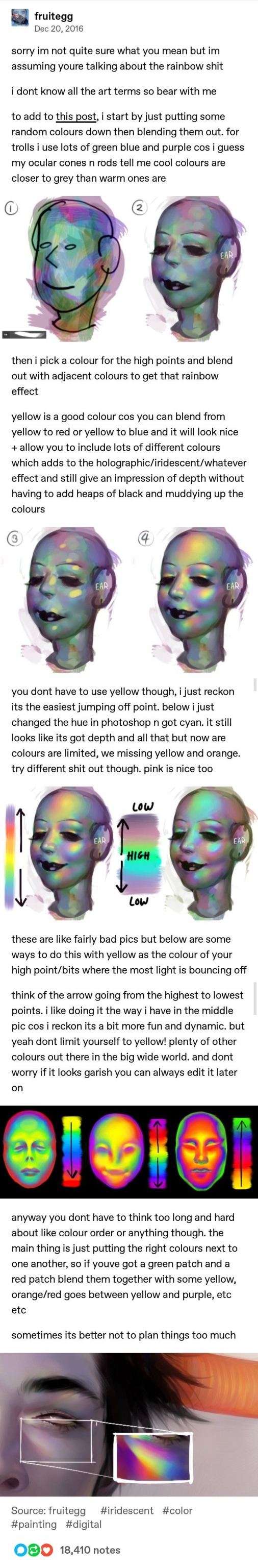
Iridescent Skin Tutorial by Fruitegg
#art#digital art#iridescent#iridescence tutorial#painting iridescence#how to paint iridescent#digital painting tutorial#fruitegg#rainbow effect tutorial
789 notes
·
View notes
Text
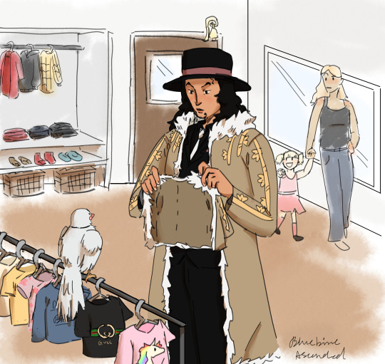
your honor he did that shit. however he bought his bird a mini of his coat so they could matchhhhh
#remind me to never paint a background ever again it got so bad my computer literally crashed and refused to wake up#it had my dad looking up tutorials. shout out to my dad for helping me wake up my computer 🫶#certified lenovo moment#my art#rob lucci#one piece#one piece fanart#hattori one piece#digital art#art#artists on tumblr
430 notes
·
View notes