#edit: added images for clarity
Explore tagged Tumblr posts
Visit Tumblr Blog
Explore Tumblr blogs with no restrictions, modern design and the best experience.
Last Seen Tumblr Blogs


Fun Fact
Tumblr has been banned in Indonesia for providing people with access to pornographic content.
Text
Was rewatching Islands, there are sooo many interesting things left open ended!!!

Like the islands had to have had at least one more human migration (other than Two-Bread Tom and his folks) to explain the Swedish language population. Possibly there were even more, the islands seem pretty multicultural and Two-Bread Tom’s group was pretty small.
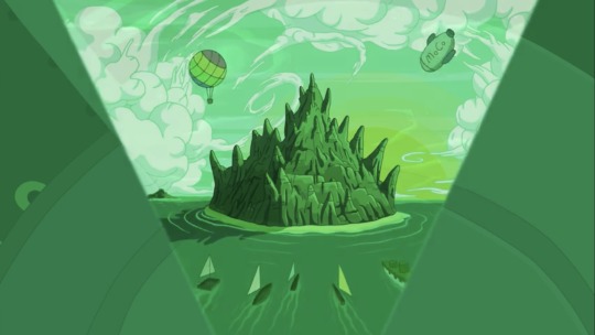
There’s also the Guardian and MoCo’s involvement in settling the islands! Presumably the islands would have had to establish contact with the main continent (there wasn’t any indication in Stakes that Moe was involved yet) Was there a time before they got super isolationist where there was still such a thing as human-Ooo relations?
BMO is compatible with all the human tech so that seems to imply either tech hasn’t changed that much or Moe was involved in standardization practices too! BMO also uses galaxy standard parts which is more evidence for all of Moe’s weird projects, but super cool if human tech might be compatible with the wider galaxy if they ever make their way there. BMO likely was around at the time too! He’s one of the first Mo’s and knows of the existence of Fraiser.

Moe has had his hands in like a million other unexplained things!!! We know nothing about his involvement with Mars or the Fire Giants! Overall he seemed just so secretive and I hope the factory kept records so all the information on these crazy projects didn’t die with him.

I also like really want to know more about the humans after Susan left. Minerva coming into power was a massive change to the entire structure of society, Seeker/Hider/Experimenter classes seem to no longer even be around. Generally the insane levels of authoritarianism has been toned down a bit. Like this is equivalent to a massive overthrowing of the government, and all of this happened within a single lifetime too! I really want to read like a fanfic or something that fills in the time period of re-ed to modern day in Frieda’s life. Lol should just try and write it myself probably but big projects like that are tough.
And lastly, this is less of a niche thing but also HOW DID MARTIN GET TO SPACE???
Anyway this was me rambling about the things that make me insane. Islands was sooooo great man. Like I am squeeing with joy as I write this (although I am also sad that a lot of this I will never have canon answers for).
#adventure time#mine#need to share my nerd thoughts with the world man#people need to talk to me about this#literally do it please if you think any of the stuff i am saying is interesting feel free#save#bmo#frieda at#at islands#edit: added images for clarity
24 notes
·
View notes
Text
i am so wikibrained i love it. i love knowing everything i can about the things i like. i want other people to have the access to this information. i want this information to be clear and understandable.....
#ive been editing the aj wiki a lot lately..#mostly like little clarity edits and adding the gifs of pet actions..#but yea... its nice.. i have a huge appreciation for what the regular aj wiki makes do..#the pets pages are sorely unfinished... and getting to add my stuff to them and have them look all nice and complete feels great#i did the lovebug gifs today!! that was a fun one :) ive never had a pet lovebug before...#the images for the pet snow leopard arent gifs... im kinda thinking about sneaking in a cheeky little spamton in there#cause yknow the pet snow leopards can make a pretty good spamton...#and the items used to make that dont cover up a lot!!#im still undecided but. it could be fun. idk ill figure out soon
18 notes
·
View notes
Text
Happy New Year 2025 from WWC
Hello everyone,
Merry, cheery holidays! The WWC team and I have been making many silent strides closer to a writingwithcolor.org.
What we've been up to
While the going has been slow, we've made a lot of progress since raising donations from you guys to go towards a .org, which we've secured ever since. With this support and encouragement, we plan to maintain the blog as a permanent resource.
As for progress and use of donations
Times have been busy and oh, so trying, but we're trying harder. Also, donations (and free time) have been going to good use.
For instance, we've:
Cleaned up (Added, removed, renamed, combined) WWC post tagging for clarity and consistency.
Created mirroring pages on new blog (e.g. navigation, stereotypes and tropes navigation, etc.)
Migrated all blog posts to our standalone blog (4000 some posts)
Maintained the URL ($12 a year, Writingwithcolor.org, hidden from view lately as we get closer to launch, although we've had it redirecting to Tumblr only until recently)
Overall building out blog content on the host site ($15.99 a month)
Next steps are to:
Finalize our theme (The fun part)
Finish blog post cleanup on the migrated posts (WIP!).
More actions at a latter date after publishing
Currently, I have been going through each and every post, one-by-one, to:
Edit, update and refine content
Fix broken links
Improve accessibility, particularly on image-heavy posts
A lot of changed in the world since 2014, so we want even our earliest posts to reflect today's standards or at least note if something is olden days or we have a more helpful post or resource since.
Example of a post on the .org. Final theme and colors not applied yet
Soft launch and new hopeful publish date
This is the end stretch before we have an official SOFT LAUNCH!
We're considering it soft since there are just some things we can't easily correct yet or will just make everything take even longer to wait on. We'll continue to cross-link between here and there as we work on getting it all centralized, though.
But to be clear, as intended, we'll continue to post on tumblr as well as long as it sticks around.
Our new prospective publish date is for Spring 2025, in which we can also re-open to questions, release new guides, invite new members, etc. etc.
But who knows - perhaps we will get a chance to answer some questions in between then.
Thank you and let's catch up!
All of your support and patience has been so appreciated. Thank you for sticking around throughout the extended hiatus. Nonetheless, I do hope our robust depository of existing answers, detailed guides, recommendations, reblogs and so on has been helpful with your creative, professional and academic pursuits.
What have you all been up to? What strides have you made in 2024 and what goals do you have for 2025? Have you published any works? We want to hear it all. Share with us on this post!
Wishing you all a happy and healthy 2025,
~Colette and WWC team
640 notes
·
View notes
Text
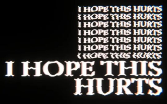
I saw someone ask what "I hope this hurts" means beyond the obvious, and I started to respond only for it to turn into an essay... Because I don't feel like dumping something so long in some unsuspecting person's notifs, I'm just going to post it here instead.
I started writing this after playing the game, but ended up watching a playthrough because I couldn't remember exactly where "I hope this hurts" was repeated. I think I caught the only few times it was mentioned, but I wouldn't be surprised if I missed something, so feel free to correct me on that or anything else I might have gotten wrong.
Spoilers for the full game and CWs for everything you would expect from discussing Mouthwashing apply.
Edited 10/16/2024 for clarity and some minor issues with formatting. I added sections in hopes of making it more readable, as well as a few more screenshots that I hope will support my points better. *Indicates where I made potentially significant additions to my original analysis.
Part One: Jimmy
Jimmy is someone who has a delicate ego. This means that he's very concerned with how he's perceived by those around him. We see this in how he responds to Curly and the news of the company's closure, which he takes it as a personal attack in spite of it very clearly having nothing to do with him on a personal level.
For people like Jimmy, a threat to one's image (whether it's a matter of their perception of themselves or, maybe worse, the perception others have of them) brings intense emotional pain. Even though it's clear that Curly meant no personal offense, and likely saw more good in Jimmy than was actually there, Jimmy sees this as a great threat to his own image, and thus identity.
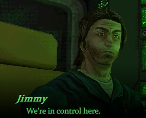
To be clear, it's not just that Jimmy thinks Curly is looking down on him. It's also that Jimmy needs his role in the company to maintain his image, and he needs to eventually become captain. This is his ultimate goal because the respect and control that someone like Curly has, in Jimmy's mind, is tied to the title he possesses. And Jimmy wants that. He wants respect, he wants to be listened to, he wants power over others. (This is also why Swansea's final speech is so important, in relation to the belief that if one just reaches this next goal, they might feel a little more human, a little more in control, a little more fulfilled, but as Swansea shows us, that's just not the case. And it's true for Jimmy, too. Jimmy isn't magically fulfilled by obtaining the title of captain.)
But in the beginning, Jimmy has yet to realize that just getting the role of captain won't magically make him a man who is respected, or even a man who is truly in control. He sees no opportunities for himself on earth. The only option is to stay in this company and become a little lord of his own ship... and suddenly that's ripped out from under him. He will never reach the goal he's been chasing for all of this time.
Anya telling him about her pregnancy is the final push he needs to go over the edge.
Part Two: Captain
Returning to the initial reveal that the company is shutting down for a second, I think it's important to keep in mind a few things:
1. The importance of the title of captain in Jimmy's mind.
2. How this extends to his perception of Curly, him being the current captain.
3. Jimmy's self-centeredness preventing him from understanding the feelings and perceptions of those around him.
When Curly says what he does, Jimmy immediately jumps to the conclusion that Curly sees himself as above everyone else (and most importantly, as above Jimmy), to the point of considering them "dirt." I don't think Jimmy is just projecting his greatest fear (being seen as lesser) onto Curly. I think he's projecting his own perceptions.
He's placed all of this importance on the title of captain, and thus Curly. The captain is above Jimmy. Jimmy is beneath him, is lesser. And we know how Jimmy treats those he sees as lesser (first Anya, and then the rest of the crew once he's captain, *manipulating Daisuke into putting his life at risk because Daisuke, who is just an intern after all, just isn't important to Jimmy being an example).
I think this is a fair reading because Jimmy does something similar with Swansea when he insists that Swansea is keeping the last cryostasis pod for himself. I understand some might say that this is just Jimmy's attempt to manipulate Daisuke and Jimmy doesn't actually believe it, which is a fair interpretation, but I sincerely think he believes what he's saying in this instance. And I think that because Jimmy sees selfishness as common sense. It's what he would do were he in Swansea's position, and what makes him giving the pod to Curly significant.
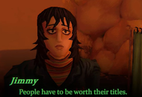
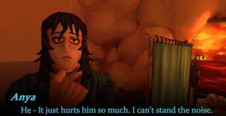
Part Three: Anya
So, Jimmy is already hurt and panicking. He sees his chance at power and thus fulfillment slipping away. And then Anya tells him that she's pregnant.
Anya, who he has shown time and time again that he thinks little of.
Anya, who he clearly sees as beneath him.
Any mention of the pregnancy, no matter how gently it was worded, would immediately feel like a threat to him on multiple levels. And not only that, but a threat from someone lesser than him. His image, his status, his control, his power—it's already slipping from his fingertips. *It's happening right then, in that moment. It's not just a potential future where he's held accountable in a real way (maybe if Anya involved authorities, or if Jimmy was legally responsible for supporting a child once they returned to earth). It's happening now, because his image is crumbling.
For this reason, I believe I hope this hurts to be directed at anyone and everyone that he sees as "threatening" him.
Anya and Curly have made him hurt. He wants to make them hurt.
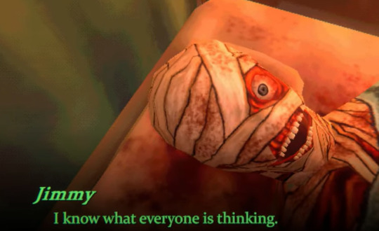
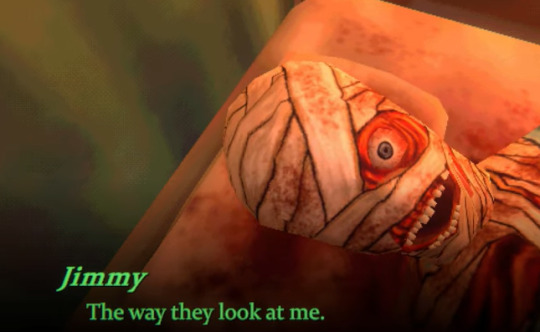
He doesn't care about Daisuke and Swansea. If anything, he's so caught up in himself and this contorted vision of reality, I wouldn't be shocked if he convinced himself in the moment that they, too, were looking down on him for some reason. (See again, "I know what everyone is thinking. The way they look at me." Obviously this is said in the midst of his spiral, after the crash, but I wouldn't doubt the paranoia was there before that moment.)
He wants to make them hurt as they've hurt him. He may also want to make himself hurt in order to vent out his emotional pain. If not, death may simply be the easiest way to escape pain and the threat the future holds in his mind.
*Part Four: Without the Guilt
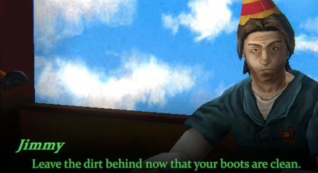
In addition to all of this, I think crashing the ship (making them hurt) is his vision of what Curly has done or is doing to him. This is how he "leave(s) the dirt behind."
To understand this, I'm going to include the birthday conversation and the conversation between Jimmy and Curly about crashing the ship.
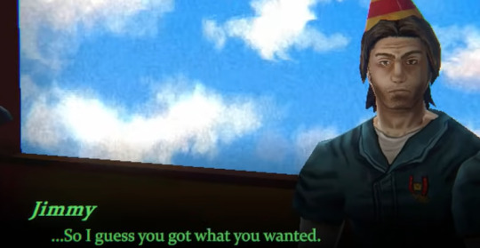
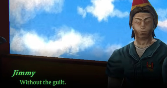
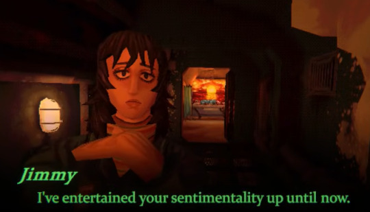
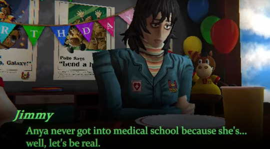
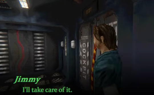
Jimmy: ... So I guess you got what you wanted. Without the guilt. Curly: Jim... If I had known... Jimmy: I can go back to my, how'd you put it? "Struggle of a life?" Jimmy: Anya never got into medical school because she's... well, let's be real. Jimmy: And how many employment years Swansea got left in him? Jimmy: Daisuke will be fine, mommy and daddy have him covered. So there's that at least. Jimmy: But you. Headed for bigger and better, right? Curly: I'm just... I'm just working on my life being a place I don't have to fucking escape! That's what I was trying to tell you, nothing mor- Jimmy: We're the ones you're trying to escape! Leave the dirt behind now that your boots are clean! Curly: That's not what I meant. Jimmy: It is what you meant. Jimmy: You just couldn't frame it to yourself in a way that kept you as the hero. Jimmy: Abandon the crew but remain the model captain.
To me, this is one of the most important and revealing sections of the game. Jimmy is not only projecting onto Curly, he's telling us exactly what he's going to go on to do (or attempt to do) when he becomes captain.
In addition to this, we see his manipulation on full display as he twists Curly's words and won't allow him even a moment to truly speak beyond a few lines he manages to get in between Jimmy's ranting.
That's not to mention we see the beginning of yet another pattern in Jimmy's behavior: getting a person to admit their weakness, then using it against them and/or using it to hurt them (he does this with Daisuke, for example, when he hears Daisuke's fears/desire for approval and proceeds to use it to get Daisuke in the vent). Here, Curly speaks about feeling trapped. Jimmy will soon trap him in a crashed ship just as much as he traps him in his own body, which Jimmy will proceed to drug. But I'll return to that.
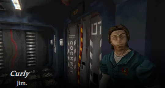
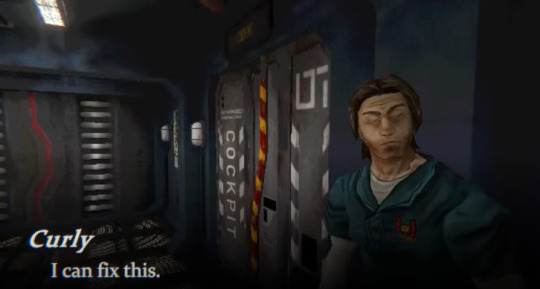
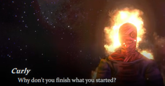
Curly: Jim. I can fix this. Jimmy: What do you think will happen when we get back? Hm? Curly: We can figure all of this out. You and me. Take care of it. Kills ninety nine percent. Jimmy: All I ever hear is how great of a leader you are. God, it's so annoying. Jimmy: But, now... What do you think will happen now when we get back? Curly: We'll fix this together. Jimmy: Everything you and I worked for in our lives. Accomplishments, changes. Jimmy: None of it will matter. Curly: You've gotten through difficult situations before. This time won't be any different. Work through it, one day at a time. Jimmy: It's not just me, is it? Jimmy: You were supposed to be the one who had everything under control. You said so yourself. Jimmy: The ship, this crew, everything that happened here... Jimmy: This was your responsibility, Captain. Jimmy: That is what you'll be hearing the rest of your life. Take responsibility. Jimmy: Or this can all be remembered as a tragedy. Jimmy: Despite what must have been the best efforts of its acclaimed captain. Jimmy: The Tulpar crew was never found. Jimmy: No one survived to tell the tale. Take responsibility. Jimmy: You're standing at the top. Jimmy: Feet in cement. Jimmy: I get it now. Right? Curly: ... Curly: ... Right.
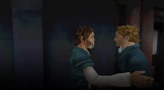
This is an important moment, because aside from the scene in which Jimmy is approaching Curly while he's on fire, it's the only other time that I can recall the game separating from their perspectives to allow us to see them both, standing together.
We see a flash of Take care of it. Kills ninety nine percent. Jimmy begins to pull away. Another flash. He continues to draw back. Another. He turns towards the cockpit.
Jimmy sees through Curly. He sees Curly's worst where Curly sees only Jimmy's best, and he's more that willing to use that against Curly.
He sees a man who is not going to do what's hard. He sees a man who is going to try to "fix it" only in the most superficial sense. A man who confuses the appearance of cohesion and peace with the reality of it. Someone who sees the rocking of the boat as a manifestation of taking action against a wrong rather than the wrong itself.
In the end, it seems they're both ruled by appearances. And Jimmy will soon rip appearances in every sense from Curly's fingertips. He will make him hurt. He will get his revenge. He'll turn Curly into the villain, taking away his title, his respect, and his very face.
For daring to look down on him, Jimmy will turn Curly into dust.
But I think these words—I hope it hurts—come back to haunt him.
Part Five: The Eye as a Mirror
Like I said, I went back to try to find each time the phrase is used. There's the beginning, of course, but then there's the pregnancy sequence, for lack of a better name.
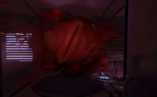
When the Polle monstrosity emerges from the giant uterus (?), we see these words:


In this sequence, we see a lot of different images and concepts connected: Anya's pregnancy and thus her sexual assault by Jimmy are tied to Polle and the company. The emergence of the Polle monster from the giant uterus (and the idea of the removal of the pregnancy) is tied to the mouthwash, as it's an act of "cleansing." This is all then tied to the phrase I hope this hurts.
Unless I missed something, these are the only two moments when the phrase is used: When Jimmy crashes the ship, and when he's experiencing this hallucination.
All clean! Really gets rid of that bad taste in your mouth, huh? Through wreckage! Through silence! Wash it away! All day fire fresh!
"Clean" is important immediately. "Leave the dirt behind you now that your boots are clean," Jimmy says. Because in this accusation is Jimmy's actual intentions himself. He wants to rise above others and clean himself from their filth. Now, he wants to clean himself of his sins.
I think "Really gets rid of that bad taste in your mouth" is mocking him. A direct challenge to the thought that he could ever truly be "cleaned," at least in the ways he's so desperately trying to go about it. *Not to mention how this connects to the mouthwash, as it might get that 99%, but there's always going to be 1% left.
"Through wreckage" obviously refers to the wrecking of the ship, but also of their lives. All by Jimmy. Though I wouldn't doubt in his mind it connects to the wreckage of consequences (ie. Anya's pregnancy resulting from Jimmy's actions).
"Through silence" I feel connects back to Jimmy's attempts to keep everything quiet, both literally and figuratively.
"Wash it away" also has a mocking edge, as if stressing the foolishness of Jimmy's attempts to treat these very serious events as if it's all just "dirt" he can wipe off.
Finally, we see "All day fire fresh!" This line stresses the connection to the mouthwash, of course. It also calls to mind the concept of cleansing by fire. Important considering Curly.
And after each, I hope it hurts. Jimmy's statement of pure, childish rage. His desperate desire to make others hurt as he hurts. To lash out, to get revenge. To have control until the very end.
This is also why Polle haunts him. Because he, as a man desperate for control, will always be under the thumb of the company even with that title of captain. That hurts him. And maybe the closest thing to ever recognizing the evil he's done to Anya is envisioning it as similar to the company's control, but even that feels like a mockery because he's so horrifically incapable of seeing her as a human being that she's been reduced to her womb. That's what he's really afraid of, in the end, and the fear feels like something else is in control. It makes the organ feel giant, larger than him, capable of hurting him.
When I was watching the playthrough, I thought that there was going to be four or five "I hope it hurts." I thought it would represent each person Jimmy hurts, or all of them, because he hurts himself too. When the sixth came, I thought so much for that theory. But then, I thought about it and there's the fetus. That makes six.
So, I hope this hurts means "I want to hurt you the way I've been hurt. The way you've hurt me." It's Jimmy saying that if his life has been wrecked, he'll wreck yours. It's Jimmy saying he'll shut you up. It's Jimmy saying he'll burn everything down if it means he can maintain control, or even just the illusion of it.
Part Six: Pain
But I think there's another side to this. Like some of the other lines I said feel are mocking him, I think I hope this hurts turns against Jimmy, especially here. And more than that, pain (and by extension, pain medication) plays a massive role in the game, after all. So I hope this hurts feels as if it haunts every moment where it's involved.
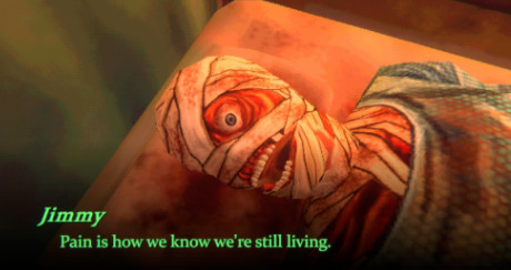
Jimmy says this the first time he gives Curly his pills. Pain is how we know we're still living.
The pills are clearly connected to death from the start. If "pain is how we know we're still living" then pain is connected to life and freedom from it is connected to death. That's saying nothing of Anya's use of the pills to kill herself. I think this connects back to the crash, as well. If life is pain, death is an escape from it.
I think it's also significant that the act of swallowing the pain pills is in and of itself painful.
The pills that are meant to take the pain away become a method of torturing Curly. It's a way to make him hurt, and to exert control over him. Even something that should take away his suffering is just an extension of it.
At one point, Jimmy says "Once these are out, we'll have nothing to keep him quiet." In this sense, the pain pills are meant to suppress, not to heal (Through silence!). They're supposed to shut Curly up and keep him from expressing his anguish in the only way he has left (the noises that disturb Jimmy's sleep).
Others have compared this, or Curly's state, to how Anya has been forced to bottle up her own suffering. Jimmy is keeping them both quiet, or at least attempting to. The ultimate form of keeping them quiet would be to, of course, kill them all.
The pills can also be seen as an attempt to hide or conceal the hurt that has been caused rather than to actually heal. In this way, they're like the mouthwash: something that's not really helping, just covering up an issue (and thus making it worse). And the mouthwash represents Jimmy's attempts to "fix" things. He doesn't actually want to make things right, because that would mean taking accountability. He wants to protect his own ego by "fixing" things in a mimicry of Curly "fixing" things in which he wants to create a sense of "rightness" without actually adressing what (or who) has been wronged. Jimmy can't stand to look at himself, because he would see that he really is constructed of his worst moments, or at least, that's what I suspect he would see.
Conclusion
Considering all of this, I hope this hurts can then become a mantra about living in spite of everything. I hope this hurts means "I hope I'm alive in the end. I hope we're all alive in the end." It could mean "I hope I'm allowed to hurt, because I am hurt, and the harm that's been done to me must be seen rather than suppressed and hidden." It could mean "You can't keep me quiet. You can't ignore or hide what you've done to me."
Maybe most of all, I think it means I hope you reap what you sow. When it's turned back on Jimmy, when it's almost mocking or haunting him, it becomes in part about his emotional weakness. About his inability to look at himself and his reality without experiencing the pain of humiliation. I don't think he ever experiences half of the pain he's inflicted on those around him. Still, he has to deal with the fact that his attempt to hurt others instead of facing himself has caused him more pain rather than taken it away as he'd hoped.
And I think that's why he suddenly decides to make Curly a "hero" instead of a "villain." There's a tipping point where he's pushed into a corner. The pain is too much. He hasn't confronted his own actions in any real way, but he's done enough that he can't stand to save himself anymore. It hurts too badly to live with what he's done. It sends him into another stage of fantasy/delusion. The only thing left to do is what he intended to from the start: kill himself to escape and damn Curly to a slow death. Because to go on living in spite of the pain would be the right thing to do, in a sense. To live in the hell of his own creation. To face what he's done. But instead, he'll entrust those heroics to Curly.
This feels barely coherent in the end, so I might come back in a few days and say wow what the fuck was I talking about? But hopefully there's something here that captures some truth. Again, please feel free to correct me if I'm misremembering anything or if I missed something.
#mouthwashing#spoilers#tw#cw#most of the fucked up mouthwashing shit is mentioned here#idk how ppl are handling tws because are some considered spoilers?#idk
314 notes
·
View notes
Text
This post is made with speech to text because my hand hurts from typing so much today. Please forgive any typos or speech to text swapping similar sounding words.
If you would like to start writing your own image descriptions, feel free to ask any questions.
The main things to keep in mind is that they should begin with some variation of image description start or ID, and end with some variation of image description and, and ID or something like that. This distinguish the image description from the caption or anything else.
Image descriptions should not be written in italics, bold, all caps, or any colors. If text in the image is in all caps, write it in regular case, and simply note before or after it that it's in all caps.
Image descriptions should describe all images in the post, without skipping any. This includes images that are nothing but text.
Plain text image descriptions in the body of the post are more accessible than alt text alone, because many people who need image descriptions cannot use alt text, and Tumblr is known for its glitches, so the accessibility of the alt text all by itself varies widely over time.
It is more accessible to have the image descriptions indented than not, because this helps to visually separate the image description from the caption. Having brackets or parentheses at the end is also helpful for this. This allows people to easily distinguish between the caption and the image description if they need to.
If you are an artist, writing image descriptions for your art will give you full control over the image description, and will allow you to correctly identify details that others might miss. This gives you the opportunity to show which parts of your art hold meaning to you and are important to notice.
If you are describing real people who are unknown to you, unless it is specified within the post or you are already aware, please do not assign any gendered terms to them, or any " male presenting or female presenting" terms like that. This is completely unnecessary and leads to misgendering. It is best to simply describe visible facts about the people. Hair color, length, clothes and style, pose, expression, the light or darkness of their skin, things like that. Do not assume that someone is white simply because they have light skin.
Do not use image descriptions to lie to the audience in any way and do not use image descriptions to make jokes where the audience reading the image description is the butt of the joke.
As an example, if there is a very clearly fake screenshot, do not say that it is simply a screenshot, or if a photo is very blatantly photoshopped, do not say that it is simply a photo. Say an edited photo, a badly edited photo, a screenshot with editing, something like that to indicate the changes have been made and then what you are going to be describing is not the natural version.
As an example, you would say a crab photoshopped to be driving a car. Rather than a photo of a crab driving a car.
Unless you are transcribing a text within the image, do not use meme speak within image descriptions. Do not refer to dogs as doggos for example, unless it is to specify that the dog in the image is, within the image, labeled as a doggo. Do not describe someone walking downstairs as breasted bubbly downstairs, even if it is an actor humorously walking down the stairs to imitate that sentence. Describe the facts of the movements, and then you can make the comparison for clarity.
If someone adds an image description to your post whether this be an original post or a reblog that you have added an image to, it doesn't matter how many notes to post already has, please copy and paste that image description into the original post or your original reblog. If it is a new post that has only a few notes from friends, after you update the original, you can just ask your friends to delete the reblogs of the inaccessible version and reblog the new one. Most people who are good people and care about disabled people will happily do so.
Keep in mind that image descriptions are accessibility tools. Treat them as such.
Anyone can write image descriptions. You do not need any special qualifications or training. As long as you are willing to take constructive criticism if you make a mistake, an image description written by someone who's new to it and honestly doing their best with good intentions is better than no image description at all.
I'm sure I'm forgetting some things, so please feel free to add on more tips and advice.
#made with speech to text#image descriptions#accessability#disabled#cripplepunk#neuropunk#autistic#adhd#if you care about disabled people#start writing image descriptions#especially if you're able-bodied
1K notes
·
View notes
Text
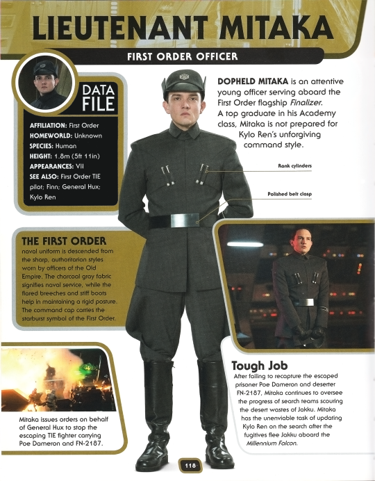


Soooo I've been obsessed with the image in this post since I first saw it, and decided to hunt down the source [Star Wars Character Encyclopedia: Updated and Expanded (2016 Edition)]. Here's Mitaka's page, and a close-up of that image; unfortunately it's tiny!
Feel free to use, edit etc.
Update: here's the best digital version of that image that I can find, slightly edited [maybe I'll clean it up someday..]:

Additional notes and transcript below:
[Google lists Mitaka's actor Sebastian Armesto at 5'8" and the fact that they added 3" to him makes me giggle. Let him be a little short!]
The fact that Mitaka's homeworld is listed as 'Uknown' is interesting to me. I wonder it's something thought out by the writers, or just hand-waving [guy didn't even have a name in the movie credits, iirc]. I've long hced that Mitaka was born on a starship to Imperial parents - but it's also possible that Mitaka was taken into the FO at a very young age and simply doesn't remember his home planet.
As most Mitaka enjoyers know, Mitaka graduated at the top of his class in the Academy. Despite being appearing terrified when facing Ren, he's evidently very, very good at his job. And, I know "Ren's unforgiving command style" is being tongue in cheek, but it does implicate a contrast to Hux's command style, which is apparently not-so unforgiving.
Something I see some get wrong — Mitaka is part of the FO Navy, not the Army. He's in charge of starships rather than ground forces, and he would make the ranks of Commander, Captain, and Admiral rather than Major, Colonel, and General.
So apparently Mitaka was indeed, under Hux, the one in command of not only recapturing Dameron and Finn, but also the retrieval missions on Jakku, and giving orders — which to me seems quite a step above the responsibilities of a mere Lieutenant and why I hc Mitaka as a Lieutenant Commander, but I digress. It makes sense then why it was specifically Mitaka who was designated to tell Ren about their failure to capture both the droid and the 'fugitives' — though it's also my hc [have lots of those] that Mitaka could have put this on an underling, but chose to face Ren and take the blame personally out of a sense of duty and honor, despite being terrified.
Editing note, because I'm a graphics nerd at heart: the half-tone dots in the close-up are predictably driving me bonkers, but from what I can tell, there's not much that can be done about it other than a time-consuming paint/smudge over, or messing with PS plug-ins [as far as I know -- I'm very new to scanning print]. I tried some descaling and blurring, but of course you can't do much of that without a loss of quality and clarity, and that's something I hate to sacrifice. I'll keep messing with it. Or, if someone has any idea of another source for this picture you would be my savior ! This is the only instance I can find of this image.
Transcript:
Lieutenant Mitaka First Order Officer
Data File Affiliation: First Order Homeworld: Unknown Species: Human Height: 1.8m (5ft 11in) Appearances: VII See Also: First Order TIE pilo; Finn; General Hux; Kylo Ren
Dopheld Mitaka is an attentive young officer serving aboard the First Order flagship Finalizer. A top graduate in his Academy class, Mitaka is not prepared for Kylo Ren's unforgiving command style.
The First Order naval uniform is descended from the sharp, authoritarian styles worn by officers of the Old Empire. The charcoal gray fabric signifies naval service, while the flared breeches and stiff boots help in maintaining a rigid posture. The command cap carries the starburst symbol of the First Order.
Tough Job After failing to recapture the escaped prisoner Poe Dameron and the deserter FN-2187, Mitaka continues to oversee the progress of search teams scouring the desert wastes of Jakku. Mitaka has the unenviable task of updating Kylo Ren on the search after the fugitives flee Jakku aboard the Millennium Falcon.
[Image Caption] Mitaka issues orders on behalf of General Hux to stop the escaping TIE fighter carrying Poe Dameron and FN-2187.
73 notes
·
View notes
Note
https://www.tumblr.com/psicheanima/775135029372272640/143?source=share
I rlly love the way you rendered this one, could you please show us how you did it?
Oh, of course! But there was no rendering since it was a black and white image, I only edited it. So, this is the original.

Then, we use our beautiful app “DazzCam” to make it look as if the image was taken by a real camera. The adjustment is “S 67”

Finally, we just edit the image.
Blacks: All the way to 100
Brightness: slightly high
Contrast: very slightly low
Vibrancy: slightly high
Clarity: very negative
Luminance: very High
Dehaze: all the way negative
Glow: all the way high, added a multiply layer with a white layer under for even higher strength
Then add a slight vignette. And my color curves are always slightly on green/red. And you just adjust based on the image.

I hope this can help you. It’s a bit difficult to explain the editing process because I really do just lollygag until I get the result I want. I had a Polaroid version of the drawing too.
45 notes
·
View notes
Note
Hi there, hope you're doing well! I was wondering if you could share how you edited this picture 👇🏻 [https://www.tumblr.com/simsimulation/784301034552049664?source=share] The clarity and overall look are really impressive!
Hi! I didn't really do too much. I used procreate to smooth out everyone's skin, added a highlight on one side of their faces, and just drew in the outlines around them. I did have to redraw Imogen's eyes + nose and use the liquid tool on Lou's face. And then brightened up a little. Aside from that- that's it. Everything else was done in game using reshade! (The coloring, the lighting, the depth, etc.)

Here's the image straight from the game!
26 notes
·
View notes
Text

Our Dearest Good Omens Fandom,
As you are no doubt aware, we at Do It With Style Events have been working tirelessly since 2020 to bring you nothing but the best fandom events. It is, therefore, with great excitement that we write to you today to inform you of our latest schemes for your enjoyment…

Strongly Worded Notes celebrates the art of communication (or, as it were, miscommunication), in all the various mediums it uses. From handwritten letters on expensive parchment, to telegrams, to the digital E-mails; even pictograms and maps shrouded with secret codes! In this event we ask you to embody the spirit of that Ineffable Duo and communicate in epistolary exchanges.
Writers and Artists are invited to join this Teamed event, with sign-ups closing on May 25, 2025.
We dearly hope you’ll join us for another amazing fandom event.
Sincerely yours,
The DIWS Mods
P.S.: For clarity, we use the word “letter” throughout our instructions below to mean any kind of epistolary message, not just literal snail mail letters.
Read under the cut for more info, or check out our full information document here
How it works
Artists and Writers are all invited to participate. This is a teamed event, with each team composed of 2-3 writers and 1 artist to create epistolary fanworks (letters). Each team will be given a prompt card, with one required prompt on the front and optional, suggested prompts on the back. Prompts will include an era, a medium, as well as genres and tropes to include. Prompt cards will be built based on the team’s responses during signups.
Every writer will be responsible for creating 3-5 letters from their character(s) point of view. Letters must be long-form, meaning no text messages, DMs, or other “instant” communication tools. Think: handwritten letters, telegrams, postcards, emails and even snarky pointed warring blog posts.
In teams of 2 Writers, there will be an assigned “Crowley”-writer and an assigned “Aziraphale”-writer.
In teams of 3 Writers, the third character will be added based on signup responses and the team’s planning.
Every artist will be responsible for creating 1-3 works. These works can either be letters in themselves, or accompanying artwork to go along with a writer’s letter. Works can include: images of gifts included with the letter, maps to secret rendezvous points, newspaper clippings, postcards, and more. Artists may choose whose perspective they are creating from for each piece.
After teams are created, they will have one (1) built-in week for discussion, plotting, and pre-planning, and then eleven (11) weeks to complete their works. A detailed schedule is below! We find participants are most likely to successfully complete the event when they are members of our Discord server. Therefore, we require server membership during the length of the event. Our server includes dedicated channels for creators to share, as well as find resources and connect with Beta Readers, Brit Pickers, and more! Discord is also the fastest way to get information and connect with the mods. Join us today! https://discord.gg/MbE7d4RUeE
How to Signup
All participants can sign up starting on May 10th: https://forms.gle/k775oBAWD7uRsv7b7
Signup Deadlines:
Writers and Artists - May 25th
Pinch Hitters - Always Open!
Timeline
May 10 - Signups Open
May 25 - Signups Close
June 1 - Groups Announced
June 1-7 - Pre-planning stage
June 9 - Check In #1 (Group Plan Decided)
July 21 - Check In #2 (Progress Check)
August 18 - Check In #3 (Individual Creation Almost Done, Team Editing Begun)
August 23 - 31 - Posting!
Want to Learn More?
Check out our full information document here You can also join us on Discord and ask questions!
#do it with style events#good omens#good omens fanfiction#good omens fanart#good omens events#aziraphale#crowley#ineffable husbands#good omens epistolary works
32 notes
·
View notes
Text
Comic-Con 2008 - Enhanced Edition of Supernatural Panel
youtube
Direct link. Warning: Some of the special content I added has big spoilers for season 4 beyond the original videos.
This video features Jared, Jensen, Eric Kripke, Sera Gamble, and Ben Edlund. If you've already seen the original videos and you're wondering why you'd want to watch this, see the details about the enhancements below. For other enhanced videos, check my YouTube channel or my Tumblr index post.
Video Improvements - Upscaled, fixed bad aspect ratios, improved colors

I received a great deal of help from @sensitivehandsomeactionman on the color correcting. They gave me tips on how to achieve better colors and they even took a screen shot from my video and corrected the colors on it with their own software to provide me with an example of what was possible. Having that example to reference was invaluable for me, because I'm not good with colors.
Without that help, Jared and Jensen would have looked like they were in training to become the world's tallest Oompa Loompas. Any remaining color wonkiness (Wonka-iness?) is due to my own failure to apply what I was taught and my failure to see the colors properly. But look at that difference! I was pretty excited about this.
Combined Videos to Cover Entire Event
As with my other enhanced videos, I combined multiple videos to create as seamless a video of the event as possible, from beginning to end. For my earlier videos, that meant combining maybe 5 videos. For this one, I used a total of 19 videos from 3 different sources. A lot of those were used for the talking head bubbles, explained further below.
None of the videos are my own. My video description on YouTube has links to the original videos I used.
Good, Color-Coded Subtitles
As with my other enhanced videos, I attempted to provide accurate and as-complete-as-possible subtitles. They're color-coded to make it easier to tell who's speaking. This is especially helpful when people are speaking at the same time, or when the speaker is off camera.
Since there were so very many people talking in this video, I doubled up on a couple colors if I thought I could do so without it being too confusing. Here's the complete color key:
Red = Jared Blue = Jensen Brown = Eric Kripke Pink = Sera Gamble Purple = Ben Edlund Green = General audience Yellow = The person asking the questions. In the first half this is the moderator, Alynda Wheat. In the second half, this is the fan at the mic. White = Mostly the publicist (Holly Ollis), but a couple times it's used for people off camera who I believe were Comic-Con staff. Two shades of orange = surprise guests
Additional Clarifying Content
As with my other enhanced videos, I've added some images to help add clarity to the references used by the speakers. I added images of characters and scenes referenced from the show, images to explain various pop culture references, as well as some explanatory text to help add details or clarity when I thought it might be useful.
I mostly kept this extra content to the sides so that, if it doesn't interest you, you can hopefully ignore it and focus on the main part of the video. Unlike my previous videos, sometimes this is on the left side and sometimes it's on the right side. The margins shift depending on where the talking head bubbles are.
Talking Head Bubbles - Jared and Jensen front and center, but other speakers visible too
This "enhancement" isn't anywhere close to perfect, but it sure as heck isn't from a lack of effort. This represented at least half if not two-thirds of the time I spent working on this video.
I always find the Comic-Con videos frustrating to watch. When the camera moves to other people who are talking, I want to see Jared and Jensen instead. I like to see their reactions and sometimes they do funny things that get missed. But when the camera is steadfastly focused on Jared and Jensen, I also get frustrated because I can’t see the people who are talking. Nope, you can’t win with me! I want to see everything.
I attempted to mitigate this frustration by adding talking head bubbles. The main source videos I used were the ones with the most constant and stable focus on Jared and Jensen. However, if one of the other source videos had a decent focus on another guest, I inserted a small window into that other video as seen below. Eric shows up on the left, because that's where he was seated relative to Jared. Sera and Ben show up on the right, because they were on the other side of Jensen.
Like I said, it's not anywhere close to perfect. Trying to make the bubbles look stable was an enormous challenge for me. Behind the scenes the person in the bubble was bobbing and weaving all over the original video frame, so I had to constantly adjust the position of the secondary video to keep the subject centered in the bubble. They also aren't always bubbles. The people taking the videos often had the writers on the edge of the frame because they wanted to capture Jared or Jensen too, so the bubbles start to collapse when they get too close to the edge because there isn't enough video surrounding them to form a circle.
I haven't decided if the end result was worth how much effort I put into these darn "bubbles", so I'd welcome any feedback -- good or bad.

#enhanced edition con video#j2#jared padalecki#jensen ackles#eric kripke#sera gamble#ben edlund#comic con#comic con 2008#Youtube
124 notes
·
View notes
Text
Donation scams
For pet donation scam information, go here.
What is a donation scam? - This kind of scam occurs when someone is asking for money but isn’t being genuine/honest for why they need it and upon closer inspection you’ll often find out their fundraiser information is stolen from someone else who needs support. For example, the text itself would pull up someone else’s fundraiser that’s posted on another site such as Facebook or Gofundme with names that don’t match up or certain details edited out or added from something else entirely. In a sense, the post doesn’t make much sense or seems to be mashed together from other places. These are scams because money given to them isn’t going towards their goal and also not going to the one who needs it.
Was there an ask sent? - Asks for these scams are varied with no common theme but they usually seem poorly worded and link you to their post which may be pinned. Usually they’ll be sent immediately after following you with no prior interaction even when they call you their friend. Sometimes they’ll say they see you share mutual aid posts too but that’s generally just some excuse they’ll use so you won’t be too suspicious of them. Legit people be warned: Spamming these asks will get people suspicious of you and asking you questions instead. If someone tells you to please limit them, it’s advised you try to. Don’t send these asks to anyone who has stated they don’t like them.
Is the account new? - Another common thing to check is the posting date of the posts on the blog. An account with a massive amount of posts dating across many years is generally a legitimate person if they have several original posts and overall appear to be a person. Unfortunately, scammers tend to backdate posts to make their blogs look older then they may be but rarely have that many original posts. By turning on timestamps, you can see the original posting date in other notes if they have shared posts. Usually the backdated posts are only a few days old but have been made to look years old. What is post backdating? Please refer to this post.
Does the story make sense? - Basically, how well does the story they give sound and does the information it has seem reasonable. Is there anything in it that seems too far fetched to be applicable to a situation? Such as stating they need money for someone’s funeral but the images they supply seem to be photoshopped. Or they have their name on a paper but there seems to be a filter over it which may be obscuring minor details from the original unedited image. You may notice the story also doesn’t give much information out that would be anything important like if a law applies to their situation but they don’t supply a general idea of what country their in. Sometimes the story changes after a few days too.
What else should you do? - If you still can’t figure out if someone’s legitimate, then you may try to nicely ask them questions related to their situation. These questions don’t have to be anything needing personal information; It can request clarity about something your unsure of or further explanation regarding a detail that doesn’t seem to make much sense overall. Most people don’t mind answering these questions as long as your being reasonable and friendly. Most usually will answer you. Unless they ignore you.
What if it is a scam? - Once you have gathered enough resources to confirm the post is by a scam account, it’s necessary to compile it into one place then make a post showing it or show them what you found as well. The scammer will most likely get really angry and deny your evidence and then block you and continue scamming people. Unfortunately it’s suggested to post the information yourself before confronting scam accounts.
Other stuff to look out for? - Asks being spammed; Mass tagging accounts who share mutual aid posts; Replies/reblogs are missing; Harassing people who proved they are scamming
How to report these accounts? - Report -> Something Else -> Illegal content or use -> Phishing
—
If you like this guide, feel free to check out my blog as I report on these scams nearly daily among other kinds of scams that I post about. If you like my hobby, feel free to drop some pocket change as thanks! However, all I really want you to do is share this post to help me bring awareness of tumblr scams. Send it to people who might not know what a donation scam is or link to it in posts you make! Thanks. Hope this information is helpful!
270 notes
·
View notes
Text
Theorizing about the new TADC character teaser!


For those not in the know, Gooseworx posted the first of the above images on her socials yesterday. Obviously teasing future TADC characters.
The second image is an upside down edit, to help get a better gander at the reflections.
As none of these characters match any of the abstracted performers, the most likely option is that these four a NPC created for adventures, or possible, one shared adventure.
For the sake of clarity, the characters will henceforth be referred to as Blue, Pink, Green and Grey.
I'll discuss them individually before giving a theory about episode 2
Blue:

A lot of people have compared this character to the cast of the fighting game Ballz 3D, and predicting they're made of balloons, but upon closer inspection, I have uncovered some details no one else has pointed out.

In addition to making out what appears to be a simplistic face texture, seemingly hovering in front of Blue's face, but the shapes and contours of their limbs make them resemble coils, like a thick rubber version of Gangle's torso.
Pink:

Pink here has understandably been compared to Queenie by many fans, as well as many assuming them to be the leader of this odd group. Other's have drawn comparisons to Baroness Von Bon Bon, which are also understandable. But what else could a detailed look over reveal?

It would appear Pink has a heart pattern on their chest, as well as large puffy hair and an adorable little crown.
Her dress has 2 to 3 layers, depending on if the highlighted segment towards the bottom left is actually anything meaningful.
I also took the liberty of estimating her hand proportions.
Green:

The most "normal" looking of the four, at least in this teaser, kind of like Ragatha in the main cast reflection teaser. The ghostly element is obvious and the extra blur added by their glow affect compounded by the reflection complicates analysis a bit, but I like a challenge.
The first thing that stuck out to me was what I can best describe as a line of many small buttons, like an old fashioned woman's shirt. The change in thickness of one arm also gave the impression of sleeves.
Lastly (and most likely to be parandolia), I think I found the rough outline of a darker patch on the head, likely the actual head.
Grey:

I've seen the most disagreement over what this weirdo is. My first thought was a penguin, but I no longer hold that opinion. Rather, I agree with many others who sight this a a revisit of Frogni (an unused frog design for Pomni). So, let's dissect this thing.

So, Frogni is definitely here in spirit, especially with Grey being the most main cast-like new comer. The orange/bronze arm is what really stuck with me, especially as I haven't seen anyone point it out.
Conclusion:
I think these NPCs will be rivals to the performers (Gangle, Kinger, Ragatha and Pomni) in a "rival showdown" adventure. Jax and Zooble will either opt out or defeat their rivals so quickly that they weren't included (similar to Bubble in the main cast teaser)
#the amazing digital circus#tadc#tadc Gangle#tadc Kinger#tadc Queenie#tadc Ragatha#tadc Pomni#tadc Jax#tadc Zooble#tadc theory#tadc prediction#goosewrox#glitch productions
82 notes
·
View notes
Text
youtube
FINAL FANTASY VII REBIRTH - PC ANNOUNCE TRAILER
youtube
Japanese version
The PC version of Final Fantasy VII Rebirth will launch for Steam and Epic Games Store on January 23, 2025.
Final Fantasy VII Rebirth first launched for PlayStation 5 on February 29, 2024.


Screenshots
PC Features
The PC version introduces new features and customizations to take full advantage of the platform:
Lighting – Lighting has been adjusted, and the game’s overall rendering of light is significantly improved. The updated areas and cutscenes present with even greater beauty and clarity than before.
Frame Rate and Resolution – NVIDIA DLSS support means that frame rates can be enhanced and image quality upscaled. There is now also support for variable refresh rate (VRR).
Textures – The Level of Detail (LoD) for background models and MIP maps for background textures can both be freely configured in the options settings. With this background polygon density and texture density can be set higher than was previously possible, allowing for gameplay with higher-quality graphics.
Controller Input Support
Connecting a DualSense® controller with a PC allows players to use the same controls as the PS5 version. Keyboard and mouse support has also been added, alongside the option to freely customize the controls between world exploration and combat or mini-games.
Steam Deck
The Steam version is planned to be playable on Steam Deck as well.
Pre-Orders
Players can pre-order Final Fantasy VII Rebirth on PC via Steam or the Epic Games Store and take advantage of an Early Bird discount of up to 30 percent off across all editions for a limited time. Additionally, those who pre-order will receive the Moogle Trio Summoning Materia, giving access to a powerful summon for their first steps into the unknown journey. The preorder bonus also includes a Shinra Bangle Mk: II and a Midgar Bangle Mk: II. The Posh Chocobo Summoning Materia will also be offered to all players who purchase the PC version of the game regardless of their purchase timing.
A full list of digital editions available for pre-order is as follows:
Standard Edition (limited time price: $48.99)
Digital Deluxe Edition (limited time price: $62.99) – Includes digital Mini-soundtrack, digital artbook, and digital DLC items including the Magic Pot Summoning Materia, Reclaimant Choker accessory and the Orchid Bracelet armor.
Final Fantasy VII Remake & Rebirth Twin Pack (limited time price: $69.99) – Offering great value during the pre-order phase, the Twin Pack includes FINAL FANTASY VII REBIRTH, available at launch, and the full game download of Final Fantasy VII Remake Intergrade which will be available to play as soon as the Twin Pack is pre-ordered.
Final Fantasy VII Remake & Rebirth Digital Deluxe Twin Pack (limited time price: $89.99) – Includes Final Fantasy VII Remake Intergrade full game download plus all Digital Deluxe Edition contents.
Accolades
Final Fantasy VII Rebirth was named Game of the Year by USA Today, and was also awarded the Best Score and Music at The Game Awards 2024 show. The company’s highly acclaimed hit, which earned over 110 perfect review scores from global critics, was also nominated at The Game Awards 2024 for Game of the Year, Best Game Direction, Best Narrative, Best RPG, Best Performance (Briana White as Aerith), and Best Audio Design.
About the Game
Final Fantasy VII Rebirth is a new, standalone adventure set across a vast and vibrant planet. The game sees Cloud, Tifa, Barret, Aerith and Red XIII escape from the dystopian city of Midgar into the wide world beyond. To hunt down Sephiroth, a haunting figure from Cloud’s past bent on ruling the planet, these unlikely heroes join forces with new companions like the spirited ninja operative Yuffie and the wisecracking, feline-shaped robot Cait Sith. Final Fantasy VII Rebirth delivers an unforgettable experience to players filled with unexpected twists, memorable characters and jaw-dropping set pieces that longtime fans and newcomers can both enjoy.
Final Fantasy VII Rebirth follows the previous installment, Final Fantasy VII Remake, which was released in 2020 to universal acclaim from players and critics around the globe. Final Fantasy VII Remake became the highest-selling digital release on the PlayStation platform in Square Enix’s History, exceeding more than seven million shipments and digital sales worldwide since its release.
#Final Fantasy VII Rebirth#FFVII Rebirth#Final Fantasy 7 Rebirth#FF7 Rebirth#Final Fantasy VII Remake#FFVIIR#Final Fantasy 7 Remake#FF7R#Final Fantasy VII#FFVII#Final Fantasy 7#FF7#Final Fantasy#Square Enix#video game#PC#Steam#Epic Games Store#TGA 2024#The Game Awards#long post#late post
11 notes
·
View notes
Text
Yvette Heiser - Enhance Your Photography with These Pro-Level Photo Editing Techniques
Photography is more than just capturing a moment—it’s about storytelling, emotion, and creativity. However, even the most well-composed shots can benefit from post-processing. Yvette Heiser Painting with Pixels: A Guide to Advanced Photo Editing Techniques explores how professional editing can elevate an ordinary image into a visually stunning masterpiece. Whether you're a beginner or an experienced photographer, mastering these pro-level editing skills will help you refine your photos and bring out their full potential.

1. Start with RAW Editing for Maximum Control
Shooting in RAW format instead of JPEG gives you more flexibility during editing. RAW files retain all the image data, allowing you to adjust exposure, color, and details without losing quality. Most professional photographers use software like Adobe Lightroom, Capture One, or Photoshop to process RAW images.
Quick Tip:
Adjust the white balance first to ensure accurate colors before making other edits.
2. Perfect the Exposure and Contrast
Even with careful shooting, exposure may need fine-tuning. Adjusting brightness, highlights, and shadows can balance an image and add depth. Contrast adjustments help differentiate between light and dark areas, making your photos pop.
Pro Tip:
Use the histogram in your editing software to ensure a well-balanced exposure without losing details in highlights or shadows.
3. Enhance Colors with Precision
Color correction and grading can completely transform the mood of an image. HSL (Hue, Saturation, and Luminance) adjustments allow you to control specific colors, making them richer or more subdued.
Best Practices:
Use split toning to add artistic color effects to highlights and shadows.
Adjust the vibrance instead of saturation for a more natural color boost.
4. Sharpen and Add Clarity for Crisp Details
Clarity and sharpness adjustments enhance textures and bring out intricate details, making your subject stand out. However, excessive sharpening can create an unnatural look, so it’s essential to find the right balance.
Quick Tip:
Use the "masking" feature in Lightroom when sharpening to apply it selectively, avoiding unnecessary noise in smooth areas like skies.
5. Remove Unwanted Elements with Retouching
Even the best photos may have distractions, such as dust spots, stray hairs, or background clutter. Tools like Clone Stamp, Healing Brush, and Content-Aware Fill in Photoshop can seamlessly remove unwanted elements without affecting the overall quality.
Pro Tip:
Use a low-opacity healing brush for subtle and natural-looking touch-ups.
6. Apply Dodging and Burning for Depth
Dodging (lightening) and burning (darkening) are classic darkroom techniques adapted to digital editing. These adjustments help shape the lighting in an image, drawing attention to important areas while adding dimension.
How to Use It:
Dodge the highlights on faces to create a soft glow.
Burn background elements to add depth and guide the viewer’s focus.
7. Use Gradient and Radial Filters for Dramatic Effects
Filters like gradients and radial adjustments help enhance specific parts of an image while keeping the rest untouched. These are particularly useful for improving skies, adding vignettes, or drawing focus to the subject.
Best Use Cases:
Apply a linear gradient to darken overexposed skies naturally.
Use a radial filter to subtly brighten the subject while keeping the edges darker.
8. Final Touch: Add a Signature Style with Presets and LUTs
Professional photographers often develop a signature look using presets (Lightroom) or LUTs (Look-Up Tables for video and photo editing). These tools speed up editing by applying predefined color and tone adjustments.
Pro Tip:
Customize presets to fit each image rather than applying them universally.
Final Thoughts
Editing is an essential part of modern photography, allowing you to refine your images and bring out their full artistic potential. Yvette Heiser, investigating the Transformative Power of Photography, highlights how post-processing can turn ordinary shots into breathtaking visual narratives. By mastering these professional-level editing techniques, you can transform your raw captures into visually stunning works of art. Whether you’re adjusting colors, enhancing sharpness, or removing distractions, the key is to maintain a natural and polished look.
Experiment with these tips and elevate your photography to the next level! Would you like any additional insights or software recommendations?
#wedding#camera#moments#pictures#childphotography#photographer#photography#yvette heiser#photographytips#events
10 notes
·
View notes
Text

Not a whole lot is known about the backstory of this PSA, which was made in the early 1990s as part of the We Care About New York campaign started by Mayor Ed Koch a decade earlier. When we asked the Sanitation Department about it, a spokesperson said that the officials who would have been responsible for it have passed away. “We have never really been clear on the specifics there—who approached whom, who paid, etc,” DSNY’s Joshua Goodman told us.
Goodman suggested we speak to the PSA’s cinematographer, Frederick Elmes. Elmes regularly collaborated with Lynch—they made “Eraserhead” and “Blue Velvet” together, among other films, as well as a string of commercials.
We reached out to Elmes to learn more about how Lynch’s We Care About New York ad, and he was kind enough to speak with us.
This interview has been lightly edited and condensed for clarity.
Hell Gate: Tell me about how this PSA got made.
Frederick Elmes: David Lynch and I went to film school together. We went to the American Film Institute, and we made the film “Eraserhead” together, and I worked with him on several other features. In the midst of all this, I started shooting television commercials. And David kind of had an interest in making short films, like, you know, television commercials, but there really wasn’t anybody that was too tuned in to what he was doing. We did work together on one French perfume commercial in the early days. I would say that this job for the New York City Sanitation Department was just completely the opposite.
youtube
So where the French commercial was this kind of romantic, very dreamy, beautiful woman in a beautiful house in Paris, with sort of gorgeous color, this spot with the rats is very gritty New York, black and white, with food spilling in the streets. But that’s what they wanted to see. It was supposed to be a rough-edged look at people throwing trash just anywhere and trying to help break that habit, because what it leads to is the rat population.
Did you interface at all with the Sanitation Department? Did they know what they were getting?
No, I’m sure they had no idea what they were getting. I’m certain they had no idea. I mean, there was no such thing as making a storyboard about it. David may have made a couple of little sketches about trash in the street and rats crawling around in the gutter and in the subway system and so on. But I don’t think they had any sense of the mood of it, or the music—the music kind of swells and gets kind of gruesome there at the end.
In fact, it’s hard to know just what part the Sanitation Department had in it. I mean, it’s a PSA, so the job goes out to an advertising agency who comes up with a concept and tries to put together a package—”Yes, this director and here’s the story we’d like to tell,” and then they get some input from the director. I don’t know that I ever remember seeing a script. I just remember David listing off a bunch of shots that we had to do in various neighborhoods in the city.
Did David come up with the specific images of people across the city—like the mom kneeling down and giving her daughter a popsicle and then carelessly tossing the wrapper?
Yeah. The agency liked seeing that sort of thing because, yes, it’s trash in the streets. I don’t believe they ever had a sense of the edge that David Lynch would put on it.
Filming the rats—how did you do that? You must have had to get really close to them.
Really, really close. Yes. We used special close-up lenses to let us get in there. And it couldn’t just be in a studio, it had to be in a gritty situation. We weren’t going to build that, we just went and found it. I don’t remember where we shot, but it could have been in part of the subway system where there’s decay, and there’s a sense of filth and a little bit of water. You know, a place you wouldn’t ever want to go.
Did you have to wait for a rat to emerge to start filming them?
No, we didn’t. We brought rats. We actually had some control over the rats. There was an official rat handler that helped us with controlling things, and it was all quite humane.
Did David tell you specifically, “Get in really close on those rat teeth?”
Yeah, oh, absolutely. I don’t know that that was ever in his description to anyone else. [Laughs]. But he and I had a plan to get super close and not miss any detail there.
What was y’all’s relationship to New York City?
I grew up on the East Coast, I knew the city pretty well. David had been to the city and was certainly familiar with it, but was living in Los Angeles. Actually, we were both living in Los Angeles at that time, so we had to come out to the city to scout these locations to make it happen. It was a pretty low-budget affair. It’s a PSA, not a real commercial, as it were.
What was it like seeing it on TV?
It was pretty shocking. It really did stir things up. It was so contrary to any other campaign that we’d heard of. I remember getting calls from people, some of the local New York crew that I knew would say, “Oh yeah, I saw it. Wow. It’s making waves.” [Laughs] It was shocking that this would actually go on television, it was so edgy.
Did you get any notes from the Sanitation Department?
No, I just remember the shock from friends and people who worked on it saying, “Oh my God, it’s on the air!”
It is funny to think of a cereal ad with cheery upbeat music, and then right afterwards, you get rat teeth and all these really dissonant horns and that kind of wailing sound effect.
It’s all stuff that David built. They are effects that David built. He was particularly good at putting together a moving soundtrack, something that connects emotionally with the images. So he had a bunch of tricks up his sleeve to build those tracks. He loved that sense of industrial city sounds, and he had a library of things, so he just drew from that. And we had a sound recorder with us so we could actually collect things on the fly as we were shooting.
What else do you remember about shooting this ad, or working with David Lynch back in that time?
It was a wonderful exploration, because it was an opportunity for us to make a short film together. David and I just loved doing that sort of thing, working on little shorts.
And this one had a real sense of purpose—that we could take this idea that they want a PSA that’s going to promote this notion of getting rid of waste, and actually make a film that promotes that. For us, it was like a playground, a fun project to do and see it through the laboratory and get the sound right and all those things. And then realize that, yeah, they actually liked it enough to use it, you know? [Laughs]
There’s a lot of discussion now about how good David Lynch was at highlighting the surreal that exists within the mundane, and when you think about it, it’s kind of surreal that we New Yorkers just walk around in mounds of trash with rats crawling around us. This PSA really gets at that.
David was pretty good at catching that feeling, at creating images that make you feel a certain way. I don’t know what effect this PSA had, but that was a pretty rotten time in New York City. I used to shoot in the city a lot on films, and it was a time when the city was not in great shape.
The trash was bad, but everything was bad. There were problems with finances and all those things. The infrastructure was falling apart. Maybe this played a little role in making people realize what was happening.
I do wish it had been a little more effective on the rat front.
I’ll tell you, it used to be worse than what it is now.
Well thank you so much for speaking with me—I’m really sorry for your loss.
Yeah, it’s been a really rough, rough time. I had been in touch with him, and I knew he was sick, and the emphysema was getting worse. And I think the fires and all that just just made it even, rougher on him, because he lived in the Hollywood Hills there.
I knew him for many, many years. We worked on a lot of projects together, and he was a wonderful, wonderful collaborator. He always listened. He was always curious what others working with him had to say, what their thoughts were. And he was willing to try to integrate and use other opinions in his work.
His work was pretty transformative on all levels, whether it was about rats, or about a piece of music, or a song in a dramatic film. It was pretty transformative and original work that he did, completely unique. He wasn’t someone who was interested in pleasing the crowd. He was not interested in joining Hollywood and making Hollywood sorts of movies. He really had his own ideas, his own visions, and he stayed with it.
10 notes
·
View notes
Text
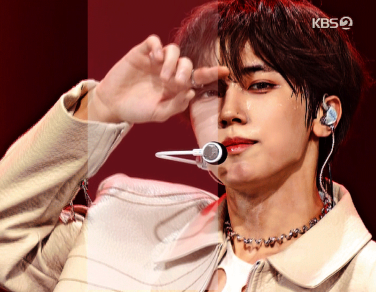
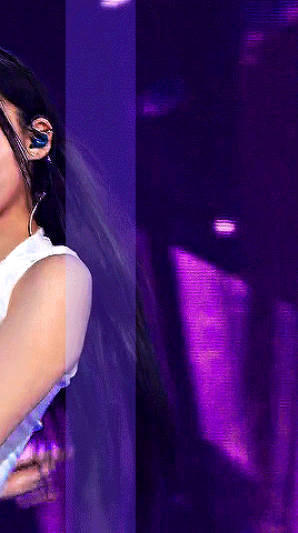
updated stage settings: (that literally no one asked for!)
assumes knowledge of photoshop and a working vapoursynth. if you don't use vs, you can replicate with mpv - though sharpening will most likely need to be stronger, since i use finesharp in vs.
when using mpv/screencaps, i recommend importing as a dicom file! it loads faster and is a little clearer in my opinion. when using screencaps, only crop once. if you need to change the dimensions, zoom, etc., i would undo to the full size you imported at or it will lower your quality.
examples: an ending fairy of cravity's seongmin, and a typical stage set gif (using a close-up) of tripleS's kaede. shows the steps, effects, and goals of sharpening and coloring, but does not share psds or actions since i recommend using your own unique sharpening and coloring style. psds cannot be provided (i didn't save them) but i will share my actions if asked to! the actions i used are the two i almost always use (with a few exceptions) on stage gifs.
no keep reading because it ruins formatting (2 images side by side), so apologies for the incredibly long post!
ending fairy:
run through vapoursynth, resized (540 x 420) and sharpened with finesharp set to 0.7 (the last # in the fs code). not preprocessed, as i wanted the normal speed and exported it with a .04 frame delay!
sharpened using my stage sharpening action (4 diff smart sharpens)

colored using levels (using the eyedropper on what i want to be pure black), and curves (done to add contrast, using only the rgb channel)
colored (prev step still visible) using exposure, with the exposure upped and gamma around .90. also used brightness and contrast to get the look i wanted, while also keeping highlights in a range that i can edit (going too bright or too high contrast makes my later adjustments less effective)
colored (prev steps visible) using hue/saturation (adjusting the hue, saturation, and lightness (to the negatives) of reds and yellows), and selective color (fine-tuning tone of reds and adjusting whites)
colored (prev steps visible) using selective color (adding back some white and adding cyan to it), and hue/saturation to further fine-tune (red + yellow), and brightness and contrast to get the final brightness and contrast/clarity i wanted.
the original (resized and with vs finesharp) masked over the finished
close-up:
run through vs, resized (268 x 490), preprocessed 60fps slow, and sharpened with a finesharp of 0.7
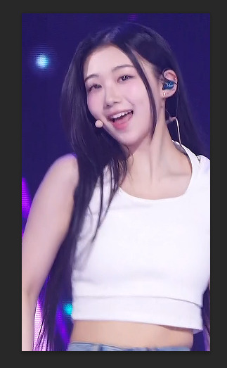

sharpened using my master mv sharpening (i changed the gaussian blur 500 from .04 to .03, + the unsharp mask is set to 50% opacity)
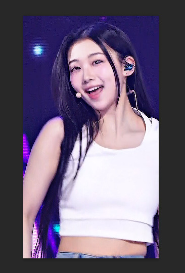
colored using levels (on what i want to be pure black, her hair by her ear in this case), and curves (unlike seongmin's which just adjusted rgb, i also changed the blue and green channels! i do this when it is not an ending fairy but several close-ups to try to make the coloring more consistent across lighting changes (i also do it on more challenging lighting from other sources))
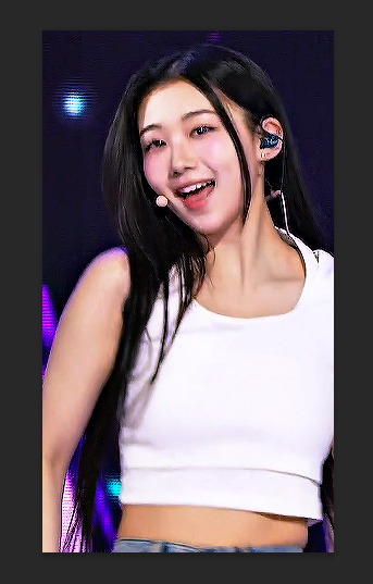
colored with exposure (prev steps visible), with exposure upped (+) and gamma adjusted (~.90), and brightness and contrast to get the look i want (same highlight forethought as before)
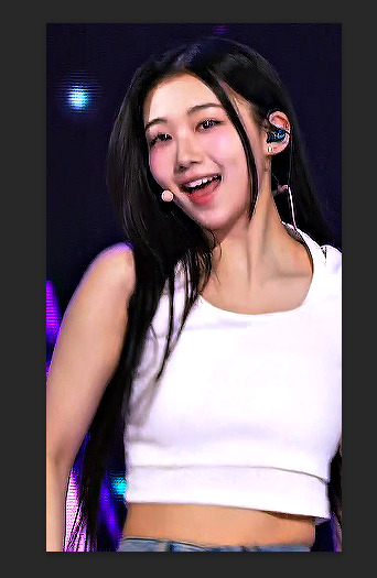
colored (prev steps visible) with hue/saturation (adjusting hue, saturation, and lightness of reds and yellows), selective color (fine-tuning tone of reds and adjusting whites)

colored with selective color (adding back whites and adding cyan to them), hue/saturation to further fine-tune, and brightness and contrast to get the final look and clarity
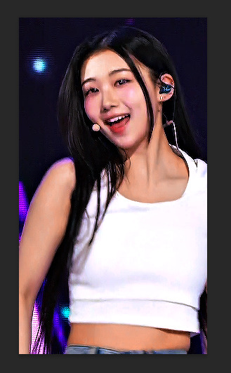
optional, but nice for multi-shot sets: another hue/sat above your last brightness contrast, only adjusting background colors for cohesion when paired with the other gifs of the set
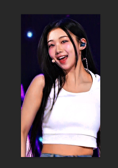

also optional: change speed to be faster, depending on the look you want. i tend to use ezgif.com/speed and do 105% speed
the original (resized, vs finesharp, preprocessed to 60fps slow) masked over the finished gif. the one on the right has been adjusted with ezgif at 105% speed

15 notes
·
View notes