#how to use fieldset tag in html
Explore tagged Tumblr posts
Visit Tumblr Blog
Explore Tumblr blogs with no restrictions, modern design and the best experience.
Last Seen Tumblr Blogs


Fun Fact
Kazakhstan’s Minister of Communications and Informatics has blocked the Tumblr site because it contained 60 sites of terrorism, extremism, and pornography in 2015.
Note
Hello, wanted to say I read and loved the demo. Very well done. I just had a few questions, would love to know what Twine Template you use, especially at the beginning. Where you have the character creator, I love that the box around your selection changes to say/match what you chose. Such as depending on what skin color I choose it changes to signify that. Would love to know if you would share how you did that. I look forward to future updates! Best of luck.
Thank you! 🤍
I'm using the default template for SugarCube, if I remember correctly. Glad that you liked the box effect, it was my solution to reducing the number of passages whilst still allowing the validation of user input in character creation.
I did it through a combination of HTML tags and SugarCube native macros. Technical stuff under the cut:
Here is an example for eye color:
<fieldset class="charbox"><legend id="chareyes" class="chartxt">$p.appearance.eyes</legend> <div class="charoptions">Your eyes are: <<link "hazel">><<set $p.appearance.eyes to "hazel">><<replace "#chareyes">>$p.appearance.eyes<</replace>><</link>> <<link "brown">><<set $p.appearance.eyes to "brown">><<replace "#chareyes">>$p.appearance.eyes<</replace>><</link>> [rest of the options removed for brevity]</div> </fieldset>
The fieldset and the legend HTML tags together form a single box, a so-called legend, which I declare per attribute such as name, skin color, etc. You need a fieldset to make legend work iirc, but legend is where that text is displayed and it is positioned on the box frame by default. Important here is to give a unique ID to the legend tag ("chareyes" in this case), as we are interested in manipulating the text shown in it depending on our box.
In the sample above, the options I present for the eye color are listed within the Twine <<link>> tags. For these links there is no target passage to go to. Instead, you can see it is coded to do two things upon clicking the respective option. One, setting a game variable to the selected color.
<<set $p.appearance.eyes to "brown">>
Two, triggering a replace command to change the value shown in the legend to the description of the selected eye color according to the variable we have set in the same line. This is the bit you are asking about:
<<replace "#chareyes">>$p.appearance.eyes<</replace>>
Replace triggers without changing passages, so this way you can adjust multiple variables on a single "page". You'd obviously need to adjust the corresponding CSS classes to make it look the desired way, but the mechanics are serviced with just this idea above.
Hope this helps!
12 notes
·
View notes
Text
HTML fieldset Tag
The HTML <fieldset> tag is used to create a group of related elements in HTML form.Use the <legend> tag to define caption or title of the fieldset element.The <fieldset> tag create a box around the related elements. Syntax <fieldset>Content...</fieldset> Example <!DOCTYPE html> <html> <head> <title>HTML fieldset Tag</title> <style> fieldset{ padding:15px; background:…

View On WordPress
#add fieldset tag#fieldset#fieldset and legend tag in html#fieldset html#fieldset html tag#fieldset in html#fieldset tag#fieldset tag in html#how to add fieldset tag in html#how to use fieldset tag in html#html css fieldset tag#html fieldset#html fieldset and legend#html fieldset tag#html form fieldset#html5 fieldset#legend tag in html#tag fieldset#tag fieldset html#use of fieldset tag#what is fieldset tag
0 notes
Text
Website Design and Programming – Introduction to Web Forms
There is practically no website without at least a form in one of its pages. Forms are useful to collect data from the website visitors and users. Once the user submits the form to the server, a form processing script must get the form data, validate that the user input matches the expected format for each field (e.g: email address field must be a string of text with the format of a valid email address) and process this information as desired. The script may save it into a database, send it by email or just do some processing with it and display the result. Validating the user input is essential to prevent malicious users from damaging your site.
A form definition in html starts with the form tag and ends with the /form tag. This tag can have several attributes like method (GET or POST), and action (the url of the form processing script). If use the GET method, the form data is encoded in the action URL. This method is recommended when the form is a query form. With the POST method, the form data is to appear within a message body. This is the recommended method when the form will be used to update a database, or send email, or make any action other than just retrieve data.
The form fields are used to collect the data. Generally a label is placed by each field, so the user knows what data to input. There are different kind of fields, among them:
· Textboxes
· Textareas
· Drop-downs
· Multi select
· File
· Radio buttons
· Checkboxes
· Buttons
· Hidden
The hidden fields are used to send some data that the user does not need to see, along with the form. An example of this could be a form number, so the form processing script identifies which form has been submitted.
The File field allows users to upload a file. The form processing script will get the file together with the rest of the form data. For this field to work properly, you need to include this attribute in the form tag: enctype=”multipart/form-data”.
Buttons are used to submit or reset the form.
Refer to an HTML guide for full description on the attributes and syntax of each tag. You may find a guide at http://www.w3schools.com/tags/default.asp or at http://www.w3.org/MarkUp/ among many other sites.
When the form is complex, it is useful to group fields in areas using the fieldset tag. Just place the fieldset tag, then optionally a legend Section Name /legend tag, then all the pertinent form fields, and the /fieldset tag after them.
It is possible to use CSS (Cascading Style Sheets) or inline styles to change the look of the form controls.
You can bring your forms to a different level by combining them with the usage of scripting language like JavaScript. You can make the form react immediately to certain events, like the user clicking on a control, or a field changing its value. You can highlight the field that has the focus, for example. Or count how many characters have been entered in a text box or a textarea. You can make calculations and display the results automatically. The possibilities are endless.
Thanks and regards,
https://gurujisoftwares.com
1 note
·
View note
Photo

hydralisk98′s web projects tracker:
Core principles=
Fail faster
‘Learn, Tweak, Make’ loop
This is meant to be a quick reference for tracking progress made over my various projects, organized by their “ultimate target” goal:
(START)
(Website)=
Install Firefox
Install Chrome
Install Microsoft newest browser
Install Lynx
Learn about contemporary web browsers
Install a very basic text editor
Install Notepad++
Install Nano
Install Powershell
Install Bash
Install Git
Learn HTML
Elements and attributes
Commenting (single line comment, multi-line comment)
Head (title, meta, charset, language, link, style, description, keywords, author, viewport, script, base, url-encode, )
Hyperlinks (local, external, link titles, relative filepaths, absolute filepaths)
Headings (h1-h6, horizontal rules)
Paragraphs (pre, line breaks)
Text formatting (bold, italic, deleted, inserted, subscript, superscript, marked)
Quotations (quote, blockquote, abbreviations, address, cite, bidirectional override)
Entities & symbols (&entity_name, &entity_number,  , useful HTML character entities, diacritical marks, mathematical symbols, greek letters, currency symbols, )
Id (bookmarks)
Classes (select elements, multiple classes, different tags can share same class, )
Blocks & Inlines (div, span)
Computercode (kbd, samp, code, var)
Lists (ordered, unordered, description lists, control list counting, nesting)
Tables (colspan, rowspan, caption, colgroup, thead, tbody, tfoot, th)
Images (src, alt, width, height, animated, link, map, area, usenmap, , picture, picture for format support)
old fashioned audio
old fashioned video
Iframes (URL src, name, target)
Forms (input types, action, method, GET, POST, name, fieldset, accept-charset, autocomplete, enctype, novalidate, target, form elements, input attributes)
URL encode (scheme, prefix, domain, port, path, filename, ascii-encodings)
Learn about oldest web browsers onwards
Learn early HTML versions (doctypes & permitted elements for each version)
Make a 90s-like web page compatible with as much early web formats as possible, earliest web browsers’ compatibility is best here
Learn how to teach HTML5 features to most if not all older browsers
Install Adobe XD
Register a account at Figma
Learn Adobe XD basics
Learn Figma basics
Install Microsoft’s VS Code
Install my Microsoft’s VS Code favorite extensions
Learn HTML5
Semantic elements
Layouts
Graphics (SVG, canvas)
Track
Audio
Video
Embed
APIs (geolocation, drag and drop, local storage, application cache, web workers, server-sent events, )
HTMLShiv for teaching older browsers HTML5
HTML5 style guide and coding conventions (doctype, clean tidy well-formed code, lower case element names, close all html elements, close empty html elements, quote attribute values, image attributes, space and equal signs, avoid long code lines, blank lines, indentation, keep html, keep head, keep body, meta data, viewport, comments, stylesheets, loading JS into html, accessing HTML elements with JS, use lowercase file names, file extensions, index/default)
Learn CSS
Selections
Colors
Fonts
Positioning
Box model
Grid
Flexbox
Custom properties
Transitions
Animate
Make a simple modern static site
Learn responsive design
Viewport
Media queries
Fluid widths
rem units over px
Mobile first
Learn SASS
Variables
Nesting
Conditionals
Functions
Learn about CSS frameworks
Learn Bootstrap
Learn Tailwind CSS
Learn JS
Fundamentals
Document Object Model / DOM
JavaScript Object Notation / JSON
Fetch API
Modern JS (ES6+)
Learn Git
Learn Browser Dev Tools
Learn your VS Code extensions
Learn Emmet
Learn NPM
Learn Yarn
Learn Axios
Learn Webpack
Learn Parcel
Learn basic deployment
Domain registration (Namecheap)
Managed hosting (InMotion, Hostgator, Bluehost)
Static hosting (Nertlify, Github Pages)
SSL certificate
FTP
SFTP
SSH
CLI
Make a fancy front end website about
Make a few Tumblr themes
===You are now a basic front end developer!
Learn about XML dialects
Learn XML
Learn about JS frameworks
Learn jQuery
Learn React
Contex API with Hooks
NEXT
Learn Vue.js
Vuex
NUXT
Learn Svelte
NUXT (Vue)
Learn Gatsby
Learn Gridsome
Learn Typescript
Make a epic front end website about
===You are now a front-end wizard!
Learn Node.js
Express
Nest.js
Koa
Learn Python
Django
Flask
Learn GoLang
Revel
Learn PHP
Laravel
Slim
Symfony
Learn Ruby
Ruby on Rails
Sinatra
Learn SQL
PostgreSQL
MySQL
Learn ORM
Learn ODM
Learn NoSQL
MongoDB
RethinkDB
CouchDB
Learn a cloud database
Firebase, Azure Cloud DB, AWS
Learn a lightweight & cache variant
Redis
SQLlite
NeDB
Learn GraphQL
Learn about CMSes
Learn Wordpress
Learn Drupal
Learn Keystone
Learn Enduro
Learn Contentful
Learn Sanity
Learn Jekyll
Learn about DevOps
Learn NGINX
Learn Apache
Learn Linode
Learn Heroku
Learn Azure
Learn Docker
Learn testing
Learn load balancing
===You are now a good full stack developer
Learn about mobile development
Learn Dart
Learn Flutter
Learn React Native
Learn Nativescript
Learn Ionic
Learn progressive web apps
Learn Electron
Learn JAMstack
Learn serverless architecture
Learn API-first design
Learn data science
Learn machine learning
Learn deep learning
Learn speech recognition
Learn web assembly
===You are now a epic full stack developer
Make a web browser
Make a web server
===You are now a legendary full stack developer
[...]
(Computer system)=
Learn to execute and test your code in a command line interface
Learn to use breakpoints and debuggers
Learn Bash
Learn fish
Learn Zsh
Learn Vim
Learn nano
Learn Notepad++
Learn VS Code
Learn Brackets
Learn Atom
Learn Geany
Learn Neovim
Learn Python
Learn Java?
Learn R
Learn Swift?
Learn Go-lang?
Learn Common Lisp
Learn Clojure (& ClojureScript)
Learn Scheme
Learn C++
Learn C
Learn B
Learn Mesa
Learn Brainfuck
Learn Assembly
Learn Machine Code
Learn how to manage I/O
Make a keypad
Make a keyboard
Make a mouse
Make a light pen
Make a small LCD display
Make a small LED display
Make a teleprinter terminal
Make a medium raster CRT display
Make a small vector CRT display
Make larger LED displays
Make a few CRT displays
Learn how to manage computer memory
Make datasettes
Make a datasette deck
Make floppy disks
Make a floppy drive
Learn how to control data
Learn binary base
Learn hexadecimal base
Learn octal base
Learn registers
Learn timing information
Learn assembly common mnemonics
Learn arithmetic operations
Learn logic operations (AND, OR, XOR, NOT, NAND, NOR, NXOR, IMPLY)
Learn masking
Learn assembly language basics
Learn stack construct’s operations
Learn calling conventions
Learn to use Application Binary Interface or ABI
Learn to make your own ABIs
Learn to use memory maps
Learn to make memory maps
Make a clock
Make a front panel
Make a calculator
Learn about existing instruction sets (Intel, ARM, RISC-V, PIC, AVR, SPARC, MIPS, Intersil 6120, Z80...)
Design a instruction set
Compose a assembler
Compose a disassembler
Compose a emulator
Write a B-derivative programming language (somewhat similar to C)
Write a IPL-derivative programming language (somewhat similar to Lisp and Scheme)
Write a general markup language (like GML, SGML, HTML, XML...)
Write a Turing tarpit (like Brainfuck)
Write a scripting language (like Bash)
Write a database system (like VisiCalc or SQL)
Write a CLI shell (basic operating system like Unix or CP/M)
Write a single-user GUI operating system (like Xerox Star’s Pilot)
Write a multi-user GUI operating system (like Linux)
Write various software utilities for my various OSes
Write various games for my various OSes
Write various niche applications for my various OSes
Implement a awesome model in very large scale integration, like the Commodore CBM-II
Implement a epic model in integrated circuits, like the DEC PDP-15
Implement a modest model in transistor-transistor logic, similar to the DEC PDP-12
Implement a simple model in diode-transistor logic, like the original DEC PDP-8
Implement a simpler model in later vacuum tubes, like the IBM 700 series
Implement simplest model in early vacuum tubes, like the EDSAC
[...]
(Conlang)=
Choose sounds
Choose phonotactics
[...]
(Animation ‘movie’)=
[...]
(Exploration top-down ’racing game’)=
[...]
(Video dictionary)=
[...]
(Grand strategy game)=
[...]
(Telex system)=
[...]
(Pen&paper tabletop game)=
[...]
(Search engine)=
[...]
(Microlearning system)=
[...]
(Alternate planet)=
[...]
(END)
4 notes
·
View notes
Text
HTML Forms: Building Interactive User Input

HTML forms play a vital role in web development, allowing users to input and submit data on websites. Whether it's a simple contact form or a complex registration form, understanding how to build interactive user input forms is essential for creating engaging and dynamic web experiences. In this blog post, we will explore the fundamentals of HTML forms and discuss best practices for building interactive user input.
<form> Tag:
The <form> tag is the foundation of HTML forms. It acts as a container for all form elements and defines the boundaries of the form. The "action" attribute specifies the URL where the form data will be submitted, and the "method" attribute determines the HTTP method to be used (GET or POST).
<input> Tag:
The <input> tag is the most commonly used form element. It allows users to input various types of data, such as text, numbers, email addresses, and more. The "type" attribute defines the input type, and additional attributes like "name" and "placeholder" provide further context and guidance for users.
<textarea> Tag:
The <textarea> tag is used to create a multiline text input field. It's ideal for capturing longer messages, comments, or descriptions from users. The "rows" and "cols" attributes can be used to define the size of the textarea.
<select> and <option> Tags:
The <select> tag creates a dropdown menu, while the <option> tag defines individual options within the dropdown. This combination allows users to select one or multiple choices from a list. Attributes such as "selected" and "disabled" provide additional functionality and user experience enhancements.
<label> Tag:
The <label> tag is used to associate a label with an input field, providing a clear description or prompt for the user. It improves accessibility and helps users understand the purpose of each input field. The "for" attribute should match the "id" attribute of the corresponding input field.
<button> Tag:
The <button> tag creates clickable buttons within the form. It can trigger form submission or perform other actions using JavaScript. The "type" attribute can be set to "submit" to submit the form, "reset" to reset form values, or "button" for custom actions.
<fieldset> and <legend> Tags:
The <fieldset> tag groups related form elements together, providing a visual and semantic grouping. The <legend> tag is used to provide a caption or title for the fieldset. This combination improves form structure and readability, especially for complex forms.
Form Validation:
HTML5 introduced built-in form validation, allowing developers to validate user input without relying solely on server-side validation. Attributes like "required," "min," "max," and "pattern" can be used to enforce specific rules on input fields. HTML5 also provides the "pattern" attribute, which accepts regular expressions for custom validations.
Handling Form Submissions:
When a user submits a form, the data is typically sent to a server for processing. Server-side scripts, such as PHP or JavaScript, are used to handle form submissions and process the data accordingly. The server-side script specified in the form's "action" attribute receives the form data, which can be accessed and processed further.
Styling and Enhancing Forms:
HTML forms can be customized and styled using CSS to match the website's design and branding. Additionally, JavaScript libraries and frameworks like jQuery and React can be used to enhance form interactivity, provide real-time validation, or create dynamic form elements.
Conclusion:
Building interactive user input forms is an essential skill for web developers. HTML provides a range of form elements and attributes to collect user input and create engaging web experiences.
To streamline the development process, leveraging online HTML compilers can be incredibly beneficial. online html compiler offer a convenient way to test and validate forms in real-time, allowing developers to see the immediate results of their code. These tools provide an interactive environment to experiment with different form elements, input validation, and styling, enabling faster iterations and bug detection.
Remember to combine HTML forms with server-side scripting, such as PHP or JavaScript, to handle form submissions and process the data effectively. Additionally, css compiler online can be utilized to style and customize form elements, ensuring a cohesive and visually appealing user interface.
By mastering the art of building interactive user input forms and utilizing html compiler online, developers can create seamless and user-friendly experiences that enhance engagement and facilitate data collection on websites. Embrace the power of HTML forms and leverage the convenience of online HTML compilers to elevate your web development skills.
0 notes
Photo

Forms or <form></form>
Whether we like them or not, forms are all over the internet. They allow users of our websites to interact with content on our pages or submit information to a database.
Form structure is very important. We need to think how would a user fill out this form? What would be their expectations?
The fieldset tag will group information together and it can help a screenreader understand hierarchy on your form. Take a look at the below image to see the fieldset tag in action.
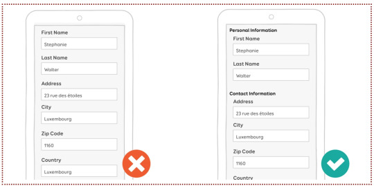
In smashing magazine, Stephanie Walter suggests that you place optional fields at the end of your form as the attention spans of your users are going to dwindle over time. She also recommends that you place the label in a “single-column layout” as it will be nicer for the reader. Both of the above images are an example of single column layouts, e.g. the “First Name” label is above the field with “Stephanie” in it.
However, if the user’s device is in landscape mode, you may want your labels beside your fields. Stephanie has way more tips in her article, but lets look at forms in their html form now. No pun intended.
<form> is a container tag that can contain many different types of fields for your form.
The <input> tag configures the different fields on our form, like for a name, password or email address.
A <textarea> is a larger and scrolling text box on your form. You can define it’s size by using rows and cols. For example;
<textarea rows=“3” cols=“7” id=“address”></textarea>
This might be used for a comment or message box, or maybe an address (like in the example above).
<select> configures a select box or what is often referred to as a drop down menu.
<option> configures an option in a select box.
At the end of your form you might have a <button> tag. It might be written like;
<button type=“button”>Click Me!</button>
You could also have a submit button at the end of your form, for the user to submit their information.
There are many attributes that can be attributed to these tags. Some include;
type
name
id
size
maxlength
value
required
placeholder
They all attribute different values to your tag and thus help the user interact with your form in different ways. Likewise, you can later style your form using CSS.
There’s loads more about forms, but that’s all for now! :)
0 notes
Text
Blog search application in Vespa
Introduction
This is the first of a series of blog posts where data from WordPress.com (WP) is used to highlight how Vespa can be used to store, search and recommend blog posts. The data was made available during a Kaggle challenge to predict which blog posts someone would like based on their past behavior. It contains many ingredients that are necessary to showcase needs, challenges and possible solutions that are useful for those interested in building and deploying such applications in production.
The end goal is to build an application where:
Users will be able to search and manipulate the pool of blog posts available.
Users will get blog post recommendations from the content pool based on their interest.
This part addresses:
How to describe the dataset used as well as any information connected to the data.
How to set up a basic blog post search engine using Vespa.
The next parts show how to extend this basic search engine application with machine learned models to create a blog recommendation engine.
Dataset
The dataset contains blog posts written by WP bloggers and actions, in this case ‘likes’, performed by WP readers in blog posts they have interacted with. The dataset is publicly available at Kaggle and was released during a challenge to develop algorithms to help predict which blog posts users would most likely ‘like’ if they were exposed to them. The data includes these fields per blog post:
post_id - unique numerical id identifying the blog post
date_gmt - string representing date of blog post creation in GMT format yyyy-mm-dd hh:mm:ss
author - unique numerical id identifying the author of the blog post
url - blog post URL
title - blog post title
blog - unique numerical id identifying the blog that the blog post belongs to
tags - array of strings representing the tags of the blog posts
content - body text of the blog post, in html format
categories - array of strings representing the categories the blog post was assigned to
For the user actions:
post_id - unique numerical id identifying the blog post
uid - unique numerical id identifying the user that liked post_id
dt - date of the interaction in GMT format yyyy-mm-dd hh:mm:ss
Downloading raw data
For the purposes of this post, it is sufficient to use the first release of training data that consists of 5 weeks of posts as well as all the ‘like’ actions that occurred during those 5 weeks.
This first release of training data is available here - once downloaded, unzip it. The 1,196,111 line trainPosts.json will be our practice document data. This file is around 5GB in size.
Requirements
Indexing the full data set requires 23GB disk space. We have tested with a Docker container with 10GB RAM. We used similar settings as described in the vespa quick start guide. As in the guide we assume that the $VESPA_SAMPLE_APPS env variable points to the directory with your local clone of the vespa sample apps:
$ docker run -m 10G --detach --name vespa --hostname vespa --privileged --volume $VESPA_SAMPLE_APPS:/vespa-sample-apps --publish 8080:8080 vespaengine/vespa
Searching blog posts
Functional specification:
Blog post title, content, tags and categories must all be searchable
Allow blog posts to be sorted by both relevance and date
Allow grouping of search results by tag or category
In terms of data, Vespa operates with the notion of documents. A document represents a single, searchable item in your system, e.g., a blog post, a photo, or a news article. Each document type must be defined in the Vespa configuration through a search definition. Think of a search definition as being similar to a table definition in a relational database; it consists of a set of fields, each with a given name, a specific type, and some optional properties.
As an example, for this simple blog post search application, we could create the document type blog_post with the following fields:
url - of type uri
title - of type string
content - of type string (string fields can be of any length)
date_gmt - of type string (to store the creation date in GMT format)
The data fed into Vespa must match the structure of the search definition, and the hits returned when searching will be on this format as well.
Application Packages
A Vespa application package is the set of configuration files and Java plugins that together define the behavior of a Vespa system: what functionality to use, the available document types, how ranking will be done and how data will be processed during feeding and indexing. The search definition, e.g., blog_post.sd, is a required part of an application package — the other required files are services.xml and hosts.xml.
The sample application blog search creates a simple but functional blog post search engine. The application package is found in src/main/application.
Services Specification
services.xml defines the services that make up the Vespa application — which services to run and how many nodes per service:
<?xml version='1.0' encoding='UTF-8'?> <services version='1.0'> <container id='default' version='1.0'> <search/> <document-api/> <nodes> <node hostalias='node1'/> </nodes> </container> <content id='blog_post' version='1.0'> <search> <visibility-delay>1.0</visibility-delay> </search> <redundancy>1</redundancy> <documents> <document mode='index' type='blog_post'/> </documents> <nodes> <node hostalias='node1'/> </nodes> <engine> <proton> <searchable-copies>1</searchable-copies> </proton> </engine> </content> </services>
<container> defines the container cluster for document, query and result processing
<search> sets up the search endpoint for Vespa queries. The default port is 8080.
<document-api> sets up the document endpoint for feeding.
<nodes> defines the nodes required per service. (See the reference for more on container cluster setup.)
<content> defines how documents are stored and searched
<redundancy> denotes how many copies to keep of each document.
<documents> assigns the document types in the search definition — the content cluster capacity can be increased by adding node elements — see elastic Vespa. (See also the reference for more on content cluster setup.)
<nodes> defines the hosts for the content cluster.
Deployment Specification
hosts.xml contains a list of all the hosts/nodes that is part of the application, with an alias for each of them. Here we use a single node:
<?xml version="1.0" encoding="utf-8" ?> <hosts> <host name="localhost"> <alias>node1</alias> </host> </hosts>
Search Definition
The blog_post document type mentioned in src/main/application/service.xml is defined in the search definition. src/main/application/searchdefinitions/blog_post.sd contains the search definition for a document of type blog_post:
search blog_post { document blog_post { field date_gmt type string { indexing: summary } field language type string { indexing: summary } field author type string { indexing: summary } field url type string { indexing: summary } field title type string { indexing: summary | index } field blog type string { indexing: summary } field post_id type string { indexing: summary } field tags type array<string> { indexing: summary } field blogname type string { indexing: summary } field content type string { indexing: summary | index } field categories type array<string> { indexing: summary } field date type int { indexing: summary | attribute } } fieldset default { fields: title, content } rank-profile post inherits default { first-phase { expression:nativeRank(title, content) } } }
document is wrapped inside another element called search. The name following these elements, here blog_post, must be exactly the same for both.
The field property indexing configures the indexing pipeline for a field, which defines how Vespa will treat input during indexing — see indexing language. Each part of the indexing pipeline is separated by the pipe character ‘|’:
index: Create a search index for this field
attribute: Store this field in memory as an attribute — for sorting, searching and grouping
summary: Let this field be part of the document summary in the result set
Deploy the Application Package
Once done with the application package, deploy the Vespa application — build and start Vespa as in the quick start. Deploy the application:
$ cd /vespa-sample-apps/blog-search $ vespa-deploy prepare src/main/application && vespa-deploy activate
This prints that the application was activated successfully and also the checksum, timestamp and generation for this deployment (more on that later). Pointing a browser to http://localhost:8080/ApplicationStatus returns JSON-formatted information about the active application, including its checksum, timestamp and generation (and should be the same as the values when vespa-deploy activate was run). The generation will increase by 1 each time a new application is successfully deployed, and is the easiest way to verify that the correct version is active.
The Vespa node is now configured and ready for use.
Feeding Data
The data fed to Vespa must match the search definition for the document type. The data downloaded from Kaggle, contained in trainPosts.json, must be converted to a valid Vespa document format before it can be fed to Vespa. Find a parser in the utility repository. Since the full data set is unnecessarily large for the purposes of this first part of this post, we use only the first 10,000 lines of it, but feel free to load all 1,1M entries:
$ head -10000 trainPosts.json > trainPostsSmall.json $ python parse.py trainPostsSmall.json > feed.json
Send this to Vespa using one of the tools Vespa provides for feeding. Here we will use the Java feeding API:
$ java -jar $VESPA_HOME/lib/jars/vespa-http-client-jar-with-dependencies.jar --verbose --file feed.json --host localhost --port 8080
Note that in the sample-apps/blog-search directory, there is a file with sample data. You may also feed this file using this method.
Track feeding progress
Use the Metrics API to track number of documents indexed:
$ curl -s 'http://localhost:19112/state/v1/metrics' | tr ',' '\n' | grep -A 2 proton.doctypes.blog_post.numdocs
You can also inspect the search node state by
$ vespa-proton-cmd --local getState
Fetch documents
Fetch documents by document id using the Document API:
$ curl -s 'http://localhost:8080/document/v1/blog-search/blog_post/docid/1750271' | python -m json.tool
The first query
Searching with Vespa is done using a HTTP GET requests, like:
<host:port>/<search>?<yql=value1>&<param2=value2>...
The only mandatory parameter is the query, using yql=<yql query>. More details can be found in the Search API.
Given the above search definition, where the fields title and content are part of the fieldset default, any document containing the word “music” in one or more of these two fields matches our query below:
$ curl -s 'http://localhost:8080/search/?yql=select+*+from+sources+*+where+default+contains+%22music%22%3B' | python -m json.tool
Looking at the output, please note:
The field documentid in the output and how it matches the value we assigned to each put operation when feeding data to Vespa.
Each hit has a property named relevance, which indicates how well the given document matches our query, using a pre-defined default ranking function. You have full control over ranking — more about ranking and ordering later. The hits are sorted by this value.
When multiple hits have the same relevance score their internal ordering is undefined. However, their internal ordering will not change unless the documents are re-indexed.
Add &tracelevel=9 to dump query parsing details
Other examples
yql=select+title+from+sources+*+where+title+contains+%22music%22%3B
Once more a search for the single term “music”, but this time with the explicit field title. This means that we only want to match documents that contain the word “music” in the field title. As expected, you will see fewer hits for this query, than for the previous one.
yql=select+*+from+sources+*+where+default+contains+%22music%22+AND+default+contains+%22festival%22%3B
This is a query for the two terms “music” and “festival”, combined with an AND operation; it finds documents that match both terms — but not just one of them.
yql=select+*+from+sources+*+where+sddocname+contains+%22blog_post%22%3B
This is a single-term query in the special field sddocname for the value “blog_post”. This is a common and useful Vespa trick to get the number of indexed documents for a certain document type (search definition): sddocname is a special and reserved field which is always set to the name of the document type for a given document. The documents are all of type blog_post, and will therefore automatically have the field sddocname set to that value.
This means that the query above really means “Return all documents of type blog_post”, and as such all documents in the index are returned.
Relevance and Ranking
Ranking and relevance were briefly mentioned above; what is really the relevance of a hit, and how can one change the relevance calculations? It is time to introduce rank profiles and rank expressions — simple, yet powerful methods for tuning the relevance.
Relevance is a measure of how well a given document matches a query. The default relevance is calculated by a formula that takes several factors into consideration, but it computes, in essence, how well the document matches the terms in the query. Sample use cases for tweaking the relevance calculations:
Personalize search results based on some property; age, nationality, language, friends and friends of friends.
Rank fresh (age) documents higher, while still considering other relevance measures.
Rank documents by geographical location, searching for relevant resources nearby.
Vespa allows creating any number of rank profiles: named collections of ranking and relevance calculations that one can choose from at query time. A number of built-in functions and expressions are available to create highly specialized rank expressions.
Blog popularity signal
It is time to include the notion of blog popularity into the ranking function. Do this by including the post_popularity rank profile below at the bottom of src/main/application/searchdefinitions/blog_post.sd, just below the post rank profile.
rank-profile post_popularity inherits default { first-phase { expression: nativeRank(title, content) + 10 * if(isNan(attribute(popularity)), 0, attribute(popularity)) } }
Also, add a popularity field at the end of the document definition:
field popularity type double { indexing: summary | attribute }
Notes (more information can be found in the search definition reference):
rank-profile post_popularity inherits default This configures Vespa to create a new rank profile named post_popularity, which inherits all the properties of the default rank-profile; only properties that are explicitly defined, or overridden, will differ from those of the default rank-profile.
first-phase Relevance calculations in Vespa are two-phased. The calculations done in the first phase are performed on every single document matching your query, while the second phase calculations are only done on the top n documents as determined by the calculations done in the first phase.
expression: nativeRank(title, content) + 10 * if(isNan(attribute(popularity)), 0, attribute(popularity)) Still using the basic search relevance for title and content, boosting documents based on some document level popularity signal. This expression is used to rank documents. Here, the default ranking expression — the nativeRank of the default field set — is included to make the query relevant, while the custom, second term includes the document value attribute(popularity), if this is set. The weighted sum of these two terms is the final relevance for each document.
Deploy the configuration:
$ vespa-deploy prepare src/main/application && vespa-deploy activate
Use parse.py — which has a -p option to calculate and add a popularity field — and then feed the parsed data:
$ python parse.py -p trainPostsSmall.json > feed_with_popularity.json $ java -jar $VESPA_HOME/lib/jars/vespa-http-client-jar-with-dependencies.jar --file feed_with_popularity.json --host localhost --port 8080
After feeding, query
$ curl -s 'http://localhost:8080/search/?yql=select+*+from+sources+*+where+default+contains+%22music%22%3B&ranking=post_popularity' | python -m json.tool
and find documents with high popularity values at the top.
Sorting and Grouping
What is an attribute?
An attribute is an in-memory field - this is different from index fields, which may be moved to a disk-based index as more documents are added and the index grows. Since attributes are kept in memory, they are excellent for fields which require fast access, e.g., fields used for sorting or grouping query results. The downside is higher memory usage. By default, no index is generated for attributes, and search over these defaults to a linear scan - to build an index for an attribute field, include attribute:fast-search in the field definition.
Defining an attribute field
An example is found in blog_post.sd:
field date type int { indexing: summary | attribute }
The data has format YYYYMMDD. And since the field is an int, it can be used for range searches.
Example queries using attribute field
yql=select+*+from+sources+*+where+default+contains+%2220120426%22%3B
This is a single-term query for the term 20120426 in the default field set. (The strings %22 and %3B are URL encodings for " and ;.) In the search definition, the field date is not included in the default field set. Nevertheless, the string “20120426” is found in the content of many posts, which are returned then as results.
yql=select+*+from+sources+*+where+date+contains+%2220120426%22%3B
To get documents that were created 26 April 2012, and whose date field is 20120426, replace default with date in the YQL query string. Note that since date has not been defined with attribute:fast-search, searching will be done by scanning all documents.
yql=select+*+from+sources+*+where+default+contains+%22recipe%22+AND+date+contains+%2220120426%22%3B
A query with two terms; a search in the default field set for the term “recipe” combined with a search in the date field for the value 20120426. This search will be faster than the previous example, as the term “recipe” is for a field for which there is an index, and for which the search core will evaluate the query first. (This speedup is only noticeable with the full data set!)
Range searches
The examples above searched over date just as any other field, and requested documents where the value was exactly 20120426. Since the field is of type int, however, we can use it for range searches as well, using the “less than” and “greater than” operators (< and >, or %3C and %3E URL encoded). The query
yql=select+*+from+sources+*+where+date+%3C+20120401%3B
finds all documents where the value of date is less than 20120401, i.e., all documents from before April 2012, while
yql=select+*+from+sources+*+where+date+%3C+20120401+AND+date+%3E+20120229%3B
finds all documents exactly from March 2012.
Sorting
The first feature we will look at is how an attribute can be used to change the hit order. By now, you have probably noticed that hits are returned in order of descending relevance, i.e., how well the document matches the query — if not, take a moment to verify this.
Now try to send the following query to Vespa, and look at the order of the hits:
$ curl -s 'http://localhost:8080/search/?yql=select+*+from+sources+*+where+default+contains+%22music%22+AND+default+contains+%22festival%22+order+by+date%3B' | python -m json.tool
By default, sorting is done in ascending order. This can also be specified by appending asc after the sort attribute name. Use desc to sort the in descending order:
$ curl -s 'http://localhost:8080/search/?yql=select+*+from+sources+*+where+default+contains+%22music%22+AND+default+contains+%22festival%22+order+by+date+desc%3B' | python -m json.tool
Query time data grouping
Grouping is the concept of looking through all matching documents at query-time and then performing operations with specified fields across all the documents — some common use cases include:
Find all the unique values for a given field, make one group per unique value, and return the count of documents per group.
Group documents by time and date in fixed-width or custom-width buckets. An example of fixed-width buckets could be to group all documents by year, while an example of custom buckets could be to sort bug tickets by date of creation into the buckets Today, Past Week, Past Month, Past Year, and Everything else.
Calculate the minimum/maximum/average value for a given field.
Displaying such groups and their sizes (in terms of matching documents per group) on a search result page, with a link to each such group, is a common way to let users refine searches. For now we will only do a very simple grouping query to get a list of unique values for date ordered by the number of documents they occur in and top 3 is shown:
$ curl -s 'http://localhost:8080/search/?yql=select%20*%20from%20sources%20*%20where%20sddocname%20contains%20%22blog_post%22%20limit%200%20%7C%20all(group(date)%20max(3)%20order(-count())each(output(count())))%3B' | python -m json.tool
With the full data set, you will get the following output:
{ "root": { "children": [ { "children": [ { "children": [ { "fields": { "count()": 43 }, "id": "group:long:20120419", "relevance": 1.0, "value": "20120419" }, { "fields": { "count()": 40 }, �� "id": "group:long:20120424", "relevance": 0.6666666666666666, "value": "20120424" }, { "fields": { "count()": 39 }, "id": "group:long:20120417", "relevance": 0.3333333333333333, "value": "20120417" } ], "continuation": { "next": "BGAAABEBGBC" }, "id": "grouplist:date", "label": "date", "relevance": 1.0 } ], "continuation": { "this": "" }, "id": "group:root:0", "relevance": 1.0 } ], "coverage": { "coverage": 100, "documents": 1000, "full": true, "nodes": 0, "results": 1, "resultsFull": 1 }, "fields": { "totalCount": 1000 }, "id": "toplevel", "relevance": 1.0 } }
The three most common unique values of date are listed, along with their respective counts.
Try to change the filter part of the YQL+ expression — the where clause — to a text match of “recipe”, or restrict date to be less than 20120401, and see how the list of unique values changes as the set of matching documents for your query changes. Try to search for the single term “Verizon” as well — a word we know is not present in the document set, and as such will match no documents — and you will see that the list of groups is empty.
Attribute limitations
Memory usage
Attributes are kept in memory at all time, as opposed to normal indexes where the data is mostly kept on disk. Even with large search nodes, one will notice that it is not practical to define all the search definition fields as attributes, as it will heavily restrict the number of documents per search node. Some Vespa installations have more than 1 billion documents per node — having megabytes of text in memory per document is not an option.
Matching
Another limitation is the way matching is done for attributes. Consider the field blogname from our search definition, and the document for the blog called “Thinking about museums”. In the original input, the value for blogname is a string built of up the three words “Thinking”, “about”, and “museums”, with a single whitespace character between them. How should we be able to search this field?
For normal index fields, Vespa does something called tokenization on the string. In our case this means that the string above is split into the three tokens “Thinking”, “about” and “museums”, enabling Vespa to match this document both for the single-term queries “Thinking”, “about” and “museums”, the exact phrase query “Thinking about museums”, and a query with two or more tokens in either order (e.g. “museums thinking”). This is how we all have come to expect normal free text search to work.
However, there is a limitation in Vespa when it comes to attribute fields and matching; attributes do not support normal token-based matching — only exact matching or prefix matching. Exact matching is the default, and, as the name implies, it requires you to search for the exact contents of the field in order to get a match.
When to use attributes
There are both advantages and drawbacks of using attributes — it enables sorting and grouping, but requires more memory and gives limited matching capabilities. When to use attributes depends on the application; in general, use attributes for:
fields used for sorting, e.g., a last-update timestamp,
fields used for grouping, e.g., problem severity, and
fields that are not long string fields.
Finally, all numeric fields should always be attributes.
Clean environment by removing all documents
vespa-remove-index removes all documents:
$ vespa-stop-services $ vespa-remove-index $ vespa-start-services
Conclusion
You should now have a basic understanding of how Vespa can help build your application. In the next blog post we will proceed to show how can we use Statistics and Machine Learning to extend a basic search application into a recommendation system.
2 notes
·
View notes
Text
Mini Project Retro: Building a Form with HTML & CSS
Given I recently implemented a form in React, I figured I’d go back to a smaller, unfinished assignment from the freeCodeCamp HTML & CSS track: to build a form. They’re usually pretty simple assignments: you get some user stories that will have tests against them, an example to inspire you, and off you go.
The end result is here.
I made a random post-event satisfaction form, and all in all it took about 8 hours (1 day), without adding any JavaScript to it:

Lessons
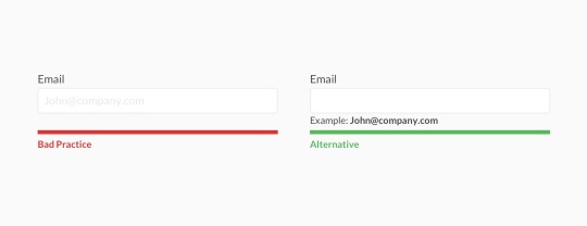
Placeholder text is bad UX, and not recommended by the Nielsen Norman group and other practitioners.
It’s in my CodePen because some of the stories require this or else the tests will fail, but seems like the industry has moved on since. It looks harmless but can be confusing for users, especially when it’s used as helper text that disappears as you type. There are plenty of alternatives to various use cases for placeholder text, which include tooltips and better labels above input fields.
Use <fieldset> and <legend> to group options or questions for better accessibility.
I hadn’t seen them much before, but wanted to experiment with them. They work together to tell screen readers that a group of form fields relate to each other, and to provide a label for the group. Screen readers read the legend before introducing them to the options. On the GOV.uk Accessibility blog, the GDS recommends using them when you have a single multiple choice question, or when you have several questions relating to the same topic -- which is how I used them.
Use <label> to make form fields more accessible.
The label tag wraps the text for a specific form control item, usually the name or label for a choice. This ties meaning to the item and makes the form more readable for screen readers Bonus: this also means you can click on the text next to a radio button to select it, rather than inside the radio button itself.

Styling the form took a lot of time (and could’ve taken longer)
It took time to get fonts and colors right. I’m not a designer but I want to make things look decent (if not pretty) even if it’s not a requirement. I worked around this by scouring Pinterest and Dribbble for pleasant color schemes, and landed on just four colors (blue, dark and light grey, and white) and a few variations for the button hover state.
What I’d do differently
Try a different layout for the fields. There’s more to do to make it readable and accessible, align the dropdowns, and so on.
Different and custom styling; I could spend forever on things like custom checkboxes and radio buttons but decided not to for the purpose of this exercise.
Make the form responsive. This wasn’t a requirement, but I’d go back in and add it later.
0 notes
Link
Web Designing Course Syllabus
Best Web Designing Training institution is SkillXpert. Learn Web Designing Training with onf of the software industry expert, who have been dealing with Testing Applications since a decade.
Introduction to Web Technologies
How the Website Works? Types of Websites (Static, Dynamic and CMS Websites) Responsive Web Designing Client and Server Scripting Languages Domains and Hosting Web Standards and W3C recommendations Careers in Web Technologies and Job Roles
Adobe Photoshop
Introduction to Adobe Photoshop Interface Tour of Photoshop Document settings – Dimensions,Color Modes,Resolution and Presets Move Tool Marque Tool Lasso Tool Quick Selection, Magic Wand Crop, Slicing Tool Healing Brush, Patch Tool Brush Tool History Brush Eraser Tool Pattern Stamp, Clone Stamp Gradient Tool Blur and Exposure Tool Pen Tool, Shape Tool Text Tool Other Photoshop Tools Layers, Groups and Smart Object Blending Options Filter Effects Client requirement Analysis Realtime Website Layout Design Responsive Design with Grids Practical Task in Layout Design
HTML 4.01
Introduction to HTML Basic Structure of HTML Difference Between HTML and XHTML Head Section and its Elements Meta, CSS, Script, Title and Favicon HTML 4 tags Table tag and div tag Headings, Paragraph, Lists, Pre and Span Tags Anchor Links and Named Anchors Image Tag,Object Tag,Iframe Tag Form Tag and its attributes POST and GET Method Fieldset and Legend Text input, Text area Checkbox and Radio Button Dropdown, List and Optgroup File Upload and Hidden Fields Submit, Image, Normal, Reset Button
HTML 5
HTML 5 tags Header,Nav,Main,Section,Article tags Aside,Figure,Dialog,Details,Summary and Footer tags Mark,Figcaption,Code and Cite tags Audio and Video tags Input tag new attributes and values Buttons,Datalist,Required,Placeholder and Autofocus Using HTML tags in realtime websites HTML Validators
Adobe Dreamweaver CC
Introduction to Adobe Dreamweaver Dreamweaver Interface Basics Creating new documents Working with modes Definging a Site Creating root-site folder and its elements Working with previews Designing interface using Insert tools Properties Panel Template Design in DW Editable and Non-Editable Regions Defining the DWT for project. Working with errors, validating code
CSS 2
Introduction to Cascading Style Sheets Defining CSS CSS Selectors Universal Selector ID Selector Tag Selector Class Selector Sub Selector Child Selector Adjacent Sibling Selector Attribute Selector Group selector CSS 2 Properties Type Properties Background Properties Block Properties Box Properties List Properties Border Properties Positioning Propeties Realtime Implementation CSS Menu Design (Horizontal, Vertical and Drop-down menus) Form Designing
CSS 3 Advanced Selectors
nth-child() and nth-of-type first-of-type and last-of-type first-child and last-child first-line and first-letter before and after CSS 3 Properties Rounded corners Advanced Background Properties Shadow property New Font properties Opacity Gradients Transition and Transform properties Animation properties
Responsive Web Design + BootStrap
Introduction to Responsive Design Devices and their dimension ranges View-port tag Using css media queries Basic Custom Layout Introduction to Bootstrap Installation of Bootstrap Grid System Forms Buttons Tables and Images Image sliders Icons Integration Realtime page design using bootstrap
Java Script
Introduction to Client Side Scripting Introduction to Java Script Javascript Types Variables in JS Datatypes in JS Operators in JS Conditional Statements Java Script Loops JS Popup Boxes JS Events JS Arrays JS Objects JS Functions Using Java Script in Realtime Validation of Forms
jQuery and jQuery UI
Introduction to jQuery jQuery Features Installing jQuery jQuery Syntax jQuery Ready Function jQuery Selectors jQuery Actions jQuery plugins jQuery Validation plugin jQuery Slideshow jQuery Dropdown jQuery UI Working with jQueryUI jQuery Accordions jQuery Tabs jQuery Tooltips jQuery Autocomplete
Domain and Hosting
Web Hosting Basics Types of Hosting Packages Registering domains Defining Name Servers Using Control Panel Creating Emails in Cpanel Using FTP Client Maintaining a Website
Wordpress
Introduction to CMS Introduction to WordPress Installation of wordpress application Installing a theme Using Dashboard and its components Creating Pages Setting Menu Installing plugins Editing content Customizing Techniques
Angular Javascript
Introduction to AngularJS Installation of angularJS application Components in angularJS Directives Modules Expressions Controllers Built-in-directives Filters and Tabs Examples for applications
Website Design Project
Clients Requirement Analysis Planning the Website Creating the HTML/CSS Structure Creating project using Bootstrap Integration of Features using JS and jQuery Project Testing
Web Designing Resources and Material
Graphics (Icon, Buttons, Backgrounds) Photoshop (Brushes, Patterns, Textures, Styles, Gradients, Actions) PSD Templates Study Material in PDF Daily Notes in Class All class examples files on our FTP server space for easy access Professional CSS Templates Professional Flash Templates 100 Stock Photos for Website Work Java Scripts and Jquery Files (Date, Slideshow, Dropdowns, Modal and Ajax Scripts) 100% Job Assistance till you get placed Demo Project in course Email Support for any issues after the course
0 notes
Link
Envato Tuts+ Code http://j.mp/2kTDKJw
What You'll Be Creating
This is the second part of the series on Introduction to Forms in Angular 4. In the first part, we created a form using the template-driven approach. We used directives such as ngModel, ngModelGroup and ngForm to supercharge the form elements. In this tutorial, we will be taking a different approach to building forms—the reactive way.
Reactive Forms
Reactive forms take a different approach compared to that of the template-driven forms. Here, we create and initialize the form control objects in our component class. They are intermediate objects that hold the state of the form. We will then bind them to the form control elements in the template.
The form control object listens to any change in the input control values, and they are immediately reflected in the object's state. Since the component has direct access to the data model structure, all changes can be synchronized between the data model, the form control object, and the input control values.
Practically speaking, if we are building a form for updating the user profile, the data model is the user object retrieved from the server. By convention, this is often stored inside the component's user property (this.user). The form control object or the form model will be bound to the template's actual form control elements.
Both these models should have similar structures, even if they are not identical. However, the input values shouldn't flow into the data model directly. The image describes how the user input from the template makes its way to the form model.
Let's get started.
Prerequisites
You don’t need to have followed part one of this series, for part two to make sense. However, if you are new to forms in Angular, I would highly recommend going through the template-driven strategy. The code for this project is available on my GitHub repository. Make sure that you are on the right branch and then download the zip or, alternatively, clone the repo to see the form in action.
If you prefer to start from scratch instead, make sure that you have Angular CLI installed. Use the ng command to generate a new project.
$ ng new SignupFormProject
Next, generate a new component for the SignupForm or create one manually.
ng generate component SignupForm
Replace the contents of app.component.html with this:
<app-signup-form> </app-signup-form>
Here is the directory structure for the src/ directory. I've removed some non-essential files to keep things simple.
. ├── app │ ├── app.component.css │ ├── app.component.html │ ├── app.component.ts │ ├── app.module.ts │ ├── signup-form │ │ ├── signup-form.component.css │ │ ├── signup-form.component.html │ │ └── signup-form.component.ts │ └── User.ts ├── index.html ├── main.ts ├── polyfills.ts ├── styles.css ├── tsconfig.app.json └── typings.d.ts
As you can see, a directory for the SignupForm component has been created automatically. That's where most of our code will go. I've also created a new User.ts for storing our User model.
The HTML Template
Before we dive into the actual component template, we need to have an abstract idea of what we are building. So here is the form structure that I have in my mind. The signup form will have several input fields, a select element, and a checkbox element.
Here is the HTML template that we will be using for our registration page.
HTML Template
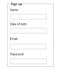
<div class="row custom-row"> <div class= "col-sm-5 custom-container jumbotron"> <form class="form-horizontal"> <fieldset> <legend>SignUp</legend> <!--- Email Block ---> <div class="form-group"> <label for="inputEmail">Email</label> <input type="text" id="inputEmail" placeholder="Email"> </div> <!--- Password Block ---> <div class="form-group"> <label for="inputPassword">Password</label> <input type="password" id="inputPassword" placeholder="Password"> </div> <div class="form-group"> <label for="confirmPassword" >Confirm Password</label> <input type="password" id="confirmPassword" placeholder="Password"> </div> <!--- Select gender Block ---> <div class="form-group"> <label for="select">Gender</label> <select id="select"> <option>Male</option> <option>Female</option> <option>Other</option> </select> </div> <!--- Terms and conditions Block ---> <div class="form-group checkbox"> <label> <input type="checkbox"> Confirm that you've read the Terms and Conditions </label> </div> <!--- Buttons Block ---> <div class="form-group"> <button type="reset" class="btn btn-default">Cancel</button> <button type="submit" class="btn btn-primary">Submit</button> </div> </fieldset> </form> </div> </div>
The CSS classes used in the HTML template are part of the Bootstrap library used for making things pretty. Since this is a not a design tutorial, I won't be talking much about the CSS aspects of the form unless necessary.
Basic Form Setup
To create a Reactive form, you need to import the ReactiveFormsModule from @angular/forms and add it to the imports array in app.module.ts.
app/app.module.ts
// Import ReactiveFormsModule import { ReactiveFormsModule } from '@angular/forms'; @NgModule({ . . //Add the module to the imports Array imports: [ BrowserModule, ReactiveFormsModule . . }) export class AppModule { }
Next, create a User model for the registration form. We can either use a class or an interface for creating the model. For this tutorial, I am going to export a class with the following properties.
app/User.ts
export class User { id: number; email: string; //Both the passwords are in a single object password: { pwd: string; confirmPwd: string; }; gender: string; terms: boolean; constructor(values: Object = {}) { //Constructor initialization Object.assign(this, values); } }
Now, create an instance of the User model in the SignupForm component.
app/signup-form/signup-form.component.ts
import { Component, OnInit } from '@angular/core'; // Import the User model import { User } from './../User'; @Component({ selector: 'app-signup-form', templateUrl: './signup-form.component.html', styleUrls: ['./signup-form.component.css'] }) export class SignupFormComponent implements OnInit { //Gender list for the select control element private genderList: string[]; //Property for the user private user:User; ngOnInit() { this.genderList = ['Male', 'Female', 'Others']; }
For the signup-form.component.html file, I am going to use the same HTML template discussed above, but with minor changes. The signup form has a select field with a list of options. Although that works, we will do it the Angular way by looping through the list using the ngFor directive.
app/signup-form/signup-form.component.html
<div class="row custom-row"> <div class= "col-sm-5 custom-container jumbotron"> <form class="form-horizontal"> <fieldset> <legend>SignUp</legend> . . <!--- Gender Block --> <div class="form-group"> <label for="select">Gender</label> <select id="select"> <option *ngFor = "let g of genderList" [value] = "g"> </option> </select> </div> . . </fieldset> </form> </div> </div>
Note: You might get an error that says No provider for ControlContainer. The error appears when a component has a <form> tag without a formGroup directive. The error will disappear once we add a FormGroup directive later in the tutorial.
We have a component, a model, and a form template at hand. What now? It's time to get our hands dirty and become acquainted with the APIs that you need to create reactive forms. This includes FormControl and FormGroup.
Tracking the State Using FormControl
While building forms with the reactive forms strategy, you won't come across the ngModel and ngForm directives. Instead, we use the underlying FormControl and FormGroup API.
A FormControl is a directive used to create a FormControl instance that you can use to keep track of a particular form element's state and its validation status. This is how FormControl works:
/* Import FormControl first */ import { FormControl } from '@angular/forms'; /* Example of creating a new FormControl instance */ export class SignupFormComponent { email = new FormControl(); }
email is now a FormControl instance, and you can bind it to an input control element in your template as follows:
<h2>Signup</h2> <label class="control-label">Email: <input class="form-control" [formControl]="email"> </label>
The template form element is now bound to the FormControl instance in the component. What that means is any change to the input control value gets reflected at the other end.
A FormControl constructor accepts three arguments—an initial value, an array of sync validators, and an array of async validators—and as you might have guessed, they are all optional. We will be covering the first two arguments here.
import { Validators } from '@angular/forms'; . . . /* FormControl with initial value and a validator */ email = new FormControl('[email protected]', Validators.required);
Angular has a limited set of built-in validators. The popular validator methods include Validators.required, Validators.minLength, Validators.maxlength, and Validators.pattern. However, to use them, you have to import the Validator API first.
For our signup form, we have multiple input control fields (for email and password), a selector field, and a checkbox field. Rather than creating individual FormControl objects, wouldn't it make more sense to group all these FormControls under a single entity? This is beneficial because we can now track the value and the validity of all the sub-FormControl objects in one place. That's what FormGroup is for. So we will register a parent FormGroup with multiple child FormControls.
Group Multiple FormControls With FormGroup
To add a FormGroup, import it first. Next, declare signupForm as a class property and initialize it as follows:
app/signup-form/signup-form.component.ts
//Import the API for building a form import { FormControl, FormGroup, Validators } from '@angular/forms'; export class SignupFormComponent implements OnInit { genderList: String[]; signupForm: FormGroup; . . ngOnInit() { this.genderList = ['Male', 'Female', 'Others']; this.signupForm = new FormGroup ({ email: new FormControl('',Validators.required), pwd: new FormControl(), confirmPwd: new FormControl(), gender: new FormControl(), terms: new FormControl() }) } }
Bind the FormGroup model to the DOM as follows:
app/signup-form/signup-form.component.html
<form class="form-horizontal" [formGroup]="signupForm" > <fieldset> <legend>SignUp</legend> <!--- Email Block --> <div class="form-group"> <label for="inputEmail">Email</label> <input type="text" formControlName = "email" id="inputEmail" placeholder="Email"> . . </fieldset> </form>
[formGroup] = "signupForm" tells Angular that you want to associate this form with the FormGroup declared in the component class. When Angular sees formControlName="email", it checks for an instance of FormControl with the key value email inside the parent FormGroup.
Similarly, update the other form elements by adding a formControlName="value" attribute as we just did here.
To see if everything is working as expected, add the following after the form tag:
app/signup-form/signup-form.component.html
<!--- Log the FormGroup values to see if the binding is working --> <p>Form value </p> <p> Form status </p>
Pipe the SignupForm property through the JsonPipe to render the model as JSON in the browser. This is helpful for debugging and logging. You should see a JSON output like this.
There are two things to note here:
The JSON doesn't exactly match the structure of the user model that we created earlier.
The signupForm.status displays that the status of the form is INVALID. This clearly shows that the Validators.required on the email control field is working as expected.
The structure of the form model and the data model should match.
// Form model { "email": "", "pwd": "", "confirmPwd": "", "gender": "", "terms": false } //User model { "email": "", "password": { "pwd": "", "confirmPwd": "", }, "gender": "", "terms": false }
To get the hierarchical structure of the data model, we should use a nested FormGroup. Additionally, it's always a good idea to have related form elements under a single FormGroup.
Nested FormGroup
Create a new FormGroup for the password.
app/signup-form/signup-form.component.ts
this.signupForm = new FormGroup ({ email: new FormControl('',Validators.required), password: new FormGroup({ pwd: new FormControl(), confirmPwd: new FormControl() }), gender: new FormControl(), terms: new FormControl() })
Now, to bind the new form model with the DOM, make the following changes:
app/signup-form/signup-form.component.html
<!--- Password Block --> <div formGroupName = "password"> <div class="form-group"> <label for="inputPassword">Password</label> <input type="password" formControlName = "pwd" id="inputPassword" placeholder="Password"> </div> <div class="form-group"> <label for="confirmPassword" >Confirm Password</label> <input type="password" formControlName = "confirmPwd" id="confirmPassword" placeholder="Password"> </div> </div>
formGroupName = "password" performs the binding for the nested FormGroup. Now, the structure of the form model matches our requirements.
Form value: { "email": "", " password": { "pwd": null, "confirmPwd": null }, "gender": null, "terms": null } Form status "INVALID"
Next up, we need to validate the form controls.
Validating the Form
We have a simple validation in place for the email input control. However, that's not sufficient. Here is the entire list of our requirements for the validation.
All form control elements are required.
Disable the submit button until the status of the form is VALID.
The email field should strictly contain an email id.
The password field should have a minimum length of 8.
The first one is easy. Add Validator.required to all the FormControls in the form model.
app/signup-form/signup-form.component.ts
this.signupForm = new FormGroup ({ email: new FormControl('',Validators.required), password: new FormGroup({ pwd: new FormControl('', Validators.required), confirmPwd: new FormControl('', Validators.required) }), gender: new FormControl('', Validators.required), //requiredTrue so that the terms field isvalid only if checked terms: new FormControl('', Validators.requiredTrue) })
Next, disable the button while the form is INVALID.
app/signup-form/signup-form.component.html
<!--- Buttons Block --> <div class="form-group"> <button type="reset" class="btn btn-default">Cancel</button> <button type="submit" [disabled] = "!signupForm.valid" class="btn btn-primary">Submit</button> </div>
To add a constraint on email, you can either use the default Validators.email or create a custom Validators.pattern() that specifies regular expressions like the one below:
email: new FormControl('', [Validators.required, Validators.pattern('[a-z0-9._%+-]+@[a-z0-9.-]+\.[a-z]{2,3}$')])
Use the minLength validator for the password fields.
password: new FormGroup({ pwd: new FormControl('', [Validators.required, Validators.minLength(8)]), confirmPwd: new FormControl('', [Validators.required, Validators.minLength(8)]) }),
That's it for the validation. However, the form model logic appears cluttered and repetitive. Let's clean that up first.
Refactoring the Code Using FormBuilder
Angular provides you with a syntax sugar for creating new instances of FormGroup and FormControl called FormBuilder. The FormBuilder API doesn't do anything special other than what we've covered here.
It simplifies our code and makes the process of building a form easy on the eyes. To create a FormBuilder, you have to import it into signup-form.component.ts and inject the FormBuilder into the constructor.
app/signup-form/signup-form.component.ts
import { FormBuilder, FormGroup, Validators } from '@angular/forms'; . . export class SignupFormComponent implements OnInit { signupForm: FormGroup; // Declare the signupForm //Inject the formbuilder into the constructor constructor(private fb:FormBuilder) {} ngOnInit() { ... } }
Instead of a creating a new FormGroup(), we are using this.fb.group to build a form. Except for the syntax, everything else remains the same.
app/signup-form/signup-form.component.ts
ngOnInit() { ... this.signupForm = this.fb.group({ email: ['',[Validators.required, Validators.pattern('[a-z0-9._%+-]+@[a-z0-9.-]+\.[a-z]{2,3}$')]], password: this.fb.group({ pwd: ['', [Validators.required, Validators.minLength(8)]], confirmPwd: ['', [Validators.required, Validators.minLength(8)]] }), gender: ['', Validators.required], terms: ['', Validators.requiredTrue] }) }
Displaying Validation Errors
For displaying the errors, I am going to use the conditional directive ngIf on a div element. Let's start with the input control field for email:
<!-- Email error block --> <div *ngIf="signupForm.controls.email.invalid && signupForm.controls.email.touched" Email is invalid </div>
There are a couple of issues here.
Where did invalid and pristine come from?
signupForm.controls.email.invalid is too long and deep.
The error doesn't explicitly say why it's invalid.
To answer the first question, each FormControl has certain properties like invalid, valid, pristine, dirty, touched, and untouched. We can use these to determine whether an error message or a warning should be displayed or not. The image below describes each of those properties in detail.
So the div element with the *ngIf will be rendered only if the email is invalid. However, the user will be greeted with errors about the input fields being blank even before they have a chance to edit the form.
To avoid this scenario, we've added the second condition. The error will be displayed only after the control has been visited.
To get rid of the long chain of method names (signupForm.controls.email.invalid), I am going to add a couple of shorthand getter methods. This keeps them more accessible and short.
app/signup-form/signup-form.component.ts
export class SignupFormComponent implements OnInit { ... get email() { return this.signupForm.get('email'); } get password() { return this.signupForm.get('password'); } get gender() { return this.signupForm.get('gender'); } get terms() { return this.signupForm.get('terms'); } }
To make the error more explicit, I've added nested ngIf conditions below:
app/signup-form/signup-form.component.html
<!-- Email error block --> <div *ngIf="email.invalid && email.touched" class="col-sm-3 text-danger"> <div *ngIf = "email.errors?.required"> Email field can't be blank </div> <div *ngIf = "email.errors?.pattern"> The email id doesn't seem right </div> </div>
We use email.errors to check all possible validation errors and then display them back to the user in the form of custom messages. Now, follow the same procedure for the other form elements. Here is how I've coded the validation for the passwords and the terms input control.
app/signup-form/signup-form.component.html
<!-- Password error block --> <div *ngIf="(password.invalid && password.touched)" class="col-sm-3 text-danger"> Password needs to be more than 8 characters </div> . . . <!--- Terms error block --> <div *ngIf="(terms.invalid && terms.touched)" class="col-sm-3 text-danger"> Please accept the Terms and conditions first. </div> </div>
Submit the Form Using ngSubmit
We are nearly done with the form. It lacks the submit functionality, which we are about to implement now.
<form class="form-horizontal" [formGroup]="signupForm" (ngSubmit)="onFormSubmit()" >
On form submit, the form model values should flow into the component's user property.
app/signup-form/signup-form.component.ts
public onFormSubmit() { if(this.signupForm.valid) { this.user = this.signupForm.value; console.log(this.user); /* Any API call logic via services goes here */ } }
Final Demo
Here is the final version of the application. I've added a few Bootstrap classes to make the form pretty.
Wrapping It Up
If you've been following this tutorial series from the start, we had a hands-on experience with two popular form building technologies in Angular. The template-driven and model-driven techniques are two ways of achieving the same thing. Personally, I prefer to use the reactive forms for the following reasons:
All the form validation logic will be located in a single place—inside your component class. This is way more productive than the template approach, where the ngModel directives are scattered across the template.
Unlike template-driven forms, Model-driven forms are easier to test. You don't have to resort to end-to-end testing libraries to test your form.
Validation logic will go inside the component class and not in the template.
For a form with a large number of form elements, this approach has something called FormBuilder to make the creation of FormControl objects easier.
We missed out on one thing, and that is writing a validator for the password mismatch. In the final part of the series, we will cover everything you need to know about creating custom validator functions in Angular. Stay tuned until then.
In the meantime, there are plenty of frameworks and libraries to keep you busy, with lots of items on Envato Market to read, study, and use.
http://j.mp/2kTDOJg via Envato Tuts+ Code URL : http://j.mp/2etecmc
0 notes
Text
Introduction to Forms in Angular 4: Reactive Forms
What You'll Be Creating
This is the second part of the series on Introduction to Forms in Angular 4. In the first part, we created a form using the template-driven approach. We used directives such as ngModel, ngModelGroup and ngForm to supercharge the form elements. In this tutorial, we will be taking a different approach to building forms—the reactive way.
Reactive Forms
Reactive forms take a different approach compared to that of the template-driven forms. Here, we create and initialize the form control objects in our component class. They are intermediate objects that hold the state of the form. We will then bind them to the form control elements in the template.
The form control object listens to any change in the input control values, and they are immediately reflected in the object's state. Since the component has direct access to the data model structure, all changes can be synchronized between the data model, the form control object, and the input control values.
Practically speaking, if we are building a form for updating the user profile, the data model is the user object retrieved from the server. By convention, this is often stored inside the component's user property (this.user). The form control object or the form model will be bound to the template's actual form control elements.
Both these models should have similar structures, even if they are not identical. However, the input values shouldn't flow into the data model directly. The image describes how the user input from the template makes its way to the form model.
Let's get started.
Prerequisites
You don’t need to have followed part one of this series, for part two to make sense. However, if you are new to forms in Angular, I would highly recommend going through the template-driven strategy. The code for this project is available on my GitHub repository. Make sure that you are on the right branch and then download the zip or, alternatively, clone the repo to see the form in action.
If you prefer to start from scratch instead, make sure that you have Angular CLI installed. Use the ng command to generate a new project.
$ ng new SignupFormProject
Next, generate a new component for the SignupForm or create one manually.
ng generate component SignupForm
Replace the contents of app.component.html with this:
<app-signup-form> </app-signup-form>
Here is the directory structure for the src/ directory. I've removed some non-essential files to keep things simple.
. ├── app │ ├── app.component.css │ ├── app.component.html │ ├── app.component.ts │ ├── app.module.ts │ ├── signup-form │ │ ├── signup-form.component.css │ │ ├── signup-form.component.html │ │ └── signup-form.component.ts │ └── User.ts ├── index.html ├── main.ts ├── polyfills.ts ├── styles.css ├── tsconfig.app.json └── typings.d.ts
As you can see, a directory for the SignupForm component has been created automatically. That's where most of our code will go. I've also created a new User.ts for storing our User model.
The HTML Template
Before we dive into the actual component template, we need to have an abstract idea of what we are building. So here is the form structure that I have in my mind. The signup form will have several input fields, a select element, and a checkbox element.
Here is the HTML template that we will be using for our registration page.
HTML Template
<div class="row custom-row"> <div class= "col-sm-5 custom-container jumbotron"> <form class="form-horizontal"> <fieldset> <legend>SignUp</legend> <!--- Email Block ---> <div class="form-group"> <label for="inputEmail">Email</label> <input type="text" id="inputEmail" placeholder="Email"> </div> <!--- Password Block ---> <div class="form-group"> <label for="inputPassword">Password</label> <input type="password" id="inputPassword" placeholder="Password"> </div> <div class="form-group"> <label for="confirmPassword" >Confirm Password</label> <input type="password" id="confirmPassword" placeholder="Password"> </div> <!--- Select gender Block ---> <div class="form-group"> <label for="select">Gender</label> <select id="select"> <option>Male</option> <option>Female</option> <option>Other</option> </select> </div> <!--- Terms and conditions Block ---> <div class="form-group checkbox"> <label> <input type="checkbox"> Confirm that you've read the Terms and Conditions </label> </div> <!--- Buttons Block ---> <div class="form-group"> <button type="reset" class="btn btn-default">Cancel</button> <button type="submit" class="btn btn-primary">Submit</button> </div> </fieldset> </form> </div> </div>
The CSS classes used in the HTML template are part of the Bootstrap library used for making things pretty. Since this is a not a design tutorial, I won't be talking much about the CSS aspects of the form unless necessary.
Basic Form Setup
To create a Reactive form, you need to import the ReactiveFormsModule from @angular/forms and add it to the imports array in app.module.ts.
app/app.module.ts
// Import ReactiveFormsModule import { ReactiveFormsModule } from '@angular/forms'; @NgModule({ . . //Add the module to the imports Array imports: [ BrowserModule, ReactiveFormsModule . . }) export class AppModule { }
Next, create a User model for the registration form. We can either use a class or an interface for creating the model. For this tutorial, I am going to export a class with the following properties.
app/User.ts
export class User { id: number; email: string; //Both the passwords are in a single object password: { pwd: string; confirmPwd: string; }; gender: string; terms: boolean; constructor(values: Object = {}) { //Constructor initialization Object.assign(this, values); } }
Now, create an instance of the User model in the SignupForm component.
app/signup-form/signup-form.component.ts
import { Component, OnInit } from '@angular/core'; // Import the User model import { User } from './../User'; @Component({ selector: 'app-signup-form', templateUrl: './signup-form.component.html', styleUrls: ['./signup-form.component.css'] }) export class SignupFormComponent implements OnInit { //Gender list for the select control element private genderList: string[]; //Property for the user private user:User; ngOnInit() { this.genderList = ['Male', 'Female', 'Others']; }
For the signup-form.component.html file, I am going to use the same HTML template discussed above, but with minor changes. The signup form has a select field with a list of options. Although that works, we will do it the Angular way by looping through the list using the ngFor directive.
app/signup-form/signup-form.component.html
<div class="row custom-row"> <div class= "col-sm-5 custom-container jumbotron"> <form class="form-horizontal"> <fieldset> <legend>SignUp</legend> . . <!--- Gender Block --> <div class="form-group"> <label for="select">Gender</label> <select id="select"> <option *ngFor = "let g of genderList" [value] = "g"> </option> </select> </div> . . </fieldset> </form> </div> </div>
Note: You might get an error that says No provider for ControlContainer. The error appears when a component has a <form> tag without a formGroup directive. The error will disappear once we add a FormGroup directive later in the tutorial.
We have a component, a model, and a form template at hand. What now? It's time to get our hands dirty and become acquainted with the APIs that you need to create reactive forms. This includes FormControl and FormGroup.
Tracking the State Using FormControl
While building forms with the reactive forms strategy, you won't come across the ngModel and ngForm directives. Instead, we use the underlying FormControl and FormGroup API.
A FormControl is a directive used to create a FormControl instance that you can use to keep track of a particular form element's state and its validation status. This is how FormControl works:
/* Import FormControl first */ import { FormControl } from '@angular/forms'; /* Example of creating a new FormControl instance */ export class SignupFormComponent { email = new FormControl(); }
email is now a FormControl instance, and you can bind it to an input control element in your template as follows:
<h2>Signup</h2> <label class="control-label">Email: <input class="form-control" [formControl]="email"> </label>
The template form element is now bound to the FormControl instance in the component. What that means is any change to the input control value gets reflected at the other end.
A FormControl constructor accepts three arguments—an initial value, an array of sync validators, and an array of async validators—and as you might have guessed, they are all optional. We will be covering the first two arguments here.
import { Validators } from '@angular/forms'; . . . /* FormControl with initial value and a validator */ email = new FormControl('[email protected]', Validators.required);
Angular has a limited set of built-in validators. The popular validator methods include Validators.required, Validators.minLength, Validators.maxlength, and Validators.pattern. However, to use them, you have to import the Validator API first.
For our signup form, we have multiple input control fields (for email and password), a selector field, and a checkbox field. Rather than creating individual FormControl objects, wouldn't it make more sense to group all these FormControls under a single entity? This is beneficial because we can now track the value and the validity of all the sub-FormControl objects in one place. That's what FormGroup is for. So we will register a parent FormGroup with multiple child FormControls.
Group Multiple FormControls With FormGroup
To add a FormGroup, import it first. Next, declare signupForm as a class property and initialize it as follows:
app/signup-form/signup-form.component.ts
//Import the API for building a form import { FormControl, FormGroup, Validators } from '@angular/forms'; export class SignupFormComponent implements OnInit { genderList: String[]; signupForm: FormGroup; . . ngOnInit() { this.genderList = ['Male', 'Female', 'Others']; this.signupForm = new FormGroup ({ email: new FormControl('',Validators.required), pwd: new FormControl(), confirmPwd: new FormControl(), gender: new FormControl(), terms: new FormControl() }) } }
Bind the FormGroup model to the DOM as follows:
app/signup-form/signup-form.component.html
<form class="form-horizontal" [formGroup]="signupForm" > <fieldset> <legend>SignUp</legend> <!--- Email Block --> <div class="form-group"> <label for="inputEmail">Email</label> <input type="text" formControlName = "email" id="inputEmail" placeholder="Email"> . . </fieldset> </form>
[formGroup] = "signupForm" tells Angular that you want to associate this form with the FormGroup declared in the component class. When Angular sees formControlName="email", it checks for an instance of FormControl with the key value email inside the parent FormGroup.
Similarly, update the other form elements by adding a formControlName="value" attribute as we just did here.
To see if everything is working as expected, add the following after the form tag:
app/signup-form/signup-form.component.html
<!--- Log the FormGroup values to see if the binding is working --> <p>Form value </p> <p> Form status </p>
Pipe the SignupForm property through the JsonPipe to render the model as JSON in the browser. This is helpful for debugging and logging. You should see a JSON output like this.
There are two things to note here:
The JSON doesn't exactly match the structure of the user model that we created earlier.
The signupForm.status displays that the status of the form is INVALID. This clearly shows that the Validators.required on the email control field is working as expected.
The structure of the form model and the data model should match.
// Form model { "email": "", "pwd": "", "confirmPwd": "", "gender": "", "terms": false } //User model { "email": "", "password": { "pwd": "", "confirmPwd": "", }, "gender": "", "terms": false }
To get the hierarchical structure of the data model, we should use a nested FormGroup. Additionally, it's always a good idea to have related form elements under a single FormGroup.
Nested FormGroup
Create a new FormGroup for the password.
app/signup-form/signup-form.component.ts
this.signupForm = new FormGroup ({ email: new FormControl('',Validators.required), password: new FormGroup({ pwd: new FormControl(), confirmPwd: new FormControl() }), gender: new FormControl(), terms: new FormControl() })
Now, to bind the new form model with the DOM, make the following changes:
app/signup-form/signup-form.component.html
<!--- Password Block --> <div formGroupName = "password"> <div class="form-group"> <label for="inputPassword">Password</label> <input type="password" formControlName = "pwd" id="inputPassword" placeholder="Password"> </div> <div class="form-group"> <label for="confirmPassword" >Confirm Password</label> <input type="password" formControlName = "confirmPwd" id="confirmPassword" placeholder="Password"> </div> </div>
formGroupName = "password" performs the binding for the nested FormGroup. Now, the structure of the form model matches our requirements.
Form value: { "email": "", " password": { "pwd": null, "confirmPwd": null }, "gender": null, "terms": null } Form status "INVALID"
Next up, we need to validate the form controls.
Validating the Form
We have a simple validation in place for the email input control. However, that's not sufficient. Here is the entire list of our requirements for the validation.
All form control elements are required.
Disable the submit button until the status of the form is VALID.
The email field should strictly contain an email id.
The password field should have a minimum length of 8.
The first one is easy. Add Validator.required to all the FormControls in the form model.
app/signup-form/signup-form.component.ts
this.signupForm = new FormGroup ({ email: new FormControl('',Validators.required), password: new FormGroup({ pwd: new FormControl('', Validators.required), confirmPwd: new FormControl('', Validators.required) }), gender: new FormControl('', Validators.required), //requiredTrue so that the terms field isvalid only if checked terms: new FormControl('', Validators.requiredTrue) })
Next, disable the button while the form is INVALID.
app/signup-form/signup-form.component.html
<!--- Buttons Block --> <div class="form-group"> <button type="reset" class="btn btn-default">Cancel</button> <button type="submit" [disabled] = "!signupForm.valid" class="btn btn-primary">Submit</button> </div>
To add a constraint on email, you can either use the default Validators.email or create a custom Validators.pattern() that specifies regular expressions like the one below:
email: new FormControl('', [Validators.required, Validators.pattern('[a-z0-9._%+-]+@[a-z0-9.-]+\.[a-z]{2,3}$')])
Use the minLength validator for the password fields.
password: new FormGroup({ pwd: new FormControl('', [Validators.required, Validators.minLength(8)]), confirmPwd: new FormControl('', [Validators.required, Validators.minLength(8)]) }),
That's it for the validation. However, the form model logic appears cluttered and repetitive. Let's clean that up first.
Refactoring the Code Using FormBuilder
Angular provides you with a syntax sugar for creating new instances of FormGroup and FormControl called FormBuilder. The FormBuilder API doesn't do anything special other than what we've covered here.
It simplifies our code and makes the process of building a form easy on the eyes. To create a FormBuilder, you have to import it into signup-form.component.ts and inject the FormBuilder into the constructor.
app/signup-form/signup-form.component.ts
import { FormBuilder, FormGroup, Validators } from '@angular/forms'; . . export class SignupFormComponent implements OnInit { signupForm: FormGroup; // Declare the signupForm //Inject the formbuilder into the constructor constructor(private fb:FormBuilder) {} ngOnInit() { ... } }
Instead of a creating a new FormGroup(), we are using this.fb.group to build a form. Except for the syntax, everything else remains the same.
app/signup-form/signup-form.component.ts
ngOnInit() { ... this.signupForm = this.fb.group({ email: ['',[Validators.required, Validators.pattern('[a-z0-9._%+-]+@[a-z0-9.-]+\.[a-z]{2,3}$')]], password: this.fb.group({ pwd: ['', [Validators.required, Validators.minLength(8)]], confirmPwd: ['', [Validators.required, Validators.minLength(8)]] }), gender: ['', Validators.required], terms: ['', Validators.requiredTrue] }) }
Displaying Validation Errors
For displaying the errors, I am going to use the conditional directive ngIf on a div element. Let's start with the input control field for email:
<!-- Email error block --> <div *ngIf="signupForm.controls.email.invalid && signupForm.controls.email.touched" Email is invalid </div>
There are a couple of issues here.
Where did invalid and pristine come from?
signupForm.controls.email.invalid is too long and deep.
The error doesn't explicitly say why it's invalid.
To answer the first question, each FormControl has certain properties like invalid, valid, pristine, dirty, touched, and untouched. We can use these to determine whether an error message or a warning should be displayed or not. The image below describes each of those properties in detail.
So the div element with the *ngIf will be rendered only if the email is invalid. However, the user will be greeted with errors about the input fields being blank even before they have a chance to edit the form.
To avoid this scenario, we've added the second condition. The error will be displayed only after the control has been visited.
To get rid of the long chain of method names (signupForm.controls.email.invalid), I am going to add a couple of shorthand getter methods. This keeps them more accessible and short.
app/signup-form/signup-form.component.ts
export class SignupFormComponent implements OnInit { ... get email() { return this.signupForm.get('email'); } get password() { return this.signupForm.get('password'); } get gender() { return this.signupForm.get('gender'); } get terms() { return this.signupForm.get('terms'); } }
To make the error more explicit, I've added nested ngIf conditions below:
app/signup-form/signup-form.component.html
<!-- Email error block --> <div *ngIf="email.invalid && email.touched" class="col-sm-3 text-danger"> <div *ngIf = "email.errors?.required"> Email field can't be blank </div> <div *ngIf = "email.errors?.pattern"> The email id doesn't seem right </div> </div>
We use email.errors to check all possible validation errors and then display them back to the user in the form of custom messages. Now, follow the same procedure for the other form elements. Here is how I've coded the validation for the passwords and the terms input control.
app/signup-form/signup-form.component.html
<!-- Password error block --> <div *ngIf="(password.invalid && password.touched)" class="col-sm-3 text-danger"> Password needs to be more than 8 characters </div> . . . <!--- Terms error block --> <div *ngIf="(terms.invalid && terms.touched)" class="col-sm-3 text-danger"> Please accept the Terms and conditions first. </div> </div>
Submit the Form Using ngSubmit
We are nearly done with the form. It lacks the submit functionality, which we are about to implement now.
<form class="form-horizontal" [formGroup]="signupForm" (ngSubmit)="onFormSubmit()" >
On form submit, the form model values should flow into the component's user property.
app/signup-form/signup-form.component.ts
public onFormSubmit() { if(this.signupForm.valid) { this.user = this.signupForm.value; console.log(this.user); /* Any API call logic via services goes here */ } }
Final Demo
Here is the final version of the application. I've added a few Bootstrap classes to make the form pretty.
Wrapping It Up
If you've been following this tutorial series from the start, we had a hands-on experience with two popular form building technologies in Angular. The template-driven and model-driven techniques are two ways of achieving the same thing. Personally, I prefer to use the reactive forms for the following reasons:
All the form validation logic will be located in a single place—inside your component class. This is way more productive than the template approach, where the ngModel directives are scattered across the template.
Unlike template-driven forms, Model-driven forms are easier to test. You don't have to resort to end-to-end testing libraries to test your form.
Validation logic will go inside the component class and not in the template.
For a form with a large number of form elements, this approach has something called FormBuilder to make the creation of FormControl objects easier.
We missed out on one thing, and that is writing a validator for the password mismatch. In the final part of the series, we will cover everything you need to know about creating custom validator functions in Angular. Stay tuned until then.
In the meantime, there are plenty of frameworks and libraries to keep you busy, with lots of items on Envato Market to read, study, and use.
via Envato Tuts+ Code http://ift.tt/2BL0pBu
0 notes
Text
Beautiful Breadcrumbs using css3 | Css only Breadcrumbs
Beautiful Breadcrumbs using css3 | Css only Breadcrumbs Hello friends with this article I am going to share with you a very interactive Breadcrumbs using css and css3 where I will share my some knowledge about css after and before properties and css3 border properties by which you can easily create a cross Brower compatible breadcrumbs for your website very easily. You can say these breadcrumbs css only breadcrumbs because I will use only css and css3 to make these breadcrumbs. Here you will get four breadcrumbs. Each breadcrumbs will have some additional properties threw which each will look wise different. Now I will let you know how I have created this css only breadcrumbs using css3: First of all create a html structure based on div and ul li tags. Div contains a id each id will contain different style in style sheet to present separate design. Where we are using ids crumbs1, curmbs2, crumbs3 and crumbs4. These IDs have same internal structure separated by different styles according to their ID. One Two Three Four Five One Two Three Four Five One Two Three Four Five One Two Three Four Five Now I will tell you how stylesheet structure will work for this html codes. I will start from ID #crumbs1 it will be a center aligned div taking margin from top 30px to separate each breadcrumbs having different IDs. List style will be no to avoid list black dot or other styling which is by default. Each list inline div will be list-inline to make it horizontal list using css display:list-inline. Now I will create a basic structure to make if effective breadcrumb by css #crumbs1 ul li a { display: block; float: left; height: 50px; background: #ffd928; text-align: center; padding: 30px 40px 0 80px; position: relative; margin: 0 10px 0 0; font-size: 20px; text-decoration: none; color: #fff; } It will be a simple straight list with background and padding and some other styles. After that I will create triangular structure in right side of each list anchor using css by playing with broder-properties. As you can see in code given below: #crumbs1 ul li a:after { content: ""; border-top: 40px solid transparent; border-bottom: 40px solid transparent; border-left: 40px solid #ffd928; position: absolute; right: -40px; top: 0; z-index: 1; } Same I will do with left side anchor by creating another tringle using css as code given below which will same border color as background hold. #crumbs1 ul li a:before { content: ""; border-top: 40px solid transparent; border-bottom: 40px solid transparent; border-left: 40px solid #f2f2f2; position: absolute; left: 0; top: 0; } Here this code creates tringle for both left and right side as given below: content: ""; border-top: 40px solid transparent; border-bottom: 40px solid transparent; border-left: 40px solid #f2f2f2; now we will use css code to make list first-child anchor and list last-child anchor to make it default layout so that tringle will not appear in first-child anchor for left and last-child anchor for right side. Code is given below please check it: #crumbs1 ul li:first-child a:before { display: none; } #crumbs1 ul li:last-child a:after { display: none; } As you can see in demo when we hover on breadcrumbs any list anchor it gives a effect by making it bit dark that means it is visited or hovered or we can present it effect to make it active as active breadcrumbs. For the following code as given below: #crumbs1 ul li a:hover { background: #ff9a2d; } #crumbs1 ul li a.active{ background: #ff9a2d; } #crumbs1 ul li a:hover:after { border-left-color: #ff9a2d; } #crumbs1 ul li a.active:after { border-left-color: #ff9a2d; } Here you get a details code for all please check It will be more helpful for you : CSS code for all breadcrumbs: body, div, h1, h2, h3, h4, h5, h6, p, ul, ol, li, dl, dt, dd, img, form, fieldset, input, textarea, blockquote { margin: 0; padding: 0; border: 0; } body { margin: 200px; font-family: Helvetica; background: #f2f2f2; } /* Breadcrumbs 1 Css stylesheet */ #crumbs1 { text-align: center; margin-top:30px; } #crumbs1 ul { list-style: none; display: inline-table; } #crumbs1 ul li { display: inline; } #crumbs1 ul li a { display: block; float: left; height: 50px; background: #ffd928; text-align: center; padding: 30px 40px 0 80px; position: relative; margin: 0 10px 0 0; font-size: 20px; text-decoration: none; color: #fff; } #crumbs1 ul li a:after { content: ""; border-top: 40px solid transparent; border-bottom: 40px solid transparent; border-left: 40px solid #ffd928; position: absolute; right: -40px; top: 0; z-index: 1; } #crumbs1 ul li a:before { content: ""; border-top: 40px solid transparent; border-bottom: 40px solid transparent; border-left: 40px solid #f2f2f2; position: absolute; left: 0; top: 0; } #crumbs1 ul li:first-child a { border-top-left-radius: 10px; border-bottom-left-radius: 10px; } #crumbs1 ul li:first-child a:before { display: none; } #crumbs1 ul li:last-child a { padding-right: 80px; border-top-right-radius: 10px; border-bottom-right-radius: 10px; } #crumbs1 ul li:last-child a:after { display: none; } #crumbs1 ul li a:hover { background: #ff9a2d; } #crumbs1 ul li a.active{ background: #ff9a2d; } #crumbs1 ul li a:hover:after { border-left-color: #ff9a2d; } #crumbs1 ul li a.active:after { border-left-color: #ff9a2d; } /* Breadcrumbs 1 css stylsheet Ends */ /* Breadcrumbs 2 css stylesheet starts */ #crumbs2 { text-align: center; margin-top:30px; } #crumbs2 ul { list-style: none; display: inline-table; } #crumbs2 ul li { display: inline; } #crumbs2 ul li a { display: block; float: left; height: 50px; background: #56e9ae; text-align: center; padding: 30px 40px 0 80px; position: relative; margin: 0 10px 0 0; font-size: 20px; text-decoration: none; color: #fff; } #crumbs2 ul li a:after { content: ""; border-top: 40px solid transparent; border-bottom: 40px solid transparent; border-left: 40px solid #56e9ae; position: absolute; right: -40px; top: 0; z-index: 1; } #crumbs2 ul li a:before { content: ""; border-top: 40px solid transparent; border-bottom: 40px solid transparent; border-left: 40px solid #f2f2f2; position: absolute; left: 0; top: 0; } #crumbs2 ul li:first-child a { border-top-left-radius: 0px; border-bottom-left-radius: 0px; } #crumbs2 ul li:last-child a { padding-right: 80px; border-top-right-radius: 0px; border-bottom-right-radius: 0px; } #crumbs2 ul li a:hover { background: #49c593; } #crumbs2 ul li a.active { background: #49c593; } #crumbs2 ul li a:hover:after { border-left-color: #49c593; } #crumbs2 ul li a.active:after { border-left-color: #49c593; } /* breadcrumbs 2 css stylesheet end */ /* Breadcrumbs 3 css stylesheet starts */ #crumbs3 { text-align: center; margin-top:30px; } #crumbs3 ul { list-style: none; display: inline-table; } #crumbs3 ul li { display: inline; } #crumbs3 ul li a { display: block; float: left; height: 50px; background: #ff818b; text-align: center; padding: 30px 40px 0 80px; position: relative; margin: 0 10px 0 0; font-size: 20px; text-decoration: none; color: #fff; } #crumbs3 ul li a:after { content: ""; height:80px; width:40px; border-radius:0px 40px 40px 0px; background: #ff818b; position: absolute; right: -40px; top: 0; z-index: 1; } #crumbs3 ul li a:before { content: ""; height:80px; width:40px; border-radius:0px 40px 40px 0px; background:#f2f2f2; position: absolute; left: 0; top: 0; } #crumbs3 ul li:first-child a { border-top-left-radius: 10px; border-bottom-left-radius: 10px; } #crumbs3 ul li:first-child a:before { display: none; } #crumbs3 ul li:last-child a { padding-right: 80px; border-top-right-radius: 10px; border-bottom-right-radius: 10px; } #crumbs3 ul li:last-child a:after { display: none; } #crumbs3 ul li a:hover { background: #ea606b; } #crumbs3 ul li a.active { background: #ea606b; } #crumbs3 ul li a:hover:after { background: #ea606b; } #crumbs3 ul li a.active:after { background: #ea606b; } /* breadcrumbs 3 css stylesheet end */ /* Breadcrumbs 4 css stylesheet starts */ #crumbs4 { text-align: center; margin-top:30px; } #crumbs4 ul { list-style: none; display: inline-table; } #crumbs4 ul li { display: inline; } #crumbs4 ul li a { display: block; float: left; height: 50px; background: #2b97cc; text-align: center; padding: 30px 40px 0 80px; position: relative; margin: 0 10px 0 0; font-size: 20px; text-decoration: none; color: #fff; } #crumbs4 ul li a:after { content: ""; height:80px; width:40px; border-radius:0px 40px 40px 0px; background:#2b97cc; position: absolute; right: -40px; top: 0; z-index: 1; } #crumbs4 ul li a:before { content: ""; height:80px; width:40px; background:#f2f2f2; border-radius:0px 40px 40px 0px; position: absolute; left: 0; top: 0; } #crumbs4 ul li:first-child a { border-top-left-radius: 0px; border-bottom-left-radius: 0px; } #crumbs4 ul li:last-child a { padding-right: 80px; border-top-right-radius: 0px; border-bottom-right-radius: 0px; } #crumbs4 ul li a:hover { background: #207ca8; } #crumbs4 ul li a.active { background: #207ca8; } #crumbs4 ul li a:hover:after { background: #207ca8; } #crumbs4 ul li a.active:after { background: #207ca8; } /* breadcrumbs 4 css stylesheet end */ Demo Download Click to Post
0 notes
Link
Reading Time: 14 minutes

Have you ever wanted to create some React form elements, but didn’t how? Good news! In this tutorial, you will learn how to create a number of simple React form elements. What elements? You will create elements such as button, datalist, checkbox, label, input and radio. These are probably the most often used form elements. If you are just a beginner, don’t worry. This tutorial will be very simple and beginner-friendly. If not, I hope you will still enjoy it.
Table of Contents:
Briefing
HTML and assets
CSS (Sass)
Styling the React input elements
All in one piece
JavaScript
Creating Button component
Creating Datalist component
Creating Checkbox component
Creating Label component
Creating Input component
Creating Radio component
Creating Form component
All in one piece
Live demo on CodePen.
Briefing
In the previous React tutorial, we created a simple flipping card. A lot of you liked that tutorial. Also, some of you asked for another very simple tutorial focused on React. The result is this tutorial on creating simple React form elements. Form elements are one of the most often used elements in web design. And, I would say that these elements are also quite common in app development. To make this tutorial accessible to people with wide range of skills, we are going to keep it simple.
We will create React form elements web designers and developers are working on a daily basis. These form elements include text, email, number and password inputs. We will also work with radio buttons and checkboxes. In addition, we will create simple select and datalist. And, let’s not forget other basic elements such as label and button. I hope you will enjoy this tutorial focused on creating simple React form elements.
HTML and assets
The first thing we have to do is putting together necessary assets. I decided to exclude any external resources that are not necessary. As a result, we will need only three assets for this whole tutorial. The first two are React and ReactDOM. The third one is Babel compiler (or transpiler?). React and ReactDom are necessary. Babel is optional. When I work with React, I like to write in ES6 JavaScript syntax. I wanted to do the same in this React form elements tutorial.
The problem is that not all browsers provide stable support for ES6. In addition, many features are not implemented at all. So, in order to make the code more usable, without having to use ECMAScript 5 syntax, we can use Babel. Then, our ES6 syntax will be compiled into older ECMAScript 5 syntax. As a result, everyone will be happy, hopefully. Usually, I like to include normalize stylesheet. Today is exception. There will be no external CSS stylesheet.
This means that we can move to the step number two. We need to create container we will later use to render the form containing all React form elements. So, let’s create simple div element with class “react-form-container”. And … That is all we need to do. HTML part is finished.
Code:
<div class="react-form-container"></div>
CSS (Sass)
Step number two is creating some basic styles for the React form elements we are going to create. Before we get any further, we should set some default font-size and font-family for the document. Feel free to use any font you like. 16 pixels as font-size for html will be enough. For body, let’s use font-size of 100%. As font-family, well, let’s keep this tutorial really simple and use “sans-serif”.
Code:
html { font-size: 16px; } body { font: 100% / 1.414 sans-serif; }
Next, let’s work on styles for the React form elements. Also, let’s add a few for the form itself. Styles for the form are optional. I used them just to position the form in the demo on Codepen. So, feel free to skip these lines. After the form, let’s style fieldset element. I used this element as a container for React form elements. You can use div if you want. However, I think that fieldset is a better option since we are working with forms.
The majority of styles for fieldset will reset the default browser styles. We will remove margins, padding and border. Next, we will use margin-top for every adjacent sibling fieldset to add a bit of space between multiple fieldsets.
Code:
form { margin-right: auto; margin-left: auto; max-width: 320px; } fieldset { padding: 0; margin: 0; border: 0; & + & { margin-top: 24px; } }
After we took care about form and fieldset, let’s style labels and individual React form elements. In case of labels, we will use margin-bottom to add some space between them and inputs. Let’s also change the display to “block”. As a result, labels and inputs will be on separate lines. Lastly, we can change the color.
Code:
label { margin-bottom: 8px; display: block; color: #2b2e4a; }
Styling the React input elements
The previous elements were boring. Let’s fix this now by using more creative styling for the remaining React form elements. For all inputs (except radios and checkboxes), selects and textarea let’s set the width to “100%”. Then, padding to “8px” and also remove all borders except the bottom one. For focus, we will remove the outline and change the color of the bottom border. Also, we can use transition to animate this change.
Code:
input:not([type=checkbox]):not([type=radio]), select, textarea { padding: 8px; width: 100%; border-top: 0; border-right: 0; border-bottom: 1px solid #bdc3c7; border-left: 0; transition: border-bottom-color .15s ease-in; &:focus { outline: 0; border-bottom-color: #3fc1c9; } }
Next React form elements on the list are radios and checkboxes. This will be quick. We will use margin-right and set it to “8px”. We will wrap these elements inside labels. Margin will add a bit of space between them and the text of the label. Another quick task is setting resize property of the textarea to “vertical”. Next is button. We will use left and right margins and display of “block” to center it horizontally.
Next, let’s add some padding and change the font-size to “16px”. In addition, we can change the background-color, color and remove borders. To make the button more pleasing, we can make the borders rounder. Let’s also set the cursor to “pointer”, just to make sure. Finally, we can add some styles for focus, hover and active states. Changing background-color will do the job.
Code:
input[type=checkbox], input[type=radio] { margin-right: 8px; } textarea { resize: vertical; } button { margin-right: auto; margin-left: auto; display: block; padding: 8px 16px; font-size: 16px; color: #fff; background-color: #3fc1c9; border: 0; border-radius: 2px; cursor: pointer; transition: background-color .15s ease-in; &:focus:active { background-color: darken(#3fc1c9, 8%); } &:focus { outline: 0; } &:hover { background-color: lighten(#3fc1c9, 15%); } }
All in one piece
Before we move to JavaScript and React, let’s take all the bits and pieces of CSS (Sass) and put it together.
Code:
html { font-size: 16px; } body { font: 100% / 1.414 sans-serif; } form { margin-right: auto; margin-left: auto; max-width: 320px; } fieldset { padding: 0; margin: 0; border: 0; & + & { margin-top: 24px; } } label { margin-bottom: 8px; display: block; color: #2b2e4a; } input:not([type=checkbox]):not([type=radio]), select, textarea { padding: 8px; width: 100%; border-top: 0; border-right: 0; border-bottom: 1px solid #bdc3c7; border-left: 0; transition: border-bottom-color .15s ease-in; &:focus { outline: 0; border-bottom-color: #3fc1c9; } } input[type=checkbox], input[type=radio] { margin-right: 8px; } textarea { resize: vertical; } button { margin-right: auto; margin-left: auto; display: block; padding: 8px 16px; font-size: 16px; color: #fff; background-color: #3fc1c9; border: 0; border-radius: 2px; cursor: pointer; transition: background-color .15s ease-in; &:focus:active { background-color: darken(#3fc1c9, 8%); } &:focus { outline: 0; } &:hover { background-color: lighten(#3fc1c9, 15%); } }
JavaScript
It is time to dive deep into the best part of this tutorial. In previous section, we created a decent amount of styles. However, we didn’t see anything yet. Let’s change it and create the first of React form elements. Yes, it will be the good old button. But before that, we can store the div we created inside a variable so we quickly access it later.
Code:
const formContainer = document.querySelector('.react-form-container');
Creating Button component
Okay, let’s create the button. We will use button element with type and value attributes. As values, these attributes will refer to the props with the same name. Between the tags, we will render the text extracted from text attribute. Finally, we will wrap the button inside fieldset.
Note: Any time we use OR operator with “null” it means that the component will either use data provided via props or it will not use the attribute. So, when you don’t use one of these optional attributes, it will not be rendered in HTML.
Code:
// Create component for button class Button extends React.Component { render() { return ( <fieldset> <button type={this.props.type || 'button'} value={this.props.value || null} > {this.props.text} </button> </fieldset> ); } };
Creating Datalist component
The second element we will create will be datalist. I know that this element is not used as often. However, that doesn’t mean we can’t include it among the React form elements. Options for the datalist will be provided via options prop. We will use split() method to create an array from these option. Then, we will use map() function to cycle through this array and return option tag for each. Next, we use Label component, with necessary attributes, we will create later.
After that, we need to use input element so we can work with the datalist. Finally, we will create the datalist. It will contain one default option and then we will render the list we generated before.
Code:
// Create component for datalist input class Datalist extends React.Component { render() { // Get all options from option prop const dataOptions = this.props.options.split(', '); // Generate list of options const dataOptionsList = dataOptions.map((dataOption, index) => { return <option key={index} value={dataOption} /> }); return ( <fieldset> <Label hasLabel={this.props.hasLabel} htmlFor={this.props.htmlFor} label={this.props.label} /> <input list={this.props.htmlFor} /> <datalist defaultValue='' id={this.props.htmlFor} name={this.props.name || null} required={this.props.required || null} > <option value='' disabled>Select one option</option> {dataOptionsList} </datalist> </fieldset> ); } };
Creating Checkbox component
Next on our list of React form elements is a component for checkbox. Checkbox component will use attributes such as id, name, required and type. We can make some of these attributes optional. As I mentioned in the part about styling, we will wrap checkbox element inside label.
Code:
// Create component for checkbox input class Checkbox extends React.Component { render() { return ( <fieldset> <label htmlFor={this.props.htmlFor} label={this.props.label} > <input id={this.props.htmlFor} name={this.props.name || null} required={this.props.required || null} type='checkbox' /> {this.props.label} </label> </fieldset> ); } }
Creating Label component
The next component, the label, we will create will be quite small. We will need only to specify the value of htmlFor attribute and text inside the label. Props htmlFor and label will do the work. We can also implement function to not to use label at all. To do so, we will use if statement and check hasLabel prop. If value of this prop will be “true” we will return code for label. Otherwise, nothing. Except radios and checkboxes, each of our React form elements will use this Label component.
Code:
// Create component for label class Label extends React.Component { render() { if (this.props.hasLabel === 'true') { return <label htmlFor={this.props.htmlFor}>{this.props.label}</label> } } }
Creating Input component
Input will be probably the most often used component from these React form elements. Because there is a number of inputs, let’s make it more flexible. We will define following attributes: id, max, min, name, placeholder, required, step and type. Again, some of these attributes will be optional because we will not need all of them all the time. Type will use “Text” as default value.
Code:
// Create component for input class Input extends React.Component { render() { return ( <fieldset> <Label hasLabel={this.props.hasLabel} htmlFor={this.props.htmlFor} label={this.props.label} /> <input id={this.props.htmlFor} max={this.props.max || null} min={this.props.min || null} name={this.props.name || null} placeholder={this.props.placeholder || null} required={this.props.required || null} step={this.props.step || null} type={this.props.type || 'text'} /> </fieldset> ); } }
Creating Radio component
Radio and checkboxes are quite similar. For this reason, the components for these two React form elements will look almost the same as well. The only difference will be that we will set type attribute to “radio”.
Code:
// Create component for radio input class Radio extends React.Component { render() { return ( <fieldset> <label htmlFor={this.props.htmlFor} label={this.props.label} > <input id={this.props.htmlFor} name={this.props.name || null} required={this.props.required || null} type='radio' /> {this.props.label} </label> </fieldset> ); } }
Creating Select component
Next component is select. This component will use similar code to datalist. We will need to make only few changes. First, we should change the names of variables. This is not necessary, but it will help us avoid possible confusions. Next, we will get rid in input element and replace datalist tags with select tags. We will also use opening and closing tags for each option.
Code:
// Create component for select input class Select extends React.Component { render() { // Get all options from option prop const selectOptions = this.props.options.split(', '); // Generate list of options const selectOptionsList = selectOptions.map((selectOption, index) => { return <option key={index} value={index}>{selectOption}</option> }); return ( <fieldset> <Label hasLabel={this.props.hasLabel} htmlFor={this.props.htmlFor} label={this.props.label} /> <select defaultValue='' id={this.props.htmlFor} name={this.props.name || null} required={this.props.required || null} > <option value='' disabled>Select one option</option> {selectOptionsList} </select> </fieldset> ); } };
Creating Textarea component
The last item on our list of React form elements is textarea. This component will use some of the code we used for Input component. We will also add attributes for cols and rows. These attributes will receive value from props of the same name. Also, let’s make these attributes optional because … Well, they are not necessary. And, CSS is better for changing the size of textarea.
Code:
// Create component for textarea class Textarea extends React.Component { render() { return ( <fieldset> <Label hasLabel={this.props.hasLabel} htmlFor={this.props.htmlFor} label={this.props.label} /> <textarea cols={this.props.cols || null} id={this.props.htmlFor} name={this.props.name || null} required={this.props.required || null} rows={this.props.rows || null} > </textarea> </fieldset> ); } };
Creating Form component
I know. Text area was supposed to be the last component. However, we need some place where we can put our React form elements. Form component will is the best choice. Form component will use only two attributes: method and action. Next, we will use all the components we previously created with some random content so you can see that everything works. And, finally, we will render the Form component inside the div container we created in the beginning.
Code:
// Create component for form class Form extends React.Component { render() { return ( <form method='' action=''> <Input hasLabel='true' htmlFor='textInput' label='Text input' required='true' type='text' /> <Input hasLabel='true' htmlFor='emailInput' label='Email input' required='true' type='email' /> <Input hasLabel='true' htmlFor='numberInput' label='Number input' required='true' type='number' min='0.5' max='100' step='0.5' /> <Input hasLabel='true' htmlFor='passwordInput' label='Password input' required='true' type='password' /> <Select hasLabel='true' htmlFor='select' label='Select' options='one, two, three, option four, five' required='true' /> <Datalist hasLabel='true' htmlFor='datalist' label='Datalist' options='Chrome, Edge, Firefox, Internet Explorer, Opera, Safari, Vivaldi' required='true' /> <Textarea hasLabel='true' htmlFor='textarea' label='Textarea' required='true' /> <Checkbox hasLabel='true' htmlFor='checkbox' label='Checkbox' required='true' /> <Radio hasLabel='true' htmlFor='radioOne' label='Radio one' name='radios' required='true' /> <Radio hasLabel='true' htmlFor='radioTwo' label='Radio two' name='radios' required='true' /> <Button type='submit' value='submit' text='Send form' /> </form> ) } } // Render Form component ReactDOM.render(<Form />, formContainer);
All in one piece
Just like we did with CSS (Sass), let’s put all the pieces of JavaScript together.
Code:
// Create component for button class Button extends React.Component { render() { return ( <fieldset> <button type={this.props.type || 'button'} value={this.props.value || null} > {this.props.text} </button> </fieldset> ); } } // Create component for datalist input class Datalist extends React.Component { render() { // Get all options from option prop const dataOptions = this.props.options.split(', '); // Generate list of options const dataOptionsList = dataOptions.map((dataOption, index) => { return <option key={index} value={dataOption} /> }); return ( <fieldset> <Label hasLabel={this.props.hasLabel} htmlFor={this.props.htmlFor} label={this.props.label} /> <input list={this.props.htmlFor} /> <datalist defaultValue='' id={this.props.htmlFor} name={this.props.name || null} required={this.props.required || null} > <option value='' disabled>Select one option</option> {dataOptionsList} </datalist> </fieldset> ); } } // Create component for checkbox input class Checkbox extends React.Component { render() { return ( <fieldset> <label htmlFor={this.props.htmlFor} label={this.props.label} > <input id={this.props.htmlFor} name={this.props.name || null} required={this.props.required || null} type='checkbox' /> {this.props.label} </label> </fieldset> ); } } // Create component for label class Label extends React.Component { render() { if (this.props.hasLabel === 'true') { return <label htmlFor={this.props.htmlFor}>{this.props.label}</label> } } } // Create component for input class Input extends React.Component { render() { return ( <fieldset> <Label hasLabel={this.props.hasLabel} htmlFor={this.props.htmlFor} label={this.props.label} /> <input id={this.props.htmlFor} max={this.props.max || null} min={this.props.min || null} name={this.props.name || null} placeholder={this.props.placeholder || null} required={this.props.required || null} step={this.props.step || null} type={this.props.type || 'text'} /> </fieldset> ); } } // Create component for radio input class Radio extends React.Component { render() { return ( <fieldset> <label htmlFor={this.props.htmlFor} label={this.props.label} > <input id={this.props.htmlFor} name={this.props.name || null} required={this.props.required || null} type='radio' /> {this.props.label} </label> </fieldset> ); } } // Create component for select input class Select extends React.Component { render() { // Get all options from option prop const selectOptions = this.props.options.split(', '); // Generate list of options const selectOptionsList = selectOptions.map((selectOption, index) => { return <option key={index} value={index}>{selectOption}</option> }); return ( <fieldset> <Label hasLabel={this.props.hasLabel} htmlFor={this.props.htmlFor} label={this.props.label} /> <select defaultValue='' id={this.props.htmlFor} name={this.props.name || null} required={this.props.required || null} > <option value='' disabled>Select one option</option> {selectOptionsList} </select> </fieldset> ); } } // Create component for textarea class Textarea extends React.Component { render() { return ( <fieldset> <Label hasLabel={this.props.hasLabel} htmlFor={this.props.htmlFor} label={this.props.label} /> <textarea cols={this.props.cols || null} id={this.props.htmlFor} name={this.props.name || null} required={this.props.required || null} rows={this.props.rows || null} > </textarea> </fieldset> ); } } // Create component for form class Form extends React.Component { render() { return ( <form method='' action=''> <Input hasLabel='true' htmlFor='textInput' label='Text input' required='true' type='text' /> <Input hasLabel='true' htmlFor='emailInput' label='Email input' required='true' type='email' /> <Input hasLabel='true' htmlFor='numberInput' label='Number input' required='true' type='number' min='0.5' max='100' step='0.5' /> <Input hasLabel='true' htmlFor='passwordInput' label='Password input' required='true' type='password' /> <Select hasLabel='true' htmlFor='select' label='Select' options='one, two, three, option four, five' required='true' /> <Datalist hasLabel='true' htmlFor='datalist' label='Datalist' options='Chrome, Edge, Firefox, Internet Explorer, Opera, Safari, Vivaldi' required='true' /> <Textarea hasLabel='true' htmlFor='textarea' label='Textarea' required='true' /> <Checkbox hasLabel='true' htmlFor='checkbox' label='Checkbox' required='true' /> <Radio hasLabel='true' htmlFor='radioOne' label='Radio one' name='radios' required='true' /> <Radio hasLabel='true' htmlFor='radioTwo' label='Radio two' name='radios' required='true' /> <Button type='submit' value='submit' text='Send form' /> </form> ) } } // Render Form component ReactDOM.render(<Form />, formContainer);
Closing thoughts on react form elements
Congrats, you’ve just finished this tutorial and created a number of React form elements! This tutorial was very easy and simple. It was mostly practice in using props with the right attributes and how to generate options for select and datalist. For many, this was probably not a challenge. Still, I hope you had fun and enjoyed this tutorial. I promise that next time, I will prepare something more challenging.
Thank you very much for your time.
Want more?
If you liked this article, please subscribe or follow me on Twitter.
The post Learn How to Create Simple React Form Elements appeared first on Alex Devero Blog.
0 notes
Photo

The Benefits of Using CSS Grid for Web Form Layout
Form layout and design is a fundamental yet frustrating part of web design and development. Ask anyone who's ever tried to style a <select> box or align a label consistently in all browsers.
In 2016 I wrote “Make Forms Fun with Flexbox”, which identified how several form difficulties could be solved with Flexbox. A key benefit was HTML source order consistency, with the <label> always following its associated field tag in a container:
<div> <input id="name" name="name" type="text" /> <label for="name">name</label> </div> <div> <select id="experience" name="experience"><!-- options --></select> <label for="experience">experience</label> </div> <div> <input id="html" name="html" type="checkbox" /> <label for="html">HTML</label> </div>
Flexbox could then be used to:
reposition the label if necessary — that is, move it to the left of the field on text inputs, select boxes, and textareas
vertically align the label and field.
It also became possible to style labels based on the state of their field using adjacent sibling selectors — for example, applying bold to a label when its associated checkbox is checked:
input:checked + label { font-weight: bold; }
Flawed Flexboxed Forms
Unfortunately, there are a number of problems using Flexbox to lay out a form. Flexbox creates a one-dimensional layout where each item follows another and wraps to a new line when necessary. Field/label pairs must be placed in container elements with display: flex; applied to guarantee each appears on a new row.
It was also necessary to define a fixed label width, such as 10em. If a long label required more room, its text would either overflow or resize the element and push the field out of alignment with others.
Finally, forms are normally laid out in a grid. Shouldn't we be using CSS Grid now that it's fully supported in all mainstream browsers? Absolutely!
Development Approach
Most CSS Grid articles demonstrate the concepts and may provide graceful degradation fallbacks for older browsers. That approach is ideal when the layout is mostly decorative — for example, positioning page content, headers, footers and menus. It rarely matters when oldBrowserX shows linear blocks in an unusual order because the page content remains usable.
Form layout is more critical: a misaligned label could lead the user to enter information in the wrong box. For this reason, this tutorial takes a progressive enhancement approach:
An initial floated layout will work in all browsers including IE8+ (which doesn’t support Flexbox either). It will not be perfect, but floats never were!
Enhance the layout using CSS Grid in all modern browsers.
The examples below contain very few CSS classes, and styling is applied directly to HTML elements. That’s not the BEM way, but it is intentional to keep the code clean and understandable without distractions.
You could consider using similar code as the base for all forms on your site.
The HTML
A typical HTML form can be kept clean, since there’s no need for containing (<div>) elements around field/label pairs:
<form action="get"> <fieldset> <legend>Your web development skillset</legend> <div class="formgrid"> <input id="name" name="name" type="text" /> <label for="name">name</label> <select id="experience" name="experience"> <option value="1">1 year or less</option> <option value="2">2 years</option> <option value="3">3 - 4 years</option> <option value="5">5 years or more</option> </select> <label for="experience">experience</label> <input id="html" name="html" type="checkbox" /> <label for="html">HTML</label> <input id="css" name="css" type="checkbox" /> <label for="css">CSS</label> <input id="javascript" name="javascript" type="checkbox" /> <label for="javascript">JavaScript</label> <textarea id="skills" name="skills" rows="5" cols="20"></textarea> <label for="skills">other skills</label> <button type="submit">SUBMIT</button> </div> </fieldset> </form>
The only additional element is <div class="formgrid">. Browsers can’t apply display: grid or display: flex to fieldset elements. That may eventually be fixed, but an outer container is currently required.
The post The Benefits of Using CSS Grid for Web Form Layout appeared first on SitePoint.
by Craig Buckler via SitePoint https://ift.tt/2PAuiZi
0 notes