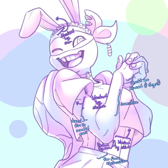
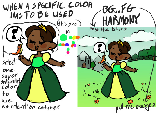
#i need to try and work with palettes with cooler colors... all of the light sources in these are warm lights... beh...!!!
Explore tagged Tumblr posts
Visit Tumblr Blog
Explore Tumblr blogs with no restrictions, modern design and the best experience.
Last Seen Tumblr Blogs


Fun Fact
In February 2021, Tumblr had 518.6 million blog accounts.
Text
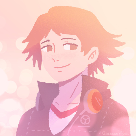
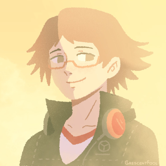
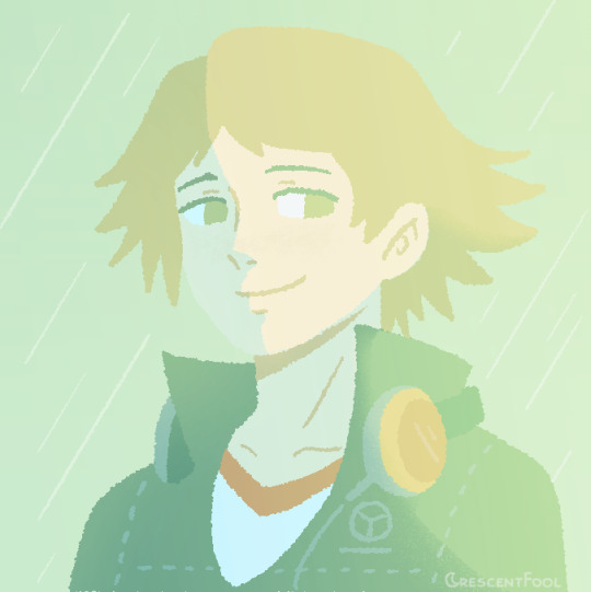

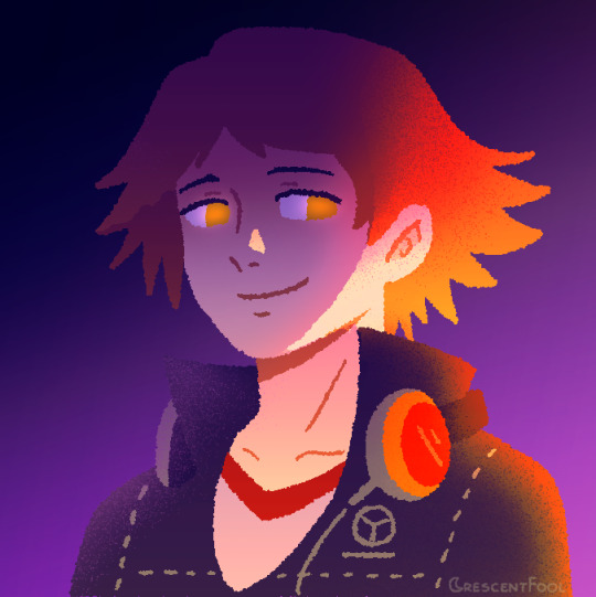
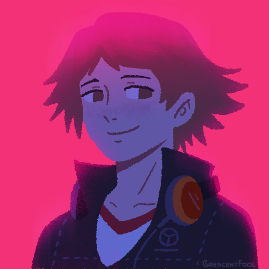
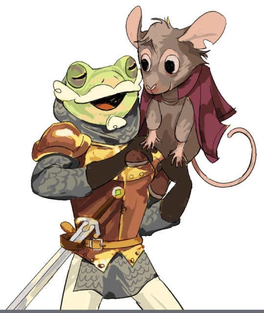
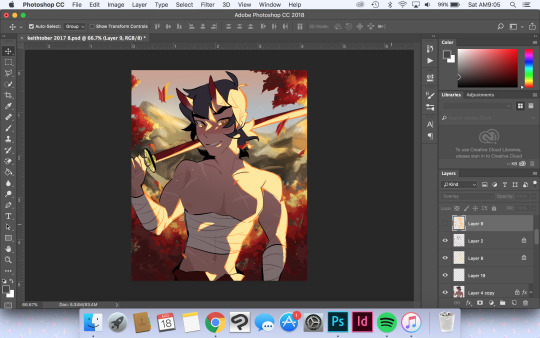
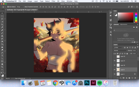
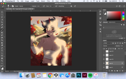
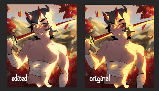
yosuke hanamura but with six different lighting treatments!
#persona 4#yosuke hanamura#visdev#visual development#lizzy does art#tees my hees you get a double upload today bc i forgor to upload whiffy earlier in the week and i finished this today LOL#if no one got me i know the coloring process got me...#this started off as me wanting to draw shadow yosuke lineless style and shade using gradients#but then turned into a 'haha what if i just treat this like a color key you'd make as a visdev artist'#i need to try and work with palettes with cooler colors... all of the light sources in these are warm lights... beh...!!!#it was fun to explore mood through color again <3 ! this will not be the last time i do something like this methinks#shoutout to the p4 portrait of yosuke. i looked at that to get the sketch down. we love you references#ALSO SHOUTOUT TO THE REALTIME 3D HEADLIGHTING REFERENCE ON ARTSTATION BY william nguyen#THAT SAVED MY BACON FOR THIS PIECE!!! so so helpful for anyone who's painting portraits and want to capture-#how light falls on the face and whatnot... wahoo referencing!!!
97 notes
·
View notes
Text
IMAGINE PART I: “Cat’s Got a Friendship Bracelet Too” — Reneé Rapp x Reader
— This One Says ‘GAY’ in Glitter Letters.
Reneé’s niece has serious craft table energy.
Elbows deep in glitter glue, her hair in two uneven pigtails, she squints down at her rainbow bead collection like she’s solving an algebra problem.
“I’m making one for Sparkle next.”
You blink. “Sparkle?”
“The cat.”
You nod solemnly. “Of course. Obviously Sparkle needs one too.”
“She’s not just a cat,” the little girl says with pride. “She’s my child.”
You glance across the table at the grumpy, one-eyed gray tabby perched on the windowsill like she pays rent.
“Totally get it. She gives main character energy.”
You're at Reneé’s childhood home for the weekend.
What started as a casual “yeah you can come, it’s just family stuff” spiraled into you being forcibly adopted by a seven-year-old named Olivia, who decided within fifteen minutes that you were “cooler than Aunt Neé” and “probably know how to make bracelets that actually fit.”
Reneé took it well. Mostly. She’s sitting across the room now, sipping iced tea and scrolling through her phone with a smirk.
“So you are trying to steal my family,” she calls out.
“I don’t have to try,” you respond sweetly, threading a lime green bead next to a sparkly heart charm. “They just like me more.”
“Bold words from someone who still glues their fingers together.”
“That happened once.”
“You glitter-bombed the sink.”
“It was festive.”
Olivia giggles. “Auntie Neé doesn’t like fun.”
“Thank you, Olivia.”
Reneé flips you off behind her water glass.
There are beads everywhere.
On the table. In the rug. Inside your shirt somehow.
Olivia is working on a bracelet that spells out “BOSS,” one letter on each pearl. You’re making one for Reneé that just says “MENACE” in alternating neon blocks.
You’re thinking of making Sparkle’s say “ICON.”
Or “SHE/THEM.”
“Okay,” Olivia says seriously. “Now it’s Sparkle’s turn.”
“How big’s her wrist?” you ask, then immediately regret it.
“Cats don’t have wrists.”
“Right. Obviously. Her… wrist zone.”
“I’ll measure with this,” she announces, holding up a pink scrunchie.
You watch her gently wrap it around Sparkle’s middle like a belt. The cat blinks once. Doesn’t move.
“She likes me,” Olivia says proudly.
“She tolerates you,” Reneé mutters from the couch.
“That’s love, baby,” you say, winking.
Eventually, you all end up sitting in a triangle on the living room carpet.
Reneé leans against the couch, legs long in soft sweatpants, watching you and Olivia lay out bead color palettes like you're designing for Coachella. There's soft music playing from someone's phone, and the late afternoon light is hitting her cheekbones just right.
She's got a blue band around her wrist now.
Your handiwork.
It says MENACE in wonky capital letters.
“This is slander,” she murmurs, touching it lightly.
“This is truth.”
She doesn’t take it off.
Olivia eventually passes out, face-down on a pillow, rainbow string tangled in her fingers, tiny mouth open mid-snore.
You drape a blanket over her.
Reneé pets Sparkle’s head. The cat purrs once, then immediately bites her thumb.
“She hates me,” Reneé whispers.
“She’s showing you affection.”
“She drew blood.”
“Love hurts.”
Reneé turns to you.
There’s something soft in her eyes. Something quieter than her usual sarcasm. Her hand finds your ankle where it's tucked under your knee and rests there.
“You’re really good with her.”
You blink. “Sparkle?”
“Liv.”
You smile. “She’s a good kid.”
“She’s never liked anyone this fast.”
“Guess she has taste.”
Reneé grins.
“She said you're her new best friend.”
“She said I could be the flower girl in her imaginary wedding to Harry Styles.”
“I rescind the compliment.”
You sit there for a moment, breathing in the silence, surrounded by beads, snores, fur, and the gentle weight of her fingers against your skin.
The cat is wearing a lopsided bracelet with the word CEO spelled backward.
Your wrist says GAYRAGE in rhinestones.
There’s glue in your hair.
You’re so happy you could burst.
#fanfic#fanfiction#imagine#imagines#x reader#Reneé Rapp#Renee Rapp#Reneé Rapp x reader#Renee Rapp x reader#RPF#Real People#Real Person Fiction#Real Person Fanfic
30 notes
·
View notes
Note
I absolutely LOVE the way you colour your work!! Would you be willing to show us how you do it/give any tips?
aww tysm!! it's kinda a newer style for me but i can give the rough overview haha
general tips:
-you've heard it a million times, but use references! this style specifically works best as an abstraction of preexisting colors + values, so you'll need a solid starting point to work off of
-keep colorpicking to a minimum (i personally keep my references on a separate device to stop the temptation). you'll never get better at choosing colors if you let the software do it for you all the time, and sussing out your colors manually will improve your color sense
-have a grayscale layer and full saturation layer handy to check your progress. if you can tell what youre looking at in grayscale and it looks sorta 3D, youre on the right track. a saturation filter is mostly a me-thing but i feel like it helps check for cohesion in the palette
-dont be precious. get real loosy-goosy with it; there'll be time to tidy up at the end when you're happy with colors, but for the meantime just zoom out and slap stuff down as you experiment. start big and narrow in from there, because theres a good chance youll change up big areas and undo detail work early on
more in depth/technical process below cut vvv
for references, id recommend using milanote (and to use my friend referral link to give me more space...please... *NOT SPONSORED!! https://www.milanote.com/refer/rcEZd79TldqRGqntPI ) or another tab/app to collect images
here's an example that has nothing to do with starkid lol:
the more the merrier. the colors i used for my starkid pieces were based on screenshots i took from the proshot. references are your friends!!
i use a real scrungly brush called "Fine Brush (Sumi Ink)" in the dogwater app i use (MediBang Paint) that doesnt have great control and helps me loosen up
after i get the lineart down i pick a base color that matches the "tone" im going for (yellow here because it's got a light, happy/jovial vibe), and then get reallyyyyy rough colors by eyeballing my reference (no colorpicking!! go for colors that work relative to the base color). perfection is not the goal here, only a starting point to improve upon
these are pretty drab and uninspired, so at this point i like to analyze the colors i chose by temporarily boosting saturation 100%. after considering how not cohesive magenta, orange, and lime green are, i chose to hit this piece with a low-opacity orange burn layer to unify the palette warmer-ish and bump saturation. layer modes are your friend here, and there will always be one to make your colors more interesting

then i start amending the colors, trying to match the references' relative values and colors but staying w/i the color context ive established (not matching ref exactly, just going cooler/darker/whatever in a similar way but with my colors instead)
ill flip on grayscale constantly and work out self-described problem areas
it's a lot of push and pull until im happy, and after tugging around for a bit ill merge everything and do some global changes with overlay, saturation, burn and sometimes divide layers. i have no process with this besides trial and error tbh
ill have a detail layer overtop usually to fix stuff that i couldnt be bothered with in the lineart stage and thats kinda it? it's really hard to articulate my process 1) because it changes every time i draw and 2) im constantly improving at art and 3) im me and not you and what works for one might not the other
also. i feel like you were asking how i got the painterly look and not the value choices i made? but the truth is i use an angry, scratchy brush and it comes out looking somewhat painterly. so uh go nuts
16 notes
·
View notes
Note
Here’s variations on a Ruby outfit:
The cloak was inspired by the Fixing RWBY redesign (made by the Sketchy Huntsman, specifically the wonderful @swirlmup and @butterflybluelady)! Is the emblem on her skirt and her cloak too much? I’ve always been interested in adding green to Ruby’s pallette (like the stem of the rose), but I’m always afraid she’ll end up looking like Christmas. How did I do? The yellow bow was a reference to Yang my previous Blake redesign.
I feel like I was less experimental with her color palette than my recent Weiss redesign. But you can’t make her outfit too red because she has her giant red cloak. Ruby might become a big red blob with too much red, and the black works so well to emphasize the red. (I guess what ain’t broke don’t fix it?) Do you think making the black of her outfit a very very dark green or blue? Maybe I should have tried using dark brown as an accent color. I was also afraid of making Ruby less goth/emo since it’s a unique trait of hers that I like and differentiates her from other similar character types.
Have a great day!!!
You’re being too hard on yourself, these outfit variations are so good! First glance Ruby looks adorable, ready to fight and in character, something I struggle with when it comes to redesigning Ruby!
But let me gush about 1 and F as they’re my absolute favorite of the bunch.

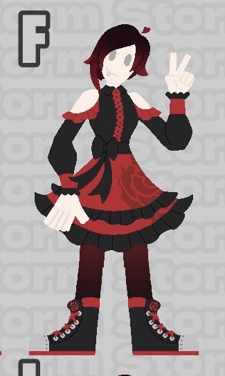
Ruby Rose.
For 1, I wish Ruby got to wear yellow or gold for Yang, I really do because we see Yang wear orange for her which is a mix of red/yellow. I think it can work even if it means sacrificing silver which is also an important color to Ruby. As for the outfit itself I love it as she looks well protected for combat and even cooler with a different styled cape, you got her emblem shown three times which is fine, most characters only have their emblem displayed once than all over or sometimes not at all. I think the emblem works better on her shoes as a brooch doesn’t matter in the show canon despite what Volume 9 wants you to think.
And for F I love it more, much like with Yang it seems Ruby works best with the least amount of colors so don’t feel bad if you wanted a darker blue or darker brown to replace the black. The red is enough and much like her Ice Queendom look which I absolutely love, she doesn’t need the red cape to look good or reference Little Red Riding Hood. The outfit already looks like she’s going to take a stroll to Grandma’s house while also killing a monster on the way there. The silver makes her look sleek, and the outfit overall isn’t bad if she’s in Beacon, you could add a cape if you want to it but I would recommend a short cape so that there’s not a lot of red as there’s plenty of red without a cape already.
Overall I really like what you whipped up for Ruby, you kept her cute with some personality where she’s still trying to take her dream of being a huntress seriously.
I also see you played with green and silver more which are cool too! I like the idea of Ruby wearing green for a rose’s vine and for Oscar seeing as they’re close, I don’t think it’ll look Christmasy if you did put her in green. I see Oscar’s outfit and it doesn’t remind me of Christmas, but if you want maybe just add tiny bits of green to Ruby as an accent. Silver might just work best if it was a darker silver, the show kinda tends to put Ruby in light gray which clashes with her skin. You gotta make the silver really pop like the gold does.
12 notes
·
View notes
Text
Home is Where the Heart Is
Azul x reader
Mc has an interest in interior design and home reno.
Warning: none, possible second hand embarrassment from someone looking at your sketchbook.
No implied gender at the moment.

"So... I've caught word that you aren't entirely satisfied with the the lounge's decor, Prefect. I was so very intrigued by what that could have possibly meant, I just couldn't help but ask you myself. Customer satisfaction is important to running a successful business afterall."
Despite his polite smile and signature customer service tone, you could tell Azul was at least a bit miffed. You instantly stiffened up and turned to Azul, who currently had one hand resting on the back of your chair and leaned down on your right.
You had been minding your own business only moments ago, sketching several rooms of Ramshackle dorm. Simply taking in the space of the Monstro Lounge and enjoying a freshly made beverage. As luck would have it, you must have mindlessly mumbled something about the lounge while sifting through many possible colors and their affects on mood.
"Ah!... Azul! Hello! Uh... I hope I didn't offend you. I'm working on a small project of mine and I must have been thinking out loud! Silly... me... hehe...", you tried recalling what you could have possibly said that illicited Azul confronting you. You tried to subtly close your sketchbook to save yourself from further embarrassment, only for it to swipped from under your hand. You whipped around to find Jade holding your book in his gloved hand with a ominous smile on his face.
"Now Prefect, there's no need to be so shy. We just wish to discuss your dissatisfaction with Monstro Lounge.", Jade had flipped open your book with one hand and began to skim through the pages. JADE! THAT SNITCH! He must have heard me say something! At this point you're stumbling over your words, trying to sputter out your best excuse. All the while Jade continued his search through your book when he landed on the most recent page. It took a moment before realizing what was drawn upon the page, his eyes widened before handing the book to Azul. You couldn't take it anymore when Azul took in the drawings on the page with sharp, critical eyes.
"L-Look! I'm sorry! I didn't mean to offend you really! The Monstro Lounge looks great! I swear! It's just when I get an idea I can't help but at least sketch out what it could possibly look like! I just-"
"You drew this?"
"Ah... yes?..", you shrunk a bit in your seat.
"Hm..."
Azul... almost looked impressed! Huh.
"And... you think this would be a good look for Monstro Lounge?..."
"Ah... well...", you slowly straighten up in your seat. "The way the lounge looks now... works for the location and the regular customers. I just... I just noticed that the majority of regulars are Octavinelle students. Obviously due to proximity, but also a comfortable atmosphere. Many of the students are merfolk. So they would feel at most comfort and ease with darker, cooler colors. But this isn't really the case with those who live on land. In that case it would most likely be neutral, earthy colors.", you sit up straighter and pull out a magazine showing many examples of decor and furniture. All the while, Azul moves to sit in the chair across from you with a curious glint in his eye as you flip to a page that presents a cafe-esk scene.
"I was just curious what it could look like in a location on land. Many cafés use a similar palette with creme colors with medium to dark brown accents and the occasional pop of color. The creme color really helps brighten up a space more and makes it seem bigger than it is. The brown helps give the space definition and balances out the light colors. Then, the pop of color will give the space more life to it. Commonly using a indoor plant or a piece of art. Oh! And a large mirror on the all would help make a small space seem even bigger! And- ah...", you finally snap out of your train of thought, realizing you were just talking Azul's ear off. "Oh... sorry I was rambling.", you blush and nervously tug on your sleeve.
"It's perfectly fine, Prefect.", Azul smiled again, this time it seemed a bit more genuine. "It's clear you meant no harm. Admittedly, you have quite an eye for design.", Azul placed your sketchbook back down onto the table. "I had done my own research into color theory and interior design when the lounge was built. Although, It had not occured to me that it went so deeply.", Azul leans back into his seat, eyes closed in thought and resting his gloved hand on his chin. "I'm somewhat... embarrassed to say that I had not looked into it as critically as I should have...", his eyes flicked open and his eyes focused on me," But you, my dear Prefect, seem to have great interest and much knowledge on the subject."
He leaned forward resting his elbows on the table and eyes softening slightly, "Would you by chance be interested in continuing this conversation in the V.I.P. room?"
You were stunned for a moment. He... wanted to talk about... interior design? You felt the excitement build up inside yourself and you could practically imagine sparkles shining in your eyes.
"...Absolutely!"
Author's note: Hello! This is the first fic I've written for the TWST fandom and if you're reading this, thank you for taking the time! I really appreciate it!
If you enjoyed this fic let me know, I'm thinking of making this into a mini series were you get to see Azul and MC at developing their relationship! I haven't started a second part just yet, but I already have a base idea for it!
Again thank you for reading and let me know how you liked it! Have a nice day!

#twisted wonderland#twst#disney twisted wonderland#disney twst#azul ashengrotto#twst x reader#twisted wonderland x reader#twst imagines#twst azul#azul x reader#azul ashengrotto x reader#twst jade#azul twst#twisted wonderland jade#jade leech#wingman jade leech#jade really be snatching up sketchbooks SMH#rude mfer
255 notes
·
View notes
Note
how long does it take you to draw and colour? since you post everyday which is great for me :D any tips for colouring cause Im still tryna figure all that out
hmm welllll, i don't exactly time how long it takes to draw but my partner said that sometimes i'll be working on a piece when they go to sleep and i'll still be working on it when they wake up 7 hours later so...my guess is anywhere from 3-8 hours each depending on complexity? at least for the art that i normally post, most of which is relatively simple.
not entirely sure what kind of tips you were looking for, but i'll just throw out some of my thought processes and stuff i try to keep in mind whenever i color. i'm gonna try and keep these relatively to the point so i won't go into much detail on art terms n whatnot, BUT i am also pretty terrible at explaining things so if you need clarification on anything, feel free to ask!
(sorry it's so longggg, i got carried away. i am...very wordy when it comes to art lol)
i like to block in the colors during the sketching stage before i do the lineart, especially for pieces where i know i want to do something funky with the color palette. you can see this in a lot of my process shots. doing colors in the planning stage just gives me a lot more freedom to focus purely on the colors and shading and how they work with the composition, without having to worry about the minute details like making sure the colors are inside the lines.
in order to save time while coloring, i'll usually just select the negative space (after making sure all the lineart is closed) > expand selection by 1 pixel (to make sure the edges are hidden within the liineart) > invert selection > fill bucket, then use clipping layers above that to color individual areas.
layer modes are your friend! i use multiply, overlay, and glow dodge (this one may be specific to mangastudio?) in almost every one of my drawings, but it's definitely worth playing around with all of the modes just to familiarize yourself with them if you haven't already.
color is honestly SO subjective. i'm never a fan of color picking (from source material or my own refs or whatever) bc while it may have its uses when it comes to consistency, imo it's much more fun to make them up as i go. you get a lot more variety from piece to piece while also familiarizing yourself with the character's palette that way. usually i'll start by deciding on the overall mood/palette (cool/warm, de-saturated, neon, pastel, etc), filling in the background color, then picking the characters' colors based on that. like with this venti pic, i started with a purple background and based my colors around that purple so they all fit the specific look i was going for. i could maybe get a similar effect by starting with the normal colors and using filters, shading, layer modes, etc to get the funky colors, but it will be much harder/more work and doesn't get as drastic of an effect imo.
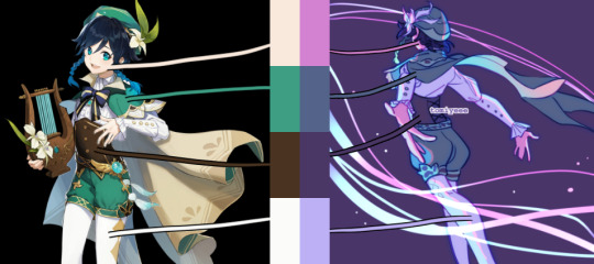
on that note, don't be afraid to use shades/colors that may seem odd! you'd be surprised how many times i've used gray in place of blue, orange, purple..basically any color. in the above example, you can see just how different the colors ended up being from the original. after i decide on my palette + bg color, i'll just throw down the color i think will work and then (bc that first guess is usually wrong and meant only as a ballpark estimate) see if it needs to be warmer or cooler/darker or lighter/more or less saturated/etc and adjust accordingly. it's like mixing paint or tuning an instrument! it takes a little bit of practice, but after a while you start to get the hang of what colors will look like in which color palettes. white is usually the easiest to start with bc it will always just be tinted whatever color your palette is (like how the "white" in the above example is just a light purple).
this and the next point are more about shading but i include it as part of the coloring process: the easiest way i've learned to do shading is to darken the entire image/character/part you want to shade (usually with a solid color multiply layer) then add in the lighting either by erasing parts of the multiply layer or by using a separate layer set to overlay or glow dodge (or a similar lightening layer mode). it works a lot better than drawing the shadows imo because it kind of mimics how light works in real life; things are dark by default until you let light in and it hits what it can while leaving the rest still dark.
if you want to blend shadows, i usually still use the above method, but just blur certain areas of it and when i'm deciding which parts to blur (bc i don't just do so indiscriminately) i'll mentally sort all of the shadows into 2 categories:
shadows created by light being blocked by an object: like putting your hand in front of a flashlight. these shadows will retain their sharp edge, but can transition into the 2nd category if they are far enough from the obstruction, like how your hand's shadow will become blurrier the further you move it from the flashlight. the more distance between a light source and the surface it's projecting onto, the more chances for the light to scatter = softer edges
shadows created by light "rolling" off the surface: like the shadows on a ball or rounded surface. these will get blurred and i usually like to put a little bit of color along the blurred edge (a different and usually brighter/more saturated color than the rest of the shadows) just to add some life to the shadows.
here's an annotated version of this mikey pic with just the shadows so it's a lot easier to see :) sorry im bad at annotating..
aaaand this post has probably gotten way longer than you were hoping for so i'll cut it off here 😭 hope this has been at least somewhat useful, and good luck with your art!
27 notes
·
View notes
Note
hey i totally understand if you don’t wanna answer this but do you have any tips on like. colouring specifically skin? it always frustrates me because my coloring always looks flat. totally understand if you dont wanna ans bc i could just goog but i love your art!
oh it’s not a problem at all! honestly i LOVE giving art tips lol i talk too much anyway. but as for skin, i tend to stay away from choosing too saturated/desaturated colours like this is usually my sweet spot
depending on what skin colour im working with. my colours aren’t limited to that though i will go in and out of that space depending on what i’m working with, but in general, i tend to stay in that hue area (hue area not colour!!)
and to avoid looking flat, i like giving my skin ‘flush spots’ or basically i apply saturated colours that depends on the skin colour + undertone and blur them so they make the skin look nice and flushed since irl skin does have their own red spots or blush spots. like for example this is on my recent one without the shading & the lighting:
you’ll notice that there’s faint red blushes on her shoulders, arms, in the middle of her hand, elbow and he has it on his cheek and fingertips (i would add it on his shoulders as well or between where the muscles are) it’s pretty faint but for me i think it makes a lot of difference and they make the skin feel more alive/less flat since they look like they’re actually flushed/or have blood circulating under them lol. skin doesn’t have one cohesive shade as well. undertones + if they’re warm toned/cool toned plays a part in the colours your choosing so determine if your characters lean more onto warmer tone (like jaime here) or cooler (like brienne). if they lean more onto warm, you’ll most likely stay around the red/orange/yellow area + maybe green, cooler would be pink/purple/blue but again this all depends on what ur subjects needs. i recommend you try and play around with adding different colours on the skin, try and show where the cooler tones are on their face/body, the warmer tones, etc.
the colour of your shading matters as well i think!! this is for my art style specifically, so i’m unsure if it would work for you, but i generally use a warmer colour to shade like a dark red or a dark brown instead of black since i find that they give the piece more depth. like when picking colours, i usually go across the colour wheel instead of straight down so i can get the saturated hues. i find that working with a monotone colour palette (where you just pick the colours that are below the ones you have) will end up making your piece look flat, so i try to get varying shades of hues as possible.
but anyway, try it out! see if that works for you. honestly i think understanding the fundamentals of colour theory + how skin works is very useful, so if you have some free time in your hands, i really recommend watching either a yt video about colour theory OR a makeup tutorial since they usually explain undertones + colour in depth lol. the face has different tones in them and that calls for them to use different colours if they want to colour match, and i find them explaining how it works super useful (and very interesting imo)
#but my biggest recommendation is just play around with colour honestly#try and go outside your comfort zone like before i used to be obsessed#with shading with purple lol and my highlights were orange-y#there's other coloring techniques as well so just see which one works for you best#and which one benefits ur style the most !#Anonymous
55 notes
·
View notes
Note
hi!! i was wondering if you had an faq about your art? i was hoping to find some of your tips regarding skin and shading if you've already given them, it's just so gorgeous
Hello!! ✨ I don’t have any kind of organized FAQ, but I’ve got a couple speedpaint videos in my #process tag. I’ve been meaning to put together some kind of mini guide to how I paint faces. This is organized poorly but here are some very abridged tips in the meantime:
Always have a reference image for the lighting you want. The more comfortable you are with painting, the less reliant you’ll be on the reference image. But I literally always have something to use as a rough guide.
Zoom in as little as possible. This was a HARD habit to break but very worthwhile.
At all times, use the largest brush size that you can get away with.
At all times, try to accomplish your goal in the fewest number of strokes possible (I fail at this a lot).
Try to paint with your brush at 90-100% opacity.
Try to use 1-2 brushes max unless you need something hyper specific (freckles, stubble, etc).
Limit your palette. A larger range of values will develop naturally as you render, but I start with a palette the includes only:
Middle value skin tone
A shadow color
A highlight color
You can make a palette fast by picking a middle value skin tone that looks nice, then: make it cooler, darker, and more saturated for the shadows, or warmer, lighter, and less saturated for the highlights. My tendency to make shadows cooler and highlights warmer is just personal preference and can be switched. 👍
Lay down your middle tone across all the skin areas, then block in the darkest shadows, then add in some highlights. You now have a “rough draft” to render further! I actually have footage of me doing this here.
When I say block, I mean block. You’re looking for solid shapes of color with defined edges. We’ll soften them as we work.
Work the whole canvas!! Block out ALL the shadows before you start rendering one area. I am yelling this through time to myself in 2017.
God this list is a mess lmao. These are all specific habits that I’ve focused on in the past year or two. The combo of big brush at high opacity + no zooming turned some kind of key in my brain, and my workflow has improved a lot. If you’re someone who is used to soft brushes and blended edges, I’d suggest giving it a try! 🥺💖 Thank you for the message!!
68 notes
·
View notes
Text
Color Tutorial
An anon asked about how I do color so I guess these are the basics? might go more into shading and and other stuff later but idk
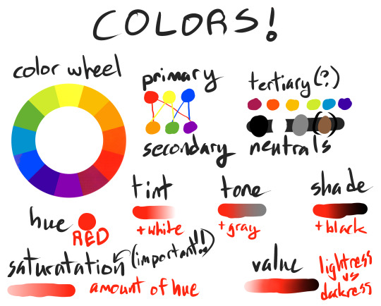
color terminology
the color wheel aka the rainbow, primary colors (red blue and yellow), secondary colors (orange, green, and purple/violet), tertiary colors(red-violet, red-orange, golden yellow, yellow-green, blue-green/aqua, indigo/blue-purple/violet)the term tertiary isn’t used a lot tbh, Neutrals (black, white, and gray, i also consider brown a neutral but its technically a type of orange). Hue(the straight up color ex; red and green are different hues), tint (adding white to a color ex; pink is technically a tint of red), Tone(adding gray to a color), Shade (adding black to a color). Saturation refers to the amount of color included while value refers to the amount of white/gray/black(or lightness and darkness). Saturation is SUPER IMPORTANT for creating color schemes, having too many highly saturated colors in a color scheme can result in eye strain and not direct the audience as well as you could.
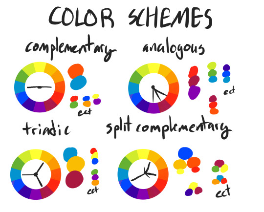
Complementary; two hues opposite to each other on the color wheel. Analogous; (usually three) hues next to each other on the color wheel. Triadic; three hues equal distant apart on the color wheel(like a triangle). Split Complementary; a hue and two colors on either side of its complementary(like a “Y” shape). There is also a quadratic, which is a square or rectangle shape but I didn’t show that one.
OK NOW LETS COLOR SOME CUTE PRINCESSES
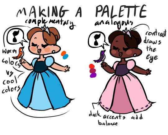
When making a palette, chose your base hues, but then play with the different variations you can make from those by adding white/gray/black. Often a good way to create distinction between two areas of your piece is to use a complementary as it is balanced between warm and cool colors. Analogous palettes are hard for me to do really well, i usually like to have a neutral or a contrasting color in there. However! one way to create contrast in analogous palettes is to play with values. A light crown in dark hair draws the eye more than the gray crown in the dusty orange hair. If your piece feels off balance, try putting small, darker, details in the lighter areas, it creates a heaviness and more contrast to fill up space.
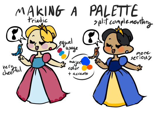
Triadic palettes (especially anything close to the primary colors) are often very childlike and happy looking. it also balances the piece really easily, providing enough difference around the whole space that the eye can move around the canvas easily. Split complementary are my personal favorite. Often, your main hue dominates your piece, with the complementary splits providing accents or even being used as a neutral or drawing the eye to a specific place. Here the dominate color is blue, then yellow, then orange in the skin and just barely on the bird.
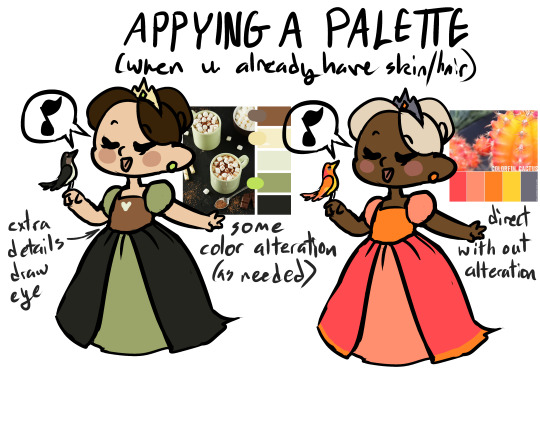
Sometimes my own color palettes don’t work, and I pull from already made ones instead. Usually I can just apply these to the outfit or background while leaving the hair and skin whatever color the character needs. Sometimes I tweak the color palette to better suit my tastes/needs for the piece. Pre-made color schemes are helpful but sometimes lack contrast so I’ll also throw black or white into the mix as well.
Often I need to have a specific color in my piece, sometimes in a specific spot. In this case its a bright aqua-green bodice. So I put it into complementary, analogous, split complementary, and triadic color palettes, and decided I liked analogous best(though it is a rather wide analogous). Now that I have my two other hues, I play with the saturation and value for them. I leave the orange super saturated on the gems and the bird to draw attention to them, but toned it down for her skin and hair. When doing a piece with a background its a good idea to stick with your original color palette as it provides a harmonious over all appearance, BUT if you want your character to stand out make sure you use either lighter/darker or warmer/cooler colors compared to your figure. Make the background super different if you want the character to fight against it or look out of place. An easy way to BS perspective is to push the cooler colors(blue primarily) to the back and pull the yellows and oranges out more in the Foreground(this mimic atmospheric perspective). I again used the orange and an attention grabber in the flowers to pull the viewers eyes to the foreground and therefore to the princess.
Hopefully this is helpful?????
#tutorial#art tutorial#color#color tutorial#colors#primary#secondary#complementary#analogous#triadic#split complementary#princess#princesses#this is just how i personally do things none of these are hard and fast rules
514 notes
·
View notes
Note
I really like your shigaraki redraw! I was wondering how you choose the colours of your drawings, you begin with black and white or you have already in mind a specific palette? I always struggle with coloring, especially in this period, I always feel disappointed with my art :(
omg thank u !! im glad you like it :”)
and yeah !! so when i color something, its usually just me playing around with the different program functions; seeing what i can do with different colors and layers on multiply / color burn / overlay, etc., tone curve, gradient map, so on and so forth. i think i have some form of aphantasia, so rather than having an image in my head of what i want something to look like, i’ll usually figure it out through trial and error according to some like. i guess Feeling of how it should look. such as, if you want to go for a gloomy theme, you might want to adopt a cooler color palette; more purples, blues, and greens. or if you’re going for a different approach, say smth like love, you might opt for a warmer palette in which you use reds and oranges. ofc they arent rules or anything, but they can be a nice guideline if you’re having trouble deciding where to start . i think curiosity for how certain colors interact will bring you large percent of the way. after that, it’s more a matter of personal preference for whichever colors you think fits the best.
im sorry you’re feeling disappointed with your art though !! thats such a tough feeling to work through but i hope you can find some methods that work for you ! i can go ahead and share my process if that gives you some idea for what to try :3
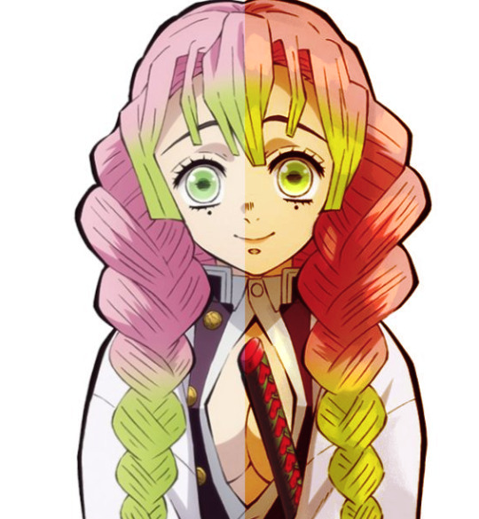
at the most basic level, i’ll usually have a base layer of a character’s normal palette and then i’ll have a few extra layers set to overlay, multiply, color burn, etc. on top. usually of reds or purples because those are my fav colors :3 i use layer settings like multiply to add shadows, glow dodge / screen to add highlights, and color burn / overlay / soft light to shift the hues or saturation of the colors in some particular direction. for instance, heres a mitsuri pic i edited. her colors are too cool for my preference, so i went ahead and added an orange color dodge layer to the right side at 74% opacity . i looked at how the layer looked in multiply, overlay, color burn, color dodge, etc. and the different opacity levels before deciding on this particular combination. depending on what program you use, you might not have these settings. i believe paint tool sai has less than clip studio paint, but they usually share a few in common.
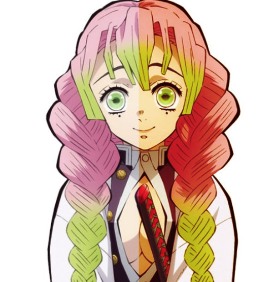
as you can tell, its already a lot warmer and headed towards the direction i want :3 but in giving it this orange hue, i feel like i’ve made it darker, too. so to make it more exciting, im going to add some new colors to her eyes and hair. i think yellow will be a nice compliment to the greens, so im gonna go ahead and add a yellow highlight using glow dodge at 18% opacity.

and if i decide i want to add a few extra shadows just ‘cause, i’ll usually pick some pre-existing color off my drawing to keep the palette more cohesive. in this case, i went ahead and chose the reddish-purple color from her uniform and put it on a new multiply layer at 15% opacity
they’re small individual additions all things considered, but i enjoy watching them build on each other :3 . thats usually the process i’ll take when drawing w a base color. add or take how you like
in the case of the shigaraki one, i initially colored in black and white because i wanted to emulate the manga appearance, but once i colored his iris red i decided i wanted to add some more colors overall. something you can do with greyscale images that i like to do is add gradient maps !! these can transform your blacks & greys into actual color which you can then adjust with more layer editing (like above). your program may come with pre-set gradients, or you can download new color packs online / make your own.
left is the original, middle is a dark blue-to-red gradient map at 71% opacity, and the right is that same gradient with increased contrast, orange color burn layer at 60% , and 15 gradient posterization.

they all add color in their own way, its just up to you to choose which direction to go :-)
the different program settings can be confusing @ first but they’re a lot of fun to play around with if you ever have the time. and once you start to learn how these settings generally affect the drawing / its color, you’ll have a more innate feeling of how to use them without needing to think about it much before hand
but AAHH hopefully this gave u some insight for how i color my pieces 🥺️ msg me if theres anything u want clarification on :-D !!
#newdramaticvalues#asktag#lgtext#i genuinely just smash buttons until i make it work though AHAHHAAH
21 notes
·
View notes
Text
This is a sequel to Chapter 81: Part 8 — Klarosummer Bingo in my Klaroline series, A Beautiful Symmetry. This was written for Klaroline Bingo @klaroline-events. Prompt: Working. As con artists, Caroline, Bonnie and Katherine knew the risks, but when the Mikaelson brothers conned them, their fight AND flight response kicked into overdrive.
Chapter 122: The Hamptons — Part 2
“It is safer to beg than to take, but it is finer to take than to beg.” ― Oscar Wilde, The Soul of Man Under Socialism
Nothing was more satisfying than pushing Klaus’ shiny Jaguar over the cliff. It was the final item on Caroline’s to do list as she, Bonnie and Katherine left the Hamptons. Caroline stood with her friends, refusing to flinch as the sound of shattering glass and screeching metal collided with the jagged rocks below. She got sloppy. She should’ve realized a mid-market convertible less than $100,000 would never have been the vehicle of choice for a jet-setting playboy whose family money went back generations.
“Fucking Mikaelsons played us,” Katherine snarled, brown eyes flashing angrily. “We set up the perfect con, a final score so we could retire, only for it to blow up in our faces when we found out they were trying to con us!”
Bonnie opened the cooler at their feet, twisting off the top of the beer bottle and taking a deep gulp. “We got them in the end, though. Posted all their fake identities on that stupid Hamptons gossip site. They’re burned in the Northeast now — I even tipped off the highway patrol to be on the lookout for Kol’s Rover.”
“Did we use cornstarch or flour to mimic the coke the cops will find in the back,” Caroline asked with a mocking grin, clinking her bottle with Bonnie’s in celebration.
Katherine chuckled darkly. “Flour. But only on the bottom. The top are a few kilos courtesy of our old Markos connection.”
The women shared a laugh, but Caroline found her gaze straying back to the wreckage below. It had been years since a man had tricked her. Since she’d let a man get close. Still seething over Klaus’ betrayal, her tone was fierce as she said, “The Mikaelsons no longer matter. It’s time to move on to our next job.”
“Working shouldn’t be this hard,” Caroline muttered, her voice muffled behind her mask as she polished the alabaster jar on the lathe equipment. She carefully smoothed the sides, ensuring the machine work wouldn’t be visible.
Green eyes narrowed behind her goggles as Bonnie advised, “You should use the bow-drill next to ensure modern tool marks aren’t detected.”
“Seriously?!” Caroline rolled her eyes, certain that underneath that mask was her friend’s signature scowl. “Do you want to do this instead? It’s not like I’ve ever painstakingly crafted forgeries from five different ancient civilizations. Oh, wait — I have.” She hated how shrill her voice sounded and she knew Bonnie and Katherine were dealing with the same anger and disappointment about what happened in the Hamptons. It wasn’t fair that she was taking her misery out on them. As Bonnie started to storm out of the workshop, Caroline called after her, “Wait. That was shitty. I’m sorry.”
Bonnie sighed, distractedly running a hand through her sleek bob. “You miss Klaus.” At Caroline’s indignant snort, she shook her head. “Lie to yourself all you want, but I see it and Kat would too if she pulled her head out of her ass. And I miss Kol with his stupid limericks and crazy stories that somehow always start with skydiving and end in the back of a police car.”
“Kat’s avoiding thinking about Elijah by memorizing campus security and building schematics at Berkeley.”
The women shared a look of commiseration, knowing that Katherine’s hyper-focusing was almost as dangerous as when she spent too much time at the gun range. She didn’t forgive or forget. Elijah was fortunate that were on the other coast.
Picking up a steel file, she carefully ran it across the wide base of the jar. “I trust she’s working out the reason why there’s a huge lag time in the security guard patrols on Tuesday and Thursday evenings in the Hildegard Building?”
Bonnie chuckled, “Figure drawing classes are on those nights. Nude figure drawing. The pervy old guards are trying to make some Girls Gone Wild fantasy happen.”
“Eww. Also, perfect — I can have the other three jars ready by next Tuesday and Kat can make the switch then.” Caroline was responsible for the main part of the Berkeley con — carve perfect copies of the ancient Egyptian alabaster vessels that Katherine would swap out for the real artifacts. Bonnie already had been hired by Berkeley to authenticate their latest archaeological find. She’d forged impeccable credentials as an Egyptian art authenticator with an emphasis on Old Kingdom artifacts.
Once Bonnie declared Caroline’s work as authentic, the girls would skip town, leaving Berkeley officials none the wiser that their ‘ancient Egyptian’ artifacts displayed were less than two weeks old. It was a familiar con, one they’d pulled off successfully multiple times across the States. They needed this win. The Mikaelson debacle had shaken their confidence, and the women were desperate to get things back to normal.
“I’ll leave you to it, then.” Heaving a heavy sigh, Bonnie added, “I should probably go check up on Kat in case she decides setting something on fire would make her feel better.”
Shaking her head, Caroline got back to work, fervently wishing she knew what would make her feel better. She kept thinking back to the argument she overheard between Klaus and Kol.
“Don’t tell me this is just another job for you,” Klaus replied angrily, “You got too close to Bonnie and Elijah’s all but forgotten the rest of the world exists thanks to Katherine.”
Kol scoffed, “And Caroline? I saw that ring — don’t think I’m not aware of what that means to you.”
She stupidly kept the ring on a long chain around her neck, tucked away under her blouse so her friends wouldn’t see. Why did she do this to herself? Because she heard Klaus’ desperation. However the brothers’ con had begun, somewhere along the way, they’d caught feelings and everything had changed. Just like it had for Caroline and her friends.
But she also kept recalling little details that she should’ve picked up on, things that could’ve unraveled Klaus’ con sooner had she not been so distracted by how she felt about him.
With a dimpled smirk from Klaus, Caroline kept forgetting she was in the middle of a con. Despite his seductive smiles, she couldn’t help but notice the genuine excitement he showed when she surprised him with a trip to the art museum. From her extensive research into his background, she knew he had an affinity for art, including a graduate degree in art history. “Isn’t it breathtaking,” she asked, pointing out the beautifully preserved Madonna and Child canvas.
“It’s an impressive Caravaggio,” Klaus said dismissively, already eyeing the next exhibit.
Frowning, she asked, “I thought this was a Verrocchio? You’d mentioned he had been your focus when you studied Italian Renaissance art?”
A slight flush creeped up his neck, and he kissed her knuckles as he purred in his accented voice, “I appreciate a woman who can identify the rebirth of classic antiquity.” There was an endearing hesitancy in his tone as he said, “Actually, I’d like to share my latest passion with you.” With an excited twinkle in his eye, he guided her toward the next gallery, one filled with vibrant colors and bold brush strokes that instantly captured her attention.
“These are powerful,” she murmured, admiring the series of abstract portraits.
He squeezed her hand, whispering excitedly, “I discovered GyoBeom An at a low point in my life; his work is an explosive blend of constructing and deconstructing images using a bold, contemporary palette. Even though the brush strokes are strong, almost violent in places, to me, it feels like the art reveals what’s hidden in a whisper rather than a shout.”
His impassioned speech struck a chord with her, and she was alarmed to realize she’d started to tear up. There were so many things she was hiding from Klaus. So, she told him the only thing she knew to be true. “I’m honored you’d share this with me.”
Klaus looked nervous, but the sincerity of his tone seemed genuine. “You’re special, Caroline. I wouldn’t share this with anyone else.” And then he kissed her until they were both breathless.
It was a beautiful memory. And it was all a lie. Just two cons lying to each other, Caroline thought bitterly. She pushed aside the flood of memories that kept trying to break free, and instead bent her head to her work once more.
____________________________________
Caroline’s expectations for the buyer went up a notch when she got her first look at The Bitter End over on Clement Street. Not only did the bar’s name match her mood, but the grimy, threadbare atmosphere made her feel at home. Better than the pretentious clubs in the Hamptons. Her contact informed her that the dive bar was in a quiet neighborhood away from tourists — the perfect spot to negotiate terms.
The con was nearly complete — Katherine effortlessly swapped out the ancient artifacts for Caroline’s forgeries and Bonnie had done such an outstanding job ‘authenticating’ that Berkeley had offered her a coveted spot on their latest dig in Karnak, examining a newly discovered series of tunnels underneath the Temple of Amun-Ra. (Katherine was still trying to convince them it was a sign they should take their skills to the exclusive spa in nearby Luxor and run either the Heiress Special or the Desert Rose cons.)
She crossed the threshold, eyes quickly adjusting to the dim light inside the dive bar. She was there to settle the final part of their con — agree on the price for the ancient Egyptian alabaster jars. Something brushed across the back of her neck, and she turned sharply, ready to deliver an elbow to whichever drunk decided to get too gropey. But no one was there. Suddenly on edge, she headed toward the back booth, where the buyer waited in the shadows.
The scent of leather and cedar flooded her senses, making her heart pound. He was here. Bonnie would tell her to run. Katherine would tell her to break his nose and then run. Caroline’s curiosity was piqued as she contemplated a third option.
“Hello, sweetheart,” Klaus greeted her, lovingly caressing the syllables of her name with that seductive accent of his. “Are you armed?”
“Perhaps. You?”
Gray eyes twinkling, he replied, “Only with righteous indignation. My brothers and I nearly emptied our bag of tricks calling in favors to make that spot of trouble with the police and the coke disappear.” Leaning forward, his lips curled into a dimpled smirk as he added, “And then there was that unfortunate accident. Going after the car — you certainly know how to cut a man to the quick.”
Arms crossed in front of her, Caroline asked defiantly, “Clearly, you scared off my buyer, so you must want something — what is it?”
“Answers. From you and your cohorts’ actions, it was obvious you figured out what we were up to. You three don’t strike me as cowards — why not confront us?”
She scowled, not appreciating how close he’d become. He was trying to force a connection. Bastard. “A good grifter knows when to cut her losses. It turned out we were all just con artists trying to scam each other. There was nothing to be gained from staying.”
A hint of steel entered his gaze as he growled, “Or, there was everything to gain. I thought I fell for a woman that forever would be beyond my reach. The little fictions we told each other gave way to something real. And then we discover we’re even more perfectly suited than we could’ve imagined.”
Blue eyes widened at his words. What Klaus was suggesting was insane — there could never be trust between cons. “Seriously?! Are you out of your mind? We’d constantly be suspicious of each other, waiting to be screwed over.”
“Details,” he answered with a careless shrug. “Tell me you haven’t missed me every day since you ran off.”
“I haven’t,” Caroline answered flatly, refusing to give into this insanity.
She was prepared for him to lash out, but instead, he flashed her a knowing smile while digging in his pocket. Suddenly, he dangled her long silver chain between them, complete with the beautiful ring he’d made her. That he’d stolen right off her neck.
Klaus’ desire-filled gaze was intense as he told her, “Good thing for both of us you’re a terrible liar.”
17 notes
·
View notes
Text
The Light Was Playing
Roswell New Mexico Week Day 6/7:
Fic Prompt: If I could do it all over again + Free Day.
Summary: Alex started painting as part of his therapy. Michael stumbles upon this new hobby.
Notes: I thought of writing Alex as a painter and it turned into a future fic! I might have some other painterly ideas, so let me know what you think! Also not beta read, but I've tried to edit it as much as possible!
Read on Ao3
Michael rounded the corner of the cabin, immediately stopping in his tracks. "Oh, sorry… I guess you didn't get my text."
Alex looked up from his canvas, a little startled by his unexpected visitor. "Evidently not," he replied, tossing the brush in a jar of water.
It was such a great day for painting outside that he had decided to do a quick setup and get to work. The light was playing off the hills to the east picture perfectly, and he was positioned just back enough from the cabin to be able to include it in the scene as well.
The thing was, he'd gotten into the habit, at least while painting at home, that his clothes were a burden (and he was sick of trying to keep them clean) and painting in the nude was a completely freeing and exhilarating experience. He also loved the feel of the cool grass between his toes from the little patch of lawn he'd planted for his beagle to roll around on.
And that's how Michael found him, bare-assed wearing nothing but an apron, his prosthetic, and some sunscreen.
Alex could tell everything about this scene Michael had stumbled upon left him dumbfounded and surprised. It's not like he was keeping this hobby a secret, but it wasn't like they had time for in depth conversations about extracurricular activities that didn't involve tracking down shady government alien secrets.
At the suggestion of his therapist, Alex had started taking some art classes at the community centre. She said it would be a way to express his emotions in a physical way that he could reflect back upon, a catharsis, rather than beating the heavy bag to a pulp at the gym, which wasn't really getting him anywhere in the long run. At least not from an emotional standpoint.
If he had to do it all over again, knowing what he knows now, he might have tried to runaway with Michael like he had suggested all those years ago. But Alex had been stuck under years and years of mindfuckery at the hands of his father.
So, part of the therapy was about coming to terms with the fact that teenage Alex was definitely not to blame, and that grown-ass man Alex could look to the future and try to right some wrongs, including an attempt to be happy.
Alex found happiness, joy even, in the process of painting. It was meditative and helped him get out of his head. These simple acts of creation, one brush stroke at a time, enabled him to work past the darkness that weighed him down.
After a weekend away in Santa Fe, checking out some galleries and art fairs and flea markets, he became really inspired by Georgia O'Keeffe's paintings of the New Mexican landscape. He'd been to more than a handful desert postings during his time in the Air Force - some places were beautiful, some expansively war-torn, but there was something about the red hues of home that stayed with him and captured his creative spirit.
Painting worked for him like the way music used to be able to. He could get lost in the mixing of colors of the palette and the way the textures created dynamic moments he could get lost in. These days music, both listening to and trying to maybe get back into writing, left him wallowing in the emotions he was trying to get past. Sometimes his anxiety got so elevated from certains songs he'd have to just sit out under the stars, only letting the buzz of insects fill the silence. Working with color and light on these blank canvases of possibility were his new release.
"What did you need, Guerin?"
Michael was still stuck in the same spot, his gaze taking it all in.
"Really doesn't matter anymore."
"Well, seeing as it must not have been an emergency, there's a cooler with beer next to the lounger," Alex pointed out, "so sit, relax, and give me a few minutes to finish this up?" He really didn't want to ruin his flow, but he also wanted Michael to stay. They were still working on figuring everything out, mapping out what being together might mean in the longer term.
Michael plopped down in the chair, chugging back nearly half of the bottle in one long pull, his eyes never leaving Alex and what he was doing.
Alex found it a little unsettling at first, allowing anyone but his dog and the birds into his creative space. But soon enough, they fell back into their comfortable rapport as he filled Michael in on how this whole thing got started while continued the painting. And honestly, he was loving this almost daring, teasing situation.
"So, can I see your other paintings sometime?" Michael asked, cracking open another beer.
"Maybe someday, but so many of them are pretty rudimentary since I'm really just learning," was his self-deprecating reply.
"I'm no art critic, but that," Michael said, pointing towards the canvas in front of Alex, "is fucking gorgeous."
***
Alex stepped back from the canvas, taking it all and trying to discern if anything was missing or if the painting was done. He felt pretty satisfied with the end result. And he was just glad he'd been home to take advantage of the great weather to paint outside.
He started tidying everything to get ready to go back inside. The brushes were thoroughly rinsed and wiped clean, the paint tubes were put back in his painting tool kit, and he was wiping off his fingers when Michael called him over.
"Hey Alex, come here for a second, you missed a spot."
"Did I?" He questioned, eyebrows raised as he slowly made his way over to Michael. "Where?"
"Turn around and I'll get it for you." Michael's voice was low and gravelly, and it did things to Alex. So did the look in his face, the early evening summer sun playing off the golden tones of Michael's eyes and his curls. He was going to have to dedicate a whole lot of future paintings to capturing his favorite parts of Michael Guerin.
But Alex eventually turned around, just in front of where Michael was sitting. He knew there wasn't any paint on his ass, but he decided to play along anyway.
Michael gently caressed Alex's skin, running a finger from his lower back and followed the curves of muscle all the way to the back of his left knee. Then he placed a hand to Alex's hip and brought his lips in for a lingering kiss to Alex's right ass cheek.
Alex let out the breath he'd been holding.
Micheal untied the apron held closed at Alex's back with a bow. Then he used his hands to guide Alex back around to face him.
Alex took this as a cue to pull the apron over his head. He tossed it off behind him, not really caring where it ended up in the moment. He was half hard and really wanted Michael's mouth back on his body.
He didn't have to wait long as Michael took him in hand, gave his cock a few cursory strokes, and leaned in a little closer before dropping a kiss to the head. He then licked along the shaft, teasing Alex in all the right ways.
Alex's fingers found their way into Michael's curls, holding on for dear life as Michael sank his mouth down around Alex's cock. He could feel it hit the back of his throat.
"Miiichael," Alex groaned out. The way Michael's lips and tongue and hand worked his cock absolutely devastated him. He rocked his hips forward, barely able to control himself any further, and started fucking into Michael's mouth.
Alex was close.
And Michael apparently had ideas.
Michael pulled his mouth off with the filthiest, wettest slurps Alex had ever heard.
"Fuuuck, why'd you stop?" Alex could barely contain his disappointment, as he really was about to come.
"I want you to come all over my chest, and then, while we're in the shower cooling off and cleaning up, I want to fuck you until you're hard again. Then we'll see what happens from there."
"Yeah. Okay. Sounds fucking great."
Michael pulled his shirt over his head. He got his hands and his mouth back on Alex, bringing him back to the edge of orgasm.
Alex pulled back, bringing his own hand to work his cock until he was coming all over Michael's chest and shoulders, just like he'd wanted. Michael was beautiful, a gorgeous canvas painted with splashes of white contrasting against his tanned skin.
He plopped himself down onto Michael's lap, not fucking caring if the lawn chair gave out beneath them. He was exhausted, in the best way.
Alex licked a few errant drops of come from Michael's cheek and then pressed his tongue into Michael's mouth for a filthy open-mouthed kissed.
Before things got too heated again, he stopped abruptly, standing up, tugging Michael up with him.
"You carry all this in for me," he said, gesturing to his fresh painting, easel, and supplies, "and maybe I'll even let you stay for dinner when we're done in the shower."
#rnmweek19#roswellweek19#malex#alex manes#roswell new mexico#michael guerin#rnm fanfic by mander3 swish
9 notes
·
View notes
Text
i wanted to try compiling opinions on my gravity falls tea blends, if just for personal reference!
the blends i’ve made are dipper, mabel, stan, ford, the author, the mystery shack, and ford (alt). looking at it now i’m like, wow i made three separate ford blends isn’t that overkill, but y’know what it’s fine
people’s reviews:
there are customer reviews on the listings themselves, just click through to specific blends!
mabel, dipper, stan, ford, the author, the mystery shack, and ford (alt)
stan
ford (alt)
i might be missing some in posts/replies/tags on tumblr, but can’t find em rn
and here are my own reviews/opinions. i don’t do much with steeping times (3-7 minutes or whenever i finally remember i’ve been steeping tea) and sometimes i leave the tea leaves in the cup ‘till the end of time, so it’s whatever. i always add sugar though, and occasionally add milk if the tea’s strong enough for it
mabel
my original review post
my review on the listing says, “it reminds me so much of bubblegum that i almost want to rename it that [...] while i already tend to let loose leaf teas steep in the cup forever i'd actually go out of my way to recommend it for this one; it lets the fruit come through a little better. and ofc, bubblegum is nothing without sugar, so please add sugar.”
my impression since then: adding sugar is correct. also this blend originally had sprinkles, and while i still support that decision, i removed it because sprinkles leave a bit of oil (?) in the tea when they melt-- not the best look for a light tea like this
dipper
my tiny review answer
i remember this one being a nice light fruit tea, but i’m reordering it for an updated opinion! if you don’t like slightly-sour fruit teas, though, you won’t like this one. also, steep it forever, the flavor is pretty light otherwise, and personally both dipper and mabel’s blends taste better iced
update, turns out it’s even better with sugar and milk! i just never had milk on hand when i last tried it so i couldn’t confirm until now. with milk it turns into a nice, warm, vaguely fruity tea that i’m a big fan of
the mystery shack
my tiny review answer
i remember this one as a “whenever” tea that wasn’t too light or too heavy, but i’m reordering it for an updated opinion. no milk, just sugar
stan
my original review post (my impressions of dipper and ford there are obsolete, i redid those blends since that post)
my impression since then: he’s still perfect
make sure to add sugar. and optionally milk. and blow a kiss at that mug, why not
ford
i’m ordering it again to give an updated opinion! from what i remember, the lapsang souchong was a Little much for me, even after editing it down. which is like... very fitting. secretly i call this the portal ford blend, especially with an extra-smoky spoonful of tea leaves, but i cannot let myself get into eras.
i wonder what high school/college ford’s blend would be like though
ford (alt)
my review on the listing says, “Now this is the sweet Ford tea I've been looking for. I steeped it for 4-5 minutes, drank it hot with cream and sugar, then drank it iced with cream and sugar, and it's about as delicious as Ford looks.”
i’m gonna level with you, i just wanted to say the phrase “as delicious as ford looks”. like it’s true i like the tea but i also wanted specifically to say it
i drank it again today (with milk and sugar, of course) and yep, i still like it. i would’ve done the whole plain tea -> tea with sugar -> tea with sugar and milk progression taste-test, but i did that thing where i microwave a bit of milk in a mug, pour the tea leaves in, and fill the rest of the mug with hot water and let it all steep. so. pretty creamy though.
the author
my original review post (my impressions of dipper and ford there are obsolete, i redid those blends since that post)
my impression since then: while i wasn’t impressed with it initially, the more i drank of it the more i came to like it?? almost similar to how i felt abt researcher ford himself
when i brewed this in college i liked to dump the loose leaves into a mug, pour in hot water, wait ~5 min, and add in sugar and milk. i’d drink some while waiting for the shuttle, then put the rest in the fridge (i know it was still hot when i put it in the fridge and that i’m Not supposed to do that, but my fridge was basically empty in college so it’s Fine) and dash out to go to class
i’d come back from class and bam, i’ve got iced tea that’s been steeping for 4-5 hours! the flavors really settle in with the milk, the tea leaves really settle in to the bottom... perfect. drink that chilled delight up in a sweltering hot room and stay awake for the next 12 hours because i put the most coffee-ish tea into the author blend that i could find
it’s pretty much a caffeine boost, making it more like a tea that ford would drink (if for whatever reason he ran out of coffee), and less a tea that represents him
i don’t consider it an everyday tea for me because it feels a tad more dry than other teas (i attribute that to the blood orange) and that’s why i always made sure to add milk, but, drinking tea often already tends to dry me out. how do regular tea-drinking people do it
and here’s my reasoning for the teas in case you’re like “i don’t get you sovo how could these possibly fit these characters”:
dipper
passionfruit: the boy’s dedicated to solvin’ those mysteries
sour apple: dipper is sometimes a sour apple and that’s Okay
lemon grass: i can’t really explain this one except that you know how there’s that like, lemony plant stalk you’d sometimes see kids chewing in elementary school, and it’s kind of a childhood thing for me?? also it goes with the other sour tastes in this blend
blueberry: it’s in his color palette
fruit tea aspect: to match with his twin!
mabel
watermelon cooler: watermelon’s just such a fresh, pink, summery fruit! also, that mabel sweater that one time
wild strawberry: the description on the site gave off a sugary sweet dessert vibe and those are Definitely mabel vibes
spearmint: i wanted something with a brightness and glow about it-- also once in taiwan i had tea with a minty cooling effect to it and i loved that, it was perfect for hot summer weather. i’ve been searching for it forever because i remember nothing about what it looked like, just the flavor
rose petals: summer romance aesthetic
strawberry pieces: i wanted more pink, more color, and i think that’s something mabel would appreciate. also i love eating those little re-hydrated fruit pieces in tea
fruit tea aspect: to match with her twin!
stan
rooibos caramel: stan’s heart is like a block of caramel... kinda tough when you start out, but as it warms up it gets sticky sweet and tends to wanna stick to you. i heard from the reviews on the caramel teas that the rooibos version is slightly sweeter than the black tea version, and i wanted the sweetest caramel so i went with rooibos
mambo: i heard smoky, savory, succulent, and rich and slammed that “add to blend” button
lapsang souchong: oh “smoky aroma”? oh “sweet pine flavor”? oh “sometimes gets a bad rep for being brashly smoky”? come on into this blend please
ginger: it’s kinda sharp, a little dividing, and a little too much for some people
lapsang souchong & ginger: to match with his twin!
ford
assam melody: “deep, burgundy-red”? “solid, ‘friendly’”? come be a base in this blend please
pu erh hazelberry: i knew i wanted pu erh for the earthiness, i just wasn’t sure which; i went with this one because it’s the most appealing dessert-like one of the ones i looked at, and You Know ford’s got a sweet tooth
lapsang souchong: partly to match with stan on the whole smoky pine aspect, and partly because ford shaves with fire and in fact, regularly plays with fire
cocoa nibs: it kinda complements the hazelberry & he needs a touch more than stan
ginger: similar to my reason for stan’s
lapsang souchong & ginger: to match with his twin!
the author
assam melody: provides the same character base as ford’s blend
toasted mate: i hear this is the closest you can get to coffee-levels of caffeine in a tea, and i needed that bc this is researcher ford we’re talking about
blood orange: blood splatter in the journal, anyone? splish splash
cinnamon: a dash of cinnamon goes into the cure for zombies, and also into this tea
ford (alt)
earl grey bravo: it’s a black tea base so i don’t stray too far from the original blend, a dash of grey, and a classic that always gave me a “refined” kinda vibe. i never used to think much of earl grey and took some time to come around, which is in line w my experience w ford. the citrus is almost a tie to the author blend,, blood orange becoming just orange
rooibos caramel: i needed to feed my sweet tooth and i'm pretty sure ford would support this decision
gunpowder: because gunpowder, but also because it adds a hint of smokiness that provides a similar-but-different alternative to the previous lapsang souchong. toned down and a little mellowed out, if you will.
cocoa nibs: a tie to the original blend that now complements the caramel
ginger: the ginger-and-caramel is what he shares with stan now, and i love that
the mystery shack
green rooibos key west: just west of weird, amiright??? also it’s got a bunch of summer-y fruit flavors, and the shack probably gets the majority of its business in the summer
earl grey moonlight: i was thinking about stargazing on the roof of the mystery shack and the moon turning into bill's eye, and stan working on the portal in the cover of night
pu erh dante: oh “soft earthy flavor”? “woodsy tones”?? “clean, damp forest aroma, dried mushrooms, leather and earth”??? yes thank you
orange peels: one thing i super associate w the mystery shack is all that arrow-shaped signage and all those yellow-orange question marks. so... yellow-orange bits of orange peel, acting as pops of color to guide your money outta your wallet
161 notes
·
View notes
Note
Okay I've been trying to figure this out forever but it never seems to come out right!! The lighting, like the one you did on the Oni Kieth drawing from 2017, how??? Like the intense bright sun lighting! I try and it never comes out looking right?
i didnt realize i drew two oni keiths from 2017 so im assuming its the orange one bc the lighting is stronger in it lol it took me awhile to find my psd but i did so let me explain it!
here i have turned off all foreground lighting, which is all the lighting i had on keith. (i didnt have an overall overlay layer, so this is the base color i used for everything.) i rushed this step specifically bc i was tired of drawing but where i thought the light would hit, i colored the lineart a not-too-saturated orange (usually it doesnt need the help from the extra saturation). i was a little more experimental w this bc i dont really do that often. it acts as a rim light for the rim light itself, and so the lines dont get lost in the lighting. sometimes big chunks of rim light dont look that good depending on the piece, so sometimes u still need the lines to cut through. in this case, thats what i did.
next, in this pic, lighting is still turned off except the rim light is on. i didnt hit everywhere the light would hit but i remembered just being tired lmao but basically i just blocked in where the light hits (i was working more geometrically here). after i did that i locked the pixels on the rim light layer, and outlined the rim light itself with the same orange i used to color the lines. it just adds a bit more color and depth to the rim light, and light is brightest where it hits directly.
in this step, i added the lighting, but its blending option is Normal instead of Overlay so u can see what the actual color is. typically, you dont actually need a really bright saturated color to make the lighting stand out! what helps it is the yellow rim light underneath it, since when u turn the blur to Overlay, it becomes translucent. i also used orange bc it helps add the saturation u didnt use for the rim light. focus on the lighting to set the setting and mood, which in this case is outdoors at sunset!
in this pic i made the glow paler and less saturated in color as an example. u CAN do this and it will still look good, but i preferred the orange because the color was heavier and it looked more sunset!
here is an alternate w the overlay switched on. they both look good, but it just depends on the time of day the lighting is and your own personal preference! the edited to me looks more like a general, aesthetically pleasing light, while the second feels more exaggerated, but warmer (also later in the day). you can also try cool colors w the overlay if u have a piece with a cooler palette!
thats about all i know to say about this, let me know if you need more explanation or anything!
27 notes
·
View notes
Text
The Angry Artist Ch2
Link on AO3 | Boku no Hero Academia | Bakugou Katsuki x Kirishima Eijirou Summary: Bakugou is a very passionate artist major, while Kirishima is a model and fashion major. By some weird force, the guy watches Bakugou while he works. Tags: No Quirks AU, College AU, eventual smut Chapter 2/?
It was three days later that he ran into Kirishima as he was trying to enter the art room.
“Oi! Watch where the fuck you’re going.” Bakugou huffed, angry that he had to stare slightly up at him again. Kirishima rubbed the back of his neck.
“Sorry Bakugou.” His eyes narrowed in realization. Why was Kirishima leaving the art room? It wasn’t that odd that he had beat him to the art room, but he never left.
“You got class?” Kirishima’s head tilted in the slightest.
“Hm? No?”
“Got something to do?”
“No.”
“Then where the fuck are you going?” Kirishima’s eyes widened before he then stepped to the side, inside of the door, head turning as he spoke.
“Well…” Now Bakugou could hear and see as he entered the art room. The red couch was completely crammed of girls and there was a line practically all the way to the corner where Monoma was explaining his sculpture – which the goddamn bastard had yet to finish! Bakugou growled in annoyance, glaring at Monoma who, when he spotted Bakugou, simply smirked, head tilting upwards as he spoke louder.
“Oh shut the fuck up Monoma.” Bakugou snapped, stepping into the room more.
“Jealous Bakugou?” Monoma kept his smirk, the girls around him glaring at Bakugou for interrupting Monoma in the first place.
“Not even over your dead body.”
“So hostile,” Monoma tutted, flipping his hair out of his eyes, which only fell right back into place. Bakugou ground his teeth and thought Monoma was a fucking idiot and making a fool of himself, but for some god forsaken reason the girls swooned with the motion. “They, and I, have the right to be here.” Before Bakugou could even belt any expletives, Kirishima was stepping forward and in front of Bakugou in the slightest.
“Monoma,” Kirishima flashed a charming smile but Bakugou could see the fangs being bared as he stared right at Monoma – and see how the girls were also gravitated by his smile. “You do have to remain quiet.” He pointed at the signs listed around the room that stated it was a quiet workspace only. “And you nor your… friends, are either whispering or murmuring.” The girls were quiet now as they looked at Monoma. “I’m sure you and the ladies can agree to that.”
“Wow… the campus beauty is protecting the beast – how poetic.” Monoma looked at Bakugou around Kirishima, taunting him just like one would do to a beast, before getting their hand bitten off. “Regardless, I do recognize one talent to another,” He half mockingly bowed. “We’ll be quiet from now on.”
“Tch.” Bakugou clicked his tongue loudly as the group resumed their chatter but at the “art room approved” level. He began walking to his chair and easel but stopped when he noticed Kirishima hesitating while he looked at the exit doors. “Where you going?”
“Ah… well the couch is taken, so I can’t watch you…”
“Pull up a fucking stool dumbass.” Bakugou reached his easel and Kirishima was right at his heels.
“You mean I can sit beside you?”
“If you want to.” Bakugou set his drawstring bag down beside his work and the first thing he did was grab a nearby stool and hand it to Kirishima before he went to retrieve all that he would need. Once he was ready with his supplies, he dug out his earbuds and plugged them up into his phone, the earbuds dangling lightly around his neck now. Kirishima was already seated, looking like a perky waiting puppy.
“Are you sure I can sit this close?”
“You might get paint splatter on you.” He rolled up the sleeves to his hoodie, looking at his covered painting instead of Kirishima. “I’ll try not to.” He knew he’d be careful to paint only the painting or himself, and not the pretty redhead next to him. It was odd too because he hated being watched – but from this close where someone was looking over your shoulder basically? Unheard of. But, he didn’t mind the way the redhead watched his every move, from far away or from up close. He uncovered his painting and got settled in his seat to prepare the paint on his palette.
“I’m sure you won’t.” Kirishima smiled.
“You sure?” He quirked a brow as he looked to Kirishima. Kirishima blinked slow as he took in Bakugou’s look, smile slowly falling. Bakugou knew he looked mischievous, maybe a little crazy as the corner of his mouth was quirked up.
“You… y-you wouldn’t… right?” Kirishima looked like a baby deer in headlights – and it was so fucking cute. He let Kirishima wallow a few seconds more before he smiled wide with his teeth showing. Kirishima immediately relaxed, lightly shoving at the blonde’s shoulder.
“Bakugou! I thought you were serious!” His voice bubbled with a laugh and Bakugou joined with soft snickers, pleased with himself.
“Should’ve seen your face.” Bakugou smiled and squeezed out paint onto the palette that had definitely seen better, and cleaner, days. Kirishima smiled.
“You got me good.” Bakugou hoped Kirishima kept that smile. “So, you have the background done?”
“Yeah,” Bakugou said as he mixed paint to create colors.
“So what’s next?” Bakugou began to create darker hues on his palette, only creating small splotches of it on the board in hand.
“The subjects.”
“Ah,” Kirishima nodded. “You do tend to layer on the background way before you paint anything else. You don’t even leave a space or sketch anything out on the canvas first… you just paint over it.” Kirishima was completely right and it really drove home for Bakugou that Kirishima was paying attention to him, that he watched him for so long and so much that he knew the way he liked to paint.
“It’s easier for me.”
“Really?” Kirishima hummed. “But… won’t it make your painting bulky and bulge eventually with all your layers?”
“With this type of paint it might a bit, but, that makes it fucking cooler.”
“Ooooh,” Kirishima drew out his awe as Bakugou picked up a stipple brush pad.
“And the hues are better.”
“Hues?” Kirishima’s head tilted again like the curious puppy he was. Bakugou stood up to get even closer to his painting, dipping the brush into a pink color he had created that he had mixed with an orange.
“When I do this,” He gently tapped the stiff brush pad onto the painting, over the swirls of blacks, creating an outline. Kirishima’s eyes widened as he watched. “You can see it blending with the colors beneath and it changes the color slightly. If the paint isn’t thin though, I do a light layer and let spots of it through and it will trick the eyes in most cases.” Bakugou within the time of explaining had created a faint, barely seen, silhouette of a person in the center and had begun on a second in the corner.
“Wow.” Kirishima was completely in awe and the captivated look Bakugou saw when he glanced back was breathtaking. His hand paused slightly midair before he refocused on his work. By the time he had the second figure outlined in the corner and a third as a far off speck on the other side, he realized he had forgotten to put in his earbuds.
He didn’t dare put them in.
#The Angry Artist#fanfiction#bakushima#kiribaku#fanfic#bnha#boku no hero academia#slow burn#artist au
3 notes
·
View notes
Text
"Inside the Google team that dreams up colors"
How do you bring a new color to life? Just ask Isabelle Olsson, who leads Google’s Color, Materials and Finish team. “Every year we work on hundreds of new colors, but maybe one or two make it,” she says. They dream up colors for things like Nest Minis and Pixel phones and develop them from scratch. Their goal is to create colors you’d love to see, not hide away in a cabinet or case.
Among the latest to make the cut can be found in the new Pixel Buds: Oh So Orange, Clearly White, Quite Mint and Almost Black. I recently spent time talking to Isabelle about why color is so important and where she finds inspiration—and of course, which Pixel Buds shade is her personal favorite.
Where did your interest in design first come from?
There’s been one consistent thing I've always wanted to do, and that’s make people smile. When I was little, industrial design wasn’t a profession I was aware of, so I did things like stage design for plays, designing costumes and jewelry and building doll furniture. Eventually, when I went to art school, I found a way to combine my creative side with my problem-solving side, because I also loved math and physics.
Nearly all of us have a favorite color, often starting when we’re little. Why do you think that is?
Color is the foundation for living. Look at flowers, some of which evolved to look bright to attract bees. There’s something about color that reminds us we are alive. And color is very personal, and so culturally specific to the setting and context we’re in. You even see different preferences depending on the climate you live in; if you’re in a hot climate you might prefer different colors than if you’re in a cooler climate.
Electronics used to just be black…then black and white...then the occasional gray. What are some of the things that opened this space up to more variety?
For a long time, tech for tech’s sake was enough, but I don’t think it’s enough anymore. There’s a reason when you go to a paint store there are literally hundreds of shades of white. We really believe that color, material and finish affect your wellbeing.
A look at a few sources of color inspiration the designers use.
At Google, we’ve set out to create products that fit into people's lives, and you just plainly can't do that without color. When we create our palette for the different product categories, we really think about where a product is going to live. Is it in your pocket or next to your bag, or is it going to live on a shelf or on that beautiful wooden cabinet you got from your grandma? We think about how we can fit in or stand out in that environment.
What are some color and finish trends you’ve noticed in electronics?
There’s been this transition away from designing furniture to hide technology, like those media cabinets people shoved electronics in. Our goal is to design things that people are happy to have out in the open, that fit beautifully next to whatever vase you have, or a pair of earbuds you choose the same way you choose a jacket or a bag.
What real-world inspiration goes into color selection?
We try to live with the objects and the colors we design. For instance, when we design something for the home, be it a new color or a new shape, we place it on a shelf. Then every day for a week we walk past it, and we start seeing things we didn’t previously see. We don't just design something and look at it and then it’s done. We try to live with the objects and the colors. These days, we’re sending product models to our houses and living with them in our homes.

We also bring back objects from trips as inspiration. A toothbrush, a bar of soap, a little plate, a spoon—seriously, anything. Then in the studio, we have drawers for these things from all over the world organized by materials. We even have one that’s labeled “organic,” and that’s always fun to open because you never know what you’re going to find. Sometimes it’s stones but sometimes I’m like, What’s that smell? Then we use these objects to make physical mood boards. It’s this idea of turning off your logic brain and turning on your intuition side.
How do you make sure you don’t jump onto temporary color trends?
One thing we do is look at markets for longer-lasting products. It’s like furniture: It’s not like you buy a new couch every year, it’s maybe every five or 10 years. We can be inspired by fashion, but it's important to know that it can be a very quick cycle. It’s important we ask ourselves if something is a short term trend or a lasting movement.
What was the process for choosing the Pixel Bud colors?
We had this vision of this little dot floating in your ear. It’s almost like little candies, so we had bowls of candy in the studio for inspiration.
Creating colors for something that goes on your body is so different from creating colors for something you hold in your hand or put on a shelf; it needs to coordinate with different hair styles, different skin tones and how people dress. We knew we could love a color when we looked at it, but what happens when it goes in the ear? We did a ton of prototyping and experimentation and then narrowed it down to around 100 colors, and then narrowed it down to 25. Then we tried them on a ton of people and photographed them, and we started to see some common themes of what worked in the ear and what just looked good on the table.
For a while we had two dark neutrals and I thought, Wait a minute, that seems like a wasted opportunity. That’s how we brought back the green color, Quite Mint, which is my favorite and hadn't made the cut at first.
I know there are different internal names for colors. What were some of the Pixel Buds’?
We called Quite Mint “pistachio,” which isn’t quite actually the right color but we liked the name! And I think we just called Oh So Orange “sun orange.”
I think my favorite device color name is Purpleish for the Pixel 3a.
That’s my favorite name to this day because it felt so to the point! In some light, it’s purple, in some it’s sort of white, so it’s purple...ish. I loved it.
Head to the Google Store to check out the Pixel Buds colors, which are available next month. (Not all colors are available in all areas.)
Source : The Official Google Blog via Source information
0 notes