#illustrator tips and tricks
Explore tagged Tumblr posts
Visit Tumblr Blog
Explore Tumblr blogs with no restrictions, modern design and the best experience.
Last Seen Tumblr Blogs


Fun Fact
Average visit duration of Tumblr.com is 10 mins and 25 secs.
Text
Look at the first design, and you immediately think: "Oh, it's simple, I know how to design it too."
And do you know what? 95% of people who think it's simple couldn't do it, or at least they did it wrong.
I just uploaded a tutorial video on Illustrator tips will blow your mind and change the way you design. I hope it proves helpful to you. If you like it, please give me a thumbs up. Thank you!
Video:👉 These Illustrator Tips will Blow Your Mind (Part 1)
#logo#logo design#logotype#logo inspiration#graphic design#logo designer#design#illustrator tips#illustrator tutorial#illustrator tips and tricks#adobe illustrator#design tips#illustrator for beginner#advanced illustrator tutorial#dainogo#tutorial#logo tutorial
29 notes
·
View notes
Text

Friendly reminder!
#draw a dog tuesday#tumblr live#life hacks#illustration#tips and tricks#living the good life#public service announcement#helpful doggos
37K notes
·
View notes
Note
Hi!
Your art is SO GOOD!!!
I wish I could draw as good as you.
When it comes to drawing a singular character in a simple pose, I can manage that.
But when I try to draw something a bit complex or draw comics of my own, I struggle a lot. Especially when there are multiple characters interacting.
I have so much going on in my head but I'm unable to put it on paper.
Can you please share some tips or resources to get better at art?
Again, your art is ABSOLUTELY GORGEOUS and I LOVE how you draw the movements of the characters!!!
YES I CAN!
Here’s a Gleafer Quicky cheat sheet!

#illustrator#illustration#digital artist#artist on tumblr#gleafer art#art tricks#art tips#cheat sheet#hey you asked me#so I answered
550 notes
·
View notes
Text

2025 Eye Drawing Tutorial
I have made an updated eye drawing tutorial!
This is how I personally draw my eyes!
Feel free to use if you'd like! No credit needed if you use this, but it's always appreciated! 💜💙
#art#digital art#artwork#drawing#artist#artists on tumblr#art tumblr#art tips#art tutorial#drawing tips#drawing tutorial#art guide#drawing guide#tutorial#how to draw#eye tutorial#eyes tutorial#digital artist#ipad artist#digitalart#digital drawing#illustration#creator#clip studio paint#procreate#medibang#paint tool sai#photoshop#firealpaca#tips and tricks
25 notes
·
View notes
Text

AN ART TIP I REALLY LIKE: When drawing light; make sure the hue shifts progressively the farther the light gets, or when it less brighter, usually when shifting to midtones. It helps to give a more lively, and even soothing environment to look at. As for the hue shift...It usually shifts towards the shadow of the object it's being lit at. For example; as seen at the image above. The yellow light slowly becomes more and more cooler, the further the light source is spread out. From yellow, to orange, to red, to purple. It tends to take the shorter path of the hue. Aaaaanyways. Hope this helps!
#digital art#illust#art#artists on tumblr#illustration#art tips#art advice#art help#art tricks#shading#rendering#lighting
23 notes
·
View notes
Text
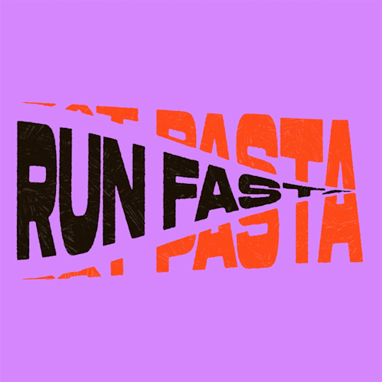
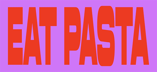
(instagram)
Tutorial in After Effects under the cut.
• Create a new composition and call it Split.
• Write your text, pre-comp it, call it Text or whatever you want.
• Create a mask from the center to one side (top/bottom), change anchor point to the top.
• Bring down Scale property and unlink it, keyframe the text to go from 100% to 0% in 1s towards the anchor point.
• Cut the layer at the end.
• Duplicate pre-comp.
• Select the bottom one, click M to bring down mask properties, invert the mask and move anchor point to the bottom (so the text scales to the bottom).
• Duplicate Text pre-comp one more time. Select it, press M and delete the mask, move anchor point to the center. Create new keyframes to scale it from 0 to 100 in 1s (properties unlinked). Select both keyframes and delay it by 1 frame. It makes the text look like it’s scaling from the center.
• Change bottom and top text color by adding Fill effect to the pre-comp.
• Easy ease all keyframes.
• Select all pre-comps and duplicate them, put them at the top and put them at the back to extend your animation (or arrange in your preferred order if you’re doing a phrase like me). So far it should look something like this:
• Create new comp Wave of 10s, add your Split comp.
• Create new Solid layer, call it Map, add Gradient Ramp effect, make white at the left, black at the right and hide the layer.
• Select Split pre-comp, Right-click → Time → Enable Time Remapping and extend the layer to the end.
• Add loopOut() expression to Time Remap.
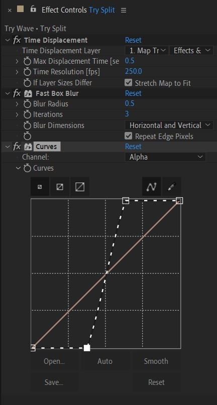
• On Split pre-comp add the effect Time Displacement, on Time Displacement Layer select your Solid layer (Map), and on Source select Effects & Mask.
• Change Time Resolution (fps) to 250-300.
• Add Fast Box Blur effect, change Blur Radius to 0.5.
• To bring back the sharpness add Curves effect, change the Channel to Alpha and change values (see screenshot).
• Play around with Max Displacement Time [sec] on Time Displacement effect depending on the look you’re going for. I set it to 0.5.
• Now this whole animation is driven by our Solid layer (Map) we created. So if you make any changes to it, the animation changes too. For example, you can change Ramp Shape to Radial on Gradient Ramp effect, and see how it changes your animation.
• I additionally added some texture on the text, used Track Matte and added wiggle(5,500) expression to the Rotation property so texture would be constantly moving. Also added some additional effects to the new Adjustment Layer on top such as Roughen edges, Turbulent Displace, Posterize Time and Noise. Let your freak flag fly - it’s a matter of taste and creativity of what you do with it. Your animation should look something like this:
#artists on tumblr#animation#artwork#2d animation#after effects#gif tutorial#art tutorial#art tips and tricks#after effects tutorial#tutorial#art#motion design#tips and tricks#tips#digital art#gif#visual art#loop#learn after effects#illustration#infinite loop#pasta#funny#pasta humor
70 notes
·
View notes
Note
Do you have tips on uploading trad art to tumblr and not having it look scuffed as all hell 😭😭😭 your art looks great pls share your secrets
Aaaa, thank you! I actually decided to shift my focus back to traditional art very recently and it means a lot to hear that ;; I hope this helps you and anyone else with similar questions!!
So I have two methods that I usually rely on when capturing my traditional art. The first one is kind of limited, but it is faster and more accessible. For these demonstrations, I'm going to use a colored sketch of my OC, Brinley. Step One: Taking Your Photo! All you'll need for the first method is your phone. What you want to do first is to find an area with nice, even lighting- the less warm, the less you'll have to correct later, so the closer to daylight, the better. In fact, using the light outside is a great way to capture your art! Note: If you are in a place with very cool lighting you will also have to correct the colors, but in my experience, cooler light is easier to work with. Position your artwork so it's illuminated with the light source directly in front of you. If it is behind you, it will be harder to get your shadow out of the shot. The spot I was in had my light source behind me, so my arm covered it a bit.
I repositioned myself to a spot with the light source in front of me instead, and I was able to get a nicer shot.
Keep your phone as level as possible over your drawing, and as close as possible without your phone going out of focus.
And now the first step is done! Step Two: Editing Your Photo! This is where everything starts to come together! Firstly, crop your drawing to your preference. I try to keep the negative space around my art as even as possible. IPhones have a handy feature where you can choose an even aspect ratio, so that will help keep things simpler if you want. Next, all you have to do is mess with the settings until you get it how you want it to look. Filters can help it to look more cohesive. I like to keep the art close by me to reference so I can get it to look as close to real life as possible. Note: black and white art is the easiest to edit due to the high contrast. Finished! Congrats! Your art is ready to post! Here's what my sketch looked like after I added a vivid filter and then messed with the settings.
The second method can be a bit more difficult, but the results always look better than just taking a photo. What you'll need is a computer (I think you can also use an ipad- any device will work as long as it can connect to the scanner), a scanner and any art/photo editing software. Step One: Scanning! The scanner I use is technically used for office work, but can be used to scan photos, therefore the quality is very much in the middle. There are scanners that are used purely for scanning high quality images of art and photography that will produce much better results on the initial scan, but this works just fine! There are also stores and other places where you can scan your work even if you don't own a scanner. First, make sure your art is as flat as possible and in the middle of the scanning bed. It doesn't have to be perfectly straight as it can be edited later, but if it isn't flat or it's on the edge of the bed, it will end up blurry in some areas or completely cut off. After that, go to your device and set the resolution to at least 300 dpi to guarantee a high quality scan, and then begin. This is what my sketch looked like after the initial scan.
Now we can move onto the next step! Step Two: Editing! You may have noticed that the colors are very washed out- scanners that aren't optimized for art and photos tend to do this, but with some editing, it'll look great! After opening it in CSP and selecting a canvas size, it's ready to edit! Note: Opening the image directly will automatically set the document's dpi to 72. Idk if that's a constant for other programs, but this means the overall image quality will be very low, so the picture has to be imported into a higher quality document with dpi set to 300 manually. I usually just copy and paste it into another document. Level correction is your friend! That's the correction layer I use the most when editing and it does the most heavy lifting, usually. After that, I sometimes edit the saturation. Since this is a digital method, you can edit your drawing however you want! You can fix some mistakes this way, or completely change things. There were notes and a sketch next to this drawing that i didn't want, so i painted over them with white- since i edited the level correction to up the exposure, the painted areas are indistinguishable from the background. Finally, I add either a gradient map for cohesion or fiddle with the tone curve until I'm happy with the final product. Once again, I like to keep the original art next to me while I'm editing for reference. (And then after that I might add a noise filter or some other effect, LMAO) Finished!! And now you have your scanned art!
These are all the editing layers I used!
Like with anything, trial and error are very important! You'll get better at editing art over time, so don't be discouraged if it doesn't look like you wanted it to the first time. Thank you for the ask, bye!!!!!!!
#tutorial#art tips#art tutorial#art tutorials#art resources#drawing tips#traditional drawing#traditional illustration#traditional art#art help#tutorials#resource#references#useful#marker art#copic markers#copicsketch#copicdrawing#copicillustration#tips#tips and tricks#art how to
29 notes
·
View notes
Text

Shading without blending? HAAAARD i hate it but anyway i like how the hair turned out. Still having trouble with the skin and face if anyone has any tips I would greatly appreciate them 🫶🫰
#art#artist#sketch#doodle#drawing#procreate#digital drawing#digital painting#digital art#digital illustration#tips#tricks#drawing tips#please help#shading#shadows#light#values#color theory#ocs#my ocs#oc art#oc#original character#original art
3 notes
·
View notes
Text
Useful links for (graphic) design
'sup folks, I've compiled a list of links of websites and tools that are useful for designing stuff! They're divided in different sections.
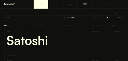
FONTS - All of them are free and easy to use, unless otherwise stated.
https://www.freefaces.gallery/
https://www.fontshare.com/
https://dirtylinestudio.com/freebies/ (These are the free versions only for personal use, so no selling stuff with it)
https://velvetyne.fr/
https://usemodify.com/ (Make sure to check the license to see if it's free to use)
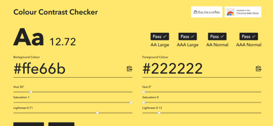
COLORS - Helps you pick colors in different ways
https://colourcontrast.cc/ (Helps you see if your font and colors provide enough contrast)
https://picular.co/ (Type a prompt and it will give you colors associated with that prompt)
https://pigment.shapefactory.co/ (Gives you a wide selection of dual color palette's that have a lot of contrast)
https://t-o-n-e.com/ (Gives you color palette's that have the 60-30-10 applied to it)
LOGO INSPIRATION- Searching for logo inspiration
https://logosystem.co/ (Gives you a big variety of logo's)
https://dribbble.com/search/logo (Dribbble also shows other stuff than logo's)
GENERAL USEFUL LINKS - As the name says
https://freedesignresources.net/ (Here you can find a lor of free stuff like vectors, images, font's etc.)
I'm going to update as I learn and use more of them later down the line on this website that I made: https://design-links.carrd.co/ .
#illustration#digital art#queer artist#art#inspiration#procreate#design#graphic design#creative#designinspiration#tips and tricks#how to#tools#useful#graphic art#typography#logo#layout#graphic source
12 notes
·
View notes
Text
How I Choose Colors.
Choosing colors is one of my favorite parts of drawing. It can really pull a piece together and help portray a mood. There are so many different ways to go about color there is no way I would be able to go over them all. I can go over 2 of my favorites that I tend to use the most in my work though. This is going to be a longer post but I do hope that you stick around. I am not a professional artist so some of the terms I use may not be 100% accurate but I do hope that I can get my point across.
Muted Color schemes.
When trying to convey themes of sadness I will often go with cooler colors. Using muted tones can also help bring about a sort of calmness as they aren't as striking to the eyes.
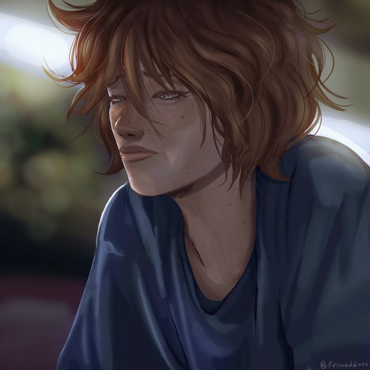

On the left, the colors are warmer, and while we can see on his face he is experiencing some sort of sadness, the overall color scheme of the image doesn't necessarily convey that. In my opinion, a warmer color scheme is much better for conveying happier moods. it shows more comfort and joy.
On the right, the colors are cooler and it makes the drawing look colder. It makes it feel a bit more like he is feeling isolated and his environment reflects his sadness.
Having a warm background and a cool character(or vice versa) may introduce an interesting contrast though. I haven't tried it myself much but now that I am thinking about it, I think it could work well to show how a character feels versus the way the world is around them.
RED.
A lot of the time when I use saturated reds in a drawing it's supposed to portray some sort of shock factor. I haven't used it much lately but I will show you an older piece I drew for someone that utilized a lot of red.
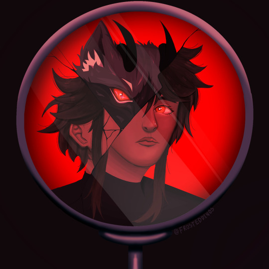
In this piece the shock is supposed to come from the fact that this character is not completely human. The red sort of aids in this as it introduces a certain air of danger. The cracked mirror portrays the shattering of a facade and that general Idea.
Red can also be used to aid in portraying one character being the one inducing fear or a character being angry. This color language can be used with other colors as well such as yellow showing joy and blue showing tranquility or peace.
Anyway, those are the top two ways I choose colors. I hope that this helped, even if just a little.
#art#drawing#art tutorial#beginner artist#color theory#how to color#digital art#digital illustration#artwork#artists on tumblr#tutorial#drawing tips#tips and tricks#art advice
8 notes
·
View notes
Video
Jak narysować OWCĘ w #pixelart #gamedev #aseprite
#youtube#owca#rysowanie#malowanie#rysunek#krokpokroku#tips#tricks#pixel art#pixel graphics#pixel aesthetic#piksels#pixel illustration#sheep#minecraft#aseprite#digital art
2 notes
·
View notes
Text
youtube
5 Useful Text Effect Tips & Trick
In this video, I will show you 5 Adobe Illustrator text effect tips and tricks that might be useful for you.
#graphic design#youtube#illustrator tutorials#education#3d text effect#text design#text effects#Text Effect Tips & Trick#adobe illustrator tutorial#adobe illustrator tutorials#free education#educate yourself#graphic designers#typography tutorial#typography tutorials#typography tips#Youtube
2 notes
·
View notes
Text

Sea of wildflowers 🌈


#watercolours#watercolourpainting#watercolour art#art#paintings#art gallery#wildflowers#tips and tricks#colour study#splatter#watercolour#artwork#floral#floral illustration#flower garden#spring flowers#flowers#floral art#tricolor#garden#drawing#drawing videos#youtubesubscribe#artistshoutout#youtubesupport#youtuber#pencil drawing#pencilshading#flora and fauna#flora
3 notes
·
View notes
Note
Do you have any tips for drawing faces/expressions? I really like the way you draw them
DO I HAVE TIPS FOR YOU!- that’s what he said hehhehhehsnort
The key to good facial expressions is all in the eyebrows and subtle shifts of the FACE MEAT.
See below example.⬇️

I have art tips and tricks for my Patreon pigeons if you’d like some more!
Good soup.
#illustrator#illustration#digital artist#artist on tumblr#gleafer art#art tips#art tricks#artist on patreon#patreon creator#let’s draw!
639 notes
·
View notes
Text

Thank you to @theonewhopoops :'D I appreciate the tag! This was actually a very experimental process with a whole lot of failures in all honesty. Short form of this is... 1. Tried to hand paint scales.. That was a horrible idea and they were not scaled properly to my illustrations. 2. Tried to make a scale brush??... That also didn't pattern realistically for me. :'''D 3. Found a black and white very simple snake scale texture that I polarized even further. I inverted it and just copied and pasted the texture and warped it all over their bodies on each illustration. This weirdly enough worked!


You can see a lot of this usage in many of my snakes, especially in the black and white rougher stages. The only areas I would hand paint are the belly scales and the faces. As snake scales in these areas are pretty unique and need extra love and attention. I hope this helps a bit! 👍

#digital art#digitalart#digitalartwork#digital illustration#digital painting#made by human#illustration#noai#no ai art#stylized#how does one start?#tips#tips and tricks#how to make scales
7 notes
·
View notes
Text
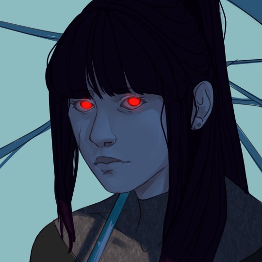
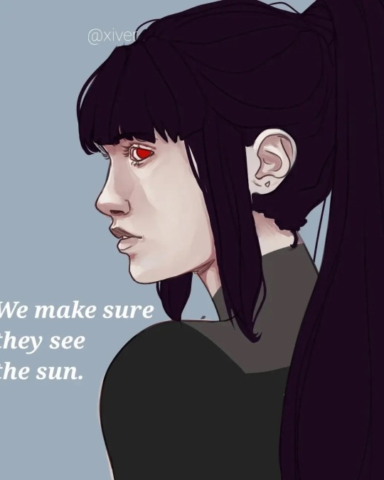

I have no idea why I couldn't stop drawing her, but I do love her(Cassandra).
#anime#art#artists on tumblr#illustration#oc#oc art#ocs#my ocs#oc rp#oc artwork#my oc art#artwork#original art#digital art#artedigital#arte#art tips#art tips and tricks#illustragram#illustration tips#painting#paint tool sai#poetry#fnaf#arcane2024#arcane#rpg#oc rpg#roleplay#new rp
2 notes
·
View notes