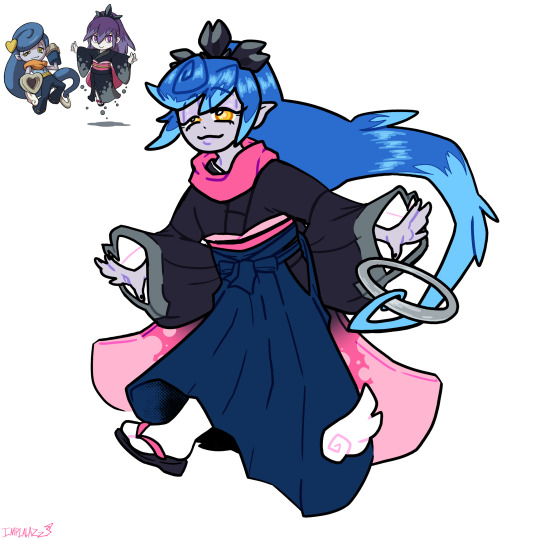
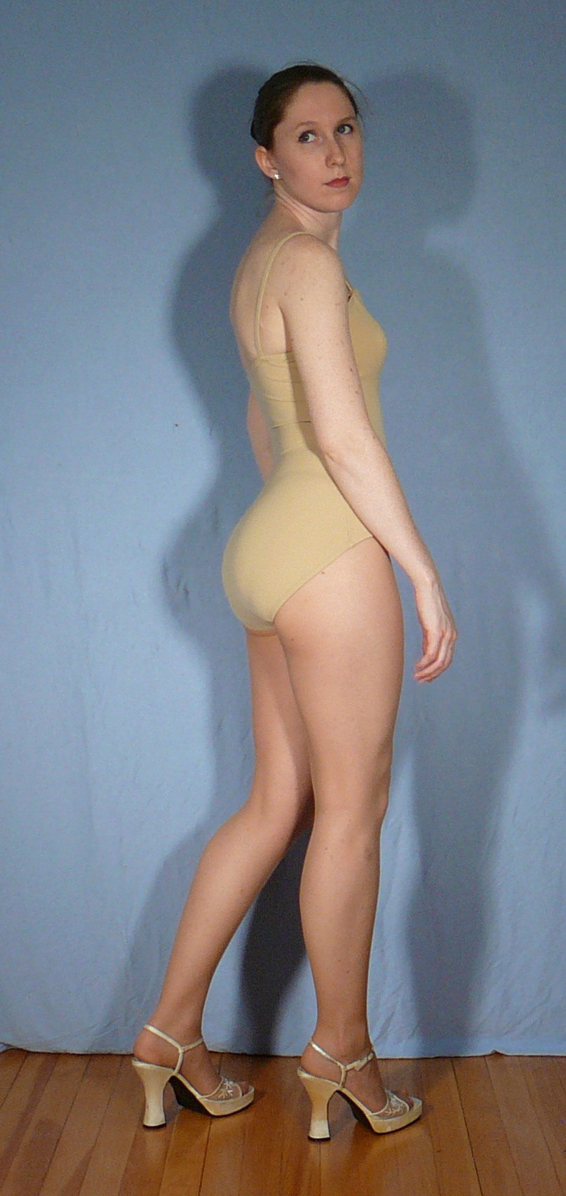
#pose reference from one of same-side's drawings
Explore tagged Tumblr posts
Visit Tumblr Blog
Explore Tumblr blogs with no restrictions, modern design and the best experience.
Last Seen Tumblr Blogs


Fun Fact
Tumblr has been providing a Korean-language service since 2013.
Text
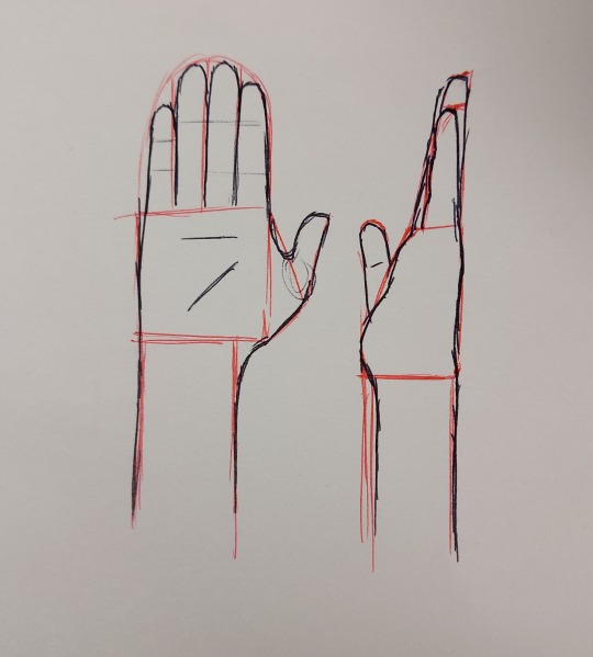
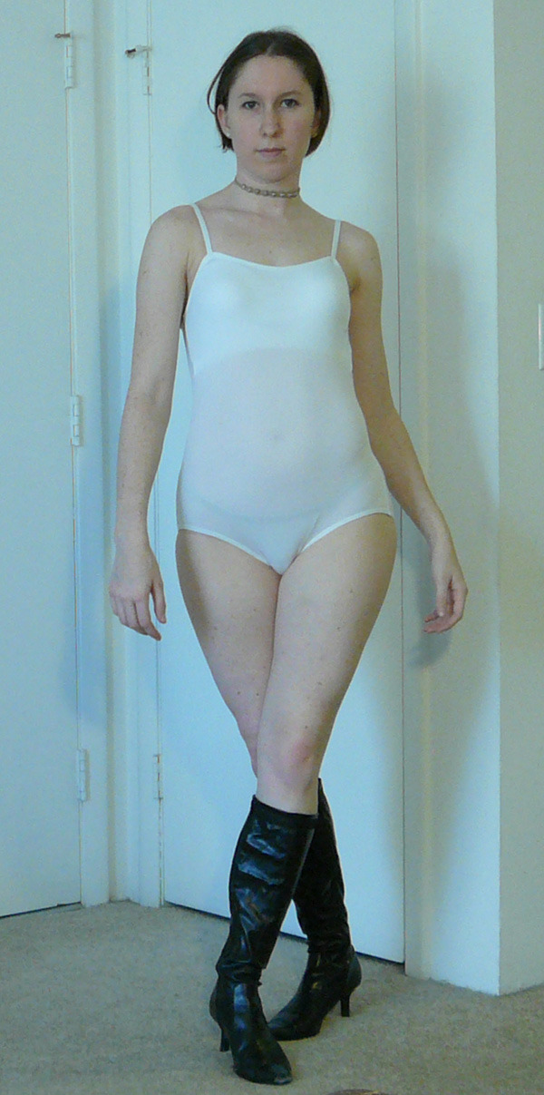
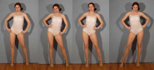
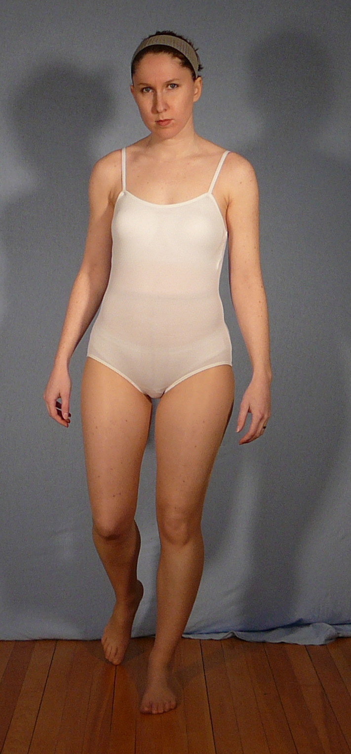
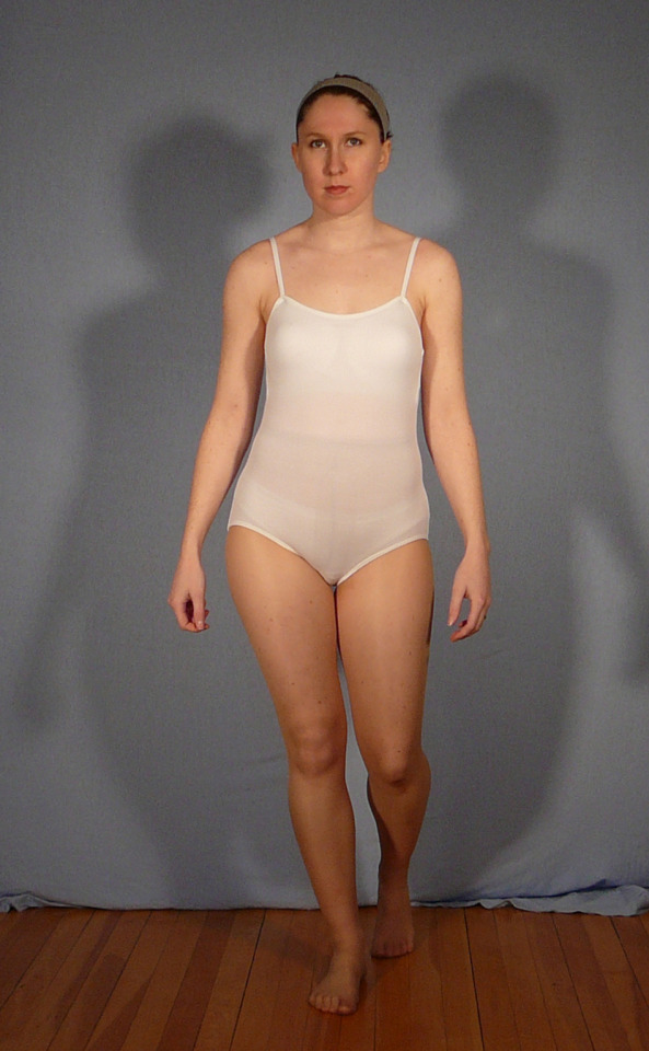
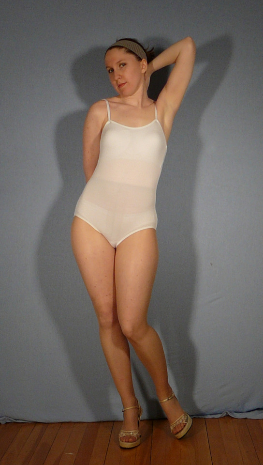
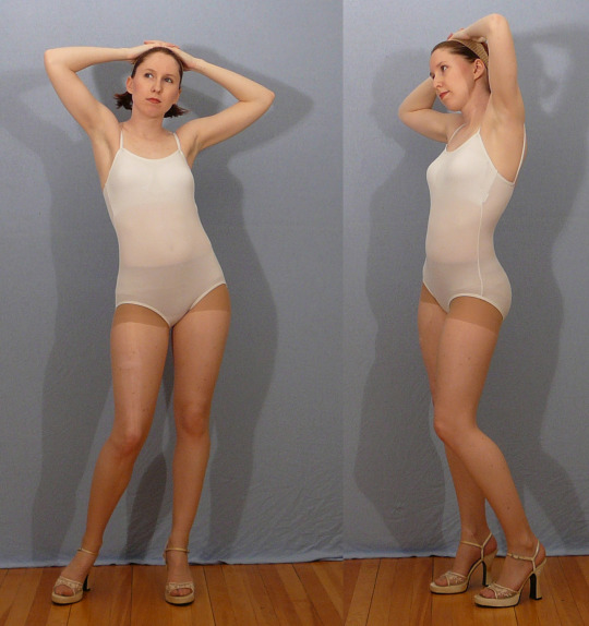
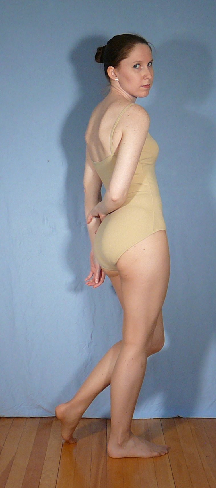
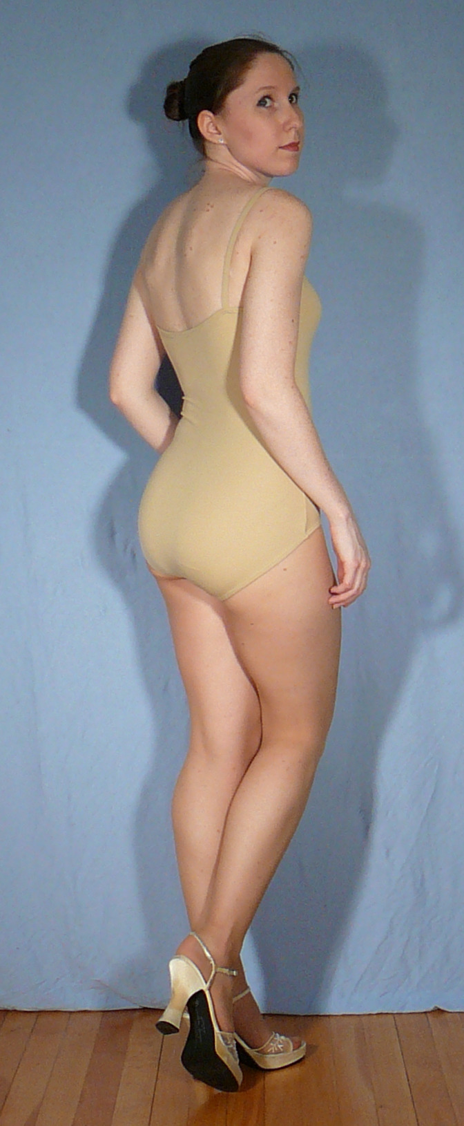
How to properly create a readable reference… !
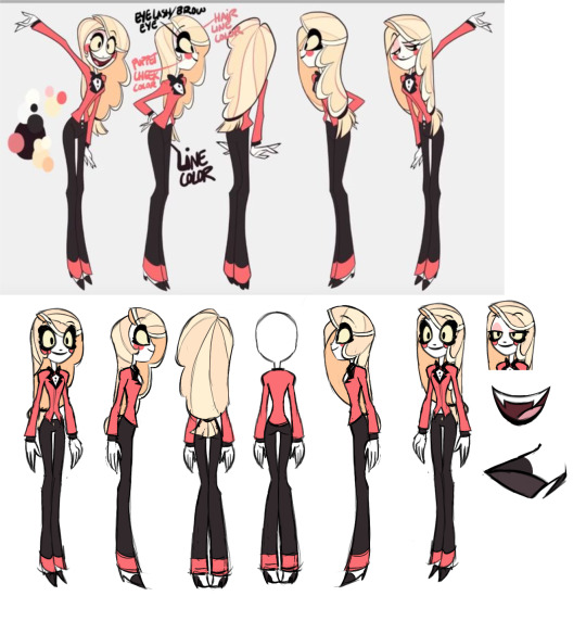
Using old pilot reference as an example, I’m here to expand on this to make a turn around sheet that will be more helpful to someone who would be looking at this while animating the design….
1st, get rid of the posing, it’s stretching anatomy and complicating the image, how will we be able to see how her shoulders rest if we can’t see her arms down at her sides? Leave poses for a separate page for exaggerated expressions
2nd, giving her a neutral expression can not only help us better balance the thickness of her lashes but also make the eye shape clearer- and where her features should rest naturally when she is calm. Giving the animator a consistent anchor after an especially exaggerated movement of the face. We always must have a proper clear default.
3rd, proper side angle, her arms pinned back slightly to expose her side, showing the animator how the shirt ends at the side or how the lapels connect to the back and wrap around the neck- which can be shown at the back angle too.
4th, proper back angle, you can see I have two set here one where her hair is out of the way and exposing her back while one had the hair fell down, showing us not only how the back of her shirt looks but as well as how her hair would fall- leaving nothing to imagination and guess which could have contributed to animation consistencies to the pilot art style. Preferably we would also have a straight on shot as well, but for space sake I left that out for now.
5th, all are in the same pose and all body parts match up, none of the hand on hip or out in an awkward position. We have to know in animation the BASICS then from there the animator is free to bend it in practical ways but will always know what the rules may be. It’s exactly why so many shows have animation bibles. The more information you feed your animators the more streamlined your project will be. Don’t make the animators work any harder then they already do by guessing what the hell you were going for…
6th, add ons, what is the inside of her mouth look? What about a place we can’t see such as her top lid (while also getting a view of what her lashes look like down at half lidded) or the underside of her foot? Leave no place left untold! Remember animation can help give your characters the illusion of living in a 3d environment. They can and will see the underside of them or behind them- work thoroughly.
Whether you are making animation or even a comic, a proper reference is crucial to character consistency as well as a perfect place to add additional information one might not see at first but grow incredibly vital in later drawings.

421 notes
·
View notes
Text
so as a preface I wanna state that this blog is PG-13/TV-14 like the game, so there's topics regarding mental health, self harm, suicide (as they're factors in Siffrin's life, even if the focus isn't on these details its still something they live with) so it shouldn't be surprising that i don't take any issue with discussing the human body nor with depicting it.
in fact like, the comic (soon even!) will make jokes and tease the idea of showing nudity (NOT genitalia) because frankly, i do think the human body is funny. i've already made jokes about butts before so this isn't out of my realm of comedic bullshit. said nudity is censored, partly so i don't have to worry about comicfury/tumblr upping the rating/adding warnings but also the censor bars themselves are part of the gag
that said, while i don't think the human body is inherently sexual, i DO get anxious as hell talking about it even if my work doesn't flinch from any topics. (don't ask me how that works, i'm anxious just typing this LMAO?) anyway i just wanted to talk about this to get a read of what people think, and how I could go about it going forward?
i draw the Siffrins as skinny people. They're described as short and scrawny ingame* and I intend to keep true to that detail. But skinny doesn't mean bone-thin. I enjoy pushing body diversity in my work, and Siffrin isn't without fat. They (like me actually!) hold fat at their thigh-hip-belly area. my art has gotten more detailed/ anime-level realistic in proportion so this became more clear when it came time to not bullcrap-simplify the anatomy.
* (They're the same height as Mirabelle w/ heels on; the Running One and Siffrin afterward call themselves scrawny)
so like, the Siffrins are skinny. they're pear/triangle shaped, i didn't give them large breasts. despite that, i've gotten a few comments alluding to them being big? and that confuses me?

my only guess is that the outline just naturally makes everything look thicker AND/OR side angles could make it seem bigger? am I weird and have a distorted view of what's small? earlier today i even cut off the extra line thickness but i'm still getting comments on this. (NOT that anyone has been inappropriate or anything)

I know the jester pose itself DOES push things so, yeahhh, things are more emphasized, so maybe that's??? what's being referred to? my only hope is as the comic continues (it'll mainly be night segments like rn) and we see more of the two without a cloak it'll be more obvious they're not big honkers idk. like i'm just??? questioning my ar abilities here and way over thinking things 😭
#ooc#does loop big booba or is sam ok at drawing anatomy as they intended lets VOTE NOW#christ do i tag anything here or not cause like i said i personally don't view any of this as like. raunchy or anything but idk how others#are going to feel about it. maybe its how i was raised but i feel like i'm gonna get shot at for even bringing this topic up LOL#like im making it weird its on ME#AUGHhghhghhhhh
164 notes
·
View notes
Note
So I don't know who to ask about this, and since it's your profession, I figured you'd know most! I like to use Magic Poser to help me draw my characters' poses, but I feel like I always wind up altering the proportions to fit the models rather than my style without meaning to just because I'm drawing what I'm looking at. It feels less like looking at a reference and more copying a picture, and it makes me feel really bad, like I'm cheating at art. Do you have any thoughts or word of advice on this? I'd greatly appreciate it. Thanks!
Hey Nonnie! Hmmm there's I feel like kind of two questions here. One, using Magic Poser or any other legit reference to make your art is not cheating. It's just using a tool the way it's meant to be used (as a reference). There's nothing at all wrong with that. ♥ However, if you are getting Not The Results You Want from this process that's another issue entirely. So, two: what do I do if the art I'm making from reference doesn't look like *my* art? If you find that working from a reference is changing your style in ways you don't like, I have suggestions: 1) do a sketch from the reference just like you normally would in whatever style comes out naturally using the reference 2) look at the drawing you did and put the reference away 3) draw another drawing from the drawing you did but try to make adjustments towards the stylization you prefer (your first drawing is your reference for your second) OR, if your brain will do this for you: 3b) after sketching from the reference (maybe a few times for good measure) put the reference away completely and try to draw the pose from memory* and see what happens. If you think you're overly reliant on references to the point you think it's holding you back then you can start to wean yourself off of them but doing more and more drawing without them. Maybe start with a 20min warm-up on my Sketch App drawing a bunch of poses really fast from reference, then pull up a new pose, look at it, and try to draw it without checking back in at all. Honestly the best way to get to a style you like is to just draw A LOT. Draw lots of different ways. Mess around with line weight and shapes. Make things swish, make them pointy, make lines that cross over a lot, make a mess, make it neat, keep going. Do a lot of drawing and investigate what feels and looks right to you. And if a tool isn't serving your goals, you can let it go. It might be hard at first but you will find your way. ♥ * Side note: I have aphantasia which means I don't have head pictures. If I look at a reference and walk into the other room, I am not going to be able to replicated it very well from memory. That being said, if I sketch a pose over and over and over a bunch I will retain it somehow, somewhere (I don't know how brains work). The next time I go to draw that pose it will be easier. Just popping this in here in case you have the same trouble.
530 notes
·
View notes
Text
EXTRA OVERCOMPLICATED ICEWIIIIINGS
You know how it goes, Joy Ang is cool and I'm not yadda yadda move on.
Details and explanation below!
Otherwise, next week is the last Pyrrhian tribe: NightWings!!!! See you then!
More overcomplicated dragons.
If the RainWings are the design that destroys Joy's work the least, this one takes the original IceWings and tosses them out the window. Going into this design I knew it would be hard, but boy was I unprepared to get art block for 2 months because of it.
I eventually found my inspiration in the girdled, spiny, and horned lizards, They. Are. So. Freaking cool. If you think a crocodile skink is awesome, look up girdled lizards. Not as fancy with the eyeliner but they are SPIKY!
I fell in love in particular with the giant girdled lizard. I knew I wanted the scales of the IceWing to look rough and like they were made of actual ice or diamonds - or covered in frozen sleet and snow - and this lizard was basically perfect inspo for that. Also, blue spiny lizards. They are basically real life IceWings, full stop.
But even though I had perfect references to draw from, I still struggled with the head shape. I wanted them to feel like a reptilian polar bear, which is why I slightly blunted it, but I think I should have gone with a more angular shape instead. I can always change it later when I do their full-body.
I did have a very fun time with the horns, however. I wanted them to be a mix of narwhal teeth and icicles (yes, narwhal 'horns' are actually overgrown teeth. One tooth, usually, but sometimes they can have two!!). Before I get distracted I should explain how they grow: the scales at the base of the horn are constantly growing and essentially create the horn. That's what gives them their narwhal-like spirals.
I chose a similar approach to the neck spikes (untangling that mess was fun, let me tell you. Grids are very useful when doing many scales/spikes). At the base of each one you'll notice a scale forming it. On the back, I wanted to give a good side profile of the spikes. Technically, they are ever-growing, and need to be trimmed or sharpened constantly.
Now, as I was drawing them, I asked myself: why do IceWings need a mane of spikes?
A stupid question, you might wonder, but to me it's very important. Animals look the way they do for survival. So, while it's important visually for the ice theme, how could they be explained scientifically?
And then, when thinking of polar bears, I got my answer.
How the hell does a giant sparkly dragon hunt in the north? Seals would probably be part of their diet, but it's hard to sneak up on them if you're a ten ton reptilian flying creature, so I imagine they would tackle the problem like a polar bear would by waiting by a breathing hole and pouncing at the right moment. They already look like a frozen snowbank, so that part is easy.
But any hungry polar bear would be doing the same thing, and like a giant dragon, they would be waiting downwind of the breathing hole too. They wouldn't pose a threat to adult dragons or dragonets larger than them, but in real life polar bears are dangerous hunters and prey on humans. Why wouldn't it prey on a dragonet it thinks it can take on? Things in the WOF universe seem to be extra big (or scavengers/humans are tiny) so I think it would be a feasible for a desperate bear to hunt a dragon. They cannibalize, anyway, so going after another apex predator isn't out of the question. In this case, the horns and neck spikes would be a dragonet's saving grace, discouraging attacks from behind and especially on their necks. A bear's teeth could never get through their scales, but they could still crush their airways and choke them, and the spikes would keep them away from their necks and protect them from that fate. As they grow up, the neck spikes' length and strength could be used to determine a dragon's health and help them select good partners.
Finally, continuing with the bear theme: for the scales, I took inspiration from polar bear fur (which is actually hollow) to help design how IceWings preserve their body heat. In polar bears, its used to make them look white by reflecting the light of the sun, but in IceWings it could keep the cold out. Air pockets would create a barrier between them and the outside elements, and whatever gets in would meet their thick layer of fat that does the real warming. Yes, IceWings would be squishy, but you'd probably poke your eye out or stick permanently to their side a la tongue to cold metal pole.
Don't hug IceWings; they're very cold.
#wof#wings of fire#wof art#art#my art#digital art#icewing#wof icewing#wof fanart#Overcomplicating the WOF Tribes
338 notes
·
View notes
Text
Here is a shrimpy rambling about the Butler sprites for the April Fool's event 🦐
GAWD DAMN THEY BROUGHT OUT THE ENTIRE BAKERY WITH THOSE SPRITES
On a more serious(?) note, the sprites remind me of the Summer Raphael card. They're not L grade levels of rendering but they don't match the S grade card art style either. Naturally, I would assume they are S+ cards.
They will probably be acquired the same way as Summer Rara too: by purchasing a ticket with the code at the pop up venue. While I do get the marketing strat of lowkey forcing people to actually go to the venue to not only buy the code but also the physical merch, I hope PB wouldn't make much of a fuss about people reselling codes to people who really want the cards but aren't able to go to the pop up event.
So about the sprites! I don't think they are AI. That's just my opinion. Seeing the full body ones and looking through all of it from top to bottom (as respectfully as I could lol) they just suffer a bit of wonky-ness that all WHB sprites suffer. I don't wanna fault the artists since they've probably done the best they could. They gave us really good cakes after all. It could be from management's side of things or whoever is in charge of the art department.
Remember: the artists can give it their all but at the end of the day, management has the final say in things. Which sucks ass but that's the reality of things.
Besides, I think PB is smart enough to realise that using AI for their sprites would be like taking a shotgun to their own foot and ruin whatever's left of the players' goodwill. I hope.
MY BEEF!
The sprites are good but not perfect. There are glaring issues that we've seen and pointed out. Most of these are just stuff I personally have beef with.
1. Beel's skin tone.
Good god they massacred him. That is not Beel. Who the fuck is that man. I'm so happy the fandom agrees they fumbled this so bad. Putting up my edit beside it to preserve my sanity /hj


2. The poses and the proportions.
They're a hit or miss. Satan and Beel have the best poses imo. Mammon's is a bit fruity. Levi's and Belphie's is fine enough. Asmo's being a tease with the little butt grab. But Lucifer? Bro is your back alright???
And the butts...yeah idk how Beel's got the biggest and roundest. Oddly enough I think Belphie's got the most proportionate butt.
3. The difference in the rendering of their faces
Lookie at this:

Look how the rendering becomes more and more....simplified? as we go through the Kings in order of release. The main 4 is fine. Beel and Satan arguably have the better rendering with the lighting in their faces and hair. (i fucking hate using the unedited Beel sprite cuz of the skintone but im trying to make a point here)
Lucifer's is so-so but then we get to Belphie and Asmo....they got done dirty 💀 it's like the artist ran out of steam or smth.
I feel disappointed but not surprised kinda.
5. Asmo's hair
Just like Beel's skin tone, WHERE TF DID IT GO???? WDYM WE GET A LIMP ASS PONYTAIL FOR HIM???

Man where did all that hair go 💀 also did they make him paler??? like,,,how is that even possible
What in "Hell" is Bad's main selling point are the characters we simp and thirst over. PB should give great care when it comes to their art for them. I'm fine with average quality for the art but what I'm looking for is consistency. And for them to forget such a crucial feature like skintone, it really tilts me so bad. I can excuse the hair. You can argue that it's a different hairstyle but skintone??? I'm sure as fuck the artists have and can use a crap ton of references when they draw the character. So why the fuck did Beel's sprite turn out like that.
And then there's the inconsistency with the rendering. Idk what's going on during the art process but srsly....the difference is off putting, to me at least. Belphie's and Asmo's ass and clothes are more rendered than their faces.
At this point it's more of a Quality Assurance thing. Can PB get someone to review the art before it gets released or smth 💀 gotta make sure it's all yk, fucking consistent to all the art released so far
If you've made it this far, thank you for taking your time to listen/read to this shrimp's rambling about the demon porn game🙏
#what in hell is bad#prettybusy what in “hell” is bad?#whb#what in “hell” is bad?#🦐:ramblings#whb butler event#i am yapping and complaining because i want PB to be better#criticism is inevitable#how PB takes it will show us what they atcually stand for#i just hope they wont use ai#that's like shooting their own foot
61 notes
·
View notes
Note
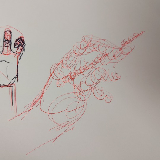
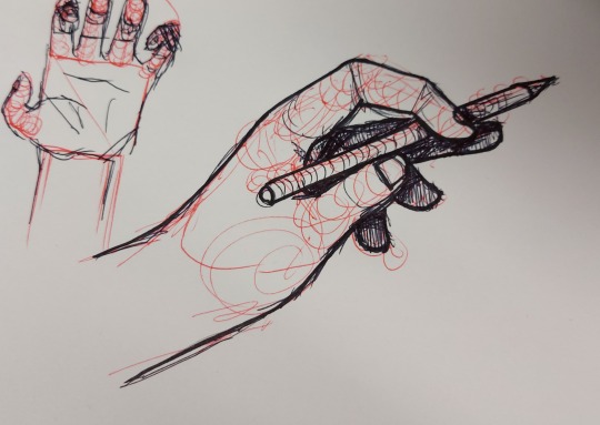
Could you make a quick tutorial on drawing fingers?
Sure! Pardon the quality, I'm on my lunch break at work.
SO I kind of cheat a little, in that when I'm just doing a doodle, I don't use references- I kinda just wing it like this? The palm is pretty much always the same shape, so I start with a square, and the fingers are never wider than the palm, so an arch of the same width does most if the work for me:

And from the side, I can kinda cheat that too, since the fingers are usually the same thickness all around and, again, never thicker than the palm:

and depth is where it starts to get. Fucky.
For depth, I usually start with the square I know the palm is, then just scribble in the general shape the fingers are making:
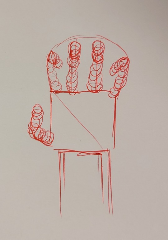
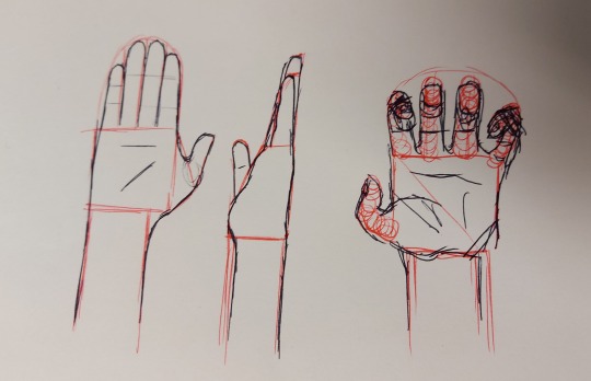
and then break those noodle curves into three-part segments after. And really, they'd look a lot more ridiculous without the nails- the curve of the nails is adding to the illusion of a tube curled forwards, instead of like. An awkward blobby jellybean shape
And for more complex poses, I usually take photos of my own hands, or hold a pose with my left while drawing with my right.

Really, for fingers or hands or anything else at all, I only ever have two reliable tips for anyone:
Don't draw what it is. Draw what it LOOKS LIKE. If you try and draw a hand that looks like a hand is structured, you have to build an entire model inside your head that looks the same as the one you see and THEN you have to make your brain translate it perfectly to paper. If you just draw what you see, with no other assumptions, the path is much shorter.
IE, You don't need to know how something works. You just need to accept it for what it is. (This is why you don't see most of my pinky in the gourth example sketch- if I can't see it, it doesn't exist.)
And 2. Just fucking bullshit it. Is it anatomically accurate? Sure. But if your eyes still say it's bad, tweak it. There are no rules. Do what you gotta do to make it convincing, not real. Real things look fake all the time. Make something fake that looks real. Far simpler to pull off.
Anyhow, my alarm just went off- I hope this helped? Might do a video sometime, actually. Thanks for the ask! 💛
1K notes
·
View notes
Text
My art process, more or less
Hey, so a lot of people have asked me before to share some of my art process. So when drawing a recent quick personal piece I decided to finally take screenshots as I went to make a write-up. This is the artwork:
And below the cut is all the steps as I drew this. I wasn't counting the time but I think it was something like ~5 hours between two sessions.
This is less a tutorial and more just showcasing how I draw. You know how writers sometimes call themselves a planner or a pantser? I'm a pantser with art. When I try to plan stuff out too thoroughly I get stuck in the mindset of like, it HAS to be one way and I can't improvise. Improvisation and pivot is kind of essential in how I draw, and I recommend everyone trying to not be so rigid when drawing if you can help it. I'm kind of all over the place and winging it through most drawings so I hesitate to call it a tutorial as I feel it would be hard to follow for beginners. I can only manage to draw this way because I already have some classroom training, thousands of hours and artworks under my belt, and a pretty strong sense of visual recall that gives me a good sense of how to eyeball proportions and the like. Okay, disclaimer done, let's jump in I guess
I had an idea to draw my OC wearing a layered shirt combo that I saw in a cat video and I thought suited him. You'll see the snippet I took of it in the corner of the canvas throughout, but that's where the idea spawned. I began with just trying to get the basic gesture and flow of the pose. I was constructing it from my head, as I most often do (I don't recommend this, but I am usually too lazy for finding pose refs)

I flip the canvas and use the lasso tool all throughout and just continue to push and pull on the body shape and gradually add more substance to it until I'm satisfied with the undersketch
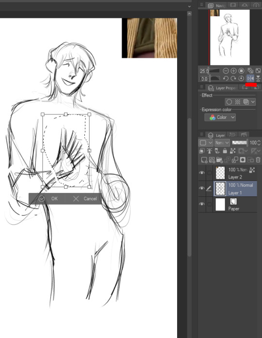

Once I feel like the undersketch is what I want it to be, I lock the transparency and reduce the opacity to 15%. You could also just change the colors on it if you'd prefer, but I've done that and then drawn on the wrong layer too many times lol so I prefer to just lower opacity. Then I make a new layer at 100% opacity and start to draw the clean sketch on top.

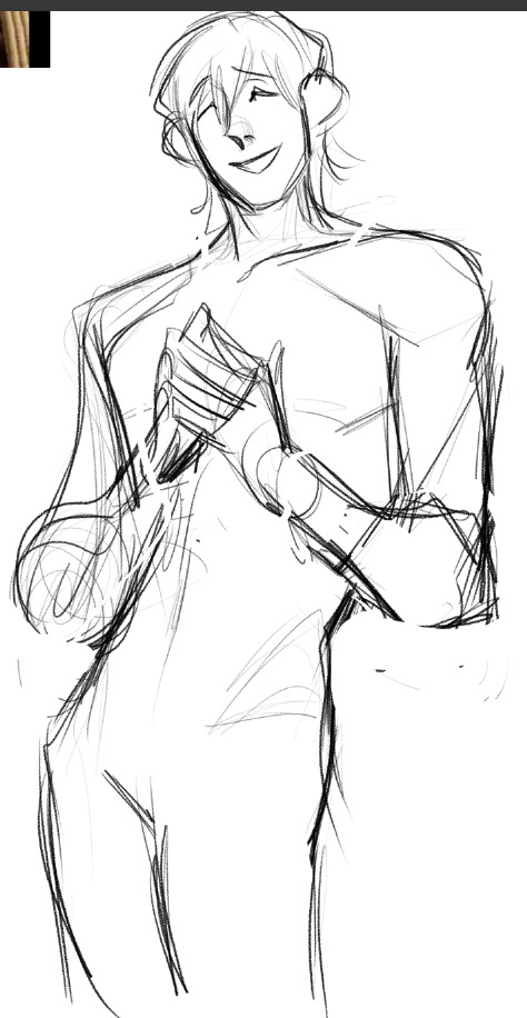
I'm making changes to the pose and expression as I go, as you can see I ended up shifting his head away from where it's positioned in the undersketch

I achieve some of the effects in my art, especially the line weight, through setting the colors to transparent and continuing to use my sketch/line brush so that it now acts as an eraser but maintains the same texture and size as my brush strokes. I use it to cut away excess lines, and also add transparency to stuff like having the eyebrows be a suggestion beneath the bangs

I redrew parts of his face, neck, and hair several times and questioned what I was doing with my evening (normal part of the process) and eventually ended up with this:

I realized the hands were way too vague in my undersketch so I went back to it to try and figure out the hand pose better

And here's the finished hands. Well not really finished, I continue to mess with line weight later, but this is basically their final form
And this was basically the finished "lines" (it's still a sketch to me because I use this rougher brush, but people always refer to it as line art. So I guess it's line art), with the undersketch on and with it off


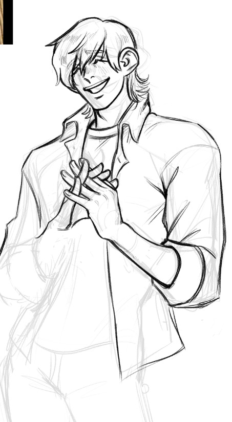
Of course I took one look at the art above and said "something's wrong" lol but I was in a bad mood and it was late so I went to bed. I came back the next day and began tweaking it, using my beloved lasso tool to adjust his face somewhat which helped a lot

I then proceeded to add some more line weighting, adjusted proportions further, and toned down the folds on his jeans because there was WAY too much focus on them lol. Side by side to show the differences:

Okay now we can start colors. And I know this is the thing you're all here for, the skin rendering. Well, sorry to burst your bubble, but it's mostly just magic with textures and layer modes! I make a flat color layer for the skin base, and three layers clipped above it (clipped meaning, they lock to the alphas of the base layer). The first layer clipped above is set to 100% opacity with a normal layer mode. This is for color variations on the skin like blemishes, freckles, lips, tattoos, hickeys, and in nude works, nipples and genitals. In this artwork though, it's just his lips.

The top-most skin layer (three above the base) I set to 40% opacity and hard light mode. This is important, but can be adjusted. You can use multiply or soft light if you want, or adjust the opacity, really mess with it. But this is fore the texture on the skin. I use a custom airbrush that simulates skin pores, and I use a saturated orange color and dust it all over his skin
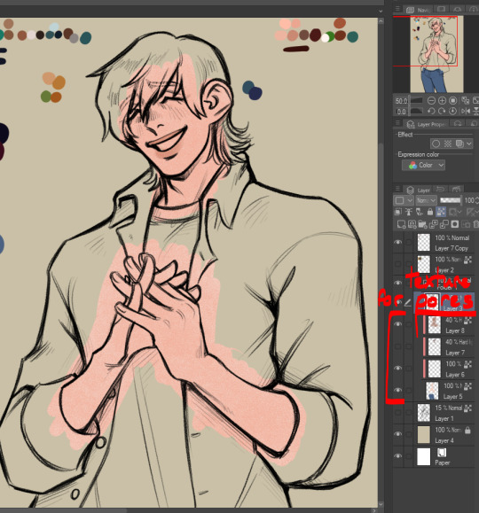
Next is what I normally like to call blush but it's all over, so it's really like. Definition? People call it rendering and I suppose it's kind of like that but in my head I'm just being lazy to make my flat colors look better and not have to actually do proper shading on the piece! But this is below the pores layer (so it's two layers above the skin base) and it's also set to 40% opacity, hard light. Again, use your discretion and play with it. I use a dark red color for this, it leans slightly pink but it's still fully red I'd say. Like a wine red I guess? And I just start defining shapes of the body, and deepening it in areas that actually would have a lot of blood flow (like the cheeks or ears)

I basically do it like this: I use the same brush that I use for blending when I am doing actual rendering (it's just an oil brush with a chisel tip that I got off the assets store, though it is currently unavailable last I looked) and I block out the area darkly. Then, I swap my color to transparent once again and I use that to carve out the midtones. I use a light touch so I can blend it out really nicely but I do leave some hard edges where it feels appropriate.


So satisfying, so beauteous (★ ω ★) Then I just add in the rest of the colors, putting them in their own layer so I can easily edit them later.

And edit them I did. What is this color scheme?? Whack lol I color picked the shirts from the video I was referencing.. and realized I didn't like it. So I tweaked the colors to better match Mal's earthy color scheme. I also colored the lines by locking transparency on the line layer and coloring over it in a deep red.
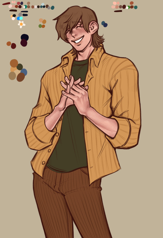
Lastly, I made some little edits to line weight, gave him his fuzzy arms (essential, and also? Charm point) and used a deco brush from the clip studio assets store for the background. Here's the finished artwork:

And here's the deco brush, if you wanted to download it:

#art process#art tutorial#art stuff#art resources#art tips#idk man idk how to tag this#long post#cass art
33 notes
·
View notes
Text
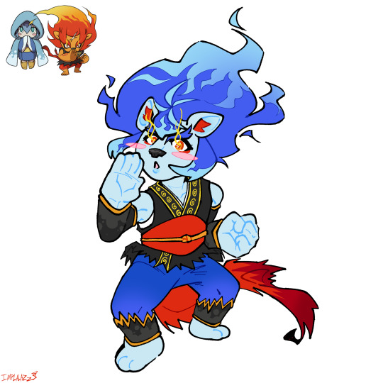
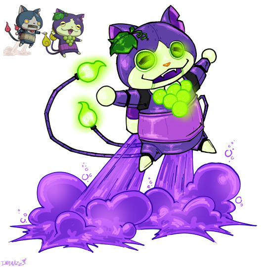


Waaaaaaaaa I’m back with more yokai fusions & also a comically small Buchikoma
L-R: Blazitina, RoboGrapenyan, Damonono, Buchikoma, Komajisan, Pandatina
Again more design thoughts under tha cut ✌️
My fingers always feel sore after typing this much….. Lots of learning about the details of traditional clothes this time. I chose these pairings cuz I felt lazy & wanted to draw the simpler ones first lol
Blazitina: Lion girl 👍 First thing I can think of in my thought process was making the belt an obi sash. Tattered at the ends to batch Blazion’s & with an obijime for fun. I didn’t super feel like giving her the same kind of Miku-esque kimono sleeves that I gave Lord Lie-In so I just made them weird kinda arm warmers. Did the same for her pants too, I’m not sure what they’re called but they’re inspired by the leg warmer kinda things in PLA on the fancy kimono. Also gave her a juban cuz idk I made her gi dip too far under her arms & yknow she’s a little lady she’s gotta stay covered up. I know all of this traditional kimono gear isn’t conductive to good karate but whatever…… She doesn’t get boots cuz I like drawing paws & her ahoge mimic Blazion’s scar (I didn’t have enough room to fit it in). I was thinking of giving her an x shaped hair clip but I thought it’d be too busy on her head. Overall despite some things I’d change (the way I shaped the obi I know realize the shape is TOO stylistic) I think this is my favourite design of the bunch
RoboGrapenyan: Very much inspired by the pkmn Violet paradox mons* (*See the bells & eyes.) Not much to say it’s a pretty straightforward fusion. The tail onibi are lightbulbs because it feels more robotic & I thought it’d be cool. The jet exhaust is grape soda……. That was a choice. LOOK I’LL EXPLAIN, uh….. grape….. grape exhaust? Grape vapor? Grape soda????? Sure. Also I think in the back of my mind I was thinking of that soda gun from that one episode of SpongeBob. Naughty Nautical Neighbors. I had to google it I had to know what episode it was….. yeah.
Damonono: YAAAAYYYYY FIRST TIME DRAWING HAKAMA THEY’RE WEIRD BUT I’LL GET BETTER AT IT!! They’re supposed to be split leg hakama but in every reference I looked up they’re so wide that they just look like the skirt kind rather than having two leg holes. I gave them hakama cuz bootleg jeans would be weird with a kimono. And I like hakama. That’s it. The sleeves….. Let’s talk about those. I didn’t wanna give them the heart guns/cannons cuz idk…. I liked the way Damona’s hands were posed & I wanted to keep that. So instead they have weird fucked up heart shaped kimono sleeves. I wanted to keep Damona’s long obi too but I thought it might mess with the silhouette already having the sleeves & also that’s just not a thing you do with hakama. So….. her sleeves are kind of like the end of her obi…….. I’m only now realizing she could’ve had them tied up normally & they could still hang that low….. whatever. In my mind they go under the obi, get tied up so they can put on the hakama, & then untie them & let them hang over the hakama. Look I don’t think of fashion in terms of is this normal? Is this practical? If it looks good I do it. Not much else to say. I had to look up a tutorial on how to put on hakama cuz I wanted them to be as accurate as possible……. And now I know how to put them on so that’s cool I guess. I LOVE LEARNING!!!!!!!!
Buchikoma: Again pretty simple. I gave him a little tuft of hair to emulate Buchinyan’s wispy hair tuft. I forgot to draw the spot of the side of the right thigh, lol. His eye spot is shaped like an onibi cuz it’s cute 👍. His haramaki has the patterning of Jibakoma’s tummy spot cuz I can’t not give him the haramaki that’d be a crime. His ears are farther apart & smaller like Jibakoma’s, & his tail onibi are shaped like that cuz idk I tried to imagine what Jibakoma’s tail looked like & I thought of that. Overall another one of my favourite yokai fusions I’ve done. That’s my son
Komajisan: SPLIT EARS!!!!! Inspired by a fandom design of a certain character from a certain comic I won’t name….. IYKYK. Split ears cuz 2. Also extra swirly bits on the swirls cuz 2. I was thinking of adding blue spots to his bindle but I didn’t like how it looked so I didn’t do it. Fun paw spots cuz it’s cute. Forehead onibi are kinda angry lookin cuz idk….. I just felt it. Also mini onibi in between the forehead ones cuz 2. Some makeup accenting cuz……. IT’S CUTE!!!!!!!! I was also thinking of making the onibi half brown & half blue but it looked bad so yeah, I didn’t do it.
Pandatina: Probably my favourite in terms of lineart. I actually got noticeably better at drawing kimono particularly the sleeves. I’m proud :]. I honestly didn’t feel like giving her a haori/cape/whatever so I didn’t (also I just forgot to lol.) So she has a good sewn into the collar of her kimono. Clover shaped obijime like Slimatina cuz it looks cool & I like it, also I needed more clover shapes lol. She’s got one in her hair because of that too, I was thinking of making it blue but I thought nahh. She’s intentionally very pale cuz I wanted her skin tone to really match the snake part of her body. And she has eyeshadow on to emulate the spots around Pandanoko’s eyes, same with her pupils. Again just a simple fusion
#🎋.my art#yokai watch#yokai oc#fusion#Frostina#blazion#robonyan#grapenyan#casanono#damona#pandanoko#komasan#komajiro#buchinyan#jibakoma
150 notes
·
View notes
Note
Good afternoon! I really like your art, especially with Nikolai. I don't often see any content on it, and that's why it's very nice to see. Can I ask you how you draw hair and other items of clothing? It's just that in the future I also want to practice drawing to draw my favorite characters. 🌹
Hi there thank you! :D
Uhhh I tried my best to compile my way of drawing things, take this as a reference because I'm not a professional by any means and a lot of things I do are very much simplified and dialled down to fit my chibi style :3 but I'm flattered that you ask me, I like sharing my process sometimes!
alright first off with hair, we'll take Nik for example. For me I usually try to make sure the hair flows from the same origin (refer the red arrow on chibi Nik), this will make sure the hair looks consistent and neat. For me I usually like to add more volume and floff to hair to make it cuter (exaggerated feature), so I do that by making the hair thicker or more curly. What really brings the hair together imo is the side burn, all the cod characters have it so study how they look like (like how Price's one will be connected to his beard, while Nik's end in a neat line). Lastly, look at the characters and ask yourself what are their prominent features? Like for Soap, it's his mohawk. For Nik? It'll be his high widow's peak and the neat slick back look. If it is hard to draw it yourself, trace over the reference photo to get an idea, then draw it yourself again on the side, it'll allow your hand to recognize the shape and flow better.
Hair can be individualized according to your own artstyle, for example @/nekrosmos (hi hehe) draw Nik's end of the hair curling inwards (link of the example). Studying other artist's way of drawing characters can help ease the process of finding your own, if ya wanna look at Nik fanart I highly recommend @/shkretart's page (example used is from here) (also would recommend their post about how they draw heads here, because from there you can see how they plot down the shape of the hair as well)

also! something I like to do is showing the character's emotions through hair as well :3
example:

see how the Price in lower opacity has his hair jagged because he's horrified by the taste of shamrock + my OC dishevelled hair because she's cranky/angry


uhhh when it comes to clothes I don't really have much advice because I....don't draw a lot of variety of clothings XD

I think most importantly if you can get the torso shape correctly the clothings wouldn't be much of an issue since ya can just follow references (see 2nd photo with the square + inverted triangle method, reference used: valiants, pignk). Like the hair, I just take the what I think are prominent features of an outfit then remove the gear (see Ghost below for example).


I think the only thing I can comment on are creases?? even so I'm still a newbie at this but yeah again, tracing over images to study them is what I do most of the time, especially when I'm doing a non-chibi art. Whenever I feel like the sleeves looks weird, I try to find a similar pose, draw over the crease, see what went wrong then implement it on my own art. I think what really changed my mind was it's not just about the lines of the clothes inside, you should take account of the creases that creates the fold on the outline. You can watch this video by emiliodekureart if you want a more detail explanation! (I follow a lot of their tutorials cuz it's simplified and easy to understand and follow :3) (another ref is Morpho Clothing folds and creases if you wanna learn in depth)


Okay, say you got the torso, shape and creases down, what's next? Textures! the way you add details or color a clothing can make small but noticeable differences. Here's how I approach a clothing using my commission works as examples below.
Similar to hair, first I see what's the most obvious feature of the reference photo which are the pattern lines and patterns. Usually with wool or animal fur or any material that's fuzzy I like to add the " lines to my doodles.

For this example we're looking at suits, so the materials are usually harder that's why the edges of the clothes will be sharper (see Ghost's shoulder ends and elbows). Add in details like lines/patterns to show different materials. Sometimes you can overlay the shades with textures, which all can be found online to add that feel to it, yk? (like Soap's pants and this hat)


Lastly, you can always change the way you want to draw based on the references, you don't have to follow it 100%, scroll through sites to find one you like and tweak it!

hope these are helpful!
#soap's ref shirt has horrendous colors do you guys agree#what is that brown LMFAO#feels like it's something Price would wear tho#I WAS VERY TEMPTED#but nah i decided a coat and jeans is more of his vibes#gomz yapping#idk if i make sense HAHA these are like#shit i learn by myself by a lot of trial and errors#these may not be relevant months later with how often i change my artsyle#i feel like ive been pretty consistent with my chibi tho so i'll acknowledge that#ask response
32 notes
·
View notes
Text
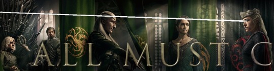
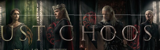
Placing Dimensions and Eye Directions Analysis for Season 2 Posters
Disclaimer: before we go forward, I want to remind everyone that I am a random person on the Internet and this is a simple interpretation that I created using my knowledge on composition, dimension plains and perspective in drawing. If you choose to add input – please, be respectful about it, it’s an open discussion; as the creator of this take, I am not going to take any insults, hate or negativity over a simple fandom post, so be warned that I will block such on sight. If you find my ideas and analysis unpleasant for your perception of the characters – please, disengage and feel free to block me as well. Let’s all be civil :))
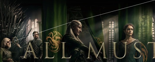
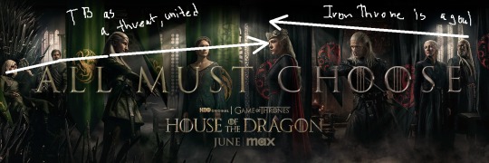
In this post I will talk about the placing of each team individually, towards team members and then each other. Along with that, I will be analysing characters’ poses and line of sights for each of them individually since it is telling a pretty compelling story. As a reference I will be using a merged image of all posters together in one (credits to @liv-cole for the image that I saw here and @ara-meyy for showing it to me when it first appeared on Reddit)
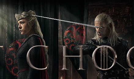
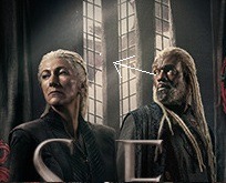
Let’s first take a look at Team Green and their stance:
The far back is taken up by Criston Cole and then Aegon on the Iron Throne. First and foremost, the farthest in the whole plain. He does not line up with anyone in the picture and his placement makes the most sense – in the canon of next seasons, Criston will take the position the Hand, which does put him so close to Aegon with his sword at the ready. He the final line of protection for the king, however, his eyes are not directed to the side – in the direction of Team Black.
However, he is placed slightly behind Aegon and his throne. His eyes are also looking forward at the angle that makes him look beyond the banner of Team Green and, in order, is directed at Aemond, not Team Black. The sight is not the one you would describe as of certainty. I could go off about the shot being not the most pleasant, but I could also theorise that Criston’s sight is telling us about the caution with which he could potentially treat Aemond in further seasons.
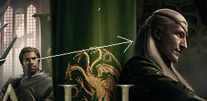
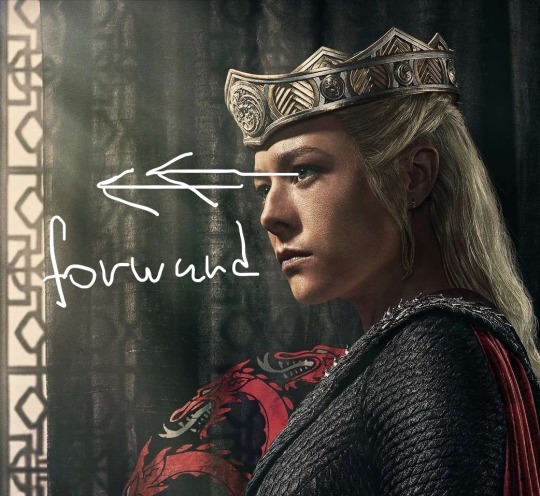
Aegon’s position on the poster is slightly closer to the viewer than Cole’s but still is further than Aemond’s or Alicent’s. His figure is quite interesting and, in all honesty, contrasting to what we saw in the sneak-peek of the second season. He looks both relaxed and tensed on the throne. The general language of the way he is seated is aloof, he is not wearing his crown, but is holding it as a window into his future. He comes off as the transition period between the man we saw in the sneak-peek and the previous season. He is tensed by his duty, by the Iron Throne, but his hedonistic nature has not left him yet.
What is most interesting is his line of sight. If we look at his eyes, they are not directed at anyone at all. They go straight throne the circle of his crown and off into the distance. He is not on the same field to look at Rhaenyra or anyone else. His look is one of absence. Being the king on the Iron Throne, he is isolated from the conflict by his posing. The reasoning for it might be 1) his transition period into an active participant of war (before Blood and Cheese), 2) his present reluctance to be in this conflict that was established in previous season or 3) mostly his absence in the season after his character goes through dragon fire. Perhaps, we would see more of his struggles as the king and, if lucky, even the progression from an unwilling heir to the king that takes charge and makes decisions.
Interestingly enough, his line of sight goes beyond all of Team Green members and out the frame before it reaches Team Black members. If it is not his future he is looking at, it is like a prison cell’s window at the freedom he could have, perhaps?
Next comes Aemond, who is in the most front of the picture. What’s important to note here, his figure is the closes to the viewer and is actually on the same dimension field as Rhaenyra. He is stood between her and Aegon which makes sense since Aemond will be a driving force of the war (which also affected the number of episodes we will see him in). He is not the focus of the conflict, but he is the line of defence for his family and a force to reckon with. His hand is above the hilt of the sword, he is at the ready to draw it and, unlike Criston, his stance is not cautious but confident. He also has his lip corners up in the poster, enjoying the thrill of war, the hold of power that he has.
His line of sight is directed straight into Rhaenyra’s face, not anyone else. She is his primary concern or, perhaps, a target, because she is the main threat to his family and his brother’s ruling. Among his team, he looks like the most natural and merged into his role of protector. Note that this does not oppose Aemond and Rhaenyra, and, if it does, it is a one-sided conflict in which Aemond is involved while Rhaenyra is not an active participant.
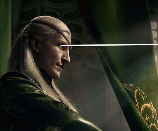
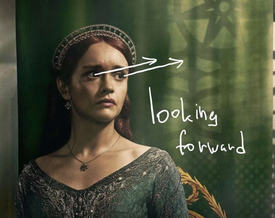
The last in Team Green and the closest to Team Black is Alicent.
It is clear why she is stood in front of everyone in the team, but she is much further in the background. The placing of her dimension makes her stand a layer above Aegon but two layers deeper than Aemond. She looks reserved and worried, and such placing shows that she is not Rhaenyra’s main opposition. She, as was shown in the previous season, would stand in front of her kids to protect them, which places her front-line in team’s order, but it is no longer her conflict, no longer a rivalry between her and Rhaenyra. Unlike the book version, show!Alicent is not the mastermind, but a scared and devoted to her cause mother, and when the time comes for war – she gives way to her children (being placed in the background) but still shows that she is present and protective of them (being the first in line).
Her eyes are terrified and teary, looking at Rhaenyra. It shows very well her stance in the show, that her motivation was the fear for the life of her children before Rhaenyra.
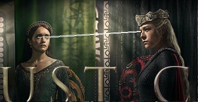
Now off to the Team Black.
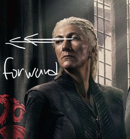
Since we are going from left to right, I’m going to start with Rhaenyra, who is also the representative of Team Black.
Surprisingly so, her and Alicent have similar poses, but the position translates a different message. While Alicent is one of resolve and acceptance of her position in the background, Rhaenyra’s pose is showing her leadership. She is showing herself as the queen in this poster and, it is really hard to miss, but in a way her stance reminds me of 8th season Daenerys (I personally dislike the parallels because I think Rhaenyra would be better off as a stand-alone character, but hype train is a hype train).
She stands tall, she wears her crown, she is dressed as a ruler and as a dragonrider. What is interesting, though, is that her line of sight is directed forward. Since she is on the same plain as Aemond, they both are the closest to the viewer and share dimension, she is not looking at him. She is looking forward, past him. My ideas for this are 1) she is looking at the Iron Throne in the background, not even Aegon, but the throne itself; 2) she is looking into the future, since, in Western culture, the idea of looking forward is associated with the future. Her sight shows determination and readiness for battle or her looking forward for her victory. The entirety of Rhaenyra shows here that she is the rightful heir in her own eyes and she is going to take what is hers.
The idea that her sight goes through both Aemond and Aegon and ignores them, in a way, reinforces the narrative that they are irrelevant to her, they are not the threat and, because of that, be the things the other way, she would not have them executed because they simply do not matter to her this much. It is not a battle between her and her siblings here or her and Alicent, but it is a story about her battle for the throne, as it seems.
What also caught my attention is that both Daemon and Alicent stand distant from Rhaenyra, practically within the same distance from each of her sides. It is purely my take here, but perhaps it is showing the relationship that she lost or is going to lose (given the rift that awaits her and Daemon?).
Now moving along to Daemon. Personally, I expected him to placed closer to his queen, given the establishment of their relationships, but in the poster, he is one a layer deeper into the background than she is. His overall posture of, not protectiveness towards his queen, but rather protectiveness of himself gives mixed signals as if it is not him being Rhaenyra’s shield, but her being his. Given what happens in canon between them, it might be foreshadowing.
However, what drives the point is his line of sight. He is looking up and forward, and, unfortunately, the way he is placed behind Rhaenyra makes it seem that his eyes are directed not at her, but at the crown. His general expression is not of a man that is preparing to protect his loved one, but one of a man who is scheming a way out for himself, there is a fleeting concern and calculation in the way he looks. For the sake of not hurting anyone’s feelings, it is purely my take and my reading of his character in the poster, take me as biased.

Daemon is ready to strike, but strike who?
Following figure is Rhaenys.
Rhaenys has a reserved pose and a look that is peeking at someone or something. Given the background from the show, there isn’t much to say about her in the poster. She strikes me as an unwilling participant of the war, but a participant that is going to do her bidding and show her strength. Rhaenys stands tall, truly like the Queen Who Never Was, and her stance shows that she will be a force to reckon with too, considering she is a dragonrider and a skilled one at that.
Her eyesight can indicate two things: she is looking forward, with a tilt of her head, which potentially places Alicent at her line of sight. It makes sense in a way given their confrontation in two instances in a previous episode. It feels as if she, as a mother who lost both of her children, asks her how far she is willing to go to protect who’s dear to her. It feels like in this there is a conflict of two mothers that is established: the mother that lost everything and now fights for what is left of her children (since Baela and Rhaena are indirectly pulled into the war as well) and the mother that will lose everything in the future. Alternatively, Rhaenys could be looking at Aegon and the Iron Throne, but at this point of her development as a character, that makes little to no sense.
Lastly, Corlys. Just like Aegon, he looks isolated from the conflict, but for different reasons. Initially, I had a thought that he was looking forward, and, considering that he takes place further in the background than anyone on Team Black, he could be looking at Aegon and the Iron Throne, but upon close inspection I concluded that Corlys is most likely looking outside the window. It perhaps is foreshadowing for him later on searching a way out of the conflict or out of the list of Rhaenyra’s supporters.

Now, to the parallels between the characters.
Aegon and Corlys are literally the last men standing of both their teams – both on the poster and in canon. They will be the last surviving men of their respected teams, having only Alicent outlive them both.
Daemon and Aemond being opposed only by their placement as the second from the centre of the poster – perhaps, a foreshadowing for a battle that they will clash in; Aemond is looking forward and, like in canon, anticipates the fight and goes in confidently while Daemon is looking out for himself specifically and does not acknowledge Aemond as a threat for himself.
Rhaenys and Alicent – a conflict between two mothers that already lost everything or will lose everything, the Queen Who Never Was and the Queen in Chains, both trapped in this conflict because of their children or what is left of them (grandchildren).
Aegon and Rhaenyra and the way they treat their role – Rhaenyra merging into her role as a queen and wearing her crown proudly while Aegon looks through in as if a window outside his prison.
Overall, the teams display different attitude.
Team Green looks like a well-established line of defence around Aegon: his Hand is by his side; his brother is the main force of protection and then his mother who would sacrifice herself to save him. Their placement is to protect Aegon from the threat of Team Black.
Team Black appears, to say the least, not as the protection for Rhaenyra, but people who hide behind her, which surprised me. It looks rather fickle, with Daemon and Corlys being anywhere but present to protect their queen. They also form a perfect line from the back to the centre that shows that it is not only Rhaenyra’s fight, but it is also not them fearing Team Green, but having a goal to get back the Iron Throne.
#hotd season 2#hotd season 2 posters#hotd critical#team green#team black#rhaenyra targaryen#aegon ii targaryen#alicent hightower#daemon targaryen#aemond targaryen#corlys velaryon#criston cole#rhaenys the queen who never was#rhaenys targaryen#poster analysis#house of the dragon#hotd meta#lena goes off
187 notes
·
View notes
Text
Locked in Eternal Battle

Transcript: You can do this forever...
My favorite part of my art process is the color. Color can bring a piece to life, make it feel full. But...
It's hard to do that with a character that's just black and white! Since I've been mostly drawing Siffrin, my usual coloring process has become boring. Though, on the plus side, this makes me want to experiment more. I've been messing around with the tools in my art app (Infinite Painter) during my art process recently. That's how I got this piece. I used one of the charcoal tools for the shadows. I think it's called Glazed Vine. I don't remember what tool I used for the values on the cloak. It might have been the same tool, but I think it was different.
With using absolute black for Siffrin's design and the background, I had to outline the blacks with thin white line art. Though, with the lines being so thin, they were somewhat translucent. Whenever I had to use multiple strokes for a connected line, you could see everytime I lifted up my stylus. I tried to fix this by inking the lines multiple times. That fixed the problem, but that made the lines way too bright. So I looked at one of the lines that didn't need multiple attempts of line art, and I used my color picker on the line to get a light gray. Then I used the light grey to redo the bright white line art, and viola. Problem solved!
I had difficulty figuring out the pose and anatomy for this artwork. I probably should have searched up a reference, but meh. I think it turned out pretty good, anyways. I think I struggled with making the feet look like they're touching the ground, though. I suppose there could be more anatomy mistakes, but hey! Siffrin's cloak does a fantastic job at hiding any mistakes I could've made. Speaking of the cloak, I really like how it turned out! I think I did a good job with the cloak folds.
And that's basically all I have to say about this piece. Though, I want to mention that, for some reason, it's easier for me to draw anatomy and poses on paper than on my phone. I don't really know why that is. Maybe it's because I have more surface to draw on with my sketchbook?
Anyhow, I'll go ahead and add the initial sketch and a screenshot of my artwork in the middle of the coloring process.


I was originally planning on this piece being about Siffrin sacrificing himself for their friends, but I ended up changing that. I also had to change the hands. You can see that the hand holding Siffrin's dagger is wrong.
I added the mid-color screenshot because I just think it looks cool. It kinda reminds me of something that Julia from Drawfee would paint.
#In Stars and Time#In Stars and Time Siffrin#ISAT#ISAT Siffrin#In Stars and Time Fanart#In Stars and Time Siffrin Fanart#ISAT Fanart#ISAT Siffrin Fanart#In Stars and Time Spoilers#ISAT Spoilers#Fanart#Art Practice#Art Experimentation#Art#TW Blood#CW Blood#TheMusicIntrovert
25 notes
·
View notes
Text
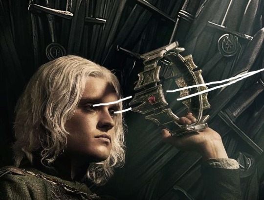
TUT (ASKED BY @nuggetz-w-marz on the Identity V oc community ) ON HOW I DREW MARIUS’ “IN-GAME” MODEL SHEET + IN-GAME APPEARANCE


For starters, I used procreate for this! But you can use any other digital art app (ibis, csp, fresco, etc etc). This is not a 3D model but rather a mock-up of one. It’s not perfect, but it’s pretty good for my first time making something like this!
STEPS START NOW!!
#1 - FIND REFERENCES OF IN-GAME MODELS


this part is super important for getting the style right! I used multiple refs to see how the 3D models are shaded as well as regular character skeletons and how angles looked.
this pose would be how they look in the exhibition showroom— if it’s like an actual model turn around, then look at the poses used for new skins
#2- SKETCH TS OUT

i think the main issue would be making the full turnaround, i just mainly use a reflection of the front pose and a reflection of one of the side poses and edit them from there
once you have the sketch solidified, you could do the lineart if you want to— but it would be completely unnecessary in the long run
#3- FLAT COLORS

i just have a layer underneath the sketch (sketch is on multiply) and put out the flat colors for everything
#4- SHADING AND HIGHLIGHTS


these are like the early stages of my rendering process for the model sheet. One with the blending mode on “multiply” and the other on “normal” to see the colors i used.
there was a lot of airbrushing and layers used. i had like three layers EACH for shading and highlighting. the symmetry tool is also your best friend for the opposite side models and the face. I could make a whole rendering tut too if asked bc THAT needs a whole post for itself. the hair takes the longest, but the one that’s hardest to master is the clothing bc of needing to know how wrinkles work (which i don’t…)
for the skin i mainly used purples and pinks for the shading and orange and yellow for lighting. Clothing was the same but also blues, greys, and greens in the shading as well.

for the hair, i recommend shape out the strand first and then shade them like long tubes
#5 FUN PART: END RENDERING
I loved putting on the last details of the drawing and watching it come together. the rendering I did was only his glasses and his satchel…
#6 EXPORT + IN-GAME EDIT
basically export it as a transparent png for the sheet!! And then what you can do is go into the game and screen record a character’s skin animation and for a split sec it’ll be blank and screenshot it…orrrr you can use the one i have right here!! honestly go nuts.

For the shadow is a low resolution silhouette of the character and offset a bit and i used the color #0d0337 on a multiply layer at 55% opacity. For the character itself, lower the saturation until it fits the character and on another layer, put it to add/screen and use #7f774d for any lighting needed to make them fit the background. If you want to, you can even use the same color from the shadow to add more shadows on the character model
AND THATS IT!!!!
This post took way longer than i wanted it to but that’s okay!! I like helping other artists and esp when asked directly it’s pretty banger!!
30 notes
·
View notes
Note
Hello! I was looking for some standing poses yesterday, using all three sites, and I ended up just having to kind of blindly scroll through the “General poses” DA folder and clicking on the “more like this!” deviations in the side bar. I ended up snagging a pose or two from you and a cluster from JoonPubStock, I think her name is.
I was specifically looking for poses I could use for costume design/ideation, where I could draw a fairly neutral front-ish pose that still had a little personality in like, how the hips were canted, arms folded, head tilt, etc, that I could draw and then come up with clothes ideas on like, layered tracing paper or something. Character design lineup/paper doll kinda thing. I think I ended up using one of your OG Sailor Moon poses as a jumping off point, since they are more static, though they had a little too much anime sass for me to use for my character. :(
Next time you’re doing file maintenance stuff, could I request adding “standing” to the list of pose types/subfolders/tags? And, if it’s not too much trouble for the next round of website iterations, being able to filter using multiple tags at once? Like, being able to specify that I want to look at single, female, slim, standing images instead of having to look through each category individually.
Thank you so much for all the work you and your team do, as well as the network of pose artists you collaborate with! And thank you for offering so much of it for free, and for the other tools you’ve developed and shared. As an unemployed, disabled, non-university-student artist, these resources are really, really valuable. I appreciate you!!
I hear you but there's a few challenges with this because *most* poses are standing. It's the same reason I don't tag myself as a model because it's mostly me. But maybe I can still help by directing you to something like my Character Reference Sheet Pack or maybe even some of the standing poses in the free Anniversary Pack. There's also the old 3D model packs which might be *too stiff* for this but could be a jumping off point. The farther back you scroll on in the DA archive the more static the poses will get because I didn't have a camera good enough to catch much movement or action. Here's a few from Shoots 1-25 that might be helpful for the type of thing you're looking to do. I am SO helpful the stock is useful! 🥰 Hope this helps and Happy Drawing!
#ask adorkastock#character reference sheet#basic poses#<- maybe a good tag?#simple poses#casual#generic standing human female poses
378 notes
·
View notes
Note
This might be a bit of a weird question as I know this isn't a drawing blog, but do you happen to have any pointers for finding good reference photos for drawing cane users? I'm having trouble finding interesting/dynamic poses, and the vast majority of pose generator sites I've found don't even show people with mobility aids. Stock photo sites and google are also limited in their usefulness, mostly giving me very stiff poses. If you have any tips that would be great.
hello dearest asker!
I tried to be an artists once upon a time so let me direct you to some things that might help! Here is an excellent post written up by @deoidesign shows how motion and functionality with a cane works. Here is a post by @sparrowsocks on the cane design itself and the practicality of it. Here is another "How To" guide that is a bit more simple but covers how the hand changes with different handles.
Here is a reference of hands gripping cylindrical objects that I think might be a little helpful. Grabbing a cane or just moving it are all things that go into it too.
If you're going for more a historical setting, Here is a library of sources of historical walking sticks and canes. That source is more novelty canes and not for practicality for a mobility aid, but Here is another source for History and it has more practical canes.
Also things like old photo rolls when film was just becoming what we know today could be something helpful too.
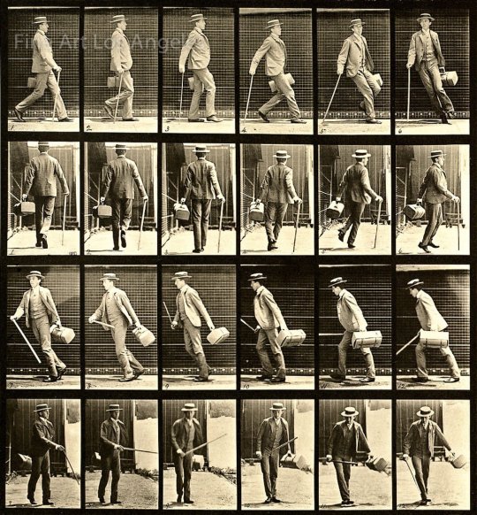
[Image Description: A black and white picture roll of two sets with twelve frames in each. The first roll is a side angle of a man holding a can and walking then taking a right turn and walking back. The second roll is a backside angle of the man walking with the cane and then taking a right turn and walking back.]
We can see for example in the first two frames how the opposite leg moves with the cane.
And of course we have more photos from the Victorian era of men with canes. Granted canes were used largely for fashion but a lot of people did use them for balance and such too. Also they're good references for poses while holding a cane.
Another thing I can recommend is just watching videos of someone using a cane. Look up disabled YouTubers or people who do physical therapy videos and they show largely how movement with a cane should look and more.
If you're looking for dynamic poses I would recommend looking up cosplayers or models who are disabled and use canes. But also looking up disabled actors that use canes or similar mobility aids and go through their filmography is another good way to see references. A lot of disabled people who are artists also post their own photos and videos for art references specifically too.
One last thing is how the character holds their body and what type of cane they need is gonna depend on how they are disabled. Working that out and doing more research is gonna change some things. But also even though there is a proper way to use a cane, some people use canes in different ways to suit their needs and comfort. The biggest example in media is House from House MD and while Hugh Laurie isn't disabled, he does a pretty accurate portrayal of someone using a cane in an alternative way. I personally (when I was getting fitted for one) would use my cane very much as House does, and other people have said much the same.
Hopefully this helps in some way and your fellow artists may be able to throw more help in the notes. Happy drawing!
~Mod Virus 🌸
143 notes
·
View notes
Text
Hey Look At This Comic: The Property Of Hate (Again)
I love the comics technique of having a whole continuous environment occupying the metaframe (the whole expanse of the page) which a bunch of smaller frames slice up so that characters can carry out their actions on a whole stage. it feels a little bit like how they used to solve the problem of moments in time in renaissance paintings of bible stories: just slap the same characters on the painting multiple times and figure people can keep up with reference to the source text and use of conventional costuming &c.
Sarah Jolley loves playing in this space, and I love these early examples in The Property of Hate.


I mean, these first few pages aren't quite as straightforward as space getting sliced but look at the continuous flow of that last sequence above, where the little sock snake Assok is hopping up and down the calcified sides of the dead tree carrying messages back and forth between RGB and the hero. it's such an intriguingly unusual and irregular thing for a comic to do, and yet it's immediately really intuitive what's going on, the back and forth of the conversation guided by Assok's little hops up and down. follow the bouncing sock! she plays with the diegesis in this really interesting way where Assok's hops up and down the tree can't be quite literal--after all, we see the two other characters in the exact same spots. that's, in fact, part of how the sequence remains coherent, is we can see them changing pose against the same backdrop. so Assok's movements, and the texture of the tree, must be in figurative space, giving us the impression of the movement. ironically, I think that little reliance on what I'll call a subjective diegesis makes the whole sequence feel grounded in the set, which both clarifies the arrangement of speech bubbles, cuts out the tedium of having to have Assok repeat all the dialogue, and enhances our sense of the tree as a setpiece.
that's great stage setting for a few pages later:

...when we get a more traditional example of that slicing of space, as RGB chases the hero around the coral-spike canopy of the sleeping tree. I love the curves of motion here, the way the dialogue makes up one arc along the upper corner of the page, and the characters' motions arc along the lower half, letting the two paths reach a pitched confrontation point at the very bottom right corner of the page as their argument devolves into name calling. the black gutter that divides the page into three passes in and out of the tree's shapes, emphasizing the environment not just as a 2d set they're running around on but a whole 3d jungle gym they're clambering on. and there's even this fun moment where RGB's arm has to reach back up into a previous frame-zone for a handhold as he climbs down into the next, a cheeky little violation of time and space.
the tree is so well realized as a set, in fact, that I suspected it was a 3d model originally, posed in different ways and then painted and drawn over. I asked Jolley what her process was and found out I was half right about it being a 3d model. According to Jolley, "It is- but a very literal one. I made it out of clay! it is sitting on my shelf acquiring dust as I type this." this makes a lot of sense based on the tree's more modeled and detailed texture compared to the comic's typically more cell shaded look! the complexity of the way the environment and paneling play off each other necessitated the model: "I needed to be able to draw it from crazy angles and knew I'd have a hard time, so it made sense to just make it so I could hold it in my hands." the result is a setpiece that's got this otherworldly edge to it. it's a technique that might not work for every comic, but the expressiveness that I talked about before in Jolley's work contextualizes the aesthetic complexity of integrating a clay model with cartoon outlined figures, making it just another part of the wildly exuberant show.
this post originally ran on Cohost on September 16, 2024 . you can read more reviews in the Hey Look At This Comic tag and support me on Patreon.
24 notes
·
View notes
Note
Any advice on drawing McCoy? I’m not used to drawing ancient wrinkley bastards (affectionate) and it’s surprisingly tough v-v
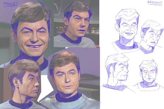
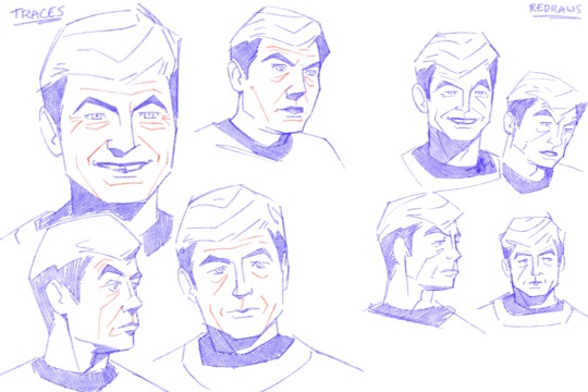
FOR SURE lmao i made. a diagram. just a warning that i am going to be irritating and long winded because u just hit a topic i really like sorry lmao
so first off i did some traces just to show whats there vs redraws to show my interpretation
ive said this on other asks but again jsyk, tracing isnt bad!! its a tool. theres some stuff with intellectual property and whatnot but using tracing to study shapes and forms is a really valuable practice.
also just taking some time to learn facial structures and anatomy is super useful, reading what bones and muscles are where and how they interact with one another. taking this info and staring in the mirror and moving your face around and thinking about it. just really furthers understanding of how the face works. trying to sound normal about this but i love anatomy and motion and physics and whatever
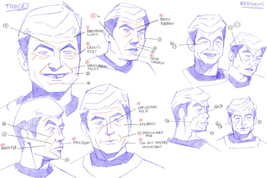
anyways im going to go through all the numbered points so there's no confusion. 1. forehead lines - self explanatory. more prominent when brows are raised 2. crows feet - at the outer corners of the eyes, more prominent when smiling or squinting 3. nasolabial folds - the folds that go from the corners of the nose to the corners of the mouth. more prominent when the mouth is wide, like smiling 4. brow furrow - self explanatory, most prominent when brows are furrowed. mccoy tends to have two right next to his eyebrows, kirk has one in the middle. everyones face works different lmao 5. chin crease - caused by how the chin and lower lip interact. 6. nasojugal groove - start from the inner corners of the eye and can extent over the cheeks. everyone has these and idk why people dont like them i think theyre really cool!!!! but Society. i guess. :/ 7. eye bags - caused by the skin sagging beneath the eyes. mccoy isnt even that old in tos i think hes meant to be mid 40s by the end of the 5 year mission, hes just got really prominent eye bags lmao 8. idk what the name is for these, but when the mouth is wide and pushes the skin to the sides, these folds sometimes form outside of the nasolabial folds 9. philtrum - the groove above the upper lip. i dont usually draw this but mccoy's struck me as prominent enough that i usually draw it on him 10. masseter - the muscle that moves the jaw up and down. its a pretty rugged muscle and while i wouldnt say mccoy's is especially prominent, it kind of extends that nasojugal groove from certain angles/positions 11. orbicularis oris - mouth muscle, usually easier to see when lips are pursed or frowns are pulled. mccoy's is pretty prominent from 3/4ths or side, his mouth tends to protrude in profile 12. this isnt a muscle but more of a line defining the planes of the face, but since i drew it i felt i should explain lmao
a few points:
im an animator i tend to exaggerate and emphasize certain things so i usually make him more square.
i like to combine eyebags and crows feet for brevity/flow, same with nasojugal grooves, eyebags, and masseter lines. my approach is always subject to change based on pose, expression, reference image, etc.
i take out details that i deem redundant or cluttering and keep what details i need to make things feel Right
all this info is applicable to any character of any age, its just in how you apply it and facial proportions that willl change how old a character is perceived to be
there's a lot more with drawing a Character rather than an Actor, just because the features are there doesnt necessarily mean things will feel correct? its very much in the mannerisms and poses and expressions
i only went over my approach to his likeness but not really body type or posing or anything idk if u want that i could always try to answer that later haha
_______________
anyways all that info kind of exists nebulously in my brain while i draw its not like im sitting there thinking Must Draw. Nasolabial Fold...... i jsut do what feels right with the visual info i have. also i love specificity in faces.... i dont like to be a hater but when every character is drawn the same it pisses me off a little lmao. so
also dont take my word as The Only Way to do anything i just draw how i like to draw and no one should feel like these are things that Must be done to be a good artist or anything do whatever the hell u wanna do
#anyways my apologies that was. a lot#it will happen again if asked of me.#anon#ask#everyone has this stuff going on with their face and its really cool but capitalism and the beauty industry and whatnot#have been rotting peoples brains since the moment they came to be#the more u look at and appreciate how ur skin an muscles and bones interact with one another the more fine u are with your own face#trust me#because its really cool. like mechanically and stuff#idk if its like theraputic or something but maybe it is or maybe i think about it all way too much#how i draw#ive got some other similar things under that tag i think pertaining to merlin but still similar info
177 notes
·
View notes