#reilly method
Explore tagged Tumblr posts
Visit Tumblr Blog
Explore Tumblr blogs with no restrictions, modern design and the best experience.
Last Seen Tumblr Blogs


Fun Fact
Tumblr is available in 18 languages.
Text


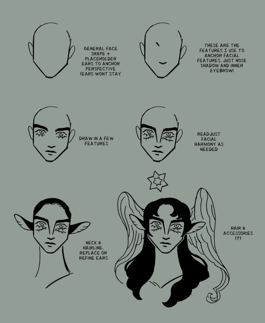
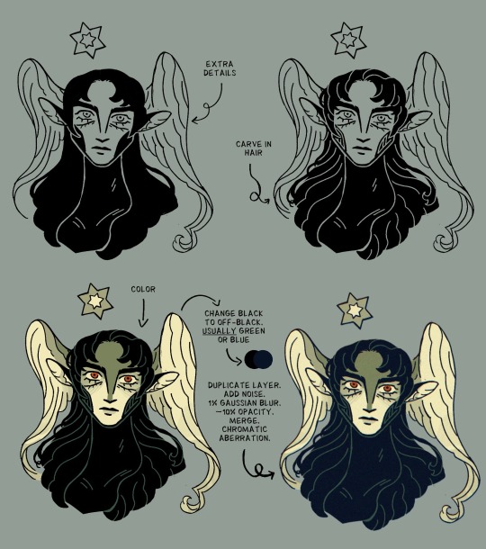
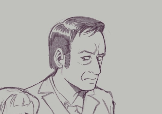
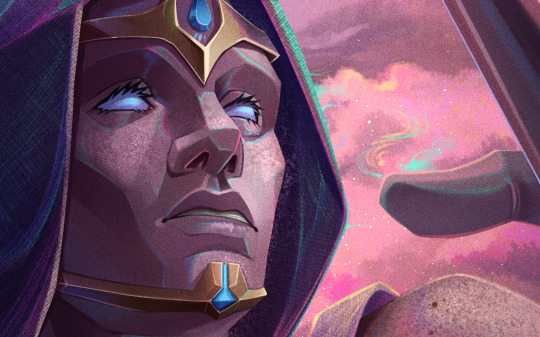
Let's draw, Papa Four!
Here's a sketch I did, broken down into three stages using the 'Loomis' and 'Reilly' methods of head construction. These methods really help with understanding the proportions, structure and planes of the head.
Check out my Patreon for a more detailed explanation, downloadable templates as well as a monthly print through the post! ✉️
.
.
#ghostbandfanart #papaemeritusart #portraitdrawing #portraitstudy #loomis #reillymethoddrawing #reillymethod #drawingtechnique #ghostband #papaemeritusv
#ghumblr#ghost band#ghost bc#nameless ghouls#papa emeritus fanart#the band ghost#portrait drawing#loomis method#reilly method#cardinal copia
24 notes
·
View notes
Text

Reilly's method study day 1 and 2 Blue is traced over the pictures and black is freehand :D
2 notes
·
View notes
Text
Anatomy drawing method-related question
Anyone familiar with Loomis, Reilly's, or the Industrial Method of drawing the human figure? I decided to go back to my roots in traditional sketching for a brief bit of studying, however, I totally forgot what I started with back when I was in SCAD.
I do remember that I used Atlas of the Human Body of the Artist, but most of that was just copying from the diagrams in the book. I don't remember if that class (it was my first life drawing course) studied the methods I mentioned above.
I do have an old edition of Imagine FX's How to Draw and Paint Anatomy (cool magazine on anatomy, go download it). It mentions the above methods, but only briefly before going into specific body groups and how to draw them.
Basically, my main goal is to relearn anatomy but also gain back some fluidity in my poses for human and animal characters. The most important thing about this is that I also need to relearn anatomy for 3D sculpting humans (or literally anything organic), especially for my WOR project that has humans in its worldbuilding.
#mystuff#anatomy#drawing#how to draw#art tips#anatomy tips#loomis#reilly method#imaginefx#if you can find this magazine edition its really good#tw nudity
5 notes
·
View notes
Text
we did the loomis and reilly methods in my drawing class


#my conclusion is that reilly method is good for understanding the planes of the face (esp for lighting reasons)#and loomis is good for wierd angles. in theory at least. it wasn't explained as well as the reilly method#unityrain.art#drawing#drawing reference#drawing resources#i have the video links if you want them
3 notes
·
View notes
Note
reading golden hour and there’s something so pleasing about how you draw faces, what’s sorta the process and proportions? how’d you go about it?
(sits down with a pencil and a notebook. nevermind me and my artblock, i’m just studying here)
Thank you! Tbh it’s a bit hard to say— I’m traditionally trained, so I use a loooot of shorthand when drawing. However if you’re struggling with faces, I would highly recommend checking out the Reilly method! These anchors for facial proportion were developed and simplified specifically for animation, so it’s very applicable to comics as well. I fall back on this when I’m struggling, and am usually better for it. Though usually I’m lazy and just freehand.
However, here’s a breakdown of how I do my shorthand. (I also have art block pretty bad rn, so bear with me lol)
Mostly, I kind of just like long noses :~p
99 notes
·
View notes
Note
Any recs on studying anatomy? How did you get a grasp for it? Apart from your own style, which is GORGEOUS, I love how grounded it feels. Sososo beautiful. Thank you for sharing your talent with us. 💖
First of all, thank you so much, anon!! <3
When I first started, my main resources were Proko’s Figure Drawing and Anatomy playlists, Loomis books, and Michael Hampton’s Figure Drawing: Design and Invention. Recently I found Tom Fox’s Anatomy for Artists really useful, too; a thing he said in that book which I’d always keep in mind is that when it comes to drawing the human figure, sometimes believability is more important than accuracy, which is to say depicting something that seems functional and organic is more important than trying to draw every single muscle accurately.
My approach to anatomy and figure drawing typically follows this hierarchy: gesture -> shape/form -> anatomy. This isn’t to say that anatomy is unimportant; anatomical knowledge does inform the first two steps a lot and you do need to know at least a bit about the shape of the human body and how parts are connected, what I mean here is that anatomical details can only come off as “believable” if they are built on solid grounds (i.e. good gesture and form).

(didn't have time to draw sth so I dug up sth I did in 2022 to demonstrate my point)
Another thing I tend to keep in mind is that, even though we may have the same building blocks, our bodies are covered by skin and fat, which differ from body to body. I think paying attention to these details makes the drawing look more organic.

Finally, I think that with art, it’s important to remember that there’s really no “correct” way to do it. For gesture drawing, I do something similar to what’s shown in Proko’s videos where I usually start with a general line of action first, but I’ve seen some people who said that they find this method confusing and start with form right away, which is not something I can do. Some people start their gesture drawing with the head, some start with the rhythm of the ribcage and pelvis, some people prefer the Reilly method over Loomis when it comes to constructing the head… there are advantages and disadvantages to these ways of drawing of course but ultimately the best way is whatever you’re comfortable with that can get the results you want. Just try out a lot of methods and study what style you like and eventually, you’ll figure out what works best for you.
#sidenote while I’m flattered that people find my anatomy good I don’t think of myself as an expert on this at all haha#I didn’t learn how to do a proper ercoché or muscles’ names and how they connect and contract and all of that until 2-3 yrs ago#when I took an anatomy course from a local artist#I started as a self-taught artist so I’m pretty much just figuring things out as I go lol#a
42 notes
·
View notes
Note
how do you have this myriad of quotes, that too on wildly different topics? do you just read a lot? what all do you read, why, how do you pick out books, how fast do you read? i wanna know everything!
Hi! Most of the quotes I share are from books I've read, although now and then I come across an interesting excerpt from a book I haven't read and I post it on here, so I can remember later why I added this title to my to-read list. (Else I tend to lose interest in the books that have been waiting on that list for years and end up removing them, not remembering why I added them in the first place...) I don't think I read very fast, I just spend a whole lot of time reading, it's my #1 hobby!
I add books to my to-read list very whimsically... The other day I bought 7 books in a secondhand bookshop, then read an article in a science magazine that made me want to read the book this scientist had written, then drove past some ruins on my way home and thought it would be nice to read some books about ruins, so I googled it and found 4 promising books, so at the end of the day I had added 12 new titles to my bottomless pit of a to-read list.
I'm not sure how I end up picking books from it—I do a lot of seasonal reading (eerie Gothic novels are enhanced by autumn and conversely!) But also I went to look at some books I've read recently, and I had a good reason to read each one when I did:
The Palace of Dreams, Ismail Kadare: I woke up from a messed-up dream and decided now (a Monday at 3am) was the perfect time to start reading this book about a dream-analysis factory
Sueños en el umbral, Fatema Mernissi: it was August and I was looking for a seasonal read, and this one is set in Morocco which made it feel summery to me. (I really enjoyed it, I recommend it if you like women's memoirs. It's called Dreams of Trespass in English)
Disent les imbéciles, Nathalie Sarraute: Someone said something dumb near me which reminded me that Nathalie Sarraute wrote a book called "So say the fools". I wouldn't recommend reading it in translation considering she is barely readable in French (I like her)
The Great Zoo of China, Matthew Reilly: life was stressful in early September and I wanted a mindless read with monsters and explosions (and exploding monsters), so this was perfect
Sto je muškarac bez brkova, Ante Tomić (I read it in French): a friend was travelling to Croatia which was a sign from the universe that I needed to read the one Croatian novel on my to-read list. I don't remember when and why I added it
La Chaîne éternelle, Fernand Gregh: the political situation in my country is shit so it's time to read some early-1900s alexandrine poetry, since poetry is the opposite of politics
So I would say my method for picking books is to add absolutely whatever to my to-read list following random impulses and let them ferment in there for years being vaguely aware of their existence, until the stars align to make this book suddenly relevant or necessary :)
98 notes
·
View notes
Text

Some studies when I was watching BCS for the first time. I really enjoy getting a good likeness, not just because it helps with recognizability of the fanart but also because it's a really fun challenge. Some tips on how I approach this:
You can see how I work through Kim and Jimmy's faces here: First I trace directly over screencaps from the show, focusing on marking the distance of each feature and its placement on their head shapes. How close is the brow to the eye, nose from the middle of the mouth, etc.
After tracing it out, I do some freehand sketches relying more on the shapes and proportions I've mapped out. The little arrows I've drawn next to some of the faces help me remember to keep note of the way certain lines or shapes curve into others. These are great things to exaggerate, because when you keep these things accurate and intact, the illusion of likeness comes through.
Whether you actively recognize it or not, your brain is always making connections to the negative space relationships between features almost as much as the shapes and positions of the features themselves.
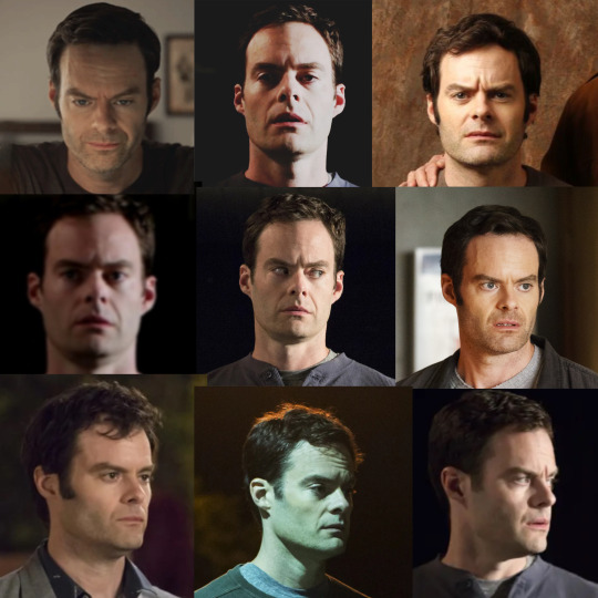

Another thing I like to do is collect much more detailed, organized reference of the character I'm drawing and figure out the harmonies of the face. This is kind of a bastardized and oversimplified Reilly method, where I'll draw straight lines connecting each feature of the face to build landmarks. You can see me working though that here, with Barry.
I started figuring out his head shape, but I also found that the midpoint of his furrowed brow creates a triangle shape with the shape of his nose down to the edges of his mouth. Keeping this shape consistent, even in simplified/stylistic depictions of the character, means he will always be a little recognizable, because the part of your brain that knows what Barry looks like connects with that existing shape.
Playing with those abstractions can help you experiment with how you want a character to look. Don't worry if they don't look perfect. That's the fun of study. Here are a handful of Kimmies, each varying in % of likeness (and degrees of success), but all keeping some key points of her "design". You can see where I start to play with features, removing some things, tinkering with others.
Another little note...since we view these people through cameras, different focal lengths can affect the way their features are proportioned (take a look at the perceived width and height of Hader's enormous fucking head in the upper right corner compared to the adjacent images, for example)–– so this is a good way to keep that in check when you're doing studies. As always, this isn't drawing law. Draw fanart however you please, and feel free to discard all of this information! This is simply my approach, and it is fun for ME!
Thanks for reading.
This post brought to you by my Patrons, who saw this first on July 4 2023.
677 notes
·
View notes
Text
Art Resources 01 [Facial anatomy]
Hi! First post of the Art Resources thing I mentioned a while back :) Figured I'd start with something people generally want to know more about- or something people think they already know about but could still used some lesser known tips!
Resources, break downs and tips under the Keep Reading thing :]
1. The Basics
There are thousands of methods to constructing the face. The most popular one is the little circle with the cross in the middle, and sometimes a few more lines for the jaw. While that can be a useful guideline, if you're just starting to learn the ropes it might be better to use a method that has more structure decomposition and land marks to help guide you. Here I'll leave two methods of deconstructing the face that I believe are the most useful to draw faces in different angles and perspectives as well as identify where exactly should each element be placed.
REMEMBER: All of these methods are just guidelines. In order to get different facial features, you can adjust proportions for each of these and play around with sizes.
1.1 The Loomis Method
A structural approach to drawing the head, based on first: simplifying general forms and second: identifying landmarks for the face elements. Pretty good for beginners, helps you understand the head from a more tridimensional stand point to be able to draw it from different angles.
youtube
1.2 The Reilly Method
Also a structural approach, but this one is based on understanding the rhythms of the face (proportions, harmonies, and even some general muscular anatomy). It can be a bit harder to understand and use as a building block for beginner artists, but it can serve as a way to check your proportions after an initial sketch.
youtube
Here are other two methods, a bit less known, but that go a bit more in depth about the head. If you're a beginner, I'd recommend watching the Loomis method first before diving into these other two methods. Note: these are playlists covering each method, and the videos are longer, but worthwhile.
1.3 The Michael Hampton Method
1.4 The Steve Huston Method
And here's a hybrid of a visual and structural approach too if you're interested! (Again, this one is recommended mostly if you already have a good grasp of the general structure)
Having trouble finding that reference of the head from that specific angle? Here's a 3D model that can be used as reference from any angle. Bonus: It has a built in light feature that allows you to understand which planes of the face the light would hit!
There's also a version with more feminine features.
Here's a website that lets you pick a head angle and then searches for reference images with that angle too. Allows you to pick age, gender, and other features like glasses, facial hair, etc.
2. Understanding What's Below
When drawing the head and face, what most people think of is what we see everyday: the skin. However, there's more to the head and face than just that: there's a whole structure laying underneath that builds up everything on top. Understanding that structure can lead to better execution of skin level facial anatomy.
And what's that structure? Well, bones of course. And muscles. Even if (most of the time) we don't draw them, knowing they exist and how they are placed on top of each other can help with building what we do draw. Understanding the building blocks of the face will make it easier to avoid, say, making one eye bigger than the other. Or a forehead that's too small. Or ears that are too high. Or side profiles that cut off the brain.
Something I recommend for this is making study sheets of the bone structure, muscular structure, and skin structure. For this it's important to name the main bones and muscle groups. Not because you need to commit them to memory, but because if you name them on your practice sheet, it's easier to remember later on that they EXIST (even if you don't remember the name).
Here's a 3D model of the skull
Useful guide for the names of the bones of the skull
Here's a 3D model of the face muscles with names
3. Elements of a Whole
So we now understand the general structure of a face and some useful guidelines to build it. Good! But now, a face has a bunch of individual elements with their own individual structure and stuff to look out for. Those are, of course:
Eyes
Noses
Lips
Ears
3.1 Eyes
It's important to note that the eye has a volume of its own- it's not just a sticker laying on top of the face. It can be helpful to think of the eyeball inside the eye socket when drawing it (taking into account the bone structure we learned before). When understanding the eyeball as a sphere, it becomes easier to place the skin above: the eyelids. This can help with drawing the eye from any angle.

This can also help when drawing the dreaded Other EyeTM, specially if you are still a beginner artist. If you start by constructing the eyes with spheres and approach it from the perspective of "placing" the skin above that sphere, it's easier to get sizes and proportions right.
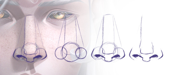
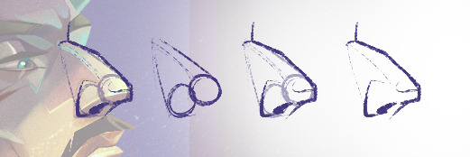
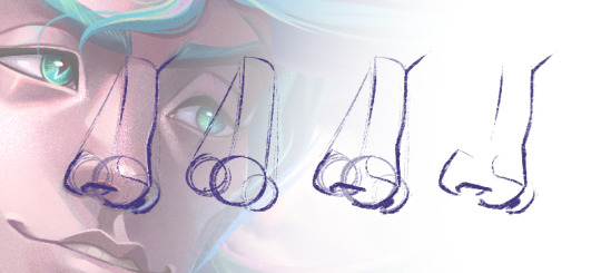
3.2 Noses
Again, spheres can be your friend.
3.3 Lips
Spheres part 3
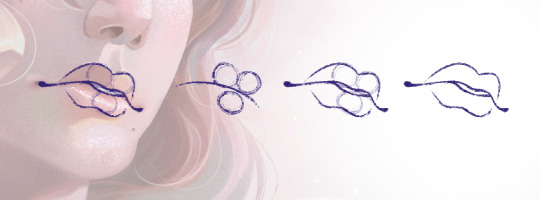
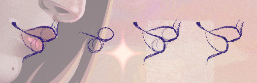
A funny thing with lips that often gets over looked when one is just learning the ropes of anatomy is that it also wraps around the volume of the face. Just like the eyes aren't stickers laying on top, the lips aren't either. It's important to take the curvature of the face when placing the lips from different angles and expressions. For example, when we thing of a smile, its usually this idea that comes to mind:

Which yeah, that's fine! ...As long as your subject is facing straight to the camera.
But when we have even a bit of perspective, the way the mouth looks changes, and we often don't think of that and just draw what we think the mouth looks like... which can lead to odd looking mouths, like they're pasted on. So, it's important to keep in mind the volume of the face:
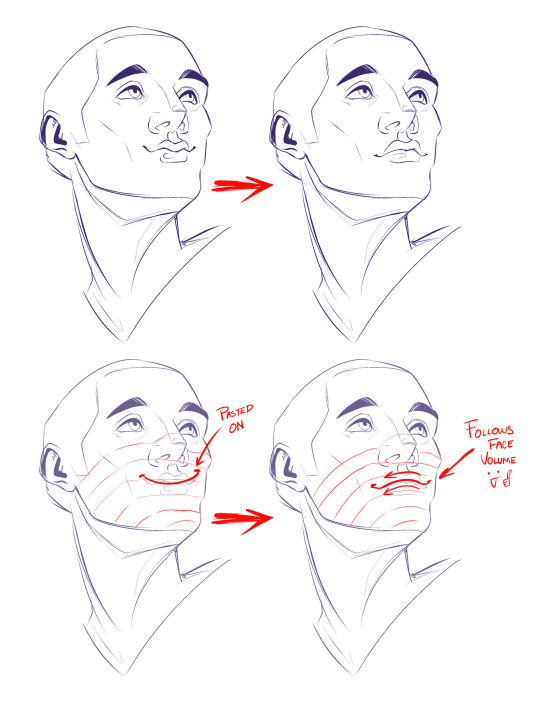
This is true for all features of the face: keeping in mind the volume. But, it can be more noticeable on the mouth.
3.4 Ears
Spheres part- no.
Even if the ear is one of the "flatter" parts of the head, it doesn't mean they don't have volume. Depending on the angle of the face, it'll change how much of the ear is shown- or which parts.
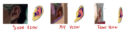
All ears are different and have their quirks, but they all can be divided in three major segments, colour coded in the image. If you deconstruct the ear in these three major parts, keeping in mind they have their own volume, it should be easier to figure out which of those parts will be seen depending on the angle of your face.
4. Expressions!
Now that we understand the elements and construction blocks of the face (bones and muscles), we can play around with them a bit more. So, time to make expressions!
When playing with how the skin moves, it's fundamental to understand the muscle groups of the face and how they move, relax and tense depending on the expression. Knowing that these muscles exist and how they interact with the skin above will help you know where the eyebrow should furrow, where wrinkles would form.
A BOOK I widely recommend is Anatomy of Facial Expression, which you can find here for purchase
Or here as a PDF
This book also covers skull anatomy, so it's a useful tool to study the structure talked about in 02.
There's also an ArtStation account that uploads a bunch of useful 3D model resources for anatomy (facial or otherwise).
Scott McCloud's book, Making Comics, has a section dedicated to facial expressions too (great book in general, not only if you're interested in comics!). You can find it in PAGE 80 (or 88 in the document).
Another thing that can be helpful is studying from life! You can do that by making different expressions in front of a mirror and pay close attention to which muscle groups tense and relax, where wrinkles appear, how your skin moves. Or, if you're like me and hate staring at your face, you can also study from video references.
Here's a link to a PLAYLIST containing various videos of people making different expressions.
The previous playlist contains real people, thus, REALISTIC ANATOMY. It's important to note that even if your drawing style is heavily stylised (like anime, cartoon, etc), it's still fundamental that you understand real world rules so you later know how to bend and break them properly to implement those to your own style.
However, that doesn't mean you can't study STYLISED EXPRESSIONS too! It's actually a great idea to see how other people exaggerate certain anatomical aspects to their own work so you can also understand how to do it in yours. Here's a list with various videos of EXPRESSIONS IN MOTION for animation tests. Study them the same as the previous ones: paying close attention to how the face and muscles MOVE.
youtube
youtube
youtube
youtube
youtube
Pause the videos you study as needed! While all of this might seem more useful for animation, it's also incredibly useful in illustration, and studying things in movement can help with understanding them better, thus putting them to paper (or tablet) becomes easier.
Finally, here's some videos in a sort of CLASS FORMAT that can help with walking you through drawing expressions more effectively than a text post could lol
youtube
youtube
youtube
#art resources#I'm sorry this took so long life just gets in the way some times#also sorry for the radio silence over here#it'll probably stay like that for a while lol#hope this can somewhat make up for it tho :']#please also tell me if the redaction is clear or if I should change something about format for these things#Maybe I'm doing way too much explanation and y'all just want the links lol
74 notes
·
View notes
Text
Some art resources I use (mostly apps)
I don't know if it will help someone but here we go
APPS
• Head Model Studio - IOS & Android
/ link for premium android apk /
This app has head models for all the most famous head-drawing techniques: Loomis Method, Reilly method and Asaro head.

• Hand Draw 3d pose tool - IOS & Android
It's focused on hand poses, good for practicing

• Magic poser - IOS & Android
It's a 3d pose app.

• CMY color wheel (just for Android)
Like the name says, it's a CMY color wheel, good for when you're working with real pigments instead of doing it on digital


• Color & Pallette / Color Picker & Palletes / IOS & Android
I use this one for picking colors from real images. It's good bc it isolates the color. I do a lot of traditional painting so it helps me knowing which colors I should mix. It also shows you the tints, shades, tones, the analogues colors and the complementary ones of the color you isolated.


• Pocket color wheel (just for Android)
It's from the same creator of "CMY color wheel" but it has some explanations about color theory on it. I still prefer the wheel from "CMY color wheel" but I felt like I should mention this one too.

WEBSITES
• Animal photo art references search
There is a 3d skull on it and as you change the skull position and click on "search" it shows u images from the animals in the angle you put the skull at.

++ INTERESTING VIDEOS ABOUT DRAWING FACES

• Drawing faces from any angle
• How to draw the head in any angle
• You can draw faces from low angles now, because I just made it easy for you
These are alternative methods do the classic head - drawing methods
I know these ones are mostly just basic resources, but I hope it's useful for someone! (the videos are really cool, trust)
8 notes
·
View notes
Note
hey! your one of my ike fav artists ever and i was wondering if you had any advice of how to construct heads and faces in that more vintage style, if there's any artists you reference or techniques you use?
aw thank you very much!! that's very appreciated. a good thing about the art of that era is that there's a lot of educational material to pull from, and a lot of it is on the internet archive for free
as far as artists to reference, my favourite is james r bingham


you can see some things i've outright stolen, like that reaaaallyy crunchy linework and monochrome colour schemes. the heads are pretty big, too
as far as techniques, there's quite a few. there's the loomis method (if anybody reading this has ever been any self-taught space than you hear the cries of 'draw loomis... loomis... loomis...' echoing through your home at night, but there is a reason for that)


another popular option is the frank reilly method. i never got to grips with it, but i know people who swear up and down this is THE way to do it. maybe it'll help you
youtube
if you're more of an intermediate artist and feel like you have general proportions and feature placement down, but want a guide more suited to the style, then the famous artists course is probably the place to go. i'm also aware downloading from a random google drive is a hell of an ask, so here are some parts from book six i reference a lot


for the sake of completeness, here's how i go about constructing likenesses, which is more in line with how oil painters do it. that is to say, don't be disheartened if none of the above clicks. you can hash out a method

i draw a box in perspective for the cranial bones and mark out roughly where the chin ends. from there, i can place the nose, and reference the facial features against each other for proportions. when that's mostly done, i cap off the skull, then do the hair and small fixes. good luck and have fun!!
#rochedotpng#art resources#long post#this got out of hand but you see the vision#tldr: pretty big heads and an iron grip of facial anatomy will give you what you seek
33 notes
·
View notes
Note
Hi, Dross! I have a question about your technique for drawing faces - do you use either the Loomis or Reilly method, or a mix of both, or did you start out with one particular method when you got back into drawing again and then evolved your approach with more practice and experience? Or are you someone who draws faces directly as is without construction lines?
Hello Xan! kind of depends on the drawing. For serious work I might make some rough gestural shapes on a layer and then come in and draw more detailed work over top of it but usually since I'm crunched for time I just throw down some lines and hope for the best.
I had tried using grids and instructions from "how to draw books" but I find them to be a bit time consuming so I prefer to just draw the face directly.
18 notes
·
View notes
Text
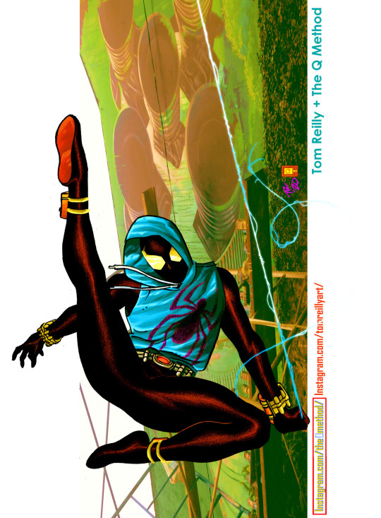
Ben Reilly the 90's Scarlet Spider by Tom Reilly & Q Method.
#the scarlet spider#ben reilly#hoodie#cool look#1994#clone saga#spider man#1990s#90's#90s#mid 90s#spidey#90s aesthetic#kaine#jackal#webshooters#tom reilly#90s nostalgia#carrion#chasm#peter parker#webhead
19 notes
·
View notes
Note
I saw your Minthara drawings and just wanted to say WOW, you're talented! Do you have any tips for digital drawing, and especially getting facial features so accurate?
Hello there, MischievousSeagull.
Thank you for the ask and for the compliment. I really appreciate it. Minthara is just too gorgeous not to draw her (every day, for the rest of my life).
To answer your question, I must say I am very much an amateur and self-taught as well so my advice my not be what professional artists would always agree with. I personally regret not studying art and doing character and object studies when I was younger because I believed 'drawing from references was cheating' so I never did. Now I know that in order to draw a character and make it look like themselves you will need:
1. Start with high quality references:
I aim for a few different ones from different angles, with good light but not flat light as this washes out facial features. I usually find something I like and then wing the rest of it. I recommend checking out and supporting Baldurs Gate 3 community in game photographers, they are amazing! The bigger the resolution, the better, so you can see the the details clearly and avoid ending guessing 'is this a shadow or a dimple or a smudge?'. Also, studying the references will help you recognise the characters features. And Minthara has a few!
It helps me to keep the reference in grey scale for and even with slightly more contrast to better understand the structure of the face, especially if I am just learning to draw a new character.
2. Make the features match:
There are so many different ways of approaching the form here and I ended up trying out a few ones. I personally need to have some kind of guide for the relative position of eyes, mouth and middle of the face as it can save from making massive errors. But I am becoming more and more impatient and mostly just wing it and spend hours correcting it later.
Doesn't matter how you do it: using the Loomis method, Asaro Head/planes of the head model (I love it, it helps a lot, especially if you are planning to have more detailed shading in your art!), Reilly method or the thirds method, colour blocking shapes method that they teach in art schools (I do that chaotically sometimes) or just mark the positions of features from references or just trace it, this is 50% of success. It doesn't matter how you get there, especially if you are a beginner.
What I have been doing with Minthara is trying different faces, sometimes just the reference, with my chosen body position and choosing the one that looks 'least off' and then sketching it. I remember to mark the features of the face as it's crucial at this stage, whether you stylise your art a lot or just stick to the character proportions: thin lips, deep/almost hooded eyes, the way her buccal pads are shaped, the more pronounced nasal dorsum and the adorable angry look of concern with furrowed brows. And obviously the ears. However, I will make the ears longer and the eyes slightly bigger as it looks better for my style.
The structure is very important because and you gave to trust the process. The ugly phase can be torture and if the drawing has no redeemable features, I will never come back to it. However, the next step can lift it all up.
3. Shape it with darknesss and light:
Choosing the way you render can make a big difference in how the drawing turns out. What helps me at this stage, after I have my base colour established and filled my shapes with it, is to have a layer with shadows (copy the base colour and just change layer properties to multiply and time it dial it down to 50%) and a layer with light (the same but use a different mode like Add or Screen) and that's the base for shading on which I build my colours. But to be fair, I am not great at this and I still refuse to aim for a higher contrast in my drawings. This is something I'd like to improve in this srea. I learned to avoid airbrush and work with blending brushes.
I usually play with these light and dark layers until it looks okayish, then proceed with adding extra light and some details. If I keep forgetting where they light is coming from, I draw a little sun to remind me.
4. Ok, now crisis control:
Sometimes, even if I have the most perfect reference the more I render, the less it looks like the person I intended for it to look like. This is why I keep doing these things throughout the process:
A) Mirroring: canvas>flip horizontal every now and then. Our brains lie to us and if you look at your art long enough,you will not be able to see mistakes. Sometimes, when I want to finish something quickly, I end up not checking for errors (wrong eye position, nonsensical anatomy, etc), and seeing the final version after sometime, it can make me feel like a rubbish artist. Having breaks and coming back to unfinished art is a good way to keeping it a little bit more objective as well.
B) Levels in grey scale: Rendering is hard and with little understanding how colours work it can ruin the best lineart more sketch. It helps to have a grey layer set to Colour on top of your art to check if the dark and light balance is there and if shapes look the way you wanted them to look. My brain likes bright colours and sometimes they don't go well with the rest of the composition, this is where grey scale helps with planning it all.
C) Check what went wrong with the reference: If I mess up badly and nothing is improving my drawing, I will go back to the original reference. Mirroring both helps to look at the structure with fresh eyes but if that fails, I will try to redo the base form or marked features in the reference. If it's hopeless, I'll trace the features until the drawing looks right to me.
I used to draw by looking at reference on a (in)famous okeaki platforms and I learned many things from just going back to the form over and over using guidelines on both the drawing and the reference as one couldn't import a picture in that software like we can do in Procreate. I recommend just studying forms and shapes and simplifying complex structures. I'd be a much better artist if I wasn't feeling like it was cheating back them. Going to various exhibitions and learning that my favourite artists traced their own photos and built the composition around them blew my mind and encouraged me to explore more ways of creating art.
I hope this answers your questions and I hope to see your work in the near future and the planned animatics! I'm learning Procreate Dreams and hoping to create a few short animations, once I get the hang of it.
This was a bit long but it was a really good question and one that I often ask myself in the process. Thanks for asking! I almost ended up doing a tutorial on Minthara's features but that'd be overdoing it, haha!
Cheers to creativity!
Izzy
8 notes
·
View notes
Text
Throwing it back to my portrait studies from around 3 years ago! 🎨 I started with the Loomis and Reilly methods to understand structure and rhythm, and looking back, the progress feels unreal 🫣🔥
It’s a reminder that consistency really pays off! Any other artists tracking their journey like this? 👀

#digital painting#concept art#art illustration#artwork#digital art#sketch#sketches#artstudy#artstudies#portrait#portraiture#art#art mutuals#artist on tumblr
2 notes
·
View notes
Text
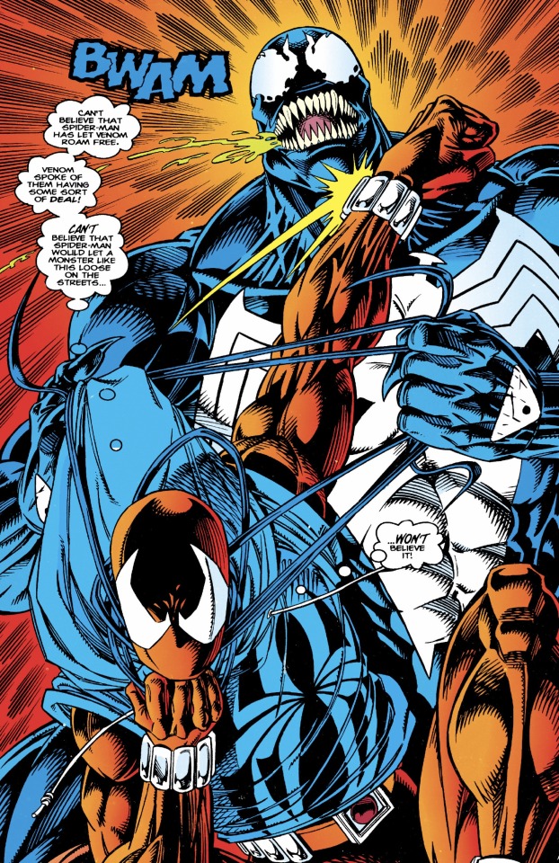
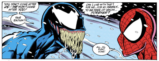
One of my favorite Spider-Man: Clone Saga stories has always been the 4-part "The Exile Returns" arc, which not only features Ben Reilly's debut as the Scarlet Spider, but also Benjy's first major victory as a superhero since returning to New York after 5-years when he singlehandedly defeats Venom (aka Eddie Brock) in mortal combat. What made the fight between Ben and Venom so epic was that the story was actually a response to a previous story in Amazing Spider-Man (1963) #375, which had Peter Parker make a deal with Venom to stay out of each other's way. While this plot point was prompted by Marvel’s decision to turn Venom into an anti-hero during the 90s, a lot of fans and creators were angered by this decision since they felt that the concept Peter making a pact with a villain like Venom betrayed the character's morals of power & responsibility.
This frustration was openly expressed in The Exile Returns storyline, which portrays Peter’s clone Ben as being shocked & disillusioned upon learning about Spider-Man & Venom’s deal. Through adopting the mantel of the Scarlet Spider, Ben essentially declares to himself, "If Peter's not going to accept responsibility and bring Venom to justice, I'll just have to step in and do it myself!"
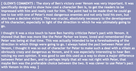
Spider-Man group editor Glenn Greenberg even commented on the writers of The Exile Returns directly responding to the events of ASM #375 in the 36-part online essay, "The Life of Reilly," which extensively covers all the behind-the-scenes drama surrounding The Clone Saga:

In addition to these interesting meta & subtextual themes, another reason why the fight between the Scarlet Spider & Venom so memorable to me is because of the clever & inventive methods that the former utilizes to defeat the latter! Instead of relying upon the symbiote's usual weaknesses of loud noises & extreme heat, Ben utilizes his own original inventions by shooting multiple "impact-webbing" pellets down Venom's mouth that then immediately expand into hundreds of tiny web strands. The impact-webbing strands end up getting caught directly in-between Eddie Brock & the symbiote, forcibly weakening their bond as Ben then utilizes his "stinger" web-darts to further subdue Venom as he beats him into submission.
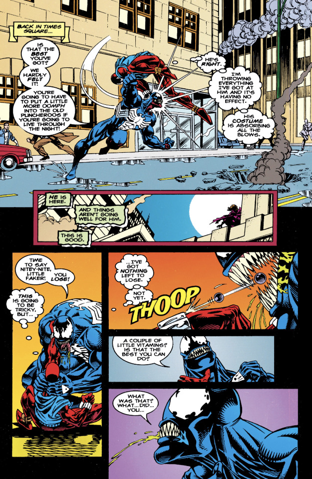
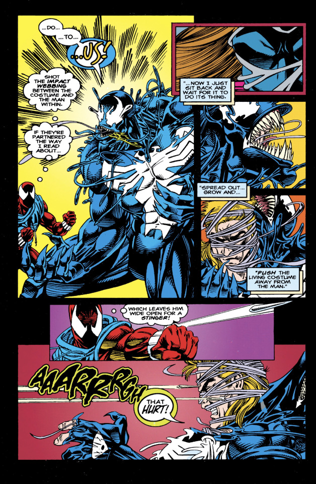
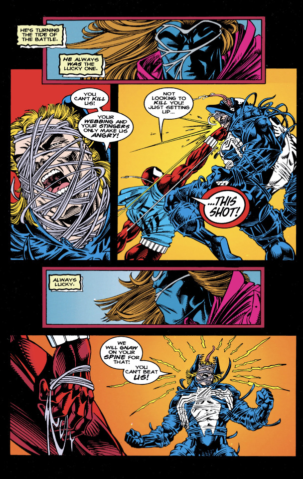
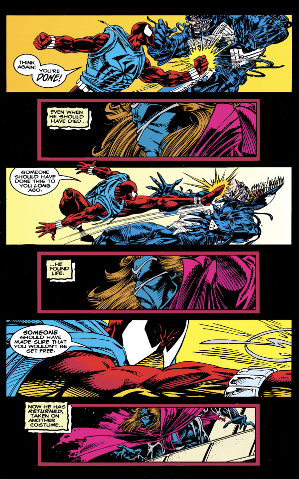
Seeing Ben Reilly singlehandedly take down the one supervillain that Peter Parker was never able to truly defeat up until that point was honestly one of the most badass and entertaining fight scenes that I've ever read in a superhero comic!
Honestly, it’s rather shocking that neither the impact-webbing nor stingers stuck around in the comics after The Clone Saga ended (only appearing in the video game adaptations), since those things are FREAKING awesome!
From adjectiveless Spider-Man (1990) #53 by Howard Mackie & the late Tom Lyle (May he Rest In Peace...).
#spiderman#scarlet spider#ben reilly#kaine parker#peter parker#venom#eddie brock#venom symbiote#clone saga#the exile returns#howard mackie#tom lyle#marvel comics#glenn greenberg#the life of reilly#90s comics
21 notes
·
View notes