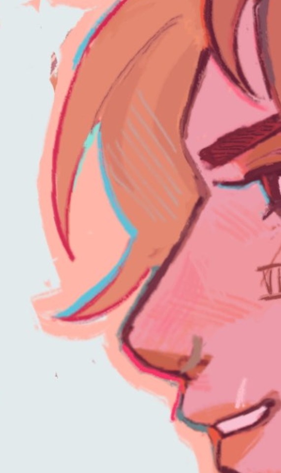
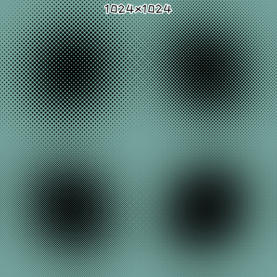
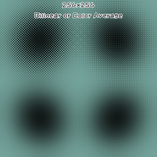
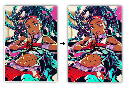
#using gradients for textures is so useful actually
Explore tagged Tumblr posts
Visit Tumblr Blog
Explore Tumblr blogs with no restrictions, modern design and the best experience.
Last Seen Tumblr Blogs


Fun Fact
Mobile Tumblr US users spend an average of 4.04 minutes per session on the app.
Note
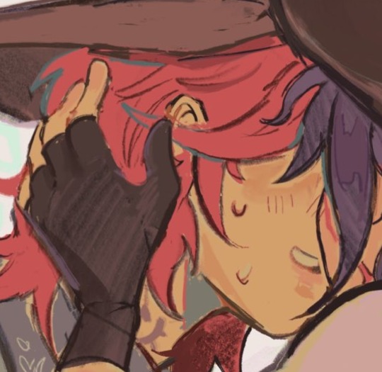
Hello!!! I'm a very big fan of your art, it's always so beautiful and whimsical, your Asriel designs is my favorite ever! I have three questions because I think your stuff is really cool, so I hope this isn't weird. If you answer any of your questions at all, I will be incredibly appreciative! Thank you for posting your art, I hope my art's as good as yours someday.
1. How do you do the colored lines on your drawings? You both use black and different colors like red, and it adds so much more vibrancy to your art. How do you pick the colors and add them? Od you draw them in black first, then replace them, or do you only use it for extra details you add after doing the line work?
2. Your coloring has such great texturing, it's grainy, it looks very painted, and blends the warmth on skin [or fur] amazingly. What do you use for this / how?
3. I thought I should add an UTDR question because I mean what are we here for. If your illustrations do not decieve, Asriel seems to be your favorite character, but who's your second favorite, and why?
ooughhh tysm <333 genuinely means sm to me 😭 when I make that process video I keep wanting to make I'll definetly be more specific ab the first two but for now:
question 1!! I actually do all of those things LOL, it depends but typically I will do the lines in black or whatever random color I start with, and then after I color I'll lock the transparency and go over it with different colors until I like how one of them looks. then sometimes I'll keep the transparency locked and then recolor some specific lines to more warm tones (mostly for organic material like skin or tufts of fur, bc white fur is very transluscent) (which is also why i never rlly color it fully white). sometimes though I do add an extra layer over top the lines and everything and kind of use it as a "clean up" where I just paint over messier lines (most of my art is pretty "messy" because i dont really do "lineart" per say i just use the sketch) and during that I often add more colored lines on top just for funsies. also, something really specific I do with my lines -> I duplicate the later, change the line color to usually a nice warm orange, and then use gaussian blur juuusst a bit so that the lines look super bleedy and dreamy. and I do this for quite literally EVERY drawing essentially, I actually do this to replicate the "glow" feature flipaclip added because I turned it on once by accident like 3 years ago and then started playing around and realized it was kinda goated
question 2!! the main way I get that papery grainy look is by selecting everything outside of the lines, inverting the selection, and then filling everything in with one consistent textured brush (i use the painty brush in my big brush post for this) and then I add a layer over it and clip it to that, so all the colors will have that texture to them, if that makes any sense. I also use the charcoal brush w the color jitter on a low opacity for gradients over almost every block of color I put down (mostly just because i like how a lot of varied color looks), but I do that a LOT on the dreemurrs in particular because, again, white fur is very transluscent and a lot of warm light comes through. I use a lot of orangey gradients in places where the fur thins out (ears, nose, obv horns bc they dont have fur theyre just keratin).
and question 3 I actually had to really think about this one but I think it simply MUST be my glorious mother toriel (it was a toss up between any other dreemurr tbh) but fun fact !! when I first played undertale as a kid my first favorite character was undyne. loved her deeply. until I finished the pacifist run and my mind was changed very very swiftly LOL
#clip studio paint#addibg this tag because my brush post is under it so u can find thst easy and i dont have to link it
61 notes
·
View notes
Text

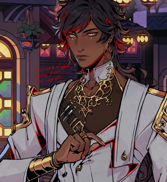
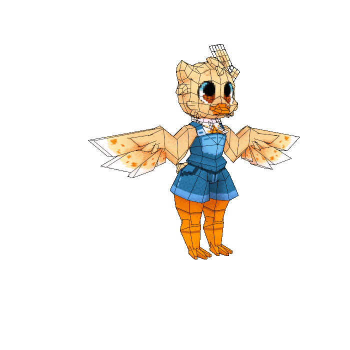
another low poly model finished!!! hello john guilty gear
#perry art#fanart#guilty gear#johnny#3d model#made this as practice and i had a ton of fun!!!#using gradients for textures is so useful actually#also idk if you can tell this is my first time manually rigging something (which isnt super hard actually)#i DID forget to rig some things and you can see it in the final render lol (like the belt thing on his jacket)
46 notes
·
View notes
Text

^_^
#all my problems are solved guess who's stupid ass found out he can just use the less textured side of watercolor paper.#have to find balance in blending bc i dont actually like super seamless gradients...like in digital#i WANT to see the watercolor edge effect its so pretty#a doodley
599 notes
·
View notes
Text

garrett or something
#my art#garrett thief#thief 2014#idgaf anymore#its been too long since ive drawn#im so washed im actually so washed#im not even watermarking this#i used like 10 million gradient maps (i used 3) on this stupid thing#i like gradient maps they make me feel like i know how to color#and if i posterize enough then nobody can see my mistakes#this looks like ass tho but WHATEVER#I DONT CARE#LEAVE ME ALONE#runs away#cries#ok 3 days later and i think i lied i mightve cooked with this#i just like the texture and also garrett actually looks like garrett
131 notes
·
View notes
Text
on the bright side i’ve figured out how to make auto actions in csp and made one each for a blur/noise filter and chromatic aberration. with the goal of looking like a screenshot of something from cartoon network in the 2000s
it took So Much trial and error to get the chromatic aberration to work well but once i learned that the auto action can only happen to one layer at a time i got it down pat
#it feels a little silly to say but i felt really smart while i was figuring it out#the noise effect was easy. the chromatic aberration wasn’t#auto actions only record making a new layer; changing layer modes; making correction layers; changing a layer’s settings; transforming. etc#you can’t record drawing anything or like making a fill or applying a texture unless it’s perlin noise afaik#normally to do chromatic aberration you make 3 copies of your final drawing; clip pure RGB layers to each. one red. one green. one blue#all of the values at 255 for the given color and 0 for the other 2. set the color layer to multiply. merge each with their drawing#so you have 3 layers of your drawing in R G and B#set the top 2 to screen and then start offsetting them however you like depending on how strong you want the effect to be#bwammm#to get recordable steps for auto action i had to do everything to each color layer at once#copy the drawing. so the action is COPY. new correction layer gradient map; i made 3 gradient maps that were flat R B G#like not actually maps. but that was the easiest way i could think to get a ‘fill’ in an auto action#next clip it and set it to multiply. merge. then i had to offset it w/o being able to see what it’d look like at the end#since auto actions only work on the ‘top’ layer. you can’t hop between layers. you can only work in one direction#so to make sure the aberration looked right i did a test run and counted out the pixels transformed in each direction for each color layer#like when zoomed in 4 times from base R goes up 3 left 1; B down 2 right 4. etc#so id just know how to transform each layer while i was recording the action and id get a reliable aberration with a halo i liked#the auto action doesn’t include merging everything at the end bc that scares me. so i can always just edit the offsets on each color layer#for future uses of the action. but. i like knowing i got a reliable recording of a good offset on each color#i can just make a drawing look like it came from the 2000s in 2 clicks now!#2 clicks!!! i got it!! i’ve tested it on a few drawings and it just works!! two clicks!!!#i’m proud of a lot of parts of this lineup. i might talk about it more on here or insta for funsies#i like breaking down my own art. i think a lot of technical artists do#god there’s a reason my mom thinks i should be an art teacher 😭😭😭#i talk
2 notes
·
View notes
Note
No question I just wanted to say the way you drew the water on the new page is BREATHTAKING
Actually, you know what, I do indeed have a question. How on earth did you make it look so good??
I'm really glad it worked! I've never had to paint the underside of water before, and it was an interesting challenge, since so much of wave texturing is communicated through seaspray, a particle effect that can't be used from under the water. Here's the gist:
Started with solid blue, of course. Since the bottom panel was going to be a plunge into deep water, threw in an easy dark gradient.


To texture the underside of the water, I started with light and shadow. Light gathers on the crests of waves, so I brushed out an approximation of where it seemed like it made sense for the light to be catching. Because of the radial splash in panel 2, I wanted the illusion of the water bending inwards towards the camera, so I kept the light to the edges of the splash and filled the center with shadow.
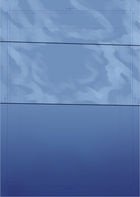

Darkened more across the board to increase the intensity. I added a second darkening layer, this time a deep blue instead of purple, to create the effect of multiple colors above the surface being filtered through the bluish water. I also wanted to imply the shadows of the fragments of the shipwreck falling towards the water, hence the smaller, sharper dark areas.

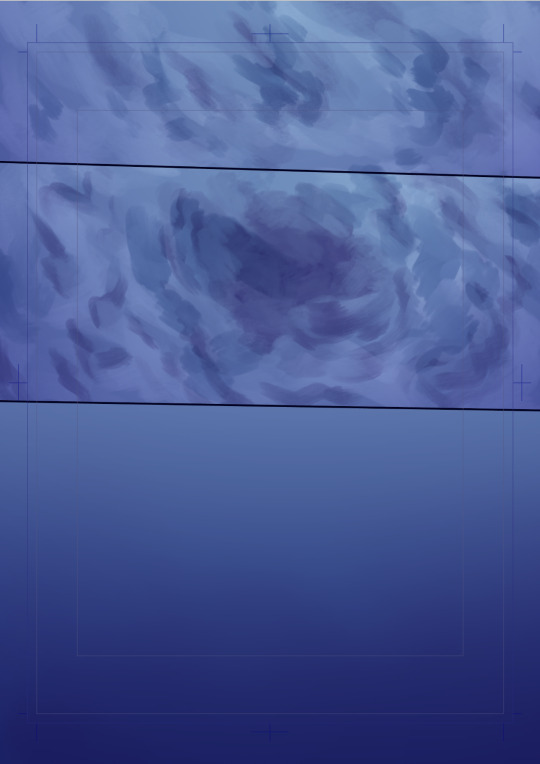
Glow! A thinner, finer brush to capture the specular highlights on the crests of the waves, and of course some light rays in the third panel to reinforce the feeling of depth. This layer used a gold color, which is the only part of the water texturing that wasn't in the blue-purple range.
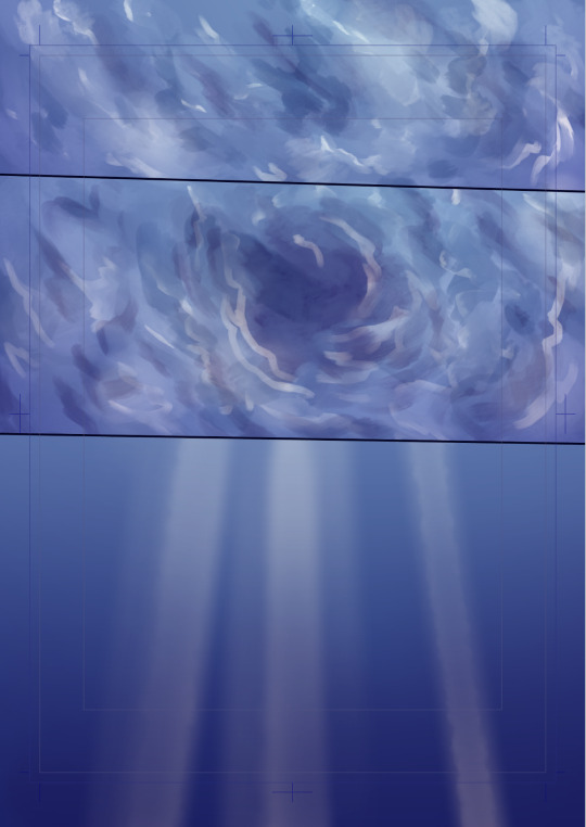
Boat bits - I started working out the atmospheric perspective effect with these, to create the illusion that the ones further from the camera were less opaque because the water was obscuring them. I also added a layer of simple bubble effects (a dot particle brush screened over the page)

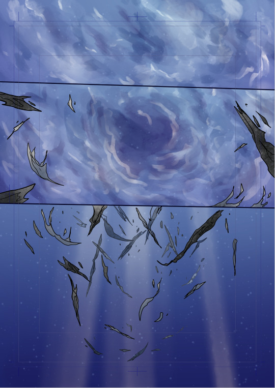
For the final layer, figures, more bubbles, and more precise hand-drawn bubbles to communicate the movement the specific way I wanted to. Rapidly-moving bubbles stretch and distort rather than remaining perfectly spherical, and they also helped sell the scale, implying that the objects with larger bubbles were closer to the camera and thus farther from the surface.

And that's the gist of it! I'm glad it worked because it was a real seat-of-the-pants endeavor over here
561 notes
·
View notes
Text
okay i'm back from the movies let's talk about screen and multiply layers

you can read part 1 of this series of tutorial posts where i mostly talk about gradient maps here.
now we're going to talk about the other layer effects. i feel like these ones are already pretty commonly known, but i've also been using them for like 15 years so it's very easy to assume everyone knows everything but actually i'm just old. anyway.
the panel up top is where we're starting from. i've got a nice blue color gradient applied, and everything looks a bit more harmonious. but...... those inks are pretty harsh, especially in contrast to the background, where there's no black inks at all. i'd like everything to come together a little more.
you can do this with a gradient map, if the darkest value is set higher than black. but since we're not using the gradient map at 100% (it's just 30%) the black isn't really affected by it. so it just stays black.
what a screen layer will do--and this is in practice, i don't know what it's actually mathematically doing--is turn your darkest value into whatever color is on the screen layer. so this is what a screen layer set to 100% would do to this panel. (NOTE: all the layers applied in this post are clipped to a folder containing just the characters. they are not affecting the backgrounds, they'll just affect the characters. the gradient map does affect everything)
That's Pretty Blue! the color that neeta's hair currently appears is the color of the layer. everything else is lightened up and also made a little more blue. and this doesn't look terrible, but screen layers will pretty much always make your art a bit lighter, because it's trying to make its color the darkest color. tbh it's great for fog effects and making your blacks light enough that a texture can show up in them. but let's turn it down a bit, to 40%.

hey nice. everything is still a bit lighter, but neeta and emery's hair isn't as sharp against the background. still enough that they stand out as the most important things in the panel, but not so much that they feel pasted overtop. it's a bit like putting some atmospheric perspective between you, the reader, and the characters. there's air in the image. (and why it's good for fog!)
but i want it just a little darker to make up for the lightening up that happened. i don't think i actually need to explain multiply layers, because everyone has definitely used those for shading at one point or another. but here i'm using a very very light blue over the entire characters. i'm not using it for shadows, but to make everything a bit blue.
now it really feels like they're in a room. the only pure white is the speech bubble and gutters. their eyes/teeth/glasses will still read as white, but they are not white. everything is at least a Little blue, so everything is unified.
and that panel above is what the final looks like! let's look at it side by side with just the gradient map.

neat! it would be perfectly acceptable to stop with just the gradient map, if you value high contrast black inks and characters popping off the page. i... don't! i like the air that's generated by going a little bit lighter overall. it has a nice matte effect, which is why i'm very glad my book was printed on matte paper.
and that's why hunger's bite looks so good. you should buy it and read it
348 notes
·
View notes
Note
Don't wanna be a bother but I bumped into ur touchstarved oc stuff and do you have any pointers for drawing in the touchstarved style? I can't really nail it down 100% but you do so... pretty please?
Hii yeah ofc, it's no bother at all no worries! You sent me this at the right time actually jsdhksd I'm in the middle of redesigning Emma right now and I've been taking a close look at the art style again, so it's all fresh in my mind!
Assuming you already have your design ready and have found a pose or composition you like, replicating the art style will probably come down to getting the lineart and shading to look similar.
About the lineart:
Probably goes without saying, but you'll need a pen with the opacity turned off to get the clean, ink-like lines. If you use CSP I recommend the default textured pen, which I think has a similar look, but honestly any pen will do.
The thing you have to look out for the most when doing the lines is the darkest shadows. It's a bit tricky to explain, and I think a lot of it comes with practice, but you have to look for the places where the darkest shadows would be, or where the light could barely reach. Once you spot them, instead of shading them you create a sharp shape and paint them black, like so:
I also recommend varying the thickness of your lines, but not at random. Instead, try to keep lighting in mind while you draw them. You could draw one continuous thin line for something, and then only thicken it where it falls away from the light, or where it'd create an occlusion, or wherever you want a shape to stand out from another. A thick line will essentially either "push back" or separate things in space, while a thin line will pull it forward or make things look like they're closer together.

You can also exaggerate the shadows in order to create more contrast. Like in the case of Kuras' sleeves and coat, for example- you could argue that some bounce light could still get in there, but with the shadows exaggerated it creates a really nice, clean shape. You can also separate these shapes from other lines by leaving a small space between them and the lines.

The metal might look a bit different, but it follows the same logic as everything else- your darkest shadows will be pure black. It might look like it has more shadows but that's just because it's more reflective, so the light is usually concentrated on highlight and bounce light areas, so the tones around those areas will be darker.
About the shading:
From what I've noticed, it's all about keeping it subtle and simple. If you color pick the characters, you can see the variation between light and shadow is subtle and not all that contrasting. Most of the contrast is done with colors, not values.


The light source is usually from the top right, characters are pretty well lit, and there's a little bit of a blue backlight from the left that helps them stand out against the backgrounds.
The shading is mostly sharp, cel shading, rarely blended. Wherever there's blending, it's usually subtle or a gradient
They also use gradations to indicate color shifts, like the colors in Leander's coat. You can do this with the gradient tool or an airbrush.
I recommend picking 1 color for light, 1 color for shadow, and maybe 1 inbetween midtone to use sparingly in places where you want a very subtle shadow. You can go more fancy if you're trying to create something that looks more like the game's CGs, but if you're going for the same look as the sprites, it's better to keep it simple.
You can shade manually each part of the character, or you can try using a multiply layer. For multiply, I like shifting the color towards a warm or pinkish tone and keeping it light and desaturated to get a similar look as the sprites.
Highlights are used very sparingly, only on a few places like the nose, mouth, eyes, and a few on the hair. Maybe occasionally somewhere else, but only if necessary, like in the case of very reflective materials like metal, gold, glass and leather.
The characters also usually have subtle textures on their clothes, and you can quickly create something similar by using a textured brush and an overlay or multiply mode. Like so:
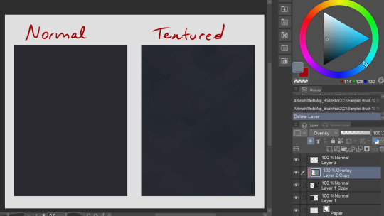
It's subtle, but makes a difference in my opinion! You can try this with a lot of different textured brushes to get the exact look you're going for.
That's all I could think of right now! If you have any questions or wanna know anything specific I didn't mention here, let me know!
153 notes
·
View notes
Note
GOSH i just absolutely love your colors and the textures in your art!! How do you pick your colors and or how do you color? do you have any time lapse or anything?
hi!! thanks so much glad you like it
well if the artwork doesn’t have super complicated colors I usually just grab shades from official art and tweak the curves until it looks good (it’s kinda random—I’m not really a color theory pro) also I actually posted a speedpaint of fem!narumitsu with this exact coloring scheme before
but if the coloring is complex I start with grayscale and then apply gradient maps
as for textures 99% of the time it's just noise. but sometimes when the art looks too empty I add extra textures using brushes
221 notes
·
View notes
Note
Odd question, but when you're shading your pictures, where do you put the "true" color of whatever it is you're drawing? The parts that are in light are brighter than the original color and a bit of a different color, too, based on the source. The shadows are darker than the original color and more based on the undertones of the object/hair/skin or whatever, so also not the original color. I've noticed you have a kind of gradient between the colors to make them harsh but still blend together, too. Where does the shade you're basing these off of come in?
Sorry if this doesn't make sense 🙏 I'm trying to study art styles I like to figure out how to improve my own drawings, and your page is a huge inspiration for me.
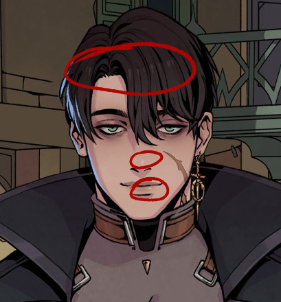
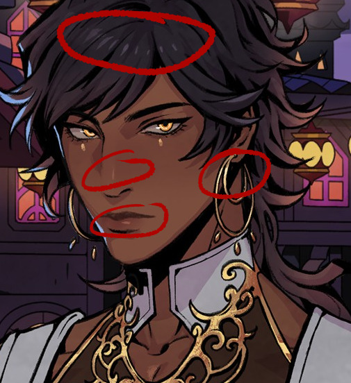
Hmmm If I understand correctly, you're asking me why you can't color pick the base tones as shown below from anywhere in the picture, right?

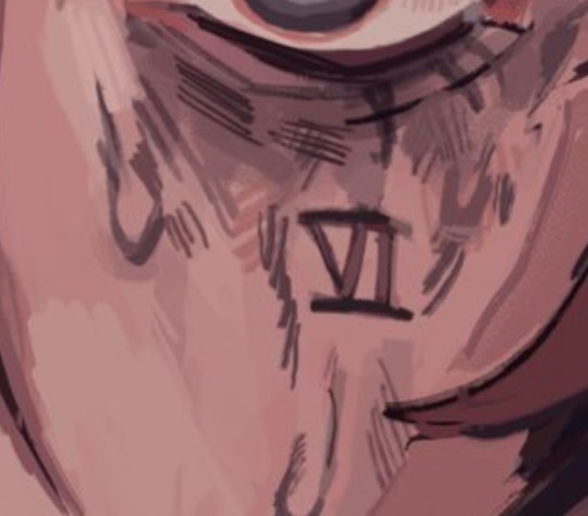
That's because A) I know these colors, roughly, by heart. So, Instead of picking them from the original drawing, I did what I always do and selected them manually. But also - and what I think is actually relevant for your question: B) A lot of processing takes place OVER these base colors! Let me get the spherical piece of Bhaal's sacred flesh to explain.

Here we have just the base color by Itself. Next, I add a light wash of the undertone to places like the face, ears, hands - basically anywhere the body has a tendency to become flushed. The intensity of this depends on the person and skintone, and in DU drow's case I tend to make it pretty prominent.
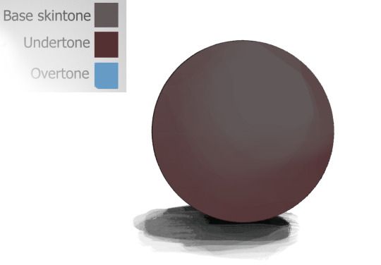
Next, I add the "overtone". I don't even know if that's the right term for it, but it's something that happens with very dark skintones because they tend to reflect more light. With my character, this color is almost always blue for stylistic reasons.

The base tone is still there, even though you probably couldn't easily color pick it anymore. It's doing it's quiet, thankless job: being a base!
As if that wasn't enough, out comes all the fancy stuff:

And I can get even sillier than this with more layers of shadows, multiple light sources, highlights, and so on. These colors here are just examples too - they can be pretty much anything in a similar level of brightness/contrast. All elements of the art that I want to render get this treatment or similar depending on their texture, not just the skin, so you can probably guess how they would get "lost" despite being used as a base.
Hopefully this clears things up!
706 notes
·
View notes
Note
could you share how you paint hair and skin? your art is so nice to look at
thank you so much!
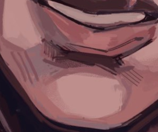
maybe one day I'll make a more detailed post with screenshots as I render... but honestly my painting process is really pretty simple. I usually use a textured brush or something with hue jitter turned up 1-2% to put down base colours, and then I go in with a medium hard airbrush for shadows and for adding warmer colours where blood flows (nose, ears, cheek, around mouth sometimes, eyes).
after that i merge all my layers and basically draw on top of everything. bunch of refining details and texture and LOTS of cross hatching. hatching is a really good way to transition between colours i find!!
(another tip I use for skin rendering is adding gradients within shadows, anddd ofc I add hatching when I do that too)
I wish I could offer more technical advice but I really don't know what I'm doing in the slightest I just throw colours on there and hope for the best😭 I guess other good things to keep in mind for skin are the planes of the face (im rly bad at this one, but basically just look up planes of the face on pinterest and use that as a guide for shadows and form) as well as hard vs soft shadows!!
im also. Not good at this one. So don't take my word for it but i guess it's good to have a variety of shadows that end harshly vs shadows that are softer and blend in more? if that makes sense? you just need to think about 1. what is casting my shadow 2. what is it being cast on (or idk maybe its not. that's just kinda what I do) and render from there!
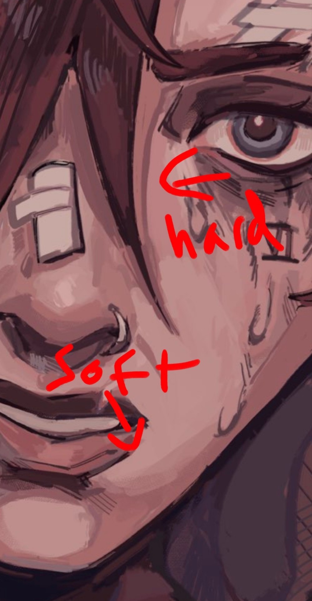
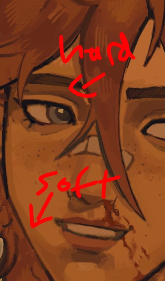
I like to outline my harsher shadows but thats rly just cause I love to outline everything. OOH THATS ANOTHER THING. use harmonious colours and outline shit it looks soooo good.
i do that shit all the time.Like don't be shy about grabbing colours that don't make sense being in your drawing. it's a drawing who gaf if vi arcane's hair is outlined in turquoise. NOBODY! and it looks fire!
for hair I just bullshit it and add hatching I really don't have a clue how to draw hair. I guess figure out where the hair strands are coming from and then draw them coming out from there (This is some real expert advice here damn) and then add shadows underneath the hair tuft clump things ?? no clue. someone make a tutorial for me im kinda the one that needs it in this situation.
uh I hope that helped at all!! Please watch YouTube videos and stuff by actual professionals take everything I say with a grain of salt because seriously I don't know how to do any of this I probably should study art more but I am LAZY
#art#digital art#art tutorial#painting tips#digital painting#art tips#tutorial#artist#ask#art advice
130 notes
·
View notes
Note
I want to know how you render.
A lot of people seemed to be oddly interested in how I render so...
Shape first
I use solid brush or lasso to block in the light and shadow first.
You can see this in the Till drawing because it's all hard edges


2. Add high saturation colour in the area where the light turns into shadow.
I like to do this cause it gives a glassy transparent feeling to my drawing.
like these:


3. Cause most of my drawings are 70% in shadow + 30% in light, i will render the shadow
that means, adding another "light" to the shadow, like reflective light or so. For the till drawing, its a blue light from the left

However, we need to make sure the secondary light doesn't destroy the main light source, so this secondary light will only cause hue and or saturation changes instead of value changes
...
Above are the logic for my doodle drawings, but if i want to continue, i will do the following:
4. Separating more forms
ie, for the till drawing
if the form faces left, it will be affected by the blue light.
if the form turns away from camera and not affected by the blue light, it will be redish
if the form is hard, shape will have hard edges
if the form turns, shape will have soft edges
5. Separate space
Things in front are solid and things in the back are blurry


---
Well, in my art logic, i think "rendering" is separating more layers of information, ie
separating form's plane (via lighting, edges etc)
separating space (via blurriness and light decay)
separating material (e.g. if hair strip is thin, it will be more transparent etc)
oh and i usually add gradients, so it contrasts with the hard blocks i make ✌
---
hope this helps
I posted some of my drawing process on Bilibili @356Migoro, if anyone is interested.
---
🤔Actually, I intended to make a YouTube channel to share my art shenanigans, but I'm just a bit too busy lately, let me know if there's anything else you are interested✌
---
also, normally I don't paint in a solid step-to-step process, its usually i realise that after i have done something, there's still not enough information, so that i "add logic" to my drawing. (e.g. adding the blue light for the till drawing)
---
and since people asked before:
i use CSP to paint everything
I only use 5 type of pens, they are my main partners in crime✌✌✌ (1) lasso and Default G-pen to line and block in hard edges, (2) Transparent pens for mixing colour (3) Blur tool, (4) Gradient (5) texture pen

glhf
#art tutorial#digital art#art process#thanks for having me lols... have a good day#and the reason why my art style changed a lot after my Slow Damage period#is that i traveled to a mountain in China to seek art knowledge from Ale-sensei#(its actually a proper art training institution in China called Magic Leaders but I'm just trying to be funny here)#so yea I am still trying to find my balance between what i already knew and what i learnt there...#and there's a period where i learnt too much and i became really confused so my art style is not very consistant
236 notes
·
View notes
Text
Answer to an ask I accidentally deleted
:"D idk remeber the user of the person who asked this but they asked something like,
"the mailbox you made is made of separate boxes but the bird you made looks like it's one mesh could you explain your process with the bird model and show off it's wire frame?"
Thank you so much for the ask! Sorry it took me a while to respond but I hope this is still helpful! The bird is actually split up into a ton of different parts just like the mailbox these ones are just a bit less square
I think the most difficult part of this project was the uvs. Making the pixels look constant was definitely a challenge for certain body parts. I didn't take the time to merge all my uvs so I have like 5 separate textures for this one model which is probably really silly but I'm not gonna put it in a game or anything so I didn't bother. thinking about it like a minecraft skin really helped me with get it right haha but that might not help everyone.
for the pixel art gradients I used a method I figured out a while ago that is really easy. I shade on an image size about 4x the size of my pixel art and use a screen tone effect on those shading layers I then rasterize the effect and resize it back to my pixel art size, using different big image sizes, screen tone sizes/shapes, and the resize style will change the look of the funky gradient it's a bit of trail and error but when you get it right it's so fun.

#artists on tumblr#3d art#3d modeling#3d blender#behind the scenes#3d tips#pixel art#pixel art tips#my art#my 3d art
94 notes
·
View notes
Note
HI HELLO I love your art So much,,, do you have any tutorials on how you render your stuff? For example, the colors you use & how you pick them, how you get that pink tone around the Lineart (I think) (it's just rly cool). I would love to see stuff like that, cuz your art is Such visual candy (◍•ᴗ•◍)
Hey! Thank you so much, I'm glad you like my art, I worked hard to make it what it is!! Means a lot you appreciate it!!!!!!
I've had no professional art training, I seriously don't know what I'm doing and struggle making tutorials. But will try here!!
For me the colour work is really situational on the drawing! I find myself experimentally attempting to weaponize colour theory and there's a lot of instinct involved that I can't figure out how to verbalise yet. Here's an example of some thought process I have:
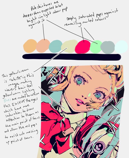
My main advice is to play with sliders a lot and really experiment (that's what I do for every drawing)!
To get the pink glow around your lineart, copy your lineart layer, fill the copy in with a pink of your choice (sometimes I do a gradient), blur the layer (experiment with how much blur you'd like), put it directly below the lineart layer, and set the layer to multiply (or any mode you think looks pretty)!
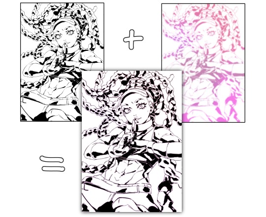
You may want to adjust your piece's brightness/colours after applying it and sharpen the image after exporting.
A lot of colour gradients are involved and on their own they can eventually compromise the gritty/punchy style, especially the ones that are between extreme and subtle. A good way to combat this is with screentones/haftones!! You can use them to diversify colours and imply shading/texture.
I recommend going nuts and having a lot of fun with it to find what works for you!
I often add a lot of small lens flares as they satisfyingly cut through the piece, imply flash photography (which goes well with the strong black shading), add visual noise to areas you don't want to be your main point of focus, are a great way to show speculars, and idk man sparkles are just pretty haha.
Go nuts with them and have fun!! When you get them to look good, think to yourself why that is.
I made a tutorial ~1 year ago on how I shade with black. This simple trick will really help it look good, 3D and rendered - it just requires a lot of knowledge about shadows to start with. I have a lot of experience rendering "normally" which helped me learn how to use black in an experimental way.
Minor correction that the shadows labelled "ambient occlusion" in the tutorial are actually just normal shadows, ambient occlusion is total lack of light.
I hope this is useful to you!! You have a knack for art, your work is very inspired. Please keep drawing!! I am still learning too, let's keep going baby.
-Cravat x
483 notes
·
View notes
Note
Ik vind het geweldig hoe levendig en karaktervol je gezichten zijn! – en de manier waarop je je haar tekent is ook prachtig! Zou je, indien mogelijk, wat tips kunnen delen over je proces?
Dank u!
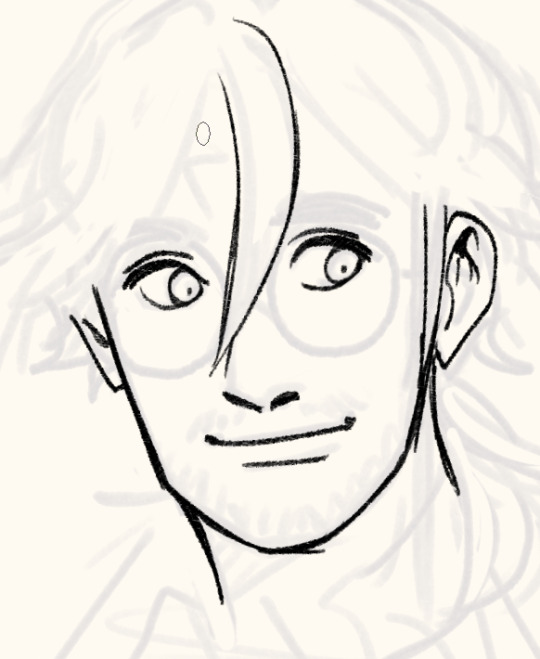
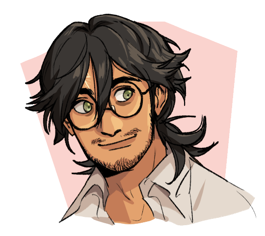
Process:

I sketch very loosely, usually using a pencil brush. Drawing quickly and lively is the priority here, but sometimes it means the drawing quality is really awful lol. I try to flip the image a few times to make sure it's not like, Wrong. Which it will be, to be clear. I hold my pen at a dramatic slant, so my faces are always distorted.
Here's a corrected face next to how I instinctively sketch it out (after flipping the image):

Bad
I wanted to say you can tell when I use 3D models to expedite this but actually they look identical because I not only correct my natural distortion but I also correct the 3D jank. Is correction my art style...?

Anyway, the rest of the piece.
I find it easier to use a thinner brush and go over the lines a few times to make it thicker than use a brush with thick line weight. This gives me more control and looks more natural.

I build up thickness on the beard with condensed hairs curling one direction and then in the other. Layering them makes it look thick and natural. (Mustache is more sparse, so it's just single curves.)
Then I pull up old colours to flat it. I usually work in only 2-3 layers, one for darks and one for lights - dark and light colours will fill differently, and splitting them like this means I can use a lasso fill faster. If there's a really detailed element, I give it its own layer for ease of lasso.

When colouring, big gloopy pen pressure is actually useful to livening up the piece. Make sure theres a light source. I always pick the one that makes the nose easier to draw. Add a second, deeper shadow in corners (like just under the chin) for some depth.

Now that he has more dimension, I can actually see there's a wee bit more to correct. What am I correcting? I don't know. It just looks wrong. I use mesh transform and the liquify tool until my brain stops hurting.

Good enough! Now for the mandatory filters.
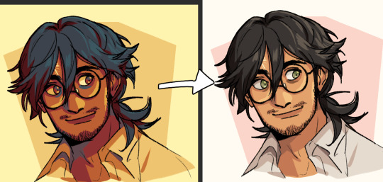
I use mzxmmz's iikanji gradient sets (all 3), because they're very drastic and make interesting colour splits. I set them to 20%~30% opacity on a soft light correction layer.
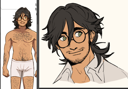
And there he is. Crazy stalker handsome rogue Harry
As for the way I draw my hair, there's actually a quick cheat:

Draw the curls like ribbons (orange). Note how the thickness varies, like the angles of a ribbon. Add texture with little accent lines (green). Fill it out by following along the edge of the curl (purple). Repeat this with a bunch of different strands. It will end up looking very full and with a strong sense of shape.
You can establish this shape by just drawing single lines of the curl pattern/shape you want and then filling out the rest with the ribbon form, detail, and following-line.
Beautiful complex-looking organic curl pattern in minutes!
76 notes
·
View notes
Note
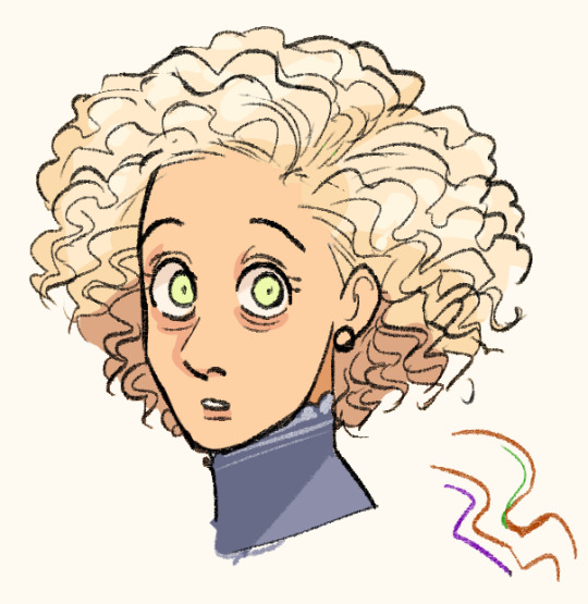
*clicks the pen* How do you draw Vincent's curly fuzzy hair? I imagine you got a good brush for it but how about shading it?
So a lot of it has to do with the brush, which is actually my all-purpose brush I use for most aspects of my painting.
it has a sponge-like texture, as seen below:

you can see how the edges form that perfect fluffy shape, which is ideal for highly textured hair
I actually put a step-by-step of this latest piece up on my patreon wip tier, so I can show you how the hair was done:

so it's basically just blocking in the shape, using the airbrush for the initial gradient, then constantly adding more texture by dabbing the brush in short bursts, from darker shadows to the lighter brown/gray highlights~
I know it's not a super thorough explanation, but I hope this helps <3
#asks#quinncent#tutorial#vince's hair is one of my fave things to draw 🥰#actually..textured hair in general is usually easier and more fun~#(2 of these are just the same image lol whoops 😅)
143 notes
·
View notes