
Fashion Design and Marking student at Northumbria University. Style intern for Urban Outfitters.
Don't wanna be here? Send us removal request.
Statistics
We looked inside some of the posts by alexandrapeterken and here's what we found interesting.
Average Info
Notes Per Post
6
Likes Per Post
4
Reblog Per Post
2
Reply Per Post
0
Time Between Posts
5 days
Number of Posts By Type
Photo
17
Last Seen Tumblr Blogs


Fun Fact
After the announcement of the deal with Yahoo!, there were 170K signatures of unhappy Tumblr users petitioning to prevent the sale in 2013.
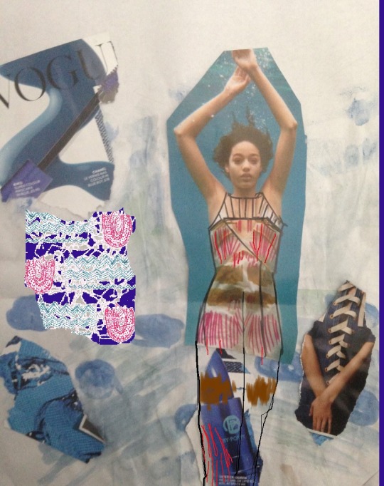
Photo
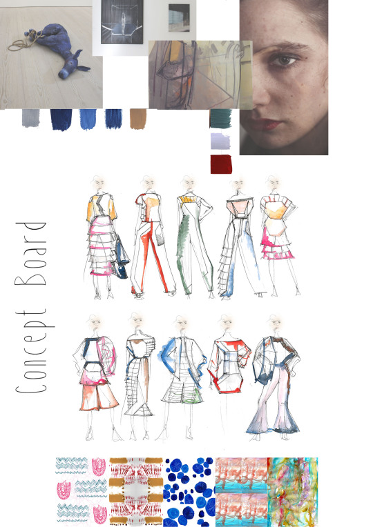
Final concept board to show my hand drawn illustrations based upon my range plan. I have also shown my colour palette with imagery and prints.
2 notes
·
View notes
Photo
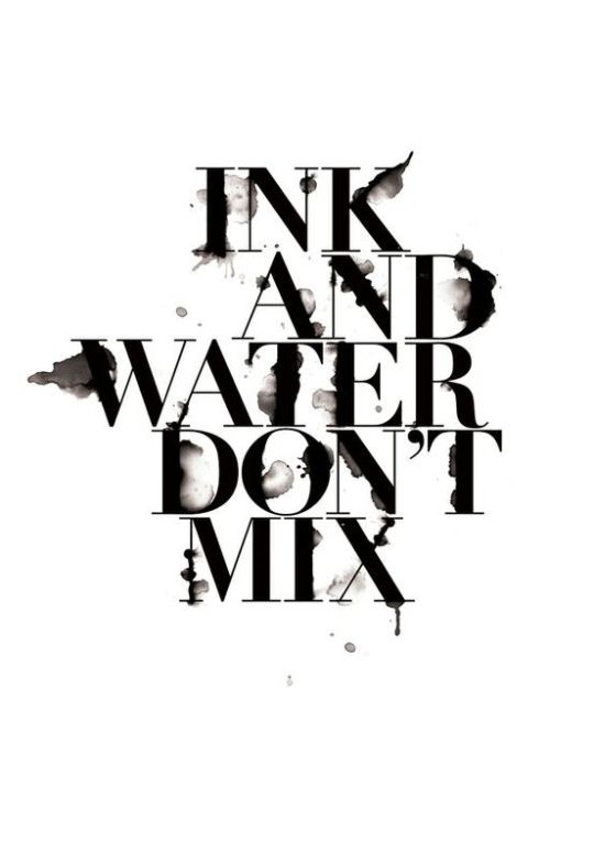
http://blog.spoongraphics.co.uk/tutorials/create-a-cool-wet-ink-typography-effect-in-photoshop
This is the final typography I came across on Pinterest, but then linked it back to the creator who has his own blog with helpful tips and tutorials to create interesting typography! It’s quite helpful so I will definitely look more at his tutorials for my future work.
Anyhow, I really liked this style of typography because of the mix with clean cut text but messy splashes of ink. The edited typography works really well on the white background - making it realistic to actual ink on a page. It’s a very professional and bold text. The layout of the text is very precise - again the quote has been cleverly linked to the style. The presentation is very clear and aligned. It’s still practical and easy to read yet fun. This makes a nice change to normal ‘boring’ font faces. I think this would be good for picking out a quote from an article or using the style on an illustration/image.
0 notes
Photo
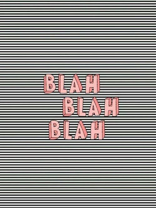
http://weheartit.com/entry/211458904/explore?context_user=outerspacej&page=15
I really like this cartoon effect typography. I think just the way it looks hand drawn at different angles makes it fun and interesting. I think the use of colour is really clever with the dull background linking to the ‘blah blah blah’ quote, but with a feminine pink edge. In my opinion I would have probably liked to have see less of the black and white stripe background - however I think this adds to the meaning of the quote. I also would prefer the typography to be slightly bigger to fill the space. Over all the presentation is fun and current - i like how its pop arty and could be used on anything from illustrations to titles. I think i will definitely use this for inspiration in the future.
0 notes
Photo

http://moxeeon.tumblr.com/post/10261323902
This is another typography style that I came across on Pinterest. I was looking for something with a delicate style and quite simplistic.
To me this reminds me of a French theme. I think this is because of the thin line yet feminine flick of the lettering. It’s a quiet typography and could be seen very personal - almost someones diary/journal handwriting. I really like how the font is mixed with capital and lowercase lettering. It looks really natural and still readable. To me this looks like a book cover, which is why I like the layout. It’s very simplistic, but still bold with how the bright lips have been placed with the smaller lettering at the bottom. I think this equalises out the whole look. The presentation of the typography is very ‘cutesy’ and has a really raw vibe to it. I would love to use this as inspiration for when writing text or to use within other illustrations.
0 notes
Photo
http://theinspirationgrid.com/creative-typography-by-luke-choice/
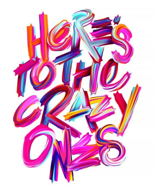
I came across this typography on Pinterest, and then linked it back to the website showing the clever and colourful typography by Luke Choice.
I really love this style of typography because of the loud choice of colour and font size. It makes it look like it’s quickly been done by someone who just wants to go wild. Hence the clever twist to the ‘crazy’ quote. The blend and use of colours works really well and makes it an eye catching typography image. I like how the letters are layered on top of one another in almost a tight formation - making you look closer at what is actually says. I also like how the width of the typography is generally aligned so all the words fit into the one shape.Over all the presentation is great, and I like how it still looks clean even with the bold strokes and mix of colours.
0 notes
Photo
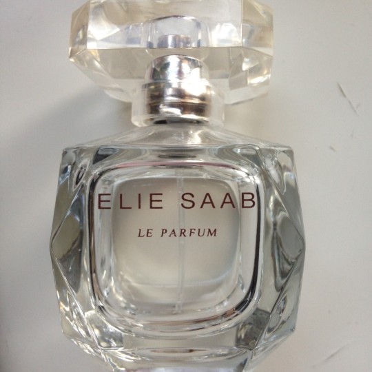
This is from my bottle of Elie Saab perfume - a clean angled bottle with very simplistic typography. I think this is a quiet use of typography. They have used capital letters yet the spacing and use of the smaller font size creates a delicate look. I also really like how ‘le parum’ is in italics - making it feminine and eye catching. This style of typography definitely suits the bottle shape and the over all clean look they have created for the perfume. The layout is perfect, with the text covering the full side of the bottle, yet not being too big. Over all the presentation is clean and modern. This would be great to use for text or a quote.
0 notes
Photo
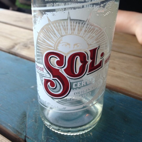
This is another typography that I spotted on my friends drink! Before this, I had never closely looked at the typography on a bottle of Sol (partly because I don’t drink it) however I love the detail used on the colour and illustration. This is a very loud font due to its size, use of capital letters and bold colour. I like the shading used on the colour, making it look 3D and stand out. Another aspect is the white outline of the font, which again makes it stand out from the bottle. The style of the text reminds me of old Mexican/western style - linking back to where Sol originally came from. The illustration is perfectly laid out with the eyes of the sun only just peeking out from behind the text. I think the use of white text on the bottle makes it subtle and not over powering. I really like the presentation, however the only thing putting me off is that the design is over crowded and it’s hard to focus on one part of the design. If I were to take inspiration from this, it would be from the main use of text and fun illustration. This could be used on the front of a publication or on a stand out page.
0 notes
Photo
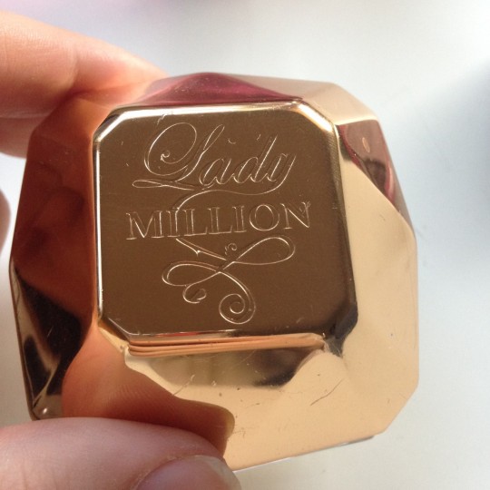
This is the Lady Million perfume by Paco Rabanne. I’ve had this perfume for a while now and I’ve always admired the choice of typography used on the bottle. I really like the mix of the feminine, old fashioned style writing for the world ‘lady’ and then the bold block lettering for the word ‘million’. I think this is a clever way to show how women can be strong and successful. Almost in a way to show you’re the female boss. I also really like the continuation of the lettering, creating the soft curves, giving it more of an expensive look to the bottle. I really like how the layout of the typography covers the full space, as any smaller it would have been hard to read. The presentation of the typography is smooth and looks expensive. It’s feminine yet bold, and I think this contrasting style would be good to use on titles or illustrations.
0 notes
Photo
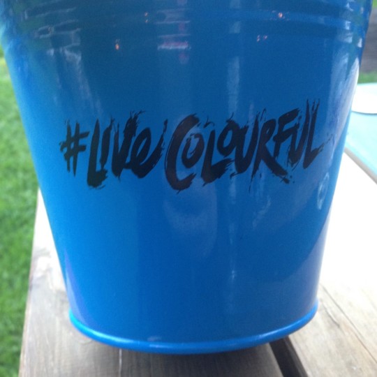
I found this typography on a small bucket, used by a pub to hold cutlery and serviettes. What first attracted me to this was the bright colour of the bucket mixed with the contrast of bold black font. I like how the meaning of the text links to the free brush stroke of the lettering. It’s a really fun typography and aiding this is the use of the hashtag. The use of the hashtag makes it current and recognisable - associating it with social media such as Instagram and Facebook. I think this gives massive appeal to people of the younger generation. The angle and size of the font is the perfect size as it is readable even on the curved surface. Another thing I like about the presentation is the fact that the typography has the ‘quickly done’ look, however rest of the space is clean. This is great use of negative space. I think over all this typography style will be great to use for titles or sub titles.
0 notes
Photo

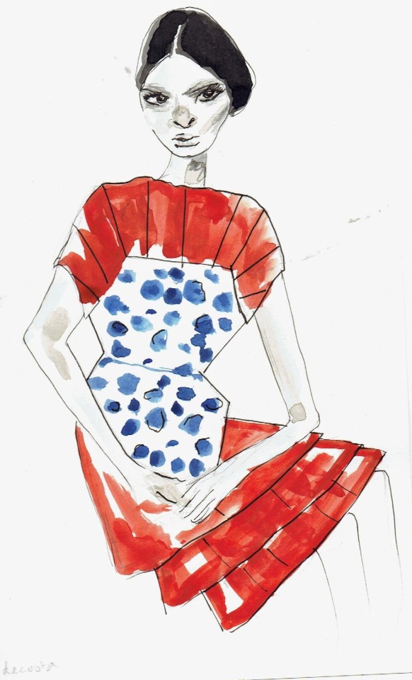
To conclude my research into fashion illustrators, I looked in Nuno Da Costa. I really liked his style of the detailed face mixed with the freshness and colours he adds to the fashion pieces. In the top illustration he did for Givenchy I loved the texture and merge of colours which I tried to re create in my own fashion illustration.
http://www.illustrationweb.com/artists/NunoDaCosta/view
I feel like when I compare them to each other, my illustration looks really poor quality compared to Da Costa. I would have liked to refine this on Photoshop/Illustrator. However I do like my bold choice of colour and the twisted angles on the face.
Da Costa was a difficult fashion illustrator to conclude with, however I will definitely be looking at his work in the future for inspiration.
1 note
·
View note
Photo
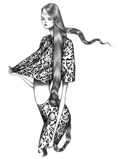
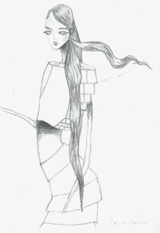
One of my final illustrators that I came across was the very talented Laura Laine. Her Gothic style of work really amazed me as I have never seen a style like it before. I love how she creates dramatic shaping of the body and hair - creating movement to the illustration. Even though the body proportions are highly accentuated, it just makes it all the more interesting.
http://www.lauralaine.net/
I was excited to re create the style using only pencil to try and create different dephts and textures. I did find it difficult purely using only pencil and no help from digital aspect; however I really like my outcome. To improve it I would definitely make some of the illustration even darker, and add more detail to the clothing.
1 note
·
View note
Photo
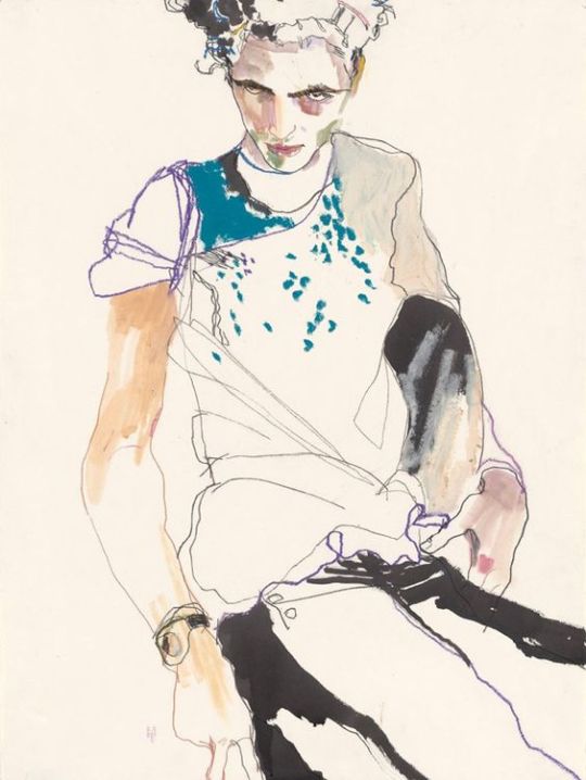
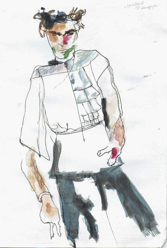
Howard Tangye caught my eye for his use of bold colours merged with skin tones and the rough style of line work. The aspect that most intrigued me was the mix of textures used within his illustration and how it portrayed the fashion piece.
http://www.howardtangye.com/ From his website you can see the way he creates drapes and texture but still keeping a subtle silhouette and style.
In the same way I have tried to re create my own illustration in his style, mixing ink, water colour, fine liner and coloured pencil. I really like the outcome, however I would have liked to refine the hands (I’m terrible at drawing hands in case you didn’t notice.) I would have also liked to get more detail into the face.
Overall Howard Tangye is an amazing artist with very expressionist fashion illustrations. I think he is great at adding colour to an illustration which just brings it life.
2 notes
·
View notes
Photo

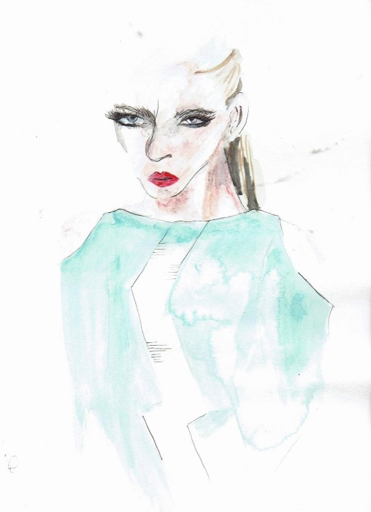
Antonio Soares is definitely one of my favourite fashion illustrators that I came across when researching for this task. I love the method and media that he uses to create his dramatic illustrations.
Please take a look at his amazing work: http://antoniosoares.tumblr.com/archive !!!!!
I used water colours and fine liner to try and recreate his look featuring one of my own designs. However I feel it looks very messy compared to his work as I didn’t have access to Adobe Illustrator/Photoshop to smooth and refine my illustration. I think the detail he uses in his work is incredible, as well as portraying the fashion piece.
Antonio Soares is definitely a fashion illustrator who I will look to in the future for inspiration.
0 notes
Photo


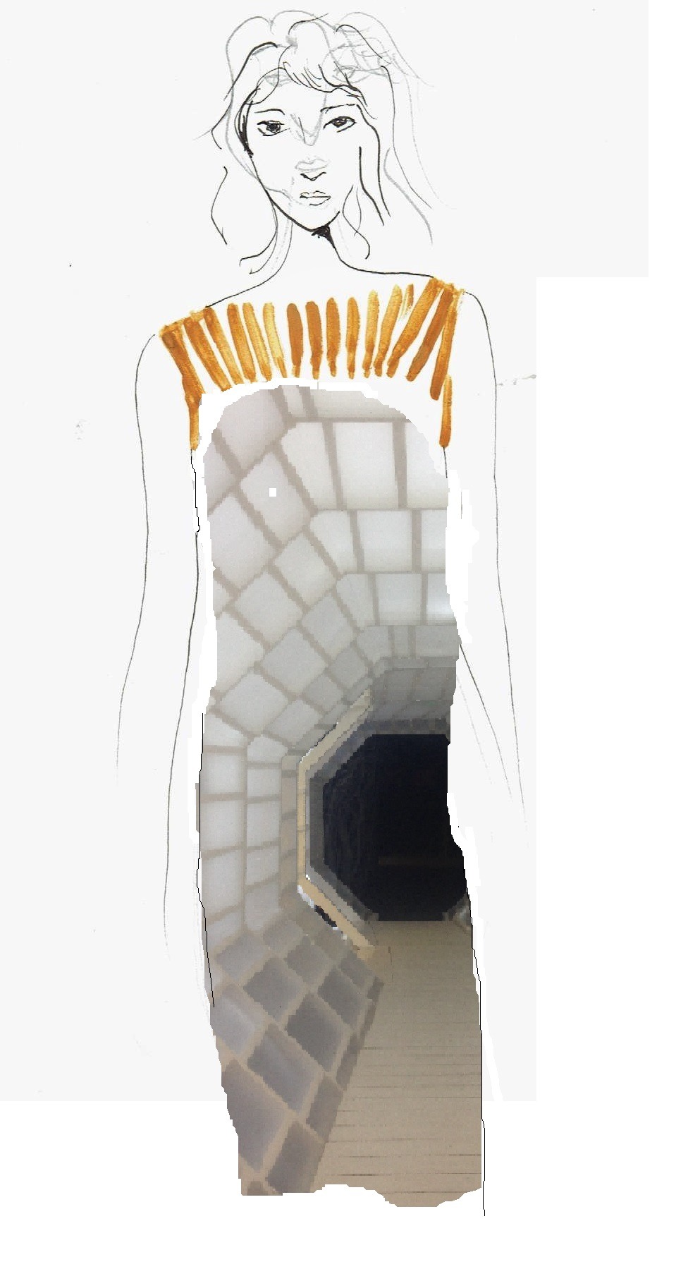
The second fashion illustrator I really liked was Denise Nestor. I loved the use of detail in the face and the simplicity of using only pencil and simple silhouettes.
http://www.denisenestorillustration.com
The first image reminded me of Alice in Wonderland with an imaged merged inside another. The style of the face on the second image is really unique because have how two faces are layered on top of each other at different angles. As you can see I have combined the two different Denise Nestor illustrations to create my own illustration showing the silhouette of one of my designs. The image used within the illustration was a photograph taken for my design inspiration. I have also double drawn the face. I know that my illustration is not as detailed as Denise Nestor’s, however it’s the elements that I wanted to interpret. I know that if I had access to Adobe Illustrator that this could have been a stronger fashion illustration with quality and precision.
0 notes
Photo
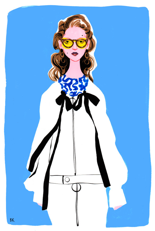
When looking into fashion illustrations, I wanted to re create my own work in the style of great artists. Not in a way to simply copy, but to understand their talent and how uniquely they can create a piece of work. I came across Bijou Karman on Pinterest, and then followed onto the website: http://www.bijoukarman.com/
I really liked the cartoon style of fashion drawing but how it still has intricate detailing and high resemblance to the fold of the fabric. Another thing which stood out to me was the bold use of colours.
I have recreated my own illustration by using acrylic paint and details of fine liners and pro markers. I really like how this has turned out considering the only editing program I used on this was Paint to fill in the dark blue background. However I know it’s not as cleanly finished as Karman’s.
0 notes
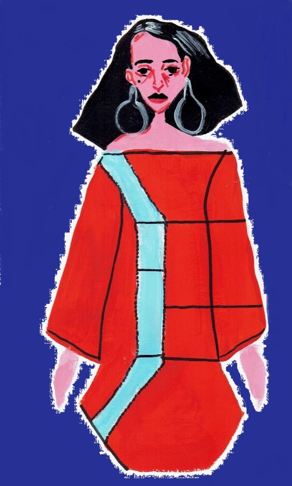
Photo
This is another outfit I have created using inspirational photography from Andrea Koporova. I really liked the coloured she used, mixed with the angle and depth of the woman in her ‘A Lost Mirror’ collection. Again using on cut and stick I like how the colours and angles have worked together. I also really like the combination of random collage which makes the piece more interesting. In the same way as my first outfit inspired by photography, I would have liked the outfit to be more refined and be more precise on the print.
0 notes
Photo
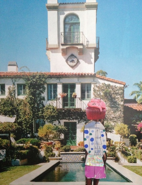
This is a recreation of one of my outfits using magazine cut outs and pro markers. The inspiration was taken from Simryn Gills’ work and I have used a replacement item to block the face. I think that considering I have only been able to use cut and stick without any aid from Photoshop/Illustrator, the outcome has been positive. I really like how proportionate the body looks against the background, however I wish the actual outfit could look more realistic to how I would want it.
0 notes