
Statistics
We looked inside some of the posts by aliyaterez-blog and here's what we found interesting.
Average Info
Notes Per Post
544
Likes Per Post
326
Reblog Per Post
218
Reply Per Post
0
Time Between Posts
7 days
Number of Posts By Type
Photo
11
Text
6
Last Seen Tumblr Blogs


Fun Fact
Tumblr was created by web developers David Karp and Marco Arment.
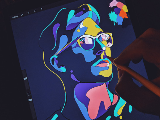
Photo


The photos I choose were all by the photographer Alex Prager. Her work reflects Old Hollywood which is an era that I love. The use of colors heavily relate to the 60s/70s and photo quality creates that realistic effect. She focuses on greens and oranges which stand out creating eye-catching images. I also enjoy her use of lighting; there are many different shadow effects and use of flash to create bright contrasting images.
I am always drawn to portraits and creative ways they can be delivered. The way women are portrayed in a realistic natural manner through these images is very interesting as well. The bright backgrounds, confused expressions, and loud outfits all work together. The images provide an unsettling odd feeling that is still intriguing. I find myself always drawn to photography of this nature.
1 note
·
View note
Photo

Artwork Copyright © Tyler Spangler
Buy prints here: society6.com/tylerspangler
515 notes
·
View notes
Photo
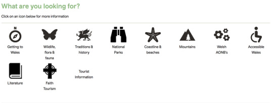
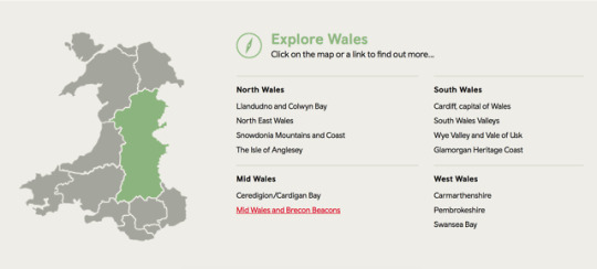
To find the perfect website, I started researching different countries I've been to. Rather than a city, I was interested in seeing how a whole country would be marketed. Www.vistwales.com was a website that immediately caught my eye. When the website is opened, the home page plays a video showing all the lush greenery of Wales; that is one of the parts of Wales that drew me to it as a tourist so I thought it was smart on their part to include such fantastic imagery.
I found the website very easy to navigate and extremely organized. Included were so many different ways to search and plan for a holiday. There are the options to pick by location, activity, themes and so much more. Each is matched with a cute little icon that was simple and easy to understand.
Overall, I think that the VistWales website is very successful in helping tourists and potential visitors see the true beauty and vast amounts that can be explored in Wales.
1 note
·
View note
Photo

The Barnes Foundation is a really interesting place. We learned about the creative process that their designs go through to produce graphics for all things related. It was interesting to hear about the restrictions they were faced with depending on which piece they were working with. Those types of roadblocks force them to think in more creative and innovative ways. Learning about how some work could not have any type over it or only being able to use one piece from the collection was very interesting.
Because their team is In-house designers, they work strictly for the company producing lots of content. Being able to work with something visually capturing like art makes for an interesting job with endless new content. I really enjoyed how they photographed their final products. The table spreads, the organization of flyers they created and the bold colors really made the pastel impressionist artworks stand out.
Overall, I really enjoyed our trip to The Barnes Foundation and I am looking forward to going back and exploring all that they have to offer.
1 note
·
View note
Photo
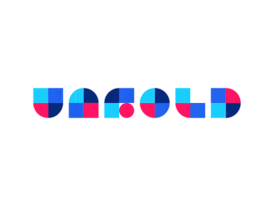

Eddie Lobanovskiy is an up and coming designer. He founded the creative digital agency called Unfold. I am drawn to his work because of the bold illustration style that he has. I enjoy the creative ways he incorporates moving images into his work as it catches my eye. Also, his color scheme is very cohesive throughout. The third image was interesting to me because it shows his design process when developing ideas. Overall, I am excited that we found this designer as I will keep him on my radar. His style is similar to my own so I will for sure be using him for inspiration.
2 notes
·
View notes
Photo


The first time I heard about Paula Scher was when we were required to watch the Abstract video on her. Aside from her logos, cover art and rebranding, I find her taste in typography and the way she uses it to be very innovative. This is what I am drawn to most. I love seeing how text is manipulated in different ways to achieve various goals. Whether the type is layering over shapes, spinning in new directions or the letter is deconstructed, it all works together to create an intriguing, bold and eye-catching larger piece.
1 note
·
View note
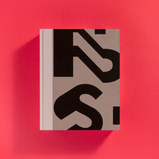
Photo


I started out my search for a book by heading directly to the illustration section. As I’ve said in previous posts, illustration is one of my favorite art forms. After much searching, I finally came across this book, Lifestyle Illustration of the 60s by Rian Hughes, on a higher shelf. It caught my eye because of the bright orange color, bold fonts and because the 60s are one of my favorite time periods. The book moves through each year rather than having specific chapters. The table of contents uses a skinny yet wide font, keeping with the theme. This font is used throughout the whole book and I feel like it is simple yet eye-catching.
The illustrations themselves are so beautiful. I am one for romance and many (especially in the earlier years) are all couples in love. They are all very similar yet different at the same time. Towards the later years, the images start to focus on solely the woman and start to develop a more true illustration vibe. Works are simplified and use monochromatic scales to create beautiful yet simple imagery.
Overall, I really enjoyed this book and would love to find more like it. It filled me with a lot of inspiration for my own personal artwork.
1 note
·
View note
Photo
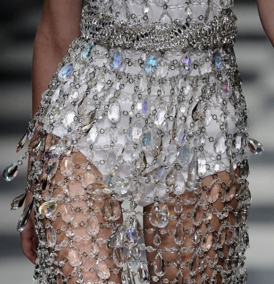


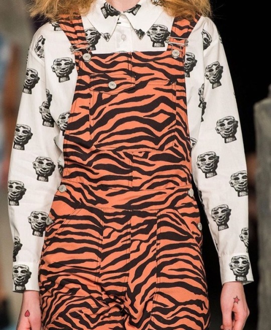


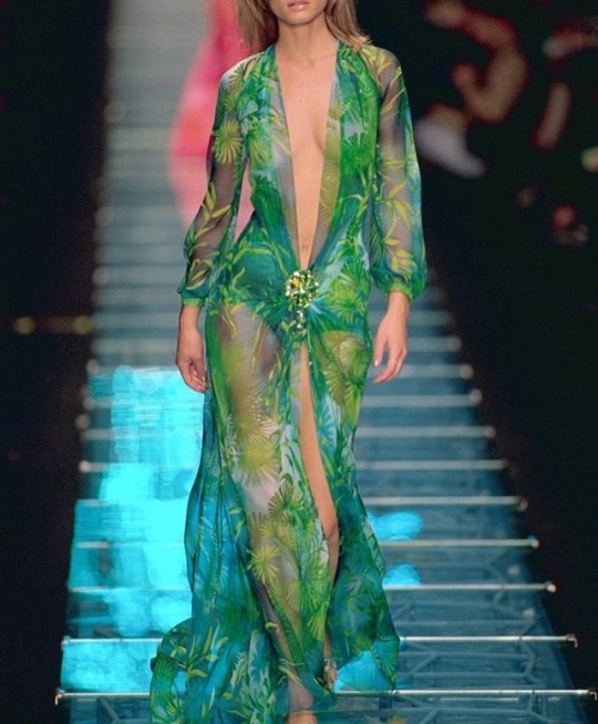

Fashion is something that runs through my head 24/7 and has ever since I was little. These are all outfits that I have had saved for a while now because they all stand out to me. I love and appreciate all kinds of designs but bold pieces that highlight the female form are my favorite for some reason. That is probably because the majority of these works are from the 90s and 2000s by high-end designers like Versace, Prada, etc. I’ve always loved the high waisted look which I am seeing is a common theme here too. I enjoy monochromatic combinations that let the cuts and materials stand out rather the actual prints and designs.
1 note
·
View note
Photo


This Friday, Q, Lauren and I traveled all the way out to China Town on the one day it actually snowed this winter. Gloves, scarves, hats and all we hobbled to the Septa line and eventually found our selves in a sit-down restaurant. I ordered Pad Thai with tofu and wow was it delicious. I could only eat half but who doesn’t love leftovers. At the end of our meal, we were given fortune cookies with the oddest fortunes and translations. Big shout out to THE gentleman of the year, Q, who paid for our meals.
After we were warm and stuffed, we bundled up again and ended up in a market place where I ended up buying a huge pack of vegetable noodles for only $4 and then some interesting candies that had fun packaging. Once we shopped till we dropped, our last stop, of course, was dessert. We shared a coconut tart, a honey cake, and a sweet cake. They were all so good but the honey cake was my favorite.
Everywhere we went there was so much typography that stood out. Every logo, brand name or even newspaper was graphic and eye-catching. Even though I could not read any of it, the designs and icons that were matched with each made it easy to understand.
Overall, I had a really fun time in China Town. I have been there quite a few times but each time I visit I am never disappointed. The food is always amazing and having the opportunity to experience different cultures so close to school is a very cool part of Philly which I love.
1 note
·
View note
Text
Time Management
My whole entire life I have struggled with time management. I use to feel like I could only get my work done when I was in a time crunch. Starting school this year, I told myself that my old habits needed to stop.
One thing I always use is a paper planner. I make sure that all of the places I need to go are written out. This works as a visual reminder for where I need to go and when. I also have a super cute marble and gold to do list that I use every day. There I write out every single task that needs to be completed.
Keeping a mindset that once my work is done, I will feel free and relaxed is also important. I make sure to get what is important completed as soon as possible so that when plans come up, I can enjoy them without worrying.
It also helps to get into a routine. I know how much free time I have each day to maximize the work I get done. This helps me plan out when to eat, when to take a break and when to get my work done.
Being able to finally control my habits with time management has made a huge impact on my life. I feel happy and relaxed 80% of the time, even when I am getting my work done. Instead of procrastinating by watching Netflix and feeling guilty, I now have free time to watch Netlifx without being stressed.
1 note
·
View note
Photo


A ton of great work was put out in 2018. My favorite is the movie poster for Suspiria, a horror movie about a dance studio. The poster reminds of one that would be used for an action movie like James Bond but I find it intriguing because it is for a movie based around dance. Although it does not completely relate, I like the ransom note/college feel that is presented with this piece. It is a warmly toned piece but the contrasting elements (free form paint splatters and carefully structured letters) make it very eye-catching. I am surprised that I am picking this piece because it is far from my own personal taste but for some reason, it stands out to me.
1 note
·
View note
Text
Although i’d rather not admit it, I spend most of my time watching movies. From war films to chick flicks I can be found watching almost anything in my free time. One thing that I hve not yet looked into here in Philly are movie theaters. When something I’m really excited for (Avengers: Endgame) I have to see it on the big screen for the full effect. After some googling I found the Roxy Theater. It is a cute little theater that was re done in 2013. They show all kinds of films from popular current ones to small independent films. The Roxy Theater is a walkable distance so I am excited to check it out! http://filmadelphia.org/roxy-theater/
1 note
·
View note
Text


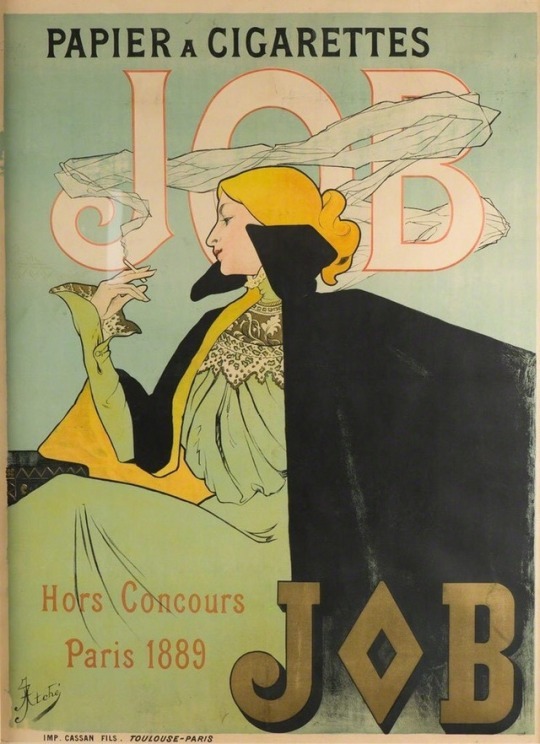
For my 10 commercials I stuck with a theme. In today’s world we are constantly sourrounded by advertisiting. Logos are branded on our clothes and the food we eat, and ads are woven into our social media platforms. It is impossible to escape. When I think of advertising and whag standd out to me the most, I imedditly think of advertising from a while ago. There is something about “vintage” advertising that catches my eye.
The ad I would like to focus on is the cigarette ad. The first thing I love is the illustration. As I have mentioned in previous posts, my favorite form of art is illustration. The playful and stylized nature of all the ads are what I love the most. This one in preticular has a very eye catching color scheme. The way the smoke wraps around the letters is very cool too. Branding cigarettes to be elegant and high class is perfectly executed with this ad.
1 note
·
View note
Text


Visited Easy Passyunk this week. It’s a super cute little hipster town. We ate at Pats and I had cheese fries which i would rate 8/10. -1 for price and -1 for too much cheese. Lauren and I split an apple pie and that was 9/10. -1 for price. East Passyunk was founded in 1682 and is known for its shopping. We walked around the shops and took part in the tree lighting festivities. I am definetly going to go back sometime but hopefully there are less dogs #scared
1 note
·
View note


Text


These are all color combonation pictures I took over the past few weeks. My favorite one is the last one. I took it when I was driving from the airport. I really love the primary colors in the bridge, sky and red in the car. It’s a fun contrast. I am also drawn the the middle top posters in New York. I am always drawn to patel color combinations but for some reason the primary combinations are jumping out at me most. Also the first image, funky orange wallpaper at my grandmas, has a cool and bold pattern to it that stands out.
1 note
·
View note
Text


Just finished watching the Abstract documentary on Paula Scher and wow was it interesting. To be honest I thought it was going to be really boring but I was totally wrong. It is crazy how one person can create so much imagery that is seen everywhere all the time. She has created very influential and iconic designs ranging from Citi Bank to the Public Theater. Her abstract style changed the way design and typography were created and presented forever.
Her view on the world made me take a step back and look at the way I see things. As she was sketching and riding in the taxi it kind of made me self-aware about how much time I spend on my phone and not seeing the world as it is. It is important to be influenced and inspired by what is around you.
11 notes
·
View notes