
Don't wanna be here? Send us removal request.
Statistics
We looked inside some of the posts by anthony-zheng and here's what we found interesting.
Average Info
Notes Per Post
1
Likes Per Post
1
Reblog Per Post
0
Reply Per Post
0
Time Between Posts
16 days
Number of Posts By Type
Text
5
Last Seen Tumblr Blogs


Fun Fact
China blocked Tumblr because of pornography and censorship problems in 2013.
Text
Module 5 Scavenger Hunt

This poster advertising the class “Gender in News Media and Technology” uses imagery that has the denotative meaning of 4 women in different clothing and backgrounds giving a talk.
However, the poster also has the connotative meaning of unification and power empowerment. All four of these women come from either different careers or backgrounds as denoted by their outfits, but they are connotatively unified by the same red coloring in their clothing. From their suits, to the construction hat, to the head cloth, they all have the red color scheme bringing them together. The smiles and red blushes on the face also connotes a sense of confidence and happiness that empowers all four women.

This bell graphic that appears in every elevator is a great example of an iconic function. It bears a literal resemblance to a bell to inform people that the button can be used to run for help, similarly to a bell.

This “make summer a thing” poster is a great example of the use of indexical function. Instead of trying to use a literal image of summer, it uses graphics that are existentially related with summer. The watermelon is a fruit that is commonly eaten during summer times. The flamingo represents lawn flamingos or even inflatable pool flamingos that you would also see in the summer. The sun is a more literal representation of summer weather. The beach umbrella also invokes the idea of beaches and summer weather. The flower also invokes the relationship between plants flourishing and in the summer weather. While each of these graphics are not an iconic or symbolic image of summer itself, they act as an indexical function due to their pre-existing relationship with summer as a concept.

The recycle symbol on this recycling bin is a great example of a symbolic function. It is culturally accepted that the graphic of 3 arrows interloping in the triangle shape is the symbol of recycling. Even if the arrows have nothing to do with the act of recycling, it is a culturally accepted representation.

6. This poster advertising the class “Games and Society” is a great example of a graphic that references a past aesthetic. The font used in the header specifically references the pixelated aesthetic of video games fonts in the 1980. During the time, video game graphics were extremely limited, So this pixelated look came to define the aesthetic of the time period. This immediately invokes a feeling of nostalgia, as this era was such an iconic period of video game history. #module5
0 notes
Text
Design Scavenger Hunt Module 4
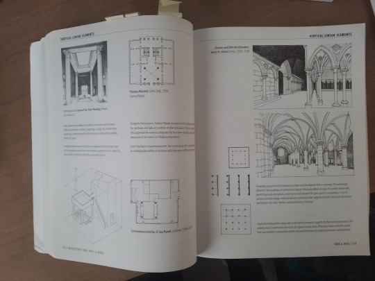
An example of a publication that has rhythm is this architecture book by Francis D.K Ching. The pages are filled with images and descriptions that showcase architecture examples and concepts. The placements of the images and text throughout the pages are very dynamic and forces readers to move throughout the pages both vertically and horizontally. The pages also have enough white space for the eyes to rest or focus on the illustrations.
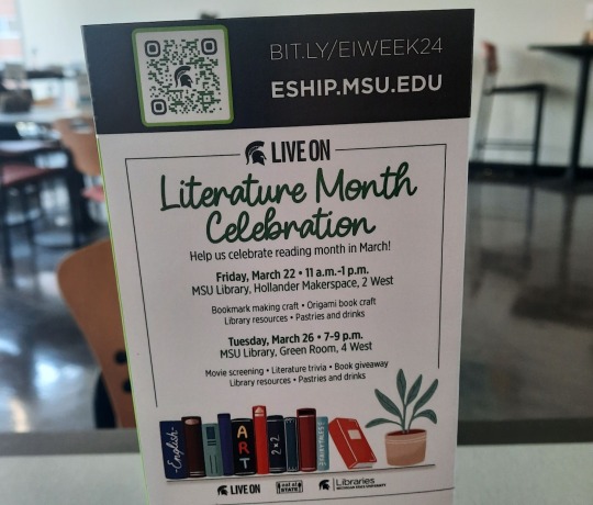
In this sign advertising Literature Month Celebration, there is a clear hierarchy of importance created by the typography. The words “Literature Month Celebration” are the most important as not only do they have the largest font, but it also has a unique curving font type that does not match the rest of the signage. The dates are also given high emphasis as they are the only words that are typed out in bold making them larger and more noticeable.

In this description from a poster for “Beyond the Show” episode, there are many letters ascenders. The letters h in show, f in first, and t in talk are examples of ascender as the letter’s top terminal extends above the letter’s mean line.

In the poster for recycling paper, the lower case letters g in magazines and p in Newspaper are great examples of letters with descenders. Their lower terminals extend below the baseline.
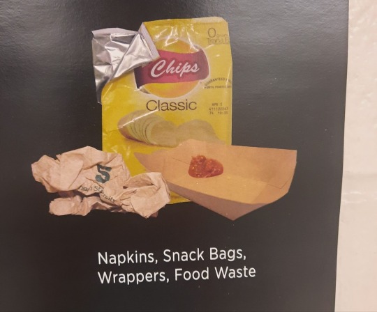
In this poster for throwing away trash there are many examples of letters with a counter. The lower case letters a, o, and are letters with a counter as they have enclosed spaces inside.
This poster for recycling paper has an example of a letter with a crossbar. The capital letter A in all has a crossbar, as a horizontal line moves across the center of the letter.
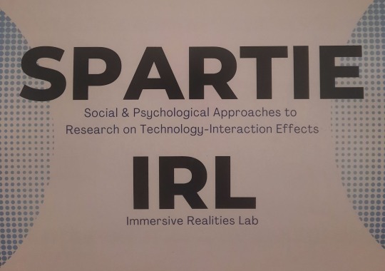
The font in between the Spartie IRL sign is a great example of large x-height. The ascenders and descenders in the lower case letters are short and less noticeable. While the lower case letters y and t are larger than letters without an ascender or descender like a, s, and e, it is still relatively small compared to other typefaces.
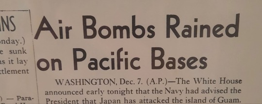
This old newspaper headline is a great example of a font with a small x-height. Here the ascender in the lower case d is much more pronounced as the letter is twice the height of letters without ascenders like a, n and e.
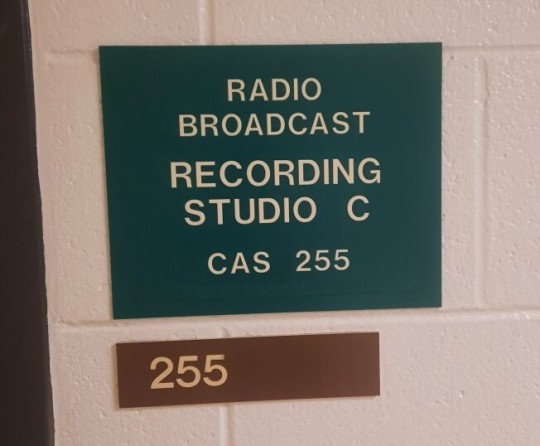
A great example of designs and fonts that are modernist are these door signs that you can often find throughout modern buildings. They are clear and straightforward, and the font types are straight and emphasize legibility, which are key hallmarks of modernist typography.

This poster for “Fragile Remnants” not only uses its unique fonts to draw attention to the poster, but to connote a natural feeling to the film. By using a font that looks more handwritten than mechanical, viewers automatically get a sense that the film is very human and dramatic without even reading the type of title.
#module4
0 notes
Text
Module 3
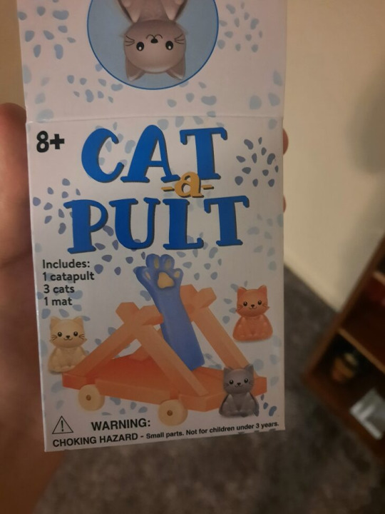
This toy Cat a Pult is a great showcase of complementary colors. By making the words Cat and Pult blue and keeping the letter a yellowish orange, it is able to call attention to the pun in the title. The words cat a pult can also be seen as the word catapult.
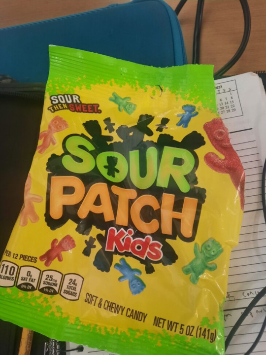
2. This sour patch kids bag is a great example of analogous colors. It uses warmer colors like yellow, orange, and red to bring together the words and background, while still creating contrast with a black outlines and a bright yellow green text.
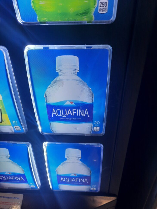
3. This aquafina water bottle on this vending machine heavily uses a cool blue color pallet. To elicit the feeling of cool and refreshing nature of water. Even the background of the vending machine image uses a bright blue to reinforce the same idea of a cold beverage.

4. This hazelnut coffee creamer leans heavy on warmer hues like red, orange, and yellow. This is used to elicit the feeling of a sunrise, which is often associated with a morning coffee.
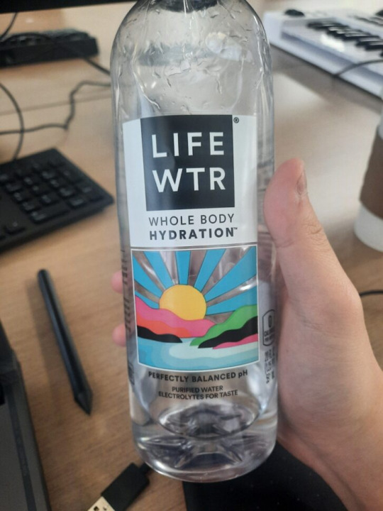
5. This Life water bottle uses contrasting color hues to create an image of a sunset with basic colors. The yellow sun contrasts with the blue water and sky. The black green and pink colors in the mid ground act as different landmasses. By having multiple contrasting colors, it is able to create a sense of depth in the image with rather simple colors and shapes.
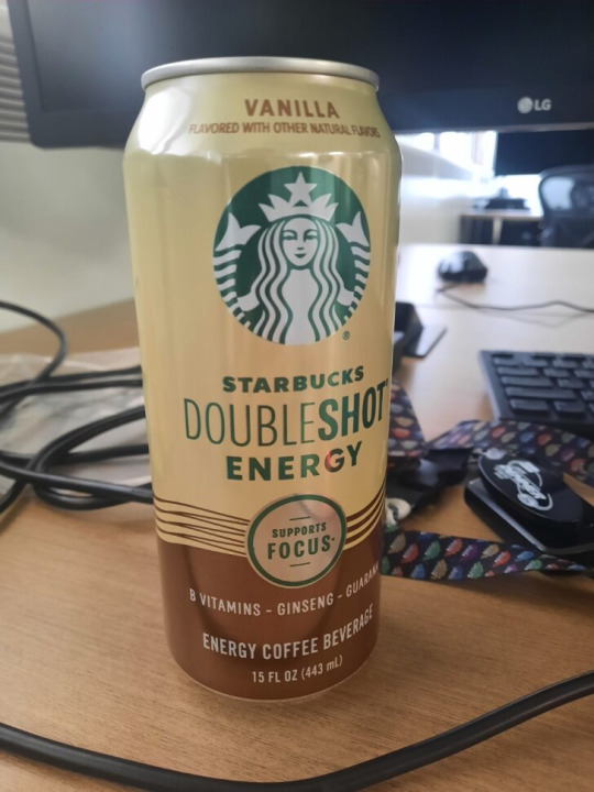
6. This can of Starbuck coffee showcases the gestalt principles of proximity by having brown lines grouped together near the lower end of the can. By having them grouped together in such close proximity, it creates the sense of energetic and fluid waves.
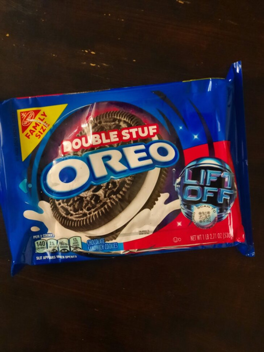
7. This oreo package showcases an active figure ground relationship as the dark blue surrounding color acts as a background. The words “double stuff Oreo” also stand out from the dark oreo cookie and exist in the front ground.
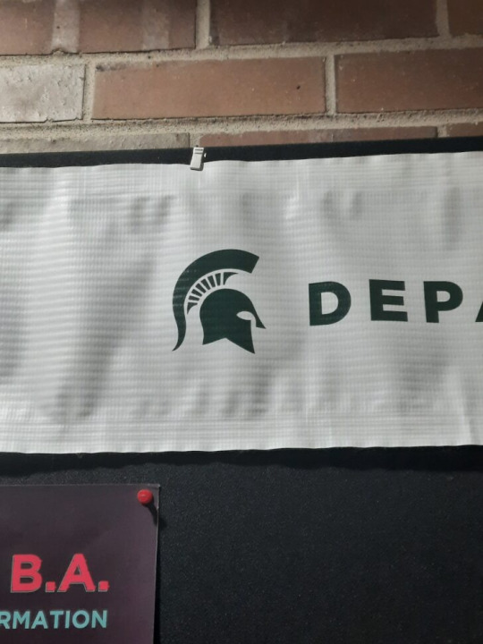
8. One of the best examples of a graphic design that draws upon history is the MSU spartan logo. By using a representation of a spartan helmet as the logo, it creates an association between the strength of spartan warriors and the school itself.
0 notes
Text


The first picture is a cup I got from a cat cafe. It uses silhouette of a cat on a crescent moon. The crescent mood shape creates a strong contrast and shape that draws attention to the cat. The words "constellation cat cafe" are also small in scale, as to not draw attention away from the cat shape.
The second picture is shirt graphic that says celebrate with us. The graphic uses a large curving font to draw attention to the word "celebrate". It uses the repeating shapes of the leaves to draw viewer attention downward towards with words "with us"
The third picture is a fortune cookie box I found. it uses different scales of fonts and types to draw attention to the largest words in the center of the box. The words are also surrounded by icons and symbols from the company. The close positioning of these text and icons focuses the viewer's eyes to the center of the box.
The fourth picture is the cover of Myth of Sisyphus by Albert Camus. The book cover using a hierarchy pattern of small shapes to big shapes of climbing and increasing scale to draw attention to the title at the top of the book.
The last picture is a special menu from a sushi place. It uses evenly thick black boarders to draw attention to the specials of each day. It also uses different font sizes and scales to draw attention to numbers and important words. #module2
0 notes
Text


Picture 1: The first image is a plastic cup I got at a cafe. The design of the cup uses the word recycle in different languages, plastered around the cup. This bold and clear typography makes the graphic easy to read. By having the word written in languages also makes it inclusive to all cultures.
Picture 2: The second is a MSU graphic poster that talks about "Winter Blues". The illustration of a sad squirrel in winter apparel instantly conveys the graphic message. The bold and colored font also makes the information easy to read.
Picture 3: The third picture is the Amazon prime logo stickered on a shipping box. The logo's blue font allows it to stand out from the black background. An arrow makes the logo look like a smile, but also conveys the idea of Amazon shipping from one location to another.
Picture 4: The fourth image is the box for Blackwing 602 pencil. The front side shows the name of the pencil in a clear and understandable font. The Blackwing logo is isolated at the bottom. The left side of the box shows a minimalist line design that also high lights the letter B.
Picture 5: The last image is a sign shows writes "filtered water". The font is white, clear, and easy to read. It also shows the symbol of a water drop with an arrow moving up the side to represent the recycled aspect of the water.
#module1
1 note
·
View note