
HT, 25, they/them | art blog (I rarely post but thank you for visiting!)
Don't wanna be here? Send us removal request.
Statistics
We looked inside some of the posts by anyilia and here's what we found interesting.
Average Info
Notes Per Post
427K
Likes Per Post
236K
Reblog Per Post
191K
Reply Per Post
318
Time Between Posts
4 months
Number of Posts By Type
Note
3
Text
5
Photo
9
Last Seen Tumblr Blogs


Fun Fact
1,644 Tumblr posts in 1 second.
Note
sorry if this question has already been asked, but what brushes do you use?
most of them are in here somewhere :P i mostly use 6 nowadays
23 notes
·
View notes
Text
#poll ended but i would've voted “mid”/“it's decent”#poll#also hi yes I'm alive but I don't really post anymore
17K notes
·
View notes
Text
hot artists don't gatekeep
I've been resource gathering for YEARS so now I am going to share my dragons hoard
Floorplanner. Design and furnish a house for you to use for having a consistent background in your comic or anything! Free, you need an account, easy to use, and you can save multiple houses.
Comparing Heights. Input the heights of characters to see what the different is between them. Great for keeping consistency. Free.
Magma. Draw online with friends in real time. Great for practice or hanging out. Free, paid plan available, account preferred.
Smithsonian Open Access. Loads of free images. Free.
SketchDaily. Lots of pose references, massive library, is set on a timer so you can practice quick figure drawing. Free.
SculptGL. A sculpting tool which I am yet to master, but you should be able to make whatever 3d object you like with it. free.
Pexels. Free stock images. And the search engine is actually pretty good at pulling up what you want.
Figurosity. Great pose references, diverse body types, lots of "how to draw" videos directly on the site, the models are 3d and you can rotate the angle, but you can't make custom poses or edit body proportions. Free, account option, paid plans available.
Line of Action. More drawing references, this one also has a focus on expressions, hands/feet, animals, landscapes. Free.
Animal Photo. You pose a 3d skull model and select an animal species, and they give you a bunch of photo references for that animal at that angle. Super handy. Free.
Height Weight Chart. You ever see an OC listed as having a certain weight but then they look Wildly different than the number suggests? Well here's a site to avoid that! It shows real people at different weights and heights to give you a better idea of what these abstract numbers all look like. Free to use.
331K notes
·
View notes
Note
First of all, I want to say that I love your work. It makes me so happy! I'm pretty sure that has to do with your color scheme. So, I just wanted to ask, how do you choose your colors?
🌿 This website is amazing for color palettes and there’s so many of them to choose from! But I realized that I kinda suck at sticking to palettes someone else made so I gave up on using pre-made color schemes haha.
🌿For my art I always use soft colors with a pop of brighter/contrasting colors. I use Paint tool SAI as my main drawing program and I always have the HSV slider and color swaches options enabled.
🌿 I’ve saved a lot of colors on my swatch pad throughout the years (5 years so far) so when I’m coloring a piece I always choose from the colors I already saved and then I adjust them through the HSV slider if needed. Here’s my swatch pad:

🌿 When working on pieces with one dominant color I like to mix warmer shades with cooler shades of that color. Here’s my Sailor Moon piece as an example:

🌿 For my Kiki matching set I knew I wanted it to look soft yet have contrasting colors (‘cause that’s the kinda colors Kiki wears). Colors can also look different depending on what other colors you pair them with and even tho I picked a pink-ish color and a orange-y color for her shirt/cap and jacket,they actually come off more as red and yellow (at least that’s how I see it idk haha).

Keep reading
3K notes
·
View notes
Text
Making & using a lace brush in CSP
saw this tweet on twitter,
https://twitter.com/ClipStudioTips/status/1216735942658199554
which actually goes over using file objects to make repeating textures, which is the same method I used to make my lace brush shapes! I elaborated on the process on twitter, and I’m just crossposting this here.
So the first thing is to make a new file object as explained in the tweet, and then if you make use of CSP’s symmetry rulers you can make some complex repeating patterns like this!
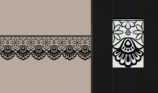
The flowers were all done using a 6 line symmetry ruler, and the part at the bottom used a 2 line ruler.

& when you set the file object to tiling, you can set what directions it tiles in, too!
Once you’re all done drawing your pattern, you want to make it a brush tip. You need to set this up correctly! CSP’s brush tip engine works as black = primary colour, white = secondary colour,
so to ensure that the brush changes colour as expected: make sure you’re working on a transparent background, and convert your layer to greyscale before you save it as a brush tip material!
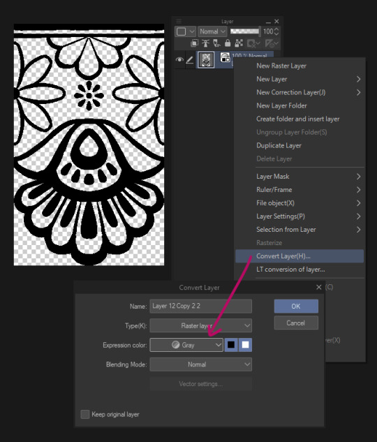
This step is important, if you don’t set the layer to greyscale, it will not change colour, even if it’s in black & white.
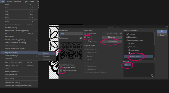
Anyway with that done you can make it into a brush tip shape by going to edit > register material > image… Here are the settings you’d want for a lace brush! Make sure to tag it so you can find it later.
Once that’s saved you can make it into a brush,


go to brush tip and change the material to your new lace tip
go to stroke, and enable ribbon
if it’s repeating in the wrong direction, go back to brush tip and change the angle to either 90 or 270 (depends which way up you want it)
And you’re done! But as for actually using it, actually prefer to have my lace brushes using the figure line tool, and to make a vector layer for them!
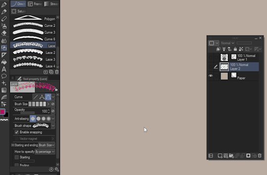
That way you can adjust the line as you need to create more realistic deformation. This works fine with the brush tool too, but drawing a line with the brush tool will create a lot of anchor points so it’s a little trickier to work with.
Anyway! Here’s an example of me using this method

9K notes
·
View notes
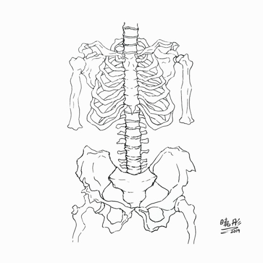
Photo

Just some anatomy studies. Drawn from various online sources.
15 notes
·
View notes
Photo


A simple step-by-step process of my coloring by request ~
I would recommend reading this tutorial as well for a more in depth explanation of my process. It’s essentially the same as this one, so I didn’t find it necessary to repeat the steps in detailed text.
8K notes
·
View notes
Photo

skelebois in your area ✨ [IG]
16 notes
·
View notes
Photo
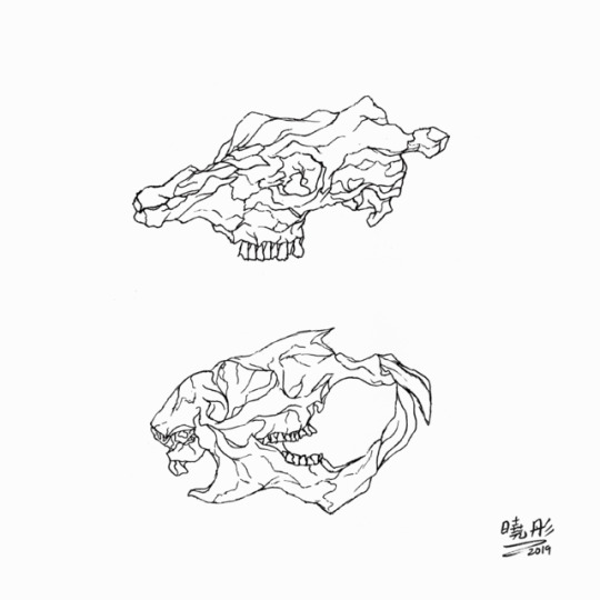

animal skull studies - 18.09 [IG]
7 notes
·
View notes
Text
*thinks of a drawing concept I don’t have the skill to execute* *thinks of a drawing concept I don’t have the skill to execute* *th
21K notes
·
View notes
Photo


anoosha syed (foxville_art) on Twitter made a really interesting tutorial on how to colour non-white skin in illustrations that I thought people who follow this blog might find useful (:
(resposted with permission)
19K notes
·
View notes
Photo


KH\eyblades 🔑💖
#kingdom hearts#kingdom hearts 3#artists on tumblr#weapons#weaponry#fan art#traditional#so hard to draw but so rewarding
22 notes
·
View notes
Photo

FFXV stuff ✨
#final fantasy#final fantasy xv#ffxv#artists on tumblr#my art#traditional#weapons#weaponry#can u tell i went overkill on the steampunkness of the engine blade lmao
53 notes
·
View notes
Photo


🌸🌸 五月 🌸🌸
9 notes
·
View notes
Note
(different anon) I'd love to see a tutorial someday too. Specifically, how the heck do you get your pastries and ice creams and bread to look so soft and natural?! I've made a couple simple food pixels myself, but they all seem so stiff in comparison.
hum well personally i think making things look natural starts wi sketching out line work. (i did a comparison of a bread bun, starting with the same blue sketch to show the differences) i always do rough sketches & work over them bc i think it gives me a better idea of the form.
i know sometimes it seems right to have everything perfect & symmetrical but it all depends on what your drawing in the first place - because you mentioned like bread & ice-cream etc those things are rarely perfect anyway, so i guess avoid being too structured
then i think another big thing is the colour choice & the balance of the halftone dots for shading. I feel like too much half tone & its one big ordered gradient & yeah that looks kind of odd. & for the colour.. its tempting to just pick out the darkest tone & just gradually make it paler for the highlighty bits - but in reality when you really look at something there’s usually a lot of different kinds of colours (even if it is just white bread). So yeah id say experiment with that - i usually exaggerate and go for much warmer colours tbh.
the last thing that i think makes a huge difference is how you do the shine (if any). it helps to just think about the actual thing your drawing (goes wi out saying but curved and squishy bread probably has a softer curvy shine) and it’s probably not such sharp stark white

i feel like the picture just explains it all way better haha
-`mini tutorial about pixel bread bun´-
1K notes
·
View notes
Photo

2019.01.30 - starved demon
#my art#artists on tumblr#the promised neverland#yakusoku no neverland#macabre#fan art#traditional#i think this might be the inkiest drawing i've ever done#i ran out of ink halfway but good thing i found spares
29 notes
·
View notes