
Don't wanna be here? Send us removal request.
Statistics
We looked inside some of the posts by aquaberi2 and here's what we found interesting.
Average Info
Notes Per Post
573K
Likes Per Post
267K
Reblog Per Post
306K
Reply Per Post
240
Time Between Posts
16 days
Number of Posts By Type
Text
14
Photo
1
Note
2
Last Seen Tumblr Blogs


Fun Fact
In 2020, 27% of US Tumblr users had an annual household income of over $100,000.
Text
I’m so sad its over 😭 but happy I was able to participate! This year was so fun!!!


#art fight#art fight 2025#procreate#artfight 2025#artists on tumblr#digital art#digital artist#team crystals
7 notes
·
View notes
Text

Am I too late??? Did I miss getting my final #mermay in?????
I DID TWO THIS YEAR LETS GO! (I’m actually super proud of this one 😭)
16 notes
·
View notes
Text
Finally finished my piece for Mermay 2025!
I planned to do more pieces this year (I still could, probably…) but I spent a lot of time working on the background for this one. I may be slow, but I continue to learn!

6 notes
·
View notes
Text
My iPad is currently unavailable so here’s another old #Mermay
I can’t wait to work on my sketches for this year. I’m doing MORE THAN ONE this time!

3 notes
·
View notes
Text

I fucking LOVE Mermay!
Here’s an oldie while I work on a new fish person
5 notes
·
View notes
Text

I am in the cycle of starting Baldur’s Gate, playing for awhile, can’t decide who to romance, stop playing. Start playing Baldur’s Gate, play for awhile…. And so the cycle goes!
#artists on tumblr#digital art#procreate#digital artist#fanart#oc#baldur's gate 3#baldurs gate fanart#baldur’s gate tav#baldur’s gate oc
5 notes
·
View notes
Text

It’s been so warm here lately I’ve been leaving my windows open. Driving to work and seeing all the flowers and leaves starting to come out made me want to make a spring-themed nymph!
I may make this into a series: one for each season. We shall see 🌺
1 note
·
View note
Text


I’ve *always* wanted to do a redraw from some of my old work- guess I’ve learned a thing or two over the years ☺️
2010 vs. 2025!!
0 notes
Text
It’s been so cold here- snowed off and on this last week and I. Am. Done.
Bring back beach weather!!!!!!! Bring back beach babes 😍

#artists on tumblr#digital art#procreate#digital artist#fanart#mario fanart#princess peach#princess peach fanart#mario art#princess daisy#daisy x peach#peach x daisy#princess daisy fanart
14 notes
·
View notes
Text

First piece of the year!!
Decided to try drawing a different sailor scout- Michiru! I love the color palette for Sailor Neptune 💙 this was a great opportunity to try some out some new techniques!
#artists on tumblr#digital art#procreate#digital artist#fanart#sailor moon#sailor moon fanart#sailor neptune#sailor neptune fanart
7 notes
·
View notes
Text

New year, new icon 💅
2 notes
·
View notes


Photo


Different Stories Resonate with Different People
507K notes
·
View notes
Text
For the last three years I’ve done an Art vs. Artist at the end of the year to reflect.
Even though I didn’t make a ton of art this year, I’m still happy that with what I DID make. Hoping in the new year to continue making and growing ❤️

2 notes
·
View notes
Text
Today is my birthday! I am 34yrs old today- my process, supplies, and style have changed so much over the years, and I’m so much more confident than I’ve ever been before.
Here are my four favorite art pieces I’ve made so far. It’s all fan art (and two OC’s!!!) ☺️


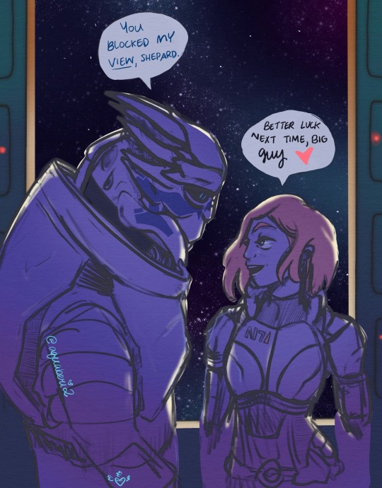
#artists on tumblr#digital art#princess peach#princess peach fanart#procreate#magical girl#magical melody#mass effect shepard#mass effect garrus#elden ring oc#mass effect fanart#fanart
2 notes
·
View notes
Note
Hullo! I’ve been watching a bunch of your Timelapses and I was wondering how do you always come up with the colours for your pieces? They’re always so cohesive and pleasing to look at (I almost exclusively work in greyscale so if I’m using colour it’s always a lucky guess and it never looks quite right)
Hey there!
I have to be honest that most of the time I don't actually know what I'm doing and that I have no idea how most of my pieces are gonna turn out. My work process is usually based on "Fuck around and find out", haha. I'm happy to know that it apparently doesn't come across that way, though.
A lot of it comes very naturally to me simply because I've been drawing non-stop for so long, but I can give you some small tips that really help me:
1. Have as many references as possible!
Here's what my reference sheet looked like for the Jayvik piece:

It helped me a lot to understand the overall color scheme I wanted to convey. Lots of very cold tones, pinks and very light blues and greens. These colours sorround Jayce and Viktor throughout all of season 2 and I wanted to keep them, especially since in my piece they are lying in the glowing hexcore.
Don't shy away from using references, get as many as you possibly can! Look at other poeple's art too and try to understand how they work with colours.
2. Work with complementary colours!
Since I paint a lot of romantic illustrations I want them to look pleasing and comforting, which I can accomplish by using complementary colours! You see this a lot with couples that are blue and red coded, for example. And I wanted to do the same thing in the Jayvik piece! For that I used the highlights in their hair!


Viktor's highlights are a soft pink hue.


While Jayce's are a soft blue hue.
The colour wheel works perfect for figuring out if two colors compliment each other because they are literally right across from one another!
3. It doesn't have to be true to life.
Pretty self-explanatory, but I thought I'd add it in here anyways. It's important to understand how colour and light works, but you don't always have to follow the rules. Does the rim light look cool but it makes zero sense? Who cares! Keep the cool rim light! Just have fun and fuck around.
4. A little trick to make your life easier!
I'm not excatly the best at colour theory, I still struggle with it quite a bit, but here's a little trick I like to use from time to time:
If you want all your colours to look coherent, take one specific color as your flat colour. Choose a hue that you would like your piece to have. Like this:

Now you choose whatever colours your characters have and paint them in. For example, here are the skin colours I chose for Jayce and Viktor:

Looks off, right? These colours don't fit the overall piece at all. So what do we do?
Turn down the opacity! It's that easy, wahoo!

I went from 100 Opacity to 72 for this specific illustration. And look at that!

It's so much nicer already! Now you know what colours to use as your actual flats! Just repeat this with every other part of your illustration and you'll have a great starting point. :)
I really hope this was helpful! I'm not an actual teacher and I don't have a proper illustration degree, so some things might not be completely accurate, but I thought I'd try my hand at this anyways!
794 notes
·
View notes
Note
Princess rosalina break dancing to distract the enemies?
Hmmmmmm 🤔 a most intriguing idea…
0 notes