
Don't wanna be here? Send us removal request.
Statistics
We looked inside some of the posts by artnowcolor and here's what we found interesting.
Average Info
Notes Per Post
5K
Likes Per Post
4K
Reblog Per Post
2K
Reply Per Post
7
Time Between Posts
1 day
Number of Posts By Type
Photo
14
Text
2
Video
1
Last Seen Tumblr Blogs


Fun Fact
Average visit duration of Tumblr.com is 10 mins and 25 secs.
Photo

Questions of the Week:
What’s abstraction good for? Describe some of the reasons why artists might employ abstraction in their work.
What does having a physical space to make art mean for your process and how do you make your space work for you?
11 notes
·
View notes
Text
FINALS WEEK SCHEDULE: WEDNESDAY 4/27 @10:15AM - 12:30PM
1 note
·
View note
Photo


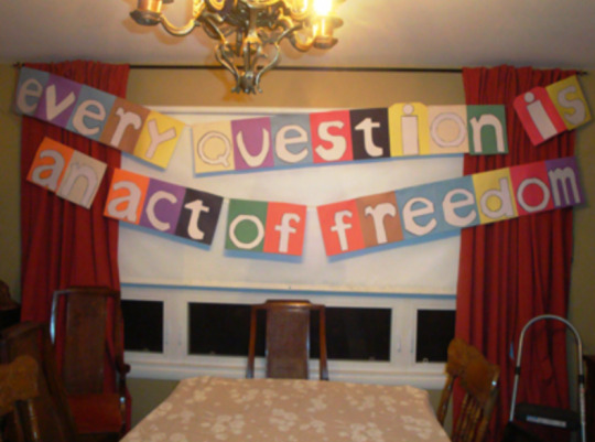

Color Research: Make an Encouraging Banner ala Miranda July
For our final color research assignment, I want us to use our color knowledge to make something fun and hopeful as the semester draws to a close. For this week’s assignment I was really inspired by an artist that I love, Miranda July, who does a lot of cool stuff, but this particular assignment comes from a collaborative project she did with Harrell Fletcher, that is both a website and book called “Learning to Love You More.”
The “Learning to Love You More” project was a 7 year long crowdsourced art project, where over 8,000 people posted work they had created in response to a series of prompts. The project was started in 2002 and ended in 2009, though you can still visit the website online, linked here. (Just for fun, I will be emailing you later today with a pdf of the full list of assignments from the book, just in case you want some creative ideas to start your quarantine summer.)
For your color research this week, we will be each be doing our own versions of Assignment #63 which says:
Think of something encouraging you often tell yourself. For example: Everything will be okay. Or: Don’t listen to them. Or: It’ll blow over. Now draw each letter of the sentence on a large piece of colored construction paper or squares of fabric. One letter per piece. Draw them blocky so you can cut them out. Cut them out. Glue each one onto a piece of construction paper or fabric that is a contrasting color. Then glue the edges of all the pieces of paper or fabric together to make a banner. Hang the banner in a place where you or someone else might need some encouragement. For example, across your bathroom. Or between two trees so that you can your neighbors can receive encouragement from it. Or in a gas station.
Create your own colorful and encouraging banner. Use cut out paper, magazine scraps or even painted paper to create your letters and backgrounds. Consider your color choices in relationship to the text on your banner. How can you increase the impact of your encouragement through your color choices?
Hang up your completed banner inside your house, in your yard or neighborhood or wherever you think folks could use the encouraging reminder. Take a picture of your encouraging banner and post it to your blog.
Use the hashtag #colorresearch to make it easy to find.
Images from top:
several examples of encouraging banners from the “Learning to Love You More” website
my copy of the “Learning to Love You More” book
1 note
·
View note
Photo


Color Research// Natural Dyes: Avocado Skins
We will be trying a bit more natural dyes today, using the avocado skins collected by Mariya and Jenna this semester to see what colors they offer us.
Images above, from top:
Alvocado skins and some fabric dyed with them.
Another easy natural dye to try at home is onion skins. Here is some examples of the color ranges possible with this natural dye.
A pile of onion skins, because... #orangeweek
2 notes
·
View notes
Photo


Critique
We will be looking at your studio projects in the art studio starting this Wednesday for our class time together. The conversations we have about completed artwork in art school is called a critique and this conversation is a critical learning component of your education in art making.
Plan to be present and participate in the discussion both class sessions . Please understand that valuable learning happens throughout the critique conversation, not just when we are talking about your project.
We talk briefly about the critique structure on Monday during class before we begin to look at your artwork on Wednesday. I’m excited to see what you have made and always look forward to critique days as inspiring to me personally. I hope you also find meaningfulness in our critiques as well.
Critique Schedule
Wednesday April 13th
Faith, Emma, Christian Y, Maryna, Sharon, Kaylen, Becca, Mariya
Wednesday April 20th
Sofiya, Connor, Abby, Jenna, Kristian M, Zach, Espy, Jason, Bianca
Images above, from top:
critique schedule as determined last week via some chance magic in class
This historic photograph is from the Bauhaus classroom of Joseph Albers, where he is critiquing student color research projects. Our critiques this week place us within a long tradition of art education that will be a part of any studio based art class you take.
a helpful quote about what a critique is from a book by Rhode Island School of Design, designed to help parents of art students understand the value of an art education.
my critique helps grouping from a deck of cards I made called “What to Learn in Art School” with text based on a book by Kit White called 101 Things to Learn in Art School”
1 note
·
View note
Photo


Orange!
Its orange week. Join me in the exploration of all things orange this week as we surround ourselves with the color orange to better understand what it offers our lives and our creative work.
Images above from top:
painting by Mark Rothko
painting by David Shrigley
print by Jonas Wood
sculpture by Jeff Koons
installation by Olafur Elliason
color infographic from the depths of the internet
2 notes
·
View notes
Photo

Questions of the Week
How does the location or context of a work of art affect its meaning?
Are there any particular activities that you do everyday as an artist?
3 notes
·
View notes
Photo

Congratulations to Bianca on her role in Jessup Theatre’s “The Three Musketeers”!
More about the show:
This adaptation of the classic novel by Alexandre Dumas is a tale of heroism, treachery, close escapes and above all, honor.
Commissioned by the world famous Bristol Old Vic, it tells the story of a brother and sister, D’Artagnan and Sabine, who sets off for Paris in search of adventure. D’Artagnan hopes to join the valiant King’s Musketeers. Sabine, meanwhile, is being sent to a convent school, but decides quickly that it’s not for her. She’d rather fight by her brother’s side. Cardinal Richelieu has different plans for both of them, but with their new best friends, Athos, Porthos and Aramis by their sides, they save the day for king and country. Dumas broke all the rules with this one, combining heroism and comedy in equal measure, and the critics agree that this is the best adaptation of the novel ever written.
Doors open 1 hour before showtime so that you can reserve your seats (first come, first served) and enjoy the pre-show.
You can support Bianca by seeing the show. Buy your tickets here.
2 notes
·
View notes
Text
I saw this in my feed this morning and thought it was interesting. I like how the defined structure (vintage postcard color + yarn circle) is an engaging way to explore color relationships and proportions. What do you think?


Everyone has a dream in life, I don’t… Natalie Ciccoricco
5K notes
·
View notes
Photo


Color Research: Hapazome
For our other color research activity of the week, we will be trying out the simplest (and maybe the funnest?) natural dye process I know- Hapazome, as another way of exploring color in nature.
Here is how it works:
Step 1: Gather some plants and leaves from wherever you are. Don’t overlook small or unassuming flowers, leaves, even single tiny petals on the ground. The important thing for hapazome is the plant material is fresh and plump.
Step 2: Place a piece of paper on a hard surface like the small wood boards I have available in the art studio today for you to use (careful of the raw edges!!).
Step 3: Place a plant or leaf on the paper. Do you best to lay it so it is as flat as you can. Put another piece of paper over your plant, like a sandwich.
Step 4: Use your mallet or hammer to gently bash the surface until you see the color coming through the paper. Once you think you have fully pressed out the botanical color, gently remove the plant material from the paper.
Step 5: Lay the paper flat to dry.
Try this out today!
Please plan to post a scan or image of your color research experience with Hapazome onto your blogs to receive credit for it.
Images above, from top:
some foraged material ready for hapazome
my hapazome station at home
an example of hapazome
my Hapazome station at home from earlier in covid. I used this set up to teach this particular color research exercise for color theory on zoom last time so I’m grateful to get to be together for this version of hapazome now.
2 notes
·
View notes
Photo
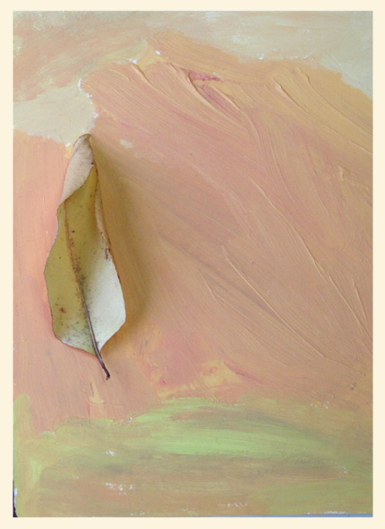


Color Research: Color in Nature
The natural world has a lot to offer a close study of color and color relationships. This week, I want us to hone in on looking at natural materials around us to learn more about color.
My hope is that in looking and extracting color from natural sources you will:
1.) Become conscious of the the range and variety of readily available, effective, and sophisticated color schemes sources in nature.
2.) Become aware and practice using tactics of expanding and exploiting natural sources for their color.
3.) Practice using color relationship based strategies for using color in an artwork.
Here is the plan for your color in nature research:
Find 2 different subjects in nature whose color is impressive, evocative or interesting to you. Search for a wide variety of color and distinctive harmony, such as brilliant or unusual color. Don’t plan a color scheme, just observe and capture nature. Choose 2 physical natural objects for your subject for this week’s color research activity.
Use each natural object as your research subject to paint a color study. You will make a total of 2 painted color studies (1 per natural object). The images above are all examples of what I mean by a color study. This is very different than using the grid structure we have used a lot for previous color research.
For the color study:
Work to accurately capture the colors of nature.
You do not need to paint an illustration or even an approximate likeness of your subject, In fact, its best if you simply paint an abstract arrangement of the colors you see. In effect, study and capture the color, but ignore the identity of your subject.
Look closely for subtle colors and transitions between colors – look for the colors that bridge, or connect, one color area to a neighboring area of color.
Look especially for the broad range of colors present – try to find at least 5 colors to use in each color study.
Match color proportions and color juxtapositions in your studies as best you can.
Look carefully at how much of each color is present in your subject – get the color proportions of your painted study to match the proportions of the colors in your natural subject as best you can.
Also, pay close attention to which colors lie next to each other in your subject. The arrangement of color with respect to color is important. So, the juxtapositions of color in your painted study, should be similiar to the juxtapositions of color in your natural subject.
Create an abstract color composition/design while giving attention to composition — treat each study as a small, abstract design with a major focal area, and minor areas of interest. Take a picture of both your composition and your natural object and post these to your blog.
Label your color studies with the hashtag #colorfromnature to make it easy to identify.
3 notes
·
View notes
Photo

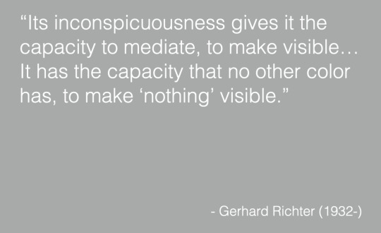

Gray or Grey Wednesday
Wednesday is our day to discuss together the power of grey as color. Wear your grays and bring your stories and experiences.
Why would an artist choose to use grey in their work? What characteristics does grey offer our work and its meaning?
Images above, from top:
some grey
a quote about grey from artist Gerhardt Richter
grey characteristics as a infographic
2 notes
·
View notes
Photo


Black and White Monday
Monday is our day to discuss together the power of white and the power of black as colors. Wear your blacks and whites and bring your stories and experiences.
Why would an artist choose to use black or white in their work? What characteristics do white and black offer our work and its meaning?
Images above, from top:
I collect table of contents pages and like to scan them. This is a rare white one that reminds me of our earlier whitecaps color research assignment.
quote about whiteness from David Batchelor’s book “Chromophobia”
quote about blackness from artist Odelin Redon, immediately followed by an artwork by Odelin Redon
black art meme
2 notes
·
View notes
Photo

Questions of the Week
What do you do to keep yourself motivated and interested in your work?
Can art provoke change or transform our way of thinking? How?
6 notes
·
View notes
Photo


Color Research: Organize Something by Color
Color has long been used by folks as a systematic method of organization for information and ideas. For example, think of how we have used color to describe our California state quarantine levels county by county over the past few years.
Color organization can also be literal visual structure to store and organize stuff.
Take a break from painting this week to organize something in your life by color. Look for something you can arrange wherever you are, things like books, toys, clothing, jewelry, beads….you get the idea. Arrange the items of your choice by color. Can your color organization system make your like easier or better somehow? What could you organize by color that could function to save you time or energy or boost your happiness?
When I’m arranging items I start by putting like colors together. So all the reds all the greens…Within these subcategories I look to place things from light to dark or something like that. If a color is missing, that is okay.
Take a photo of your color organizing and post it onto your blog. Use the hashtag #colorreseach to make your post easy to find.
Images above:
toys organized by color
games organized by color
books organized by color
3 notes
·
View notes
Video
youtube
N
youtube

Color Theory History
Please take some time independently this week to explore the history of color theory by watching the two short videos linked above. These videos each focus in on a particular important figure of color theory history and how they came up with their ideas that have impacted how humans think about and study color in art schools everywhere: Issac Newton and Josef Albers.
These videos hit at these important subjects very differently- one very academically by a professor at Cambridge, and one as a children's book read aloud to preschoolers. Watch both with an open mind. Take note of anything in particular that interests you to research further.
Why do you think I’m including these videos in our course content? What can these different approaches to color theory tell us about the nature of color and its study?
Artists and scientists have sought to devise a systematic framework for explaining, understanding, and using color through out human history. This collection of theories is what we will consider today as a history of how humans have made sense of color and tried to systematize it.
Here is a link to a well researched essay introduction to color theory history if you want to learn more about the history of color theory beyond just the two particular figures mentioned in the videos.
A few other interesting sources for color theory history info:
1.) Colorsystem is an online archive of a total of 59 easy-to-understand, richly illustrated colour theories from the Antiquity to modern times: in short, a complete cultural history of colour written by Prof. Narciso Silvestrini and Prof. Ernst Peter Fischer. Check it out!
2.) Here is a link to a stunning visual archive of a chronology of various attempts through the last four centuries to visually organize and make sense of color. A wide variety of forms and methods are represented: from simple wheels to multi-layered pyramids, from scientific systems to those based on the hues of human emotion.
After reviewing the video and briefly exploring the color theory sources linked above, please post a short written reflections about this history onto your blogs. Use the hashtag #colortheoryhistoryreflection to identify your post.
Images above, from top:
video on Issac Newton
video of storytime with children's book “An Eye For Color: The Story of Josef Albers” by Natasha Wing
a visual summary of some color theory historic diagrams created to understand color and color interactions
1 note
·
View note
Photo

our green color research vibe...
3 notes
·
View notes