ashmouthbooks
ashmouth books
sideblog of @greaseonmymouth for my bookbinding stuff
70 posts
Don't wanna be here? Send us removal request.
Last Seen Blogs
hiwelcometothemonstersancturary
a sanctuary for monsters🍉
thehouseoforion
The House of Orion

furfangs
awoo

fruitpalm91
End Of Gout Amazon

e-notology
E-Notology
Text
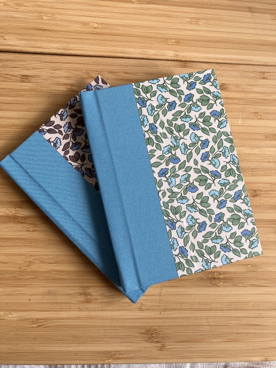
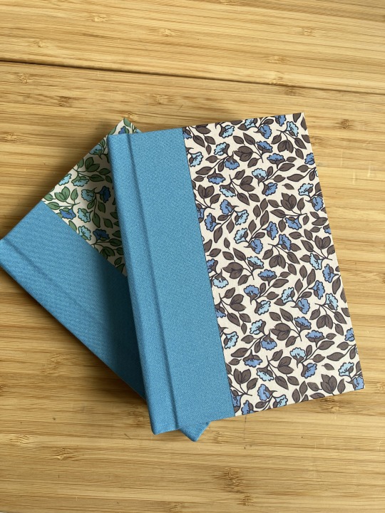
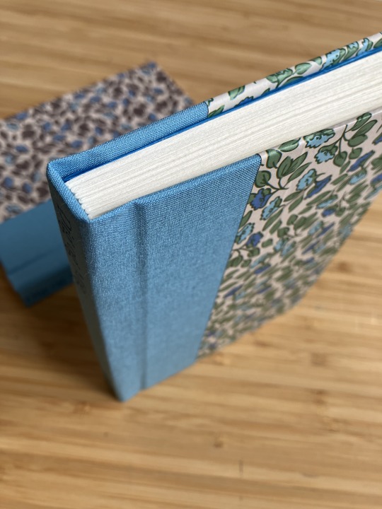
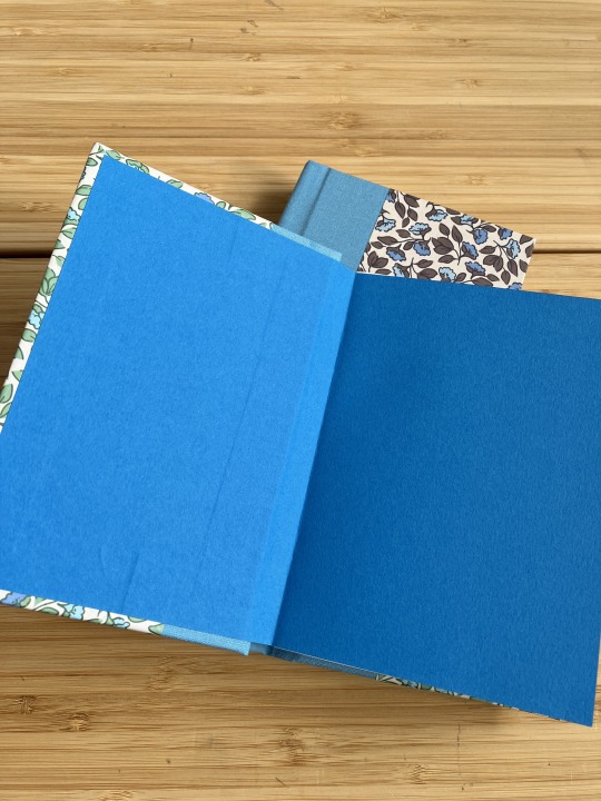
back in 2022 I made a sewn board binding of an Uprooted typeset I received through the annual @renegadeguild exchange in 2021, typset by Æthereal Press. In 2023 I received another Uprooted typeset through the exchange, this time typeset by Wild Woofs Press, so I decided to make it match the first one.


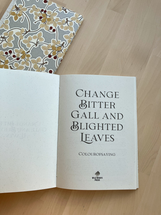
look how pretty of a pair they make!
Change Bitter Gall and Blighted Leaves by Colourofsaying (Agnieszka/Kasia)
A5 sized, sewn board binding
ends: 100gsm eco-craft oatmeal
spine: linen/viscose natural cloth backed with paper
cover: 4/0 Pepin (2017 Art Nouveau) of dubious weight over 160gsm Canaletto 20% cotton & acid free bookpaper and 1mm board
the breakaway spine came out much better this time (I have done a lot of breakaway spines at this point! practise may not make perfect but it does correlate with improvement). I did have to re-sew the textblock because I forgot to sew on the boards, but luckily I realised this before I glued the spine, so it was no big deal to cut the thread off and sew the block again.
57 notes
·
View notes
Text
Thank you!
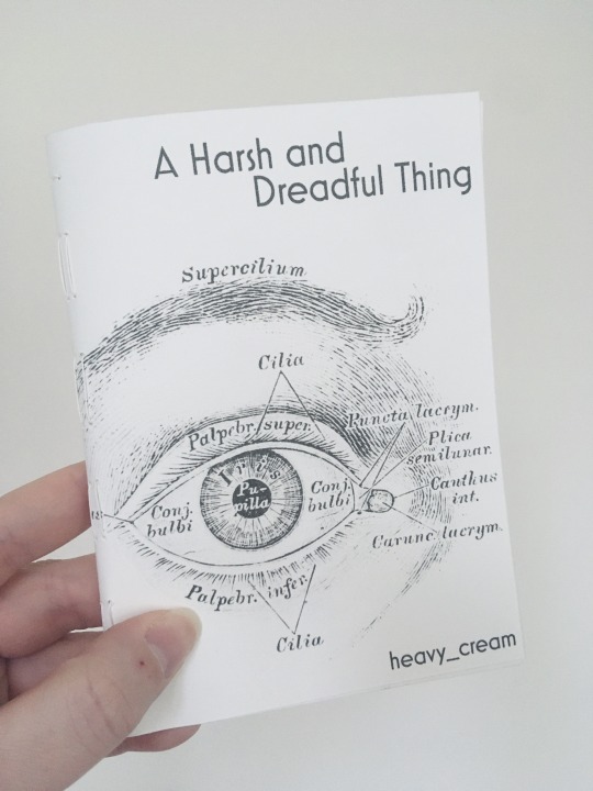
I don’t think I realised how small this was intended to be! Though I have to admit if I’d printed this on A9 it likely would’ve compressed juuust enough to make it unreadable for me. This is straddling the line as is. So I’m very happy with the A8 size and the generous margins :D
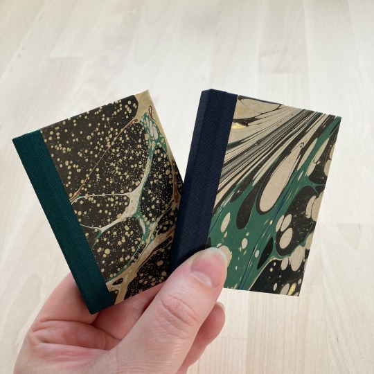
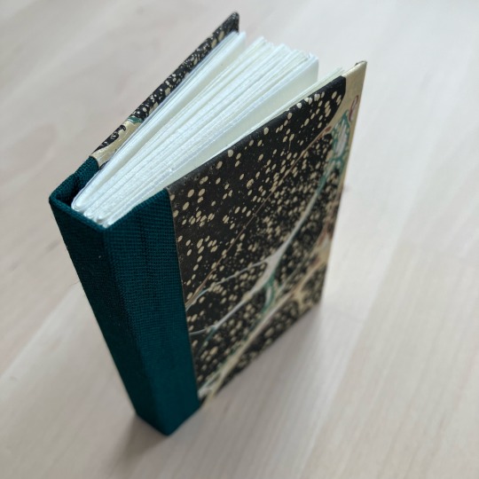
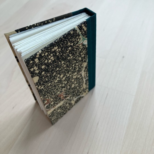
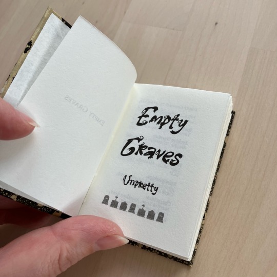


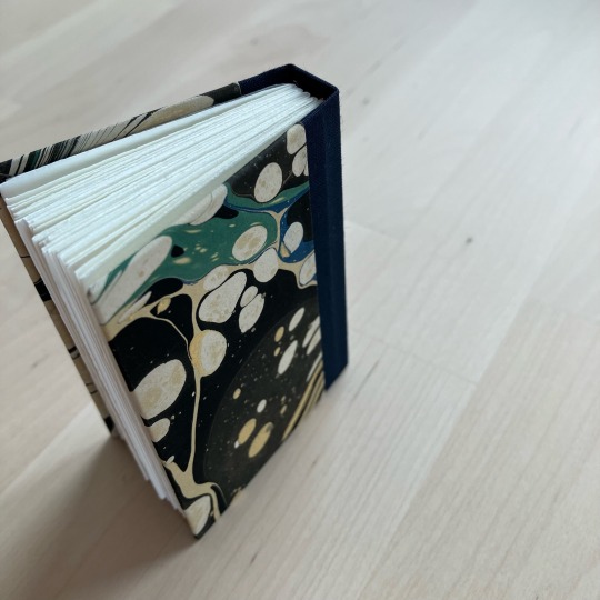
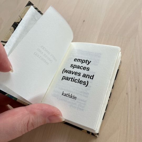
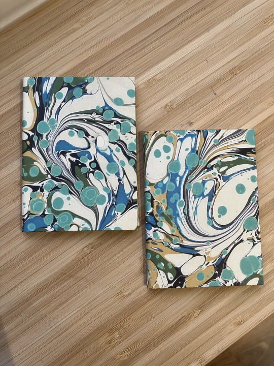
Empty Graves by @unpretty and Empty Spaces (waves and particles) by kathkin
I participated in @renegadepublishing’s tiny book bang last year, and as participant I got access to all the typesets from the event. I saved the ones I thought I’d want to do, and yesterday I looked through that folder, spotted two fics with the word ‘empty’ in the title and thought “oh neat, i know and like these fics, and I can make matching-but-not-same binds for them”. I was delighted to re-discover that they were typeset by the same person, @little-cat-press, so I went ahead with the matchy idea.
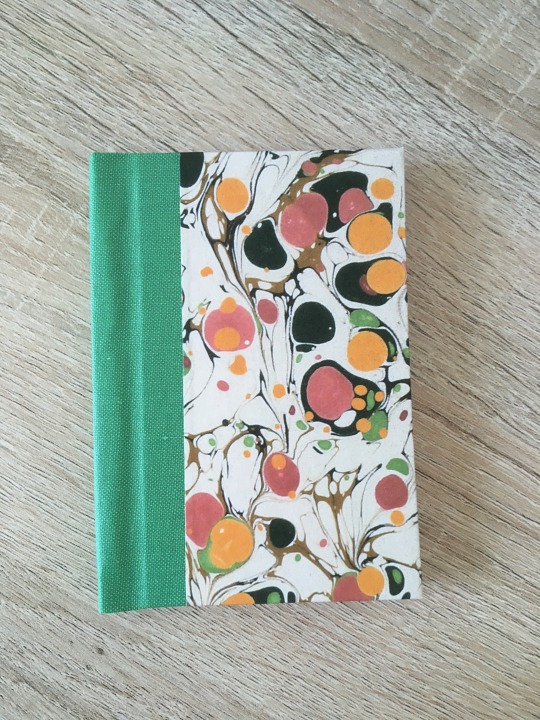
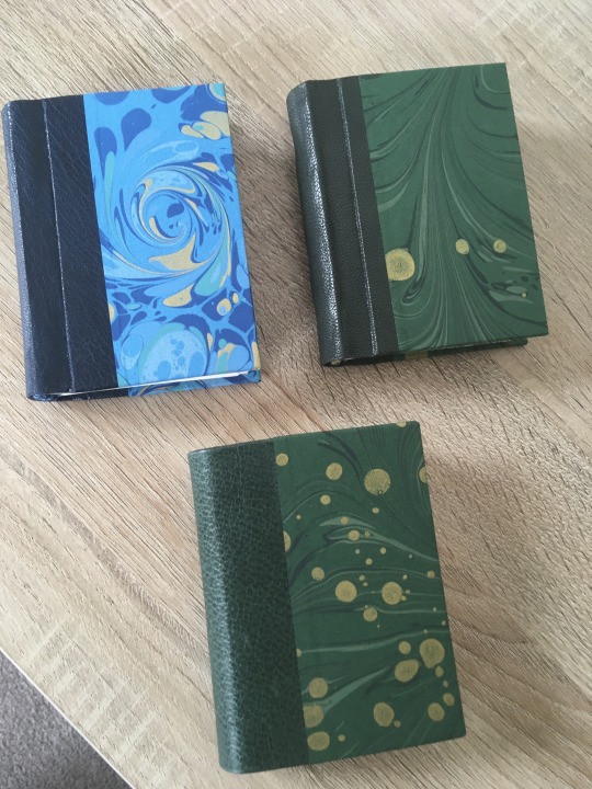
Empty Graves is a Superman fic from the POV of Martha Kent, and just so happens to be one of my faves in unpretty’s sprawling series. I chose the marbled cover paper because it evokes stars and galaxies and space for me. The fic is very contained, localised - the Kent farm - but high stakes; Martha will protect her son from the universe if she has to (and she does), because her family is her universe. I liked the idea of wrapping this small-but-big fic in something that resembles the vastness of space. The spine is green to match the hints of green colour on the otherwise dark marble.
Empty Spaces is a Back to the Future fic from Doc Brown’s POV, and featuring transmasc Marty McFly. The Back to the Future movies are foundational to me, and this fic is simply wonderful, highlighting the unique friendship between Marty and Doc. For this I knew I wanted something that evokes time travel, and wound up with this section of a larger marbled pattern that resembles the sci-fi woosh of time (and space) travel. This spine is blue to match the hint of blue visible alongside the green.
Both marbled papers are from Jemma Lewis Marbling & Design. The insides are printed on 90gsm Munken Pure Smooth Cream. These are self-ended, so no endpapers. The bookcloth is sourced from Ratchford but I don’t know which brand it is.
These are A8 sized (printed on A4) - I believe the typesets are intended for letter sized paper, but as I’m not in the US A-series it is. This prints fine on A4. The margins to the sides are slightly wider than originally intended, but that doesn’t seem to be an issue here.
265 notes
·
View notes
Text
Empty Graves by @unpretty and Empty Spaces (waves and particles) by kathkin
I participated in @renegadepublishing’s tiny book bang last year, and as participant I got access to all the typesets from the event. I saved the ones I thought I’d want to do, and yesterday I looked through that folder, spotted two fics with the word ‘empty’ in the title and thought “oh neat, i know and like these fics, and I can make matching-but-not-same binds for them”. I was delighted to re-discover that they were typeset by the same person, @little-cat-press, so I went ahead with the matchy idea.
Empty Graves is a Superman fic from the POV of Martha Kent, and just so happens to be one of my faves in unpretty’s sprawling series. I chose the marbled cover paper because it evokes stars and galaxies and space for me. The fic is very contained, localised - the Kent farm - but high stakes; Martha will protect her son from the universe if she has to (and she does), because her family is her universe. I liked the idea of wrapping this small-but-big fic in something that resembles the vastness of space. The spine is green to match the hints of green colour on the otherwise dark marble.
Empty Spaces is a Back to the Future fic from Doc Brown’s POV, and featuring transmasc Marty McFly. The Back to the Future movies are foundational to me, and this fic is simply wonderful, highlighting the unique friendship between Marty and Doc. For this I knew I wanted something that evokes time travel, and wound up with this section of a larger marbled pattern that resembles the sci-fi woosh of time (and space) travel. This spine is blue to match the hint of blue visible alongside the green.
Both marbled papers are from Jemma Lewis Marbling & Design. The insides are printed on 90gsm Munken Pure Smooth Cream. These are self-ended, so no endpapers. The bookcloth is sourced from Ratchford but I don’t know which brand it is.
These are A8 sized (printed on A4) - I believe the typesets are intended for letter sized paper, but as I’m not in the US A-series it is. This prints fine on A4. The margins to the sides are slightly wider than originally intended, but that doesn’t seem to be an issue here.
265 notes
·
View notes
Text


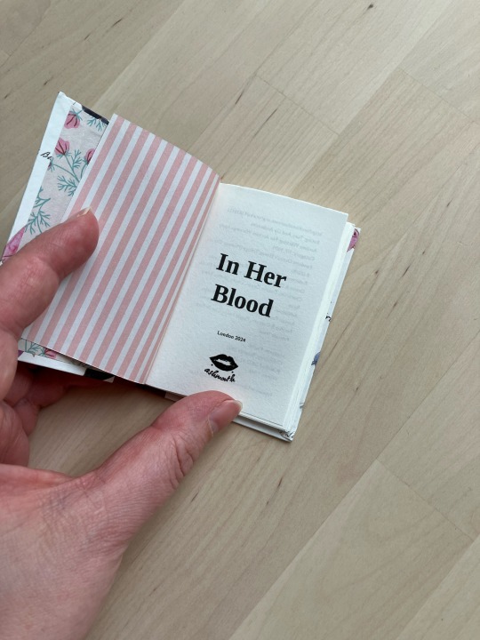

Look, another smol book! A8 single signature, also made using scraps. One of the fun things about this hobby is that you wind up with a lot of off cuts and small pieces of usable paper and bookcloth and cardboard that would be a shame to throw away…enter tiny books.
The fic is In Her Blood by ChokolatteJedi, a short Ocean’s 8 / Ocean’s Eleven crossover full of family feels.
#now with link to tiktok video#i'm still figuring out how to even do tiktok videos that are nice and i'm not sure i've hit the sweet spot yet
69 notes
·
View notes
Note
Hello! Your handbound books are absolutely and as a novice bookbinder myself, I'm amazed! I have a question for you:
I've bound a few books before (copies of my own fic), but that work was around 23k words. I'm working on one now and it's 132k words ... a very long book. I don't know if I'll be able to print it at home. Are there any places you'd recommend me to send the pdf to so they can print it out for me?
Thank you! 🥰
Honestly I print everything myself at home, even long books at that size, so I don’t have any recommendations for print shops at all. If you do want to try it at home the best advice I can give you is to open your printer settings and choose the “best quality” options - this can be different from printer to printer. The key thing is to go slow and steady to give your printer fewer opportunities to fuck up. Mine tends to track ink all over the pages if it goes too fast, for example.
Also, to start with, print one signature at a time instead of hitting print on the whole PDF, that gives you the opportunity to check the pages and course correct if something is off before you print the rest. (Also helps if you’re running low on ink! I printed a 77k word fic that way once while my printer kept beeping about being low on ink; I got the whole thing printed before running out of ink, but I would have only ruined one signature if I had run out, and could’ve easily stopped to swap cartridges and redo it before continuing.)
4 notes
·
View notes
Text
Look, another smol book! A8 single signature, also made using scraps. One of the fun things about this hobby is that you wind up with a lot of off cuts and small pieces of usable paper and bookcloth and cardboard that would be a shame to throw away…enter tiny books.
The fic is In Her Blood by ChokolatteJedi, a short Ocean’s 8 / Ocean’s Eleven crossover full of family feels.
69 notes
·
View notes
Text
process videos are so much more fun to do when you've got a proper work station ✨
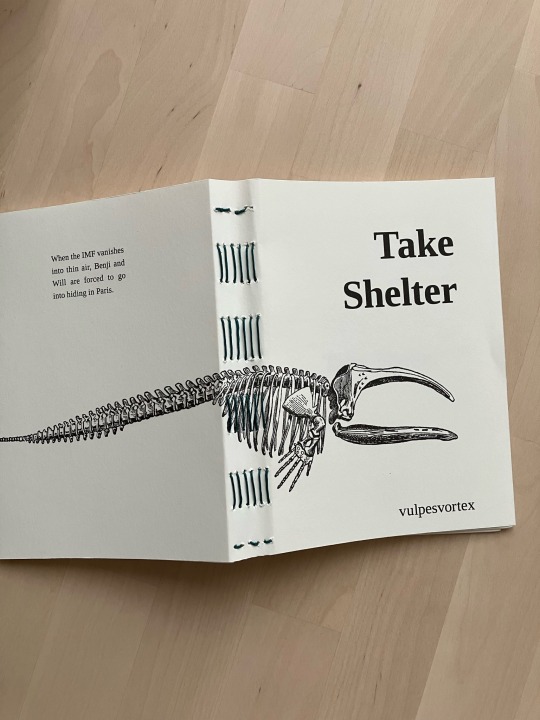
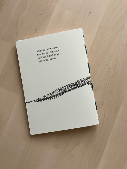
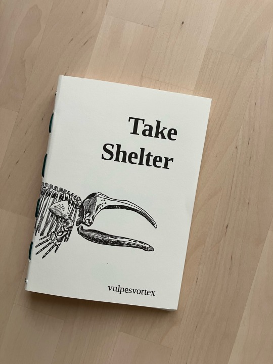
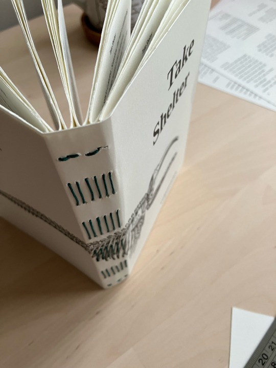
I am back on the no-glue pamphlet train! I splurged on some coloured linen thread yesterday purely because I thought it’d be nice to use for this kind of book. The thread is quite a bit thicker than what I usually use so I definitely won’t use it for regular books - but here I think it makes a lovely contrast.
A6, printed on long grain 90gsm Munken Smooth Cream, and the cover is printed on 160gsm Canaletto cream.
Take Shelter is mission impossible fic by @foxesonstilts - there’s a bit in there about a whale penis bone but do you know how hard it is to find any kind of picture of a penis bone?? and once you start looking at whale skeletons and you realise none of them have penis bones one might be tempted to write letters to museums asking them to please include the penis bones in the exhibits (and scientific illustrations)…
147 notes
·
View notes
Text
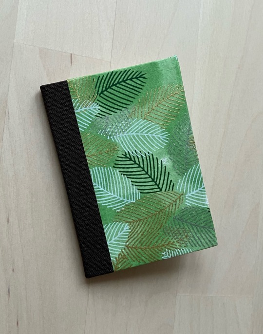
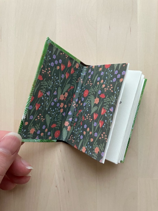
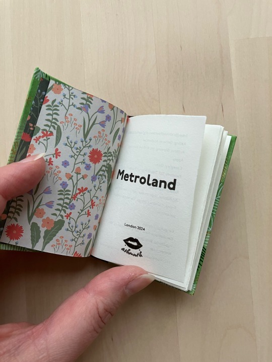
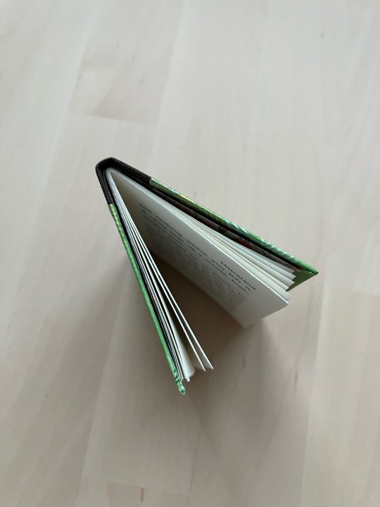

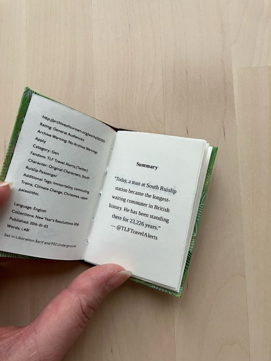
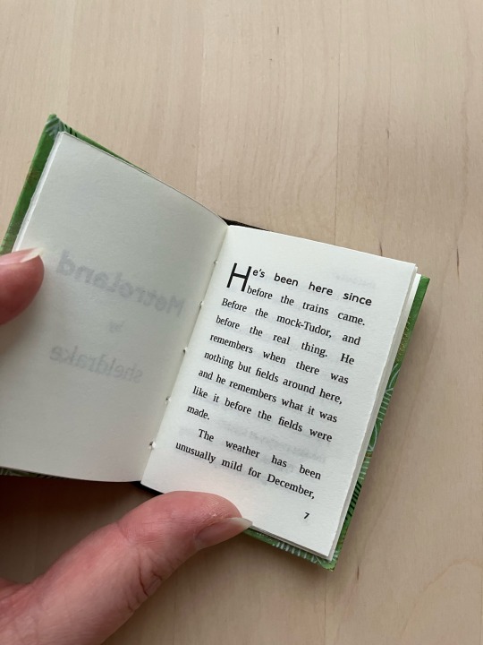

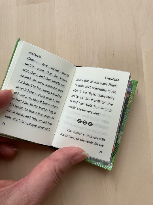
Metroland by sheldrake, an A8 tiny book made from (primarily) scraps.
I found this fic by chance when I was looking for climate change themed fics on ao3. While climate change isn’t not a theme, I found this to be a surprisingly lovely and thoughtful response to a TLF Travel Alerts* bit, so I held on to the fic until I could figure out how to bind it. Evidently the answer is: tiny
Printed on 90gsm long grain Munken Smooth Cream. Case is scrap board, scrap chiyogami, scrap brown book cloth. The ends are 70gsm origami papers (not scraps).
I typeset in Liberation Serif and P22 Underground, which is the typeface TfL uses on all their stuff. The scene dividers are, yes, the TfL logo. The body text is Liberation Serif, but the title, front matter, page numbers and running headers, drop cap and first line are all P22 Underground.
* parody twitter account for Transport for London/TfL
75 notes
·
View notes
Text
I am back on the no-glue pamphlet train! I splurged on some coloured linen thread yesterday purely because I thought it’d be nice to use for this kind of book. The thread is quite a bit thicker than what I usually use so I definitely won’t use it for regular books - but here I think it makes a lovely contrast.
A6, printed on long grain 90gsm Munken Smooth Cream, and the cover is printed on 160gsm Canaletto cream.
Take Shelter is mission impossible fic by @foxesonstilts - there’s a bit in there about a whale penis bone but do you know how hard it is to find any kind of picture of a penis bone?? and once you start looking at whale skeletons and you realise none of them have penis bones one might be tempted to write letters to museums asking them to please include the penis bones in the exhibits (and scientific illustrations)…
147 notes
·
View notes
Text
binderary 2024: 2/2
stretch goal reached! a good thing too because next weekend I'm travelling and the weekend after that it's March, so this is it for me and binderary 2024.
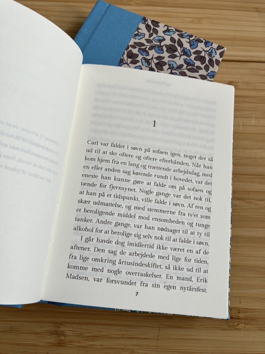
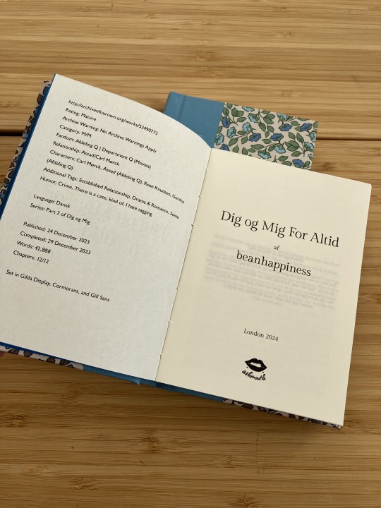
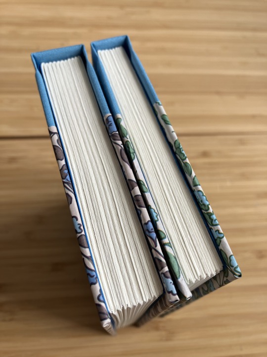
my stretch goal was to make a matching set of hardbacks and I decided to stay on theme and do Dig og Mig and the sequel Dig og Mig For Altid by @beanhappiness - two Afdeling Q fics. I love these fics a lot, and from a fandom history perspective I can reveal that Dig og Mig is the first ever fic written for this fandom! (At least on AO3 it is, I don't know if there are others out there - if there are, please link me, I want to read them!).

I wanted to make a matching set, and for this I decided that meant the books are identical except for the cover paper - the cover paper is the same pattern, in different colours but with one colour in common: blue. so these are very blue books.
(let's ignore for a moment that I completely fucked up the positioning of the titles on the spines. I didn't center align them correctly before printing, and on the second book I majorly fucked up the measurements and didn't notice until after I took the book out of the press that the title was too close to the top of the spine, at which point it was too late to just print a new one...)
(the sun was wreaking havoc on this photo session, can you tell?)
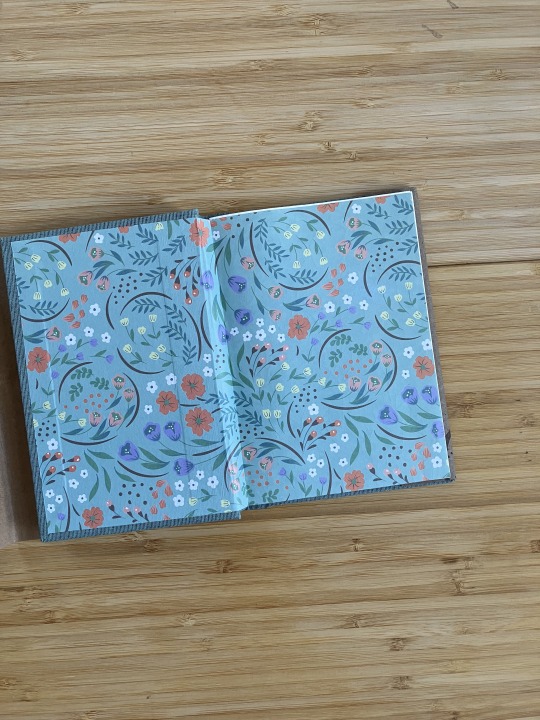
case: squareback hardback bound in sky blue bookcloth of unknown make, boards covered in decorative paper from Søstrene Grene (weights 70gsm and 140gsm respectively), over 2mm boards
insides: endpapers are 150gsm Daler-Rowney Canford Electric Blue, and the text is printed on 90gsm Munken Pure Smooth Cream


previous posts
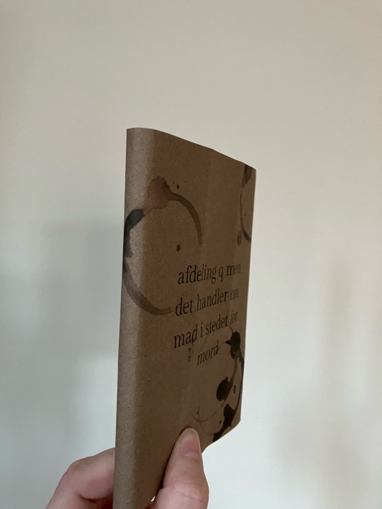
afdeling q men det handler om mad i stedet for mord
et Afdeling Q Julemysterie
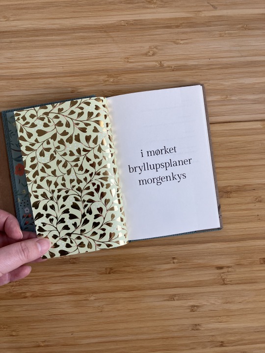
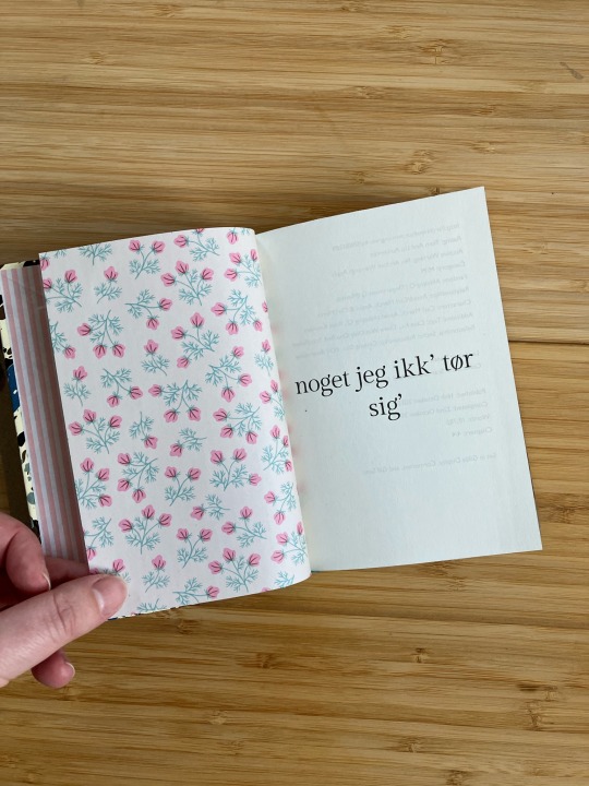
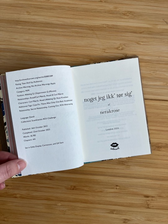
noget jeg ikk’ tør sig’
i mørket / bryllupsplaner / morgenkys
binderary 2024
goal: 3/3
stretch goal: 2/2
bonus: process video of making the case + casing in Dig og Mig, on tiktok
#binderary 2024#department q#afdeling q#my bindings#bookbinding#fanbinding#I haven't posted to tiktok since august last year?? wow
53 notes
·
View notes
Text
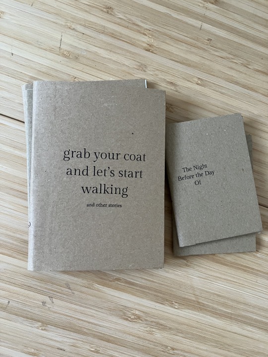
binderary 2024: 3/3
goal reached! I have now also bound all of my own Afdeling Q fics (except for my current wip, which I don't even know when I'll finish writing).


dustjacket: recycled packing paper of unknown origin salvaged from my work recycling bin
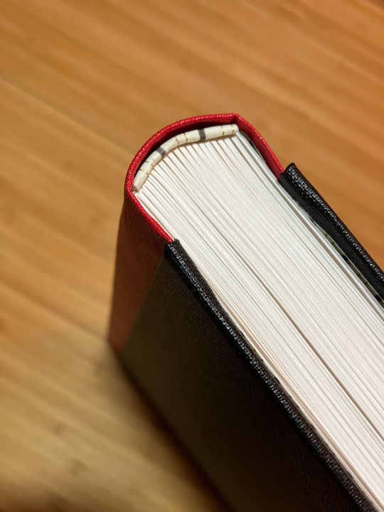
case: squareback hardback bound in Dubletta duck-egg blue/green over 2mm boards
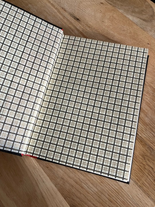
insides: endpapers are 70gsm doublesides decorative paper from Søstrene Grene and the text is printed on 90gsm Munken Pure Smooth Cream
this is a very slim book and i debated whether to even make it since it's only three stories - one of which fits on two pages - but I suppose that just means I need to keep writing in order to have enough fics for a second anthology? 🤔
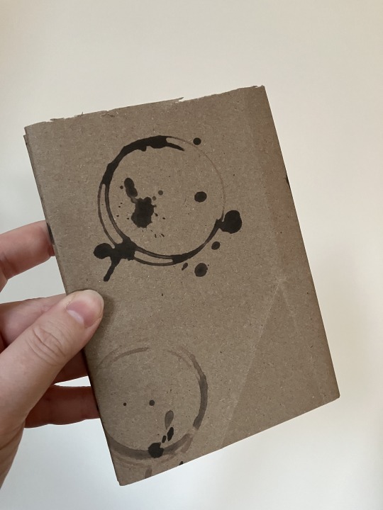
because it's an anthology I wanted the design to be distinct from the other three Afdeling Q binds I've done, so I went with a full cloth binding instead of quarter bound. the ends were chosen to match with the bookcloth, but also because the reverse had gold foiling and I couldn't resist. the dustjacket, of course, matches the other books: distressed brown paper with printed on fake coffee stains to emulate old case files.
All four books together:


previous posts:
afdeling q men det handler om mad i stedet for mord
et Afdeling Q Julemysterie
noget jeg ikk' tør sig'
binderary 2024
goal: 3/3
stretch goal: 0/2
43 notes
·
View notes
Text
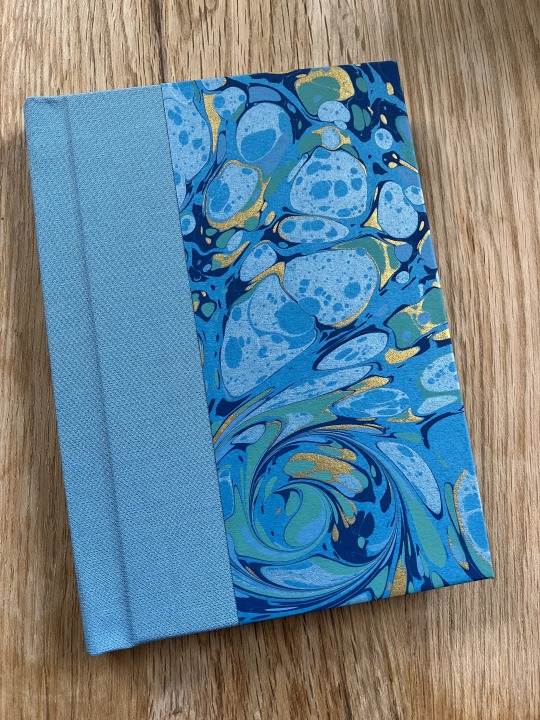
Binderary 2024: 2/3
Next up is another fic by yours truly, noget jeg ikk’ tør sig’ which is yet another Afdeling Q fic. If you are sensing a theme to my binderary books you would be correct.


Dustjacket: recycled packing paper of unknown origin salvaged from my work recycling bin
Case: quarterbound square back, spine covered in bookcloth of unknown make, seafoam coloured, and boards covered in 120gsm marbled paper on buttermilk base, from Jemma Lewis Marbling & Design (2nd quality sheet). 2mm boards
Insides: endpapers are origami paper, 70gsm, from Søstrene Grene and the text is printed on 90gsm Munken Pure Smooth Cream
I decided to match to the first book somewhat, so I made a matching dustjacket. This fic is a case fic so the dustjacket is on theme. It is also an “only one bed” kind of fic and even though the hotel they’re staying in is likely to be generic Scandinavian - i.e. IKEA catalogue white - the one time I went to Samsø I associate with grandmotherly patterns because my friend’s summer cottage was very old fashioned like that. Hence the endpaper pattern, which reminds me of some of my grandmother’s old tablecloths. The bookcloth and marbled paper reminds me of the sea and seafoam, and while the sea doesn't feature very heavily in this fic, Samsø is a small island.
The origami paper I used for the ends was actually too small for an A6 sized quarto so I had to splice two sheets together:


I’m so pleased that you can’t tell where the seam is unless you look very closely!
binderary 2024
goal: 2/3
stretch goal: 0/2
33 notes
·
View notes
Text
binderary 2024: 1/3
february is binderary over at @renegadepublishing and this year I decided to take part. my goal for the month is to make three A6 quarto hardbacks with dustjackets, and as a stretch goal another two A6 quartos (with or without dustjacket).
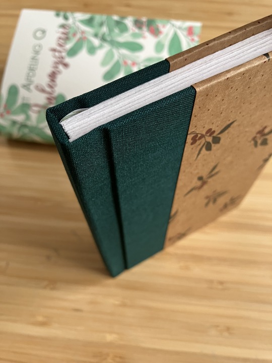
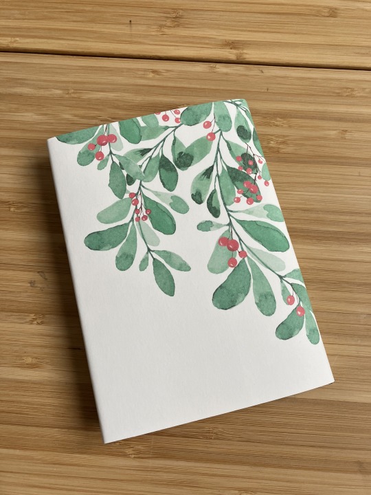
1/3: et Afdeling Q Julemysterie by yours truly
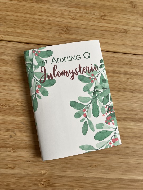
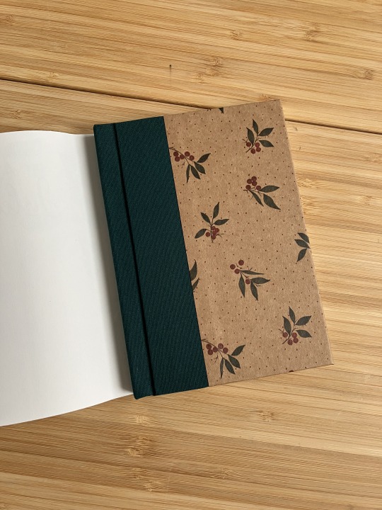
dustjacket: printed on 160gsm Canaletto cream
case: quarterbound square back with the spine covered in evergreen bookcloth of unknown make (I suspect rayon, tissue or paper backed) and the boards covered in 250gsm paper from pack of seasonal papers from Søstrene Grene, patterned with mistletoe. 2mm boards
insides: endpapers are 120gsm paper from the same pack of seasonal papers from Søstrene Grene, patterned with mistletoe, and the textblock is printed on 90gsm Munken Lynx Smooth Natural White

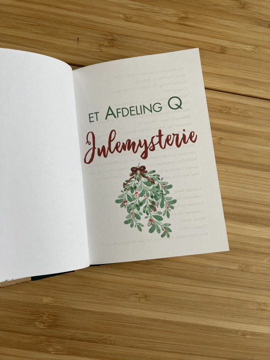


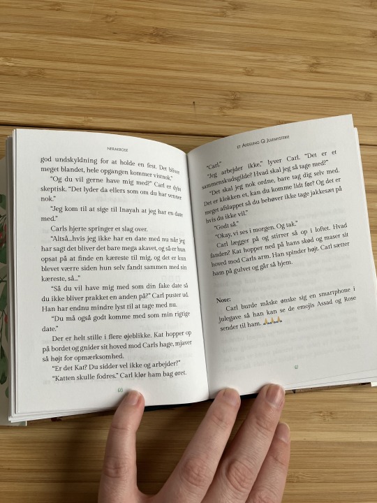
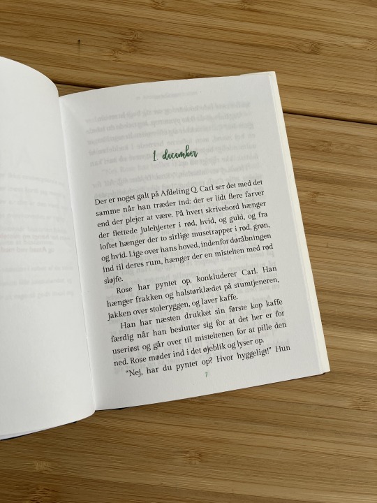

why, yes, mistletoes feature very heavily in this fic ✨✨
those who were around when I was posting the fic will recognise the graphic on the dustjacket and the title page from ao3 and this post. I thought it'd be fun to use it again for the book and then I used the same typeface and colours for the chapter headers and page numbers as well. I've previously bound one of my Afdeling Q fics and for that fic I used recycled brown paper for the dustjacket, obviously I didn't want that again for this fic, but I wanted a nod to the practical brown of casefiles to sort of...tie in...I guess? so for the cover boards I chose a brown paper with a minimalist mistletoe design. the bookcloth is from my stash and the evergreen colour matched the green on the paper perfectly. I'm sure there is an ideal ratio of bookcloth to cover paper when doing quarterbound books but don't ask me what it is I don't know I just eyeballed it
and yes. I am in fact still obsessed with these traumatised and codependent detectives and making them smooch about it is the highlight of my day.
binderary 2024
goal: 1/3
stretch goal: 0/2
56 notes
·
View notes
Note
omg wait are you in denmark??? can I ask where you get your book binding supplies, like the paper for the covers? I immigrated from the US in Sep just as I was getting into the hobby and havent figured out hobby shopping yet
I am not! I live in London, UK, and I get all my supplies from here as after Brexit it's often more hassle than it's worth getting stuff shipped from Europe, and shipping costs from the US are outrageous.
YOU, however, live in a) the EUROPEAN UNION and b) a fairly centrally located country with easy train connections to the rest of Europe. Please enjoy it for as long as it lasts, I miss it every day.
I don't know where to get bookbinding supplies in Denmark as I didn't start this hobby until after I moved to the UK. For general arts & crafts needs I used to go to Søstrene Grene (and last time I was home I stopped by quickly and they haven't changed at all) as they have a wide variety of decorative papers and related items. they tend to be seasonal so check by every few weeks if what they have doesn't appeal. It also has to be said they cater to a very specific target audience so most of the stuff they have is very instagram-friendly and pastel-y, but I've been lucky in the past and have found nice things.
Panduro Hobby is where I would go to get things like cutting mats and sharp knives and adhesive, possibly. they also have random craft tools but I wouldn't trust them to have things like bonefolders in their sortiment. they also have plain coloured paper of the kind that you can usually find in any store that carries stationery, I like to use that kind of paper as endpapers when I just want something plain, but still coloured. they sometimes also have decorative paper.
I have made it a habit here in the UK that whenever I go somewhere that has a gift shop or carries gift-related inventory (museums, art galleries, bookstores, etc.) I check the wrapping paper rack. these places will often have large single sheets of decorative paper meant for wrapping gifts BUT one can usually also use them for cover papers, or even endpapers. they don't always take moisture from adhesives well, so be careful working with those kind of papers, but maaan the variety of random pretty wrapping papers in stores like these is genuinely upsetting to me as I must Restrain Myself, but anyway, go to these places and see what you can find!
back to my point about the EU. I strongly recommend that you look towards Germany and elsewhere in the EU for things you can't find in Denmark, and have it shipped to you. within the EU there's no import/customs tax or anything like that, and I've always found German companies to be reliable and fast. Sweden might be an option too? If you're in Copenhagen Malmø is just 25 minutes away by train and for all I know there could be something there worth visiting. and for Germany, jump on a train in the other direction and make a daytrip out of it. You can get to Hamburg or even Berlin and back in a day.
also, I enjoy Pepin Press papers a lot - here in London I get them from Daunt's Bookshop - Pepin Press is based in Amsterdam but their papers are carried by retailers globally, for more info check https://pepinpress.com/
5 notes
·
View notes
Text
2023 in books
better late than never, right?
2023 was a relatively slow year for me in bookbinding, but I still made 30+ books. (ask me how much time I spent on my other hobbies and it becomes clear why books were fewer.)
A5 books
the first A5 of the year was an entry for a bookbinding competition (which I didn't win), where the theme was climate change. I had a lot of fun putting it together and it was the first time I made an A5 tête-bêche book - I usually do these A6 or A7 size.
this was also the year I decided to start a collection of menocchio fics, which also led to experiments with printing directly onto bookcloth to get titles on the spine

what's fun about bookbinding is that you can Just Make A Book, but you can also Get Ideas And Run With Them with it. which is how I wound up with this black on black book. destiel necromancy fic, because of course it is

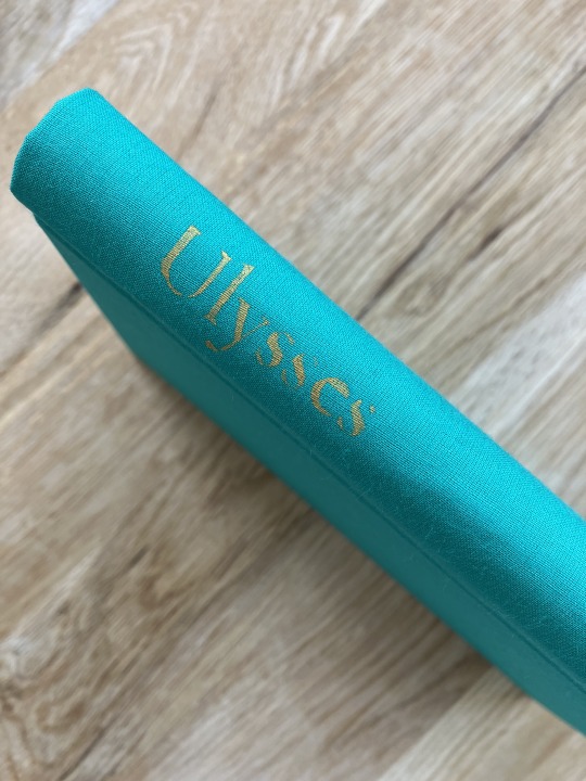
going back to something more colourful...Ulysses. not the James Joyce one, the slowburn 00Q one. named for a Tennyson poem.

final A5 book of the year is my Renegade Exchange book, which I bound for Silent Sun Press - a Crowley-centric genfic with outsider POV, so naturally I went for TV!Gomens colour schemes


A6 and A7 books
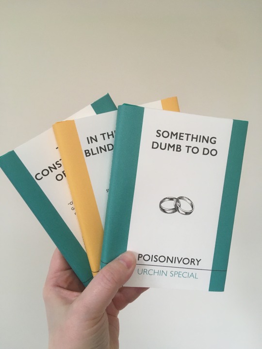
I started the year ambitiously - in addition to entering a competition, I started my urchin specials project. thus far I've still only bound these first three books for the project, but I plan to do more. first dustjackets as well!

I continued with the no-glue pamphlets and did three
I joined the Tiny Books Exchange, and as a proof of concept - before I typeset an A7 sized tête-bêche - I did a little tête-bêche of the two Temeraire fics I wrote for yuletide once upon a time

then followed of course the Tiny Book I bound for the exchange - my copy (test & proof of concept, bottom), the giftee copy (green, top right), and the author copy (blue, top left)
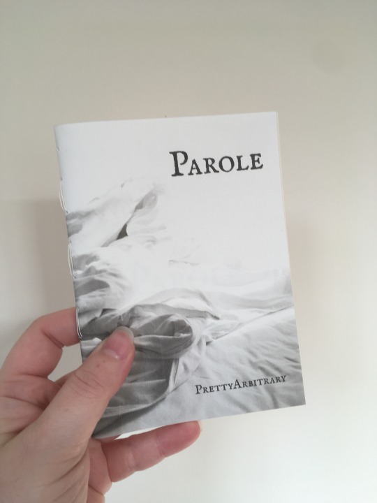
I typeset a lot more than I bind - I have plans to bind so and so, so I typeset it, but don't always have the time to bind it right away. so I have folders full of typesets ready to go at a moment's notice. this one was typeset a whole year before I bound it
are these paperbacks or just very slim hardbacks? I call them paperbacks as I used 0.5mm boards and they have no spine, but ymmv
this one definitely is a hardback - with slightly thicker boards, a spine, and two fics in one book. I do love those tête-bêches


at my work we have a lot of deliveries wrapped in this nice recycled brown paper that was just going into the recycling bin, and I thought: why not make books out of it? so I played around with it (and my printer) and came up with a neat aesthetic for paperbacks with breakaway spines (using 0.5mm boards)

will I ever stop with the tête-bêches? no. also this one has endpapers made from SEAWEED. how cool is that?


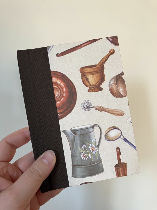
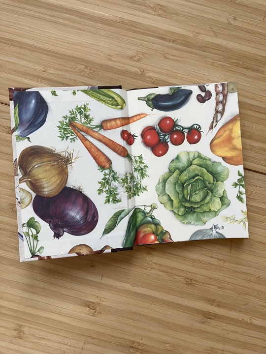
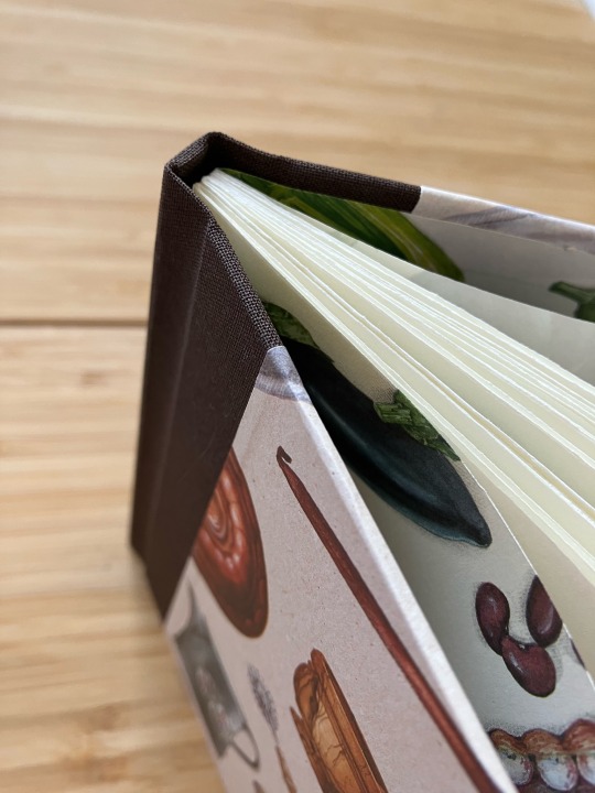
the last A6 of the year is this little collection of my own stories for a tiny Danish fandom. detectives and trauma, but make it about food? yes. food and cooking themed endpapers and cover papers, and the dustjacket has fake coffee stains on it. perfect


and that is all, folks. I did a lot of different styles and types of binding this year, I had fun with it, I learned a lot, and I'm happy with what I've created.
223 notes
·
View notes
Text
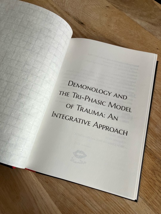
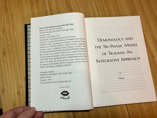
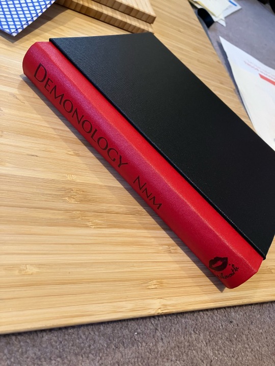

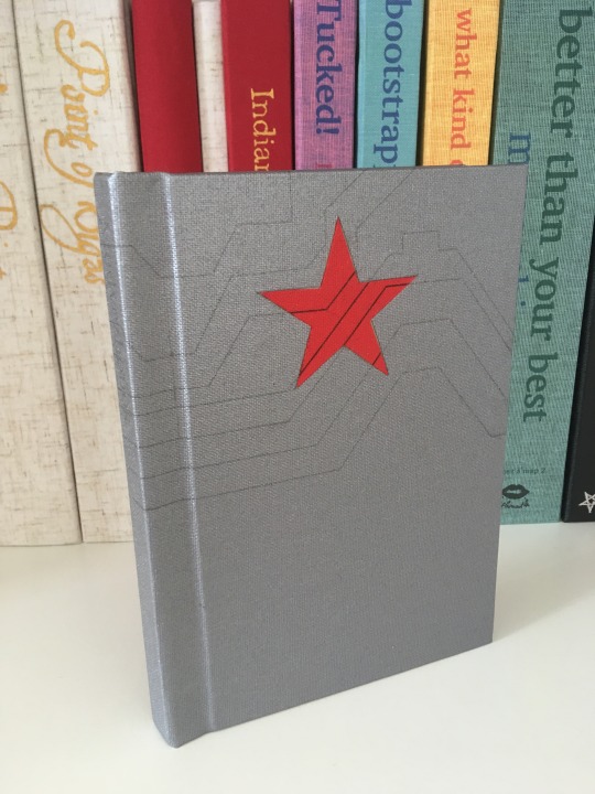
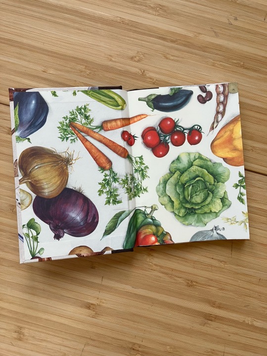
I participated in the @renegadepublishing bound book exchange again and this is the book I made for Mick at Silent Sun Press (who I don’t believe has a tumblr).
The fic is a Crowley-centric gen fic so I chose Crowley colours (his black jacket with the red collar) and on the inside I used Japanese chiyogami paper with a tartan pattern that reminded me strongly of Aziraphale - because Aziraphale is always at Crowley’s core. I used the same paper for the headbands. The case is a modified Bradel constructed like a hardcover case and I cased in like a hardback, i.e. the spine of the case is not fixed to the spine of the textblock.
The fic is Demonology and the Tri-Phasic Model of Trauma: An Integrative Approach by Nnm.
126 notes
·
View notes
Text


long time no see! I have been busy these past few months in a new-old fandom (Afdeling Q | Department Q) and have barely done anything else except rewatch, read & write ad infinitum.
well, here we go - an A6 quarto with dust jacket of the first fic I wrote for this fandom, a five part series (four, plus a coda) of fics to go with each film. It’s food themed, but also the title of the first fic is Kaffe (coffee). When I wrote the second fic I just named that document Kaffe 2, then Kaffe 3, etc. who needs proper document titles?? All I cared about was making Carl and Assad smooch, you know.
the dust jacket I wanted to have a vague old case file look to it and since many of the old files they work with do have stains on them, and I already had this coffee/food theme going…well. I am so pleased with how this binding came out! Even though I got chocolate stains on the title page for Kaffe (not pictured here, don’t judge me) and had to redo the case because the spine was too wide in the first one. It’s so pretty. I can’t believe I’ve gone this long without making a book
I am STILL obsessed with these two traumatised & codependent detectives so like, join me on the dark side? we have fic
78 notes
·
View notes