
Don't wanna be here? Send us removal request.
Statistics
We looked inside some of the posts by beandrawings and here's what we found interesting.
Average Info
Notes Per Post
128K
Likes Per Post
99K
Reblog Per Post
29K
Reply Per Post
110
Time Between Posts
15 days
Number of Posts By Type
Text
16
Photo
1
Last Seen Tumblr Blogs


Fun Fact
The Tumblr app for Google Glass was released on May 16, 2013.
Text

Still haven’t watched this show😔
14 notes
·
View notes
Text


🪷 PORTRAIT COMMISSIONS OPEN! 🪷
Hey folks!
I’m opening portrait (bust) commissions – kind of a small emergency round. Things are tight financially right now, and portraits are something I genuinely love doing, so I thought this would be a good way to stay creative while also making ends meet!
🧾 Quick Info
• Price: $55 USD;
• Payment: upfront, via PayPal only;
• Type: portrait (bust).
🎨 What I Can Draw
• OCs, canon characters (from media), D&D or fantasy races, real-life people, etc.
• Diverse characters welcome! If you’re unsure, just ask; I’m open to different ideas and designs!
💡 What Helps a Lot
• Face claims, mood boards, character notes, vibes; anything you’ve got!
• But don’t worry if you don’t have much, we can work it out together!
💌 How to Reach Me
Send me a DM or e-mail me at [email protected]
~
Thanks so much for the support, it truly means a lot right now. Let’s see how this goes! 💕
300 notes
·
View notes
Text

Quick redraw sketch of old Voltron fan art I found from 2018!
#art#digital art#fanart#procreate#illustration#voltron#art improvement#drawing improvement#keith kogane
21 notes
·
View notes
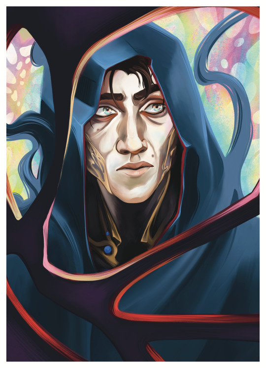
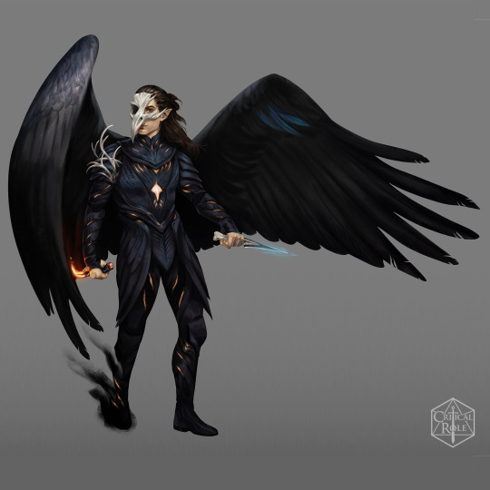
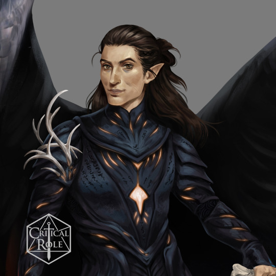
Text

Caleb
136 notes
·
View notes
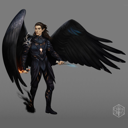
Text
Viktor
35 notes
·
View notes
Text

Yasha!
29 notes
·
View notes
Text

Chappell ✨
55 notes
·
View notes
Text


I was asked by a friend yesterday if I could offer basic tips about comic paneling. As it turns out, I have a lot to say on the matter! I tried breaking down the art of paneling using the principles of art and design, and I hope it helps you out!
30K notes
·
View notes
Text

Some Type B1 Killer Whales 💙
These killer whales live in Antarctica and are the masters of the wave washing hunting technique. They are visibly different from Washington’s Southern Resident Killer Whales with larger eye patches and yellowish white skin from algae growth and the cold temperature of their home waters preventing them from shedding dead skin. if you want to learn more about them I suggest watching the documentary “Animals Up Close”
There are only about 100 individuals of this eco-type left, the population declining an estimated 5% each year. The decline of the B1’s is most likely caused by Climate change, warmer global temperatures mean less sea ice in the Antarctic, an essential part of their hunting techniques, less see ice means less opportunities for these whales to hunt.
Colored pencil on 32” x 40” Mat board, background removed digitally
15 notes
·
View notes

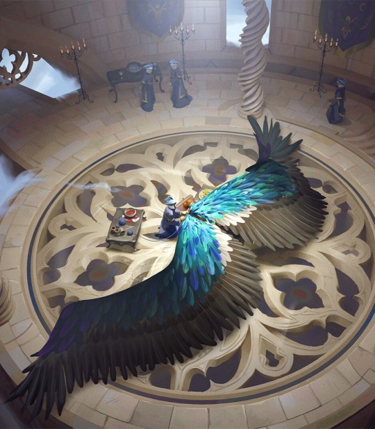
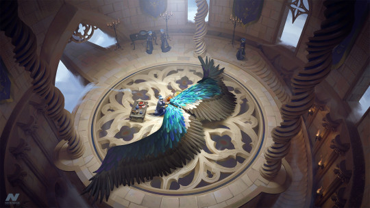
Text


Arc 3 sketches :)
4 notes
·
View notes
Text

someone commented ‘the sun, the moon and jayce’ under my previous meljayvik post i laughed so hard that i just had to draw it
57K notes
·
View notes
Text
And that's a wrap on my official VM art!
I am still so so amazed by all of this.
We have truly come full circle: It was art of Vax that first made me watch CR and now here we are years later, me drawing official Vax?!Thanks for all the intense critter support over the years, folks < 3
3K notes
·
View notes
Text

26 notes
·
View notes


Text
Think the twins are going to kick my ass for turning them into Velvet & Vaneer 🏃♂️💥🥊


Genuinely love the twins' story so much on a personal level(esp Aurelio) I actually had the traditional haircut for 8 years and had just outgrown it right before reading tsbt lol
idk who I cry over more, them or Teo&Relio but common factor is Relio so 🫶
Started working on these back in May wanting to do all the competitors before CM released but moving & shenanigans halted them the main trio are next >:)
223 notes
·
View notes