
Helloo I am Melis and I am a newly graduate of art history. I write about art, philosophy, and sometimes poems. You can give me feedback, comments or start a discussion. Writing, review and essays requests are also accepted. (your own work or else) https://linktr.ee/bijnaart
Don't wanna be here? Send us removal request.
Statistics
We looked inside some of the posts by bijnaart and here's what we found interesting.
Average Info
Notes Per Post
20
Likes Per Post
16
Reblog Per Post
3
Reply Per Post
1
Time Between Posts
12 days
Number of Posts By Type
Text
8
Photo
3
Last Seen Tumblr Blogs


Fun Fact
Tumblr was attacked by a cross-site scripting worm deployed by the Internet troll group GNAA on Dec 3, 2012.
Text
Graffiti in Groningen Review

A little tour around the city and it is almost impossible to miss the big yellow tower and the unique architecture of the Groninger Museum. Nowadays it is even harder to pass by without noticing the familiar faces looking down on you from the museum's walls. They are portraits of over 200 Groningen residents taken for the Inside Out project as a part of the JR: Chronicles Exhibition.
JR is a French artist who started his career with graffiti. Later had a chance to experiment with the medium photography with the camera he found in the metro. His exhibition in Groninger Museum shows an overview of his career from his first photos and documentation of graffiti on the streets to his large scale printed portraits that challenges political and social controversies around the world.
Simultaneously with JR: Chronicles, Groninger Museum also include a side exhibition called Graffiti in Groningen. The exhibition explores the history of graffiti as a genre and especially graffiti in Groningen between 1970's, 80's and beginning of 90's from football hooligans and punk era writings to large scale pieces and tags. Groninger Museum is one of the first museums in Europe to collect and acquire graffiti pieces for their collection during the 80's as well as exhibiting their collection in 1992. The former director of the museum Frans Haks was visionary enough to add graffiti pieces to the museum's collection and today, Andreas Bluhm is continuing this vision by commissioning two new pieces. With the museum's initiatives and the extensive research and collection of Hugo Engwerda, the graffiti scene in Groningen has been brought under the light again.
There is a beautiful contrast outside the building between the black and white portraits from JR and the wide window covered with colourful tags from the local graffiti writers. That contrast exemplifies inside the building. When entering the exhibition space, you are welcomed with two big pieces by Mick la Rock and Stars & Weak, one of the earliest and known graffiti artists from Groningen. The two works commissioned by the museum are in two distinctive styles of the same genre which complements and contrasts each other at the same time. Stars & Weak has a colourful piece with a lot of detailed elements that appears and disappears in the background. It is a complex piece that requires a lot of forms and layers to oversee. Whereas Mick La Rock have more abstract piece with shapes and forms that are interconnected. Her colour palette is more limited, yet the work stands boldly with blues and bright yellows. Yet, both requires a great controlled aerosol skill.

For a long time, graffiti struggled to be recognized as a legitimate art form that is serious enough to be shown in a museum. The prejudice against the art form is rapidly decreasing and turning into a mainstream form of art. Although the debate around whether it is high art or not is still loud, the artists who work with the medium can confirm that they are putting the same effort, detail, skills, and training as any other masterpiece of any medium.
While I was preparing to write a review for the exhibition, I came across an article by a journalist student who had a chance to visit the exhibition prior to the opening and a chance to speak with the museum coordinator. Where the coordinator of the museum said “It's accessible. It's not really high art, it is a low key way of making art that is arguably easier to understand. It’s about storytelling.” regarding Graffiti.


JR: Chronicles and Graffiti in Groningen are two simultaneous exhibitions that showcases the power of graffiti, the performativity of the artform as well as giving an insight to the practice with its challenges and outcomes. The act of graffiti is inevitably criminal and therefore, subjected to controversy but the controversy is never about whether it is a legitimate way of making art or not it is rather about ownership and vandalism. Yes, it is accessible, anyone can find and purchase a spray can and write things on the wall just as they can purchase acrylic or oil paint and start painting. Having the material does not necessarily make any form of art accessible. In every medium requires its own techniques and practices and perhaps the insight to the practice is not as easily accessible as the material. It takes certain affinity of the eye, to recognize the letters in certain styles. That is because it is for other writers to recognize it and not for the whole public. You might make the same connection and say that is why it is not a mainstream medium or high art which would not be wrong. Graffiti might need to be more open if it wants to exist with the rest of the mainstream art but again that is a matter of choice. At the end of the day, choices we make creates our story and every artist makes a statement in their medium of choice. And graffiti is a statement of existence and artistic vision. If you visit Groningen Museum, you will be taken to a new understanding of the art form. It shows series of ways graffiti is practiced, learned, taught, shared, and appreciated. It is a long tradition of learning from each other, developing certain aspects, making them personal and sharing that experience and knowledge with the next generation of writers. Pinox82 is one of the most well-known writers in Groningen as he is the one who started incorporating the year he started in his tag. His element was appreciated by other writers as well and adopted within the genre. But it was not over a night that Pinox produced everything. Graffiti just like any other medium of art, requires study which can be seen in the exhibition as well. One page of a notebook from Pinox82 where he studies various tags and adds descriptions next to them explaining what certain elements adds to the style. Another is various pages of “black books” which are notebooks artists land to each other for collection and study purposes. Graffiti does not only have the function to communicate to other writers, it also has aesthetical concerns regarding their locations. According to George C. Towers, based on aesthetic criteria, graffiti can be considered an art form. He adds “All of the aesthetic properties and criteria from the base element of colour to the complex issue of artist intention which is ascribed to other works in.” You can experience the spirit of the art form yourself until 6 February for Graffiti in Groningen and 12 June for JR: Chronicles.
0 notes
Text
The Review of The Exhibition ‘Stage of Being’ at The Voorlinden Museum
Figure 1, Mailander Dom (facade) by Thomas Struth
Figure 2, Stage of Being by Robert Zandvliet
Figure 3, Spark, Spark, Spark by John Armleder

The exhibition ‘’Stage of Being’’ takes place in the Voorlinden Museum. It consists more than 40 artworks from different artists and with different media. The exhibition borrowed its name from Robert Zandvliet’s painting. The main theme of the exhibition is our existence as humans. The catalogue starts with the questions ‘’ Who are we? Where do we come from? What are we doing here? Where are we going?’’ And the following description is ‘’We live in a world of progress: we know more and are capable of more, we live longer than ever before; maybe one day we will even achieve immortality. At the same time, we humans struggle with feelings of emptiness, loneliness and fear. Once, religion and ideology provided guidance and assuaged our doubts. Nowadays, we rely on self-help books, doctors, philosophers and coaches – but above all, on ourselves.’’ It seems that the exhibition is built around human existence, its struggles, fears and representation of understanding the one’s own environment. The museum building consists of rooms that are connected to each other in a way that you have to follow a certain path, going through each room with different artworks. There are seven rooms specifically for ‘Stage of Being’. According to the questions and answers session with the curator and the director of the museum, these seven different rooms are not connected to affect the viewer or the visitor in a certain way. But they stand by the idea that people will find their own connections in each room. I went through the rooms according to the suggested order in the catalogue. And selected few works from each room to understand the connection between the title of the exhibition and the works themselves. Room one starts with a photograph (Fig 1) ‘ Mailander Dom’ (fassade) by Thomas Struth. The photograph shows the cathedral of Milan which is the largest building in Italy. And there are people sitting at the stairs, walking, talking on the phone or doing their daily routine. Passing by the enormous building not even realizing the value of the building. It references the first few questions at the beginning of the exhibition about who we are? where do we come from? and etc. It is a reminder of the everyday struggles of people. Their routines, lives and feelings that they go through every day with forgetting where they are. And just become the part of a mass. The photograph is followed by Robert Zandvliet’s painting, Stage of Being (Fig 2). The painting is acrylic on linen with an unpainted spot in the middle. In the catalogue it says Zandvliet tried the Rückenfigur technique which means that the unpainted spot is supposed to remind a silhouette. It gives the feeling that what started as an existential questions as masses, turns into the artists own interpretations and representations as individuals who stand out in masses. Room two follows with the same theme. It is works of artists representing their own internal struggles. What strikes me the most in this room is a plexiglass work by John Armleder. The work is called ‘Spark, Spark, Spark’ (Fig 3). The work consist of slightly curved mirrors and it covers the whole side of one of the walls. It is the first thing you see when you are walking towards to the second room. The artists own explanation for the work is that it is only experience in the present. People can experience their reality in a curved and stretched way. but what I found significant about this work is that it makes visitors, a part of the exhibition. Not just in a sense of seeing but also participating in it. As soon as one sees its own reflection, in that moment and time they are the work themselves. They become the work itself but another striking thing about this piece is that its unintended reference to the cathedral. Because what you see is not only yourself but all the other visitors in the room. And in that moment it seems like the one who is looking and the others he or she sees becomes a part of a mass. When walking into the third room, the first thing you will see is a stainless steel sculpture of a human by Antony Gormley called Mass (Fig 4). What is eye catching about this piece is that the more you get closer to it, the silhouette disappears and it just becomes this mass of spider web. Artist himself describe it as both “mass of steel and a mass of a person”. A human silhouette wired with the world around it. Which is a reminder of two things, one is that as individuals we need to take a step back from ourselves and look at ourselves from a distance, so we can see more clear. And second that we are a part of a mass that is interconnected and wired, even as individuals. Another feature of this piece that really fascinated me is the placement of the work. It is not certain if it was intentional but the placement of the sculpture allows sunlight to shine on the steel which makes it reflective and shiny from time to time, depending on the sun’s place. The main subject continues to be the masses and individuals within those masses. The art works can reference each other without artist’s intentions. The exhibitions main theme of “Stage of Being” fits perfectly to the artworks. It is fascinating to see an artwork made by one individual can reflect so many different ideas on others. And without even realizing it making them a part of a bigger mass. Because of all the different artworks by different artist, telling a different story and collecting them in the same environment creates a different crowd or a group. Again as in the first photograph of the exhibition, each artist representing their own self by their works but also contributing to a mass society by their own struggles of life without being aware of it. The questions that were asked in the beginning started to come to light as going through every piece and seeing everyone has a different answer but in a way it's also the same struggles.


0 notes
Text
Visconti Sforza Tarot Deck- Death

This set of tarot cards or tarocchi dates back to the fourteenth century. The cards are individually hand painted by Bonifacio Bembo. The deck was commissioned by the Duke of Milan, Filippo Maria Vısconti. for Bianca Visconti as a gift. There are seventy-eight cards which composed the whole deck with only four cards missing; the Devil, the Tower, the Knight of Coins and the Three of Swords. Some emblems or heraldic devices which belongs to the Visconti family on the cards could be an indication that the earliest possible date for the deck is 1432 when Visconti and Sforza families are united (Moakley,1966). It is known that the deck originally belonged to the Sforza family but there is no evidence about the ownership after that until the seventeenth century. It is sought to belong to the noble Donati family and then passed on to a Court Alessandro Colleoni of Bergamo. Unfortunately, there is no exact date of when the deck came into the hands of the Colleoni family. It is also known that at a certain period of time, the deck was broken up and each card or some cards had different owners. But ın 1911 the Pierpont Morgan Library in New York managed to acquire thirty-five of the cards from a dealer who got them from the Colleoni family. The remaining thirteen of the cards is still in the possession of the Colleoni family (Moakley,1966).
The cards are painted in heavy cardboard with dimensions of 175 x 87 millimetres. The cardboard is very thick which makes the deck hard to use for actual play. The triumph and court cards are painted with gold over red, with silver mostly used for armour or decoration of robes. The common cards are painted mostly with gold and with a little bit of colour on a white background. All of the cards have a plain red back.
The history of the tarot cards is still not so clear. Although it is believed that they were brought to Italy around the 1300s by gipsies. At first, these tarot cards were used to play ordinary card games. But eventually, some occult traditions picked up on these cards and gave them divination forms. The standard deck including Visconti-Sforza set consist of fifty-two cards. In these fifty-two cards there are sub-categories as followed; The first twenty-two Major Arcana cards which are Queens, Kings, Prince and Knights, they reflect the journey from birth to death. The second is Minor Arcana, which is the Cups, Swords, Wands and Coins and they indicate the small, specific events. Therefore they became a passage like a tool for the unconscious mind (Davies, 2012). Although tarot considered unscientific or in other words more spiritual based than technical, there are two scientific aspects of tarot and tarot readings such as psychological and astrological.
Firstly, there have been many articles about the relation between tarot and psychology. Most of them revolve around similar topics or fields of psychology such as the notion of archetypes, individuation and synchronicity. As for archetypical tendencies, tarot reading is thought to help understanding an individual’s thought process. Carl Gustav suggests that it plays a similar role as a Rorschach ınk test. The reaction given to the cards can indicate what element of one’s psyche is at work and it helps to understand the thought process of an individual to figure out what aspect of their mental state needs more understanding and attention (Gaelsdottir, 2018). Another psychologist, Dr Art Rosengarten suggests that tarot offers to manage the synchronicity mechanism. As the tarot card are open after one another, the reader is opening up emotionally and mentally, therefore is more connected to his/her unconscious mind. If a certain card is drawn over and over again that displays a certain personal meaning which the individual should pay more attention to the symbolism on the card and therefore the related issue in their mental state. This is called “meaningful coincidence” in Layman’s term which can be associated with positive psychology methods. Positive psychology focuses on the aspects that work, helpful or effective instead of what doesn’t work. Therefore the cards that are drawn and their symbolism or meaning can be useful t understand an individual’s emotional and mental state based on the repetitive cards or their reactions to certain cards.
In an interview with Dr Rosengarten, he talked about psychotherapy and how tarot can be helpful in that field. As he explained “When talking about a particular dynamic or issue in a person’s lives that is very clearly represented in a particular tarot card, I’ll say, “there’s a tarot card and it shows a picture of exactly what we’re talking about. Let’s say we’re talking about the eight of swords, which is a picture of a woman who’s bound and gagged, standing barefoot near the ocean, and there are eight swords surrounding her. This is a great illustration of cognitive distortion; such that the swords represent negative thoughts which are blinding and binding the person’s ability to see clearly, when in fact she’s standing on the shoreline right next to the open ocean. The ocean symbolizes the unconscious—and in the background, on top of a mountain, there is a beautiful castle that she cannot see because of the distortions of her negative cognitions. By showing them a picture and being able to point to the different internal images within the pictures, it’s very useful in that it gives them something to hold onto. It’s an alternative to the studious cognitive reframing exercise—which is very left-brained and word-based and they come back with all these rational ideas about their depression but they don’t really have an intuitive connection to what’s going on.” (Rosengarten, 2000)
The second aspect is astrology and it is also closely related to tarot cards and readings.
Tarot may be considered ad more on instinctive, spiritual and based on interpretation, in other words, more abstract whereas astrology gives a structure to this abstraction with calculations that helps to understand and interpret them on a more technical level. Although they may seem different they are the different toolsets that use the same principles. The principle they use is nature’s law and four elements which are fire, earth, water and air. Astrological symbols and explanation are based on these elements as well as zodiac signs. And Tarot is based on the same four elements. For example, the Cups represents relationship, love, feelings or emotional issues which correspond with the element of water. Or the Coins that represents to health, finance or materialistic values and possessions corresponds with the element of earth (Verlag, 2005). In that sense, the astrological signs or zodiac symbols are intertwined with the tarot symbols and their meanings. There are twenty-two major arcana cards as mentioned before and there are ten planets and twelve zodiac signs which are twenty-two in total. Therefore, each card is assigned or corresponds to one of the planets or signs. Despite the fact that they seem different practices, astrology is based on natural cycles and tarot use these natural cycles and interpret them in hand-drawn images and symbols or in other words, it visualizes the calculations of astrology (Monod,2013).
In conclusion, Science and mysticism are not very different from each other in fact they can be seen as the two sides of the same coin. They have different ways of interpretation or expression. In other words, they are looking from different perspectives to the same issue.
Tarot and therefore mysticism is more dependent on our own experiences and it’s outcomes in the natural world where science is more about general facts and calculations of those facts or observations. The insight into the natural world is not only through rational thought but it can also be understood through more spiritual sense. Therefore tarot allows science as acting as an illustration or visualization for the world of science instead of calculations and statistics of science. They are inherently connected. Even more modern science (such as quantum theory) proves this even further. As the main focus of this paper which is the tarot card, the Death, as well as the whole deck, is made as an art object. Each of the cards is handcrafted and painted by a famous miniature artist. Some of the symbols are specially related to the family emblems of the Visconti and Sforza families. And it is known that it was commissioned as an art object because the deck was found in almost perfect condition which means that they have not been played but only displayed. Even though they were painted as each of them is a unique piece of art, the symbols, numbers and the imagery belonged to the branch of science that it is related. They still carry aspects of science as the imagery comes from the expression of those scientific fundamentals. Objects, whether its a science object or an art object and in this case, both, are not just objects in the sense of human production but they have different or maybe deeper values within themselves. Considering the social context of objects each of them tells a different story and those stories also often vary from one individual to the other. They are a big part of our communication with each other and with the surrounding world. Without objects, there will be so little to talk and communicate and therefore very little knowledge to give or receive. As it is thought by the World Archeology, “The central idea is that, as people and objects gather time, movement and change, they are constantly transformed and these transformations of person and object are also tied up to each other.” (Bynum,2016)
David Bohm also supports the relationship between science and as he said during AMSSE in 1990 “ Until recently science was mechanistic and reductionistic. Now through quantum and relativity, there is room for the creative. Mechanistic science is rather limited. The artist can point to a deeper significance suggesting how life can cohere like a work of art. If we separate art, science and spirituality as they are today, we have tremendous incoherence.” (Bohm, 1990)
With the help of other articles and historical information mentioned in the bibliography section, the relationship between an art object and a science object is looked through the object of my choice which is a fourteenth-century tarot card. In the case of the tarot card, art and science are intertwined as this specific object cannot exist without science and knowledge. Aside from science and art being interconnected within this object, the general sense of the object has different meanings for the tarot card. The information it carries can be different for each individual as the symbols or the card being drawn for a specific question per se can have different outcomes or can vary in the emotion that it gives to that individual. Therefore this is an object that carries not onşy a specific knowledge on a certain topic but rather dependent on the person that the object belongs to or the person who uses it.
Bibliography
Auger, Emily E. Journal of the Fantastic in the Arts, vol. 21, no. 2 (79), 2010, pp. 294–296.
Bynum, Caroline. “Object.” The Threepenny Review, vol. 145, 2016, pp. 19–20.
DAVIES, GLYN. “Gold from the Visconti to the Sforza: Milan.” The Burlington Magazine, vol. 154, no. 1306, 2012, pp. 60–61.
Dummett, Michael. “Six XV-Century Tarot Cards: Who Painted Them?” Artibus Et Historiae, vol. 28, no. 56, 2007, pp. 15–26.
Gaelsdottir, K. “The True Science Of Tarot Cards.” Sivana East, Sivana East, 22 Dec. 2018.
Jorgensen, Danny L., and Lin Jorgensen. “Social Meanings of the Occult.” The Sociological Quarterly, vol. 23, no. 3, 1982, pp. 373–389.
Moakley, Gertrude. The Tarot Cards: Painted by Bonifacio Bembo for the Visconti-Sforza Family an Iconographic and Historical Study. The New York Public Library, 1966.
Monod, Paul Kléber, “An Occult Enlightenment?” Solomon's Secret Arts: The Occult in the Age of Enlightenment,, Yale University Press, 2013, pp. 263–299.
Rosengarten, Arthur. Tarot and Psychology: Spectrums of Possibility. Paragon House, 2000.
8 notes
·
View notes
Text

Art Away Groningen 2021 Review
The contemporary art world is enough of a jungle for newly artists. Digital platforms are haven for recognition but when it comes to market the work, they fail to fulfill the purpose of an art fair. Usually, art fairs are the platform where that happens. They serve as a meeting place and an economic cluster. Therefore, it is not a place to look at art, but it is a marketplace with a time frame that connects artists, curators, collectors, institutions, buyers and art critics. Although artists have more freedom with their context and narrative of the work within digital platforms, fairs are using descriptions and catalogues to cover the issues. Unfortunately, due to Covid 19 and the recent regulations regarding it, art fairs and exhibitions are far away from happening. The measurements only allow shops to be open on appointment. So, artists Ayala Pavo and Hendrik Hanschel took the initiative for themselves and created the Art Away concept. It is a concept that fits really well with the corona measurements while displaying artists. For the edition zero, Art Away hosted more than forty talented artists that each had 5 works for sale. The event held for two days where people need to make an appointment to visit the "store" for half an hour.
The place, Herestraat 72 affords a planned walking path for people to keep moving without getting so close to each other and there are no long waits in front of the works as it is a place to market and network. Each artwork had an individual post-it with a number and a price which people can take it with them and purchase the work at the checkout point.
Usually in an art fair, the valuation of the works is done by a collective network of experts in the field along with the artists but Art Away successfully eliminates this issue with one of their highlight which is affordable art. They gave a price range where artists are allowed to pick their own price within that range. And when the price is affordable the audience also widens and shifts towards the general public as well. The difference between an exhibition and an art fair lies on the purpose of them. An exhibition audience can be from all kind of levels of art lovers whereas an art fair's audience is more narrowed down to a specific target of collectors, scholars and critics. Therefore, Art Away created a confusion when they stated "Creative sector has been hot especially hard by the effects of pandemic as space to exhibit works have become scarce and stages continue to remain empty. Which contradicts with their mission statement " The concept emerged from the current complex situation and it is aiming away from the individual and researches a new approach to shared experience of creativity." In order to move away from the individual into a shared experience, one needs to have a narrative that turn into a meaningful connection with the work. The narrative adds a value to the work for the buyer and the meaning of the work creates the shared experience between the creator and the looker. This connection and value is not limited to the concept of an exhibition but this connection is also needed in an art fair because it gives an insight to the work which determines the artist's niche. Art Away lack the context and narrative that the visitors needed which made them critic the concept of walking without having enough time to look at the works. They either needed to have enough time to take the works in or they needed the narrative or the context of the works to find a meaningful connection between them and the work.
Art Away's over focus on marketing instead of finding a balance kept the event on an individual level instead of the shared experience they were aiming for. Although the marketing was successful within the circle of the artists and local creative supporters, the event resulted in less sales and recognition than the artists and the concept deserved. Yet, Art Away successfully managed to create an online presence in a short amount of time and they are actively platforming artists. Even though the event itself lasted for two days, artist profiles and works are still up in Art Away's online profile for sale and recognition. One of the best aspects of this concept is that everything for the artists meaning that every bit of money from the sales as well as the recognition are going directly to the artists.
Therefore, Art Away is an independent initiative founded by two artists who faces with the current struggles and aiming to create a bridge between creators and its target. Yet, without the struggles of a pandemic it does not afford to substitute an art fair or an exhibition.
#artcritic#modernart#art writing#contemporaryart#curators#advertising#groningen#exhibition#exhibitionreview
0 notes
Text

Monster with a large open mouth with teeth, a wavy scaly body and a small tail. The beak turns into a smooth, slightly flared chalice. The tail turns into a short, tapered mouthpiece with a dented edge.
SILVER METAL
SILVERSMITH IS UNKNOWN
NETHERLANDS 1780 1800
Object Tale (Biography)
It was not like any other day. The sky, the soil, the water, the land was the same as it was in the Netherlands, but it was ordinary at all for the young, Dutch silversmith who was commissioned by the mysterious man in black cloth. He was asked to create a whistle that whispers and only one of the most delicate and lonely creatures can hear. This whistle was for a dragon, it would sing the most beautiful sound to its ears to ease its fears. It would guide it through the sky when he opens his wings to fly. It would call for help when the master has some problem to dealt.
So, the silversmith chose the finest sheet of silver metal to begin his battle. “I’m going to make the most beautiful whistle there is!” said the silversmith. As the silver sheet in front of him woke up to see the world and its creator. “These hands that demands me to be the best there is. Sorry for that I was asleep, but the road we are about to take seems steep” The whistle could only guess and the rest was faith for it did not know the end of it all, it could only hope to become whole. All were soon to be revealed to it when it started to squeak. “Hey, I’m getting dizzy and everything is upside down” as the silversmith bend it round and round to shape a tube that would blow the tune. Soldered, burnt and hurt, the whistle began to sob as the silversmith began to nod. “Ah! there it is. It is coming together, and it should be the best I’ve ever done so far.” The tube of silver couldn’t believe “these words that I hear, I shall not fear as he is taking care of me very dear for that I shall become the best for him” It was tired, been through a lot yet knowing less than it got. So was the silversmith when his kid walked in the workshop to tell his father that it was time to gather for the supper. “I can finally rest as I have a lot more left for, I will be the best” thought the silver tube.
“What is it?” asked the kid. “it’s just a rounded-up silver plate but it will soon become a whistle that will sing for its master” said the father.
For the first time, it could know more, more about the best it will become. “So, I will sing? I shall have the nicest voice there is then.”
It didn’t know all the hammering, bending and soldering for it to be shaped into the fine whistle would hurt this much. But the silver tube was determined not to make a sound.
So, the days went by as they worked together the father and the son. The whistle did not say a word anymore for that it already knew so much more.
The whistle was almost complete, it only needed some scale to its tail. It was a dragon whistle after all so what used could it be if there is no way to show. So, the silversmith began to carve the scales. It was painful. For every scale there is, the whistle wished to exist. “through pain, comes the fame!” it thought. Then there was the head to put it at rest, the eyes as it needed to see to guide. Finally, the mouth for it ought to sing the mystical sound.
“There it is! It is finally alive” said the silversmith in joy for it was his best work he has done in long. He cleaned the whistle. Brushed the dust from its crust and varnished to make it shine. And just like that it was gone from his hands as the manner of kids slowly descend.
“I’m going to play it now. I will play the first song for that I have waited so long” said the kid. But no. It was not for the kid nor the silversmith. It already had a master who couldn’t return any faster.
They waited and waited for the man to appear as the whistle’s joy began to disappear. “I’ve come this far to to become the best whistle. To whisper to the ears of those whom the sky fears. Now, now I sit here alone without a purpose, just waiting to be purchased. What a shame and what a waste of fame.” the whistle said angrily as it couldn’t be of any use.
“I’ve done my best, yet it still sits in the place that I set.” said the silversmith sadly. So, the mysterious man never showed his appearance, and no one knew the faith of his disappearance. “This must be my punishment for that I might not be the best the master faked his own vanishment! I don’t even know how I sound yes. Before I could even be found here, I will be lost with a master as ghost. What a shame that I am alive when there is nowhere to arrive. "said the whistle. Then it sobbed and cried so did the silversmith as he couldn’t show his pride. The moon and the sun passed by and there was the silversmith’s sun with his puppy eyes. “Can I play with it now?”
“Yes! Please. Finally, someone who want to play me. I cannot believe that it is happening, but it was only fair for that I suffered along the way I deserve to sing away.” said the whistle in excitement.
But suspicious was the silversmith “Was it even real or just a myth? Was there ever a man who couldn’t claim his property or was I just the lucky one to give the whistle its liberty?” Some become the best just to be alive. “Just as the whistle for it alone ceased to exist for long, so long that it could create a man before I even began” thought the silversmith. The whistle was there waiting so he said decided that it would be a shame not to hear how it sounds. “What the heck! Don’t tilt your neck. I will grand your wish as the whistle is yours to sing” the father said to the boy. The kid jumped up and down with joy as his father was proud of his boy.
It was not awake the whistle as it didn’t know its purpose other than to decay day by day. When the kid finally picked it up from the table it cried with happiness “My wished are granted I can finally sing! I shall now sing the best melody for that I stay in everyone’s memory.” the whistle was the happiest. It was the silver metal sheet before it was rounded into a tube. Then the scales, the memories of every mark on its body, it was finally worth it.
The kid played the most suiting melody as it was some kind of remedy. “what a proud father I am, what a proud craftsman I am for that I gave life to two, one that was born out of love, the kind that ends in the sheets where kids not allowed but eventually come out and the other the noble sheet of silver plate that was carved and shaped” thought the silversmith while looking at his most beautiful creations. The kid’s playing was interrupted by the sounds of flapping wings in the distance searching for directions. So they sat for the arrival of the most unexpected guest. There he was with all his glory. Giant yet delicate. Fearless yet shy. “It’s a dragon! I sing for dragons” the whistle said as it greet its master “What an honour to be the one to unveil your wonder”
3 notes
·
View notes
Photo

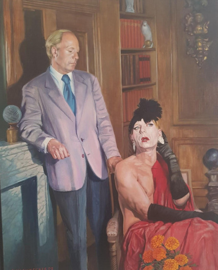
Ein Mann, Zwei Identitäten by Peter Schauwecker.
0 notes
Text
Ein Mann, Zwei Identitaten Peter Schauwecker
Ein Mann, zwei Identitäten by Peter Schauwecker can be interpreted in many ways. As in this paper, there is a story behind the work, a conflict between a man and his alter ego. That conflict is beautifully reflected in the painting and it can be seen into expressions in the faces of two figures. The feeling that they were supposed to give was achieved realistically.
The main subject of this paper is the painting by Peter Schauwecker called Ein Mann, zwei Identitäten. It can be found in MooiMan gallery in Groningen, Holland at the moment.
The gallery's theme is mainly a male body and related subjects. The place is an apartment turned into a gallery so placements of the works are not related to any specific reason. It is the most efficient usage of the place. The works on display are painted by Peter Schauwecker and the subject of this paper is called Ein Mann, zwei Identitäten. The piece is placed on one of the widest walls with other paintings of the same subject.
At first glance of the work, it has a smooth surface and it is not shiny. It is indeed a very colourful work. There are some bold colours highly saturated red and light purple, blue and orange. The usage of the light and shadows are aimed to be realistic and as the sun comes from the right as the shadow of the figure can be seen on the left side of the wall.
The piece is 88×70 cm, framed. This allows the viewer to see the work as a whole and focus on the details later. Which is a good concept for this work because the figures in the painting should be seen together as a whole.
Ein Mann, zwei Identitäten was painted in 2002, so it is a relatively new painting and it was painted in Germany where the artist is from. The technique of the work is oil on canvas which allows colours to be more bright and texture to be more smooth. Concerning the standpoint, there is not a specific way to view the piece rather than standing in front of it. It is the best possible way to see both of the subjects in the painting. In the gallery, there here are a few other paintings with the same subject in different environments and situations which gives the clue that the artist has been working with the same subject for a long time. The placement of this piece related to its surroundings because other paintings surrounding this piece has the same subject of interest.
The reason for selecting Ein Mann, zwei Identitäten by Peter Schauwecker is its ability to stand out with its bold colours and the expressions on the subjects faces which can say a lot and can be interpreted in different ways.
At first glance, we see two men, one in a light purple suit with a blue tie. He's standing on the corner of what seems like a fireplace, leaning with one of his elbows and his other hand is holding a chair. On the chair, the other man is sitting, looking away and wearing what seems to be a drapery that falls off of his shoulder. He also has a black headband and some accessories. It can be said that he is a transvestite man. As it can be seen the subjects are the two personas of the same man and the thesis I will be proposing is that this painting reflects the identity crisis of its subject.
This piece will be analyzed in three steps. The first step is the composition, poses, and proportions of the figures with an explanation of the colours used. The second step is to analyze the background. See if there can be any relation to the subjects. The final step is to analyze the figures in the work and get a sense of the works overall mood. Trying to understand what it represents or how can it be interpreted.
The composition of the work can be described as stable although one of the subjects includes a movement. As for the poses of the figures first, we see a man in a purple suit and blue tie standing in the corner of a fireplace. One of his elbows is on the fireplace, looking down while still holding a chair with his other hand. It is not an active figure but there is a sense of power or tenseness. The second figure in the painting is the transvestite men sitting on the chair holding what seems to be a drapery in bold red, covering his body except for one side of his chest. He has makeup on, earrings and hair accessories. One of his hands is on his legs and one hand on his shoulder. He is facing the viewer but he is looking towards the right side, where the light comes from.
As for the background, a fireplace has been already mentioned. The other objects in the background are, a bookshelf with what seems to be a lot of encyclopedias and some figures. It can be seen that the room is made out of wood and the use of light and shadows achieves the goal of giving the texture of the wood. The background can be understood in two ways for this painting. One is that it is just to fill the space and it is not related to the story of the subjects. Second is that it can be interpreted in a way that books represent culture and knowledge as a representation of how cultured is the subject in the painting.
The overall mood of the painting is despair and authority. To explain and interpret the painting better I will refer the figure in the suit as the man and the transvestite man as his alter ego.
Firstly the man is standing over his alter ego looking down at it in a way of disapproval or with an unsatisfaction. This can be understood in his pose both standing up, holding the chair and looking down. He is the authority figure and it can be seen that he has some disapproval of his alter ego. As for the alter ego which is sitting down, looking away with an expression of weariness. He is looking away to the light source which can be a window as if he wants to be somewhere else. He is sitting down facing the right direction, he is looking to that way but his head is turned to the viewer. His back is turned to the man but still listens to him in a way. Even though the general mood of the alter ego is negative, it is not necessarily sad. The story of this painting can be understood as the men's identity crisis. My personal interpretation of this painting is that the man has reached a certain age and he has a certain worldview and experience. And those books objects are there as a representation of this knowledge, and experience. He works as a transvestite performance artist but when he's not performing he is actually very simple and modest men. He is holding his alter ego down which can be interpreted in a way that he is not willing to perform anymore. His senses and logic tell him to slow down and live much simpler. As it can be seen the red drapery the alter ego is holding, the covered side of his body is on the right side and he's also looking at that direction. The place where the drapery falls and his body is shown is on the left side next to the man. The alter egos eyes and pose suggesting that he wants to keep performing and looking out as if he still fancies that world of fame, glam, and elegance. And the orange flowers on the floor representing excitement and enthusiasm.
No background research was made for this interpretation but as it is mentioned above, the surrounding paintings of Ein Mann, zwei Identitäten has the same person as their subject. And this painting is the last one Peter Schauwecker made about this subject. Concerning the theme of the other paintings on the same subject, they all include the alter ego, performing or posing in different costumes. So it is important to look at and analyze this painting with the knowledge of its being the last one about this subject. This might mean that the alter ego stopped performing and now we see the owner of that alter ego for the first time. We see him in a suit, in his own environment, in a room rather than a stage or a setting. And trying to keep the alter ego down, putting an end to that chapter of his life besides for his ongoing desire to perform.
#dragqueen#lbbtq#art history#artcritic#art writing#contemporarypainting#holland#netherlands#kunstwerk#moiiman#groningen
0 notes
Photo

Four Faded Sunflowers By Vincent van Gogh (1887)
2 notes
·
View notes
Text
“the sunflowers are mine...”
The painting of Four Sunflowers Gone to Seed by Vincent van Gogh is a flower still life. The flowers are life sized, and they filled the entire canvas both vertically and horizontally. The oil on canvas painting is 21.2 cm to 27.1 cm. So, the viewer is welcomed with big, yellow flowers from a distance and as one gets closer to the flowers, they become more detailed and filled with colour. It has no background or added decorations, only the flowers on the foreground. Although the flowers are decaying and falling to the sides they are still in detail and carefully placed within the composition to fill the space as well as emphasized the details of different stages of decaying on the flowers. Which might be an indication that the decaying was still ongoing while he was painting. Besides the composition of the flowers the brush work and colours are also equally important.
The brush strokes on the top part of the background are horizontally lined along the whole top part of the canvas. Also, the brushstrokes that are around the whole canvas are visible rough strokes that are on top of each other or aligned vertically. So, the background is also in harmony with the colour scheme as well as the composition. In the middle, the sunflowers cover the entire space with both thin and thick lines. The outside leaves of the sunflowers are curved towards outside and the middle part where the seeds are, the lines get straighter, thinner and more compressed. As for the branches, they are painted as normal thick branches, then small vertical lines were added on them to create the texture.
The colour scheme varies from covering yellow tones to blue. Warm and cold colours used together to give it a contrast. As he wrote to one of his friends “I have made a series of colour studies in painting simply flowers, seeking oppositions of blue with orange, red and green, yellow, and violet, seeking the broken and neutral tones to harmonize brutal extremes. Trying to render intense colour and not a grey harmony.” (Bailey, 2010). The dominant colour of the background is blue but softened with white, yellow and orange stripes of brush strokes. Sunflowers have the scheme of yellow, not so bright or vibrant but a little faded tone of yellow as the flowers are already dead. The middle part of the flowers is once again dominated by the same yellow only with black, blue and green thin brush strokes to indicate the seeds. Details in the painting are handled delicately. Van Gogh managed to convey or represent the deformity as well as not so flattering angles in an enjoyable manner. As mentioned before, the flowers are in different stages of decay. Therefore, their colours are depicted in a way that it is visible they lost their brightness. So, the darker the yellow, closer the flower is to die and rot completely. Use of colors was important for him as he explained his sister in a letter saying “Arranging colours in a painting, to make them shimmer and stand out through their contrasts, that is something like arranging jewels or designing costumes.” (Bailey, 2013).
Van Gogh once wrote to his brother Theo “Always continue walking a lot and loving nature for that’s the real way to learn to understand art better and better. Painters understand nature and love it and teach us to see.” According to Martin Bailey who is the biographer of Van Gogh, the special love of flowers could be connected to his interest in progressing or developing an idea about painting. He had known very little about impressionism the time that he went to Paris for the first time but he still desired to achieve decorative strength as he had a great interest in Japanese prints. Just like the Japanese prints where everything is related, not in depth except the surface of the picture, he used a “cloissonist” line which is used in stained glasses for separating one colour from another to enhance the form and contrast. In February 1888 he went to Arles, a city and a commune located south of France famous among artists including Van Gogh for its southern lighting. Van Gogh was painting sunflowers at the time he invited Paul Gauguin in his studio. He was impressed by the work of Gauguin as he also gifted a sunflower painting for Gauguin. Van Gogh painted a series of sunflowers to impress his guest as he hung them in the room, where he was staying. According to Martin Gayford, author of the book The Yellow House: Van Gogh, Gauguin, and Nine Turbulent Weeks in Arles, “Gauguin was bowled over by the Sunflowers, which he repeatedly praised and asked for as a gift.” Van Gogh was excited for the opportunities that could come with the arrival of Gauguin as Bailey quotes Van Gogh’s letter to his brother Theo, “He painted the Sunflowers quickly and with great energy and confidence. I’m painting with the gusto of a Marseilles eating bouillabaisse, which won’t surprise you when it’s a question of painting large Sunflowers.” After the series was finished Van Gogh realized that the sunflowers became his signature as he said to his brother Theo in 1889, “While other artists were known for picturing particular flowers such as peonies and hollyhocks, the sunflower is mine.” (Bailey, 2013). Van Gogh clearly had a passion for nature and flowers as it can be seen they are an important impact in his artistic development. I would like to end this essay on a personal note. It is no surprise that an artist as delicate and fragile as Van Gogh would choose a different flower than the sunflower.
Bibliography
Bailey, Martin. The Van Gogh's at the Grafton Galleries. The Burlington Magazine , vol. 152, no. 1293, 2010, pp. 794–798.
Bailey, Martin. The Sunflowers Are Mine: The Story of Van Gogh's Masterpiece , Frances Lincoln Limited (2013).
Welsh-Ovcharov, Bogomila . The Ownership of Vincent van Gogh's 'Sunflowers' , The Burlington Magazine , March 1998, pp. 184–192.
0 notes
Photo

ART CANNOT BE MODERN, ART İS PRIMORDIALLY ETERNAL
0 notes
Text
EGON SCHIELE : ART CANNOT BE MODERN, ART İS PRIMORDIALLY ETERNAL
Egon Schiele is a modern artist in the category of Expressionism. He has many controversial paintings of figures and self portraits. The figures and the self portraits has one thing being in common and it is the fact that they are representing a feeling, emotion or an instinct rather than being models or anatomically true representatiın of bodies. They all serve to much deeper purpose and meaning of being in a certain state of mind. And in this paper I will look at his work called “Art Cannot be Modern, Art is Primordially Eternal” with chairs. He does the same thing with chairs as he has been doing with portraits and the subjects of the painting becomes more than a painting of a chair but the existence and the being of the chair. These figures whether they are people or objects, they are more than their basic purpose and it should be understood with that way of thinking. What is shown in the painting does more than only showing or being displayed, it is also telling. And these can be considered as two different things as Hegel thinks that something either can or can not be. But in fact I think this painting also proves that wrong by both showing and saying at the same time. And also it is far from aesthetics as they are just objects so it is the idea, the thought behind it that gives the feeling to the viewer. And as such in this painting, there are several elements to this painting. One the chairs being there, not fort he purpose of us sitting, they are not even placed towards us. So the idea is that they are there for themselves, just as beings. As every object has it’s being aside from its purpose. I think this is what is going on in this painting. And Schiele is trying to tell this logic through a representation of two chairs. As the main focus of the painting is just them. Although they are not representation but they are the content, a message. So ın this painting chairs loses their function as chairs and becomes this idea of being, an entity serving themselves. As humans, we look for concepts and reasons for our surroundings without even thinking about the underlying concepts.
Another important aspect of this painting for me is that it is painted when Schiele was in prison for the allegations of this sexual act as his previous paintings seemed like pornography. Schiele did not change anything in his paintings. These chairs are no different from the figures he painted. They both serve for the same purpose, as the portraits said something much different than just portraits but they are showing or “talking about“ emotions and underlying feelings or perversions. Same thing goes with the chairs, as they are more than representation of chairs but they should be understanded in the context of beings or entities. The idea of meaning something different than portrait or a still life object. And the fact that he did not change his mind or his view of the world and he did not change the concept of his paintings, still he managed to give the same essense and ideas. The chairs are no different than the portraits that called pornpgraphic. He accomplished to show and tell his thoughts real well with chairs as he did with the portraits.
7 notes
·
View notes