#exhibitionreview
Text
Practice: in transitional space
This project presented at the Students' Biennale an exhibition platform and educational initiative of Kochi Biennale Foundation in collaboration with The Foundation for Indian Contemporary Art(FICA) and Foundation for Indian Art and Education(FIAE) that runs parallel to the Kochi-Muziris Biennale.
This part was part of a larger intervention by 15 curators entitled, Later the atelier ate her. All are coming together from December 2016 to March 2017 through exhibitions and activated spaces at the Kochi Students Biennale. It was spread across seven venues at the Jew Town in Fort Kochi. This curatorial text comes from my research site visits, discussions with students, and intervention at three art schools in the western part of India – Mumbai, Goa and Surat.
The explorations finds ground in art institutions around practice as something shifting, moving in and out and making alluring connections. It focuses on making, on processes that evolve in-between places. Here practices explored are ever-changing, experimental and transitory in places like classrooms, studios, dwellings, shops and kitchen.
The curatorial process unfurls after many conversations, and intuition to some extent, sifting through exercises and seeking signs of technical dexterity among student works at Surat School of Fine Art, Surat and Goa College of Art, Goa. On the other hand, a sustained workshop becomes the curatorial mode at Sir Jamshetjee Jeejeebhoy School of Arts, Mumbai.

Milan Padasla, Linescape, interactive sculpture- glass, plyboard, drawing and print on paper
What emerges is everyday material that constructs visual narratives in various mediums. Linescape an interactive sculpture developed from glass panels with overlapping tapes at equidistance are measures to create a make-shift to a functional thing. This idea of the appearing and disappearing movement of grid patterns passing by a farm leads to this work that allows viewers to turn it around as a playful relation to co-exist with design. The evidence of place and time in the work The Skull by Binita portrays a connection to crafting moulds by pressing ink imagery with stamps made of rubber. Referentially, Marching Moulds by Sanika Khanvilkar points to power structures that go unnoticed in a quotidian exercise in a mechanics shop. Repetition finds cohesion in diligently systematic implementation.

Manashri Pai & Rajaram Naik, installation view paint on ply, PVC pipe
The vernacular for cotton candies in varied regions gets transformed and engaging in this suspended installation. Rather manipulated cotton dipped in food colour establishes meaning as it provokes the viewer to interact, snatch, pull and share stories from memory. A confrontation to perception and reality is delineated in trick of beguilement.

Pooja Mehta, Untitled (2016), cotton, food colour, drawing on paper
Whilst probing at length a workshop activity, ‘Practice: in transitional spaces’ at the Sir Jamshetjee Jeejeebhoy School of Arts, Mumbai confines looking, observing and engaging as exercises to chart dialogues, collate from memory, extract biographies, critique on the city’s development, growth and demolishment and decay. A divide that precedes colon implies relational imparting to explicit sharing between individuals. The transitional sets departure for making work and unleashes subtle distinctions and dialogues in localities. It seeks to assimilate what it means to be negotiating in a local. An intervention is laid between individuals- bakery, tea stall, cobbler, bag repairer and many more. These works travel from the Western part of India from three art institutes in Goa, Surat and Mumbai.
Practice: in transitional space also a workshop with the JJ School of Art, Mumbai students Mumbai supported by Sher-Gil Sundaram Art Foundation and FICA, Foundation for Indian Contemporary Art, New Delhi and mentored and guided through the tenure by the artist Sudhir Patwardhan and art historian and researcher Amrita Gupta Singh with the curator in the months that followed between students and collaborators alongside recce, works, talks, sharing and exchange of ideas.
0 notes
Text
Rafael Domenech's "The Medium is the Message." All about this book-in-space exhbition!

Rafael Domenech’s “The Medium is the Message” is an exhibition that acts as a book-in-space, where self-publishing is at the forefront of the meaning of the work. The gallery space is decked out with colorful scrim vinyl that partitions the installation into different workspace segments. Within the space, all furniture has digitally CNC-routed texts that contour the different elements of the installation (the chairs, lamps, tables, etc.). The text “collapse the space between” can be seen along the trim edges of two supports. All furniture and tables can be rearranged within the space to suit the needs of whoever is publishing in the space.
In the back corner of the installation sits a table with a spread of different prints and books published via the self-publishing station. I picked up a publication published by VCU alumni Mariana Parisca as part of the ICA VCU’s nine-month exhibition MURRMUR (Misread Unread Read Re-read Misread Unread Read), an exhibition about books, publishing, distribution, and ideas. The book is a result of a collaborative workshop with participants bringing a small thing they valued in response to a prompt facilitated by the artist.
The most interesting part of the work is the furniture design and contextualizing the space as a facilitator for print-based ephemera. The possibility of the furniture to move and the access to free printing speak to how accessible the space can be. It also sheds light on how underrepresented publications are in larger art institutions and contemporary art, and offers a space to center it. However, the formalities of the space overshadow the actual making process and engagement with the audience. With the presence of a gallery attendant, printing in the space feels like being watched as you use a self-serve xerox machine at a local print shop – oftentimes a really uncomfortable experience. It’s important to remember that participatory art can be really difficult to engage audiences not versed in the language of galleries and museums, and I consider this space to be a less approachable workspace. “The Medium is the Message” also makes me curious about the number of voices outside of VCUArts present in the making process. It’s extremely hard to tell from what is present.
The self-publishing station has open hours from Thursday to Sunday from 10am-5pm and the exhibition runs until July 16th 2023.


0 notes
Text


Contemplative, meditative stunning art ~ Clarice Beckett exhibition “Atmosphere” @geelonggallery 1920s-1930s mist mornings, rainy days and sunsets that no camera can quite capture properly. Highly recommend ⭐️⭐️⭐️⭐️⭐️ #claricebeckett #australianartist #australianart #exhibitionreview #exhibition #artexhibition
7 notes
·
View notes
Photo

"(…) Is Nandi Loaf the most important artist of the twenty-first century? That’s not a question I can reasonably answer just yet, but the thing that I do know for certain is that questions always outlive answers." Sunday reading: Almog Cohen-Kashi reviews Nandi Loaf's current show at King's Leap in New York. @_alm0g_ @nandi_loaf @kings_leap 🔗 in stories 👀 #nandiloaf #almogcohenkashi #kingsleap #kingsleapgallery #kingsleapnewyork #newyorkexhibitions #artreviews #exhibitionreview #art essay #newyorkart #nyc #installation #art #contemporrayart #ofluxo #ofluxopatform @ofluxoplatform (em New York, New York) https://www.instagram.com/p/CL15mqjFPGr/?igshid=1ce4i4f0mt73s
#nandiloaf#almogcohenkashi#kingsleap#kingsleapgallery#kingsleapnewyork#newyorkexhibitions#artreviews#exhibitionreview#art#newyorkart#nyc#installation#contemporrayart#ofluxo#ofluxopatform
7 notes
·
View notes
Text
Woodman, Arbus and Mapplethorpe Exhibition Review
Walking into this exhibition I noticed the photographers Woodman, Arbus and Mapplethorpe all had their own bizarre style of photography. The layout of the exhibition flowed really well, it gave a brief insight into the photographers work without boring you with and overload of photos, they seemed considered and chosen precisely.
My initial impression on Francesca Woodman's work seemed to portray or explore questions of self image, self work, her sexuality, alienation. This did this by a unique style of self portraits in which she would be partially or fully naked, obscured or blurred by an object or by movement.

This photo was taken in 1976, Rhode Island. Woodman’s approach to this image is very interesting, the slow shutter speed to capture her body but making her face blurred. To me this suggests she is lost, almost looks as if she is blind wandering around. The blurring of her face showing she doesn’t actually know who she is, which is prevalent in a lot of her work. The natural light coming from the right side of the frame creates soft shadows across her body. To capture this Woodman would’ve had to use a tripod and probably a medium format film camera judging by the almost square frame. She was said to be influenced by European culture and art as she often spent her summers at her parents’ farmhouse in the countryside near Florence in Italy. The influence of surrealist art, particularly the photographs by Man Ray and Claude Cahun is visibly seen in the themes of her work.
Diane Arbus’ work to me seems to provoke questions, whether it be a photo of a man in makeup, a naked older couple in their living room or a ghostly shot of young twin girls.

Diane Arbus, Identical Twins, New Jersey, 1967.
I chose this image as I think the combination of high contrast black and white with the almost jarring look of the children creates an amazing yet eerie image. It appears to be shot outside with natural, soft lighting. Most likely shot on medium format film camera given the era and the film rebate. Could not find size and type of print unfortunately. I think what makes this photo as strong as it is, is the fact they are identical twins but portray different facial expressions. After noticing this you begin to look at their faces and realise they aren't that identical after all. The stance and pose of the little girls is what makes the image eerie, the unbroken gaze into the viewers eyes makes them seem mischievous, somewhat similar to the twin girls in the shining. Arbus was said to be influences by photographers such as Lisette Model, Henri Cartier-Bresson and Richard Avedon which is evident in some of her work. In turn she influenced photographers such as Cindy Sherman, Sally Man and Annie Leibovitz. Which is not surprising as female photographers weren't taken as seriously in the era that Arbus worked. For someone as bold and unique as Diane Arbus to have such accomplished work, I don't think she gets enough credit.
1 note
·
View note
Text
Time is out of joint. Exhibition Review.

On March 22nd the Art History Society visited the exhibition Time is out of joint at the Galleria Nazionale d’Arte Moderna e Contemporanea in Rome. The title of the exhibition, echoing Shakespeare’s Hamlet (Act I, scene 5), is meant to make us aware of time as an aspect of visual art. As highlighted on the Gallery’s website, the phrase “time is out of joint,” “investigates the notion of time in its fluidity, non-linearity, and stratification,” where no meaning or identity is fixed. As our guides explained, museum exhibitions tend to think of time in predictable ways, such as grouping together works from a single period, in chronological order, or seeing paintings and sculpture as frozen images of time. This exhibition tries to incorporate time in less traditional ways through a novelty of chronological disorder. It juxtaposes works from disparate historical periods, and looks at art not as frozen time, but as a flowing process; it shows time as part of works of art.
As the exhibition endorses the departure from chronological labeling, I will also describe three pieces of art that were especially fascinating for me, out of order.
The exhibition displays Giulio Polini’s Ennesima (1975-1988), is meant to show the viewer how the project developed over time. Ennesima is a series of twenty-two rectangular sketches. Polini was executing this project for over thirteen years. He started with a white page filled with handwriting; next, he added another page with the handwriting divided by four tables. That division of his handwriting progressed, as the writing was simplified into characters, lines, and, finally, a black rectangular occupying the whole space, that is repeated numerous times in the series. Ennesima covers the aspect of time as a sequence needed to complete it, namely thirteen years. The series could reference the fear caused at the beginning of the XX century related to the mechanical reproduction and dissemination of art, that tears off art’s cultural significance and exceptionalism. Additionally, the series shows how, as time passes by, meanings become simplified, just as letters blurred into a grid of characters and lines, until they fully disappeared.
Similarly, the exhibition’s display of Francesco Gennari’s Autoritratto nello studio (2014) doesn’t merely show a finished product as an outcome of a process, but attempts to display the process of creation over a significant period of time. Autoritratto nello studio is a cone-shaped marble sculpture, set on a museum floor, as artist decided. The cone represents a stream of light, falling on a desk from a lamp. The cracked parts on the edge of sculpture’s base, that resemble holes or missing parts, are in fact shadows of an artist’s elbow and his pencil. Gennari not only turns light, with its immaterial power and ambiguous physicality, into a monolithic piece of marble, but also represents art as process. The process of creation, of long hours spent in the night trying to find a perfect way to express the metaphysical and transient idea, is caught by Gennari in a stable and everlasting stone. The cone is juxtaposed with Gennari’s sketches on the walls around it. The metaphor for the process of creation and inspiration is juxtaposed with its product. Additionally, as our tour guides told us, the edges of the cone do not touch the ground because Gennari carved stars and moon on its bottom. It might be a reflection upon the fact that the audience is not aware of the amount of time and the number of nights that an artist spends on a piece of art, as well as, perhaps, a cosmic inspiration that an artist might experience.

In another room, the exhibition focuses on works of art that portrais subjects that are volatile, that change from moment to moment. For example, Monet show flowers not as still life, but as events that change from one second to the next. As we look at the painting, we know it portraits a fracture of a singular moment when the light is angled just so, and when the reflection on the water is illuminated just this way. Monet’s Ninfee rosa (1897-1899) is juxtaposed with a photograph that also conveys a volatile reflection on a liquid surface, namely Francesco Gennari’s Autoritratto su menta (con camicia bianca) (2011). Gennari’s self-portrait is a photograph taken of a reflection of the artist in a bathtub filled with mint syrup. Although together with our tour guides we had a hard time trying to find a meaning of the use of the mint syrup, Autoritratto su menta carries the same emphasis on the aspects of time as Monet’s waterlilies. The blurred face of the artist emulates the tidal reflection of water plants, that was substituted with the artist’s figure. What was fascinating is that while looking at the photograph I could see my own reflection in the blurred face of the artist. Was that an effect that the artist wanted to reach, that is a message about the changeable nature of human identity? Certainly, we could see the relation between the bathtub filled with mint syrup and Monet’s pond with waterlilies. Just as Monet was catching the moment in his canvas, so was Gennari trying to catch his image and, perhaps, the changing human identity.
We were fascinated by the concept of curating the exhibition in a non-chronological order, where the artworks are spread throughout the whole museum collection. The works correspond to both the concept of time as process and part of an artwork, as well as to the themes that we were encouraged to look for in each room. We will be happy to come back to the Galleria Nazionale d’Arte Moderna e Contemporanea for more memorable art experiences such as Time is out of joint.
~ AHS Social Media Coordinator Natalia Stanusch
#time#is#out#of#joint#timeisoutofjoint#exhibition#review#exhibitionreview#art#modern#moderart#contemporaryart#musem#rome#roma#Galleria Nazionale d’Arte Moderna e Contemporanea#Arte Moderna#arte Contemporanea#arte#artexhibition#ancient#antiquity#jcuarthistorysociety#ahsjcu#history#society#student#student-run#trip
1 note
·
View note
Text
Morris and Company: A Review of a Delectably Deceptive Textile Exhibition
by Emma Varano
Rebounding from my upbringing in a rural town of 5,000 people devoid of any known cultural institution, I fell head first into the urban landscape of my college town of Chicago, Illinois.
The arts scene that I was exposed to was much more domestic. My grandmother has been an accomplished textile artist since my birth; she excels in crafting large format pieces that are complimented excellently by a private setting, alluring to touch and to sight with delicately pillowed forms punctuated by her gentle handiwork throughout her art pieces. In other words, she’s a quilter. She taught me how to crochet, embroider, sew, cross stitch, and, albeit begrudgingly, how to knit while my mother worked as a registered nurse at the local hospital.
Populating the sun kissed country hills I saw through car windows were barns adorned with a classic circular Pennsylvania Dutch art piece, a kind of folk art that I have a much higher appreciation for now as a lowly art student as compared to when I was a kid in the back seat of my mom’s old sedan. The forms and shapes that fall under this style I adore, and now that I have a touch of art jargon in my arsenal I have a slightly smoother time articulating my appreciation for the floral bells and curves and geometric patterns that I have yet to see replicated anywhere else, much less acknowledged by the art world (as with many other cases of anything that is befallen of the fateful ax of the folk art label).
As follows my excitement for the opening of the Textile rooms in the basement of the Art Institute of Chicago. Walking through the South Asian hall, I frequently peaked my head around the small alcove before the stairs in front of the entrance to the Greco-Roman sculpture area. I remember first entering into this small area to only find a stagnant sign dutifully accompanied by a rope blocking off the velvety blue stairs leading down, telling me and anyone else struck by a similar curiosity that the Islamic exhibit was closed and under repair. One fateful day in February of this year, I veered my head around the corner to the staircase and was delighted to see that the sign and rope were no longer stationed at their posts but instead relieved of their durational guard.
A graphic featuring documentation of a textile work beckons the museum goer down the stairs, assured by a wooden guide rail in their descent. We are faced with an oblong room with dark blue gallery walls and shiny herringbone floors, adorned with glass cases enclosing various Egyptian art objects. Passing through, there are large glass doors leading into a greatly patterned room. I entered the William Morris exhibit, a gorgeous room with a delectable color scheme echoing that of the art that it holds.

Much of the work relied on Morris’ inspiration from art history and from nature, which comes through in floral motifs and organic patterns in his ink-dyed pieces or embroidered works that pull more inspiration from Middle Eastern origin. Through the didactics and the information obtained from the AIC website, it was made clear that Morris and Co sought to foreground specialists and artisans while marketing to a consumer economy, using hand dyed techniques in an era where the efficiency of the machine was all the rage. The piece to the right is an example of one of the artists who designed under the umbrella of Morris and Co and it effectively communicates their call to nature.
I heartily enjoyed visiting this exhibit in the AIC. Fuelled by a youth in domestic/folk art and surrounded by nature, Morris and Co’s mission profoundly resonated with me as an artist. However, I wish that this exhibition (accompanied by the Egyptian exhibit) did not completely overwrite the Islamic section. I was greatly anticipating studying Islamic textiles and calligraphy, and find it suspicious that a British and Egyptian exhibit forcibly took its place. The ethics of completely nixing Islamic art from being on view at the AIC are deplorable, as a colonizing power takes the place of an already misrepresented practice in art history. After all, why wipe out a timeline that had a direct impact on the exhibit being shown in the present?
The museum is a ground that has the power to control history directly. Oftentimes museums and other such institutions hold up notions of white supremacy, eurocentrism, and are overwhelmingly centers of promoting a violently colonial narrative, to which the Art Institute of Chicago is no better. In fact, the AIC glaringly displays a plethora of these aforementioned stains and is an active participant in keeping these traditions alive and well despite thinly shrouded veils of cute support of art nouveau-like designs in Morris and Company: The Business of Beauty.
Despite my critiques of the institution housing it, I implore anyone with access to the Art Institute to visit this pleasant exhibition that will run until the thirteenth of June this year. Morris and Company is an experience that I recommend; I would advise, however, to remain wary of what the AIC as an institution is pushing with promoting a white (and British at that!) man’s company in place of a Muslim art exhibit.
0 notes


Text
Exhibition Review
Steven Berkoff- ‘Gorbals 1966’
“Young boy smoking”
I was mostly intrigued by this image as it stood out the most among the others. Most of the other photographs were featuring destroyed housing but here I see a child life or perhaps his home life being destroyed, which is a possibility as to why he has a cigarette attached to his mouth. The photo makes me angry and frustrated because I wonder why he has been allowed to smoke. It’s not as if he’s discreetly walking around with a cigarette, he’s in a public place with people walking around. This makes me feel as if it is normal for the children to smoke as the child doesn’t seem to be bothered by his bad habit, even the child next to him is standing and smiling at his friend, possibly waiting for a draw.I think the photo is very striking and delivers a message with intentions to shock us, to believe a child is damaging his life at such a young age. This makes me think that Steven Berkoff wanted people to realise the tragic conditions and houses that these youngsters were subjected to.
Brain Griffin- ‘POP’
When I first walked into this section of the exhibition, I had no idea that these photographs were used for band albums and front covers. I was amazed because of how different they were and how striking they were even when the majority of them were black and white images. This image is quite small but has been beautifully framed. This one was my favourite because of how beautiful the lighting is. The photographer has taken a dull looking location and turned it around using the lighting, creating bold shapes. The lighting appears to be natural lighting and you can tell by the harsh shaped the large buildings are making, they do not look artificial. I love how he has stuck the model in the middle making him appear as if he is lost and looking for someone/something. It makes me wonder if the photographer was trying to tell us a story about the band it was used for, if it was used for a cover. I actually like how the shadow of a lamp post is just below the man as if he is standing on top of the shadow, possibly on a day dream or his own little world while he is waiting.

“POP”

“young boy smoking”
EDIT
Both of these images are so contrasting as “young boy smoking” seems very busy and has a lot of to look at which can be quite distracting. Even though there is a lot happening we are still completely drawn to the boy being very adventurous into the adult world in which he does not know will eventually hurt him. His facial expression makes him appear incredibly laid back about the idea of smoking and he does not seem to care.
This image contrasts with “Pop” as it seems as though there is a lot of space in this image making is drawn to the single man in the middle. He almost looks lost and hopeless where as the young boy does not care and is not concerned for his future. Both are very striking and bold in different ways as “pop” is striking in the way that there are harsh shadows, shapes and a deeper meaning making the viewers really think about this piece. “Young boy smoking” is striking in a different way which is that this has a much more straight forward and obvious meaning to it.
2 notes
·
View notes
Text


Streetlevel Exhibition
Light waves
I decided to write my review on Josée Pedneault. A photographer who was asked to take part in streetlevels residency exchange, where their theme was heritage and migration. Josée narrated the memories of Nasir S. a fisherman and free driver who left a Somali island to come to Scotland for a new life. Her work includes drawings produced by him as he was telling the story for things he didn’t know the English word to.
1 note
·
View note
Text
The Review of The Exhibition ‘Stage of Being’ at The Voorlinden Museum
Figure 1, Mailander Dom (facade) by Thomas Struth
Figure 2, Stage of Being by Robert Zandvliet
Figure 3, Spark, Spark, Spark by John Armleder

The exhibition ‘’Stage of Being’’ takes place in the Voorlinden Museum. It consists more than 40 artworks from different artists and with different media. The exhibition borrowed its name from Robert Zandvliet’s painting. The main theme of the exhibition is our existence as humans. The catalogue starts with the questions ‘’ Who are we? Where do we come from? What are we doing here? Where are we going?’’ And the following description is ‘’We live in a world of progress: we know more and are capable of more, we live longer than ever before; maybe one day we will even achieve immortality. At the same time, we humans struggle with feelings of emptiness, loneliness and fear.
Once, religion and ideology provided guidance and assuaged our doubts. Nowadays, we rely on self-help books, doctors, philosophers and coaches – but above all, on ourselves.’’ It seems that the exhibition is built around human existence, its struggles, fears and representation of understanding the
one’s own environment. The museum building consists of rooms that are connected to each other in a way that you have to follow a certain path, going through each room with different artworks. There are seven rooms
specifically for ‘Stage of Being’. According to the questions and answers session with the curator and the director of the museum, these seven different rooms are not connected to affect the viewer or the visitor in a certain way. But they stand by the idea that people will find their own connections in each room.
I went through the rooms according to the suggested order in the catalogue. And selected few works from each room to understand the connection between the title of the exhibition and the works themselves. Room one starts with a photograph (Fig 1) ‘ Mailander Dom’ (fassade) by Thomas Struth. The photograph shows the cathedral of Milan which is the largest building in Italy. And there are people sitting at the stairs, walking, talking on the phone or doing their daily routine. Passing by the enormous building not even realizing the value of the building. It references the first few questions at the beginning of the exhibition about who we are? where do we come from? and etc. It is a
reminder of the everyday struggles of people. Their routines, lives and feelings that they go through every day with forgetting where they are. And just become the part of a mass. The photograph is followed by Robert Zandvliet’s painting, Stage of Being (Fig 2). The painting is acrylic on linen with an unpainted spot in the middle. In the catalogue it says Zandvliet tried the Rückenfigur technique
which means that the unpainted spot is supposed to remind a silhouette. It gives the feeling that what started as an existential questions as masses, turns into the artists own interpretations and representations as individuals who stand out in masses. Room two follows with the same theme. It is works of artists representing their own internal struggles. What strikes me the most in this room is a plexiglass work by John Armleder. The work is called ‘Spark, Spark, Spark’ (Fig 3). The work consist of slightly curved mirrors and it covers the whole side of one of the walls. It is the first thing you see when you are walking towards to the second room. The artists own explanation for the work is that it is only experience in the present. People can experience their reality in a curved and stretched way. but what I found significant about this work is that it makes visitors, a part of the exhibition. Not just in a sense of seeing but also participating in it. As soon as one sees its own reflection, in that moment and time they are the work themselves. They become the work itself but another striking thing about this piece is that its unintended reference to the cathedral. Because what you see is not only yourself but all the other visitors in the room. And in that moment it seems like the one who is looking and the others he or she sees becomes a part of a mass. When walking into the third room, the first thing you will see is a stainless steel sculpture of a human by Antony Gormley called Mass (Fig 4). What is eye catching about this piece is that the more you get closer to it, the silhouette disappears and it just becomes this mass of spider web. Artist himself describe it as both “mass of steel and a mass of a person”. A human silhouette wired with the world around it. Which is a reminder of two things, one is that as individuals we need to take a step back from ourselves and look at ourselves from a distance, so we can see more clear. And second that we are a part of a mass that is interconnected and wired, even as individuals. Another feature of this piece that really fascinated me is the placement of the work. It is not certain if it was intentional but the placement of the sculpture allows sunlight to shine on the steel which makes it reflective and shiny from time to time, depending on the sun’s place. The main subject continues to be the masses and individuals within those masses. The art works can reference each other without artist’s intentions. The exhibitions main theme of “Stage of Being” fits perfectly to the artworks. It is fascinating to see an artwork made by one individual can reflect so many different ideas on others. And without even realizing it making them a part of a bigger mass. Because of all the different artworks by different artist, telling a different story and collecting them in the same environment creates a different crowd or a group. Again as in the first photograph of the exhibition, each artist representing their own self by their works but also contributing to a mass society by their own struggles of life without being aware of it. The questions that were asked in the beginning started to come to light as going through every piece and seeing everyone has a different answer but in a way it's also the same struggles.


0 notes
Text
The Unsettling of Ordinary
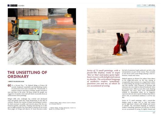
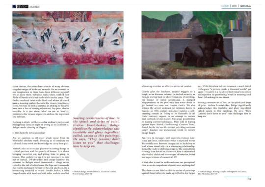
0 notes
Photo

In case you didn’t already know, @alison_saar is enthralling, eloquent and poetic @bentonatpomona #Repost・・・ “Given the extraordinary agency of Black women in American life, it’s hard to think of any recent art more salient right now.” Pick up a copy of today’s LA Times to read Christopher Knight’s beautiful review of “Alison Saar: Of Aether and Earthe.” Or read online, link in bio. Congratulations to Rebecca McGrew, Irene Tsatsos, and Alison Saar! @rebeccagracemcgrew @tsatsoulia @alison_saar @latimes @latimes_entertainment @armoryarts @christopher.knight.7 @pasadenaartalliance @focalaart @feministartcoalition @pomonacollege #alisonsaar #ofaetherandearthe #bentonmuseum #bentonmuseumofart #artreview #artcriticism #exhibitionreview #alisonsaarbreach #alisonsaartopsyturvy #alisonsaarisbrilliant #christopherknight https://www.instagram.com/p/CR4OMINsMzJ/?utm_medium=tumblr
#repost・・・#alisonsaar#ofaetherandearthe#bentonmuseum#bentonmuseumofart#artreview#artcriticism#exhibitionreview#alisonsaarbreach#alisonsaartopsyturvy#alisonsaarisbrilliant#christopherknight
0 notes
Photo

illustration for @evnreport for the etc. series on Listening to imagine exhibition review. read the article on www.evnreport.com #illustration #editorialillustration #magazine #evnreport #listeningtoimagine #exhibitionreview #visualart #digitalillustration #armisht https://www.instagram.com/p/CMRkBMIMIYj/?igshid=v5f1eocp4yb
#illustration#editorialillustration#magazine#evnreport#listeningtoimagine#exhibitionreview#visualart#digitalillustration#armisht
0 notes
Photo

"(…) Is Nandi Loaf the most important artist of the twenty-first century? That’s not a question I can reasonably answer just yet, but the thing that I do know for certain is that questions always outlive answers." Sunday reading: Almog Cohen-Kashi reviews Nandi Loaf's show at King's Leap in New York. @_alm0g_ @nandi_loaf @kings_leap 🔗 in stories 👀 #nandiloaf #almogcohenkashi #kingsleap #kingsleapgallery #kingsleapnewyork #newyorkexhibitions #artreviews #exhibitionreview #art essay #newyorkart #nyc #installation #art #contemporrayart #ofluxo #ofluxopatform @ofluxoplatform (em New York, New York) https://www.instagram.com/p/CL14-ZUlWP4/?igshid=vwodw2xlaedj
#nandiloaf#almogcohenkashi#kingsleap#kingsleapgallery#kingsleapnewyork#newyorkexhibitions#artreviews#exhibitionreview#art#newyorkart#nyc#installation#contemporrayart#ofluxo#ofluxopatform
6 notes
·
View notes
Text
The Modern Institute Exhibition - ‘I KNOW WHERE I'M GOING • WHO CAN I BE NOW’
How does the flyer/poster advertise this exhibition?
Reading from the website the description of the exhibition, it feels like it is marketed similar to a trailer for a movie. It is a dramatic description, from which I gathered the person writing the text – Will Bradley, is trying to get across the idea of appreciating art and the importance of it.
What is the suitability of the gallery space? How is the exhibition laid out?
The exhibition is filled with different sculptures, paintings, graphics and different pieces by lots of different artists. I can appreciate that the viewer gets to choose what they look at, which is unusual.
How has the work been mounted? Is this appropriate for the work?
Some of the work is mounted, some is scattered around. I get the impression each artist got a choice of one piece to include, and that the work would remain
Who made the work?
The list on website states as follows : Sam Ainsley, Martin Boyce, Matt Connors, Stephanie Crawford, Gardar Eide Einarsson, Duggie Fields, Luke Fowler, John Giorno, Andrew J. Greene, Peter Hujar, Marc Hundley, Suzanne Jackson, William E. Jones, Alan Kane, Andrew Kerr, Elisabeth Kley, Adam McEwen, Victoria Morton, Sanou Oumar, Toby Paterson, Richard Porter, Walter Price, Dominic Samsworth, Peter Schlesinger, Josh Smith, Ettore Sottsass, Paul Thek, Hayley Tompkins, Fredrik Værslev, Frederick Weston
Who did they make the work for?
I think the target audience is the same at the Jim Lambie exhibition, which would be people interested in modern art, being young people and creatives.
How does it make you feel?
I find it a bit overwhelming, not knowing what to think initially and processing the mixing of different styles and pieces was confusing.
If the work has a title does it make you think about the image/s differently?
I couldn’t find any titles or names of who the work was by. I think this makes the viewer focus on the work and impact rather than the individual behind it, something the artists clearly think is important.
How would I describe it to someone later?
A combination of lots of different styles of modern art, presented as a sort homage to art culture.
Does the photograph make you want to ask questions? What are the questions?
I would personally like to know more about the work, the person that made it and why. I find these somewhat useful in this type of exhibition with multiple people contributing.
Is the photograph valuable? How do you know?
I would say that they are not marketed to be sold, moreso to be appreciated for what they are?
Is the work for sale and who might buy it?
I don’t believe the works are for sale.
What information is available about the artist?
Not any information about the artists other than their names.
Who organised the exhibition and who selected the work?
The team at the modern institute aswell as the many artists involved.
0 notes
Last Seen Blogs


yeehaw-yibo
🥩Dance

naughtybooks
Naughty Books

pela-alma-que-habito
Eu sou o precipício, eu sou a queda!
dazed--xx
🌻Angsty Sunflower 🌻