
briefhistorybriefhistory
A Brief History of Brief Histories
Actually just reading art theory so you don't have to
38 posts
Don't wanna be here? Send us removal request.
Last Seen Blogs

arsenikous-blog
Αρσενικου

musicistheair-blog
Music Is The Air

mirage-movies
1001 Movies

lyub-ov
ΜΑΤΙΑ ΚΟΜΜΑΤΙΑ

hakutines-blog
Letters & Postcards!
Text
Looks Like Frida: The Problem with the Frida Barbie
Recently, Mattel produced a new range of Barbie dolls. The range, designed to represent inspiring women, features dolls based on athletes, artists, scientists and film directors, amongst other professions. In the glossy publicity images, nestled snugly between Amelia Earhart and Katherine Johnson, sits a doll with flowers on her dark up-do, a few stray hairs between her brows suggesting her iconic monobrow.

Amelia Earhart, Frida Kahlo and Katherine Johnson as Barbie dolls
Of course, Mattel is striving to keep its profit margins healthy in a struggling industry of toy manufacturing. The corporation is also trying to deflect years of criticism around the Barbie franchise and the hideously unrealistic proportions of the Barbie body. Unsurprisingly, the Frida doll has drawn a huge amount of criticism.
A lot of this criticism comes from feminist circles, where the idea of a Frida doll, softened and sculpted into a vaguely ethnic Barbie mould, has been thoroughly rejected. And that criticism has a lot of merit. Frida has become a feminist icon, inspiring generations with her fearless exploration of femininity, the body and the self.
But western feminist thought cannot completely contain the entire argument as to why the Frida Kahlo Barbie not only disrespects her memory, but also the politics in which she very deliberately placed herself. While it is fine to discuss the way Kahlo would have likely abhorred the unrealistic body proportions of her little plastic representation, it is also important to discuss how Kahlo, and her legacy, have become distilled down into a toothless symbol of generic resistance, stripped of her ethnic heritage until she becomes a universal catch-all for womanhood, performed as fridge magnets, phone cases and tote bags.
Frida as a symbol
Firstly, we must look at how Fridamania became as it was. Although Kahlo enjoyed a relatively successful career in her lifetime, it wasn’t until after she died that she began to be lauded as an international feminist symbol. After a biography was published by 1983 by Hayden Herrera, Kahlo shot from artist to celebrity. Her work underwent a massive revival and during the 1980s and 1990s, the price of her work skyrocketed. In fact, it wasn’t only her artwork which shot up in value - in November 2000, at a Sotheby's Latin American art auction in New York, a box of Kahlo memorabilia, including ribbons, photographs and dried flowers, sold for over $55,000 USD. At exhibitions of her work, you will find not only the usual memorabilia of postcards, posters or t-shirts. Now, the ranges of Frida-inspired products include jewellery, cosmetics and cookbooks. A quick search on Google reveals depictions of Kahlo on nail varnish bottles, back packs and even, bizarrely, as a Daft Punk fan.

Whoever made this, turn on your location. I just want to talk.
Kahlo was even the subject of a 2003 biopic, Frida, perhaps the nail that sealed the coffin - we can no longer differentiate between Kahlo’s work and the enthralling drama of her life. In Devouring Frida: Art History and Popular Celebrity of Frida Kahlo, 1999, Margaret Lindauer writes,
'the drama of her life has become zealously coupled with her paintings. Indeed, there often is little distinction between Kahlo and her paintings, which converge into a single entity, Frida's-life-and-art.'
Of course, it is natural in some ways to want to relate the life of an artist to their work - it is an established technique of literary and art criticism. But to solely interpret Kahlo’s art through her life is to do a great injustice to her work and reduces it to the story of a single woman, as opposed to recognising it as a rich tapestry which draws upon a vivid cultural and political landscape.
To truly understand the essentialism of Kahlo, we have to look at the wider view of how artists from outside the traditionally narrow scope of the Western art canon - in particular, Latin American artists - have been interpreted.
Looks like Frida
Gerardo Mosquera wrote in his 1992 essay, The Marco Polo Syndrome, Some Problems Around Art and Eurocentrism,
Third World artists are constantly asked to display their identity, to be fantastic, to look like no one else or to look like Frida... The relatively high prices achieved by Latin American art at the great auctions have been assigned to painters who satisfy the expectations of a more or less stereotyped Latin-Americanicity, able to fulfil the new demand for exoticism at the centres. As a consequence, Rivera is valued well above Orozco, Remedios Varo more than Torres García, and Botero considerably more than Reverón.
By this, Mosquera means that the Western art world - and the Western art market - demands a sort of twisted “authenticity” from artists from outside of its narrow scope. These artists must be completely unique or must fit into an already established, comfortable, understandable mould, shaped by artists like Kahlo who have been accepted into the canon (in a narrow, binding way, something that we’ll return to later). Where those artists do not comply with this, they are undervalued and held to be “derivative” of Western practice.
This was horribly exemplified by Jean Fisher, who, in her essay The Syncretic Turn, Cross-Cultural Practises in the Age of Multiculturalism, 1996, wrote about the posthumous retrospective of the Brazilian artist Hélio Oiticica at the Witte de With in Rotterdam in 1992. European art critics were heard to remark that, while they recognised Oiticica's conceptual thinking, it was “inauthentic” - his practise was just a reflection of Euroamerican practice, and therefore was not “Brazilian” enough.

Hélio Oiticica’s Grand Nucleus Grande Núcleo, 1960–66
Kahlo as a brand
Unlike poor Oiticica, Kahlo has remained as the commercially and critically acceptable face of Latin American art, and much of this is due to the Kahlo brand and the way that her identity was boiled down. The essentialism of Frida Kahlo allowed her to be turned into a non-threatening and marketable product. In Isabel Molina-Guzman’s 2010 book, Dangerous Curves: Latina Bodies in the Media, the author writes:
Central to mainstream media representations of Latinidad is the production of ethnic authenticity, of an authentic ethnic or panethnic identity often grounded in familiar and marketable characteristics. Furthermore, media produced by U.S. ethnic and racial minorities equally depend on a mode of 'strategic essentialism' to produce authenticity.
Molina-Guzman was writing specifically about the film Frida, but her words are applicable too to the mass-branding of Kahlo. “Strategic essentialism” here refers to a strategy which is discussed in post-colonial theory where oppressed groups simplify their mass identity, even when there are vast differences between members of the group, in order to achieve certain goals. However, as Molina-Guzman writes, this same tactic is also used by the creators of the film - and the wider art market and media - in order to create the kind of “authentic” identity that was not granted to Hélio Oiticica. The producers and director of the film created a very specific interpretation of Mexican identity in order to create a piece of media which is commercially viable in the Western world. Molina-Guzman writes:
the characterization of Kahlo as an anti-establishment, defiant rule-breaker remains consistently romanticized within global popular culture—making her an alluring and profitable multicultural and political icon for contemporary audiences invested in multicultural identity politics.
This essentialism of Kahlo’s identity is applicable not just to the biographical film made about her, but also to the way that Kahlo is now interpreted by the Western art world as a whole, and by the audiences hungry for a taste of non-threatening ethnic glamour.
Frida as generic radicalism
This essentialism of Kahlo, and therefore the distillation of the Mexican identity into a marketable product, is of course something that can - and has been - exploited by the free market in order to make profit. Not only can one buy countless Frida-inspired products, but one can now also use them to signal a type of political affiliation which says very little at all, a politics which has been watered down by capitalism into easy to swallow, vague ideas of non-conformity. These politics have little to nothing left of Frida’s revolutionary spirit.
Do you want to suggest - but not too radically - a half-hearted idea of individualism? Why not use the Frida Kahlo emoji pack (the creator of which, Sam Cantor, by the way, said: “Frida was just perfect for the project. She conveyed her emotions so honestly and openly in her work. What better artist to translate into emoji, which we use to express emotion today?”)? Like Theresa May, do you want to project an image that of feminism, of loving and protecting women, while actively working to destroy the support systems which have helped to provide women with a basic standard of living? Why not wear a bracelet with her self portraits on it as you rally your troops to further dismantle the welfare state?

Honestly, I have no idea what emotion this is supposed to convey.
The image of Frida Kahlo has become so generic now that Oriana Baddeley, in her essay Reflecting on Kahlo: Mirrors, Masquerade and the Politics of Identification, wrote:
By the end of the twentieth century Kahlo's signature mono-brow had become recognisable to a mass audience outside of those interested in Mexican art history or Surrealism. Her self-portraits appeared on fashionable clothing and accessories. The face of Frida was used with the same regularity, and often with a shared symbolism, as images of Che Guevara or Bob Marley, so that her art and her appearance were forever confused in the public imagination. By buying into this Frida, the consumer can declare a non-specific radicalism, an acceptable declaration of nonconformity. As one contemporary website sales line puts it: 'Give your vehicle the revolutionary spirit with a Frida Kahlo car window decal.'
The image of Kahlo has become so distorted that we can no longer differentiate between Kahlo, the revolutionary Marxist artist, and the Barbie doll wearing a red shawl as a subtle nod towards her ethnicity.
Frida Kahlo’s politics
Of course, there is another reason why Kahlo would have likely hated the legacy which has resulted in the doll. While the world has not dwelled heavily on Kahlo’s politics, she was a communist, her politics and world view heavily influenced by Marx. She was a member of the Mexican Communist Party, although left when her husband, Diego Rivera, was expelled. At her funeral, her casket was draped with a red flag as mourners sang The Internationale.

Her 1954 painting, Marxism Will Give Health to the Ill, depicts the disembodied head of Karl Marx floating above her, his god-like hands gently embracing her as she casts off her crutches and walks unaided. The painting, a metaphor for her belief that Marxism could heal the world, shows the strangling of a bald eagle, neatly dividing the image into good versus evil, the power of the people versus the imperialism of the powerful state.

Marxism Will Give Health to the Ill, 1954
In order to truly do justice to Kahlo’s work, we must never forget the politics which shaped her worldview and influenced her art. Part of this is about rejecting the vapid representations of her which have been so readily commercialised - the fashionable t-shirts, the twee cookbooks and, yes, the doll. But we must also remember that Kahlo’s identity was not a tool to be used to signal our own radicalness or gender politics. We must remember that it is not useful to pick or choose from her rich, complex identity the parts which best support our own agendas. As Kahlo wrote in her diary, she was:
Always revolutionary, never dead, never useless
31 notes
·
View notes
Text
Charging Bull vs Fearless Girl: A Story About Public Art
The art world has had its fair share of controversy recently which has spilled out into mainstream media coverage. From Dana Schutz’s frankly exploitative painting of Emmett Till to recent protests at the opening of the Carl Andre show at the Los Angeles Museum of Contemporary Art, the normally somewhat insular world of contemporary art has been grabbing headline after headline as artists court controversy so hard I thought for a moment we were back in 1997. The most recent headline to grab my attention? Arturo di Modica, the artist best known for the Charging Bull statue of Wall Street, is demanding the removal of the Fearless Girl rejoinder.
Charging Bull was installed on 15th December, 1989. Arturo di Modica didn’t have a commission or permit to install the statue where he did, but he installed it there in what has been referred to as a moment of guerrilla art. Workers at the New York Stock Exchange decided to call the police - after all, it’s not every day that an Italian man in a van drives up and installs a bull made of bronze and stainless steel on your front doorstep - and the NYPD seized the statue later that day. Public outcry led to the statue being re-installed at a new location two blocks away only six days later, complete with ceremony, on 21st December 1989.

Di Modica has described the bull as being a symbol of how he views America and American ideals - he has recently described it as representing “freedom, world peace, strength, power and love.” Other articles have quoted him as describing it as a symbol of an economic boom, something he has entwined with these Americanised ideals. I don’t feel the symbol of a charging bull is necessarily the most obvious representation of the concepts of love or peace, but regardless, di Modica has made clear it is, to him, a symbol of his adopted nation. To me, an outsider looking in on American culture, the bull reads as powerful, dynamic, dangerous. Its body curves and twists as if the creature is about to charge, lines of tension carved into its face and its tail lashing violently like a whip. Some have suggested di Modica created a symbol which represented the stock market itself, with its unpredictability and intensity.

Apologies as this image is actually part of artist Liu Bolin’s series Hiding in the City, it just happened to be the best image I could find. I’d like to clarify that Liu remains uninvolved in this fiasco.
However the statue is read, it stayed in the location at Bowling Green, a few blocks away from the NYSE, and as time has passed, has become part of the local culture of the area. Fast forward to International Women’s Day 2017, and another sculpture appeared opposite the bull, in almost every way its opposite. The statue was of a little girl made of bronze, her skirt whipping around her legs and her chin tilted defiantly upwards, towards the bull. Fearless Girl was meant to stay for a month, a piece of temporary art installed to prompt debate and discussion surrounding the role of women in finance, coinciding with IWD. Much like Charging Bull, however, the public reception to the work was overwhelming. Parents prompted their children to pose with her, women came from miles around to mimic her stance, the internet lit up with discussion and debate, much of it complimentary towards Fearless Girl. Following a public petition, Mayor Bill de Blasio announced that Fearless Girl’s tenure would be extended until February 2018.

It eventually became clear that the statue had been commissioned by a commercial company, the State Street Global Advisors of Boston, which many, including di Modica himself, have loudly and publicly condemned. According to the papers, their intention was to spark the discussion which had emerged since the unveiling of the statue. Fearless Girl has drawn a number of interesting responses - including criticism that the symbol of women on Wall Street should most definitely not be that of a child - but perhaps the most interesting to me has been the debates surrounding the origins of Fearless Girl.
Many have argued that her provenance doesn’t matter - that now she’s here, she provides the public with a symbol of resistance, defiance - some have even suggested she represents a solitary figure of opposition to the endless, relentless march of capitalism. Others have argued that the statue performs one function above all others - she acts as a advertising campaign for State Street. In all of the debate and articles surrounding her, a good number have included the name of their company. Many feel suspicious that the company presuming to spark this debate doesn’t have the most diverse board room either, with only three of eleven board members being women. In fact - some have even pointed out that, while SSGA encourages the companies it has stakes in to diversify their boardrooms and leadership positions, even if they don’t, SSGA won’t stop investing in these companies.

Personally, I think it does matter who paid for her, in the same way that it matters that British Petroleum spent 26 years sponsoring major exhibitions at the Tate galleries. Money in art is present, it is always present and we should be critical of who pays for a commission, just like we should be critical of who sponsors an exhibition, who pays for a priceless work at auction, who uses the most exclusive and expensive materials in their work. For me, I do not think it is possible to separate either work from the economic conditions under which they have been created - capitalism - and how this influences, shapes and derails not just the art world, but the entire world. Yes, we should be critical that Fearless Girl was commissioned by a company who have something to gain from their own promotion, but we should also be critical of the economic system which di Modica is implicitly praising in his sparkling appraisal of the United States. Di Modica has created a work of art which celebrates a capitalist industry in a capitalist system in a capitalist country - for him to decry the Fearless Girl as an advertisement for SSGA is more than slightly ironic. No one here is without financial motive.
However Fearless Girl and its economic origins have been interpreted by the public, however, it has been thoroughly condemned by Arturo di Modica. Di Modica’s argument hits out at Fearless Girl for allegedly breaking di Modica’s copyright over the bronze bull. He says that, by placing the girl in direct opposition to the bull, the context of the bull has changed from a positive and charged message to one of fear, of admonition, and this has violated his copyright. He intends to sue, although no suit has been filed at the time of writing.
Now, I’m no expert in US copyright law, but as far as I understand the basic principle, it’s impossible to copyright an idea or a concept - just the manifestation of those ideas. So the sculpture itself is part of di Modica’s intellectual property, but he cannot claim that the copyright over this piece of work covers its conceptual ideas too. Such a thing is, in fact, laughable - does concept not change, mature and remanifest itself over time? Was Charging Bull not used to promote the Occupy Wall Street movement by Adbusters, and does this not add a new layer of conceptual development that di Modica could never have possibly accounted for? Concept is not a fixed or static quality, it is a constant evolution of how your work is read through the layers of history, through world events and changes in custom. One hundred years ago, as the world was modernising rapidly, di Monica’s bull would have likely been seen as antiquated, old fashioned, parochial in a time when the art world - and the public at large - were inundated with new technologies and advances in science. Today it could be read as a quaint throw back to more agrarian times.

Occupy Wall Street poster by Adbusters
Di Modica has seemingly internalised an idea that this one interpretation, this ephemeral quality of “Americanness” (an indefinable, distortable, subjective and some say say laughable idea in itself), is the only way to read Charging Bull and are intrinsic in that reading. All viewers must be struck by the undeniable “Americanness” of the animal - despite the fact that the idea of “Americanness” is mutable and ever-changing, and deeply influenced by your relationship with the United States and its inner workings. As I have mentioned above, to an outsider, the bull has no obvious qualities that one might attribute as American - indeed, the first time I saw the sculpture, before this scandal ever hit the front pages, my thoughts were - is this a representation of the aggression, of the fragile hyper masculinity of the finance industry? I didn’t think of America, I thought of the Spanish tradition of the running of the bulls, most notably practiced in Pamplona. After all, we can only understand art by drawing from our own lives, our own spheres of knowledge and experience to help us interpret how and why something has been made. A particularly patriotic viewer of Charging Bull may indeed see the positive, ephemeral qualities of Americanness in it - but an undocumented viewer who has experienced first hand violence from the police and other wings of the American state? They may see instead the racism and persecution they have experienced in the land of the free.
So where the artist’s intentions perhaps differ from the audience’s readings, where does this leave the work? In a normal gallery setting, a curator would look at the entire arrangement of work in relation to each other and look at what sort of reaction they wish to spark in an audience. A curator would choose to, or not choose to, place Fearless Girl in opposition to Charging Bull, and those decisions would be significant in how those works are understood by an audience. A good curator looks at the world as it is now and how the current political and economic debates influence how we see and interact with the world and its wider conceptual questions. For example, now, in Europe, many curators are responding to many political factors - the migrant crisis, Brexit, the rise of Donald Trump and the alt-right. All of these have implications on how viewers understand the work and how we understand and parse the work around us. A skilful curator will lead an audience member through a journey where the artist’s intentions are explored but also challenged, refined, interpreted by the setting or context the work is placed in - and sometimes this involves pairing works by multiple artists who have made statements which have relevance to each other.

Bob and Roberta Smith respond to the Brexit referendum.
Di Modica is correct in one way - the placing of the girl does change the bull, it suggests a halt of the bull’s endless aggression, a target for it to aim at. This has conceptual ramifications for both works, but ultimately di Modica has suggested that there is one correct, patriotic reading of the bull, and anything that calls this reading into question is an infringement of his “rights.”
This brings us to the crux of what public art really is. There is no curator there to negotiate between the two artists and two pieces of work, no gallery structure to provide viewers with pamphlets which explain the artist intentions. Public art is a truly unmoderated interaction between a piece and the audience, in a much more direct way than a gallery experience can provide. Public art is made to be interpreted by the public without the conceptual assistance of a curator to pick out themes to focus on, the audience must interact with the work without interference and draw their own conclusions.
At times, this has been comical. An example from my hometown of Glasgow would be the monument to Arthur Wellesley, the First Duke of Wellington, also known as the Wellington Statue or, to us locals, “that statue with the cone on its head.” Despite discouragement from the local authorities and police, it’s been a tradition for this statue to wear a traffic cone as its hat and has been since at least the early 1980s, if not earlier. Allegedly, the local city council spends £10,000 per year in removing cones, just to have them put back up there by helpful members of the public. In 2013, the council proposed doubling the height of the plinth the statue sits on, but withdrew the plans after a massive public outcry.

Sometimes the horse gets a hat too.
People didn’t care about the statue - in fact, I had to Google the proper name of it - but they cared about the fact that it wears a bright orange cone on its head. A whole cone subculture has sprung up - you can now buy cone shaped hats, badges and knickknacks, and local news periodically runs baffled, alarmed headlines when the cone goes missing - and this local culture is an important one when we read the statue now. Of course, we must acknowledge that the artist, who had it erected in 1844, could not have possibly yearned for his work to be adorned with a small and distressingly orange cone, but we also cannot separate it from its modern day reinvention. It has taken on a new symbolism, a new importance which, for many people, supersedes its original aim to create a monument to the Duke of Wellington.

Popular left wing blog athousandflowers.net takes a stand in #conegate2013.
Which is more important, we might be tempted to ask. Which should we seek to preserve - the artist’s original intentions, or the response of the community into which a piece of work has been placed? I personally don’t believe an art work exists without an audience, which is not to say we should always pander to populist ideas of what audiences want to see, but rather to suggest that a community response to a piece of work is valid, powerful, and completely outside of an artist’s control. Isn’t that why we invest in public art? The idea is in the title - public art - art for the people, removed from the carefully controlled gallery environment so all people can interact with it, draw a conclusion as to how they feel about it, to relate it to their lives, and their neighbourhoods, and the reality of their day to day existence. The very best public art engages with the communities into which it is placed, and the public responds to the very best public art.
Many have pointed out the irony in di Modica’s demands that the space around his illegally installed work be preserved in accordance with his wishes. I’d suggest this goes even beyond irony, into a place of entitlement. When street artists make work on a wall, they don’t expect it will stay there forever, in the same form. Di Modica has implicitly placed himself above other guerrilla artists by demanding special concessions towards how he thinks his work should be viewed and interpreted. Di Modica does not wish the meaning of his work to change or mature or be understood in ways that differ from his intention - so why make it a piece of public art at all? Why not display it in a temperature controlled, properly humidified gallery, where a curator can have a pamphlet produced that covers the themes of his work? To use the world as your pedestal means being more flexible than di Modica has shown he can be, it means being able to accept that your work will be unmoderated, that the audience will respond to it in a broader and, perhaps at times, deeper way than work shown in a controlled environment.
In the end, to me, it doesn’t matter hugely if Fearless Girl stays or not. Personally, I do find her a mixed message, a beacon of wishy-washy liberal hope that by merely talking about the gender disparity, it will all go away. I find art which makes less of a sensationalistic headline more appreciable, on multiple levels. Fearless Girl has the subtlety of being whacked around the head with a baseball bat, and I don’t find myself rushing to defend what I see as a dressed up advertising campaign, but I appreciate the way she has been given new meaning by the dozens of people, adults and children, who pose with her every day and who do see her as a symbol they wish to rally behind.
However, what has baffled and alarmed me is the way di Modica has responded - through threats of lawsuit. Neither of these works has any more intrinsic right to the space, and neither has truly engaged with the community surrounding them, rather than simply creating populist messages to respond to a global phenomena, unspecific to the women of the finance industry.
Instead of focusing any further on those two works, I’d rather draw your attention to a piece of public art created in England by Jessie Brennan, entitled If This Were To Be Lost, created in 2016.

The phrase came from an earlier project Brennan ran in collaboration with the people of the local community in Peterborough, where the artist worked with the local community volunteers who run the Green Backyard, a community growing project, to create a vast archive of cyanotypes and audio recordings. The words were made in plywood and installed along the garden, where it is visible to passengers on the East Coast London-Edinburgh train. The photos Brennan puts on her website are, to me, a phenomenal and real exploration of what public art is. Why? Because she has openly shown children playing on the installation, making the space and the work their own. If that is not what public art is about, I have no idea what it is.

See If This Were To Be Lost on Brennan’s website here.
#arturo di modica#charging bull#fearless girl#cone heid#jessie brennan#if this were to be lost#public art#i'm not really a critic i just have a lot of feelings
7 notes
·
View notes
Text
Context & The Most Famous Artist: Why the Boring Bro of Art Needs To Shut TF Up
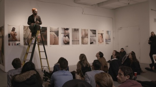
A video has been circulating Facebook recently of Matty Mo, self proclaimed Most Famous Artist, and his Snapchat nudes project. Many of you will already be familiar with Mo as the guy who walked into a gallery and displayed one million US dollars, which he sold off as chunks for an inflated value, or perhaps you’ve seen one of his more innocuous projects such as Selfie Wall.
The premise of the project is simple: Mo put a call out on Instagram, asking for people to Snapchat him nudes with the caption Happy birthday Most Famous Artist. In the video, Mo speaks at length about how he makes art for the internet age, an age where ideas of shock or shame are disconnected from daily reality and the act of sending nudes is a normal part of life. We see him setting up for his show and directly interacting with young art buyers who pay up to $1200 USD for a large size print (printed on “high quality art paper,” which is a technical term for “trying to compensate for the low resolution delivered by front facing cameras” by the by).
Understandably, the internet is critical.
Firstly, many are understandably skeptical about how this constitutes Art, which admittedly is a debate held around the wider context of contemporary art and how it can often be difficult to read, appreciate or enjoy. Mo receives nude photos which someone else has composed, shot and edited, and has applied an opaque curatorial process in deciding which of the hundreds of photos he used is makes the final exhibition. Many are responding with questions about how Mo’s input has elevated the photos from snapshots into pieces of fine art.
The artist defends himself by drawing heavily on the Duchampian concept of the readymade, which was birthed just over one hundred years ago and first defined in the Abridged Dictionary of Surrealists, published 1938. Interestingly, Duchamp’s best well known and most controversial readymade, Fountain, was first exhibited one hundred years ago in 1917, and in May of that year, the following text was published in The Blind Man, a magazine run by Duchamp and two friends:
Whether Mr Mutt with his own hands made the fountain or not has no importance. He CHOSE it. He took an ordinary article of life, and placed it so that its useful significance disappeared under the new title and point of view – created a new thought for that object.
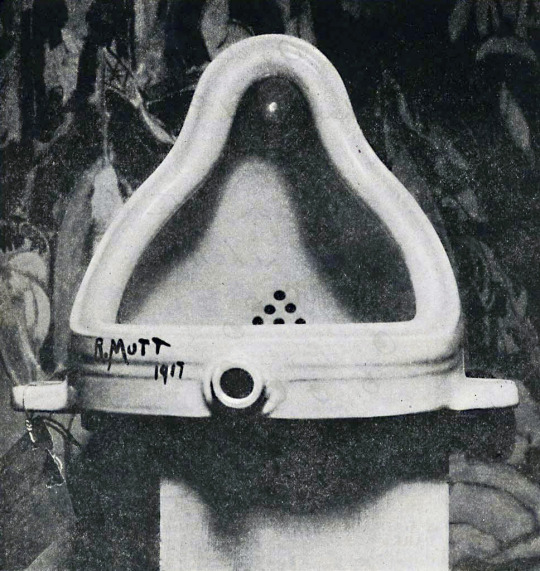
Readymades were, and still can be, incredible pieces of art (although I suspect many viewers would disagree with me there), because of the Duchampian act of transformation applied to the object. This was often a simple twist - when Duchamp painted a fake name on the side of a urinal and placed it on its back, on a plinth, he was transforming it from simple commodity into objet d’art, simply by deciding it would become a piece of art.
At the time, of course the public viewed his work with scrutiny, but the artistic merit of his work was also contextualised by other artistic movements and scientific developments in the world. The problem with the readymade now is that our nearest and most immediate contextualisation is the work of the YBAs - Tracy Emin’s My Bed (1998), for example.
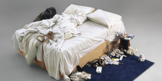
My Bed illustrates the difference between a Duchamp readymade and a late 20th Century readymade, which is the theoretical and contextual framework which surrounds the work.
Duchamp’s Fountain was made at a time when Dadaism was a huge force for change in contemporary art, and his practice of readymades was supported by the Dadaist tradition of lifting things from their original context and putting them into new ones, creating ridiculous and nonsensical objects and scenes. (Although, to be clear: Duchamp was not directly associated with the Dadaists and was careful of his use of the term.) The Dadaist movement was a forerunner of Surrealism, and made work in a specific time in world history - surrounding the First World War - when modernisation and industrialisation was happening before the eyes of the artists.
Emin’s My Bed has been referred to as a readymade, but draws from a very different conceptual root from Duchamp’s Fountain. Emin made her bed in the heyday of the Young British Artist, in the 1990s, after years of postmodernist thought. Her work is inherently personal, and My Bed is allegedly a faithful recreation of the scene of a four day depressive episode. It’s impossible to read My Bed without putting it into perspective of the decades of feminist art which came before it - My Bed wouldn’t and couldn’t exist without the work of artists like Valie Export, Yayoi Kusama or Louise Bourgeois (although, please trust me when I say I have multiple issues with that era of feminist art).
To compare Duchamp’s readymades to Emin’s readymades forces us to ask what they really have in common - which is ultimately very little, other than the fact that they both come from pre-manufactured objects.
This is what brings us back to Matty Mo and his use of Duchampian buzzwords to justify his work. He may say he draws from Dadaist thought on the readymade and the contextualising of items, but the problem is that his work exists in a hugely different context to Duchamp’s Fountain. When Fountain was first presented, the world was just coming to terms with its own modernity, and mediums like photography were still difficult to access for many.
Now, photography is a staple of the 21st Century. We live in a more visually exciting and explosive time than ever before, and imagery floods our eyes and minds constantly in advertising, popular culture and social media. While the nude portrait has long been a staple of art, we now live in a time where the nude, as a medium, moves between Art and Ordinary. This is probably where Mo draws the link between the readymade and how he sees his “work,” but it is a lazy and shallow comparison.
Today’s nudes represent a type of self portrait which has previously only existed within the art world. Now, anyone can be both model and artist, anyone can define the parameters in which their body is seen, consumed, transformed into an objet d’art. The power of the nude is in the ability to self define, which is removed by Mo’s clumsy curatorial efforts.
Look at the images that Matty Mo surrounds himself with - bodies which are traditionally aesthetically pleasing - generally white, generally slim, generally a reflection of the beauty standards applied to society. While Duchamp changed the world with his readymades, Mo merely reiterates oppressive power patterns which are already a part of daily life. As any young woman who’s ever sent or received a nude knows, those power struggles find their way into every aspect of our lives, including our sex lives.
I fail to see the power or the glory in an artist upholding the same oppressive standards which the feminist artists above worked to subvert. In fact, I see this less as a genuine curatorial effort and more as a man’s way to make himself feel a sense of power and control, by selecting the bodies worthy enough to be transformed into “art”.
(You’ll also notice a particularly gross moment in the video, where Mo sends a heart-in-eyes-emoji in response to a sexy picture and looks far too pleased with himself. Gross.)
We don’t gain any conceptual ground from this rehashing of oppressive practice, because Matty Mo is unable to critically reflect on it. He deflects, pointing to Duchamp, pointing to the ephemeral nature of Snapchat, claiming his screenshotting of images is a crucially transformative act instead of a repetition of dynamics seen both inside and outside of the contemporary art circuit.
Readymades no longer have any inherent value, which means we fall back onto the second most prominent element of Mo’s work: shock.
The images are designed to be inherently shocking. Snapchat has distinct visual cues, the greyed out text bar or comically enlarged emojis, which feature in most of his images. The shock aspect of his work is broken down into two components:
Firstly, the idea that people have volunteered to send their personal images to a man they do not know and will probably never meet. Mo banks on the controversy that he gains here, which is made apparent by the lengths he goes to in the video to explain how he gathered the images.
Secondly, the images have been blown up to large size and hung in a prominent location. Mo speaks at length about how he managed to get a gallery space on Wall Street, which we see features large glass windows. A woman walks past and covers her eyes as she sees the sexualised imagery, emphasising the supposed horror felt by members of the public.
Both of these factors are designed to shock the viewer with Mo’s brazen curatorial choices. But the problem is? I don’t find it shocking. I find it terribly dull and reminiscent of regular, daily life. Wow, a man asking for nudes which he’ll use for his own personal gain. Colour me surprised.
Shock art only works where the normal is subverted, bastardised, turned inside out - and even then, you have to be willing to do some pretty weird stuff to be shocking in this day and age. Mo is trying to appeal to a generation who grew up linking each other to shock sites on the internet, he’s trying to market himself to young collectors who probably have memories of the weird stuff we used to send via MSN and AIM. But now? There is very little that can shock a desensitised audience, and children of the internet generation are our most desensitised audience yet. The idea that we are meant to be shocked by nude bodies is a weirdly Victorian throw back, considering the feminist movements of the 1960s and 70s, and today’s contemporary body positivity movement. Perhaps Mo intends for us to be shocked by their method of distribution - he does harp on at length about how he’s ‘subverting’ Snapchat and how humanity have used our base nature to turn it into a sex tool rather than for ‘ephemeral conversation,’ but I find that line of thought just utterly boring and unworthy of being followed up on. Wow, the consumer base has had a huge input in this app is used, humanity is so base and driven by sex, yadda yadda, some crap about the lowest common denominator, so deep, wake up sheeple.
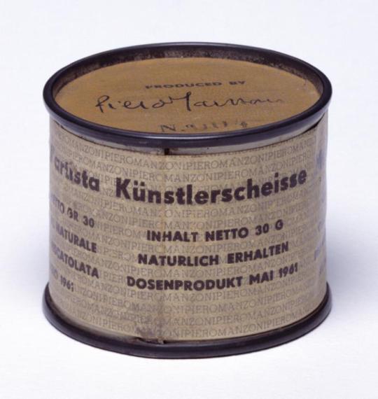
Besides which, shock art has been thoroughly explored. Artists have worked with shock for decades to disrupt conversations and turn them on their head. Hell, in 1961, Piero Manzoni produced 90 cans of Artist’s Shit and since then nothing has been off limits. We’ve seen artists pull scrolls of paper from their vaginas, tattoo lines across the backs of paid participants, crucify themselves on cars, and generally do anything and everything that has been seen as taboo or off limits.
Matty Mo’s work is inherently derivative, and he embraces that with open arms. A quick scan of his website, which I will not subject you to, shows work which is openly reminiscent of Yves Klein, Damien Hirst, Jeff Koons and Roy Lichtenstein - that’s without even talking about the parallels between his Snapchat series and Richard Prince’s appropriated (and also gross) nudes.
While there’s nothing wrong with being derivative, nor drawing on the work of artists who have inspired you in the past, Mo’s work shows a level of entitlement and a sense of ownership through his framing of his use of artistic trope as new, exciting and original. His personal branding as The Most Famous Artist reflects the privilege most white male artists have - repeating a pattern seen many times throughout history before - where a male artist commodifies and uses the bodies of non-men as “inspiration” or “muses,” all the while giving little respect, or financial renumeration, to his subjects.
Frankly, I am not surprised or startled by Mo’s work. His “work” has the conceptual depth and agility of a first year art school student, which is probably ungenerous to first year art school students. He is the product of a long line of entitlement, an entitlement which does not invite him to critically reflect on his “creations,” but allows him instead to continue to push flat, boring and derivative ideas out while retaining media attention - and that’s without even fully exploring the ethics of the project, the issue of intellectual property, the way viewers and collectors have responded to it, but frankly, I’ve already devoted enough time and attention to him.
If you’d like to take a look at a really interesting internet artist instead, check out the work of Darius Kazemi, artist and botmaker. I particularly enjoy the Bureau of Nice Stats project, which automatically sources “nice statistics” in a fabulously surreal and hilarious way.
#the most famous artist#art bros are the worst#matty mo#please art history is really important because it stops us making boring work like this#really wish i'd been there for your art school crits#tumblr long reads
14 notes
·
View notes
Photo


Sanja Ivekovic, born 1949 in Croatia, makes work about being a woman, and specifically about being a woman in in Croatia, a country which has only been independent since 1991. She came of age in a period where artists were breaking free from restrictions laid upon them by institutions, which laid the ground for a form of resistance – known as the New Art Practice – which struggled against the official modernist culture.
Ivekovic’s work often examines the transition between Communism and post-Communism in East-Central Europe, as well as the links between post-Communism and women’s rights. She uses the signs and symbols of a post-Communist world, such as make up or luxurious nylon tights – products inherently associated with a post-WW2 West where capitalism flourished. Ivekovic has stated “nothing is free from ideology, everything we do has a political charge and the division between politics and aesthetics is entirely erroneous.”
Obviously, Ivekovic also explores womanhood, and what it means to be a woman in modern life, both under Communism and capitalism. Her work allows peeks into private rituals many women perform that, for many of us, become a founding part of our identity, such as applying make up. In her Double Life series (1975), Ivekovic paired 66 images of women in advertisement with 66 images of her in her own private life, creating a link between the ideas of privacy and consumption, and reflecting on the nature of the way women are marketed to while simultaneously acting as a product within their own right.
One of Ivekovic’s most famous works which probably illustrates her understanding of the manipulative ability of images is Triangle, a 1979 performance in which Ivekovic protested against the ban on sitting on balconies in Zagreb during a visit by President Tito. Ivekovic installed herself on her balcony with a book and a glass of whisky, and simulated the act of masturbation. In response, a person surveying buildings from an adjacent rooftop notified a policeman, who then rang the artist’s doorbell and asked her to move inside, as Ivekovic had expected. In this way, Ivekovic exposed the relationships between expectation and reality, privacy and publicity, propaganda and truth.
5 notes
·
View notes
Photo


My favourite story about Diego Rivera, born 1886 in Mexico, occurred when he was only three years old. When his parents caught him drawing on the walls, they decided not to punish him. Instead, they installed chalkboards and canvas onto the walls so their child’s talent could be nurtured. In that story, we find the seed that would grow into Rivera’s body of work, his murals, and the philosophy that would drive his career: art belongs to everyone.
Rivera was already a successful artist when he became inspired to start painting murals. After the Mexican and Russian Revolutions of 1910 and 1922 respectively, Rivera’s previously Cubist style began to evolve. Following a trip to Europe in 1920, Rivera became entranced by the Renaissance frescoes of Italy – convenient timing as Rivera was able to return to Mexico in 1921 and participate in the government-sponsored Mexican mural programme, as planned by José Vasconcelos. In the autumn of 1922, Rivera helped to found the Revolutionary Union of Technical Workers, Painters and Sculptors, as well as joining the Mexican Communist Party. From that time on, his murals were painted in fresco only, and broadly dealt with themes on Mexican society, the 1910 Revolution and the power of the worker.
Rivera’s most famous work is probably Man at the Crossroads, started in 1933 and destroyed in 1934 by the Rockefeller family. Originally, the Rockefellers had commissioned a mural on the ground-floor wall of the Rockefeller Centre on the theme: “Man at the Crossroads Looking with Hope and High Vision to the Choosing of a New and Better Future.” What better a subject for a man like Rivera?
His complex composition depicted many aspects of modern life, contemporary culture and scientific advancements. Rivera referenced recent discovered made by science while contrasting scenes of modern life, such as wealthy society women playing cards and smoking. In contrast to the bourgeois subjects he had painted in that section, on the opposite side, he painted Lenin holding hands with a multi-racial group of workers. It is this portrait of Lenin that eventually caused the destruction of the work – although the vision of the Russian May Day rally right above him probably didn’t help either. Lenin’s portrait wasn’t added until April 1933, when the New York World-Telegram newspaper published an article condemning the mural as “anti-capitalist propaganda.” Rivera added Lenin a few days later.
To the artist, the composition represented contrasting social contexts, a tool he used famously in his New York murals such as Frozen Assets. In Man at the Crossroads, Rivera contrasts the debauched and wealthy with what he depicts as a socialist utopia ushered in by Lenin. In Frozen Assets, Rivera contrasts the desolate warehouses of sleeping homeless people with the warm, cosy vaults of the rich. The theme throughout his work is apparent: the inevitable inequality of capitalism.
Given the negative publicity the mural was stirring up, Rivera was asked to remove the image of Lenin. He refused, instead offering to add the portrait of Abraham Lincoln as a compromise. In early 1934, Nelson Rockefeller famously ordered the destruction of the mural.
Despite weeks of protests and the way it made his family seem hypocritical after their long-proclaimed dedication to the arts, Rockefeller stated: "The picture was obscene and, in the judgment of Rockefeller Center, an offense to good taste. It was for this reason primarily that Rockefeller Center decided to destroy it."
Rivera’s original mural now only exists in a few black and white photographs depicting it the way it was shortly before destruction. Rivera managed to repaint the mural using these photographs as reference at a smaller scale, at the Palacio de Bellas Artes in Mexico City where it was renamed Man, Controller of the Universe. The new version included a portrait of Lenin, alongside Marx and Engels, as well as a depiction of Nelson Rockefeller’s father (a lifelong teetotaller) drinking in a nightclub with a woman.
Ironically, despite the way Nelson Rockefeller was eager to move away from an association with Rivera, the history books have paid attention to and recorded the destruction of the original Man at the Crossroads. The work, now famous precisely because it was removed, lives on as one of Rivera’s most famous – and controversial – pieces of work.
#diego rivera#painting#muralism#mexican muralism movement#fresco#communist art#modern art#modern art explained
6 notes
·
View notes
Photo


Jacob Hashimoto, born 1973 in the USA, builds ephemeral, beautiful installations that capture the wonder and awe of nature in a restrained, controlled way. He uses traditional kite-making techniques to build his work, which straddles the line between sculpture and painting, between two and three dimensions. His shapes are strung together into chains, and layers of these are stretched between short poles, allowing the artist to build layers of chains, increasing the complexity of the work as more are attached.
His work is designed to create a shifting illusion of light, space and motion. His 2011 installation Armada, Hashimoto installed three lever mechanisms which caused the suspended ships to gently roll over invisible waves, entrancing viewers with its simple serenity. The installation brings to mind graceful scenes from classical painting, it recalls the shapes of waves, clouds, sails caught in the wind. Hashimoto’s skill is in combining his tiny elements with each other to create large pieces, each link an important component of the whole.
It’s important to read the sheer beauty of Hashimoto’s work not as an extra, an additional element to be considered after his concepts. The strength of his work is found in the fact that beauty is an essential, inherent component of his serene scenes.
5 notes
·
View notes
Photo


Philip Kwame Agapya, born 1958 in Ghana, manages to combine a photographic formalism with candid portraiture in his bright, delightful images. The artist and his assistants hand-paint the backdrop of every portrait, and Agapya asks his models to interact with the fake environment as if it were real. By asking his audience to play with the background, he brings out genuine expressions - happiness, nerves, the moodiness of a little boy posing for a possible family portrait - gives his audience glimpses into the mindset of his models.
Apagya explores kitsch with a vigour not seen since the days of Pop Art, but Apagya’s kitsch focuses less on the minutiae of American pop culture and more on the concept of the American Dream. In a globalised world where America culturally dominates most of the planet, it’s no surprise that Apagya explores the materialism and promise of the fabled land of promise. In contrast, his models are often dressed in traditional Ghanaian dress or distinctively Ghanaian jewellery, and so Apagya manages to bring together two cultures, referencing the fantasies of Western-style wealth but with a distinctly African twist.
Apagya skilfully brings together reality and fantasy in his images. At times, the backdrop isn’t quite large enough, and the artist includes the floor of his studio or a strip of ceiling in his images often. This hint of what is going on outside of the frame is a reminder to us of the strength of Apagya’s ability to construct a fantasy which captures the attention of both the model and the audience. His images feel human, glorious and alive.
3 notes
·
View notes
Photo


Ivan Navarro, born 1972 in Chile, is a modern kind of minimalist. His work pays open homage to the great minimalist works created by the likes of Dan Flavin through the use of colourful fluorescent tubes. Like the artists of the original 1960s Minimal movement, Navarro’s choice of material is industrial, sterile and unfeeling. Unlike the Minimalists, however, Navarro rejects the doctrine of removing the personal from his work: much of his work is inspired by his youth growing up under the dictatorship of Pinochet.
Minimal art was an art about the future, about industrialisation and the death of old media, to be replaced with the materials of a new world. Minimalism was about the relentless progress of the world, and in this context, the use of industrial materials was fresh, futuristic and exciting. With Navarro’s work, there’s a sinister undertone - he’s spoken before as to how the supply of electricity was used to control people, particularly through torture. Electricity is a continual theme throughout his work and is used also as a metaphor for wealth, power and status. In 2004 Navarro produced a sculpture called Homeless Lamp, The Juicesucker by building a shopping cart out of fluorescent lights, the idea behind which was to create a sculpture which can be displayed anywhere to anyone, breaking the elitism of gallery spaces. Navarro filmed himself pushing the cart through the streets and illegally using electricity from the outlets on street lights, usually used by municipal staff for roadworks.
Similarly to the Minimalists, Navarro uses his fluorescent lights to explore space and create new shapes and forms between the positive and negative spaces of his work. Unlike the Minimalists, however, Navarro moves a step beyond the arrangements of fluorescents and actually uses them to construct identifiable objects, such as chairs, doors or words.
Navarro’s work walks a fine line between enchanting and industrial, his sculptures alluring in their bright colours and shine, with materials that belie how fragile the final sculptures are. His work has the potential to remove a viewer from the mundane and transport them to Navarro’s dazzling yet sinister world.
0 notes
Photo


Cildo Meireles, born 1948 in Brazil, is well known for his dramatic, engulfing installations which often play with multiple sensory elements. His work is deeply influenced by his upbringing and early career in Brazil, and his name is synonymous with the efforts of Brazilian artists in the 1970s to fight back against the censorship from their military government. In 1970 he began one of his most famous projects - where he would stamp bank notes with political slogans or change their value to zero before putting them back into circulation. Particularly during this period, Meireles worked with a lot of consumer goods, inscribing slogans such as “Yankees Go Home” onto Coca-Cola bottles before sending them for recycling, and he encouraged others to do the same. In this way, Meireles was able to release messages which he never would have been able to with a piece of art which would sit in a gallery.
Meireles was highly inspired by the likes of Hélio Oiticica and Lygia Clark, two other Brazilian artists who worked heavily with texture and immersive environments, influenced by their homes in Rio de Janeiro. Like his predecessors, Meireles’ work transports the viewer from a white cube gallery box to whatever environment he has dreamt up. His work contains a kind of physical presence, but also references the clean geometric lines and shapes that were popular in the Brazilian art scene during his youth. Textures and shapes are very important to his practice.
Interactivity is an important aspect to Meireles’ practice. His 1970-75 installation Eureka/Blindhotland consisted of 200 black rubber balls, all approximately the size of a football. A pair of scales high on a pole sit in the centre of the space, with one side occupied by a wooden cross, and the other with two heavy-looking wooden blocks. Despite the appearances of the items, the scale sits perfectly balanced. The rubber balls have been filled with different materials, and so their weights change. Meireles invites the viewer to enter into the centre of the space and play with the balls, only to discover their deceptiveness. The artist sees himself as a moderator between art and audience, and that all viewers have a part in creating a piece of work. As an artist, Meireles considers himself to be like a “conduit” who helps connect people with creative experiences.
0 notes
Text
The Glasgow Effect: An Ineffective Response to Glasgow’s Very Real Issues
Several people have asked me what I think of The Glasgow Effect, a performance piece launched on the 1st January 2016 in which the artist, Ellie Harrison, born in 1979 in London, has pledged to stay within the Strathclyde region, limiting her ability to travel and work as she usually does, for a period of one year. Harrison wishes to explore the limits of “sustainable practice” and demonstrate the degree to which “successful” artists must travel in order to work.
Controversially, her project has been awarded a £15,000 grant from Creative Scotland, which Harrison states will partly be used to allow her to let go of teaching commitments outside of the Greater Glasgow area. She openly publicises her transportation policy, part of a wider environmental policy which informs the way she makes her work, and comments that, for the duration of the Glasgow Effect project, her transportation rules will be even stricter. Harrison lays down strict rules for herself, stating that, while she holds a UK driving license, she does not own or run a car on a regular basis, and that she does most of her travel by public transport, only using taxis when necessary. While she has published her policy in an effort to encourage transparency, it comes across as smug while residing in a city where thousands rely on public transport as the cost of owning a car is beyond their means.
Naturally, Harrison has received a large amount of criticism on social media, particularly from Glaswegians themselves. This is no surprise - firstly, £15,000 is a large amount of money, especially given that one in three Glaswegian children live in poverty. In an era of Conservative cuts and austerity, it's not shocking to see many Glaswegian people protesting, while their community centres are long gone and their education funding has dried up, that an artist should be given thousands of pounds to stay in one place.
Now, to be fair to the artist, performance art gets a lot of stick, partly because the artist doesn’t necessarily produce a documentation of the performance that can take the place of a physical item. While many see the value in skills such as painting or photography, performance art is often seen through the lens of “well anyone can do that.” Harrison hasn’t spoken as to what she sees the physical outcomes of the project to be, or even if there will be one - in fact, her art has a far more refreshing approach of moving outside of the gallery, interacting with the community around her and exploring art in the context of community instead of institution. That’s great, and I, for one, am extremely excited to see an artist getting a grant for such an intangible piece of work, because it speaks volumes as to how Creative Scotland fund pieces and how open they are to working with 21st Century ideas about what a piece of art is.
But - and believe me, this is a very big but -
But.
Harrison’s work seems less about The Glasgow Effect and more about The Narrow Segment of Glasgow Effect. As someone who moved to the city principally to study at Glasgow School of Art and who was launched into the city’s artistic community from day one, she speaks about Glasgow with the rosy view of the incoming student, the one who’s only ever lived in the nice parts of town and never had to grow up watching the slow death of the community they know as home. Harrison talks about the opportunities open to artists in Glasgow which are numerous, but completely inaccessible for the vast majority of young people who grow up in Glasgow.
Glasgow has a great art scene, but it also has unimaginable levels of poverty for being in a developed country. The title of “The Glasgow Effect” is actually derived from a catchphrase developed to describe the huge health inequalities of the city. It came from a study conducted in 2010 about the difference in health and life expectancy of Glasgow compared with equally deprived cities, and found that Glaswegians from poor communities have lower health levels and lower life expectancy as compared to counterparts from equally poor communities in places like Manchester, Liverpool and Birmingham.
Harry Burns, formerly Scotland’s Chief Medical Officer, described the Glasgow Effect as a “psycho-social” problem, suggesting that poverty alone is not responsible for the sinking average life expectancy in certain parts of Scotland, but that poverty’s bedfellow of poor social cohesion is partly responsible. Indeed, many communities in Glasgow fell apart during the de-industrialisation of West Scotland, and many have never recovered.
The Glasgow Effect in itself is a puzzling problem unique to Glasgow, an issue with a million possible factors and only one key cause that experts seem to agree on: poverty. In comparison, Harrison’s Glasgow Effect is a twee round up of all the ways an established artist can continue to engage in art without necessarily making any serious or meaningful engagement of the true Glasgow Effect.
Creative Scotland defend Harrison by stating that her project is meaningful - can an artist make a living in one city, unlike the way most modern artists have to operate? What Harrison forgets is that to live as a full time artist is a privilege denied to most of the inhabitants of the city she has voluntarily locked herself in. When at least one in five working Glaswegians earn below the Living Wage, Harrison has been awarded a grant that surpasses the annual wage of many, most of whom will never be given the opportunity to attend art school, host a show or be able to gain a grant because of the exclusive nature of art. Art within the system of capitalism is inherently classist and elitist, and being able to live as a full time artist requires the ability to pass through a system that will judge where you came from, what school your degree is from and how you talk.
Harrison’s Glasgow Effect has so far not provided any response whatsoever to the very real issues in the city. So far, this project is more an academic exercise into the economics of working as an artist in a city with a smaller art scene than London. To give Harrison her due, she has previously made work on the themes of inequality and her intentions are likely good - but she has launched her project half-cocked, talking mostly about how the funding will be used to explore the ideas behind “career progression” with very little outlining how she plans to engage local people.
Scotland is a place of extreme contrasts, and Harrison’s project seems only to engage with the more respectable aspects, while trying to make light of the serious issues of poverty and ill-health in Scotland. At a time when many Glaswegian youth are trying to get together the funds to leave the city to pursue education or employment, Harrison’s declaration that she will stay within the Strathclyde region has failed to impress with its un-nuanced view of Scotland.
If Harrison really truly wishes to engage with the local community, I’d encourage her to look at the work of artists like Iseult Timmermans, who coordinated the Red Road Community Studio for over two years while actively working with the community from Red Road and working to document their community before the demolition of the high-rise buildings. Timmermans’ projects included building a camera obscura in an empty flat and teaching members of the community to build pinhole cameras. Timmermans is an example of an artist who I would truly applaud for her community engagement - her work was made during the process of that engagement itself, instead of simply occurring in the spaces communities use without actually creating a connection with the people who view it.
22 notes
·
View notes
Photo


Much of Alicja Kwade’s work is about the line between impossibility and possibility. The artist likes to play with physics and time, light and sound are regular materials in her toolbox. Her love of science is entwined with her love of superstition - in fact Harry Houdini is one of her greatest heroes.
Kwade’s work pulls apart the fabric of reality to compare and contrast the artist’s idea of the “real” with the audience’s. Her frequent use of glass and mirrors are reminiscent of parallel dimensions and pockets in space, themes she explores fully in her immaculate presentation of her work. Kwade highly values work in which the artist’s hand is absent - she prefers her sculptures to look pristine, almost alien in their perfection.
Kwade’s aim is to explore what is reality, and how we underpin reality with ideas of authenticity and realness. For example, her 2006 project Bordsteinjuwelen (Gutter Gems) saw Kwade take a series of ordinary stones she found on the streets of Berlin and had them cut into “diamonds,” using the type of stone cutting usually reserved for precious gems. In this way, Kwade questioned our ideas of value, form and material. Is a stone more valuable when it has been treated as a more valuable stone? Does a stone become more precious when an artist has direct that it should be cut in a certain way?
Kwade’s work has a certain light heartedness to it, an important aspect which is often overlooked in favour of discussing her very real scientific knowledge. The way in which her inanimate objects slouch is often somewhat comical - a sagging pallet, a curved door, the items Kwade constructs are humorous for their humanity. The artist bestows them with a kind of anthropomorphism which creates another level of connection for the viewer on a far more personal level.
5 notes
·
View notes
Photo


Living and working in New York City, Nari Ward takes inspiration from the materials found around him in his urban landscape. Best known for his installation “We The People,” Ward uses found materials to contemplate political systems and the place that average people have within them.
“We The People” is made from shoelaces. Discarded, knotted and often broken shoelaces, which have been hand dyed and arranged to spell the famous words in dripping letters. The form of the words is immediately evocative to viewers, putting us in mind of calligraphy, parchment and ink wells. Not only do the shapes immediately remind us of the archaic text of long-deceased scholars, but the words echo the opening lines of the United States constitution, a document created to enshrine the rights of citizens into law.
Ward’s installation mixes the highest common denominator - the laws laid down in the country he resides in - with the lowest - discarded items on the street. The found materials he uses are suggestive at best - within the use of these materials, there are questions of class and race, pregnant with the reminder that social divisions within the USA are far from over.
As such, his work begins to question the place of people within the US political system and if the constitution can be used to protect its most vulnerable citizens.
0 notes
Photo


Sol LeWitt is best known for his minimal sculptures and for his part in the development of the Conceptual Art movement. LeWitt defined Conceptual Art as that which “is made to engage the mind of the viewer rather than his eye or his emotions” and declared that the idea behind a piece of art, even if it’s never made, is just as important as the finished product.
As well as writing some of the seminal essays which define the Conceptual Art movement, Sol LeWitt gave us some of the most famous examples of work which falls into this genre. His artistic vocabulary consisted of lines, simple colours and geometric shapes, and LeWitt aimed to remove the element of chance from his work. Every single line and angle is made deliberately for a reason, even if that reason isn’t logical. LeWitt’s work is characterised by the use of serial numbers and patterns, repetition and progression. His iconic open grid structures were influenced by ziggurat pyramids and skyscrapers, and LeWitt was fascinated by the mathematical possibilities of cubes and squares, two of the shapes most frequently used in his work.
LeWitt revolutionised the way modern art is produced - he likened himself to an architect, stating "An architect doesn't go off with a shovel and dig his foundation and lay every brick. He's still an artist.” LeWitt kept a crew of assistants who would painstakingly building his structures according to the exact specifications he had drawn up, raising questions of ownership and authorship in art - if the artist never touches their own work, did they really create it? As the originator of the idea, does the artist retain intellectual ownership of the sculpture if they never physically build the end product? These questions continue to be debated by artists now.
4 notes
·
View notes
Photo

Content note: this blog will be discussing pieces of work in which drug use is depicted
Ethical Production in Portraiture: A Comparison
The art world is known for being full of questionable morals and ethically ambiguous decisions, even when it's trying to be self conscious - one only has to look at Santiago Sierra to see the confusion and irony that often comes up when the art world turns its perceptive eye inward and tries to display its own power structures. Just as questionable are the practises that often go into portraiture, and I'd like to explore this today by comparing two artists: Keith Coventry and Mark Neville.
On the surface, Coventry and Neville have few similarities - Coventry is praised as a post-modernist darling whose work explores urban deterioration, working class culture and poverty. Neville explores different themes through a lens less jaded, his photographic portraits of communities focusing on the power and beauty of working class groups while acknowledging the struggles of coming from deprived areas.
I had the privilege to see both artists lecture during my studies at university, and I feel the above example - while not strictly what one would traditionally call portraiture - is a good example of the differences in practise between these two artists. Keith Coventry began this series in the late 1980s, where he would remove trees from impoverished areas and cast them into bronze. He would often name the locations the trees were taken from - for example, one is called Burgess Park, SE5, Planted 1983, Destroyed 1988. In this way, Coventry is advertising that the trees come from deprived areas - Burgess Park is an area of south-east London bordered by council estates with high poverty levels.
When Coventry presented an image of his trees while lecturing at my school, a sculpture student from my year asked him if he replaced the trees that he'd taken from the community. Coventry confirmed he did not. There's an interesting contrast there - Coventry saw the community as neglecting the trees, as not valuing them enough, so he cast them into expensive bronze and placed them into galleries where the vast majority of community members would never see them.
For his Crack Girls series, Coventry paid a group of drug users a small sum of money - around the region of £10/20 as far as I remember - in order to photograph them using. He based a large amount of work on influences drawn from his models and recreated their pipes, a reproduction of which you can buy for just under £1000, a far cry from the minute amount given to the models, without whom Coventry would never have been able to create such dramatic, shocking work for the delicate upper class viewers. This price difference is a huge indication of how Coventry sees the models - that they do not perform any emotional labour through the act of modelling and therefore do not deserve a significant payment. When I asked Coventry how he justified the prices his work sells for at auction while his subjects generally cannot access fine art spaces such as galleries to see the work they were depicted in, he told me that that was just the inequality of the art world, and there's not much an artist can do about that - but at least he was "raising awareness," in his own words.
Mark Neville is has a refreshingly upfront attitude that directly contradicts Coventry's sly cynicism towards the working class. In 2004, Neville spent a year as artist in residence in Port Glasgow, an extremely deprived area of Scotland.
Donna pregnant (Ancient Order of the Hibernian Social Club) - 2005
Neville spent his year photographing the community, and at the end of the project produced a coffee table book of the images. Unlike almost all other artists, Neville chose not to sell the book for £30 a copy from exclusive book shops. Instead, he produced just enough copies so that each household in Port Glasgow would receive one free copy for them to do with what they liked, and no copies were made commercially available by Neville himself. Of course, the reaction was mixed. Some community members felt insulted when they saw the poverty of the town displayed in photographs, feeling that Neville should have focused on positive images and community landmarks. One group of Protestant dwellers staged a dramatic book burning at a local Catholic club, outraged by what they saw as a pro-Catholic portrayal of the sectarian divide. Others sold their copies on eBay and made a pretty penny. Many kept theirs.
Boys at Devont - 2005
Neville's final product is less a distinct piece of art to be shown in galleries and more an action which rippled through the town. Instead of hiring private couriers to distribute the books, he hired the local boys football club and funneled the money directly back into the community, as opposed to taking his funds outside. The club bought new football kits with the money. After the publishing of the book, Neville reworked the project to display it as a gallery show - and included the comments, letters and reactions of many of the town's residents. Instead of shutting out the voices of the subject, as Coventry does, Neville opened his show to them, making their voices the emphasis of the exhibition, not his images. He also designated that a proportion of all print sales from the series would be sent directly back to Port Glasgow charities, meaning his involvement with the community didn't end when his residency did, or when his book was published or even when the first gallery shows were assembled.
We cannot say that Neville made a tangible, profitable piece of work because he did not - the book will never be reprinted and by committing to donate to the community through print sales, Neville will likely never make much money off the back of his council-funded project. Unlike Coventry, though, his work focuses not just on raising awareness - we all know poverty exists in modern Britain - but on making a marked, positive change in communities, on actively breaking down the walls that prevent the working class from engaging in fine art, on centering the voices of his models and acknowledging their emotional labour included not simply modeling for the work itself but also in the hundreds of emails, newspaper clippings and letters which were included in the gallery show.
Fine art is a notoriously self centred place, a world where exclusion on all levels is the norm. What artists need to work towards now is a practise which is conscious of the social issues we raise in our work and conscious of our own place in regards to these. We need fewer artists who comment from upon high and cast a judgmental eye over the lower classes, and we need more artists who actively aim to empower communities and to make art which is not just about them, but is also for them.
4 notes
·
View notes
Photo

Meyer Schapiro - Alice Neel, 1947, oil on canvas
Power, Money and Portraiture
A Brief Introduction to Portraiture and Power Dynamic
Content note:this article will discuss portraiture, including nude paintings and photography which may not be SFW.
Arguably, portraiture has existed since cave paintings began, but when we look to the roots of Western art tradition, the most common cited origins are in the portraiture of Ancient Egypt (although generally Western philosophical thought is attributed to Ancient Greece and Rome, which in itself sets a precedence for the way African art has been robbed by European practitioners). In Ancient Egypt, these portraits mostly depicted emperors, kings and gods - the most powerful of the powerful. And so began the relationship between power, money and portraiture.
In Ancient Greece, through sculpture gods were immortalised and lay people - commoners - were elevated to a stature far beyond their own when carved from marble. The Ancient Romans were amongst the first civilisations to portray a figurehead of some kind on currency, a tradition which still exists to this day.
Augustus of Prima Porta, statue of the emperor Augustus, 1st century CE.
Skip forward a couple thousands of years and potraiture in the West really came to life in the Renaissance period, when portraits concentrated on the status and personality of the sitter and tried to indicate thusly by placing objects around the scene - a globe, for example, would indicate a well travelled and educated sitter. During the Early Renaissance, mid-15th Century, we begin to see the emergence of the first self portraits. While the great Italian painters rarely produced self portraits, they were said to include self portraits as characters in a group. This was as much a test of skill of anything else - a true to life portrait would likely bring in more patronage in a time when painting was considered a skilled vocation. One of the most common themes of the Renaissance was religion, and many paintings produced during this era echo the sentiment of Ancient Roman sculpture - if one was not already a deity or a figure of power, one could become so by being immortalised in art.
Following the Renaissance, the Baroque period saw the first portraits begin to emerge of common people.
The Milkmaid - Johannes Vermeer, 1660
During this time, painters began to produce portraits depicting middle class life, but the subjects were still dictated by the wealthy patrons who commissioned the pieces. The subjects remained anonymous, a contrast to the portraits of patrons who are still identifiable to this day. In the 17th Century, seeing a portrait of yourself depended mostly on your status, making the quiet images of humanity a somewhat unusual subject choice for patrons who without doubt could have spent their money on a portrait of themselves instead. Here we find the roots of what later evolved into modernist portraiture.
The Age of Reason and the Industrial Revolution changed much about the accessibility of painting and brought it into the homes of the middle class. With canvas and paint more accessible than ever previously before, this period marks the time when painting went from being a trade one was trained in from apprenticeship, to being a hobby and persuit that could be explored by new generations of artists. While this represented a small opening up of the exclusive art world, where untrained artists could begin to practise, portraiture would continue to be dominated by artists who had completed formal art school training.
The Social Realism movement is a good example of how art began to include the poor urbanites as subjects. Inspired by the worldwide democratic movements of the 1800s, artists - usually of a left-leaning persuasion - began to turn their eye towards the struggles of the working class and poor. Their paintings functioned as much as political statements as they did as pieces of art.
Hard Times - Hubert von Herkomer, 1885
Alongside the Social Realism movement, photography began to bloom as an exciting, post-Industrial Revolution art form. Photography began as one of the most accessible forms of art which has ever existed and remains so to this day. While it was not common to own a camera in the 19th Century, daguerreotypes were common and available for purchase, usually produced by travelling practioners who worked from town to town. By 1853, an estimated 3 million daguerrotypes were being produced in the US alone. In a way that had never existed before, society had a way to capture faces, and it was resoundingly successful.
Through the daguerreotypes and wet collodion prints that have survived from the era, we get a peek into the psychology and customs of the Victorian era, one of which is the "invisible mother" phenomena of baby portraits. In an almost comical turn of events, mothers were covered in cloths, hidden behind tables and stood behind curtains in order to keep their baby still for the 30 second long exposure required for a wet collodion print. In these, we find a more honest reflection of Victorian life, where one may only have one opportunity in a lifetime to have a portrait made, than existed before in the portraits of rich, vain patrons. Interestingly, many of the photographers who specialised in portraiture of babies and the elderly were women, as photography was considered an acceptable profession for women by the 1860s. An important aspect to keep in mind when considering the origins of portrait photography is the way in which a poor subject began to find self definition. Previously, self definition was only available for rich subjects, who defined themselves through the imagery of the portrait which depicted objects as in relation to personality. In these photographs, we see poor subjects who are finally able to self define in a way historically they had never been able to - not through representative objects, but through the creation of the photograph itself as an act of recording.
The 20th Century saw the rise of Impressionism and Post-Impressionism, which broke open the flood gates of portraiture and distorted the rules which had been developed for centuries by trained artists.
Les Demoiselles d'Avignon - Pablo Picasso, 1907
It is around the turn of the 20th Century when we begin to be clearly able to define the affects of colonialism on art, most notably through the development of Cubism. Cubism, as pioneered by Picasso, developed from his fascination with traditional African art. Picasso knew next to nothing about the culture or aesthetic traditions of West and Central Africa, but brazenly used the forms and shapes from items such as masks and small sculptures to influence his painting. Tellingly, Picasso would later strongly deny the influence of African art, most likely for patriotic reasons, and so began the repeat motif of the 20th Century - Western artists derriving work from artists of colour while denying their influence.
In this way, portraiture retained its link with power. In the above example, this power dynamic is represented by two distinct threads: firstly, the representation of sex workers and secondly through the absorbtion of uncredited influences by artists of colour.
As marginalised workers, when sex workers are represented by non-sex workers, it is often not in order to portray them as humans or as valid subjects for a portrait, but because they are sex workers. Their occupation therefore determines their worth to the viewer - we can see this is the multitude of analytical essays about this painting, where derogatory terms for sex workers often enter the article before even three lines have passed. Sex workers have often been used as models in art, and have rarely been attributed as models correctly; and often the labour of modelling is undermined by an assertion that - because they are sex workers - emotional labour is not labour to them. Additionally, critics often discuss the style of faces as being part of Picasso's "primitivism" period - a somewhat derogatory term for Western art which derrives most of its influence from traditional art from cultures of colour. In his mixing and matching of cultural influences we feel the direct legacy of French imperialism, which was at its high point when the painting was produced. Like most Europeans, Picasso considered Africa as a symbol of savagery, and therefore felt it appropriate to use the aesthetic languages of the continent without ever admitting it.
We have talked somewhat about the power dynamic that exists between painter and subject - in instances where the subject defines the image more than the painter is able to due to their patronage, the depiction of marginalised groups by relatively more privileged painters, the way in which subjects began to be able to represent themselves and in the subtler power dynamic of cultural appropriation. Another important aspect of modern portraiture is the way in which portraits have been used to define leaders or goals. Perhaps the perfect example of this, to draw from outside the Western canon for the first time, is the portrait of Chairman Mao that rests in Tiananmen Square.
When considering the portrait of Mao, and indeed the creation of the brand of Mao, firstly we must consider the location of the portrait, and the fact it was not the first portrait to hang in Tiananmen Square. A large portrait of Sun Yat Sen, the founder of the Chinese republic, was hung after his death in 1925. The image of Chiang Kai Shek, the Nationalist leader, was hung in 1945. When the Communists rose to power in 1949, a hastily sketched portrait of Mao was hung to symbolise his occupation of a seat of power and his replacement of China's previous leaders and ideology.
The image of Mao evolved over time, the image of him in an army cap later replaced with an image of him looking sideways - an image criticised because Mao appeared to be turning away from the masses. By the time of the Cultural Revolution, Mao was depicted with both ears showing, a metaphor for how he wished to listen to all people and not a select few. In this evolution, we find a key tenant of the use of Mao's image: the image must reflect the impression the people should have of their leader. The portrait must speak on behalf of the leader in some ways - while many people would never have heard Mao speak or seen him in action, most citizens of China at the time would have seen this portrait. In roughly the 1950s or 60s, what we now think of as the standardised portrait of Mao was developed and has survived.
Interestingly, and the only instance in this essay where this situation is covered, the multiple artists who have created images of Mao over time have faded into obscurity. This in itself proves the power of an image of a leader - the artists were told to focus not on creativity but on accurate rendering, and their individual identity as artists has been de-emphasised in order to support the idea of Mao, the brand.
"If you emphasized the artist, then it would be a work of art," one painter said. "That was not the intention."
Of course, where the official version exists and carries such power, the image of Mao therefore becomes something other artists can subvert to express questions about China's modernity and place within the global world.
Portrait of Mao - Qiu Jie, 2007, lead on paper
Qiu Jie's Portrait of Mao is a pun, with "mao" meaning "cat" in Mandarin and images of cats, in traditional Chinese culture, can be used to convey blessings and a wish for a long life. In this image, we see the artist's questioning of the strong image of Mao, his mirroring of forms used in the famous Tiananmen Square portrait, contrast against his imagery designed to evoke an older China, the kind Mao's Cultural Revolution fought against. For Chinese artists, Mao's portrait still remains a brand true to China and a symbol of the country's history and cultural struggles.
Of course, portraiture is too wide a subject to be neatly condensed and picked at. What I have described above are only some of the more obvious aspects of the relationship between portraiture and power but here we pick up on some of the most important themes which continue to shape post-modern (and what some painfully describe as "post-post-modern") art being produced now. Later in the week, we will look to discuss fetishisation in art, followed by looking at some excellent art practise which aims to empower subject, community and artist.
#art history#art criticism#alice neel#johannes vermeer#hubert von herkomer#photography#photography history#pablo picasso#mao#chairman mao#qiu jie
8 notes
·
View notes
Photo

Content notes for this post: discussion of racism and oppression within fine art, which references gendered and whorephobic slurs and racial slurs, including use of the N word and discussion of anti-Blackness in relation to the work of Bjarne Melgaard. Where images are particularly provocative and upsetting, I will link to these with warning.
Bjarne Melgaard: A bad Basquiat
When Brian Sewell, the Evening Standard's in-house art critic, described Bjarne Melgaard as "bad Basquiat [...], unoriginal, the perfect example of postmodernism," he no doubt was intending to comment only upon the aesthetic of Melgaard's work - which mostly manifests in messy paintings, tumbling displays of expanding foam and patchwork assemblies of visual motifs lifted from all corners of the 20th and 21st Century. To be fair to Jean-Michel Basquiat, it is a poor comparison.
Basquiat's work focused on a series of distinct themes that related intricately to his identity as a Black man. Basquiat once said “The black person is the protagonist in most of my paintings. I realized that I didn’t see many paintings with black people in them.” His work has been described by many white art critics as "primitivism" - a sign of the white art market's fascination and fetishising of his use of art tradition which did not originate in the West. Indeed, for decades, "primitivism" has been a label applied to art which, when created by a Black artist, signalled something exotic and consumable to the overwhelmingly white art market. Basquiat drew upon his own heritage while fighting against an art world which would hesitate to accept him - upon meeting Basquiat for the first time, famous art dealer Larry Gagosian commented “I was surprised to see a black artist and particularly one that was-you know-with the hair. I was taken back by it, and kind of put off.”
However, when we look at Melgaard's work, while it is obvious that much of his work is defined and influence by his sexuality, as a gay artist who believes defining as such as important, his body of work lacks the same clear thematic drive as Basquiat's. Melgaard's interpretation of his own sexuality is weak and confused, using gendered, whorephobic slurs and imagery of women in submissive, degraded poses such as the below painting
Melgaarde has been described as a provocateur, as a man who cannot stand to leave boundaries uncrossed - but what, I ask you, is innovative about a man creating degrading images of women? Aside from having been placed into a white cube gallery context, what is the difference between the images Melgaarde creates and the imagery of women created under patriarchy, where depictions of women's bodies are used to sell products? Melgaarde believes in the power of art to transform the context an image is used within:
“I think art can include anything. But is it different if it’s art, rather than not? I think it is. I think it is very different when you show imagery like that in an art context and when you show it on the front page of Hello! magazine.”
What I would argue is that Melgaarde is more correct than he knows - that the art context is also influenced by who creates it. This is where we come to one of Melgaarde's most famous and most disturbing pieces of work - a recreation of Allen Jones' Chair, using a black woman instead of Jones' original white mannequin. (Note: the image in question can be viewed here, please note in this context a white woman is sitting on the "chair" in question).
In the article linked to above, Jonathan Jones - a white art critic working for the Guardian - makes the confusing and shambolic arguement:
So what was Melgaard's point? Surely, in making this woman black he means to retoxify the art of Allen Jones, to offend people with an image long since accepted. The intention is therefore the opposite of racist: it is to question power and representation. Are you offended by this black woman's abuse? Then why is it OK for white women to be similarly humiliated in a respected pop art icon in the Tate collection?
Jonathan Jones argues that our repulsion at Melgaard's art is not because an audience sense the racial tension which has been added as an extra layer to the original work, but because of some strange reverse racism, where we find the degredation of a white woman acceptable. Jones is wrong, for the record - the original sculptures were attacked with paint stripper, smoke bombs and stink bombs in the 1970s when they were first produced. The image of a black woman being degraded has prompted no such direct action backlash, but Jones seems to think that discussions on Twitter by Black women who find it insulting are symptomatic of "a popular culture whose default mode, in the Twitter age, is to catch out celebrities and call them names – racist!"
In this instance, I do not believe Roland Barthes is right. I do not believe The Death of the Author, that overworked text shared with every 2nd year fine art student in the hope of putting them off of using their tutorials as personal therapy sessions, should be applied to work such as this. Why? Because the life and lived experiences of the artist directly contribute to the value and meaning of the work.
Melgaarde's work is meaningless tat to me, a leftover from the era of shock art. Melgaarde must use themes of antiBlackness and misogyny in order to "push boundaries" that aren't really boundaries at all - his use of the N word is not "pushing boundaries" when it is a slur applied against Black people on a daily basis, worldwide. Recontextualising it into an art world - where a white man profits from his work about Black people in an art world which is almost exclusively white - is not ground breaking - Picasso did the same thing when he stole the aesthetic of African artists and failed to credit them.
Melgaarde draws out the same methods of exploitation and oppression over and over, but fails to properly cast himself as the oppressed artist. Instead, what he creates is work derrived from the suffering and oppression of others - there is nothing original about that. There is nothing reminiscent of Basquiat in that, who drew on his own lived experiences and heritage, who fought tooth and nail as a Black man to enter the art world and whose work was largely consumed after his death.
To call Melgaarde a "bad Basquiat" is to deny the authenticity and power of Basquiat's work and reduce the artist to Melgaarde's level: that of an oppressor, posing as the oppressed.
#bjarne melgaard#art#fine art#art criticism#jean-michel basquiat#racism#antiblackness in art#allen jones
12 notes
·
View notes
Photo

In 2008, thousands of people in Sichuan province, China, died in an earthquake so huge, tremors and aftershocks were felt in Bangladesh. In 2009, Chinese artist Ai Wei Wei paid tribute to the thousands of children who died in poorly constructed schools as part of his Munich exhibition So Sorry. The show marked a turning point for Ai, who went from being a favoured artist of the Chinese government for his worldwide celebrity and the designer of the 2008 Beijing Olympics stadium, to being a dangerous political dissident that the Chinese government had to deal with.
In Remembering, the above piece of work, Ai used 9000 children's backpacks to simply spell out the words of a mother whose child had died in the earthquake:
She lived happily for seven years in this world
While on the surface, Remembering is a beautiful and poignant piece which points to the cruelty of death and the anguish of disaster, it also spells out a harsh critique of the Chinese government, with Ai bringing accusations of corruption that reaches all the way to the top of the government. Even the name of the exhibition, So Sorry, has a double function - on its surface, it is a wistful note to the dead and their families; below the water it serves as a reminder of the empty, hollow apologies of officials.
The location of the exhibition added a poignant extra layer to the display, which was hosted at the Haus der Kunst in Munich, Germany, which was constructed under the Nazi regime to display politically appropriate, thoroughly vetted art. In displaying a work he would never have been able to in China in a place established to uphold the same censorship Ai's work falls under now, he makes a powerful commentary on the ability for the oppressive state to undermine and destroy the individual in both life and death.
Ai maintains corruption in government resulted in the funneling away of funding needed to build safe schools for students, and the 2008 earthquake has become a recurring theme of his work, used as a sounding board for exploring ideas of corruption, dictatorship, grief and oppression. Measuring 100 by 10 metres, Remembering is a painfully open, apparent signal of grief that cannot be ignored, its bright primary colours attracting the eye to the painful message contained within which the average European visitor will not understand.
Touching on his theme of disposability and the cycle by which Communist China disposes of the old and welcomes the new, Ai and a team of volunteers researched and published a list of as many names of those who died in the earthquake as possible - in direct violation of the Chinese government's attempts to hush those who spoke out about the disaster. By recording their names into an audio piece which can be listened to here, Ai carved out a piece of remembrance for the victims that would otherwise have been denied to them. It is reminiscent of his earlier work, in which he utilised Ming and Qing era items and antiques that had been discarded of in the rush to industrialise China, the way that Ai takes something, or one, discarded by officials, and creates a lasting tribute to it.
Many writers dive into Ai's life and explore his childhood as the son of a darling poet of the Revolution who was later disowned and sent to a labour camp, where Ai grew up. However his politics cannot be read from his biography and his life is a bad lens through which to examine work which explores not only the individual, but the individual's place within a society that encourages conformity and concurrence. Rather than doing his work the discredit of looking at it through the artist's direct experience, we must look, as a whole, at Ai's body of work which spells out its meaning clearly to the audience.
Many more writers want Ai to fit into a mold of contemporary Chinese artists, one defined by their recycling of aesthetics and themes more suited to a China ten or twenty years ago, a China still struggling to unify its identity as both Communist and capitalist. Many Western critics see the job of the Chinese artist as unraveling the relationship between these two states the country inhabits, and reusing and recycling aesthetics lifted directly from both ideologies - there is a reason why Wang Guangyi's pop-style Mao portraits sell high at auction. These writers create a simplistic dichotomy of oppressed artist vs evil state which simply isn't reflected in Ai's work - he is supremely critical of the government, yes, however his work overflows with love for his country and his culture. His work seeks to explore what it is to be Chinese now, a child of a state divided and mended by political ideology and a country which has sought to hide the materials themselves Ai uses, emblematic and distinctive pieces of Chinese history.
For an audience to properly engage in Ai's work, we must leave behind his life story and our own conceptions of what Chinese artists should show us, a Western audience. We must shed our clumsy Confucius metaphors and references to Oriental-anything. Instead of attempting to fit Eastern artists into a Western art canon which is not comfortable with globalising its world view, we must engage in the work itself, as opposed to deflecting real critical analysis, in its context, in its activism. We must stop seeing Ai Wei Wei as a political radical solely, but rather, as a man who loves his country and fellow citizens with such strength that, no matter the personal consequences to himself, he will not stop demonstrating on their behalves.
Click through on the image for a link to Ai Wei Wei's website.
9 notes
·
View notes