calumhawkinsart
Calum Hawkins
Student at Strode College studying Art & Design A Level with a focus on pollution and its impacts on marine life 🌊
43 posts
Don't wanna be here? Send us removal request.
Last Seen Blogs
Text


This is sadly my last official post for this project as I finish college on Friday! I've really enjoyed my art A-Level- I just wish I had more time on it! @strodetextiles , thank you for being an amazing, supportive art teacher- the whole class is going to miss you loads. I decided to post these two pieces because I haven't posted them before and, looking at my work holistically, I think they're my favourite. I really like the variety of colours used in the collages and how I have continued my central colour contrast theme. My favourite piece - perhaps the final piece of my project as I didn't have time to fulfil all of the goals I set out in my initial proposal (combining the rubbish with the sea creature itself) - is the one at the top. I like how, inspired by feedback from my teacher, I drew crushed, squashed, used cans instead of cans in pristine condition, as this is what they would look like in the ocean. The colours are excessively vibrant and I like the impression this gives with the black tones of the turtle. I also like how I continued this "discarded" theme in the second awareness poster / collage due to the Coke and Pepsi cans, the torn M&Ms bag and the Capri Sun pierced with a straw. The compositions of both pieces give the impression that the sea creatures are swimming through the waste, which is something I was cautious of when experimenting with the arrangement of all the pieces. I was also thoughtful in the sizing of each of the pieces- some are larger and smaller than others and so this gives the piece an unpredictable appearance, like the unmaintained nature of pollution in the ocean. I've also continued using large brands. Overall, I like these pieces and think they encapsulate my project really well- the quotes used on the awareness posters are effective and help get across my agenda as well as the activists'. I can't believe that I've finished college- I'll miss it so much. Once again, a huge thank you to @strodetextiles!
#pollution#waste#brands#turtle#savetheturtles#plastic#ocean#saveouroceans#awareness#colour#coloured pencils#graphite pencils#collage#Coca cola#Pepsi#poster#art#art a level#project#Sylvia Earle
24 notes
·
View notes
Text

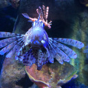
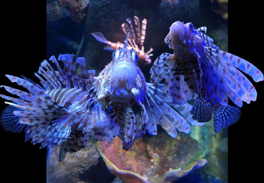
This is my art exam piece- I only had 3 hours on it and so I didn't manage to finish it. If I had longer, I would have tried to incorporate detail and differences in tone throughout the piece, like I did in the middle fish. After my teacher has marked it, I plan on trying to finish it by the project deadline next Friday. Overall I quite like this piece- I like how I started on the fish in the centre of the formation because this one is the focal point. Below is the reference I used for this piece; I looked through my aquarium photographs from the start of my project and decided to use Photoshop to edit three of the lionfish together in the same picture (just ignore the black parts either side- I didn't want to stretch the main image because it would have distorted the main fish, and I'm not overly confident with Photoshop). I really like the composition of this piece and how it is simple yet complex- I like the feel of movement in it. I decided to use graphite pencils in this piece because I am most confident with them. Using them also carries on my central theme of sea creatures deteriorating and dying due to its dull colour in comparison to the vibrant tones of the reference. Due to only having just over a week left on my project I have decided, as I still have a couple pieces to do as well as some sketchbook work, that for my final piece I will probably just finish this piece and create one last awareness / pollution collage with my favourite waste product pieces.
#pollution#awareness#decay#deterioration#marine life#sea creature#lionfish#photoshop#exam piece#art#art a level#fish#sea creatures#graphite pencils
12 notes
·
View notes
Text

To interact with the subject material of my project more, I painted a layer of white emulsion over a visor so I could draw on it. The visor itself is symbolic of the COVID pandemic and so I felt drawing a sea creature on it was relevant due to the amount of waste caused by it (plastic visors like the one above, disposable masks, PPE etc). I found some carbon paper and drew the octopus onto it, which left a black outline on the white layer of emulsion beneath it. I thought, at this point, that the octopus was lacking in detail and so I used a pencil to fix this, although I made sure to leave some areas white. I like how the octopus fits the visor's screen near-perfectly, something I was cautious of when drawing it. Even though this piece isn't as detailed as some of the others I've completed so far, I quite like it. Though I used a different, unfamiliar surface to draw on, I have also used graphite pencils, which I'm fairly confident with. Next, following advice from my art teacher, I'd like to fuse plastic lids together to create a new, even more unconventional surface to paint on.
#pollution#waste#octopus#covid#pandemic#visor#plastic#aquarium#awareness#decay#deterioration#marine life#sea creature
8 notes
·
View notes
Text
This week I completed my art essay and did another of the sewing experiments I did last week. Today, though, I focused on getting more pollution-themed collages done, the one above still under the Halloween theme. This one is much more wild and unpredictable in composition compared to the last one, which I posted a couple weeks ago. It's a more accurate depiction of waste in the ocean- some of the pieces are torn and most are facing different directions. I like how the fish looks like it is swimming through the rubbish and how, like in my other collages, the colour contrast between the fish and the waste is clear and striking. Overall I like this piece and how it is more playful and experimental in composition. I plan on making more of these collages on Thursday, and will complete pages in my sketchbook for each.
#waste#pollution#brands#awareness#netting#trapped#artificial#coloured pencils#sewing#decay#deterioration#marine life#sea creature#halloween#haribo#sweets#packaging#plastic#bright
7 notes
·
View notes
Text


Over the Easter holidays, I wanted to experiment more with the breaking down of waste products in the ocean. I decided to draw a Coke and Pepsi can because the brands are very popular- this is consistent with my theme of using large, instantly recognisable brands to present pollution. I like the vibrancy of the colours used in these pieces, and think the tonal shading was effective. I used a white pencil to add highlights on the Coke can piece and a silver gel pen for the Pepsi can. Overall I really like these pieces, although they were challenging (especially all the creases to give the cans a crushed look)- with these I wanted to slowly break out of my comfort zone to lead to something more practical, which is shown below.


Using the photocopier, I manipulated the colour of the Coke can piece, creating a green, blue and pink version. I really like these and think they would work well in a pollution collage along with the original red one. The colours remain to be bright and artificial-looking, which was my aim. I also like how the photocopier kept the sheen of the original drawing (the highlights on the creases) as I think this gives it a more realistic, three-dimensional feel.


To create something completely different for my project, I needed to use a sewing machine, which I have never used before! I set up the sewing machine (with help from Molly!) and sewed straight lines across the desired image to create a net-like grid. I really like how this process links back to my netting piece at the start of my personal investigation. At first I was a little intimidated as this is something completely out of my comfort zone, but eventually I got more comfortable with the process and enjoyed myself- I'd like to do something like this again soon. I think it would be a great idea to do this process again with one of the sea creature pieces.

After I had finished using the sewing machine, I placed one of the photocopies into a few centimetres of water, letting it absorb some of it for a while. I then took it out of the sink and started to take away parts of the paper to give the piece a rough look, being careful to leave parts of the Coke can so its form could still be distinguished. I then pinned it to some polystyrene to keep it flat and to aid in its drying- I'll post another picture of the finished piece when I get back to college tomorrow. Overall, although this process was completely new to me and out of my comfort zone, I really enjoyed it!
#waste#pollution#brands#cocacola#pepsi#awareness#netting#trapped#artificial#coloured pencils#sewing#decay#deterioration#marine life#sea creatures#saveouroceans
13 notes
·
View notes
Photo
Above is another collage experiment, this time with the graphite turtle instead of the angelfish. Overall I quite like this experiment. The turtle piece is my favourite of my sea creature pieces and I really like how it looks visually with the waste product studies (especially the Randoms and M&Ms). I quite like the composition- although I have surrounded the turtle by six waste products, creating a trapped feel, I feel that it doesn’t look too overcrowded. However, a criticism I would make about this experiment is that the right limb looks a little out of place- it might look better if it was placed behind the Maynard’s Bassett’s packaging instead of in front of it. I think this would create a stronger impression that the turtle is swimming through the waste.
#pollution#waste#brands#turtle#savetheturtles#plastic#ocean#saveouroceans#awareness#colour#coloured pencils#graphite pencils#halloween#collage#art#a level art
9 notes
·
View notes
Photo

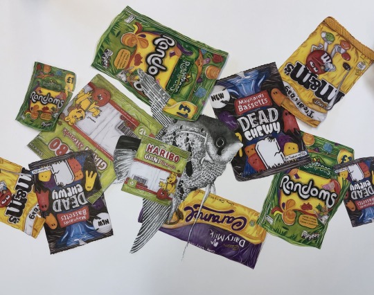
Due to not being in college since December because of lockdown, I wasn’t able to photocopy any of my drawings and, as a result of that, make any more collages for my project. However, I returned to college a few days ago and managed to use the photocopier, so now I’m in a position where I can explore different compositions for my themed, planned collages over the Easter holidays. The one above is a Halloween-themed collage composition experiment (I haven’t stuck anything down yet) where I have gathered lots of my drawings and combined them with a black and white photocopy of my angelfish painting. Overall I quite like this experiment. My favourite part is the colour contrast- the difference between the vibrant greens, yellows, purples, reds etc juxtapose the grey fish, making it stand out as a result (I also carefully considered where to put the fish and decided it looked best in the middle- I will post other experiment photos later). I have also continued my theme of large brands playing a role in oceanic pollution (Haribo, Dairy Milk, Rowntree's etc) which I think is effective. I like how the ‘Dead Chewy’ packaging symbolises death not only because of the name but because of the imagery used on it- this perhaps tells the viewer that sea creatures all around the world are dying because of this waste (it’s also fitting for the Halloween theme). Despite this, I think I could consider a more playful, experimental composition, for example having some of the drawings upside down, as they’re all upright in this experiment. It also looks a little top-heavy in my opinion, so to make it more balanced I could make the fish smaller, for example. Any feedback is really appreciated :)
After getting feedback from my art teacher, I think it’s a good idea to try to be a bit more experimental with my work. This includes drawing / painting on more unconventional materials (like the cardboard piece previously- I’m thinking of making a series of three- and fused plastic), as well as completing a few playful exercises combining the sea creatures and waste products (e.g. cutting photocopies into strips and bringing them together).
#pollution#waste#artificial#awareness#collage#colour#coloured pencils#product#acrylic paint#decay#deterioration#m&ms#Haribo#Dairymilk#sweets#Halloween
10 notes
·
View notes
Photo

Today I have to hand in all my work so far to my teacher for marking! There are four assessment objectives and I think the one I am most lacking in is A02 (exploring and selecting appropriate resources, media, materials, techniques and processes, reviewing and refining ideas as work develops), so I decided I wanted to experiment with painting on unconventional materials such as cardboard to boost this area. This piece is extremely different to all the work I’ve done so far- it’s relatively loose and more expressive, and I’m unsure if I like it or not! For this piece, I collected cardboard, plastic film, tape, a stamp and bubble wrap, items associated with the postal system. I ordered something from Amazon (carrying on my consistent theme of large brands playing a role in pollution) and flattened the box it came in. I stuck it together, trying to create an uneven surface to paint on, tearing it in some areas to give it a rough, discarded look. I also chose to place the Amazon logo in a prominent area. I painted over sections of the bubble wrap and pressed it onto the cardboard to create a print- I really like how this looks and how I layered the white over the black in some areas. I also stuck bubble wrap onto the piece and this gives it more of an interactional feel. I also stuck on paint mixing ‘palettes’ as I felt this gave the piece more of a wild, expressive feel and it made the brown cardboard less dominant. For the turtle itself, I used white, black and grey acrylic paint; this carries on my theme of having sea creatures in shades of grey, symbolising decay. I like how I have contrasted this with the attention-grabbing red ‘fragile’ tape. The colour red is associated with danger, and so I think the tape was used effectively because it creates the impression that the turtle, among many others, is in imminent peril. The adjective ‘fragile’ means ‘easily broken or damaged,’ which in my opinion captures the marine world well. I also like how I continued this red colour scheme in the postal stamp in the top right corner.
Overall, I like this piece but, as mentioned, it is very different to what I’m used to which is why I’m uncertain. The painting itself isn’t the best, but I tried to set myself a time limit on it so I can get other work done too.
#pollution#waste#cardboard#acrylic paint#decay#deterioration#sea life#awareness#marine#expressive#post#packaging
16 notes
·
View notes
Photo
I started and finished this piece yesterday and thought I would post it early! I really liked the variety of colours on this packaging and feel that I have replicated these successfully. Aesthetically, it fits with some of my other waste product drawings, which I like. I thought there might have been too much green and so I made the diamonds (top of packaging) blue instead of green to make them stand out- I didn’t want them to be near invisible to the viewer. I like the shape of this drawing and how, like in the M&Ms drawing last week, I have drawn the packaging after use (the tear in the top right corner), which adds to the impression that someone has littered it. Despite the fact I like this piece, some of the green areas are a little patchy and not as smooth as I wanted them to be, so if I have time I may decide to go back to this piece and amend this. Also, some of the text is a little off- I found it hard to do this accurately due to the curvaceous shape of the packaging.
#pollution#waste#sea life#awareness#randoms#artificial#litter#drawing#study#coloured pencils#art#a level art
11 notes
·
View notes
Photo

I finished this piece this week, and overall I’m relatively happy with it, despite the fact that I think some of my other waste product studies are better and more realistic. It was hard to build up tone successfully on the yellow areas because I had a limited amount of yellow coloured pencils (limited to 2-3). I used a light shade of brown to attempt to create more depth and tone and I think this was successful, but feel I could have been a bit braver with the creases instead of making them so subtle. I like the vibrant colours used throughout this piece and how it continues my consistent theme of waste products being artificial in colour due to their mass-produced, harmful to the environment nature. I also like how M&Ms is an instantly recognisable, popular brand, which fits well with other products I have drawn (McDonalds, Haribo, Maynard’s Bassets, Doritos etc). My favourite thing about this piece is how there is a visible tear in the packaging where it was opened- this adds to the impression that the contents have been consumed and it has then been discarded.
#pollution#waste#sea life#artificial#halloween#awareness#packaging#m&ms#drawing#study#a level art#art#coloured pencils
10 notes
·
View notes
Photo


This week I’ve mainly been focusing on my art essay. I’ve written a lot more (though it still needs to be edited), but have a few more paragraphs to write and I need to develop some of the current ones further, including the analysis of some of my own work. Throughout the essay I have discussed artists who have inspired my work the most (Todd Forsgren, Veronica Steiner, Joel Penkman for example) and have talked about how they have influenced me. I have also written about environmental activists who have inspired me, though I still need to work on this paragraph and add in images of the awareness posters I have produced so far. The essay is supposed to be illustrated and so I have included images of the artists’ work that has been the most influential to me. I have also included images of my own work that I feel relates most with the artist studied.
#art#essay#pollution#sealife#awareness#greta thunberg#david attenborough#Artist Research#marine#aquarium#turtle#savetheturtles#research#analysis#writing#waste#wildlife#conservation#packaging#response#marine environment#marine life#drawing#coloured pencils#graphite pencils
28 notes
·
View notes
Text
I’ve recently been working on the piece above for my lunch-themed collage (crisp packets, plastic bottles, coffee cups etc). I quite like how this piece is looking at the moment- I especially like the dark blue area and how I have made visible creases here, alluding to the fact that the waste product has been used and littered. I also like how it says ‘nothing artificial’ on it- a consistent theme in my project has been drawing waste products like this one in bright, artificial colours. So, in a sense, the ‘nothing artificial’ contrasts with the strong, artificial colours of the product. I still need to draw in all the blackcurrants, add detail to the leaves, finish colouring in the straw and the top and bottom of the carton.
#sea life#a level art#art#pollution#bright#waste#artsy#natural#ocean#aquarium#coloured pencils#caprisun
14 notes
·
View notes
Text
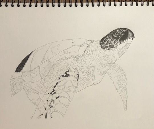
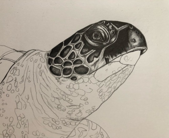
Above is a photo of the second finished graphite turtle piece. This drawing took me a few days to complete- I put lots of effort into it. Comparing it to the graphite turtle at the start of this project, I think it’s clear how much I’ve improved and developed my skills with the graphite medium. I used darker tones in this piece compared to the previous one (ranging from 2H-8B on this one), and I also think the proportions are far more accurate. I especially like the dark tones on the turtle’s shell and main limb, and how this gives the drawing more depth and a three-dimensional, more realistic feel. I wanted to incorporate as much detail as possible into this piece, and I think that on the whole I accomplished this. Overall I really like this piece as it shows how much my art has improved; I also really like the composition. This piece was quite a challenge because the reference I used cut off the end of the turtle’s main limb and the back one, and so I had to improvise and extend them to “complete” the drawing. I think this was successful- I looked through various other turtle images in order to make them accurate.
#sea life#a level art#art#pollution#bright#waste#artsy#natural#ocean#aquarium#graphite#sea turtle#savetheturtles
9 notes
·
View notes
Text
Recently I realised I’ve been focusing mainly on drawing waste product pieces, so this week I decided to start a sea creature one.
I think I’ve improved greatly since the last graphite turtle piece I completed. The outline of this piece took ages to complete, but I think spending so much time on it was beneficial because the drawing is correct proportion-wise in my opinion; the turtle above is a lot more proportional than the last one, which I finished at the start of the academic year. I also like how I have used darker tones on the turtle’s head, which I will continue to use throughout the piece (mainly on the shell and the scales on the limbs). I intend to use softer tones on the turtle’s neck and main body, which will hopefully accentuate the darker tones.
So far I quite like how this piece is progressing- I’m looking forward to finishing it. This piece will perhaps go in a Christmas pollution-themed collage (wrapping paper, sweets, decorations etc) or a COVID-themed collage (hand sanitiser, disposable masks, medication, etc). I will post updates on this soon.
#sea life#a level art#art#pollution#bright#waste#artsy#natural#ocean#aquarium#graphite#work in progress#awareness
20 notes
·
View notes
Text

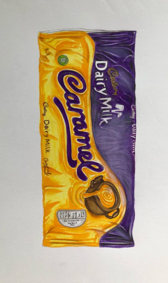
Above are two more waste product studies. The one on the left was started in my art exam yesterday, and after the exam I decided to finish it. Overall I’m quite happy with the result, but feel the packaging may have had a bit too much brown! Despite this, I like how the brown works well paired with the dark blue and other bright colours of the smarties, providing an element of contrast. The brown represents the chocolate that was inside the packaging, so in this sense I think the mass of brown is justified. I also like how the packaging has been opened and that I showed this in the study, further presenting the fact that products like these are littered after they are used. The Dairy Milk caramel study isn’t the best study I’ve done by any means, but I do like the yellow section and how I’ve built up tone here. However, I don’t really like the purple area of the study because I had a limited array of purple coloured pencils.
#sea life#a level art#art#pollution#bright#waste#artsy#natural#unnatural#ocean#artificial#packaging#brands#dairymilk#smarties#chocolate
10 notes
·
View notes
Text


Pictured above are some research pages from my sketchbook that I have done recently.
Veronica Steiner strongly influenced my collage work. Steiner creates beautiful images which possess animals (typically animals such as owls and crocodiles which are generally seen as being less beautiful) surrounded by flowers, skeletons and various other objects. Using the same approach, I’ve been combining both drawings of sea creatures and waste products. Steiner’s use of contrast between living animals and the skeletons particularly influenced me because the skeletons suggest a deterioration. The barn owl piece surrounded by grey poppies influenced me the most, and I have went into detail as to why this is on the sketchbook page.
Ben Frost inspired my idea of incorporating pop culture into my work through the plastic Finding Nemo characters. Frost is an Australian contemporary artist best known for his bold, irreverent pop art and his kaleidoscopic mash up paintings that take inspiration from areas such as graffiti and collage. I was particularly influenced by his McDonalds pieces and the others pictured on the sketchbook page.
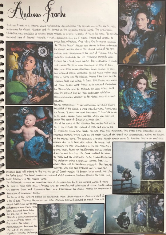
Andreas Franke is an artist extremely relevant to my project and its aims. Franke is a Vienna based photographer who exhibited 24 portraits under the sea to raise awareness for plastic pollution and its impact on the decaying marine world. The exhibition contained some of Franke’s portraits of people “drowning” in a sea of plastic, trapped and unable to break free, reflecting what life is like for marine animals. I thought how interesting the pieces were when I first saw them, and was intrigued by the role reversal of people and sea creatures. By having humans trapped inside these webs of plastic opens people’s eyes to the reality of oceanic pollution. The image depicting a baby provokes an emotional response and the viewer instantly wants to help it. This begs the question: why does this desperate need to save this innocent baby not extend to the marine world? Doesn’t marine life deserve to be saved too? I have went into more detail on why I chose to study Franke’s work and how he has inspired me on the sketchbook page.
#sea life#a level art#art#pollution#bright#waste#artsy#natural#unnatural#aquarium#ocean#artificial#packaging#artist research
33 notes
·
View notes
Text

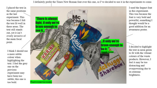
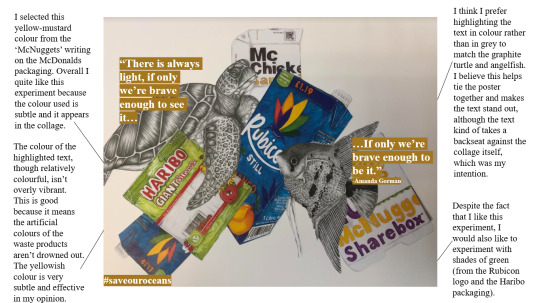


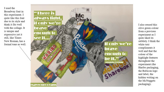
Above are some of my awareness poster compositions for one of my completed collages. I experimented with various different fonts, including Times New Roman, Impact, Stencil and Bernard MT Condensed. I also experimented with font sizes- I think the experiments with the larger fonts look better visually in my opinion.
Recently, Joe Biden was inaugurated, becoming the 46th president of the United States. Kamala Harris made history by becoming the first female Vice President. Amanda Gorman, the youngest inaugural poet in US history, read an inspirational poem at the inauguration. A particular quote that stood out and inspired me was “there is always light if only we’re brave enough to see it. If only we’re brave enough to be it.” This quote aligns with my belief that one individual can have a profound impact on issues in the world, including pollution, which can result from just on individual littering. Although Gorman’s quote regarded the issues facing America after the presidency of Donald Trump (🤮) and the recent storming of the Capitol, her quote can be applied to numerous different problems such as deforestation, climate change and pollution. The quote is inspirational, providing a light at the end of a long, seemingly unending tunnel. It encourages people to be the person who instigates change, to be the one who raises awareness for the environment and its plight. The quote suggests that people can change for the better, helping the environment recover from the issues facing it, if only we’re brave enough to make a stand. Gorman, like Greta Thunberg and David Attenborough, has informed my work and its course through her quote, which I have featured on the above experiments.
This was my first attempt at making an awareness poster so please let me know if I could include anything else, or if you have any suggestions!
Also: which one is your favourite? I need to decide on a final version and, while I’m still experimenting, these were some of the best ones in my opinion.
#sea life#a level art#art#pollution#bright#waste#artsy#natural#aquarium#ocean#unnatural#contrast#graphite#coloured pencils
9 notes
·
View notes