
I’m Nix, I dissect how my thinking processes felt during learning to teach you about drawing
Don't wanna be here? Send us removal request.
Statistics
We looked inside some of the posts by celestiquetower and here's what we found interesting.
Average Info
Notes Per Post
2K
Likes Per Post
2K
Reblog Per Post
518
Reply Per Post
4
Time Between Posts
7 days
Number of Posts By Type
Text
13
Last Seen Tumblr Blogs


Fun Fact
69% of Tumblr users are millennials.
Text
Intuitive character design flow
It’s a huge topic, so it takes a while to test it out and refine, but I really want to drop the structure 🥴 It works like an attention distribution system so you don’t waste time and energy guessing around or getting your vision blurred because you try to do several things at the same time, which compromises the overall quality. I figured this out specifically for the anime-style I’m aiming for in my future game, but I guess it works for all +- complex characters.
First of all — your character brief. You can’t do a meaningful design without knowing anything about your character.
Example loadout (cunning, provocative):
• Core unit (who is this character?): Fox. The thing you recognise this character at first glance as.
• Support 1 — focal point. (What is this character’s core thematic/truth?): Nemiza (a symbol I chose). “Can you move on when not every part of you is ready yet?”. Attach images of symbolism/any center piece speaking the character’s inner world.
• Support 2-3 (What is this character’s mood?): (texture/color/pattern): colors primarily leaning into dark green-teal with orange/light orange accents since he's a Paragon tier (my world’s colour coding). I chose something round + sharp for his mood (I will choose 1 and iterate). Attach images to your brief.
Attention distribution steps
1. Core unit
Character identity, personality & story/thematic/rough form language.
Sketching characteristic poses if needed — helps crystallize character attitude feel to establish emotional connection, even just in rough mannequin form. This is the brief we just established above
2. Finding inspiration (what type of clothes?)
Doesn’t have to be a once-and-for-all decision — look what suits your character. Would your youthful character wear short sleeves, shorts? Would your regal character wear long, vertical clothing shapes? What’s the clothing piece that demands most attention — puffy coat with sleek trousers? A big glove or shoes? A hat? If everything is equally important the design becomes a mess. It’s all about hierarchy
3. Plain black whole character silhouette
What is this pokémon?
4. Layering of medium shapes
Take a lighter color and block in individual big shapes like the coat and trousers
5. Basic details
Take an even lighter value and block in smaller shapes like belts, zippers or other accessories. Messy is ok
6. Place accent shapes (Support 1)
Why is it placed where it’s placed (can be symbolic)?
7. Determining the compositional path and visual rhythm
Details that are not on the compositional path can have less contrast (e.g. from shoulder to hip, from chest to hand). I have a tutorial about visual rhythms. Just having a general idea is enough
8. Sketching the character with basic outfit shape, nothing fancy yet.
I added this step because I found it difficult to do interesting clothing shapes right away, so I decided to make the shapes plain (a basic t-shirt or jacket).
9. Add patterns (Support 2-3)
Patterned fabric? A pattern going along the edges? Choose your fighter
10. Start deforming clothing cuts into more interesting shapes inspired by previous pattern placement.
You can add colors at this stage, but grayscale is okay. It's more efficient in case you change the design later
11. Determine materials for physics and rendering
12. Sketch character in poses. Does the design work?
13. Color and texture
13. Structural sketch (front, side, back) so the outfit translates into 3D in your mind. Basically concept art
14. (optional) FX
I attached my attempt on point 8-10, though I still need to tame the beast of visual rhythm in characters and making turnarounds, so it’s not finished yet. I will edit this post in case something changes, but I don’t expect massive changes at this point.


Technical skills used in this path:
Basic color harmony
Human anatomy/proportions (simplified)
Texture implication
6 notes
·
View notes
Text
It’s kinda weird when I know I got a lot of theory to post, but I haven’t polished it into a clean path yet. I need to test it out first and analyse my thought process during the test. So, if you were wondering why I have such gaps between posts — that’s why.
2 notes
·
View notes
Text
Perspective distance shrinking principles
That's a topic I found it difficult to find information for, so I tried to get to the bottom of this. Scale. How much exactly do objects shrink with distance? How do I know how big a house should be in the distance? Once this clicked into place my pictures finally started to feel right.
The horizon line is your eye level, not end of the scene
Subconsciously I perceived it as the end of the scene sometimes. But it's just on which height your eyes look at the scene. It's not a "wall" — it's where things converge if they're far enough. So if nothing stretches infinitely far away, it doesn't converge into a dot.
-> Shallow scenes = little shrink. The difference in scale between foreground and background is mild. -> Deep scenes = more exponential shrink. Sizes start to compress faster, especially the closer they are to the "back wall" of the scene. Think of it like this: foreground — you can fit x3 of the same distance between objects. Then 2 of a smaller distance than the first one. then 1 of a smaller distance than the previous. That's how perspective lines converge into points.
At the horizon line, if your object isn't an infinitely far away dot, the object appear to touch the horizon line with their tops or middles, depending on height and position.
Anchor size
The thing that helped me to stop doing a scale-soup: Determine an anchor object (usually a human because we all intuitively know a human's height. Or a door). Place one into the foreground and into the farthest point of the scene (background). This helps you feel out the space in-between these two points. Just a symbolic sketch will suffice. It's a guide, not a necessary part of the scene. Now, if you connect the tops and bottoms of both of them you can determine the object's size all the way through the scene, so you now know exactly the stool's size relative to the human(object) anywhere in the scene. Or the house's size. Everything else is determined in relation to each other.
Technical skills used in this path:
Perspective 1/2/3P
6 notes
·
View notes
Text
Guiding light through hue and shadow — unifying the color-mood of a scene
I was away for a while because I studied a lot. That means — I got a lot of reserve material. And here I am to throw it at you.
The biggest topic for me was color. I was struggling so hard to make it look unified. Whenever I tried it looked like a child did it unless I copied the colors from somewhere. So, I took a hue-bias (warm orange as my background) and started to try. The colors here are analogous (color harmonies), so it was pretty easy - when I needed a more bluish-looking orange I took a grayer shade of orange or when I needed a green I took a darker & desaturated tone of yellow. This made it look more blue in relation to the warmer oranges and the yellow-green integrated well too since it is still in the warm color space. But then I tried thumbnails containing man-made things and stumbled.

I first thought it was the structure to blame since organic shapes are harder to get "wrong". But then sketched a few structures and found that I was fine with them. That's where I noticed — the colors I tried to use here contrast too much, meaning they're further apart on the color wheel (the lower structure was supposed to look yellowish in red light, but I grew annoyed with that one and didn't finish). So, the further apart the colors were, the harder is was to get it right.

I started to think: how exactly does desaturation work and color shift work so the object still reads as its local color without actually being it? How much does it get desaturated? How much does it lean in a different color? Here's what I found out: -> The further apart the colors (complementary, like a blue object under orange light) and the lighter the light color is, the more it gets desaturated (because complementaries cancel each other out and lighter color implies less saturation automatically). The more saturated the light color is, the less the hue shifts away from the original hue. Let's look at it on an example:

The 1 is the background color, 2 is the original color of the blue napkin, 3 is the color of the blue napkin under the light and 4 is the light color. If you look at 1 and 3, you can see how the hue on the circle shifted from orange to a more red hue. If you look at 4, you see that the light color is pretty saturated, so on 3 the new "blue" didn't shift much toward grey.

Now I took the same color of the napkin and background, but changed the light color closer to white. 2 is the blue under this light. We can see that it shifted toward grey way more than before and has a greater shift from orange. If the previous one was more red in hue, this is more pink.

Now just to show the shift from green — the blue under the light (medium saturation green) became a more grayish cyan. BUT. There's something we haven't considered.

To make the previous examples I used the light color and a brush on 50% saturation. So what happens if we change the light intensity? Here I took the same light color, but brushes with 20% opacity and 80% opacity. On the upper one we took the napkin blue as the original color and the light shifted in only slightly more towards cyan in hue and a bit grayer. On the lower one with 90% opacity we got also a slight shift towards cyan and slightly darker in value and saturation.
-> What we could see in all of these examples — every time the local color of the napkin got affected by the light we got a decrease in saturation and hue shift. Only the intensity varies. For the hues — saturated, half/more intense light — the new hue of the object doesn't shift much from the original hue of the light. BUT for less saturated and less intense light the hue shifts a lot from the original light hue, if not even starting at the object's local hue.

Okay, that's all great, but... In which direction does it shift? On the examples with blue and orange above the hue always shifted along the lower half of the color circle where the darker colors are, counter clock-wise from blue, even if the distance is even from both sides. But what with other colors? I took a green and purple napkin this time — local colors on the right, light-changed colors on the left.
Green and orange aren't too far apart on the wheel, both in the top, light half of the circle. The hue shifts from green predictably more to the yellow in-between these two and gets only slightly lighter and desaturated. But purple and orange are on different halfs — purple is way darker than orange. Here the hue shifts from purple towards orange a bit more, landing in the reddish-pink zone — still purple enough to be read as purple and red enough to communicate the warmth of the orange light — while decreasing saturation drastically.
In these cases, the hue change under light doesn't start from the light color like the blue/orange combo did — it starts with the local color and shifts towards the light hue. This is because these colors are closer to each other on the wheel and don't cancel out each other's colors as much.
Technical skills used in this path:
Color harmonies
6 notes
·
View notes
Text
Objects… Or how to make yourself think about what kind of details to add to your scene
While drawing, even though I cracked how to structure scenes, there’s something I kept avoiding — objects. They’re small and you need to come up with a whole new set of things to use in a scene so it makes sense and doesn’t look boring or out of place. I asked chatGPT to help me get through this block and it worked really well — now I can unfold environments, narratives and even other objects around an object. I get an abstract prompt from my AI and unfold everything around it myself. Decided to share this in case it helps someone overcome this block too. Here’s the framework and one of the examples I created through it.
Start with a Purpose
What needs to happen here? Is this object meant to carry, block, illuminate, warn, memorialize, invite?
Invoke the Invisible
What unseen story surrounds this object? Who used it last? Why did they leave it behind?
Material as Metaphor
What is it made of? Does that material reflect its importance? Age? Cultural value?
Contextual Echo
Is this object lonely? Repeated? Broken? Out of place? What feeling does it want to awaken in the viewer?
Name It
Don’t say “jar” — say Moonfire Vessel of the Eastern Oracles. Naming sharpens design intent
“An object that waits”
This object is meant to unlock forgotten memories. It’s like a diary with reflective pages that reflect the echoes of KSR characters. It’s not meant to be discovered in full form, but sometimes there are pages of it in random places - in camps, pits, storages, abandoned anomaly field research places. The pages mixed with Fesis’ book pages are waiting to be discovered to unlock paths unseen before. Let’s take the field research place - there are wooden boxes in icy fields, a campfire to keep warm, a teapot to brew hot drinks and also some thermoblankets infused with flamehearts pulsating slightly at the campfire, losing their energy after being abandoned. The researchers clearly ran away from this place judging by how chaotic it looks like. There are some flamehearts that already lost their energy and don’t glow anymore - there is a slightly glowing everlasting ice cave behind the camp that absorbs warmth - that’s why everything kept losing energy. The researchers were looking for the echo page and found it - it was lying on a toolbox in the camp, but something big came and left icy footprints, chasing them away. There were also some high-tech domes that served as tents, but more solid (and pretty transparent) to shield them from wind and keep warmth. Now, the mirror page was inside one of the two domes, waiting to be discovered by someone to echo their memory from a parallel cycle. It seems to never age - it’s like a reflective, refractive paper. The one dome it lays under still maintained working energy while the other one was already long shut off.
4 notes
·
View notes
Text
I found out something about painting environments no one tells you about
Okay, I got an idea how to draw one. Further steps? My brain lagged. But I debugged it and proudly carry the information into my blog because it made me level up my thumbnails in 4 days of active exploration.
I was fumbling around with no idea how to approach these small invisible decisions that we make for a picture. I already knew about the shape size variation thing we should do to make scenes look better, but it still looked chaotic. Pros probably learn it intuitively, but I gave it a language — here's the trick:
💫Value layering💫
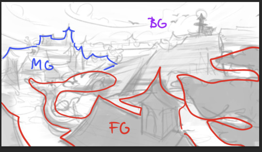
Foreground, midground, background. Each of these scene layers has it's own dominant value. Look at these pictures — they go from dark (FG) -> light (BG) with some transitional values in-between these layers to keep it cohesive. This was an important insight that helped me greatly. Depending on the mood (which is the first thing you should determine) the arrangement of values can vary. You can make a dark BG, light MG and midtone FG. Your choice.

The next aspect of a scene to keep in mind — shape rhythm & tempo control. A visual rhythm is basically the same feeling of a form (angular in the examples above) repeating through the whole scene. It makes everything look more cohesive and intentional. Here are some things to consider to manage your visual rhythms and bring in interest (variety):
Repetition You repeat more or less the same shape throughout the scene. Look at the examples above — foliage, branches, rooftops — all has pretty sharp angles.
Size variations Big, medium, small. Always adds interest.
Directional flow Let the shapes look into different directions. You can point them to the focal point (I will revisit this later in this post) or just elsewhere for variety. As long as it doesn't disrupt the composition.
Contrast/disruption As long as it doesn't disrupt the composition? Now we "break" this rule. We add another form — in the pictures above (1, 2) there is a curve leading us into the scene. It's not angular, so our eye is drawn to this contrast amidst the triangles. It's a compositional element and leads us through the scene.
Rhythm tempo Now we arrive at FG/MG/BG again. As each layer has its own dominant value, they also have different rhythm tempos — generally, how often the shape repeats in one layer, how tight they are placed to each other, how big they are and what edges they have. First, repetitions and spacing: -> Fast tempo = tight spacing, lots of shapes and variety — creates a feeling of noise. -> Slow tempo = bigger gaps, fewer shapes, less variety — creates calmness. -> Dynamic tempo = a mix of both above. Most interest. Size: -> Small shapes = fast. -> Big shapes = slow. -> Medium shapes = medium tempo. Directionality: -> Shapes look in different directions = more chaotic, more movement = fast. -> Shapes look in the same direction = more calm, order = slow. -> A mix of both would make it dynamic. Edges: -> Smooth edges = calm = slow rhythm. -> Jagged, broken, complex = visual noise = fast. -> Mix = dynamic.
Readability So... How do we actually manage all this calm and noise? -> Fast tempo = can become too noisy with too much variation and clutter — hurts readability. -> Slow tempo = easier to read — fewer elements competing for attention. -> Dynamic tempo = highest potential for both clarity and interest if variation is controlled well. A rhythm in the overall scene can be: -> Fast + clear = readable. -> Fast + messy = unreadable. -> Slow + clear = very readable (but probably boring) -> Slow and messy = confusing.
How to choose a rhythm?
Start with emotion - Calm -> few large shapes, simple edges -> slow tempo. - Busy -> many small/medium shapes, complex edges -> fast tempo. - Ancient -> repetitive + fractured, with some disorder -> mid-fast tempo. - Holy -> balanced spacing, symmetrical, slow variation -> slow tempo. - Tense -> uneven spacing, jagged silhouettes -> mid-fast. - Organic -> smooth edges but asymmetrical shapes/spacing -> mid.
Choose shape language - Round = Soft, friendly. - Rectangular = reliable, stable, grounded. - Triangular = dynamic, tension, danger. -> Mix these for mixed shape feeling.
Keep variation within a shape family - Similar base shape. - Different scale, rotation, spacing. - One shape type (language) + 1 disruptor form.
Visual function
Elements in the scene have a function — shape families — groups of visual masses that feel related in some way. Here are the ones I found:
Anchor shapes — create stability, calm, structure. Examples: ground planes, cliffs, walls, main body of a tree (think: heavy/chunky).
Directional shapes — add motion or guide composition. Examples: rivers, roads, tree branches, smoke, shadows (think: pointing/leading somewhere).
Accent shapes: add tension, life, story hooks, draw in attention. Examples: anything high contrast, elements that pop.
Bridge shapes — connect different forms/planes, prevent image fragmentation, unify areas. Examples: mid-ground trees, archways, transitional rocks, buildings between land and sky (think: "melting", mood, readability).
Rhythm shapes — create a beat/visual pulse, tempo, pattern, pacing.
Framing shapes — enclose the focal point/guide attention inward. Examples: foreground branches, cave entrances, architecture.
Texture — add visual noise, realism, material surface info.
Atmospheric/mood shapes — suggest weather, tone, emotion without physical form. Examples: fog, glow zones, backlight haze, dust.
Story shapes — carry narrative or cultural/worldbuilding info.
Many shapes serve several functions at once. A broken tower might be an anchor, directional form and story shape at the same time.
This is my progress in 4 days: Beginning

Today (the first attempt after figuring things out)

#clarity frameworks#tower entries#environment#environment design#digital art#digital painting#drawing tutorial
6 notes
·
View notes
Text
🧪 Character Arcs 101: what they are, what they aren’t, and how to make them hurt
by rin t. (resident chaos scribe of thewriteadviceforwriters)
Okay so here’s the thing. You can give me all the pretty pinterest moodboards and soft trauma playlists in the world, but if your character doesn’t change, I will send them back to the factory.
Let’s talk about character arcs. Not vibes. Not tragic backstory flavoring. Actual. Arcs. (It hurts but we’ll get through it together.)
─────── ✦ ───────
💡 what a character arc IS:
a transformational journey (keyword: transformation)
the internal response to external pressure (aka plot consequences)
a shift in worldview, behavior, belief, self-concept
the emotional architecture of your story
the reason we care
💥 what a character arc is NOT:
a sad monologue halfway through act 2
a single cool scene where they yell or cry
a moral they magically learn by the end
a “development” label slapped on a flatline
─────── ✦ ───────
✨ THE 3 BASIC FLAVORS OF ARC (and how to emotionally damage your characters accordingly):
Positive Arc They start with a flaw, false belief, or fear that limits them. Through the events of the story (and many Ls), they confront that internal lie, grow, and emerge changed. Hurt factor: Drag them through the mud. Make them fight to believe in themselves. Break their trust, make them doubt. Let them earn their ending.
Negative Arc They begin whole(ish) and devolve. They fail to overcome their flaw or false belief. This arc ends in ruin, corruption, or defeat. Hurt factor: Let them almost have a chance. Build hope. Then show how they sabotage it, or how the world takes it anyway. Twist the knife.
Flat/Static Arc They don’t change, but the world around them does. They hold onto a core truth, and it’s their constancy that drives change in others. Think: mentor, revolutionary, or truth-teller type. Hurt factor: Make the world push back. Make their values cost them something. The tension comes from holding steady in chaos.
─────── ✦ ───────
🎯 how to build an arc that actually HITS (no ✨soft lessons✨, just internal structure):
Lie they believe: What false thing do they think about themselves or the world? (“I’m unlovable.” “Power = safety.” “I’m only valuable if I’m useful.”)
Want vs. need: What do they think they want? What do they actually need to grow?
Wound/backstory scar: What made them like this? You don’t need a tragic past™ but you do need cause and effect.
Turning point: What moment forces them to question their worldview? What event cracks the surface?
Moment of choice: Do they change? Or not? What decision seals their arc?
🧪 Pro tip: this is not a worksheet. This is scaffolding. The arc lives in the story, not just your doc notes. The lie isn’t revealed in a monologue, it’s felt through consequences, relationships, mistakes.
─────── ✦ ───────
🛠️ things to actually do with this:
Write scenes where the character’s flaw messes things up. Like, they lose something. A person. A plan. Their cool. Make the flaw hurt.
Track their beliefs like a timeline. How do they start? What chips away at it? When does the shift stick?
Use relationships as arc mirrors. Who challenges them? Enables them? Forces reflection? Internal change is almost never solo.
Revisit the lie. Circle back to it at least three times in escalating intensity. Reminder > confrontation > transformation.
─────── ✦ ───────
🌊 bonus pain level: REVERSE THE ARC
Wanna make it really hurt? Set them up for one arc, and give them the opposite. They think they’re growing into a better person. But actually, they’re losing themselves. They think they’re spiraling. But they’re really healing. Let them be surprised. Let the reader be surprised.
─────── ✦ ───────
TL;DR: If your plot is a skeleton, your character arc is the nervous system.
The change is the thing. Don’t just dress it up in trauma. Don’t let your character learn nothing. Make them face themselves. And yeah. Make it hurt a little. (Or a lot. I won’t stop you.)
—rin t. // thewriteadviceforwriters // plotting pain professionally since forever
P.S. I made a free mini eBook about the 5 biggest mistakes writers make in the first 10 pages 👀 you can grab it here for FREE:
#writingtips#writingadvice#writeblr#writingcommunity#tumblrwritingcommunity#writersonline#amwriting#writinghelp#writinghack#storystructure
2K notes
·
View notes
Text
Awareness model I use so you can shape your own tower-explorations
Nix’s 5-Step Awareness Loop
You are never too dumb. You can do everything — you just need to find the path your mind takes and build one around the obstacles when you hit them. Everyone goes through this, aware or not. Being aware of it just reduces the friction that difficulties create — “work smarter, not harder.” It’s usable in other fields than drawing because it’s a general cognitive awareness training process, but I will use drawing examples since that’s how I can explain it best.
1. Trigger Detection
“I hit a wall.”
The moment of discomfort or resistance becomes your signal, not your enemy.
2. Contextualization
“Is it mood-based or a skill problem?”
Am I internally resisting (fear of failure, you don’t like the task, disappointment in self) the task or lack the skills to execute it?
3. Obstacle Analysis
“Why? What looks dissatisfying?”
Dissect the emotion and the artifact. Is it aesthetic? Technical? Emotional? Sometimes it helps to compare your work with the one that has the skill level you want to find these elements.
4. Workaround Creation
“How do I work around this?”
Instead of forcing it, you navigate — changing tool, task, angle, or mindset. From the previous step you clearly know the problem, now it’s easier to find a solution. If red didn’t work, try blue. Maybe mix red and blue. The key is to try different approaches, not hitting the wall until it breaks. This step makes you unstoppable.
5. Integration
Record the insight — in your blog, journal, mind, or process memory — so next time the wall feels less like a cliff and more like a puzzle.
I use a process I call “emotional documentation”. A small entry with the following structure: What felt off (even a vague description, just document the emotion it began with)? What made me realise it? What do they do differently? What workaround worked for me?
I do it so I can remember the feel of the insight so next time I hit the same/a similar wall I already have a map. The more maps you stack — the more you notice — your awareness expands the internal database it pulls from.
Good luck with your explorations! :)
7 notes
·
View notes
Text
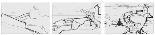
How to steal like an artist (and still create something new) part 2: thumbnailing environments (composition + design)
For several days I felt blocked, unable to imagine the final piece. I tried to draw the building in 3D to better visualise it in space - but it was still difficult. Nothing felt right. Until I remembered a question I constantly forget to ask before starting a drawing:
What does this environment feel like?
This is the base question that will influence my composition decisions. I designed a tower from which people jump and glide all over the kingdom. This function and the overall wind kingdom theme already gives me cues for the form language I need to use to bring over the feeling I need:
High/vertical forms (for showing the forms stretching upwards towards the birds)
Open space (sky, probably a worm’s-eye perspective. Should feel like freedom)
Wind (curled forms/diagonals, link to the culture)
Yellow-red color gamut with blue contrasts for the steppe integration. Something like that (not final):
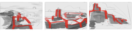
I sat down and brainstormed: how do I start? What’s the most essential part? Perspective and zoom. I can’t start drawing without knowing from where I’m looking at the tower.
For the start I decided to go with diagonal from the tower, either from below or from the top, like we’re birds looking at it. I wanted to show the tower AND the kingdom receding into the background around the lake.
First of all: don’t even try to just draw in the building right away while exploring thumbnails. Draw boxes and simple forms in perspective first - we just need to explore how the picture will feel, where we feel the weight in the picture. Silhouettes are enough. Perspective doesn’t have to be perfect. Don’t try to do something impressive at this point — that’s a job for later, otherwise we get caught up in unnecessary things using our energy on things that we likely won’t even use. Thumbnails are supposed to be messy for exploration.
At least that’s what I’ve been stuck with, subconsciously wanting to create some impressive detailed thumbnails pros do on youtube. Messy boxes go brrr. Save your sanity.
To get into the feeling of space in my head (not exploring composition yet) I just started with some random rotations of the abstract scene draft
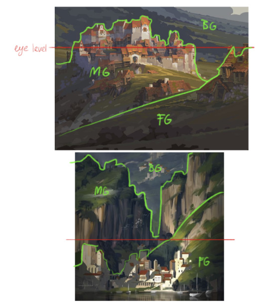
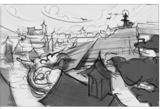
Okay, space clicks. Let's talk layout: Foreground, midground, background. I took a few artworks to analyse how they're build. You can pretty clearly distinct the layers, which creates depth = sense of space.
Let's throw some overlapping boxes/shapes onto the canvas to explore different layering variations, since overlapping creates the illusion of depth. When I look at the observations above, the layering feels like something 2D to me (to think about it in the thumbnailing phase). I will really focus on just create random boxes without thinking of the place as a 3D minecraft server much.
Now I think we got something that looks closer to an artwork with a composition. Now - how do we actually use composition?
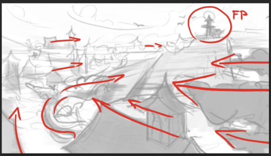
Currently I decided to go with this thumbnail. I won't be able to implement my tower design in this one, but anyways, it was still a good practice. Let's take it on the canvas size we're going to draw this artwork on and dissect how the eye goes through it. Composition is pretty fluid, but usually follows the principle that the focal points have the most contrast = most interest, everything else is supporting the eye-path towards it.
For those perfectionists like me: the focal point doesn't have to be something grandeur/with a lot of meaning and importance. It can just be an object that doesn't make you rethink your entire existence. For me it's a smaller silhouette of the tower in the distance — just because it's the highest point of the wind-kingdom and so does create a feeling of altitude and wind, which is the core theme. In the end, we just need to show that it's a wind kingdom. So much about choosing the focal point.
You can have several focal points, but they should have a hierarchy. Composition is just the path your eyes take through the picture. Let's talk about paths:
Leading lines I chose this point of view because it has a good view on the whole circle-formed plateau. We look from the beginning of it and the road leads our eye to the focal point — the tower. In the foreground (FG) I got a tree, which horizontally-shaped chunks look into the direction the road goes. The edges of the buildings there are also aligned with the diagonal road direction, which makes me look from the lower right diagonally to the middle-left. There, another tree chunks look into the direction of the road and into the direction directly of the tower, directly over the lake. From there we transition into the middle ground (MG). The MG is slightly less detailed, but the leading lines (edges of roofs) still align with the direction of the curve, guiding us from the middle-left towards the background, the top right.
Other compositional elements The BG has least detail. The buildings are now just horizontally aligned. The shape of the clouds, the birds flying towards the tower and the sun setting behind the tower's roof all are compositional elements so our eyes end up at the tower. In addition, the bright sun contrasts a lot with the dark silhouette of the tower, creating more contrast. That's also a compositional element we will talk about next.
3. Light & shadow I made a rough map of how I envision the shadow shapes. Here the right side of the picture is rather dark at places where the sun rays fall behind the object. The more behind — the darker the other side of the object. The dark planes in the lower right half are on the background of the also darker plateau side planes, so they don't stand out much out of low contrast. The left, light part's shadows aren't very dark, so there's also not much contrast. But the sky where the sun is and the tower? That's the high contrast point that draws our eyes in.
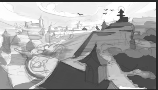

4. Color I just messily brushed in the colors I chose at the beginning. At the tower I used the blue & red for the contrast. For the other buildings I let them melt more into each other, but the shadows are more blue (sky ambient light, I can dissect this in another entry) and the planes hit by sunlight are slightly more yellow.
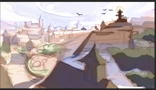
Finally, we got the final sketch!
Videos used for understanding help:
1. https://www.youtube.com/watch?v=ViEPZsLolls&list=PL-ndvBIAbfwgIrNN8panNWqf-mMQyEIaf&index=5 2. https://www.youtube.com/watch?v=QU3oPFqHLuM&list=PL-ndvBIAbfwgIrNN8panNWqf-mMQyEIaf&index=3
Technical skills used in this path:
Light & shadow
Color theory (color contrast)
Perspective
Composition: FG/BG/BG; leading lines; light/dark and color contrast
"The emotions raise through light and rest in color."
#tower entries#emotional architecture#environment#environment design#celestique teachings#clarity frameworks#art as cultivation#perspective#art#digital art#composition#color#lighting
9 notes
·
View notes
Text
How to steal like an artist (and still create something original): creating an environment, part 1
In a previous post I talked about how it felt to make building thumbnails. But there I got lucky that I came up with details to use — usually I have a really big block with that. I constantly want to make something original. To come up with things myself. Therefore I often forget to use references. I used them, but for inspiration for the bigger forms — and the smaller remained blurry in my head. So I was stuck in guesswork and got frustrated often. Then I explored — what's the path to make this work more smoothly?
I started drawing existing building thumbnails I found and looked what made them interesting. A youtube video also helped me (link at the end of this post). Here's what I found out:
Terrain first: The buildings are built on it. Is it flat? Mountaineous? Are there broken off rocks nearby? Is the building on a cliff?
Complexity factors to make them look interesting: height and width variety & depth (overlap of different parts) and size variety
Surrounding nature: Maybe there is a tree or ivy growing at the building?
Use simple forms to create: Simple forms are simple, but adding them together or cutting parts of them is what creates complexity & interest
These are the fundamental things to build the silhouette. But how do I come up with detail? Here's what I found out:

I decided to take Chinese and mediterranean architecture vibes and threw together some references found on shutterstock and normal image search. Usually it's better to use few references so that the results remain cohesive, but I gathered a bit more for the exploration part — for the separate designs I'll limit myself on fewer forms.
I put these references together and outlined some forms that I liked on these pictures. Now I need to decide: what kind of building will it be? Important buildings would be bigger & detailed, while simple houses are kept less eye-catching for composition purposes. I will go with a gliding tower placed on the highest point in the kingdom.
I am doing a wind kingdom on plateaus — so this time I need to have an image of a place, not just a building. The building is just the focal point. But I have big difficulties imagining a whole place together (usually photos of cities look like a lot of houses thrown together into a pile and organically grown cities are too structureless for me to understand and implement at this point), so how will I do it? Let's take a look on a few top-down views of villages (because cities are too complex to understand):

Often villages and cities form around its terrain. The buildings are arranged in an imperfect grid. Simplest layout. But if I build a top-down layout of a lot of buildings arranged in a single grid it will look too uniform.

Radial layout from the center creates some "pizza slices" and continues the road in different directions (up/down/right) and break in smaller branches. The center is a clear focal point + the right road leads to a second, secluded one, on a more mountaineous terrain. But generally, we can see how these houses are grouped together in clusters.
That's something we can try now. I will go with this shape of plateaus arranged around a lake:

I roughly divided the platforms into a grid going from the tower. Doesn't have to be final, we just need something to put our houses on.

Randomly spread some houses on the "slices" I created and added some shadow to roughly indicate the landscape (value variation would also do, just haven't thought of it right away). The streets naturally formed in-between the houses. I haven't done everything since I just need the part around the tower.
Now I have an idea of how the environment looks like and I can map it better in my head. Now we need to define the buildings in this area: the tower, safety gear store, maybe a small restaurant, pantry with stuff to maintain the tower or an administrative building, since it's the focal point of the city, someone's houses. Normally defined by function. We also can add some nature around. When I have difficulties deciding what's going to be there — I ask ChatGPT what types of buildings could be in such an area or research. Doesn't always come naturally to me.

Now to thumbnailing the buildings! I start with just randomly stacking some boxes in 2d frontal, rooftops and some forms using the observations stated before: terrain (flat), height and width variations & overlap and size to make this look interesting. I'll explore some more iterations behind the scenes (the first idea usually isn't the best one).
In my experience, it's inadvisable to start with complex shapes right away. Use simple shapes (boxes).

Once I'm satisfied with the silhouette I go back to the details I outlined on the references and use some of them to bring these boxes to life. Basically the things we "stole". Some simple shadows for depth. I will do the same again for smaller buildings, but with less complexity.


I will continue with drawing this in perspective and thumbnailing in part 2 so it doesn’t get overwhelming all at once :) (I am out of breath myself)
#tower entries#worldbuilding#celestique teachings#clarity frameworks#environment design#environment#layout#cityscape#thumbnails
7 notes
·
View notes
Text
The emotional physics of line: drawing a face with feeling
"The flow dances through every emotion held by form."
I sat down and analysed the way I draw faces. How it feels like. In this tower entry I'll go with realistic proportions since it's important to know how it works before stylization. But first, there is a foundational concept I need to explain — the emotional physics of line. This allows you to create drawings with energy. Dynamic.
Even if you don't draw movement, the lines still can look dynamic. I'll dissect this topic in the next post. As an example, I decided to take this picture:

Looking at it I feel the movement of the sleeves. I believe everyone knows how fabric feels like when you take it at two points? The space in the middle is hanging down due to gravity. Or when you grab only one point and swing the fabric? The swinging energy follows the grabbing point in inertia. You can imagine this feeling when drawing lines — the lines are moving.
Here's how I mapped the energy flow of this picture using this feeling:

Now to drawing the face: I'll use the Loomis method to build the head. You can't draw a face without feeling the head's volume. The face sits on a form — it doesn't float.
I drew a circle for the head and a smaller, squeezed circle. This maps the side of our head — where our ears are.

This is how placing the smaller circle works:

Then I cut the smaller circle vertically and horizontally, the horizontal line marking the line of the eyebrows — now we got a center point at the intersection. Extending the horizontal line onto the big circle feels somewhat like doing it on a cube. From there I go down in a slight curve and end the line where I want my chin to be. Everything left from the line is the face (the line cuts the face at the cheekbones) and right from it is the jaw and ears.

Now I add a slightly tilted ellipse for the ear in the lower right section of the small circle. The tilted line expands downward and meets with the slightly tilted upward from the chin line of the jaw.
A bit lower from the brow line (aligning with the top of the ear), approximately at the middle of the head, I draw a line where our eyes will be. At the half of the lower head half I draw a line for the nose (aligned with the bottom of the ear), and half on the lower half's half, aligned with the jaw angle, is the mouth. The top half of the upper half gives you the hairline. So, we got out facial proportions.
The positions can vary depending on individual facial features, but that's not important right now.

Facial features: I determine the eye's width and use this for measuring the proportions. If you have difficulties determining the width— take a circle.
Use one eye's width to measure. There's space for:
One eye between the two
One eye between the eye and the side of the face
And one eye between the side of the face and the ear
Width of the nose = space between inner eye corners (can vary); width of the mouth = center of the eyes. Now we just need to insert the features.


How to draw the features is already a different topic about anatomy, but knowing this is enough to start with.
To return to why I mentioned the line energy concept above for faces, I sketched a stylised sketch of an anime face. For a drawing that feels like something the line energy is more important than the technical structure. But of course, the foundation needs to be set.

Technical skills applied in this path:
Gesture (the emotional physics of line)
Loomis head construction
Facial proportions
"The face you're drawing is waiting to be felt."
#tower entries#clarity frameworks#emotional architecture#celestique teachings#proportions#drawing#face#art as cultivation
8 notes
·
View notes
Text
Environment design: mental framework for designing buildings
A building isn’t born from blocks. It’s born from attention.
For a long time, I struggled to draw cities. No matter what thumbnails I sketched, they didn't feel right. They felt boring and soulless. Until I decided to treat each part of the scene with care. I rushed, quick to iterate my thumbnails. I thought the more I iterate, the bigger the chance to find the layout I liked, that something would click. But the issue wasn't the layout - it was the soul. I drew boxes, but they felt empty and weird.
Out of desperation I decided to draw some buildings separate. Frontal. I didn't know what to do, so I stayed longer on one building — added shapes, cut shapes. Varied the size of shapes. Doors, windows, columns, patterns... Until I realised — this finally felt right. It transformed from a soulless box into a beautiful building.

I noticed the result. I stopped. I reflected — how did I feel during the process? I didn't rush. I tended this one thumbnail with care — like I had all the time in the world to care about it until it becomes beautiful, like it has a soul — and it got one.
The problem wasn't the layout. I can't create a scene that feels like something with big shapes alone, even if I try to make them interesting. Generally, city street layouts are pretty boring — streets are just straight. Buildings are just boxes. Sometimes shaped more interesting than streets, but still boxes. The detail is what makes the scenes feel alive — not the layout.
Intended outcome feeling:
Sci-fi + Hawaiian. Eerie symmetry and order. A city that feels "too clean".
Technical skills applied in this path:
Perspective (behind the scenes, for composition thumbnails. Not that important for designing buildings if you do it in frontal).
Shape language
Color psychology
Color contrast
Value contrast
Composition in design (focal point = most contrast)
Big, medium and small shapes
Scale indicators (the little human figure at the sides of the buildings so you can imagine how big the building is)
If you’ve ever felt like your environments were hollow, maybe they’re not empty. Maybe they’re just waiting to be seen.
#tower entries#emotional architecture#clarity frameworks#celestique teachings#art as cultivation#environment#design#environment design#building
7 notes
·
View notes
Text
What path does your mind walk to reach its destination?
This is the Tower of Celestique.
A place where insight crystallizes through metaphor. Where drawing is not just a skill — but a dialogue between soul and structure. Here, I archive the frameworks, reflections, and breakthroughs I’ve gathered in the quiet — in other words, I analyse my process of learning through meta-cognition and turn this into understandable structures. Welcome to the height where clarity begins. Feel free to ask for topic breakdowns.
@empressgarden — main blog
2 notes
·
View notes