Don't wanna be here? Send us removal request.
Text
Reflection
Since i've finished both of the outcomes I have planned to finish, I believe my FMP went really well, as I usually don't manage to finish what I originally set to do at the beginning of my projects due to a variety of reasons, usually due to lack of time.
I think I have managed to complete most of the targets I set for myself each week and for my project as a whole, and it has been pretty successful as a whole in my opinion in terms of my final outcomes.
In my last reflection post I said that I was going to only do flat colour for my second artwork because I didn't have enough time, but instead i've managed to completely finish it - adding shading as well as a background. I'm pretty proud of managing to finish both artworks, and i'm happy that i've managed to complete the goals I had set up for myself at the beginning of this project.
0 notes
Text
Final outcome - Second character illustration
Overall, I really like how this piece turned out, and I think it visualises what I had in mind before I drew this super well.
Compared to my first drawing, I think I like how this one turned out more, as I am a bigger fan of the softer shading style as well as the choice of colour palette in general. I think my two final outcomes look great, and i'm very proud of what i've managed to achieve during these weeks, and the time and effort spent sketching and putting my all into these pieces.
It took me around 6-7 hours to complete this illustration, which I don't think is that bad for something like this. Although similarly to my last drawing, I struggled a little bit with ideas as well as artblock which hindered some of my progress.
Personally, I think both of my outcomes turned out well, as well as match the theme I chose.

youtube
0 notes
Text
Research - Presentation techniques
In order to showcase my final outcomes, I need to display them on slides so that they can be viewed both efficiently yet still be able to look professional.
Therefore I have decided to research different ways that are available to present artwork like mine.
0 notes
Text
Working on second digital illustration - Lighting and background
The final steps for my artwork were to complete the shading and the background. For my lighting, I wanted it to be a soft, gentle light that casts over a little bit of my character, almost like a bittersweet sunset. Since my character's expression was similar to that, I wanted the lighting to portray that same feeling as well. So I decided to try and make my lighting similar to one you would see during a nostalgic evening.
When I chose the pose for this particular drawing, I originally envisioned my character laying on a field of grass - so that's what I ended up drawing. I did a simple drawing of some grass, using a brighter, lighter green for patches of the ground and a brush that looked like pieces of grass for the actual grass itself. I also drew a small blooming forget-me-not, as I thought it would make the artwork have a stronger bittersweet feeling to it, as a lone flower might make the whole thing seem lonely yet calming at the same time.


0 notes
Text
Working on second digital illustration - Colour and shading
The next steps of my drawing were to colour it and shade it. Using my character colour palette sheet, I copied the right colours that I needed and used them in the appropriate places. Once the flat colour was done, I finally moved onto shading my work. I used the exact same method of shading as I did for my previous drawing, but I decided to try and use less harsh shading style to try and give my piece a more softer and serene feel to it to better match the aesthetic of my theme.
I used a darker shade of the hair colour to start shading the top parts of her hair, blending it out and adding a brighter colour on the middle of the hair to try and give a shinier feel to it overall. For the rest of the clothes I tried to not use too much dark shades for the creases, instead opting for a lighter and more transparent shade for some areas of the dress especially.
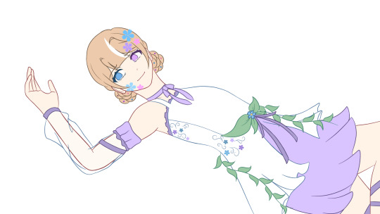
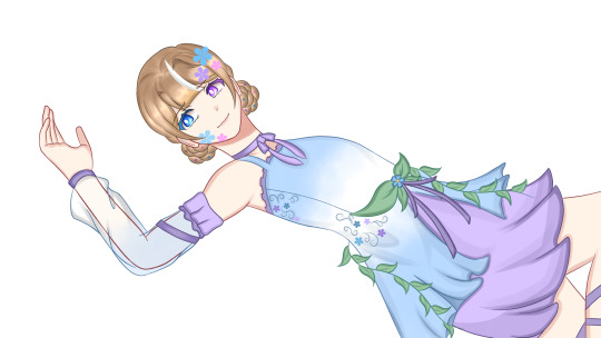
0 notes
Text
Working on second digital illustration - Lineart
After I finished my first artwork, I then started to work on my second character's one, this time repeating the same processes I used before.
I first started off with using the base of the pose I picked before starting to draw my character's hair and face. I wanted her to have a bittersweet and almost solemn expression, so I tried to make her look at the ground next to her longingly, as forget-me-nots tend to symbolise remembrance and loyalty.
After I was done with the main parts of the head, I moved onto the body, and started to sketch out how I wanted her clothes to look like in her position while using my character sheet as a reference. Once again, I used red and blue brushes so I could easily differentiate my sketch from my final lineart.
When the sketch was done, I smoothed out any lines and went over my sketch lines with my normal brush colour and finalised my outline.


0 notes
Text
Final outcome - First character illustration
When I finished my drawing, I used the time lapse option on ibisPaint to export my video as a speed paint. This means it shows exactly how I went about drawing my art, as well as each step I took and compiles it into one quick, shortened video that lasts for 1-2 minutes.
My whole drawing took me about 8-9 hours, which I think ended up being this long because i struggled a bit with how to draw certain parts of my character and or background, and it was just time consuming in general.
Overall, I am quite happy with how my first piece turned out, and I really enjoyed drawing my character as well as adding all the details and shading. I also feel like i've improved my digital art skills, as this piece really made me think about how I needed to approach an artwork like this, and how I could use my time more efficiently by, for example, duplicating bits of my drawing instead of drawing them again and again. I also think I managed to use the most out of drawing in a digital format, as I used a lot of features such as different brushes and blending modes, etc.
I like how this drawing seems sort of imposing, which I hope conveys the passionate meaning of a rose flower, and I also really love the shading and lighting I did.
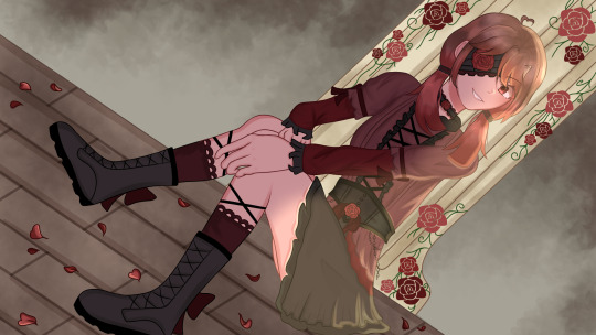
youtube
0 notes
Text
Working on digital art - Lighting and background
The last things I needed in order to finally complete my digital art were the lighting and background. I wanted the lighting for my character to be pretty simple, so I decided to go for a sunset like colour that shines on half of my character, and for the shadows to be a less noticeable dark red colour behind the light in order to hopefully make the lighting pop out more. I used an airbrush mixed with a normal pen brush for my lighting, using a softer colour for the initial light before going over it a little with a normal brush to sharpen and brighten some of the edges.
For my background, I wanted to have something that my character would lean on since that is what her pose implies, so I thought of the idea of drawing a stone pillar that had roses growing around the edges and sides of it to give it a run-down, mysterious feel to it and to make it look more detailed. I drew the roses using a rose brush that is included in the ibisPaint app to free up some time effeciently instead of manually drawing every rose by hand. As for the ground, I went for wooden tiles/planks as I thought that would blend in well with the rest of the background.
I still wanted to incorporate bits of my theme into my background, so I then added some fallen rose petals on the ground as I thought that would make a nice addition to finalise my work.
This piece would be used during a still cutscene during a game such as a visual novel.


0 notes
Text
Research - Different art styles part 2
The Case Study of Vanitas
The Case Study of Vanitas has a similar art style to most animes/mangs of today, but it still contains a lot of distinct features that I really like and think is worth to research about.
There is a lot of detail that go into the characters' hair and eyes, as you can see in some instances each strand of hair or eyelash. This attention to detail really makes the art pop out at you.


Studio Ghibli
Studio Ghibli's style is very well known for being really appealing to look at, as the characters are drawn in a simplistic way yet also still looking distinct simultaneously. Since the animation is very commonly hand drawn, it means that there isn't much need for excessive details like too much shading. Instead, the main focus is on the characters' whole body: their faces, hair, clothes and just how they are structured overall.


Disney
Disney has one of the most recognisable art styles out there, and their many animations have even paved the way for other individual styles, for example mickey mouse popularised the animation style of rubber hose.
A lot of the old animation were all hand drawn, giving the characters an almost soft tone to them as the colours used were also usually toned down and muted, especially the backgrounds. There was a big emphasis on showcasing the characters' personalities through their expressions and actions, and the characters were drawn in a realistic and naturalistic way, much like classic storybooks.


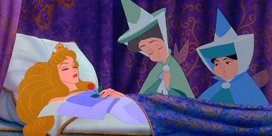
The Summer Hikaru Died


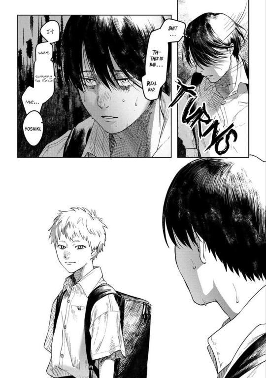
0 notes
Text
Reflection of goals
For my FMP, I wanted to draw two character designs based off of flower symbolism, as well as producing two final fully coloured digital illustrations.
However, as I don't have enough time to fully finish two illustrations, I have decided to complete one character illustration fully, and only do the lineart and flat colour for the other character.
0 notes
Text
Target audience
For my FMP, as I am focusing on character design and illustration for a game, I want my audience to be anyone that likes playing games and enjoy character concepts such as mine. My main target audience would be teenagers, but could also be young adults.
0 notes
Text
Weekly targets - 28/04/25
Complete second digital character illustration (only lineart + flat colour)
Work on finishing first illustration
0 notes
Text
Research - Ethics of AI art
Because my FMP is focused on art, I have decided to look into the ethics of AI generated art, a very notable issue in today's society.
AI art is visual 'art' created through the use of artificial intelligence programs. This means that anyone can go onto one of those programs to ask it to generate an image or artwork. There are a number of ethical concerns about this, the most common one being how AI takes away human creativity as it is a machine, as well as taking away what it means to draw meaningful, passionate art.
Another major concern is how AI art is trained and how it's taking away human artists' work. Programs that use generative AI allow the AI to be trained off of other, real artists' works. This means that AI art is actively harming actual artists, as it is basically stealing their work and even their art style. Since AI art is seen as more effective, it is also taking away people's jobs as people would rather use an AI that can generate artwork in a matter of minutes, rather than commission an artist and wait for them to finish a drawing. Some people also may argue that AI artworks lack a soul, as it didn't come out of somebody with a passion, but rather a non-living machine that has no consciousness.
There is also the issue of the impact AI has on the environment. Research shows that just by simply generating one image uses as much energy as charging a phone. Studies also show that compared to other uses of AI - such as generating text and asking questions -generating images by far uses the most energy. Generating 1,000 images with a powerful AI model is responsible for roughly as much carbon dioxide as driving the equivalent of 4.1 miles in an average gasoline powered car.
However, there are also some positives of AI art. It can even prove useful for some artists who want to experiment with different styles and composition, allowing them to create a drawing themselves that was first planned with AI. It can also save time for a lot of people, making the planning stage for artists to go a lot quicker, as they can generate an art composition idea or brainstorm quickly instead of having to do it themselves.
youtube
youtube
0 notes
Text
Working on digital art - Colour and shading
Then I moved onto the final parts of my main drawing. I used the previous colour palette I made in order to start adding flat colour on my work, making sure to follow the layout of colours from my initial concept. When I was satisfied with that, I finally moved onto shading.
I started shading on my character's hair first, adding the highlights on the bottom of the hair as well as darker and lighter parts near the centre and top bits. I also added a slight shine to the hair, which I think makes the hair feel a lot more prominent. I also worked on making the eyes look prettier by adding dark and light spots onto it, and shading my character's skin by adding shadows as well as adding a small blush.
Afterwards I moved onto the clothes, using a similar technique for shading the hair. I first used a slightly darker colour for the base shading, and then went over it afterwards with an even darker colour to make the creases stand out.
As I am quite familiar with the app IbisPaint, I didn't need to look at any tutorials to help me with my work.


0 notes
Text
New timeline
23/04 - 27/04: Work on blog (Research, outcomes)
28/04 - 30/04: Finish off digital art (Background)
0 notes
Text
Research - Different uses for flowers
Medicinal
Flowers are used in a variety of medicines, and are known to have medicinal properties. For example, lavender is known for its calming effects and can be used to reduce anxiety and promote relaxation, and is often used in aromatherapy. Roses are not only symbols of love but also hold medicinal value, with rose petals being used to cool and soothe in teas and oils.


Decoration
Flowers are most commonly used for decoration purposes, and are usually seen in special events such as weddings, parties, birthdays, funerals or even just in someone's house. Flowers are used as decor for many reasons, most notably for their ability to add colour and beauty to a space, as well as to convey sentiments and help connect people to nature.


Food
Flowers can even be used in food, and can be seen in a variety of different recipes. They are commonly used to add flavour, colour, taste and texture to foods. Flowers can be used to decorate desserts, or even added into salads and ice cream to make it taste floral and sweet.


Perfumes
Flowers are a common scent for perfumes, as flowers are known to have a lovely and sweet smell. Some common fragrances include rose, jasmine, lavender and gardenia, etc. Many perfumes include these types of flowers and are a very popular choice for scents.


0 notes