citrusdigest
citrus digest
the little sketchbook in your pocket / project for emerging tech / kylie marchitello
16 posts
Don't wanna be here? Send us removal request.
Last Seen Blogs

bees-chan
I Heard You Wanted Bees

second-reveil
QUENTIN ANDRUP
kdrama-icons
kdrama icons
tweedyplumbing
Tweedy Plumbing

lorome3546
Untitled
Photo
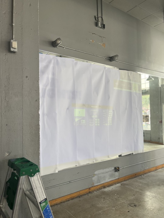

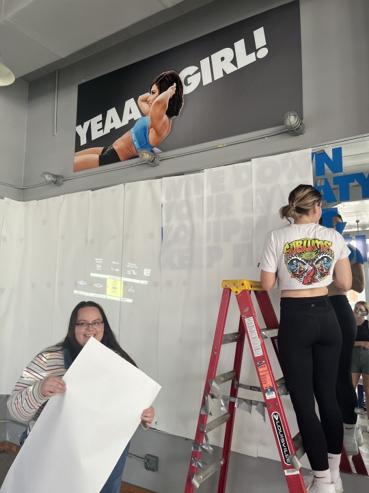

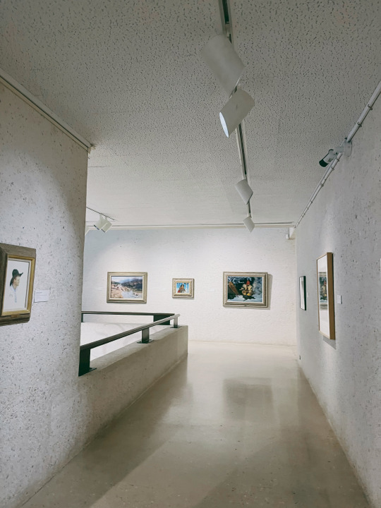
Projection Mapping final product! This project helped me gain even more experience with working in groups and hosting an exhibition. It was cool to use a projector for the first time and I hope I’ll be able to use it in future projects as well! This project also allowed me to see just how vast the world of data visualization is, as everyone in our cohort thought of a new solution to the same prompt. Overall it was nice to see the outcome and be able to work alongside my talented friends .
0 notes
Photo


Colour Journal paintings process! This project taught me a lot about colour theory. It was nice to be able to select colours I think would look well together, and throughout the process I had to make some executive decisions in order to achieve what I wanted. For example, the cherries highlights were originally a dark red colour, however, when I painted the cherries I realized that this highlight portion would not stand out against the other dark colours around it. So I decided to use a light pink instead. Overall I really enjoyed this project and was happy with the final product.
0 notes
Photo
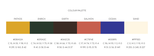
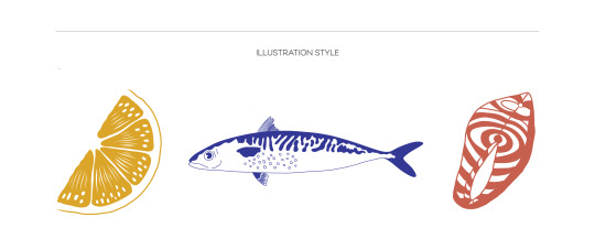
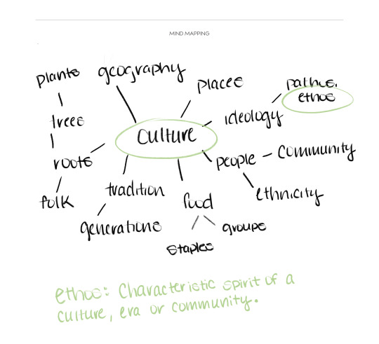
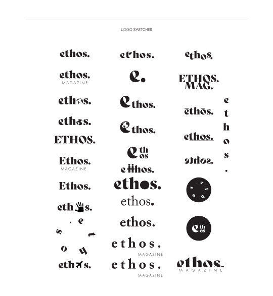
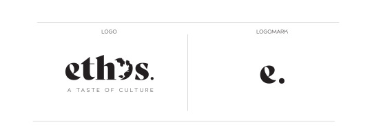
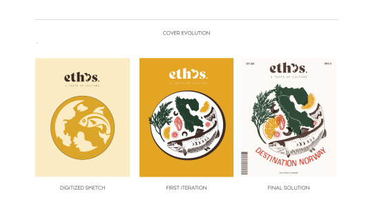
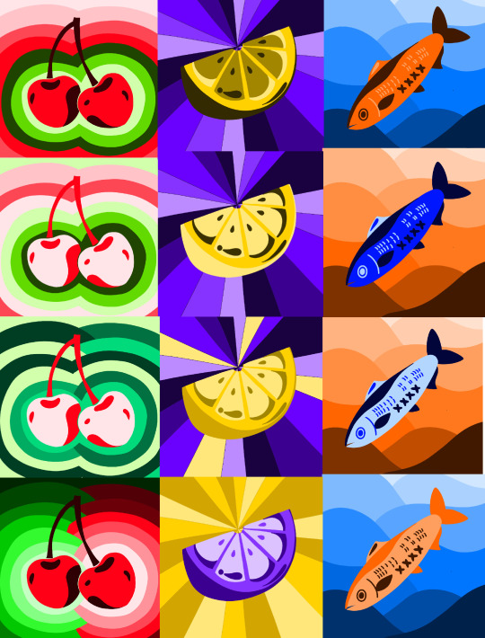
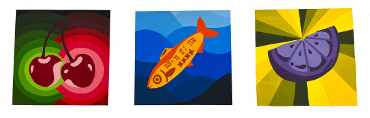
Creation of my cover for Publications! This project really challenged me to pull out some illustration skills that I’ve been avoiding. I taught myself how to use fresco for this assignment and it was definitely worthwhile, as now I prefer it over what I had been using which was procreate. Brand identity is something I’m slowly learning to really love, as it almost feels like a puzzle to solve for me. I started off with mind mapping various sectors of food and culture in order to come up with a strong branded name, and eventually settled on Ethos. I feel this was a simple yet distinguishable way to encapsulate the entire idea of the magazine. Next I selected my colour palette, which was bold yet organic versions of colours that I felt could be varied enough to give me a wide range of illustrations. My illustration style was to be sketchy and bold with blocks of colour and fun patterning and cross hatching, which gave even more visual interest. The final cover is a concept of salmon soup (which is a traditional delicacy in Norway) made up of Scandinavia and various food items that would be found in this dish. The end result ended up more alluding to the concept rather than the literal iterations from the start. I was happy with this outcome as it allowed me to create an illusion of either a meal or the shape of an earth. Overall this project taught me to challenge myself more and get outside of my comfort zone to learn even more skills and programs
0 notes
Video
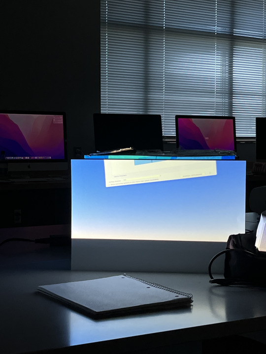

This particular week we learned all about projection mapping. Turns out it’s a lot easier than I would have thought. We did have a few issues trying to get our laptop to project in the beginning but it was a simple fix to change permissions within the computer itself. I learned that with projection mapping the most important component is making sure your concept comes across well, the rest is simple. In order to make a great concept, it’s important to make sure you research your topic and have a visual that is accessible to everyone that is easy to understand but is also visually interesting.
0 notes
Photo
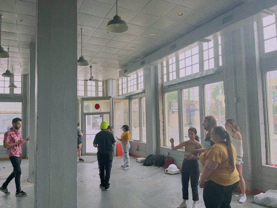
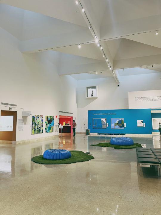
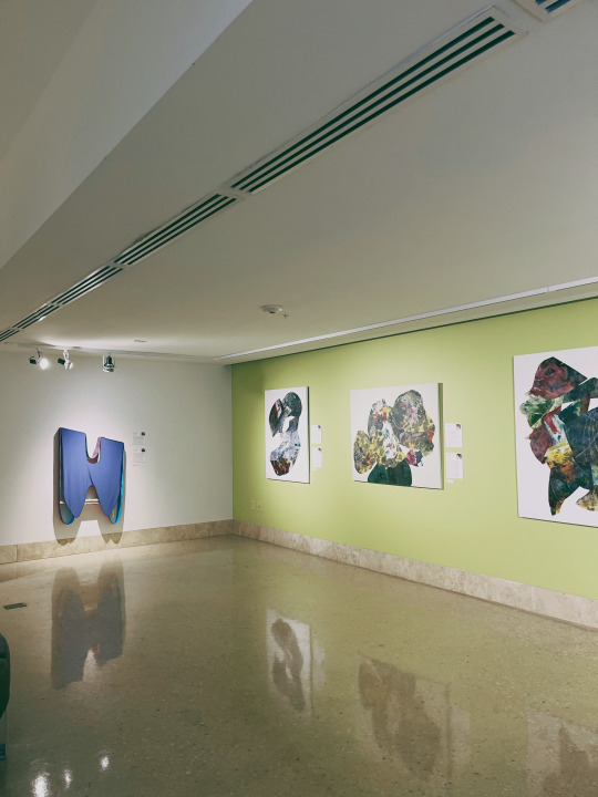
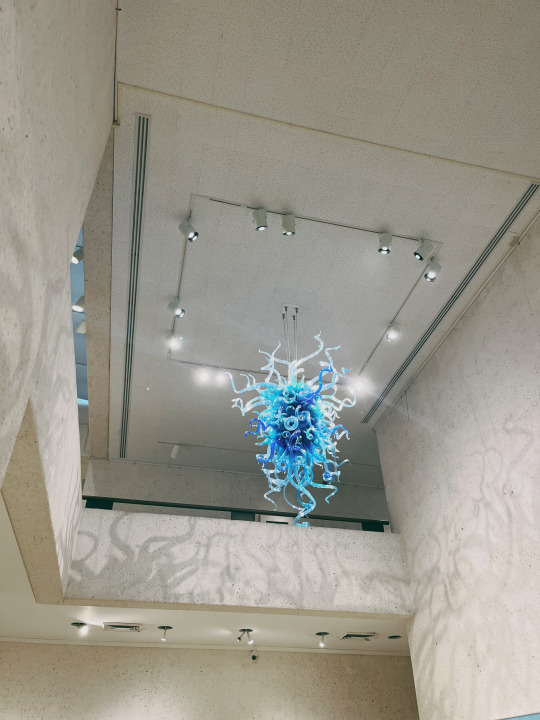
Scoped out places for our projection mapping today. It was my first time visiting the art museum down here in corpus. It was definitely a cool experience as this is the farthest I’ve gone as far being involved with the planning process of projects. This week I’ve learned about what all goes into planning for projection mapping- turns out it’s a lot of math! I didn’t expect to have to measure walls but it definitely makes sense to plan ahead with that stuff. Going to the location made me even more excited for the exhibition and I can’t wait to see it come to life!
0 notes
Video
My motion layer to my risograph poster! This was a great way to get back into using after effects after a long hiatus. It was interesting to mess with all of the different presets that after effects offers. I ended up going with this rainbow motion effect to the text to give it some colour to relate back to the colours on the poster. Additionally, I added in some images to give the effect that the camera was taking a photo. If I were to do this assignment again, I think I would’ve created more of a “video” type of AR element, that gave more context to the product itself and the SD card. We also used Artivive for this and I loved how simple it was to use.
0 notes
Photo
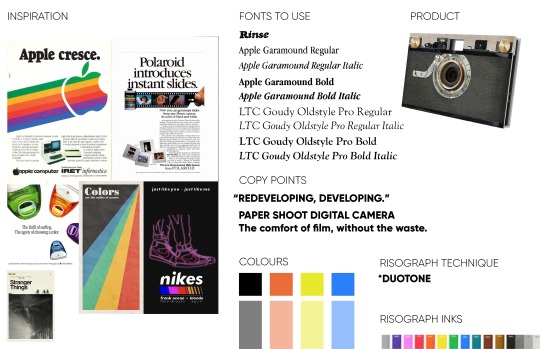
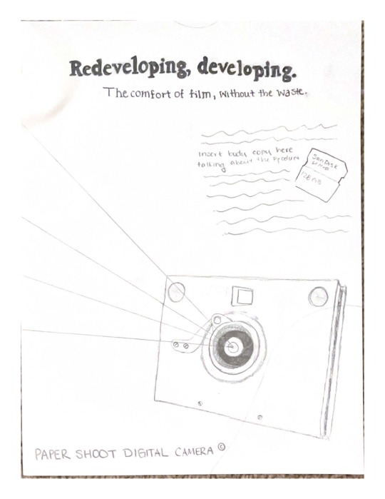
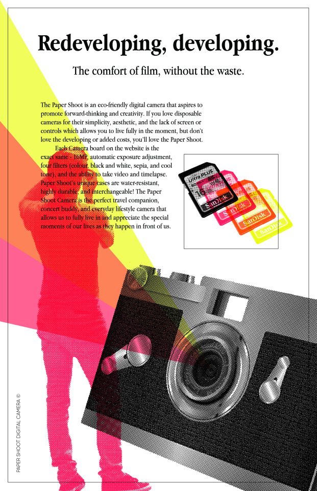
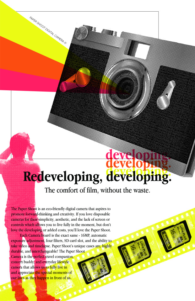

This project was an 80s inspired poster that was to be printed on the Risograph. This was my second risograph assignment and I was able to take more chances with layering the inks. I learned how to use multiply on illustrator which came in handy with my magazine assignment in publications. I also learned about how to create a halftone effect which adds a super cool visual element. I’ll definitely be using these techniques in the future.
0 notes
Photo

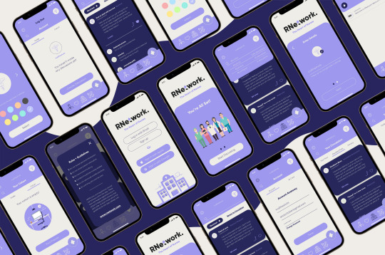
The final product of my UI/UX project. This one tested my ability to create something based off of real-life problems from real people I interviewed. This particular week taught me a lot about the importance of making sure your concept is solid and solves an issue. There are a lot of ideas that I could think of for problems I’d LIKE to solve. But, with the process of interviewing, mind mapping, word listing, and user testing. I was able to create something that has a real shot at working beyond just my designer bubble. I was really happy with where my logo ended up as well.
RNetwork+ is a HIPPA compliant forum based app that allows nurses to connect and vent to other nurses.
0 notes
Photo

I interviewed 16 different people for planning my UI/UX project. Throughout the process of asking questions I realized halfway through that I needed to frame my questions in certain ways in order to get people to answer specifically what I needed. For example, a question I asked was relating to problems people had post-graduation. This created a lot of the same answers relating to jobs. I ended up changing the question to be something more like, name 3 problems you had post-graduation in your work life and hobby life. Additionally, I gave them an example after the question to let them know the problem didn’t have to be something as grand as finding a job. It could be as simple as not knowing when to water their plants. This allowed for more discussions to open up, and within those discussions I was able to come up with an idea that was unique.
0 notes
Photo

Worked with Adobe Dimension for the first time (I’ve worked with it before but never to this extent.) I didn’t realize the extent of how much you could do on that program and it definitely will help me with future mockups. I spent forever on Adobe stock just looking at all of the cool downloadable items to use. Its super helpful because I struggled to take photos of my packaging projects but with these 3D renderings I can create seamless ones without all of the photoshopping. This program is definitely super fun to mess around with. (I’ve once again used oranges in another project, hence citrus digest.)
0 notes
Photo

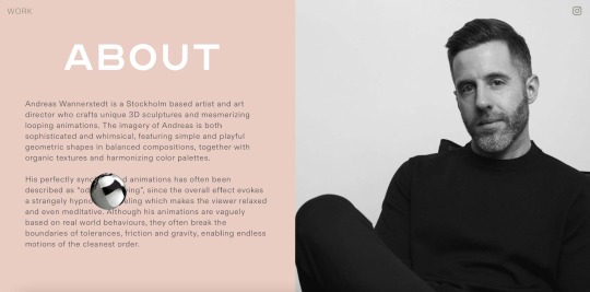


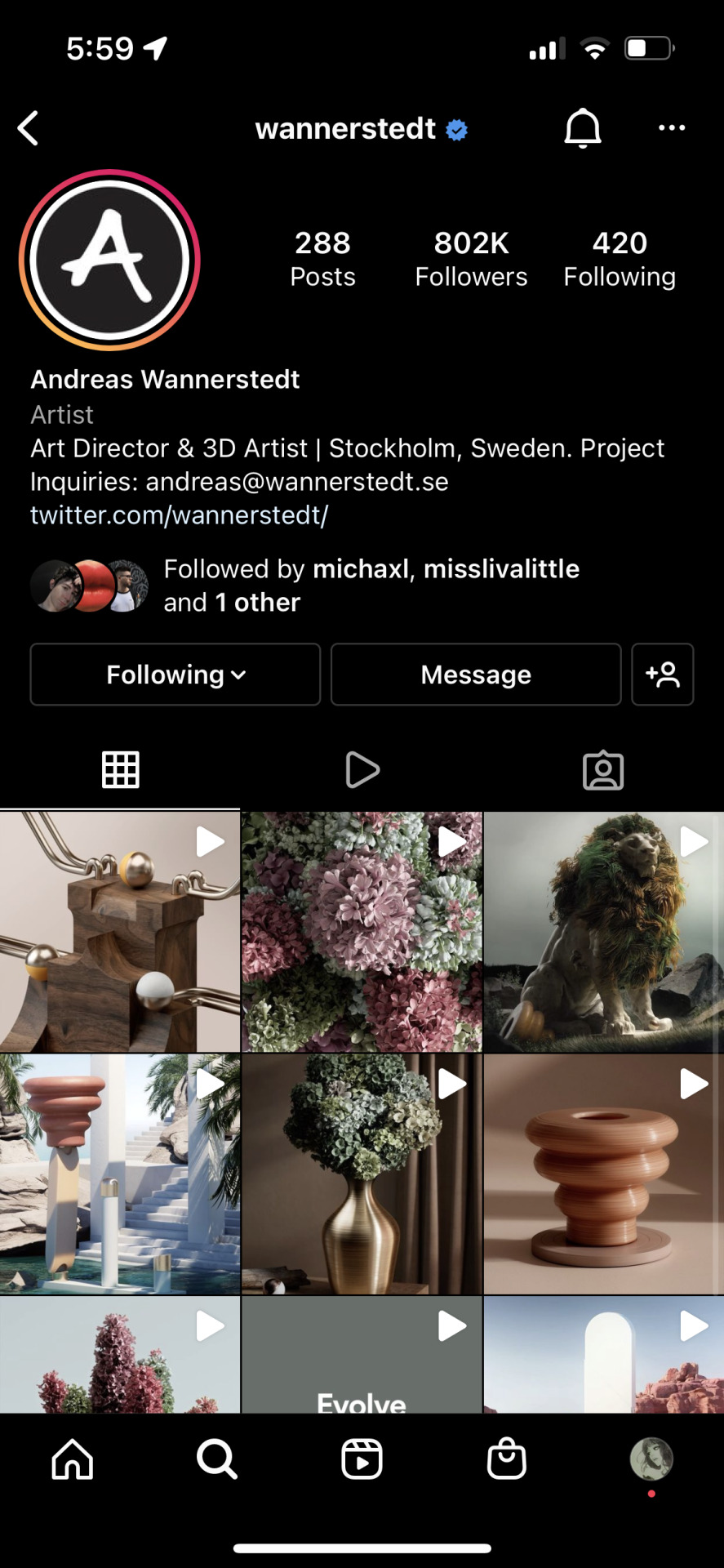


Created a mini website for the 3D artist Andreas Wannerstedt. This project was interesting to me as it allowed me to broaden my scope of who I followed on social media. I usually follow illustrators or graphic designers, but never really delved into the world of 3D art or projection mapping. Additionally, we used cargo site to create these websites, which opened up a door to innovative platforms to allow for creativity. I had never heard about cargo site but I’ll definitely be using it in some capacity in future projects!
0 notes
Video
Created my own AR experience based off of the game We’re Not Really Strangers. The game is based around human connection and allowing yourself to be vulnerable. In order to accomplish this I wanted to ensure that the interactive component of the experience allowed for this. The concept was that people are able to write in their own answers to the card given, while also being able to read everyone else's responses. This game means a lot to me and it was really fun to be able to think of a way to expand the brand. This particular week taught me to always be thinking beyond the brand. It’s one thing to create a brand that reaches a target audience, is successful at what it does, etc. But it’s also important to think about the brand beyond what it typically does. The designer also must think about, how can I reach a new and expanding audience? Things like Augmented Reality, QR codes, projection mapping, 3D renders are all things ever-evolving and entering the creative space. It’s important to stay up-to-date on things and think about how you can incorporate them into your own brand.
*We’re Not Really Strangers is not a game owned by me, I am not affiliated with them in any capacity, this is strictly for a class project!
0 notes
Photo
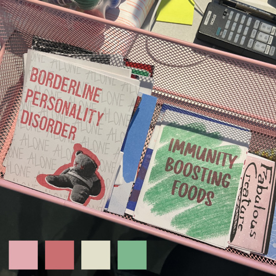

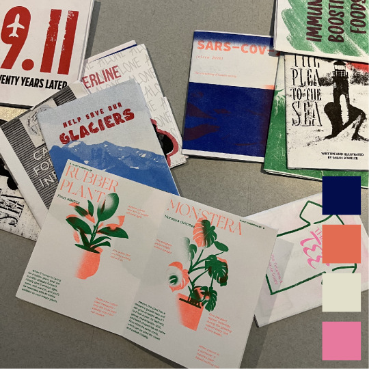
This week we had a zine presentation from a man by the name of Clay Reuter. We also got to see some zines made by the students in the other cohorts. This was particularly inspiring to me because hearing Clay talk about all the different zines he’s made, and why he made them, made me think about the fact that you’re able to just create things without it being an assignment. In particular Clay talked about one of his zines he made as a New Years card for his friends and family. This was really cool to me in that he just thought of something he wanted to do and then just made it. One of the zines he gifted the class was this whole project based on the alphabet and the emotions felt growing up in a school. The letter I got was “X” and the word attached was “xanthostansi.” I asked him what this meant and he told me he just made it up! Its a combination of the words xantho, for yellow, and stansi for state. He wanted this to mean “feeling yellow,” or “feeling cowardly.” It never occurred to me that I could just simply create new meanings in projects, and I thought this was a really neat addition. I always follow too closely to the rules and I think I need to break out of the habit of it. I feel like someone has to ask me to make something these days and I rarely make time to just make things that I want to do. I’m going to try and incorporate this more in the future. Thanks Clay!
Zines shown in these photos are not mine and are just photos I took during the presentation day, all rights belong to their owners.
0 notes
Video
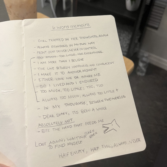
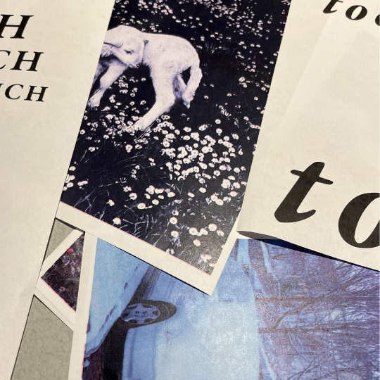

This week I tried using a scanner for the first time. (Not really, but basically.) It was definitely a fun process to try designing with unconventional methods. One of the things I really liked about this project was being able to incorporate a 6 word memoir. I was finally able to pull out my poetry skills. While writing my ideas, however, I noticed a similar pattern in my life of creating personal work that is only sad in nature. It made me think about my future choices and potentially creating something happy. I think emotions are important when being an artist, a lot of creatives use it as an outlet for things they cant express through words. I don’t want to only create sad things, though. I want to create things that are inspiring, and joyful. I think I’ll incorporate this more in the future. As for the scanner, it can stay. Creating with unconventional methods has inspired me to try this again, with other projects. In a small way, it’s opened my mind to thinking outside of whats expected and realizing that I can use materials beyond a computer.
Photos used in the gif are compiled scanned images found on the internet, all photos belong to their rightful owners.
0 notes
Photo
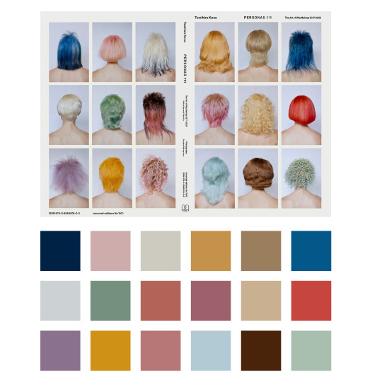
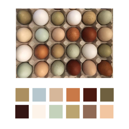
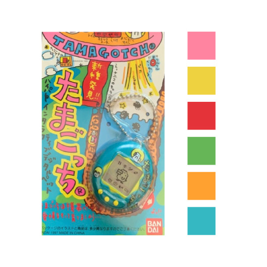
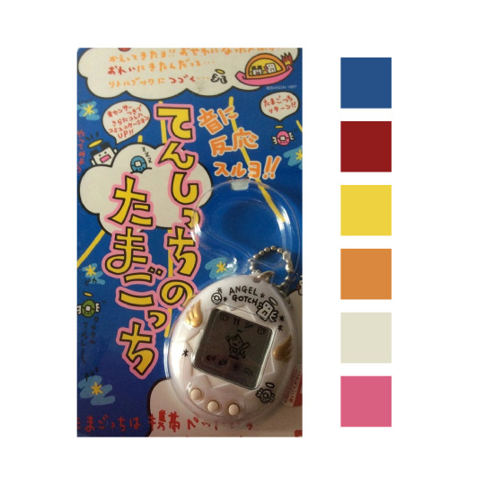
This past week I’ve been inspired by colour. I’ve made some palettes from photos I’ve seen on the internet through my time. I’m starting to see colour palettes in essentially everything I see now, and it makes me want to create something related to these every time it happens. I’m taking colour theory this semester and I think it’s had a good influence on my perceptions of hues and shades. I’ve always taken inspiration from the colour palettes in movies and photography in magazines, but now I’m starting to see them in my everyday life. It’s very interesting to see certain combinations that I wouldn’t have thought would work together, but somehow they do. For instance, the carton of eggs picture isn’t something I would usually pair together, mints and blues, but when I see them in a collection of neutral tones it inspires me greatly.
These photos are not mine and are only photos I’ve used for reference in my colour palettes. All rights belong to their owners.
2 notes
·
View notes