
Conbon Blog is the blog of creative director Connor Lesniak. You can expect new posts about the business of design, original watercolors and food photography, and the craft of design. You will also find news and updates about Conbon Industries, Connor's body of work.
Don't wanna be here? Send us removal request.
Statistics
We looked inside some of the posts by conbonindustries and here's what we found interesting.
Average Info
Notes Per Post
293
Likes Per Post
226
Reblog Per Post
67
Reply Per Post
0
Time Between Posts
3 months
Number of Posts By Type
Text
4
Photo
12
Link
1
Last Seen Tumblr Blogs


Fun Fact
Tumblr was the first site to host the blog for President Barack Obama in 2011.
Text


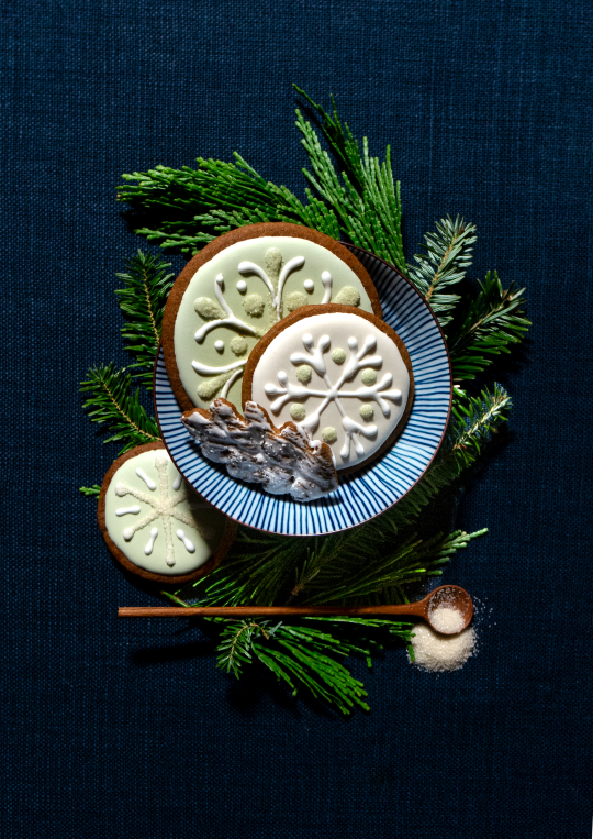
Christmas in Color
Merry Christmas, blogosphere! This year has been absolutely bonkers — I changed jobs, made huge campaigns for amazing clients, learned so much about my own limits, and through it all remained mostly myself.
Last year I told you I'd post way more. That wasn't a lie...but it certainly isn't a fulfilled promise. I have so much more of Japan to share, new trips scheduled for 2025, great progress on a bunch of design projects, not to mention garden roses and spring bulbs early next year.
But for today, I'm sharing the annual gingerbread spread in all its colorful snowflake splendor. Inspired by the flora of Christmas wreaths in the South — magnolia leaves, holly berries, eucalyptus and cypress seeds, I used tinted icing and sanding sugars to create as many variations on a theme as I could reasonably tolerate. I'm getting older, and this level of work for something ultimately eaten in a matter of seconds is less appealing than it used to be.
Enjoy your holidays, and Happy New Year, dears.
105 notes
·
View notes
Text


Sunrises in Japan
In May of 2023 I took 3 weeks off from work to visit Japan. The trip included in Tokyo, Kyoto, Takehara, Hiroshima, a restored Ryokan on the west coast, biking the Shimanami Kaido, shopping for ceramics at spring pottery festival in Mashiko, and eventually – because I couldn't not – culminating in Tokyo Disney. Some of the most magical moments of the trip happened in the smallest hours of the morning. The sun rises between 4 and 5am, and for whatever reason, probably jetlag, I could rise with it. Walking the streets with my camera and hopelessly-tourist curiosity, I found empty streets, incredible peacefulness and mystical light.
In these photos, mostly Kyoto or the small hamlet of Iwami Ginzan in Oda, I tried to capture that feeling. I can't say that was consciously my intent, because most of the time I take photos when I see something I want to remember rather than to create a moment. But in the glow of the low sun, with the perfect soft shadows and with the street lights and lanterns still dimly lit, things just worked out.
In the last few photos shown, I couldn't help but snap some of the sweet planters outside doors on the main street of Iwami Ginzan. Just little things here and there but somehow elevated, like little sculptures featuring plant life.
5 notes
·
View notes
Text


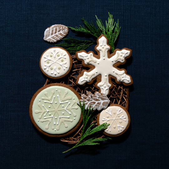

One Year Later...
It's been a year since my last post to this blog, and in that time a lot has been accomplished. I've updated my website with an entirely new design (including in this blog!), I've been to Europe and Japan, I've been on the board of the Georgia Watercolor Society, I've pitched and won major new clients for Edelman, I've worked on a total kitchen/living/dining remodel for an interior design client, I've enjoyed Michelin-starred tasting menu meals, and I've been gardening roses and obsessing about my lawn as ever.
More to the point: time flies when you're busy. But I have a lot of beauty to share that has been sitting in the wings as I worked to update my digital presence. And this, the annual gingerbread update, marks the end of one year, and the beginning of a very new life for this blog.
I'll say more about this another time, but while in Japan we collected so many beautiful ceramics and crafts. So, so many. Not least of which are the willow woven placemats used in this shoot. They inspired a return to a natural aesthetic for this year's batch of cookies, and in turn these photos show simple, still-life inspired compositions with the bare-bones elements that drive all delicious gingerbread: the bite of fresh ginger combined with the sweetness of sugar and molasses. And I don't deny that I'm a sucker for little spoons.
We'll be enjoying these cookies along with family and friends, and I hope you all get to enjoy the spoils of the season – along with the peace, joy, and stillness that the world so desperately needs right now – as well. Happy holidays!
21 notes
·
View notes
Text


It's Vintage
It's hard to believe that for more than a decade I've been making gingerbread and styling photoshoots for the holidays. Looking back at some of those early years is a walk down memory lane, so many shades of gray and so many 6-pointed designs. It's a challenge to make anything original!
In the beginning, my philosophy was that instead of making Christmas cookies, which aren't particularly relevant to people who don't celebrate Christmas, I'd make "winter" cookies. Snowflakes, snowballs, hats and mittens. Throw in a couple fir trees that first year. It felt easier to share these holiday-agnostic designs with everyone, and it also meant not having to make a ton of icing colors.
This year was about to be no different. But as I looked for inspiration, rummaging around in my cupboard of little bowls, plates, boards and napkins (some never used!), I came upon a very unlikely – and very much overlooked – prop. A vintage, red and white-edged tray, carefully wrapped in boondoggle and decorated with what could possibly be bluebirds on golden twigs. The birds and branches are inlaid with opalescent shell material, the illustration sharp and soft at the same time. And...there was something so freakish about all of it that I pulled it out and set it down.
I admitted that the birds were beautiful, and the uniqueness of the inlay was cool, too? Then came the hard part: could I use this thing? How can I make it work?
I quite literally matched its colors to Pantone chips, and then built a couple shades and tints around it. Light, dusty blue. Mossy green. An emerald that might be good punctuation for the white of snow. When a designer makes cookies...
Glittered with shimmering sugar crystals in a variety of other greens, the combination of color, texture, vibrance and glam started to bring everything together. It's an aesthetic that I couldn't have predicted would ever come from me!
The tray itself was made in Westen, Germany, and other than it being a hand-me-down from my Grandmother, I know very little about it. I suspect it's from the '50s, which sets us back a number of years beyond last year's '80s theme. But combined with some of that same Grandmother's teacups and a couple of new Japanese yunomi I picked up in Asheville last weekend, something about its earthy, high-low mix really adds up to a mood.
I hope you enjoy the vibe, and likewise, I hope you enjoy the season. Happy Holidays!
131 notes
·
View notes
Photo

When I was a young person in design school, a former teacher introduced me to a book called Drawing on the Right Side of the Brain, by Dr. Betty Edwards, to help explain how drawing is more a science than an art. That it could be practiced and learned like any other skill, and that for people who think they’re stuck with an analytical brain for math and order and logic (the left side), there was hope. The right side of the brain wasn’t inescapably inaccessible. Regarding that, and the right side of the brain, I recall an ah-ha moment that I recognized in my every day creative life: it’s very hard to use both sides of the brain at once, when one side is thoroughly engaged. For creative people, many may recognize this feeling as somewhat akin to “being in the zone” – when you have a flow and you’re creating and there’s a loss of sense of time and environment. A painter, when engrossed in painting, might find it hard to carry a conversation or do analytical work at the same time as they paint.
This afternoon I began a project that involves designing a built-in wardrobe, and it struck me that in the midst of the calculations required to get proportion, scale and, in this case, what 5 feet divided 3 and then 4 ways is, I became lost in the “zone.” Creativity mixed with mathing mixed with a little bit of fun.
Does this mean I’m using both sides of my brain? Guaranteed no one could’ve had a fluid conversation with me in the process...so maybe not. Regardless, I do recommend the book.
3 notes
·
View notes
Photo

In the south, Peonies have come and gone. But a few stems from Whole Foods dress up my desk this week as I work through the manic Atlanta weather. Stay tuned for new new interiors concepts that put bright pink next to persimmon...lil peak at the Moncorvo from Schumacher waiting to be ordered for drapery!
4 notes
·
View notes
Photo


Gingerbread 2021 Extravaganzyeah!
It's that time of year again, when I make gingerbread and then for my own practice and enjoyment take photos of it. This year, I had a couple yards of sage green velvet left over from another project and man, did it create a mood.
I like how much the velvet contributes texture and depth to each photo, creating really dark darks in the shadows and a complex sense of light in the highlights. It feels vintage but contemporary, and I think that's in no small part to the use of one harsh light instead of a softbox or even natural daylight. Like Betty Crocker 1988 but also like Conbon 2021?
As one more departure from the norm, I cut out and decorated some woolly hats for 2021! What a CRAZY thing to do!!
I hope everyone is healthy, safe, and vaccinated this holiday season. And as ever, Mury Crastsis.
3 notes
·
View notes
Photo


Greetings from Amsterdam Some More
Unfortunately for this blog, I have been lazier than ever on this trip. Typically a vacation across the world would involve intense planning on my part, lots of predetermined activities and meals and precise timing of in-depth itineraries. But because it’s COVID, we’re playing it a little by ear, making reservations day-of. That lackadaisical attitude has carried over to posting and capturing of everything around me, and though the photos I have are numerous...they are not copious, as would be my usual.
Walking the streets and stopping to capture hollyhocks, stone stoops, doors, flower boxes and a genuinely charming view across the canal is still the name of the game, however. Especially the little vignettes that keep popping up – one bike parked and not locked in front of a million-euro row house; a bench with books piled high out in the rain without a care; the contrast of an inky blue enameled door against bright yellow daisies at a florist. The city center is weirdly storybook-perfect, alive with signs of every day life and people who live a casual elegance as their version of mundane.
Not to mention the weather being low 60s and cloudy every day. Couldn’t have asked for better atmosphere than mother nature’s version of central AC.
On the third day here – the day after the Rijksmuseum – we walked to an art supply store and I bought myself a hefty collection of really nice Caran D’Ache colored pencils. The feeling that my personal souvenir from this city should be art-related was really strong, but also I was dying to draw something. I am still going to draw some of these row houses and perhaps even turn them into paintings, but while Jason was at the office one evening, I broke in the pencils drawing one of the flower pots I’d seen earlier in the day. I’m not GREAT at colored pencil but I really loved the precision and versatility I could achieve that, unlike watercolor, is completely within my control. This little sketch pad is A3-sized. So a postcard, really.
In addition to the photos of streets and houses, I have been trying to pay attention to the way people act and dress. This part of the city is a 50/50 mix of tourists and locals. The locals are easy to spot: chic clothing mostly composed of a clean, fitted pant, tucked-in tee or tailored white shirt, and a jacket that makes perfect sense for rain or chill, but doesn’t feel too heavy like a winter coat. Lots of blue, white, khaki, black and military green. Effortless but not a uniform. A little like an identity in fashion for a whole place.
And I think I came here expecting the Dutch to be really blunt – almost rudely so – but that hasn’t been the case! Surprise! That said...the service has been lackluster at almost every restaurant. I think it’s an ‘impatient American’ thing. Or at least I hope it is, otherwise Amsterdammers have set their expectations dramatically lower than necessary.
As for today, we saw two cultural institutions: the Anne Frank House, which was moving and thoughtful and just really frightful given the political climate in the U.S. right now, and Vincent meets Rembrandt at the Noorderkerk, which was also very thoughtful but not at all moving in the same way. I have photos from both and they deserve their own post. But between those two activities, it was a full day of being out and about. My feet have begun to protest being used, and they have a point.
The plan for tomorrow is to find something to do outside the center of the city and then meet some of Jason’s co-workers for dinner. I hope to have more than just city streets to share by the next time I write about it on this trip...but until then, get a load of the photos I did share! Wish I could put up more than 10...maybe Tumblr will work on that. Dank je wel!
4 notes
·
View notes
Photo


Greetings from Amsterdam!
It is 2021, COVID still isn’t over and yet, Jason and I are in Amsterdam. These are wild times – though both of us a vaccinated and masking up in any crowd or indoors situation. Much of the country is unmasked in general, even if the tourist situation is ridiculous. In the Grachtengordel, the 17th century canal neighborhood where the hotel is, people are out and about in the fresh air drinking at street cafes, watching the boat traffic, or zipping by on bicycles.
So I present 10 photos from the last two days, all outdoors. There is a ton of indoor photography to share from today’s trip to the Rijksmuseum, but with the limitations of photo count on Tumblr, I have to batch things out.
First, the canals, obviously. One thing I learned while reading up about them is that while they are concentric in nature, they weren’t built in concentric rings one after the other. Instead, they were built all at once fanning out from the IJ, like a windshield-wiper. And those are the modern canals. The originals in the city – like the Singel – have been here since the middle ages! The Singel once encircled Amsterdam like a moat, until 1585ish, when plans were drawn up to expand the city. It’s now the innermost canal, and you’re looking at it (and an offshoot) in the pictures here.
Second, the Rijksmuseum. Holy cow, I’m not that knowledgeable about Dutch history or architecture but this is clearly a standout place in the country. What I’d gathered from school is that the Dutch first made themselves rich by being merchants and traders, and later it was the Dutch East India / West India Companies that opened the world to exotic goods and impressive textiles, wares and resources. But what I learned here is the nitty gritty stuff. Like, in Japan, the Dutch East India company was the only merchant allowed to conduct trade of Japanese goods with the rest of the world. They were permitted a little settlement on a man-made island called Dajima, in Nagasaki harbor. Only one access bridge was built to the island, and it was closely guarded by the military of the Tokugawa Shogunate. Trader ships had one dock, and everything on them was counted by the Japanese.
Meanwhile, in the (now) U.S., the Dutch West India company gave us the first settlement on what is (now) Manhattan. Of course it was self-serving, meant to defend fur traders so they could export back to the motherland, but the result is that Dutch people created a Golden Age of sorts in Amsterdam, and that made an impossibly charming city.
I have a ton of photos of the Rijksmuseum’s contents and I will share those eventually, but the gardens behind it really felt worth sharing, too. European gardens have a unique quality of feeling new and ancient at the same time (in my opinion), and this was no different than others I’ve seen. I think it’s the architecture and structured setting mixed with new blooms and leafy growth; that juxtaposition could freshen up any old place!
I didn’t bring my wide-angle lens today, or you’d be able to see a better version of the whole landscape, but neatly trimmed boxwoods and beautiful marigolds, magenta cosmos and even nasturtium bordered lush lawns and compacted stone paths. The geometric organization pulled at my left-brain heartstrings. One little building serving as a coffee shop was tucked into a tall hedgerow, and there at the center of its pediment was a beautiful and unique sun dial telling the time.
I made a special effort to capture the pollinators. Bees were everywhere, coating their furry little torsos with pollen and, I hope, making some divine Dutch honey somewhere. Maybe that’s a souvenir I need to bring back with me?
3 notes
·
View notes
Photo


As I do every year, I’ve baked gingerbread cookies to share with my friends and fambily. In the past I’ve photographed them in close-up, in patterns, in stacks and in bowls. I’ve used green, blue, gray and white cloth backgrounds. I’ve tried props and flavor inspirations.
But none of those photos really gives a full picture of how much work goes into this effort, and how many cookies are the result. More than a hundred, some big and some small, the largest snowflakes and roundels 6″ across, the smallest leaves merely 2″. From start to finish the process of making the dough, chilling it, cutting it out, baking, preparing the icing, flooding, piping and cleanup is around 12 hours. It is painful, and so, so worth it. This year, my friend Jennifer Taylor came over to help...and it still took us until 1am.
I have placed a teacup of hot chocolate in the center of this image for scale, because in real life this quilt of gingerbread was enormous. I’m proud to say every cookie was iced, and I’m prouder to be able to share them with you.
Hoping your holidays are wonderful, filled with cheer and dreams of your COVID vaccination, brimming with optimism and truly, really happy.
Merry Christmas, from Conbon.
1 note
·
View note
Photo


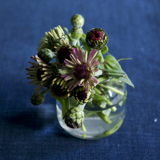


This weekend, my husband and I went to a pick-your-own wildflower farm outside the city. The primary goal was to nab some pumpkins before the holiday (and I did, so many tasteful heirloom pumpkins!), but for $10 one could fill a cup with as many wildflowers as they cared to. “Wildflowers” in this case meant zinnias and sunflowers, but I don’t much care for sunflowers in vases. So, we ventured into the beds, scissors in hand, and collected as many zinnia blooms as could fit in that cup.
I was particularly drawn to the buds, with their globular form, encased in black-lined little scallops around the colored centers. Each one looked so geometrically exact and, in some way, alien. I made a little study arrangement of all of the stages of the bud before the petals are fully opened, and it does look peculiar! But I love that little arrangement, sitting in a jar I usually use for honey. I’m reminded of the Ancient Egyptians, whose columns were topped with geometrically-arranged capitals, often of leaves, reeds, petals and such.
Of course, the arrangement of actual flowers didn’t disappoint either.
0 notes
Link
I have been feeling this very hard for the last couple of years. Starting with a “we have to look the part” mentality, I feel new brands think that they must fit in just enough to be trusted by consumers, but stand out just enough to be special and different.
The result of that that combination is a dramatic halving, calming, averaging of the world’s visual and commercial interest. Every single website feels the same, every single startup is starting up the same way. Stories are not unique, propositions of value are simultaneously inflated, and deflated.
I loved this article for heavily researching and then roasting the absolute daylights out of these guys.
2 notes
·
View notes
Photo


I haven’t made macarons for at least 5 years. Once an obsession, I’d make these soft little cookie sandwiches for parties or holidays and be that guy, always explaining myself.
One secret about me: I don’t love macarons. They’re just little sugar bombs with more sugar in the middle. When you look at them, you think one thing, and when you try one, get another. But they’re beautiful miracles of baking science and after you get over the initial annoyance of learning that you can’t bake them before they’ve formed a tacky skin, or that if you whip the egg whites too much you have to “punch” them down in the batter until it flows at the right consistency, they’re pretty easy to make.
My friend Jen was free for the weekend and we’d talked about baking them together – so between us, we whipped up two batches. Yellow is lemon curd and vanilla buttercream, turquoise is chocolate buttercream, all from scratch. Believe me, feet were hurting from all that baking yesterday but the reward – that I photograph them and then post about them here – was definitely worth it.
These bowls are all from my visit to Japan a year ago. The glass coupe is part of a set I inherited from my grandmother, and that pink marbly thing is a block of salt. About 10 years ago my clients at Buzztable sent me a box of specialty salts and this was in it, and I’ve just held on to it ever since. Never used it.
Now I just have about 3 dozen of these things in the fridge. Any takers?
4 notes
·
View notes
Photo


Over the last many months, I’ve been modeling my house and yard in SketchUp. It’s been incredibly useful for prototyping landscaping ideas and designing beautiful – but not always realistic – architectural detail around the land. But most recently I’ve turned my attention to modeling the office where I sit all day working.
The main thing is built-in cabinetry, which will store so many bits and bobs, craft supplies and painting materials, a printer and years of records and receipts. But the OTHER main thing is that for the first time, I’ve planned out everything beforehand – down to the rug. So what you see here is the model, and then the materials as they are now (I'm prone to swapping out one for another). I don’t have the rug in hand yet but when I do, many things will cascade from it – like the paint color for the cabinetry and the fabric color for the window seat and drapery. Right now, the seat is that sagey-green velvet with the Schumacher tweed trim. The drapes are the seafoam linen, also trimmed with the Schumacher. The desk is the gray wood, while the blinds are the rich walnut and green-gray trim tape. The cabinets will probably be either the darkest or second-darkest paint color from Benjamin Moore. And for good measure, because I love it so much, I included a trim tape from Kravet, I think, that has neatly knotted leaves in shades of green and blue and beige.
If you’d met me in 2009, when I was just starting my last year at Parsons, and asked me what colors I was likely to decorate my life with, I think some form of the above would be my answer. Sage green, gray-blue and taupe, natural wood, and robin’s egg. I like the steadiness of that.
1 note
·
View note
Photo


Almost two years ago, after her mom passed away, my mom showed me this collection of nearly 100-year-old leads that her dad had bought, intending to use. She was cleaning out the basement workshop of her parents’ house, and there were tens of these little boxes of leads, packaged up in neat little balsa wood protective cases. I was absolutely FASCINATED by the packaging.
As I get older, I become more drawn to objects for their story alone, but these had both story and family connection. My grandfather died before I was born, and I’d never known him personally. But the stories of his incredible craftsmanship, talent in the workshop, and ingenuity to create and/or repair anything and everything has always been fuel for my imagination.
The most brilliant part of these designs is that they were created and reproduced entirely with analog technology. Someone drew the typefaces by hand, drafted the logos, invented the copper-on-turqouise color scheme without seeing it on a computer screen first. And they have such a quality of warmth, not to mention vintage charm. To top it off, both Koh-i-noor and Eberhard Faber (which is both still around as Eberhard Faber and Faber-Castell) make products that I use regularly. Eagle Turquoise eventually became a Prismacolor brand, but I don’t have any of those in stock. Still, generations of brand preference, right there.
1 note
·
View note
Photo


In the beginning of March, when Pandemic still meant ambiguity and work had just transitioned to full-time-from-home, I ordered two new rose plants from Oregon in hopes that I would watch them grow and enjoy their scent.
From the Kordes family of roses, these are KORgeowim, also known as Earth Angel.
I celebrated every single development in their young lives, from tiny little twigs in one gallon pots to the appearance of aphids, which I swiftly and a little hypochondriacally defeated with Neem Oil, to the blossom of their first blooms that I hyped like the appearance of an undiscovered Hopper masterpiece. I’ve become attached to these plants, probably unhealthily so, because they have blossomed in adversity and provided me with a focus while confined. Their flowers, smelling rich of citrus and raspberry and bright, like a traditional rose, are like 3-inch, pale pink replicas of that David Austin Juliet wedding rose that everyone who likes flowers has obsessed over since before I worked at Martha Stewart.
I’ve started to get enough blooms on each plant that I can probably cut a few of them for myself, but I’ve only done that once. It doesn’t feel wrong in the least to want to bring their beauty indoors, but they are so young that I hate to deprive them of any joy they themselves may get from their own flower. In the way that we all are proud when we look nice in a new shirt, they deserve their flush.
What a wonderful gift, to be able to share this private and quiet little joy, with myself and others. Seems small, but the attachment isn’t going anywhere.
5 notes
·
View notes
Photo


These delightful top-downs from artist Erica Lee Sears have been popping up in my Pinterest feed recently and I've been saving them like crazy. They’re energetic and charismatic while being one of my favorite things: still lifes of food.
What really catches my eye is how Sears manipulates value and chroma to tell the story of light and color.
One of the early lessons I learned in watercolor – from Margaret Martin, a favorite – is that shadows need not be grayer versions of their local color. In true life, they rarely are. Rather, shadows in art can be any color, any saturation, as long as the value matches the brightness of the light. This is best illustrated in Sears’s paintings of citrus, above, where the shadows cast on the oranges are a rich emerald green instead of a darker version of the peachy flesh, and on the lemons, where Erica has interpreted the shadows as a vibrating shade of turquoise fading into mauve.
This technique creates electricity in paintings, and though it’s not exactly realism, certainly seems to enhance reality. Everyday things, when depicted in this form, are elevated – like the pickle jar – from quotidian to quirky. It’s not easy to do, either; a touch too bright with the shadow color and one ends up with an optical illusion and a question mark of a painting.
One of the hooks that took me from Pinterest-saves to a site visit were Sear’s series of cereal portraits. Tedium and patience, plus a lot of beautiful brushwork made me stop and listen to what each one was saying. I love how in the FrootLoops portrait the colors of each niblet are saturated and strong, with their shadow against the mauve table casting a deep cobalt shade of blue. The lights and darks each loop casts on other loops is similarly beautiful, deepening or brightening the local color and effecting depth.
The same is true for the Lucky Charms, set against a gradient of pale sage turning to lilac, the grainy brown of each X and O reflecting shades of pink and yellow in their individual forms. It’s so busy and yet, not. The cereal casts a shadowy monochrome of flat, dark indigo on the surface, settling some of the space by undercomplicating, compensating for the bustle of the bowl’s contents. There is not one exact shade, tint, or color shared by the rainbows.
As I search for the inspiration to paint something for above my guest beds, I’m constantly being pulled in the direction of purchasing someone else’s work. It’s hard not to, isn’t it, when this is what’s pulling at me.
0 notes