A space for creative + innovative minds. Let’s get inspired, together.
Don't wanna be here? Send us removal request.
Statistics
We looked inside some of the posts by creativentory and here's what we found interesting.
Average Info
Notes Per Post
2
Likes Per Post
2
Reblog Per Post
0
Reply Per Post
0
Time Between Posts
8 days
Number of Posts By Type
Text
6
Photo
1
Last Seen Tumblr Blogs


Fun Fact
Celebrities use Tumblr as well.
Text
Making design colour accessible
When it comes to design, we often look at the visual aspects first, it’s meant to grab the viewers’ attention before they even begin to read, right? Whilst this is true, we often don’t think about the difficulties some people face when looking at a flyer, poster, or a website.
Braille Institute is a not-for-profit organisation in America that offers free services to students that suffer from blindness and vision loss. As part of their rebranding, they have introduced a typeface which that has won the 2019 Innovation by Design Awards for Graphic Design. You may be thinking what’s so special about a typeface? Well, this typeface has been specifically designed for people that have difficulty reading type.
This typeface has got all designers talking, although it does break the design rules- if you look at the use of sans-serif fonts and serif fonts being used together (for example capital ‘I’ is san-serif, but the lower ‘i’ has a serif). It also has bits and pieces from other typefaces, which may seem like a strange combination – but hey, if it hits the mark – should we question it any further?
Have a look here:

(Image: courtesy Braille Institute of America, 2019).
Looking further into visual impairment, according to the World Health Organisation, at least 123.7 million people have some form of vision impairment or blindness that ranges from moderate to severe.
Although this typeface will help Braille Institute reach a wider audience, it important to note that when it comes to making design accessible - it’s not only people with visual impairment that struggle with viewing or understanding a design. People with auditory, speech, cognitive and physical disabilities are also amongst those that design needs to be accessible for. Doing so really does make a difference in the lives of many, and honestly, it is not difficult to achieve with the right tools and guidance.
The W3C provides a clearer definition of Accessibility, Usability and Inclusion, and encourages on how we can bring this into practice - especially when it comes to designing on a web. Next time you are designing something, see if you can incorporate some of the practices discussed.
Here’s a tool that I discovered some time back that really assisted me in designing for visual impairment. It is called Colour Oracle. This is a colour blindness simulator which lets you add a filter over your website or any graphic or illustration, so you can see exactly how people affected with colour vision see. Try this next time you are designing and let me know what you think of this tool.
With an approach to creating a digital design that meets the accessibility guidelines – I really hope to see a more inclusive web and graphics in the coming years.
0 notes
Text
My Twitter activity


As you all know, I have spent the last few weeks exploring Twitter and how fellow designers and creatives use the platform to reach their audience. I wrote a blog post on my Twitter experience, If you have missed it, you can find it here.
Here’s a visual update on my Twitter activity.
1 note
·
View note
Text
Exploring design content on Twitter
I have never used twitter previously, hence I was a bit confused with its navigation system.
I found a lot of designers were posting their own design work and art, which leads me to think there are a lot of designers and creative people on Twitter (which I didn't expect).
The accounts that I searched on twitter were the one’s I follow quite regularly on other platforms, I was able to retweet some of their tweets.
With my overall experience, I don't think twitter is the space for designers as a lot of design-related content gets lost amongst other posts. I am not sure if this is just my experience as I am fairly new to Twitter but I look forward to hearing other opinions on this.
Hashtags that are most related to my topic are:
#advertising #website #webdesign #marketing #graphicdesign #typography #typedesign #logo #branding
Through these hashtags I was able to locate content related to my topic, I also discovered that a lot of the content that comes up by typing these hashtags was irrelevant (when I searched ‘#logo and #branding’ I didn't really see much of what I was looking for). Although by searching under #graphicdesign, I was able to find a lot more design content. Which goes to know that the more descriptive a hashtag is, the more relevant content you can find under it.
I created a twitter account to experiment and do these writing tasks: https://twitter.com/creativentory
I tweeted the following from my twitter account:
Have you ever wondered what the benefits of having a descriptive logo are, as compared to non-descriptive logo design?
Does that really affect how a logo is perceived by an audience? Find out more in this article by Harvard Business Review: https://hbr.org/2019/09/a-study-of-597-logos-shows-which-kind-is-most-effective#comment-section
It’s 2019, and we are still behind in meeting design accessibility needs. Finally, there is some progress! Here’s a typeface that breaks barriers. Find out more from this article by Fast Company:
https://www.fastcompany.com/90395836/this-typeface-hides-a-secret-in-plain-sight-and-thats-the-point
And I re-tweeted the following on my twitter account from other design blogs:
Creative Bloq - @CreativeBloq New study finds we've been doing logos wrong all this time, and minimalist designs are actually a turn-off for consumers. Hmmm. http://bit.ly/2Nq0eBE
Creative Bloq - @CreativeBloq
Give your rankings a helping hand with these clever SEO tricks http://bit.ly/2mofLpb
Creative Bloq - @CreativeBloq
Paramount Animation gets its own mascot and logo - after eight years of waiting. http://bit.ly/2mAbLSQ
Design Council - @designcouncil Yasushi Kusume, Innovation and Creative Manager from #IKEA shares his thoughts on what makes a knowledgeable, talented, and skilled designer! https://designcouncil.org.uk/news-opinion/what-makes-knowledgeable-talented-and-skilled-designer… #DesignSkills #DesignThinking
Armando Roque - @ArmandoRoqueCcs
@DesignMuseum’s exploring the solar system #FontSunday — Educational prints of some of the major planets in our solar system by @gulliverhancock — @JAStokesNJ #MovingtoMars.
0 notes
Text
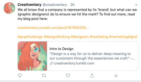
Intro to Design
“Design is a way for us to deliver deep meaning to our customers through the experiences we craft” - Reena Merchant
Design is often compared to art, but not many people actually understand the difference between the two. Although both of these fields involve the designer or artist ‘creating’ a product - the purpose of that product varies significantly. Art is created based on the artist’s perspective - it’s meaning is not always what others may interpret it as. In contrast to Art, Design should only have one meaning. The design conveys a message, and the intention of that message is to lead to action. It is important to note that the message is strong and consistent across all of the client’s marketing materials. A poster, flyer or logo design is not created without a purpose.
John O’nolan describes the purpose of design as “to communicate a message and motivate the viewer to do something”.
A designer uses a company’s vision and purpose as a guide to creating a design, whether that’s a logo, a website or a poster.
When designing, it is very important for one to have an understanding of the Design Principles. These are rules or guidelines for designers to abide by to ensure a design is effective. The 5 top basic principles as suggested by Canva are Balance, Repetition, Contrast, Dominance and Hierarchy. These principles help with the structure, look and feel of any design.
A company is represented by its ‘brand’. Here is a good example of a style guide or a company branding guide. The way this guide by The Guardian is showcased – goes to show the importance of a brand, and how it relates to the reputation of a company or client.
Remember, design can be innovative, creative and unique - but if it lacks basic design principles - it can easily become a disaster. The purpose of a design can easily be lost - so abiding by these design principles allows designers to avoid such mistakes. Here at Creativentory, I hope to share tips and guidance on how to create an effective design.
Watch this space to learn how you can improve your designs, and your marketing approach to help grow your business.
0 notes
Text
My Personal Interest
I used to draw and paint as a little kid. This is not unusual – as most kids are into painting and drawing right? Well, in my case – I never really stopped painting or drawing. Coming from a family that is full of engineers, I often felt I was the odd one out!
This interest only developed further as I grew up, and it was when I got introduced to computers that made me explore the digital side of things. I could make my art come alive on a digital screen – the colours were vibrant, and you could easily ‘erase’ your mistakes or errors (unlike you can on a canvas). Although for me traditional art is irreplaceable and not comparable to digital art. One thing (of many other things) that digital art allows us to do is use different elements and techniques in a matter of seconds.
My interest in art and design had led me to choose Digital Design as a course at Curtin, where I learned about website development, graphic design (+ brand development) and animation (2D motion design). Studying Digital Design allowed me to learn skills in various different mediums and softwares. And I have gained further experience by working on different projects at a Creative Studio here in the South West. I deal with clients and take them on a journey to explore their company brand, sharing and guiding them through the design process of their new website or logo design.
Since working in a creative studio, I have learnt one thing that is similar to every business - they all are constantly looking at creative and innovative ways to improve their marketing. And, the businesses that struggle with this the most are small businesses. In addition to creating a design, I really enjoy being creatively inspired and sharing design ideas with others.
This is where Creativentory comes in, through this platform – I plan to assist small businesses and amateur designers to gain creative inspiration and learn tips & tricks on how to create designs that are professional, visually appealing, targets their audience and in return, lead to business sales.
0 notes
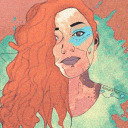
Photo

The avatar that I have chosen is a digital drawing of myself. The reason why I have this as my avatar is that this relates to my design blog and represents me in a ‘digital’ way. It brings the blog alive with its bright colours, which in addition to the blog’s pastel background, goes with the theme and creates unity. The digital drawing is hand-drawn on a Bamboo tablet, it’s innovative, creative and unique to my style. The splash colours in the background give off an artistic look and feel. The overall design is a snippet of my personality – bubbly, creative and fun!
0 notes
Text
About Me
Creativentory: A space for creative + innovative minds.
Welcome to Creativentory, my name is Aimal. I work as a digital designer in a creative studio here in WA, Australia. As a digital designer, I provide a wide range of design services – including brand design, infographics, video editing and website development services to small start-up businesses to large multinationals. I have worked on multiple design projects for clients of different industries including engineering, hospitality and in the government sector. I would describe my designs as modern, cutting edge and sleek. When I am not working, I enjoy going on walks, reading books, painting and photographing nature.
1 note
·
View note