
tutorials, refs, guides, tips and whatever might be helpful for art
Don't wanna be here? Send us removal request.
Statistics
We looked inside some of the posts by crunchy-help and here's what we found interesting.
Average Info
Notes Per Post
1M
Likes Per Post
663K
Reblog Per Post
539K
Reply Per Post
170
Time Between Posts
1 month
Number of Posts By Type
Photo
12
Video
1
Text
4
Last Seen Tumblr Blogs


Fun Fact
The most popular pages on Tumblr are about Minecraft, GIFs, and David J. Peterson.
Photo


bearded vulture(s) by James McCallum
25K notes
·
View notes
Video
youtube
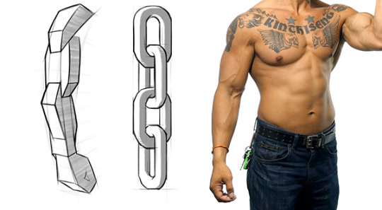
There’s three main groups: the flexors and extensors each take one half of the forearm, and the ridge muscles sit on top like a little tiara. Each group has it’s own unique form. Learning their anatomy will help you design awesomely dynamic arms.
Let’s try to make forearms manageable to draw. This is a body part most artists don’t quite understand. It can be real intimidating if you don’t know the muscles.
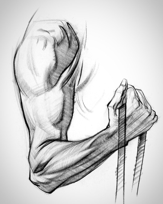
The arm has a simple chain design and the forms interlock down the arm.
To avoid the snowman effect, use straight, angular lines and look for asymmetries. Compare the apex of both sides of the forearm to understand the curvature better. Notice that the flexors reach lower on the wrist than the extensors and ridge muscles.

Look for this kind of thing when you’re drawing the gesture of the muscle groups. A wave rhythm where the curve on one side leads into the next curve on the other side.
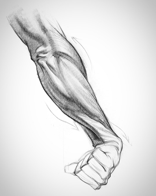
I’ll explain more in-depth in the video - www.proko.com/179
52K notes
·
View notes
Photo


’What is hair and how i can render it?’
I got this question and I really wanted to show on very simple examples how to render hair. Because it really is… simple! Following this guide you will be able to paint hair in few minutes.
This is called the ribbon technique.
It is used by many artists out there. I just wanted to show you a couple of examples. As you can see I picked Adam Hughes and J. C. Leyendecker. Look at it and see how they paint the hair. It doesn’t look like a mop. It looks more like big, overlapping shapes organized in some fashion.
Try to imagine a string of hair like a ribbon. Ribbon symbolize a large portion of hair. Don’t focus on every single hair string, instead of this imagine it as bigger shape. It will catch light in highest point and it will have core shadows.
Establish where light is hitting the hair and where it turns dark. Start with big shapes. big brushes to get the lights and volumes right. Then You can go into details and paint small brush strokes to add details like single hair strings.
I attached two examples. First is very simple where you can clearly see and understand the similarity between hair and ribbon. Second example is theory put into practice. But it’s basically doing the same things as shown in simple example.
Let me know what you think about this?
I based my knowledge on James Gurney blog (author of Dinotopia and Light and Color book)
And for the example I used Faestock (from deviantart) photo.
45K notes
·
View notes
Photo
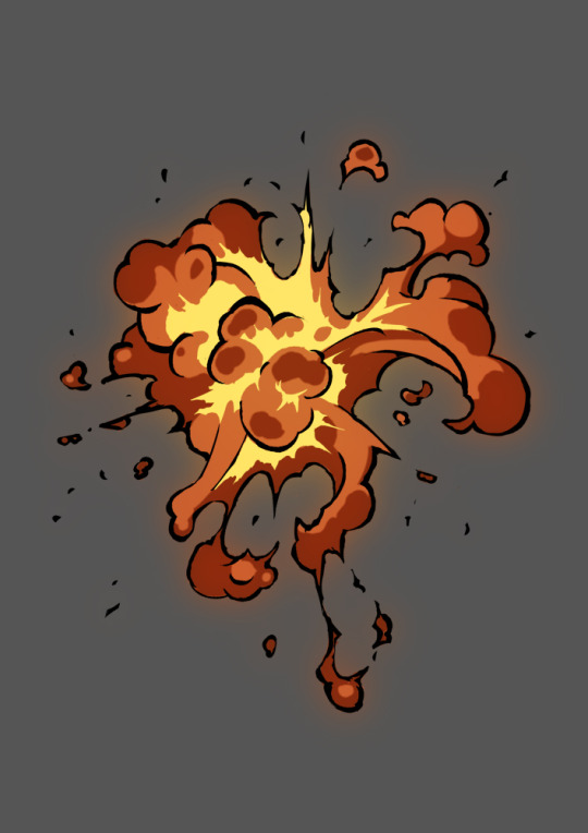
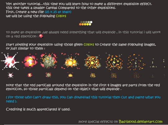
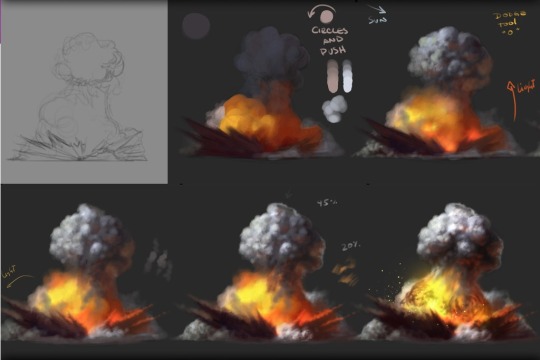

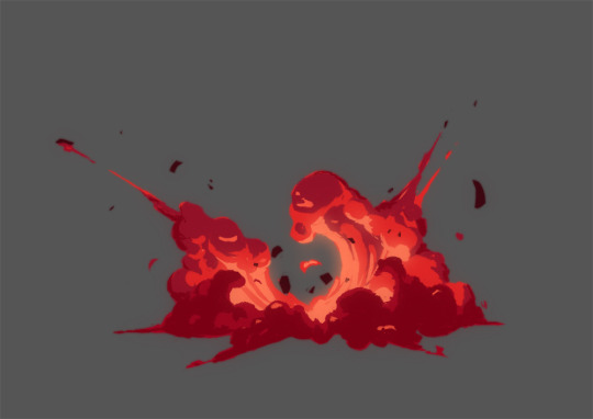
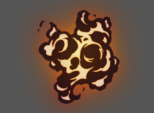
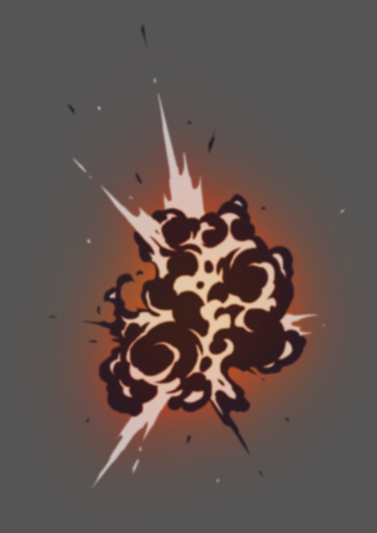


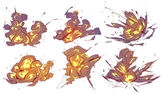
Explosion Tutorial! Top Image & Row 4 Row 2: Left, Right (Video) Row 3 Row 5: Left, Right, by Alex Redfish Bottom Image
44K notes
·
View notes
Text
sir-hyde answered your post: EDIBLE-HELP?
I have trouble drawing muscular/bulky and heavyset guys any refs?
This is a HUGE issue I have myself. I don’t do muscle art commissions because of this reason....Let me see what I can do for you!
0 notes
Text
http://edible-help.tumblr.com/ask !!! Please, I am more than willing to help!
EDIBLE-HELP?
Just a reminder that http://edible-help.tumblr.com/ is my tutorial and artistic inspiration blog. If anyone has suggestions or would like me to find/make a tutorial or something, please shoot me a message!
I made the blog to help myself and other people!
9 notes
·
View notes
Text
The Relative Color and the Absolute Color
Since the colors are never what they look like, It’s useful to understand the color in two ways : the RELATIVE color and the ABSOLUTE color.
The Relative color is the color as it is seen, according to the perception of the eye and the translation from the brain to the mind. The Absolute color is the color as it is, in reality.
This is part of the colors relationship, and the contrast of the colors.
To be able to get the right relative color (meaning without any false notes), it’s crucial to know what its absolute color really is.

For example, the absolute color of grey is very often the relative complementary color of its surrounding color.

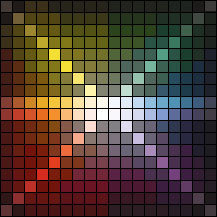
Depending of the kind of picture and depending of your color’s intentions (that is off special effect or narrative effect), using an absolute complementary (that is, for the previous e.g, a true blue) in direct contact to its surrounding colors may easily create a so much strong contrast that the mind will perceive it as a false note, then causing a global unbalance on all other colors in the image.
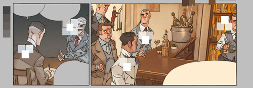
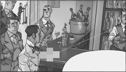
E.g, here is the page 05 from “Detectives” vol.02 (Hanna/Sure/Lou, ©Delcourt editions)
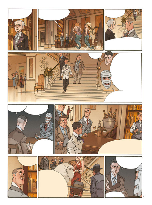
The “grey” panels 05 and 09 have a cold vibration, almost blue, because they are in a direct relationship within a yellow hot tan. This two panels, in minority, are also secondary in the narration of the page.
Using a true absolute blue would reverse this narrative order because the color contrast would became so much strong that they would became the primary focal point of the page.

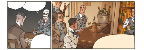
Let us look a little closer at the 3rd strip. The mind read the left panel as cold, in a subtle blue. The shirts are read as white, and the bottles of champagne as greenish…

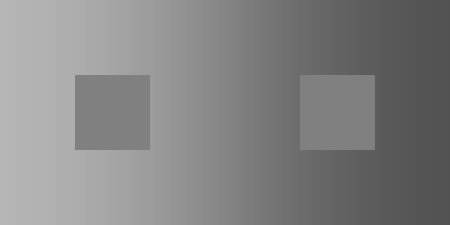
…but by isolating the absolute colors, in comparison with a Titanium white, none of this previously mentioned relatives colors exist in this picture.
…And if they were, the balance of the colors would be broken, and the falses notes would be made. Notice how the eye now read differently the picture, it can’t stop looking at those white shirts and then those bottles. It almost forget to look at the balloons and the characters. ( i’ll talk about the narration through the contrast of colors later, in another post)
It is the same for the values. A relative value defines itself compared with its surrounding values.


Let’s look back at our 3rd strip. Watch the contrast between the shirts, and the light jacket in the front, how they seem to be so much lighter in comparison with the other clothes.
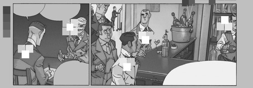
When in reality, if we compare them to each other, the difference became a lot more subtle than it seemed to be.
This is a side effect of the relative color. The mind analyzes et translates a color based on its database stocked in its memory, trying to identify the color in the most simple and efficient way possible.
The shirt itself is light indeed, and white. But it’s simply its “name”. Its “classification”, its “identity” (see the flat step of my quick step by step). What we’ll ask in a store.
In reality, this shirt is not white, and not much lighter than the light face of the grey jacket or the blue shirt. But for our mind, white means light. Lighter than everything. However, a white shirt in shadow is often darker than a back shirt in the light, whatever the mind is saying.
So, compare, isolate, compare, isolate, compare, always.
You can change your “mind database” with some practice. By using a paper sheet with holes to isolate outside colors. ( grey paper is best) Or by opening some pictures in a software and use the color-picker to learn what is going on with the color relationship. Testing yourself to find out the absolute color of your surrounding whenever you can.
Then, colorisation will become much easier, and like a musician able to reproduce a song he heard a the first try, you’ll develop the Golden eye.
#The Relative Color and the Absolute Color#color#color help#relative color#colors and values#art help#references#art resources#art
12K notes
·
View notes
Photo


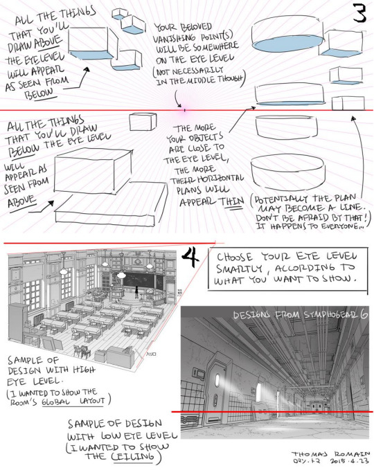

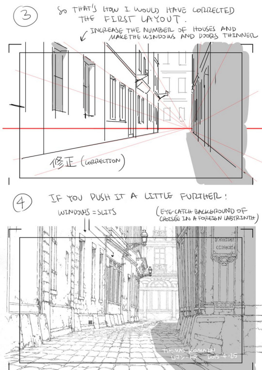
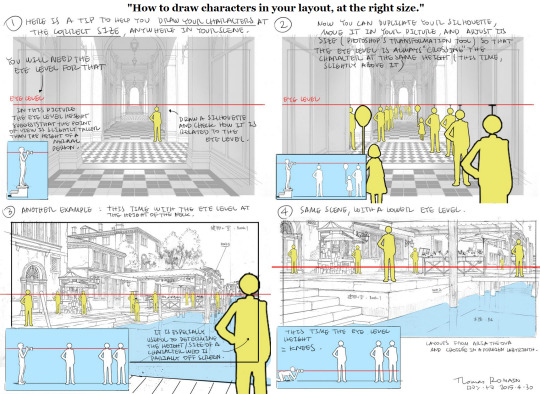

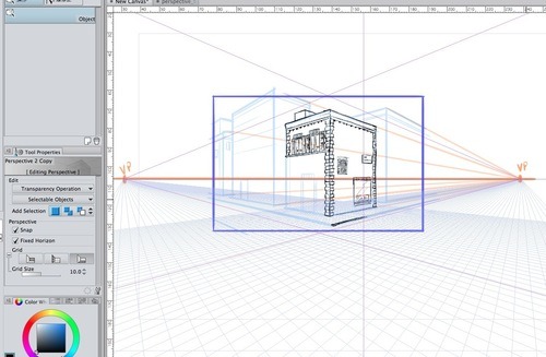
A master post of Thomas Romain’s art tutorials.
There’s not enough space to post all of them, SO here’s links to everything he has posted (on twitter) so far : 1 2 3 4 5 6 7 8 9 10 11 12.
Now that new semesters have started, I thought people might need these. Enjoy your lessons!
#tutorials#perspective grid#perspective#perspective tips#art resources#art help#how to draw#perspective help#buildings in perspective#references
396K notes
·
View notes
Photo


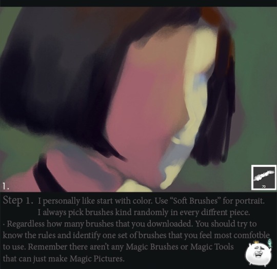
Please support me so I may continue making tutorials and guides for everyone!
https://www.patreon.com/doxydoo?ty=h
89K notes
·
View notes
Photo


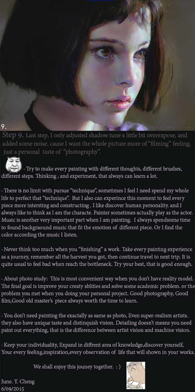
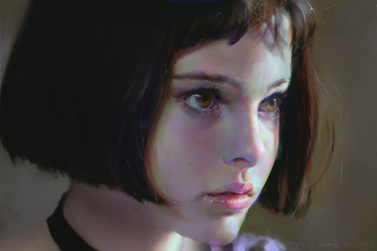
June Y. Cheng
2K notes
·
View notes
Photo


315K notes
·
View notes
Photo
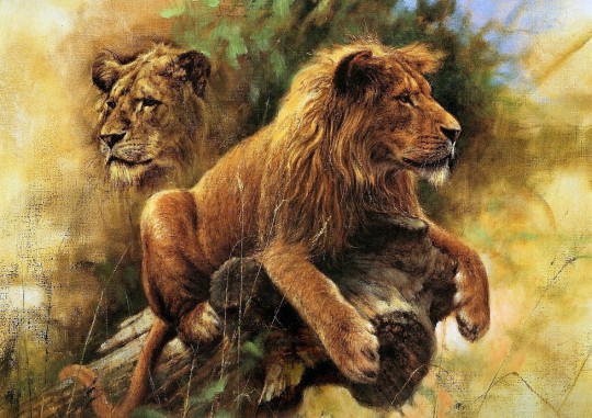
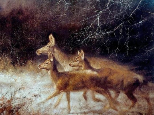
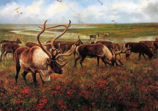
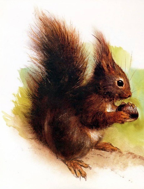
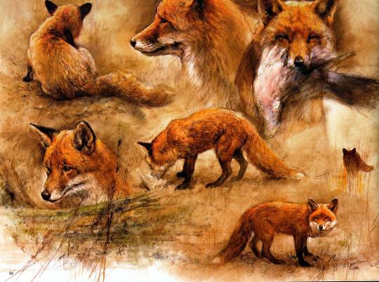
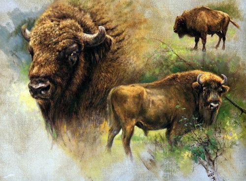
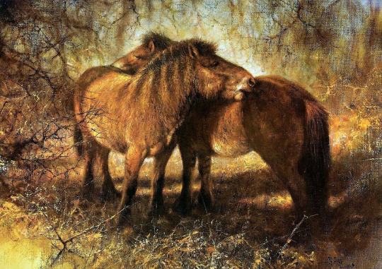

Animals by Rien Poortvliet (Dutch, 1932-1995)
388 notes
·
View notes
Photo

Have you ever wanted to draw with your friend(s) online but found that iscribble and/or flockdraw just didn’t do what you needed them to? Did you miss features such as pen pressure and the undo button? Did you need more than three layers?
WELL I’VE GOT SOME GOOD NEWS
There’s this one tool that does SO MUCH MORE than either of those websites ever did.
It’s called drawpile and it is fantastic.
Sure, flockmod actually has an undo feature, but when used it deletes everyone’s progress from a certain amount of time which would cause some issues!
But drawpile has an undo specified to your actions and only yours. So if you’re drawing with anyone else, and you control z the hell outta your drawing, your friend’s art will be completely unaffected! This is the only shared drawing program I have seen that can do this.
And it’s 100% free.
BUT WAIT THERE’S MORE.
Drawpile supports PEN PRESSURE. Whether it’s for opacity, sizing, or hardness, or a combination of any of those, your tablet pens will work!
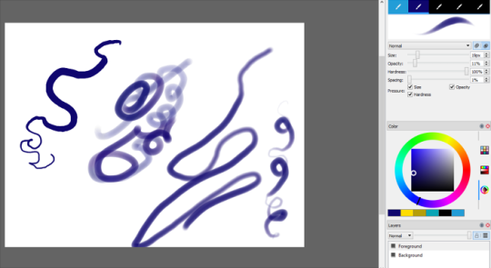
You can play around with your strokes to get them wherever you need them to be, much like a normal, individual art program!
And on top of that, you can have way more than just three layers!

You can have so many layers I literally don’t have the patience to try to find the limit. You can also rename them, clear them, make them invisible to you, and delete them as you wish!
ANNND it also has layer settings like normal drawing programs!

It doesn’t have all of the ones some individual programs do, but considering this is completely free and to be used by multiple people at once, this is incredible!
Not to mention you can lock a layer so only you can draw on it!

This is especially helpful to make sure no one accidentally does anything on your layer or any other layer that shouldn’t be touched!
Drawpile also has a paint bucket tool and the ability to open existing pictures in it so you can color pick from things for your art!
You can also mirror the canvas as you work and rotate it any way you need to in order to get your strokes just right!
You can also select certain pieces and rotate/transform/scale/move them as desired, which I never saw available in other group draws.
All you have to do is download the program from the site!
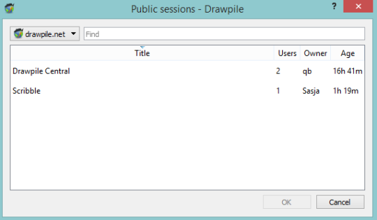
You also have a choice in what sort of session to make, and don’t have to make an account for it!
When you host a session for others to join, you can lock it with a password and give it out to only your friends. If you want it to be public, don’t set a password and check “announce at drawpile.net”.

Your session will then appear in a list for anybody to join!
There aren’t many people on at a time yet it seems, but honestly if you ever use iscribble or flockdraw, I HIGHLY suggest switching to this program. There aren’t any premium features either, from what I’ve seen. Unlike the other aforementioned sites, you don’t have to be a user for a certain amount of time to unlock different privileges.
I’m sure there are other features I haven’t mentioned either, but their site explains far better than I!
Download it here!
58K notes
·
View notes
Photo
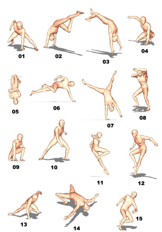

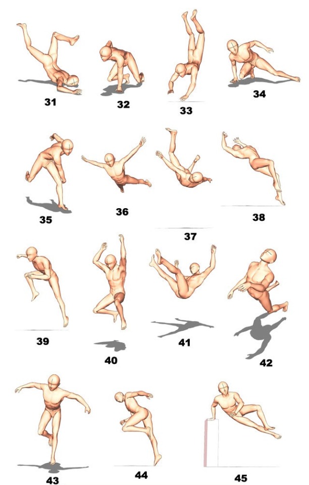
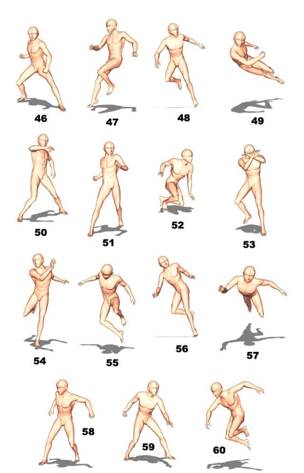
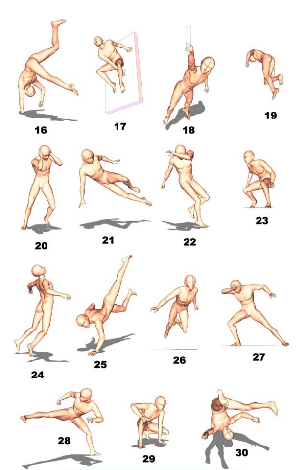


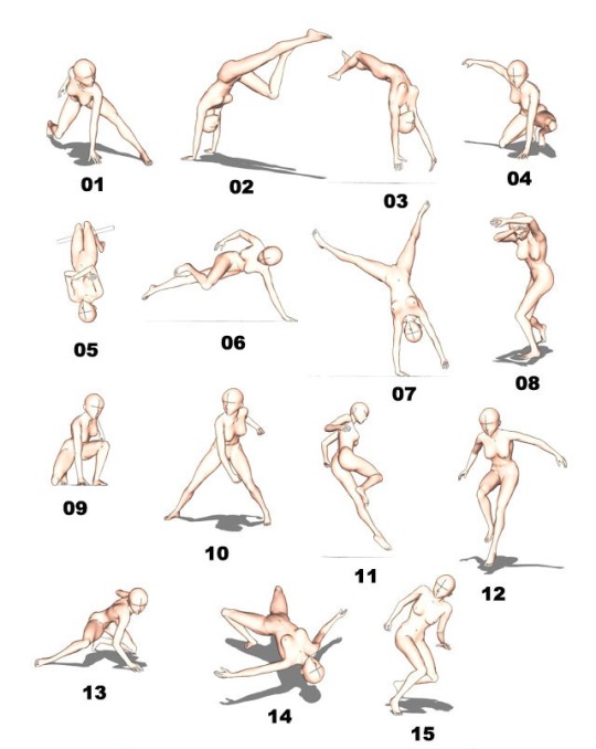
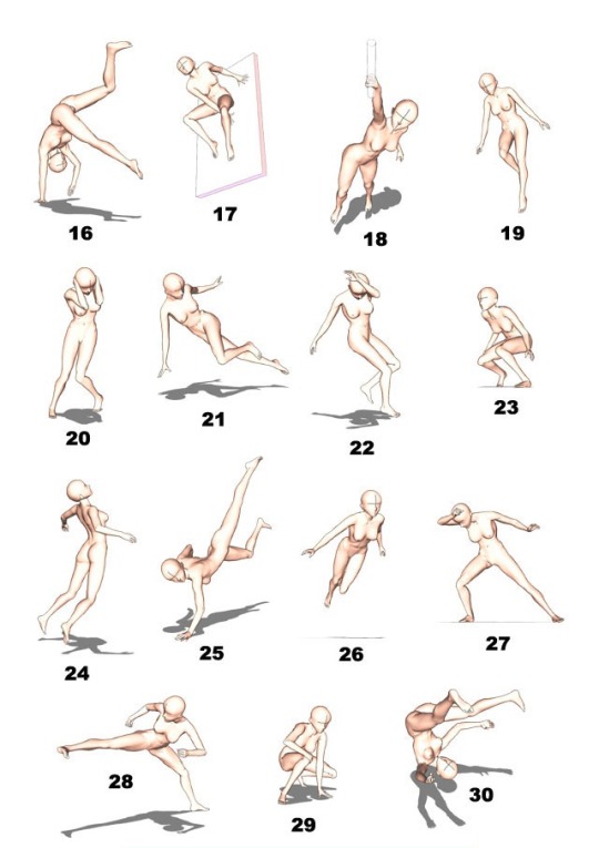
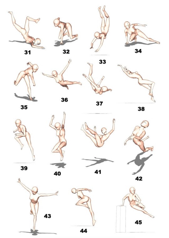
Dynamic Poses by Modelfactory
110K notes
·
View notes
Photo
source: [x]
16K notes
·
View notes
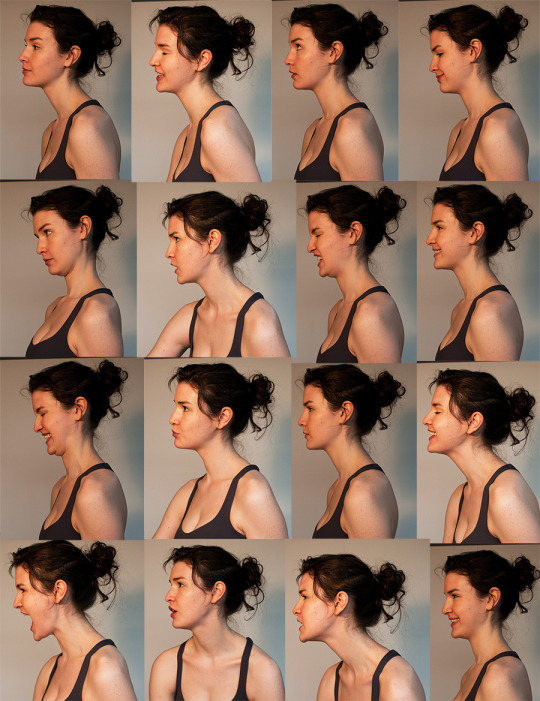
Photo


Anatomy of the Legs and Feet
6K notes
·
View notes
Text
10 typical perspective errors
Drawing perspective is considered one of the hardest things in art, except the mistakes usually done are pretty much always the same and can be avoided with a little care.
1. Lines not reaching the vanishing point

Well this is pretty simple to avoid but it’s the most common mistake. It’s probably due to either carelessness or really not having understood the basic of perspective. I encourage you to go back and find some basic tutorial for this.
Anyway, be ALWAYS careful about where to ‘send’ your lines, they NEED to go towards the correct vanishing point or it will just look awkward. Double check if necessary.
And always, ALWAYS use a ruler.
If your style requires lines that are a bit less geometrical (as mine do, I have a style of inking that’s sketchy so ‘perfect’ lines drawn with a ruler usually don’t fit well in the picture) use a ruler anyway for the pencils and then ink later by freehand. At least you’ll have correct guidelines underneath.

For traditional drawing be sure you have a ruler and be sure to use it for each one of your lines.
Modern drawing software will help you a lot with this if you draw directly on computer: painting software such as Clip Studio Paint or Manga Studio 4EX or 5 have perspective tools that will automatically snap your lines towards the vanishing point.
it’s quite a long tutorial, you’ll find the rest under the Read More or you can download the pdf file here
Read More
31K notes
·
View notes