
Lizzie 🌸17 | She / Her | UAL Level 3 Diploma in Creative Practice | Instagram and Etsy @doodlebette
Don't wanna be here? Send us removal request.
Statistics
We looked inside some of the posts by doodlebette and here's what we found interesting.
Average Info
Notes Per Post
25
Likes Per Post
23
Reblog Per Post
1
Reply Per Post
1
Time Between Posts
22 days
Number of Posts By Type
Text
16
Last Seen Tumblr Blogs


Fun Fact
BuzzFeed published a report claiming that Tumblr was utilized as a distribution channel for Russian agents to influence American voting habits during the 2016 presidential election in Feb 2018.
Text
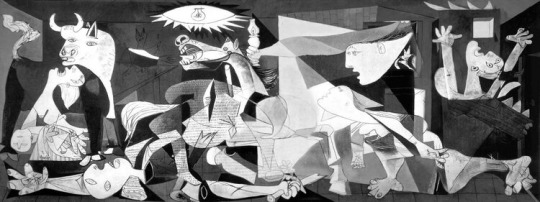
Art History Assigbment 13: Conflict
‘Guernica’ is a large-scale oil painting by Pablo Picasso. It was painted in 1937 as an immediate response to the Nazi bombing of Guernica in Spain.
The composition is quite abstract, which is exaggerated by the cubist forms. A bull stands over a morning mother, an injured horse cries out and many dismembered bodies are scattered throughout the piece.
The whole piece has been painted in black and white. This shows how bleak the bombing was, and also makes it harder to see what is going on. Figures are indistinguishable from each other, it is one huge scene of dispair. Adding colour would take away ambiguity and add clarity to the scene, but often leaving elements up to the viewer’s imagination creates a deeper connection as they can use their own experiences to fill in the blanks. 1937 was during the Second World War so almost everyone would have some experience of war or loss that they could relate the piece to.
The large scale of the canvas means the figures are almost life-size, which is impactful as we can translate the image easily into real life. It also shows the scale of devastation.
Picasso was living in Paris at the time he painted this, which changes his response slightly. On one hand, he hasn’t actually experienced the events or the aftermath, so it doesn’t represent a personal experience. However, he grew up in Spain, and being so far away from your home country when such a horrific event has happened must be very isolating. The scene being so abstract and hard to decipher could represent how Picasso felt trying to piece together what had happened from newspaper articles.
Image via: thestrategybridge.org
1 note
·
View note
Text
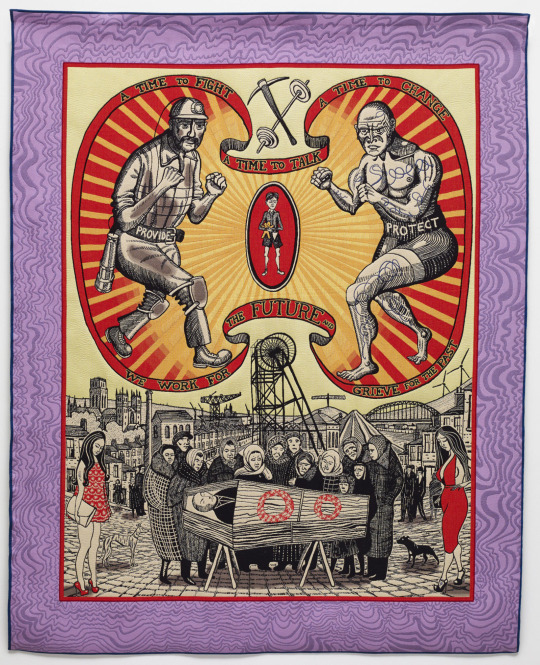
Art History Assignment 12: Masculine Ideas of Identity
‘Death of a Working Hero’ is a 2 x 2.5 metre tapestry, made by Grayson Perry in 2016. In it, he explores toxic expectations of men in society, and how it personally affected the artist negatively growing up, as well as larger areas of working-class Britain.
The two figures at the top of tapestry are a miner and a boxer. The miner represents working class men who worked long hours to earn money for their families, and the boxer is paid to fight. They both wear belts with the words ‘provide’ and ‘protect’, which are historically the two main roles of men within the family. Aggression has always been seen as a ‘manly’ way to sort out arguments or problems, which is why the two sides are fighting. It could also show that the pressure to constantly provide and protect their family is leading men to fail to do the same for themselves.
In the centre of the tapestry, a funeral is taking place. This was Perry’s way of showing how these standards result in a high rate of male suicide. Only women stand around the coffin, which could show how only women are allowed to show emotion, or there are no other male members of the family still alive to mourn.
There are two women dressed in bright red clothing, which deliberately contrasts against the rest of the scene. Perry has done this for a reason, so these figures obviously hold a symbolic meaning. Their outfits could be considered inappropriate for a funeral, as they are quite dressy/ revealing. They stand back from the other group of mourners, as if they have been outcast. They could represent Perry’s alter ego Claire that he created as a way to escape the pressure put upon him as a male.
The bright ribbons are inspired by Victorian banners paraded at mining strikes. They are also reminiscent of circus illustrations, which shows how men have to put on a false front and ‘perform’ as the man of the house.
Perry has put himself within the piece, as the small child holding a teddy bear in between the two male figures. This shows how he was exposed to the toxicity at a young age and felt like he didn’t fit in.
Image via: www.paragonpress.co.uk
0 notes
Text
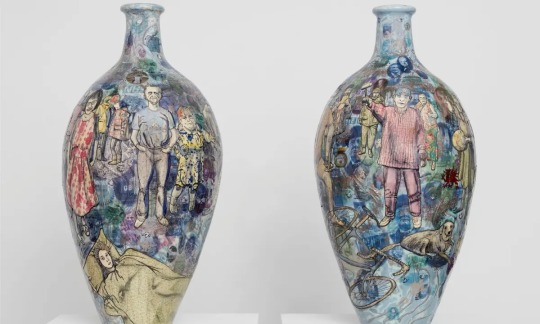
Art History Assignment 11: Social Commentary
The Brexit Vases are a set of two ceramic vessels made by Grayson Perry in 2017. They encapsulate events surrounding the British Referendum the year prior, which had caused much controversy. The two vases represent both ‘leave’ and ‘remain’ parties, with the leave vessel being slightly larger, representing how they received slightly more votes.
I think using ceramics to display this message is particularly effective because they are fragile and can be broken easily, which represents how divided Britain was at the time. Trade was also a big factor in both sides of the debate, and historically the UK has both imported and exported large quantities of pottery.
To decorate the vases, Perry used scraffito and glazes. He asked the general public for suggestions on what to display on each vase, items they think are important to each agenda. This input from the public means these vases have no personal bias from Perry and are almost more scientific, a time-capsule of opinions from the topic.
Both of the pots feature traditonal iconography associated with Britain, including teapots, a full English breakfast, the seaside and the pub.
The remain vase shows the Waitrose and NHS logos alongside figures such as Barack Obama and Shakespeare, whereas the leave vase features the Cadbury’s logo, the Queen, Nigel Farage and Winston Churchill. I think the icons people chose to represent both sides are very interesting, as they are quite similar. There are Influential figures and politicians on both vases, as well as British items and brands. The referendum divided Britain in many areas but both sides are more alike than we may realise. In many ways, everyone had a shared aim of protecting the UK, but it was how people thought that would be best achieved that differed.
Perry’s main takeaway from these vases was of a similar opinion, stating how ‘we all have much more in common than that which separates us’.
Image via: www.theguardian.com
0 notes
Text
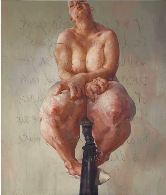
Art History Assignment 10: Feminism
Propped (1992) is a large format oil painting on canvas by Jenny Saville. In the piece, Saville is sat on a tall stool in front of a mirror. Female forms in media are often soft and dainty, but Saville rejects those standards and paints herself using loose, expressive marks showing skin texture and imperfections. The large scale of the piece is visually commanding and I love the message it portrays; she is not afraid to take up space, and sits upon her own pedestal. The use of perspective in this piece is very interesting, the foreshortening exaggerates the shapes of her legs. This distortion of her figure could represent her own insecurities or how society sees her, instead of how she actually looks. When this piece was first exhibited, a large mirror was placed on the opposite wall which emphasises how Jenny is looking at herself in this piece, and her expression is her reaction. Her expression is almost pained, as if she is uncomfortable with being seen in this way, showing how vulnerable it is. Yet she doesn’t need to be overly confident in her appearance or sit delicately, she has drawn how she truly exists.
Image via: www.artsy.net
0 notes
Text
Art History Assignment 9: Prejudice
No Woman No Cry is a mixed-media painting created by Chris Ofili in 1998, in response to the Steven Lawrence murder investigation, in which the police were found to be ‘institutionally racist’. A public campaign into the case was made by his mother, Doreen Lawrence, who is the subject of this artwork.
Visible links to Steven Lawrence and his investigation can be seen in this piece. Ofili has used a layer of phosphorescent paint within the piece, writing the words ‘RIP Steven Lawrence 1974-1993’. This layer is visible under UV light. This could represent the subject’s internal thoughts she how she is crying because if her son.
The subject of this piece is portrayed as crying, and with her eyes closed, so there is no gaze. This is effective as it helps show Doreen’s internal grief, and how she had to remain strong in the public eye. Her closed eyes also show how she is inconsolable, and does not want the viewer’s sympathy, but it determined to get justice for her son.Within the subject’s tears are photos of Steven Lawrence, which makes it clearer to the viewer what the topic of this painting is about, as well as representing how Doreen’s grief is for her son, and helps answer the question of what the woman is crying about.
Visible under UV light are the words ‘RIP Stephen Lawrence, 1974-1998’. This makes the meaning of the piece explicit, but by hiding it, Ofili could be reflecting how police tried to cover up the truth and blamed Stephen for his death.
This piece uses lots of different techniques and mediums, in a very layered approach.This is a deliberate choice by Ofili, as he was inspired by how, despite her grief, in every interview Doreen Lawrence gave, she seemed to grow stronger and more determined for justice. The materials used include resin, oil paint, glitter, collage and elephant dung. The linen weave of the canvas also shows through, adding another layer of texture.
Doreen wears an elephant dung necklace. Ofili uses elephant dung a lot in his pieces as he likes the juxtaposition between art and grotesque objects. The three elephant dung pendants have been sealed, two of them act as the base of the piece with the title of the piece pressed into them with pins, and the third is worn as a pendant around the woman’s neck. Ofili has encorperated these elements into the piece to add an extra sensory element to the piece
The colourscheme is very bright and warm toned. This juxtaposes with the sad emotions as warm tones are typically associated with happiness. Perhaps this could show how Doreen channeled her grief into determination, or link to traditional Jamaican patterns which use the same colourscheme.
The skin has been painted using tiny dots of coloured oil paint, and appears mosaic-like. Within the skin and around the piece are tiny chains of dots with hearts painted on them. This could represent how her heart has been broken by the murder of her son, and how her grief has been put on display to the public, like a chain around her neck.
Other chain imagery is used in this piece, with the diamond grid pattern that overlays the image. This shows how Doreen felt let down and trapped by the police force and legal systems, and how she feels like her grief is being abused for media coverage, rather than for justice.
Image via: Wikipedia
0 notes
Text
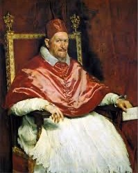

Art History Assignment 8: Conventions
The left portrait of Pope Innocent X was painted in 1650 by Diego Velázquez. It is oil paint on canvas, and in a Renaissance style. Paintings at this time were often commissioned by important figures, to show off their wealth and power, and are full of symbolism. The main colours in this piece are red, white and gold. These symbolise power, wealth and purity respectively. The Catholic Church in the 17th Century ruled over most of Europe, spreading the message of God. However, they often used their power to go to war and dictate other countries. This is depicted in the portrait by his white gown, which was traditional clothing, which is shrouded in a blood red cape. Pope Innocent has a direct gaze at the painter, which shows how impatient he is, and how little he is enjoying being commanded by someone else.
A modern re-interpretation of this painting is a study by Francis Bacon, in 1953. Here Pope Innocent is distorted and looks in pain, as if he is being electrocuted. The vertical lines could represent a veil hiding him or a more abstract idea of an aura or demonic possession of some kind. It could also represent Bacon’s own frustration with his work, that he’s begun to dismantle and deform it by dragging a brush through the wet oil paint. The painting could show how Pope Innocent has been judged for his sins when he was alive and is now suffering in the afterlife. Such a negative view of an important figure would’ve been unacceptable in 1650, but the dwindling power of the church made it more socially acceptable for Bacon to create his piece.
Photos via Wikipedia
0 notes
Text
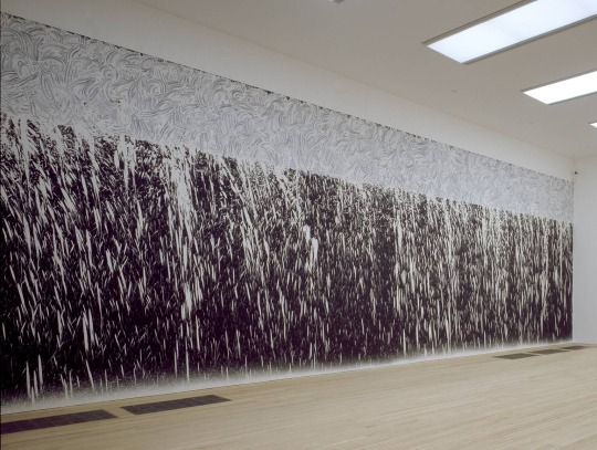
Art History Assignment 7: Land Art
Waterfall line (2000) by Richard long is a large format mural made from river mud. This painting was commissioned by the Tate Modern in 2000, which I find interesting because of the juxtaposition between a clean, industrial gallery and a messy, natural landscape. Perhaps Long is simply choosing to paint a landscape in a more abstract way, or is commenting on the destruction of the natural world to make room for civilisation.
The wall behind is painted black and the pale mud contrasts highly. I think this contrast is effective as it allows you to see the markmaking better, particularly the swirls of watered-down mud with different opacities. The combination of large swirls and splatters represents the flow of water at a waterfall. The large strokes are reminiscent of Chinese painting techniques, however, instead of using brushes, Long used his hands. I think using sediment from the location to paint the waterfall is very clever as it adds to the senses: you smell and touch the mud. Using his hands to apply it is also quite sensual and helps him connect with the material and how it moves.
Photo via Tate.org
0 notes
Text
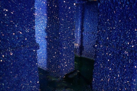
Art History Assignment 6:
Seizure (2008) is an installation by Robert Hiorns. He took a London council flat, due to be demolished, and poured 75,000 litres of copper sulphate into it through the ceiling. This then crystallised into intense blue crystals. I think this installation is mesmerising, the crystals are beautiful but the harsh blue is almost artificial and alien-looking. The contrast between the organic material and a very industrial location is also an interesting concept: man-made structures will be reclaimed by nature and the flat is now more reminiscent of a cave. The flats were demolished a year later as planned but the installation was moved into a gallery. I think this adds another idea about what makes art beautiful, council flats are not seen as beautiful, but art in a gallery typically is. By taking the art out of its original location, is the impact lost, or increased?
Photo via Pinterest
0 notes
Text

Art History Assignment 5: Assemblage
The sculpture ‘Indistructable object’ by Man Ray, first made in 1923, is an example of assemblage. He has taken a metronome and attached a collaged eye to the hand using a paper clip.
Man Ray used the metronome whilst painting to dictate his speed and timings. This helped him keep focus and avoid procrastination. However, he felt he needed more pressure put on himself whilst he was working in the form of an audience to watch him, which is why he decided to add the eye.
One day, he was overwhelmed with the silence and pressure from his created audience that he smashed the sculpture to pieces. He had originally named the sculpture ‘object of destruction’ which could reference how the action of being watched was destructive to his practice, or how he eventually dismantled it.
He has recreated the sculpture multiple times, and each time it has been eventually demolished. The simplicity and ease of construction alllows this to happen. I find it interesting how each time he has recreated it he has made it slightly different, with different eyes belonging to people he knows.
Image via: www.tate.org.uk
1 note
·
View note
Text
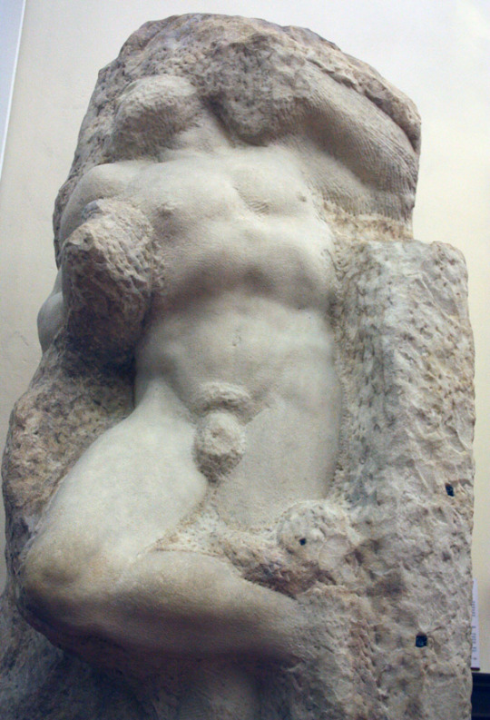
Art History Assignment 4: Stone
The Awakening Slave is a sculpture by Michelangelo, created in 1525-1530. It is carved from serravezza marble and is in a naturalist style.
This sculpture is a part of a series designed to be displayed at the tomb of Pope Julius II. It depicts a slave who appears to be trapped and is trying to break free. It is unfinished, which I think makes the pose even more dynamic; the extra marble that Michelangelo hasn’t chiselled away reinforces the idea that he is restrained. Because it wasn’t completed, the hands and face aren’t very detailed and so are quite ambiguous. This is effective as it means we are unable to see his expression and reflects how slaves are hidden and invisible in society. It is also a juxtaposition because historically religious figures and the affluentiual in society had statues made of themselves because they were so expensive, and identifying their features was a key focus.
Elements of the naturalist style are evident in how the figure has been observed. The dynamic pose is full of contrapposto and turns, and you can see how the chest is inflated as if the figure is taking in a breath.
I think the restraints could be analysed in a literal way (he is a slave in shackles) or in a more metaphorical way (the slave is trying to break free from his place in society but can’t because he has no voice).
Photo via: academia.org
0 notes
Text

Paint: Art History Assigment 3
The Marilyn Diptych, by Andy Warhol, collates two 2 x 1 ½ metre canvases. Warhol painted these quite soon after Marilyn’s death, in 1962, and wanted to juxtapose her bright, popular public image vs her deteriating private life. Warhol used silk screen painting for the dark outlines, and acrylic to fill in the colour blocked areas.
The qualities of acrylic are expressed in this piece through the large flat colour areas, which are opaque, bright and crisp. This is very representative of the Pop Art style.
The other side of the image is much more detailed, going from being more detailed, with grey mid tones, to much more simplified black outlines. This piece could be viewed linearly in either direction and tell a different story. From right to left would show her deterioration in mental health. From left to right could show how she was forced to bottle up her emotions and depth to become a 2-dimensional public figure, designed to sell.
The left canvas uses the same crisp outlines from the far right, and is much more uniform. This represents how women, like Marilyn, were used to sell and promote Hollywood’s very narrow beauty standards.
Using Marilyn as a subject for these paintings was particularly poignant because of her recent death, and also because she was the epitome of Hollywood glamour at the time. Even today, she still holds relevance in society.
Image via: The Guardian
0 notes
Text

Concrete: Art History Assignment 2
The Nameless Library (also known as the Judenplatz Holocaust Memorial) was built in 1988 by Rachel Whiteread. It was created to honour Austrian victims of the Holocaust and is located in Vienna.
Whiteread wanted to show how the victims were people with vast knowledge and skills. Their deaths led to a cultural genocide, with stories and traditions being lost, entire communities killed. The walls of the memorial are cast concrete books, facing outwards, so you cannot see what the titles are. This is to make it more universal, but also to represent how the knowledge has been lost. During the Holocaust, many books and religious texts were destroyed.
Similarly, the doors of the library have no handles, so you can’t get inside to retrieve the information.
The use of concrete is very effective here, as it has been cast and poured into precise shapes. Whiteread speaks about this memorial and says how it was never meant to be beautiful, it was meant to hurt, and the bleakness of the concrete helps portray that. The construction of the memorial itself is very intricate, but there is no ornamentation or frills.
The only carved details are small engravings on the base of the memorial, listing the names of the concentration camps at which the victims were killed. On the concrete below the locked doors is the estimated number of Austrian victims. In the centre, there is a Star of David.
Image via: Wikipedia
4 notes
·
View notes
Text

Patronage: Art History Assignment 1
Wells Cathedral is a form of public architectural patronage. It was built in 1176-1450, to replace a previous church on the site, in the hopes to bring more congregation members and tourists to the area; spreading the message of God, as well as boosting the local economy. It was built from locally sourced limestone and Bath stone and was designed by 4 architects (due to the time it took to construct) Elias of Dereham, William Joy, William Wynford and Anthony Salvin.
It features lots of Gothic architectural features,which were contemporary at the time. It is actually the earliest Cathedral to be built in this style in the UK. The inside of the building has vaulted ceilings which are supported by large scissor arches. It’s front façade, where visitors would have originally arrived, features 300 sculptured figures and stained glass windows. It is incredibly ornate and dominates the landscape, which would help attract pilgrims and visitors. Even now, it is still a prominent tourist attraction to the local area.
Its scale also allows it to hold a large number of people, and it is mostly one story which means it has very good acoustics for choral singing and prayer, as well as holding its large organ. Cathedrals in the Catholic religion are supposed to house God, which is why it is so grand. Decoration inside the cathedral uses expensive materials such as gold and marble.
In recent years, a new vistor’s entrance has been built and ramps have been placed to make the Cathedral more accessible, as when it was originally built wheelchairs and prams weren’t commonplace.
Image via: www.worldatlas.com
3 notes
·
View notes
Text

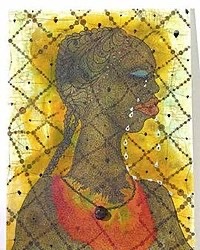
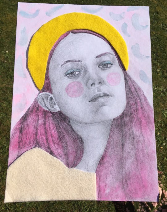
Continuing on from my last piece, this is another entry to a ‘Draw This in Your Style’ challenge, this time by ‘ ‘@ heymaryjean’ on Instagram. I used graphite, felt and watercolours. 🌈
#rainbow#rainbowart#rainbow aesthetic#portraiture#art#design#handmade#illustration#portrait#dtiys instagram#dtiys2021#dtiys2020#graphite#watercolor#feltingart#artstagram#art student#new artblr#art blog#artistsoninstagram
4 notes
·
View notes
Text
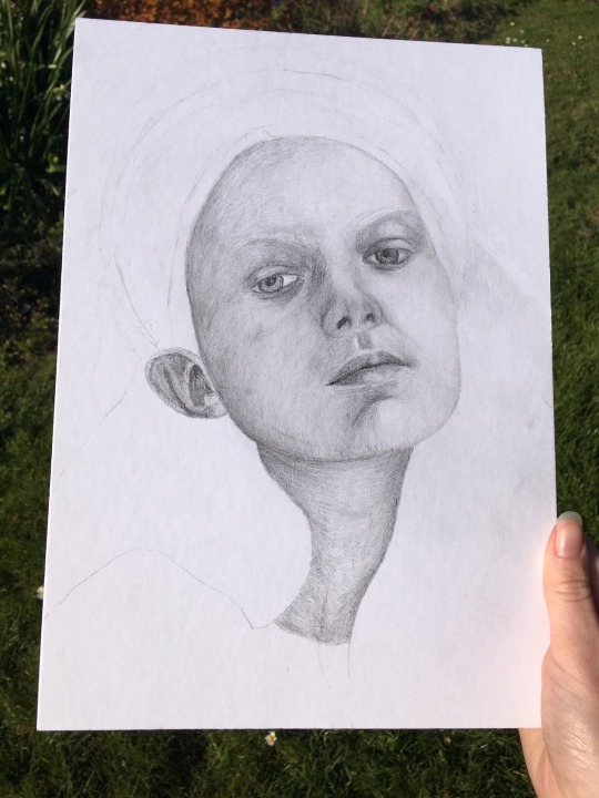
Hello again Tumblr! Here’s a portrait I made at the beginning of Lockdown 1 back in April. It really helped me get out of a creative block after not being able to finish my GCSE Art project. 😊
It was an entry to a ‘Draw This in Your Style Challenge’ by ‘@ layanamct’ on Instagram. I had lots of fun making it, and really enjoyed trying to replicate something in my own way, although I wouldn’t say I necessarily have my own style yet. I think these sorts of challenges make you step out of your comfort zone and try things you didn’t think of before, and are a good way to interact with artists within the community. I recommend them if you’re looking for something fun to do! 😅
I changed the pose and a few details from the reference drawing, but I wanted it to still be recognisable, especially since the original drawing was digital. For those of you who are interested, I used graphite, watercolour and felt for this piece. 🍓 I think it kick-started a love for combining textiles and portraiture, which I did a lot over the summer. It’s funny looking back at old work and seeing what trends and topics you were interested in at the time. 😆 I’m not sure what sort of work I do most of now, I tend to do a lot of everything. For my final project I would love to do something Illustration-focused though. 😊
You’ll probably be seeing a lot of me over the next few weeks as I transfer work across from my Instagram, so see you next time! 🥰

#art#design#illustration#handmade#artists on etsy#new artblr#art blog#artistsoninstagram#textiles#portraiture#portrait#dtiys instagram#ditys challenge#mixedmedia#graphite#discover new artists#lockdownart#summerart#artstagram#art student
5 notes
·
View notes
Text

Hello Everyone! Since this is my first post on my Tumblr account, I thought I would tell you a little bit about myself. I did one of these on Instagram last year, but I thought I’d update it. 🌸
My name is Lizzie, and I’m a 16-year-old full time art student from the UK. Illustration is my favourite art form, but on my course I also study other things, such as Textiles and Ceramics, which I really enjoy. 😅 I try to explore a variety of mediums, and over the summer I did quite a few digital Illustrations, which I found really fun. I also have an Etsy Shop, which I am planning on selling some prints on, but this will probably be in the Summer when I’m less busy. ☀️
Now, for some other, non-art related things about me!
I play the clarinet! I am grade 6, and play in a few local and school music groups; my favourite things I’ve been a part of were the times I’ve done Pit Orchestra for my secondary school, as the music is always so fun to play. I also played the saxophone for a little bit when I could borrow the school’s saxophone, and I’d love to play it some more one day. Obviously all my extra-curricular activities have stopped now because of Covid, but hopefully I can get back into them later this year.
I’m quite a studious person and really enjoyed all of my subjects at school. I particularly like languages and was due to study A Level French alongside my course, but it didn’t fit in with the timetable. I like to think I knew a decent amount of French at one stage, and I would love to pick it back up again. In the future, I’d love to learn BSL (British Sign Language) and I also want to take a First Aid course at college, as I think it’s a useful skill to have, and I really enjoyed the sciences at school.
I hope you enjoyed learning a little more about me, feel free to introduce yourselves in the comments too. And hello if you’re here from Instagram, I’m knew to this whole Tumblr thing so you’ll have to help me out. 😆 Anyways, see you next time! 🥰
#art#about the artist#new art tumblr#new art account#art student#artists on tumblr#artist blog#procreate#portraiture#petportrait#artists on etsy#artistsoninstagram#illustration#handmade#mixedmedia#youngartist#design#a level art#new artist#petstagram
7 notes
·
View notes