Don't wanna be here? Send us removal request.
Photo

Manifesto #6
I used the constraint: Type + Texture + Colour
Our last manifesto. I wanted to add a little colour back into my manifesto’s. My final thoughts about accessibility was. “Who decides normal.” So much get put under that thought for me. I just wanted to have some fun with this question.
3 notes
·
View notes
Text
SUMMARY #6
SUMMARY
This was the most in dept learning I've ever had the chance to do for disabilities. There are so many ways to include inclusivity. We must be aware of that when going into design. Though we might not remember everything for disability, we must make the effort. We are only human after all. If we all strive to add accessibility, it will become the trend, not the outlier. The WCAG’s Four Principles of Accessibility is a great thing to remember: Perceivable, Operable, Understandable, and Robust.
You can just think stylistically when designing. Making sure that when all is said and done, you users can do just that, they can use your design. Whether it be visual, auditory, cognitive or something else. Everyone has the right to use, to enjoy, to live. I really like the quote from Edward Tufte where he said, “Don’t get it original—get it right.” and “The user is never wrong, and the user is never stupid. In information design, only designs are wrong and stupid.” It’s a great mindset to take.
TAKE-A-WAY STATEMENTS
Include inclusivity.
Accessibility should be the trend, not the outlier.
Put in the work so they don’t have to.
The people come first.
2 notes
·
View notes
Photo

Manifesto #5 - Modified
This topic is something i can relate to and i wanted to do it justice. As mine was chosen for the Instagram here’s the comment I left with it.
“As I myself struggle with a hidden disability I understand the want, the need, to be seen. I wanted to do this topic justice, show people out there that they're not alone. @Kaeblie”
1 note
·
View note
Photo

Manifesto #5
I used the constraint: Reversed Type Only + Black and White
My initial idea started with just the outline of the head. i knew i wanted the illustration to be completely contained within the head to help convey the message. I used a sans-serif font because i wanted my design to be simple and easy to read no matter what.
3 notes
·
View notes
Text
Summary #5
SUMMARY
What is “Accessible Design?” What form does it take? And where do we start? So many questions, I know. But all important. Research the thing you are designing find out online what others might have brought up as issues, see if you can hit as many points as you can. If you find you are getting messages or complaints, either see if it can be improved or add it to the knowledge banks for next time.
We, as designers, have a responsibility to make design accessible. As I have a few close people with disabilities in my life it’s always something I try and strive for when designing. Educating ourselves is half the battle, even if we believe in accessible design if our client doesn’t nothing changes. We go in with good intentions, knowing that’s not all it takes, and convincing them from a standpoint of profit. Sometime the client is looking specifically for accessible design, and you just need to push them in the right direction.
TAKE-A-WAY STATEMENTS
Accessibility is not an afterthought, it can't be.
Don’t limit yourself to the stereotypical image of “disabled” it's not always visible and maybe not who you think.
A client might just need help understanding.
In your lifetime, disability is the higher chance not the exception.
1 note
·
View note
Photo

Manifesto #4 - Modified
I knew when i first posted it there was something wrong with it. After the suggestions to classmates i was finally able to make something that was legible.
I removed the stroke and broke up the smaller words to alter the way your eyes go through the piece.
0 notes
Photo

Manifesto #4
I used the constraint: Type Only
There are so many people who call themselves graphic designers. There is enough of us that change is possible. Its already happening, just very slowly. We have to power to shape how others perceive the world.
I went through quite a few iterations before landing on this. Different type, opacity, colours and sizes. I know it can be improved. There’s something off, ever so slightly wrong but i cant quite put my finger on it. I'm excited for the group critique.
0 notes
Text
Summary #4
SUMMARY
Cradle to Cradle and Cradle to Grave shows us the difference in how a product's lifestyle passes. As designers, we now have some ideas to strive for. With LCA, we can see if the product we help design can be made better. Be prepared and have an example to show a client of more environmentally friendly things to do, as we’ve learned clients are more open to it than we might think. Sometimes all they need is a good example.
Berman’s reading always leaves me with some interesting things to think about. I feel like the quote “I am hereby giving you permission to be extraordinary.” Is what stuck with me the most. You see all these great people in the world and they are extraordinary in our minds. Some may be super smart or whatnot but a lot of people that change the world are ordinary. Be the extraordinary you want to see in the world.
TAKE-A-WAY STATEMENTS
Accessible design is not just good its common sense
A products life cycle should loop, not end
Be the extraordinary you want to see in the world
Designing to becoming obsolete should be what we strive to change
1 note
·
View note
Photo

Manifesto #3 - Modified
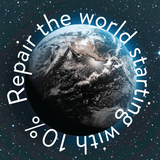
I have to say this is by far my favourite manifesto I've done yet. As mine was chosen for the Instagram here’s the comment I left with it.
“My idea for this came with the quote "...I will be true to myself and will spend at least 10 percent of my professional time helping repair the world.” It stuck out as I never thought it had to be such little time dedicated. But considering all the designers in the world, that 10% would add up fast. @Kaeblie”
1 note
·
View note
Photo

Manifesto #3
I used the constraint: Type + Image
This idea of using 10% of your time was a huge new idea for me. When you think about wanting to do good with yourself you're not sure how much of yourself should be put towards it. This allowed me to think about my priority’s again.
1 note
·
View note
Text
Summary #3
SUMMARY
Ethics in the graphic design industry are a weird thing. We have a code of ethics just like medical professionals but we don’t have that same type of push to follow them. “I will be true to my profession, I will be true to myself and will spend at least 10 percent of my professional time helping repair the world.” This is the three-part pledge Berman follows and I believe we, as designers, should as well. We need to make that push towards small gestures, that 10%. We are more than a sum of our parts. The design process can change, it just needs time.
TAKE-A-WAY STATEMENTS
10% is enough to make a difference.
Ethics need to be considered.
Sustainable design starts with the big picture.
Giving back doesn’t mean giving up on each other.
0 notes
Photo

Manifesto #2 - Modified
After reviews today's i am trilled with how well the updated version of this is.
0 notes
Photo

Manifesto #2
I used the constraint: Hand Written + Sans Serif
The reason I chose the colour scheme i did, to go along with the message is because I myself, am a member of the lgbtq+ community. Eventually id like to be able to help out queer youths, so relating the phrase to these colours worked quite well.
0 notes
Text
Summary #2
Summary
Despite what we're used to as designers have to design what's real, not just what's appealing. Despite what we might think designers do in fact have a hand in advancing our economy and making a difference in how society views certain subject, like with global warming. People may view graphic design as an undervalued position be we are the people who can educate society about so many important issues. Without us, communications from company to consumers becomes muddled.
We work to make sure things are for the consumer. Is the typography legible, what colours were chosen? Things like this is always what we have to keep in mind. While we aren't the deciding factor, we do have influence over the message and information people receive. We work so hard to make things pretty but if they are only one use then what's the point. Why create something for it to almost immediately go in the trash. If we have the choice to do good, why are we still consciously supporting the bad. We must keep pushing for sustainability. Consumers learn to fill that empty hole with more products. Consume everything we’re shown, that’s what we’ve been taught. How can we break that cycle? We should be held responsible as well.
TAKE-A-WAY STATEMENTS
Designers can do better than net zero
Aiming for a sustainable world
My morals have such a huge roll over the work I do
Sustainable design is attainable, we just have to keep pushing
0 notes
Photo

Manifesto #1 - Modified
the updated version worked on in class today.
0 notes
Photo

Manifesto #1
I used the constraint recipe “Reverse Type + Colour”
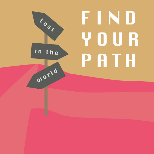
One of my biggest challenges as a designer is feeling like I don't’ know where I'm going. So Its only obvious that the this would be the take away sentence to use.
0 notes
Text
Summary #1
SUMMARY
Trying to find a balance in your work where you are making a living but also following your own moral compass is a difficult challenge in the modern-day design industry. Thankfully the progress is showing. Unlike before we as designers have options when it comes to what work we choose. Our choices are slowly starting to matter. We can make a difference.
There are four main factors to keep in mind when trying to build a conscious creative mind. With personal we are focusing on our choice, how we can choose to do the moral option. Economic is the balance between keeping money in your pocket but still trying to do moral work. The social aspect has to do with actions that support positive change for pressing social issues and the integrity that comes with building up those communities. Finally environmental, he most challenging. This is where we are looking to have our work positively affect the environment around us that includes stuff like climate change and social justice.
TAKE-A-WAY STATEMENTS
A desire to do better with no idea how to do so yet
I wish to become a designer where morals are just as important as money
How do you make a real difference in our world?
In the digital era, how will I use my platforms to do what's right?
Will I be aware enough not to fall for big company's just using designers?
0 notes