
The blog for the Illustrations and GIFs I will create and the extra stuff.
Don't wanna be here? Send us removal request.
Statistics
We looked inside some of the posts by emmawillillustrate-blog and here's what we found interesting.
Average Info
Notes Per Post
4
Likes Per Post
2
Reblog Per Post
2
Reply Per Post
0
Time Between Posts
4 days
Number of Posts By Type
Text
3
Photo
14
Last Seen Tumblr Blogs


Fun Fact
The “We are the 99%” Tumblr blog became the slogan for the Occupy Wall Street movement.
Text
Contact with Industry
Today i asked questions to two Illustrators who’s work I’m inspired by and wanted more advice as I’m learning to work with Adobe Illustrator more.
I asked Ben Boothman first.


Then I sent one to Rhinothewrecker who dose work using Illustrator and creates designs for merchandise.


I may get a response I may not but it was just a good idea to ask for some advice to help me.
0 notes
Photo

I wish I done that.
work by Trung Nguyen.
When it came to my book cover and idea I should have played around with how It was going to look. I know I wanted to keep the idea of a box head and the whole head in the clouds idea but I should have experimented and played around with how the clouds surrounded the character. Because although my idea was good and so was the final design, I honestly didn’t like it as much as I thought and wish I took more time experimenting on the background and how it would work around the character who was in the middle. I should have given the clouds and text more depth then what it looked like. Although I did give them a paper feel and a grain background I should have played around with it more. Same with the character. I felt like it was a bit too close and should have back around and had more background surrounding him or his box head.
One of the things I should have also done is stay away from black outline. Although I decided to leave it out in the final product I wanted to have it over the title and looking at this I could have been a lot smarter in how I placed the title as the one I did honestly look rushed. I also noticed that I should have moved the character away from the text and have him a bit more at distance. It would have made the final product look clearer than what I had. I just felt like the whole thing didn’t look right and I should have played around with the text and character so it didn’t look so clogged together in the final result. I also had trouble fitting the wording and text in at the back of the cover and on the front. I should have played around with the placement of the character and wording a bit like how Trung Nguyen work did.
A final thing I wish I done was play around with textures on the shapes and background. Her work shows a mixture of different texture and colours. I love how she plays around with line artwork above the shapes and as an extra feature like the flowers. I should have done this with the clouds and give them more texture as I’m cable with line art. I also should have done this with the character as I didn’t find the burning to stand out as much on the finished version.
0 notes
Text
123
Advice I have gotten over the year on my work, here are three main ones.
1. It’s okay to make mistakes.
One of the things I hate when drawing is making mistakes, it throws me off either continuing or the whole idea in general. This is why I have become picky at how my work looks especially when colouring or trying new things. I know it’s okay to make mistakes but I struggle to understand that as a positive thing. When it comes to drawings I tend to keep to a few ideas and a piece of work that I would like to stick to. The mistakes are made when it comes to the line art, I then get annoyed because I have to draw it again. One of the big mistakes I have made and look alright in the end is having a sketchy line art and I can do things with that. Some art gets redrawn others don’t but I have learnt that making mistakes is a learning progress and shouldn’t be seen as a negative response.
2. Experiment. You never know what you might find.
Experimenting isn’t something I like to do but I have realised that it helps a lot especially with the progress of my art. Most of my art now has turned into experimenting rather than going with my original idea. This is advice I have kept in mind because of the way I draw, I wanted to try different things unlike different tools. I still want to work with pens and markers but I have found ink to be a great experimental material. One of the biggest experiments I have tried this year is using a drawing tablet or colouring with block shapes on Illustrator rather than markers, this is also working well for when I start adding my style into my work especially with character designs. It works better than the paint brush or makers did. But I still want to continue drawing and colouring with markers but understand that experimenting can lead to some interesting things.
3. Ask for opinions.
Opinions is something I’m not good with wanting to know but as I progress, I realised that it’s better than hiding my ideas and ways of working away from everyone. This has become useful for stepping away from original ideas. I always want to keep to original ideas but learnt that not always the best idea. This is going towards character development not looking right or something not looking finished. I know I listen to ideas and opinions but sometimes I don’t stick to them, not because they are useless just because it’s an opinion and I tend to find a way working around it. Or I like the idea but don’t do it in the end because it may change something. Especially with how it’s going to look when finished. But I do find opinion helpful especially if it’s just for a small tweak or changing an idea I had and expand on it.
So that’s the advice I’ve had and keeping to in next years progress.
2 notes
·
View notes
Photo


Artist research:
Sow-AY
As I moved onto doing charter design for my project I wanted to do smaller designs that would animate and help show gaming addiction, this was scrapped but I kept the idea of video game and characters just showing the fundamentals but in this sort of way.
Artist can be found here: https://www.instagram.com/sow_ay/?hl=en
0 notes
Photo


Artist research.
Glenn Durrance
work as it was linking to my first idea I had including the TV head idea.
Work can be found here: https://www.artmajeur.com/en/glenndurrance/artworks/8435263/t-v-nightime-with-violence
0 notes
Photo


I didn’t exactly know what I was doing and so I had to look at my Moodboard which helped with my ideas. I drew old 80s-90s tvs to little drawings I want to turn into a GIF.
I did have to move away from video game addiction as it was harder to draw out without being too common. So I looked into doing the 8 fundamentals of video games instead. Still wanting to do the GIF idea, I played around with tracing paper and ideas especially on fantasy and sensation.
0 notes
Photo

Before working on drawings for my theme, I wanted to do a moodbaord to help me think and all show ideas I have.
0 notes
Text
PROJECT 2 Talk of Today Fairy Tales for Androids
Basically my own part of the project.
It’s based on video games, originally planed on Video game addiction and the effect but was changed and then scrapped to talking around the 8 fundamentals of Video games. With the help of some characters I development.
0 notes
Photo

Final version with shading.
0 notes
Photo

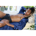
The book cover I wanted to submit.


This wasn’t my final version, the final one had more time and shading. I just want to submit it sooner then later.
0 notes
Photo

When doing some extra detail to the character after I did the final version. I wanted to add more effect to the character to make the colours stand out more and then I tried block colours on top of block colour to make a shadow effect, this did not work as I wanted to make sure it would stand out when on the book cover and so I went with using the burning tool on Photoshop instead.

The burning tool could only be used when I had the vector shape I could burn the colours and the shapes to give highlights, midtone and shadows. By using my drawing tablet it helped with steady shading.

I had to do it a few times for me to see how the shading and highlights would work, I also did it on the shirt, bag and eye.

The shading didn’t look right when I started and I decided to play around with the shading on the drawing as I want it to stand out.

The final version after adding the burn tool on the character. Makes the book cover look more finished.
0 notes
Photo

Final version before I decide to print it off.


The final version before feedback and group criticism. I also want to go back and work on it by placing the burning tool over the character on the final product.
0 notes
Photo

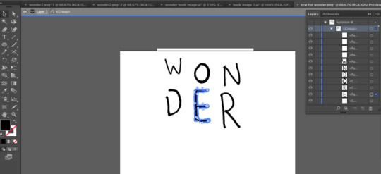
The text was okay till I had a second opinion. This then made me want to change the original text to a new type of text.

To get the text right, I had to write the word wonder in different fonts and styles and then pick the best one. This helped as I felt more freedom for the title of my book cover. I went with a more block style and less scratchy style to help bring the type more forward into the front cover making it easier to read and see.

I was also working on the rest of the character and when working on the text. After doing the body and bag, I wanted to make him stand out more, I tried redrawing the shapes but different shade of the colour. This was scrapped and then tested again when I finished the final production. I then decided to move onto burning. But this was not added till after I printed off the first version.

I decided to add more texture to the background of my book cover by placing a textile background and cutting the clouds using the lasso tool in Photoshop I was able to add this underneath and it gave a real nice finish. Along side the blue background which was placed with a filter on top. I went with gravel but very lightly.

Also downloaded some new font styles to help with the blurb and the quotations.
#wonder#childrenbooks#illustrations#adobeillustrator#adobephotoshop#texstyles#wording#font#experimenting#playing
0 notes
Photo


The background for the book cover was going to be simple so it didn’t take away the aspect of the main character. I also wanted to keep to the idea of having the head in the clouds.
To make the clouds I used the pathfinder tool and merge little circles and give a small outline. This was scrapped as the thought clouds didn’t look right so I tried again. This time using less circles and I liked how it looked. The title was from the original drawing I did.

I also planned on keeping the clouds shape simple as I was going to but the blurb on the cloud. However the final outcome didn’t look right and was changed by using textures when placing on Photoshop.
0 notes
Photo


It is easier to do it in Illustrator, the box head was my main focus when working.I wanted to use the 3D tool in Illustrator to turn a rectangle into a 3D shape, then be able to to bring it back into Photoshop to change the colours for the shading to a more skin colour and keep the highlights and shadows.
Then to create the facial features, I used a drawing tablet and the pen tool. I was able to understand that Illustrator uses layers and create different shapes for the hair, the ear was made using the Rectangular tool and his eye was created using the Ellipse Tool. The eye is a key feature and so is how I did the pupil as that is how I normal draw characters and their eyes.
The last image shows different skin ton colours for the final box head design. I was also originally going for a square look but then after playing around with the 3D tool it was better to use a rectangle look.
0 notes
Photo
I also used these to see how limited colours could be used for the book cover as I was wanting to keep it simple. As the book I was doing was Wonder, I wanted to keep the light blue that was on the original design whiles sticking to limited colours.


As I was going to use Illustrator for my book cover I decided it was easier to look at other children books which had be made using shapes. I’m slowly learning that you can create good looking work in Illustrator and as the book cover design has to be simple, It was easier to do it using shapes then detailed drawings or sketchy work I did whiles planning.
References:
https://www.pinterest.co.uk/pin/820640363330766948/
https://www.pinterest.co.uk/pin/820640363330766895/
https://www.pinterest.co.uk/pin/820640363330767054/
https://www.pinterest.co.uk/pin/820640363330767019/
https://prismmagazine.ca/2016/08/24/the-poetic-beauty-and-effortless-ease-of-sara-pennypackers-pax/
1 note
·
View note
Photo
As I was going to use Illustrator for my book cover I decided it was easier to look at other children books which had be made using shapes. I’m slowly learning that you can create good looking work in Illustrator and as the book cover design has to be simple, It was easier to do it using shapes then detailed drawings or sketchy work I did whiles planning.
References:
https://www.pinterest.co.uk/pin/820640363330766948/
https://www.pinterest.co.uk/pin/820640363330766895/
https://www.pinterest.co.uk/pin/820640363330767054/
https://www.pinterest.co.uk/pin/820640363330767019/
https://prismmagazine.ca/2016/08/24/the-poetic-beauty-and-effortless-ease-of-sara-pennypackers-pax/
1 note
·
View note