
Don't wanna be here? Send us removal request.
Statistics
We looked inside some of the posts by flurrymobile and here's what we found interesting.
Average Info
Notes Per Post
4
Likes Per Post
4
Reblog Per Post
0
Reply Per Post
0
Time Between Posts
4 days
Number of Posts By Type
Text
17
Last Seen Tumblr Blogs


Fun Fact
Tumblr.com is the 103rd most visited website in the world.
Text
Country Profile: The Brazilian Smartphone Market
By Aman Bansal, Flurry Analyst
Brazil is the world’s 6th most populated country and 4th largest smartphone market, only behind China, India and the United States. As South America's largest country, Brazil’s population accounts for half of the continent. Combined with a 46% smartphone penetration rate, Brazil is an attractive market for both app developers and OEMs. In this report, we take a closer look at Brazil, one of the world’s top smartphone markets.
Flurry Analytics, owned by Verizon Media, is used by app developers in 1 million mobile applications, reaching 2 billion smartphones worldwide every month. To understand the size of Brazil’s smartphone market relative to South America, let’s review the current distribution of smartphone users across the continent.

In the chart above, we list the percent of active smartphones by country in South America. On the left, Brazil accounts for 61% of all smartphones in South America, which is higher than the 50% proportion of the population it accounts for. In addition, Brazil saw 13% growth year-over-year in new device activations compared to only 2.5% growth for all of South America combined. This above-average growth indicates that Brazilians are adopting smartphones at a faster rate than the rest of the continent.
Next, let’s review the platform preference in Brazil.

In the chart above we show the market share of Android versus iOS devices in 2019 and 2020. As of August 2020, 86% of the smartphones in Brazil ran on the Android operating system compared to 14% on Apple iOS. While Android is clearly the dominant leader, Apple has gained 2 percentage points since August 2019. We reported last month that Apple’s low cost device strategy is increasing sales in international markets, and Brazil topped the list with 123% year-over-year iPhone growth. In other words, Apple’s market share gain in Brazil could be part of a larger play at growing share in international markets.
Next, let’s take a look at the leading smartphone manufacturers in Brazil.

In the chart above, we list the top 5 smartphone manufacturers in Brazil as of August 2020. Samsung is the clear leader controlling 46% of all smartphones in the Brazilian market. It’s followed by Motorola at 22%, Apple at 14%, LG at 7% and Xiaomi at 5%. Apple and Xiaomi each gained market share year-over-year by 2 percentage points, while Samsung lost share by 1 percentage point.
Finally, let’s review the most popular device models in Brazil.

In the chart above, we list the 10 most popular smartphone devices in Brazil by active devices as of August 2020. We list Samsung models in blue, Apple models in orange, and Motorola models in gray. Samsung’s Galaxy J5 Prime, released in 2016, is the most common device, making up 3.2% of the market. Overall, Samsung’s Galaxy line holds 6 of the top 10 spots, showing Samsung’s control of the market.
Brazil is a key market for any OEM or app developer interested in South America. Its large population and relatively low smartphone penetration rate means that smartphone adoption and usage will likely continue to soar in the years ahead. With Apple’s recent success in the region with its lower priced devices, we expect OEMs to compete more on price to attract new device adoption. Make sure you subscribe to the Flurry blog and follow us on Twitter and LinkedIn for more country profiles.
iPhone is a trademark of Apple Inc., registered in the U.S. and other countries.
Samsung and Samsung Galaxy are trademarks of Samsung Electronics Co., Ltd. in the United States or other countries.
The Flurry blog (https://www.flurry.com/blog/) is an independent blog and has not been authorized, sponsored, or otherwise approved by Apple Inc. or Samsung.
2 notes
·
View notes
Text
Mobility Drops 50% in Western U.S. Due to Wildfires
By Estelle Danilo, Flurry Analyst
Coronavirus has severely impacted U.S. mobility in 2020. Foot traffic to financial centers plunged by 70%. Trips to retail stores declined by 26%. Airport visits collapsed by 75%. And now with wildfires raging across much of the Western U.S., we see a new factor impacting mobility. With air quality critically impacted in California, Oregon and Washington, compounding a state of reduced mobility due to Coronavirus, we’ve seen an unprecedented reduction in people leaving their homes. In this report, we examine the impact of U.S. wildfires in the West on mobility through the usage of navigation apps.
Flurry Analytics, owned by Verizon Media, is used in over 1 million mobile applications, providing aggregated insights across more than 2 billion mobile devices per month. For this analysis, Flurry estimated user mobility using sessions across navigation mobile apps that provide drivers with directions, maps or speed meters. We also used the Air Quality Index from the U.S. Environmental Protection Agency. We focus this analysis on users in California, Oregon and Washington as these states have been most impacted by wildfires, as measured by the number of acres burnt.
Using car trips measured across navigation apps we can see the shift in mobility.

Fig. 1: Change in U.S. Navigation App Sessions during Wildfires
In the chart above, we show the daily percent change in navigation app sessions compared to a pre-wildfires baseline. We set the baseline to August 1 before wildfires grew severe enough to become a U.S. trending topic, according to Google Trends. Since observed changes were similar across California, Oregon and Washington, we present their group average in the chart. The color of the dots across the line represents the air quality measured on that day. For instance, the August 1 data point is green because air quality was considered “good” while the September 14 data point is red because it measured “very unhealthy” on that day.
On September 11, for the first time in 2020, air quality was considered “unhealthy” across California, Oregon and Washington. Over the next 3 days, air quality grew “very unhealthy,” resulting in navigation app sessions dropping by a staggering 55%. Similar but less severe drops also occurred when air quality worsened from “good” to “moderate” on both August 20 and September 5. Navigation apps reached their lowest point on September 19 following seven straight days of “unhealthy” to “very unhealthy” levels. As air quality dropped, so too did mobile trips outside the home. More recently, while air quality has come back to healthy levels in Oregon and Washington, moderate air quality persists in California, resulting in depressed mobility.
Due to poor air quality from wildfires, user mobility has dropped by 50% on average across California, Oregon and Washington. With new wildfires such as Zogg and Glass spreading in California as of September 27, the west coast is not yet back to normal. We’ll keep you updated on future important trends in travel and mobility. For the latest reports, subscribe to the Flurry Analytics blog and follow us on Twitter and LinkedIn to get the latest industry analyses.
0 notes
Text
Samsung and Apple Jockey for Smartphone Leadership with Contrasting Approaches
By Lisa Moshfegh, Product Marketing
Apple and Samsung together account for more than half of the world’s active smartphone install base, and are clearly the leaders of the OEM smartphone market. But if we take a closer look at how they each earn their market share, there are remarkable differences. This Flurry report takes a closer look at Apple versus Samsung market share, the number of products each company has in the market, top devices in the top 20 countries, and more.
Flurry Analytics, owned by Verizon Media, is used in over 1 million mobile applications that reach 2 billion smartphones per month. Unlike other market share analyses that rely on device shipments or sales, we measure devices currently active in the market, which we believe presents a more accurate picture of current market share. Let’s begin with an August 2020 snapshot of active devices by OEM.
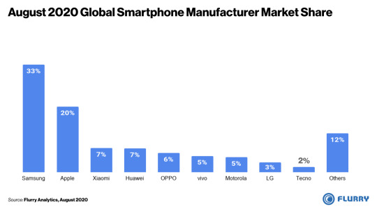
In the chart above, we list device manufacturers by their share of global active devices. Note that due to insufficient data in China and Europe, we exclude those regions from our analysis. Starting on the left hand side, Samsung is the global leader with 33% of the world’s active smartphones, followed by Apple with 20%. Now let’s take a closer look at which devices are most popular.

In the chart above, we list the world’s top 15 active smartphones using data from August 2020. We color coded Apple devices in blue and Samsung devices in orange. You’ll note that all of the top 15 devices are made by Apple or Samsung, with Apple holding the top 10 spots. Expanding to the top 15, Samsung Galaxy devices begin to show up. Of the top 15, Apple has 12 devices, and Samsung 3. No other manufacturer’s device appeared on this list, reminding us how much these two OEMs control the world’s device base.
Considering the first two charts together, you’ll likely wonder how Samsung leads Apple in global market share by so much while holding very few of the top 15 devices. That could come down to how they approach product lines. Most years, Apple launches one or two iPhone models, sometimes with a few different device tiers as was the case with the iPhone 11 series. Samsung, on the other hand, launches as many as twenty different models in a given year to accommodate regional preferences and provide coverage across the price spectrum. To illustrate this, let’s do a side-by-side comparison of the market share versus the number of active devices between Apple iPhone and Samsung Galaxy lines.

On the left side of the chart above, we compare the market share of Apple’s iPhone line, in blue, to that of Samsung’s Galaxy line, in orange. And on the right side, we compare the number of active devices between the two product lines. The Samsung Galaxy line is 8 percentage points higher but achieves this market share with 457 devices compared to Apple iPhone’s 28 devices. Slowing down for a moment, this means that there are 16X more unique Galaxy models active around the world compared to Apple iPhone models. This fragmentation of Samsung devices helps explain how Samsung can have more total market share without having any of the top 10 active devices. With this approach, the Samsung Galaxy active user base is 1.4X that of Apple’s iPhone. While this translates to more market share, Samsung’s fragmentation could also raise questions about economies of scale and complexity in manufacturing, distribution and promotion.
Overall, the top 15 devices shown in our earlier chart represent 20% of the world’s smartphone market. The remaining 80% of the market comes from more than 8,000 device models offered by over 800 OEMs, illustrating how fragmented the entire industry is, Apple notwithstanding. Let’s next check out which devices are most popular in each country.

In the table above, we list the most popular device in each of the top 20 countries, excluding Europe and China due to insufficient data. Doing so reveals more OEMs and devices, with some regional trends appearing. In Latin America, including Brazil, Mexico and Argentina, Samsung’s Galaxy J line is the leader. In countries with higher income per capita, such as the United States, Canada and Japan, the iPhone takes the top spot. Notable Chinese manufacturers Huawei, Oppo and Xiaomi also appear on the list in parts of the Middle East, Asia and Latin America. And third party analyst reports show that both Huawei and Xiaomi have strong penetration in China.
Samsung’s approach of shipping many more device variants, and at lower price points, has resulted in capturing a third of the world’s smartphone install base. Apple, with fewer devices at higher price-points controls a one-fifth of the world’s install base. And while Samsung has a larger total footprint, Apple may enjoy economies of scale with longer production runs across fewer SKUs and more focused distribution in the world’s more developed economies. Either way, this competition leads to innovation and choice for consumers, further driving advances in smartphone technology and capabilities. Make sure you subscribe to the Flurry blog and follow us on Twitter and LinkedIn to stay up-to-date on the latest smartphone adoption and usage trends.
iPhone is a trademark of Apple Inc., registered in the U.S. and other countries.
Samsung and Samsung Galaxy are trademarks of Samsung Electronics Co., Ltd. in the United States or other countries.
The Flurry blog (https://www.flurry.com/blog/) is an independent blog and has not been authorized, sponsored, or otherwise approved by Apple Inc. or Samsung.
0 notes
Text
Will the iPhone 12 Convince Consumers to Replace Older iPhones?
By Peter Farago, Flurry GM and Aman Bansal, Flurry Analyst
When Apple launches its annual line-up of new iPhones each Fall, it creates a surge in device adoption that spans the holiday season. Since the 2017 launch of the completely reimagined iPhone X, improvements to subsequent phones have been incremental, offering gains mainly related to the chipset, camera and screen. Since then Apple has released the iPhone XS and XR variants, the iPhone 11 line up and the 2nd Generation iPhone SE. The iPhone 12, coupled with 5G support, seems poised for stronger than usual uptake. For this analysis, we review the underlying drivers of iPhone device replacement including the relationship between consumer affluence and device age to understand how the upcoming iPhone 12 is positioned for this holiday season.
Device Obsolescence
A primary factor that drives new iPhone upgrades is device obsolescence. Apple doesn’t seem to explicitly plan this, but rapid innovation around both their hardware and operating systems results in reduced performance across older devices. Working against the growth of Apple’s annual iPhone unit sales is the fact that consumers are holding on to older devices longer. Today, consumers upgrade iPhones about every four years, compared to every three years back in 2018. For the iPhone 12 launch, those using the iPhone 7, launched in September 2016, or older models are candidates to upgrade their devices this cycle. We offer analysis on this below.
A Bigger Step
It’s speculated that Apple’s iPhone 12 will feature greater improvements than typical releases, which will likely increase device uptake. From a design standpoint, it likely re-introduces a smaller screen version as well as a metal, sharper-edged frame not seen since the iPhone 4. It will get a step up in speed while also better conserving battery life with the more energy-efficient A14 Bionic chip. There is a lot of buzz around the camera, with the largest phone versions rumored to feature a 64MP main camera, which will be a large improvement over the 12MP camera on the iPhone 11. Leaked rear glass pane images suggest that Apple will include a LiDAR scanner in the iPhone 12 Pro and Max that will help support augmented reality in some games and shopping apps, for example, by scanning local surroundings and superimposing various graphics into scenes.
A Shorter Window
Earlier this year, Apple CFO Luca Maestri announced that the iPhone 12 launch would be delayed, projecting that supply would be “available a few weeks later” than usual. That puts the launch most likely in the October timeframe, and the delay is likely due to Broadcom falling behind on producing the microprocessors for the iPhone 12. Apple has reportedly gone to great lengths to overcome production challenges related to COVID-19 and, unless delays are longer than expected, this should not be a major factor in its most important market, the United States, as new device uptake tends to ramp closer to Christmas.
The 5G Factor
Interest for the iPhone 12 appears greater due to the expectations that the device will be 5G-enabled, promising consumers access to seamless connectivity, faster speeds and next-generation user experiences. That said, tests have shown that 5G speeds are not pervasively available and sometimes actually slower than 4G speeds. The perception of a step-change in wireless technology could lead to a higher rate of iPhone upgrades this year, especially due to the pent-up demand created by Apple initially waiting to support 5G until this generation of iPhone. However, 5G may still be more of a future promise.
Affluence & Age of Device Base
Among the greatest factors in determining how well iPhone 12 may get adopted is simply whether consumers can afford them and what iPhone models they currently own. To better understand these factors, Flurry conducted some analysis, which we present below. Flurry Analytics, owned by Verizon Media, is used in over 1 million mobile applications worldwide, providing insights into more than 2 billion smartphones around the world. Take a look at the chart, and then we’ll go through it.
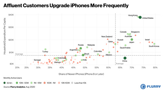
Fig. 1 Affluent Customers Upgrade iPhones More Frequently
In the chart above, we plotted countries by their consumer spending power and the age of their iPhone install base. On the x-axis we show how new the iPhone install base is. The farther to the right, the higher the percent of devices that are iPhone 8 or later models. On the y-axis we show the consumer spending power in a country, using household expenditure per capita. The higher up the chart, the more money is spent per household. The color of the dot relates to the size of a market, based on the monthly active iPhone devices Flurry detects in that market.
Let’s take a look at a couple of examples to get oriented. Represented by a dark green dot, the U.S. is among the largest markets with the highest consumer spending power and has a high proportion of newer iPhone models in use. This means that people in the U.S. can afford new devices and also upgrade much more frequently than in other markets. By contrast, Vietnam, in the lower left of the chart, has below average spending power and a larger proportion of older devices in its install base. Because the population cannot likely afford to upgrade devices more frequently, they hold on to iPhone 7 and older devices for much longer.
From our calculations, 63% of iPhones in use around the world are less than four years old (iPhone 8 or later models). For reference, we overlaid that average on the chart with a dashed gray vertical line. Countries to the right of the line replace their devices more frequently and overall have much newer phones. Those to the left of the line replace less frequently and have older devices, on average.
Statistically, we found a +0.8 correlation between spending power (household expenditure per capita) and the share of newer devices (a higher percent of iPhone 8 or later models). That is a very strong positive association, which means that the more spending power in a market, the newer the phones. This makes sense since a new iPhone requires a substantial investment and it explains why the United States and Hong Kong, both with a high household expenditure per capita, also have relatively low percentage of older iPhones in their respective markets.
Most of Apple’s smaller markets, represented by light red or gray dots, have low consumer spending power and a lower device replacement rate. This primarily includes most of Africa, as well as parts of Asia and Latin America. Consumers in these countries keep their iPhones for a longer period, likely due to having lower disposable income.
Some bigger iPhones markets such as Brazil, Russia, India and Indonesia have relatively low consumer spending power combined with a low device refresh rate. This means that a less expensive base version of the iPhone 12 can have a disproportionate impact on these key markets to get people to upgrade their iPhones sooner. This aligns with a previous report that Apple’s low-cost iPhones have helped Apple strengthen its footing in many international markets.
Using our calculation that 37% of global iPhones are four or more years old, and that there are an estimated 950 million active iPhones in the market, we estimate that 350 million iPhones are ripe for upgrade based on their age. This gives Apple a sizable addressable market with its iPhone 12 line. From various leaks, including from technology analyst Jon Prosser, Apple’s lowest priced model is speculated to start at $549 (with a rumored iPhone 12 4G). If this is the case, then Apple appears well positioned to drive upgrades from the older part of their install base. At the same time, with the highest end model speculated to retail for $1399 (iPhone 12 Pro Max), they would also cover off early adopters and loyalists in more affluent markets that want the latest and greatest Apple has to offer. By all accounts we predict a stronger than typical uptake of the iPhone 12 line compared to previous year’s launches. We’ll monitor early uptake of the iPhone 12 line when it becomes available and share those findings with you. Make sure you subscribe to the Flurry blog and follow us on Twitter and LinkedIn for the latest reports on smartphone, app behavior, mobile development and other trends.
iPhone is a trademark of Apple Inc., registered in the U.S. and other countries.
The Flurry blog (https://www.flurry.com/blog/) is an independent blog and has not been authorized, sponsored, or otherwise approved by Apple Inc.
0 notes
Text
How the Coronavirus Pandemic Impacted Summer Travel in 2020
By Estelle Danilo, Flurry Analyst
When the coronavirus pandemic hit, borders closed around the world and Americans spent months under lockdown. As Summer approached, stay-at-home orders were lifted and many hotels reopened. However, travel destinations and activities remained limited. Travel abroad was restricted, summer camps were canceled, indoor dining at restaurants was shut down, and entertainment activities such as going to museums, movie theaters, and theme parks were not permitted. As a result, COVID-19 crushed many travelers' Summer plans. What remained possible was visiting outdoor recreation sites including camping and hiking in both national and state parks. In this report, we look at how American summer vacation behavior dramatically shifted between 2019 and 2020 due to Coronavirus.
Flurry Analytics, owned by Verizon Media, is used in over 1 million mobile applications, providing aggregated insights across more than 2 billion mobile devices per month. For this analysis, Flurry measured the number of outdoor recreation visits using sessions across mobile apps that help users plan hiking and camping trips. These apps enable users to reserve camping sites, and find nearby hiking or camping locations through maps and photos of national parks.
Additionally, Flurry estimated vacation trips using sessions across hotel reservation apps. When travelers go on a trip that lasts more than a day, they need to book a place to stay. As a result, we think that hotel reservations are a robust proxy for vacation trips. We do not account for family trips during which travelers do not need to book a hotel.
Let’s first examine the changes in Summer vacation trips using hotel reservations as a signal.

Fig. 1: Change in Hospitality Mobile App Usage in the U.S.
In the chart above, we show the monthly change in total app sessions within hospitality apps compared to a January baseline. We compare this year’s usage in blue to last year in grey in order to identify unusual shifts in 2020. Until March of this year, hospitality industry app usage tracked about as expected, following last year’s trend. However, starting in April, after state officials issued COVID-19 stay-at-home directives, many hotels closed which resulted in a 75 percentage points plunge in year-over-year app hotel reservations. Compared to the January baseline, bookings were down by 54% when it should have been up by more than 20%.
During the Summer holiday months—from June to August—when many hotels reopened and reservations would have usually peaked—the app usage indicators of industry health remained in severe decline, on average 61 percentage points lower than last year. Although most hotels had reopened, they were among the most crowded forms of holiday lodging, which increased the risk of exposure to the virus. Additionally, social distancing measures altered the hotel experience. For example, shared amenities such as spas and swimming pools were often closed. We think this likely deterred customers from booking traditional forms of hotels.
By contrast, U.S. online spending for Airbnb, a hotel-alternative—less crowded and affected by COVID-19 measures—jumped by 33 percentage points this Summer relative to last year according to EdisonTrends data. Even though Airbnb reservations rose, accounting for 20% of U.S. market share, hotels still represent 70% of the U.S. lodging market according to Second Measure data. The 61 percentage points drop in hotel Summer reservations therefore indicates that vacation trips this year substantially declined.
Next, let’s see how outdoor recreation visits have changed over the Summer.

Fig. 2: Outdoor App Usage Recreation Trends in the U.S.
In the chart above, we show the monthly change in U.S. sessions on outdoor recreation mobile apps over the January baseline. Until March, this year’s usage of outdoor recreation apps was typical, following the trend from last year. However, in April, following stay-at-home orders, outdoor recreation trips tumbled by 54 percentage points year-over-year. This drop occurred right when hiking and camping activity typically begins to rise in the year. During the Summer holiday months—from June to August—when hiking and camping peaks, outdoor recreation apps hit remarkable record high usage, surpassing 2019’s increase in activities by 41 percentage points.
National parks became one of this Summer’s destinations of choice for many Americans, likely because they can be reached within a day’s drive and planned without much lead time. In addition, various health experts shared ahead of the Summer that the transmission rates of the virus are believed to be lower outdoors than indoors, making national parks an ideal vacation spot during the pandemic.
As evidenced by our analysis of travel apps and outdoor recreation apps, COVID-19 radically changed travel and vacationing trends in 2020. App-based hotel reservations dropped to an unprecedented low during a typically busy Summer season. At the same time, the pandemic brought a significantly larger audience of Summer travelers to U.S. national parks this year.
With the recent wildfires prompting the closure of many U.S. national parks, we’ll keep you updated on future important trends in travel and mobility. For the latest reports, subscribe to the Flurry Analytics blog and follow us on Twitter and LinkedIn to get the latest industry analyses.
0 notes
Text
Apple Increases Sales Velocity with Lower Priced iPhones
By Lisa Moshfegh, Product Marketing, and Aman Bansal, Flurry Analyst
In 2018, Apple announced they would no longer publicly share the number of iPhone devices sold each quarter. Instead, they would focus on quarterly revenue as a way to include their growing services and subscription business. In the two years since this announcement, Apple has expanded its services business to seven offerings, including Apple Fitness+ and Apple One announced earlier this week. With this new revenue stream layered on top of the iPhone, Apple has been reducing the minimum starting price for the iPhone to expand their footprint and sell more services. For this report, we analyzed the impact of Apple’s low price devices on iPhone sales worldwide.
Flurry Analytics, part of Verizon Media, is used in over 1 million mobile applications to provide aggregated insights across more than 2 billion active devices every month. We include only devices sold directly through Apple’s retail channels so as to exclude devices that are resold through secondary markets. Let’s first review new iPhone activations in the second quarter of 2020 when Apple launched the iPhone SE (2nd Generation).

In the chart above, we plot the percent of new device activations by week in the U.S. We focused on the U.S. market since the iPhone SE’s international launch was much more staggered and doesn’t provide as clear of a picture of cannibalization. During its launch week in the U.S., the iPhone SE captured 14% of all Apple iPhone sales. At the same time, Apple’s other lower priced iPhone 11 and iPhone XR models saw sales declines of 5 and 4 percentage points, respectively, very likely due to consumers choosing the iPhone SE. Apple’s higher priced models, the iPhone 11 Pro and iPhone 11 Pro Max, experienced only a slight dip during the iPhone SE launch week, and have since recovered their market share.
By all accounts, the iPhone SE launch was successful, accounting for 14% of Apple’s total sales during its launch week. It’s also noteworthy that this took place in a global pandemic. To understand whether their sales were incremental or cannibalizing the iPhone XR and iPhone 11, we took a look at growth outside the U.S.

In the chart above, we list the countries where Apple’s lower priced devices are growing the fastest. In August 2019, we consider the iPhone XR Apple’s only low-price device. And in August 2020, we consider the iPhone XR, iPhone 11, and iPhone SE as low-price devices. The blue bar represents the August 2019 share of sales of the iPhone XR. The gray bar represents the August 2020 share of sales of the iPhone XR, iPhone 11, and iPhone SE. For example, in Turkey during August of 2019, the iPhone XR made up 35% of all iPhones sold through Apple’s retail channels. One year later, in August 2020, the iPhone XR, iPhone 11 and iPhone SE combined accounted for 75% of all iPhones sold through Apple in Turkey. Countries are sorted in descending order of year-over-year growth shown by the embedded table on the right of the chart. A few observations stand out:
With the exception of Vietnam, more than two-thirds of all Apple August 2020 retail sales were generated from lower price devices.
The top 8 growing countries for low-price Apple devices are in Asia. Samsung and several Chinese smartphone manufacturers currently dominate in Asia, but Apple appears to be making strong gains with its lower-priced devices.
Several countries including India, Brazil, Mexico, and Russia have relatively low smartphone penetration, providing Apple an opportunity to increase share in emerging markets.
Now that we’ve shown that Apple’s low price devices are making up a larger share of Apple’s total sales in many international markets, let’s look at how low-priced devices may be increasing overall net Apple smartphone adoption.

In the chart above, we show the fastest growing iPhone countries, based on year-over-year iPhone sales through Apple retail channels. For reference we include the global growth rate in gray, at 8%. Growth has been strong, especially in certain Android dominated markets across Latin America and Asia. For example, Brazil and Turkey have both approximately doubled the number of iPhone sold with growth rates of 123% and 98%, respectively. And many of these countries still have relatively low smartphone penetration, which positions Apple to pick up share as adoption rates increase.
Based on the increased sales velocity of their low price devices, combined with an overall increase in total sales, Apple is driving growth through lower priced devices while maintaining high end device sales volume. However, the more Apple releases budget devices, the more it could diminish its perception as a luxury brand. The trade off between selling fewer, premium devices at high price points and aggressively driving growth at lower prices points will strain its brand positioning. Make sure you subscribe to the Flurry blog and follow us on Twitter and LinkedIn to stay up-to-date on the latest smartphone adoption trends.
iPhone is a trademark of Apple Inc., registered in the U.S. and other countries.
The Flurry blog (https://www.flurry.com/blog/) is an independent blog and has not been authorized, sponsored, or otherwise approved by Apple Inc.
0 notes
Text
Apple Grows 2020 Market Share by Appealing to Lower Income Segment
By Estelle Danilo, Flurry Analyst
For the last several years, Apple has pushed the limits of premium price points with its flagship iPhone line. Priced at nearly $1,500, fully-loaded iPhone XS and iPhone 11 Pro phones are now more expensive than some MacBook Pro laptops. This pricing strategy has helped Apple maintain its premium position in the market, grow revenue on a per unit basis, and attract more affluent consumers. While this approach helps Apple court consumers who can further purchase subscriptions and services like AppleCare and Apple Music, it leaves demand from a lower income segment better served by its competitors—until now. Enter the iPhone SE 2 with a base price of $399. Marketed as a budget phone similar to the 2016 first-generation iPhone SE, it seeks to expand Apple's share in a more price sensitive part of the market. In this report, Flurry measures how market share has shifted among leading OEMs in the U.S. since the release of the iPhone SE 2 earlier this year.
Flurry Analytics, owned by Verizon Media, is used in over 1 million mobile applications, providing aggregated insights across more than 2 billion mobile devices per month. For this analysis, Flurry additionally used U.S. Census Bureau data to group devices by median household income (HHI). We then backed into disposable income levels by adjusting household income using the ACCRA cost of living index, compiled by the Council for Community and Economic Research. For example, while HHI is higher in California and New York, so too is the cost of living. By accounting for both, we get an adjusted income level that better reflects true disposable income. Finally, we use the Pew Research Center definition for income tiers: Upper income is defined as $150,000 or greater, Middle Income is between $50,000 and $150,000, and Lower Income is below $50,000.
Let’s first look at how U.S. market share has shifted among smartphone OEMs so far in 2020.

In the chart above, we show market share in the U.S. by manufacturer from January through August. We separated OEMs by Apple, Samsung, Chinese Manufacturers and all Others. This helped us better identify where market share shifts were occurring. On the left hand side, January through April, you can see that the market share held per OEM remained relatively stable. The story changes in May, however, following the release of Apple’s iPhone SE 2 on April 24. On the right hand side, May through August, Apple gained 3 percentage points while Chinese OEMs lost 5 percentage points. Over the same period, Samsung and Other OEMs each gained 1 point. With the simultaneous changes in market share between Apple and Chinese OEMs, we believe that Apple’s iPhone SE 2 most directly took share from lower priced Chinese OEMs including Huawei, Xiaomi and OPPO.
With its lower price point, we formed a hypothesis that the iPhone SE 2 made its largest market share gains for Apple among a lower income segment of the population. To test this, we grouped Apple’s market share gains throughout 2020 by upper, middle and lower level income segments. Let’s check out the results.
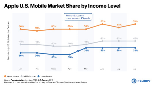
The chart above shows Apple’s share of the market by upper, middle and lower income levels. For example, in August, Apple had a 53% share of the Upper Income level segment, where household income is greater than $150,000. Prior to the launch of the iPhone SE 2, Apple’s share by income level was relatively consistent. After the launch of the iPhone SE 2, however, Apple’s share of the lower income segment surged in May by 4 percentage points, from 35% to 39%, and has held that share up through August. What’s noteworthy is that Apple not only expanded share into the Lower Income segment but also simultaneously grew in the Upper Income segment. By doing so, Apple can both expand its install base while continuing to serve the segment with the highest income. This best positions Apple to continue accelerating growth of Apple Services, its fastest growing source of revenue according to Statista.
Despite the COVID-19 recession, Apple successfully expanded market share down market while maintaining its strong lead within the high income segment. With this strategy, Apple will have to manage a new risk of potentially eroding its premium perception among the most affluent consumers while offering less expensive, more mass market devices. With the premium-priced iPhone 12 launch just months away, we’ll continue to monitor Apple’s market penetration and keep you updated. For the latest reports, subscribe to the Flurry blog and follow us on Twitter and LinkedIn to get the latest industry analyses.
iPhone, MacBook Pro, AppleCare, and Apple Music are trademarks of Apple Inc., registered in the U.S. and other countries.
The Flurry blog (flurry.com/blog) is an independent blog and has not been authorized, sponsored, or otherwise approved by Apple Inc. or Samsung.
0 notes
Text
Apple and Samsung Jockey for Global Smartphone Dominance
By Lisa Moshfegh, Product Marketing, Flurry Analytics
Samsung and Apple dominate the smartphone industry globally. Combined, they control more than half the total market share on the planet. In most regions of the world, either Apple or Samsung is the top vendor. While Apple leads in its home market of North America, Samsung tends to lead elsewhere. In this report, Flurry looks at the global market share by active user base. While most market share analyses estimate device shipments or sales, Flurry directly measures what phones are in use today. As a result, our analysis shows market share based on active devices, or true install base, which we believe is a more meaningful view of market share.
Flurry Analytics is used in over 1 million mobile applications worldwide, providing aggregated insights from more than 2 billion mobile devices per month. For this analysis, we exclude the European Union and China due to insufficient data. However, external analyses show that Apple and Samsung are the top two vendors in Europe and that Apple is second in China, only behind Huawei. Let’s take a look at the world map of active devices, broken out by continent.
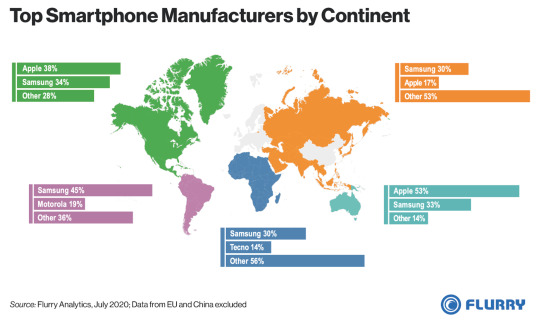
For each continent, we show the top two smartphone manufacturers based on their share of active devices. Scanning the mapping, you’ll notice that either Apple or Samsung leads on each continent, showing their strength as a duopoly. Aggregating market share based on the total map, Samsung has 33% of the market and Apple has 22%. Note again that this excludes data from China and the EU. Starting with North America, Apple makes up 38% of the active device base, followed by Samsung with 34%. In Asia (excluding China) and Australia, Apple and Samsung’s combined share totals 47% and 86%, respectively.
On continents where Samsung is the market leader, it tends to dominate. In Latin America, for example, Samsung leads Motorola by 36 percentage points. In Africa, Samsung leads Tecno by 16 percentage points. And in Asia, Samsung leads Apple by 13 percentage points. Apple, on the other hand, is the market leader in North America and Australia, two regions with higher income per capita, indicating that Apple appeals to users with more disposable income.
Outside of China, Tecno is the only Chinese manufacturer to earn one of the top two spots on any continent. In Africa, Tecno ranks second behind Samsung with a 14% share of active devices. Given Africa’s low smartphone penetration, Tecno could be well positioned to capture some of the continent’s forecasted growth in the years ahead. And it wouldn’t be the first time a Chinese manufacturer successfully took control of a foreign market because of their ability to manufacture quality smartphones at affordable price points. So we should not count Tecno, Huawei, Xiaomi or any other Chinese OEM out from successfully gaining share as the adoption rates rise in Africa and other emerging markets.
Apple could be well-positioned to gain share in several markets as they strongly appeal to a younger demographic, which means that their share will organically strengthen over time. For more insight into this trend, check out this Flurry report showing that those under 35 years of age strongly prefer iPhones. That said, Apple faces uphill battles in Latin America, Africa, and even parts of Asia. As of now, it appears that Samsung is well positioned to build on its existing lead. We’ll continue to monitor the active device share of top smartphone manufacturers. For the latest reports, subscribe to the Flurry blog and follow us on Twitter and LinkedIn to get the latest industry analyses.
iPhone is a trademark of Apple Inc., registered in the U.S. and other countries.
Flurry’s blog (flurry.com/blog) is an independent blog and has not been authorized, sponsored, or otherwise approved by Apple Inc. or Samsung.
0 notes
Text
Now Available: Flurry SDK 11.0.0 for iOS 14
By David Lundell, Senior Director of Product Management, Flurry Analytics
Over the last few weeks we’ve prepared you for the upcoming release of iOS 14 in our emails, blog posts and in one-to-one conversations. To revisit our blog posts, here’s a round-up:
Preparing for iOS 14
How iOS 14 Negatively Impacts Mobile App Revenue for Publishers
How iOS 14 Disrupts Mobile Ad Campaign Attribution
Announcing Flurry Conversion Value Analytics for iOS 14
Today we are letting you know that our 11.0.0 SDK for iOS is available. You can find complete documentation on how to upgrade here. The new SDK includes the Conversion Value analytics we announced last week (documented in more detail here) as well is opt-in authorization integration (please find documentation here).
As a reminder, Flurry Analytics will continue to provide analytics whether your users opt-in to Apple’s App Tracking Transparency Framework or not. Our offering is based on the Identifier for Vendors (IDFV) instead of the Identifier for Advertisers (IDFA). Flurry will respect your users’ privacy choices and will not use any data for advertising purposes unless your end users opt-in. And Flurry is committed to continuing to help developers evolve as iOS 14 changes how apps are built, marketed and monetized.
We hope the new SDK helps you be prepared for iOS 14. If you have any questions, concerns or comments during integration, please let us know at [email protected].
0 notes
Text
State of Mobile: COVID-19 Edition
Lisa Moshfegh, Product Marketing, Flurry Analytics
COVID-19 and the ensuing stay-at-home orders have caused mobile app usage to skyrocket. Consumers are looking to fill unexpected free time due to limited leisure activities and social distancing, meaning many of us are reaching for mobile devices to pass the time. Throughout the past few months, Flurry has investigated various shifts in user behavior due to the pandemic by looking at app usage across categories. For this report, we’ve compiled our recent findings into one document to demonstrate the cross-category impact of the COVID-19 pandemic. We hope you’ll take a look.
Please find the slides here. And make sure you keep in touch on our blog, Twitter, or LinkedIn to stay up-to-date on our latest analyses.
0 notes
Text
U.S. In-Store Shopping Rebounds after 26% Drop due to COVID-19
By Estelle Danilo, Flurry Analyst
The Retail category in the United States has been among the hardest hit during COVID-19. This stands to reason as non-essential businesses were forced to close and consumers sheltered at home. In this report, we look at how in-store shopping behavior has been disrupted over the course of 2020.
Flurry Analytics, owned by Verizon Media, is used in over 1 million mobile applications, providing aggregated insights across more than 2 billion mobile devices per month. For this analysis, Flurry hand-curated a sample of apps used by vendors to process in-store transactions. Since these apps are primarily launched only when transactions are executed, we used app sessions as a proxy for shopping transactions. Let’s start by looking at how the volume of in-store payments compares to U.S. retail sales.

In the chart above, we compare monthly in-store payment app sessions in blue against retail store sales in grey, from January through July. Retail store sales are seasonally adjusted by the U.S. Census Bureau and cover a broad range of businesses such as clothing, food, electronics and automotive. The first thing you’ll notice is that in-store payment sessions and retail store sales are strongly related, with a correlation coefficient of 0.7. The more frequently consumers make in-store purchases in our sample of apps, the more sales are generated by retail stores. Among other things, this gives us confidence that we are using a relevant sample from Flurry’s data set. When it comes to a shift in shopping behavior, both the volume and amount in dollars of retail transactions began to decline in March, followed by a strong dip in April, and then a steady upward climb from May to July. While we believe that in-store payments are still below what they would have been had COVID-19 never occurred, the rebound has been solid. Retail sales were most affected from March to April, declining by 13%. This decline of in-store sales is the biggest drop observed by the Department of Commerce since record-keeping started in 1992. To identify more precisely when shopping behavior changed, let’s drill down to a daily view of in-store payments.

The chart above shows that from March 16 to early April, as states began to issue shelter-in-place orders and close non-essential businesses, in-store payment app sessions declined by 26%. Over the next 4 months, in-store payment app sessions steadily climbed back by 43%. As some retail businesses gradually re-opened with curbside pickup, and many states lifted stay-at-home orders, in-store shopping returned to pre-pandemic levels. One interesting thing that stands out is how the shape of the data changed before and after shelter-in-place orders were issued. Before, you’ll notice many more blue spikes which denote peak days in payments app usage. After, you’ll see more white dips (and fewer blue spikes) which means payment app usage dropped heavily on many more days. The next chart helps show what’s happening; namely that consumers used to make high volume of payments on the weekend (blue spikes), while once shelter-in-place orders were issued, consumers began to reduce weekend payments (white dips). Let’s take a look.

The chart above shows the average percent change of in-store payment app sessions for each day of the week. We averaged sessions from January 1 to March 15 (pre-shelter-in-place orders) and from March 16 to August 16 (post-shelter-in-place orders). We chose March 16 as the cut-off date since that’s when the majority of shelter-in-place closures took effect in the U.S. and when in-store consumer transactions began to change. Beginning in mid-March, in-store transactions declined across all days of the week by an average of 10%. The likely cause is that consumers are making fewer in-store transactions in order to avoid in-person contact, which increases the risk of exposure to the virus. Instead, a lot of shopping has shifted online. Additionally, what stands out is that in-store transactions fell the most on weekends, by an average of 19%, compared to 10% on weekdays. We believe that working from home has brought about a new weekly schedule where consumers have more time on weekdays to step out and run errands. As a result, we think consumers began to spread their shopping activities more evenly across the week, to open up more time on weekends for leisure activities, and to avoid weekend crowds.
While in-store shopping transactions and retail sales have recovered substantially since the pandemic first struck, consumers unusually continue to shop less on the weekend than during the week. The long shutdown continues to have a lasting impact on the shopping landscape. With the back-to-school shopping season underway, we’ll continue to monitor trends in shopping behavior at retail stores. To get and share our latest mobile insights, follow us on Twitter and LinkedIn.
0 notes
Text
Announcing Flurry Conversion Value Analytics for iOS 14
By David Lundell, Senior Director of Product Management, Flurry Analytics
We are excited to announce a set of solutions to help publishers manage and understand the Conversion Value they set in order to measure post-install campaign performance. A new Flurry Analytics SDK will be available later this month to support this developer need ahead of Apple’s iOS 14 release.
In last week’s blog we discussed the impact iOS 14 will have on attribution. We also discussed the Conversion Value and how important that will be to growth efforts in a post-iOS 14 world. If you missed it, you can read it here. Many of you told us you’re not sure what to do with Conversion Value. After all, you have 64 values with arbitrary meaning. This is where our new Conversion Value Analytics solution can help.
Flurry Analytics SDK 11.0.0 will enable you to pass your Conversion Values to Flurry as standard Flurry User Properties. With Conversion Value as a User Property, you will be able to use Flurry to analyze your users’ Conversion Values with actual post-install behavior. For example:
See new devices broken out by Conversion Value
Compare key Funnels by Conversion Value
See any usage by Conversion Value
Create Flurry User Segments by Conversion Value
Our SDK will also have another option: a utility that maximizes the information you can provide in the Conversion Value. The new Flurry SDK enables you to set your Conversion Values to easily track both retention and key events. We use the limited 6 bit value SKAdnetwork gives you to record both the daily user retention and up to four custom event combinations.
The first 2 bits will be automatically set to the number of days since install, so you will have User Property buckets corresponding to 0 days, 1 Day, 2 Days and 3+ Days. Please note that you need to set this on each session to make sure you capture this fully.
The second 4 bits will be set to correspond to key event combinations across 4 default key events we have identified: Register, Log In, Subscribe, and In-App Purchase. You can overwrite these default values to represent any events you want.
So you’ll get 4 days and 4 events which Flurry will automatically set for you in any combination. Just set the event when triggered and Flurry will take care of the rest.
You can simply set the Conversion Value yourself or use this utility. Either way you’ll be able to use Flurry to see what actions these users performed days, weeks and months later. Whichever option you choose, the Flurry Conversion Value offering has 4 distinct advantages:
Conversion Value User Properties are device-level. When your ad network gets SKAdnetwork postback, there will be no device ID. By contrast, setting Conversion Value as a User Property allows you to use Flurry Analytics to tie it back into detailed user behavior beyond the install, all in a privacy-friendly way.
Our reporting will be faster. Apple’s SKAdnetwork postbacks will take up to 24 hours to get to your partner ad network, and then will need to propagate from there back to you. The Flurry Conversion Value User Property will be available in filters, breakouts and other Flurry reporting within a few hours.
We follow SKAdnetwork’s timing logic. Setting a Conversion Value will mirror the Conversion Value your ad network will receive in the SKAdnetwork postback because we will update the value and the 24-hour countdown timer in the same way SKAdnetwork does.
Our Conversion Value reporting can fill in the gaps. Because some SKAdnetwork Conversion Value records may be dropped by Apple due to Apple reporting thresholds, our reporting may be more complete than what Apple provides to your networks.
As a reminder, we’ll release Flurry Analytics SDK 11.0.0 later this month, which will be iOS 14 compliant and will enable you to pass your Conversion Values to us as standard Flurry User Properties. If you have any questions about Conversion Value, iOS 14, or anything else, please reach out to us at [email protected]. We’d love to hear from you.
0 notes
Text
Are App Developers Shifting Revenue Models as Advertising Gets Challenged?
By Peter Farago, Flurry GM, and Aman Bansal, Flurry Analyst
Since the App Store and Google Play launched over a decade ago, advertising has enabled app publishers to offer free, high quality applications. Even when users fail to explicitly pay an app publisher for the use of an app, the publisher can still earn revenue. With 76% of all apps generating revenue from advertising, according to a recent Ad Colony survey, the ad revenue model has been a cornerstone of app monetization—at least until this year.
In 2020, two events have started to impact advertising revenue. First, COVID-19 has driven a large drop in ad spending. eMarketer initially forecasted U.S. mobile ad spending to grow by more than 20% in 2020, but due to COVID-19 ad spending is now instead expected to decline by 10%. Second, at WWDC in June, Apple announced that app publishers will soon be required to gain end-user opt-in for sharing data, which will cause an even larger drop in ad revenue. This requirement goes into effect when iOS 14 launches in September. While the stated reason is user privacy, which Flurry supports, opt-in rates are expected to be so low that Apple’s IDFA, the key identifier used for advertising, will become largely unusable. Think of it as de facto deprecation. With the removal of this identifier from the ecosystem, the IAB estimates that publisher ad revenue will drop by another 52%.
For this study, Flurry looked at what revenue models app developers have been using in 2020 and whether those have been shifting over the course of the year. With ad revenue under siege, we wondered if app developers are showing signs of moving toward more paid models. Flurry Analytics, owned by Verizon Media, is used in over 1 million mobile applications, providing aggregated insights across more than 2 billion mobile devices per month. For this analysis, we identified 3,500 unique applications that use ad revenue, in-app purchase or a combination of both to monetize their applications. We limited the sample to include apps that have a minimum of 10,000 monthly active users. Let’s start by looking at which revenue models were used at the beginning of 2020, before the impact of COVID-19 began.
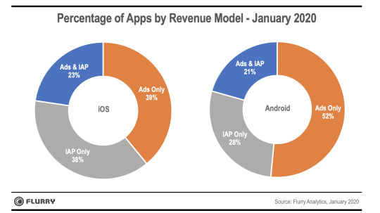
The side-by-side donut charts above show which revenue models were used by app developers at the beginning of this year for both iOS and Android. We grouped models by Ads only, In-app Purchase (IAP) only or using a combination of Ads & IAP. At a high level, app publishers use IAP more on iOS, and Ads more on Android. 38% of apps use IAP on iOS versus 28% on Android. Likewise, the number of apps that use a combination of IAP and Ads is slightly higher on iOS at 23%, versus 21% on Android. When it comes to monetizing only with advertising, 52% of apps do so on Android versus just 39% on iOS.
We next took a snapshot of revenue models in July and compared that to the January baseline established in the charts above. By then, COVID-19 had deeply impacted advertising spending, by as much as 30% according to eMarketer. Additionally, Apple had made its announcement regarding use of the IDFA in June. While the impact of this announcement might not have been fully understood yet, the news was out.
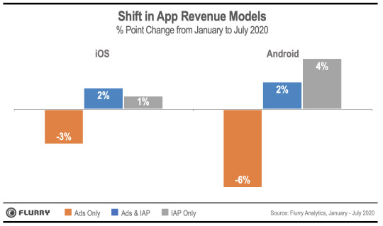
The chart above shows the percentage point change in revenue models used within applications from January 2020 to July 2020. On the left we show iOS, and on the right we show Android. The total changes within a platform balance out to zero between ‘Ads Only’ versus the sum of ‘Ads & IAP’ and ‘IAP Only.’ For example, on iOS, the percentage points of apps using Ads Only declined by 3%, while the sum of Ads & IAP and IAP Only increased by 3%. On Android, ‘Ads Only’ decreased by 6% where the sum of apps using IAP increased 6% (+2% Ads & IAP and +4% IAP only). What this chart tells us is that app developers are shifting away from using only advertising for monetization on both iOS and Android. To date, we believe the main driver is due to the drop in ad spending as a result of COVID-19. While Apple’s announcement may lead to a larger, longer-term impact to ad revenue viability, the effects are not yet fully understood or realized. It also makes sense that Android is seeing a larger drop in apps that use advertising only to earn revenue since Android is known to be the platform where ad revenue tends to perform better. Google, with its roots in advertising, has invested more in enabling ad revenue generation over transactions such as in-app purchases. Now that we’ve looked at the revenue model shift by platform over time, let’s drill down to see changes at the app category level.
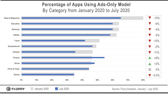
The above chart compares the change in app categories using an advertising only revenue model for monetization between January 2020 and July 2020. In gray, we show the percent of apps within a category using advertising only, and in blue we show the percent of apps using advertising only as of July 2020. And we ranked the categories in descending order based on using advertising only to generate revenue. At the top of the chart, you’ll see that News & Magazines, Education and Business app categories use advertising to generate revenue more than other app categories. By contrast, at the bottom of the chart, you’ll see the categories that rely least on advertising exclusively for revenue. From the bottom up, those are Games, Photo & Video and Social. Note that apps in these categories may still use advertising as a main way of monetizing but that revenue is blended with other models. This chart shows apps that use advertising only, and no other revenue models. For example, around 35% of game apps use advertising only. The rest of game apps use a blend of Ads & IAP, or IAP exclusively.
As app developers face the prospect of declining ad revenue, and in particular from changes brought about by iOS 14, we expect there to be a shift toward paid models. In this future state, developers with a dependency on ad revenue may prioritize their Android apps over iOS, for as long as Android supports advertising. It still remains to be seen whether or when Google might follow Apple to enforce a similar opt-in tracking policy. We’ll continue to monitor which business models are employed by app developers as iOS 14 rolls out and beyond. For the latest mobile insights and to share those insights with others, please consider also following us on Twitter and LinkedIn.
1 note
·
View note
Text
How iOS 14 Disrupts Mobile Ad Campaign Attribution
By David Lundell, Senior Director of Product Management, Flurry Analytics
Last week we explained why the release of iOS 14 will reduce publisher ad revenue and how Flurry can help reverse some of that impact. This week we focus on how iOS 14 will also impair mobile ad campaign attribution.
In the pre-iOS 14 world, Mobile Measurement Partners (MMPs) used IDFAs to report granular details about app install campaigns. With freely collected IDFAs, advertisers could learn which app showed an ad, the specific campaign and creative used to drive an install, and even actions taken by end users after downloading an advertised app. As we enter a new era in which the majority of IDFAs will no longer be available, this mobile attribution model has been upended.
To address the gap it is creating for MMPs, Apple has improved its own SKAdnetwork framework. SKAdnetwork helps advertising apps and ad networks connect their campaigns to installs.

When a new app is installed, the advertising app registers for attribution and sets a Conversion Value to indicate the value of the user. Apple will periodically send postbacks to the ad network that delivered the install, reporting the campaign, publisher app and conversion value associated with the install.
For end users that have not opted into tracking, SKAdnetwork metadata is the only way for apps to measure campaign performance. And Conversion Value is the only indicator beyond the install event to gauge the quality of the install. To ensure user privacy, Apple has designated itself as the only intermediary that can track and report attribution for these installs.
Conversion Value is a six bit value set by the app after users launch a new app for the first time. Apps can update the conversion value within 24 hours. Updating the value automatically resets a 24-hour timer, which postpones Apple from reporting attribution data to ad networks. With 6 bits -- which creates a possible 64 different values -- and a limited time in which to set those values, apps will need to be smart about using Conversion Value to effectively describe and predict the user’s expected lifetime value.
Flurry will help simplify this process with new features we are developing. Starting with a new SDK we will release later this August, Flurry will first make it easy to set, manage and evaluate the Conversion Value that an app reports back to SKAdnetwork. The SDK will include a way to provide the Conversion Value as a Flurry User Property, enabling you to analyze and compare users with different Conversion Values. For example, you can see how users with one Conversion Value converted in one of your funnels versus users with a different Conversion Value. Or, you can breakout Flurry charts (including active users, new devices and sessions) to show top 10 Conversion Values.
So how can publishers like you further use the 6 bit value within a limited time frame to effectively place a value on an install? Flurry will help you there, too. With Flurry, you can use the Conversion Value to indicate user retention and in-app behavior which Flurry Analytics already measures. Our August SDK release will make it easy for you to use Flurry’s out-of-the-box solution to set the ‘number of days since install’ along with key events that the end user triggered, such as Registration, Log In, Subscription or In-App Purchase. We’ll describe this solution in more detail in next week’s post.
We’d love your feedback on this. To let us know what you think, or ask any questions, please send us a note at [email protected].
1 note
·
View note
Text
Gen Z and Millennials Prefer Apple Over Samsung
By Lisa Moshfegh, Flurry Product Marketing, and Aman Bansal, Flurry Analyst
Gen Z and Millennials have grown up with mobile technology at their fingertips. Most don’t use landlines, or even cameras aside from the ones on their phones. Representing nearly half the population, and the bulk of consumer spending, major smartphone manufacturers are in a battle for their loyalty. In this report, we compare consumer demographics of Samsung and Apple smartphone users.
Flurry Analytics is used in over 1 million mobile applications, providing aggregated insights across more than 2 billion mobile devices per month. For this analysis, we look at the breakdown by gender and across four generations: Baby Boomers (55 years and older), Generation X (35 - 54 years old), Generation Y (aka Millennials, between 25 - 34 years old) and Generation Z (13 - 24 years old; note that Furry does not collect data for consumers under the age of 13).
Android is the leading mobile operating system with 72% global market share compared to 28% for iOS. In terms of handset manufacturers, Samsung is the global leader with 32% market share, followed by Apple with 28%. Even though Apple and Samsung make up the majority of the smartphone market, it is worth noting that 40% of the market is composed of other OEMs. In particular, Chinese manufacturers like Huawei and Xiaomi have shown growth over the last few years. Let’s start by comparing smartphone brand preferences by generation.

In the chart above, we show the distribution of users by generation for both Apple and Samsung. In both cases, Millennials and Generation X make up about 90% of each OEM’s user base. This stands to reason since those two generations span the ages of 25 to 55 years old, representing the majority of the global workforce. The key difference is that Apple mobile device users are younger on average. 53% of all Apple mobile users are under the age of 35, compared to only 28% for Samsung.
Generation Z also shows a strong preference for Apple, although they still make up a small percentage of the world’s total smartphone audience. 32% of all Gen Z smartphone users are on an iPhone, compared to only 21% on a Samsung device. That 11% point difference could mean a significant advantage for Apple as more of this younger group ages into smartphone ownership. Next, let’s look at smartphone brand preference by gender.
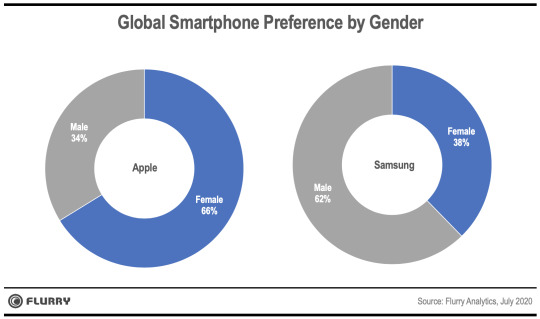
In the above side-by-side pie charts, we split Apple and Samsung audiences by gender. Globally, two-thirds of all Apple device owners are female. The figures are nearly reversed for Samsung, with men making up 62% of their mobile device audience. While not shown in a chart, we did break these audiences down by gender and generation. Doing so revealed that Apple appeals particularly well to Millennial and Gen Z females. In fact, over 4 times as many female Millennials use Apple versus Samsung devices. Within Generation Z, twice as many females use Apple over Samsung. There is a fair amount of speculation as to why younger females use Apple and older males use Samsung. Apple’s sleek design and intuitive user experience may appeal more to women, while the ability to heavily customize Android on Samsung could appeal more to men.
Our analysis shows that females and younger generations prefer Apple. If Apple can maintain the preference among younger users, we believe they will gain market share, particularly as the younger part of Gen Z begins to adopt smartphones. For Samsung, the big question is whether they can take share from the remaining 40% of the market. The Samsung Galaxy line does compete well with iPhones, but Samsung’s core strength is in the middle of the market, where they face increasing competition from less expensive Chinese devices. We’ll continue to monitor smartphone adoption trends and keep you updated. To never miss an update, make sure you follow us on Twitter and LinkedIn as well.
iPhone is a trademark of Apple Inc., registered in the U.S. and other countries.
Flurry’s blog (flurry.com/blog) is an independent blog and has not been authorized, sponsored, or otherwise approved by Apple Inc.
0 notes
Text
How iOS 14 Negatively Impacts Ad Revenue for Mobile App Publishers
By David Lundell, Senior Director of Product Management, Flurry Analytics
When Apple announced iOS 14, it outlined a new policy which requires app publishers to seek end user permission to access a user’s IDFA. While estimates on forecasted opt-in rates vary, the result is clear: the IDFA will become scarce. Among the implications for app developers, the most pressing is an expected large drop in advertising revenue. In this post, we’ll discuss how disabling the IDFA leads to a sizable drop in ad revenue.
With the announced opt-in policy on iOS 14, app developers that rely on ad revenue should expect their ad performance and fill rates drop. Today, Ad Networks and Demand Side Platforms use the IDFA to reach target audiences. Going forward, when the IDFA becomes largely unusable, advertisers will no longer know which consumers they're reaching. As a result, ad spending will drop, leading to lower CPMs and fill for application publishers.
For consumers that permit tracking, the IDFA can continue to be used in ad requests. That said, Flurry expects that the significant majority of consumers will not permit tracking. For all intents and purposes, publishers should consider the IDFA mostly unusable. Without a targeting identifier, advertisers will be forced to bid blind and therefore lower their bid amounts. Advertisers will further bid lower because granular attribution will no longer be possible. We’ll go into more detail about attribution in a future blog post.
In-app advertising suddenly will become a less viable revenue model. In response, publishers will be forced to either preserve IDFAs or pivot to other revenue models.
In-app purchase and subscriptions: Apps that are ad-supported, or employ a hybrid model, may shift to paid models.
IDFA maximization: Some publishers may attempt to gate app functionality in order to incentivize opt-in.
We also recommend publishers explore a third approach: Leveraging their first party data for advertisers. Publishers can rebuild ad performance by using their own data to make their audiences more attractive to advertisers, even without an IDFA.
Flurry can help make this happen. Using both the Flurry Analytics and Verizon Ads SDKs, publishers can gain superior fill and performance across a number of ad formats. Together, the Flurry and the Verizon Ads SDKs will package publisher audience profiles in a privacy-friendly way and make them available to advertisers. The more advertisers know about your users, the higher the CPMs and fill you can expect. Most importantly, this solution adheres to Apple’s new guidelines. Only data from your own apps is used, and data from third-party or your own opted-out users is never included.
We are working out the release timing of this capability, which enables publishers to leverage their own data for improved advertising performance. To get early access to this solution, please contact [email protected].
0 notes
Text
Work Travel to City Financial Centers Has Plummeted by 70% due to COVID-19
By Yan He, Principal Research Engineer, Verizon Media Data Science and Estelle Danilo, Flurry Analyst
Measures taken to contain Coronavirus —restricting travel, closing non-essential businesses and enforcing social distancing— have plunged the U.S. economy into a severe recession. Financial districts in major U.S. cities house a disproportionate number of corporate headquarters, which generate a significant share of economic activity in America. In this report, we show how travel to U.S. financial districts has plummeted during the economic downturn.
Flurry Analytics, owned by Verizon Media, sees app usage on one million mobile applications, with a large concentration in the United States. To estimate the change in traffic to U.S. financial districts, we averaged the number of active mobile devices across 5 of the country’s largest financial centers: New York, Los Angeles, Philadelphia, Boston and San Francisco. For our pre-coronavirus baseline, we use January 13 - 19, the most recent non-holiday week prior to the first U.S. coronavirus case. Let’s examine the changes in traffic to these business centers.
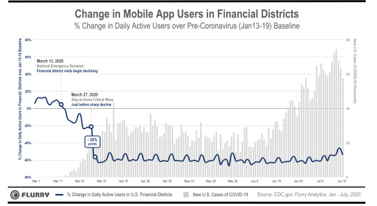
In the chart above, we show the percent change in daily active mobile app users located in U.S. financial districts from March 1 to July 20 compared to the January baseline. We display this change in blue against the rising number of new coronavirus cases in gray. During the first two weeks of March, the pandemic had not yet impacted travel to financial city centers. As we observe in the chart, travel to financial districts was relatively stable during the first two weeks of March, hovering around 10% higher than the baseline.
Starting March 13, when the federal government declared a national emergency, activity in financial districts began to decline. Over the next two weeks, activity further dropped by 25 percentage points.
Then, from March 27 - 28 — in just a one day period — travel to financial districts nosedived by an additional 35 percentage points. At this time, CDC data showed an exponential rise in new COVID-19 cases. Additionally, stay-at-home orders had already been put in place by around half of U.S. states, resulting in a large part of the population beginning to work from home.
From April through July, travel to financial districts remained low, around 60% lower than the January baseline. As new cases of coronavirus began surging again in June, travel to financial districts remained low and unchanged, indicating that most professionals continued working from home. Additionally, visits to financial districts declined by 6 percentage points more on weekdays than on weekends. This corresponds to people no longer commuting to financial districts during the workweek, as 88% of organizations encouraged or required employees to work from home, according to Gartner.
With stay-at-home orders issued mid-March, trips to financial districts have tumbled by a staggering 70%. This sudden plunge coincides with the significant decline in U.S. economic activity that began in February. As we write this report, with coronavirus cases on the rise again, many companies have announced that the majority of their employees will work from home until 2021. As a result, we do not anticipate activity in financial districts to return to baseline levels anytime soon. We’ll continue to monitor mobile app usage and keep you informed about important trends.
0 notes