
Don't wanna be here? Send us removal request.
Statistics
We looked inside some of the posts by fmp10nathanielorr and here's what we found interesting.
Average Info
Notes Per Post
8
Likes Per Post
7
Reblog Per Post
1
Reply Per Post
0
Time Between Posts
1 hour
Number of Posts By Type
Text
17
Last Seen Tumblr Blogs


Fun Fact
Tumblr’s reach among the 26-to-35-year-olds in the US is 11%.
Text


These are pages twenty two to twenty four of my portfolio. The final three. In the first image it shows the process for how I made my second poster, including the rough pencil sketch with a black pen outline. Then the slide with my final outcomes, my two posters with a bit of information about how I feel about each of them and changes, details and things like that. And finally, the evaluation page. This slide goes over how I think I've improved on my work, blog posts, time management, techniques and shows some of my past work, including my comic page, clay chicken, treasure chest, model island and trading card for my pirate project, My plush and comic panel from my space project, along with some of my sketchbook pages from my free time. Overall I'm very happy with how my portfolio and my work from this year has ended up.
1 note
·
View note
Text


These are slides fifteen to twenty one out of twenty four of my portfolio, The first two are the character designs sheets of Lash, the goblin girl and the two unused characters, Abigail (Top) and Rachel (bottom right), and then the slide for Owen and Bailey, showing how Bailey's fur is blurred together and how Owen's original design looked, along with the character sheet with the final five. Then I included a slide full of the process of how I designed the characters sitting poses for the poster. showing each character getting added and eventually coloured. the the next five is the complete process of the poster being designed, starting from the outline to the final look and then the re-visited final outcome where i added the fire highlights, changed the colour of the bush behind Finn and added some more detail on the trees in the back.
0 notes
Text


These are pages eight to fourteen out of twenty four of my portfolio, the first image had to be retaken since it was at a strange angle but looks much better as of now. Then we get into the last two work sheets, each given their own slide which was a huge improvement from having two slides with them crammed on, then I included some PowerPoint slides I made around a month ago in my free time that shows each character's interests, like, musicians, films, tv shows and their personality, along with some reference images to their designs. And then are the two pages for Gwen and Finn's design, originally, these were just one page but my teacher said that they are good enough that they can breathe on their own and with the outlines, colour schemes, practice designs, info, and final designs I think the slides look great.
0 notes
Text


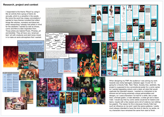


These are the first seven out of twenty four, slides for my Portfolio, I have never made one before and yesterday I had tried to make it completely by myself but after getting notes from my teacher, ended up changing multiple things like, having an intro page, giving each work sheet it's own page, removing the green background which was too eye catching, taking away from some of my work, making the research page less neat and controlled and just adding multiple images of my blog and references I'd used instead of being able to read my already posted blog posts. There were more improvements made as it goes along. I was told that each page needs to have the viewer stay on the page for as long as possible, and flow nicely, staring with a title in the top left, info and progress images in and around the middle and the final image be on the bottom right. These improvements given to me, make each page look so much better.
0 notes
Text
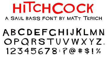

This is the font made by Saul Bass and an image showing some famous movie posters using it, it has a very abstract feel and gives off a very unsettling, uneven-ness to it, most likely why it's being used on things like The Shining and Vertigo. I really like how all the letters are actually different from one another yet, part of the same set, some lines and parts of each letters are thinner and thicker and those parts change position on all letters. The reason for me including this is because on my second poster, I didn't really end up with a nice font for my title 'The Campfire' and wanted to show something that would have been a drastic improvement, for next time i have to either, draw a title, or letters, or make a font.
2 notes
·
View notes
Text
This is a link to an artist on Youtube who has, basically a video for everything an artist will want to know, whether thats drawing covers, composition, posing, Keyframe illustration, colour theory and anatomy. His videos go into depth on all these subjects and more, he mainly draws his own characters but obviously all the narration tips are transferable for your own. Absolutely recommend checking his videos out if you're wanting to get better at art.
1 note
·
View note
Text
youtube
These links are (top) various ways you can fund animations, such as tv shows and films. Going over the global screen fund, BFI short form animation film and providing advice on funding yourself. The second link is a video showing the upcoming animated movies, I've added these to show the impact that animation has had on today's society, with multiple theatrical releases every month and the lengths people will go through to make either, a film, a tv show, or even just a commercial.
0 notes
Text
youtube
youtube
youtube
When it comes to sound effects, you'd be surprised on how the most normal sound in an animated film or Saturday morning cartoon, is actually created, for example a stick being stepped on in a forest is actually a guy chewing a piece of celery, or how a horse running is two coconuts being smashed onto a pile of dirt. Obviously when it comes to sound in film and television, you want your audience to be completely captivated and immersed, so you need it to sound as realistic as it possibly can be, so even if the actual sound for a chocolate bar being opened doesn't sound right, then the sound designers will go through extreme trial and error to find the perfect sound. In the third video, a professional sound designer goes techniques on how to find the perfect sound, definitely worth a watch.
0 notes
Text
youtube
youtube
These are some guide videos on how Studio Ghibli draws their characters, animals and backgrounds. They're both very helpful if you're looking for tips on how to stylise your art, I have a very smooth lined, colourful art style so most of the drawing techniques aren't things I can really use, however, the process in which they design the characters is really interesting, as well as their animals. The backgrounds in Ghibli films are very intricate, detailed and reflect the real world. In the first video, they go through the main five steps to being an artists, those being, 'Find The inspiration', how you can see another artists work, like graffiti, a promotional poster in a shop poster or a film, and take the parts you liked about them and make something out of it. 'Confidence', how you can fail again and again while trying to perfect your vision, but have the confidence to persevere and produce the best version of your idea. 'Reality', taking inspiration from real life but also realising that maybe your project either, isn't good, or that it's too similar to already existing work. 'character' how not only the design of your character matters, but their actual character how they act in certain situations, their likes, they're dislikes, their personality and how they talk, And finally, 'Purpose', you need to decide on why you're making this piece, is it for money, is it because you want to see your name on a book cover or because you have something you want to create and share.
0 notes
Text


above are pictures of the Scooby doo characters, Stand by me, and band of brothers. These are very well known groups of characters in pop culture and the reason for that is because they stand the test of time. The group's chemistry all work so effortlessly that you really get the feeling they've been friends for years. Scooby-doo's characters are all very cartoony and have exaggerated personalities that work well with the others, Fred being the leader who is the bravest in the group, daphne being the popular girl whose mostly the damsel in distress, not so much in recent years, Velma is the the brains who is constantly reading and figuring out the puzzles and shaggy ad Scooby are the loveable slackers that aren't as smart as the rest of the group. They all go hand in hand and give the audience someone to relate to. Stand by me has, the sarcastic friend, the tough guy, the kind relatable friend and the over weight kid who is always the butt of the joke. Having a good set of characters is what keeps a film, show or book series in the public eye for so long, for example, The Goonies, Teen Titans, X-men, The Breakfast Club and Friends.
3 notes
·
View notes
Text

Here is another work sheet which I forgot to post, this was from the very start of the project which is all of the information about my poster, like, the characters and their personalities, what pose they'll be doing around the campfire (these were changed) the world it takes place in, the rough ideas for the poster, some practice work I could do and a list of possible animations that could be in the poster.
0 notes
Text

Here is a worksheet that I forgot to post which shows the early designs for Owen and the sitting poses I drew before starting the FMP poster. The Owen design without a head at the bottom is the one I traced in photoshop and became the final design for Owen and the coloured design above is the reference I used when deciding the actual colours. The sitting poses for Lash, Owen and Finn bellow were also traced in photoshop into the final poster but with a lot more tweaking and editing than Owen's regular design. My teacher also said it would be a good idea for me to think of what my characters would sound like so I made up a list of voice actors for each of them, being;
Owen - Caleb McLaughlin Gwen - Gillian Jacobs Finn - Rudy Pankow Bailey - Josh Brener Lash - Jeanine Mason Abigail - Marsai Martin Rachel - Jolie Hoang-Rappoport Elijah - Steven Yuen
0 notes
Text

This is the worksheet that I drew my first FMP poster layout on and still had a load of free space, so I wanted to fill it with some quick forest art since, it was something I didn't really practice before starting the poster. I drew three trees, each a different size and style, a tree stump, a log and a campfire. It was actually quite fun doing this and I do wish I had done this earlier as practice.
0 notes
Text

This is the worksheet which I did my second polaroid poster design which I didn't end up using and some small sketches for Bailey. I've now added another poster design. It's supposed to be four forest silhouettes gradually getting lighter as it goes back, the layer at the front would be a dark green. Obviously it's too late to make this into a poster and I've already got two so this was more of just getting an idea I've had in my head for around a week off my chest and taking up an empty space, but I also decided to add three more films and TV shows that each character likes to a list since it was really helpful last time to help me get a good solid idea on how they are as a person, and again, I still had some left over space at the bottom of the page and wanted to fill it.
0 notes
Text


Now that I've finished my poster for my FMP, I wanted to reflect on how close I stuck to my initial timetable. I would say that in terms of blog posts, I did try and get around 15 a week but if for some reason, I didn't, I would just add the amount I didn't do that week to next week. But towards the fifth or sixth week, I stared to slip off schedule and had to then cut the three characters 'Elijah', 'Abigail' and 'Rachel' from being in the poster and also cut the fire being animated. Aside from Blogs and the cut work, I would say that I stayed pretty on top of my work, getting my other five characters all designed before Easter and starting the outline for my poster during the holiday. Then getting the poster finished as well as the second poster with the polaroids finished a week before hand-in, I think that I was much better managing my time this year than last year.
0 notes
Text


Miles Morales Spider-Man is one of the most popular fictional characters in recent years due to the spider-verse films, his various comic runs and game appearances. But the reason he's so popular is because he is the re-birth of such a well known character and is written in such a way that he doesn't take over completely, but more of a breath of fresh air and a new avenue to be explored, that the previous character couldn't go down. I'm writing about Miles since he impacted a new audience so well in only fourteen years, when Peter Parker Spider-Man has been around since 1962, over 68 years, And if my comic series that I've made my FMP poster for, were to be launched, I wondered if it would take the world by storm as well as Miles did. He launched in Marvel's Ultimate Fallout Issue 4 and is shown to be a nerdy teenager with an interest in art and music, which, those two new additions of personality traits to the Spider-Man name, brings in a new audience of artists and music lovers. Just by giving him popular interests, they made him so loved, so quickly, so if I'm to hypothetically make my series blow up in popularity, I just need to bring in popular interests that will draw people in and give them something they can relate to. for example, if I introduced a character who could play drums, a small girl who plays the drums could somehow find out about the series and relate to said character. But not just that, Miles Morales is a half black, half Latina boy and that allows, people of the same nationalities to see themselves in him. also with the main point of 'Into The Spider-Verse' being 'anyone can wear the mask' so Miles getting the Spider-Man identity and no one knowing who he really is, it allows everybody to envision themselves in the mask. That is what makes Miles Morales so popular.
1 note
·
View note
Text


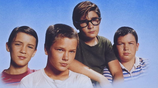
The Goonies is a cult classic that I re-watched before starting my project since it has the exact audience, aesthetic and story that I wanted for my FMP. a group of friends with varied personalities going on an adventure together. But the most well known part of the film isn't the treasure, or the locations, or even the story, it's the characters. Each one has such a diverse and life-like personality, like Chunk who is the idiotic, loveable goof who is always the slowest in a chase. Mouth, is the mouth, the sarcastic, annoying friend that taunts everybody. Mikey is the exploring, history buff that loves to hang out with the group. Data is the nerdy inventor genius. Brand is the Jock, older brother to Mikey and the group. Andy is the love interest and Stef is the girl who screams. While the female characters are a bit over looked, it's still the characters dynamics that all work so well together and what makes it such a good film.
0 notes