
Last Seen Blogs
batobob-blog
fighty cockatoo

takemetorapture
video games are art

hedecididoseguiracristo-blog
Ninguno tenga en poco tu juventud!

thebarefemale
a blog about smut

oswaldamnit
OswalDamnit
Text
I know I’m a day late, but I’ve been trying to find a good day to post this for about a year, and I keep just missing it. I don’t care anymore. Happy late Birthday Rumiko Takahashi!
Designed/Made this wall hanging from like 4 parts. It was as big as I could make in one print. The emblems can be taken off and worn as pins if I want, but I mostly just wanted to do that cause I realized that I could. I flip-flopped back and forth on which color to put emblem on, but I decided this cause I think this color contrast works. best.


This is an alternate design for the kettle I made. I’m happy with it, but it just feels like too much, but I can swap them out whenever I want and even wear this one as a pin/broach.


35 notes
·
View notes
Note
Dude omg how do you make your pins
A lot of these are 3D printed and then I hand paint them. Since I am not the most dexterous, I model them to have each color on separate heights and I can sorta paint by numbers. Several are cut out of sheet metal for the shape using tin snips and sanded down to match. These I will generally make a stencil using tape for the design. I also have sanded down the face of a coin to get a clean circle.
1 note
·
View note
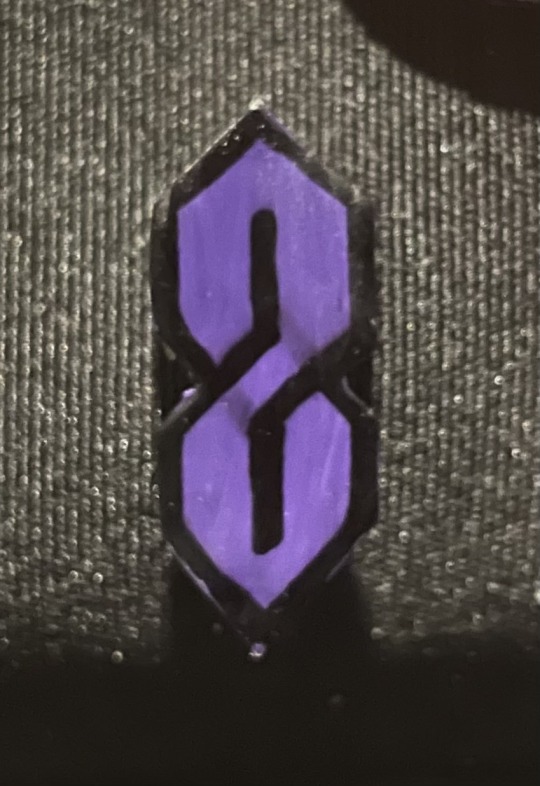
Text

Made another pin, this time a generic form of my classpect (Maid of Void). I know the Void symbol on the chest is a little off, but I have never claimed to even be passable at free hand painting. I chose orange as the shoe color, cause I didn’t like how beige or grey looked, so I just went with my favourite color/from the light color scheme.
#homestuck#413#pins#3d printing#i wanted to throw on a :) but couldn’t figure out a way to make it temporary
3 notes
·
View notes
Text
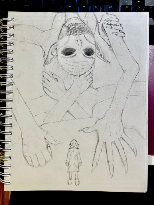
The first meeting with Polnaros just stuck in my mind so much that I decided to try and draw something for like the first time ever. Still not totally satisfied with how parts of this turned out, but I got the important aspects, so it’s good
21 notes
·
View notes
Text

I made a pin to celebrate the long, long, looonnng, time we had to wait for the official release of season 2. But by god was it worth it, I love this show, all versions.
40 notes
·
View notes
Text


Made an eevee. I know that the paint coat isn’t too consistent, but I left it like that so it would give it some variance. Still not too happy with the ears, but I think the eyes turned out rather well. I couldn’t resist adding the toe-beans. Again, I didn’t make the model, but I did paint it.
0 notes
Text

This was my first time painted an actual 3D model that I printed, and it turned out fairly well. I chose Umbreon because it’s one of my favourite Pokémon (thanks Colosseum) and it required very painting since its mostly black
4 notes
·
View notes
Text


This is a phone stand that I designed and made for Father’s Day since my dad is such a huge Star Trek fan. It can even hold something as large and heavy as a tablet without any issues


The logos were separately printed so I could color them easier and instead of permanently inserting them and attaching it with glue or something I decided to make them into wearable pins. The federation emblem uses paint and I paused the print on the Klingon halfway through to swap the filament (since I only have a single filament printer)

I also created a silver variant, using the same method as the Klingon emblem, since that’s what the communicators actually look like, but gold pops more against the white
1 note
·
View note
Text


The alt designs of this one are almost identical since I was pretty set on the design from the start, but I still wanted to see how different fin designs looked. Which was fairly pointless, since I cut these things out with tin snips, and the most detail I can get is much rougher than any of the differences
0 notes
Text


This one was made with a different type of paint, so I’m still working on getting even coats, but that doesn’t matter too much. I will often make a 3D model of the pin even if I plan to make it out of metal so I could see possible design variations. These were the possibilities and the final I decided upon
0 notes
Text

I’m actually quite proud of this one, not only does it show my improvements from when I started, I cut the bow out separately and attached it later. This adds quite a bit to the design I believe. Ignore the chip on the ear, apparently I need to touch it up.
1 note
·
View note
Text

This pin is made out of a nickel that I sanded down so the paint coat would be flat. It ended up a much better circle than I would have gotten through my usual methods
4 notes
·
View notes
Text
And now back to when I started making them out of metal again. I always liked this design, and while it is technically a reference to something, most people (it just showed up in the background a lot) wouldn’t think of it upon seeing this pin.
I kinda messed up in how an S looks when making this (and am only now, 4 years later realizing I had it right the first time) so you can somewhat see the lines still.
1 note
·
View note
Text

This is a fairly simple one. There’s not many iconic images that can be made into pins. I did debate between this and the O with the figure in it, but went with this since it has more vibrant colors
3 notes
·
View notes
Text

I’ve gotten so many questions thinking it’s the Ducks logo that I’m debating just flat out removing it. Or maybe just making one for my preferred hockey team
8 notes
·
View notes
Text


Best image I had for this one was a 3/4 perspective, so I ended up just using it for reference and creating the front on design myself.
2 notes
·
View notes
Text

Interestingly enough, the filament I used to print this one wasn’t black or red, but orange. I guess I was originally going to use orange instead of red? But picking filament colors is important because it can let you skip large portions of painting.
2 notes
·
View notes