Statistics
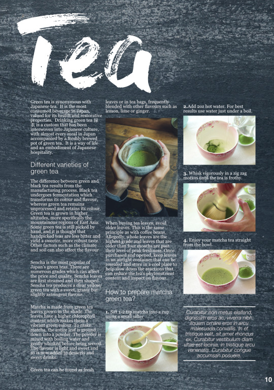
We looked inside some of the posts by gd512676 and here's what we found interesting.
Average Info
Notes Per Post
2
Likes Per Post
2
Reblog Per Post
0
Reply Per Post
0
Time Between Posts
3 days
Number of Posts By Type
Text
17
Last Seen Tumblr Blogs


Fun Fact
Total funding amounts to $125.3M.
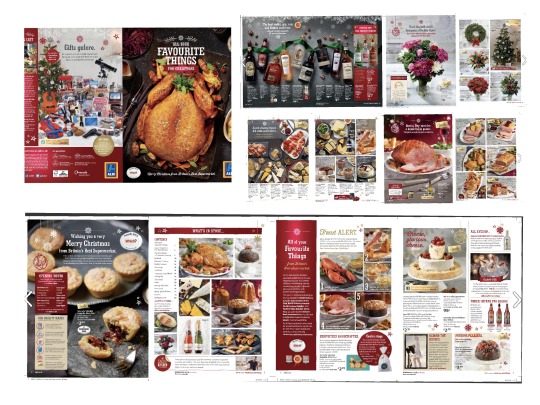
Text
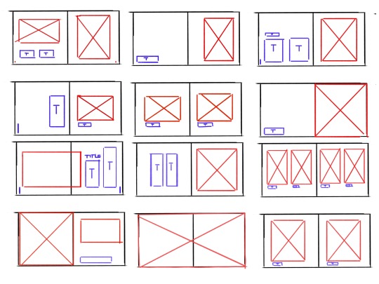
Assignment 2 (the website sketch)
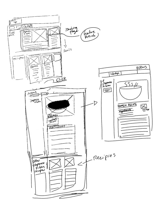
Add on image for assignment 2 - website concept
0 notes
Text
Assignment 2 (Part 2)
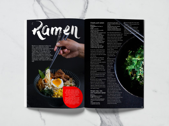
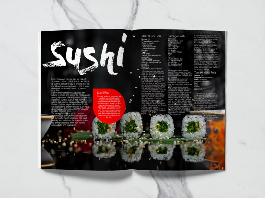
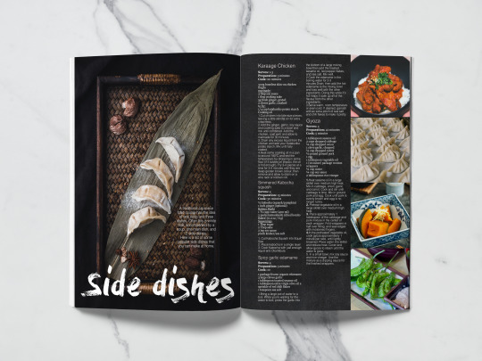
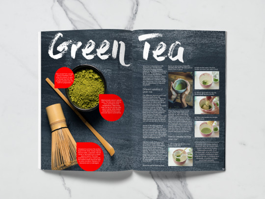
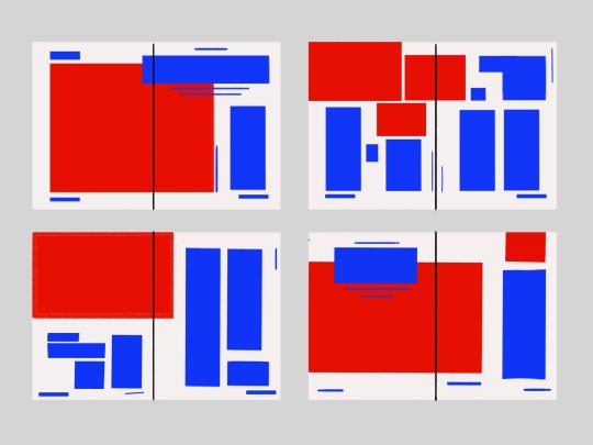
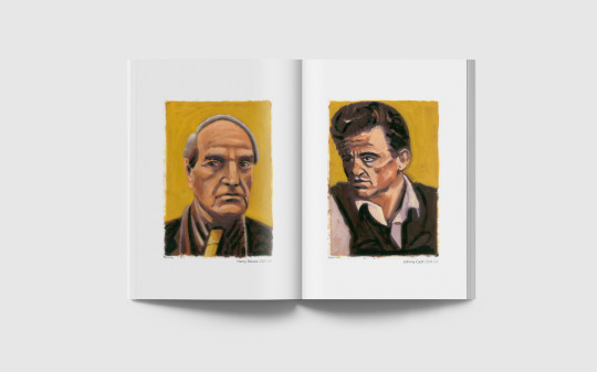
Below are the final pages as a spread -


And here are the layout pages as individual pages, as they seem to be hard to read on the blog.

Finally, here are the mock ups in magazine form-
I also had to consider how this would look as an online design, below are some sketches of how the website might look tried to carry over the feeling, but I don’t think these sketches are as strong as what else I have created.
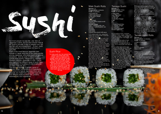
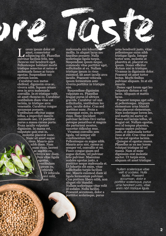
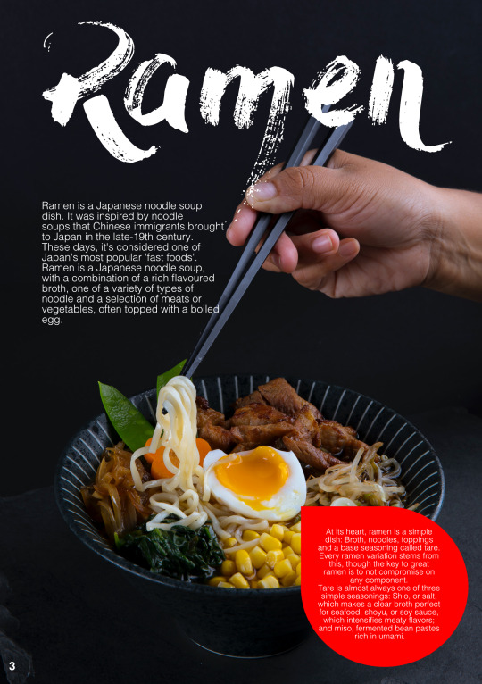
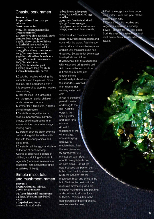
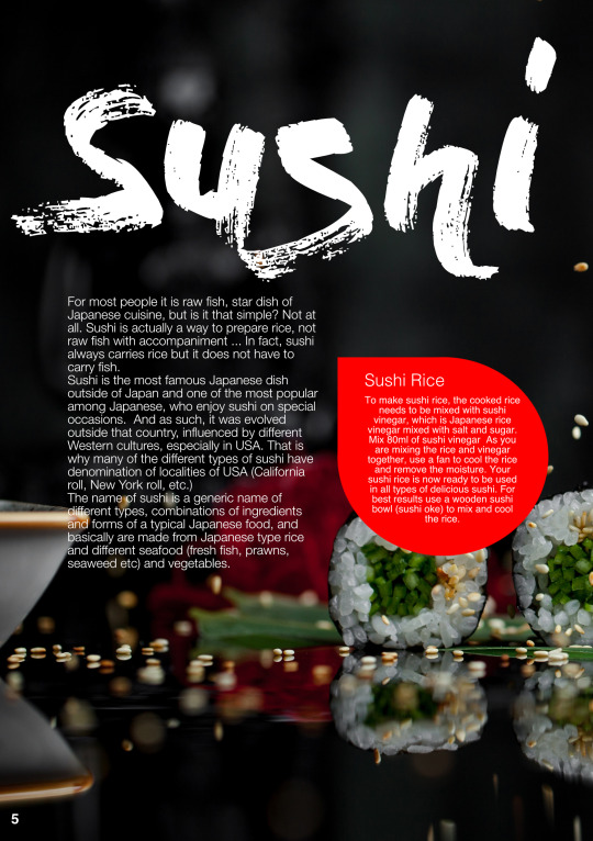
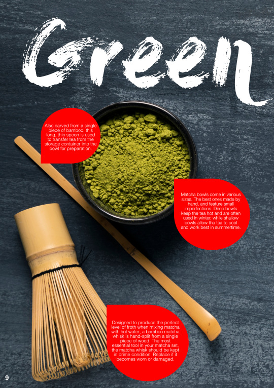
Overall, I wanted to create something that was consistent and attractive, I wanted all the pages to look like part of the same publication. I feel like I have achieved this. So far, this is the best thing I think I have ever designed and It feels premium and I am really happy with how the whole thing flows. The only page that I do not feel confident about is the green tea page, but I feel that is because of how the images look in the columns. I think in the final design I would exclude this page, but I still learnt a lot making it.
Below are the image attributes used from several sites
- https://www.dafont.com/dry-brush.font - https://www.freepik.com/free-photos-vectors/food">Food photo created by azerbaijan_stockers - www.freepik.com
-https://www.freepik.com/free-photos-vectors/background">Background photo created by freepik - www.freepik.com
The rest of the image are from Unsplash and require no attribution.
0 notes
Text
Assignment 2 (Part 1)
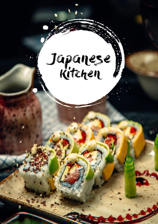
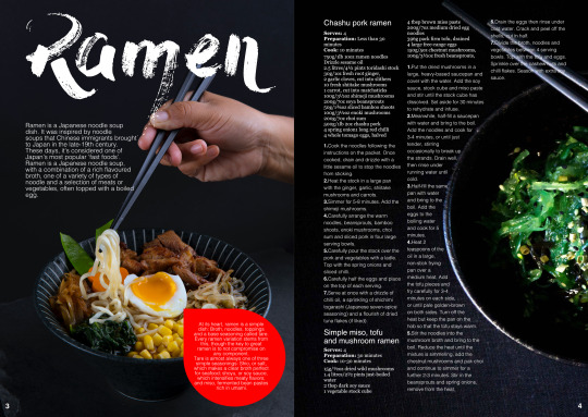
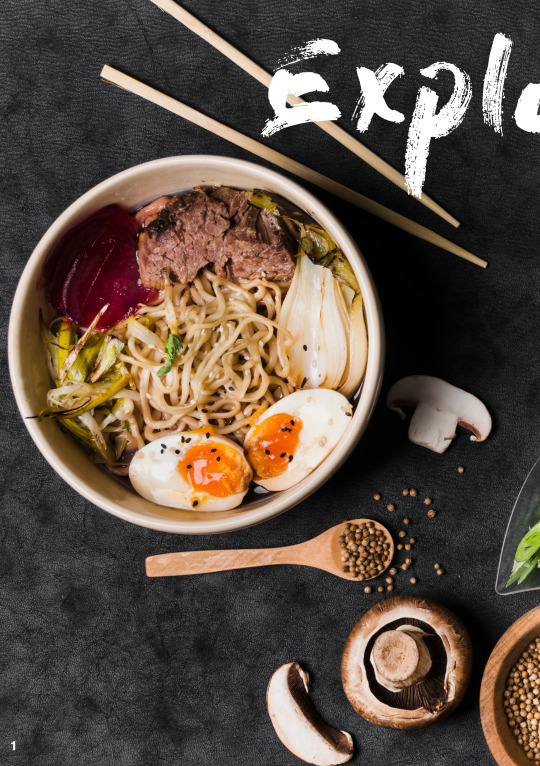
When I began this assignment, I had a vague idea of what I wanted to create, but in the end it turned into something else. I wanted to make something that reflected Japanese cooking, my last holiday was to japan and I wanted to make a supplement that reflected a generalised idea of Japanese cooking.
Research
I started by researching other supplements and food magazines. There is such a wealth of food magazines and I read as many as I could get my hands on. I took some of the magazines apart and analysed the fonts and other parts that I liked as you can see below. I made notes over the top of my research and began to formulate what I would need to include in my publication.
Sketching and Brainstorming
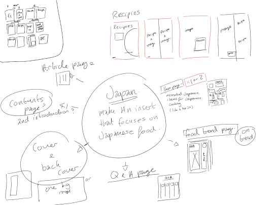
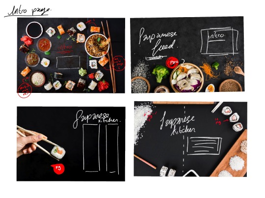
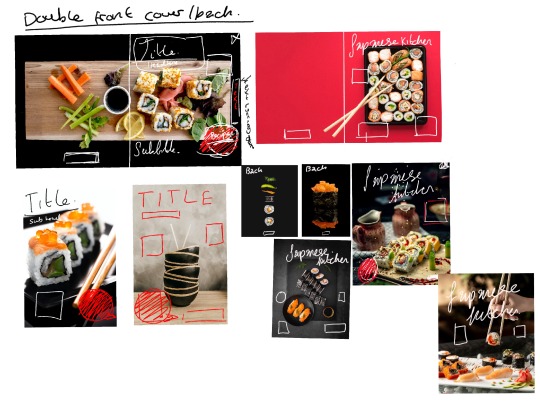
This is the section that took the longest, every time I designed something I wanted to change it into something else. The first step was to brainstorm, I just let all of the ideas flow out and made notes about what I wanted to include. I determined that most of the supplement should be recipe based, but I also wanted to make a page the introduced the whole thing. I made various sketches before I began and then found mock up images off how I wanted the design to look, some of these ended up being my final images that I used.


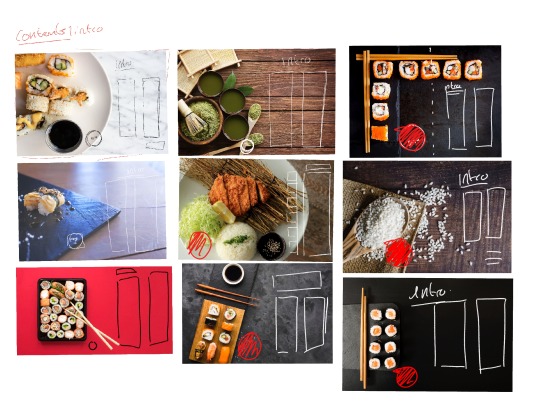
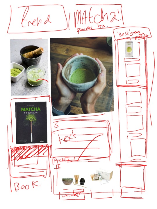
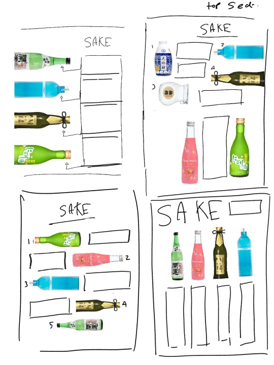
Some of the pages above were not used in the final thing, such as the sake/ matcha page, even though they evolved into something a but different I wanted to include them.
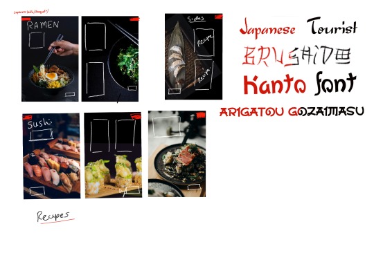
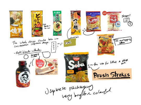
After having a rough idea of the layout, I began to think about how I could incorporate a feeling of Japanese food into the actual design. I looked at Japanese food packaging and this then led to me using the ideas of brush strokes like on the soba cover.
This would form my final title font on all the pages. I took the shape from the silken tofu box as I felt that this would be aa good block shape for text and more interesting than just a plain circle. This also led me into designing the front cover graphic. I wanted to take the shape from the bottle and make something that used the circle which resembles an “Enso” (A single brush stroke and one simple breath, linked to the practise of zen - representing a spiritual moment)
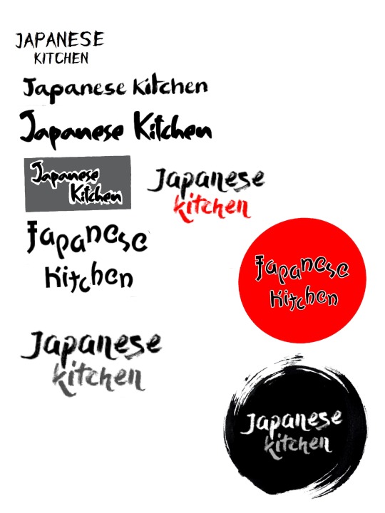
I mocked a quick version of this up in procreate with a front called dry bush.
At one point I felt that I would use more of an overlapping design (as seen in my red circle title design) much like the chow main packet, but I felt that It didn’t flow as well as splitting up English words was hard to read. I found that using a dry brush design on the black backgrounds worked really well as it reminded me of a recipe chalk board and looked really good when applied to the page, it was really eye-catching and made the p[age feel more artistic.
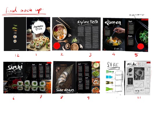
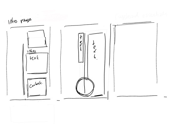
I then made a final mock up and started planning out what articles I would use. I wanted to make a 12 page document that incorporated recipes and an introduction page that would speak about why Japanese food is interesting and fun too make.
Creating the Publication
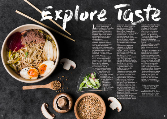
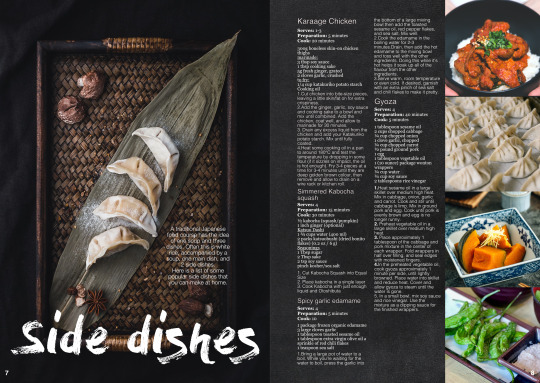
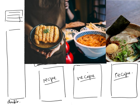
The first thing I did was set up the master page and add the page numbers and add the full page images, making sure that I made it an A5 file. Some of the images that I used need to be accredited as I got them from a website that requires attribution, but most came from Unsplash. The links will be at the bottom of this blog post. I spent a while moving the pages around, changing the image placement by millimetres until I was happy with now they looked. I then decided on how many columns on each page. I chose 3 as I needed to fit multiple recipes on each page.
After setting everything up, I put the titles on each page and added the red text blocks. Adding the recipes in, I decided to use a recurring format for each recipe. The recipes are mostly from the BBC cooking website.
I then made the front cover, I decided to keep it simple on the cover as this is a publication inside of a supplement, I really liked to keep it calm and minimalistic. I made the ink circle in Illustrator a a vector and added the text in Indesign.
Colour is something I really though about, I knew that I wanted to use photographs with a black or grey tone and white writing, and I used red as the other colour. I wanted to keep it minimalistic and clean and easy to read.
The fonts used are - Dry brush for the titles (Allowed for personal use) Georgia for body text and recipe ingredients. Helvetica Neue for everything else (in both light and bold). There was a lot of moving things around very slightly, I changed the main idea for the last two pages to fit in with the rest of the book, I thought about making the last two pages more of a variety page, with products and other links, like a what’s trending page decided against it. I think this was a good decision. But I find the page to be the weakest because of it.
I also learnt how to text wrap. There are 2 or 3 instances in the whole thing where I have the text wrapping around a plate or keeping the text inside of a text bubble. I will be using technique more in the future. The gris is also something I will consider from now on. I learnt so many new techniques during this unit, in particular in the travel magazine and I feel this to be an extension of that.
Continued in part 2 (The next blog post)
0 notes
Text
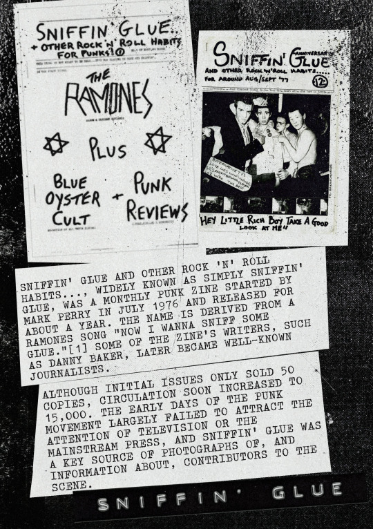
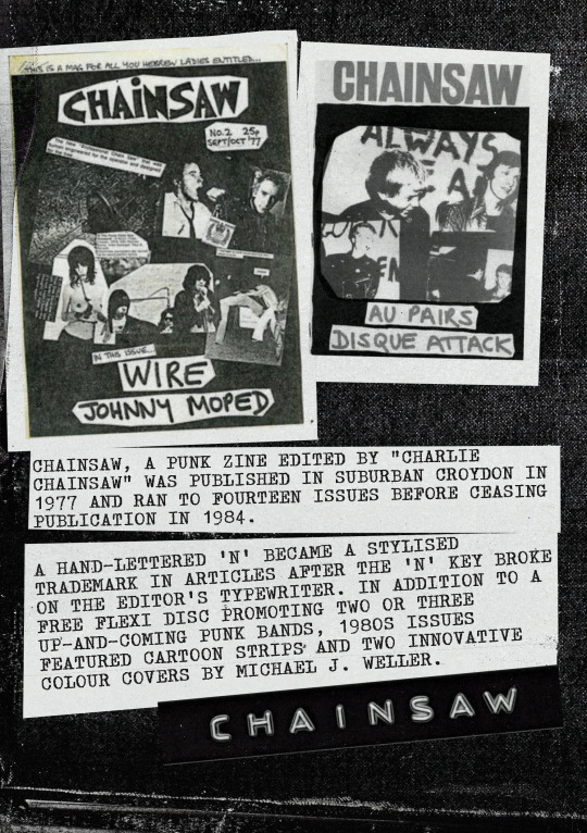
Altered pamphlet
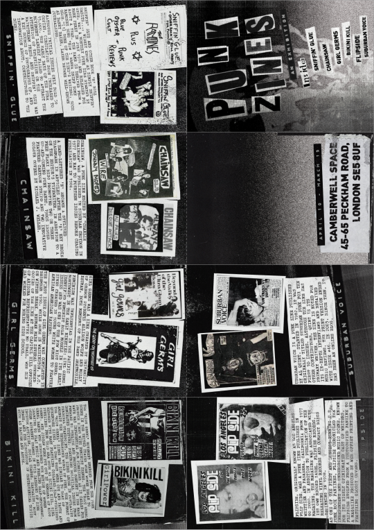
I was really excited to try this exercise when I saw it, I have been a huge fan of zines for a while now and have expressed interest in making my own. So I thought, why not make a zine of a zine. I originally wanted to make a pamphlet on artists books and did some research into different artists like Tracy Emin and John Broaddus. These didn’t really grab me though and I ended up looking for more inspiration.
I then looked at zine culture, and in particular the history and roots of zine culture and decided that I would base my exhibition pamphlet on Punk zines and the diy culture of creating a zine. I looked through http://editradio.org/2020/01/the-evolution-of-fanzines.html and gathered inspiration.
These are some notes that I made about Punk zines in general-
Very low cost
These are meant to be photocopied
Handmade zines have a lot of cut and paste, markers, anything you can get your hands on if its cheap.
Zine culture came from 1930s and a sci-fi culture (I found a load of Star Trek zines and sci-fi zines seem to be a cornerstone of not only Zine culture but fan culture in general.
“writing about something that isn’t being written about elsewhere”
“the fanzine used as a form of archive.”
Feminist zines and punk zines are intrinsically linked.
Punk isn’t just music, its a way of life and DIY CULTURE is ingrained
You can find work about class, race, mental health, disability, sexuality, gender, motherhood and other feminist topics.
A lot of the early zines made on cheap printer paper.
‘Hand stapled, and assembled using found imagery, typewriters and direct photocopying of academic journals, the pages of these publications rarely feature any original illustration, let alone a full-on photo shoot.
Now, I feel like zines are more like what magazines used to be, because zines seem like a more accessible platform. People who may have wanted to create a glossy magazine have found a more affordable way to do that within a zine."
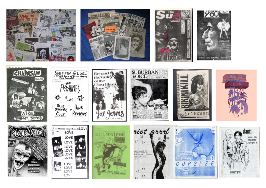
I then researched a ton of Punk zines, I wanted to look at the earlier ones as more of a history retrospective and I found various websites with catalogues, I made notes as I went and decided on what I wanted to make.
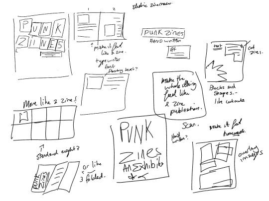
Possible cut out front covers?
Labelling tape
Big writing
blocks of white and typewriter text on top
Make it look like its hand assembled
Half tone
Photocopier look
Unorganised and chaotic
Just do what you feel, no pressure (No grid)
(Side note: While doing this exercise I rediscovered an amazing “game’ that I saw at EGX last year called Electric Zine maker, - http://unicornycopia.com/ezm/ and it inspired alot of effect I made during photoshop, its a full programme for making 8 page zines. It has received several grants and I consider it to have the essence of DIY punk zine culture in the digital age . It is actually excellent way into making zines without having expensive software, the app is a free, or as a small donation, accessibility is such an important part of zine culture and the more low barrier entries the better. I had fun playing in here, so many effects and it helped me into thinking about creating in a different way. and I actually used it to lay out my final zine and export it was a png and pdf.)
I then drew out a very rough idea of what I wanted, as I wanted to make something that would be spontaneous and evolved as I made it.
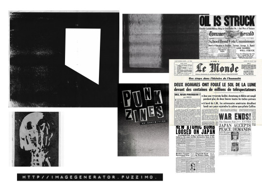
I then gathered materials - I found a great resource of old photocopier effect and a commercial free label maker that would let you create sticker labels, which I used on very page. I used an image of an old punk zine that I liked, the skull in which I put through the halftone machine ( A photoshop action set made by a company called true grit) and used this a s a background. I used old newspaper scans as the title. I cut them out on photoshop and assembled them very quickly, focusing on what felt good and not worrying about the balance. I knew I wanted to keep it black and white when I started making it. There is something so visceral and authentic that this zine could be reproduced cheaply on a photocopier if needed.
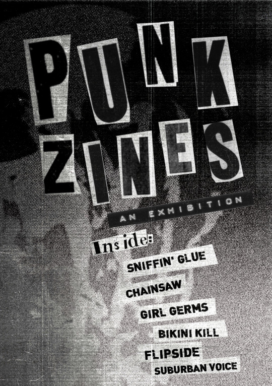

The fonts I used for this exercise were - Dracionian Typewriter, Dink, Amercian typewriter. I love the look of old typewriter print, and these were the best I could find without buying an old typewriter. Dink is such an amazing font, really grungy and Gave the bold text a bit of extra oomph, especially on the back.
The pages assembled in much the same way, the information and images mostly come from a site called wikiwand, wikipedia and several vice articles. All of the pages have the same sort of layout, but slightly different, this is all about experimentation and what feels right.
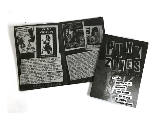
After I had assembled all of the pages I placed it into a A4 page, making an A6 Zine and printed it out, I have never made a one page zine before, but I really enjoyed it. I feel like I want to base my critical review around Zines and Zine culture. But this is something that I need to think about more for my proposal.
Below is the layer out version ready to be printed and cut-
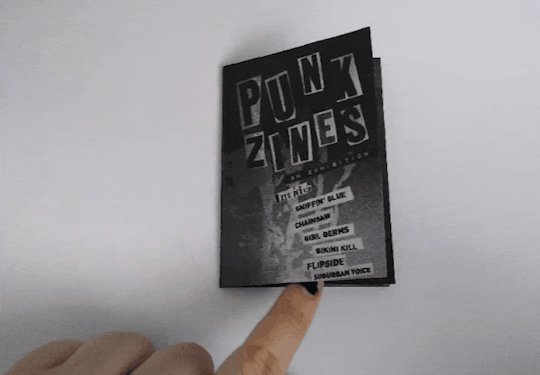
Below is the printed out versions as a photo and a gif version of me flipping through -
Reflect on your experience of taking a more experimental approach. What have you taken from this way of working?
So, during this whole exercise I had a lot of fun, I love experimenting and moving things about. For most of the exercises, I find that I am going in knowing 100% how things are going to look. But during this exercise I allowed myself to play and just feel the artwork. No grid, no lining things up, I felt totally free. Using a range of materials and techniques to make something that I have never created before felt so satisfying when it all came together. Looking at the final thing is such a joy for me, I normally see so many mistakes, like this isn’t lined up enough, this isn’t perfect. But what this exercise allowed me to do was to leave perfectionism at the door and just create, for the sake of creating. I now know how to make a zine and I will take so much from this exercise. Even though I know that the next assignment needs to have a Grid system in place, I will try to keep the playfulness and experimentation fro this exercise.
0 notes
Text
All the worlds a stage
Research
When I began this exercise I had this idea of making a spotter where the typography was being eaten by the environment around it, I made a quick mock up on photoshop but ultimately decided against this. As I reread the brief and it required Physical typography. I had no idea what Physical object photography was before this exercise. After some research I came across a term called - Typophoto.
But what is A Typophoto?
All notes below come from - https://www.photopedagogy.com/typophoto.html
Essentially it is the practise of combing letter forms and photographs.
“ I tried to create a typed image of a purely abstract and poetic nature, setting into a graphic poetry what Nezval set into verbal poetry in his verse. The magic signs of the alphabet.-- Karel Teige”
The idea of illustrating or decorating letters is not a modern one. The earliest examples of 'illuminated' letters come from the Eastern Roman Empire (400-600AD). By the Middle Ages, monks, working in monasteries as scribes, made elaborate, decorated copies of ancient and religious texts. By the 14th century, due to demand from private patrons, much of the production of illuminated manuscripts had become commercial.
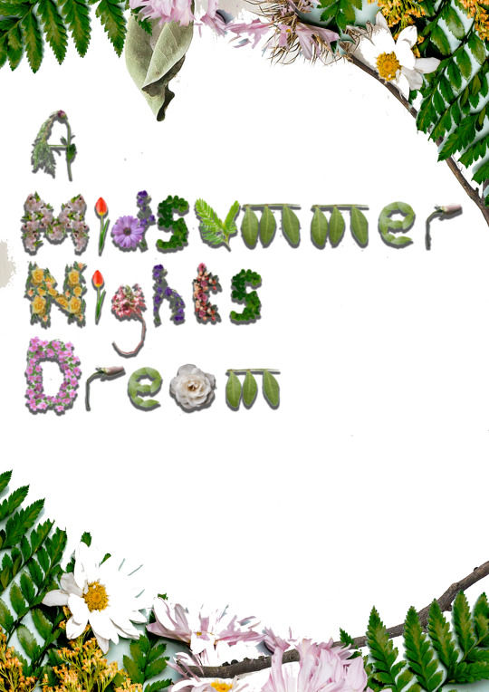
I then saw how I was going to make this poster. I was going to make an alphabet of objects, but out of found images of plants. I wanted to approach the midsummer night dream project as I began looking at how flexible flowers are and how they can be made into other shapes in photoshop.
Below are some examples of found object libraries -
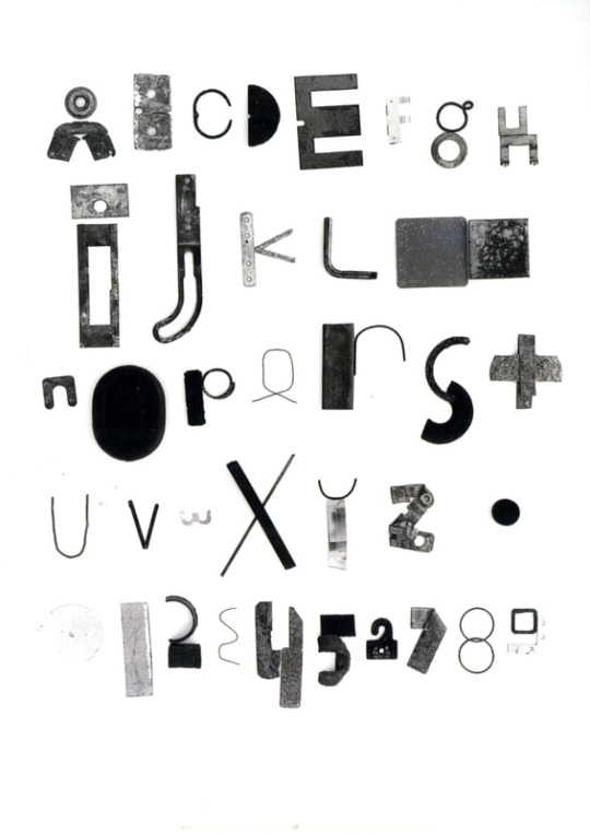
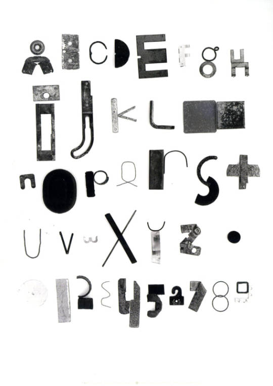
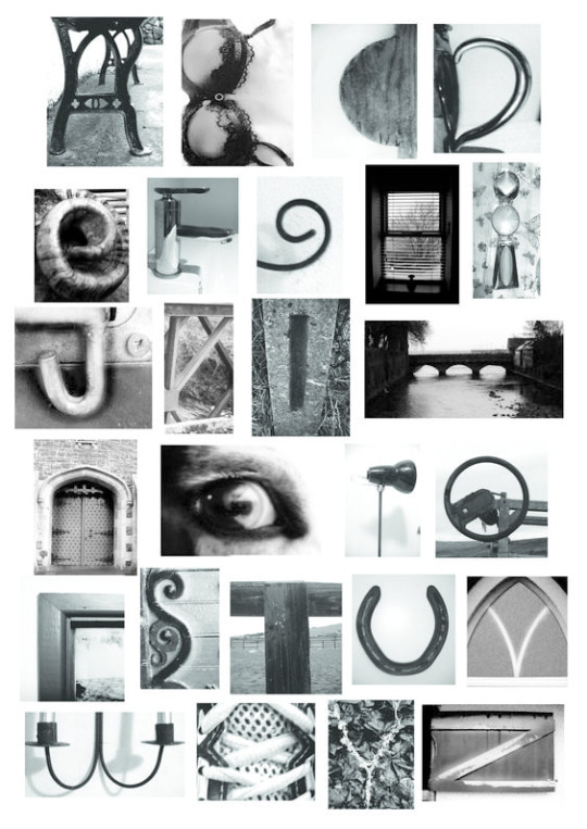
I was really influenced by the Fashion font by Yvette Yunjung Yang - I like the idea of found Images and editing them into the shapes that you need, Like I did with my A, M, D and G.
I sketched out some ideas, originally I wanted to have vines connect the poster and more it more calligraphic, but I decided that would be too hard to make for me right now as I am essentially a beginner at intricate photo manipulation and collage. But I really tried my best to look at commercial free images and find the natural shapes in them.i really am happy with the m’s (they are a clipping of a plant).
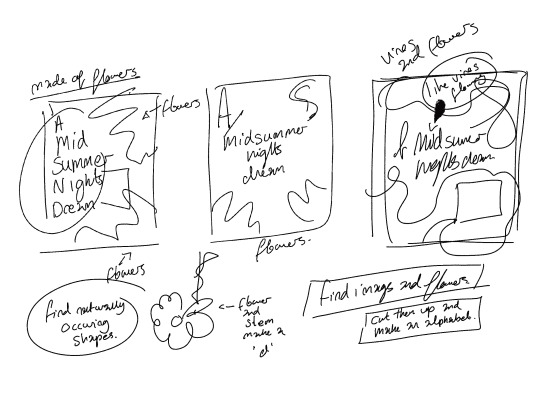
I used a drop shadow on the letter shapes and then arranged the in a such a way where the poster was able to add more information at the bottom, while decorating the edges.
I really just made this poster and moved on, I didn’t really like the end result as much as I thought I would. It’s sort of looks like a kids book to me, and I would want to make this more mature looking. I do like the combination between found images and collage of existing photos.
0 notes
Text
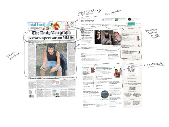
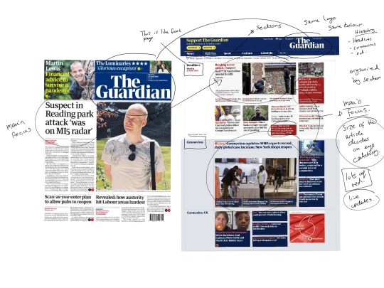
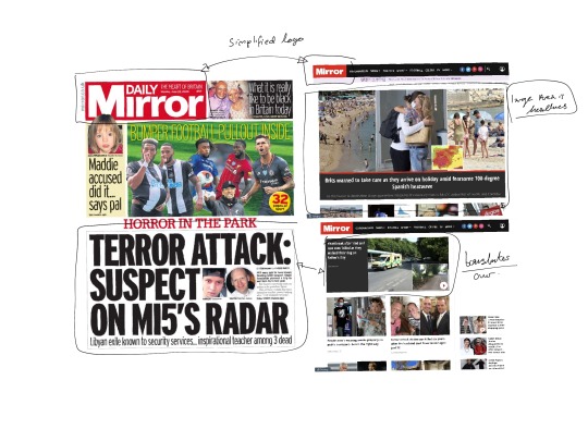
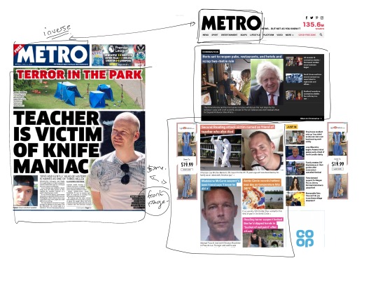
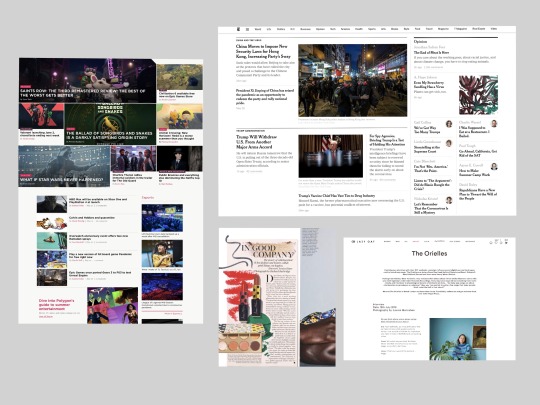
Research point - Newspaper Layout
How have their graphic designers dealt with the differences between traditional and new media?
They seem to move off all of the articles into sections and make everything easy to navigate. Like looking at the websites the Cornonavirus updates and news headlines are at the top of the page, while everything else is moved down and positioned either in the side bar or as you scroll down the page.
The tabs at the top of the page are very helpful in finding where you want to go.
Colour coded sections - red seems to be live updates and important inrformation.
The logo of the newspaper is sometimes shorted down and simplified to fit in with the website.
I’m so used to seeing webpages these days, I almost prefer a website as it directly links into the articles that you want directly.
More text and less images on the landing page on some of the newspaper webpages as the articles seem to be full of the full images and then you are linked there.
Print media seems to have a headline and image and then the start of the article on the front page, this then leads into pages of articles. The back of the newspaper always seems to be sport. Pages layed out in article format with columns. The newspaper always seems to follow the exact page layout, while all the websites are slightly different.
Depending on the website it does feel like an extension of the print media and therefore, even though they might not look the same in fonts, as typefaces don’t always translate the same in print as online.
0 notes
Text
Your manifesto
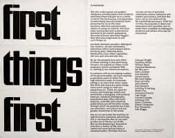
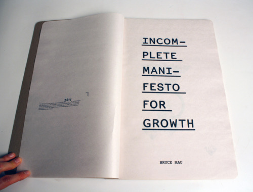
I began this exercise by researching other manifestos, below are some of the they key ones that I looked at -
First things first
Incomplete manifesto for growth
Wyndham Lewis Vorticist Manifesto
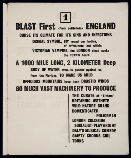
The New Art School Rules! - A collective manifesto
Ellen Jonsson and Irene Albino knitted a 25-metre long essay
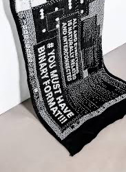
Looking at these manifestos gave me the confidence to be minimalistic, Looking at the new art school rules really influenced my manifesto.
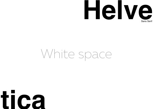
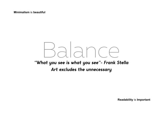
Minimalism is something that I feel is good and interesting in graphic design. I think minimalism is beautiful and I wanted to make my manifesto about this. I originally wanted to make a 1 page manifesto, but ended making a 3 page manifesto as I wanted to spread out my designs and make them more minimalistic to look at. I used minimalistic fonts, in particular Helvetica, as I feel like it is a font that is a staple for minimalist design. Below are some of the phrases that I used to make the document.
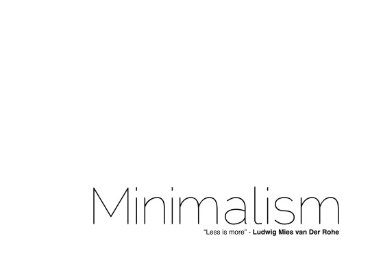
Minimalism
- Readability is important and minimalism is beautiful
-“What you see is what you see”- Frank Stella
-Simplicity
-Less is more - Ludwig Mies van der Rohe
-Doing more with less - Buckminster Fuller
-White Space
-Balance
-Art excludes the unnecessary
Making this was really fun, I’m still learning to use publisher and this was a fun experiment. I wanted to make something that had a great amount of white space and a limited colour palette, with limited fonts.
1 note
·
View note
Text
Research Point - typography and typesetting
I began this exercise by Identifying some examples of typography and typesetting that I found satisfying to read. This is really divided into two categories, Type that I find aesthetically pleasing, and type that I find clear and easy to read.
Below is a section of easy to read texts, I find these enjoyable to read because I can get through them quickly and clearly with all the information played out in front of me. The typography and typesetting is clean and often Serif based. This helps the words to flow better and achieve a weird sense of calm when reading, like a good novel where you can just settle in and read.
The other type is the aesthetically pleasing Typography, this is often harder to read but is nicer to look at and the typography is often the counterpoint of the page, I assembled some pieces below that I have found to be eye-catching and nice to look at. I really like looking at well though out typography, something that catches the eye on the page.
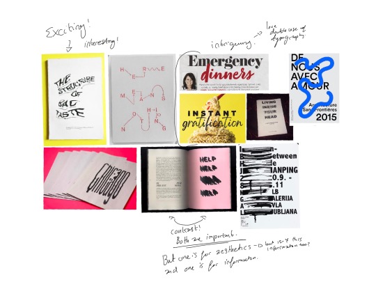
Below are a few reflections -
Beatrice Wardes’ argument and Johnathon Barnbrook’s approaches both apply other forms of text, but in different ways.
Graphic design is all about communicating ideas and for these ideas to be communicated the message needs to come across clearly. But how we do that is all up to the graphic designer.
Not every page can be a solid block of text, nor can every page be a work of typographic art. Should graphic design always be at service to the text? No. The two sides of typography need to remain in balance. Without visual assertion, how would we evolve our visual language? Would graphic design become a stagnant and boring lost art? The main loss here though would be the visual interest and intrigue. I want the information, the idea, but the vessel of typography doesn’t always have to be a clear window.
We have to remain playful in the craft, but also maintain the balance between the two. The act of making the words more than the words themselves emphasises their meaning and in some ways transcends the original message of the words on the page. But it is up to the graphic designer to hold on to the integrity of the original meaning, while boosting its key attributes. Graphic design is art, not just communication.
Is the interpretation of the viewer not as important as the writers? Once we put something out into the world in some ways it ceases to be just yours, it part of the collective. Allowing multiple viewpoints and perspectives, allowing more creative freedom.
Not to say that a clear window into the authors words isn’t essential sometimes. A novel, a textbook, instructions and so many more things rely on clarity and readability of the text. However, consider the cover of these books, a stark contrast to the black and white pages within.
Legibility needs to happen in really all aspects of design.
I love to look at penguin book covers, they have some of the most dynamic typography and ideas for novels in recent times. The job of the front cover is to entice and draw the eye. A black and white text block is not going to do that.
Overall, the intent changes the way that we read a text. Whether through choosing a certain design or a style of presentation. I believe this applies to all text. We cannot have just have artistic typography nor can we have blocks of text everywhere. No matter what the medium these two sides of typography are essential building blocks of how we use graphic design.
0 notes
Text
Envelope patterns
This was such a fun exercise, I really like making patterns and I knew that I wanted to make something different from what I usually make. I normally make designs that have paper-cut or painting as the style, but this time I wanted to make something with words and vector images.
I had a load of research images that I had already collected as I have been making surface patterns for a little while now in illustration practise.

I also looked at envelope inserts to see the type of thing that I would need to design for.
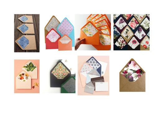
I began by sketching some ideas down. I knew I could only use a single colour so I wanted to make something fun and playful that went beyond simply protecting the letter.
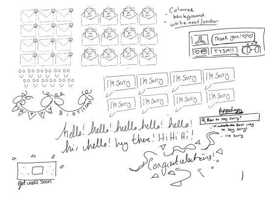
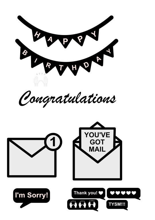
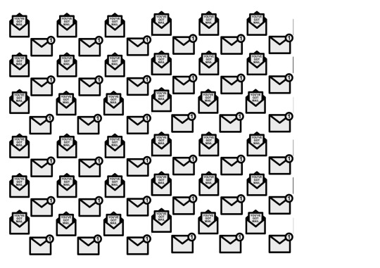
I wanted to make something playful, so I thought about why you send a letter. Birthdays, to say sorry, to sat congratulations ect, but I also wanted to make another design that was generic: YOU HAVE MAIL!
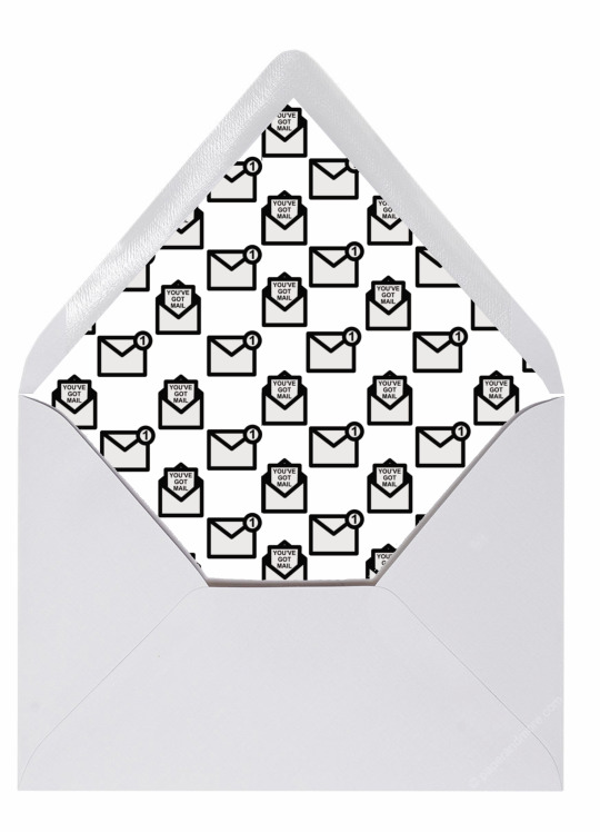
I wanted to make a series of patterns that incorporated our modern email/ message society and incorporate that into traditional envelopes. The original email.
This led me to my first design. I looked at the mail app on my phone and though about how I could incorporate this into my design, I wanted to mix getting a letter with getting a new email. So I scribbled down two separate ideas. One that was a notification email and one that said you’ve got mail on it. Originally I was just going to keep these as two separate envelopes, but in the end I thought That its would be more visually dynamic to place them next to each other. This one I kept black and white, but I could see this being changed to white like rest of the text on the other images.
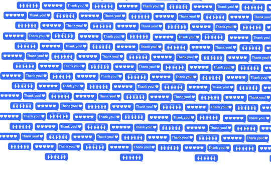
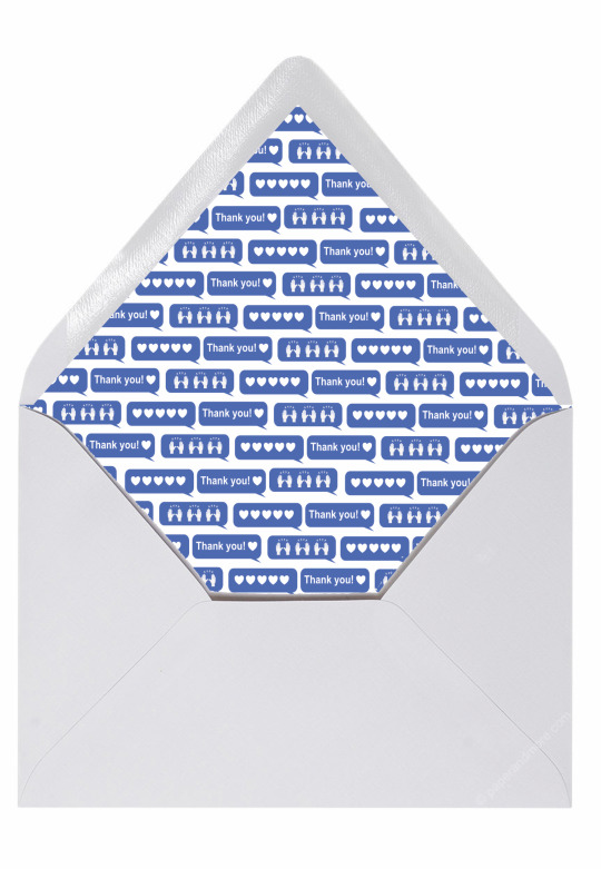
The next one I designed was the thank you message insert, this is made up of iMessages (sense the colour blue) with different emoji and Thank you written on the. I really liked this design the most out of all of them, I really liked the message structure and how it worked as a pattern. I used designer to make all of these and the heart was already a shape, but the thank/ praise emoji was a stock asset that I desaturated and added in afterwards. The only part of the design that I did not make.
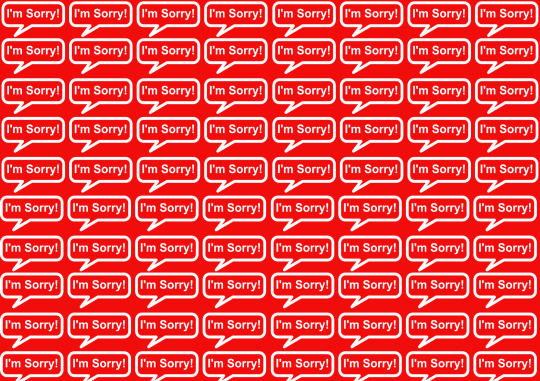
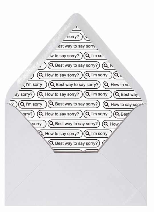
I also made an I’m sorry envelope. This one was just a repeated pattern over and over, I think I need to go back in and reconsider this one. I made it to be a bit like the thank you message one, but I don’t think it really has the same appeal as the others.
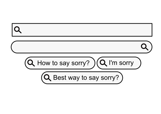
Edit- I went back to an earlier design. I figured that this design had no meaning and that I would use the google search idea that I had. I Made a repeating pattern that focused around the search bar and typing things in as an apology. For example ’Im sorry’ “how to say sorry”. I felt that the previous design was much too aggressive, especially in the red. This newer design I feel is much more suited to saying sorry as keeps with the theme that I wanted to go with.
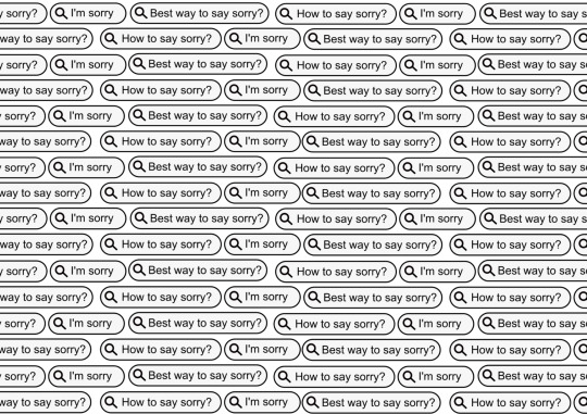
Below are the final mocked up versions. I had so much fun in this exercise. Making patterns is something that I enjoy doing and it was really fun to explore it in a new way.
0 notes
Text
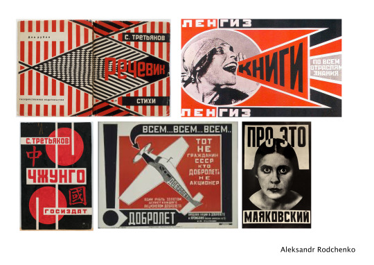
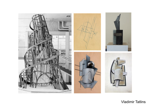
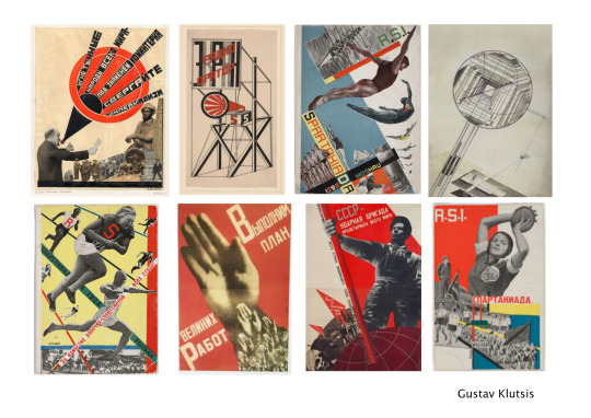
Soviet Remakes
Research
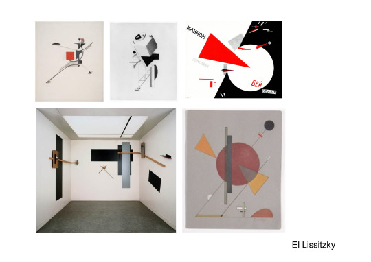
I began this exercise by researching constructivism and the recommend artists as seen below. I really enjoyed looking at the range of these artists as constructivism is something that I really haven’t had the experience of looking at before. I compiled some artists that I felt were pioneers in constructivism. Below the images re some quick notes I made about the actual images itself. I also looked at Saul bass during this exercise as well, just to see some of the principles in work
Constructivism
Is a form of abstract art, founded by Vladimir Tatlin and Alexander Rodchenko in Russia in 1915.
Its all about the construction, This is art that is built rather than relying on expression.
Should reflect the modern industrial world.
A world less hermetic and more based in factories and laboratories.
Influenced by Picasso’s Cubist constructions.
Construtivists were constructors of a new society - The modernising of the Russian revolution.
Supressed In the 1920s in Russia , but was bought to the western world by Nabum Gabo and Antoine Pevsner.
This then became a modern influence on modern sculpture
Influenced Minimalism and Brazilian neo-Constructivism - (Linked to bauhaus)
It is a mixture of Forward thinking theory and Political propaganda
Observations about constructivism
Sparce and empty looking - almost sterile and mechanical
Geometric forms
Modest materials used - glass, woods, metals
Its about taking form down to its almost basic elements
Artwork is dictated by material
The free combination of primitive shapes
Soviet movie posters
From here I looked at soviet movie posters, I have never really looked at these either and I find them to be a bit intimidating. There is a lot going on in the composition, but a lot of it is made of geometric shapes and it is easy to see how they could have been broken down.
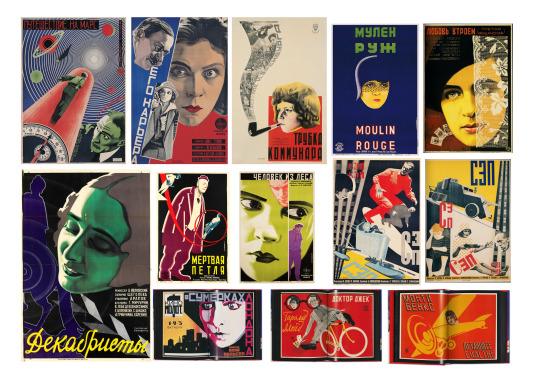
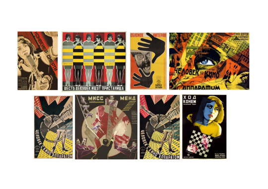
There really does seem to be the main shapes just repeated throughout the composition, the triangle, the square and the circle. a lot of primary colours used, but somewhat desaturated in some images.
From looking at this posters I was able to make some sketches of designs that I would want to use for my movie poster.
Making the poster
I chose Psycho for my poster, I am really familiar with this film and I felt like it was a classic Hollywood film that had an iconic scene that would make a good focal point for the poster. A lot of the posters feature a woman or main characters head separated from the body, as a focal point and I knew that I would do this for the character of Marion Crane.
Below are some of my initial sketches I made when thinking about how I wanted my poster to go.
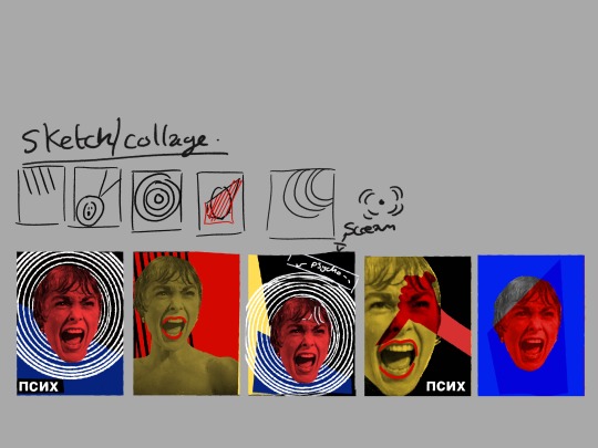
At this point I knew That I wanted to have the spiralling circle effect on my poster as it resembles an Emanata in particular a Agitron. I walks wanted to make sure that I had some strong geometric shapes in the piece as that is a core point of constructivism. I decided to colour Marion red to represent blood from the death scene. Originally I was going to make her yellow like alot of the other soviet posters woman and colour her lips red, but I felt like this would be more dynamic. Although I have my doubts about this. I don’t know. I feel quite unconfident about this exercise. I Also included a red triangle facing down to feel like a knife. I wanted there to be meaning behind my decisions.
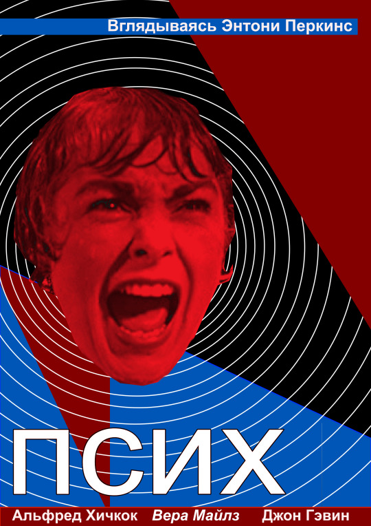
Making the poster was actually a bit more difficult than I planned. I have been used affinity designer for some points instead of illustrator, and learning how to do the repeating circles was actually really annoying, but once I figured out how to perfectly space them apart the effect looked pretty good as It looks like she is shouting. I ended up moving some of the text around, looking at the way that the soviet posters looked. I made the poster in Russian as I felt that it helped give it that look.
Overall, I had so much trouble visualising this poster and making it. I’m not really happy with the final thing. I have learnt so much this unit but I feel like this is a giant step backwards and I could do better. Hopefully I will haver the chance to go back and move things around, maybe change the colours around a bit.
1 note
·
View note
Text
A Sense of place
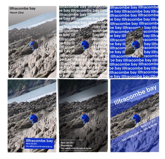
This was a great chance to just experiment really quick. I grabbed a picture of of boyfriends dad that I took in illfracombe bay down in Cornwall and played around with placing text down in certain ways on the image.
Integrating Photography and typography is one of the essential parts of graphic design and I just let my ideas flow a bit as I made multiple versions. I pushed the text all around the canvas to see where it looked the best and then tried to make vignettes and overlays different and interesting. I love the idea of repeating text and I really liked the bold blue and white as a cut out. I chose this image because I really liked the dynamic shape of the picture and I felt that it really lent to interesting compositions.
Trying to get them to work together was a challenge, I found it hard to get the text to show up on the rocks and the water seemed like the only place to put a title. But adding block colours really helped the the text to pop.
If I were able to take new photos I would approach them in differently knowing that I would incorporate text into them.
I would
Leave more negative space in the image ( Perhaps Sky or grass or water)
Place the figure to one side or make sure that I knew where the text would go before hand.
0 notes
Text
Travel
Research
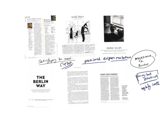
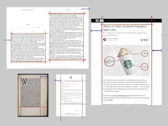
I began by researching different types of layouts in travel magazines and travel guides. I also looked at a few coffee table photography books to get an understanding of what the brief wanted. I knew that I needed to create something that merged the ideas of magazine and coffee table book and needed to understand what made each of these mediums different. Below are a few pages that I stuck together so I could see the flow of the magazine.
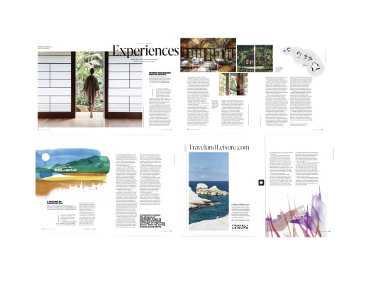
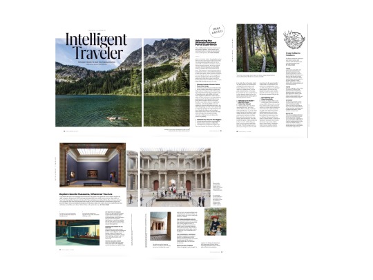


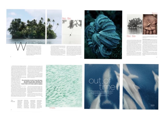
I really found that I need to find a balance between whole pages of photography and text.
A lot of coffee table books just have whole pages of photography and very little text, white magazines seem to have a good amount of images and ample amounts of articles.
As with most magazines, there are columns and when I am making up my grid and master pages I must make sure that my columns, gutters and alleys are consistent and tie the whole piece together.
Creating stage
I have found that making sketches when researching really helped me to inform what I wanted to make. I blocked out some of the shapes in procreate and this then led me to thinking about how I wanted the whole thing to flow.
I sketched out a few ideas while looking at my research , I wanted to create a really sleek elegant design that felt professional.
I chose a final design and sketched out everything I needed to make the final design. I chose the bleed, the margins and the fonts. I chose Futura for the main titles and Baskerville as the body text as I felt this was a very legible font that would look elegant. I chose a black and white motif, as I felt that the colour of the photographs really is the focus here. I thought about adding in maybe a splash of colour but I decided it was sort of distracting.

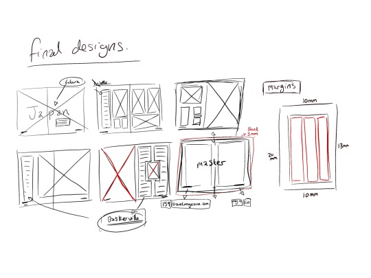
I then has to learn to make a master page for the page numbers and the bottom notes. I liked the idea of national geographic having the website at the bottom of the page and decided to include that one one side and have the month on the other. I ran into some problems when I accidentally edited something in the master document and it would change the rest of the pages. But I figured it out after a little bit of trial and error.
Here are some notes I made during making the actual document -
1. While experimenting with the things I could do in publisher, I discovered placing lines around the text to create boxes. I used this a few times in the document, mostly when trying to show an area with emphasis.
2. I also learned how to use the Drop caps feature, having seen it in many layouts, I thought it was something that would elevate the design. It also breaks up the monotony of an all text page.
3. Flowing from one page to another is really important on a spread, try to think about the 2 pages as one big image.


After I decided that everything looked good, I saved them as spreads. They looked pretty nice and I am actually really pleased with them. The more time I work with a grid the easier it is to visualise and design.
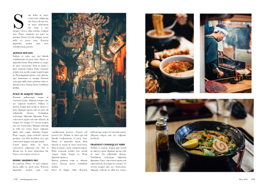
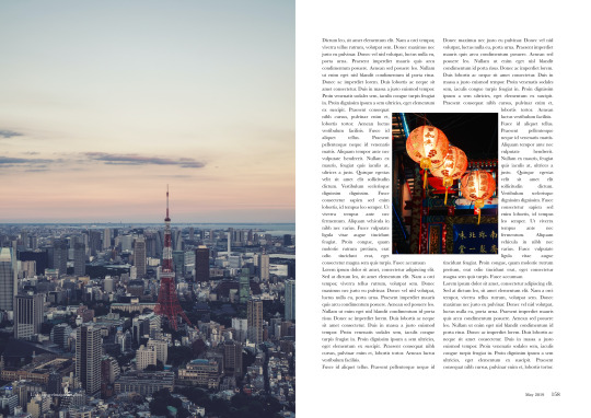
Here are the final spread mock ups below-


Final thoughts
I learned so many things during this exercise, and I feel like I am getting stronger as a designer. There are some things on looking back at the exercise that I will go back and change. For example I forgot to include a photo caption next to the images liked I planned. If I get the chance I will add these in when I get the chance.
I thought the flow of the pages worked really well, I really tried to make all the pages feel like were from the same magazine. Sometimes I feel like I make things that don’t fit together, but I feel like this all slots together.
I am really happy with how the whole thing looks though. Probably my favourite piece of work that I’ve done so far. I feel like I answered the brief and learnt a lot of new skills along the way.
0 notes
Text
White space
White space , or negative space is the space between screen elements.
Active white space - intentional and included in design for emphasis. Is included to give more focus to the elements on the page.
Passive white space- Naturally occurring space surrounding a word or line.
During this exercise I will mostly be exploring Active White space, but will be aware of using passive white space to my advantage.
I began this exercise by looking at some established designers that have used white space within their work.
Research

I looked at a range of posters, webpages and magazines for research. I have made notes on each of the pieces that I have found.
How are the designers using space in their work? How does it draw the eye, support you’re reading or convey a sense of luxury?
The sense of luxury is something that is something that is desired when selling a product, a lifestyle or an idea. The use of white space is something that luxury designers utilise to a varying degree.
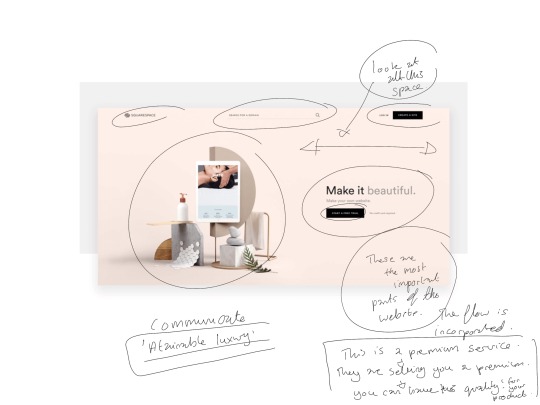
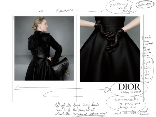
There seems to be a distinction between ‘Heavy white space’ . Heavy White space is seen to be luxurious. Used by the elite, for example Chanel and Apple. We are taken on a journey with white space. It begins at the amount of white space used on the page.
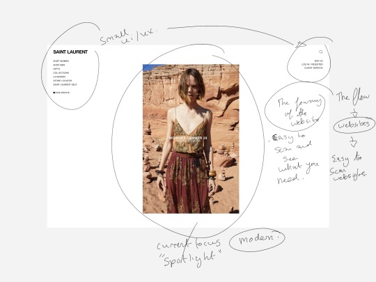
Our eyes are drawn in by the focal point, often at the centre of the page. Where the product or idea is placed. Wide margins Draw the eyes in. Looking at apples website for example is a masterclass. The first time you click on a product, it’s all you see when the web page loads. Looking at the iPad Pro’s bright focal point against the white space is such a contrast. All the writing is out of the frame. There are also no adverts in the white space on a luxury website, it screams “We have the money to make this look however we want”.
Keeping with the idea of the luxurious website is Squarespace. Squarespace is an “attainable luxury” its not as expensive as an apple product and looks to communicate that it is a high end contender through showing its worth. The white space communicates that this could be yours, that you could make a website like this. It draws the eyes and only has the most important parts of the website are visible and wide amounts of space between everything.
Looking at magazines and advertisements was eyeopening. I saw a brand use a 4 page spread for 7 words. Si on Rêvait ? La Haute Couture in vogue. The bold simple font opposed to the white space creates intrigue and creates a legibility. We ask, what is this? What is so important that it needs to take up 3 pages on a few words? This screams luxury. Unlike a website where you can just make more space if needed; Print media is more strictly controlled and having a white page is more work and expense to include. Pure Luxury.
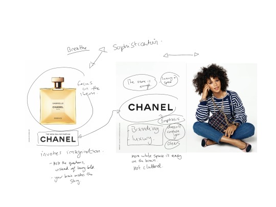
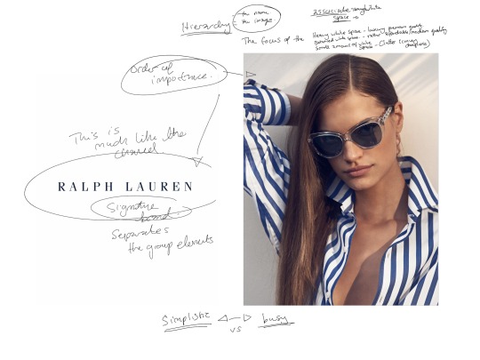
Chanel is Luxury personified and every single advert is could finding’s print is bold. Chanel is the logo and is often placed on a page by itself. A clear emphasis on the name and the product. Much like La haute Couture, Chanel does not share space. It breathes. Wide margins, the product placed in the centre all to achieve the most amount of white space, the most amount of luxury. This is the same for Dior and any other luxury brand, we find out eyes looking at the logo or title, all while soaking in the white space.
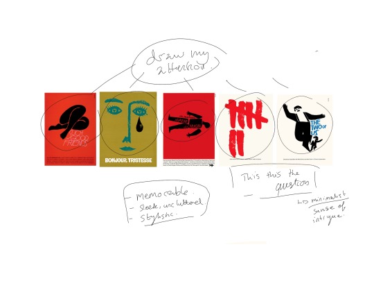
I also looked at some poster designs for this research point, Saul Bass’ posters are all about white space. They are memorable and stylistic, sleek and uncluttered and have a very simple image at the centre. The rest is all white space and I feel that this gives a sense of focus and intrigue.
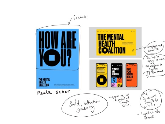
I also looked at a campaign by the mental health coalition, created by Paula Scher. The campaign uses the white space as an object to reflect the mood of the page ( The pages eventually turn white at the bottom) and this in opposition to the bold big text really shows that this is an important subject worth talking about. Its given Importance by giving it a large amount of white space.
*Further research*
I also wanted to research /Artist books and catalogs/, to see the type of thing that I should be designing and made some small sketches of various pages that I came across.
This led me to sketching out a few Pages that would let me explore what I wanted some of my pages to look like. There were parts of other artist books that really piqued my interest and inspired me.
There are some gallery exhibition pdfs from the MOMA and Tate modern as well, trying to get some feelings of what a professional looking design should look like.
I found all of this research to be really instrumental to the making of the artist catalog.
*Creating stage*
The next step was to find an artist, Some of the artists that I had wanted to use were not available to the VADS, Oxford library or the Bridgman educational library.
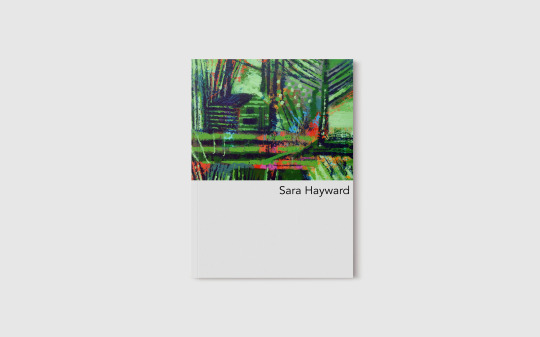
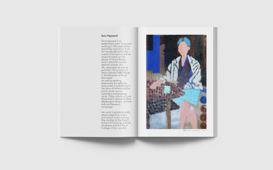
Eventually I decided on an artist named Sara Hayward. I felt very attracted to her artwork and that it would be appropriate for a gallery like this.
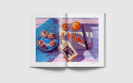
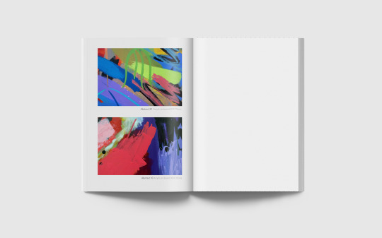
I found a range of images that showed a collective of her work, from portraits to still life. In all of my research, there seems to be a general consensus of showing a range of the art instead of just one area of their work. I collected the images and took my sketches of layout and moved to Affinity publisher.
I looked at the images that I had and began to sketch out mock ups of pages that I wanted to include.
I did change some images around and move the text boxes a bit, but overall I ended up keeping many of the sketches.
I made a grid, that would encase all of the images and the text. I had to move around some of my sketches and adjust things for the image sizes. Eventually I made a 20 page document, including a front cover and back cover.
This is a list of observations that I made about my Design document:
- *Black Bold Title* & Lighter Grey Description (Contrast) - Limited Palette for writing, the focus is the artwork - White space to let the artwork “breathe” on some of the pages, some pages can be left blank all together - One experimental page where the image takes up the whole page, apart from the borders (Pages 10/11) - 2 columns seem to be the standard for writing an amount of text. - Using Avenir as the main font - as it is clean and resembles all the artists books that I have looked at.
Below are the pages from the book I made on affinity publisher. It shows the small grid that I used for all the pages, I wanted to show my working process a bit more.
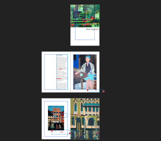
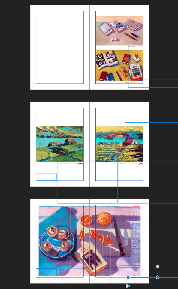
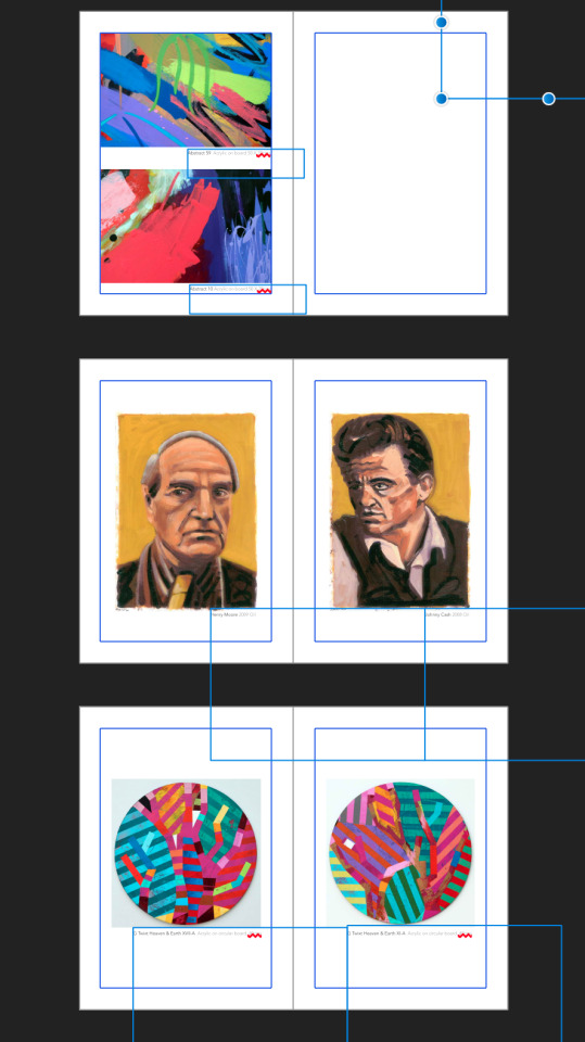
I wanted to make something that looked sophisticated and encapsulated the feeling of “white cube status”.
I will include my booklet as a pdf when submitting but below is the mock up and jpeg files. I can’t show the individual images as I am not allowed to show Bridgman images on my blog.
*Final thoughts*
This was a fun exercise, I have always liked the idea of making a book like this and learning about margins/grids and layouts in general really helped me to plan things out.
Up until now I had found positioning and ordering things to be personally difficult. I never knew where things should go, and why designs elements should work in a certain way.
Now I feel that I am beginning to get a groundwork in understanding why things work in graphic design. I have a long way to go, but this is one of the first exercises where I feel like I am actually designing, instead of just trying to work my way through the exercise.
0 notes
Text
Research Point- Grids
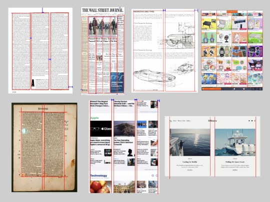
Identify a range of grids that are used in contemporary and historical publications.
Before looking at different uses of grids, I decided to research the types of grids that are commonly used in design.
What is a grid?
- System for organising layout - Can be used for print, screen and any other user interface - Different grids serve different purposes
After determining what a grid is, I did some research into examples of the different types of grids and how they have been used in contemporary and historical usages. I also tried to make note of how big the gutters, rows, columns and margins were so that I could compare them, and find meaning into why they were designed in such a way.
Different types of grids
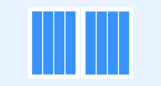

-Most common type of grid -Divide page into vertical fields and objects are lined up with them -For Example - Magazine and Newspapers
Are these grids informed by a particular view of design?
Columns developed to help you read more efficiently. When looking at a newspaper or article your eyes may get lost when reading across a big page.
There is a balance between the gutter and the columns - The margin should normally be set to 2x while the gutter is x as this restores harmony to the flow and reduced tension.
Breaking it down into a column makes sure that your eyes can follow the information.
You can also separate information by placing them in different columns.
The width of a column should correlate to some part of the internal design such as text size, meaning that a column should be considered before it is made too wide or narrow.
Modular grid
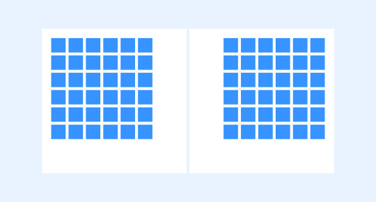
An extension of the column grid
-Take the column grid and ad rows to it -These intersecting rows create *Modules* -For Example - Magazines, online stores, image galleries, poster design.
Are these grids informed by a particular view of design?
Modular Grids are similar to Columns grids but with horizontal divisions, marked out by rows. Meaning that the flow between the gutter and the margins should still be considered to make reading easier.
They work best when a flexible offer is needed, and more complex problems.
They are better for complex projects and are more akin to a tabular design.
Each module in the grid holds a part of the design, broken down into smaller pieces that can be distributed throughout the document.
They van present information in way that helps maintain proportions, this leads to consistency.
There is also more of an aesthetic appeal to the modular grid. The bauhaus and Swiss style was looking to create meaning in order and clarity of a design.
During the 1950s-1980 the modular grid became associated with rationalism, objectivity, order and minimalism. Below are some examples of the iconic structures that came from both of these movements.
Manuscript grid
-A one Column grid that encapsulates the text and determines where the text will sit. -Often mirrored -For Example - Novels and traditional books
Are these grids informed by a particular view of design?
They are the simplest grid and they work best with a continuous block of texts or images
The margin is the main indicator of how the design is received.
If they feature wide margins that help focus the eye by compressing and narrowing the text block. Creates a feeling of calm, enabling concentration.
However if the Margin is narrower then the feeling is reversed, the closer the text to the edge of the pages the more tension is felt.
When the block of text is placed asymmetrically, allowing a larger white space on the page, it allows one side of the eye to rest, all while creating visual interest.
Hierarchical grid
-Any regular grid that is for a particular need. -Could be completely freeform -Could be composed of two super imposed grids or other grid elements mostly used in web design
Are these grids informed by a particular view of design?
The hierarchal grid is used when none of the other grids work in the way that the designer requires.
They (often) come about by placing and combining various design elements and finding a structure that solves the design problem.
They are a good fit when a project needs a grid that breaks the mold and a new structure is needed to make all of the elements work.
(Other Parts/Types of the grid, that I felt needed to be included, these are more apart of actual structure of the grid)
Pixel grid

-Digital Screens are made up of microscopic grids of pixels
Baseline grid
-Dense Grid of equally spaced horizontal lines -Often used with column grids
Between reading “Making and breaking the Grid” and looking at various articles on Grid design and invention I have learnt so much about the grid. I had never really considered why and how elements are placed on the page. Tis is such a core of graphic design principle and I will try and incorporate the Grid as much as I can in future design projects as it is a great foundation on which to build.
0 notes
Text
Research point
Pick out the similarities in the layout of a range of novels, textbooks, newspaper or other print or digital products.
Magazines
Do these similarities suggest a set of common conventions, such as the size of gutters and margins, the use of columns or the treatment of page numbers, footnotes or images?
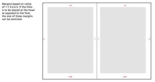
Size of gutters and margins - seem to be pretty consistent, I noted down somewhere that a good modern ratio is 1:1.5:2:2.25
Numbers -Seem to be in the left and right corners of each page
Images - No standard for images - but mostly confined to the columns
Columns- seem to have at least 2 normally, breaks up the text in a nice way.

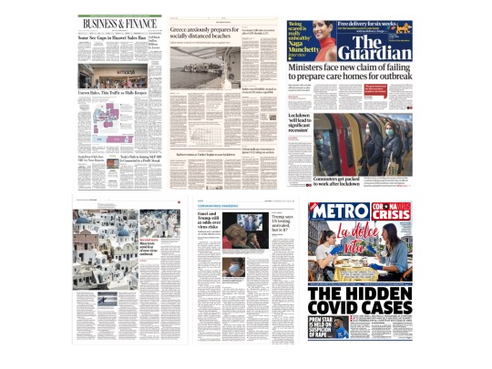
Newspapers
Do these similarities suggest a set of common conventions, such as the size of gutters and margins, the use of columns or the treatment of page numbers, footnotes or images?
Size of gutters and margins - common specifications seem to be that it must have a half inch (.5 inch), white margin around all four edges of each page.
Numbers -numbers seem to be at the top of the paper, either in the middle or on the right hand side.
Images - Take up several columns, normally a feature point of the page, as always for print 300dpi
Columns- At least 4 normally, sometimes more.
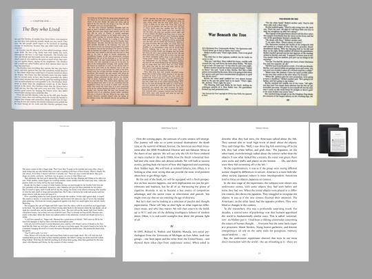
Books
Do these similarities suggest a set of common conventions, such as the size of gutters and margins, the use of columns or the treatment of page numbers, footnotes or images?
Size of gutters and margins - standard sizing is apparently -
For bound books 6"x 9" (15cm x 23cm) or smaller, use 0.5"
For 8.5"x11" (21.59cm x 27.94cm) documents (bound or unbound), use 1-inch margins.
Should have 65-70 characters per line (including spaces).
Numbers -bottom middle
Images - Images are rare, but if they are printed normally small and above the start of a new chapter.
Columns- 1
0 notes
Text
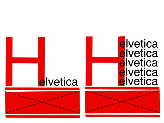
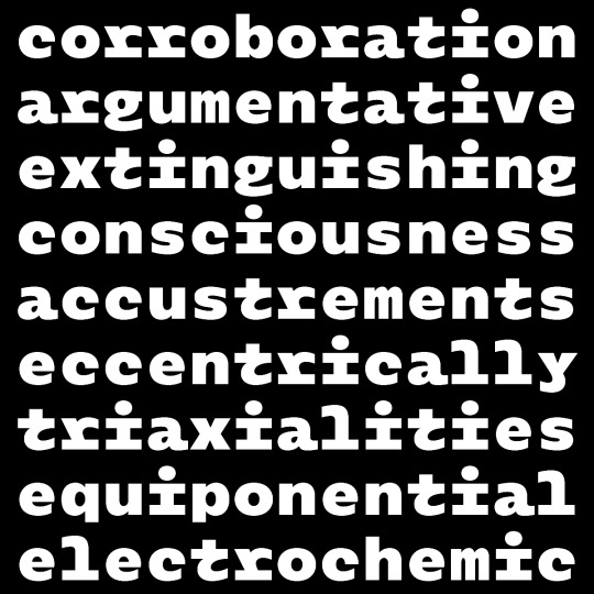
Exercise: Type Samples
Below is the the research that I did before I started sketching out what I wanted the layout to look.
There's a range of type sheets and ideas that I liked. I had no idea what I wanted the brief to look like overall, and gathering a bit of research helped me visualise how I wanted the final piece.
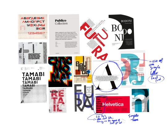
I visualised my favourite ideas in thumbnail forms just jotted down the ideas as quick as I could. I wanted to create something clean looking that showed all the requirements.I liked the idea of having a singular letter, or group of letters that dominated the piece. I wanted to make something that could convey all of the information in one look.
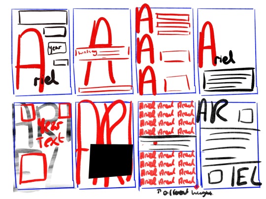
The next step was to decide what idea I liked and do a little mock up. I decided on a thumbnail and played around the idea further.
This was the idea that I chose, I felt that all of the text would fit at the bottom, and the rest of the page would then show off the typeface.
I decided at this point I wanted to show off the different parts of the font, for example Bold, Bold oblique ect.
I decided to use Affinity publisher for this exercise, I really like the affinity suite and I have been using adobe Indesign for a while now. I thought It was time to learn some new software.
I also typed up some research for each font, about usage and history and included that as the main bulk of the body of text.
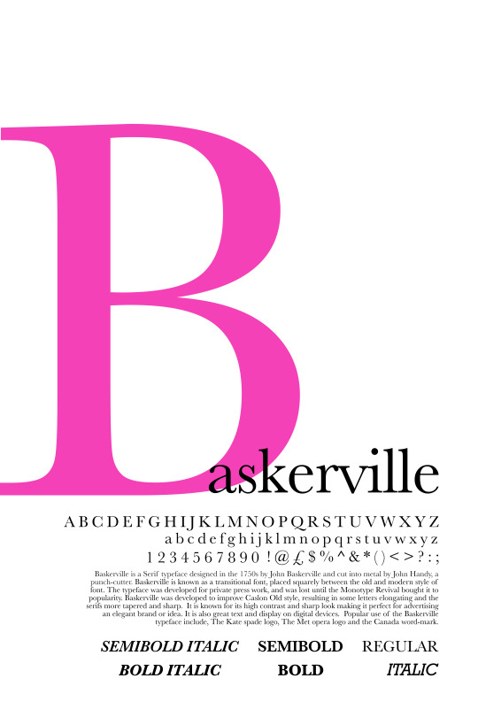
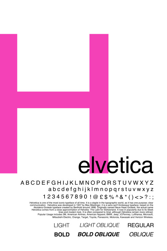

Above are the finished pieces, I experimented around with the colours and decided on a bold pink. I wanted something that would really stand out. Originally I was going to use red and black, but I felt that it didn't pop as well as a bright colour. I kept all the font in line from the right hand side as I wanted it to line up in a different way. I was going to have it line up on the left, but placing the large letter Right up against the side of the page made the writing look out of place and squished.
0 notes
Text
Research point
Explore what typography is available from the type foundries at the moment.
To approach this research point I decided to divide this exercise up into smaller categories.
Contemporary version of an older font
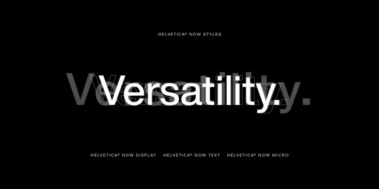
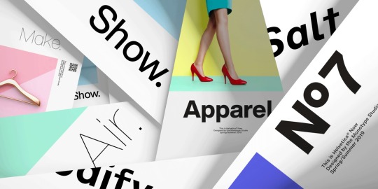
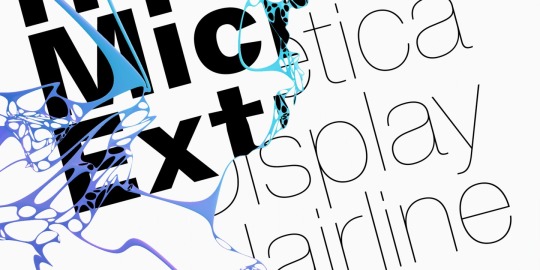
Helvetica Now
https://www.myfonts.com/fonts/mti/helvetica-now/
Filling a gap in your type categories
Below are a number of different fonts that have stood out to me over the course of the research point. They all seem to have something that is lacking in my design work.
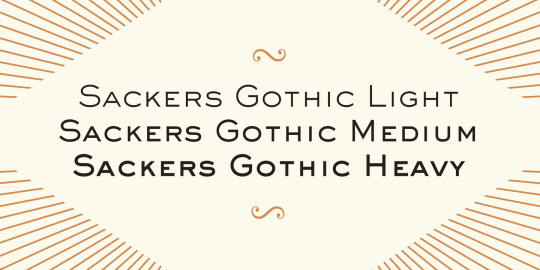
Sackers Gothic
https://www.myfonts.com/fonts/mti/sackers-gothic/
I have a lot of bold fonts in my collection, but I really love the shapes in this. The letters look elegant and clear, and I really want to add this to my collection. This would be great for poster work or invitations, anything that needs to feel classy and eye catching.
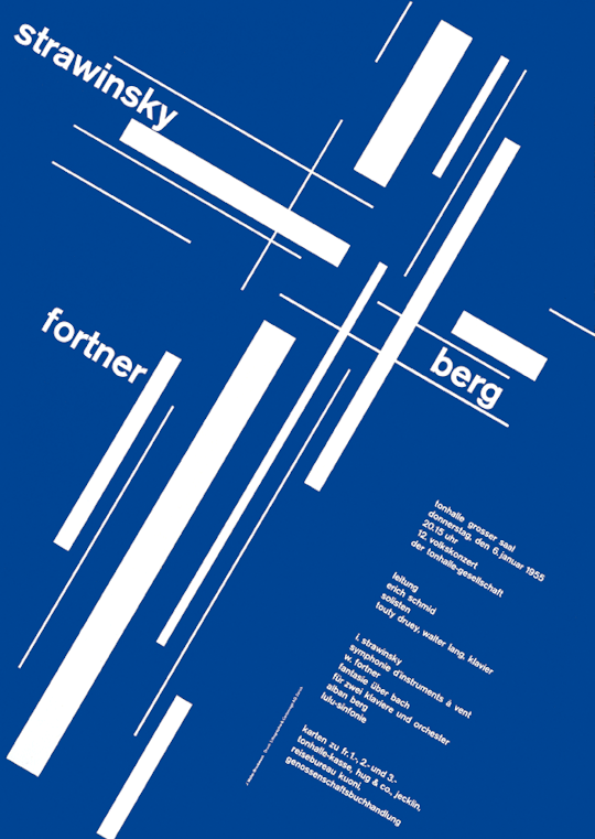
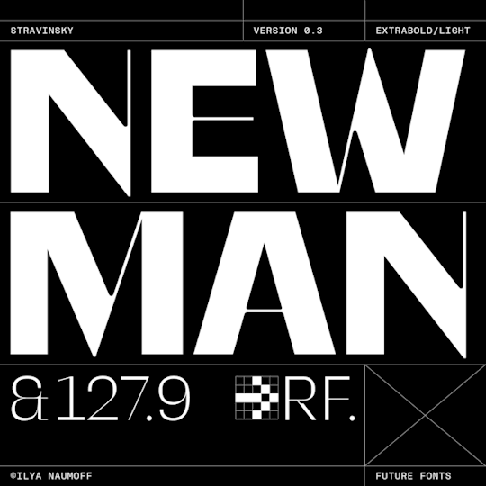
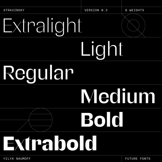
Stravinsky
https://www.futurefonts.xyz/ilyanaumoff/stravinsky
Another classy font. I love the thin to think elements in this font, I really like how the X, W, N and M look in this set. Really elegant, again something that would look good on a magazine cover or article, invitation or poster. This is a font intended to catch eyes and attract attention.
ISO
https://www.futurefonts.xyz/scribble-tone/iso
This font is nice and clean, and it reminds me of coding. This is a font that could be used with a more bold font, this is more of something that could just fade into the background. I like how clean it feels, but at the same time reminds me of a computer screen, perhaps a coding screen. It’s quite neutral but has a little bit of flair.
Agrippa
https://www.futurefonts.xyz/loveletters/agrippa
BRZO
https://www.futurefonts.xyz/erik-marinovich/brzo
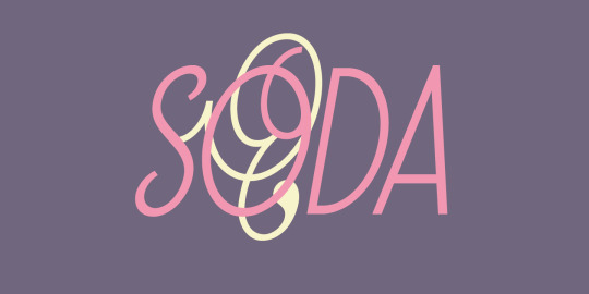
Soda Script
https://www.emigre.com/Fonts/Soda-Script
This font makes me so happy to look at. It’s like a mixture between a vintage font and a modern one. Really nice flourishes and I love cursive s fonts, I don’t have enough of them and I need to expand some more. This feels like it could be used for poster work, or logo work. I would use this as an eye catching piece. I am considering buying this font soon, or finding one like it.
Experimental fonts
Below are some examples of fonts that look experimental. I love when fonts look a bit “out there” and I love looking at all of the shapes and designs. There are some really fun shapes in here that I really like the look of. I want to possibly add a few of these to my arsenal.
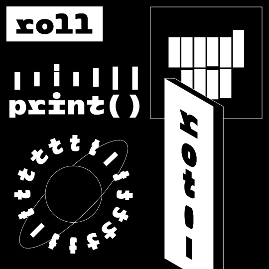
rotor
https://www.futurefonts.xyz/jan-sindler/rotor
“rotor (read from both directions) – just like the typeface. From decoded to encoded message along with the rotation axis! It's a monospaced monolinear typeface that merges surprise and joy together into a unique experience. Why condense letters, when you can rotate them?” - Future fonts.
I really like the idea of rotor, I've never seen a rotating font, the shapes look amazing. I can just imagine how great this would look on a poster. The idea of rotating a font, could make amazing compositions. This is more of a decorative font in my opinion, where the typography becomes more part of the overall design. Really cool font.
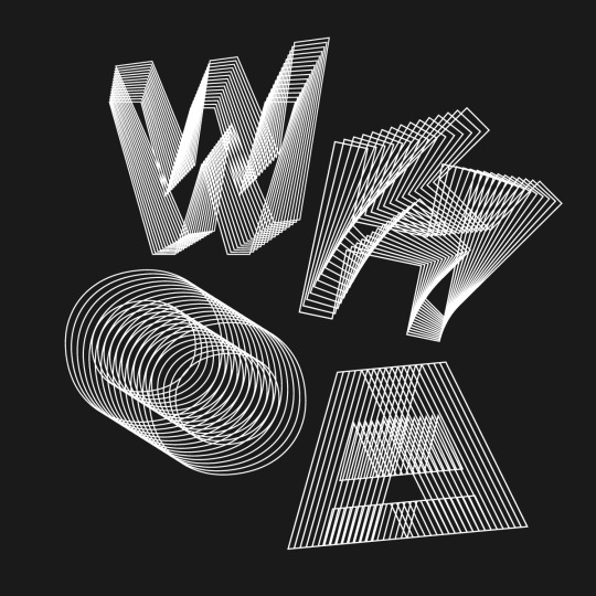
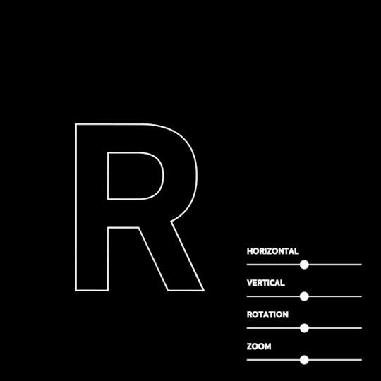
WHOA
https://www.futurefonts.xyz/scribble-tone/whoa
“Use three sliders to expand the outlines into a three dimensional hyperspace. It also comes with a filled ‘top’ style, that can be layered on top to help with readability.” - futurefonts
Woah is a moveable and adjustable font. I have also never seen one like this before, the use of sliders to create different compositions is amazing, I would love to use this for a poster, a lot of the experimental fonts that I have looked at I can imagine using decoratively, perhaps in logo design. The idea of making every piece you design slightly different with the siders is really inspiring.
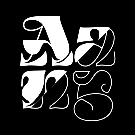
Gloubi
https://www.futurefonts.xyz/lo-ol/gloubi
Gloubi is such an eye catching font, it’s not really a font you can use for everyday and is maybe not as useful as some of the other fonts that I have explored in this research point, but I really like creativity of it. The shapes are eye catching and really nice to look at and all together make up a really nice set of letters and numbers. Like most of the other experimental fonts, this would be great for a poster or logo. Really decorative and appealing to look at.
0 notes